As you may recall, this year we’re taking a new approach to the Uni Watch Power Rankings over on ESPN. Instead of ranking all 122 MLB, NFL, NBA, and NHL teams in one shot, we’re going league by league over the course of the year (plus I think I’m going to add a new category: best cities, as ranked by their teams’ uniforms). We did the MLB rankings a few months ago, and today we’re going to have the NFL. I’m not going to give any hints except to say there’s a new team in the top spot — find out who it is here.
Sixers uni leak, continued: Yesterday I described how Sixers player Nerlens Noel, who was representing the team at the NBA draft lottery, appeared to have the team’s new uniforms, which haven’t yet been unveiled, sewn into the lining of his jacket. I wondered if this might have been a “scripted leak” by the team and promised to follow up.
Turns out I was right. Nerlens’s jacket lining was actually mentioned in an email that the team sent to its fans immediately following the lottery. Here are some additional details from Sixers spokesman Michael Preston:
Nerlens had already seen the jerseys and wanted to know if he could use portion of it for his jacket lining (like he did with his Kentucky jersey when he was drafted).
We thought it would be fun opportunity for him and for us during the lottery, so we sent him blue and white jerseys, which essentially confirm the wordmark that will appear on the uniform (which was already reported last week).
There are still many more elements that haven’t been revealed!
And there you have it. The full uniforms will be unveiled on June 18.
Uni Watch Book Club ”” Split Season: When I got to college in 1982, I met this guy named Jeff Katz, who managed the student-run record store on campus. We quickly bonded over a shared love of music and records. By the time he graduated two years later, he had groomed me to become one of the store’s new managers. I don’t think we ever once talked about sports.
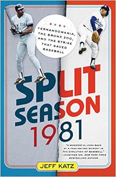
Three decades later, I’m the Uni Watch guy and Jeff is the mayor of Cooperstown, which basically makes him the ambassador for the Baseball Hall of Fame. He’s also a baseball author, and his new book, Split Season 1981: Fernandomania, the Bronx Zoo, and the Strike That Saved Baseball, came out this week. Surprisingly enough, it’s the first book ever written about that bizarre strike-interrupted season, and it’s a really good read. Jeff tracked down tons of former players (Doug DeCinces, Dave Winfield, and many more) and also interviewed the great labor negotiator Marvin Miller before he passed away in 2012. Highly recommended — and not just because the author is an old college chum of mine.
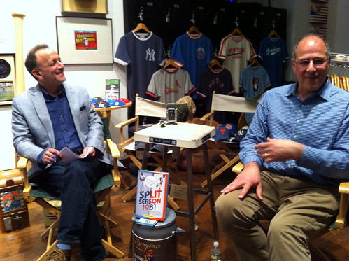
Jeff was in town last night to do a Q&A at the Bergino Baseball Clubhouse in Manhattan. Here he is with Clubhouse honcho Jay Goldberg (Jay on the left, Jeff on the right):
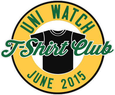
Just give me all your money already: The June offering from the Uni Watch T-Shirt Club — the BFBS design — is now available. Full details here, or go straight to the ordering page.
While we’re at it, the Uni Watch smart phone case, with a nifty stirrup-based design created by reader Matt Beahan, is available here.
The Ticker
By Mike Chamernik

Baseball News: The White Sox will wear 1959 throwbacks in July and August and 1976 throwbacks in late July. For the 1959 set, “I cross-referenced the dates that they say it will be worn (July 10 and Aug. 14) with their schedule,” says Brendan Hickey. “It looks like they will be doing a home and home throwback series with the Cubs with each team wearing a home throwback and road throwback in their two series this year. [The 1976 throwback listing] did not list a set date on this one so I couldn’t find an opponent for them.” … A TV cameraman at Monday night’s Mets/Cardinals game was watching the Rangers/Lightning playoff game (from John Ekdahl). … Grantland did a 30 for 30 short on the Giants’ Crazy Crab, perhaps the worst mascot ever. … The Nats celebrate wins by pouring chocolate syrup on the team’s best hitter for a given game. After hearing that, Hershey’s sent the club 108 bottles. Oh man, those poor folks that do the team’s laundry. … Both Yan Gomes and Derek Norris talked about their catcher’s gear with Esquire (from Tommy Turner). … Speaking of Norris, he changed his locker room nameplate to read “Norrisaurusrex” (from Phil). … A Brewers fan made an excellent Miller Park grill. … The Nashville Sounds scoreboard is shaped like a guitar. Putting the linescore on the neck of it was a nice touch. … Mike Napoli has an extra button on his jersey, between the “Red” and “Sox” (from Ben Marciniak). … Illustrator Andy Friedman likes to draw baseball cards (from Amanda Punim). … A few years ago, Paul wrote a piece about how some Dodgers coaches wore red caps in Spring Training in the 1950s and 60s. One of those caps was up for auction last month (from Chris Cruz). … Brewers C Martin Maldonado had a hall of fame-sized plug of tobacco in his mouth last night. ”¦ The WVU team uses football-style merit decals on their batting helmets (from Dan Medina). ”¦ Here’s a better look at the Raisin Eaters throwback that the Fresno Grizzlies will be wearing tomorrow night.

Hockey News: The New York Times took a look at how goalies stretch. … Nick Foligno was introduced as next year’s Blue Jackets captain. He was presented a jersey with a captain’s “C” — and also the patch for this past season’s All-Star Game (from Nick Hatch). … New unis for the SPHL’s Peoria Rivermen. The look is similar to the one the team had in the 1980s. … Alexander Ovechkin wears bracelets when he plays. Jean Labbe snapped that shot while watching a highlight video of the Rangers/Caps series, and I found a pic from a few months ago. ”¦ The Lightning try to create a larger-than-normal home ice advantage by selling tickets only to Florida residents and by not allowing fans to wear opposing teams’ jerseys in certain parts of their arena. Key passage: “The policies are clearly stated on the Lightning’s Ticketmaster site. One affects mostly season-ticket holders in the Chase Club and Lexus Lounge areas. ‘Please note that for all 2015 N.H.L. playoff games at Amalie Arena only Tampa Bay Lightning team apparel (or neutral) will be permitted in these club and adjoining seating areas,’ the statement reads. ‘Fans wearing visiting team apparel will be asked to remove them while in these areas.’ Spectators who do not comply are offered similar colored apparel to wear; if they refuse, they are moved outside the club area to another available seat.”

Soccer News: Here’s what Germany’s Euro 2016 home kit might look like. … A Spanish publication counted down the 10 best dressing rooms in soccer (from Neil MacLeod). … Also from Neil, new kits for Dundee United of the Scottish Premier League. … “I noticed something recently about Chelsea’s Eden Hazard,” says Jean Labbe. “He cuts a pair of socks about mid-shin and puts it on on top of another full sock. It reminded me of what some NFL players do but I had never seen something comparable in soccer. I do not know when Hazard started doing that but he seems to have been doing it every game recently.” ”¦ Barcelona and Juventus will both wear their home jerseys in the Champions League final (from Drew KB).

NBA News: The Hawks encouraged fans to dress like TNT sideline reporter Craig Sager last night. … After seeing a collection of minimalist NHL logos, Redditor peanutpickle10 created his own set for the NBA.

Grab Bag: UGA makes a fair bit of money from its apparel deal with Nike (from Jacob Moore). … Here’s a great site that showcases typography from urban environments (from Phil). … Howie Lewis found a site that sells team logo floormats. … A line of snake-proof hunting boots has been recalled (from Jason Hillyer). … “Not sure this is a welcome development for a sport where sportsmanship is so prized, but Kodiak now offers gloves that let curlers imitate football’s logo-palm-flash thing,” says Scott Rogers. “Though it’s nice to see that anyone doing the palm flash would just be showing a curling house, not a club logo or anything.” … Chicago’s Big Ten 10K allows runners to wear shirts based on their Big Ten school (from Kenneth Traisman). … Here’s another case against headgear in girls’ lacrosse (from Kurt Esposito). … An Oklahoma City attorney has been evicted from her office because of her creative skull and crossbones logo. … In 2012, New Zealand rugby player Carl Hayman lost his shirt during a match (from Eric Bangeman). … A Brazilian clothing company is in a little bit of trouble for making a Maori-inspired gi (from Phil). … “NHRA Pro Stock Biker Sean Gann likes to dress up as superheroes while he drag races his motorcycle,” says David Firestone. “Last year, he dressed up as Batman, and this year he dresses up as The Flash.” … Also from David: A roundup of sports most unique trophies. … Camouflage-trimmed Memorial Day lacrosse helmet for the Denver Outlaws (from Jared Buccola). ”¦ New state logo for Tennessee. … I was watching In Living Color on FXX late the other night and Kris Kross was the musical guest. I just felt the need to remind you of their sportswear stylings.
Not exactly a power ranking, but has anyone else tried to do uni-realignment? I tried this with the NFL. The only rule was I had to stick with 8 divisions of 4 teams each. It’s harder than you think. I put the Bears, Packers, Steelers, and Raiders in a “Classics” division easily enough. But then you get to the end and are left with “average” uni teams like the Titans and Texans. How to group those teams together? Anyway, it’s a fun project. Just curious if anyone has done anything similar.
“The Mack Daddy will make ya Jump Jump The Daddy Mack will maky ya Jump Jump Kris Kross will make ya Jump Jump uh huh uh huh” Thanks.
Just when you’ve finally forgotten about stuff like that…
one of them died a few years ago; I remember an outpouring of nostalgic “emotion” on Facebook about it.
Growing up, I so wanted a Starter jacket and Starter baseball jerseys and Starter caps and Starter pretty much everything. My mom decided they were too expensive so I settled for a Zubaz Scottie Pippen signature cap.
Ovechkin’s bracelet looks a bit like a rosary to me. The spacing of the beads, the cross.
The rosary is not part of the Orthodox Christian tradition and I believe that Ovechkin is Russian Orthodox so it is unlikely that’s what he is sporting. The Catholic Church did not establish the devotion until the late 14th century, long after the schism that divided the Eastern and Western Churches in 1054 A.D.
But the Orthodox church does have the tradition of praying the Jesus Prayer, often using a string of beads much like the Rosary.
While it’s not a conventional Orthodox prayer rope, such bracelets with beads are not completely foreign to the Orthodox tradition. As arrScott pointed out, such bracelets are used for the Jesus Prayer (“Lord Jesus Christ, Son of God, have mercy on me, a sinner”) and other daily or incidental devotions. Some Orthodox also use rosaries, even though they’re not specifically for that purpose.
Is he also wearing a kabbalah string? Sheesh.
Nashville has long had the linescore on the neck of the guitar scoreboard at Greer Stadium. I think fans were quite happy to see this replicated on the new scoreboard at the new park.
Thank you, and good night.
link
Enjoy every sandwich.
A heads up that tonight is another one of nights to honor key Red Sox players of 1975 (tonight is Luis Tiant).
Be on the lookout for those gorgeous pullover jerseys and the striped stirrups.
Meh. I can’t quantify the emotional attachment fans have to a beloved uniform, but the Red Sox are one of those teams that need buttons. C’mon, the name parts right in the middle!
Looks like Napoli’s uni has more than just the one extra button between Red and Sox. It looks like he has an extra button between each of the regular buttons.
They’re REALLY trying to avoid this: link
Which I can certainly appreciate.
Napoli likes to leave the top two buttons of his jersey undone. Without that extra button, it would be unbuttoned WAY too low.
New link kit is out. It’s fine on its own but is a pretty massive downgrade from link. On the plus side, the goalie shirt is nice, and the regular shirt is way better than the link (in 2009-10) to revisit link.
Also of note: This is very different from the “leaked” version linked in the ticker earlier this week. And link.
Not bad – they didn’t over do the collar area design. I could do without the “umbro” on the sleeves, though.
The Nats celebrate wins by pouring chocolate syrup on the team’s best hitter for a given game.
Um… ew? The first thing I thought of was Sparky Lyle’s pervy cake-sitting. But I’ve said too much…
After seeing a collection of minimalist NHL logos, Redditor peanutpickle10 created his own set for the NBA.
A different artist contributed hockey logos where the Islanders crest subtracted everything but the puck and the stick in the circle. It was perfection! Can’t believe the Isles weren’t all over it.
I’m 80 percent done with Split Season, and it is a good book. Worth the purchase.
RE: Crazy Crab
He was supposed to be the worst mascot. He was billed as the anti-mascot and in the ads introducing him Frank Robinson (manager at the time) gave him the death stare. It was very funny and Crab was hated just like he was supposed to be.
Love the soccer dressing room gallery. And I like how some locker rooms are relatively spartan (Manchester United players basically get hooks, apparently no locker) while the AC Milan locker clubhouse looks like the deck of Starship Enterprise.
In the grand tradition of The Office, Who Wants to be a Millionaire, and Dancing with the Stars, American Idol, America’s Got Talent, House of Cards, etc, etc, NBC is apparently Americanizing a British TV property and link.
In conjunction with Walgreens drug stores.
link
The NBCSN Premier League crew wore red nose on the show Tuesday.
RE: Chocolate Syrup Celebrations for the Nationals
This post from this morning talks about the celebration and discusses briefly the laundering process:
link
Relevant passage;
Cleaning chocolate syrup off a baseball uniform has proven to be about a two-hour process: attendants first soak the chosen uniforms in a mixture of Tide detergent powder and hot water. They then scrub the uniforms by hand while using Slide Out – a baseball detergent – and/or a pine tar remover. Finally, they run the uniforms through a normal wash cycle. Then they do the entire process again. And then yet again. Nine steps later, the uniforms are spotless.
Good lord. One hopes the players just haven’t thought about it. The alternative, that the players know what gratuitous labor they’re imposing on clubhouse staff and don’t care, would be just about enough to make me switch loyalty to the Phillies.
I know players tip the clubhouse staff, often generously, but I hope they’re really paying out this year.
So far there’s only been three total instances of the chocolate celebration, with three different players. Dan Uggla, Bryce Harper, and Ryan Zimmerman. I would think those guys know to tip the equipment staff appropriately, at least they have the funds to do so.
To me, this falls into the category of things you don’t make someone else do, not the category of things you tip him well for doing.
Regardless, I’d be surprised if the chocolate thing lasts the season. Teams seem to fall in and out of this sort of fad pretty quickly. Though come to think of it, an easy-to-launder brown jersey with red script and numbers could look fantastic.
Yeah, I agree they shouldn’t put the clubhouse staff through that in the first place, but if they’re going to do it (though they shouldn’t), I expect them to pony up accordingly.
Only one team should be doing this…the Padres. And don’t wash them so thoroughly.
#BringBackTheBrown
Barca and Juve will wear their normal kits?
I should damn well hope so – blue and claret vs black and white. No clashes at all.
But isn’t it sad that these days that has to be announced?
Well, it *is* standard protocol for UEFA to announce the kits ahead of the game since it’s neutral site (and they usually send out a match info kit). And there was that time in 2005 when AC Milan was the “home” team and Liverpool was the “away” team, but the uniforms were switched at the request of both teams (Milan almost always wear all-white in European Cup finals).
Actually, link and link since both teams consider those shirts lucky. Though Liverpool won in 2005 and Milan won in 2007, so I’m starting to think “lucky shirts” don’t always deliver results.
Just last year, Real Madrid and Atlético Madrid were able to both wear their primary kits in the Final, but only after the designated visiting team (I think it was Atlético) made a specific request to UEFA President Michel Platini. They noted that in league competition, both teams were able to wear their primaries no matter who was the home team, and wondered why it had to be different in the Champions League. Platini is rather old school in his aesthetics (he resumed the tradition of having teams ascend to the stands to receive the trophy), so he readily granted the request.
hey noted that in league competition, both teams were able to wear their primaries no matter who was the home team, and wondered why it had to be different in the Champions League.
UEFA is stricter about color clashes and readability than domestic leagues – they used to require solid number areas for striped/hooped jerseys and measure number/jersey contrast with a spectrophotometer.
The NFL Power Rankings are up:
link
I’m sorry, but the fact that the Steelers’ “iconic” sleeve stripes are actually cut off and typically missing the bottom stripe on all but QB and Kicker jerseys should not allow them to take the number one spot, I don’t care how much you like the throwback uniform.
Fun piece as always.
I think the Saints have one of the best football uniforms of all time, although I don’t disagree with your assessment of the current details that detract from an otherwise great look.
Ravens would be at the bottom of my list – purple and black will never work on anything, ever.
I don’t think Paul (and most of the Uni Watch readership, it looks like) and I will never see eye-to-eye on the Seahawks. The neon works because it’s Seattle – when it’s overcast or rainy, it pops nicely off the dark blue tops and pants. If it were any other city, I’d agree, but it’s small enough to let the navy be the star, but bright enough to provide a much needed contrast.
Agree, I dig the neon green trim. But then again I also loved their all neon alt jersey.
The neon green isn’t the problem. It’s the rest of the crappy uniform that sucks.
After going through each UniWatch uniform assessment, it seems that there are maybe 5 teams that have what I would consider aesthetically perfect uniforms.
Colts, Raiders, Giants, Bears, Bills.
As for all the others — Too much piping (Cards, Jags, Texans), dark pants (Saints, Jags, Bears), stupid number fonts (Bucs, Vikings), and uniforms that don’t match the helmet design (Cards, Chiefs, Bengals)
And what the fuck is wrong with Cleveland — Totally ruined a great uniform.
If this is progress, I loathe it. Give me the uniforms from 1973 any day.
Great idea for a topic – what are the aesthetically perfect uniforms in sports? Agree the Colts is absolutely perfect.
The Chiefs are perfecter. Blood clot or no, they should be ranked no lower than #1.
For the NBA, I’d argue the Trail Blazers. It’s distinctive yet clean, modern but nostalgic.
I like the Knicks’ colors and their current look, but the taint of Jimmy Dolan is too strong. Celtics are fine, but it’s too steeped in nostalgia for a sports whose aesthetics are generally more up-to-date.
I’d put the Lakers second for an updated look that references the past.
Spurs and Bulls. Timeless classics.
I like your choice of the Blazers, though.
No team with a gray face mask can have a aesthetically perfect uniform.
Sorry, just a fact.
Lee
This is true. The one team that could be an exception would be the Raiders, but even they would look better with a black facemask.
Not even the Raiders. It should be black.
Lee
No, a gray face mask can work with a silver helmet. Even better with a gray helmet. But, otherwise, yes.
Disagree.
Gray face masks were a limitation of the times they were created.
In today’s world, there is no excuse for them, for any team.
Lee
I’d be ok with actual *silver* facemasks for Dallas and Detroit.
But yeah…black for the Raiders.
And maybe the Cardinals, oddly.
The helmet is still a problem — the flaming thumbtack logo has always felt too
USFLArena LeagueFixed. Nothing about the Titans’ look is USFL-worthy. Nothing.
I really don’t understand the hatred for the Titans logo. Sure, it’s not as classic-looking as the Oilers logo it replaced, but is it really *that* bad?
I wouldn’t use the h-word, but when you’re comparing it to a league that was top-to-bottom uni-tastic, there’s no comparison. The logo’s OK for the No Fun League or the Arena League, or even the CFL. It just wouldn’t cut it in the USFL, though.
I’d like to see the flaming thumbtack moved to the sleeve and the ‘derrick’ sword become the helmet logo.
I wish they’d add a subtle touch of red to the rest of the uniform too.
Anytime anyone uses “USFL” as a pejorative when it comes to uniforms doesn’t really “get it”.
USFL uniforms as a whole were remarkably well done, and restrained, especially when you consider it was a rival to the NFL, and had every reason to try to be ‘different’.
There isn’t an ‘awful’ uniform in the bunch, and in fact I’d argue there are at least 10 NFL teams that are wearing something worse than any USFL team ever did.
Lee
I hate hate hate how people give the Cowboys a pass. Their uniforms are AWFUL, and don’t make a lick of sense.
Easily the most overrated uniforms ever.
Lee
I agree. Other than the Jags due to their helmet and perhaps now the Browns (can I get a “holy shit”?), Dallas’ uniforms would be at the bottom for me. The different blues, stupid black outlines on the whites’ sleeve stripes, dorky “green” pants with the whites, all make it the obvious choice. I’ve always said the blue/cursed combo looks great, and that if they simply paired that with an appropriately styled/colored white jersey, they’d have one of the best.
It would be such an easy fix.
Pick a blue (the one already on the helmet). Pick a silver (the one already on the helmet). Build the rest of the uniform based off the helmet.
Lee
Well, the mismatching silver makes some sense, or at least it did before HDTV, the greenish silver showed better on TV.
Doesn’t explain why they still do it or the mismatched blue, though.
Showed better how? Even when I watched the Cowboys in the ’70’s, the pants looked green-ish, their helmets did not.
Lee
Right, but it’s easy to make the helmets look silver, less so with fabric (especially considering the limitations at the time). And the green was much less pronounced on standard-def. On HDTV, it’s not just green-ish – it’s actually green.
Gray would have looked better than green-ish.
Lee
Well, tell it to Tex Schramm.
FWIW, I think the old gray pants were a really unflattering look.
I’ve liked the idea of a slightly bluish silver for the Cowboys’ pants. For use with both jerseys, too.
You contend that the Bears helmet logo is looking a bit dated. How would you correct it? Going back to the white version isn’t really an option, as it would look out of place with the rest of the uniform. I also recall that a key reason they added orange to the wishbone “C” was to sufficiently distinguish it from the University of Chicago’s monogram such that the Bears could trademark it.
My thought is that it’s become untouchable, like the Giants “NY”, the Packers “G” and the 49ers “SF.”
Unrelated to the content itself, but does anyone else ever happen to glance at the comments section on the ESPN pieces? They normally have a few of the most recent posts directly below the article, and sometimes I make the mistake of clicking through to the rest. I would hope Paul either doesn’t look (although I have seen him respond from time to time) or has the perspective to realize how inane the comments actually are, and not representative of his readers at all.
There is of course the argument that neither I the reader nor Paul the author are under any obligation to read through and/or take anything to heart, but a small part of me always is concerned that our cultural “heroes” will ultimately be worn down by this tripe to the point where they no longer want to turn out some or all of their (mostly-cherished) product, for lack of a better word.
I look at the comments for some of my ESPN articles, but not for an article like this one. Sucker’s game, losing battle, nothing to be gained, etc.
I enjoyed it. But I find it strange that Washington uses the classic striping pattern on their socks only – while doing the two color thing on the sleeves. The Steelers have preserved their version of that striping, even if it the bottom gets deleted. In fact, it might also look cool if the Packers put their version of that Northwestern striping pattern on their socks, since they’ve simplified the stripes on the jerseys.
And, um… regarding face-masks. I must admit I never pay any attention to what color they are. To me it’s an equipment thing.
I don’t get the facemask color thing either. Seems it’s commented on a lot, but I rarely even notice it.
Re Steelers/’Skins, the Steelers would look better if they had pant stripes more like their sleeves (black/white/black perhaps?) rather than the thick black stripe, and the ‘Skins should change their sleeve stripes to be more like those on the yellow pants. It would improve both unis a lot IMHO.
Washington had those stripes on its sleeves when it originally wore those socks in the link.
Love the rankings as a whole. I think the Steelers’ numerals should keep them out of the top spot, though. And of course I can’t agree with you on the Jets; all they need is to drop the green pants and white socks and get the color green right and consistent. I’d also like to see them tweak the logo to make it football-shaped like the original.
I’d also rank Tampa Bay lower than Cincinnati, and the Chargers way lower than they are. Plus I must take exception to using “USFL” as a pejorative; USFL logos and unis were -awesome-.
The Pittsburgh Steelers?
When the Steelers get rid of the crappy tilted (italic) numbers THEN they can be ranked #1.
20 years later those numbers still looks terrible.
Lee
Thank you.
Agree; the classic unis with block numerals looked far better.
End of an era – B.B. King dies, David Letterman retires, and now this:
Juicy Couture, the de facto uniform of young women in the mid-00s, is link (though you can still get their velour tracksuits at Kohls!).
I’m confused. Didn’t this happen a year ago? Juicy, I mean, not BB or DL.
Never liked Miller Park, but I love that Miller Park grill! Paul, get on the horn with that guy and do a DIY lead instead of burying that in the ticker!
Agreed. Please please please let that be a DIY lead! The grill has actually given me new respect for the aesthetics of Miller Park. The exterior, anyway. When I was a kid, I saw a Weber Kettle with the lid painted the pattern of the Metrodome roof. If was clever, but ugly, and kind of clarified the ugliness of the Dome itself. The Miller Park grill has the opposite effect.
Some high school kids in Kohler, WI created a Miller Park replica out of a grill back in 2012. It was even featured on the Travel Channel.
Photos: link
Video: link
I want a bratwurst now after seeing that. Awesome.
This is where I found it: link
The thing about the Lightning forbidding fans from wearing visiting team apparel is interesting. I was especially thinking about that regarding the piece from earlier about NBA teams giving away t-shirts and shaming fans into wearing them. What if I go to a game as a visiting fan and don’t want your crummy t-shirt because I’m proudly wearing your opponents’ colors? Some of my favorite memories at sporting events are from when I went as a visitor to a hostile environment. I’m not about to be shamed into some kind of conformity, especially for a team that I don’t even like. Could they kick me out of the arena for that?
Yes, they can kick you out of the arena for that. Or for just about anything.
Personally, I wish we would have developed a constitutional jurisprudence that applies the First Amendment (and other protections) to people attending public events at government-owned or -financed facilities, such as most sporting events. But we don’t apply the Constitution that way, so teams have very wide latitude to expel anyone for almost any reason.
That’s a strange notion, dare I say farcical even. By that reasoning attendees could bring a lawfully-owned firearm to the stadium as well. In any event, what you’re suggesting could easily enough be implemented, either by lease agreement or as a condition of providing the financing.
The larger, more annoying issue is the extent to which teams now dictate the “fan experience” from on high, rather than it being something organic. To me at least, it’s a large factor (though by no means the only one) why professional sporting events in the U.S. have become increasingly soulless.
Yes, by my proposed reasoning a private entity would have a much harder time stripping individual citizens of their basic civil rights on government property. The horror! Oh noes!
If you’re OK with private companies telling citizens what color shirts they can or cannot wear on property they paid to build, great! That’s a legitimate point of view. But the soullesness you complain of is a direct result of the attitude that says it’s OK for companies to preempt the basic civil rights of citizens. We can’t have it both ways: Either soulless companies set the terms of our public space, in which case no Rangers jerseys at the Lightning game; or American citizens actually do carry their basic civil rights with them into public events on government property, and the fans, not some suits in a corporate marketing office, get to decide what the experience of being a fan is.
The way the American polity is organized, the only way to prevent sports’ corporate masters from inflicting soulless, antiseptic experiences on us is to apply general rules such as constitutional jurisprudence that require the opposite. If the only places teams could impose their own soulless visions of “fan experience” on people were arenas built at their own private expense, then one or both of two things would happen:
1. Fans would notice the difference, and demand that teams stop making the experience of attending a game in a private building suck so badly compared with the experience of attending a game in a public building; and/or
2. Teams would so greatly value their own ability to suck the soul and enjoyment out of attending a game that they would spend their money to build their own buildings instead of begging for massive taxpayer handouts all the time.
Either one of these outcomes would be a massive improvement over the status quo.
Not sure what you’re on about. I was simply observing that there’s no need to drag “Constitutional jurisprudence” – whatever that phrase even means – into a situation where a simple lease provision or condition of financing would suffice in the case of a government-owned/-financed facility. Oddly, back in the day, when stadiums were privately-financed to a greater degree, the fan experience was one imposed from top down, but rather one that developed organically for the most part. So it seems to me the issue is less a function of people ceding authority to “sport’s corporate masters” to trample their civil rights than it is a function of American society being consumer-driven to a ridiculous and harmful extreme.
I mean perhaps the two go hand-in-hand, I don’t know. I’m certainly not inclined to invest much time contemplating it. Rather, I choose to cope by simply not attending professional sporting events anymore.
Err, I mean “not one imposed from top down.”
Regarding Eden Hazard socks cut about mid-shin on on top of another full sock….. I know at least two players that do that, and I noticed it because Im a big fan of the national team of my country and yes of course they play in it , Uruguay. They are Martin Caceres (Juventus) and Fernando Muslera (Galatasaray). I notice they do it with the NT but I bet they do it on their teams too. They both use the top socks high up their legs. In Muslera’s case, being him a goalie, works more for protection I guess instead of using another option. In Caceres perhaps its the same thing, seeing that he really likes doing sliding tackles but hey.. im just ranting now, perhaps they just are fashion choices. Glad to comment.
Cheers!
Hazard is the most-fouled player in the Premier League and he famously got a link last year, so I imagine it has to do with protection (whether it’s for extra layering or keeping shin guards in place).
Hazard has actually requested shin guards that cover the backs of his legs to give his calves some measure of protection due to all the times he gets fouled from behind.
link
The cutting of the sock is rather popular in college and amateur soccer in the States. I see it all the time.
A lot of times, it revolves around the player(s) not liking the feel of the stocking’s footing area, they’d rather wear a thinner or firmer sock under. Soccer rules require the stockings to be the same color, so there’s really no way to wear other socks outside of cutting the required stocking lower and wearing what one prefers just where it’s never seen (in the boot).
The biggest problem with the Big10K is that it starts out as a 10K across Midwest farm land but ends up as a 14K in east coast metropolitan areas
Comment of the Day
How you can create a list of 33 “weird and wonderful sports trophies” without Floyd of Rosedale is completely beyond me.
Always enjoy the power rankings. Some nitpicks:
Steelers have no business at number one until they lose the italics. Ruins a beautiful uniform.
Bears helmet logo is beginning to feel dated? It’s timeless.
No way do the Chargers and Eagles belong in the top 10. Eagles don’t belong in the top 20.
Niners, Giants, Jets and Washington (regardless of nickname, uni’s are pretty great) all should be ahead of the clown suits the Patriots wear.
For me, top 10 is Oakland, Green Bay, Chicago, Dallas, Indy, KC, NYG, SF, Buffalo, Washington
Gotta agree with much of this. The Chargers road unis are particularly brutal. Those navy pants should not exist. And combining them with the navy socks is a total eyesore.
And citing the “powder-blue throwbacks” as one of the reasons for their top 5 spot? Yeah, they don’t wear those anymore. Last time they wore throwbacks was during the AFL 50th anniversary season.
And if the Bears’ C is dated, what of the Packers’ G?
This is simply not true, they have never stopped wearing the powder, and let’s hope they never do. They wore them twice last year, here’s one:
link
I wish the Cardinals would go back the Tillman era uniforms. The simplicity of the design makes them classy. I loved the state flag on the road jerseys.
If the Cardinals adopted the link of the link, they’d have a kickass uniform.
“Surprisingly enough, it’s the first book ever written about that bizarre strike-interrupted season…”
Not necessarily so. Dodger broadcaster, Rick Monday along with sportswriter Ken Gurnick did a wonderful job of covering the Dodgers’ 1981 World Championship season in the book “Rick Monday’s Tales From The Dodgers Dugout.” True, it’s a Dodger-centric point of view but it does discuss the strike-interrupted season up close and personal.
I also wrote about the 1981 season in my autobiography, “Bring In The Right-Hander!” which was published in 2014. I covered the year in depth (with a great deal of humor) from spring training to singing “We Are The Champions” on The Tonight Show starring Johnny Carson with Rick, Jay Johnstone and Steve Yeager after the Dodgers won the World Championship.
Here’s wishing author Jeff Katz all the best with his book. I look forward to reading it!
“singing “We Are The Champions” on The Tonight Show starring Johnny Carson with Rick, Jay Johnstone and Steve Yeager”
~~~
Please please tell me this exists on YouTube (or somewhere)!
Great hearing from you Jerry!
And I believe that Roger Angell’s “Late Innings” covers 1981. It is the sequel to “Five Seasons”, which covered 1972 through 1976; so it covers 1977 through 1981.
Side question to Paul: does your pal Jeff Katz say anything about an audiobook for “Split Season”? So far I don’t find it on Audible.
As much as I like to actually read, the fact is that, in practice, I can “read” a lot more books in the audio format, because every weekday I have 2 1/2 to three hours a day of commute time on my bike in which to do it. And then there are the multiple hours of pleasure riding on weekends, during which I can go through a 6- or 7-hour book in a single day.
Audio version: Not sure.
Hi, Jerry. Didn’t mean to slight your book or Rick M’s. What I meant was that no book had taken on the topic of the 1981 season as a whole, as opposed to being from one player’s or team’s perspective.
Similarly, I wouldn’t say Ball Four is a book about the 1969 season; it’s simply a book about one player’s season.
So if the White Sox are bringing back the 59 look for the two Cubs series, does that mean we’ll see those wonderful 1960’s Cubs road jerseys at Comiskey? The red and blue piping and red outlines on the lettering were the Cubs best road jersey ever. And the old Cub patch!
In regards to Eden Hazard socks, they’re are trusox. Many players in Europe wear their socks like that since they’re supposed to wear team issued ones.
Only thing I really don’t like about this site is the PC I won’t say REDSKINS mantra. Rest is really quality.