[Editor’s Note: Phil and I are both indisposed today, so we have a guest enry from David Firestone, who’s going to enlighten us on the subject of auto racing flag designs. ”” PL]
By David G. Firestone
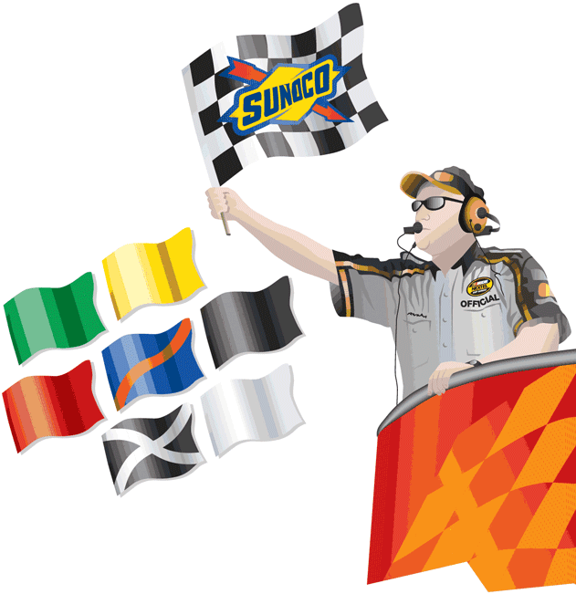
Flags and sports have long been associated with each other. And from the penalty and challenge flags in football to the scoreboard at Wrigley, flags remain a big part of sports today. But when it comes to motor sports, flags are even more iconic because they are used not just for one small part of the races but for almost every aspect.
Each flag design conveys a different signal to drivers, but there are differences between Formula 1, IndyCar and NASCAR — not only in what they mean but in how and where they are used. Let’s look at some of the most common flags and see the differences in how they’re used by different racing circuits:
• Green flag: In NASCAR and IndyCar, the green flag is used to start the race, or practice session. Formula 1 uses a series of lights to start the race, so the green flag is used to indicate that the driver has passed a localized caution. In IndyCar and NASCAR, green flags carry the American Ethanol logo.
• Yellow flag: Used in NASCAR and IndyCar to slow cars down to a predetermined speed due to unsafe condition on the track. Used in F1 to indicate an unsafe condition in one specific area of the track. This is referred to as a localized caution. If track conditions mandate a full-course caution, officials will hold up white “SC” placards, to indicate the safety car has been deployed.
• Red flag: Used universally to indicate that the race has been stopped, usually due to poor track conditions and/or an accident. In NASCAR and IndyCar, no work may be done on cars while the race is under a red flag; in F1 there is no such restriction.
• White flag: Used in NASCAR and IndyCar to signal that the last lap of the event has started. Used in F1 to warn of a slow-moving vehicle on track.
• Checkered flag: The most iconic flag in motor sports is universally used to indicate that the race has ended. Its exact origins are unknown, but the first picture of a checkered flag being used to end a race was at the 1906 Vanderbilt Cup on Long Island. NASCAR and IndyCar checkered flags carry the Sunoco logo.
• Black flag: Used in NASCAR and IndyCar to inform drivers that they have to serve a penalty or that they have a mechanical problem. In F1, a driver being shown this flag has been disqualified.
Now let’s move on to some of the lesser-known, but just as important, flag designs:
• Blue flag: Used in F1 and IndyCar to signal that a faster car is trying to overtake the driver and that the driver should clear the way. If three blue flags are ignored, the driver will be shown a black flag, and his/her race will be over. Used in NASCAR to indicate that the track is blocked and/or there are slow-moving cars on the track.
• Blue flag with a yellow stripe: Used in NASCAR. Similar to the blue flag, but not heeding this flag will not result in any penalties.
• Black flag with a white cross: Used in NASCAR and IndyCar to indicate that a driver has been disqualified, same as a black flag in Formula 1. NASCAR uses an X pattern whereas IndyCar uses a cross pattern.
• Black flag with an orange circle: Used in F1 to indicate that the driver has a mechanical problem and must return to the pits. Unused in NASCAR and IndyCar.
• Black and white flag: Used in Formula 1 to indicate an unsportsmanlike conduct by a driver. If this flag is not heeded, a black flag will be displayed.
• Red and yellow striped flag: Used universally to indicate that there is debris, oil, or fluid on the track.
• Red flag with a yellow cross: Used in NASCAR and IndyCar to indicate that the pit lane has closed. Green flag will be displayed when pit road opens.
• White flag with a red cross: Used in IndyCar and Formula 1 to indicate that there is an ambulance on track. Not used in NASCAR.
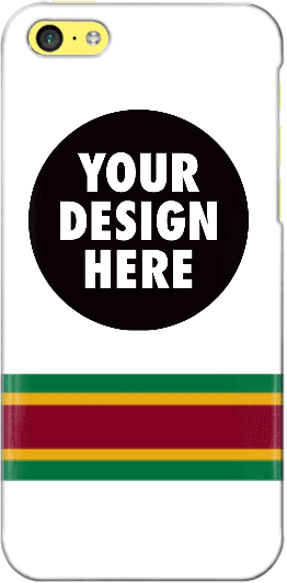
Design contest reminder: In case you missed it, I’m currently running a contest, with a cash prize, to design a Uni Watch smart phone case. Full details here.
As an aside, many of the designs that have been submitted so far feature a white background. As you can see, I used a white background for the mock-up shown at right, so maybe people were following my lead, but I want to stress that the base color does not have to be white. If you go to this page and click on “Layout,” you’ll find a link that will show all of the available background colors.

Baseball News: The Cubs and Reds wore 1990 throwbacks last night. Lots of photos here and here. There was an unfortunate moment during the Reds’ broadcast of the game when announcers Jeff Brantley and Thom Brenneman felt the need to break out the Telestrator to explain what stirrups are (from Jonathan Daniel). ”¦ Orioles OF Adam Jones wore 1960s-style O’s stirrups last night (from Matt Malinoski). ”¦ If you’ve been wanting to vote on the best baseball cap among New Jersey high school teams, today’s your lucky day (from @OhHeyItsTodd). ”¦ White Sox leadoff man Adam Eaton went high-cuffed last night as a slump-buster move (from Ryan Lindemann). ”¦ The Bridgeport Bluefish unveiled two sets of alternate uniforms on Thursday. This “Magic City” set comes with striped stirrups. Unfortunately, the other alternate set features a big, honking apostrophe catastrophe. Sigh.


Pro and College Football News: Patriots owner Robert Kraft wore sneakers for the team’s recent visit to the White House (from Tommy Turner). … Oh man, check out this article about a 70-year-old Miami Hurricanes orange jersey. What a beauty! Love the green numbers (big thanks to Eric Wright).

Hockey News: Check out this 1966 booklet, sponsored by Coca-Cola, teaching kids to play hockey (from Chris Mizzoni). ”¦ Here’s more on the proposed Vegas team’s color scheme (from Mike Engle). ”¦ There’s a club team in Austin called the Shamrocks, and holy moly do they have gorgeous uniforms (from Joey Breeland).

NBA News: The broadcast of the1982 NBA draft featuring an amusing typo (from Douglas Ford). ”¦ Also from Douglas: A cross-dressing shot of former Hawks player Dan Roundfield wearing a Braves cap. ”¦ NBA commish Adam “Inevitable” Silver was at last night’s Rockets/Mavs game, and it looks like his seatback was festooned with American Airlines logos (from Chris Perrenot).

Grab Bag: Nike products have been banned by ISIS. Insert joke about evil empires here. ”¦ Very interesting look at how corporate logos might look if they were drawn by hand (from Andrew Moeschberger).
Today is ANZAC Day, so let’s take a moment to salute our Australian and New Zealander readers. If you or your family are mourning a fallen soldier today, my thoughts are with you.
Great look for Adam Jones!
What? No mention of Juan Uribe’s uniform mess up from last night’s Dodgers/Padres game?
Don’t know anything about it. Phil is unavailable and I was traveling yesterday (and still am today) and was/am admittedly not on top of everything like I usually would be.
Perhaps you could enlighten us as to what happened, instead of just wondering why it wasn’t mentioned?
Here, I’ll help you out. Uribe came out in the first inning in the “Los Angeles” jersey while the rest of the team was wearing “Dodgers” jerseys. He changed into the correct jersey for the rest of the game. link
All other Dodger players were wearing the alternate road tops but Uribe came out wearing the normal away top.
link
…and this is why you don’t have 2 jerseys that are the same color. If the Dodgers want to have an alternate road jersey that’s fine… but it shouldn’t be the same gray as the normal version. At the very least, make it a gray vest with blue sleeves or something, so that even if you aren’t paying attention it’s still obviously different.
Looks like the Cubs and Reds both nailed the throw back uniform, including the Cubs wearing their ASG patch which they hosted in 1990. This was the first year the Cubs went back to gray road unis after about 10 years of the blue softball tops with white pants (yuck). While the CHICAGO font on the front sucks (too small and no arc), I do prefer the blue numbers on the back vs the current red number. I can live without the blue/white piping going down the leg on the pant also.
Paul, did I hear somewhere a while back the Cubs were looking to overhaul their road greys?
Australian, not Austrian, in ANZAC day paragraph.
Ugh. Fixed.
Nice feature article!
I don’t watch racing much, but I have always been fascinated by the flags. I even bought a set so I can wave them around the house.
Thanks! I had a lot of fun with this article!
Agreed – thanks, David, for the terrific intro to the flags. This is the kind of thing I love most about Uni Watch!
Reds 1st base coach wearing his own throwback uni? Billy played on the 1990 World Series winning Reds team. Could this be a first? This topic definitely worth some attention.
Despite the apostrophe issue, I absolutely love that ‘Fish uniform!
Adam Jones is a freaking hero. SUCH a good look. It’s amazing how good socks/’rups can take an average uniform and make it great. Case in point being the Rays… Uni is generally ‘meh.’ Add those stirrups and suddenly it pops.
No kidding. He has gone high-cuffed often enough over the years and I was waiting and hoping that he would rock the classic style. Still the favorites of all the different stirrups I got from Comrade Marshall.
Sorry, I inadvertently omitted Billy Hatcher’s last name. Reds 1st base coach wearing his own throwback uni.
Good catch Mike! It would have funny if Hatcher would have pulled out his old jersey from the closet and wore it on the field! Fat guy in a little shirt :D
Sweet looking 70 year old Miami or as the announcer in the film says Miamuh jersey.
The writer thinks the film was colorized though. As we know there were color filmed games back then. Such as the many 1939 color games.
The article about how corporate logos would look if hand-written was interesting. Children aren’t learning to write in cursive anymore, I understand, so that style of writing might become a lost art.
But the Coca-Cola logo? It’s already cursive!
I took up writing with fountain pens a couple of years ago – they’re like normal pens, but messy and difficult to maintain! – but it’s started to significantly improve my handwriting. I learned Palmer Method cursive in school, but I was never any good at it, and as soon as it was no longer mandatory in 6th grade, I switched to writing in all-cap block letters, like comic-book word balloons. Since switching to fountain pens, I’ve developed a much more flowing italic handwriting, with caps and lower-case letters, and my handwriting is much more legible than it ever was when I was writing cursive in school.
I’m left-handed, so all my penmanship gets cursive-y.
However, on a serious note, is the Montreal Expos <a href="link nickname logo hand-written?
Everything I have with an Expos logo on it has the same repeated not-quite-lining-up serifs and spacing. And as a diehard fan, that’s no small amount of stuff.
Wilkins was drafted by Utah first the traded to Atlanta. He had no desire to play there.
Coca Cola aside, the hand-drawn logos look better than their normal counterparts!
I’m probably lame for saying this, but I was really hoping to see the four bars when I clicked on “black flag”.
James, if your reading this, thanks again for the hospitality.
Wow, did I ever fuck up the Wigley Field link!
Yes, but see how none of us was mean enough to point that out?
‘NBA commish Adam “Inevitiable” Silver was at last night’s Rockets/Mavs game…’
“Inevitable,” I’m guessing?
Yes, thanks. Now fixed.
All seats at the American Airlines Center are “festooned” with AA logos:
link
Of course…They play in American Airlines Center. They paid a lot of money for it.
I would vote for UniWatch to be a Mon-Fri affair.
I would vote for you to feel free to read it only Mon-Fri.
Touché.
Would love an article on the ANZAC Day uniforms, the National Rugby League had some great jerseys for the day while the Super Rugby and Australian Football League wore commemorative patches.
Could it be that Robert Kraft has a medical issue and chooses sneakers because they are more comfy than dress shoes? He is not the youngest after all…
Bob Kraft has a custom line of sneakers with Nike. link
He wears them everywhere. Not a political statement. Just what he thinks is most comfortable.
Billionaires do what billionaires want, right?
Right. At least he showed up, thus managing to avoid Stephen A. Smith’s wrath.
link
Re: Reds throwbacks
Personally, I love the jersey and prefer it strongly over their current look, which is similar but comes with goofy-looking number/letter fonts.
Unfortunately, I thought I looked awful on many of the players last night, especially the ones who wore baggy, loose-fitting tops. IMO, the pull-over jerseys look muc better when the fit is tighter.
Nice article on auto racing flags. One further addition – British Formula 1 and Formula 2 stock cars use the Union Jack flag to let drivers know that a race has reached the halfway point.
In honor of ANZAC Day (or by sheer co-incidence) poking around the New South Wales Rugby League’s website shows a couple of team logos, Panthers and Jets, lifted from the NFL.
link
On a Mariners history page, I noticed a photo of Willie Horton wearing a henley style Seattle road jersey. He played for the Mariners in 1979-80, and I’m guessing he at least wore that jersey in 1979 as he is shown wearing that jersey on his 1980 topps card. I find it interesting as I did not see any other Mariners from that era wearing that jersey. Any old Mariner fans out there notice this before? Photo is here: link
Bill Henderson alert!! Bill, if you see this question – any thoughts?
PS WE ARE WATCHING EVERY MOVE AND POST ON THIS SITE!!!!
i am always pleasantly surprised when antipodean content makes it on your site. which always makes me curious, are you aware of how wide reaching uni-watch is? i’d love to see a map of where visitors/contributors come from
The scoreboard at Wrigley link is another billtoss.gif for me. The black flag w/ the orange circle is sometimes/occasionally/coloquially referred to as the “meatball” flag at track days around the US.
Since May is around the corner (Indy 500 month) you should do an article on racing car livery sets… or at least the neat or famous ones. Much more interesting than “flags” if you ask me. Cars like the Johnny Lightning Special, Jim Clark’s green lotus (the only green car winner at Indy) or even Petty’s blue 43 and the controversy of adding STP red when he got that sponsor.