[Editor’s Note: Our anonymous DIYer is back with yet another sensational hockey-themed project. Enjoy. ”” PL]
By Anonymous
I thought it would be funny to create a fictional aftermarket product that could provide any hockey jersey with a lace-up collar. So I made these little lace-up conversion kits (for all photos, click to enlarge):
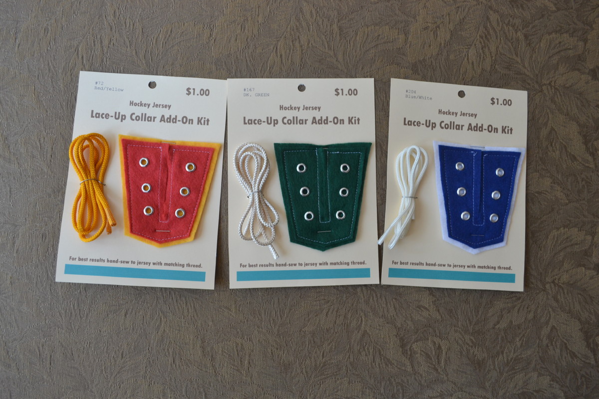
The package design was influenced by shopping in sewing-supply stores. One of unexpected results of getting into sewing is the happy discovery that sewing stores are still very old-world, and you can still buy lots of items (buttons, needles, etc.) that come on cards or other simple packaging. And many of them are less than a dollar!
Here’s how I applied one of the kits to a jersey:
1. I started with an uncrested old Calgary/Atlanta Flames stock jersey. It’s an interesting transition piece, as the body is mesh but the stripes are one piece of Durene with the stripes woven in. Has the old-style loop fight strap as well! I began by positioning the lace-up collar in the correct position and hand-sewing it onto the jersey with matching thread:
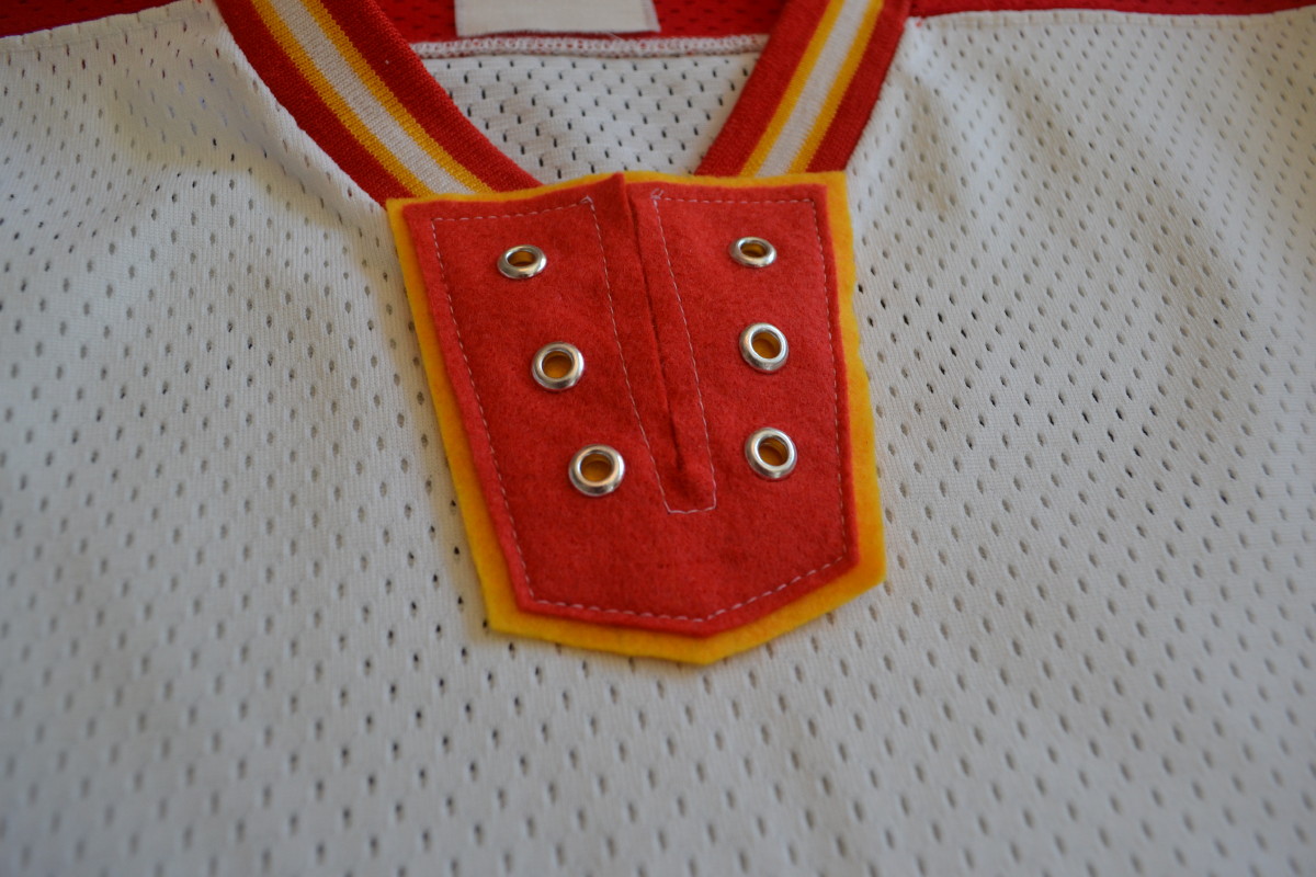

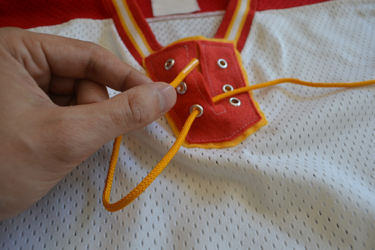
2. As you can see in that last photo, the grommets only go through the top (red) piece of felt. This makes it easy to thread the laces through the top piece, while the yellow base is solidly sewn to the jersey:
3. Here’s the finished product:
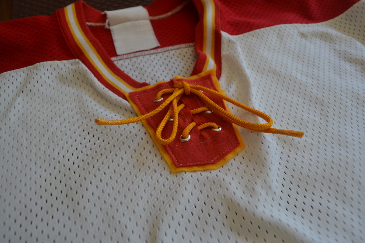
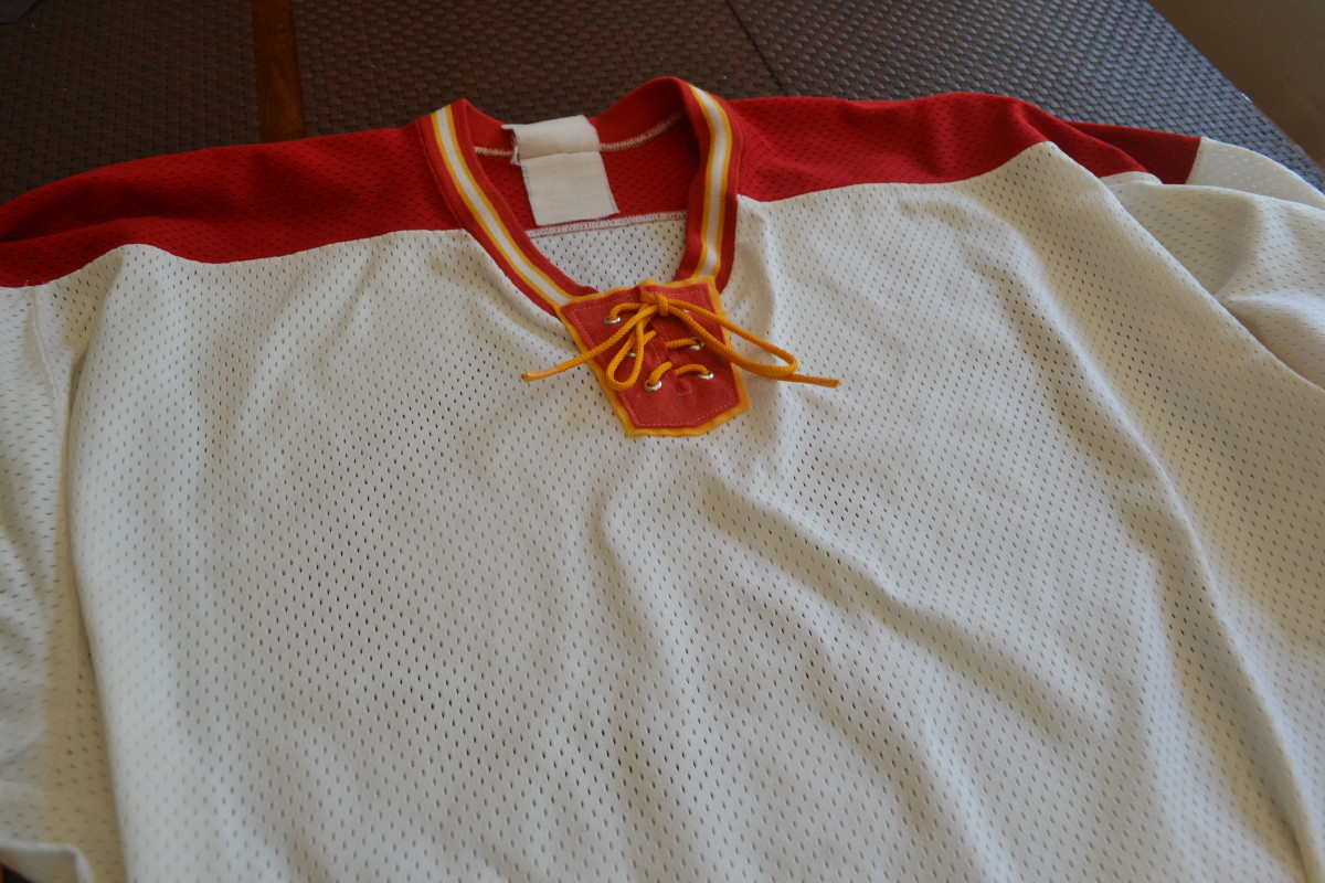
Truthfully, this jersey suffered from poor execution. I used a really crappy, cheap-looking craft felt, plus the design could have been better. But I like the idea of being able to vintage-ize any jersey — it’s not so much a product as a philosophy. Nowadays, though, I’m making complete jerseys, most of them with lace-up collars, so this project seems less of a priority.
———
Paul here. Hard to describe how much I love this one. Thanks so much for continuing to share your projects with us.
If you can’t see the slideshow above, click here
An excellent way to spend a rainy afternoon: Thanks to Facebook, I recently reconnected with an old friend who I hadn’t seen in nearly 20 years. She now lives in Boston and I’m in NYC, so this past Saturday we decided to meet in the middle: New Haven, Connecticut. We stopped in at various attractions around town (including, of course, Frank Pepe’s Pizza), but the high point was our visit to the endearingly weird Knights of Columbus Museum, where I learned, among other things, that the KofC was founded in large part to provide life insurance to Catholic families, and that life insurance is still a big part of their mission today. Maybe everyone else knew that, but I didn’t. Anyway, the museum included a big display of medals and ribbons, so I took the not-so-great photos you see above. Fascinating place — the only downer is that I forgot to wear this.
Also: I’m familiar with the long-running magazine Cigar Aficionado, but the newsstand at the New Haven train station featured a title I hadn’t seen before — Cigar Snob (yes, you can make all your “What’s a magazine?” jokes here; click to enlarge):

I kinda like the forthrightness of the title. Maybe Uni Watch should be renamed “Uni Snob,” eh?

Baseball News: Here’s a weird one: The 1943 Pirates played basketball in their baseball uniforms. The photo caption explains that this was because their regular spring training activities had been rained out (great find by Jerry Wolper). ”¦ Check this out: Larry Bird playing baseball for Indiana State in 1978. Further info here (from Patrick O’Neill). ”¦ Padres broadcaster Randy Jones worked Saturday’s spring training game in full uniform. ”¦ Flag-desecration uniforms yesterday for Vanderbilt. ”¦ With St. Paddy’s Day looming, the Mets Police blog has ranked the Mets’ various green caps and green jerseys. ”¦ Yesterday was the 100th anniversary of what Todd Radom humbly nominates to be the single greatest article ever written about baseball unis. ”¦ Nick Swisher of the Indians has “O-H-I-O” stitched into his first baseman’s mitt (from Tom Denne). ”¦ The Rays went high-cuffed with light-blue socks yesterday as a tribute to relief pitcher Grant Balour’s father, who died last week and had previously played with the Sydney Blue Sox in Australia (from Nick Hanson). ”¦ Tom Seaver did some ads for Sears menswear in the early 1970s, modeling clothing styles that, uh, have not aged particularly well. Check it out here and here (from Ben Fortney). ”¦ A Padres blogger came up with a novel idea: It would be great for the team to go back to wearing brown jerseys. How come nobody ever thought of writing about that before? ”¦ Hmmm, Reds or Reeds? (From Bob Gassel.) ”¦ Nice cream retro unis yesterday — or maybe true throwbacks, not sure — for TCU (screen shot by Brian Davis). ”¦ Follow-up note on Will Ferrell’s recently 10-uniform spring training stunt buried within this article: “Wondering why actor Will Ferrell didn’t wear white cleats when playing shortstop for the A’s on Thursday? His cleats are the one item of apparel from his day of playing every position throughout the Cactus League that will go to the Hall of Fame, so he couldn’t change them.” In case you missed it, Phil had great coverage of Ferrell’s antics on Saturday (from Michael Cross). ”¦ Orix Buffaloes OF Yoshio Itoi is wearing a captains’ “C” with a little crown on his left sleeve (from Yusuke Toyoda).

NFL News: Gridiron Uniform Database co-honcho William Schaefer has noticed something interesting: In the early 1990s, the lightning bolts on the Chargers’ pants had six points on each side (not counting the points at the very top and bottom). In 1996 they switched to eight points — except for Junior Seau, who consistently had nine. The following year, 1997, Seau wore eight like everyone else. Weird.

College and High School Football News: Reader Michael Booth found an old Hollywood High School team photo that shows the players wearing a combination of letters and numbers, instead of standard uni numbers. Perhaps this was inspired by the alpha-numeric systems used in the early 1950s by Kentucky and LSU. ”¦ Ohio State fans have started a petition to save the crop-top jersey. Good luck with that. ”¦ I think we’ve seen this before, but once more won’t hurt: Back in 1929, University of Chicago player Benny Wattenberg had glasses attached to his helmet to help with his nearsightedness (from Graham Clayton). ”¦ Clark Ruhland is conducting a Virginia Tech helmet bracket.

Hockey News: Small note at the end of this article indicates that the Coyotes will wear their peyote coyote throwbacks again in the near future. ”¦ Whoa, look at the jaw protector that Rick Tocchet used to wear. ”¦ The Blue Jackets warmed up in St. Paddy’s Day jerseys last night. ”¦ As per their usual custom, the Devils will be wearing their red and green uniforms for St. Patrick’s Day tomorrow. … The Flames will be wearing their red throwbacks on Thursday. … Interesting note in this Hurricanes/Blue Jackets game recap: “Carolina defenseman John-Michael Liles got his stick stuck in the visor of Columbus defenseman Jack Johnson in the first period while trying to check him. Johnson had to take his helmet off to remove the stick during a stoppage. There was no penalty.”

NBA News: The Clippers and Rockets both wore their colored alts yesterday creating a red vs. sky-blue matchup. ”¦ A bar in Glasgow, Scotland, is promoting its St. Paddy’s Day drink specials with the Celtics’ logo. “Not trying too hard to be original, are they?” says Scott Sargent.

College Hoops News: Check it out: March Madness emoji. ”¦ Interesting color-gradation shorts for the Robert Morris women’s team (from David Greenwald).

Soccer News: The ball design for the EPL’s 2015-16 season has leaked. ”¦ New third kit for Portugal. ”¦ Here are Adidas’s new teamwear kit templates. ”¦ These last three are from Yusuke Toyoda: Columbus Crew forward Kei Kamara celebrated a goal yesterday by creating a facsimile pantomime of the team’s old logo. ”¦ Crystal Palace players wore daffodil-adorned T-shirts for pregame warmups on Saturday in support of Marie Curie Cancer Care. Manager Alan Pardew got in the spirit by wearing a daffodil lapel pin. ”¦ Here’s an explanation of why Bayern Munich’s NOBs are positioned below the number.

Grab Bag: The Rutgers marching band is raising funds for new uniforms (from Chris Flinn). ”¦ An LAPD office ran the L.A. Marathon in full uniform to raise awareness and funds for families of fallen cops. … A heavy metal band is claiming that Kanye West stole their logo.
**NICK Swisher
Brohio
Yeah, Steve’s his pop. And probably not playing anymore. And probably not as a lefty. And probably not as a first baseman.
Brain cramp. Will fix.
It makes sense for the Coyotes to throw back: the sweaters in the team store had sold out within minutes of the puck drop. Anything other than L or XL sold out within minutes of them opening the doors.
“… Tom Seaver did some ads for Sears menswear in the early 1970s, modeling clothing styles that, uh, have not aged particularly well …”
What do you mean?
“… In the early 1990s, the lightning bolts on the Chargers’ pants had six points on each side (not counting the points at the very top and bottom). In 1996 they switched to eight points – except for Junior Seau, who consistently had nine…”
Uni Watch at its second best. Best best is anything having to do with the anon DIYer featured in today’s lede.
“… We stopped in at various attractions around town (including, of course, Frank Pepe’s Pizza), but the high point was our visit to the endearingly weird Knights of Columbus Museum…”
Way to go, Paul. Unusual aesthetic discrimination for a New Haven visitor. Tough weekend, by the way, for Eli hockey and basketball.
Paul, if in New Haven again, would suggest you try Sally’s as well, and definitely Louis’ Lunch, home of the hamburger.
I’ve been to Louis’ Lunch many times (including on Saturday — we stopped in and shared a burger, even though we were still kinda pizza-stuffed).
I know about Sally’s but have never been, because I’m so found of Frank’s.
Unfortunately, I can’t share Paul’s enthusiasm for today’s DIY project. To me, the lace-up hockey collar is ugly and useless, and I feel that’s an element that should’ve stayed retired.
Speaking of ugly hockey uniforms, the Blue Jackets’ third jerseys continue to be disappointing, and the Flames breaking their retro jerseys only further reminds me of how awful their three regular jerseys are.
Yeah, the Calgary primaries look so dated now. I don’t hate the Flames new black/red alt, but it’s so underwhelming compared to those vibrant throwbacks.The black just needs to go.
They should go back to the old ones permanently. The Islanders and Oilers did and it’s nothing but an improvement over the Reebok clown outfits.
I’d disagree with you on that. I think the set they had before the Reebok redesign was perfect.
link
The 1980s set is a great throwback to see once in a while, but not for everyday. The current set is the worst in the league.
“Interesting color….” :For future reference, is that code for awful?
I love that WaPo emoji thing, awesome stuff but who has time to do all that.
Looking at the 1988 Chargers unis, why did they wear their 1987 unis AFTER their update
Late season – 1987 version
link
Early season – update
link
I wonder if that photo isn’t just dated incorrectly? Given that the Chiefs & Chargers play each other every year, I think it’s plausible that a few images could end up being labelled wrong during the process of switching from analog to digital. Someone needs to find more photos from that game. The GUD has some updating to do if that’s legit.
that is probably the case. here they have billy ray smith again, with the same date given. clearly the updated uni
link
Agreed.
I’m guessing that the other pic is most likely from the 10/25/1987 meeting.
and there were at least some pointed bolt inconsistencies, at least in the 1995 superbowl
link
I think that the first Chargers photo is a bit older then the early ’90s. With yellow lightning bolts, and Tom Flick at quarterback against the Eagles, I’d presume that this is from 1986. Still, they did have six points back then, as well.
But I’m not actually sure about when they went to eight points, or precisely how consistent this was from player to player. Check out Leslie O’Neal from 1995:
link
Nine points there.
From the same game, here’s Bo Orlando with at least eight:
link
And from Super Bowl XXIX, the preceding January (1994’s postseason), you can see various linemen with clearly more than six:
link
I’m clueless here. This may just be one of those weird things.
Also, the pic that supposedly has Seau with eight points? I counted nine.
I also hate to have to point this out, but the link shows that the Chargers link, after not having the bolts during the first four years of that uniform style.
Yeah…I’d actually forgotten that the Chargers had plain pant stripes for a few years.
link
Nevertheless, Stan Humphries appears to have had just six points in 1992:
link
Same thing with Chris Berman favorite Marion Butts:
link
I think I’m just going to leave this one to the experts.
Same here.
and then Stan Humphries only has 6.
link
Anyone want to look up how tall those guys were? Longer legs = more points on the bolt? It can’t be that simple, can it?
Well, according to pro-football-reference.com:
Humphries — 6’2″
Seau — 6’3″
O’Neal — 6’4″
Orlando — 5’10”
Unfortunately, it doesn’t appear to be that easy.
The first thing to enter my mind was how the different length lightning bolts had to be mass-produced for the different pant sizes. Quite different from simply cutting a bolt of stripe material. The curb appeal of those “San Diego Supercharger” uniforms can’t be overestimated. I’ll bet every kid looked forward to Charger highlights on Sunday.
The Kei Kamara bit in the soccer ticker’s missing the link. FYI, here’s the link, here’s link.
Fixed.
if you look close, you can see what always bugged me about the chargers bolts on their pants when they started tinkering…. the first photo shows the bolts positioned correctly, starting at the knee, the forward facing side has the same look as the helmet bolt. then after that, it’s like they put the wrong bolt on the wrong side of the pants every year…. it’s like reversed of the helmet bolt. it’s hard to describe, maybe i should illustrate it sometime. today’s unis have the same issue, along with the shoulder bolt too…. it looks like it’s striking backwards when compared to the point layout of the helmet bolt. bugs the crap out of me. they redesigned the leg to have the same number of points as the helmet, but the point arrangement is flipped upside down (when a players leg is horizontal as in running).
What bugged me was how the shoulder bolts were double-ended, so they didn’t match the others. Enough to send anybody with OCD into a convulsion!
Well, the shoulder bolts were curved around the sleeve seam, so I’d think that it would be weird not to have them pointed at each end.
No, I mean the pattern was interrupted in the middle so there was no “wrong” way. It would have made sense if the designers tried to mimic the helmet bolt.
No matter how many points, those Chargers pants are awful.
I’m pretty sure we know what awful football pants REALLY look like…
link
Think of the children!
Less really is less, in this case.
Exactly. Is it any coincidence that in this crappiest of Saints’ Years in recent memory, they wore their Jackass Junior College-looking Black Leotard pants more often than any previous year. Sure seems so. ….
YES! I’ve been waiting ages for the return of that joke!
According to G.U.D., the Saints went black-on-black six different times during the 2014 season, which matches their 2007 total for that particular disgrace.
And when I grow up, I’m going to East Mississippi Panhandle State Consolidated Jackass Junior College.
It’s been 3 decades since the yellow pants got moth-balled?
If the San Diego MLB team goes back to brown, the San Diego NFL team must bring back the bright britches!
Uh…no. We already have three teams in the league now with yellow pants; that’s something that could get old in a hurry, if everyone starts doing it. San Diego is better served by keeping the yellow as an accent color, just for bolts, lettering, and outlines.
And if there was ever a time for the Chargers to consider your suggestion, it’s certainly not in this era of Nike’s dull, grungy matte leggings.
Blech.
Clippers and Rockets look pretty good, though they would have looked even better in different Rockets unis (is is just my monitor, or is there a lot of orange in that?).
It’s supposed to be that dark yellow that they used for detail back in the ’80s and ’90s. But yeah, there’s quite a lot of it on those alts.
Are you doing the bracket contest again this year?
Yes — will announce tomorrow.
YAY!
I like “Uni Snob”.
Big news: Adidas has announced that it will not be renewing its NBA contract after the 2016-17 season.
Story coming very soon from Darren Rovell.
What I’m hoping: UA (or Puma, for a dark horse candidate?) gets the new contract.
What I’m predicitng: The NBA goes with some Chinese or Indian supplier, since their big thing these days is to become a worldwide phenomenon.
What I’m dreading: Rhymes with “crikey.”
Or Thunder Harmer
Free schlock is no picnic, either.
Took a peek at the March Madness emojis and the oddest thing I saw was in the comments:
“Did I miss something, or are all the actual people faces white males (except maybe Indiana – and Iona, WTH)? What? Oh, Illinois is the single minority?”
I’m not really sure what minority a half navy/half orange circle with ears is, but I am pretty certain that NCAA has been trying to eradicate minority logos (e.g., Redskins, etc.) for some time.
Now people are complaining that not having minority mascots is racist, too?
WTF?
at a guess, I’d suggest the Firewater Boston knockoff is to avoid getting lawyers’ letters from a certain other nearby team in a different sport :p
My take on today’s NBA/Adidas news:
link
“When the company leaves the NBA, the hunch here is that the sleeves will probably leave as well”
oh please please please please please
Big day for uniform contacts, as Sports Business Journal is reporting that Nike has inked a three-year extension of its deal with the NFL:
link
The full article is behind a paywall, unfortunately.
Aw, crud.
But I found Nikeblog.com’s news…
link
Today’s DIY project is great. I enjoyed it a lot.
Of course laces are unnecessary. Lots of things are unnecessary. Its not like stripes or crests or logos have a functional purpose. Its all decoration, and I think laces are a great decoration.
Hope you will making more plugs for the April shirt! Or have there been problems?