[Editor’s Note: Our anonymous DIYer is back with yet another sensational project. This guy never stops! Enjoy. ”” PL]
By Anonymous
Over the next few weeks I’m going to share some projects from the past year that, for whatever reason, never saw the light of day. Either I didn’t like the way they turned out, or once I finished them I was just done with them, or I simply forgot about them and moved on to something else. In retrospect, they’re all worth revisiting. We’re going to start with a felt sleeve that I made for my laptop computer.
The ex-goalie in me automatically saw a goaltender’s blocker in the shape, so I decided to make it a blocker-themed sleeve. Here’s how I did it:
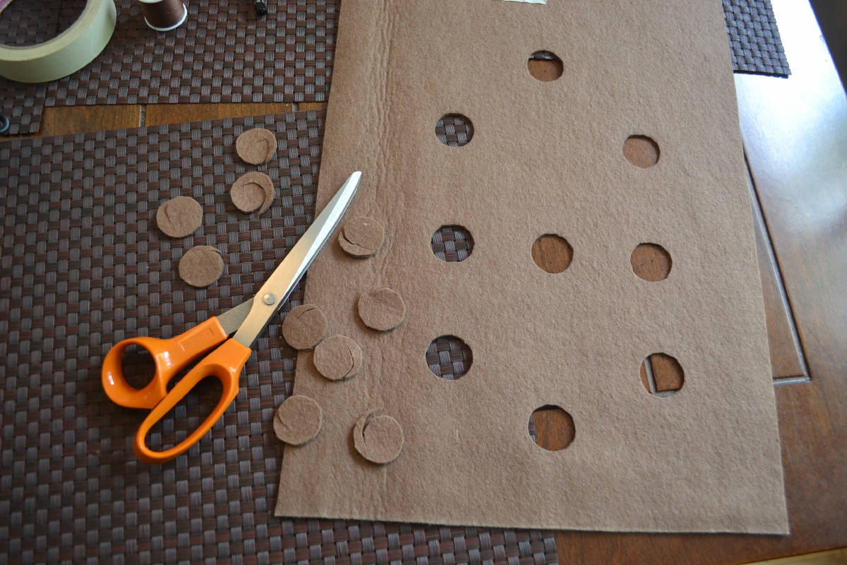
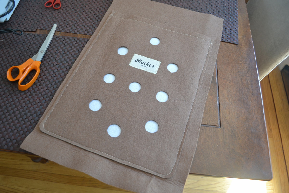
1. The first step was to cut out the holes for the front of the blocker, to create the traditional “waffleboard” look. (Apparently this was originally done to reduce weight and allow air to escape on impact, reducing stress on the seams.) I based the hole pattern on Terry Sawchuk’s blocker that he wore with Detroit (for all photos, you can click to enlarge):
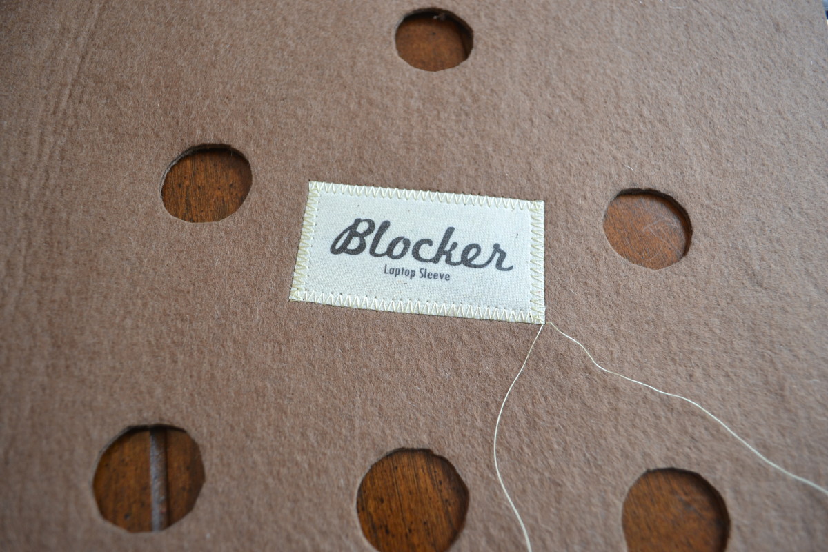
2. I made a “manufacturer’s label” from an iron-on transfer that I printed from my computer, using vintage-looking fonts. Then I sewed it on with a zigzag stitch:

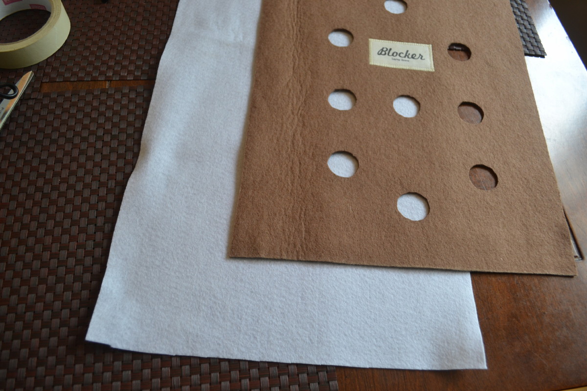
3. I cut a white piece of felt the same size as the face sheet, to provide the white backing to the holes. The holes are not sewn around the edges, as on the original blockers the white backing was usually a plastic sheet that was separate from the leather front:
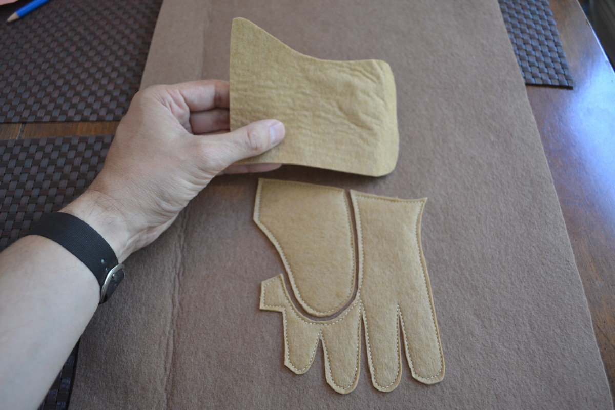
4. For the back of the sleeve, I used a number of pieces to create a 2-D representation of the glove and cuff. The design was based on the classic Cooper GM12 blocker. See the little rectangle of stitching on the thumb? That’s because old Cooper blockers had a thin fabric label that wore off when that part of the glove would rub against the goalie’s pad, leaving a blank rectangle of stitching:

5. Then I sewed the face onto the back and trimmed the final edge to complete the laptop sleeve:
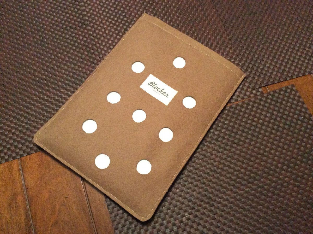
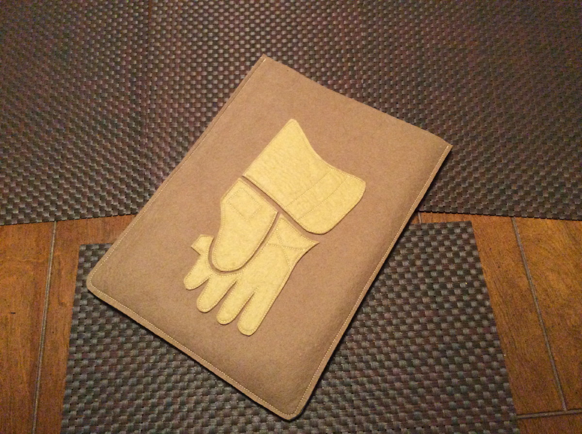
This piece actually turned out to be pretty practical — I use it every day and it works great.
———
Paul here. As usual, I find these projects to be fascinating and inspiring. And there’s more where that came from — I have two more Anonymous projects still the hopper, and they’re definitely up to his usual high standards. I’ll roll them out over the next few weeks.
T-Shirt Club update: The Uni Watch T-Shirt Club’s design for April will launch next Tuesday, March 17, and today I want to give you a sneak peek.
April 15, of course, is Jackie Robinson Day, when all MLB players mark the anniversary of Jackie’s big league debut by wearing his number. That’s what we used as the inspiration for our April design — or, rather, our April designs (click to enlarge):
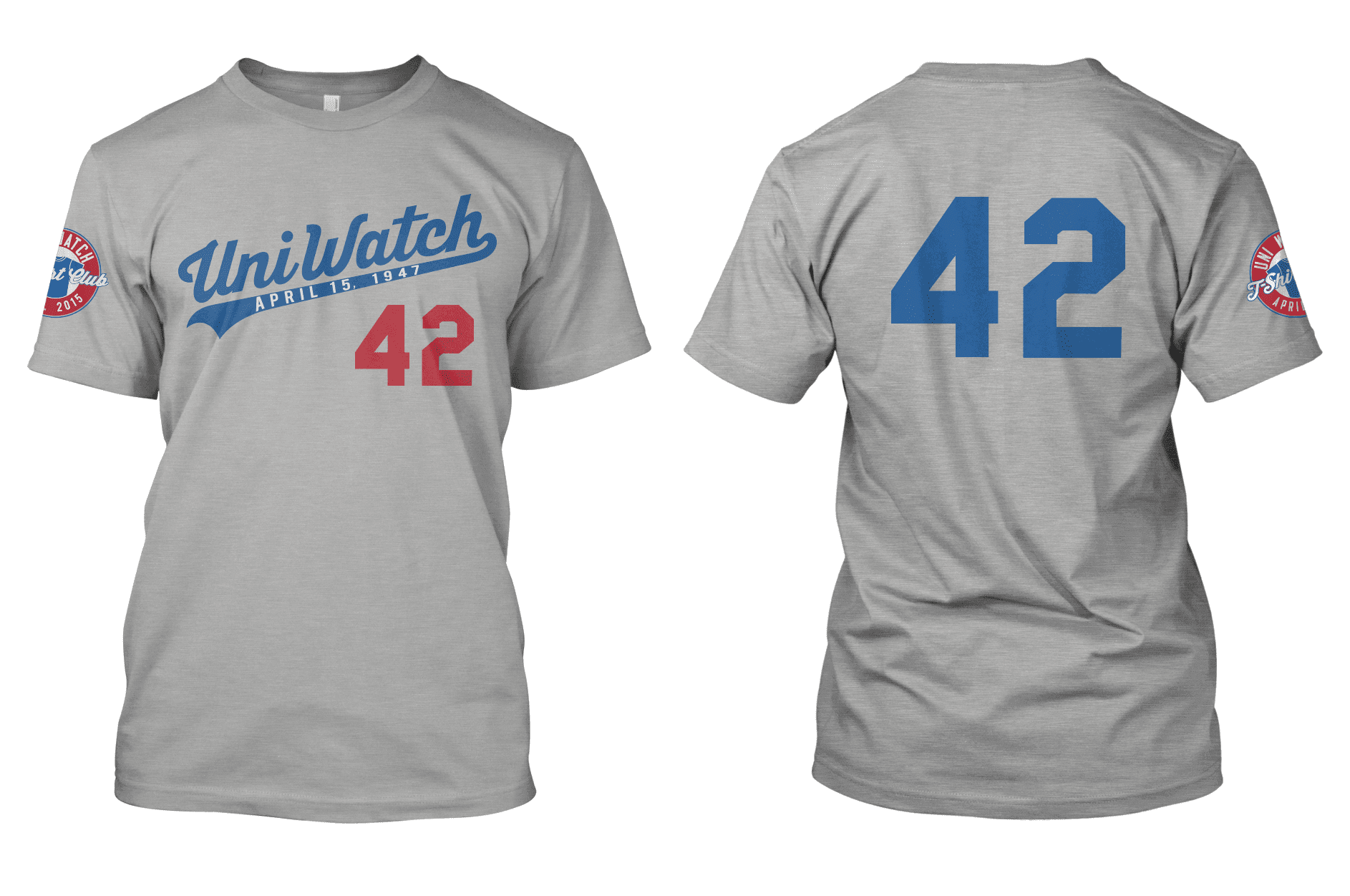
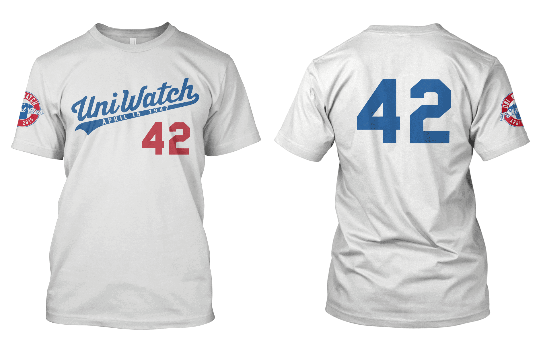
A few notes:
• Yes, we’re offering two different versions of this shirt — home white and road grey. This is the first time we’ve offered two different designs in a given month, and it will probably be the last time as well.
• For those of you trying to “collect ’em all” in order to qualify for the bonus prize at the end of the year, you only need to purchase one of these shirts in order to maintain your eligibility. You do not have to purchase both (although of course you’re welcome to do so).
• If you purchase both shirts, you will receive a shipping discount. Details here.
• The date under the Uni Watch script — “April 15, 1947” — is the date of Jackie’s first game with the Brooklyn Dodgers. (Big ups to Teespring designer Bryan Molloy for coming up with the idea of adding this element to the shirt.)
• We went NNOB because that’s what teams do on Jackie Day. I expect that these will be the T-Shirt Club’s only NNOB designs.
• I have no interest in profiting off of Jackie Robinson’s name or legacy. So I will donate 100% of my revenue from these shirts to the Jackie Robinson Foundation, which offers college scholarships to disadvantaged students of color. ESPN will match my donation (this is their standard policy for charitable contributions), and Teespring will likely make a donation as well. This is a big part of why we’re offering separate home and road designs — I really want to maximize our potential on this one.
• I realize that the Club’s last several designs have been calendar-driven, and that we still haven’t gotten to several of our “core” designs — the road grey, the green alternate, and the BFBS. We’ll definitely do one of those for May, although I’m not saying which one.
As always, thanks for listening.
Click to enlarge
Collector’s Corner
By Brinke Guthrie
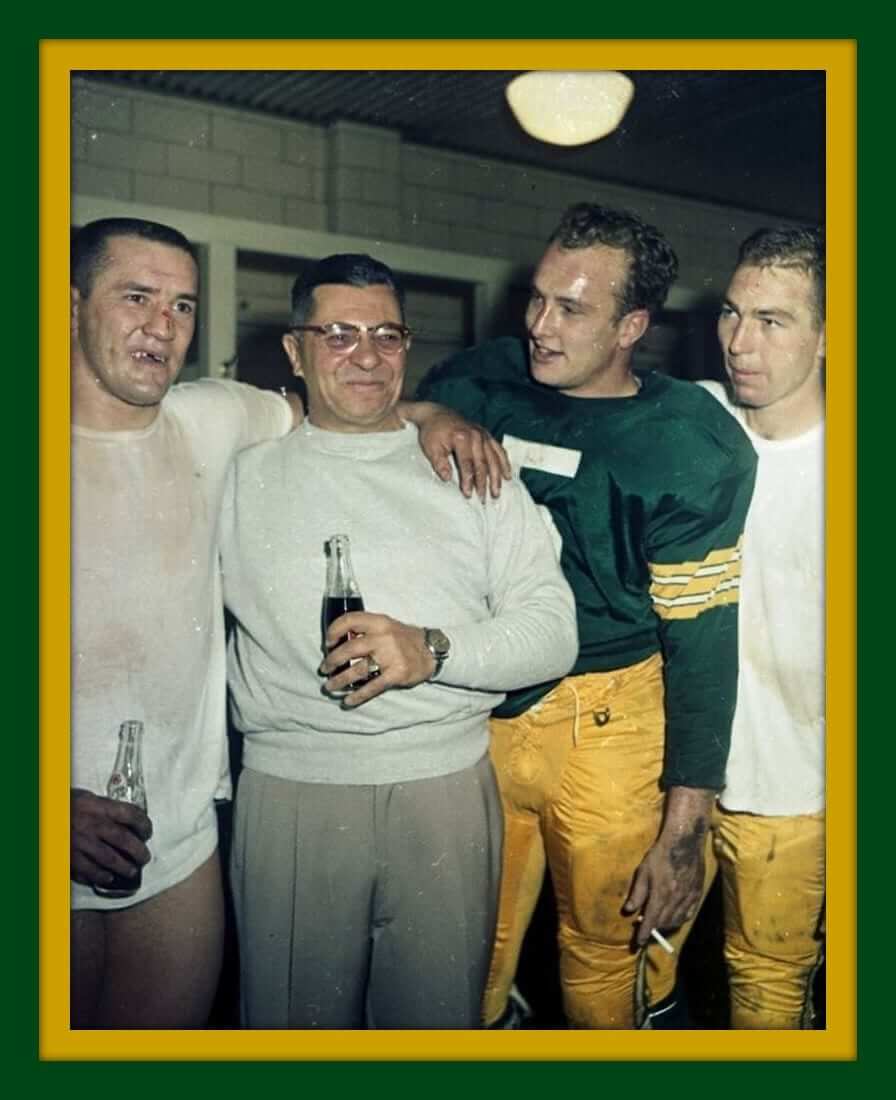
Got some Pack for you today. This photo speaks for itself. Jim Taylor, Coach Lahm-bah-dee, Hornung (who my dad backed up in Louisville high school football) and Starr. (Cue John Facenda.)
This photo says it all, too. And what’s going on with the hemmed sleeves and the facemask in this 1960s Bart Starr photo?
We could probably do an entire column on Packers items, but we’ll save that for another day. Here are the rest of this week’s picks:
• Never seen a Dodgers logo with just a block LA before, as on this 1960s decal.
• You may know about the famous Denny McLain organ LP, but did you know he also had his own line of paint?
• When you’re talking retro NFL, it doesn’t get any better than this United Airlines print ad from 1969. (The team they are referring to is the Vikes, by the way.)
• Here’s what a 49ers “smart watch” looked like back in the 1980s.
• When you made it to the NFL like Bob Trumpy of the Bengals, here’s what was waiting for you in 1969 — your face on a Partridge Meats card. “The Meats with Big League Energy.” [Odd to see the term “Big League” used in connection with the NFL. ”” PL]
• You could have your own official Monday Night Football party by wearing this 1980s T-shirt.
• Here’s an authentic practice jersey and shorts combo from 1970s ABA Kentucky Colonels star Cincy Powell.
• Cliff Engle alert! You-know-who wore this on the sidelines during his reign of terror with Da Bears.
Follow Brinke on Twitter: @brinkeguthrie
Beefsteak DISCOUNT! Last week I mentioned that the Brooklyn Beefsteak is going on tour this year, with the first stop scheduled for New Orleans on March 29.
Thanks to my beefsteak connections, I’m happy to offer you a special discount: The first 10 Uni Watch readers to purchase tickets with the discount code “MEATSNOLA” will receive a $7 discount. Huzzah!
Just so you know, I have no financial interest in this — I don’t get anything, no matter how many (or how few) tickets are purchased. I just like to support the beefsteak. Beef, beer, fun!

Baseball News: Our own Phil Hecken’s latest Sporting News article is on each American League team’s all-time worst uniform. ”¦ Great photo from April 6, 1971, showing the Cardinals changing from button-front/belted flannels to pullover/sansabelt stretch-knits. Note that this was the short-lived crewneck jersey, which was swapped out for a V-neck style in 1973 (from Bob Gassel). ”¦ Also from Bob: Here’s a similar photo, from 1972, showing the Cubs’ then-new unis. ”¦ Bob Kelly has a nice piece in his collection: a late-1980s Yankees grounds crew top. ”¦ The Rockies have put a Cactus League spin on their Twitter avatar (from Ben Hendel). ”¦ Reprinted from yesterday’s comments: Cubbies wore “Let’s Play Two” tees with Mr. Cub’s number on the back the other day (from Jen Hayden). ”¦ New uniforms for the Tacoma Rainiers. Additional images here. ”¦ New sponsor for the Florence Freedom. ”¦ Mets P Sean Gilmartin, who has no chance of making the team, wore stirrups yesterday. ”¦ The Cubs’ spring training stadium now has big signs based on beautiful old press pins. ”¦ Star Wars jerseys this summer for the Clinton LumberKings.

Pro Football News: Reprinted from yesterday’s comments: If you go to the 17:29 mark of this radio report, you’ll hear some interesting things about Patriots DL Vince Wilfork’s jersey modifications (from Tony C.). ”¦ Former Steelers great Rod Woodson is selling off his personal memorabilia (thanks, Phil). ”¦ Football players used to wear sannies and stirrups, just like baseball players, and then added white crew socks over them, as you can see in this shot of Earl Morrall and Johnny U (from Michael Clary). ”¦ New helmet for the arena team Portland Thunder. “Definitely an upgrade over their previous helmet,” says Jason Charles Franklin.

College Football News: Reader Munch Suchland found a 1983 video that shows Triumph’s bassist wearing a Southern Cal Trojans T-shirt with a yellow helmet. Anyone know what that’s about? ”¦ Here’s a college football helmet bracket. ”¦ At least one observer disagrees with the NCAA’s new rule banning crop-top jerseys.

Hockey News: Former Kings great Luc Robitaille wore a visor for most of his career, but the Kings’ newly unveiled statue of him does not include a visor (from Brian Rowland, who also provided this database of NHL statues). ”¦ A Sabres blog is holding a third jersey design contest (thanks, Phil).

NBA News: St. Paddy’s Day came early in Chicago, where the Bulls wore sleeved green uniforms last night. Lots of additional photos here. ”¦ Pure gold here: a bracket of Clyde Frazier’s best off-court outfits (thanks, Mike). ”¦ Also from Mike: Someone in Chicago set up a highway-underpass shrine for Derek Rose, which seems like a bit much. ”¦ Yet another from Mike: “Mavs F Chandler Parsons has a $1 million endorsement deal with the Chinese shoe company Anta. But after returning from an ankle injury on Sunday night, he wore Jordan shoes with the logos blacked out because he and his trainer think the Anta shoes are too flexible and may have contributed to the injury.” ”¦ And still one more from Mike: “Celtics F Brandon Bass lost his shoe while on offense Monday night, so he picked it up, ran back to the other end, played some defense, and tried to grab a board one-handed.” I think he’s our Uni Watch hero of the day (or else Mike is, for providing nearly the entire NBA section).

College, High School, and International Hoops News: I knew Fidel Castro was big on baseball, but I didn’t know he’d also played basketball. … Here are Kentucky’s 31 defeated opponents, listed by jersey, although it appears that they got some of the designs wrong (from Jim, who didn’t give his last name). … Jesse Gavin is covering the Iowa state high school basketball tourney and passes along the following observations: “Woodward Academy has co-opted the Michigan State logo, despite their mascot being the Knights, rather than the Spartans.” ”¦ “There are still teams wearing the old North Carolina knockoff argyle template. That’s Nodaway Valley.” ”¦ “Earlham’s red-on-grey look is kind of hard to read.” ”¦ “Black numbers on black jerseys for O’Brien.”

Soccer News: New sponsor for the Chicago Fire. … New crest for Cardiff City. … Here’s a ranking of MLS jerseys (thanks, Phil). ”¦ “Nike has released a limited edition (of 3000) Francesco Totti Tiempo cleat,” reports Roberto Zanzi. “It is different, as it has a tongue covering the laces. It was originally removed from model in the 2011 but Totti has been using custom tongue versions provided by Nike. They also gave him a personalized ‘Gladiator’ logo with a ’10’ integrated into the mask.” ”¦ Nike has released its new jersey templates for 2015-16. ”¦ “National soccer teams wear stars above their national crest indicating the number of World Cups won,” says Jim Howicz. “The Brazilian woman’s team has never won a world cup, but they wear the crest of the men’s team, which has won five.” ”¦ “Aston Villa’s Fabian Delphi lost his captain’s armband in the pitch invasion that followed Sunday’s FA Cup victory against West Brom,” from Yusuke Toyoda. “The lucky armband was returned after the club masseur offered a jersey in exchange, proving once again that crime pays.”

Grab Bag: Can you draw the Apple logo from memory? Probably not. ”¦ Old Dominion athletics has switched from Nike to Under Armour. ”¦ Very cool-looking throwback paint schemes upcoming for NASCAR driver Brad Keselowski (from David Firestone). ”¦ “Sad news out of Alberta, where Edmonton’s city leaders want to tear down a beautiful 1970s ‘Welcome to Edmonton, City of Champions’ sign,” says Aram Gyan. The key contention seems to be that the font is outdated. Like municipal politicians everywhere, they seem quick to want to discard anything with any history or age behind it.” … Sanitation workers in Amman, Jordan, are getting new uniforms because the old ones looked too similar to the ones worn by ISIS’s beheading victims.
Unlike Morrall, Johnny U. appears to be putting on his crew socks over just the stirrups alone.
I noticed that too.
When I played as a kid it was all 3 layers.
Can anyone explain what the purpose of wearing them that way was? Why not just wear striped socks?
I was (and still am) stumped.
I put mine on like baseball socks the first time and coach says “Where are your white socks?”
I said “Right here, under the stirrups.”
“You need white socks over those too.”
“WTF???” (OK , I was just a kid and WTF didn’t exist then, but I was thinking something like that)
link
I suspect that, whatever the initial reason (presumably practical, like the baseball origin of stirrups and sanis), this persisted because it turned out to be an aesthetically-pleasing look.
Sure, you could just make some socks that are white at the bottom and colored/striped from mid-calf upward, but the extra volume added from layering helps achieve some balance in the ankle/lower calf area, which can otherwise look particularly skinny on athletes wearing knee pads.
(Well…they’re *supposed* to be wearing knee pads, at least…)
But I agree that one shouldn’t need *two* pairs of sanis/crews. Just the white crew socks over the stirrups (or colored base layer, these days, I guess) should be sufficient.
Just to throw a crazy idea out there, for those still reading today…how would everyone feel about having this look — socks over stirrups — in baseball? Heresy…or kinda cool?
Paul…the Cubs newswire photo is actually from January 1972.
Fixed.
Given the Mets’ need for another lefty and the fact that Gilmartin, like JR Graham, is a Rule 5 pick, I think we have a good chance of seeing him and his stirrups at Citi Field.
Have to agree with that. As a Rule 5 player, if he’s not with the team, he’s headed back to the Braves.
I saw Gilmartin pitch for the Gwinnett Braves, and he wore the classic, throwback striped Braves stirrups at his AAA debut. No pics, because my phone ran out of juice. Someone got to him though, because his next start had him in plain blue stirrups.
I came here to say pretty much this. That was such an incredibly inaccurate statement. He pretty much has to make the team. He has a better shot than pretty much everybody except for the post-arbitration guys on the major league roster.
The the fact that Taylor doesn’t have any pants on in the photo of the Packers! Classic and would never happen today!
Love the fact not The the fact! Ugh!
Oh that and the fact that Hornung is smoking! Just straight classic!
re: the Derrick Rose shrine: When I lived in Chicago (2005-2010), someone set up a highway-underpass shrine to the Virgin Mary, having seen her appear in the pattern of leaked water drying, or something. It might well be the same bridge — the article says this new one is on Fullerton, which is the right part of town, at least. So the Rose shrine is either *a lot* much, or someone is being ironic.
The road Robinson t-shirt looks great!
“… As usual, I find these projects to be fascinating and inspiring…”
Absolutely. He’s amazing and endearing at the same time. I’m particular bonkers about the manufacturer’s label.
The ersatz manufacturer’s label is exceeded in awesomeness only by the false absent-label stitching on the thumb. What a terrific project – thanks, Anonymous, for sharing it with us!
I want… no, I NEED ONE OF THESE!!!
I know you’re not looking for a pat on the back, but you deserve one for donating all of this month’s shirt proceeds to the Jackie Robinson Foundation. Good job.
the awesomeness Jackie Robinson shirt more than makes up for the fact that I passed out from exhaustion early the night that the St. Patrick’s shirt campaign ended and missed the deadline by an hour.
Which begs the question … why DIDN’T the Vikes fly the friendly skies? (My guess is they had a deal with hometown Northwest Orient)
United helmet ad…..
Why does the Bears helmet still have a chinstrap attached (and apparently tucked in). Some other may also, but on the side away from the camera.
Odd logo placement on the Falcons helmet too, no?
As usual, amazing work from anonymous.
JRR Shirt: Incredible, and I’ll definitely be getting both. I can’t imagine a better one coming out, as these are basically perfection. But the JR Foundation thing is the cherry on top of the sundae. Kudos, buddy — this one’s out of the park in every way!
Love the Taylor/Vince/Hornung/Starr pic.
Ditto. Ditto. And ditto.
I will third that. In fact, let me say I’ve been very impressed with every aspect of the T-Shirt Club program so far. Extremely well done.
Thanks, man — appreciated.
Phil, I realize a lack of pinstripes on grey uniforms is a mantra to you. I choose not to live by that code. Let us agree to disagree.
There’s really no need to agree to disagree. Phil is just wrong about that. Pinstripes, as a pattern, are either fine or they are not. There is no conceivable rational aesthetic principle that would apply a pro- or anti-pinstripe stance to home or road uniforms but not the other.
I think Phil’s objection usefully illustrates the tension at play with pinstripes, though. It is kind of silly that pinstripes are accepted at all in baseball uniforms, while effectively no other patterns are. If a team tried plaid, or windowpane, or tattersall, or checks, or houndstooth, or herringbone, it would be mocked and derided by just about everyone. Pinstripes, alone of all the patterns to be found on men’s dress shirts or suits, are accepted on a baseball uniform. Surely the common reaction against road pins is based in large part on the fact that baseball’s traditional gray road uniforms makes the pinstripes look more plainly like what they actually are: A men’s business suit pattern. You don’t often see men wear link link, so a Yankees home uni doesn’t look quite as much like the link that link. Whereas a gray suit with pinstripes says “banker” to just about everyone. But that’s an arbitrary distinction: Either way, pinstripes are just a pattern drawn from the world of men’s formal attire, applied to a baseball uniform. Home and road, that’s either a legitimate aesthetic choice or it’s not.
People who deride road pins should have the courage of their convictions and call for an end to pinstripes everywhere, including the Bronx. Me, I say pinstripes, as a pattern, are just fine. Wear ’em at home and on the road. And let’s see some other patterns too while we’re at it. Surely Seattle could pull off plaid or lunberjack-style checks. Let’s see the Padres in USMC-style herringbone. The Giants did link; bring ’em back! C’mon, Tampa Bay, you know you’d be more comfortable in seersucker. And so on.
Walter, we can agree to disagree. But one thing I cannot abide is a solid softball top worn over pinned pants. That’s just an absolute abomination.
To me a baseball uniform is equivalent to a man’s suit. You wouldn’t wear a brown sportcoat with blue pinstriped pants meant to be worn exclusively with a blue pinstriped jacket. If you want to go the sport coat route (softball top), then make sure you’re not wearing your suit pants with it.
And Scotty, buddy…
I get your point about the “there is no distinction between home and road pins” and if you take that stance, I cannot argue it, since it is opinion on both sides. I just feel that “at home” you should wear your Sunday best, as it were. Your roadies should be your solid blue everyday suit (hence no pins). Basic and solid, can be worn anywhere, anytime. No frills. Let the home guys show off their fines. You’re just there to do your job and come away with a W.
Hmm, so you’re saying a team should dress like link on the road and link at home? Interesting perspective – I like it!
Can’t go all Jackie O at home, Scott…you’d trip on that gown running to first.
Phil, you got it half right. When you go to visit someone, you dress up as well. Road pins are fine.
You wouldn’t wear a brown sportcoat with blue pinstriped pants meant to be worn exclusively with a blue pinstriped jacket.
Of course not. Plaid pants on the other hand…
Oh, on that we’re in total agreement. As shown by your praise of the 1973 Oakland A’s uniforms.
Thank you. People seem (rightfully or wrongfully) to think I hate all softball tops. Not true at all. But they are so ubiquitous today all but a few teams have them and they seem to be worn simply because a team is bored with their current uniform. The A’s (and a few other teams) broke out the gold and green tops so well, and they matched the pants (white pants only) very well.
The problem is when one (or even just a few) team comes up with a signature, unique look, it gets quickly copied and when everyone (see: matte helmets, GFGS, different uni every game, etc.) does it, it ruins it not just for the originators but for everyone.
Just imagine how much those Astros rainbow guts would be hated if four or five teams adopted that look (like seemingly all adidas-clad college teams)? But we love that because it was the Astros and the Astros alone. It was loud and it was garish, but it was THEIRS.
So only the Cubs should have pinstripes? The Yanks copied off them, as did loads of other teams. I don’t think they’ve ruined the look.
Nothing wrong with a handfful of teams using the same idea. All 30? Yeah, I’d have a problem with that. Some teams could pull off the old Astros, some couldn’t.
Phil is spot on. Which is why road pinstripes are a good idea. In this world of uni me-tooism and bandwagon ubiquity, the more “letters” in the design language of uniforms, the better. So let a couple of teams wear road pins, and hopefully they’ll do so as well as the Twins and Rockies used to. While we’re at it, let’s see other patterns besides pinstripes, and cap soutache, and dark road unis, and contrast raglan sleeves, and more varied patterns of piping, and pillboxes, and matte helmets, and shiny lettering, and chest pockets, and sun collars, and placket lettering, and rainbow guts, and on and on.
It’s like today’s uni designers are sitting at a piano and only touching the keys for the notes they know from playing guitar – and not even touching the 83 other keys beyond middle E, B, G, D, and A.
I’m inclined to agree with that sentiment, Scott. Some measure of variety in a sports league is important; there can be a lack of franchise identity when everyone looks alike.
At the same time, one needs to be a bit judicious about stepping too far outside the norm. I suspect that, in too many cases these days, you have corporate types and “design experts” running the show, with sports people nowhere in sight.
This is how really bad looks make it onto the field.
Regarding the odd photo of Bart Starr – Starr was a MacGregor endorser on their “advisory board” but he never wore their helmets on the field. That looks like a MacGregor helmet and face mask, so I suspect that shot is from a MacGregor ad, and they probably provided that odd style jersey as well.
From the Florence Freedom I went to the Frontier League’s main webpage. On top are little icons for each team, and until I clicked, I could have sworn one team was named the Windy City Thunderballs.
“…Like municipal politicians everywhere, they seem quick to want to discard anything with any history or age behind it…”
As someone who is in the business from time to time of tearing down old buildings and dealing with public opinion on it, not everything that is old is historic. Sometimes it’s just old.
Those signs on the other hand do seem to have some value.
Kitsch value, maybe. I just find that Edmonton wordmark to be completely unappealing. The “Alberta’s Capital City” legend looks off to me as well, probably because “Alberta” looks like they made too many compromises on the provincial wordmark.
The stone columns aren’t too bad, and I suppose they’re meant to represent the city skyline or something like that, but the pebble-y texture just makes them feel a bit off. Maybe they’d look better in a nice dark marble.
I’m disappointed in the T-shirt design for April. I think it’s great that all the profits are being donated to a good cause, it’s just that the Jackie Robinson Tribute is already done every year in MLB by every team. To me this is a “Well, everyone else is doing it, so we should too” move. That flies in the face of the typical Uni-Watch mantra. I’m surprised that Paul and Uni-Watch “sold out” for lack of a better term, and are getting in on something that is already (in my opinion anyway) overdone. Again, great for Paul to donate 100% of the profits, that’s awesome all around, but the design just seems utterly predictable and forced to me, which are two words that certainly don’t describe Uni-Watch as a whole.
In other words, at least for me, in the “Is it good or is it stupid” test, this comes up as “Stupid”. I’m only referring to the design and color scheme, certainly not the goodwill being shown.
I’m only referring to the design and color scheme
Well, MLB teams stick to their own color scheme for Jackie Day. But if we did that, we’d just have a repeat of our home and road designs (except for the 42), so I decided to go with Brooklyn Dodgers colors.
Thanks for the feedback, Alan — thoughtful and well-stated.
I’m not sure I understand your point regarding predictability, though. Yes, every MLB team wears a Jackie uniform. But every MLB team also wears a home and road uniform (well, except for the Marlins), so are the T-Shirt Club’s home and road designs also “predictable”?
Moreoever, I think you’re missing one of the T-Shirt Club’s underlying points. We’re rolling out 12 designs, each of which represents what a baseball team might wear in a given season. Personally, I think it’s ridiculous that a baseball team could wear 12 different uniforms in a season. But the T-Shirt Club will still have a BFBS design (even though I’m opposed to BFBS) and a solid-colored alternate (even though I’m usually opposed to those as well), and the Club will have later have other designs that I’d never want a real team to wear (you can probably guess what they might be). Why? Because part of the Club’s underlying message is to point out how ridiculous the uniform explosion has become.
But of all the elements of that explosion, Jackie Day is the one thing I wholeheartedly support. As I’ve said before, I think it’s the one unqualified success of Bud Selig’s commissionership, and I’m very happy to have the T-Shirt Club be part of it — not because “everyone else is doing it,” but because I think it’s a great thing.
The key thing is that it’s about having fun with the concept.
And while I personally haven’t had much interest in getting any of the shirts up until now (mainly because I just really don’t wear T-shirts all that often anymore), I’m seriously considering getting one of these because a) I like the idea, and b) I think they look beautiful!
The key thing is that it’s about having fun with the concept.
Yes! Exactly. It’s nice if we sell a lot of tees, of course, but mainly I’m finding this to be a very satisfying creative project from a conceptual standpoint. It’s like a big, slow-motion art project, and that totally pushes my buttons. Thanks for Getting Itâ„¢!
Thanks Paul. I guess I was looking at the T-shirt Club a little differently, but now I see where you are coming from. Trust me, I normally Get It (TM), but I was slightly off on this one. Hey, it’s your project , and having your own project to have fun with is definitely something I can get behind!
What I have enjoyed about the Uni Watch T-shirt Club is that, as a form of social commentary, it still treats it subject matter in a straightforward manner and with respect. That’s why the Jackie Robinson t-shirts can be rolled out without feeling smug or overly ironic. I think the design is spot on. They look great, without the any of the underlying messages being lost.
To me this is a “Well, everyone else is doing it, so we should too” move.
I totally understand this perspective on it. Personally, I see it slightly differently. It strikes me as a “If Uni Watch were an actual team, it would be doing it, so we should play along too.” I see it more as an example of, like, a fantasy football manager designing “throwback” unis for his fictional team than like purely pecuniary bandwagon marketing.
Besides, honoring Jackie Robinson Day and #42 is very Paul, which makes it perfect for the project. I just wish that the word “Brooklyn” had been worked into the design somewhere!
this is a “Well, everyone else is doing it, so we should too” move.
Isn’t this the whole point of the Uni Watch t-shirts, to reflect what’s happening in the real world?
The Bengals were in the AMERICAN Football League in 1969.
Fingers now crossed for a Larry Doby t-shirt design in July…
Thinking of a sleeve patch for that…instead of Wahoo, Paul could turn the magnifying glass upside down and have a generic smiley face inside of it. The handle would replace the feather, and there’s your mascot..
Cincinnati Bearcats postseason unis now on Paul and Phil’s twitters. So did UC change its mind? Originally said they wouldn’t wear them, right?
To be clear, the NHL statue database is not mine, I just wanted to share the link. It’s from the Kansas City hockey blog “Lost City of Bettman.”
I went to USC at the time of the video in question and do not recall anything like that horrific t-shirt being sold on campus. To me, that looks like those knock-off shirts made by companies that do not have an NCAA license, and usually found in stores like K-Mart or Penney’s.
Last month, I commented that the 7 on the shirt was not exactly standard block. Paul, you replied that you liked your 7 better. I had to back off at that point, because I can’t argue with someone’s preference and nobody passed a law that you have to use a standard font. I must point out this time, that both the front and back 2 on this design vary from standard block and the Dodger application of the font. The upper part of the 2 has a squared corner that is supposed to be beveled in that font, as shown here:
link
That’s not a bevel, but I see what you mean — good catch. We’ll get it fixed.
Cool…just curious, a bevelled edge refers to an edge of a structure that is not perpendicular to the faces of the piece. If that is not a bevel, what would it be called?
Chamfer.
Hmmmm. Maybe it is a bevel, but it’s not how we typically use the term when referring to uniform typography. In any case, thanks again for the spot — appreciated.
Miriam Webster defines a chamfer as a beveled edge…are we going around in circles?
link
Any reason why the item about Amman sanitation workers is under soccer news – or just a mistake?
Mistake. Will fix.
The Luc Robitaille statue looks off without hit giant visor. As one of the first North American stars to adopt it, this CCM/Visor combo is very iconic. Like Gretzky in the jofa.
Luc Robitaille: I guess a visor would block his face too much, and who wants a statue of Robocop #20 LA? Take a plexiglass visor and drill it on the helmet. Artistic license I guess. Better that than a Nike swoosh on Jim Brown’s Syracuse statue.
Really attractive Jackie shirt. Is the gray version heather texture (to approximate flannels), or is it gonna be flat and remind me of modern double knit?
Should be heathered.
re: Chicago Fire
The sponsor, Magellan, isn’t new – they renewed and expanded an existing agreement to include in-stadium signage. And they haven’t replaced Quaker Oats as the jersey sponsor.
I will definitely be getting both versions of the JRD shirt. You can only “collect them all” if you collect all of them.
Regarding the May shirt, you can’t go with one of the otjer standard designs. How can you not do a Memorial Day Camo shirt? As ugly as it might be, it is what all the teams do. You have June, August and November for the road, alt and BFBS shirts. For July you need a July 4th design, September needs a 9/11 tribute, October deserves some sort of postseason “patch” and December would be perfect for an ugly sweater design.
Not that I am telling you what to do by any means……..
“How can you not do a Memorial Day Camo shirt?”
~~~
Clearly, it would show how much he hates America.
Better yet: Do a UW shirt for May or July that’s inspired by the design of a military sports team jersey. (With flag-desecration detailing on the sleeve patch, of course.)
RE: Collector’s Corner…Denny McLain paint is ridiculous but that LP, with a couple of Hal David/Burt Bacharach offerings, is tempting.
And as always with Denny, great stirrups!
I’m pretty sure that Denny McLain LP has missed out on a CD reissue/remaster.
I have the Denny McLain LP. I assure you that save for one or two cuts, it is dreadful.
Man I wish the Beefsteak was coming to LA…Paul, is there anything close to that out here you may know of? Soundz like something I’d really like to try and I don’t go east mmuch.much.
link
No connection to our Brooklyn event, although I think they were inspired by us.
Nice, thanks. Looks like I just missed this year’s, will be on the look out next year.
Those paint schemes that Keselowski will run are terrific.
Voting is now open for fans to choose the look for the #2 at this season’s All Star Race:
link
I like this design. I am still hoping for a traditional faux-back tee at some point this year but this one’s definitely nice.
“traditional faux-back”?
As opposed to a “link“?
*shrug*
Reprinted from yesterday’s comments: Cubbies wore “Let’s Play Two” tees with Mr. Cub’s number on the back the other day (from Jen Hayden).
Why do the clueless Cubs insist on getting the wrong number font on all the #14 Ernie Banks tributes? If the Cubs can’t be authentic then please stop with the tributes… it just makes you look lamer than you already are… and you are extremely lame.
Major awesomeness as to Jackie Robinson t-shirts, which look great…in IE and Chrome. For some reason they don’t show up in Firefox.
Will definitely get the gray; debating whether to get the white as well.
The images don’t show up at all in Firefox? That’s bizarre.
I’m using Firefox right now and they show up fine for me. Weird.
Might have something to do with browser settings, maybe.
Now it works. Firefox is quirky lately.
Sure would like to know the provenance of that Packers photo topping Collector’s Corner. We have the negative for that photo in our Packers archive at the Green Bay Press-Gazette.
SoCal Shirt ~if you zoom in you can see a W on the the helmet ,and a Wild before the bass’s top curve covers the rest ,probly some team named Wildcats
NFL Stirrups fun fact ~ the vintage “Johnny Hero” action dolls from the 60s which you could buy all MLB and NFL uniforms seperately for had sanis and white pullover socks for the NFL unis …