Okay, so we all know what the big news is for today: The Browns will be releasing their new logo(s). Multiple sources have reported that showtime will be at 10am Eastern.
Once the unveiling takes place, I’ll add the logo(s) to the top of the page here. Then I’m going to interview Browns team president Alec Scheiner, and then I’ll write an assessment for ESPN. Once that piece is published, I’ll include a link to it here.
I’ll no doubt have additional thoughts about the logo(s) after my ESPN piece is published. I’ll gather those thoughts together for an additional post here — possibly later today, but more likely tomorrow.
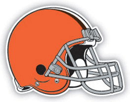
Update, 10am: Logo and helmet have been revealed. Click on the link within this tweet for further details:
BREAKING: New Browns logo, helmet: https://t.co/qxUhXdEee3 pic.twitter.com/c91OyNNjdw
— Paul Lukas (@UniWatch) February 24, 2015
Update, 11am: I’ve now written my ESPN piece. The short version: I don’t much care one way or the other regarding the new helmet and facemask colors; I love the new Dawg Pound logo; and I’m pretty worried about how the uniforms will look. Further details here.
ITEM! Suns preparing to release new jersey: The Suns will be unveiling a new alternate jersey tomorrow, and it will make its on-court debut on Thursday. You can get a reasonably good sense of what they’re up to in this teaser video:
ITEM! Power Rankings set to resurface: Longtime readers may recall that I ranked all 122 MLB, NFL, NBA, and NHL uniform sets in 2012 and 2013. I didn’t do it last year because, frankly, it was a massive amount of work that nearly killed me the two previous years. But we’re resurrecting the Power Rankings this year with a new approach: I’m going one league at a time, spread out over the year. Maybe I’ll intermix everything at the end of the year, or maybe not, but we’ll at least keep the individual league rankings active.
First up will be the MLB rankings. Here’s how they looked last time around. The new rankings will be out later this week — probably Thursday. Then I’ll do the NFL sometime after the draft, and the NBA and NHL later in the year.

ITEM! Phil hits the big time: As many of you are aware, longtime Uni Watch pal Todd Radom recently wrote a piece about the Browns’ logo history for the Sporting News. And now Uni Watch weekend editor L.I. Phil Hecken (that’s him at left) has made his own Sporting News debut. The topic is very much in keeping with the kind of stuff he does here at Uni Watch: He’s chosen the best all-time uniform for each American League baseball team.
I’m really happy to see additional voices from the uni-verse getting showcased by a legit sports media outlet, and I’m even happier that those voices are Phil’s and Todd’s. My understanding is that they’ll both be contributing uni-related content to the Sporting News on a regular basis. Big congrats to both of them.
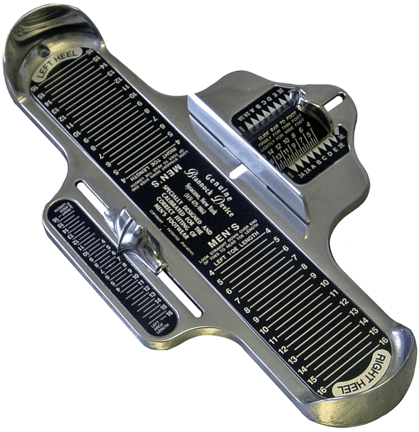
ITEM! Blast from the inconspicuous past: Back around Labor Day of 1993, I came up with the term “Inconspicuous Consumption.” It nicely crystallized my obsession with design- and product-related minutiae (and, of course, was a play on the more familiar term “conspicuous consumption”), and ever since then I’ve thought of it as my personal brand, or at least my guiding principle, with the immortal Brannock Device, shown at right, serving as the classic inconspicuous object. In the months and years that followed, I published a zine called Beer Frame: The Journal of Inconspicuous Consumption, wrote a column called “Inconspicuous Consumption” (which originally ran in NYPress and then moved to New York magazine and finally to Spin), and wrote a book called Inconspicuous Consumption. Those of you who’ve ever received anything from me in the mail — a membership card, say, or a patch — know that I still use “Inconspicuous Consumption” as my return address. (As an aside, I also briefly had a record label called Inconspicuous Records, which definitely lived up to its name. Here’s its only release).
Most of my creative projects — including Uni Watch, for sure — have had some element of the inconspicuous. But I haven’t actually written under the “Inconspicuous Consumption” banner in many years. That changed yesterday, when re:form, the design website I’ve been writing for over the past six months or so, published my latest piece, which marks the rebirth of “Inconspicuous Consumption” as a monthly column. (And yes, you can all laugh at how the art director chose purple for the column’s color scheme, grrrr, but I’m told this will change each month.)
The topic this month is classically inconspicuous — the design of things that go “Click!” when you close them, like this asthma inhaler:
Frankly, all the other things I’ve written about for re:form would have fit just fine under the “Inconspicuous Consumption” heading as well. So I’m not changing what I’ve been doing for them; we’ve just taken the step of making it a formal monthly column, complete with its own name.
I’m very, very happy about this. I hope you’ll check out the column here.
Collector’s Corner
By Brinke Guthrie
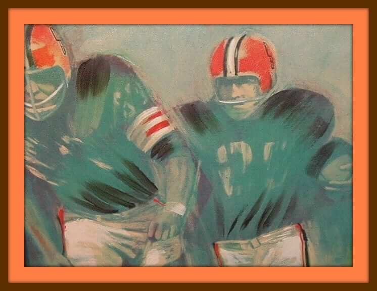
The Brownies are going to reveal a new primary logo today, so let’s start with them. First up (above) is a Dave Boss “Similart” painting with “CB” on the helmets! Then we have this promo ball with Brownie the Elf from the First Security National Bank & Trust. And here are a couple of 1960s drinking glasses — choose either a running back or a lineman.
Okay, that’s enough Browns stuff for now. Here’s the rest of this week’s eBay haul:
• Check out this 1960s 49ers MacGregor kids’ helmet.
• Cliff Engle alert! Here we have a 1970s Pittsburgh Penguins sweater.
• Good grief, check this out: a batch of 14 NFL posters from 1970. I remember having the Cowboys, Chiefs, Vikings, and Rams.
• Look at these game-worn Phoenix Suns shorts from the 1970s. Think that sunburst on the sides is big enough?
• Here’s a late-1970s Hutch “Roger Staubach signature” football. Had to be made after 1976, based on the red helmet stripe on the box photo.
• Love the cover art on this 1974 Dolphins media guide. [Oooh, that’s nice. Also like how it’s called a “Facts Guide.” ”” PL]
• Here’s a huge lot of 1970s-1980s NBA stickers, buttons, and more.
• Bagged, tagged, and ready to roll: seven 1970s NFL helmet buggies (Pats, Oilers, Jets, Bengals, Colts, Steelers, Browns) in one handy lot.
• Pittsburgh Pirates fans, serve up a cold one on this 1970s serving tray.
• No Steelers logo, but who cares? Here’s an official “Franco [Harris]’s Italian Army” seat cushion for those cold Sundays at Three Rivers.
• Nothing says Don Maynard like this 1970s Jets helmet plaque from Kentucky Arts.
• And we conclude with one from reader David Firestone, who submitted this antique football jersey from an American Federation of Labor team.
Follow Brinke on Twitter: @brinkeguthrie
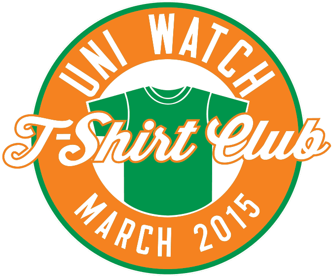
T-Shirt Club update: Big thanks to those of you who bought the St. Paddy’s Day design from the Uni Watch T-Shirt Club. We sold as many of these as we did of the white “Home” design, which was a very pleasant surprise. The shirts should all deliver by March 10, although many of you will likely receive them sooner than that.
The April design will launch on Tuesday, March 17. I’ll preview the design for you at some point during the preceding week.
Uni Watch News Ticker
By Garrett McGrath

Baseball News: Yesterday’s Ticker mentioned that Braves OF B.J. Upton, who’s renamed himself Melvin Upton Jr., would be wearing JrOB this season. Here’s our first peek at that. … The Wilmington Blue Rocks, the high-A affiliate of the Kansas City Royals, have a new logo. … In 1978, the Gray Harbor Loggers had a player named William Murray who went 1 for 2 with a single in his only game. The rest of the world would go on to know him as Bill Murray (from Tim Dunn). … A look at the new uniforms for the University of Illinois-Springfield baseball team (thanks, Paul). … Russell Martin, now with the Blue Jays, appears to have switched brands for his catching gear. ”¦ Here is a photo of Don Newcombe with the cast of the The Brady Bunch (minus Robert Reed) during a charity baseball game at Dodger Stadium, circa 1973. … No pictures but a good story from Brice Wallace: “I saw a fine version of Damn Yankees over the weekend at Weber State University. I was very impressed with the attention to detail with the baseball stuff. The logos for the Senators, Red Sox, Indians, and Tigers were period-appropriate, and the players wore their stirrups correctly (more of the sanitary sock showing in the back). But near the end of the show, a player was holding the uniform of one of his teammates, and the uniform pants were dangling from his arms, revealing that the stirrup socks were sewn onto the pants cuff, meaning the actors had no choice about how to wear the stirrups.”

Pro and College Football News: Former Washington DB Darrell Green has donated a bunch of artifacts to the Pro Football Hall of Fame, including some of the Tootsie Rolls that he famously wore inside his socks (from Jon Solomonson). ”¦ Reader Rex Henry has updated his ACC uniform tracking website to include the 2014 season.

Hockey News: The Montreal Canadiens celebrated their equipment manager’s 2000th professional game (from Jeremy Brahm). … Alternate captain Cody McLeod of the Colorado Avalanche wears a wedding band when he plays (from Jerry W.). … The Arizona Coyotes will wear their throwbacks on March 5 against the Canucks (thanks, Phil). … Tampa Bay Lightning goalie Ben Bishop has a new mask with glow-in-the-dark lightning (thanks, Paul). … The Federal Hockey League unveiled new logos for this season’s playoffs and championship. … The Boston University Terriers wore 1949-50 throwbacks last night (thanks, Phil). … The Spokane Chiefs of the Western Hockey League will have a breast cancer awareness night (from Larry Brunt). … The Prince George Cougars of the same league have a unique Zamboni (thanks, Phil). … The Kalamazoo Wings of the ECHL played two games on pink ice this past weekend — photos here and here (from Tony Anderson).

Soccer News: The Vancouver Whitecaps of MLS unveiled a new primary kit yesterday. The back of the jersey includes a little “Since 1974” notation, which raises a good question: Which is better: “Since” or “Est.”?

College Hoops News: The University of Wisconsin Badgers are hosting a Red and White Stripe Out night where fans are asked to wear designated clothing based on their seating section (thanks, Paul). ”¦ The Hillsdale College women’s team is combining pink and camo in one uni. ”¦ Still more pink, this time for the Notre Dame women.

Grab Bag: A few months before the Cuban Thaw, track athletes in Cuba were allowed to obtain sponsorships from U.S. companies (from Roch Smith). … Stained glass backboards?!? Crazy but cool. … Here’s a coin-op machine with a built-in basketball game (thanks, Phil). … Two beauties from the Sports Illustrated Vault: Larry Bird levitating and dishing during his college days at Indiana State and Tommy Heinsohn in September 1964 at Boston’s Faneuil Hall (thanks, Phil). … Roger Federer has apologized for getting caught up in the bitter rivalry between Indian and Pakistani cricket fans after he was pictured admiring the blue shirt of World Cup champions India in a marketing photo-shoot (from Ben Isaacs).
The Penguins didn’t wear black and gold until January 1980, so that sweater is more 70s style, and not legitimately from the 70s.
I like the apparel that Brink puts in Collector’s Corner but it seems as if he just lists whatever the seller lists. Often times I noticed the items are not from the period listed.
*Brinke
“Since” seems to imply a stronger sense of continuity to me. Vancouver, for example, has not been playing in MLS since 1974. So “Est. 1974” seems more appropriate to me. Whereas a relocated team like the Nats would be better off using “Since 2005” than “Est. XXXX”.
“the Nats would be better off using “Since 2005″ than “Est. XXXX”.”
~~~
C’mon Scotty, we all know the team was established in 1905.
RE: Vancouver
“Since 1974, Except For 1985, And From 1986-2000 We Were Called Something Else” wouldn’t fit on there.
Yup, it’s all fiction anyway so doesn’t matter to me either way. Man, the 86ers was a horrible name.
See, I’m thinking the other. “Est.” implies it’s the same organization since the 1974 founding, which isn’t the case. “Since” tells me the identity has existed since 1974.
Thank you, Paul–additional evidence that the masses really do Get Itâ„¢–very happy to be on the same team as Phil as well.
“very happy to be on the same team as Phil as well.”
~~~
Cheers buddy! To you as well.
And yes — big thanks to Paul for the great mention!
A) Things that can click, MUST be clicked.
2) Is that your inhaler?
D) Do you shave your fingers?
My inhaler is the one in the video, not the still photos.
I used to have super compact one that went everywhere with me. I sort of outgrew(?) my need for it over the years.
Inhalers. Good name for a NBA team, no?
Better name for a competitive eating team.
Congrats on the new gig, Paul. Excellent podium,
I’m on the opposite side of the since-est. issue. I feel like est. is inappropriate for the Whitecaps because there was a Whitecaps established in 1974 but it wasn’t this Whitecaps. This team was established in 1986 in the old
CSL, so if they were to use an established date it would be appropriate to use that date not 1974. They want to establish their connection to the NASL Whitecaps though so they use “since 1974” instead. I find it kind of disingenuous personally, and minimizes the contributions of the players and staff of the 86ers that kept soccer alive in Vancouver through five different leagues by my count.
Exactly, one doesn’t see the Canucks saying since 1945 just because there was a a PCHL/WHL incarnation of the Canucks. They celebrate their own history and acknowledge the contributions of the PCHL/WHL Canucks without co-opting their history the way the Whitecaps have done to the NASL Whitecaps.
In the 1974 Dolphins Facts Guide, I like how the schedule is separated into Pre-Season and “Championship Season.” I don’t think I’ve ever seen the regular season described in that manner.
Six pre-season games and an exhibition game. And we think 4 pre-season games are too many now.
DOn’t have time to look it up now, but I think the MLB rulebook refers to the regular season as the “championship season.”
You are correct. In the rulebook it does say “championship”, but on mlb.com, it says regular season. Good thing they didn’t clear that up.
Awesome picture of Brady Bunch with Newcombe. And what a terrific find on Bill Murray with the Loggers!
Small correction though: Barry Williams (Greg Brady) also not pictured.
Allan Melvin (Sam the butcher) also not pictured.
He was busy bringing Alice the meat.
This is link of the Bill Murray story. They were filming for an SNL special called link that aired in October 1978.
I posted that in the comments yesterday. Flew under the radar, I guess.
I wonder what jersey Peter is wearing? Also curious as to what the patches say on the hats.
Christopher Knight may be wearing a Hollywood Stars jersey…leftover from previous exhibition games(?):
link
I think the patch on Mike Lookinland’s cap has the date ‘1973’ on it, but it’s not very clear to me.
Ya know…it appears to me in that Brady Bunch shot that Peter is wearing a Hollywood Stars uni.
If so, that’s pretty sweet.
It’s definitely a Hollywood Stars uniform that Peter has on. I wonder if the shorts Jan has on are Stars related as well…
Additional pics from that night, but no commentary unfortunately:
link
Hollywood Stars Night was a regular feature on the Dodgers’ promotional schedule back in the ’60s and ’70s. Just a quick game (maybe 2-3 innings) with stars (sometimes a very loose definition of “stars”) who wore either Dodger knock-off uniforms or Hollywood Stars uniforms like Christopher Knight did in this photo. Most of the stars did it for yuks, but a few (like Kurt Russell and John Beradino) would bring some game.
That’s a great photo, Phil. That has to be somewhere between 1962-65. That’s David & Ricky Nelson in Angel hats and the scoreboard in the back looks like it’s a White Sox-Angels game at Dodger Stadium. I’m guessing the Angels did Hollywood Stars Night like the Dodgers did.
What is above the MLB logo on Russell Martin’s cap?
It appears to be a Blue Jays logo.
link
Conrats, Paul and Phil, on the new gigs.
Thanks, Jim!
I’m no thespian but it seems to me that the reason the wardrobe department of Weber State would have sewn the sanis/stirrups into the cuffs of the legs of the pants for the production of Damn Yankees would be to allow for quick changes between acts.
DBN has seen the Browns logo and gave a tease:
link
As long as it is nothing like the DBN logo. That is horrid!
Thing I learned today: “The Sporting News” still exists in some capacity.
TSN was my first subscription to a magazine/newspaper. I was a young teen living in Japan and craved some sort of baseball coverage beyond what was printed in the “Stars & Stripes”. I would get the issues about 2 weeks late, meaning I was reading coverage of stuff that happened 3 weeks previous but it was great!
Darker orange. Brown face mask.
That’s it?
Cleveland being Cleveland
So the Browns are just going to neon orange and brown facemasks? What a shame… I’m sure the uniforms will be a disaster.
…really? I thought the whole point of this new logo thing was to have a non-helmet “primary” logo to use.
At least the brown mask is better than the gray.
“The contemporary redesigned wordmark is simplistic and utilizes a stronger, bolder font.”
Worst sentence I’m likely to read this week. “Simplistic” is not a fancy way of saying “simple” or “elegant.” It’s an insult. The Browns are telling us to our face that they think the new wordmark sucks. (Though technically a Kinsley Gaffe, since the Browns obviously don’t know what words mean and so didn’t intend to tell the truth here.) “Utilize” is used incorrectly in place of the shorter, perfectly apt “use.” And in terms of communicating to the general public, “stronger” and “bolder” are redundantly synonymous. The only defensible, properly chosen and used words in that whole sentence are “The redesigned wordmark is and a font.” Which is about right.
I really want to like the fact that the Browns “redesign” is nothing but a handful of very minor, mostly positive, tweaks. But overselling it with BS like the above just makes me hate the Browns and wish they’d move to Baltimore all over again.
They should have gone back to white.
Drew Carey is rolling over in his grave!
And banging on the roof of his coffin saying “get me out of this grave!”.
In other news, that dude from Reddit was a total liar. Shocking. The Browns suck and so does this “redesign”.
The brown mask makes them look like a high school team.
Why didn’t they update the helmet illustration? No one has worn that style of mask since the 80s! It wasn’t even that popular of a mask back then!
The blank helmet has made them look like a high school team for decades.
They typically play like one, so that’s fitting.
Most high schools have logos on their helmets.
What a very Browns thing to do…
That has got to be THE most ridiculous “re-branding” of all time.
I’ll hold my judgement until I see how the uni is being changed. I agree, changing the orange slightly, making the mask brown and changing the wordmark dog logo doesn’t seem like much. Did anyone really expect the helmet to change drastically? I sure didn’t. If they do, the fans will have a shit fit.
Browns fans are having a shit fit over this logo change! 95% negative comments flying on Facebook and Twitter today and it is early! The new logo is a bit underwhelming to me but not bad.
It reeks of change for change’s sake, which is kind of a hallmark of current NFL times, sadly.
If you’re one to believe there are essentially two current approaches to uniform design — the new-school thinking that loves Oregon’s 70-billion uniforms and all things flashy, and the old-school, more Lukasian, traditional way of thinking — this makes no one happy. With all this hype, I think fans expected more … a LOT more. The Reddit idea with a Paul Brown silhouette was bold and daring, yet with a nod to tradition. It built intrigue. A new facemask color and a slightly different tint does nothing to live up to that.
The new-school would have wanted something radical. The old-school would have rather you just stayed the same. Instead, you get something uninspired that’s just different enough to be different but not really all that different. Seems like committee thinking was at play here.
I mean, the Packers wordmark could probably use updating, too, and maybe they want to modify their ‘G’ to have a bevel. That’s not a rebrand. That’s just a tweak. And what we got with the Browns today feels like just a tweak.
Weak. Go big or keep it the same.
Who are the Browns fans that supposedly want radical uniform changes as implied in Pauls ESPN article?
Did he say anything else about the uniforms?
Yes. He said, “We took a fairly conservative route with the changes we unveiled today, and then we think our uniforms will be more of a radical change, and we think our fans want that too.” So for those of you who were either hoping for or dreading something more dramatic involving the logos, think of today’s events as the calm before the storm.
Cool article on the inhaler and the satisfying “click”. Can’t say I’ve though much about it lately, but I used to have a windbreaker that had plastic snaps instead of a zipper (which always seemed strange to me, but that’s another subject). When snapping the coat closed, the way the snaps were designed worked well enough, but really didn’t “snap” like metal ones do. I don’t think I every had trouble getting them to work, but I always had to check them to make sure they worked given the absence of the all-so-satisfying sound. I’m loving how you broke all that down in your article. Thanks.
Here is a link to the local newspaper article about the Damn Yankees show at Weber State that includes a photo of the cast in uniform (torso only, unfortunately. I also went over the weekend and was impressed that they also used zippered jerseys, although I would have no clue if those are period specific.
link
Congrats Phil!
On the Browns thing, I never would have noticed that they even changed anything if they hadn’t made a whole big deal about it. Wow, deeper orange and a new lettering font that is oh so slightly different. Oh, and a new dog!
Thanks Lou!
So just a knee jerk reaction… does the new orange look almost identical to the Bengals to anyone else? I pulled the sites up side by side and it is definitely a lot closer. Personally, both sharing such and intertwined history, I would think you would want to differentiate yourself instead of close the gap.
I think they just made it a better match for the real helmets. Looking at some Browns vs Bengals images, the helmets look like they’re already the same color.
I am not so sure, generally I have always noticed a big difference. link
Just to make it simpler, this makes no sense to me.
link
It makes perfect sense for the helmet manufacturer. Why make 2 different oranges if they don’t have to?
It’s difficult to find pics that show this clearly, but when the expansion Browns launched in 1999, their helmets (and perhaps uniform striping, as well) appeared to be a different shade of orange than had been used previously.
link
link
link
Within a few seasons, I think, they had quietly gone back to their old color. I’ve always speculated that this was because the ’99 orange had been too Bengalesque.
But who knows?
JB already covered this, apparently.
I guess I didn’t scroll down far enough.
The Browns have managed to disappoint yet again. They fixed what wasn’t broken and amazingly – like everything else since Browns 2.0 came into being – they made it worse with only a minor tweak. This franchise – one that I’ve followed since the 70s – is the exact opposite of King Midas. At least brown is the appropriate color.
Softening my stance already. Holding off till uni unveiling. They were smart enough not to mess with it much. HATE the brown facemask tho… looks high school.
This is what I expected the Browns to do, update their helmet “logo” to reflect the color changes in the helmet design.
The biggest problem is this helmet style is almost extinct in the NFL. It’s as if their logo was a leather helmet, but it doesn’t have a retro-cool vibe.
The orange is very reminiscent of Oregon State.
Was really hoping for something new and different. I like the dawg pound logo, but the hype machine really had me expecting more with the primary logo. As a Browns fan, I should have known better. Chalk another one up in the disappointment column!
At least Cleveland fans are used to disappointment.
Very nice Inconspicuous Consumption! The snap closures on cowboy shirts also fit the bill.
Overjoyed to hear about the ’15 uniform rankings! But (of course, these ingrates always have a “but”) this time around, I wonder if it’d be possible to factor in the alternates less heavily–or at least, to factor in seldom-worn alts less heavily. They seemed to play a really outsize role in determining last year’s rankings, which meant the rankings didn’t end up corresponding to the unis that most of us saw, most of the time.
Why do I have a feeling the Browns changed the shade of orange in their logos so that it will match the shade of orange that Nike can produce more easily for the new uniforms?
With the Browns, if you are essentially leaving the helmet the same, why not use a more interesting helmet illustration as your logo? That helmet illustration comes standard in 1990’s clip art from Staples. If you want your logo to be your helmet, fine. But how about a different, unique angle? Something that makes you stand out? I saw many fan concepts that did just that, and I like them much better.
Having now spoken with the team president, it’s very apparent to me that they intentionally chose a helmet illo that wasn’t very illustrative. I asked him if the stripe width was changing, e.g., and he said, “You’ll find out when the uniform is unveiled.”
Geez … would a “yes” or “no” have killed the guy? What a franchise.
Sadly, my high school years will be forever linked to this team, since my school (Grant HS, Van Nuys, CA) chose the Browns colors when it was built back in ’59.
Story goes, our first football coach was from Cleveland.
-C.
So does that mean that at some point in the future they might change the helmet illustration? If they released this helmet illustration as their new primary logo and the proportions of the stripes may not be the same when the actual helmet is unveiled is that not (to use the good-stupid method) incredibly stupid?
That would be incredibly stupid. So, expect the new helmet to have wider stripes and a metallic finish.
That guy’s inner monologue:
“Oh no…we haven’t even thought about the stripe widths yet! But I can’t tell anyone that. Maybe I’ll make it sound like we’re slyly holding back details to build anticipation…yeah!”
Agreed Kyle Kendall, my BSU friend.
Randy, good to hear from you. It’s been too long. I think we predicted a Browns redo in Swinford 214 about twenty years ago.
I’m not sure why I got so excited for the Browns new logo as a Giant fan living in NYC, but it sure was disappointing. I like the brown face mask, but the new dog logo is a step in the wrong direction. I mean, I guess it’s meaner because it has some teeth showing? Sad.
Browns copying Bowling Green again.
Much as they copied their original uniforms from BGSU, now they’ve copied the current helmet and just dropped the BG logo.
link
I think this sums it up perfectly. From CBS Sports
[img]https://farm9.staticflickr.com/8657/16609161236_cf623b2046_q_d.jpg[/img]
Whoa, a brown facemask… I am BA-LOWN A-WAY. How much did they pay design firms/consultants/hobos for this revolutionary change?
Gotta love all the secrecy, press and hype over something that looks like it was decided in the elevator ride up to the office for the initial meeting.
This is like the Brian Regan “I’m the map” song joke or Jim Gaffigan’s “Hot Pocket” jingle joke… Both would work here.
I like the new orange of the Browns. It’s nice to see a colour getting brighter rather than duller.
This is the opposite of what the Jets and the Oakland A’s did when they ditched the bright Kelly green for their current dull green shades, and what the Rams and the Brewers did when they threw away brilliant blue and yellow shades for dulled versions.
Even after the Jets went to their current uni set in 1998, the hunter green used for a number of years wasn’t nearly as drab as what we see now.
Photographs vary depending on light, rain, etc., but I’m pretty confident that
link
was different from
link
Seriously, they look closer to “camo” green these days. Why?
Also, I’ve often thought that Rams might look nice if they combined their old royal blue with their current metallic gold. Anyone else think so?
So, is the buildup to the Browns’ changes the Poochie of uniform change hype?
It’s the Cousin Oliver.
If they were going for strength and toughness they needed to stay with the grey mask…. that will always look tougher than any other color, because it came from an era of toughness, and it looks like steel. As far as a helmet illo….. this is THE ONE TEAM that could use a helmet FROM THE FRONT angle as their logo, since the sides are blank…. and they didn’t go that route…. too bad :(
“Bwighter Ornge and a new dawggy wogo!” Really Cleveland? I guess the GOOD thing to come out of this is their fan base won’t have to buy up a bunch of new memorabilia.
Nice click article. I wonder if the resonant qualities of plastic are considered in the design as well? I never thought plastic would be capable of creating a pleasant acoustic sound, however my exposure to plastic percussion instruments changed this perspective. For example, the LP Jam Blocks, which are made of plastic, create an extremely pleasant and satisfying clave/wood block sound, which I still find surprising.
The word out of Cleveland about the uniform “moving further” will probably be entirely predictable.
Contrasting shoulder yolk, sublimated pattern numbers, truncated pant stripes. Been there. Done that.
Nike’s new Cleveland Browns! Exciting innovation that’s been done over and again.
My take on the Browns release:
link
Argh, more storytelling through uni elements. The new orange for the passion of the Dawg Pound. Brown facemasks for Cleveland’s toughness. Oh, and the Phoenix Suns in Ash/Ember. Blech.
I think Illustrator has killed my interest in the design. Whenever a new logo comes out, the style all looks so similar. Kind if like a movie with a lot of CGI, I see the CGI before I see what it actually depicts. In this case, modern logos all look like they were created by one person. Does the technology kill individual style from coming through?
Maybe someone who knows more about design than I do can explain why I feel this way.
I think the problem is focus groups and design by committee, not the technology.
Sure, but it’s hard to argue that Illustrator’s toolset doesn’t limit design exploration. There’s a difference between a hand-drawn design that’s finished on the computer and an idea that starts as pixels.
Homogeneity is happening on both ends.
link
As a Browns fan, I don’t like the brown facemask. I always liked the white facemask. That helmet is iconic; don’t mess with it. If the stripes are wider or disproportioned, or have a pattern embedded in them………….ugh!
I don’t know what to make of the Dog logo. What about the Brownie Elf? What was wrong with that? I always liked the idea of the Dog Pound and how it grew and came about NATURALLY, not be some focus group or marketing firm. But to me, the Dog Pound ended when the old stadium was torn down. The tried to “Force” a new Dog Pound into the new stadium. It just isn’t the same. For that reason, I think the Brownie Elf would be a way better chose, and has certainly been around the franchise a lot longer. So, is it good or is it stupid? STUPID!
Well..how about the Dawg dressed up in the Brownie’s outfit…?
It sounds as though you are actually moaning as you snap the inhaler. :)
50 Shades of Asthma?
Now that the Browns have a new logo, they need a new helmet. Here’s my concept.
link
And for the next redesign, it will be a helmet with a picture of a helmet with a picture of a helmet with a picture of a helmet with a picture of a helmet with a picture of a helmet.
Pretty sure the NHL wouldn’t allow a player to wear a wedding band, especially one like Cody McLeod who has the role for the Avalanche of punching people in the face. From the linked image looks like it’s a tattoo of a band.
It may not be allowed, but it does happen.
Petr Sykora:
link
Radek Martinek:
link
Read more:
link
I like the Brown facemask as a logo element, but I’m not sure if I’ll like how it looks on the field. Concerning Schneiner’s statement that the uniforms will be more radical, wondering how they will combine that with the traditional looking helmet. Also not looking forward to a number font based on the new word mark (what else should we expect Nike to do?). I don’t mind it as a word mark, but as numerals, It’ll look like a cheapened version of traditional block numerals
Do you mean the on-field/midfield logo or how the actual helmets will look when the players take the field in them?
Either way, I consider the brown an upgrade from the gray/grey.
I’m expecting an overly-orange eyesore from the neck down, far worse than the uniforms of, say, Arizona and St. Louis (each have a great ‘traditional’ helmets paired with contemporary jerseys and pants).
On the players, I mean. Traditional is too vague. To be more specific, what I mean to say is that I don’t see how a helmet whose only flourish is three linear stripes could possible not clash with a crazy “bumber-stickered” uniform. St. Louis’s and Arizona’s helmets are strip-less and only have logos. If we look at other Nike jobs, Miami is the only team employing traditional helmet STRIPING, and the pattern was replicated on the pants for a tame and relatively traditional look. I have a feeling we might see the orange britches make a comeback, which would provide Nike with the opportunity to tie the uni elements together using the helmet stripe as a logo of sorts. Unfortunately we will probably see that paired with an orange jersey…eek
Strange and unprofessional that the secondary logo includes the words “dawg pound”. Is the logo for the team or for a stadium section? Just weird. Also unclear is how someone like ESPN would use the logo. Would the words be included? Would the dog’s head be in an orange rectangle, circle, or some other shape?
I agree. Stupid.
This helmet has a brown facemask too.
link
Perhaps the uniforms will dazzle us.
I see Wisconsin is starting to creep in on the Indiana candy stripes. I noticed their co-eds wearing candy striped overalls. Now a “stripe out.” How quaint.
link
How much more could they disney-fy the “Dawg Pound” logo? Are they trying to take the franchise that has been the epitome of NFL futility for the past 15 years and make it cuter? It’s a joke. It’s 100% Cleveland. I feel badly for Browns fans, because they deserver better. Maybe on April 14.
Agree. When I look at the logo, I see Casper: link
Is it just me, or does this look very close the orange used in ’99-’00 before they reverted back to the traditional burnt orange in ’01?
link
link
I’ve been thinking about it and I’m actually kind of upset by what the Browns did today. In his ESPN piece Paul called it, “a long tease built up to just another tease.” Honestly, I feel stupid for being excited about this and I’m not even a Browns fan. I get “don’t believe the hype” and “don’t believe the internet” but the Browns were the source for a lot of the hype and certainly did nothing to mute it. I don’t understand why you would reveal these extremely minor changes separate from the full uniform reveal. Even if the helmet illustration is purposefully oblique, and there are major design elements that aren’t revealed in it, you’ve committed yourself to an inadequate primary logo for the sole purpose of creating another tease and hoping people will still be listening in a couple of months. All around the changes in and of themselves are fine. I have always liked the Browns uniforms, and a different shade of orange and a brown facemask isn’t going to be a deal breaker, but I think this whole reveal could and should have been handled differently.
the Browns were the source for a lot of the hype
Were they? Go back and find us all of the “hype” that the Browns spread in advance of today.
I think you’ll find that there wasn’t actually very much of it. It’s just that people like to get excited.
Yeah, sorry for the nerd rage, but I still don’t like how this was handled. It just feels like today’s reveal was utterly pointless. The changes that were made could have been made over an off-season with barely anyone noticing until training camp. Maybe I’m just being cynical but even scheduling a reveal for these changes by themselves feels kind of like more hype than it was worth. Everyone is making fun of the Browns right now and I’m guessing that’s not what they were planning on.
Well, they didn’t hold a press conference or a media event — they just made an announcement. That’s how it “was handled.” I really don’t see the problem.
Did some people expect something more visually dramatic? Apparently. But that doesn’t mean the Browns were somehow *obligated* to do something more visually dramatic.
Of course nobody is obligated to do anything. I think my main issue is that the Browns did a poor job of managing expectations. It’s true that you can’t please everyone but it’s clear from the public’s reaction that they were expecting more. It’s the Browns brand and they can do what they want with it. They can promote it however they please, but I can’t think of a way in which today’s announcement could be thought of as a marketing success. Is it the Browns fault that people were expecting more? Probably not, but they could have probably done more to temper people’s expectations if they weren’t going to deliver more.
it’s clear from the public’s reaction that they were expecting more.
1) The “public,” as you’re referring to it, is actually a self-selected group of Twitter users, which is hardly a representative sample. In general people who are unhappy with something are almost always louder than people who like something.
2) I don’t think it’s the team’s job to “manage expectations.” I think it’s people’s job to think rationally and behave/respond like adults.
I think at this point I will just say that I respectfully disagree.
Just by saying weeks ahead of time that a change was coming, they sowed the seeds. If they know Browns fans, they’d know that’s all it takes to get them going.
And if they hadn’t said anything in advance, everyone would’ve said, “What, no advance notice?!”
Can’t please some people.
Agreed. But I think the reaction would have been less in that case.
As much as I like uniforms and uniform unveilings, does anyone else just wait until the official announcement before caring? I mean, I like the Suns, and I’ve heard they’re getting a new alternate, but I don’t like all the teasing and the leaks and whatnot. Unlike other things in life, I don’t need the bada bing…just give me the ba da boom.
That’s probably why there’s so much angst amongst Browns fans today. They’ve gotten riled up for weeks over what turned out to be some very simple tweaks (so far). They should have just said, without any fanfare, “Here’s an updated logo and helmet.”
Oh, and congrats on your new gigs, gentlemen.
I couldn’t agree more.
I generally agree with this. I don’t get all hyped up, I don’t much care about rumors unless they’re substantiated or at least seem semi-plausible, etc.
But it’s not the team’s fault that other people get carried away.
As with so many things in life, it’s pretty simple: Behave and respond like an adult, and the world will make a reasonable amount of sense.
To that end, they aren’t helping themselves with the uniform announcement. Paul asks for details, but they can’t say anything until mid-April. Why does this need to be a pre-announced, two-step unveiling event? Why can’t they just do it all at once or with minimal fanfare? I agree with you, this does feel like they are just drawing it out.
Re: Browns, meh. Nothing to see here. Although the new shade of orange kind of hurts my eyes a little bit, next to the old one. I think the duller orange works better for the Browns; this one looks like they’re going for the Bengals’ orange.
But, whatever. I still think the uniform will be an OK design ruined by an absurd numeral font.
Always?
link
If the Browns re-designed every teams logo.
link
The comments for that are gold. It’s amazing how quickly it turned into a Redskins debate. But I do like the “L.A.” above the Raiders, Chargers and Rams.
Small detail: it’s Grays Harbor.
Regarding the browns new logos…Am I the only one that thinks the new dawg pound dog’s mouth looks like a nike swish?
Sorry but I do not see it.
That cartoony-ass dog logo is complete shit.
That 70s night in LA tonight as the Kings are wearing fauxback yellow on the ice.
I just noticed you said you LIKE the new Browns “doggy” logo!?!? What!?!?
The first thing I thought when I saw it was “Scrappy Doo”. You know, that annoying cartoon nephew to Scooby Doo. Oh well, more puppy power to you, man.