Click to enlarge
We’re currently in the midst of Fashion Week here in NYC, as designers are showing their fall collections. This generally has no impact on my life and no relevance to Uni Watch, but designer Tommy Hilfiger had himself a bit of a Uni Watch moment with his runway show yesterday.
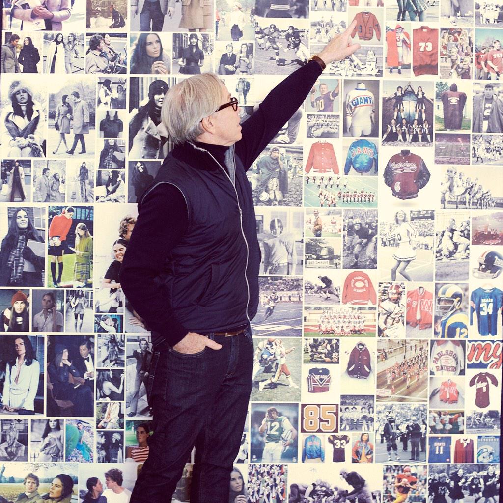
That’s Hilfiger above, in front of a wall of photos that he says were among the inspiration for his new collection. If you enlarge the photo, you’ll see lots of sports-themed pics on the wall — Joe Namath (two shots of him as a Jet and another as a Ram), Joe Theismann, a NY Giants sweater, lots of varsity jackets, a cheerleader or two, and so on.
Hilfiger took things further by staging his show in the Park Avenue Armory and outfitting it like a football field, complete with a “TH”-branded helmet at midfield, his surname in the end zones, goalposts, and more:
A quick glimpse at the set. We're going to have a ball! ”“ TH #NYFW #TommyFall15 pic.twitter.com/QRcSVErTTs
— Tommy Hilfiger (@TommyHilfiger) February 16, 2015
It's game time @TommyHilfiger. #TommyFall15 #fashion pic.twitter.com/ShTS5eCc0U
— Wallpaper* (@wallpapermag) February 16, 2015
We sneaked in early for the @tommyhilfiger #tommyfall15 rehearsal! Yes… That's a stadium! #nyfw #wgsnhub pic.twitter.com/7LGtfR9N5W
— WGSN (@wgsn) February 16, 2015
Teams have been formatting their uniform unveilings to look like runway-style fashion shows for years now, so I guess there’s a certain symmetry in a runway show being formatted to look like it’s taking place in a stadium.
Prior to the show, there were lots of football-related props backstage, including helmets (which did not match the design of the one shown on the field), pennants, and trading cards:
Backstage at #TommyFall15 in the #Twittermirror #NYFW with @celineaagaard pic.twitter.com/DgItoao8ol
— Tommy Hilfiger (@TommyHilfiger) February 16, 2015
Backstage at #TommyFall15 in the #Twittermirror #NYFW with @rachel_arthur pic.twitter.com/pqjVdKFLJH
— Tommy Hilfiger (@TommyHilfiger) February 16, 2015
Backstage at #TommyFall15 in the #Twittermirror #NYFW @holliemaysaker @angelrutledge pic.twitter.com/l3CHtXDewd
— Tommy Hilfiger (@TommyHilfiger) February 16, 2015
As for the clothing itself, I saw this sketch before the show, which seemed to suggest a vaguely jersey-based concept:

So how did everything turn out? There was definitely a football theme running through some of the designs — a uni number here, a UCLA stripe there, and so on. Most of it, frankly, looked silly. Here are some photos and screen shots (if you can’t see the slideshow below, click here):
The repeated use of the number 30 apparently refers to the founding of Hilfiger’s company in 1985 — 30 years ago. Oh, and I should mention that these designs constituted only about 25% of the show. The rest of the clothing wasn’t the least bit football-oriented and therefore looked rather strange in the faux-stadium setting.
At the conclusion of the show, Hilfiger came out holding a Patriots helmet, apparently because Pats owner Robert Kraft was in the audience. If you want to see a review of the show from a fashion writer, look here.
(My thanks to reader Chris Flinn for letting me know about this one.)
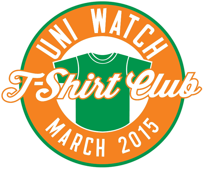
New T-Shirt Club design launch: Today is the third Tuesday of the month, which means it’s time to launch the latest design we’re offering in the Uni Watch T-Shirt Club.
As I mentioned last week, March is when teams break out their St. Patrick’s Day uniforms, so that’s what Teespring and I have used as the inspiration for our latest shirt design (click to enlarge):
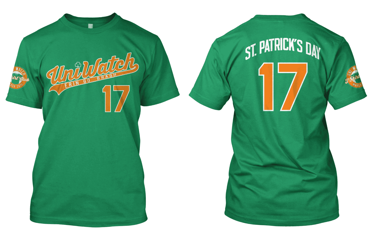
Some quick notes: Green is already a Uni Watch color, of course, but the green being used on these shirts is lighter than the forest green that we’ll be using later in the program for the “Alternate” shirt. We used orange as the secondary color because of the Irish flag. We also changed the uni number from 15 to 17 (for St. Patrick’s Day, obviously), changed the slogan under the script to “Erin Go Bragh,” and dotted the “i” in the script with a shamrock.
Here’s everything you need to know about ordering the shirt:
1. You can purchase the March shirt on this page. (Ignore the bits about “reaching our goal” and the “campaign being successful” — that’s for Teespring clients who use T-shirt sales as fundraisers.)
2. As you’ll see, there’s a choice of American Apparel ($23.99) and “Premium Ringspun,” which is actually a brand called Tultex ($21.99). Their tailoring and sizing are slightly different, and their shades of green are very similar but not exactly the same, so use the “View Sizing Chart” link and compare the colors to be sure you get the shirt that’s best for you. Domestic shipping is $3.85 for the first shirt, $1 for each additional shirt; international shipping is $9.50 to Canada, $12.50 elsewhere.
3. Unfortunately, the largest size we can offer this month is 3XL. My apologies to those of you who prefer 4X or 5X (I think we sold eight shirts in those sizes last month), but we couldn’t find a brand in those sizes that offered the right shade of green.
4. This shirt will only be available through next Monday, Feb. 23, 11pm Eastern. After that date, the shirt will not be offered for sale. All shirts ordered by then should be delivered by March 10 (and in many cases well earlier than that).
5. People who purchase all 12 shirts (collect ’em all!) will be eligible for a bonus prize at the end of the year. I haven’t yet decided what this prize will be, although I have some ideas. It may depend somewhat on how many people stay on board for all 12 shirts, and we won’t have a sense of how many people that might be until the summer, so I’ll likely wait a while before settling on the prize. But I assure you it’ll be something good.
I think that’s it. Again, the March shirt can be purchased here. The April design will launch on March 17; I’ll provide a preview of it during the week before that. If you have any questions, give a holler. Thanks for listening.

A new raffle (and results for an old one): You know how there are interactive sites where you can design your own uniform, or your own sneakers, or whatever? The baseball bat manufacturer DeMarini now has a site where you can design your own bat. Most of the design templates are, frankly, a bit too “extreme” for my tastes, but whatever — the DeMarini folks have generously agreed to provide a free bat to a lucky Uni Watch reader who’ll get to choose his or her own bat design.
To enter, send an email with your name and shipping address to the raffle address by this Friday, Feb. 20, 7pm Eastern. One entry per person. I’ll announce the winner later that week.
Meanwhile, the plus-one for my presentation this Thursday at Skidmore, Owings & Merrill will be Noah Hougland. My thanks to all who entered — wish you could all come along, really!

Baseball News: Interesting note from Michael Stoudt, who says that Andy Pettitte’s No. 46, set to be retired by the Yankees this August, will mark the first time 46 has been retired by any MLB team. ”¦ Rogers State is going with the old Chisox beach blanket template (thanks, Phil). ”¦ Here’s a close-up of Nebraska’s awful new BP top. Hey, nothing honors the troops like batting practice! ”¦ Very nice uni the other day, including tri-panel cap and Northwestern-striped stirrups for McNeese. ”¦ Campbell University’s chest protectors have “Exodus 20:15” — “Thou shalt not steal.” ”¦ The West Virginia Black Bears, a new Class A NY-Penn League team being established in Morgantown, will unveil its new logo tomorrow (from Joe Sewash). ”¦ Lots of old MLB uniforms on display in this 1969 Gatorade commercial (great find by John Philips). ”¦ Also from John: what he claims is the only remaining color footage of Game 2 of the 1969 World Series. ”¦ “Ballplayers at Cornerstone University (from the NAIA) literally live at the ball field,” says Dustin Semore. “Dewitt Baseball Stadium now has dorms above the stands. It looks like a giant press box from first base to third base with a lot of windows. It’s odd, but I would totally go there.” ”¦ Here’s some great footage from the 1999 Orioles/Angels futuristic game. Always thought the O’s design was kinda weak, but the Halos took the concept to its logical extreme. ”¦ Mets RHP Jennrry Mejia was working out yesterday in a Los Mets T-shirt. ”¦ In the wake of Barry Zito signing a minor league deal with the A’s last night, here’s a shot of him wearing the very unfamiliar No. 53. ”¦ In 1992, the Cardinals put out a promotional film to mark the team’s 100th anniversary. “Of particular interest are shots of players wearing pinned-on three-digit numbers in the early days of the farm system (at the 3:45 mark), Specs Toporcer wearing a great pair of striped socks (7:25), and Pepper Martin’s band, the Mud Cats band, wearing fascinating Cardinals-inspired uniforms (18:00),” says Jerry Wolper. … After Bob Feller died in 2010, the museum devoted to him in his Iowa hometown fell on hard times, and now it has closed. Much of its memorabilia is being given to the Indians, who’ll display it at their stadium.

NFL News: Yesterday’s Ticker had a photo of a powder blue Chargers helmet. That prompted Michael Eggenburg to send in a photo of his own powder blue Chargers helmet, which is even better than the one we saw yesterday because it has better outlining on the lightning bolts. ”¦ I think we’ve seen this before, but once more won’t hurt: As many of you know, the Saints wore a black helmet during the 1969 preseason. Here’s a 2012 auction listing for a game-used example of those helmets. Looks like the colors faded/yellowed over the years (from @ProsFB). ”¦ Seth Shaw found a 1998 preseason shot of Randy Moss wearing No. 18 and FIOB! When I posted that shot on Twitter, Mike Nessen quickly came up with this, and several people explained that Moss’s brother, Eric, was also on the roster at the time — hence the FIOB.

Hockey News: The Binghamton Senators wore purple-trimmed uniforms on Sunday. “It was for the Do It For Daron Day, a youth mental health cause started when head coach Luke Richardson’s 14-year-old daughter committed suicide in 2010,” says Jason Perrier. ”¦ Here’s a ranking of NHL third jerseys (thanks, Phil). ”¦ Flames goalie Jonas Hiller’s plain black mask matches his teammates’ black helmets. “And it protects him from getting punched in the head by Popeye!” notes Stephen Hayes.

NBA News: A sports radio guy in New Orleans things the Pelicans should bring back the Hornets’ Mardi Gras uniforms, and I totally agree (thanks, Phil).

College Hoops News: The Wisconsin-Parkside women’s team, like so many others, wore pink the other day. But coach Jacob Yorg took things a step further by wearing a pink suit. ”¦ More intriguingly, Wisonsin-Parkside had a Civil Servants Day last Thursday, to honor the military, first responders, and government employees. But uniforms they wore honored only one of those groups, and you can probably guess which one that was. I asked a team spokesman for the thinking behind this, and he said, “The thinking was camouflage still fit the theme of patriotism and commitment to the community.” So even when a team tries to think outside the military box, they end up back inside that box. Sigh. ”¦ More women’s action: North Central College and Elmhurst College went color-on-color and it looked great (from Steve Johnston).

Soccer News: “I’ve always wondered how teams handled international travel,” says Danny Garrison. “Case in point: Bayern Munich’s English-language Twitter feed sent out this picture showing the whole team’s passports together for their Champions League trip to Ukraine. Interesting.” ”¦ Here’s a look at some players modeling the new USA road kit. ”¦ Kevin Davies of Preston played without a number or NOB during yesterday’s game against Man U. Was this a blood shirt situation? (From Rasheed Clarke and Mike Glosier.) ”¦ In a related item, Bradford player Rory McArdle wore a shirt with no name or number during the recent FA Cup match against Sunderland (from Graham Clayton). ”¦ Indy Eleven’s new alternate jersey will be unveiled today. ”¦ Southampton will go back to Adidas kits next season. “They’re playing this season with unbranded kits after a dispute over Adidas’s design choices,” says Yusuke Toyoda. ”¦ Also from Yusuke: New away kits for Northern Ireland. ”¦ As noted in the Ticker last month, the electronics manufacturer LG recently made subtle adjustment to its logo. “This has caused a bit of a problem for German Bundesliga team Bayer Leverkusen, who are sponsored by LG,” says Bernd Wilms. “In the first match after the winter break, Leverkusen wore jerseys with the new logo. Strangely enough, in the three matches since, they’ve worn jerseys with the old version. If I recall correctly, Bundesliga rules require changes to the standard jersey design to be approved before the season starts. Meanwhile, all the TV-visible advertising in the stadium has been changed, including press conference backdrops, but for some reason they forgot the advertising plastered on the back of the coaches’ dugouts.”

Grab Bag: Shame on the officials at Riverside Brookfield High School in Illinois, who are selling the naming rights to their football stadium, bleachers, and concession stand (from Eric Bangeman). ”¦ Conn Nugent really likes the triple-shamrock logo being used by the Irish cricket team. Here it is in action. ”¦ A Chicago-area family created their own backyard curling sheet. ”¦ Interesting article about running shoes with extra layers of cushioning. ”¦ RIP, Lesley Gore.
Thank you for the mention, Paul! If any fellow Uni-Watch readers want to connect on Twitter, please follow me and I’ll follow back!
@miken623
Correction: Jonas Hiller plays for the Flames
[Face-palm.] Fixed.
It should be noted in the soccer section of the ticker that it’s NORTHERN Ireland that got new away kits.
Thanks. Fixed.
The players look really excited.
Thanks to Con for pointing out that excellent triple-shamrock Ireland cricket emblem. Reminds me of the Pearson Pennant, Canada’s almost national flag:
link
You can’t top the flag Canada adopted instead. But for a standalone symbol, the triple maple leaf is unbeatable in my book.
I don’t know. To me the triple shamrock looks like a bad piece of broccoli. I want to like it but I can’t.
I think it looks like a good piece of broccoli.
The emblem is alright, though it’s a fairly generic one in the grand scheme of Irish logos, sporting or otherwise.
Besides, the real news with the Irish cricket team is the neon monstrosities they are wearing. Extra unfortunate since the slogan they’ve been using to drum up support is “Backing Green” – I’d love to, but does it have to be that shade of green?
That’s the Flames, not the Blackhawks, for the Jonas Hiller item.
NM, caught by Padday first. (Should’ve refreshed.)
I think you meant caught by Harvey Lee first. I wouldn’t know Jonas Hiller from Phyllis Diller I’m afraid.
Not enough caffeine in me at the time. XD
“Dewitt Baseball Stadium now has dorms above the stands. It looks like a giant press box from first base to third base with a lot of windows. It’s odd, but I would totally go there.” …
They had me till I got to this. “Cornerstone’s mission to create a thriving community of Christ-followers “
I was wondering if they weren’t concerned about Skydome hotel type situation, but I guess it’s not that type of school.
“Let’s call our motorcycle gang The Christ-Punchers!” -Moe Sislak
From 1933 to 1999 there was a scholarship dorm at Ohio Stadium on the campus of tOSU. I had a friend who was a student in that dorm and it was pretty cool to go to his dorm room at the Horseshoe. We used to play pick-up football games on the field before 90k empty seats.
link
Arizona Stadium in Tucson still has a dormitory incorporated into it.
link
“…triple-shamrock logo being used by the Irish cricket team. Here it is in action.” They are different!
The in-action logo looks fine.
The one on the cap (press conference) looks like a cheerleader farting while picking up her pom-pom.
I think it looks like a pretty cheerleader farting while picking up her pom-pom.
Shit, now I can’t unsee that! Hysterical!
Paul,
As UniWatch doesn’t accept advertising, I salute you on your courageous battle against schools using corporate money to reduce (or limit hikes in) local taxes.
Oh, wait….
Snark aside: you are completely off the mark, here, assuming some purity is being violated. School districts have long had quiet relationships with corporate behemoths (yes, Pearson, I’m looking at you) that are both far more insidious and potentially damaging than having “Gatorade” on a scoreboard.
At least with the naming rights sale, everyone knows what the deal is — someone else is helping to subsidize the cost. Like you with your ads (or me with mine), school boards can reject potential advertisers.
And honestly – to further point out the hypocrisy of your position on this – based on the tiny type at the bottom of your page, you benefit in some way from a partnership with Gannett. The same Gannett that rakes in major dollars yearly from school districts around the country because of required legal advertising (a relic of the 20th century).
You may want to keep in mind that you are bashing a revenue stream that, at least indirectly, ends up in your pocket.
You make the same mistake that so many people here have made over the years: You assume that I am opposed to advertising per se.
But that is false. I have never said I’m opposed to advertising; I’ve long said that I’m opposed to advertising where it doesn’t belong, and that I’m very opposed to selling out civic assets, and that I’m ultra-opposed to putting more advertising in a school setting, where it will have the effect of teaching children to be consumers instead of citizens.
The concept of selling advertising to underwrite media ventures goes back literally centuries (as does the financing of school districts via taxation rather than the selling of civic assets). Still, I would gladly scrap all the advertising on this site if readers like you would pitch in and pay for the content that currently shows up here for free every day. What do you say?
As someone covering school funding up close and personal – laws like Act 1 in Pennsylvania limit the level of tax increases, forcing school districts to find other sources of revenue.
You can, with merit, argue that this is bad, but it remains the reality and not one that is going to change (Act 1 was a bipartisan measure, enacted by a Democratic governor, by the way, to limit property tax hikes and help those on fixed incomes stay in their homes – and if anything Republicans want to make it even more stringent and have in recent years).
So, again, if the choice is between firing teachers or having Gatorade on a scoreboard, I’m going with the latter. The reality may be far from perfect, but it is the reality.
As for the argument that private enterprise and government are somehow separate things: I wish. To a degree not seen since the Gilded Age, corporations own the government, from small town America to Congress. We’ve allowed it to happen with money, little by little – essentially legalized bribery.
As someone who has also run for office, I can speak to the direct ownership of elected officials and/or candidates by largely, but not entirely, corporate interests.
Oddly, such ads at a school might be the most transparent transaction – a clear indication of what a company is getting for their money – anywhere in the public sector. And the history of such public/private partnerships goes back into the history of public facility finance.
You make an argument that ads don’t belong in a school environment — but they have always been there in one manner or another. A purchased ad is a far more open and honest way, than again, what we see in text books, student/teacher/parent information systems, learning management systems and so on.
Having covered racing (and raced a but myself) the sponsor relationship is clear and evident – everyone knows the deal. I’d rather be a sell out and be honest about it than pretend some false “higher standard” when secretly taking money under the table.
So, again, if the choice is between firing teachers or having Gatorade on a scoreboard, I’m going with the latter.
Debatable, but it’s a false choice. If you read the story, they’re not selling corporate naming rights to avoid firing teachers; they’re selling corporate naming rights to finance construction improvements on the stadium.
A football stadium is not part of a school’s core mission. Live with the stadium you have instead of turning your stadium into a monument to corporate advertising.
Your philosophy on this Mr. McGann appears to be something along the lines of “everything’s going down the crapper and there’s nothing you can do about it”. Good to see political life hasn’t killed your sense of idealism or civic justice.
Actually, that article says the school has already gotten an $8.9 million grant from the state to build the stadium, and that the naming rights are being auctioned off in hopes of generating revenue that will enable them to siphon some of the stadium grant money into making school repairs. Which ain’t exactly a bad thing.
Private enterprise and the government. Two different categories.
Here’s a thing that frequently happens in the world: A single individual or a corporation pays more than half the value of an institution and then takes ownership of that institution, fires its chief executive, brings in a chief executive and other leaders of its own choosing, and then either pockets the subsequent revenue or breaks up the institution and sells off the pieces and pockets the profits.
Now, I assume we can all agree that there’s nothing wrong with this scenario in principle if the institution being bought is, say, the Tribune Media Company or any other private business, and the chief executive being replaced is the CEO of that private company, and the revenue being pocketed by the buyer is the company’s sales revenue. Warren Buffett paying cash and personally taking over a private company would be OK, right?
Yet I assume that we can also all agree that there would be something very wrong with this scenario in principle if the institution being bought is, say, the state government of Illinois, and the chief executive being replaced is the governor of that state, and the revenue being pocketed by the buyer is the tax revenue. George Soros or Charles Koch paying cash and personally taking over the government of a state would be a bad thing, right? Why? Because the government and a private business are different in kind from one another. Standards of ethics and propriety that apply to the one don’t necessarily apply to the other.
It’s unfortunate that the first sentence of every Lesley Gore obituary will name-check the treacly “It’s My Party,” to the detriment of her proto-feminist anthem “You Don’t Own Me.” But while you won’t find it on a single career retrospective of hers, the sheer protean power of this nugget never fails to knock the wind out of me:
link
Another great one….
link
(Though, admittedly, I like “Judy’s Turn to Cry” also!)
The majority of the passports in the Bayern picture are maroon because all EU passports are that color. Each country has its own design (the one with the prominent gold stripe is Spain), but they’re all roughly the same color and they all have “European Union” printed on the top.
Correct. UK passports used to be navy-blue but we now have EU maroon.
Now I’m playing “Which passport is whose?”
I’m assuming Brazil is green (Dante and Rafinha), but maybe one of them is Mehdi Benatia, who’s Moroccan but also has French nationality. Claudio Pizzaro is Peruvian and they have a maroon passport, but he also has Italian citizenship.
So I can figure out the rest of the non-maroon passports.
Within Europe, even when travelling outside the EU, I think most people would use their EU passport, particularly for a return trip to Germany.
Brazil’s was green, I believe it was about 5 years ago they updated it and now it is blue.
In the Binghamton game, there was a bit of a uniform note. Jean-Gabriel Pageau had been playing with Ottawa for the last few weeks, and was sent back to Binghamton a couple of days ago. Because he wasn’t expected back in Binghamton with how he was playing, they didn’t make up a DIFD #44 jersey for him (the number he normally wears).
Instead, he skated as #14 for the evening.
I should have mentioned that you can see him in the photo you linked. :)
HAPPY MARDI GRAS from DOWNTOWN NEW ORLEANS !!!!
The Saints 1969 Black Preseason helmet is indeed a rare item. There are even very few 1969 preseason game photographs of the Black helmets or even press references to them around. In the late 1980’s I did a “microfish” search for preseason photos and articles in the New Orleans newspaper morgues looking for any reference to the change TO the Black helmets or the decision by the NFL to force the Saints to wear the Gold helmets for the regular season (due to the Saints’ failure to inform the NFL of the change in time to comply with the league rules on marketing and approval) and there was very little in either of the (then) two daily New Orleans newspapers. Very little preseason photos even.
Back in that era the Saints would play area many of their preseason games in non-NFL cities (Shreveport, Baton Rouge, Charleston SC, etc.) and there would be very few photos from these games given that the “newness” of the team had somewhat worn off by the third season, so the newspapers simply did not cover or photograph these games much.
The actual 1969 Black helmets were given to the Richmond Spiders minor league affiliate of the Saints, which I believe played in the Continental Football League. The Saints had previously handed down their prior season Gold Helmets to the minor league affiliate, and recalled the Gold helmets from the Spiders in exchange for the “outlawed” new Black helmets ….
In the mid-1990s ex-Saint Steve Stonebreaker had a restaurant in the Metairie suburb of New Orleans with a nice glass case of vintage 1960s Saints memorabilia including a satin coach’s jacket, press clippings, a jersey, and a Black game-worn helmet with a detached facemask, but in great shape and retaining good color in the striping and decals. When Stonebreaker died unexpectedly in maybe 1995, the restaurant closed and I actually attempted to contact the persons involved with closing the restaurant to try to buy the Black helmet. The family inherited the items and never returned calls inquiring about selling any of the items. So, somewhere there is still at least one Black 1969 game-worn Saints helmet still out there – in much better shape and better preserved than the John Shinners helmet listed in the 2012 auction posted here.
Wow! Very interesting stuff man. Thanks for the background.
The McNeese State unis would make a good foundation for a Brewers late-60s (the lost years) fauxback.
LOVE that vintage Gatorade baseball uni commercial, too bad it wasn’t better quality video. Great find!
I was a catcher and love the Exodus verse on the catcher’s gear. I had “Thou Shall Not Steal” written on the under brim of my hat in HS with tally marks for everyone I threw out.
Ah, but how many marks for guys who stole successfully?
Well because there were none to worry about Paul!
It’s sad to see the Bob Feller Museum closing. My family was headed to South Dakota and Mt. Rushmore in 2013, and saw the sign for Van Meter and the museum. My family allowed for the slight detour and we spent some time in a beautiful little museum.
Feller was an interesting guy who cared for the fans. I saw him singing autographs for free at an appearance at a minor league game in the late 1980s. Once people stopped coming to the table where he was signing, he started walking through the stands, greeting fans, telling stories.
Baseball needs more Bob Fellers.
It was a nice museum, but hard to sustain any museum focused on just one person. Sounds like a lot of the memorabilia will find a home in Cleveland.
Feller was a regular on the minor league circuit back in the day and would gladly sign his autograph and show pictures from his scrapbook. I think baseball has plenty of “Bob Fellers” (whatever that means). The thing that has changed, especially at the minor league level, is having the sort of promotions that allow for a Hall of Fame player to mingle with the fans.
The link in Cascade, Iowa, has an exhibit devoted to the town’s favorite baseball-playing son, Hall of Fame pitcher Red Faber. It’s too bad the Bob Feller Museum’s memorabilia couldn’t have been similarly incorporated into an exhibit at one of the local historical society museums near Van Meter.
Re Kevin Davies’ shirt without number.
Yes – it was a blood injury – Ouch!
link
And Rory McArdle took a link.
Many years ago I used to steward in the tunnel area of Wigan’s stadium, and we had rugby matches too.
There was a rule that while a certain number of full substitutions could be made during the game, teams could make temporary substitutions for blood injuries.
In one game Wigan had a player who had a bandage round his head, a la Rory McArdle, and during the game on a couple of occasions he took off the bandage = thereby displaying a blood injury – so he could go off for a rest, without using up a permanent substitution.
Quite famously a few years ago in rugby union Harlequins were involved in a somewhat similar, though much more sinister incident. Basically, going into the final few minutes of a 2009 European cup quarter final against Leinster, Quins were trailing by just a point. A kick at goal would win the game but their primary kicker had been subbed out of the game. Quite conveniently though, one of the Quins players spontaneously began bleeding out of his mouth. The kicker was thus allowed back onto the pitch to replace him while he received treatment. He did get the chance to attempt a kick but missed badly and Leinster won the game. It later transpired though that the blood was in fact fake, produced by a capsule which had been kept in the player’s sock. The most comical aspect of the whole thing was that the “bloodied” player was caught on camera winking at the bench as he was taken off. Perhaps if they had been as committed as Roberto Rojas, the Chilean goalkeeper who cut himself with a razor blade to get a match against Brazil in 1989 abandoned, they might have been more successful.
terriblehuman,
When Mcardle’s head was injured, blood dripped onto his shirt, which had to be replaced. Bradford didn’t have a spare shirt with his name and number, so they had to use another player’s spare shirt, and block out the name (the shirt didn’t have a number). McArdle changed his shirt for the third time at half-time, and played the second half wearing #23.
I dig a couple of those Hilfiger designs: the red coat that looks like a Blackhawks jersey, and the green dress with the football lace collar. The weird hybrid thing kind of appeals to me.
There’s also a cream dress with cardinal and gold accents that seem USC Song Girl-inspired that’s not so bad.
The theme feels more collegiate than football, overall.
Unless I missed it, nothing on the USMNT and USWNT’s new kits unveiled yesterday?
Definitely a little odd. Not sure I like this trend of changing our blue to more and more a brighter blue. Just not the blue I think of when I think of America
I didn’t bother sending/tweeting since I figured someone else would jump on it.
Anyway, here be the official announcements:
link
link
FWIW, the shorts are navy blue and apparently match the blue that’s at the bottom of the shirt (it’s a gradient).
Also, men’s socks are different from the women’s (solid vs gradient/stripes).
Finally, those of you playing Nike Press Release Bingo will be disappointed to know that there’s no “heritage”, “iconic”, or “storytelling”. Though there is “pride”.
Nike buries the Bullshitometer needle in the first paragraph of the WNT announcement:
The jersey prominently features two white stars above the team badge to represent the two World Cups that they have won – the first Women’s World Cup in 1991 and their triumphant World Cup victory in 1999.
Ah, yes, the triumphant victory of 1999. I suppose their loss in 2003 was more of a sorrowful victory? Or a triumphant defeat?
Nike goes on to say the uniform “showcase[s] USA’s tremendous sense of national pride.” Though to Nike’s credit, it doesn’t explicitly say what nation USA is proud of. Judging by the color choice and overall styling, USA has a lot of national pride for Italy, Japan, or France. Clearly not USA, since neither royal blue nor horizontal pinstripes have ever really been our thing.
The one good thing that can be said for these uniforms: At least they’re blue, not red.
It’s there in the Ticker. And the leak was there the day before.
I don’t have anything more to say, aside from a sentence, because I know nothing about soccer.
I think link might be a little impractical for on-field use, what with all the extra drag and everything.
I thought that was more of Nike’s issue with dyes.
So what you’re saying is those colors DO run?
Finally, a jersey that the link could wear.
It’s a good thing the NFL doesn’t play during Mardi Gras.
I’m just going to leave this here and walk…
away…
slowly…
link
While it’s very rare for football to be played on a Tuesday, in 2008 the Super Bowl was on 2/3 and Mardi Gras was on 2/5, so it’s been darned close
I’m finding I disagree more and more with this site… that Chargers helmet with the simple, black outlined bolt is way, way better than the twin outlined one in white… the one with the single black outline pops off the helmet. The other one would be terrible on TV.
You know what? I just looked at them side-by-side, and you’re right! The first one is better. I thought I liked the second one better until I compared them next to each other.
I’m finding I agree with Randy more and more (at least in the past five minutes)…
And I’m glad you both agree because I made the first one. I’m not a big matte finish, new style kind of guy, but I’m happy with how the helmet turned out.
Now if we could get the “color pants on the road” no matter the color crowd to back off. No more “The Colts need to wear blue pants” crap. White. Clean. Original. Classic.
If your “hue” is darker than silver/yellow/gold… please go with white!
I might take a bit from each, here.
I’d have the dark (navy?) outline from yesterday’s helmet immediately bordering the yellow bolt, but then with a white outline beyond that.
This reminds me, though…could we say that Michael Eggenburg’s design features a “floating outline”…?
I would say that it falls under the floating outline category. What did they say the official name for floating outline numbers were? San Diego numbers?
Yeah.
Maybe this is a San Diego lightning bolt.
/bow
I thought the February t-shirt would be my favorite, but holy smoke – the March shirt is gorgeous! Great job, Paul! I went with the Premium Ringspun shirt because I like the deeper green, but they are both really sharp. I’m already looking forward to the April shirt!
Thanks, David — appreciated!
Purple tie-dye jerseys on tap for the Madison Capitols, a minor-league hockey team in Wisconsin:
link
Not sure if this was mentioned earlier, but it looks like the Sixers will be getting new unis next season.
link
A couple weeks ago, and I stumbled on link which is an “informed” idea of who starts between the posts that night for each matchup. Yesterday, coincidentally, I was tyring to figure out my goalie situation for my fantasy hockey team , somehow managed to find myself looking at the masks you see displayed on the goalie’s respective pictures and I found this website: link
It actually shows an up close view of Hiller’s flamed black mask that looks “plain”.