
Been many moons since our last round of wire service photos. All of these come from the great BSmile, so big thanks to him. Without further ado:
• Gotta love this shot of Spanky McFarland and Our Gang — aka the Little Rascals — wearing baseball uniforms. It’s a little hard to see, but the patches on the jerseys say “Our Gang.”
• Really like the uniforms on this 1930s women’s all-star basketball team. Fourth from the left is Babe Didrickson, the greatest female athlete of the last century.
• You don’t often see baseball players photographed while putting on their stirrups, but that’s the case in this 1937 shot of Dizzy Dean. Love how the stripes are all distorted.
• Here’s Joe DiMaggio receiving his 1938 Yankees uniform, complete with the sleeve patch promoting the upcoming 1939 New York World’s Fair (which the Giants and Dodgers also wore that year). Gotta say, I’ve never been a fan of how Joe D. wore his pants, and this photo really shows how he went lower-cuffed than was typical for that era. Meanwhile, as a bonus, here’s a rare color shot of that uniform. Note the belt loop at 12 o’clock and the resulting off-center belt buckle, both of which were common for that time.
• Never knew that Dodgers great Roy Campanella once appeared on Lassie. I believe the “C” caps are for the show’s fictional town of Calverton, although I guess they also symbolize Campy’s surname.
• As you know, I’m generally opposed to stars/stripes uniform designs, but I’d make an exception for this excellent cheerleader’s uni. Nicely done.
• Are you familiar with the 1950 baseball comedy movie Kill The Umpire? I wasn’t, but check out all the pro ballplayers — including Duke Snider — who appeared in the film. (If you want to learn more, here’s the trailer, along with additional info from Wikipedia and IMDB.)
• Okay, so this 1969 Chrysler ad isn’t really a wire service photo. Still, it’s a fun piece by the great sports cartoonist Willard Mullin, whose work we’ve discussed on Uni Watch many times.
• We’ve also discussed early-1900s MLB teams that had black trainers, many of whom wore team jerseys. Here’s a great shot of one of them: William Buckner, shown with the pitching staff of the 1913 White Sox.
• Even back in 1935, Casey Stengel was already the class clown. Those awesome striped undersleeves weren’t part of the Dodgers’ official uniform during that period, but they sure looked great on Casey.
• Little-known fact: Baseball Hall of Famer Robin Roberts was captain of the Michigan State basketball team in the late 1940s.
• Was this history’s first “Old-Timer” uniform? Could be. That’s all-time great Cy Young holding court at his baseball school.
• Wish we could get a better view of the buttons that these nuns are wearing in this shot with Pirates player Don Hoak (who looks like he had some serious forearms).
• If I’m not mistaken, this 1926 women’s basketball uniform was made out of wool. It was a fairly lightweight grade, no doubt, but still — just imagine wearing wool on the court.
Click to enlarge
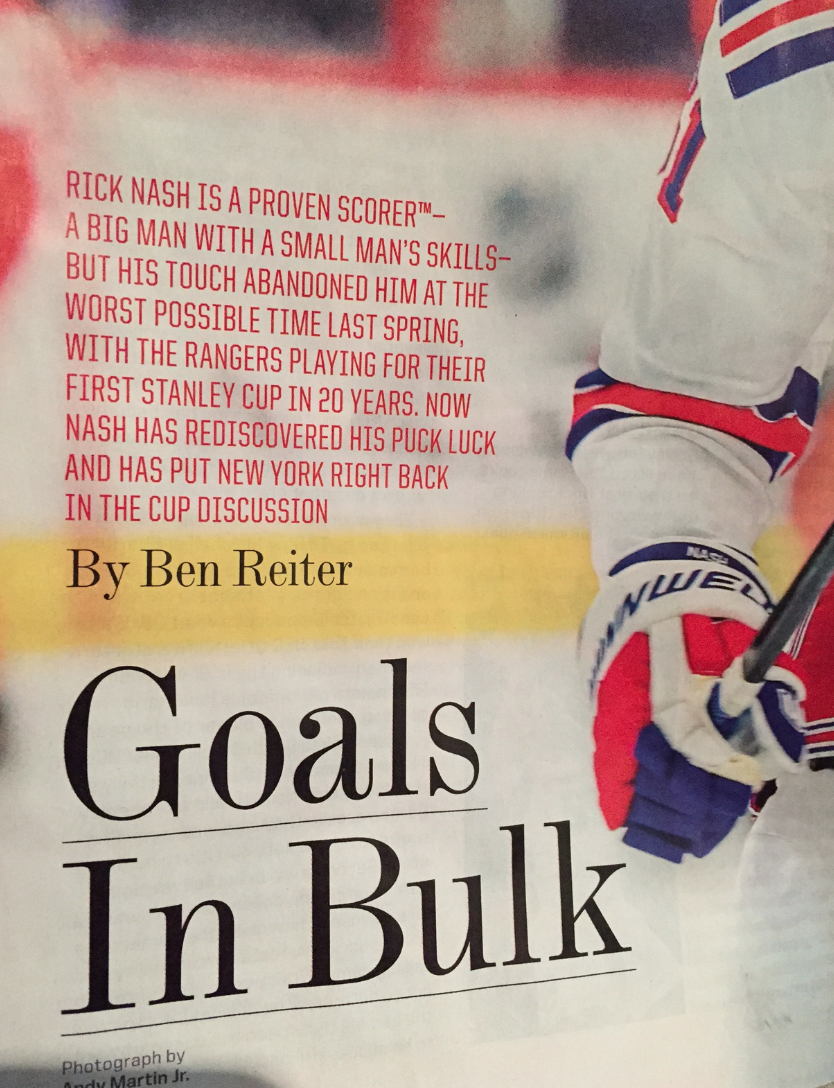
Intellectual property breakthrough!: I like to say that Uni Watch is for people who Get Itâ„¢, and I include the “TM” symbol as a joke. Is Sports Illustrated making a similar joke in the lead-in to this article on Rick Nash, or did “Proven Scorer” become a trademarked term when I wasn’t looking?
There’s another possible answer: Maybe SI just went ahead and sacked their proofreaders along with their photographers.
(My thanks to Caldwell Bailey for bringing this one to my attention.)
My sweet new @uniwatch t-shirt was in the mail slot today. Looking divine. pic.twitter.com/vPEsRL9hND
— Michael DeAloia (@techczarcle) February 5, 2015
@UniWatch @PhilHecken look what arrived today #shirtofthemonth pic.twitter.com/tLjT8B2NkE
— Tim (@deadendnights) February 5, 2015
If you want to send an “action photo” of yourself wearing your tee, feel free. Meanwhile, looking ahead, I’ll reveal the March design at some point next week, and it will go on sale the week after that.

’Skins Watch: Dan Snyder and Co. spent $180,000 on lobbying for the team’s name in 2014 (thanks, Phil). ”¦ The Oklahoma City school district is deciding whether to sell off old uniforms with the now-discontinued “Redskins” mascot. ”¦ Wisconsin point guard Bronson Koenig, who’s a member of the Ho Chunk tribe, is opposed to the use of Native mascots and also thinks the ’Skins name should be changed, proving yet again that only white people care about this issue (thanks, Phil). ”¦ Also from Phil: The ’Skins are still appealing the U.S. Patent and Trademark Office’s cancellation of the team’s trademark protection, but a California congressman is looking to make that moot by introducing legislation that would prohibit trademark protection for anything related to the term “redskins.”

Baseball News: The Giants will unveil their new home alternate jersey today. Phil will have full coverage tomorrow. ”¦ New logo for the Memphis Redbirds, plus a new uniform that will debut in April (thanks, Phil). ”¦ According to Baseball-Reference.com, Hank Aaron never wore No. 4, but it looks like that’s what he was wearing in this photo. Or maybe the second “4” was hidden behind a fold in his jersey (from Adam Treiber). ”¦ Star Wars jerseys/caps upcoming for the Buffalo Bisons. ”¦ You know how Topps will somehow Photoshop a player into a new uniform? Looks like MLB The Show has done that with their PlayStation Canada box cover photo. ”¦ The Fresno Grizzlies will unveil new uniforms today (thanks, Phil). ”¦ In a related item, there’s a uni-related rivalry between the Grizzlies and the Sacramento River Cats (from Jeff Funke). ”¦ UAB softball’s new batting helmets are inspired by the school’s football helmets. ”¦ Stan Musial’s memorabilia shop in St. Louis is closing. ”¦ New bat knob decals for UCal-Santa Barbara (from Ryan Denton). … Truly hideous “Saved by the Bell” jerseys upcoming this summer for the Brooklyn Cyclones (thanks, Phil). ”¦ New uniforms for the Hanshin Tigers, plus a yellow jersey for the Ultra Festival. They’ve also created a separate site to mark their 80th anniversary, with lots of very cool old photos and artwork (all this from Jeremy Brahm). ”¦ Lots to like in this shot of the 1956 Reds, including Big Klu’s cut-off sleeves in the back row (Phil again). … Love this Moose Lodge baseball uni, complete with a “Loyal Order of Moose” sleeve patch! (Great find by Jonathan Daniel.)

NFL News: Here’s a bunch of charts and tables that break down NFL fines and suspensions since 2002. ”¦ Good story about the agency that worked with Tom Brady to develop his personal logo. ”¦ The Jets’ locker room is getting a facelift (thanks, Brinke). ”¦ The NFL’s newfound awareness of domestic violence may mean a lot of blue-ish/teal branding. “Should we prepare for Tealtober?” asks Ron Amadeo. “Please, god, no.” Trevor Williams agrees: “This is the beginning of a story we’ve all seen before with Pinktober, Livestrong, and even the incredibly important but eventually co-opted AIDS ribbon. What begins as a push for change becomes an invisible force telling us that we must buy specific items and wear certain logos so we can feel better about ourselves. And if we go along, we do so not because we care but because we don’t want to feel left out.” ”¦ Thanks to Pats CB Malcolm Butler’s Supe-saving interception, a bunch of his jerseys are being rushed to retailers. ”¦ Here’s more about the Seahawks attempt to trademark, well, everything. ”¦ The Dolphins are adding 32 “living rooms” to their stadium. … Oh baby, check out this 1935 shot of Papa Bear coaching his players in the snow. Not sure what I like better — the striped socks of the zipper-hoodied sweatshirts (big thanks, Phil).

College and High School Football News: Grantland has an article asking, “Where would you play college football if uniforms were all that mattered?” I don’t understand the question’s premise, because I thought the uniforms already were all that mattered, but whatever — suffice it to say that I don’t agree with the writer’s conclusions, but that’s the whole point of that type of article. ”¦ New chrome helmet for NC Central (thanks, Phil). ”¦ Before Joe Mauer was an MLB player, he was a high school QB — and was involved in at least one color-on-color game (from Matt Larsen).

Hockey News: Here’s more on the NHL’s move toward player- and puck-tracking technology. ”¦ “Not only did the NHL create wretched All-Star unis, but now they’re trying to auction off jerseys that were never actually worn by the players,” says Chris Cruz. Key quote from that page: “Jerseys were prepared in black and white for each player prior to the 2015 NHL Fantasy Draft. Once Team Toews (white) and Team Foligno (black) made their All-Star Game selections, the one set of All-Star Game jerseys that were on stage and not needed by the players selected in the opposite color were authenticated and prepared for this auction.” … With the film version of 50 Shades of Grey set to open in a week, I’ve been wondering which team would be stupid enough to do a uniform tie-in. And the answer is the Bakersfield Condors (thanks, Phil). ”¦ Coyotes captain Shane Doan traded a jersey for one of NASCAR driver Kyle Busch’s racing jackets.

NBA News: The Trail Blazers wore their red alts last night to support “Go Red for Women,” a women’s heart health initiative (thanks, Phil). ”¦ Conrad Burry, who’s had more inside scoops than anyone in recent months, has a source who’s given some rough hints regarding next season’s new unis for the Clippers.

College Hoops News: Pink unis on tap this Sunday for the Hofstra women’s team and tomorrow for Central Arkansas (thanks, Phil). … With Miami now under the Adidas umbrella, someone came up with some new basketball uni concepts, and I really like them. But it’s hard to imagine Adidas going with a two-stripe design, eh? … The Auburn women’s team wore orange at home last night. … This is interesting: Joe Bailey’s daughter’s CYO game last night was color vs. color. “Her team is the home team in red,” he says. “Their uniforms are reversible and are white on the inside. With the opposing team wearing black, normally my daughter’s team would just switch, but for some reason they stayed red.” I’ve never heard of reversible jerseys before! Anyone else? ”¦ Whoa — LaSalle’s new unis are, uh, really something (from David Brzybowski and David Cattai).

Soccer News: Lots of new MLS jerseys have leaked. ”¦ New Balance is making a big push into the soccer market. Among other things, they’ve created new uniforms for the first-division Japanese teams Sagan Tosu and Montedio Yamagata (from Tommy Turner Thomas Fiers, respectively). ”¦ Sporting KC will unveil a new primary jersey on March 4. ”¦ Here’s a teaser for the new Columbus Crew jersey, which will be unveiled on March 3. ”¦ Here’s the clearest look yet at the leaked U.S. national team away kit. ”¦ Kansas State is starting a women’s soccer team and is letting fans vote on the team’s crest (from Thomas Kleffner).

Grab Bag: Faaascinating article on how you can tell a lot about a Jewish male from the type of yarmulke he wears. ”¦ Here’s the logo for the upcoming World Weightlifting Championships. According to a quote issued by the host committee, “We wanted to make sure the logo was a patriotic theme of red, white and blue and that it also incorporated stars to represent the State of Texas” (from Kevin Mueller). ”¦ The Canadian network TSN is running an investigative series on the counterfeit jersey industry (from Mike Guterman). ”¦ The Taranaki Bulls — that’s a New Zealand rugby team — are letting fans choose the team’s new logo. ”¦ Mark Doescher thinks the Oklahoma Dept. of Transportation’s new logo looks like a mash-up of the Pepsi logo and the Death Star, and he’s not wrong. ”¦ The police department in St. Petersburg, Fla., is changing its uniforms from green to blue. ”¦ The Cincinnati Bell logo is being added to a downtown Cincy office building. ”¦ Rugby news from Eric Bangeman, who writes: “Les Bleus will be Les Rouges this weekend, as France will wear red jerseys for the first time ever when they take on Scotland in the opening weekend of the Six Nations (rugby union). Scotland is the home team and will be wearing its customary dark blue kit. France has always worn white as its clash color until now. Vivé la merchandise!” ”¦ What if ad agencies were football teams? (From Phil.) ”¦ Really like these prewar Japanese beer posters, although maybe not quite as much as the person who wrote the headline on that piece (thanks, Brinke). ”¦ Ohio State wrestlers are wearing a “KK” memorial patch for Kosta Karageorge, who was actually better known for being on the wrestling team than for his time on the football team. ”¦ UNC, responding to a activist/protest movement on campus, is now requiring that all companies providing school-licensed apparel adhere to minimum worker-safety standards. … New third jersey for the Calgary Roughnecks lacrosse team (thanks, Phil).
So the NASCAR jacket Kyle Busch traded away looks to be a standard Chase Authentics piece that goes for $120-$140 retail, and Busch gets a custom jersey. Even the low end custom jerseys top that price by 30%. Ouch.
Actually, the jerseys don’t cast anywhere near what you think. The teams don’t pay retail. They pay cost. Cost for the jerseys is around $80-90 at the most, and then the name is applied in-house by the Coyotes’ staff or by a local stitcher who the Coyotes already have a working deal with.
In short, it cost the Coyotes about $100 to make up that jersey.
Since the #18 team will be wearing green in 2015, the jacket may be even less costly.
Two typos in the NFL section: 1. Calgary Roughnecks are a lacrosse team and 2. there’s reference to a pic of George Halas, but the link is missing.
All now fixed.
Re: ‘Deadspin has an article asking, “Where would you play college football if uniforms were all that mattered?”” – The link takes you to Grantland…
D’oh! That’s what I meant. Now fixed.
We might disagree on the ranking, but I think most of us are on board with the Adidas hate.
And Auburn’s uniform is a very good one.
Baseball News section: Extra ‘t’ in Playstation
Fixed.
Should be PlayStation with a capital S, but who cares?
Speaking of PlayStation.. the 10th anniversary box for MLB The Show is pretty spiffy
link
The second Hanshin Tigers link seems to be conflated with the ’56 Reds link.
Also, if he UAB softball helmets are patterned after the school’s football helmets does that mead UAB is going to drop softball as a sport? link
“confilated”
Link fixed.
Roughnecks are an indoor lacrosse team. Not CFL
Looks to me like Hammerin’ Hank lost a 4…or wearing somebody else’s uniform top.
an auction for another photo of Aaron. His second 4 is just barely visible. So I think it is just hidden today’s photo.
link
re UCal-Santa Barbara… Native Californian here. The UC schools (and there are about a dozen) prefer abbreviations such UC Santa Barbara or UCSB.
I read that Deadspin article on No More yesterday, and it is very spot on. I feel like they only get behind an issue if it benefits them. Pinktober to sell pink merchandise and build a female fanbase, No More to cover their ass on the whole domestic violence issue. I almost feel companies were told by the NFL to have their Super Bowl commercials be super depressing and attack issues rather than be funny to make it look like the NFL cares. I would not be the least bit surprised if the NFL had that kind of control over that content.
I would not be the least bit surprised if the NFL had that kind of control over that content.
I would, for two reasons. First, the NFL doesn’t actually sell most of the ad time; the NBC network and local NBC affiliate stations sold most of the ad time. Second, as big as the NFL is, it is dwarfed by many of the corporations that advertise in the Super Bowl. Anheuser-Busch inBev, for example, has a market capitalization of just shy $200 billion, more than twice the most generous estimate I can find for the NFL’s equivalent value. Nationwide, which made probably the most super-depressing ads of the day, has assets on hand of $171 billion. Nationwide could buy the entire NFL, including each individual team and the league itself, for cash, today if it wanted to. The NFL is not in a position to dictate terms to advertisers like that.
While the league does have some control over the content, the themes and tone of the ads reflect the current national conversations and cyclical trends more than NFL’s desire to take a more somber tone.
In part, I think there’s fatigue over cheap visual gags and bro humor that’s dominated Super Bowl ads in recent years. So it seems like advertisers have overcorrected en masse and gone with a sober, “We’re totally socially responsible” tone and gone with ripped-from-the-headlines storytelling.
And I think advertisers are also suffering from the Spielberg Syndrome – there’s the expectation that Super Bowl ads have to be either Very Very Big or Very Very Important.
Finally, Super Bowl has become almost too successful for its own good, and the audience is too broad for a lot of advertisers. Now they’re releasing their more breakthrough creatives for programs with marginally smaller but more targeted audiences – conference championships, Academy Awards, etc.
in the 1969 Chrysler ad, Bob Hope is wearing a Cleveland uni. He was part owner of the team. He was in a baseball themed “I Love Lucy” episode, in which Lucy dons an Indians uni: link
Yep. You beat me to it.
Bob Hope had a long lasting affiliation with Chrysler–thus his golf tournament the Bob Hope Chrysler Classic.
Also interesting that in 1969, Bob Hope was such a recognizable figure that there was no need to identify him in the ad. I see ads like that today, where I’m pretty sure it’s someone I’m supposed to recognize, but I’m so out of touch with pop culture now that I usually don’t.
Also, his buddy Bing Crosby was part owner of the Pittsburgh Pirates. Here they are together in full uniform (1946) link
That right there should be the official logo of Postwar America.
Lots of practice jerseys are reversible, depending on which ‘side’ you’re playing on in practice. Color on one side, white on the other.
Game jerseys? That’s a new one for me
A few years ago in the St Louis area both Maryville U. and Lindenwood U. wore reversible game uniforms. Haven’t seen their games recently, don’t know if they still do. First noticed it when a Lindenwood player peeled off his gold jersey after a game and it turned black (complete with number) as it turned inside out.
RE: Reversible shirts
I wore them for basketball as a youth; in fact, my college team wore them as practice jerseys.
Even the football club I support, Manchester United, has recently had a reversible shirt.
link
My youth soccer team (shout out to Arden Park Youth Soccer) had reversible maroon and white jerseys, with white shorts.
Our JV basketball teams had reversible jerseys (red/white). The worst part was the numbers and lettering was iron on, and guys didn’t wear t-shirts underneath, so the numbers would rub off on their skin and the team looked awful 98% of the time.
Umbro made link, though the reverse side was for fashion and not matches.
Growing up we wore nothing but reversible jerseys in basketball and soccer. I’ll try to drum up some pics.
Looks like the Memphis Redbirds are following the likes of the OKC Dodgers and South Bend Cubs in making their branding and uni’s very closely resemble the Big League squad’s…
I guess the best I can say about Memphis is that it’s appropriate to have such a bush-league jersey script if you’re playing in an actual bush league. The script needs to interact in some way with the birds-on-bat element. The bat should cross “in front” of the M, or the M should loop around the bat, or something.
Still, credit to the Redbirds for keeping their name. I’m not a fan of farm clubs adopting the parent club nickname. But a name in the same family works for me.
The Diz looks ecstatic to have his picture taken, especially wearing no pants.
Here is a link to the “Lassie” episode. Lots of great old-time gear being used!
link
Great find Dumb Guy, I’ll have to watch the whole episode later!
That picture of Halas with the players appears to be at Wrigley Field.
All your old meme are belong to us
Is that Peyton Manning modeling the “Satin Yarmulke” at the bottom of this page?
link
So link, I guess.
A different Spanky and Our Gang.
link
Shocking development in LA as link.
Why is this shocking?
It’s not. It’s been Gerrard’s number since 2004, and its incumbent was traded away in January.
link
My kids wore reversible jerseys when they played youth soccer — the whole league had the same ones, blue on one side, yellow on the other.
Thanks for the lede today Paul, it’s always an honor. I’m already working on the next batch of wire pics…maybe for the spring if it ever comes! (0 degrees outside today with more snow on the way, ugh).
Cheers!
~Bruce
Closet Case and Wire Service in consecutive days? Heaven!
In that Robin Roberts photo, am I correct in stating those numbers are sort of a Clarendon/Tiffany hybrid with 7 o’clock drop shadow? WOW.
Also, I guess the NCAA rule of not being about to wear numbers above _5 didn’t apply–unless maybe they applied for a waiver.
link
I don’t think the NCAA implemented the jersey number rule until the late ’50s or early ’60s. I’m aware of some Iowa basketball players who wore numbers with digits above 5 in them as late as 1959.
Hey, Vee – I don’t think anyone answered your question about Durene yesterday. Here’s the best link I could find:
link
This article backs up most of what I’ve heard about Durene. From my understanding, it’s a durable, thick-knit cotton fabric that was supposed to stand up to heavy wear. I’ve heard the fabric described as “treated” before (perhaps that’s what the article is alluding to when it talks about “specialized processing”), but the main the feature that distinguishes Durene is the way that it is knitted. I hope that helps.
Thanks! My dream is to find a stash of new old stock durene for DIY’s. Can you imagine?
It might be worth trying to get in touch with folks at link. They promote their use of “link,” including “Cotton Durene.” I don’t know if they’d have surplus material or info on a supplier, but it couldn’t hurt to ask.
Durene was also called “cotton-backed rayon.” It was made by a complex knitting machine that cotton and rayon were fed into. The rayon is the outer face, the shiny side. That was the flashy element. The cotton was the comfortable soft side, to go against an athlete’s skin and absorb sweat. This was “performace” fabric way before Nike, adidias and UA started spewing their rhetoric.
Durene was a brand name, but now, like Coke, it’s become a generic name for a type of fabric.
When the double-knit revolution hit in the late ’60s/early ’70s, it was so comprehensive that no one wanted durene knitting machines anymore. It was cheaper to dismantle them on site than to even pay someone to haul ’em away.
Finally, durene, as wonderful as the fabric is — and it’s my fave, too — is environmentally awful. It leaves a lot of waste and the fibers floating through the air can be harmful to mill workers.
This is why it’s hard to find mills that make durene — lack of machines, and the wasteful byproducts.
Great info! Thanks!
In that Cy Young picture, it appears the kid lying prone at the bottom right has his name (or something else starting with “US”) on the back of his jersey. Perhaps the name of his team?
The “Old Timer” uniform was one Cy Young obviously liked to wear: link
How about the kid wearing the corporately named “Coca-Cola” jersey? Talk about burying the lede.
That leaked U.S. National soccer jersey reminds me an awful lot like that awful Russia jersey, with the colors reversed, of course.
Cool throwback pics! As to the college football relation to grantland, why does everyone rag on Adidas as an outfitter? I honestly don’t see an issue.
why does everyone rag on Adidas as an outfitter?
Because they seem to stick every team in the same template more blatantly than the other manufacturers? (Fruit Stripe NCAA basketball uniforms, Xmas NBA uniforms, etc) Because they’ve turned UCLA Stripes into an absolute joke? Because their newest football jerseys have a completely pointless pattern on them that makes them look like Glad ForceFlex trash bags? The only good thing Adidas has going for them is that they could actually produce proper “Midnight Green” jerseys.
For all the sins committed by Nike and Under Armour, they at least get that individual schools like having an identity beyond the uniform supplier (Oregon and Maryland are the exceptions that prove the rule). To wit, Alabama and Auburn uniforms are left pretty much alone. Adidas has messed with Nebraska, Notre Dame, etc, teams that require no messing around.
While some uni-buffs may take pleasure in the aesthetics of the uniforms of minor league baseball teams, I must admit that I find absurd the very idea of affilliated teams having their own identities.
The teams in the affilliated minors exist for the sole purpose of grooming players for the parent club. They’re not even really trying to win; indeed, their best players are always taken away (promoted to the next level) before end of every season.
I was a fan of the now-defunct Newark Bears when they were in the independent Atlantic League. The Bears were actually a club, as are all other independent-league teams. They employed their own players, manager, coaching staff, and front office, whose sole job was to win for the Bears. Of course, it was always good publicity if a Bears player was signed by a Major League organisation (as happened with Jose Lima, Bobby Hill, and even Rickey Henderson). But the Bears team existed as a true entity in itself.
The experience rooting for the Bears and following the independent Atlantic League awakened me to the hollowness of the concept of affilliated teams having their own identities. So this is why I think that, despite the occasionally entertaining (and often ridiculous) uniforms of minor league teams, there really should be no “Fresno Grizzlies” or “Sacramento River Cats”.
These affilliated teams are not clubs. They employ no players (with the occasional exception, such as Razor Shines with the Indianapolis Indians during the 1980s), coaches, or managers; and their front offices have no player-personnel duties. For this reason, these teams should be called “Astros AAA”, “Giants AAA”, and so forth; and they should have the same uniforms as their parent clubs — just as Barcelona’s B team is simply called “Barcelona B” and wears the same uniforms as the main club.
No.
Part of me wants to agree with you… but I grew up watching the Toledo Mud Hens, and the idea of them just being Tigers AAA instead really bothers me for some reason.
I hear that. It’s a fine line between just being a development farm and being a part of the community. It’s the difference between “that team is here” and “this is our team.” Obviously, something can develop as both, when you have a long-term affiliation, like the Toronto Marlies and Maple Leafs, or the Paw Sox to the Red Sox.
It’s also a continental paradigm. Barcelona B works because the red and blue stripes with gold numbers are a municipal uniform across sports. That just isn’t true here in the States.
I think if I had to nail down a “system,” I think I’d be OK with unique team identities, with the understanding that the look can change with the affiliation. In other words, the Paw Sox could be a rose as sweet by any other name, but as long as they’re with the Red Sox, they should absolutely use the McAuliffe numbers and Tiffany arch name.
I worked as an intern for an NBA D-League team, and I can assure you that the players coaches, front office staff, everyone, wants to win. Fans don’t show up to watch a team that doesn’t win. You can make the game atmosphere as fun as you want, have fun theme nights, do promotions, but the best way for people to have fun is to win.
Another way is to name the team for the parent club and to play in the same market, as the Westchester Knicks have done. Even if Westchester isn’t a big winner, Knick fans will be interested in the affairs of that team.
I as a fan of the Nets am very jealous of that, as the Nets currently have no exclusive D-League affilliation, and previously had one only with a team in Springfield, Massachusetts. I’d love to see the Nets put a D-League team in the Coliseum (their former home arena, which is about to be refurbished under the direction of the owners of their current home arena), and call it the New York Nets!
Naming an affilliate for the big club is really just a more transparent way of operating.
The teams in the affilliated minors exist for the sole purpose of grooming players for the parent club. They’re not even really trying to win; indeed, their best players are always taken away (promoted to the next level) before end of every season.
That’s precisely why a team would want to have a strong identity that’s distinct from the parent organization. Because the players won’t stick around long enough to forge a strong connection with the local populace, you need the identity to do the heavy lifting. Now, it’s when the minor league team plays close to the parent team – Staten Island Yankees, Potomac Nationals and Pawtucket Red Sox certainly don’t see the need to reinvent the wheel. But why would someone in Durham, N.C. care if a Bulls player ends up becoming a trade bait for the Tampa Bay Rays?
And that’s why the comparison to Barcelona B and Real Madrid Castilla don’t work. Their fans (if they have any) are likely to support the senior sides. But there’s a reason Vitesse Arnhem don’t call themselves “Chelsea B” and wear blue Adidas shirts with “Samsung” on the front.
Right, that’s a good point about some affilliates being far from their parent clubs, and thus not having the built-in parent-club rooting interest that the Pawtucket Red Sox enjoy. But that calls into question the very idea of affilliating with minor-league teams that are located far from the parent club’s city.
When it comes to AAA, I’d really like to see a system that resembles the reserve-team system in English football. Often the reserve teams of two Premier League clubs will play one another on the day before the meeting of the main clubs. Likewise, it would be great if the AAA team of every Major League club travelled with the big club, and played their games in the morning or afternoon, before the big-league clubs took the field. This way, every AAA team would be based in the same city — in the same stadium — as its big-league parent.
Regarding the lower-level affilliates: just as cities in Florida and Arizona take pride in being known as the “spring home of the St. Louis Cardials” or any other big-league team, a city in any state could easily take pride in being, for example, “the home of Royals AA”. And, in a generation’s time, there would indeed be a great deal of fans in that town whose favourite Major League team is the Royals.
But this would require big-league clubs to actually own the minor-league teams, and thus to have the associated headaches of getting stadia built and then maintaining the stadia. Which gets us to the real reason that the affilliation system persists: so that these difficult on-site responsibilities can be off-loaded onto the front offices of the minor-league teams.
Your proposed naming convention may work fine for European soccer teams, whose reserve sides invariably play in the same city as the parent clubs and thus appeal to the same general fan base. But would renaming the Nashville Sounds to “Athletics AAA” do much to build goodwill (and, consequently, attendance) among baseball fans in Middle Tennessee? As the saying goes, most fans root for “the name on the front of the jersey, not the back.”
People want to root for teams they have a connection to. And the minor league teams have a vested interest in developing ties to the communities where they’re located. Static, often regionally-based team names seem like a reasonable way to help form those connections.
And, for what it’s worth, I disagree that minor league teams in the official Major League Baseball developmental system are not “clubs” in their own right. The teams are almost all independently-owned with plenty of employees who are not on a Major League team’s payroll. Calling a team “Atlético Madrid B” may work fine when it is a wholly owned subdivision of the parent organization. But I don’t see how that’s the best course of action for a minor league baseball team whose tenure in its home city may very well outlast the affiliation with its Major League parent.
Anyone else catch the date on the cheerleader photo? :O
Nice job on the Fifty Shades of Grey jerseys, Bakersfield Condors! They’ll be a big hit with your target fan base of families and young kids!
Let’s hope they don’t give out bobbleheads!! **
** my best joke ever!!
Re: the firing of Sports Illustrated’s photo staff.
I guess it just reached a point that, given the steadily declining quality of the mag’s paper stock and print quality, they decided that the photos could be done by just about anyone. Given the flat contrast and ink bleed-through, he magazine has looked like shit for a while now. It had to be tough for the photographers to see how a great shot looked in print.
No.
They decided, as most media outlets have (and, in a larger sense, as much of the American employment market has), that it’s cheaper to lay everyone off and then use them as freelancers than to keep them on staff and have to give them benefits. The end.
a.k.a. “dumbsizing”. The re-hired freelancers are billed at a higher rate, but they come out of a different budget, so hey, creative accounting!
Higher direct wage to the contractor, but no expense for payroll taxes and benefits. Company still comes out way ahead.
Giants’ alt is now live:
link
So… I didn’t quite nail it a few years back: link but I think I was close.
Are the NOB’s and numbers gonna legible this time? Or are they gonna be black on black with the orange outline?
NNOB (remember, Giants don’t wear NOBs at home).
Numbers are indeed black-on-black with orange outline.
Brain fart. That SF breast logo reminded me of the road alt.
Thanks. But ugh. I hate Hate HATE monochrome numbers.
I thought it would be white, and possibly orange, with the SF logo but I guess I was wrong. Looks okay.
I really don’t like the black on black, especially with the SF logo. Its disjointing given that they have plain orange on the cap. I don’t understand why the Giants have shifted to this template of triple sleeve/pant stripes and single headspoon. Its bad enough in black but its looks really odd in orange.
Its a shame because their home jerseys are so fantastic, I even like the orange on occasion. They really need to cut down to one grey, one cream, and one alt.
I’ll pipe up in favor of the monochrome numbers; San Francisco’s colors are electric enough to be readable. About the only detail they’ve fumbled in recent years is the headspoon on the road uniform.
The shade of orange used for the piping on the placket and sleeves is noticeably different than the shade of orange used for the outlined “SF” logo. I hope that’s an issue with the quicky photoshopping and now how the actual on-field jersey is going to look.
Man. If only the SF and number were orange, instead of black-on-black, that wouldn’t suck.
Still wouldn’t be a good baseball jersey, but it wouldn’t be a crime against the sport. But credit the Giants with consistency in their recent campaign to ugly up what had been one of the best uniform sets in baseball history.
I’d be willing to support these jerseys if the Giants paired them with black pants. But otherwise all we have is another in the growing number of softball jerseys being worn by MLB teams. Yuck.
I hope the Dodgers never go the softball jersey route!
Late proofread: typo in “What if ad angecies were football teams?”
* Leo Burnetts missed an opportunity by not incorporating link.
* Amusing that Grey isn’t grey.
* Wieden+Kennedy should’ve just used Oregon unis
Fixed.
Paul
Many youth teams wear reversible uniforms now. Not just the old reversible mesh practice jersey, but pretty decent uniforms that are reversible. Saves money and takes away the chances of a red vs. red game. I’ve even seen a few high school teams do it.
Here are some from Alleson Athletic.
Shorts, link
Jerseys to match, link
The middle school boys and girls teams where I teach have very nice, tackle twill reversible uniforms from ProLook. I couldn’t find them on their website so I’ll try to send a pic your way.
The name Allenson Athletics any relation, Alex Allen?) is probably taken from a person’s last name or a town’s name, but I swear, when I was reading this peripherally, I saw “Allen Iverson.”
The name “Alleson Athletics” is a Rochester, NY-based manufacturer. The company name “Alleson” is a contraction of “A. Levine and Son.” Thus “Alleson.” The original name was “Don Alleson Athletic” The “Don” was for Don Levine, the son of former CEO Bill Levine and grandson of founder Abe Levine. Donny Levine passed away at a very young age and his name was added in order to honor him. Alleson started out as E. Rosenstein and Sons who did a lot of contract sewing for another Rochester company Champion Products. Champion eventually cut ties with Rosensteins and Bill Levine got pissed off and started Alleson.
Through the mid-1979s Rosenstein made custom baseball caps under the E. Rosenstein label that were every bit the equal of New Era. We at Ruby’s sold Rosenstein caps to the Rochester Red Wings in the 1950s and early 1960s.We also sold them to many Section V high schools because of their faster delivery than New Era.
An intramural basketball team I was on back in 1989 wore reversible jerseys. Black with yellow screen printing one on side, yellow with black print on the other. I think I still have it in a box somewhere.
You know how they donate all the Super Bowl/NBA Finals/World Series/etc. shirts and stuff to third-world countries? Wouldn’t it be ironic if so many needy people started wearing these “Redskins” apparel that they become fans? It’d be MORE ironic if it was donated to needy/poor Native Americans. Yeah, the people in charge wouldn’t be that stupid or else they wouldn’t have replaced the mascot’s name in the first place, but as we saw in Super Bowl 49, smart and well-meaning people can sometimes make one poor decision.
@Conrad Burry: that source’s posts got me excited, and it was funny how he answered questions, “You Enquired Secretly”?
Now I’m reading more stuff about Bucks, Hawks, Raptors and Sixers (that one was old). This year was relatively boring for me in term of NBA stuff (Bobcats-to-Hornets move was awesome but the jerseys were underwhealming) so I’m glad there’s something cool to look forward to next season!
I know it’s not always possible, but I like when minor league teams have nicknames/mascots that are tangentially related to the major league squad, as with the Redbirds/Cardinals.
Another example (hockey wing) is the LA Kings, whose two minor-league affiliated teams are the Manchester Monarchs & the Ontario Reign.
Nice way to ensure each team has a unique identity while also providing a sense of continuity throughout the organization.
“Little-known fact: Baseball Hall of Famer Robin Roberts was link in the late 1940s.”
Is that a BFBS uniform Robin Roberts is wearing, all the way back in 1947? I know it’s hard to tell on old black and white photos, but it looks black with green numbers outlined in white. Could this be one of the first examples of BFBS? Interesting.
Ain’t research grand!
I always liked the team name “Memphis Chicks” rather than “Memphis Redbirds”, assuming a chick was a baby bird. However, “Chicks” is an abbreviation of “Chickasaws”, a Native American tribe.
link
“Here’s the clearest look yet at link.”
Remember a few months ago when Adidas took over the contract for Belgium’s men’s national team and created their new uniforms by simply link? That’s what it feels like Nike is doing with the new U.S. away kit.
I screwed up. France-Scotland match is at Stade Francais in Paris, not in Edinburgh.
Cubs spring training number porn: link
I was wondering when the Team Our Gang pic was one – before or after Hal Roach sold the franchise to MGM….
Not eligible to vote for Kansas State women’s soccer, but as a Saskatchewan Roughrider fan, any logo from a prarie team with wheat in it appeals to me.
Little Rascals uniforms wow, especially the patch-priceless I bet.
I would never spend the $ on the Giants alt but man I love SF Giants colors
Terrible Giants jersey. MLB needs to divorce Majestic ASAP.