As you may have heard, we’ve gotten a wee bit of snow here in the Northeast. My thanks to everyone who’s expressed concern about my well-being, but no worries — while we certainly got our share of the white powder, the doomsdeay forecasts turned out to be a false alarm (at least for NYC, although other areas may still get walloped), and I’m happy to report that everything is fine here at Uni Watch HQ, where the power is still on, the radiators are clanking away, and Uni Watch mascots Tucker and Caitlin are purring contentedly by my side. My morning commute (from the bedroom to the living room) was unaffected by the storm, and I have plenty of Cheerios, Diet Coke, and cat food — you know, the essentials — so it’s pretty much business as usual around here.
“Collector’s Corner” columnist Brinke Guthrie — who lives in California, 3,000 miles away from the snow — has taken an unusual interest in this storm. At one point yesterday he wrote to me with a suggestion:
Here’s an idea for tomorrow: Compare the parkas used by news teams from CNN and Weather Channel. TWC has long had a deal with LL Bean, while CNN has its own branded gear.
I liked that idea — a Uni Watch approach to the blizzard. But why limit ourselves to CNN and TWC? So I put out a call, which prompted a bunch of good responses (many of them, as you’ll see, from Chris Howell — thanks, Chris!):
What brand of "uniforms" (i.e., jackets, parkas, etc.) are TV weathermen wearing? Tweet screen shots this-a-way. pic.twitter.com/rOdJBqp0A7
— Paul Lukas (@UniWatch) January 27, 2015
@UniWatch Weather Channel pic.twitter.com/yrtlJ70dQk
— Chris Howell (@chrishhowell) January 27, 2015
@UniWatch Note the sweet CNN hat! pic.twitter.com/4a3b5dIgJy
— Chris Howell (@chrishhowell) January 27, 2015
@UniWatch Weather Channel pic.twitter.com/YAweIYQWlc
— Chris Howell (@chrishhowell) January 27, 2015
@UniWatch Weather Channel pic.twitter.com/iHfsRHCP0P
— Chris Howell (@chrishhowell) January 27, 2015
@UniWatch Columbia! pic.twitter.com/sQRrW7115D
— Mike Nessen (@miken623) January 27, 2015
@UniWatch CNN pic.twitter.com/AB17wQc66D
— Chris Howell (@chrishhowell) January 27, 2015
@UniWatch No brand name visible but looking miserable. pic.twitter.com/oKWbfqAjlG
— Mike Nessen (@miken623) January 27, 2015
@UniWatch The mayor of Providence, RI has the city crest (?) on his coat. pic.twitter.com/O7W6sP2a6y
— Chris Howell (@chrishhowell) January 27, 2015
@UniWatch MSNBC pic.twitter.com/5L7NJiFXxj
— Chris Howell (@chrishhowell) January 27, 2015
@UniWatch CNN pic.twitter.com/DQqb3xdvJ3
— Chris Howell (@chrishhowell) January 27, 2015
@UniWatch MSNBC pic.twitter.com/Vi0tMPg6Yg
— Chris Howell (@chrishhowell) January 27, 2015
Those CNN folks love their network-branded gear. pic.twitter.com/Up7QULUSRg
— Paul Lukas (@UniWatch) January 27, 2015
#Snowmageddon2015 Weather Channel's low profile look from @LLBean. pic.twitter.com/k2hTS9TH3Z
— Brinke Guthrie (@brinkeguthrie) January 27, 2015
#Snowmageddon2015 NBC News wearing the red parka look. pic.twitter.com/R9l9HwyJHz
— Brinke Guthrie (@brinkeguthrie) January 27, 2015
#Snowmageddon2015 NBC News also going with the blue look. Looks heavier than the red parka or jacket. pic.twitter.com/qMvy8cCKGp
— Brinke Guthrie (@brinkeguthrie) January 27, 2015
#Snowmageddon2015 @andersoncooper @CNN AC lo-profiling it in what looks like Eddie Bauer or LLBean. No CNN logo. pic.twitter.com/FLed8fTCiL
— Brinke Guthrie (@brinkeguthrie) January 27, 2015
#Snowmageddon2015 OK, check out the CNN ski cap or..whatever U call them. pic.twitter.com/ealHbW7LyF
— Brinke Guthrie (@brinkeguthrie) January 27, 2015
Like the @CNN hat @BrookeBCNN is rocking. We need similar ones at @MLB .com for April & October games. cc: @UniWatch pic.twitter.com/6P5zX4MplY
— Mark Sheldon (@m_sheldon) January 27, 2015
@UniWatch More CNN branded gear going late into the night. pic.twitter.com/jY878xdsG5
— Patrick Frey (@p_frey) January 27, 2015
@UniWatch The North Face! pic.twitter.com/eJOY9Gr0BC
— Mike Nessen (@miken623) January 27, 2015
@UniWatch WBZ (CBS) in Boston wearing Columbia for the blizzard. Stay warm. pic.twitter.com/Zn9uJevdtg
— Mike Slavonic (@mike_slo) January 27, 2015
@UniWatch Fox CT wearing L.L.Bean pic.twitter.com/an4cow7K9E
— Mike D (@mike3783) January 27, 2015
Meanwhile, here’s an odd design-related aspect to this storm: Some of the snowflakes are coming down in perfect (or perfect-seeming) star shapes. I haven’t witnessed this myself, but my friend Carrie has, and so have lots of other people:
Whoa! Snow falling in perfect stars in jersey city pic.twitter.com/v49vbit9KA
— Stephen Stirling (@SStirling) January 26, 2015
Bizarre, right? And the stars are six-pointed, like Stars of David — Jewish snow! There are additional examples, and a bit of an explanation, here.
I’m hoping to go sledding at some point today, but the park may not be open to the public (high winds, risk of falling tree limbs, etc.), so that may have to wait. Soon, though.
Actual sports uniform news? Sure, why not: Chinese New Year is still more than three weeks away, which means it’s time for the NBA to start selling unveil some new uniforms to mark the holiday. First up is Golden State, which is apparently trying to set some sort of record for the most different sleeved jerseys worn in a season (if you can see the slideshow below, click here):
Not bad. The colors work, and I particularly like the meander down the side (okay, so I mainly just wanted an excuse to say “meander,” which is what that pattern is called). But the front uni numbers seem misplaced — would’ve been better off putting them on the sleeve. Additional info, including the dates when this uni will be worn, can be found here.
Meanwhile, the Rockets also have a Chinese New Year uni. This isn’t really news, because the design was first reported back in September, but this is the team’s first official acknowledgement of it (click to enlarge):

This one strikes me as much less interesting (which isn’t surprising, given that everything else about the Rockets’ visual program is also less interesting than the Warriors’). Further info here.
Click to enlarge
Collector’s Corner
By Brinke Guthrie
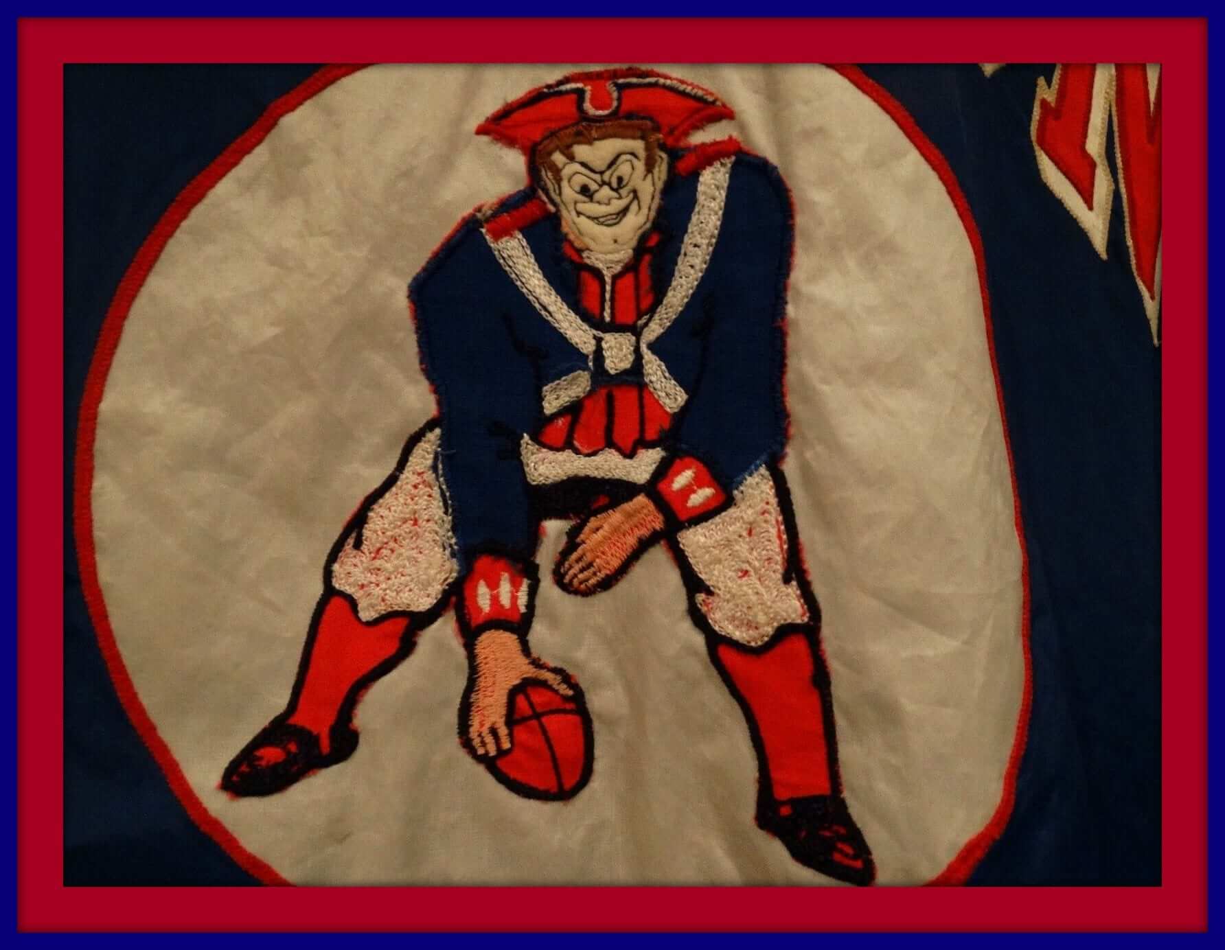
With the Big Game coming up on Sunday, Pat Patriot has never looked as crazed as he does on this 1960s Boston Patriots sideline parka. Pair it with this game-used 1960s helmet. Next, a 1964 Chargers/Boston Patriots game program. As for Seattle, I love the look of this green Starter Seahawks jacket. Also, Puma had an NFL license for about a minute, and this Seahawks jacket was one of their designs.
As for non-Super Bowl-related items:
• This experimental NHL puck was supposed to be more visible on TV.
• Ushers at 1970s Comiskey Park wore these sweater vests!
• Take a tip from the pros and look at this 1960s United Airlines NFL poster.
• The Blackhawks logo was blanked out on this 1970s Tony Esposito goalie net. Boy did I love street hockey. Doug Beerman’s driveway garage door in Terrace Park took a fierce pounding back in the day.
• Fairly creepy-looking 1970s San Diego Padres doll here.
• This 1970s NHLPA clipboard has players Lanny McDonald and Ken Dryden on the front, and all the team logos on the back.
• Maxwell House and the Brewers offered this 1970s thermal coffee mug. The Brew Crew also gave away these Koss seat cushions.
• Normally I don’t link to any eBay auction that uses the term “Man Cave,” since it’s such an overused cliché. But I made an exception for this 1970s NFL pillowcase — wow!
• Love the look of this 1970s Cubs jacket made by Felco.
• Here’s a nice collection of 1970s NFL team stickers.
And finally, here’s a note from reader Dave Guenther: “I loved seeing your Collector’s Corner from last week with the NFL Sears Ad. Perhaps like you, as a kid I spent hours ogling all the different jerseys and jackets in the ads and catalogs in the ’70s. It was a happy day when my parents presented me the very same Bengals jacket in the ad you featured last week. I still have it — here’s a shot of my son Owen wearing it today.”
Follow Brinke on Twitter: @brinkeguthrie
T-Shirt Club update: Big thanks to the 135 of you who ordered the T-Shirt Club’s February design. You shirts should be arriving no later than Feb. 11 (and, in many cases, well before that date).
The March design will launch on Feb. 17 (three weeks from today). I’ll preview it for you at some point the week before that.
Uni Watch News Ticker
By Garrett McGrath

Baseball News: Here’s a shot of an MLB ump wearing a Cubs cap and a windbreaker during a game at Wrigley. Must have lost his luggage. That’s Ernie Banks at first base, and the opposing team was the Expos, so the game had to be from 1969, ’70, or ’71 (from Brian Burns). … What happened to the Marlins’ road grey uniforms? (Thanks, Phil.) … A nice sale of Topps vintage shirts at rock-bottom prices (thank you, Jimmy Lonetti). … Some fans think it’s time for Cleveland to bring back the crooked-C cap and the red jerseys. … Reader Adam Herbst took a photo with the touring World Series trophy at the Yogi Berra Museum in New Jersey.

NFL News: With the Super Bowl just a few days away, here’s a design history of the Patriots and Seahawks (thanks, Brinke). … The Seahawks’ players and coach have a healthy portfolio of trademarks (from Kyle Hanks). … A dedicated Seahawks fan in Arizona showed team spirit by painting his house and yard with a Seahawks theme (thanks, Paul). … Super Bowl Media Day will have its own uniforms (from Willie Gabel). … “Saw this odd thing on the Bills website: In the ’93 Pro Bowl, Nate Odomes (CB) wore a blue facemask, while all the other Bills were wearing the then-standard white facemask,” Don Lehman says.

College Football News: An Ohio State fan paid tribute to the late lineman Kosta Karageorge with a buckeye-themed cake (thanks, Phil). … The University of Central Florida is adding a 10,000-square-foot beach-themed club to their stadium (thanks, Mike). Here is a larger look of the artist rendering (thanks, Phil). … A Mexican football team is using Mizzou-style rip-off jerseys, complete with fake Nikelaces (thanks, Phil).

Hockey News: Here’s a list of the 20 best hockey sweaters you’ve never seen from leagues outside of the NHL (thanks, Phil). … Andrew Daniels is looking forward to next year’s Winter Classic: “It’s going to the Bruins hosting the Habs, which sets up a potentially beautiful color-on-color game.” ”¦ Here are the uniforms from last night’s AHL All-Star Game. No neon! (From Leo Belill.)

Soccer News: “Players of Cambridge United, who play in the fourth tier of English soccer, were told before their FA Cup matchup against Manchester Untied that they’d be fined if they swapped shirts after the game because the club can’t afford to replace the shirts,” Yusuke Toyoda says. “A local law firm offered to cover the costs, but no worries: a Cambridge player got a Man U shirt without giving up his own shirt.” … Also from Yusuke: Belgian authorities are considering stadium bans for Standard Liège fans who displayed a banner with a decapitated head of an opposing player.

NBA News: The Warriors made a life-size Manute Bol bobblehead (thanks, Brinke). … “I wanted to send over this illustration our graphics designer did for an event we are doing at the company I work for,” Paul Kos says. “We wanted to have a sweet poster as an invite for the Cavs vs Bulls game and here is what he came up with. The artist is Trip Carroll and you can see more of his work on his site.

College Hoops News: Eastern Michigan University’s men’s and women’s basketball teams plan a tribute in memory of Shannise Heady by having her number 32 embroidered on their jerseys (thanks, Phil). … The coaching staffs of both Maryland and Northwestern paired gray sneakers with their suits on Sunday night in College Park instead of standard dress shoes as part of the American Cancer Society’s Suits and Sneakers initiative (from Stephen Murphy).

Grab Bag: Here’s a fine photograph gallery of cycling shoes and helmets at Australia’s Tour Down Under (from Sean Clancy). … “Iowa State University’s wrestling team hosted a “Military Appreciation Day” for its match on January 25th against Oklahoma State, which of course meant they wore G.I. Joe singlets,” Kary Klismet. “They looked pretty much like you would expect them to look on the mat.” … New Adidas sneakers pay tribute to vintage space suits (thanks, Brinke). … India prime minister Narendra Modi has a suit with his name sewn into it as pinstripes (thanks, Mike). ”¦ At the Windsor RSL Speedway in Australia in the mid-1950s, driver Bill Shevill wore a leather jacket over his racing overalls as protection against the rocks and stones that were thrown up off the track by other cars (from Graham Clayton). ”¦ Stuart Ciske found some old Chicago-centric footage from the 1940s. “From 22:20 to 25:00, it shows golf (maybe Medinah?), horse racing, Cubs, White Sox and tennis,” he says. “Although color is faded, some great shots of unis, Wrigley and old Cominskey parks.” ”¦ Want to see the Iowa State logo made out of Lego? Sure you do! (From Cody Dannen.)
“Saw this odd thing on the Bills website: In the ’93 Pro Bowl, Nate Odomes (CB) wore a blue facemask, while all the other Bills were wearing the then-standard white facemask,”
Odd. I wonder how/why that happened. Were the Bills actually thinking about switching back to blue masks? Did his normal mask get damaged and the EQ guys just swapped it with an extra one from a Seahawks helmet? The Bills did wear blue masks back in the early 80’s, but I doubt very seriously that Odomes would have used a decade-old helmet.
Odomes was the only one wearing the blue mask (I think there were 6-7 Bills in that Pro Bowl.) My best guess is the same as yours Jeff – He needed a new facemask and the blue one was the only one available.
Oddly enough, Odomes did end up playing for the Seahawks the next season, but there’s no way he would have been signed already by the Pro Bowl.
It really does look like the blue facemasks that the Bills used through 1986, but Odomes was a rookie in ’87, so it seems odd that he would have ever had one of those in the first place.
The Expos-Cubs game in question must be Apr. 11,1969. The baserunner is Manny Mota (only player to wear 15 for the Expos during 1969, the only season they wore the MLB logo on their sleeve) and he was with the Expos until June 11, 1969. The only series Montreal played in Chicago prior to that was from Apr. 11-13 and the only game Mota appeared in that series was on Friday the 11th. It would make sense for the umps to be without their gear for a series opener.
link
That would make Dick Stello the ump in question
link
And I just noticed that Banks, Mota and 1969 are all part of the picture URL ….
“…Mota (Mota..mota..”
link
Good work! When I saw the picture, I started doing my own detective work (not noticing the URL), narrowing it down to Mota and his Expos stint in 1969. Before I went any further, I decided to check the comments section to see if someone had already beat me to it and, of course…
I love taking old ballpark game photos and trying to figure out exactly the who/what/when. Sometimes it’s challenging but uniform clues are important.
That awesome Expos number font… why did the team give up on it?
The Expos gave up on a lot of things in their last decade or so of existence.
But too right about the number font. I think it would look fantastic with the current Nats uniforms as well. Their Cowboys-esque numbers are just all sort of wrong – particularly shape and weight – when paired with the curly W. Those old Expos numbers, however, would provide much better visual balance with the Curly W and the “Washington” script.
Because once Bronfman sold the team, the new management couldn’t find its own ass with two hands and a map. Player development was great, but they made so many mistakes on the business end.
I also found a different box score that gave the weather conditions for that day and it was listed as 42 degrees and sunny, so that fits with the photo and the fact that a lot of the crowd were wearing sunglasses.
One other interesting about the photo. Ernie and Stello were casting the correct shadows based on where the sun would have been for a 1-1:30 start, but Mota seems to cast no shadow at all.
i can’t get the buckeye cake link to work
Fixed. Here’s the proper link:
link
Can we not link to Bill Schoeninger articles any longer? That hockey jersey article’s title is click-bait.
There are so many obvious choices outside the NHL, yet his entire list of composed of Canadian junior hockey, and then he goes ahead and screws that up too.
He missed the Ottawa 67’s barber pole. He chose the Brandon Wheat Kings’ black jersey over their incredible yellow jerseys. He threw Medicine Hat in there despite Prince Albert’s new uniforms being infinitely better. He says nothing of the Quebec Remparts.
One of the worst articles ever. I’m pretty certain he knows less about junior hockey uniforms than the people he’s trying to attract with this article.
The article mainly reminded me of how awful that swooped curved bottom hem looks on the Reebok edge when paired with horizontal striping.
It is terrible. Those aren’t even all the best jerseys in the CHL.
If you are going to got with current jerseys the yellow Wheat Kings jersey is miles ahead of the black.
If you were to go back in time with the list I’ve always liked the ones Wheat Kings look from this era – especially the crest:
link
Don’t like their current regular logo as much, but not sure why they changed from the more interesting look they had with that logo to the current blander one.
link
Oddly enough, that NHLPA clipboard doesn’t have all the teams’ logos on it. Missing are the Minn. North Stars and Calif. Golden Seals. Assuming this clipboard predates the debut of the Wash. Capitals and KC Scouts, the Seals franchise would still have been in Oakland at this point.
Actually, based on the Canucks logo, that clipboard would have to date between 1978 and 1980, so the missing logos are the North Stars, Capitals, and Rockies, since the Seals/Barons franchise folded by way of merger with the North Stars in 1978.
The Padres doll is not from the 70s. It has the uniform they started wearing in 1985.
The seller claims in the description that his mom bought it in 1970, but given the uniform design, I’d have to doubt the accuracy of that statement.
1969 ad for kids’ Expo uniforms:
link
Page 23 of that paper, which I can’t get a link for, is a full page ad for electronic Expos tickets.
A less-than-shocking headline:
link
Nothing about the umps in Chicago, unfortunately. But I did stumble across this uni-related gem:
Lou Brock, the Cardinals’ base-stealing flash, has uniforms with the shirt tails cut off. “They bunch up at your sides and give you strawberries,” Brock explains. Maury Wills of the Expos has the same kind of uniforms.
It’s on the unlinkable page after link, which also has ads for Canadiens’ playoff tickets and the Expos apologizing for substandard service.
Im sure this has been mentioned before but that “Crooked C” Indians logo is almost as controversial as Wahoo is.
What makes it controversial? It’s just a letter…
link
Only because people are stupid.
It’s not like it’s Comic Sans or something.
I never did understand the controversy behind that lettering. It doesn’t look particularly Native American in the least — it looks more like ancient Greek handwriting — but I can’t find a single reason to see it as offensive.
What the Indians should try is to label their uniforms in the alphabet Sequoyah created for the Cherokee language. I can’t remember if I ever posted it here, but I once Photoshopped a Cherokee-alphabet wordmark onto a Cleveland Indians uniform. My 7shopping skills are terrible but it was still fun to do.
To me, it looks like two things: Midcentury National Park / campground signage, particularly like you used to see carved into wooden signs; and midcentury film and advertising lettering accompanying Indian imagery, particularly with regard to Western genre films and Western-inspired ads.
I mean, the team is called the Indians. There’s really no ambiguity about what the lettering is supposed to look like.
Still, I’m all for it. It’s distinctive, it ties into a significant team heritage without Chief Wahoo, it’s a win all around. Heck, I’d go further and link on the back of the crooked C.
Not sure how anyone could see the “crooked C” logo and think it’s anywhere near as questionable as Wahoo. I agree, the C is meant to look Native American, but redface lends itself to considerably more criticism. I’m not necessarily for or against either, just saying.
This is literally the first time I’ve heard of the crooked C being “controversial.”
Can someone who *knows* (not someone who’s making assumptions) please clarify: What exactly is the basis for this controversy? Can you point to any links that show this controversy playing out?
The closest thing to a controversy over those uniforms must have been how badly they played wearing them. A clear issue of a team not rising to the quality of its clothing. The Indians could do worse than to put that font (called “Neuland”, by the way) on their regular home and away jerseys. And the crooked “C” evokes Wahoo’s silhouette without the negative racial connotation; a nice touch.
A lot going on in that 70’s NFL stickers item….
Including another appearance of a CHINSTRAP!!
link
Not the first ever media day uniform.
Will fix.
Belgian authorities are considering stadium bans for Standard Liège fans who displayed a banner with a decapitated head of an opposing player.
Not just an opposing player, a former Standard player, a former Standard captain. Playing for *hated* rivals in some parts of Europe is a treasonous affair
Which is why I’ll never take things like ESPN’s hype of the Yankees Sawks rivalry seriously
I spent a half hour going through the bargains at the Topps page, only to find that the sale prices were not reflected at checkout. I looked a bit to see whether there was some code needed to get the prices that they have shown right there on the site, but gave up. Take note before getting hooked by their awesome selection.
All the ones I was mildly interested in were Sold Out.
Sales prices we’re reflected into the checkout for me. Got two shirts and a scarf (with shipping) for $25.
Whoa, whoa, whoa… Paul, since when were you back on the Diet Coke? I remember a while back you gave it up as a form of protest (if I recall correctly). Don’t think I read how that turned out. I’m hoping you’re not back to your regular 3000 gallons a day addiction!
I successfully kicked the addiction. Now I’m just a casual/occasional user.
I can quit at any time!
Rock bottom prices on Topps shirts?!? Alright Rich Uncle Moneybags :)
ok now I see it. For some reason everything was showing for $29 and I couldn’t figure out what Paul was talking about
“… I have plenty of Cheerios, Diet Coke, and cat food – you know, the essentials …”
Wait a minute, Paul. I’m a pretty faithful reader, though I admit to having skipped Uni Watch a few times during a dark period in my life when people actually wanted to see me appear to work. And so it could have been within that epoch of stress that you cast aside your previous detox-from-Diet-Coke rehab narrative and replaced it with a (very sensible) what-the-hell-I-like-the-way-it-tastes story. Did I mis that story?
I’m a little shocked, and certainly shaken.
PS The Rockets’ Chinese New Year unis look great to me.
As is obvious, I composed and submitted this note as Paul answered Richard’s. Doh. Sorry.
There is a wonderful link making the rounds, and among all these gorgeous photos is link showing the groups they belong to.
Those numbers you see are 2, 3, and 4 (二,三,四) in the front, and then in the back row 5 (五) and another 3 (三). A second 4 (四) is standing to their right, partially obscured.
What’s interesting is that they all have the word for “number” (番, pronounced ban) after the actual digits. It’s as if a jersey in the western world had “#3” on the back instead of just “3”.
That picture collection is amazing, thanks for sharing.
Also: electric car!??!!
link
I love the photo taken on the ship at the surrender ceremony, showing Japanese in military uniforms mingling (they don’t look happy and seem to be asking where they’re suppose to stand) with American, British and Russian soldiers. How strange it must have been to be an American standing right next to a guy in a Japanese uniform in September 1945.
Maybe it’s a distinction without a difference, but the Cambridge United players weren’t exactly threatened with fines for swapping shirts, just told that they’d have to pay to replace them out of their own pockets.
In any case, with the draw they achieved at home they’ll get another chance to swap after the rematch at Old Trafford…and since their share of the gate from that game will just about equal their yearly budget, I suppose the team will be willing to cover replacing the shirts.
Watching news reports with correspondents decked out in parkas just makes me think of Captain Kirk, who in Wrath of Khan wore pretty much the parkaiest parka of all time:
link
As awesome as all those 1910s baseball sweaters we see photos of here are, Kirk’s parka is better.
To be fair, you’re talking about James T. Kirk here. It’s rather difficult to out-cool Kirk if your last name isn’t Picard.
That parka looked just as good on Dr. McCoy and Lt. Saavik* as on Kirk, though, so I credit the jacket.
*Worn by both Kirstie Alley as Saavik in Wrath of Khan and Robin Curtis as Saavik in Search for Spock.
Loving the hockey content today. A number of those hockey sweaters from non-NHL leagues are quite cool. I particularly liked the Rangers set. Also, note to the NHL: take a peek at the AHL all-star unis and guide your future designs accordingly!
They AHL design would be an improvement, but I’m convinced I’m going to ‘meh’ on any NHL All Star uniforms until they return to the Black/Orange color scheme.
I tend to agree. I always liked the black/orange unis from back in the day. I also preferred Campbell vs. Wales instead of East vs. West. I sort of like the “draft” concept they follow now, although it was always fun to have a rooting interest (i.e., I’m a Rangers fan, so I always pulled for the Wales/East). Shit… I think I’m showing my age here.
i have a strange fascination with kanji (I learned very limited japanese when I was in the military) – so I actually think the Rockets’ unis are pretty cool. The characters for “rocket” translate to “fire” and “arrow!” And the warriors’ says something like “brave” and “gentleman.” Kind of fun to see the logic of how kanji works.
Please excuse my nitpicking: the second character in “warriors” is closer to “soldier” or “officer” than “gentleman”.
It *is* the second character in 紳士 for “gentleman” – as I understood it, in feudal times, someone who was considered gentlemanly or noble was likely to be an officer.
But yeah, I like the character combos in Japanese/Chinese, and “fire arrow” feels especially inspired.
The Topps stuff is very cool and super cheap. Surprising my wife with some Gary Carter stuff. You can take the Girl out of Flushing, but you can’t take Flushing out of the girl (that didn’t sound right)
1+ on the Topps sale, and thanks for the tip. The Willie Stargell long sleeve tee is classic.
I read an article earlier today about Craig Biggio having a hard time deciding what Astros hat to put on his HOF plaque.* The article presented the blue-and-gold hat as a separate choice from the black-and-red hat. My question, though, is from the HOF standpoint, is there any difference? It’s all bronze in there, no colors. I don’t think there’s a difference in the shape of the star on those hats, but maybe I’m missing something.
*I very nearly typed that in as plague. Make of that what you will.
Significant difference in shape of the star between the blue:
link
and the black:
link
eras. However, in terms of how it will actually appear in bronze relief at the relatively small size of a HOF plaque, it may be a distinction without an appreciable difference.
That’s what I get for going off memory. I just didn’t picture the cap logo that thick. Although, as you mentioned, I do wonder how much of a difference that will make on the plaque.
Of course, he’ll probably end up going with the H-Star hat and render all this moot, anyway.
Shooting from the hip here, but I suspect that Biggio’s plaque will feature the cap he wore link, the one with the “H” in front of the star. That logo was part of the Astros’ identity link (scroll down a bit to see the cap logos) and was revived, with slight modifications, link for the team’s current look.
As the first player to wear an Astros cap on his Hall of Fame plaque, there will probably be some sentiment for Biggio to represent the organization as a whole and the full range of its history. And since the H-and-star logo is the one most closely associated with the franchise, I expect it will be the one seen on his cap when the plaque is unveiled on July 26th.
From a historical accuracy standpoint, I have a slight preference for Biggio to wear the logo he wore from 1994 to 1999 because it coincides with the best stretch of baseball he played in his career. But Biggio has always struck me as a team-first guy, so I wouldn’t be surprised for him to make a recommendation that does the most to promote the franchise.
Just back from sledding with my upstairs neighbor (who’s “working” from home today). So much fun! Perfect day for it… So many happy kids and families in the park. Yay!
Nice!
Grew up in CT, and boy to I miss sledding days like that now that I’m in the Midwest. Not near as many opportunities where I live now.
I never really wondered about what outdoor meteorologists and reporters wear in these events, I always wanted to know how it was decided who got sent out into the bad weather.
Hey did anyone see Nick Mangold yesterday on Mike and Mike? He was wearing a T-shirt that read “Camo, America’s away uniform. “
You mean like this?:
link
Found that by Googling. Never seen it before.
Funny, because most countries wear camo at home.
In the item about the old Chicago footage, “Comiskey Park” somehow became “Cominskey Park.”
No biggie, but it’s a common typo or mispronunciation. Even President Obama, who professed in an interview with Bob Costas a few years back to being a Sox fan, called it Cominskey Field.