Click to enlarge
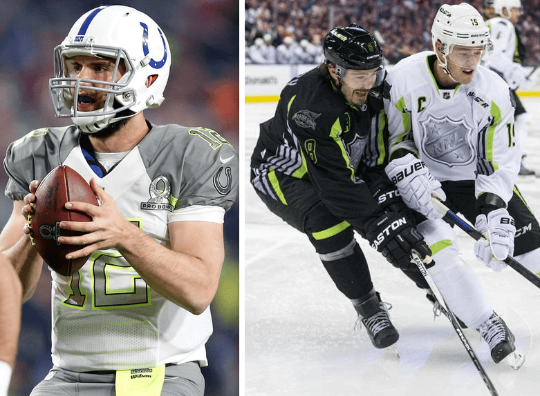
It was neon/higlighter kind of day yesterday, as the NFL and NHL both dressed their best players in garishly bold colors for their respective all-star games. Here’s a look at some of the games’ finer uni-related nuances, beginning with the Pro Bowl:
• All Chiefs players in the game wore a “29” nose bumper for Eric Berry. I can’t recall any kind of similar gesture ever taking place in a Pro Bowl. Anyone else..?
• Bears tight end Martellus Bennett’s Pro Bowl jersey patch was coming loose. Ditto for Panthers linebacker Luke Kuechly.
• One of the players from the Dolphins — I think it was offensive lineman Mike Pouncey — wore a blue visor.
• Speaking of the Dolphins, cornerback Brent Grimes went with biker shorts and bare legs — a brutal combination.
• Instead of wearing the usual white towels, the players wore — of course — higlighter-colored towels.
• In the “You’ve got to be fucking kidding me” department, the balls had neon laces — or maybe the laces just picked up some tint from the players gloves and jerseys.
• The uniform mock-ups released last week had indicated that both teams would wear white shoes, but quite a few players wore other colors.
• Someone — not sure who — was wearing some bizarre-patterned tights. (Update: I’m now told that the player in question was Cardinals defensive back Antonio Cromartie.)
• As you can also see in that last photo, Giants wide receiver Odell Beckham Jr. had the hashtag “#Royal” on his cleats. Not sure what that’s about (and I suspect I’d rather not know), but I see the word “royal” does appear quite a bit on his Facebook page.
• Here’s something I didn’t know: The cheerleaders were drawn from teams throughout the league, just like the players. But they got to wear their usual uniforms instead of being forced to wear ugly Pro Bowl uniforms.
• One interesting note: The officials used iPads tablets for instant replays. I wouldn’t mind seeing this become the go-to replay format, instead of having the ref go under the hood.
• Turning to the NHL All-Star Game: Frankly, I couldn’t find anything particularly uni-notable about that game, except that it looked awful. It’s worth noting, howver, that all-star jerseys for sale at the NHL Shop in Manhattan had cheapo iron-on nameplates, instead of the sewn-on ’plates used in the game. Lame.
• For the more historically minded, here’s a look at some key moments in NHL All-Star Game uniform history.
(My thanks to all contributors, including Alan Kreit, Jerry Lawless, Jon Saddler, Jeff Shirley, @TJN3, J. Walker, and of course Phil.)
Busy fella: There’s been a lot of activity on my other websites over the past few days. Let me bring you up to date:
• It’s been nearly a year since I posted anything on My Pet Troll (which, for latecomers, is the site I created last winter to document the Big Cock Johnson episode that originally took place here on Uni Watch). But now another writer has confronted and her troll — a troll who was a lot more belligerent and hateful toward her than Big Cock Johnson was toward me — with fascinating results. Get the full scoop here.
• Over on Permanent Record: a New York City woman was poking around in her building’s basemenet and found an old ledger that showed who’d been living in her apartment 55 years ago. She became obsessed with her home’s former occupant and began researching everything she could find about her — including, as it turns out, a story about a botched illegal abortion. Get the full story here.
• Also on PermaRec, the story of an 1880s rifle that was recently found leaning against a tree in a national park — and may have been sitting there for over a century. Details here.
LAST CALL for the February shirt: Today is the last day for ordering the February offering from the Uni Watch T-Shirt Club. The shirt will be available until 11pm Eastern tonight. After that it’s gone for good. Full details here, or just go straight to the ordering page.

Baseball News: Excellent news from new MLB commish Robert Manfred, who says he doesn’t foresee advertising on MLB unis. Key quote: “There was more chatter about that in the game 10 years ago than there is now. It’s just not a hot issue for us. I think people have great respect for the way our uniforms look. I don’t foresee that one; I really don’t.” Kudos to Tyler Kepner for asking the new commish about this. Maybe Manfred should go have a heart-to-heart with Adam Silver. ”¦ Gotta love this: The Brewers now have a live Barrel Man mascot (thanks, Phil). ”¦ Here’s an hour-long film that the Astros put together back in the 1980s to celebrate their 25th anniversary. “It features some stadium goodness (like a home run over the scoreboard at Crosley Field) as well as uniforms, from Colt .45s jackets to, of course, tequila sunrises,” says Jerry Wolper. ”¦ Jack Krabbe’s son Max knows the first rule of a good uniform: Don’t forget the stirrups! ”¦ Little-known fact: The Giants always honor their New York roots by bringing the World Series trophy to NYC. Robert Brashear went to check it out and wore New York Giants gear for the occasion. ”¦ Whoa, look at the size of the chest insignia on this jersey. Huge numerals on the back, too. ”¦ The Cubs have begun flying an Ernie Banks memorial banner above Wrigley Field. ”¦ Good news from John Kimmerlein, who attended the Mariners’ fanfest event over the weekend and was told by a store manager that the team’s new striped socks will be available for sale (although it’s not clear when). “No idea if they will offer stirrups as well as normal socks,” says John. ”¦ “Check out Al Bundy’s jersey from a 1994 episode of Married”¦With Children,” writes Tristan Ridgeway. “His team is the Chicago Cleavage, which is part of a league sponsored by NO MA’AM (National Organization of Men Against Amazonian Masterhood), formed in the wake of the 1994 MLB strike. On the back he had the NOB ‘Birdie’ (which a reporter carelessly used instead of ‘Bundy’) and No. 38DD.”

NFL News: Intentionally deflated footballs or just some old balloons? Either way, this is pretty funny (from Duncan Wilson). ”¦ And here’s a similar display from an Indianapolis shop (from Colin Short). ”¦ Hmmm, Pro Bowl or Pro Bowow? Pretty weak job of glove alignment there (from Chris Flinn). ”¦ The Madame Tussaud’s outlet in Orlando now has a wax figure of Dan Marino. But they botched the uniform — that jersey was never worn with those pants or that belt. ”¦ Oooh, check out this old Nut Bar ad featuring Red Grange (big thanks to my pal Karen McBurnie, who knows what I like). ”¦ Is this a hint of the Browns’ new uni? If only. ”¦ I didn’t watch The Simpsons last night, but Tyler Kepner did and said that Homer said (incorrectly) that the dolphin on the Dolphins’ helmet is also wearing a helmet, which hasn’t been true for several years. ”¦ Fans didn’t wear jerseys to games back in 1970 — or did they? That’s a shot of the Kezar Stadium scoreboard at the 49ers/Saints game on Oct. 18, 1970. There are clearly two fans in the back row wearing jerseys! “They’re either wearing game-worn jerseys or they’re time travelers!” says Jeff Flynn.

College Football News: “Many people jokingly ask if Auburn University is the Tigers or the War Eagles, but of course we all know ‘War Eagle’ is just their battle cry,” says Dustin Semore. “But West Carroll High School in Tennessee really does call its teams the War Eagles.” ”¦ Hmmm, is UTSA getting orange turf? (From Bob Johnson.) ”¦ I’ve mentioned a few times that I’m seriously underwhelmed by the design of the College Football Playoff trophy, and I don’t think much of the logo either. What I didn’t know until now is that they were both designed by the high-end NYC design firm Pentagram, which usually does outstanding work. Very surprised to learn they were the ones behind this. There’s a good backgrounder on the designs here (big thanks to Greg Franklin).

Hockey News: Here’s more on those computer tracking chips that were embedded in the players’ jerseys during the All-Star skills competition. … Always fun to see the Sabres-inspired design worn by the Cincinnati Swords, back when they were a Sabers affiliate in the early 1970s (from Terry Proctor).

NBA News: The Bulls wore sleeved black jerseys at home against the Heat yesterday. They also had different black shorts than the ones they’d worn a few days earlier, because everyone knows you can’t have just one pair of black shorts, wheeeee!

College and Other Non-Pro Hoops News: Pink gear yesterday for Virginia Tech. “It’s really odd that it’s not even their normal uniform template,” says Andrew Cosentino. “Different font, different side striping. It’s a completely ‘built from scratch’ uniform with no ties to their normal template. I’m sure other teams will wear the same design, just with a different university name on the front. It’s just a strange uniform from top to bottom.” ”¦ Kentucky State Policemen traded in their police uniforms for basketball uniforms the other day for a charity basketball tourney. ”¦ Duke players wore “1K” caps and T-shirts to mark Coach K’s 1000th win. ”¦ Pitt is going BFBS on Feb. 7.

Grab Bag: “During the recent Adelaide Strikers versus Sydney Sixers Big Bash T20 cricket match, Adelaide player Craig Simmons snapped his bat in half when playing a shot,” reports Graham Clayton. ”¦ Longtime Uni Watch pal David Frost is selling tons of old jerseys from his extensive collection. ”¦ David Firestone has written about the uniforms in the video game Team Fortress 2. ”¦ Also from David: “During the coverage of the Rolex 24, Fox Sports mentioned that their pit reporter firesuits were provided by OMP. I don’t know if this will cross over to NASCAR, but it wouldn’t surprise me because their pit reporters wear no fire protection at all, which is odd, since fires on pit road are a common occurance. NBC has their pit crew uniforms made by Alpine Stars, and ESPN uses Impact, which also created what I think is history’s first maternity firesuit for Jamie Little.” ”¦ Tennis pro Andy Murray’s been wearing Under Armour apparel but Adidas footwear at the Aussie Open. Word I hear is that his new UA shoes are still in development (from Noah Crouch). ”¦ “KLM Royal Dutch Airlines employee Cliff Muskiet has a collection of nearly 1,000 different air hostess uniforms,” says Graham Clayton. “Here is a selection of approximately 100 uniforms from his collection.”

What Paul did last night yesterday afternoon: There’s a new documentary out called The Search for General Tso (see trailer above), which is all about the ubiquitous Chinese restaurant dish General Tso’s chicken. Part of it is about trying to determine who created the dish and how it spread across America; part of it is about trying to find out who General Tso was and how this dish was named after him; and part of it is about the history of Chinese immigration and assimilation in America.
The movie recently had a short theatrical run here in NYC, but it’s also available on demand. So yesterday some friends and I convened at my friend Howard’s house to watch the movie. We each picked up an order of General Tso takeout on the way, all from different restaurants — you know, just to get into the spirit of the occasion. We also wanted to see if there were any significant differences between the various restaurants’ versions of the dish, see if we liked one version better than the others, etc. — a Tso-off, as it were (click to enlarge):
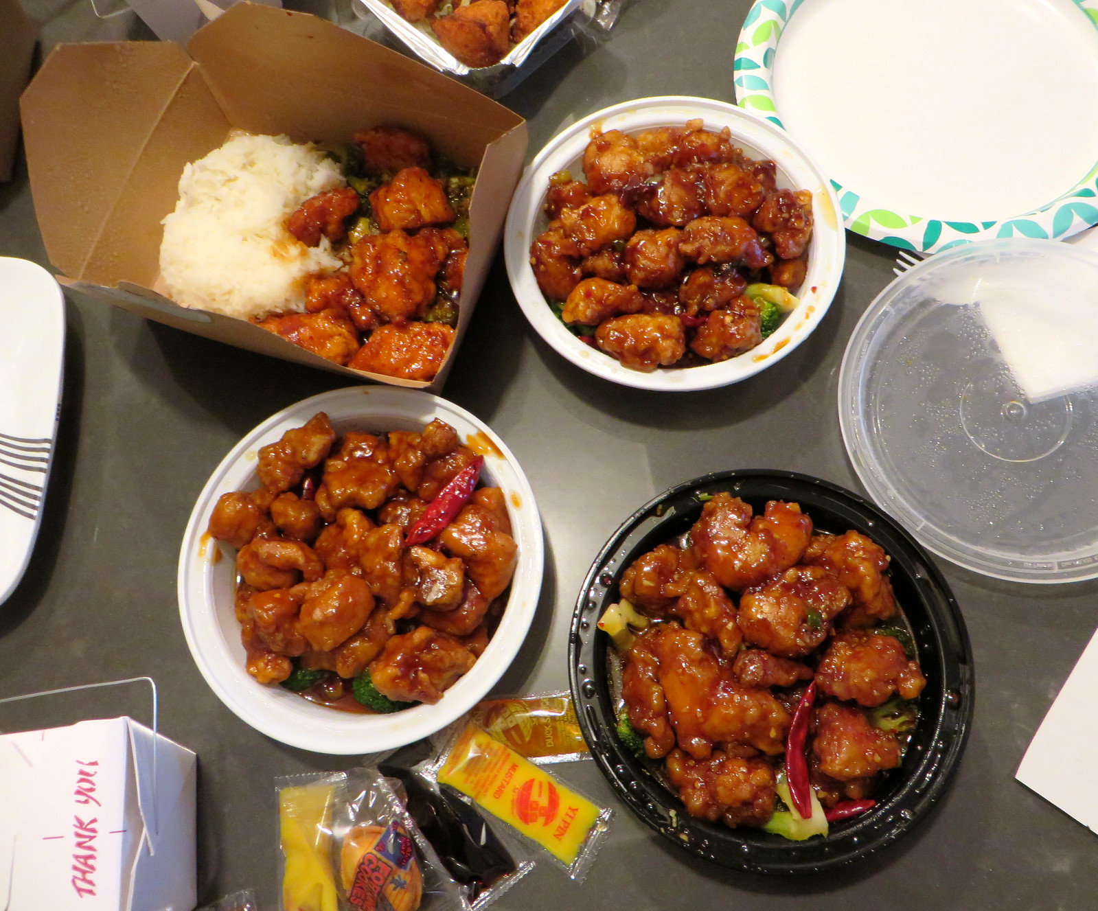
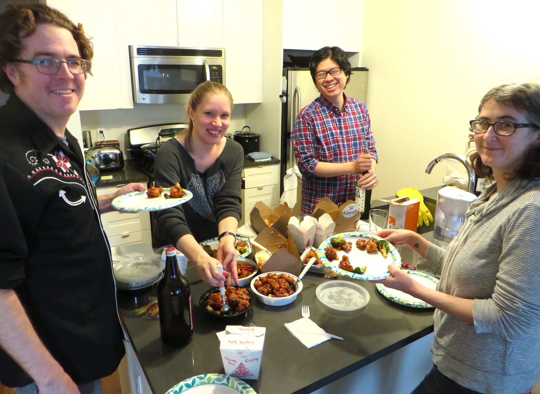
It’s a little hard to see in that first photo, but all the restaurants served the chicken on a bed of broccoli, which seems to be the default format. All of the renditions tasted pretty much the same — one was a bit sweeter than the others, but not radically. It really does seem to be a very standardized dish.
After chowing down, we watched the movie, which is really good. Smart, funny, informative, and with some really good graphics and animations. Definitely worth seeing, if your cable system offers it on demand.
It was Patrick Peterson of the Arizona Cardinals wearing the crazy tights under his pro bowl uni.
Thanks. I’ll add his name to the text.
Sorry, but it’s actually Antonio Cromartie of the Cardinals. Peterson link. Cromartie link.
Loud – yes. Crazy – no. I feel like these players are going for the shock value all wrong.
I mean, you want crazy? THIS would be crazy: link
Cat leggings in team colors – now THAT is something to look forward to!
What’s going to happen to Bernie Brewer?
He’s going to have a new buddy in the chalet. The Brewers haven’t been a one-mascot team for a long time, so why not add one more to the mix?
The Barrelman will be the Brewers’ seventh mascot if you count the racing sausages.
Eighth if you count Hank the Dog. Which you should because he’s absolutely the best one of all of them.
To continue my answer of last week’s QotW:
No, I didn’t watch any of this year’s Pro Bowl either.
(God, they look like high school teams!)
Don’t adjust your computer monitor. Not only are the laces neon, but they are either orange or hi-viz green, depending on the offense! Wow, completely unnecessary…
As for jersey number tributes at the Pro Bowl, it’s early on a no-school Long Island snow day and I haven’t had my coffee, so my sarcasm meter might be on the fritz, but Sean Taylor.
Pro Bowl:
– C-patches for JJ Watt and Antonio Brown (team Carter) and DeMarco Murray and Joe Haden (team Irvin)
– orange laces on the ball when team Irvin was on offense, volt laces when team Carter was on offense
link
link
– Golden Tate with TATE on back instead of TATE III
link
if the last link doesn’t work:
link
Were the balls inflated properly?
*ducks*
Pro Bowl tribute in 2008; three Washington players wore Sean Taylor’s name and number. Here’s an image with Chris Cooley and Chris Samuels; link
And you can see John Lynch has the #21 helmet sticker from earlier in the season as well.
Totally forgot about that. Thanks!
Reece of the Raiders honors Al Davis thrice with an AL shirt
link
Back in the 70s in Memphis, there was also a team, Oakhaven Baptist, that called themselves the War Eagles. Their colors were orange and white, a nod to the University of Tennessee. School is now defunct but just a side note that there have been other teams called the War Eagles.
“… … Oooh, check out this old Nut Bar ad featuring Red Grange (big thanks to my pal Karen McBurnie, who knows what I like). …”
Yes!
… “KLM Royal Dutch Airlines employee Cliff Muskiet has a collection of nearly 1,000 different air hostess uniforms,” says Graham Clayton. “Here is a selection of approximately 100 uniforms from his collection…”
The site that you go to when you click the link — Obsessionitas.com — looks like an excellent time-waster.
“…the dolphin on the Dolphins’ helmet is also wearing a helmet, which hasn’t been true for several years. ”
Much to my chagrin.
Does 2 seasons really count as “several years”?
I was kind of thinking the same thing. Interestingly enough, I just looked up the dictionary definition of “several”, which is “more than two but fewer than many in number or kind”. The thing is, I usually use “few” to describe a small number of something, and I don’t use “several” unless it’s at least five or so.
My personal vague-numbering schema:
Single: One.
Couple: Two, maybe three.
Couple-three: Two, probably three, maybe four.
Several: More than a couple-three
Then I get into “few” and “many” territory, which is contextual. “A few eggs” could be as little as a couple-three, since the standard unit of eggs is only twelve, whereas “a few cars” is certainly more than several, since one normally sees hundreds of cars on even a short trip where I live. “Many” is more than “few” in the given context. And “most” is still relative to the whole set, but it must be more than a bare majority.
I noticed this while watching live and was like “that’s wrong, but I’m not even going to bother emailing Paul because someone has probably already beaten me to the punch.”
I’m glad you all didn’t disappoint!!!!
On a sidenote, I didn’t think any of the FOX lineup was particularly funny last night and it’s usually two hours of juvenile laughs for me.
My reaction was exactly the same thing. (I watch in the Pacific time zone so I had the added justification that most of you already had a three hour head start on me).
I did notice that the line was repeated three times – once live and twice by “hologram”.
My understanding is that the production lead times for the animated shows are literally years long. The script and audio for this show was probably finished at a time when the line was still correct.
The Dolphins helmet will always have the old logo on it in the Simpsons universe. The characters never age… the whole show is stuck in a time bubble.
I’ve had some tofu chilling in my fridge for a few days with the intention of making my own veggie General Tso’s. Guess I’m doing it tonight, thanks Paul!
Re: Pro Bowl gestures, the Redskins players all wearing #21 to honor Sean Taylor the year that he died.
I was just saying on Saturday how I didn’t like the way the Brewers had muddied their identity by needlessly resurrecting the ball-in-glove logo and then the next day they go and further confuse the situation by bringing back the Barrel Man. It just goes to show I guess how utterly dull the Brewers identity is right now that they feel the need to desperately garnish it with “all your old favorites”.
“It just goes to show I guess how utterly dull the Brewers identity is right now that they feel the need to desperately garnish it with “all your old favorites”.”
~~~
How would you propose to fix that? Serious question. Is it that you don’t like the ball-in-glove or barrel man? Should they jettison both (or conversely, jettison their current unis for either some type of throwback or another new identity)?
Personally, I don’t know why their still clinging to the modern logo. Navy must still have some khakis-related selling power.
I don’t, however, see any conflict created by bringing the Barrelman back as a costumed mascot (other than the old logo on his cap). A mascot link the team logo.
All those discarded identities have their fans; the team is backed into the unenviable corner of trying to please everybody.
Like most people I think the ball-in-glove logo is a classic piece of sports design and barrel man is not too far behind either, but I would prefer if they went with something completely new. However, I understand that the market for baseball design is rather a little reticent about new ideas so I would understand if they went with something based around one of those old designs. All that matters is that it wouldn’t be the current bric-a-brac of different eras, colour schemes and overall design styles. At present they’re choosing, as walter says, to try and appeal to everybody at the expense of any consistent and holistic Brewers identity.
I never know how to say Tso when I order.
I’ve heard all kinds of pronunciations, but the three most common (and I have no idea if any are correct) are:
(very soft t) + so
“cho” (Like the comic Margaret)
and “chow” (like Puppy Chow)
Thanks for clearing that up.
The “experts” (including chefs) in the movie use a variety of pronunciations.
I’ve heard, “zuo guong jie” used for General Tso’s chicken.
The best I’ve ever had was in a small restaurant in Morrisville, Pa. It was double-cooked and the sauce was a bit sweeter than usual. But with lots of chilis.
As a historically-minded New Yorker, I am warmed by the baseball Giants bringing the trophy here to their native city.
When I was a kid, I was a Yankee fan. Thanks to the 3-D historic baseball cards in cereal boxes, to the Yankee Stadium 50th Anniversary record in the 1973 Yearbook, and to other means, I learnt of the Giants’ history here, a championship legacy that predates the Yankees’. So the Giants became my favourite National League team. I was thus able to appreciate the beauty of the Mets’ acquisition of Willie Mays.
And I appreciate this act by the Giants of bringing the trophy here. Well done.
Von Miller had Pro Bowl patch issues as well. The bottom half was completely ripped off.
link
Re: the wax Marino uniform (using the <a href="link as a reference):
* Marino’s Dolphins career spanned from the 1983 through 1999 seasons.
* The jersey appears to be a 2001 Reebok. The vector mark is clearly visible on the sleeve, and it appears to have the NFL shield on the collar rather than the NFL Equipment logo which was introduced in 2002. A correct version of that particular uniform would have either Starter (1997-98) or Nike (1999-2000) branding.
* The towel on his belt has the NFL Equipment mark, which definitely makes that piece anachronistic.
* The Dolphins wore orange-teal-orange pants stripes from 1967 through 1985, thus suggesting the pants are from early in Dan’s career.
* The Dolphins wore orange belts for only two extended periods – from 1977-1982 (before Marino was drafted), and from 1989-1996 (by which time the team had switched to pants stripes that better matched the helmet stripes).
* The plain teal socks are from 1987 on, so that’s another element that the pants don’t match.
* And, finally, link.
That would be the GUD here: link
Derped the link code.
Marino’s helmet always looked like it was too big for him. Probably just that GIANT mask he had on it.
RE: “There are clearly two fans in the back row wearing jerseys! “They’re either wearing game-worn jerseys or they’re time travelers!” says Jeff Flynn.”
Replica jerseys have been available for decades. They may not have been as commercially ubiquitous as today, nor often worn to games, but they were produced. They were more likely to be worn by rec league players than by dudes at sports bars. There is a famous Canadian story about a Montreal child who received a Maple Leafs jersey, to his horror, instead of an Henri Richard sweater. The story was based on the author’s youth, in the 1940s. link
Also, check out this video of the Life and Times of Wayne Gretzky link. At the 14:28 mark Wayne is doing a promotional event, at a mall/sports store it seems. In the background are racks of NHL jerseys including the “Ferguson”-style New York Rangers jerseys (which had already been discontinued by the Rangers at this point!). This was probably Wayne’s first or second year in the NHL.
oops, I meant Maurice Richard, of course – “The Rocket.”
You’re right, kids replicas go back a long way. I wonder when selling adult sizes began?
In baseball, I remember adult Brewers jerseys (or, at least, inexpensive replicas thereof) being available in the late 1970s/early 1980s. Could well have been before that. But that was small beer. By the end of the 80s the market was exploding and in 1990 we had the first uniforms designed specifically for link with the White Sox black-and-silver throwback-inspired design.
I refuse to believe that in 1970 those uniforms you see in the stands necessarily had to be game worn.
Of course they may not have been as ubiquitous then as they are now, there must have been some way to get replica jerseys. I don’t know from where or who, but some how, some way, it must have been possible.
#32 for the 49ers in 1970 was Mel Phillips, btw.
And as a current San Franciscan, every time I am reminded the 49ers used to play in Kezar Stadium, my mind is blown. I cannot imagine an NFL team playing in that stadium, which is very very small, nor the location, which is in a regular old neighborhood. Crazy.
Lee
Kezar was rebuilt completely in the 1990s with much reduced capacity. The original stadium was quite substantial: link
But yes, very interesting location. Not at all unusual for the times though, as major sports arenas were built not always downtown but sometimes in residential areas – Detroit’s Olympia was another good example.
I do know that the Kezar of today is in no way the Kezar of the 49ers era. And I know that other NFL stadiums were located in neighborhoods.
But it still blows my mind.
Lee
And sure enough, the former sites of Polo Grounds and Ebbets Field are now housing projects because they were built in residential neighborhoods.
At the lower right of the scoreboard there’s a third fan sporting a jersey (John Brodie’s #12).
They are just t-shirt jerseys. My dad had a longhorn one from way back then. Wore it to every game.
They may not be NFL replica jerseys of any kind. Maybe they are their own high school/college jerseys they just decided to wear to the game. It’s a b/w photo so it’s hard to now exactly what color they even are.
I won’t argue the guy in the #12 jersey, too much ambiguity, but that #32 looks like a 49ers jersey. Obviously the circumstances can (probably) never be determined, but whether its game worn, a t-shirt, home made, or other, I bet its a red 49ers jersey.
I’ve been searching for something, anything that would indicate NFL replica jerseys were available in 1970, without much luck, especially adult sizes.
I can find kids sizes in NFL team colors, but even those are basically just colored long sleeve tees with a number on them.
Bah…
Lee
There’s a lot to like about That 70s Show but link.
Wouldn’t 1970 actually be part of the 60’s??
You know, the whole “no year zero” thing.
Not necessarily.
While the “nineteenth century” ran from 1801 to 1900, the “1800s” could be said to have run from 1800 to 1899.
Similarly, the “one hundred ninety-eighth decade” comprises the years 1971 through 1980, but the “1970s” would actually include 1970 through 1979.
/bow
Rogers (AR) Heritage High School is also the War Eagles. link
Somewhat uni notable about the NHL All Star game…And I think it has been this way since they changed to the “fantasy draft” style of picking teams is that guys wore their numbers from their home teams. Meaning that at one point their were three #91’s on Team Toews (and 2 #88’s as wellon Team Foligno)
They never used to do this..they used to make them all wear different numbers
I really feel like feeding trolls now.
That was a nice listen.
Poor things.
We’re not all like that…
:'(
That Lindy West/This American Life podcast was a pretty amazing listen. Thanks for linking that, Paul.
I’m a little surprised there wasn’t a “douchebags” comment on the piece about NFL using instant replay on Surface tablets, especially since the refs will use Bose headphones with the tablets. I guess they got a little jealous of the Samsung replay sponsorship that MLB has.
Also, does Sam Brownback normally wear a Royals jersey when talking to the press? link
Max preps.com’s list of high schools with War Eagles as a mascot:
link
One is Sycamore in Middle Tennessee, and coincidently there is a plaque of that school frok when the teacher was a softball coach there.
I’m curious, with the hints that have been dropped, if the pro-bowl uniforms end up being the precursor to what the Browns wear next season…
I think the Ernie Banks banners are just his retired number flags Wrigley moved over the scoreboard in tribute
Is that Michael & Ping’s in the top left corner? Good stuff there.
Yes. I forget who brought that (not me), but that was one of the restaurants represented.
The Japanese homage to the Cleveland Football Pumpkins and the neon green theme today dovetails with a story my wife tells about living in Japan and seeing a kid in a baseball themed jacket with English writing on the back: its colors a bizarre mix of bright greens and mustard yellow and on the back it featured a blazing fastball with the inscription “Vigorous Throwup”.
Please tell me she got a picture.
Kezar photo of fans wearing replica, adult-sized jerseys was amazing! It seems almost inexplicable why such a gap in the history of fanwear still exists; given that so many are into athletic uniforms (myself included), why is the genesis of this behavior still entirely the stuff of anecdotal information?
Not uni related, but the comments hurled at Lindy West in the embedded article linked to “mobilized against West” are downright scary. Whether you agree or disagree with her position on such jokes, I can’t believe other humans actually typed what they did. I don’t understand how someone takes the time to type something like that, and doesn’t stop mid-sentence and say to themselves “OK, this may be a little extreme”. Sure, some of the comments are likely intended to be jokes themselves, but good God y’all.
“- Here’s something I didn’t know: The cheerleaders were drawn from teams throughout the league, just like the players. But [strike]they got to wear their usual uniforms[/strike] [b]the league refused to shell out for new uniforms for the cheerleaders[/b] instead of being forced to wear ugly Pro Bowl uniforms.”
This version seems more likely to be accurate, IMO.
“Neon green and orange is soooo last decade.” – All of us next decade.
Has Uni Watch ever explained how actress Susan Saint James obtained the 49ers jersey (#18) she wore to bed on the show McMillan and Wife in the early 1970s?
link
Or MTM’s Vikes-like jersey?
link
Susan Saint James…yummy!
Another high school with the mascot War Eagles is Putnam County High School in Eatonton, Ga.
link
I actually liked the NHL all-star game uniforms. I think they looked slick, other then the gray and black stripes. People should be more open-minded about new uniforms. It’s OK for teams to have unique uniforms.
People should be more open-minded about new uniforms. It’s OK for teams to have unique uniforms.
Has nothing to do with being “open-minded” about “unique uniforms.”
Here’s how it works: If I think something looks good, I say, “That looks good.” And if I think something looks like shit, I say, “That looks like shit.” Simple as that. There’s no agenda other than encouraging the good and discouraging the bad. Now, your concepts of “good” and “bad” may differ from mine, but that doesn’t mean either of us isn’t “open-minded”; it simply means we have different tastes. And that’s fine. (Or at least it’s fine by me. If it’s not fine by you, I guess that means you should find some other website to read, or start your own.)
Here, let’s try a little exercise:
I think they looked slick, other then the gray and black stripes.
People should be more open-minded about gray and black stripes. It’s OK for teams to have unique gray and black stripes.
There, see how it works?
In reference to the gray cleats (among other colors), the white cleats included in the Nike PB mockup are their special “Super Bowl” football cleats, and they sold those (they’re all sold out now). The gray and other colored cleats are for the players who aren’t sponsored by Nike, or don’t wear it.
I think the reason the Bulls’ shorts were different last night was because they changed the trim on their black jersey and those were the shorts they were supposed to wear last week but for some reason didn’t. If you notice the trim on each short, you’ll notice that the most recent pair matches the black tank as well as the sleeved version. Just my theory.
Check out this NFL helmet from the 60s. Per the notes, players painted ove their reg season helmet and used them in the pro bowl.
link
Went thru this in a comment thread a few days ago. This was standard procedure back when the players didn’t wear their regular team helmet designs in the Pro Bowl.
Nice Information
In regards to the pink Virginia Tech jerseys; they actually do use that font quite a bit on campus here. It has never been used on any athletic jerseys as mentioned in the blog, but occasionally you will see a wordmark with the plain font. I expect other schools will use their secondary font for these pink jerseys as well.
“All Chiefs players in the game wore a “29” nose bumper for Eric Berry. I can’t recall any kind of similar gesture ever taking place in a Pro Bowl. Anyone else..?”
In 2008, the three Redskins in the Pro Bowl all wore #21 in honor of Sean Taylor, who had been murdered that season.
link