Nathan Shields is an illustrator. Some of his work is done the conventional way, but he’s making a name for himself by producing an impressive body of work in a very non-traditional medium: pancake batter.
Shields recently partnered Fansided to create a series of videos that show him creating pancake versions of all 32 NFL team logos. It would be one thing if he used little plastic logo molds or something like that, but he drew them freehand — so cool! The videos are mesmerizing to watch, and the results are surprisingly good. I have a feeling most of these weren’t done perfectly on the first take, but whatever — it’s a great project.
Each video runs about half a minute. You can see all 32 of them below, grouped by division:
AFC North
AFC East
AFC South
AFC West
NFC North
NFC East
NFC South
NFC West
I could quibble with some of Shields’s logo choices. I wish he’d done the Ravens’ helmet logo instead of their secondary logo, for example, and I definitely wish he’d done Brownie the Elf instead of the Browns’ bulldog logo. (I say that with apologies to Todd Radom, who designed that bulldog logo and based it on his own dog!) I also wish there was at least one video shown at regular speed, instead of sped up, just so we could get a better sense of the process in real time. But hey, it’s Shields’s project, so he gets to call those shots.
If you’re thinking we’ve seen NFL logo pancakes before, you’re right. Longtime Uni Watch reader/contributor Brady Phelps made these pancakes for the last Super Bowl, for example. Still, I love seeing the videos that show the process, some of which are really surprising (check out the Colts vid, e.g.). Kudos to Shields, and to Fansided for partnering with him on these videos.
One additional thought about pancakes: If you want to give your maple syrup a boost, add a capful or two of bourbon to it, and then heat up the syrup before serving (which you should be doing anyway). The alcohol will vaporize but you’ll still get the bourbon flavor, which goes really well with the maple syrup. Trust me.
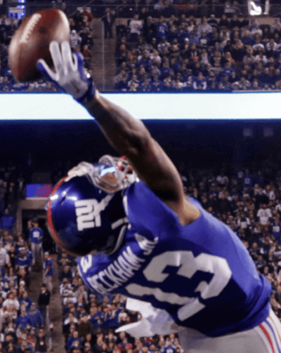
New ESPN piece: As I mentioned yesterday, Giants wideout Odell Beckham Jr.’s amazing catch on Sunday night wouldn’t have been possible if he hadn’t been wearing gloves. The same can be said of a one-handed catch made by Robert Woods of the Bills last night — no way he makes that grab bare-handed. That’s not a knock on Beckham or Woods; it’s just reality. It also reinforces a point I’ve made here several times over years, namely that the rise of gloves is among the most important changes on the gridiron over the past generation, and almost certainly the most unheralded and underrated one.
With that in mind, I’ve written a short ESPN piece about how gloves have transformed the sport over the past few decades. Check it out here.
As an aside, reader Jerry Wolper reports that AP sportswriter Will Graves issued a series of tweets last night regarding a conversation he had with former Steelers great Lynn Swann. They talked about Beckham’s catch and gloves. The pertinent tweets are here and here.
Click to enlarge
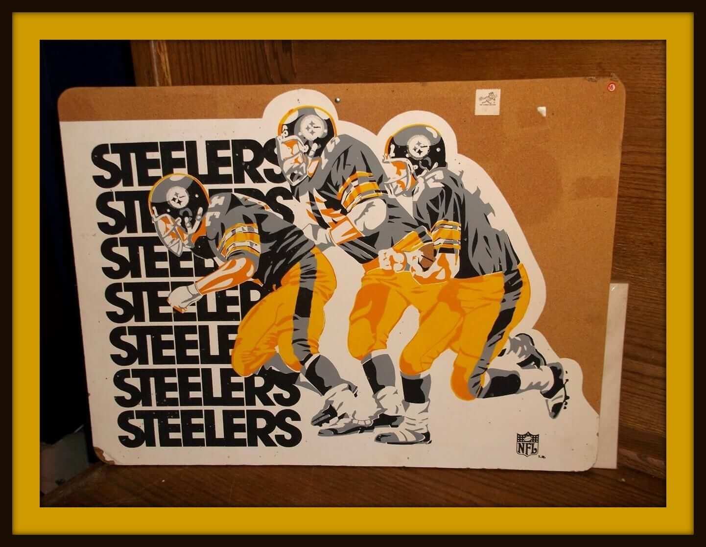
Collector’s Corner
By Brinke Guthrie
Stillers fans! Check out our lead item today, taken from the pages of a Sears Christmas Wish Book from back in the day. This is the first one of these NFL bulletin boards I’ve seen on eBay. Corners are a little gnarly on the ends, but the classic artwork more than makes up for that.
(And speaking of Sears, shame on me if I’ve never shared this link that shows more Sears Christmas Wish Books than you can imagine. Have at it!)
Here are the rest of my picks for this week:
• Staying with the Steelers, here’s a nice-looking vintage women’s Steelers sweater. Oh and while we’re at it, let’s toss in this 1970s boys’ varsity jacket, and this helmet plaque, too — never seen one with the black facemask before.
• This vintage Reds bobblehead is a little ”¦ different-looking, wouldn’t you say?
• Never seen these before: Philadelphia Flyers sneakers — from P.F. Flyers, naturally.
• Staying with the Philly theme, here’s a classic-looking Eagles poster with artwork by the legendary Chuck Ren. It’s framed, too.
• You’re a step ahead in Keds, especially if you get this 1960s store display.
• Helmet Buggy alert! This ad is for a 1970s Colts buggy. They mistakenly listed it as Indy instead of Baltimore, but the look is still the same, eh?
• You’ll have people at the gym shouting, “Luv Ya Blue!” as you stroll by with this 1970s Oilers gym bag.
• Two AFC cups and one NFC iHop cup, all from the 1970s, in this auction! (I have the NFL version of this — it’s my official daily orange juice breakfast cup.)
• Distinctive artwork on this 1960s SF Giants scarf.
• I can’t imagine using this Bengals helmet as an ashtray, but that’s what it was meant for.
• From reader Michael Clary, here’s a 1960s New York football Giants wind-up doll. (Not a Giants fan? Here are versions for the Falcons, Oilers, and Cowboys.

Holiday sponsor shout-outs: As you may have noticed, we have a bunch of new advertisers that are vying for your attention and dollars during the holiday run-up. They all offer excellent product lines, and I’m proud to have them on the site. One at a time:
• A few weeks ago I raffled off a few prints of Jeff Suntala’s gorgeous baseball stadium illustrations. If you lost out on the raffle, you should definitely consider shopping around on Jeff’s website, There Used to Be a Ballpark. And even if you’ve been to his site before, he’s just added some new prints. Great, great stuff.
• I’ve been a huge fan of Amelie Mancini and her Left Field Cards business for several years. (I even wrote an ESPN column about her two and a half years ago.) If you’re a baseball fan — or if there’s one on your holiday shopping list — then her super-cool cards and T-shirts should be just what you’re looking for. Check them out here.
• Our friends at Grey Flannel Auctions have a new catalog auction underway. I’ll be spotlighting some of the more interesting items in an upcoming edition of “Auction Action,” which will likely run next week.
• And although this isn’t new, I continue to be a big fan of American Trench’s excellent socks, a pair of which I’m wearing right now.
And there’s one additional new advertiser — a very cool one — whose ad should be showing up on the site soon. Stay tuned.
My thanks to all of these enterprises for partnering with Uni Watch. Please consider supporting them as you’re doing your holiday shopping.
Footnote: If you’re thinking of posting some sort of “Gotcha!” comment (“Sure, Lukas hates advertising — until it’s one of his advertisers!”), please read this before you do so. Thanks.
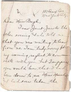
PermaRec update: A 95-year-old letter from a former student who was apply for a substitute teaching job (shown at right) is the key document in the latest entry on Permanent Record.
Uni Watch News Ticker
By Garrett McGrath

Baseball News: Here’s an old newspaper article, apparently from the 1930s, about the growing trend of sunglasses on the baseball field (from Kenn Tomasch). … The single-A Mahoning Valley Scrappers a new alternate logo (thanks, Paul). ”¦ The newly renamed Biloxi Shuckers, the double-A Brewers affiliate, posted their new cap logos (thanks, Phil). … History watch from 1883: A photo of the St. Louis Browns (also Brown Stockings) of the American Association at the original Sportsman’s Park (from Jonathan Daniel).

Pro and College Football News: The Lions unveiled a new logo celebrating the history of their Thanksgiving game. ”¦ The Oregon National Guard 41st Brigade logo will be worn on helmets during the upcoming Oregon/OSU Civil War game.

Hockey News: Here is a list of the top five forgettable NHL sweaters from the late 1990s and the early 2000s (thanks Paul). … “As I was perusing some classic Queen videos on YouTube, I noticed in the one for Spread Your Wings from 1978 that bassist John Deacon is wearing a sweet Chicago Blackhawks letterman jacket,” says Phil Johnson.

NBA News: The Magic’s sleeved gray jersey will make its on-court debut tomorrow (thanks, Phil). … The Heat will roll out a new “Miami Red” uniform campaign tonight (from Phil).

College Hoops News: “The Kansas women’s basketball team is wearing a black “Whitney” patch this season in honor of a longtime fan who died of leukemia this off-season,” says Jeff Braun. “Makes for a large number of patches on the jersey front.” ”¦ This article includes an interesting quote from Maine coach Bob Walsh: “All of our guys are wearing zero on the back of their practice jerseys. That’s the number of times we’ve been in the NCAA Tournament and we want to embrace it and attack it.” ”¦ No photo, but a note buried within this page indicates that NJIT — that’s the New Jersey Institute of Technology — is wearing “JC” patches in memory of Joe Caiola, the Assistant Director of Athletics who passed away in June.

Grab Bag: Here are your mascots for the Rio 2016 Olympics and Paralympics (thanks, Paul). … The uniform is nearly complete for the 154-member Cavalcade of Bands Honors Band, which is scheduled to participate in the 126th Tournament of Roses Parade (thanks, Paul). … Pumas are the official shoe of Rikers Island Prison (from Paul Lee). … Port Adelaide completes its V-line guernsey range with a new summer jumper in teal (from Leo Strawn Jr.). ”¦ Yesterday, we posted a leaked version of the NYCFC away kit. here is the official look (thanks, Phil).

I guess I need to submit my videos of me making XFL logo hoecakes!
Cavalcade of Bands Honors Band:
One word: Yuckthatsugly!
No apologies necessary, Paul. He also could have done a pumpkin pancake of the Browns helmet or a throwback pancake featuring the 1965 CB helmet that never was.
I have a feeling that the Biloxi Shuckers road cap is gonna be pretty popular with the younger crowd. You know why.
No apologies necessary, Paul. He also could have done a pumpkin pancake of the Browns helmet, or a throwback pancake of the 1965 CB helmet that never was.
watching anyone make something freehand like those pancakes truly amazes me. wondering if he ever tried food coloring? or too much bleeding through? Loved the way the RAIDERS pancake turned out, probably the most complex of the NFL logos.
Along the lines of what you said about NFL receiver gloves, Paul, I was brainstorming last night: if you could go back to 1970 and give an NFL team one innovation in equipment, what would give the biggest advantage? Gloves are one possibility. Shoe technology has also changed significantly since the days of heavy leather cleats. Shoulder pads, jerseys, and helmets have also improved dramatically. Thoughts?
I think you’re mixing several different types of “innovations” here. Gloves, for example, confer a competitive advantage; modern helmets, on the other hand, may provide an advantage but also provide better safety. It would be unethical to deny a safety improvement to a team.
That’s true, but I think the improvement in helmets has also allowed players (primarily defensive backs) to be more aggressive. Some of that aggressiveness has been dialed back in recent years with the emphasis on protecting defenseless receivers, of course, which has been a positive change.
As far as competitive advantage, I agree that the impact of helmets might not be as big as that of gloves and shoes.
Super tight jerseys would be what I think of.
Ah, you beat me to it. I think there’s an argument to be made that everyone was right in the 1940s, and modern helmets have made the game much less safe. But that’s neither here nor there.
I can’t think of an innovation that’s boosted one element of the game as much as gloves have.
Damn my poor italicizing skills. Was only supposed to be “less”.
Is there even an argument about helmets? Of course they’ve made the game less safe, at least from the modern point of view that recognizes traumatic brain injury both as a thing that actually exists and as a problem. Helmets surely solved the hell out of whatever basically medieval notion of “safety” problem Americans had circa WWII. When, let’s not forget, the notion that it might be a good idea for soldiers to cover their heads when under fire from machine guns was still, literally, an innovative new idea. But in light of what we now regard as safety challenges in football, helmets are obviously and inherently part of the problem, not part of the solution. There is no conceivable way for helmets in anything like their contemporary form to be part of the solution, as regards concussion and traumatic brain injury. The physics here are pretty simple.
The physics may be simple, but the politics aren’t.
Nobody in any position of authority has been honest enough to suggest that hard-shell helmets don’t belong in the NFL anymore.
Did you forget about stickum used by Fred Belitnekopf and others in the 70’s? The NFL got rid of that and now allows gloves that seem to be as sticky (and cleaner looking) than stickum.
Aw shucks. I’m very pleased with the Biloxi Shuckers. I would’ve preferred Black Jacks, but Shuckers was second for me among the list of potential names.
Since it’s pronounced bill-ux-ee, there is a beautiful assonance with the two words. The name is similar to that of many minor league teams from 100 years ago: regionally relevant, blue-collar, and tongue-in-cheek.
The nickname is fine, but the Shuckers’ logos already feel tired. Brandiose has nothing new to offer at this point.
When I read “Shuckers” I thought of corn.
Yes, the branding materials are very mediocre. I like the black cap with the oyster nested into the B, but I’m not amused by the little oyster with the bat. The lighthouse and ‘BS’ logo looked slapped together in an afternoon. I would’ve preferred that Simon did the designs rather than Brandiose. I think that the Brandiose bubble will be bursting some time soon.
I agree, it’s a great nickname.
I also love the mascot logos, though I’m lukewarm on the letters. I appreciate the call-out to the Brewers’ “B”, but I hate that script so much I’m sorry the minor league teams are being saddled with any part of it.
They do have way too many logos, though. They have three different clam logos – primary, cap with ‘B’ and clam alone – and two different link?
Agreed. One clam logo is (more than) sufficient. (Personally, I’d have shied away from literal representations of the clam. For one thing, it’s a petty literalism that the name just doesn’t need. Just as the Brewers don’t need to put an actual pint of beer on their caps. For another, the clam needs to be the mascot in the stands, not a logo on the uniforms. And mostly, the whole point is that you’re about to eat the thing, and anthropomorphizing food trends too close to cannibalism for my taste. Yeah, the M&Ms cartoon mascots give me the willies too.) And the two lighthouse logos include one that’s simply a terrible design. So why not stick with just the one that’s actually attractive? Or better yet, since it appears that the lighthouse logos were likely developed for the proposed Biloxi Beacon identity, why include a lighthouse at all with the Shuckers identity?
I understand but don’t agree with your objections to the form of the Brewers B. Anyway, I still prefer the way the Helena Brewers used the form of the B on their link a while back to the Biloxi Shuckers treatment. Connecting the bar in the B with the H strengthened what you’ve called the weakness with the B as a letterform, sort of firming up the truncated ascender.
Also, how was that not the unofficial ballcap of every homebrewer in America?
The truncated ascender isn’t even my biggest problem with the “B”; the big gaping hole in the middle is. The Helena Brewers’ version just happened to have fixed that one too.
From the Brew Crew Ball fansite (courtesy of commenter nullacct): link
Based on the logo, I would have thought Biloxi’s new nickname was the Shuckees.
Adjust the settings on the YouTube videos to .25 speed and it will look ‘real time.’ Pretty cool!
“… It also reinforces a point I’ve made here several times over years, namely that the rise of gloves is among the most important changes on the gridiron over the past generation, and almost certainly the most unheralded and underrated one…”
Thanks, Paul, for the tutorial. I’m a believer! Really changes things a lot, and good on you for making the point so irrefutably.
Stickum was used in the 70s until banned. Why? The NFL couldn’t license stickum the way it licenses sticky gloves.
Stick’um use by wide receivers was nowhere near as prevalent as people seem to think, and it didn’t confer anywhere near the competitive advantage that gloves do. What’s more, what advantage it did confer was at least somewhat countered by the fact that when it rubbed off on the football it made it slippery and thus harder to throw with accuracy. The most-known wide receiver to use Stick’um, Fred Biletnikoff, didn’t slather it all over his hands, either; rather, he put it on his game socks to enable him to reach down and re-apply it between plays. Hell, even DB Lester Hayes, the player with whom Stick’um use is most closely associated, admitted that he used it as much for psychological effect as for any physical advantage it gave him (which, if you ever saw Lester Hayes play, even WITH Stick’um he had bad hands).
link
OK, I take it back somewhat. Biletnikoff’s use wasn’t as judicious as I remembered, pretty gruesome in fact. Perhaps that explains why so many of Stabler’s passes were wobbly:
link
“… Here are your mascots for the Rio 2016 Olympics and Paralympics (thanks, Paul). … ”
Same appealingly wise-ass article also features stupid mascots for Euro Cup 2016 and Copa America 2015. By “stupid,” of course, I intend a compliment.
If your mascot isn’t stupid, you’re doing it wrong. Or it looks like Lisa Simpson giving head.
wasn’t that just the logo, not the mascot?
Apparently they haven’t given these two useless mascots a name yet; I think the one on the right HAS to be Artie. Artie Choke.
Won’t even attempt to name the one on the left until all the legal process is complete, because it’s such a Hello Kitty ripoff.
The one of the left is Hey-O Cat, and it’s completely different from that other thing you named.
Shorpy has another nice team photo, this one from 1910 with nice variety.
link
That is one creepy looking Reds bobblehead on ebay.
I don’t know if it’s just my browser/computer or what, but having that many youtube videos on the page is making the whole site load slow as hell. Couldn’t you just embed 1 or 2 and link to a playlist for the rest?
It’s your computer, my page loaded just fine.
Lee
I don’t disagree, it’s a lot to load. If I were on my home computer, I would be waiting a while.
Interesting about those pancake logos. Contrary to what I think is the widespread belief that simpler forms generally make for a stronger logo that scales better across mediums, in this medium the more fine detail, the better the logo. Vikings, Raiders, Buccaneers, even Tennessee, fare better than simpler logos like the Cowboys.
I’m not sure why he used the old Bucs logo instead of the current one.
Because he’s an artist and has some aesthetic taste?
Re: The Chicago BlackHawks letterman jacket that Queen bassist John Deacon is wearing – That was in the video for “We Will Rock You.” link
Wholeheartedly disagree with you saying that Woods’ catch isn’t possible without gloves.
He bobbled the ball at first and just secured it by pressing it on his helmet. It’s a difficult catch but it’s definitely possible without gloves.
Possible? Maybe. But I’m not convinced he ever gets that ball anywhere near his helmet without modern-day gloves.
The Lion in Detroit’s Thanksgiving logo looks like he’s trying to cough up a major fur ball.
It’s link.
Maybe now that there’s a cleaned-up version, they’ll start putting it on merchandise.
Man, seeing an old card like that underscores how nice it would be if the NFL loosened up its jersey numbering rules.
link
link
The typeface choice and letter spacing is horrible. Looks like someone who just learned how to use Illustrator created it. I expect so much more from a professional NFL team.
Jeez, I can’t even make nice round pancakes (or keep them from burning)!!! Well done sir!
Jeff Suntala’s PRINTS ARE GORGEOUS. I hope he gets some help from a historian however…His dates (i.e. Washington’s stadia) are incorrect.
Thanks J. Rigo! I fixed it.
It was a cut and paste error in my urgency to get the image up on the web. I give them all another once over before I print them out and even then if a typo slips by me, I’ll send out a corrected print gratis.
Appreciate it!
just a question, but the dude that created soccer jerseys for each state got such little recognition here when I thought that would be exactly what would garner a ton of interest from this crowd. Is it because it is soccer? I thought they were freaking cool.
link
It was enthusiastically mentioned in the Ticker and garnered lots of positive comments that day. What’s the problem?
It was mentioned in last Tuesday’s ticker and received a fair bit of attention in the comments too (as you know since you were one of those who commented). I don’t see what more needs to be said. It’s another batch of design concepts and, while I can appreciate the effort and expansive detail in this particular effort, they’re a dime a dozen. There are major league uni unveilings (real ones) which receive less attention here.
With a name like Shuckers, they have to be good.
Whatever the Biloxi squad has to pay for the rights to use that line is money well spent.
It’s gold, Jerry!
“The Lions unveiled a new logo celebrating the history of their Thanksgiving game.”
WOW! Did someone just learn how to use Adobe Illustrator? The type is horrible.
(logo of the player and Lion is awesome though)
Nathan Shields dexterity reminded me of Al Franken’s parlor trick of drawing freehand the map of the U.S. with the 48 contiguous states, in 60 seconds.
Tribute patch to Pat Quinn can be seen at link