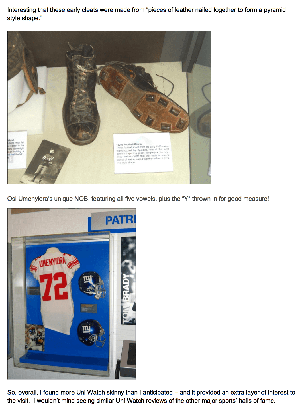
[Editor’s Note: Today we have a guest entry from Tom Speed, who made some great uni-related observations during a recent visit to the Pro Football Hall of Fame. He emailed his entry to me as a PDF, with all the photos already laid out, so I’m simply going to run it as he presented it. You can click on each “page” to enlarge. ”” PL]
By Tom Speed
Paul here. Big thanks to Tom for his keen eye, and for formatting everything in way that made things very easy me.
Click to enlarge
Collector’s Corner
By Brinke Guthrie
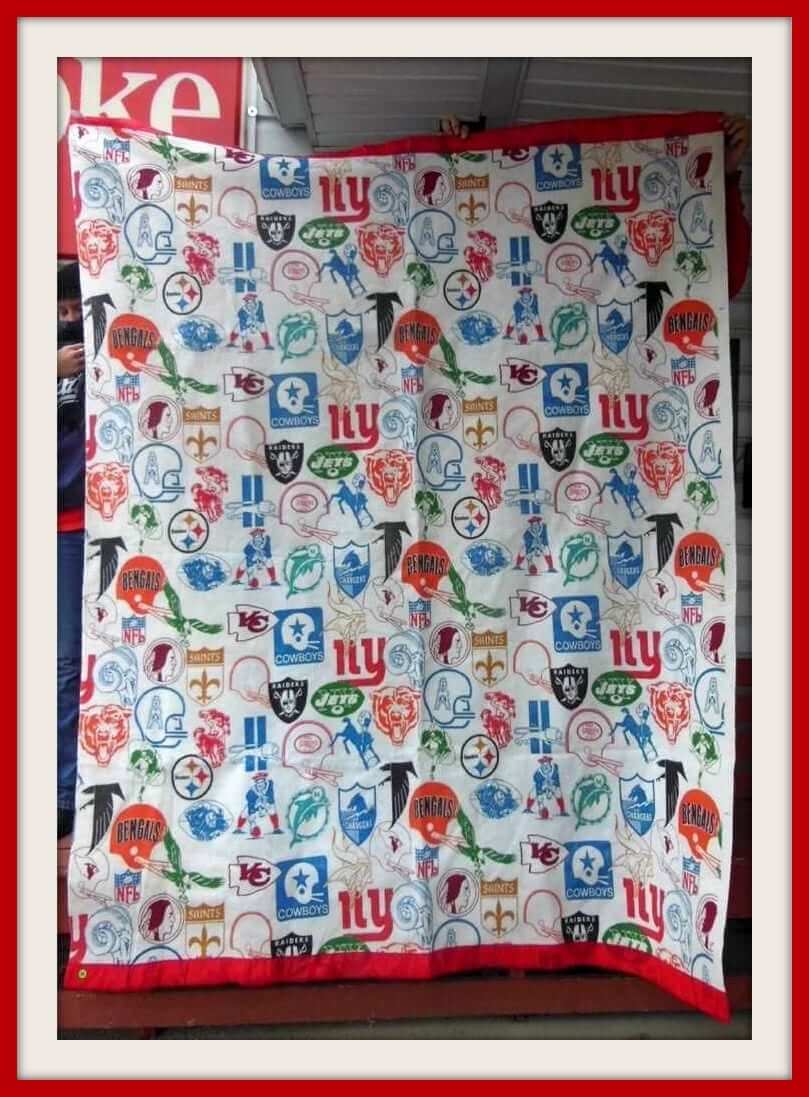
This 1960s NFL bedspread from JC Penny is very similar to a cool item I once had. It was a lightweight NFL hooded rain poncho with reflective aluminum on the inside to keep you warm, and it had these exact logos on it. Sure wish I could see one of those again — this is probably as close as I get.
Here are the rest of this week’s picks:
• From reader Jeff Flynn, a rather curious-looking 1960s WABC-NY Jets bottle opener that looks like an old helmet bank.
This 1960s NHL Pee-Wee Hockey game looks to be in pretty decent shape, with all Canadiens and Maple Leafs figures included.
• I love the bicentennial look to this 1976 Yankees media guide.
• Baseball toy figures from the 1960s! They cost exactly 15 cents back in the day, still marked with their original price.
• We’ve seen this All-Pro Helmet Kit before — you get 16 helmets, but the box alone is worth it.
• Pay one price, get two 1970s pro league stickers — NFL and MLB — from Gatorade.
• Here’s a nice 1970s San Francisco 49ers single-bar helmet plaque.
• The news that Adidas is now back in the NFL as an official shoe/glove sponsor reminded me that arch-rival Puma also held an NFL license. I think they got in via an existing Logo Athletic license or something — remember how they just covered up the Logo Athletic mark with the Puma logo? All of which is a roundabout way of bringing up this very nice Cleveland Browns varsity jacket, made by Puma.
•Any Raiders fans left out there? If so, you might want this 1970s vintage poster, featuring a quarterback who’s wearing No. 12 but who definitely isn’t Kenny Stabler.
• And we wrap up this week with a 1960s New York Giants charm bracelet from Coca Cola.

FAST Corp. reminder: In case you missed it yesterday, I recently paid a visit to FAST Corp. (the acronym is short of “Fiberglass Animals, Shapes, and Trademarks”), the company that makes giant fiberglass cows, ice cream cones, ears of corn, Bob’s Big Boy statues, and so on. My article about that visit is up now on the design website re:Form, and I don’t mind saying I think it turned out pretty well. Check it out here.
PermaRec update: A girl whose student record described her as “insolent,” “impudent,” and “a ringleader” is the subject of the latest entry on Permanent Record.
Uni Watch News Ticker
By Garrett McGrath

NFL News: Titan Quentin Groves raised his jersey after a sack during last night’s game against the Steelers, exposing his love for his hometown of Greenville, Mississippi (from Phil). … Another Titan, Jurrell Casey, was exposing his piggy bank slot on the game’s final play (screen shot by Joseph Gerard). ”¦ Meanwhile, Le’Veon Bell of the Steelers suffered a torn jersey (screen shot by Matt Barnett). ”¦ A Washington Football Team fan set fire to his team merchandise after latest loss (from Tommy Turner). … “Marques Colston of the Saints has been wearing Nike Tiempo soccer cleats,” says Wesley Eustis. … “My boss brought in his Cleveland Browns toaster – it is suppose to say Browns on the bagel afterwards,” says Jason Johnson.

College and High School Football News: On Thursday Duke will be wearing all black against UNC. … Eastern Washington will be wearing all white on Friday. They want fans to give this white uni its own name, and Phil had a good suggestion. … FSU will be wearing their “unconquered” uniform this weekend. … The Times-Picayune has another installment of its best helmet in Louisiana poll, this one for “pro-style” helmet designs. It features two Rams knockoffs (from Joel Manuel). ”¦ Did you know Toledo is known as the “Glass City”? You will after seeing Toledo’s new uniforms for tomorrow’s game against Bowling Green.

NBA News: If the Bucks get a new arena, it might look like this. “I don’t know why the windows and ‘natural light’ are such a big thing when 95 percent of Bucks home games will be at night,” says Mike Chamernik.

Soccer News: From yesterday’s ticker: Mike Aronson noticed that MLS had dropped the American/Canadian flags from the designs. “The league has decided to place the league logo on both sleeves of the jersey like all the other major professional soccer leagues,” says Justin Garton. … To celebrate their 101st anniversary this past weekend, Colombian side Independiente Medellin unfurled a giant banner at the Estadio Atanasio Girardot (from Yusuke Toyoda). … Newcastle will not advertise their payday loan sponsor, Wonga, on children’s replica jerseys starting in 2016 (from Yusuke Toyoda). … This is pretty good: home and away kits for each state and Washington, D.C. (thanks, Phil).

Grab Bag: Adding magnets to football helmets could reduce the risk of concussions, new research suggests (from Drew Mastin). … Nutrition bar maker Clif Bar has dropped its sponsorship of a number of “extreme” athletes due to concerns over what it views as unreasonably dangerous pursuits (from Patrick O’Neill). … An TV news anchorman from Australia has worn the same suit on TV for almost a year (thanks, Paul). ”¦ The dismantling of Candlestick Park in San Francisco has begun (thanks, Brinke). ”¦ “Aussie Rules football club Melbourne Demons released their 2015 alternate jumpers, including a new white clash and special red away guernsey, both featuring the club monogram,” reports Leo Strawn Jr. … Students at BYU want the school to lift its longstanding ban on beards.

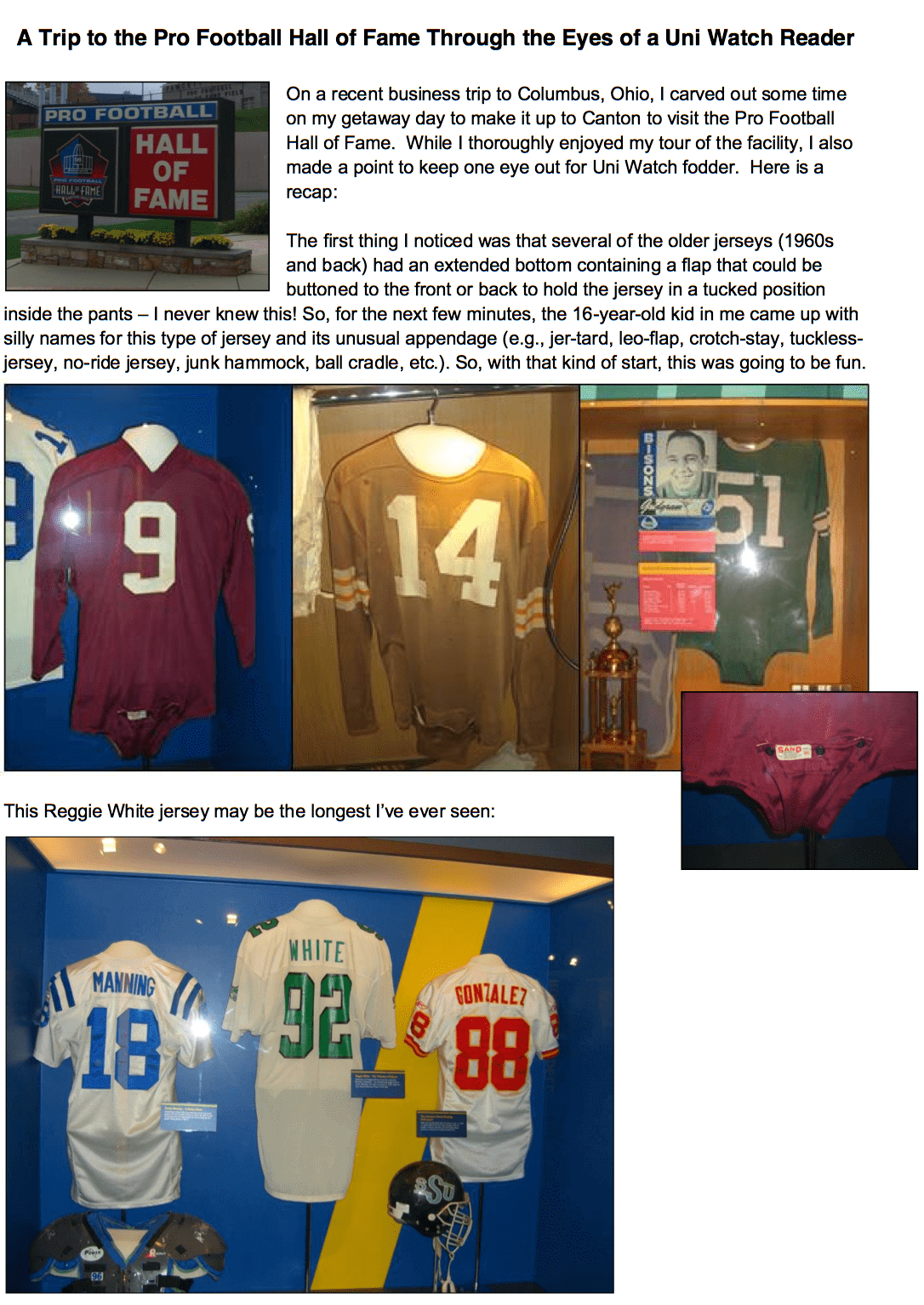
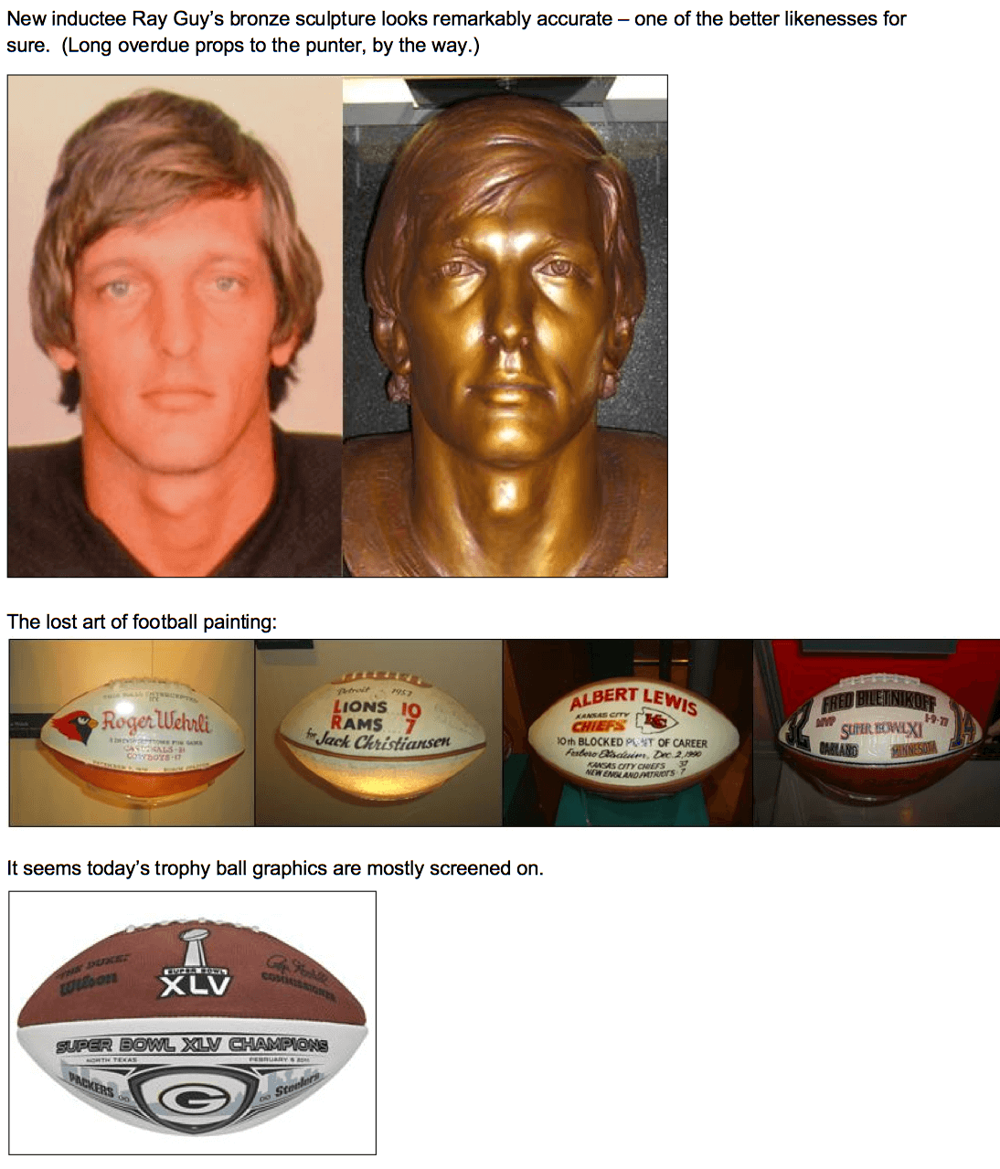
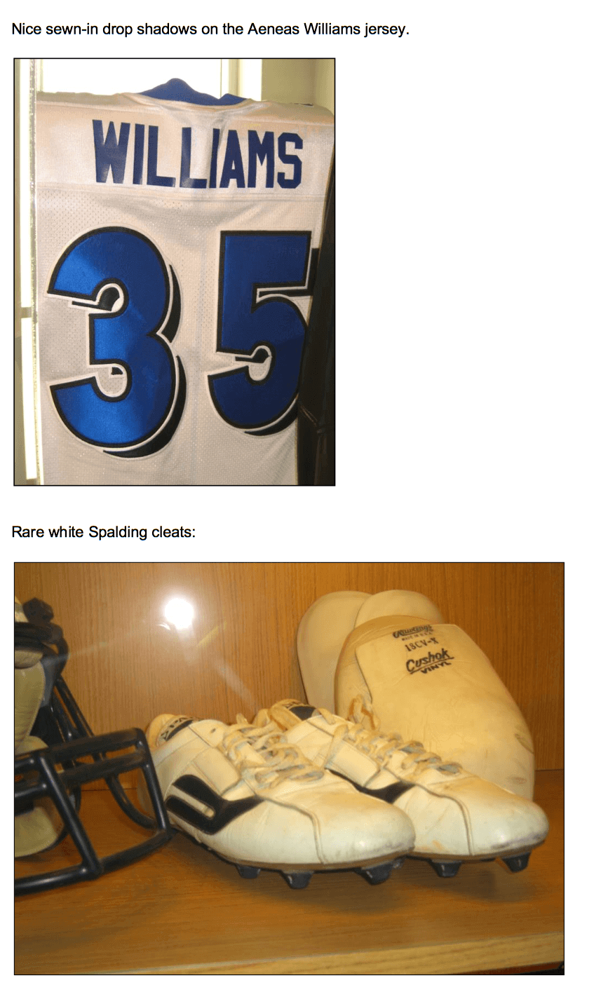
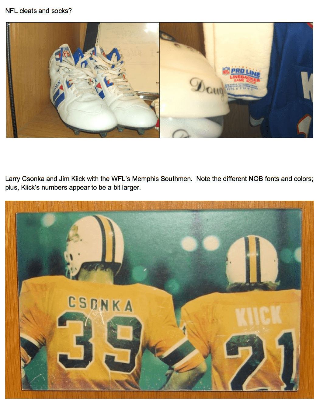
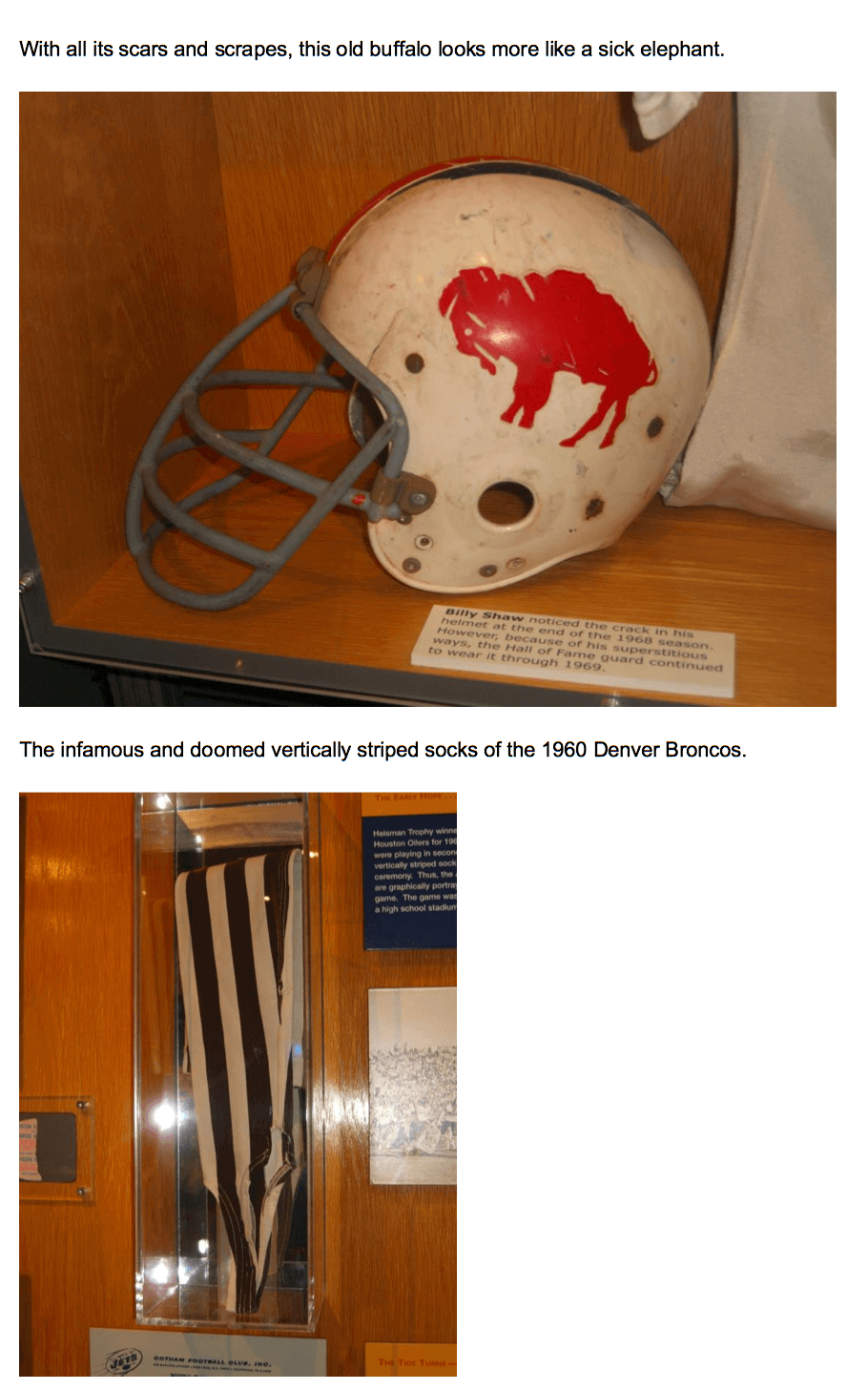
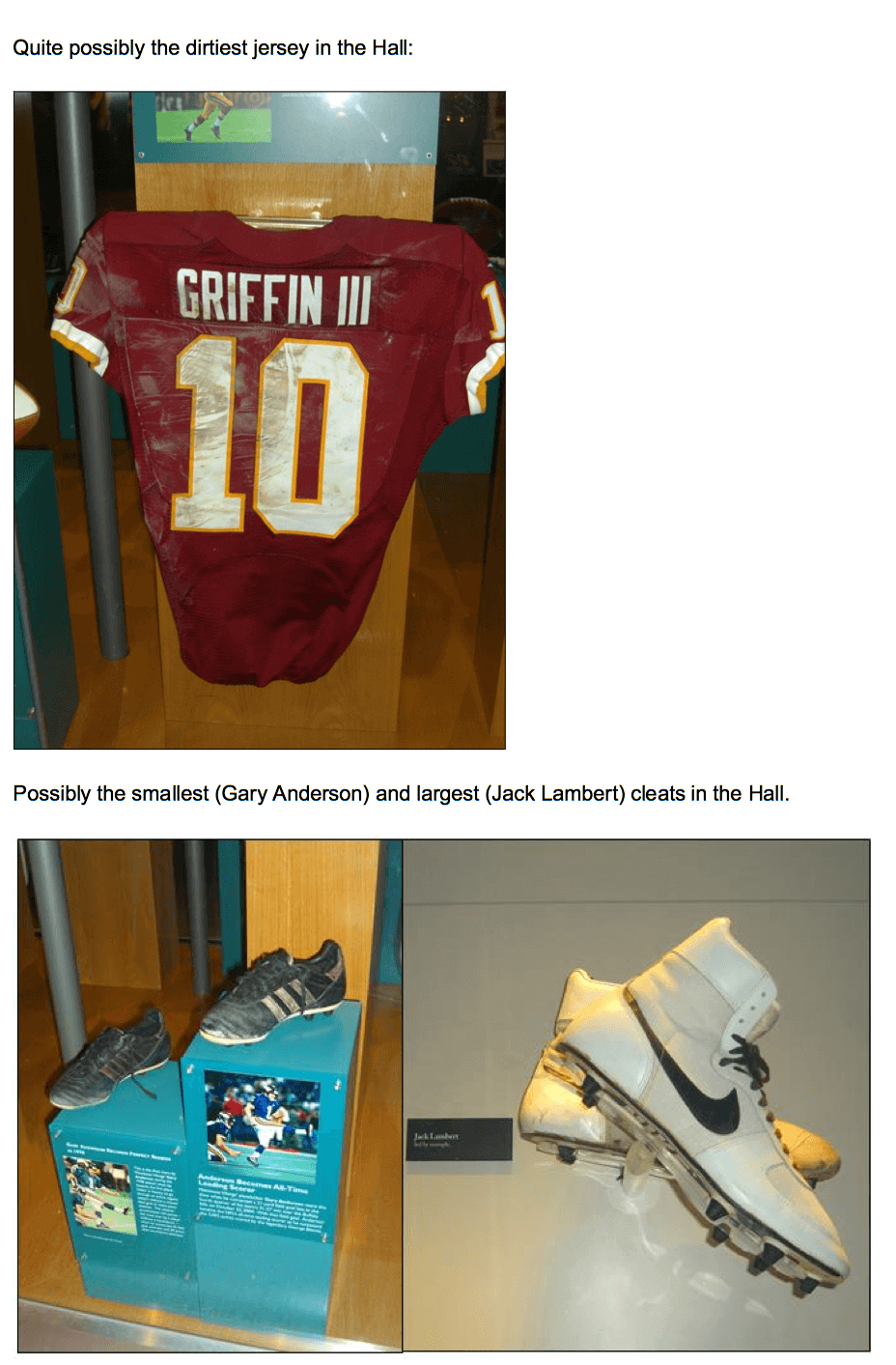
Great stuff from the Hall of Fame. A few thoughts from me:
The football from Super Bowl XLV appears to show the score as 00-00 on it.
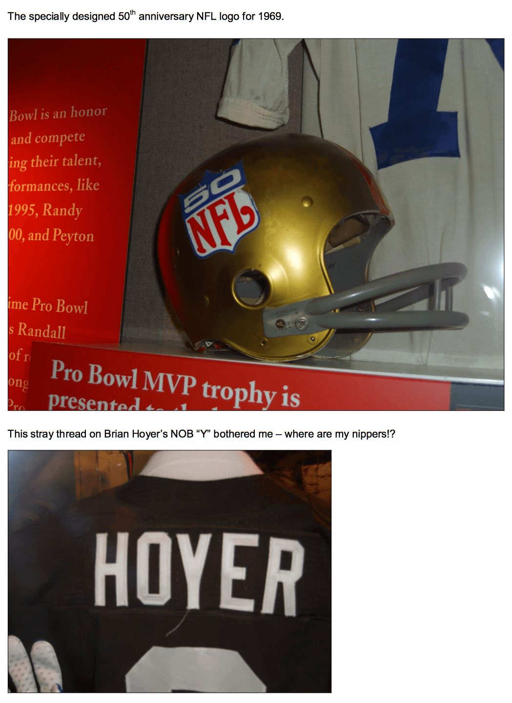
How big must that place be to include a Brian Hoyer jersey?
I would LOVE to see something like this about the Baseball HOF someday.
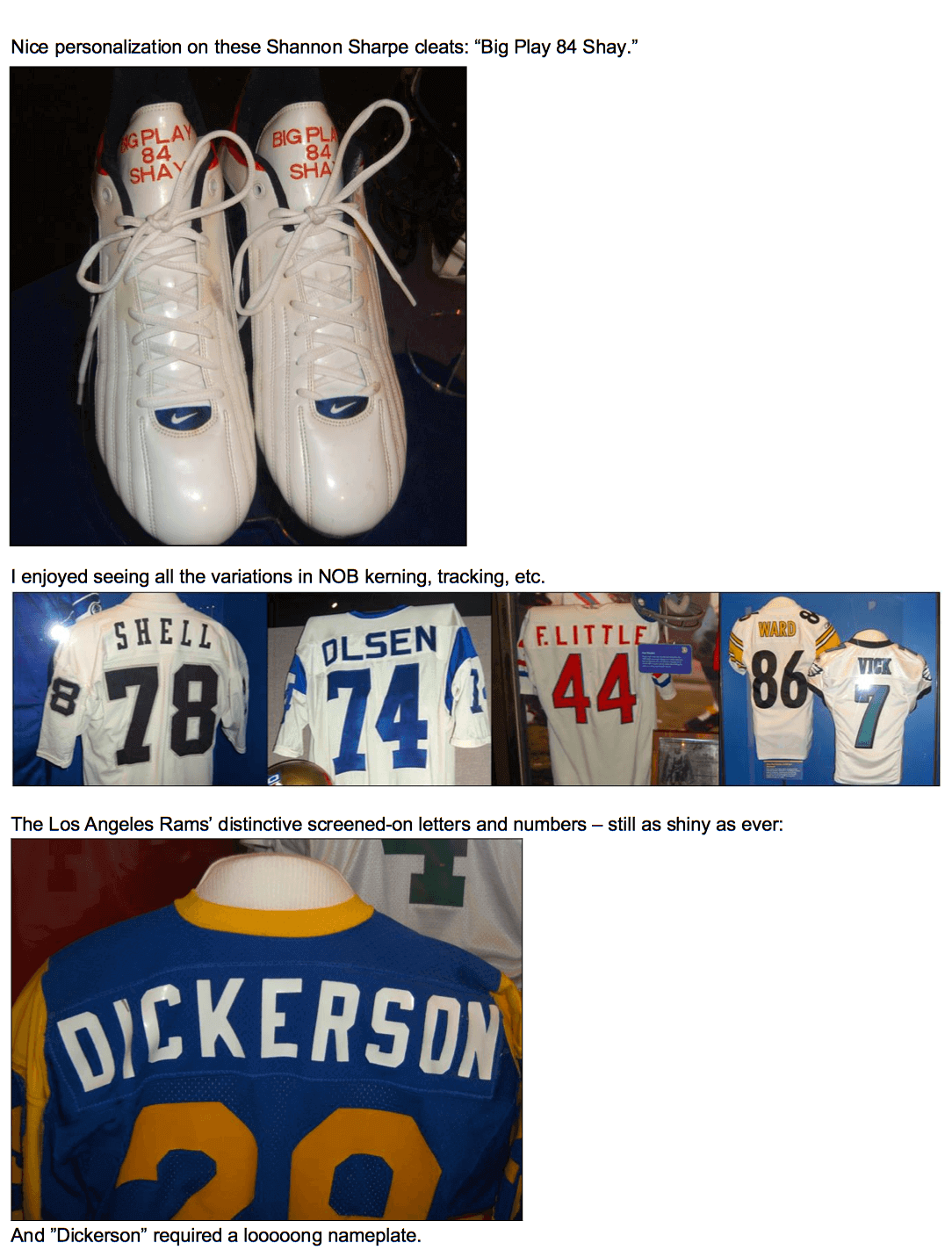
My first thought was: When did the Buffalo Bills wear that Jim Kelly jersey?
My query was addressed further down. Thanks!
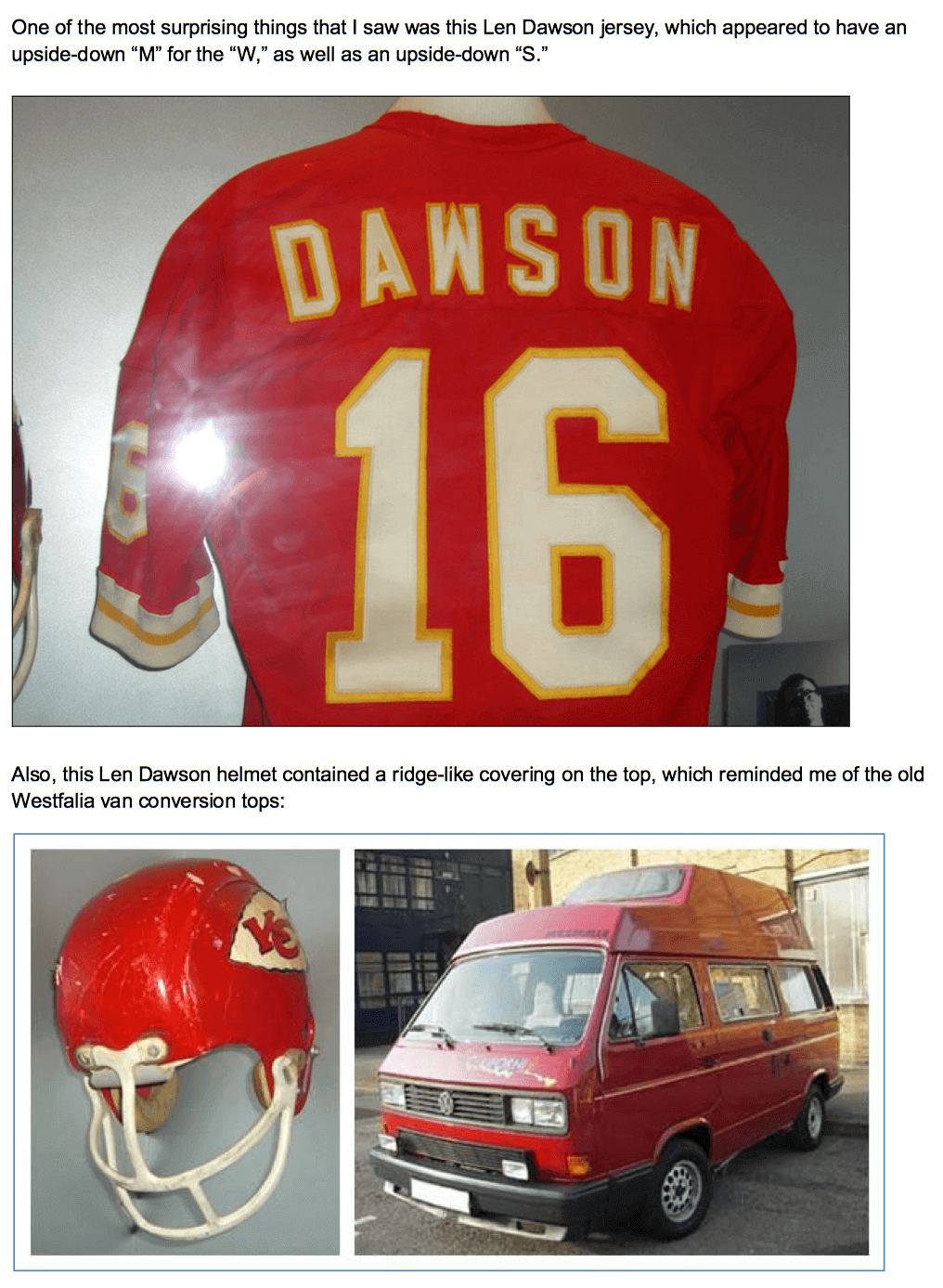
I don’t think that was Len Dawson’s helmet in the Hall of Fame photo. It looks like one that was worn by Willie Lanier, as I recall.
Wait, all the other leagues have the league logo on both sleeves?
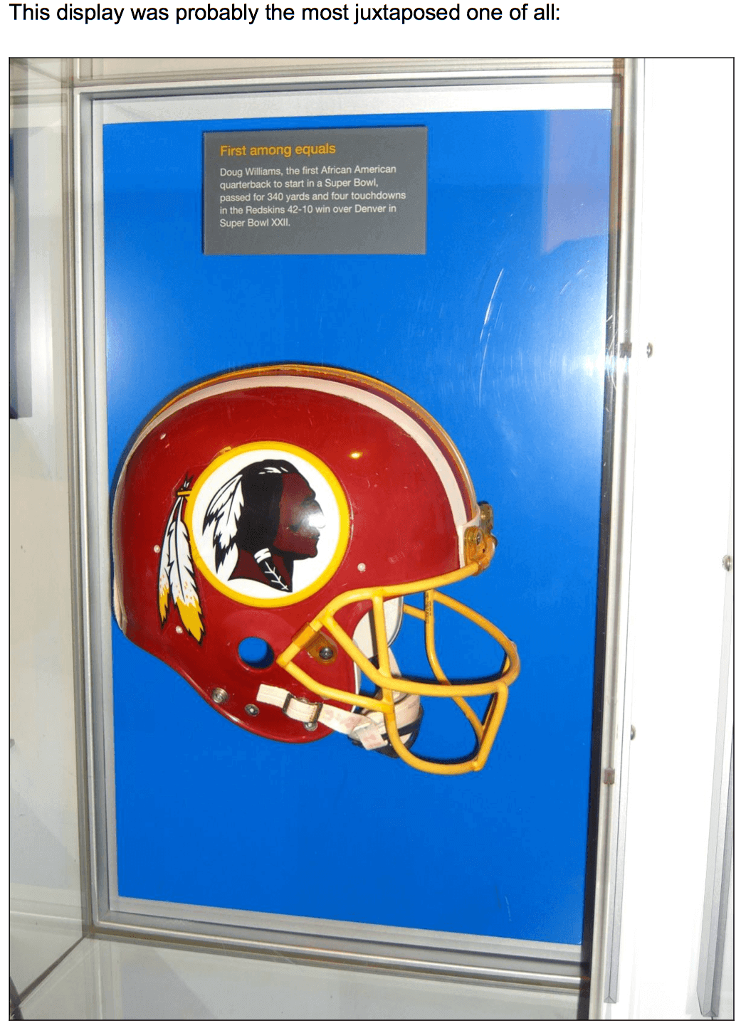
If the Redskins identity really is all about honoring Native Americans, then burning Redskins merch is an insult to Indians, equivalent to burning a cross on someone’s yard or burning the American flag. Redskins fans can’t have it both ways. Honoring actual people requires a higher standard of care and conduct than building your team identity around furry animals or dime-novel characters.
Let’s not go down this road, please. We don’t even know if the fan in question agrees with the premise that the team name “honors” Native Americans.
Let’s move on. Thanks.
Oh, hey, sorry. I meant that at a conceptual level, thinking of Redskins fan culture generally. Not an attack or anything on this particular fan. Didn’t mean to argue the merits of the nickname itself, either. My apologies! I’ll take no offense if you disappear the whole thread.
More to the point, this is Wisconsin, and the NBA plays in winter. What is this “natural light” they’re talking about?
It could be a shoutout to a local boy who made good in the architecture profession. He used natural light a lot, frequently in the form of clerestory windows.
Odd, around here, the frat boys are pretty much the only ones using a lot of Natural Light.
This is wonderful!
The Bucks share their arena with Marquette since 1974.
Thanks for the Hall of Fame pics. Does anyone else think that Jim Kelly jersey looks “off”?
It’s actually the 1994 throwback jersey, which was only worn a couple times. That’s why it looks odd.
A.K.A. the WORST “throwbacks” ever. A white standing buffalo on their red helmets (without even changing the stripes one bit), and a striping pattern never used before or since…
The only teams that put less effort into the 1994 throwback program were the Browns, Colts, and Buccaneers! Granted, the Bucs didn’t have anything to throw back to at that point, and the Browns and Colts had fairly iconic, long-standing looks, though those two did have options they could’ve considered (which they did use in the 2000s).
In 1994, the Jets also used the Namath-era logo on their then-green helmet.
But at least the rest of the Jets’ throwbacks were right!
It’s “Clif” (one F) Bar.
btw, they are delicious.
Fixed. Thanks.
Jack228, could you please email me off-list? uniwatching at gmail. Thanks.
Re: the Rams’ numbers
The ones in the pic are not screen printed, they are heat applied vinyl…that is what makes them shiny. The ink used in most screen printing applications does not have a glossy appearance.
re: that big soccer stadium banner
I didn’t send this in as a ticker item since it’s about a month old, but no less impressive: link.
Paul, I saw a Paul Kuharsky tweet last night regarding the Titans now wearing white at home. Apparently their owner, Tommy Smith stated on his Kuharsky’s radio show that “We’ve pretty much seen the last of the light blue” jerseys. Do you know if they are getting an overhaul or switching back to dark blue?
News to me. Will try to find out more.
As much as I prefer the dark blue to the light blue, the jersey color was never the problem – it was the combination with blue pants and blue-topped socks.
And I’d hate to see them go with red alts.
I agree with that statement. I prefer the navy look, especially compared with the light over navy combo, but it was always the pants which caused problems. Wear the light blue jersey with white pants and it looks just terrific. I’m also disappointed we haven’t seen the light blue pants in a while. I always liked them with the white tops.
Navy-over-light blue looks good too:
link
ChrisH – link.
That small-X-changed-to-times-sign bug strikes again…
Ugh… I hope not. I get that a lot of people don’t really like the light blue over navy that the team had been wearing (I think it looks really good, aside from the navy socks), but at least it was unique.
I saw the same tweet. I knew something was up since they had phased out the light blue pants. I thought the white jerseys/light blue pants combo was their best road uniform, but they were MIA since preseason last year. Now it makes sense. It’s a shame too since they FINALLY wore the light blue jerseys/white pants combo last year and it was by far the best look they’ve had. I loathed the light blue jerseys/navy pants combo they’ve worn for years and I never understood why. It was so XFL looking.
I don’t mind the navy jerseys but navy is so boring and overdone. At least light blue was somewhat unique and a nice reminder of their Oiler days. I hope this means a uniform update but if they are losing the light blue, it probably just means another navy variation.
I lost half an hour at breakfast going through those state soccer jerseys. Terrific project, even if the deliberate inclusion of (and commentary on) a few ugly jerseys was perhaps a bit too arch. Still, generally well thought-out designs for most states.
Agreed, and I think this is the first soccer jersey project that didn’t bug me a lot (a lot of them are lazy and simply apply colors to templates, some throw in local sponsors that don’t make sense, many just don’t get the aesthetics of soccer jerseys).
And they just wouldn’t be realistic without ugly away kits, right?
The designs were thoughtful and fun. The subtle digs at manufacturers throughout showed the designer knows a bit about Nike’s “storytelling” uni details and Adidas tendency to just give new clients a template design.
The Maryland jerseys were tops, IMO.
Nah, New Mexico and New Jersey tied for the win! Maryland was a letdown for me – it was the obvious choice, which has become a visual cliche thanks to UMD. I’d like to have seen something of the thinking behind the interesting Utah unis applied to Maryland for a fresher take.
Best single jersey: Hawaii home.
I’m digging NM, but no love for the Alaska jerseys? I know we’ve seen a similar “mountain” design on an actual jersey, but it’s got the Big Dipper! The Big Dipper!!
(The “Midnight Sun” branding is awesome too.)
Being NJ born and raised, I loved their jerseys. Giving a little credit to the Garden State was nice. I agree that the MD jerseys were a bit of a let down, however incorporating the Baltimore flag was a nice touch and something that UA has not yet done with UMD.
Thumbs up on the Hawaii home statement.
Agree, agree. Witty and well-considered, and I too liked the presence of plug-uglies with dopey explanations … As a regional homer, I think New England and DC did pretty well, …Good find, Phil. …
Much better than some of the guy’s previous work as terriblehuman says, if simply for the fact that it eschews the unnecessary jersey ads. Still though, many of the designs are highly derivative and the whole thing is still basically just a professional design guy cosplay. Even as far as the wittiness is concerned (which I did enjoy, mind you) it’s not so much a scathing satire as it is the kind of ego-stroking ribbing one might find in a White House Correspondent’s Dinner roast. I suppose there’s nothing wrong with any of that in principle, but I get this overwhelming sense from these that this is as good as we should expect as far as original ideas are concerned, that even when there’s no compulsion to do so, the designer’s individual sensibilities are subservient to the brand. Which is a shame because I quite like what little of his aesthetic sensibilities he does allow come through and I would love to see something of his which was completely divorced of any corporate pretense or idiom and was entirely his own.
I love that the Utah home kit is black and yellow hoops. It’s the Beehive State, and they’re dressed like bees!
A small stroke of brilliance.
The bottle opener actually confused me for a moment, regarding the “77” below WABC on the one side. I’m used to associating the call sign with the TV station, not the radio station. (I know WABC-TV is one of ABC’s original five owned-and-operated TV stations, and is one of four that’s still an O&O.)
What’s even weirder is that, in looking up the radio station, WABC still uses the “77” branding, rather than their full 3-digit frequency number of 770. I know our “big two” in Detroit, WJR and WWJ, went 3-digit sometime in the mid-90s. I wonder just how many AM stations still use 2-digit branding these days.
I grew up in the DC area. WMAL’s jingle switched while I was away at college.
“A.M. Sixty-Three” changed to “A.M. Six Thirty”
It still makes me want to fall down when I hear the “new” one!!
Saw this article about dropping “lady” from womens’ team names. I always thought it odd to identify teams as “lady” this or that. “Lady Hoosiers”? “Lady Tigers”? …always seemed clunky to me. Evidently, some have been doing it so long that they see it as tradition and oppose changing. It’s also kinda funny the article specifically mentions Delaware, where men are “Hens” and women are “Lady Hens”. Perhaps it’s the men who should be identified. (Man Hens?)
link
Also found this interesting Wiki link, listing differing mens and womens team names at certain schools. link
My two favorite male/female sports team names are the U. of Central Missouri Mules and Jennies and the Kenyon College Lords and Ladies.
Also, I’m surprised there’s never been an issue with the Delaware Blue Hens in this regard. I understand that the Blue Hen is the name of a breed of chicken (Blue Hen Chicken) and that even males of the breed are called Blue Hens as opposed to Blue Roosters but still… it’s an interesting thing to contemplate.
Hey, Paul, the FAST material is wonderful.
Thanks, Conn — appreciated.
Is there any information if teams are going to wear throwback uniforms for Thanksgiving?
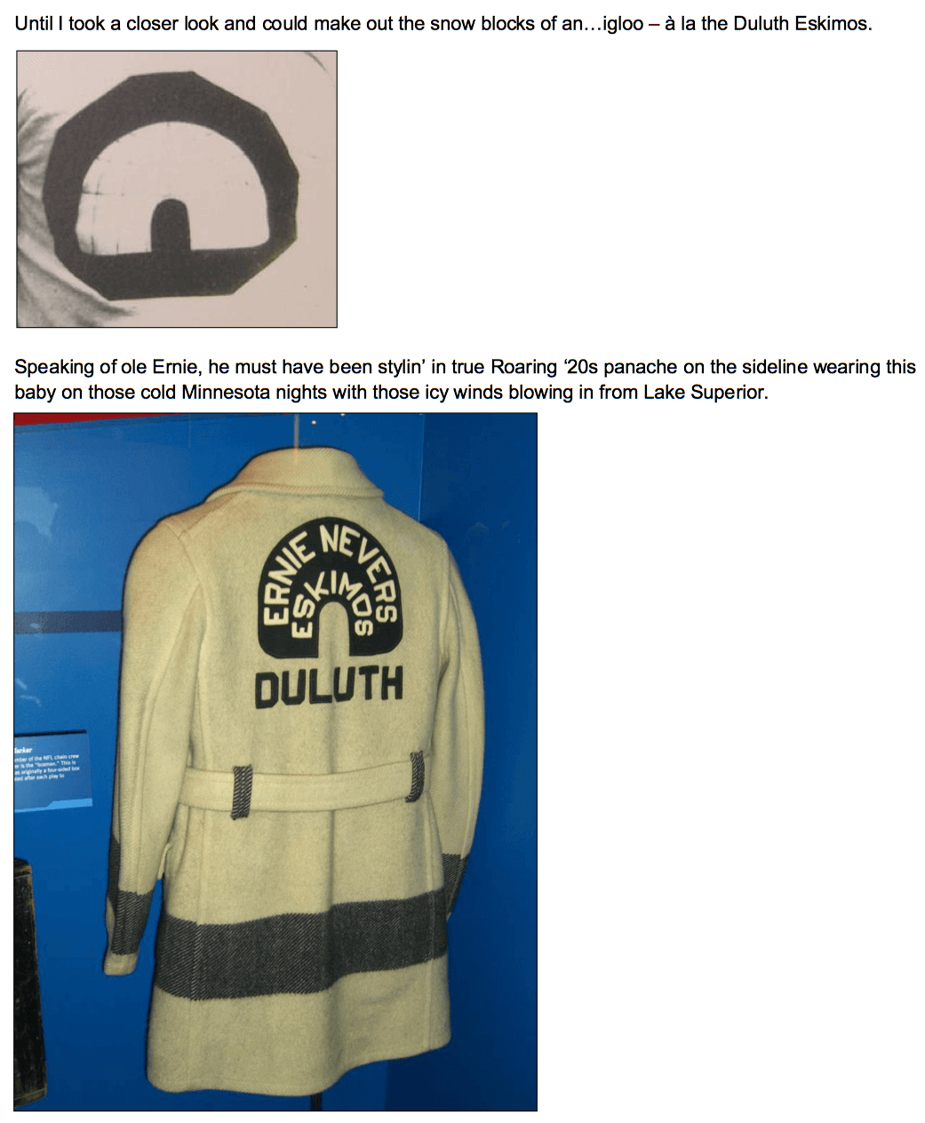
You can see the “shadow” of the #60 on the Otto Graham jersey. It was taken off and replaced with the #14.
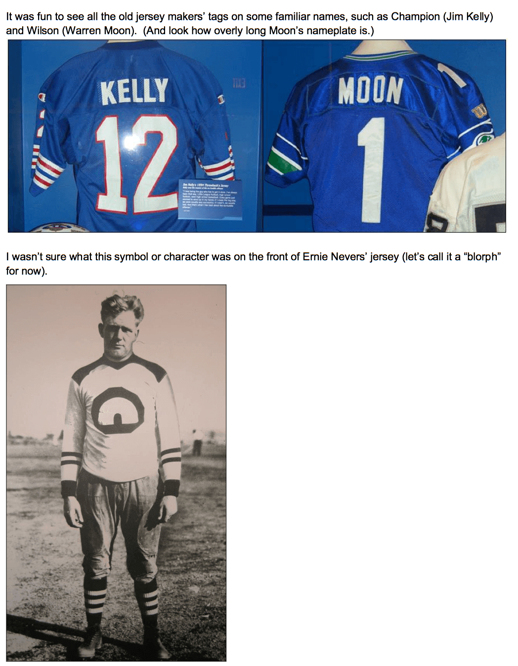
Sadly, the Eskimos didn’t spend much time in Duluth. They were primarily a traveling team. They played one game in Duluth in 1926 after signing Nevers. They were also officially the Ernie Nevers’ Eskimos.
It used to be argued that the Eskimos became the Washington franchise, but if you read the Wikipedia entry, the connection is somewhat tenuous.
Great article today, thanks Tom.
Regarding FAST, if only I had space for that octopus-on-a-rock. Awesome. Nice piece Paul!
Interesting sight at the Cavaliers/Nuggets game last night with a 0 (Kevin Love) and 00 (Darrell Arthur) on the court at the same time.
link
Good stuff on the Pro Football Hall of Fame, definitely a lot of Uni Watch material there.
I find it interesting that the HoF contains memorabilia from current playing active players as well.
That’s true of the Baseball Hall of Fame and the Hockey Hall of Fame, as well.
It’s common for things like the the hat a pitcher wore while winning his 300th game to be boxed up and sent to the Hall immediately after the game.
Don’t all these sports museums display uniforms and equipment from current players? I know the Baseball Hall of Fame has one cabinet for each team where uniforms, helmets, gloves, bats, etc. from active players are showcased.
Oh, didn’t know…
The “Beards at BYU” movement is nothing new. It’s a constant thing — I was a freshman at BYU in 1981, and there was a movement to repeal the beard ban back then.
I appreciate the Muslim kid’s argument that wearing a beard is part of observing his faith, but I’ve got a son going through the BYU application process right now, and the Dress and Grooming standards have appeared at least three times in the application, and every time, he’s had to check a box saying that he’s read the standards, and agrees to abide by them. It’s not like the school is hiding the fact that you can’t wear a beard. The distress and consternation is a little like the guy who walks into a building that has “LIVE NUDE GIRLS” plastered on every available surface, than expresses Shock! and Outrage! that he found topless women dancing inside.
And just by way of comparison, BYU tuition for Mormon students is $2500 a semester, and $5000 a semester for non-Mormon students. The closest comparable private university, Syracuse, charges just over $20,000 a semester for tuition. People don’t go to Provo for the night life, or the freedom, or even the cool mountain air. They go because it’s a quality education, dirt cheap.
Stay clean shaven? If it means I’ll save 15 grand a semester, I’d French kiss an Osmond, if they want me to.
In other sports beard news, the owner of an unpronounceable Turkish soccer team has announced link, asking rhetorically, “Is this an Imam school?”
The owner has a mustache, and it’s unclear whether his last name is Steinbrenner.
Important context: post-Ottoman Turkey was dominated, politically and culturally, by Mustafa Kemal Ataturk, whose secular reforms were a lot closer to the French vision of laicete than English or American visions of religious toleration. Modern Turkry is politically, and, increasingly, culturally, dominated by the Islamist AKP party under Recep Tayyip Erdogan, who has pushed back against the Kemalist model to create space for the public display of religiosity, including the headscarf for women and the beard for men. But there’s still a strong culturally anti-Islamist element in Turkish society, especially in the cities, for whom a beard remains a provocative display. There are very touchy cultural and political issues at play in this instance above and beyond the obvious-to-most-Americans religious implications,
BYU – The link of collegiate personal grooming standards.
What does tuition have to do with anything?
It’s okay for students to seek changes to the rules, no matter how many times those rules are listed on the application.
I completely disagree, Chance.
The Steinbrenner analogy is a reasonable one: You want to play for my team, you have to shave. If you want to be Cowboy Bill Flett (I know, I know — wrong sport), you’re welcome to sign with another team. It may be a stupid rule, but there are lots of other colleges out there, where the hirsute are allowed to roam unfettered.
Just to clarify, BYU’s student population is about 98% Mormon (and about 84% White, but that’s another issue). It is most emphatically a church school. The school’s culture is steeped in Mormonism and Mormon traditions. Every student is required to take 14 credit hours of religion classes, including a minimum of six hours in Mormon doctrines. And the Provo-Orem metroplex is as charming as a rest stop on I-95. Students make commitments to refrain from everything from iced tea to premarital sex. The hottest hangout in town is the campus ice cream parlor (which is overrated). There is not a lot to attract the typical college student, except the fact that it’s a really good school, and it’s cheap.
When you realize that you can get a 4 year degree for what it would cost you for one year at a comparable university, tuition becomes a pretty compelling consideration.
I dunno. I get your point, Cort, but just because you sign up for certain state of affairs doesn’t mean you can’t try to improve them via peaceful, persuasive measures from within.
By the same token, of course, the school’s administration is under no obligation to be persuaded by the pro-beard movement. But to suggest that the movement has no right to exist strikes me as too inflexible. An awful lot of positive change in this world would never have happened if people were simply told, “Sorry, you knew the rules when you got on board.”
I admit to some mild surprise at your stance on this issue, Cort. I have come to think of you as my source for thoughtful and progressive insight on issues of Mormon culture, often as a counterbalance to other voices I hear that champion the status quo for the status quo’s sake.
I’m not saying you don’t have a more reasoned explanation for your position in this case, but so far, your rationale has been straight up along the lines of, “If you don’t like it, go somewhere else!” I’m curious to know what you see as the benefit for BYU keeping the no-beards policy when it’s not a requirement for the church as a whole.
Paul, you’re making the assumption that things are better with beards.
Have they improved Brooklyn? I submit that they have not.
BvK1126, thank you. For the record, I am a bearded Mormon.
My stance has nothing to do with Church policies, and everything to do with being a bitter old man. They tore down Deseret Towers, my old dorms. They quit selling Nachos Deluxe at the Cougareat. The football team dresses in black uniforms, when the team motto is (or at least used to be) True Blue. In my day, we couldn’t even wear Levis to class, now all you see is dudes in long scarves and skinny jeans.
In short, I don’t care if people wear beards at BYU. I just care that I couldn’t.
Paul, you’re making the assumption that things are better with beards.
I realize you’re sort of kidding, but just to be clear: No, that’s not right. I’m working on the premise that things are better when people can make their own facial hair choices, rather than having them imposed from above. Or least that things are better when people are free to argue for that point of view instead of being told, “Sorry, you knew what you were getting into.”
I was completely kidding.
If you’re looking at BYU as an open community, your argument works, and I agree with you. If you look at BYU as team (and make no mistake — leadership sees the school exactly that way, with every student, every sports team and every activity meant to serve as a model for the benefits of the Mormon lifestyle) then enforcing dress code uniformity, including keeping the men clean shaven, has a certain logic, the NFL’s obsession with sock length.
…enforcing dress code uniformity, including keeping the men clean shaven, has a certain logic…
Understood. But according to the article, lots of other aspects of the dress code have fallen away over the years, suggesting that standards and rules can change with the times. That doesn’t necessarily mean that now is the time for this particular rule to change, but I do think it means it’s OK for the students to raise the question.
Agreed.
I still the Nachos Deluxe, though.
Can’t fault BYU for inconsistency: Just yesterday we learned that the once-scruffy mascot is now clean-shaven.
Nachos Deluxe? I’d miss ’em too.
One point: the rules don’t specify that men must be totally clean-shaven, only that they can’t wear beards. Mustaches are okay. I can see where current students would find the rules arbitrary and respectfully, civilly advocate for changes in the rules.
In fact, I believe that current students are in a unique position to ask that the dress code be overhauled. If they’re not to be listened to, who is?
To me that article is just another example of the NYT’s East Coast parochialism, where people who espouse different values/lifestyles/social mores are portrayed either with “SMH” bemusement, sneering condescension, or both. The article reports, without making any effort to show, that this guy’s cause “has struck a nerve” at the school. So call it tilting sloppily towards bemusement, but with an undercurrent of sneer.
And while I would never begrudge students the right to petition responsibly for changes in school policies, even policies disclosed to them repeatedly prior to enrollment, in my experience they’re the ones who tend to be the most resistant to change (perhaps b/c those policies are part of what compelled their attendance in the first place). The college I attended had Monday-Saturday classes for the first six weeks of every semester, and alternating Wednesday and Saturday free days thereafter (i.e., one week classes were Monday-Friday and the next Monday-Tuesday/Thursday-Saturday); when the faculty petitioned to change to a straightforward Monday-Friday class schedule, student opposition was nearly unanimous.
The one expressing regional (or perhaps cultural) bias here is you, not the NYT.
The NYT isn’t asking BYU to change its policies — students at BYU are. I suppose those students are expressing “East Coast parochialism,” right?
If you have an axe to grind against a certain media entity, that’s your business, but don’t blame them for reporting on something that’s actually, you know, TAKING PLACE.
No idea what my “regional/cultural bias” might be, as I’ve lived my entire life on the Eastern seaboard (except for college), and I don’t profess (much less practice) any faith.
That said, being married to someone who was born and raised in a Rocky Mountain state I’ve spent enough time there over the past 25 years to be at least marginally conversant with the region, and it’s been my experience for decades that the East Coast print media coverage of it is shallow, oftentimes incomplete/inaccurate, and tends toward easy stereotype/caricature. Perhaps the West Coast print media is as well, but I don’t read the Los Angeles Times or San Francisco Chronicle.
As for the article in question, the only thing it reports on TAKING PLACE is a BYU student starting an on-line petition to change the school’s facial hair policy. Not exactly a “man bites dog” story, it seems to me. Have multitudes of his fellow students enlisted in the cause? Article doesn’t say (suggesting not). Has this student or any other students suffered any adverse repercussions for their advocacy? Article doesn’t say (suggesting not). So the article is either sloppy (reporter didn’t bother to find out) or disingenuous (findings didn’t fit desired narrative). Either way it’s shoddy to me, unbefitting of publication in the so-called “paper of record.”
tl;dr: article serves no readily-apparent journalistic purpose.
article serves no readily-apparent journalistic purpose.
I think the degree of discussion that the article has prompted here — some of which has been quite enlightening — is one measure of the topic’s newsworthiness and the article’s merit.
But even if you discount that, what you’re basically saying is (a) your concept of newsworthiness is superior to the NYT’s, and/or (b) whoever edited the piece didn’t do a good job. Let’s say, for the sake of argument, that you’re correct on both counts. Even if that’s the case, I’m afraid it hardly merits a charge of “East Coast parochialism,” which sounds like a convenient bit of name-calling to slap on anything with which you disagree.
Mormons are used to bemusement, with an undercurrent of sneer. We are the ecclesiastical equivalent of the Denver Broncos uniforms: universally hated at first, then, after many years begrudgingly tolerated, but never universally embraced.
Nice display on the Hall of Fame. Haven’t been there in a few years but I remember seeing the “Other leagues” display and it having some USFL uniforms. I’ll give the NFL credit for at least acknowledging the USFL, WFL, AAFC, the various American Football Leagues that existed before 1960 (all of them were from before WWII), although they should induct players with significant playing time in another league. No love for the CFL, arena football (not just the AFL, but all indoor football leagues), and the XFL. (Although the XFL arguably shouldn’t be mentioned anyways.) I haven’t been there since the UFL was in existence, but they could make a case of having something there for them.
And I do apologize for showing off Jurrell Casey’s buttcrack. I saw some of the Twitter comments that were made after Paul uploaded it to Twitter. I think we see a lot more buttcrack shots on the field than we do the occasional “Moon over [insert site of game here]” shots. In any case, if there was any part of the uniform I would have no problem with getting tighter, only so we can be spared these shots (although I would be more than OK with the Legends Football League having such shots), humanity would be a better place.
I could imagine an XFL display featuring NFL and XFL jersies of Tommy Maddox, Paris Lenon, Corey Ivey, etc. And, of course, Rod Smart’s SB XXXVIII and HE HATE ME jersies.
*jerseys
I see TMQ is calling for an Official Uni Watch Explanation: link
I basically answered his question more than two months ago:
link
I feel like you pretty well answer that question on a near-daily basis. It was a little amusing to me that the question was asked at all. Plus, it was a little amusing to me, seeing my two favorite ESPN writers (somewhat) interact.
You’d think an editor would have picked that up.
Worst use of “Lady” (insert team name) is the Belle Plaine (Iowa) Lady Plainsmen. Umm, what?
Actually, I can sort of understand the Plainsmen example. Does a women’s team want to be called “plainsmen”? Should it be “Plainswomen”?
“Volunteers”, on the other hand, isn’t it gender-neutral? Why the need to add “lady” as a prefix?
” Should it be “Plainswomen”?
~~~
Make the whole school Plainspeople (or Plainspersons) — that will solve all, and everyone will be happy, right?
Plainiacs
Plain-Dealers
Plain Ole Folks
“Should it be ‘Plainswomen’?”
Yes.
Who you calling a plain woman?
link, I always kind of thought they were one and the same.
Probably why Nebraska Wesleyan University’s sports teams changed from Plainsmen to Prairie Wolves.
I went to a screening of the documentary link last night, about the Soviet Union’s domination of the sport of ice hockey for the better part of four decades. It’s an engrossing film, especially for anyone who remembers those seemingly unstoppable Soviet Red Army and national teams from the ’70s and ’80s.
It’s also a feast for a Uni Watcher’s eyes, with lots of footage and photos of various versions of what may be the link. One of the most intriguing to me was link, which features two very distinct shades of red (the brighter shade looks almost highlighter pink in the film footage).
A guy in the front row of the screening came decked out for the occasion in a jersey that looked link, except that the lettering on the back was in Cyrillic and the letters and numbers were screened on in white instead of black. Unfortunately, I wasn’t quite close enough to get a decent shot in the dim lighting with my crappy cell phone camera.
Is this in wide release? I would love to see this.
Currently playing here in NYC at the AMC Empire 25. Not sure where else.
Rather frustratingly, the official site doesn’t list which cities it’s available in:
link
Right now, it’s on the festival circuit and in limited release in New York. It will be in nationwide release on January 22nd. Definitely worth seeing when it hits your city.
Ireland vs USA from Dublin on right now – both teams wearing “away” kits.
Ireland inexplicably wore the white on Friday against Scotland too. Wonder if there’s an Umbro exec somewhere who’s a little unhappy about sales of the away shirt?
Regardless, I much prefer this. The current Ireland home kit drives me up the wall with the stupid mismatched greens on the shirt and shorts. Plus who doesn’t love the bomb pops? (oh yeah, most people)
I like the bomb pops! (then again, I *love* the Seahawks’ all-blue and all-white sets)
Minor complaint though – several US players are wearing baselayers with visible white collars. It’s a sloppy look, reminiscent of frat boys circa 1998 with white t-shirts under polo shirts.
I wish the US Team would just own the color Navy and have some continutiy (my favorite was the 2010 kit with the white diagonal stripe). I noticed the French in a dark blue kit the other day, but Navy is otherwise not well represented. Lots of Red (Spain, England) and Royal (Italy, Greece), but Navy appears to be there for the taking.
link
*continuity
Those Ireland kits are pretty sharp. Only thing I would add is a subtle flag detail reminiscent of Germany’s in 2010.
link
Tom, thanks for sharing your pictures from the Hall Of Fame visit. I am an hour and half away and have visited it a few times. It is always fun to see pictures taken by another visitor.
Good stuff.
And I haven’t been for about a decade, if not more. Good to see your pics.
Thanks for the HOF pics. I was there in 1997. I remember seeing Tom Dempsey’s shoe that he used to kick his then-record 63-yard field goal in 1970. It was just a little block of a shoe since he was born without toes on his right foot. Did it get taken out because his record was broken by Matt Prater (64 yards) of the Broncos last year?
Mr. Guthrie, a million thanks for digging up that Raiders poster. I had that as a kid, remembered the nice layout, and have occasionally scanned eBay for it. I can distinctly recall (also) noticing that #12 couldn’t be left-handed Snake Stabler … my first encounter (I think) with artistic license.
And yes, there are a handful of us Raider fans left. The last decade has been quite the nightmare, but I just can’t quit the Silver & Black laundry. (Sigh)
DAMN!!! My brother and I had twin bed sheets EXACTLY like the one shown (but it was the 1970’s) so I’m guessing we got them used if you say they are from the 1960’s