Click to enlarge
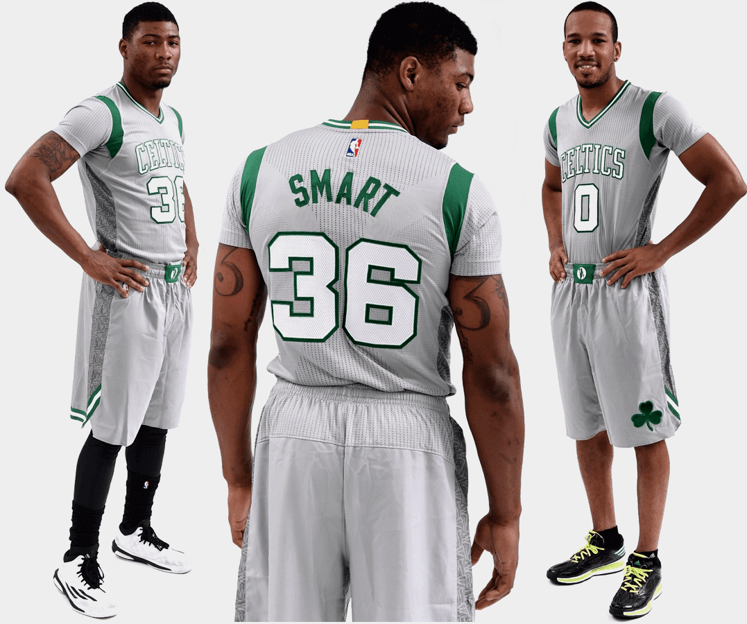
We’ve known for months now that the Celtics had a new alternate uni in the works for this season. When the shorts design leaked a few weeks ago, and didn’t look promising. And I guess you could say the full uni, which was revealed last night, has followed through on that promise.
We expect this kind of thing from teams like the Hawks, Timberwolves, or Blazers. But the Celtics? Embarrassing. But not as embarrassing as the uni design’s name, which there’s no way I’m going to repeat here. You can find it, along with the dates when the uniform will be worn (so you can mark your calendar to make other plans on those nights), here.
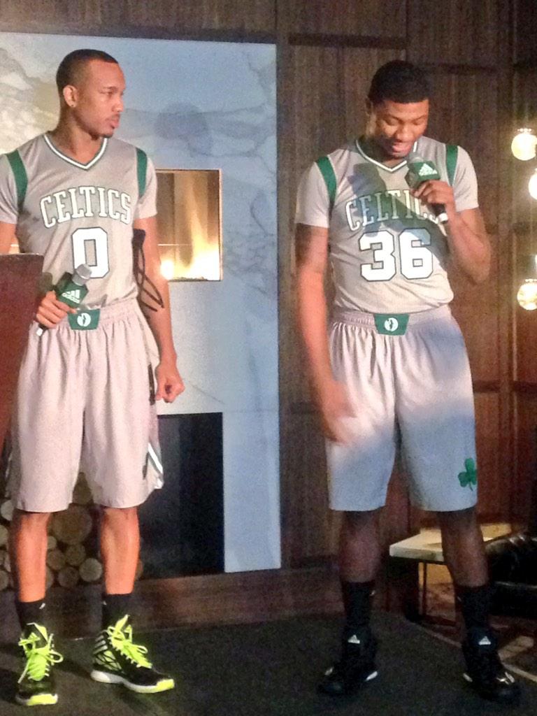
Want another photo? Okay — once more, with feeling (as in “feeling like shit”):

Sport of kings comes to Kings County: Prospect Park — Brooklyn’s version of Central Park, where I go biking every day — got a fancy new ice skating facility last winter, and on Sunday that facility will host Brooklyn’s first-ever curling class, conducted by former U.S. national champion and longtime Uni Watch pal Dean Gemmell.
Sunday’s class will be the first session in a five-week program that will include instruction and game play. Phil and I have both signed up, so I’ll probably have some good photos to share with you on Monday. Hurry hard!

’Skins Watch: Maryland’s new governor-elect plans to call the ’Skins by their regular name (thanks, Phil). ”¦ I realize you can’t always pick your allies, but those of you in the pro-’Skins camp might want to ask yourselves if you really want to be on the same side of the ball as these guys, who were at a Wizards game the other night (thanks, Phil). ”¦ There was a mild stir yesterday morning when the Indians tweeted a photo of their 2015 jersey without a Wahoo patch. But as a team spokesman confirmed for me, that’s just a low-priced replica, which doesn’t have patches. No changes to the team’s uni program in the coming season.

Baseball News: While looking for something else, I came across these 1980s stickers showing the A’s uni set. There’s also a Dodgers version. ”¦ Michael Schliefke checked out the Hallmark Visitors’ Center in Kansas City the other day and saw this Hallmark baseball jersey and jacket. ”¦ The Jackie Robinson West Little League team was apparently invited to the White House, where they gave President Obama a flag-desecration baseball glove. Kinda surprising no MLBer has worn anything like this. Anyone want to give the over/under on when it’ll show up next season? ”¦ Arizona Fall League player Tony Renda had some belt problems last night (from Andre Torres).

NFL News: Seriously unattractive game last night in Cincy, as the Bengals wore mono-black, the Browns wore brown pants, and both teams loaded up on G.I. Joevember accessories — including, get this, G.I. Joe tights for Browns CB Joe Haden. The CBS and the NFL Network chipped in by rendering the “TNF” lettering in camouflage. Sigh (screen shot by Gorden, who didn’t give his last name). ”¦ Meanwhile, cops at the game showed their support for Devon and Leah Still by wearing Still’s No. 75 (thanks, Phil). ”¦ Here’s a close look at a quaterback’s play-calling wristband (thanks, Brinke). ”¦ Jon Phillips notes that Kentucky Sen. Mitch McConnell has been using a rather Flying Elvis-esque campaign logo. ”¦ Reprinted from yesterday’s comments: Sky Sports is excited to be televising next year’s NFL games in London, but they used the outdated NFL logo (from James Burke). ”¦ Many of you probably already know the story of how the Lions ended up wearing Honolulu blue, but here it is again, just in case you want to refresh your memory (from Timothy Tryjankowski). ”¦ In the “What took you so long?” department, Nike has severed ties with Adrian Peterson (thanks, Phil). ”¦ I was at a vintage shop the other night and spotted this super-cool football-themed pillow. Looks handmade, too. Too pricey ($32), alas.

College Football News: Flag-desecration helmet for Purdue. ”¦ ASU wore its new helmets yesterday in practice. ”¦ Speaking of those new ASU unis, here’s a backgrounder on how they came to be, plus a video (from Joseph Giordano and Dave Burns, respectively). … Here’s this weekend’s uni combo for Vanderbilt. ”¦ Interesting piece on how LSU fans’ attire has changed over the past century (thanks, Phil). ”¦ Wake Forest wore gold helmets last night. As you can see in those shots, Wake was wearing mono-black, which perhaps explains — but certainly doesn’t excuse — why three idiot fans went blackface and -body. ”¦ G.I. Joevember unis on tap tomorrow for Austin Peay (Phil again). ”¦ “My grandfather, Ray Graves, played center at the University of Tennessee from 1939-41 under Coach Robert Neyland,” says Justin Davis. “I recently got an email from an aunt saying they had his old jersey and asked if I’d like it, to which I said, OF COURSE. Ray later went on to coach the Florida Gators from 1960-69, so this is a real SEC classic.” ”¦ Flag-descration helmet logo tomorrow for Washington.

Hockey News: G.I. Joevember warm-ups last night for the Flyers (from Marc Matteo). ”¦ Some heavy-duty headwear last night, plus a doozy of a shiner, for Radko Gudas of the Lightning (from Matt Larsen). ”¦ G.I. Joevember jerseys for Ohio State. ”¦ Good article on goalie mask artwork (thanks, Brinke). … Sports Business Daily ran an article on NHL COO John Collins yesterday, and at the very bottom of the piece they quoted him saying jersey ads are “coming and happening,” which quickly resulted in an avalanche of breathless media reports, even though Collins provided no details or even a timetable. Collins is clearly working from the Cuban/Silver playbook here, trying to create an air of inevitability for something he knows is going to be messy. As the NBA can tell you, inevitability is the easy part — hey, NBA uni ads are so inevitable that they’ve been inevitable for years now! But if Collins is serious, let’s take him at his word: Tweet at the NHL and tell them you don’t want ads on jerseys. While you’re at it, call the NHL office and tell Collins (or whomever) how you feel about this issue. #NoUniAds. … As an aside, I was amused by the bit where Collins “noted that jersey branding by manufacturers is already a form of jersey sponsorship.” He’s right about that, of course — I’ve been saying as much for years — but his implicit point is, “Eh, we already have one sponsorship, so why not have more?” That’s like saying you already have chicken pox so it’s no big deal if you get the measles while you’re at it.

Basketball News: You probably already the stories about sponsorship douchebaggery regarding the early Dream Teams, but here they are again, just in case (from Bryant Robinson and Bryan Kimball). ”¦ The Raptors will wear the purple dinosaur throwbacks tonight. ”¦ Here’s something I didn’t know about: In 1989-90, the Celtics wore a black memorial band with black “Follow Through” lettering. According to this auction listing, it was “for the owner’s wife, who used to tell Kevin McHale to follow through” (nice find by Matt Malinoski). … New uniforms for Tulsa.

Soccer News: NYC FC is gonna be doing that thing where season ticket holders can have their faces incorporated into the team’s jersey (from John Childers).

Grab Bag: Nike is partnering with a design/tech company to create an airplane interior design geared for athletes. Interestingly, the project is simply called “The Athlete’s Plane,” instead of something more Nike-ish, like “The Avenging Chariot” (from Jeremy Brahm). ”¦ People on TV keep using iPads even when they’re supposed to be using Surfaces (from Caleb Borchers). ”¦ Have I mentioned lately how much I love Hamilton Nolan? ”¦ Faaaaascinating piece on butter stick design! Don’t miss (thanks, Brinke). ”¦ Rugby news from Dan Budny, who writes: “Leicester played the Barbarians a few days ago and went with their original ‘numbering’ system, which uses letters. There’s more info on that if you scroll down here.” ”¦ Who has the most consistently creative magazine cover designs these days? Don’t look now, but it’s Businessweek. ”¦ Did you know nearly every hospital-born baby in America gets wrapped in the same blanket design? It’s true — really interesting details here (from Heather McCabe). ”¦ New rugby kit for France. “Of note is the change from white shorts to dark blue, and the repositioning of the three Adidas stripes (now dark blue instead of white) so that they run over the shoulder instead across the shoulder and behind the collar,” says Eric Bangeman. ”¦ Also from Eric: Rugby fans — or at least the ones in this Reddit thread — aren’t happy with the latest jersey designs. … You know its holiday shopping season when every team in every league is selling some idiotic ugly sweater. A few of these are amusing, but come on — can’t anyone come up with an original idea (or at least a good-looking one) without piggybacking on someone else’s? It’s pathetic. … An ongoing mascot controversy at UT-RGV was resolved yesterday to nobody’s satisfaction (from Cort McMurray).

Click to enlarge

What Paul did last night: The City Reliquary has a new exhibit devoted to portraits of old Jewish gangsters (including Arnold Rothstein, the guy who fixed the 1919 World Series, shown above), and last night I attended the opening reception.
The exhibit, which is called “Mazel Tough” (a name that narrowly beat out “Kosher Nostra,” I’m told), is excellent. Illustrator Pat Hamou uses a painstakingly obsessive cross-hatching technique that gives his portraits a lot of depth and texture, and he makes the most of the gangsters’ facial features. Each portrait is accompanied by a little placard indicating what the gangster was notorious for, his run-ins with the law, and so on. The whole thing is really nicely presented.
I happen to have a bit of Jewish gangster in my gene pool (my maternal grandfather was a bootlegger during Prohibition). But even if you’re not so lucky, you’ll still dig “Mazel Tough” — see it. You can learn more about the exhibit here and here, and you can see more of the portraits here.

Does using black body paint automatically make it blackface? I don’t think there was any attempt or insinuation that those folks would be imitating or mocking another race. Just simply supporting their team with school colors. I would find it hard to believe that anybody would be offended by that.
Does using black body paint automatically make it blackface?
Only if you don’t bother to think about it for a few seconds. Which, sadly, is how most people on the internet seem to react to it. It’s “OMG! Blackface! Racist!” without even considering context or intention.
I agree with Aaron, totally fine with it. Painting just the face would be one thing and probably in poor taste, but this instance LOOKS like kids supporting their team with their colors, not anything else.
Also, TCU has worn that helmet before. link
Silly? Perhaps. Objectionable? Not at all.
“Does using black body paint automatically make it blackface?”
No, it doesn’t automatically make it racist. But blackface performers originally made their faces literally black with burnt cork, greasepaint, and shoe polish. So these three fans in black body paint actually look more like Jim Crow minstrels than Julianne Hough, Claudia Schiffer, or other celebrities have in certain recent incidents that have caused some uproar.
Sure, intent matters, but the effect on the viewer is also determinative in whether someone’s behavior is socially acceptable. If these three guys had mixed some gold into their black body paint scheme, we probably wouldn’t be having this conversation this morning.
“Does using black body paint automatically make it blackface?”
No, it doesn’t automatically make it racist. But the effect an action has on the audience matters as much as intent does.
Blackface performers originally made their faces literally black with burnt cork, greasepaint and shoe polish. So these three fans actually look more like old Jim Crow minstrels than Julianne Hough, Claudia Schiffer, and certain other celebrities did in recent incidents that created some uproar.
Does this mean these guys shouldn’t get painted up to support their team? I’m not saying that. But I do suspect that we wouldn’t even be having this conversation this morning if they’d mixed some gold stripes or something into the all-black body paint scheme.
I think it speaks more to the offended viewers being offended and their thoughts on the world rather than the kids doing it. If you go around seeking to be offended or to find something to get bitchy about, you’ll find it. If you can’t slow down and look at as “oh, they are supporting their team” then maybe YOU are the problem. There is clearly nothing racist about what these students are doing. Now if they were wearing an Al Jolsen esque outfit and saying “mammy” then we’d have a problem. The “I’m offended” crowd takes the joy out of life. Please, “I’m offended” crowd… fuck off.
Since, of course, if they’d merely worn black clothing without painting themselves, nobody would imagine they were supporting their team.
re: flag desecration glove
Do baseball players really do all that much accessorizing when they are told to wear the stars and stripes caps? I feel like they look as miserable wearing that gear as we feel watching them in them. Also, baseball gloves aren’t one of those things you just swap in and out. They take time to break in. I doubt we will see a player using one on the field.
I don’t think MLB would allow it. Remember that Roger Clemens had link on his glove when he took the mound looking for his 300th win. It violated regulations, the Red Sox complained, and link.
They do have different rules for pitchers though, and rightly so. I wonder if anyone would complain if an outfielder used something like that.
Celtics alternates are horrible! Who would even come up with something like that…
Wake Forest Helmets aren’t bad…if they have the uniform set to go with it. As a Wake fan, it’s time to get with every other college and update their image.
The link to “these guys” in the Redskins Watch section isn’t working.
Thanks — now fixed. Here’s the proper link:
link
… WAT.
Paul,
There’s nothing proper about that shot. Eeeesh.
Rednecks bashing Redskins, wow. Just when you think we’ve reached the bottom in this wretched story of mascots gone bad, people out there find ways to keep on diggin’.
That’s pretty low, but I clicked on that link half expecting to see Wizards fans in Klan robes.
I’m a monster ‘Skins fan and I’m embarrassed by them. There always has to be some douche frat-type that has to take things a couple steps further.
Second link in skins watch doesn’t work.
As a Celtics fan, I’m totally embarrassed. You know they wanted to put in neon green. I kind of wish they had… If you’re going to make something crappy, make it historically crappy. How about a contest to redesign the redesign?
I just shake my head, and find myself appreciating the Yankees’ commitment to their iconic uniforms.
The bonus, of course, is that white on gray should be even less readable than black on green, which is saying something.
I can feel Red Auerbach spinning in his grave from here.
Actually, the Celtics’ alternates wouldn’t be that horrible if a) they closed the loop under the arms, and b) it wasn’t the freaking Celtics.
Since the introduction of the NBA shirtsey, it’s bothered me that it’s been assembled in such a way that it looks like a jersey on top of a same-colored shirt, so I like the approach of having the contrasting shoulder panels here, but again, complete the freaking loop. I don’t know what it is about NBA teams having an aversion in recent years to doing that (look at the Knicks, for example).
Personally, though, they should just make the shoulder loop and the sleeve the same contrasting color from the body.
As for the Celtics… their “PP” unis definitely fall well on the “Stupid” side of the “Good or Stupid” test.
Also, could they have done a sloppier job on Smart’s NOB? At first I thought it was just because he’s at a slight angle, maybe shrugging his shoulders, but nope – if you look close, the bottom of the left leg of the A is significantly lower than the bottom of the right leg of the M.
That’s not very Smart of them! (sorry, had to be done)
That’s the same TCU helmet worn earlier in the year (or maybe last?). It has the red streak for the blood that shoots out of horned frogs’ eyes.
I cannot put into words how disappointed I am that my beloved Boilermakers are beginning to fall into the stupid “LOOK AT ME” uniform fiasco… For the longest time, they simply had home and away uniforms for football and basketball, then they added a gold uniform for basketball. Fine. It’s a school color, they didn’t wear it often, no problem. Then the football team added black pants for on the road. Again, I liked the look, and it was nothing outlandish. Then they wore the black pants at home for an all black Halloween game… Fine, it’s a one off deal. Then the all black at home happened more. And they added white pants on the road. Then a gray basketball uniform. Then black football helmets, then a selfie logo on the gold helmets, then the highlighter decals on black helmets, now flag logos on the black helmets… I shutter to think that they have fallen into being just another school playing follow the leader with all this uniform tomfoolery.
As I sit here in my Purdue office, I’m sure the “lowest ticket sales in 60 years” has something to do with this new trend. And I absolutely hate it. Absolutely hate it. Thank God basketball season is right around corner.
It’s just sad. I always took pride in the fact that Purdue didn’t play around with all that nonsense. I guess those days are gone.
Give them an inch, they’ll take a mile. It’s why I’ve long wished that teams had just one home and one road uniform set. Once they start adding alternate jerseys, pants, caps, helmets, etc., anything goes.
The Reds are selling jerseys at 50% off on the team site. Any news on a Reds uni change for 2015? Creamer says they’re only adding an All-Star patch.
Majestic has introduced a new Cool Base replica jersey, so they’ve put the old ones on sale. That’s all.
The amazing thing to me about those hospital baby blankets is that the design literally has not changed in decades. Now that’s iconic.
I am convinced that hospitals don’t actually take pictures of newborns, they have a selection of stock photos in the back. You don’t need too many – Caucasian, Asian, black with hair, black without hair would cover about 90% of your needs.
As soon as I heard the NHL statement on jersey ads, I called and left the COO a voice mail. Which is stunningly easy to do, to be honest. As a Sabres fan, I’ve already lived the dual fiascos of the rebrand and the Buffaslug. Don’t throw Skoda ads into the mix.
(And really, of the four major sports, hockey has the most on-surface advertising already. Who would pay to be on a jersey with the boards, ice, and [on TV] glass festooned with ads?)
The NHL is actually closer to uni ads than the NBA if you ask me. ECHL and AHL squads have been wearing them for years.
I don’t have a problem with them, lived with them in a minor league market growing up, no biggie. But two concerns.
1. Limit the jersey to ONE ad, place under the number on the back of the jersey. Period.
2. Do NOT sell jerseys with said ads to fans (either replica or “authentic”) with the exception of game worn auction sales.
I want to reach out to the Dream Team article writer to tell him that he spelled Chris Mullin’s name wrong. It’s not Mullen…..
I think we should refer to the Celtics’ alternative uniform as…
Parkay Pride
The only Nike-style name that could possibly capture the entirety of new Celtic alts would be
Hunger
Because athletes are hungry for victory.
It’s not butter…
link
Re: Jackie Robinson West little leaguers…remembering the great article a few months back about LLWS teams wearing regional jerseys, I was disappointed to see them wearing Great Lakes rather than their actual team unis. I wonder who made that decision.
Favre’s QB wristband…..
The orientation of the text (portrait v. landscape) seems an odd choice, and thus hard to read (or to bend your arm to read). Especially with so much small print that one would be trying to read in a limited amount of time under a smidge of pressure.
Legit?
I feel like the Celtics uniform isn’t bad, but like someone else already said: you’re the Celtics. You don’t need to do this. It’s kind of the way I feel about it when I see schools like USC, UCLA or ND getting in the alt-of-the-week fray. Some of the designs are nice (some aren’t) but you don’t NEED to do this (or shouldn’t).
That being said, the Lakers have one of the more iconic/historic looks in association history. But the white sunday alt was introduced a few years back and it’s actually my favorite NBA uni currently. I’m not sure how this is that much different.
I’m more bothered by the sleeves… all the sleeved unis need to GO.
I don’t live in an NBA market, but I’ve never witnessed anyone wearing one of the sleeved jerseys. Are these things taking off in NBA cities?
I see Brooklyn Nets stuff everywhere, but I’ve only ever seen one person wearing their sleeveless jersey.
A quick google search reveals that thsee horrendous Celtics uniforms are being mocked and derided across multiple media outlets in Boston and elsewhere. My question: How likely might the C’s decide “nope. bad idea. never mind”? What other precedent is there for a team unveiling unis and then saying “uh, nevermind. forget it.”?
Well, there was the infamous 49er helmet that was unveiled, but never used in a game. Then there was the hideous alternate uniform that the Blues had that was so bad, Mike Keenan refused to use it (it never saw the ice). There may be others.
link
Union college men’s hockey team is going to be wearing purple and/or teal the month of November for domestic violence awareness. Thankful it souds from the press release its seems to be limited to skate laces and other minor accessories. Press release can be found in the link
In reference to the Hamilton Nolan article. It’s 2014, why doesn’t the Aamerican taxpayer get to see where his/her money goes?. It would be a way to make Americans feel pride in civic duty if they could see that their tax money was going to a certain school or building a new road, etc.
Your tax money doesn’t go to “certain” schools or roads – it sort of goes to all of them. Anyway, the Obama administration has taken steps in this direction: Tax forms now include a breakdown of where your money goes by general federal budget category. And if you recall, the federal government tried to indicate on signs which road and other construction projects were being paid for under the American Recovery and Reinvestment Act of 2009 … which Republicans in Congress and the media attacked as socialist propaganda.
I’m not sure about the signs being “socialist propaganda” (‘Your tax dollars at work’ signs at projects were/are pretty commonplace, at least in my region), but requiring/’encouraging’ these short-lifespan signs to be posted and passing (I think)the expense onto the states was wasteful spending, especially when you consider that the signs had almost standardization in their size/appearance/materials (aside for the ARRA logo?), all of which determine their cost.
The Celtic alts look like a Philadelphia Eagles alt had they continued using the pre-1995 uni template.
Good luck with the curling classes guys! Always my favorite Olympic sport. Definitely needs more love in Yinzerville.
With regards to last night’s game, the Bengals REALLY need to drop the black pants. Stick with white pants full-time. The Browns? I was actually hoping Cincy would’ve worn white at home, giving Cleveland the opportunity to wear their all-brown uniform. That look is not as bad as people make it out to be.
Re: Curling — thanks! Haven’t been on a sheet in aboot 3 years (and I suck anyway), so this will no doubt be some comedy at first. If Paul does get vids/photos, I hope none entail me on my arse.
Re: Bengals black pants — agree with you, but yet you want the Browns in mono brown and the Stillers in mono black. I’m not sure how you think that would be better than Cincy in mono black.
Should be a great time. We love the rink, especially now that it’s been converted back from roller to ice.
You signed up Chance? Pretty sure you still can.
link
Pat Hamou’s gangster portrait’s are great!
Butter sticks are shaped differently out West? What? That’t a real thing? How are we even supposed to share a country if something so fundamental is so wrong in one-third of the nation? What other horrors lurk in West Coast grocery stores? Do their beer bottles hold 330ml instead of 12oz?
Plenty of import beers are sold in 330ml out here.
Now I’ll have to pay attention to the volume of import beer bottles. I know that it’s illegal to commercially import spirits in the rest-of-the-world standard 700ml bottle, and there are a few whiskies that are not available at retail here because distillers don’t want to go to the expense and bother of setting up bottling lines for US-standard 750ml bottles. So I guess I sort of assumed that brewers also had to supply 12oz bottles instead of 330ml to the US market.
I honestly can’t say I have ever noticed domestically produced butter sold in anything but the “Elgin” stick format here in Denver. Now I’m totally going to be on the lookout!
We’ve had both. Lately it’s the stubby ones. I think that’s Challenge brand.
Thank goodness I live the part of the country that is not stymied and unable to use the entire line of Butter Boy corn buttering devices!
Butter Bot is the newest addition to our collection!
link
Too bad you live in the part of the country that can’t use those corn buttering devices on the best sweet corn this planet has ever grown – Olathe Sweet.
link
Oh, I might have to enter Zellwood sweetcorn into a contest or sumpthin’!
link
Listening to the podcast, I thought it was interesting that Land O’ Lakes now has butter in quarter pound half sticks – which is REALLY convenient for cooking.
link
‘I realize you can’t always pick your allies, but those of you in the pro-’Skins camp might want to ask yourselves if you really want to be on the same side of the ball as these guys, who were at a Wizards game the other night (thanks, Phil)’
Not defining myself as either Pro- or Anti-, but that argument would also preclude the ACLU from defending the Illinois German National Socialists from marching in Skokie, would it not?
(Yeah, I danced around the specific pejorative term to avoid the word automatically negating the argument…)
that argument would also preclude the ACLU from defending the Illinois German National Socialists from marching in Skokie, would it not?
The ACLU didn’t advocate for the Nazis; they advocated, as they always do in such cases, for the First Amendment and the principle of free speech. The party benefitting from that principle is irrelevant — that’s the whole point.
Which I believe your example further illustrates the point I’m intending to make, which we may or may not agree on as well:
If a principled argument could be made on behalf of even the most unpopular of thought and speech, and the necessity of that defense as was the intent of the First Amendment to preserve, it is immaterial then on who does or doesn’t agree.
The redskins issue isn’t something which our congress should be dealing with. If advertisers and fans don’t like it, they’ll stop going to games, wearing gear, etc. However, they’re not, leading one to believe this I won’t say Redskins stuff is an overvocal, overrepresented minority opinion.
Hey all, this might not be the best place for this, but here goes anyway. I’m looking into getting a custom varsity style sweater for my fiancee for christmas and was wondering if anyone knew of a good maker. Several sites come up on google, but many either require bulk orders or detailed ordering processes I don’t necessarily want to go through without knowing more about them. Thanks.
Odd, been thinking about that myself. Anyone?
Oh, I absolutely love those new French rugby kits. It’s pretty radical in the context of what might be considered “traditional” for France but it’s beautifully understated still. It maybe could have done without the gold Adidas logos, but the colours are great and I’m happy to see some sleeve stripes back on a top level rugby jersey.
As for the Redditors, aside from France obviously, they’re pretty much spot on about this year’s batch. I was especially disappointed that the move back to Canterbury didn’t yield better results for the new Irish kit.
I’m with Padday here. The new French look is pretty cool. Mind you, there’s a part of me that wishes that all French national soccer and rugby unis should go blue top white shorts red socks (ditto for Mexico with green instead of blue), but these are good. Also agree that the gold Adidas elements are unfortunate. And yeah, Ireland coulda shoulda done better.
Oh yeah. I just love “Kosher Nostra.”
France have actually had some of the nicest kits over the last few years (including a few with the full tricolore effect). It’s worth noting that they’re also the only major rugby nation to go sans ads. Coincidence?
Seeing Marcus Smart’s 33 (college number) tatoos with his 36 number made me think. Are there many others in pro leagues where they have visible tatoos of their most worn number, but have a different one now because of retired/in use numbers?
The only other player I can think of is Trevor Booker. He has his Clemson number 35 tatoo’d on his shoulder and wore it with the Wizards (link). He now wears, coincidentally, 33 for the Jazz because 35 is retired.
The new Celtics alternates raise a point that I’ve been trying to figure out for a few years now. Why do Adidas and Nike continue to insist on uniform designs that include completely insufficient contrast between the jersey color and the color of the numbering and lettering? As BurghFan points out in his critique of the Celtics uniforms above, the white-on-gray numbers are virtually unreadable, which makes the design nonfunctional for its intended purpose. How does this keep happening without someone in the league putting a stop to it?
This is the important question for me, too. Whether one thinks these uniforms look pretty or not is immaterial – this is bad design. “Design” by definition is driven by function. Sports uniforms have only a few functions, a few purposes, chief among them fulfilling the rules of the sport with regard to distinguishing teams and identifying individual players. A uniform that fails to fulfill this function is badly designed.
From the perspective of quality of design, a basketball uniform with difficult-to-read numbers is the equivalent of a football uniform with a cardboard helmet.
Houston will be honoring the 25th anniversary of Andre Ware’s Heisman season by wearing 1989 throwbacks for tomorrow’s homecoming game vs Tulane.
link
link
And these are far nicer than link, which is somewhat of an improvement over what we wore link.
Two things,
As a Blazers fan please don’t throw them in the same category as the Hawks or Timberwolves they are way better than that.
On a completely different note, does anyone in the Uni Watch community know of a website where I can see all of the current NFL field paint designs?
I wish I had an answer on the field design question. I’d love to see a site devoted to pro/college fields and basketball courts.
Yesterday I linked to a photo featuring the jersey of the Knicks’ Westchester D-League team.
Alas, here’s Thanasis Antetokounmpo sporting a more complete version:
link
I’ve had enough with NBA uniforms. Nothing is sacred.
Claims of a Howie Long jersey with suspicious alterations:
link
The jersey story seems dubious but I do wonder now if he had plaster under those perpetually taped hands.
Long learned the art of the permanently taped hands from Ted Hendicks: link
Only God and Al Davis knew what was under that tape…I bet many NFL running backs from the 70’s felt it though..
Is that a fake fanny pack on those Celtics shorts?
No, I think Adidas has a lighter weight of mesh just below the waistband on the backside, on the theory that people swear and expend more body heat there. Or something.
Love the All Black All Blacks kit.