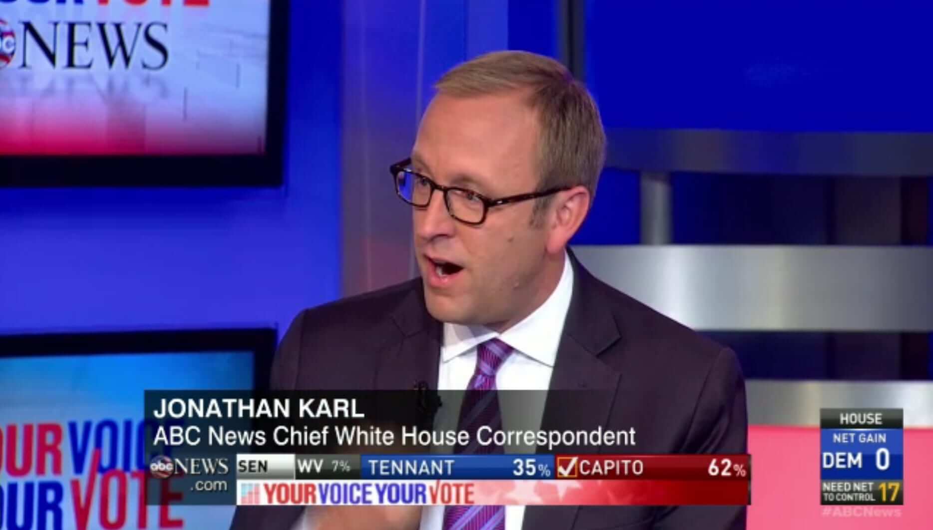
As I mentioned yesterday (and have mentioned every two years around this time), I’m intrigued by the way TV news reporters have gotten into the habit of wearing purple on Election Day — their way of looking non-partisan as they split the difference between the blue Democrats and red Republicans. It has become a “uniform” of sorts, or at least a team color.
But this year added a new wrinkle (or at least one I hadn’t seen or noticed before). In the past, TV reporters simply wore purple without talking about it or acknowledging why they were doing it. Yesterday, however, some of them explicitly referred to their purple garb on Twitter:
The best color to wear on #Election2014 is…unbiased purple @heathersawaski #reporterproblems #YLEHon5 pic.twitter.com/So0cLwXWz3
— Jenn Sullivan (@SullivanWFRV) November 4, 2014
Politically safe #purple #electionday @wraltraffic pic.twitter.com/t6CkC6ktkP
— michelle marsh (@WRALMarsh) November 4, 2014
So is the purple thing an interesting organic phenomenon, or just another example of predictably mindless “me too”-ism run amok? Either way, there’s no denying that the purple trope is now firmly entrenched across the media spectrum. In addition to putting out the call for screen shots here on Uni Watch yesterday, Phil and I also put out the call last night on Twitter, and the response was overwhelming. Here’s a sampling (with my apologies to anyone whose submission didn’t make the cut):
Our vantage point at Sen. Kay Hagan's watch party! @wral is your source for tonight's fastest election results #wral pic.twitter.com/bBV2T7fFAn
— Ken Smith (@KenSmithWRAL) November 4, 2014
@PhilHecken pic.twitter.com/ftYcyEsNTi
— Tommy Adams (@ThomasGuyAdams) November 5, 2014


@PhilHecken @UniWatch Joy Reid rocking the purple early on. pic.twitter.com/YlwOLmEpQM
— Josh Sánchez (@jnsanchez) November 4, 2014
@PhilHecken Anderson Cooper in a purple tie pic.twitter.com/nHVlThBfu5
— Den (@Den_Folds_Five) November 4, 2014
@PhilHecken “@JustinFarmerWSB: .@AmyNapierViteri scores top location tonight for live @wsbtv coverage. #YourVoteOn2 pic.twitter.com/Qbbz7wdyJO”
— Brad Tate (@bradleyjtate) November 4, 2014
@PhilHecken jamal mayers wearin the purple pic.twitter.com/6CAHW3pBGt
— Leo Belill IV (@vanillag0rilla2) November 5, 2014
@PhilHecken ABC 7 in DC pic.twitter.com/ABrSJ16mhR
— Screwlack (@Screwlack) November 5, 2014
@PhilHecken even @JBradEdwards is getting in on the purple pic.twitter.com/hErKKGMeav
— josh rawdin (@joshrawdin) November 5, 2014
@UniWatch @PhilHecken Byron Barnett, @7News Boston. #PurpleTie pic.twitter.com/9MoDfR4tjF
— Guybrush (@SteveSnowmn) November 5, 2014
@PhilHecken @UniWatch purple tie: #wcvb Channel 5 Boston pic.twitter.com/yyFeKuoxO1
— Mike Tremblay (@mtrem2) November 5, 2014
@PhilHecken @UniWatch Newt!! pic.twitter.com/n18sF1rDoJ
— â´â´ (@interst8forty4) November 5, 2014
@PhilHecken @UniWatch pic.twitter.com/6dRw0aiiIL
— â´â´ (@interst8forty4) November 5, 2014
Teamwork on FOX6 News with @bradhicksfox6 and @stephgradytv on election night. #youdecide pic.twitter.com/GeL7Na4zXt
— Cary Docter (@carydr) November 4, 2014
@PhilHecken @UniWatch even Alex Trebek is going purple pic.twitter.com/9KM7CbBD4z
— Bob Wilzbach (@rwilzb001) November 5, 2014
@UniWatch @PhilHecken Purple on the set from @kmcnewwsls of @wsls in Roanoke, VA pic.twitter.com/YI5rglbspF
— Clark Ruhland (@Hokie20) November 5, 2014
@UniWatch @PhilHecken Purple on the set from @JJadhonWDBJ7 of @WDBJ7 in Roanoke, VA pic.twitter.com/I2QnxTQi45
— Clark Ruhland (@Hokie20) November 5, 2014
@UniWatch @PhilHecken Purple tie on WISN (@WISN12News) in Milwaukee, WI pic.twitter.com/qCUjSEyxyb
— Ben Bryan (@Ben_Bryan) November 5, 2014
@UniWatch @PhilHecken Purple (or pink?) tie for Steve Eagar, @FOX4 Dallas. pic.twitter.com/IFlUMxHqgp
— Chris Mycoskie (@mycoskie) November 5, 2014
@UniWatch 3TV in Phoenix pic.twitter.com/zfjuHKhaGM
— Brad Denny (@BDenny29) November 5, 2014
@PhilHecken @UniWatch Purple tie and purple dress on set for @NBCDFW, KXAS Dallas. Brian Curtis and Meredith Land. pic.twitter.com/Lp59hB3f6n
— Chris Mycoskie (@mycoskie) November 5, 2014
@PhilHecken @UniWatch WDBJ, Roanoke, VA pic.twitter.com/J1UrEH2LMk
— Phillip Bailey (@philly_thekid) November 5, 2014
@PhilHecken @UniWatch Gerald Owens, WRAL Raleigh-NC pic.twitter.com/IVB1dvdeul
— â´â´ (@interst8forty4) November 5, 2014
@UniWatch our News Anchor in Beaumont has his purple on. pic.twitter.com/sSQZIWNH9u
— Ashly Elam (@AshlyKBMT12) November 4, 2014
@PhilHecken @mycoskie @UniWatch We've got a #purple tie! pic.twitter.com/aa09qcUq2c
— Stelly (@Stelly) November 4, 2014
@PhilHecken @UniWatch Scott Pelley, CBS pic.twitter.com/6AmeCGFEEd
— â´â´ (@interst8forty4) November 4, 2014
@UniWatch here's a local anchor in dfw market. pic.twitter.com/ozPpPFShfQ
— Ray Cartwright (@RayCartwright) November 4, 2014
@UniWatch @PhilHecken STEVE HARVEY went purple pic.twitter.com/lLZjAQ6pup
— M. Grace (@tasty_magic) November 4, 2014
@UniWatch double purple(ish) tie alert on MSN! pic.twitter.com/KQTC4cQjUC
— David Lyles (@CitizenKiryu) November 4, 2014
@UniWatch @PhilHecken Purple Love from WLWT in Cincy… pic.twitter.com/pYpT8AaM1K
— KT (@Coach_KT) November 4, 2014
@dommydigital1 @PhilHecken @UniWatch pic.twitter.com/E9sj8KxDoE
— M. Grace (@tasty_magic) November 4, 2014
@PhilHecken @UniWatch more Purple gold on PBS pic.twitter.com/waXwUEaucx
— M. Grace (@tasty_magic) November 4, 2014
@PhilHecken @UniWatch PURPLE SUIT PURPLE TIE with red and blue striped shirt on PBS pic.twitter.com/weoLGkNX5R
— M. Grace (@tasty_magic) November 4, 2014
.@UniWatch Looks Like Martha McCallum in purple pic.twitter.com/qR3TfNTSbg
— Phil Hecken (@PhilHecken) November 4, 2014
@PhilHecken B'ham's Trent Butler of CBS 42 WIAT pic.twitter.com/NDkwUU13QR
— Joey Sparks (@joeysparks) November 5, 2014
@PhilHecken San Diego reporting..purple tie & dress pic.twitter.com/qJO54ofjZK
— J Dockan (@JDockan) November 5, 2014
@PhilHecken Even @CharissaT went purple tonight https://t.co/F64HaoMYlI
— Zack Bennett (@ZackTN) November 5, 2014
@UniWatch Marc Brown ABC7 News in L.A. Purple stripes. Yay. pic.twitter.com/BAUcFKcy0h
— Tom Denne (@tomteavee) November 5, 2014
@UniWatch KUSA in Denver at GOP HQ pic.twitter.com/pEXdJFrTmg
— Matt L. Stephens (@MattStephens) November 5, 2014
There was more, but I had to draw the line somewhere. Plus it turns out that purple often looks blue or even gray in screen shots (perhaps the nicest thing one can say about it), so I left out a bunch of those shots.
(Big thanks to all contributors, including Jeff Ash, Christopher Der, Ryan Frazer, everyone who sent images via Twitter, and of course Phil.)
Actual sports uniform content, imagine that: As you are almost certainly aware by now, thanks to Phil’s excellent coverage over the weekend, Georgia and Florida went color-on-color last Saturday. I’ve used that as the peg for my latest ESPN column, which explores the parameters of color-on-color games. And in a special bonus development, you’ll be able to read this ESPN piece without scrolling past a few dozen purple-clad TV clowns. Not bad, right? Check it out here.
Uni Watch News Ticker
By Garrett McGrath

Baseball News: No photos yet, but the Twins are dropping pinstripes from their home white jersey for the upcoming 2015 season (from Alex Bending). … In the wake of yesterday’s midterm elections, here’s a photo of a Congressional ballgame in 1918 (from Charles Rodgers). ”¦ Isn’t this ground-level photo of Willie Davis sliding amazing? Here’s how it was taken (from Chris Flinn).

NFL News: The Jaguars, who’ll be playing in London this weekend, are already in the United Kingdom and wore poppies on their practice uniforms at an event in London yesterday (thanks, Phil). … Anybody want to share this Minnesota Vikings helmet car with me? (thanks, Phil)

College/High School Football News: Mississippi State unveiled their uniforms for the Egg Bowl, which will take place on Nov. 29. … The Western Kentucky Hilltoppers are honoring the loss of one of their own with a memorial decal (thanks, Phil). … “I noticed these numbers on the Maryland helmets beneath the ear holes. Anyone know why?” asks Jeff Shirley. … Massillon (OH) Washington High School debuted chrome helmets in its season-ending game against Canton McKinley (from Tom Pachuta. … This all-female chain gang crew wears pink (from Chris Bisbee). ”¦ Oklahoma coach Bob Stoops says the Sooners will “probably” wear their alternates this weekend (thanks, Phil). ”¦ Did Adidas use Baylor’s Nike-designed number font for Akron? Sure looks that way.

Hockey News: “I came across this Topps 1971-72 hockey card of Ken Hodge, and it looks like he’s wearing jeans,” says Michael Clary. “Also, he must have borrowed teammate Fred Stanfield’s No. 17 gloves (Hodge was No. 8).”

Basketball News: Bronx Pride: The New York Knickerbockers wore “Bronx” shooting shirts during pregame warm-ups last night … Mario Chalmers of the Heat appeared to have a jersey with silhouette where an NBA logo used to be, but it was actually the logo from his undershirt showing through the jersey (thanks, Phil). ”¦ More people wear basketball shorts than you might think (from Yusuke Toyoda). ”¦ Referee Marat Kogut, who was working the Cavs/Blazers game, had an upside-down “8” on his jersey. ”¦ This profile of Hawks owner Steve Koonin includes the following: “[Koonin] had pushed for early release of the new throwback ‘Pac-Man’ logo while basketball fans were glued to that Indiana [playoff] series. And as we sat in a corner office on the nineteenth floor of Centennial Tower, the 57-year-old exec was giddy as he discussed plans for carrying that momentum forward: a revamped game experience this season and new uniforms next year as ways to draw millennials” (from Britton Thomas). ”¦ The Wizards wore star-spangled socks last night. An Election Day thing?

Grab Bag: Normcore Watch: A photographer has documented regular people wearing regular clothes. Congratulations (from Yusuke Toyoda).

The shoot for the Bruins leading to the 1971-72 set was interesting. Nothing tops Phil Esposito’s pants visible in this card
link
Not to mention, Esposito’s wearing the same borrowed glove that Hodge did!
And note the inaccurate/outdated Bruins logo on the card.
How about Johnny McKenzie’s eyes in this card:
link
Or the pants in this photo:
link
Oh man, that Esposito card just made my day! Good on you, Defo.
Turns out, the plaid was such a good look that Topps used pics from the same photoshoot for Esposito’s 1970…
link
and 1972 card as well…
link
That photo shoot was a classic. If you notice both Hodge and Espo are wearing the same #17 gloves – I think a few other players from that set are also pictured wearing the same gloves if I recall
-Jet
Hodge and Epso are both wearing wool slacks. Hodge’s are a plain gray worsted, nice and boring, likely part of a suit. Esposito? Well, it was the 70s. We can only hope that the sportcoat he was wearing that day wasn’t plaid too.
The photographers would have just had them come by a studio in street clothes, throw on a jersey instead of their shirt and tie, and pose with whatever gloves and stick they had in the studio for the shoot.
Is imagine the numbers on Naryland’s helmets are for the equipment staff. They probably allude to the tightness/fit/size of the helmet. Since the helmets don’t appear to have numbers that designate them to a player, this is probably the only way they can keep up with their information.
When Maryland’s Pride 2.0 “hand-painted” helmets were introduced last season, they were numbered. Officially because no two helmets were the same. Unofficially so they could auction them off.
Since they brought them back for a second season, I’m not sure if this remains the same. But the earhole was where they were numbered last year, too. Reference:link
Hmm, maybe this link will work better:
link
If I’m not mistaken, these numbers are actually related to the “limited edition” airbrushed “Maryland Pride” helmets, which were touted as being hand-painted and individually-numbered. This video offers a closer look: link.
p.s. Love the [I Still Call Them the] Bullets star-spangled socks!
Quick note: missing an ) in the basketball section.
Thanks. Fixed.
Go Chicago Bears!!!!!
I don’t really understand the “need” to wear purple. I get that red + blue = purple, but I mean… why can’t they wear green? Or orange? Or black? Or yellow? Or any other color that is not red or blue? It just seems so hokey to stick to one color. I definitely think it reeks of “me too”-ism.
Green = Green Party
Black = Black Panther Party
Orange = Orange Order
Kidding! I think putple represents a sad, tacit acceptance of the two-party system.
Testify!!!
Uh…what?
Totally agree. I’d wear orange or yellow or something different. I hate this whole “Red State” “Blue State” thing that was coined in 2000.
Diane Sawyer went with yellow last night.
Sorry, no screen grab.
What? That’s not a neutral choice. Yellow is the color of the Libertarian Party.
John Stossel must have gotten to her…
I’m afraid I disagree: A) Its perfunctory nature mocks something that ought to be mocked. B) It saddles Republicans with red, a color they should hate:), and C) “Red” is easy to associate with “Rep”ublican.
It’s all just part of the stupid game politics has become (or maybe always has been). This might as well be the Super Bowl to these idiots. The real effects of the decisions of government officials is a complete afterthought…they’re too busy thinking about ratings and the checks they’ll cash if they get a big enough Neilsen’s share.
I wore black yesterday, befitting the future of the United States.
Imagine living in Texas, man. We elected the evangelical version of the Taliban to be our governor and lieutenant governor, and a third generation Bush, to boot.
It’s gonna be a long couple of years.
Not even speaking as much with regard to yesterday’s results, but just in general for the American political system… the ever-increasing influence of untraceable money, our dopey excuse for a fourth estate, the fact that you’d almost have to be insane to even WANT to hold high political office… It’s a sad state of affairs!
Sour grapes, not necessarily of the purple variety?
Light green would be the color for sour grapes, I believe.
“Taliban” is a bit much, no?
The Bush dynasty is now on its fourth generation in politics. You’ve gotta start counting with Senator Prescott Bush.
Really? The Taliban? Good Grief.
In the Kansas senatorial race, the media generally used purple to identify Greg Orman, an independent.
And to answer Paul’s question on whence cometh purple ties, I vaguely remember a case study from freshman anthropology class, where researchers found that a primate on some South Pacific island discovered that they could improve the taste of the yams he dug up by dipping them in sea water. Once that one chimp (monkey, whatever) figured it out, all of them started to do it. It was a yam dipping frenzy.
Media purple on Election Night is like that. It’s just like monkey yams, only with a different variety of primate.
I don’t care what political party floats your boat … yam-dipping monkeys? Now THAT’S funny.
-C.
“…Isn’t this ground-level photo of Willie Davis sliding amazing?…”
Sure is.
Instantly one of my favorite sports photos.
The very last ticker item for today — Yusuke Toyoda’s link — is really very cool: the Bill-Cunningham-ification of non-trend-setting urban pedestrians.
Much recommended.
OK, I understand wanting to draw the line somewhere, but for Paul this is unusual. I know he’s not into hashtags, but embedded tweets? As a suggestion, in the future is there a way we can just have like one or two tweets embedded and the rest linked or something? Just sayin’…
I couldn’t scroll past the purple ties fast enough. Got the point after the first one.
Yeah… definitely went a bit overboard today. Couldn’t we have just made most of those into a slideshow or something?
Sometimes, people, information overload is its own reward.
If a picture = 1,000 words then a 100 charts = PhD thesis!
I can’t see the embedded tweets on my work computer… :(
Why would an avowed and famous partisan wear purple on election night? Who does Newt Gingrich think he’s fooling? Dude’s a proud Republican.
That, of course, is what makes the whole thing silly. Maybe not as true for local media, but national media are all biased. They have to give their opinion on everything rather than just delivering the news. We all know what channels will give us the opinion we’re looking for. So seeing the media be biased every day, but try to show they’re not by wearing purple on election day…what a joke.
If Gingrich were a little more self-aware & humorous, I’d take that as a wickedly appropriate jab at the anchors and other talking heads in purple: “I’m about as nonpartisan as you, so I might as well join the club.”
Ditto for Ted Cruz:
link
High School Football coaches discuss alternate jersey arms-races.
link
The photo in the last post is a glorious hot mess that just has to be seen to be believed :-)
I believe Ben is referring to this:
link
Yowza.
The goggles! They do nothing!!
That jersey has “Buffaloes” misspelled. Missing the “E”.
It has to be said that last nights results have far reaching consequences, particularly for the anti-Redskins crowd. The new governor of Maryland Larry Hogan is against changing the name
And in general, this was a massive earthquake of repudiation of the Obama agenda. Yes other issues took precedent and perhaps the skins name wasn’t at the top of the list…but it was part of a bundle of issues (along with obamacare, amnesty etc) that voters rejected.
If there is a republican president in 2016 with a gop house and senate, the anti skins crowd will lose their top allies. It will be a dead issue.
Those who favor changing the name have never taken their cues from national political leaders. On the contrary, it is the politicians who saw the movement growing and then hopped on board after they deemed it safe to do so.
eh. This movement was less organic and more media driven. The media more or less tried to dictate to people that they should be offended by the name. From there the issue grew
There are some who have been harping about this for decades. I can’t say these people don’t exist because they do. But they’re a very small percentage but they’re out there.
Still this was an issue in the 2014 campaign for governor and the people of maryland elected a candidate who strongly supported the Redskins name.
eh. This movement was less organic and more media driven. The media more or less tried to dictate to people that they should be offended by the name. From there the issue grew
Your initial post raised an interesting (if dubious) point. Now you’re just slinging mud and making random assertions. Please stop. Thanks.
As a Maryland resident, I feel qualified to offer up that the Redskins name wasn’t even remotely “an issue” in the gubernatorial election, unlike, say, Anthony Brown all but calling Larry Hogan in favor of child-killing.
At the same time I realize that’s Alfred’s narrative come hell or high water, so far be it from me to try and persuade him otherwise.
Not every Republican is in favor of keeping the name.
well I can’t argue with that. But I think those that are for changing the name, that’s a tiny tiny percentage of republicans.
My father-in-law, who’s as big a Fox-news-watching, Rush-Limbaugh-listening idiot as you’ll ever hope to see, thinks that the Redskins’ name is no good, and a relic of a dumber, less-enlightenend past.
No need to call him an idiot, Rob. You can make the same basic point simply by saying he’s a Fox/Rush fan yet still wants to ’Skins to change their name. No need for name-calling, so let’s please not go down that road. Thanks.
…as defined by his political enemies, not by reality.
Regardless, if the Redskins change their name it will be because the market demands it, not because of politics or anything any politician does or says. They will change the name when it starts costing them (and/or the NFL) money to not change it, and not a moment sooner or later than that.
In Ken Smith’s attempt to be unbiased, it appears that his purple tie matched Kay Hagan’s purple signage.
Wow, WRAL Raleigh love in the Election Purple segment…three tweets!!
In non-political purple news, Orlando City (the expansion MLS club) link.
The Lions’ new kit showcases advanced features such as:
– Adidas adizero engineering — the lightest soccer kit in history, allowing players to remain fast, cool and comfortable on the pitch;
– Jacquard engineered banding on the front of the jersey, representing Orlando City’s transition to a new era;
– “This is Orlando” sublimated on the inside of the neck tape — laying claim to the City Beautiful;
– “Orlando City” and a gold crown 3D heat transferred onto the neckline, highlighting City’s championship success prior to MLS entry;
– Placement of the Club’s previous logo on the inside of the jersey — underneath the Lions’ new MLS crest — keeping the team’s foundation and history close to the heart.
Eliminate bullet points two through five and you could make the jersey even lighter…
No “history”, “tradition” or “iconic”? Adidas PR is slipping.
Not bad but I wish they had kept the burgundy color as well in their scheme. It needs that pop.
I saw on one of the promo shots, that the new MLS logo was on both sleeves.
Is that going to be the norm?
Nice to see that Hulk’s nemesis, The Leader, is now doing political commentary on PBS – everyone deserves a second chance.
link
link
Jamal Mayers purple had nothing to do with politics. That’s the overdone hockey fights cancer purple.
Mets just announced changes to their 2015 uniforms. Cream pinstriped home uni’s replaced by White pinstripes (no more solid white?). New road alt hat (blue hat, silver “NY” with orange outline). New batting practice hat (same as last year but orange front pannels instead of blue with Mr. Met on the front).
link
No. No. No. No. No.
The cream pinstripes were gorgeous.
Trust me; white pinstripes will look even better.
Pinless whites appear to have been dropped; off-white version of that might have made a nice fauxback.
Hopefully this marks the beginning of the end of the cream fad. They always look way too yellow or just plain dingy.
No! Cream unis for everyone!
I called it. :)
So the Twins are adding gold, the Mets adding silver in 2015. That makes it officially A Thing. Who’s going to add bronze? Copper? Adamantium?
The Mets aren’t “adding silver.” It’s been part of their road alts for 2 years now, and it’s actually a gray that appears silver because of the tackle-twill fabric on which it’s rendered.
Right. It’s gray on the jersey. What’s claimed above is that they’re adding silver to the cap. And it’s an alt cap, just like the reports so far of the Twins addition of an alt cap with gold on it.
Assuming that report is correct about the color of the NY logo on the new alt cap – that it’s silver, not flat gray – then the Twins and Mets together will increase the number of teams with metallic uniform details by 50%.
There is no “report” saying that the NY logo is silver or is meant to be silver, not grey, or that the Mets are “adding silver to the cap.” Unless you consider Brian’s comment a “report.” The word “silver” does not appear anywhere in anything the Mets have posted on Facebook, and no report about, or description of, the cap has appeared on the club’s official website or anywhere else as of now. Until that happens, until the Mets use the word “silver” to identify the color of the crest, the color has not been “added” to the Mets’ scheme.
Whether the crest looks silver in the photo provided is a matter of perception, as with the gray tackle-twill on the jerseys. But that’s a far cry from the team having “added” silver to its color scheme, let alone having “reported” that it is doing so.
Graf, I was referring to Brian’s post as a “report.” Which it was: Brian reported a thing. That’s what the word means. I just took Brian at face value without clicking through to the link – I honestly didn’t even see that there was a link to anything official from the Mets.
It pains me to think anyone believes I would confuse the gray on the Mets road alt jerseys with silver. I’m not that dumb!
The gray-instead-of-white thing the Mets have done with their road alt, and that they’re doubling down on with the new alt cap, is dreadfully ugly. But it’s also interesting, and it’s ugly in a way that works with the Mets identity. I like it – if I were a Mets fan, I think the gray-detailed alts would be my favorite uni elements.
OK, that’s fine.
But even so, Brian did not “report” that the Mets are “adding silver” to the cap, or to their color scheme. He only said that the cap had a “silver “NY” with orange outline.” My original point was that (1) it’s not “silver,” and (2) even if it is it’s not being “added.” I.e., (1) it’s not literally metallic silver like Rockies or White Sox have, but a grey that looks silver under certain lighting conditions, same as the road alts (i.e., Brian mis-identified it as “silver”); and (2) that color has been part of the Mets’ scheme since 2013, and hence is not being “added” now. And certainly not in the same sense that the Twins are “adding” gold, which their uniform set has not previously included.
But no matter; we’re quibbling over syntax. No offense intended.
I kind of like the road alts; I think the silver/grey numerals and lettering look sharp and I kind of like the absence of white. My problem with them is that the current road greys are so effing awesome that even having a road alt bothers me.
Graf, I’m very sorry if my intended jocular tone hasn’t come through here. You’re right of course that the Mets do not seem to be adding silver; they’re just extending their current use of gray. So it’s not part of a trend with the Twins. Which I’d have realized if I’d noticed and followed the Facebook link in the first place!
But look, Brian said – ahem, reported – that the new road hats would have “silver.” Because the Mets don’t currently wear silver, therefore any silver on their new cap would by definition be an addition to the team’s color palette. Thus, “adding silver.” It’s just that my basic premise – that it’s silver, not gray, on the cap – was faulty.
Still, somebody needs to add a metallic color other than gold and silver. How about a New York team adding the greenish copper patina of the Statue of Liberty?
Interesting, but green copper patina doesn’t really have a metallic lustre, does it?
We’ve seen all kinds of “metallic” colors on NFL helmets, kind of like the “metallic” finish on cars (see, e.g., Giants, Eagles, Redskins, Dolphins), but it’s hard to render, say, metallic green or metallic blue on a jersey or cap (the Seahawks’ previous jerseys came pretty close, though). There aren’t a whole lot of metals that aren’t essentially grayish (silver, platinum, steel, nickel) or yellowish (gold, bronze, brass) in color. Copper is sort of reddish but it’s the only one I can think of; I don’t know of any naturally greenish or bluish metals.
The best examples I’ve seen to invoke a metal other than silver or gold are probably the Buccaneers’ “pewter,” and the Arizona Wranglers’ (USFL) “copper.”
How about this cap: Statue of Liberty teal, plus dark gray, light gray, and another light gray that looks like silver:
link
I miss the old, original Inland Empire 66ers caps that had reflective silver bills. (They later switched to plain matte gray fabric before redesigning completely.)
Ych.
Helmet cart is already gone… what a steal! Fess up, who got it?
I was at the Smackdown tapings last night and HHH had on a purple tie and Vince McMahon was wearing both a purple shirt and tie. Politics is now invading my interests. Le sigh…
Well, to be fair, the purple thing is the opposite of “politics invading your interests.” Rather, the purple trope is about signalling one’s intent not to engage in politics, or anyway partisanship. You wear purple on Election Day because you fear people might read politics into your choice of clothes if you wear red or blue, so you prevent such a reading by wearing purple. It’s a deliberate attempt to prevent politics from invading things.
Also, purple tie on purple shirt might equally be regarded as Vince just reminding you that yes, he still has the aesthetic taste of Vince McMahon.
But by wearing purple they are actively going out of their way to show partisanship which in turn means they actually pay attention to politics; that is something I don’t want in my life and try to avoid. It’s a shame that today’s lede is actually politics related.
As for Vince, it was actually a decent look paired with a gray suit. Better than the old yellow blazers he used to rock.
Hungry Hungry Hipster was at Smackdown?
Would have been a better show if he was…
Brian Williams on NBC referred to a couple battleground states as “purple states”.
[Accidentally posted this to yesterday’s thread….]
Just saw on link that the Mets are switching to white pinstripes as primary home uni next year, and adding a new alternate road cap. The link appears to be all blue (crown & bill) with a gray crest outlined in orange. Also a new BP cap with Mr. Met logo and orange front panel.
Not shown or stated whether the white home alts will be switched to off-white; may be dropped altogether since they’re not included link. But, with respect to the pins, let me be the first to say, I called it. :)
Also not established is whether the Mets will add alternate batting helmets to match the alternate home and road caps. So far they haven’t done that with the orange-billed alternate caps; let’s hope they continue to use the standard batting helmets in all games.
Not totally thrilled with the road alt cap but will reserve judgment until I actually see it. I’m more worried that this will make them wear the road alts more often next year, which is a bad thing considering how awesome the road greys are.
Since Uni Watch is acknowledging the color purple today, it’s a good time to bring up this ad from a couple years ago. And actually, living in a so-called purple state like Colorado it kinda nice most of the time… link
The Blackhawks’ Winter Classic jerseys are due to be introduced this evening.
They’re link during the day. The first photo shows the team’s usual road striping (though not clearly on the same portions of the jersey), hinting at a surprisingly not-so-retro look. The next photo is due out at 1:00.
*1:00 Eastern
Why does that McKinley high school player (going against the chrome helmets) have an Ohio State hand warmer? The helmets look styled after tOSU but it still seems way out of place
It slipped my mind until now, but check out Tom Brokaw’s and Charlie Rose’s outfits last night.
link
Why was Tom Brokaw wearing a Steve Martin costume? Halloween was last week!
Today’s ESPN column is up:
link
Great column.
In the NHL there were a TON of colour-on-colour matchups in the 1970s and 1980s when three teams (Seals, Kings, Canucks) didn’t have white primary jerseys.
link
link
It was a pretty awful era for the NHL, nothing like Georgia-Florida.
Also, Sheldon Kannegiesser was the Jarrod Saltalamacchia of his day.
Star socks. Want.
Re: ESPN column
I like how color v color match-ups are handled in the soccer world. Naturally, if that approach was to be adopted here, Nike, adidas, UA, etc. would need to change a bunch of designs (an option they’d surely take in a heartbeat). And teams wouldn’t necessarily need to adopt a colored alternate; plenty of soccer clubs wear white shirts with shorts in a color other than their primary.
Since football is the primary example used in the article, and being that I’ve never played a down competitively, here’s a question to those that have: what element is most important to contrast? The jersey, helmet, or pants? The pictured Cowboys/Chiefs throwback game looked fantastic, but I would think far less of it if the Chiefs had been forced to wear, say, red or yellow pants. I can see having distinct jerseys and helmets as vital, but do the pants really matter that much?
I remember almost 30 years ago thinking that the Raiders should be allowed to wear black when they play the Broncos in orange or the Chiefs in red. Where the colors clash, there’s no reason not to allow a color-on-color matchup.
Well, the Blackhawks released their WC sweaters. Count me as a fan. Unique enough to know it’s a one-off, but not a departure at all from the look. Dare I say, it’s refreshing not to see a gratuitous sleeve patch.
The official color of the American Fourth Estate is purple?
Purple makes me think of one thing before all else, which is a testament to sports: The Baltimore Ravens. That’s a conflict for me.
We need a color other than purple.