It’s been an interesting year for the Mets’ skyline logo. Back in January, uniform designer/historian Todd Radom discovered that the logo had originally been rendered in pink and black. Six months later he figured out why it had been pink and black. And then last month we had that kerfuffle about one of the buildings in the skyline being replaced by the Citicorp Center.
But now reader Steve Dodell (who was the first to alert me to the Citicorp skyline issue, so he’s a bit of Mets logo savant) has pointed out another storyline regarding the logo — one that I really should have noticed myself years ago.
Let’s start with the original logo rendering by cartoonist Ray Gotto, who submitted the winning entry in the team’s logo design contest more than 50 years ago. It was unveiled on Nov. 16, 1961. Here’s how it looked in The New York Times the following day:
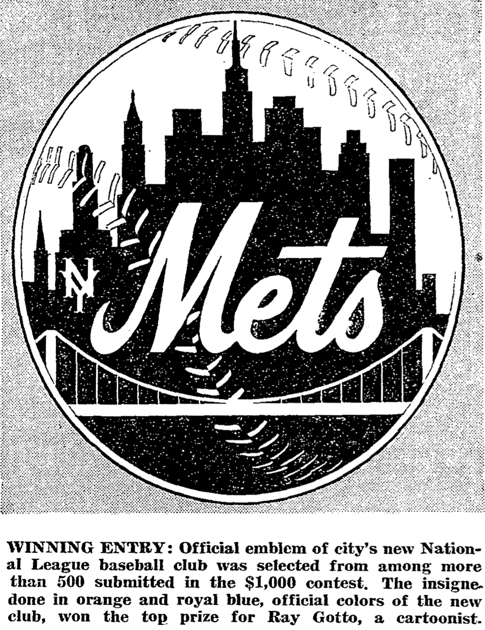
As you can see, the “Mets” script looks a bit thin in that version. Someone — maybe Gotto, maybe a graphic artist employed by the team — added a white keyline to it when rendering it in color, beefing it up to the more familiar proportions we’re used to seeing today:
The thing is, that version of the logo — the one based on Gotto’s original design — is not the one that’s been used for most of the team’s history. Let’s compare the version I just showed you (we’ll call that Version 1) to the one on this 1962 pocket schedule (we’ll call that Version 2; click image below to enlarge):
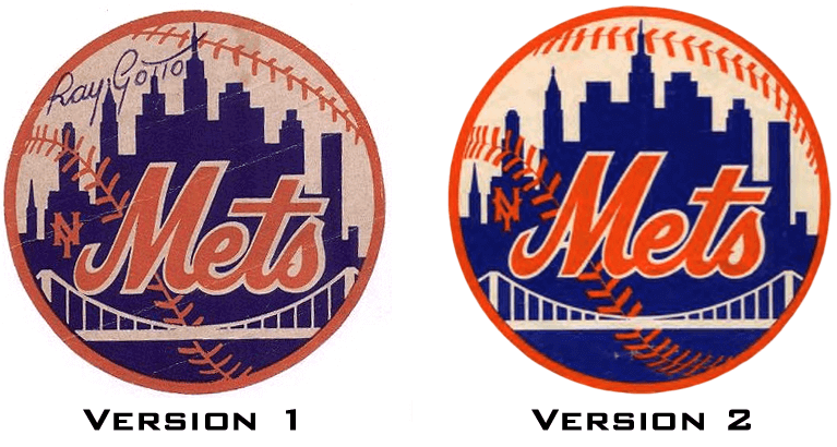
Leaving aside the color differences (we can write those off to printing variations, scanning/photo variations, fading, etc.), we can see that several tweaks were made as the logo transitioned from the first version to the second one:
1. The blue skyline silhouette was raised a bit.
2. The suspension bridge was made slightly smaller.
3. The script lettering was made slightly smaller. (The registration of the orange within the white keyline also shifted a bit, but that’s something that has never been consistent throughout the team’s history, so I’m not going to count that as a design change here.)
4. The arc of the baseball stitches was changed, and the stitch count was increased. The stitches themselves were also made a bit thicker.
5. The cross of the “t” was altered, making it shorter on the left side than on the right. This is probably the most significant change, because it carried over to the team’s jerseys.
Now, you may be saying to yourself, “So they made an initial version of the logo based on Gotto’s original rendering, and then they made some adjustments to it in time for the start of their inaugural season. They scrapped Version 1 and kept Version 2 — big deal.”
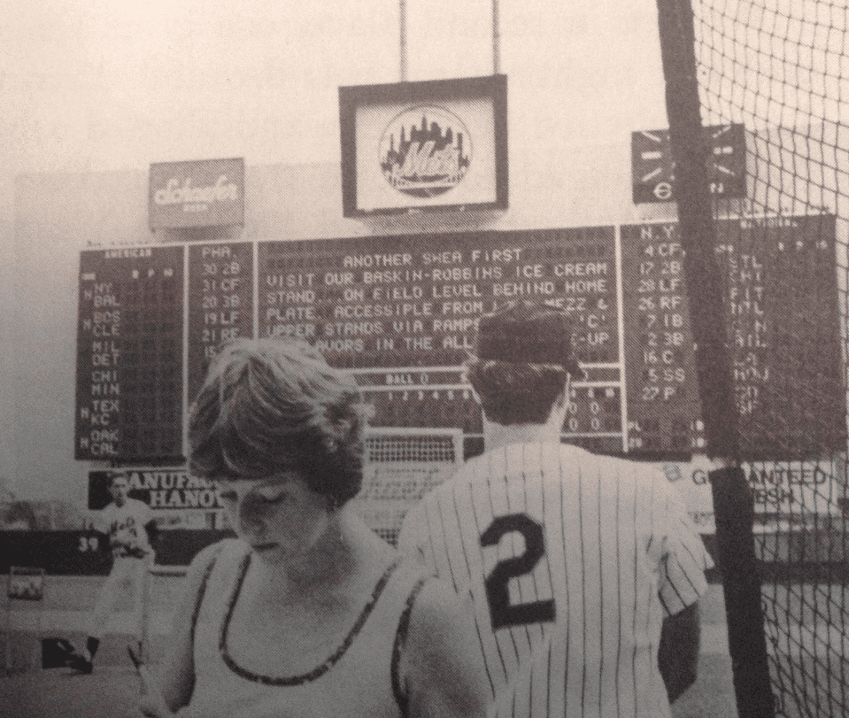
But here’s the thing: They didn’t scrap Version 1 — at least not entirely. When Shea Stadium opened in 1964 (the team’s third season), the scoreboard featured a display area that was supposed to provide photos and video replay (further info here). Unfortunately, it never really worked, so they just slapped the team’s logo in there. And they used Version 1 of the logo — the one with the longer cross on the “t” and all the rest of Gotto’s original details — as you can see in this photo from May 31, 1964 (click to enlarge):
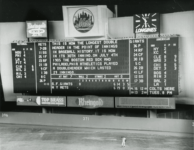
The Version 1 logo was still there on the scoreboard more than five years later, when the Mets defeated the Orioles to win the 1969 World Series (click to enlarge):
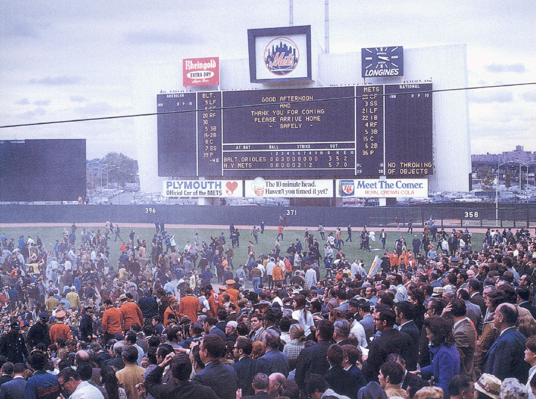
And it was still there nearly seven years after that, on Sept. 4, 1976, when this photo was taken (click to enlarge):
The scoreboard was overhauled in 1982, so the logo was definitely removed by then, but I’m not sure if it was ever updated in between 1976 and ’82. I’ve done a fair amount of photo research and have also consulted a bunch of Mets experts, but so far no dice. My hunch, though, is that the Version 1 logo, with the longer cross on the “t,” stayed in place through the end of 1981.
Meanwhile, did the Mets ever use Version 1 in any other capacity? I haven’t been able to turn up any other instances of it, but I bet they’re out there. After all, these are the Mets we’re talking about.
Speaking of which: In a characteristically clueless move, the Mets have been misspelling Ray Gotto’s surname as “Gatto” in their media guides and on their website since 1985. It’s not Gatto; it’s Gotto. And as Casey liked to say, you can look it up. So for nearly 30 years, the Mets have been misspelling the name of the guy who created the basis for their entire visual program. Idiots.
(Special thanks to Steve Dodell for bringing the scoreboard logo issue to my attention, and to Faith and Fear in Flushing blogger Greg Prince for the 1976 scoreboard photo.)

Two of my favorite things: My presence here on the site is going to be limited over the next two days and non-existent next week, but I think you’ll cut me some slack when you hear what I’ll be up to.
First, I’ll be spending parts of tomorrow and Friday in Manhattan, where I’ll be attending the taping of the latest edition of the Puppy Bowl. As usual, there will be other animals involved besides puppies, including kittens and something else that I’m not allowed to talk about yet. The whole thing is embargoed until late January, so I won’t be able to talk about it or post any photos until then, but I expect to have a full-on cutegasm all the same. And I promise to share everything with you folks as soon as I’m allowed to do so. Big thanks to my friends at Animal Planet for once again inviting me to the taping.
Then on Saturday I’m flying off for a week-long vacation in Wisconsin, my favorite place, where I’ll be enjoying the Badger State’s considerable autumnal charms. In addition to visiting friends, checking out cultural landmarks, and partaking of the Badger State’s matchless roster of taverns, I’m also going to be mixing a bit of business with my pleasure by visiting at least one and possibly two places that I plan to write about. First, I’ll be stopping in at the awesome FAST Corp., whose acronym stands for fiberglass animals, shapes, and trademarks. (Among other things, they make the Big Boy statues.) I was there once before, but that was way back in ’96, so I want to see what they’re up to these days. I’ll get a tour of the grounds, interview the staff, and take some pics, all of which I’ll cobble together into an article that should run next month on re:Form, the excellent design website to which I’ve recently been contributing.
I’m also hoping to arrange a stop at Ripon Athletic, which, oddly enough, I’ve never visited on any of my previous Wisconsin trips. Should make for a good entry here on Uni Watch. Haven’t worked out all the details on this one yet, but I think we’ll be able to work something out.
The site will still be open for business while I’m away, so things here should continue pretty much as usual. Also, my annual NBA season preview will run on ESPN at some point next week (probably on Weds. or Thurs., although that hasn’t yet been finalized), and of course Phil will provide you with the link for that once it’s ben posted.
The bad part is that I won’t be able to write about the first few games of the World Series; the good part is that I’ll be able to watch those games with my keister parked on various Wisconsin barstools, something I’ve enjoyed doing before (but not recently). Looking forward to that.
BuyMyStuff, BuyMyStuff, BuyMyStuff: It’s been, what, nine whole days since the last time I bugged you to order a Uni Watch 15th-anniversary patch, sticker, or T-shirt. Also, this T-shirt has been popular-ish lately. And hey, didn’t you make a New Year’s resolution back in January — or maybe two Januarys ago — to join the Uni Watch Membership Program?
Of course you did.
PermaRec update: It’s turning out to be a very good week for time capsules. Details over on Permanent Record.

Baseball News: Some Royals fans get points for honesty. Others get pointsfor weirdness. ”¦ George Brett wore a powder blue jersey while throwing the first pitch prior to last night’s O’s/Royals playoff game in KC. Interesting that they had him wear that instead of a home white jersey. ”¦ A Giants/Orioles World Series isn’t looking too likely, but I’m still hoping for that match-up, if only because I really want to see an Adam Jones vs. Sergio Romo orange-striped hosiery hoedown in the Fall Classic. ”¦ “I was flipping channels (I swear) and noticed a guy wearing a 1989 Cubs/Giants NLCS T-shirt on some show called Marry Me,” says Chris Flinn. ”¦ Longtime Ticker contributor Richard Paloma thinks the A’s should have a “Swingin’ A’s” throwback as a permanent alternate uni. ”¦ Want some first-class entertainment? Here’s a disputed call during a 1984 Reds/Cubs game that leads to a humdinger of an argument and, eventually, a brawl. A doozy! ”¦ Tom Konecny was watching Game 5 of the 1984 World Series and noticed that Padres 3B Graig Nettles’s NOB was straight instead of vertically arched. Ditto for Ron Roenicke. Odd, especially for the Series.

Pro Football News: Someone at last Sunday’s Bengals game was wearing a funny Pacman Jones jersey (thanks, Phil). ”¦ 49ers QB Colin Kaepernick once again wore Beats headphones for his postgame press conference on Monday night, but this time he covered up the logos. ”¦ NFL.com put together a slideshow with over 50 photos showing throwback uniforms going back to 1994. “There are some great photos I have never seen before,” says the Hungry Hungry Hipster, “including the Bears trying to block a field goal in their vertically striped 1920s jerseys and the Browns wearing TV numbers on their helmets in 2007, which I never knew even happened.” … Although it wasn’t shown on TV, Monday night’s Niners/Rams game featured some Ferguson protestors who unfurled various banners in the stadium. ”¦ Oooh, check out this cool 1950s footage of the Racine Raiders, a semi-pro team that was founded in the 1920s and still exists today. “I think semi-pro football is a treasure trove of uni-centric information, and could be a goldmine if tapped into,” says Shawn Nissen. ”¦ Stephen A. Smith said he’d wear a Tony Romo jersey if the Cowboys beat the Seahawks, and he made good on that promise — but with an old Reebok jersey (screen shot by Sean Kneringer). ”¦ An online poll has determined that the best high school football helmet in the state of Michigan is basically a rip-off of the Jags’ first helmet. The best part of the article is when the team’s former coach says, referring to the logo, “It kind of gave us our own identity.” Uh-huh (from John Korinek). ”¦ The Gridiron Uniform Database shows the 1983 Bears wearing two similar but distinct George Halas memorial patch designs. And sure enough, photos confirm that the patch worn with the white jersey had oddly pointy tips, while the one worn with the dark jersey did not. Nice how that last version had outlining on the “H,” so it looked like a goalpost. Still, very odd that the two versions didn’t match (thanks to Phil for reminding me about these patches, which I’ve always liked).

College Football News: Baylor wants its fans to do the stripe-out thing for two games in November (thanks, Phil). ”¦ Ditto for Missouri. ”¦ BeeYOOteeful throwbacks this weekend for Oregon. ”¦ New “U! S! A!” costumes for Eastern Washington — except they’re not really new. Yup, nothing says, “Patriotism” like ordering an old design out of a catalog. ”¦ Seriously ugly Pinktober helmet for Air Force. ”¦ Illinois will wear gray alternates on Oct. 25. Here are some additional photos and the matching helmet. ”¦ This is pretty cool: an interactive timeline showing the evolution of TCU’s uniforms (nice find, Phil). ”¦ “My pal Whitney Cox is photographing up at Cornell U,” says our own Scott M.X. Turner. “He forwarded me a pic of this mural showing the school’s football team in the 1890s. Stripey goodness.” Indeed.

Hockey News: The AHL’s Adirondak Flames have apologized after a controversial skit involving their mascot (from Cort McMurray). ”¦ Kudos to the crew at The Hockey News, who used Panthers goalie Roberto Luongo to create an infinite regression on the cover of their current issue (and kudos to Mike Engle for pointing it out to me).

NBA News: The Nets and Celtics will play a 44-minute preseason game, instead of the usual 48 minutes. Insert the obvious “That gives them four more minutes of commercials to run” commentary here. ”¦ We don’t yet know what the Heat’s and Celtics’ “Pride” Hubris uniforms will look like, but the shorts sure don’t look promising. ”¦ Mike Miller of the Cavs must’ve been pretty sure he wouldn’t be playing in last night’s preseason game, because he was wearing a ring (good spot by Andy Henderson).

College and High School Hoops News: New uniforms for UT-Arlington (from Casey Wieder). ”¦ Here’s Baylor’s complete sweatback set for next year (thanks, Phil). ”¦ “At our first meeting of the year for the Rhode Island board of International Association of Approved Basketball Officials, I picked up a copy of the 2014-2015 rulebook,” says Joel Mathwig. “The following note appeared within the ‘Major Editorial Changes’ section, which set forth by the National Federation of State High School Associations: ‘1-12-1a: The ball ”¦ its solid color shall be Pantone Matching System (PMS) Orange 151, Red-Orange 173 or Brown 1535, effective 2019-20.” In other words, starting in five years, the ball can be any of three different colors. And what’s the current rule? “The rule just states that the ball’s ‘solid color shall be the approved orange shade or natural color,'” says Joel.

Soccer News: The Portland Portland Timbers’ new USL Pro minor league club, Timbers FC 2, will let certain season ticket-holders choose the club’s game-day kits. “Also, the team’s logo is full of historic references: Chevrons from ’75, axe from MLS-era, and the ‘2’ is rendered in the font used on the original 1975 NASL-era jerseys,” says Erik Siemers). ”¦ Man U wanted to have an additional sponsor for the back of the jersey but faced opposition from other Premier League teams. Adam Silver and Mark Cuban could not reached for comment (from Yusuke Toyoda). ”¦ Also from Yusuke: Some British MPs want to ban Newcastle United’s payday lender sponsor on kids’ replica jerseys, just as liquor and gambling sponsors are currently banned.

Grab Bag: Converse is filing trademark-infringement litigation against 31 copycat sneaker makers (thanks, Phil). ”¦ F1 driver Michael Schumacher’s head injuries may have been caused by the GoPro camera mount on his helmet. ”¦ Here’s one guy’s list of 10 teams that need to bring back their 1990s uniforms. “Some of these are not terrible suggestions,” says Garrett. ”¦ Here’s a good assortment of sports-related maps and infographics (from Joey Breeland). ”¦ The Color Mafia, or at least one corner of it, has declared that the Color of 2015 is a very nice pale green. Don’t think I’ve ever seen that tone on a uniform, but I wouldn’t mind seeing it. ”¦ Possibly NSFW, if you’re in an uptight office: Why is there a swoosh painted on this woman’s nippe? Answer here (thanks, Phil). ”¦ Last week I linked to Norway’s cool new currency designs. Also cool: some of the designs that were rejected (from Yusuke Toyoda). ”¦ Good story on how the T-shirt was invented.
the silhouette of the building to the left of the center building in the skyline (I assume is the Empire State Building) is also different in the two logos.
I played a lot of PhotoHunt at the bar in college
Great minds things a like. I also employed my PhotoHunt skills before I continued the article to see if I could spot the difference. The difference we found was not mentioned.
Glad to know I wasn’t alone in this. Building just left of center is different from version to version.
I also did not get any of the other inconsistencies, which leads me to believe that I sucked at PhotoHunt if it didn’t include scantily clad women…
Yeah, I stopped after I saw the difference in that building because I figured that was the difference the article was going to be about. Didn’t pick out any of the others either.
If that wasn’t mentioned today, perhaps it was mentioned in another Mets’ logo inconsistency post? It seems pretty difficult to miss.
I went back through and looked at the Citicorp Building article and its not in there either. Does seem pretty difficult to miss, but it doesn’t change the fact that it’s in “Version 1” but not the “Version 2” or the scoreboard logo which was believed to be “Version 1”. I guess that makes it some weird “Version 3”.
That was the very first thing I noticed, too. I’m not a native of NYC — what building is that supposed to be and which representation is correct?
In addition to the building to the left of the Empire State being different, the “NY” to the left of the “Mets” script appears to have been moved upwards and perhaps elongated somewhat.
If you look at the version printed in the newspaper, the spire is not there either, just like on the scoreboard. This makes me think that the one on the scoreboard and newspaper was the original, and the one that is signed and labeled here as “Version 1” is the anomaly.
Also, have a look at the top left corner of the M. In version 1 it’s a lot more to the right off the left side of this changed building while in version 2 it’s much more just below. The scoreboard logo definitely matches version 2 better than version 1 on this!
In Version 1 above, the building directly to the left of the center building is different than in the other logos. It has a little “nub” on the top. I don’t see that nub on Version 2 OR on the “Version 1” that was featured on the scoreboard. So, it’s not exactly the same version from what I can tell.
The ESPN article about trying shorter NBA games missed the most obvious point (except for a passing allusion to more being better by Mark Cuban): fans will get 8% less basketball for their ticket dollar.
Exactly. When I go to baseball or basketball games and am having a good time, I want those experiences to last LONGER, not shorter.
But what if your team is a miserable pile of donkey crap?
I’m sure the owners will check if concessions sales drop 8% during a shorter game.
But think of it from another angle. The games will be shorter, but in theory all the best players will still be playing the same number of minutes. So that 8% you would lose would almost certainly just mean less playing time for backups. Is that a terrible thing? So instead of LeBron James playing just 75% of the minutes, he might play 85%. The best players would have more of an impact on the outcomes of games.
Or maybe coaches will want to give the same minutes to bench players so they’re ready to step in for an injured starter, while the stars get the same amount of rest. There’s already 12 fewer minutes on the clock than football or hockey; why increase that difference?
That makes sense in theory, but I’m thinking rotations and substitution patterns are based on intervals rather than total minutes played (except for older players and guys coming off injury who need their minutes managed), so BurghFan might be right – it might reduce the minutes played by starters. Coaches will still want to put out their situational units (i.e go small or big), regardless of starter minutes.
The problem is which minutes they’re eliminating. It’s the final two minutes that can take like ten minutes to play, when any game that’s been interestingly close up to that point bogs down into a sequence of clock-stopping fouls and free throws that may be literally the least interesting thing ever aired on television, including overnight VHF test patterns. If they could make those two minutes go away, NBA games might actually be watchable.
So, they should eliminate 4 timeouts.
Wanna end the deliberate game-stopping fouls? Make it a T for delay of game.
Exactly. The rules of basketball create strong incentives for both teams in close games to collude in not playing basketball at the end of basketball games. That’s a much bigger issue that whatever the NBA thinks it’s addressing with generously giving fans four minutes of their lives back. Things that might be worth considering: No timeouts in the final three minutes; Delay-of-game penalty calls on tactical fouls; make fouls worth two automatic points with a single free throw for a bonus third point; make fouls in the final minutes worth as many points as the shooter can make free throws in a row until he misses; and so forth. Just one or two seemingly radical tweaks could shift the incentive structure enough so that teams continue playing basketball at the end of close basketball games.
(Personally, my favorite is the infinite-consecutive-free-throws thing. Forty seconds left, a team is down by two and fouls the other team’s big man who everyone knows can’t sink it from the line to get possession back. Then he goes on to sink sixteen in a row. It would only have to happen once for the whole doctrine of late-game tactical fouling to go out the window.)
I’d rather not see any drastic changes to the game, though I think treating tactical fouls as intentional fouls wouldn’t be a bad idea. Also, give the option of taking the ball out of bounds (i.e. no possession change) on non-shooting fouls.
Re: infinite-free-throws suggestion
The law of unintended consequences… What happens when a great team is winning by twenty-five over a last-place club and accidentally fouls and the other team makes twenty-six free throws to win? You would see teams with a decent lead get nowhere near the ball because the last thing they would ever want to do is get a foul. In fact teams would play no defense at all, because even with a four point lead, you’d rather give up a two or three- point basket than let the other team have a chance at running off fifteen straight free throws. Of course you could just foul Shaq and not have to worry about it.
But in general I like the idea of radical rules changes.
“Philadelphia Atheletics”
CoTD is a good rerun, but a rerun nonetheless.
Catch of the Day is an amenity, not a birthright. Reruns are preferable to running the same item too long.
Not my intent to say anyone is entitled to CotD. Another fun site refers to its features like CotD as “free ice cream”. Just mentioning something I noticed.
Fighting Illini Football: Maybe nobody will notice we aren’t Oregon
Gee, it’ll be just like watching the game in black+white.
Wearing headphones around your neck as a fashion accessory makes you an ass… playing music through headphones hanging around your neck makes you an ass-and-a-half.
Wearing headphones properly and playing the noise so loud it comes out your nostrils also makes you an ass and is insanely common on public transport.
complaining about this sort of thing makes you old and not “with the times.
When I was in junior high in the mid-80s, with the Pirates in the toilet and WOR in our new cable TV channel lineup, I had a brief dalliance as a Mets fan. I always loved that logo, and spent many hours trying to draw it correctly…if only I’d known at the time that there’s really NO correct version!
My immediate reaction to seeing the name of that shade of green is thinking that it’s really from a planet in the vicinity of Betelgeuse and not from Guilford as it usually claims. ;)
Froody.
After watching that Reds / Cubs video, my reaction is that if you were a guy with a big gut you’re worst enemy were the sansabelt pants!
SO many great things in that video (though I didn’t watch the whole thing)!
In the first 3 minutes you had:
Sansabelt pants
Crazy, huge NOBs on the Reds
Connected NL caps on the umps
Blazers on the umps
no NOBs on the Cubs
Zimmer having to “take a knee” mid-rant!
Great stuff!
That was the first baseball game I ever attended! I went with my dad as part of large fathers & sons group. Heck of an introduction to the National Pastime. I still hate Mario Soto.
It was a bit frightening to see Zimmer seemingly cause his own cardiac event.
Slight nitpick, but when in the NFL section you wrote that that high school’s football helmet “is basically a rip-off of the Jags’ first helmet.”
Technically, that’s the Jags’ SECOND helmet design. Okay, I’m done now. Commence rolling of eyes.
*delete when in first line
Actually, it’d be the 3rd if you’re going to count unworn prototype helmets. They had 2 different versions of the silver helmet, one with the full jaguar body and one with a half version of it.
yep.
link
This shows 5 altogether. I guess the black and the black/teal count as 2.
I wouldn’t count the black and black/teal as two different designs.
Wow, I’ve been a lifelong Jags fan and fairly aware of their early history, but I’ve never seen the half-Jag prototype design. So cool.
I didn’t know “lifelong Jags fans” existed
The other day, a link was posted on this blog to an MLB all-star team from 1978 that had jersey and hat variants (link). I was thinking about the Pirates jerseys when I saw this listing on ebay:
link
I wonder if the jersey on ebay is from that tour. Anyone have other photos from that tour?
That’s not the sleeve striping they wore on-field (which was black/white/gold, not gold/black/gold), and I have no idea why Frank Thomas, who retired in 1966, would have that jersey with the USA NOB.
BurghFan – you’re right on both counts. I wondered though if that jersey would have been worn on that tour, when it appears that some of the other Pirates jerseys were oddballs too. I could understand the jersey having a USA nameplate if it was worn in overseas exhibition games. The listing says it’s from the Frank Thomas estate – perhaps he was a coach?
While Thomas was a Pittsburgher who played the early part of his career with the Pirates, he wasn’t officially with the organization afterward, and he was never a coach.
Thinking out loud:
Maybe there was some kind of Japan-USA old-timers series, where players wore their (preferred) team’s jersey with the country name on the back instead of the player name. And maybe Descentes provided jerseys in Japan. And maybe the two-color sleeve stripes were easier or cheaper than three, or maybe these jerseys weren’t supposed to be the same as the real gamers.
That’s all speculation on my part.
I didn’t see the photo when first posted but it fascinates me. I am able to identify, without aid, nearly every man pictured. Even Dodgers trainer Bill Buhler, kneeling at left.
What I don’t understand is why that Tigers player is standing in the middle of a bunch of NL All-Stars and managers. He’s standing there like he belongs. No one is shooing him away. I think it is Aurelio Lopez.
saw this auction, thought of UW:
link
What Paul didn’t mention is that when the Shea scoreboard was renovated, the place that contained the Mets logo was replaced by a big Budweiser ad. Typical.
It should also be known that although the Budweiser did cover up Shea’s scoreboard, possibly due to the redundancy of the Mets adding DiamondVision that year, part of the scoreboard did change earlier. When Nelson Doubleday antd Fred Wilpon bought the Mets in 1980, the did some renovations to the ballpark prior to Opening day that year, The renovations included a new digital clock plus logos of the Mets, the National League, and some of their sponsors including Budweiser. The Clock and ads in 1980 covered the old movie screen device that had the Mets logo (logo 1). The logo the Mets used in 1980 on the brief renovation was what we are calling logo #2.
link
The ticker item about NFHS-approved shades of color for basketballs brought to mind a college field hockey game my daughter played in a few years back. As a rule, the home team decides whether the game ball will be white or orange, and then the ballgirls (boys on this occasion, actually) are given extra balls in that color to feed the players when the game ball goes out of bounds, etc., in order to maintain the pace of play.
In this particular game, play began using a white ball. Shortly after the opening tip, however, a ‘Noreaster blew through dropping snow at such a rate that by game’s end there was approximately 3″ of accumulation. Accordingly, at halftime the teams switched out the white balls for orange ones for visibility/safety reasons, as can be seen in this slideshow of game photos:
link
Was looking through the TCU uni evolution, and the posting about adding facemasks on Aug 1, 1954 caught my attention. Was that Jim Brown of Syracuse? Playing defense? Wearing a plexiglass facemask? Sure enough, it is!! link
But SU didn’t play TCU in 1954 – link. Or 1955, but only in the 1957 Cotton Bowl. link
Does TCU not have any pix from 1954??
Maybe someone can find better picture evidence, but I’m limited with works firewall.
Version 1 was used on the cover of the Mets 1969 World Series program: link
I’m sure it’s been used elsewhere. I’ve seen it on items over the years, but never thought twice about it before reading this article.
Also…in 1994, the Mets issued a reprint of the 1969 World Series program on which they included a 25th anniversary logo. This resulted in both versions 1 and 2 appearing together on the same page (seller has misidentified item as being original): link
Here’s another example of version 1. I used to have a ski cap that was a stadium give away in the 1970’s with this patch: link
While looking at the 2 versions, I started wondering if the change was made because the “t” in version 1, with both sides of the letter balanced, looks a bit ‘cross-like’. That appearance goes away when the crossing is shortened on one side. Not saying it’s the reason…just suggesting a possible motive for the change (other than aesthetic).
Oooh, good one!
Interesting Mets logo stuff today…detailed!
Looking at covers of Mets publications through the 60’s & 70’s, it becomes apparent that there was no consistency in the use of the 2 logo styles. Version 2 was used on yearbooks & programs from 1962-1965, then from 1966-1969, version 1 was used. That is, except for the covers of the team’s media guides which used version 2 throughout that period.
As for how long version 1 was in use, here is a screen shot from the Mets 1978 video yearbook showing a needlepoint kit that was a stadium giveaway that year: link
One last item; proof that the Mets were using version 1 in an official capacity at late at 1975: link
2 time Formula 1 world champion Fernando Alonso thinks it’s time for Formula 1 to look into closed cockpit racecars.
link
Purely from an aesthetic standpoint, I think it’s interesting. It’d be a big departure, but NHRA top fuel cars made the switch a few years back. Though they admittedly have less need to see around them.
NHRA Top Fuel open cockpit
link
NHRA Top Fuel closed cockpit
link
Formula 1 current car
link
Formula 1 closed cockpit concept 1
link
Formula 1 closed cockpit concept 2
link
Formula 1 closed cockpit concept 3
link
Tom Wrigglesworth (comedian from England who looks a lot like Aaron Rodgers) actually goes to Green Bay to meet Aaron Rodgers!
As a uni bonus, you get to see a scene with Marge the sewing lady sewing him a jersey. link
I like most of the suggestions for returning certain 90’s uniforms, the Bucs and Nuggets in particular. I’d like to add the ’93-’96 Angels to that list as well as the Gretzky-era Kings.
link
link
I’d put the ’97-99 uniforms of the Milwaukee MLB team at the top of that list.
Oh, yeah.
Never understood the love for the ‘Gretzky-era Kings’ uniforms. I am guessing that with a lot of people it was because a superstar was playing for the Kings at that time, and not because of any real love for the uniforms itself. In my opinion, replacing one dull monochrome set with another would not be a step in the right direction.
If you want something that screams 90’s the 1995/96 season ‘Burger King’ jerseys would do a better job.
My opinion of their best jerseys would be the purple and gold ones from their beginning (1967-69).
TheDrawplay.com had an interesting take on the Eagles uni situation link
For better or worse, George Brett is more iconic in the powder blue due to the Pine Tar game.
Eh, maybe. Still seems odd to have him wear a jersey he never once wore while playing in that stadium.
Chris Kreider logo update: I was at the Garden last night and all the pre-lettered Krieder sweaters(both home & away) have the Reebok logo & not the word mark. Considering his late call up MSG might have had to dig into the old inventory for a limited run.
Could this mean that we should be looking for new sweater design for next year?
Enjoy the Badger State, Paul!
I’m surprised New Castle has their sponsor’s logo on the children replica kits. I know Aston Villa doesn’t do that, and I thought it a league policy. I guess it was just a common sense thing.
Gambling and alcohol are seen as obvious vices, and a threat to social welfare, but predatory lending isn’t (yet).
Gambling sponsors are banned on children’s kit as a compromise that allowed betting firms to advertise on British TV. The alcohol sponsor ban is a voluntary one by the industry.
Thanks for the info!
The Browns wore a ’50s throwback with the number on the helmet for a few years – 2006-2008 according to the Gridiron Uniform Database. Of course with the Browns the “throwback” was virtually the same as the “regular” uniform – the throwback didn’t have brown stripes on the helmet but did have the TV numbers, no TV numbers or “AL” patch on the jersey, striped socks, and thinner pants stripes.
Basically if you didn’t follow the Browns or the AFC North you wouldn’t have noticed the difference.
Here’s a link. If you’re playing brand-speak bingo, you can fill out “iconic” (three times!), “heritage” and “history” (twice).
Bingo!
I also had “chevron” and “circle”.
“The AHL’s Adirondak Flames have apologized after a controversial skit involving their mascot.”
I’m surprised that the controversy hasn’t also involved people pointing out the link resemblance to a link, a black-skinned rag doll that link of people of African descent.
Nettles’s Padre uniform was like that the whole season in 1984. Anyone acquired after the initial pre-season lettering of uniforms didn’t get his name in vertical arch — Nettles was acquired in the final days of spring training.
The same was true of the Braves when they had vertical arch; players acquired mid-season didn’t have it.
To me the contrast shows why radial arching is better for player names. The two Es in Nettles’s name are the same, as are the two Ts. If it had been in vertical arch, then each of those letters would have had a unique shape. That really annoys me; it’s just chaotic that a given letter can appear with a virtual infinitude of shapes, depending on its placement in the name and the length of the name.
For the team wordmark, vertical arching is fine, because every player wears the same mark. But for lettering the player name, radial arching (or even straight-line placement, as the 70s A’s did) is far better.
The same was true of the Braves when they had vertical arch; players acquired mid-season didn’t have it.
Not true. Newly acquired/promoted Braves players would sometimes have a radial arch for their first few games, but then they’d get the proper lettering treatment soon after joining the team.
Are you sure about that? I remember otherwise. I specifically remember Luis Polonia, who joined the Braves mid-season in both 1995 and 1996, having a radially arched name in both years’ post-season.
Also, Alejandro Peña, who joined the Braves mid-season in 1991 (from the Mets) had a radially arched name in that year’s post-season.
Unfortunately, I have been unable to find pictures of either of these players from the back in those post-seasons.
Not updating the uniform once to the rest of the team’s standards during the whole season seems like an extreme case of penny-pinching.
Well, if you were to compile a list of the more parsimonious organizations in that era, the Braves and the Padres likely would be on it…
People getting offended over the Flame/firefighter deal is idiotic. If that is offensive, then the whole Flames being their nickname should be offensive.
I tend to agree. Chicago has a tradition of using references to its much more famous 1871 fire for local sports teams (e.g., the defunct Chicago Fire of the WFL, the current Chicago Fire of MLS, and the NCAA’s University of Illinois-Chicago Flames). And Adirondak’s parent club, the Calgary Flames, derive their name from the franchise’s days as the Atlanta Flames – an allusion to General William Tecumseh Sherman torching of the city during the Civil War. If those historic moments are fit for use in sports team names, why isn’t the Glen Falls fire of 1864?
I’m offended that people keep repeating that spelling mistake.
It’s Adirondack, people!
(No, I’m not really offended, I’m just amused.)
Can I blame Paul? ;-)
Go on ahead!
The objection, so far as I can tell, isn’t to the mascot itself, or a reference to an historical fire (like the Atlanta Flames or any of the Chicago stuff), but to the skit showing the mascot knocking out a contemporary firefighter.
There’s a difference between alluding to an historical tragedy and playing out a modern version.
Ah, got it. On my first (rather quick) read of the team’s written apology, I took notice of the discussion of the mascot’s back story involving being the only surviving ember from the fire of 1864 and thought they were apologizing for THAT in addition to the knocked-out firefighter skit. On a more thorough read, I’d agree that the only thing the team is apologizing for is the firefighter skit.
As to whether the team needed to apologize for the skit, I have no strong opinion. If the city fire department had fun participating in the making of the skit, then obviously they were okay with it. It seems fairly tame and tongue-in-cheek to me.
Whether or not to apologize for something these days, groups seem to apply the “everything is offensive to somebody” logic.
Personally I like the “I apologize that people were offended apology” the best.
Even better is “I apologize if anybody was offended.” It’s a double-dickish move, putting the onus on everyone else for the stupid thing you said while at once implying that their objections aren’t actually genuine.
“I apologize if anybody was offended.” — how about:
“I sincerely do understand the viewpoint of those who are offended. I personally do not find this offensive, nor did I consider beforehand that it could be offensive to some. I apologize for how it did offend you, however, I still do not find it offensive, and I will not be apologizing specifically for it. I do truly feel sorry that it did offend you, and for your being offended, for that alone, I do apologize.
For those who were not offended by it, I thank you for your understanding as well, and I apologize that you had to endure the protestations of those who were offended.
And, for those who neither were offended nor were not offended, I apologize that you had to endure this apology.”
There. I think I covered all the bases.
Enjoy your visit to FAST Corp., Paul. I’ve been there many times as my in-laws live in that area. Lots of bars nearby and link would meet your classic Wisconsin supper club requirements.
La Crosse isn’t far so make sure you swing by link then hit the downtown bar scene there.
I think I’ve asked this before, but can’t remember your answer – have you ever visited the link?
If I were at the House on the Rock, I don’t think I’d be able to resist the gravitational pull of the New Glarus Brewery, a mere hour’s drive southeast. But maybe that’s just me.
Twice.
Was that just to take it all in, or did you make a return visit on a later trip?
As a kid, I marveled over all the stuff packed in to the catacombs. Wasn’t until much later that I appreciated the architectural joke of the house itself.
First time was in ’96, second time in ’04-ish with a different travel partner. Thoroughly enjoyed it both times.
With the Gray Ghost uniforms worn over homecoming, the University of Illinois has avoided wearing their navy blue home jerseys through at the earliest November 15th.
Is this delay in viewing the traditional home jersey color a result of a last minute change in the blue jersey design? When they were revealed the navy jersey had white numbers outlined in blue.
link
However a recent photo shows a revised jersey with orange outlines.
link
Those Illinois gray ghosts unis are such a lame attempt to honor Red Grange.
The Galloping Ghost. Should have worn cool throwbacks with blue jerseys and friction strips on front.
Major disappointment.
From the following Tribune article:
link
“special chrome decals that shift in and out of the white paint job,”
in all seriousness (I say this as someone who had junior myoclonic epilepsy for an 8-year period in my life), I hope this + sunlight doesnt set off Jerry Kill.
From the NFL.com throwback photo archive: this picture of Tom Brady in a game against the Jets is fascinating. I have no memory of him wearing a facemask other than his standard one! Was that a one-game deal?
link
Gah, don’t know how to link to the specific picture. It’s #48 of 54.
Here you go:
link
The different facemask was because it was a different helmet style. Brady did experiment with the newer helmet style for at least one or two non-throwback games as well, but decided he preferred his old, discontinued helmet model.
Paul, is New Girl going to Wisky with you?
As for Oregon, those uniforms would be one of the best in college football if they wore it full time instead of looking like clowns for most their games.
Apparently, the Flames mascot and the topless model babes have set people off. Maybe the stunts were stupid but offensive? Not hardly. Sometimes the reactions to some of these stupid things are more stupid than what was done. The Flames mascot was doing dumb mascot stuff. The bodypainting thing wasn’t meant to sexualize women athletes. It sexualized the models themselves more than anything else. I am not sure anyone, read man, looked at the models and said “damn I am now going to sexualize women athletes”.
“Portland Portland Timbers”?
The “The” is superfluous too, if you want to be a soccer snob (I am).
Did MLB or the Mets have an official “style guide” back in the 60s and 70s as the league has today?
I’m thinking that back then, before the advent of all vector graphics editing tools that are commonly used today, there were likely dozens of slight variants for ALL logos – but more so for intricate ones like the Mets.
No. There was no standardization in those days.
That raises an interesting question – when were they introduced? We know that the New York Subway system link was issued in 1970. I’ve seen MLB style guides going back to the link (and check out that jacket!). But when did they decide that they needed to put it all down in one reference pack?
Good question. Not sure.
I enjoyed the slide show of teams that need to bring back their 90s uniforms. I disagree about the Falcons, and actually wish they would revert all the way back to a red helmet, but I absolutely, totally agree with the Nuggets. I LOVE their skyline, multi-hued look!
Paul, I know that’s not one of your favorites, but I don’t know if you ever have explained why. Care to elaborate … ?
Nuggets rainbow/skyline? I don’t have a problem with that one.
Redskins wearing throwbacks on Sunday.
Logo on helmet but no stripe, so it sounds like last year’s deal.
link
Lame.
I noticed the submission about the guy on the show Marry Me with the Cubs/Giants shirt came with the phrase “I was flipping channels,” and it got me thinking. Do people still flip channels? I used to love being a channel flipper, but with digital cable and satellite now, doesn’t everyone use the Guide button to go from one show to another? I’m not trying to bash the submitter, but I think that phrase has turned from an actual action to a code for, “I was watching something I don’t want to admit I was watching.” Thoughts?
I don’t have cable/satellite, so I still flip. But I think the idea is the same, even with the guide. It’s still flipping if you’re going through pages of the guide looking for something interesting. Maybe you’ll stop on something for 20 seconds if you’ve never heard of it before. I can see it.
It’s when we “hang up” a cell phone call.
This is mostly for New Yorkers and I generally don’t like Buzz Feed clickbaits, but this typeface quiz is fun: link
Wow. That was amazing. 26 out of 26, although a couple of those were process of elimination.
15 of 26. But hey, I’ve never even been to NY.
btw: the example and the answer on #10 are not from the same photo.
#2 isn’t either.
22 out of 26.
The news of Baylor’s switch from Adidas to Nike basketball uniforms over the last couple days are a big deal. The Bears have been the chief clowns in the highlighter-toned #TeamAdidas clown army in recent years. They were willing to sacrifice any and all dignity and taste for the tiniest bit of neon-tinted attention. Adidas maintains more prominent programs with almost as little shame (link.), but Baylor was always the most willing to be used as a marketing pawn. We’re all better off with these suckers in the much safer hands of Nike. Of course, Nike has been dressing the Baylor football team like idiots for years, but this is the ultimate lesser-of-two-evils case.
Apostrophe catastrophe on this Royals AL Championship shirt:
link
“Idiots?” Really? You’re a grown man- You may want to consider taking it easy on calling people names.
Just curious, though, on what criteria do you rely when deciding if someone you don’t agree with or who has made a mistake is a “douche” or an “idiot?” I’d be fascinated to know.
When someone does something idiotic — like, say, misspelling the name of the person who designed your logo, and continuing to misspell it for nearly three decades — I call that person an idiot.
When corporations engage in behavior that’s laughably absurd on its face, I mock them by calling them douchebags.
Glad we cleared that up.
You certainly did illustrate what it means to be a douchebag.
2014 “Salute to Service” merchandise is starting to pop up
link
link
link
link
link
thanks you gan
link
link
link