
So everyone went apeshit yesterday when Deadspin reported that the NBA’s new TV deal (which, in case you missed it, you can learn about here) includes a provision that could facilitate the advent of corporate ad patches on NBA jerseys. The gist is that if a team wears a patch from an advertiser that would normally have bought a TV commercial during an ESPN- or TNT-televised game, that uni advertiser will also commit to running commercials during that game.
The Deadspin report begins with the statement “Advertisements on NBA uniforms are inevitable” and concludes with “[If you’re opposed to uni ads], the NBA is not the hill to die upon. Retreat to another sport, so you may fight again another day.” In other words, Deadspin thinks it’s a done deal.
I beg to differ. Here’s why:
1. The Deadspin report (and all the subsequent reports from other media outlets that trickled out yesterday afternoon) is based on this report from Sports Business Journal. In other words, Sports Biz Journal is the outlet that broke the story — everyone else just rehashed it. And how did the people who broke the story begin their article? Let’s take a look:
If the NBA sells corporate advertising on game jerseys, which many believe is inevitable, network partners Turner and ESPN will get certain spending guarantees related to those contracts ”” a development that was negotiated as part of the league’s massive nine-year, $24 billion media deals.
But that’s where the clarity ends, because the details of what the networks will receive ”” and from whom ”” remain as undefined as the league’s future policy on selling jersey advertising.
Doesn’t sound nearly as clear-cut as Deadspin indicated, does it?
In short: Yes, the league and its broadcast partners have created a mechanism that accounts for the possibility of uniform ads. But they haven’t yet sorted out the details of that mechanism, much less activated it. Or to put it another way, the league is preparing for the possibility of uniform advertising. Thanks for the news flash, but we already knew that.
2. Several people I spoke to last week indicated to me that the league’s new TV deal actually makes uniform ads less likely, because the NBA’s TV partners wouldn’t want their commercials to be competing with uniform ads. This newly reported provision is clearly an attempt to account for that, because the uni advertiser would also have to become a TV advertiser, so that should mollify the networks. But think about it from an advertiser’s perspective: If you’re already a uni advertiser, do you want to be forced to run TV commercials as well? Maybe you do — it would create a multi-faceted branding blitz, after all. Then again, maybe you don’t want to be locked into a “Buy one, you must buy two” system. Faced with that requirement, maybe you just skip the uniform ads altogether.
Granted, we’re talking about complex, high-stakes business maneuvering here, and there are clearly aspects of this storyline that don’t play directly to my skill set. But I’ve done my share of business writing over the years, and it sure seems to me like Deadspin made an alarmist leap from the Sports Biz Journal story. Also, we’ve been hearing that NBA uni ads are “inevitable” for years now (and they’ve been discussed for nearly a decade), which means they’re demonstrably not inevitable.
Will Adam Silver and his merry men eventually get their shit together on this? Maybe. But remember, this plan was already scuttled once before because the owners were too greedy to figure out how to divvy up the loot. Personally, I have faith in their ability to keep messing this up. #NoUniAds
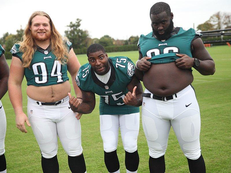
Click to make stomach even larger
The Eagle has finally landed: As you can see, the geniuses at Nike have finally figured out how to mix yellow and blue to create green, and thank the lordy for that — wouldn’t have wanted to miss a great photo like the one shown above.
But don’t get too excited just yet, because the Eagles have a bye this Sunday. Then they play on the road against the Cardinals (who’ll presumably be wearing red) and Texans (who’ll definitely be wearing red). So the Iggles won’t have a chance to wear their new green jerseys until Nov. 10 — almost another whole month from now! — assuming the green dye doesn’t bleed in the wash or something like that before then.
Meanwhile, reader Ernad Selimagic points out that Philly isn’t the only team whose primary colored jersey has been scarce lately. Six weeks into the season, the Titans have worn white for every single game. Could there be a problem with their jerseys too? Hmmmmm.
Collector’s Corner
By Brinke Guthrie
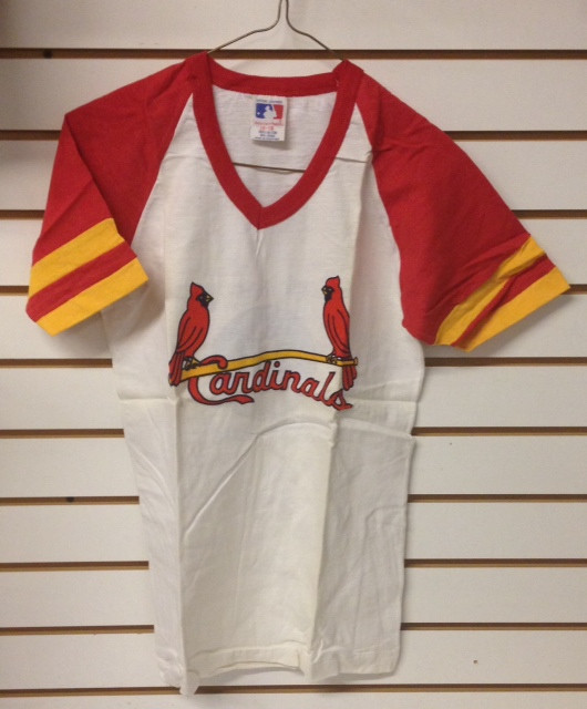
With the Giants/Cards series moving to AT&T Park today, how about a 1980s DeLong Giants pullover and this 1970s-1980s Cardinals T-shirt with striped sleeves (shown above)? And speaking of the MLB playoffs, couple of KC Royals items here, too: a 1970s Royals glass (which looks an awful lot like non-Royal Reggie Jackson, even down to the Puma stripe on his left shoe) and a 1970s Topps plastic cap and ball mini-plaque. And if you’re an O’s fan, buy a batch of Esskay hot dogs and get this “Orioles Magic” seat cushion.
But hey, there’s more to life than the MLB playoffs, so here are the rest of this week’s eBay picks:
• Oh. My. God. No further words needed — just click here.
• Wow, a big haul of those large 1970s NFL helmet plaques. You often see these sold individually, but as a set? Wow!
• Never seen a Technigraph plaque for the Lions before. Hurry, this one ends tonight. Helmet itself looks perfect but the frame has some wear. Same seller also has a Bills plaque that has more wear and tear. Also found a Cowboys version, and it looks to be in perfect condition!
• This WHA Hartford Whalers tie is in perfect condition. One of the greatest logos ever IMO. [If you like that tie, you need to check out this Uni Watch entry from two years ago. ”” PL]
• Check the retro logo on this 1960s Steelers glass. Pair it with this glass ice bucket.
• Great box cover artwork on this 1968 Ideal NHL game with the Blackhawks and Rangers.
• This looks like a Sears item to me — a 1960s Broncos scarf complete with the old bucking horse logo.
• Bucco Bruce lives on, emblazoned on this 1995 7-11 travel mug.
• Here is a pair of 1970s KC Chiefs mittens, just the thing for those cold December games at Arrowhead.
• Here’s an entire 1970s NFL gumball helmet set complete with display board. And from the same period, here’s a Raaaaaaay-duhz helmet buggy with a questionable stripe down the middle. Also found this Bengals gumball helmet– the picture’s crappy, but you can see how they originally rendered the font- not even close.

PermaRec update: A new Toyota Camry commercial (which I saw while watching an NFL game, so you’ve probably seen it too) has a surprising, if somewhat implausible, PermaRec-ish message. Get the full scoop over on Permanent Record.
Uni Watch News Ticker
By Garrett McGrath

Baseball News: The Diamondbacks already have a uniform and cap waiting for their new manager, Chip Hale. … At Friday night’s ALCS game, the Orioles sold World Cup Budweiser beer that was past its freshness date, although it’s hard to know how anyone could tell the difference (from Tommy Turner). ”¦ “I got married on Sept. 27 and gave my groomsmen classic Red Sox stirrups,” says Andy C. “They were a huge hit. Big thanks to Robert Marshall for the hook-up!”

Pro Football News: Not only did the Rams wear 1999 “Greatest Show on Turf” throwbacks last night, but their field also took part in the throwback party (thanks, Phil). … Rams WR Austin Pettis is from Anaheim, which presumably explains why he has a Mighty Ducks tattoo (from Mikey Brethauer). ”¦ Yesterday Paul mentioned that the Eagles didn’t wear any Pinktober accessories on Sunday night. Not only that, but the pink-trimmed wordmark on the field, which had been visible during the Temple/Tulsa game the day before, was gone by Sunday night (from Andrew Hoenig. ”¦ The CFL’s Montreal Als honored Anthony Calvillo yesterday by retiring his No. 13 and marking Percival Molson Stadium’s 13-yard lines (from Leo Strawn, Jr.). … This 49ers fan is not number one (thanks for nothing, Phil). … “The Pegula family, who own the Sabres, are now the owners of the Buffalo Bills, and as such they’ve been presented jerseys on a few occasions now,” says an anonymous Bills fan. “The thing is, they are the old neck roll versions, not the current version.” ”¦ Here’s a video of Fox commentator Howie Long questioning why a player who delivers a dirty hit is fined less than a player who wears Beats headphones (from Jen Hayden). ”¦ Coming this Sunday: the Chargers in powder blue and the Broncos in mono-navy (from Phil and Ron Ruelle, respectively).

College Football News: Oregon will wear 1994 throwbacks this weekend (from Chris Acquino). … “Purdue is a Nike school, but Purdue defensive coordinator Greg Hudson had a Majestic hat on in the first half of the game against Michigan State on Saturday,” says Nicklas Lane. “After halftime, he was wearing a similar hat but obviously now a Nike hat. Do you think someone at Nike spotted the Majestic hat and notified Purdue?” … No pictures, but the Kansas University team is going against the norm in the college football uniform world. “You won’t see any more funky uniforms. You’re going to see blue and gray at home, white (tops) and white (pants) on the road,” says KU defensive lineman Keon Stowers (from Derek Noll). … Reader Jared Buccola asked Fresno State if the team was going to wear anything special for their “Salute the Services” game on Nov. 1. They replied that the stars and stripes bulldog logo will be worn on a white helmet. … Rumor has it that Florida State is going BFBS against Notre Dame this weekend (thanks, Phil). … A Cincinnati jersey was missing its chest wordmark last weekend (thanks, Phil). ”¦ Hmmm, did a new Texas Tech helmet just leak?

Soccer News: MLS announced that season ticket holders can get their faces in MLS jersey numbers next season. The kits will be worn in August by all MLS clubs (from Leo Strawn, Jr.). … The University of Nebraska at Kerney Women’s Soccer club went Pinktober during their last game (from Jason Johnson). ”¦ “During the Bosnia-Herzegovina vs. Belgium match. B-H striker Vedad Ibisevic was wearing something weird on his head,” says Andy Bryson. “Turns out he took a header to the temple and he got cracked pretty good, so his other ear got taped up and apparently that headwrap was put on to keep everything in place. The injury happened 15 minutes in and he stayed in for the rest of the game after being patched up.”

Pro and College Basketball News: The Hornets’ home court design has a trippy honeycomb design (thanks, Phil). ”¦ The Illinois media guide cover features an interesting “Illini” wordmark. “The ‘LL’ in is rotationally symmetric with the ‘N,'” notes Greg Trandel (who clearly just wanted an excuse to say “rotationally symmetric,” and who can blame him). ”¦ Baylor’s hoops program has switched from Adidas to Nike and has a new set of black alts.

Grab Bag: With the Pegula family owning both the Buffalo Bills and Buffalo Sabres, they have introduced the “One Buffalo” campaign, which features the words “One Buffalo” rendered in Bills and Sabres colors. … In this world nothing can be said to be certain, except death sports and taxes. So here’s an interesting infographic on the taxes generated by sports salaries.

And from the same period, here’s a Raaaaaaay-duhz helmet buggy with a questionable stripe down the middle.
That “questionable” stripe sticker was used for quite a while on the gumball helmets. It was their way of showing the Raiders with a thin helmet stripe, rather than an overly thick one. The same thing was done for the Steelers and Colts in that era. It did get changed to a solid sticker later, but I’m not sure exactly when.
I agree.
One of my pet peeves is when people put the “blank” stripe on a helmet that does not use a stripe!!
And when the facemask is on upside down!
That Cardinals shirsey atop the Collector’s Corner is a thing of beauty.
I can’t read the Deadspin report with anything like Paul’s sanguinity. For one thing, you just don’t bake a revenue-sharing agreement into a major contract unless you really expect there to be revenue to share. (Make no mistake: the requirement to buy TV ads to go with jersey ads is revenue sharing by another name.) As to potential advertisers, it just seems inconceivable to me that any company interested in advertising on NBA jerseys will be put off by the dual-ad requirement. In effect, it’s a package: You pay on price, and you get your ads on both jerseys and TV. It’s just that some peon in your accounts payable department has to cut two checks, not one. That fact won’t play a role in any advertiser’s decision about whether to purchase the package.
Think of stadium ads: You might see a few ads in stadiums or arenas for local businesses that don’t also advertise on the team’s TV broadcasts. But for the most part, stadium advertisers also run TV advertisements if they’re a national or major local company. (And here in DC, most of the local stadium advertisers do buy local-broadcast TV ads.) Advertisers want to be in with multiple, reinforcing presences with the team. The also-TV thing is a feature, not a bug, from any serious sponsor’s point of view.
But I hope Paul is right and I’m proven to be overly pessimistic!
I can’t read the Deadspin report with anything like Paul’s sanguinity.
I wouldn’t say I’m sanguine; I just think this isn’t yet a done deal.
Not a “done deal”, but a deal nonetheless.
Ads will be on NBA shirts before Silver is out.
Lee
I’d guess that the big issue holding everything back is whether the advertiser is going to be paying the league, or the individual teams, and how the teams are going to share that money, if they do. Are they intending on 30 different sponsors all paying different amounts (because, seriously, no one is going to be willing to pay the same amount to be on a Timberwolves jersey as a Lakers jersey), or will there be just one (then two, then three…) lucky companies who get to have a place on every team’s uniform?
We can only hope that the individual team’s greed and desire to not let anyone else have a financial advantage over them is enough to keep the ads at bay, but I kinda doubt it.
The Orioles selling stale beer (advertising a whole other sport, no less) at a playoff game is the most Angelosian thing ever.
If they’re going to go out of date, Hoffberger-brewed Natty Boh would be much more appropriate.
The Redskins sold it, too:
link
But I suppose you can say it was Angelosian because it was even more stale last week than in late September …
“Rotationally symmetric”
…also called an Ambigram.
Ah, right — forgot about that term. So the adjectival form would be ambigramatic!
Memo to Peter Angelos: do not read Dan Snyder’s play book. Ever.
Eagles green jerseys….
And those are significantly different from last year’s, how???
Tailoring, fabric, silly collar, etc.
Yeah, I know, but….. really?
Um…those are not minor things.
But reproducing the “midnight” green color should not take months and months, especially when this change was most certainly known to be occurring this season.
I may be wrong here, but didn’t Paul report back when the Nike uniforms were first unveiled that the Eagles were sticking with the old style do to this issues? Doesn’t that mean that rather than taking months, this actually took years?
Not only did the Rams wear 1999 “Greatest Show on Turf” throwbacks last night, but their field also took part in the throwback party
I don’t think the field was really throwback. The royal blue helmet, yeah, but I’m pretty sure they were using endzones with the Rams wordmark with the arch above it in 1999, not the generic looking St Louis text.
The same amount of effort was put into making both the field and the uniforms ‘throwbacks’: minimal.
Those uniforms are garbage.
Lee
The unis aren’t that bad, but if they do bring these back full-time they should put a little more effort into getting them right, viz., the collars, the shape and positioning of the ram horns on the sleeves, and the shade of yellow.
If they were going to be that lazy about it, they had no business calling them “throwbacks”.
Lee
Not getting it exactly right is not necessarily a sign of having been “lazy about it.” And they can call them whatever they want. “Throwbacks” are never anything more than an approximation of the former design.
link
I know it is a Super Bowl, but I believe traditionally one end zone painted like home team’s endzone.
Actually…. Super Bowl endzones typically aren’t very accurate. I’m having a bit of trouble finding actual photographic proof, but my copy of NFL GameDay ’99 on the PS1 says that the Rams’ endzones were blue that season, not yellow.
I’m almost positive the Rams end zones were blue in 1999.
This image if from the 1999 NFC Championship vs Tampa Bay: link
Lee
Youtube is your friend.
link
Blue end zones.
Dang. Let that be a lesson me.
Does Pasquale still tailor for the Eagles? Would like to know more about how that works now in Philly with this jersey…
Purdue is a Majestic school for baseball. Another interesting insight from that photo… take a look at the variation of “gold.” (ignore the one-day cancer neon green)
As I understand it, back in the mid-90s, Nike convinced Purdue’s AD staff that they needed to standardize their gold. This was because Purdue’s “old gold” was too hard to replicate across uniforms and merchandise. (interesting, it’s the same old gold as Navy, and Mizzou… but play along). So, Nike sold them “Vegas Gold” and set out to standardize everything in the palette to the lovely khaki masquerading as gold.
Now, take another look at that photo… and what do we see? “Iowa” Gold… on some of the hats and shirts. It’s a striking contrast to the vegas gold.
Amazing that Nike gets away with such nonsense. I simply cannot believe that staff at gigantic universities don’t hold to their brand standards more closely. And they allow equipment providers to dictate how the brand is displayed. Simply baffles me. Apple wouldn’t do that. Target wouldn’t allow renegade orangish variations of its red.
Paul,
I referee youth soccer and we had our own version of Pinktober. Not the players, but the refs…
link
Our kid’s soccer team played a club over the weekend who were sporting pink socks, even though their colors are navy/red. I kept my “pinktober is out of control!” thoughts to myself because, who knows, maybe one of the players has a relative fighting breast cancer right now and it was a show of unity from the team. Maybe not, but I’m fighting my UniWatch pinktober cynicism the best I can.
Thank you for keeping your pinktober thoughts private. The pink doesn’t really bother me, but I certainly understand the discussions that have taken place on this site. I am not about censorship or anything when it comes to this issue, and sometimes a short sensible argument is in order if you’re at a game sporting pink accessories, etc.
What is really problematic to me though is people who don’t have the sensibility to realize the magnitude of what they’re really doing when they scream out loud that they hate the pink or the camo. It’s a small following here, and most folks out there aren’t aware of how inappropriate the pink and the camo is, and most probably don’t care. There’s pink for breast cancer, camo for the military, most probably feel good and patriotic for a few seconds and move on.
So if these things could be brought up in a sensible and timely argument, all the better. Screaming “enough with the pink shit” in a crowded student union…dumb.
I myself have no problem voicing my objections to both the pink and the camo. Along with a succinct explanation of why.
There’s no need to silently go along. And not all objections are automatically “(s)creaming ‘enough with the pink shit'”, after all.
You know, pink refs gear is actually kind of brilliant. In North American boy’s and men’s sports, refs in pink will almost always contrast with both teams in a game. You can’t say that of black or yellow or even chartreuse any more.
We usually wear green because of that very fact.
There’s only been one instance where we changed out of it (one team had highlighter yellow kits and we felt the green was a little too close).
Field hockey referees typically wear pink shirts for that very reason. The sports governing bodies even depict them that way in the informational/training materials they publish:
link
For the Potomac Rugby Refs our new kit is pink, not for Pinktober, but in order to contrast with local teams.
Back when I was in Nor-Cal the refs had blue and gold kits. Of course the problem there is that half the teams in Nor-Cal also wear blue and gold.
I’m digging the non-Pinktober pink kits we’ve got.
In MLS, one team’s goalkeeper wears pink. Like the ref, it makes sense since you want a color that contrasts with both teams.
Bucco Bruce lives on, emblazoned on this 1995 7-11 travel mug.
This was discussed some time ago about the Texans’ insignia, but Bruce also looks “wrong” when flipped over.
Ummmm, regarding the rumor of those BFBS unis at FSU this weekend…
“A source told Tomahawk Nation that FSU is not likely to wear them against the Irish, though some other game this year could not be ruled out.”
So not really a rumor per se.
I never liked those 1969 NFL posters. They couldn’t hold a candle to the Dave Boss posters even then. For the Packers poster, they tried to do some vaguely Peter Max-inspired thing that didn’t work even then.
So I used the day off work Monday to brew a new batch of a simple pale ale recipe. And I got to figuring that I should recognize the holiday in the name of the batch, and also it should be ready to drink right around Thanksgiving, at the peak of the football season. So after sealing the fermenter, I threw together this tangentially sports-inspired label:
link
Hopefully, it’s more irreverent than offensive.
Could you maybe ad some camo to it?
Oooh, I like that idea. I’ll keep a camo theme in mind if I ever brew a brown ale or a stout or porter.
I see the brown ale mock-up labels are already up. Nice! Might I suggest MultiCam or desert MARPAT as the filler for the word mark to make it a bit more legible?
…Or maybe Universal Camouflage Pattern as a form of social commentary!
Ha! Poor legibility is kind of the point. But I’ll keep your suggesting in mind – the ones I threw up there are just rough concepts inspired by your suggestion that I banged together over lunch. My first choice would be either WWII USMC “duck hunter” camo or the Army’s new Scorpion W2 pattern. But I couldn’t find sufficiently high resolution pix of either pattern in the 45 seconds or so I had available!
“In this world nothing can be said to be certain, except
deathsports and taxes.”And NBA jersey ads. Because they’re inevitable.
It’s always bothered me that the Hartford Whalers logo was a whale with an “ers” on the end, wouldn’t this actually spell Whaleers?
shouldn’t it be “Whale” “rs”
Do you also have a problem with “49ers”, since that would be spelled out as Forty Nine Ers?
Thanks for bringing that up; in fact, it does bother me. The Niners ought to go back to the ornate font of the Montana era, and spell “San Francisco” in little letters below the NFL shield.
i honestly never thought about the 49ers but you’re right it should be 49rs. It doesn’t bother me as much as the Whaleers
Didn’t the NFL poobah’s proclaim that they were going to tone down Pinktober this year? So maybe Jeff Lurie decided the team would have one Pink game this year and it was against the Rams?
I thought Paul mentioned there would be a muting (or eliminating) of pink from the nationally televised games.
Or am I misremembering that…
Kee-rek.
In regards to the the Titans not wearing baby blue… good. Yeha nd it’s baby blue or sky blue not “titan blue.” I’m hoping against hope it signals at least a shift in thinking back to Navy as primary, back when the Titans actually won things like divisions. Seeing the Rams in the GSOT throwbacks made me hanker for Titans Navy over white and vice versa instead of White/baby/navy. *Crosses fingers*
As long as the Titans ditch the navy pants (or only wear them with white tops and get rid of the navy socks when they do), I’m fine with them returning to navy over white. The powder blue tops over white pants is probably one of the best looking combos in the league (I think they’ve worn that exactly once, or maybe twice, and only last season). The white over white looks sharp too. But navy over white is fine.
The white over powder pants is also one of the best combos in the league, and that should be their permanent look, with a navy or white pants tossed in once of twice (if they must insist on 3 different colors of pants).
In any event this or this or worst of all this should never see the field again.
The Titans should wear powder over navy at home, and white over powder on the road.
They should wear all white only when they play in Texas.
Thats the Titans.
Lee
Since my previous comment was deleted, I’ll just say that I agree with Lee here.
An alternative theory is that maybe the Titans just really like the white over navy combo.
Despite appearing only twice since 2007, the Titans wore the white over navy combo more times than any other last season, in particular during the regular season when they wore it half the time.
Every home game so far they’ve showcased the white/navy combination. My guess is that it holds significantly positive memories of the first years under the Titans moniker which Justin has conveyed.
Navy pants are unnecessary.
White pants with powder blue jerseys always
White or powder pants with white jerseys
White or powder pants with navy jerseys
All of those uni combos above are better than any combo they’ve worn with navy pants, IMO.
Indeed.
Powder-over-navy is not so bad but they should wear white- or powder-topped socks with the navy pants.
I happen to be one of those who don’t mind mixing powder and navy…but powder jerseys OVER navy pants is just awful. I’d prefer (barely) mono-powder or mono-blue over the first combination.
However, and I don’t believe (need to check the GUD) they’ve ever gone navy shirts over powder pants. I think I could get into that one.
Hmmmm…seems as though they have worn navy over powder as recently as 2007. Looks good in the mockup. Will now search for an actual photo to confirm or deny this belief.
Yep. Versus the Falcons
Doesn’t look as good as I hoped, but that’s possibly because of the shiny pants. Maybe with swooshie’s matte pants it would look better…
Those looks are okay. It’s the white hats that messes it up
But hey, there’s more to life than
the MLB playoffsthe NFL.Fixed.
Fox commentator Howie Long questioning why a player who delivers a dirty hit is fined less than a player who wears Beats headphones
I hope he’s not the only one pointing out the absurdity of that. Good for him.
Players, like all people who make their living in the NFL, are just commodities. They get hurt, they retire, and there’s a whole new class of players with fresh tread on their tires.
Sponsors, on the other hand, are practically gods to the Protectors of the Shield. See how “serious” the bigwigs got about Ray Rice and Adrian Peterson when sponsors started making noise (i.e. not when the incidents first came to light)?
I think a strategy to stop NBA jersey ads from happening is an online campaign/petition stating fans will boycott whatever companies are on the jerseys. It can be the opposite of NASCAR where some fans purchase the products/services of those companies who sponsor their favorite driver.
I received my socks yesterday from your sponsor, American Trench. They are great- fit comfort, color, whatever one wants in a sock. Delivery and the time from order to wearing was short, because they are efficient. Cheers to a Uni Watch sponsor from a very satisfied customer.
They’re a really good operation with a great product. I’m proud to have them as an advertiser on the site.
Why do the NFL and (until recently) NBA have a white/black dividing line on shoe color?
Baseball allows teams to designate any color as the majority for their cleats. We get to see clubs like the Royals and Cardinals blend their shoes into the rest of the uniform.
Given that the NFL now has a policy of allowing players to wear team color cleats, why not just extend this and permit teams to designate a color for their cleat? The Chiefs would then be able to officially recognize red as their dominant color and maybe we could see some better consistency from other teams like the 49ers and Bears.
Wow, the new Catch of the Day art is awesome. That’s two in a row… last week’s Catch of the Day photos were also great. Thanks Paul!
Great stuff. Thanks for pointing that out.
Isn’t this a repeat??
(I could swear it the COTD a while back too)
It is definitely a repeat.
Worth another look, though.
Repeat or not, that was great. And the links led me down a rabbit hole that i spent my entire lunch hour exploring!
Great stuff.
Lee
All the powder blue talk made me wonder WHY is it called “powder blue”?
According to Wikipedia, the name originally referred to a darker blue pigment made by grinding cobalt blue glass into a powder, known as “smalt” (a great word for today).
The use of powder blue for the lighter shade dates back to 1774.
Is there “powder red” too?
(or other “powder” colors?)
That’s a really interesting question.
Never really thought about it before, probably because I tend to use the term “Columbia blue” instead (obviously my New York bias showing). ;)
What I’ve always found funny about the Chargers’ “powder blue” is that the actual blue on the old Lance Allworth era jerseys is nowhere near as light as the current “throwback” blue color based on the photos I’ve seen. The Allworth jerseys almost look Royal (perhaps a little lighter), while the current ones appear more “Carolina” blue. It’s a little like the Cowboys’ pant color. If you see footage of them in the 70s the pants are clearly grey and were so no matter what jersey they wore. It seems only later they started with the grey pants with blue jerseys/greenish pants with white jerseys thing.
That’s the danger with inferring specific color information from old photos. Many colors will look different in person than they do in photos, which in turn is different than they look on television. Then double each of those for natural light versus artificial.
The Cowboys’ green pants, after all, were originally designed so that the fabric would appear to match the helmets on the color television of the day. In person, they always clashed, and now improved broadcast technology only reveals the clash spectators in the stand saw all along.
I’m most likely to use powder blue more than other terms.
Probably partly a hold over from when I was a ring bearer for my cousin’s wedding in the mid to late 70’s wearing a powder blue tux with a big bow tie and a yellow ruffled shirt. “Fashionable” for the times – understated it was not.
Caption for that Eagles pic:
HOW DO I WEAR JERSEY?
Illinois football clearly doesn’t comprehend that Red Grange was the “Galloping Ghost.”
link
This is the Gray Ghost.
link
No, link is the Grey Ghost. :)
Serious question about the Eagles photo.
I know the two big guys are, well, big. And those jerseys are tight just on the skin. Is that the size they wear with pads too and is that material made to stretch that much? Meaning that the ones they are wearing in the photo are the same exact sizes they would wear on the field with pads.
Maybe a weird obvious answer is yes, but for some reason I find that amazing.
Today’s jerseys are super-small and super-stretchy. I’d be willing to be that those are indeed those players’ game jerseys.
I had never before seen the Bears logo that appeared on the ice bucket. I love the logos from the 60’s.
link
Sorry, here is the link to the up close view of the Bears logo.
link
Nice.
Once upon a time, logos could be fun, clever, and witty instead of “intimidating.” Sigh.
I know you guys want to go back to the 1960s but uniform ads are inevitable… Players want to get payed, owners want to get paid, uni watch is the peasant