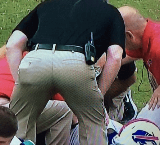
My favorite uni-related moment from yesterday’s NFL action, hands down, came during the Bills/Texans game, when a Buffalo trainer turned his posterior to the camera and revealed that he had missed a belt loop (click photo at right to enlarge). When I tweeted that photo yesterday afternoon, one of the many responses was, “Slow uni news day.” And yeah, as it turned out, yesterday was a pretty uni-unventful day around the league. But even during a busy day, I would have been totally geeked out over this one.
In other NFL observations from yesterday:
• The Bears wore their “Monsters of the Midway” throwbacks.
• The Saints wore solid black.
• So did the Ravens.
• The Dolphins and Raiders faced off in London. As has been the case for the past few years, neither team wore an “International Series” patch. (In case you don’t recall what that patch looked like, look here and here.)
• Only two teams wore white at home yesterday: the Cowboys (of course) and the Chargers.
• Most players with long dreadlocks just let the dreads flow, but Vikings wide receiver Cordarrelle Patterson was wearing a snood-ish accessory yesterday.
• 49ers wideout Michael Crabtree appears to have been wearing a whole lot of socks — or maybe just a lot of white tape.
• Speaking of the Niners, can anyone figure out Colin Kaepernick had printed on his mouthguard?
• Have I mentioned lately that retail jerseys just make fans behave like idiots?
• Pretty sure we’ve covered this before, but once more won’t hurt: Falcons defensive lineman Kroy Biermann has been wearing red contact lenses to cut down on glare.
• The numerals on Ravens linebacker C.J. Mosley’s uni number were either not the same size or badly distorted.
(My thanks to all contributors, including Andy Altemus, Matt Larsen, Small Papi, Chris Perrenot, and of course Phil.)
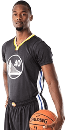
Ewwwwww: What do you get if you combine the NBA’s most sleeve-happy team with BFBS? Here, see for yourself.
What a train wreck. I’ve been pretty supportive of most of Golden State’s moves in recent years — they’ve definitely been the most visually interesting NBA franchise of late — but it’s hard to find anything good to say about this. How much does it suck, and how annoyingly is it being presented? Let us count the ways:
• There’s no team name or city name (or state nickname, or whatever) on the jersey. This, combined with the sleeves and the plain black-and-white color scheme, makes it look even more like a practice jersey that the NBA’s other sleeved designs.
• The yellow and blue trim doesn’t work at all.
• They’ve given this shade of black a new name that I’m not going to dignify by invoking. Please. It’s fucking black, and that’s what we’re going to call it.
• The uniforms were unveiled at a “social influencers” event, which sounds like the kind of douchebag-o-rama that might be fun to crash just for the pleasure of “accidentally” spilling drinks on everyone. Unless you had something better to do, like, say, whacking yourself in the head a few times with a ball peen hammer.
• Some morons at the NBA and/or Adidas came up with the idea that this uniform is “armor.” You know, because basketball is “combat” engaged in by “gladiators” who need “armor” as they “fight” to “death.” Earth to morons: You can’t keep telling us that each uniform iteration is eleventeen percent lighter than the last one and then try to tell us that this ultra-light wisp of a garment is “armor.” (Note to self: Figure the over/under on the first Kevlar uniform is about eight months from now.)
Honestly, sometimes these people are so goddamn stupid, it’s just depressing. And angering. And amusing. But mostly depressing.
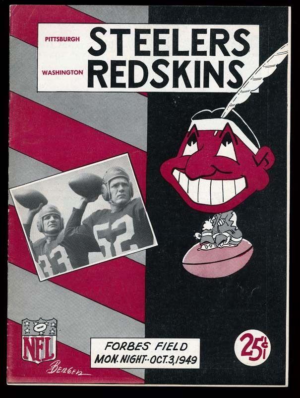
Too Good for the Ticker: I suppose I could have held onto this until Friday’s edition of ’Skins Watch, but it seems too remarkable to hold onto. As you can see on the program cover shown above (taken from this eBay listing), Chief Wahoo was used as a mascot for the ’Skins on at least one occasion in 1949. Well, I guess those Injuns all look alike, right?
Also of note: the primitive NFL logo and the Monday-night game time.
But here’s the weird thing: According to SportsLogos.net, the Indians didn’t start using that version of Wahoo until 1951. So how did it end up on a football program cover in 1949? Anyone know more?
(Doubplusthanks to Leo Strawn Jr. for this one.)
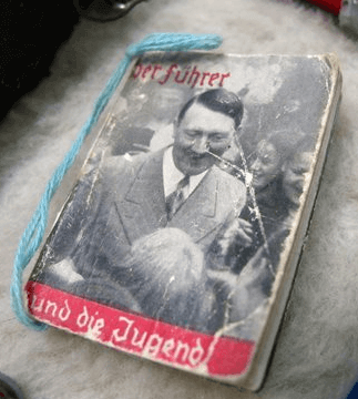
PermaRec update: An abandoned trunk found in a vacant house turned out to be full of Nazi memorabilia, including the Hitler booklet shown at right. Get the full story on Permanent Record.
Also, yesterday was a special day on the PermaRec calendar. Details here.
A way better bargain than one of Derek Jeter’s socks: Uni Watch 15th-anniversary patches are back in stock, and the anniversary stickers are available as well. Snap ’em up!

Baseball News: Anyone know why the entire Reds infield went high-cuffed yesterday? (Photo by Patrick O’Neill, who was at the game.) ”¦ Dodgers players Juan Uribe and Hanley Ramirez got to be the manager and bench coach, respectively, for yesterday’s regular season finale, so they had a bit of fun by wearing bench coach Tim Wallach and manager Don Mattingly’s jerseys. Even better, Uribe later switched to a Tom Lasorda jersey. Kudos to all involved for injecting some fun into the game (from Allen Yelent). ”¦ “A new ballpark is being built in Columbia, South Carolina, for a minor league baseball team to open play in 2016,” says Joe Mathwig. “There is currently a contest to name the team, with an option to describe a possible logo as well.” ”¦ While looking for something else, I came upon this old photo of Cardinals pitcher John Denny, whose black armband appears to have been falling off.

NFL News: A classic Green Bay sporting goods shop is closing. Key quote from the shop’s owner: “My brother, Dick, remembers dad and Vince (Lombardi) sitting at the kitchen table designing the uniforms” (from Jeff Ash).

College Football News: A youth football team called the Oklahoma Ducks is patterning itself after the Oregon Ducks, uniforms and all (from Paul Deaver). ”¦ Austin Miller has written a good story on how Ole Miss’s powder blue helmet came to be. ”¦ Hmmm, is Maryland teasing a new helmet? ”¦ Speaking of that last link, I find it interesting that Maryland is using the hashtag “#ByAnyMeans,” given that term’s provenance. Who knew Sartre and Malcolm X were Terps fans? ”¦ A little birdie tells me Oregon will wear black helmets with pink wings, pink/black cleats, black pants, black jerseys, and pink gloves this Thursday. Can’t, uh, wait.

College Hoops News: New sweatbacks — plus a HNOB — for Georgia Tech (from Britton Thomas). ”¦ The University of Kentucky has police cars with a “cat scratch” livery design that recalls the old Pitino-era basketball shorts (from Jim Joseph).

Grab Bag: DayGlo uniforms yesterday for the Kentucky women’s soccer team (from Chad Back). … “NHRA driver Kyle Wurtzel just made his professional debut,” says David Firestone. “For some reason he had both a Full Throtle Drag Racing Series patch and a Mello Yello Drag Racing Series patch. Full Throttle was the sponsor from 2008-2012; Mello Yello took over in 2013.” ”¦ Interesting to see how the European Ryder Cup sweaters have one UCLA stripe (from Sean Mitchell). ”¦ Here’s a rare video treat: Celebrity Bowling (from Steve Dodell). ”¦ Odd scene on a CNN show that was discussing Bill Simmons’s recent suspension, as the host and a guest wore the exact same outfit.

What Paul did last night: When I finished high school in 1982, my big brother Roy gave me a graduation present: a dozen blues LPs, which fed my growing interest in that genre of music. Two of the LPs were on a California-based label called Arhoolie.
Over the subsequent 32 years I’ve acquired a lot of Arhoolie albums — blues, mostly, but also some Cajun and norteño. All have been consistently wonderful. Along the way I became aware that the label’s founder, a cat named Chris Strachwitz, had been instrumental in providing the first recorded exposure for a bunch of important blues artists, and that he had become an important figure in the worlds of folklore and ethnomusicology. I always figured he was some kind of west coast hippie, not unlike the filmmaker Les Blank, whose short documentary films often included performance footage of Arhoolie artists.
Shows what I know. Turns out Strachwitz was actually born in a place that was then part of Germany and is now part of Poland. His family emigrated to America to escape World War II when he was 14. The story of how this European dude fell in love with traditional American roots music is pretty fascinating, and it’s told in a new documentary called This Ain’t No Mouse Music, which is all about Strachwitz and Arhoolie.
Given that my brother was the one who introduced me to Arhoolie Records, it seemed fitting that I should see the movie with him, so I invited him to join me at a screening yesterday. The filmmakers were there in person for a post-screening Q&A session, and so was Chris Strachwitz himself, now 83 years old but still passionate about America’s musical traditions.
The film was great. It’s at the IFC Center in Manhattan through this Thursday, and you can see screening dates in other cities here. Here’s the trailer:

Paul, the lead photo today got me thinking about something other than the missing belt loop. Notice his wallet is in his left back pocket. I always wear mine on the right. Have you ever done a story on what side men generally wear their wallet and why? My guess is it might have something to do with whether you are left or right handed, but I don’t know.
Something else for us all to ponder I suppose.
I’m left-handed and have always carried my wallet in my back-left pocket.
same here…I always thought guys wore their wallets on the same side as their dominant/preferred hand.
Not me. I’m right-handed and my wallet is always in my back left pocket.
If we’re keeping a running score:
Lefty. Wallet in the back-right pocket.
Ditto.
That’s ditto to Paul, by the way — left-handed, wallet in left back pocket.
Ditto ditto
I’m right handed and used to do back right. I do front left now. It’s better for my back.
More related to the purpose of this site, how many coaches wear their wallets on the sidelines?
I would have assumed coaches change when they get to the stadium/arena and leave their wallet in the locker room/coaches office.
Wallet in front right pocket.
Wallet in front left pocket and I’m right handed.
Ditto
Wallet: front left
keys: front right
Continuing the discussion from Friday, this is how I use my pockets:
* Front left pocket: personal phone, because I’m right handed and hold my phone on the left
* Front right pocket: keys, because I’m right-handed and the car ignition is on the right side. Also, that’s where I clip my work security badge. Also also, work phone, because both my phones are iPhone 5s and I don’t want to get confused.
* Back right pocket: wallet
* Back left pocket: empty
front left – keys;
front right – small bill cash, a wallet, a pen;
rear right – comb;
rear left – other wallet;
shirt pocket – phone.
Because there are so $#%#$@%#@%@ many cards to carry between shopper rewards, insurance, etc., I carry two thin wallets rather than one thick one.
“Just one club card” Dot com.
I am not spamming or advertising. I have used a website which, if you feed it your stores and your card UPC codes, it’ll spit out a PDF which you can wrap with shipping tape, and then you can take 8-10 plastic cards out ofyour wallet.
Like I said: I have no interest in its success. I’m just a happy user of it.
Alternately, you can install the Keyring app and use your phone to display the bar codes.
You can either scan the bar codes with your phone camera or type in the numbers.
I’m right-handed, but keep my phone in my front right pocket. I hold it in my left & dial with my right, but switch hands while actually on the phone (I tried it on the left side once, and it was weird).
Front left holds keys, chapstick, pen, etc. (used to keep the cylindrical devices in the right pocket before phones were as big as they are now).
Back right is for wallet, back left is empty.
I’m left-handed and keep it in the right back pocket, for some reason. There are trousers in my wardrobe that warrant using each of the four different positions, so I’m trying to break out of my routine.
I’m ambidextrous, and I’m not telling any of you crooks where I keep my wallet.
Totally understandable. By the way, what’s your mother’s maiden name?
Nobody carries wallets anymore. I mean, they went out with powdered wigs. Yeah, see here’s what you need. Just a couple of cards and your bankroll. See, keep the big bills on the outside.
The (more or less current) version of Wahoo was solidly established by 1949–although its first appearance as a sleeve patch was in 1951. Note the signature on the program–Pittsburgh Press artist Jack Berger, Sr., who created the Pirates’ logo in 1958. I suspect that he simply appropriated the Cleveland artwork for this one-off, nothing official at all. Not a whole lot of trademark scrutiny attached to program covers back then, also consider the stature of the NFL at the time, relative to MLB.
link
Seventh paragraph shows a crude(r) version from 1948. Agree that it was some version of appropriation for a one-off.
Yeah, I was going to post that again.
Chris Creamer’s site is amazing on so many levels, but anything from before its inception must be viewed with great skepticism. Especially dates.
RE: YOURMOM
I’d be willing to bet any amount of money that nameplate was just attached over the real nameplate. The font is completely wrong, but the numeral font is correct.
But at least he “classed it up” with a Breast Cancer awareness ribbon. : )
Looks like Kaeprrnick’s mouth guard say “new breed”
I saw that yesterday and thought that’s what it said.
I get that these are not Golden States colors at all, but i have to say I think that the grey, blue and yellow look very nice together. Once half the league adopts the grey i will hate it, but i do enjoy it for the time being.
The Warriors jerseys are obviously completely stupid in their sleevedness and BFBSness, but I too disagree on Paul’s evaluation of the trim. I think it looks very nice, as do the shorts on the whole. Of course, that doesn’t mean they should be used in games.
Except it’s not gray. It’s black, and it looks awful.
They made this good point on PTI sometime last year (I can’t remember the exact wording):
“They say these uniforms are more streamlined and lighter. You know how it would be even lighter? NO SLEEVES!”
And if reducing weight is so beneficial to a basketball uniform don’t have baggy shorts that do down to your knees.
The uniforms have become slimmer and shorter in recent years.
I enjoy sports’ aesthetics. I get itâ„¢. However, the Ole Miss article made me roll my eyes so many times I got dizzy. It’s a helmet.
Golden State’s new BFBS unis are horrendous… however… I do really like the stripe along the side. If that wasn’t there, it would be a certain “F”. Instead, it’s a “D-“
The Chargers weren’t the only home team in white yesterday … check your picture a couple bullet points up for the Saints/Cowboys game in Arlington.
The Cowboys don’t count because we expect them to wear white at home.
It sounds dumb to say “Only one team wore white at home, the Chargers and Cowboys”.
Lee
How about “Only one team that usually wears dark at home chose to wear white instead.”?
Heh, ok I didn’t notice that Paul had made that edit. C’mon man.
Note: the Skins/Indians eBay link directs to sprotslogos.net
The Ryder Cup sweater with one UCLA strip is European, not USA as the text says.
The Warriors’ jersey is actually dark grey. “Slate” or “charcoal” is a pretty common term for that color, more so than “anthracite” at least. :-)
Uh huh.
No… there kinda actually is a difference between black and dark gray. Put that thing next to the Spurs uniforms and it’s obviously a lighter color. It’s still stupid as all hell, but it ain’t black.
Just as there are many different shades of blue (and green, and red, etc.), there are different shades of black. This is one of them. We’ll be calling it black.
I have to agree with The Jeff and AndyHarry on this one. As stupid as it is for them to do, #4d4d4d (I’m guestimating) isn’t #000000, so I can’t just look at that uni and say “It’s black,” and call it a day.
Regarding the uni itself, it’s a glorified practice jersey. I don’t like it.
If they had simply called it “dark gray,” I might have gone along with that. But instead they used a term that belongs in a fucking J.Crew catalog and then trotted out the “armor” thing. They basically forfeited their right to be taken seriously. It’s fucking black, and that’s what we’ll be calling it.
CASE IN POINT: consider the gray color on the uni numbers of the Philadelphia Eagles actual game (NOT retail) jerseys. The gray is very dark (almost graphite/charcoal). From afar it blends into the background black twill layer on the numbers.
Usually on the retail jerseys, the gray is lighter.
Interestingly, on the cheap replicas (screen-printed numbers), the gray is always the right (darker) shade.
This discussion reminds me of link.
George: How can you call that gray? It is clearly light black.
Jerry: Light black? What does that even mean? You see, once something is black, it’s black. Same thing with dead: like once you die, you’re dead, right? Let’s say you drop dead and I shoot you: you’re not gonna die again, you’re already dead.
And one more pop culture ref: link
The difference between priest socks and normal “black” socks: link
It’s not dark gray, it’s light black. ;)
You must have gone to bed early last night – the Dallas Cowboys always wear white at home (but you already knew that).
Fixed.
Except for when they’ve gone throwback at Thanksgiving… or last Thanksgiving when they were forced to drop their 1960s throwbacks, and just beat the Raiders in their regular blues.
Except for when they’ve gone throwback at Thanksgiving… or last Thanksgiving when they were forced to drop their 1960s throwbacks, and just beat the Raiders in their regular blues.
Sorry for the double-post; my finger twitched at the wrong time.
“…Bears wore their Monsters of the Midway throwbacks…”
Be still, my heart.
Don’t like the Bears. Can’t stand Cutler. Love those unis.
I really wish they adopted those full time, so very nice, just one minor nitpick. The numbers seem a bit too thick, almost like they took a number set with an outline and just made the fill/outline all orange. If they could thin those numbers out a bit they would then have one of the best sets in the league. I feel their current uniforms are a bit overrated. I know…blasphemy….
They do seem too thick, but they’re pretty spot-on in terms of accuracy. Those 1940s numbers were awfully thick.
I hate the Bears but man, do I love those uniforms.
Yeah I understand they are trying to historically accurate, but looking at them purely aesthetically I feel that tweak would help them out.
Aside from the white undershirts and cleats which didn’t exist in 1947.
I’m aware that Rory McIlroy is trying his best to shed his Ulster drawl in favour of a generic American twang but he nonetheless was wearing the UCLA striped sweater of the European team at the Rider Cup.
It is a very sad thing to hear Rory’s speech go Florida. Never thought of Ulsterspracht as a drawl, though. You wouldn’t say, Padday, that there’s too much frigative oomph in Ulster intonations to qualify for drawldom?
/s/ Conn Cetchathach
True, but there can an awful long wait between intonations as you’re waiting for some of those dipthongs to satisfactorily articulate.
My wife loves the various accents of the British Isles. She was very proud of picking out Graeme McDowell as an NI native based on a 30 second interview. He obviously hasn’t “cleaned” up his accent.
Fixed.
The Tommy Lasorda jersey Juan Uribe was wearing in yesterday’s game had a Dodger Stadium 50th anniversary sleeve patch, which you can see pretty clearly in the GIF posted in the ticker.
Typo “bby”
Fixed.
I’m right handed, carry it in my right front pocket
Not sure if it’s been noted on here before, but the drivers who are in NASCAR’s postseason “Chase” have special designations this year to help fans quickly identify who is competing for the championship.
Guide
link
Examples
Brad Keselowski
link
Kevin Harvick
link
Worth making a special note, Joey Logano’s team actually modified their (mostly yellow) paint scheme to ensure the roof numbers were visible.
Logano (regular season)
link
Logano (chase)
link
That’s a cool element to the chase.
Since Jeff Gordon’s roof number is already yellow, does that mean he’d have to have it changed to another color if he’s knocked out?
Honestly, I hate the splitter, the windshield banner, roof number and decals I can live with,
Before the Niners-Eagles game someone tweeted Niners beat writer Matt Barrows and asked about the font used on the field for the numbers at Levi’s Stadium.
Apparently, the font is Stag Stencil which is Levi’s official font.
Ah, corporate synergy.
I miss that belt loop in the back about once every 10 work days. I’m just lucky not to do it when I appear on national TV.
With regard to the BFBS uniform color: Slate is definitely NOT black. It has an element of gray (black + white) to it. I know these things, I went to art school.
PuckBoy
You had to go to art school to learn the difference between black and really really really dark gray?
Anyway, to the untrained eye, that jersey looks black. Most eyes are untrained. Therefore, jersey is black.
I used to have a running joke with a co-worker referring to a color as “light black.” With respect to Paul and terriblehuman, that uni doesn’t look black to me. It looks like “light black”, or dark grey. And my eye is as untrained as they come.
Fair enough, and if I were shopping for a suit, I’d probably describe the color as “dark gray”.
But if I were at a bar and a game was on and somebody asked which team was wearing black, I wouldn’t correct him. It probably depends on context.
About those Oregon Duck unis:
Your little bird should have also told you that Oregon plays Arizona on Thursday.
Patterson has been wearing, what we here call it, his ‘horn’ for every game. Is a moddified skull cap of sorts as far as I can tell, he also wears a regular skull cap also under his lid
I believe Coderrelle Patterson has worn that little accessory since last year.
John Denny isn’t wearing a black armband in that photo. The banding on the sleeve is red, white and navy — and it’s just partially turned up so the navy is covering the red and white.
Reminds me of this:
link
That sweatbackish design that Tech will wear is, by far, the best of the genre, because it actually looks like something, unlike the Nike sweatbacks. I still think it could stand to be more subtle and would prefer it not be there at all, but it’s a whole lot better than what Nike has done. And you can’t often say that about Russell’s designs for Tech.
They’ve done fine for us in basketball. Only thing I haven’t been a fan of is the font, hopefully it’s good on the white jerseys instead of navy like it has been (the aesthetics aren’t very pleasing but it looks better when it’s gold outlined in navy).
“- Only one team wore white at home yesterday: the Cowboys (of course) and the Chargers.”
…..um….so TWO teams wore white at home yesterday….
Arggh. Fixed.
I find it interesting that Maryland is using the hashtag “#ByAnyMeans,” given that term’s provenance. Who knew Sartre and Malcolm X were Terps fans?
Good. We don’t talk about Malcolm X enough any more.
or Sartre
Jean-Paul Sartre is like the Mark-Paul Gosselaar of existentialism.
“Jean-Paul Sartre said hell was being locked forever in a room with your friends.”
“Yeah, but all his mates were French!”
Of all the great lines from the movie Caddyshack, perhaps the best is Bill Murray’s (Carl Spackler’s) quote; “in the immortal words of Jean-Paul Sartre, Au Revoir gopher.”
Typo in College Hoops section: Pitino, not Pittino.
Boy. Sloppy day today for me. Fixed.
The cynic in me says these horrible Golden State uniforms are paving the way for a time when teams don’t have team name or city name on the front because that space will be reserved for ads.
RE: Crabtree’s socks (or whatever)….
I was more interested in the fact that they had and were using a softball in the gear box. Clearly it must work for whatever ailment Crabtree had last night but I’d think there might a “real/official/medical” foot arch roller ball on the market.
Link to the Chief Wahoo NFL program cover eBay auction takes you to Sportslogos.net
Fixed.
Here’s the proper link:
link
Perhaps it’s fitting the new Warriors’ sleeved t-shirts look like shit, since they may be playing in a toilet…
Yep, made me laugh.
Could you imagine if your arena ended up with that nickname, potentially you could embrace it. With a victory well in hand, the PA system could blast the sound of a toilet flushing.
That Kentucky police car is ridiculous.
Those Kentucky shorts were ridiculous! What where they thinking? The denim look that followed looks good by comparison (mainly because the denim unis were otherwise traditionally styled).
A more primitive, forward-facing version of the current Chief Wahoo was used on a 1948 World Series press pin.
link
And not just the press pin – the link as well.
Seems to have been a link in 1948, before they settled on th e3/4 view (which, as noted above, was link that year).
The Orlando Magic also revealed their new pride uniforms.
link
I’m disappointed not to see a rainbow motif. Not sure what’s so “pride” about gray.
Do the Tech jerseys qualify as sweatbacks? I mean it’s clearly a sublimated Buzz, as opposed to a custom design that looks like a away soaked panel from a medium distance.
I think I like it but I don’t think it’s necessary either, wonder if it will be on the white jersey as well.
I do love the continued use of the comb design, wish we would find a way to implement that into our football uniforms in a subtle way (I.e. my uni tweak submission from early 2013). And I wish we would get away from this stylized Russell font, never been a fan.
That is not a black amrband on the John Denny picture. It is the bottom navy blue stripe on the Cardinals “red/white/blue” sleeve stripe, turned inside-out. Until 1987, the Cardinal sleeve striping was a thin material, which when turned inside-out (or rolled up) would show the red/white/blue stripe on the underside. So, that is just the navy blue bottom part of the sleeve stripe rolled up a bit. I remember Andy Van Slyke often had one or both of his sleeves rolled up like that back in the early ’80s, so it looked like his sleeve stripes were just “blue/white”. link
1987, Cardinals jersey’s changed so the sleeve stripe was solid navy blue on the underside. Tony Pena would roll his sleeve up, so you would see solid navy on his sleeve end.
link
sorry couldn’t link, but cut and pasted to ebay pics of this
A uni/equipment-related gaffe in one of the gaffiest gaffes in a gaffe-filled season for Michigan: the Wolverines sent in an apparently concussed QB onto the field because link.
…and the Chiefs are in mono-red for I think only the 2nd time ever tonight.
And I suspect the Patriots are blinded by the hideousness of the mono-red.
Eh, I think they should have used their other socks, but it isn’t that bad.
As a hockey fan first and foremost, I am pleased to see the Red Wings back on TV, even if it is a preseason game.
And once again, cue the people freaking out over the Wings’ straight, serifed preseason NOBs.
ATL Braves and KC Chiefs have the same stupid tomahawk chant. Why can’t one think of another version? Annoyingly the same thing as the Reds & Bears sharing the same logo. I could give a rats ass which team ‘had it first’.
Just fix it! Are they Narrow minded or what!
And those San Francisco/NY Giants using the same nickname, and those Arizona/St. Louis Cardinals, and those New York/Winnipeg Jets and those Carolina/Florida Panthers and those etc, etc etc. Good Grief!
Ravens all black look is the best look in the NFL, that black with purple lining and gold is just awesome
Hurrah! After all I got a blog from where I be capable
of in fact get helpful data concerning my study and knowledge.
Just wondering if any of the uni-watch guys liked the Saints’ gold (or cookie dough, as I like to say) jerseys they wore once in 2002. Always wished they still used them. Would love to see Brees out there in it.