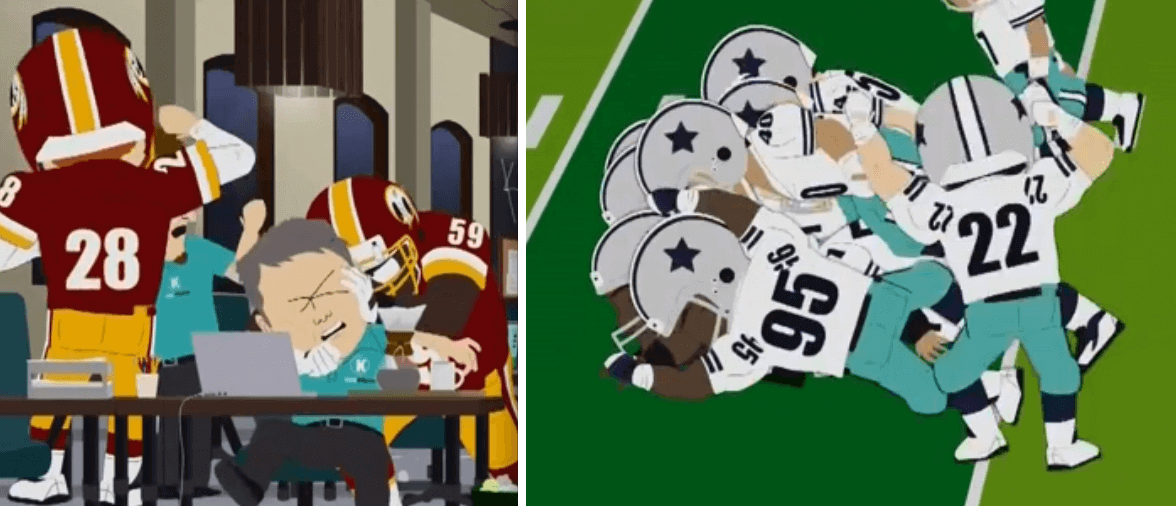
South Park’s season premiere was last night, and the topic at hand was the Washington football team. The plot was pretty brilliant, but you can read about that elsewhere, and you can watch some highlights here. (If anyone knows how to embed that clip, I’m all ears. Doesn’t seem to have an embed option.) For now, we’ll just stick to the uni-notable aspects, of which there were quite a few:
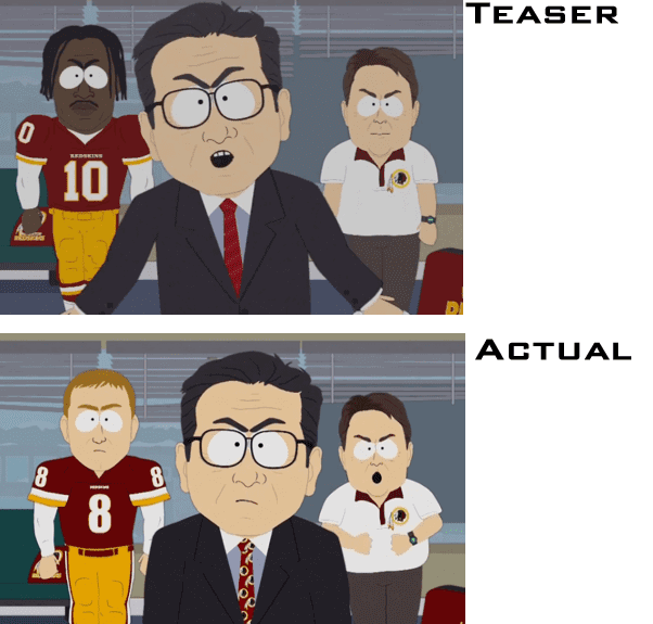
1. The teaser clip for the episode, which aired back on Sunday, showed Dan Snyder flanked by a coach (presumably Jay Gruden) and a player who was obviously supposed to be Robert Griffin III. But with Griffin now on the shelf with an injury, they swapped him out for Kirk Cousins and even got their respective sleeve styles right — impressive! But while Griffin’s jersey had the correct number font (well, more or less), Cousins’s jersey did not. Also, Griffin had a gold belt (which is accurate), while Cousins had a burgundy belt (which is wrong). Also-also, Snyder’s necktie changed from striped to ‘Skins logo-patterned:
2. ’Skins players throughout the episode were shown wearing white shoes, which is wrong — the team wears black:
3. Another glitch — blank nose bumpers (plus, as you can see, again with the incorrect number font):
4. On the plus side, they did a nice job of capturing the Cowboys’ multiple shades of silver (but once again, blank nose bumpers and the wrong number font, plus the colored belt is wrong):
5. All the players were NNOB. I understand why they didn’t want to use real players’ names, but couldn’t they just have used “Smith” and “Jones,” or even just used illegible characters? The absense of NOBs made the jerseys look wrong, especially because they didn’t make the numerals bigger or shift them upward to compensate for the missing nameplates (click to enlarge):
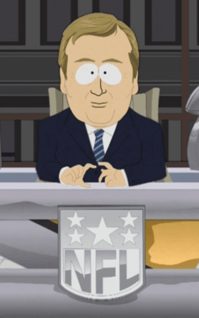
6. They came up with a cheapo version of the NFL logo, which was sometimes presented in chrome and sometimes in color:
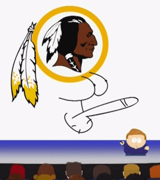
7. Finally, they took a few liberties with the ’Skins logo. Here’s the tamer version:
If there were other uni-related issues I missed, feel free to speak up.
The most surprising thing about the episode, at least to me, is that it was relentlessly anti-’Skins, anti-Snyder, and anti-NFL (and, oddly, anti-Kickstarter) but didn’t take any potshots at the groups protesting the team’s name. I had expected them to be skewered along with everyone else.
NFL Superhero Project
By Thomas Correia
It was great to see all the guesses and comments last Thursday as to which comic book superheroes would represent tonight’s Thursday Night Football match-up between the Giants and Washington. You might be surprised by the choices I made [click to enlarge]:
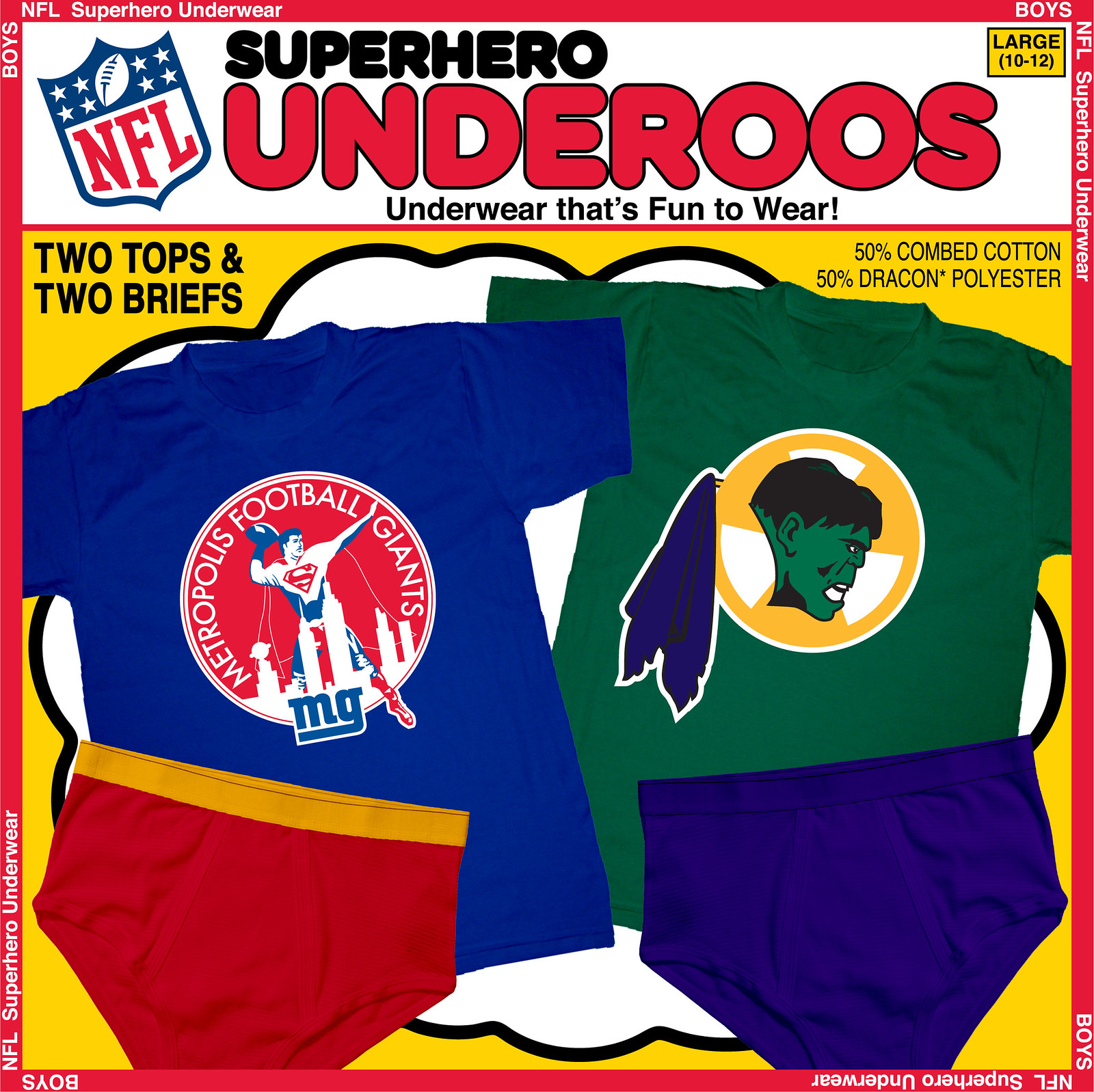
Yes, I am aware that Superman does not have the Giant-Man ability to grow as tall as Godzilla, but he is considered a “giant” among all-time comic book characters. The blue and red colors and use of the 1950 New York Football Giants logo were meant to evoke the Man of Steel among the converted Metropolis skyline. You may easily notice the Daily Planet building, and it was my six-year-old son suggested that I add LexCorp Tower as well (second building from the right).
As for Washington: Many people last week suggested assorted American Indian heroes that I could use, some of which I considered using (Warpath and Apache Chief, e.g.). The suggestion to use the Vision, due to his actual red skin, was almost on point. But I instead chose to avoid any association to American Indians and leaned toward the skin of a different color. Sure, you could call the Hulk “Greenskin,” but he might have a problem with that name, and we certainly don’t want to agitate him. I realize the colors don’t match the team, but that connection isn’t always easy to make in this project. I had also thought about using Red Hulk but decided to stick with the original character. The feathers were replaced by a piece of ripped purple cloth and I was even able to sneak in the radioactive logo behind Hulk’s head.
Next week: Vikings vs. Packers. Which characters do you think will be used for these teams?
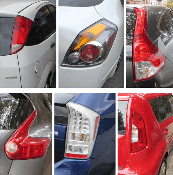
Chasing Tail: What you see above are six passenger-side taillights from cars parked on my block. Look at the variety — the different shapes, the different heights, the different ratios of red to white to amber. And yet all of these meet the federal rules and requirements for taillight design. I’m blown away by all the different ways of solving this design problem while staying within the regulatory guidelines.
I’ve been thinking a lot about this lately — not just in terms of taillights but also headlights and other aspects of car lighting design — so I’ve written an article about it for the design website Re:Form. I own a car, but I’ve never been a “car guy,” so I didn’t approach this from the usual car journalist’s perspective of equating lights with branding. Instead, I just talked about how car lights signify to me, and along the way I interviewed some people in the auto industry, including Ford’s design director. Want to know which inconspicuous aspect of car lighting I’ve recently become obsessed with? Want to find out which car’s taillight reminds me so much of a Jolly Rancher that I actually want to lick it? Check out the article here. Thanks.
Anniversary patch update: The Uni Watch 15th-anniversary patch, which had been temporarily sold out, is now back in stock. So if you had been thinking about ordering one, there’s no time like the present.
And while we’re at it: The 15th-anniversary logo is also available as a high-quality vinyl sticker. Full details here.

Mike’s Question of the Week
By Mike Chamernik
Are there any sports that you’re not particularly interested in but you still like the aesthetics? I’ve never been a NASCAR guy but I’ve always liked the paint schemes and sponsor logos and numbers on the cars. I can name a fair number of racers just by what their car looks like, not by how they actually perform on the track.
As always, post your responses in today’s comments.
Uni Watch News Ticker
By Mike Chamernik

Baseball News: After Washington’s win Tuesday, the scoreboard at Nationals Park said the Mets were from Atlanta (from Tommy Turner). … Bryce Harper wore a Derek Jeter wristband the other night. … Speaking of Harper, he thinks that his hair gel is to blame for his helmet always flying off. … The logo for the if-needed tiebreaker game is in the same style as this year’s other postseason logos. It might seem needless, but logos for the tiebreaker have existed for a little while now (from C. Trent Rosecrans). … The Pirates clinched a playoff spot Tuesday night in Atlanta. They celebrated by spraying champagne and pouring Bud Light from Falcons-emblazoned cans (good spot by Alan Borock).

NFL News: The Ravens will wear their black alternate jerseys for Sunday’s game against Carolina. According to that story, they haven’t yet decided whether to go with white pants or black pants. Which would you folks prefer? (From Phil.)

College Football News: Dartmouth has an alternate helmet (from Phil). … Lost Lettermen compiled a list of the 10 worst Adidas uniforms (from Jordan Rabinowitz). … A Cincinnati professor threatened to fail students who wear Ohio State gear (from Brinke). … Ole Miss will wear helmets with No. 38 on them to honor Chucky Mullins, who was injured and left quadriplegic in a game 25 years ago (from Michael Martin). ”¦ If you like classic old college football pics, you’ll love yesterday’s Shorpy photo (from Charles Rogers). ”¦ New uniforms for RPI. “They looked worse at a distance than in that picture,” says Joe Makowiec. “The radio announcers commented on them. The numbers on the old home uniforms were much more readable.”

NBA News: According to Mark Cuban, Reunion Tower will be on the Mavs new alternates; the jersey shown yesterday was just a mock-up (from Phil). … Related, here’s an interview with Geoff Case, the designer of the new Mavs jerseys. Case even discussed some of the similarities with the Nuggets rainbow skyline jerseys (from Phil). … The Mavs have had an aesthetically-pleasing uniform history, for the most part (from Phil). … The Nets will wear the All-Star Game patch on their jerseys this year (from Phil). … The Thunder’s D-League team will be called the Blue, and boy does their new logo stink. … The Warriors say the proposed design for their new arena, widely described as looking like a toilet, will be “refined.”

College Hoops News: New unis for UConn? It looks to be the case (from Phil). … New blue unis for Kentucky. … Georgetown showed off its gray uniforms (from Phil). … UTEP will have orange uniforms. ”¦ Here’s an interview with Kansas’s equipment manager (from Coleman Mullins).

Grab Bag: A Vancouver newspaper apologized after identifying Canucks D Jordan Subban as “dark guy in the middle” in a photo caption. ”¦ Colorado has a new logo that says it is “The State of Craft Beer” (from Barry Brite). … Qatar forfeited an Asian Games women’s basketball matchup after they were not allowed to wear hijabs, or Islamic headscarves (from Phil). … Here’s a rundown of clothing worn in the Ryder Cup over the last decade (from Brian Graham). … Additionally, here’s a gallery of Ryder Cup uniforms from throughout the ages. … Here’s a cool hand-drawn map of San Francisco (from Brinke). … The Oregonian is seeking to find the best high school football helmets in the state. … Leo Strawn Jr. found a cool old CFL ticket stub.

SP used the “generic” NFL logo because it’s trademark protected. That’s no longer the case (pending appeal of course) for the ‘skins logo. That’s why the NFL logo was a “cheapo” version.
Well played, SP, well played.
(confession: I forgot about the episode and haven’t seen it [it’s DVRed for future viewing], but it was discussed quite a bit on the twittersphere; according to those who watched, the whole point of showing the generic version of the NFL logo was to play up its trademarked status, while taking full liberties with the ‘skins [for now] non-trademarked logo).
Some are speculating they hope/think Snyder and the ‘skins will sue Parker/Stone…
Yeah, but they used the Cowboys’ helmet logo.
Not entirely true. South Park uses a solid blue star on a silver helmet. The ‘Boys helmet decal is outlined. Their throwback helmets, however, are just a solid blue.
To me, it looks like they used a generic blue star, but doesn’t the cowboy logo have an outer star (with silver between the outer and main star)? Maybe that distinction helps them get around the trademark
That’s likely, since the Saints’ fleur-de-lis with outline and distinctive middle proportions is trademarked but a generic fleur-de-lis can’t be. When they last updated the logo they added the black outer outline to it.
IANAL but this might be more about copyright than trademark. The NFL logo is a protected trademark AND a copyrighted work. The former protects against use in trade, the latter protects against use in all other areas. The Cowboys star is a protected trademark, but it’s too generic a shape to be eligible for copyright (wordmarks and simple shapes cannot be copyrighted, but they can be trademarked).
Of course, that doesn’t explain why they’ve used the Steelers and Broncos logo in the past, so I’m going to go with my friend Occam and his shaving kit – NFL logo is relatively complex and South Park does crude drawings, so they simplified it because the guys are usually working on episodes up until the 11th hour (I think they were late in submitting an episode on one occasion).
As stated below, while the animation appears to be crude, it’s the product of computer animation. If they really wanted to use the exact NFL logo, it’s just a matter of a few mouse-clicks. Delays in production are most likely not because the cartoon is hard to animate, but because the creators are either stuck in terms of writing, or — as they freely admit — they procrastinate.
Notice how the Lombardi Trophy in the background of the commissioner’s office was altered? They didn’t miss a trick.
I saw the Bat-signal. . .
So, yes, all of the obviously protected material is protected. (The Skins’ logo, the Cowboys’ logo, the images/likenesses of the various people.)
In copyright law, “parody” (comment/criticism) is absolutely protected. While the letter of the Supreme Court’s opinion in the infamous 2 Live Crew case (when Acruff/Rose Music sued over the use of “Oh, Pretty Woman”) suggests that the junior work must directly comment or criticize the original work, other courts have tended to let any use for comedy qualify. Obviously, this is a combination of what is “fair use” under the Copyright Act and the First Amendment. So, for anything that is protected by copyright law, I’d say any junior use in this episode of a copyrighted work is fairly used to comment or criticize. (Whenever I give a speech on copyright law, I use the case of an artist who takes Barbie dolls and puts them in ovens or in nooses and sells the resulting pictures. Mattel sued and lost due to comment and criticism of the representation of the original works’ connotations.)
As for trademark law, there is limited parody use. Of course, this also intersects with what trademark use is to begin with. Here, the registered trademarks used are not truly used in a trademark fashion (to identify the goods/services provided as from this content creator). The companies that make money from this content don’t use the trademarks used as their trademarks, so that combination along with – yes, again – the First Amendment – means that the limited parody use in order to comment or criticize the trademark holder is allowed. If, say, the production company, creators, or broadcaster made a statue of the logo with the genitalia, then there would be a big issue. (There’s a sentence I never thought I’d write.)
As for the people’s images and likenesses – well, I think we’ve all grown up with sketch comedy and impressions. The First Amendment preempts state laws of the right of privacy/publicity to allow public figures to be mocked.
Now that I just blew up this discussion, I’m going to go do work and run away from this blog. :)
The Redskins helmet logo was NOT part of the TTAB decision. Even if the Redskins’ appeal is unsuccessful, which is certainly far from a given, that particular logo would still be under trademark protection. The decision only pertained to the wordmark and logos containing the term “Redskins.”
LOVE that South Park accurately depicted Kirk’s baggy sleeves compared to Griffin’s tight ones.
Excellent point — I’ll add that to the text!
I’m stunned – STUNNED! – that nobody noticed the neckline difference between Generic #10 and Generic #8.
I think something should be mentioned about giving RGIII and Cousins roughly the correct sleeve-stripe sizes on their respective jerseys. Now THAT’S attention to detail.
That SP episode was up there with Jimmy’s steriods episode with Mark McGwire and Barry Bonds.
Absolutely brilliant stuff.
the crying indian-dan snyder moment was classic.
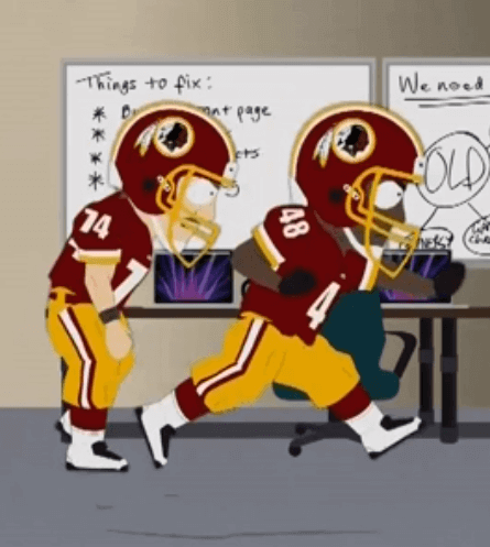
I loved the subtle (or not so subtle) reference to Gus Frerotte’s head butt episode when the players were destroying the servers.
But with Griffin now on the shelf with an injury, they swapped him out for Kirk Cousins – an impressive move on short notice.
Not that impressive. South Park is computer-animated. If all they had to do was change that scene, they could have done it in an hour or so.
I assume Paul isn’t a usual follower of South Park. Matt and Trey are notorious procrastinators and pitch, write, animate, edit there episodes in 6-7 days. Right now, they likely have no idea what they’re doing for next week.
Last night, they live-tweeted a rerun of a musical themed episode and mentioned how they came to Tuesday having put of writing all the songs for that episode’s airing on Wednesday.
Regarding Mike’s QOTW: I’ve always been fascinated by the uniforms worn in Cricket. However, I don’t follow it regularly and have found it hard to follow and, honestly, boring the few times I have tried to watch it.
Re: Griffin/Cousins swap: I wonder if there was some sort of licensing issue with the NFLPA that prevented them from using an actual player likeness in the finished episode. Might be why they switched to someone we assume is Kirk Cousins, but with the wrong number.
They may have gotten a notice from the NFLPA after the original promo aired that they can’t use the likeness of their players like that and decided to change it. I know there have been NFLPA licensing issues in the past. Would also explain why none of the players had NOB. Just speculating though.
South Park has used the likeness of Peyton Manning and Tom Brady before… so I don’t think that is the case.
That’s true, good point. Just went and looked at pics from those episodes. The uniforms and numbers are spot on, making it no mistake that those are the guys they are portraying. I’m pretty sure they mentioned them by name in those episodes too, which they didn’t do for any Washington players in last nights episode. I guess we may never know the real answer to the RGIII/”Cousins” swap.
After looking around, I came across the Wikipedia article for the “National Football League Players Incorporated (NFL Players Inc.), which is the marketing and sponsorship subsidiary of the NFLPA. It gave some details about using player likenesses. The relevant portion:
“NFL Players Inc. grants more than 65 consumer product licensees the rights to use players’ names, numbers, likenesses, and images for use in trading cards, collectibles, video games, fantasy football, apparel, and other online and retail products and services. Royalty revenue from such deals is split amongst individual players involved in the deals and the union. Approximately 2,000 NFL players are licensed through NFL Players Inc. each year”
I’m guessing a player that looks like RGIII and has the same number would cause them to either request permission (which probably wouldn’t be granted given the nature of the show), be sued by the NFL Players Inc., or cause them to provide royalties from the episode to the NFL Players Inc. My guess is they went ahead and changed it to “look like” Kirk Cousins, but purposely changed to the wrong number with no NOB to avoid any sort of legal/royalties issues. The request to change could have come from Comedy Central’s legal team too, for what its worth.
Sidenote: Cousins changed from #12 to #8 for this season.
Well that busts this wide open for me! Didn’t realize he wasn’t #12 anymore.
I went back and re-read what Paul wrote and I missed the part where he said the “Number FONT” was wrong, not the Number. Please disregard everything I have said here. LOL.
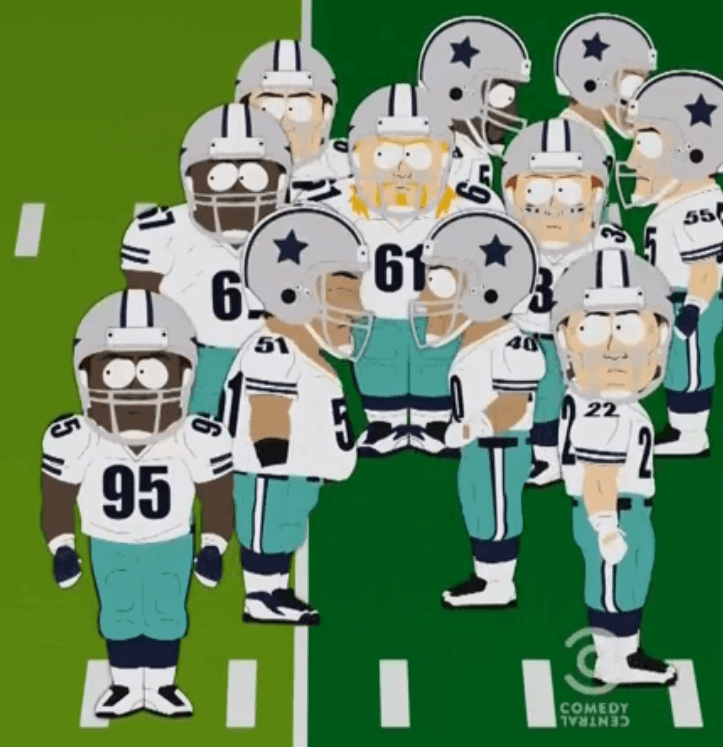
I find it interesting that SP had a Cowboy, number 22 playing defensive back.
South Park produces its episodes in 1 week, and the software tools they use makes it easy to swap in elements. They probably spent more time re-recording the audio for RGIII/Cousins character.
There is a 1-hour documentary for South Park called “6-Days To Air: The Making Of South Park” which I recommend checking out. I think it’s on Netflix.
Actually, I don’t recall seeing the Cousins character speak.
You’re correct. RGIII spoke in the teaser commerical, but Cousins did not speak.
LOVE the Underoos logos again!
One questions though… would those logos be available for download at any point? I think it would be cool to make a 32 team background on my computer or phone. Or just one logo individually.
Week 16 will be the unveiling of the last Underoos teams. After that, I plan to make all 32 logos available to Uni-Watch during Week 17… Thanks for enjoying it so far. I’ve only got 6 teams left to complete.
I thought for sure you would use The Hulk for the Packers.
Will you be recycling heroes for other teams too, or is it a one time use only?
One time use. No repeats.
That Jags T-shirt does NOT have the old logo.
(or are my eyes deceiving me?)
Yeah, that’s the current logo. It’s horribly ugly with the flag pattern on it, but it’s not old.
“A Vancouver newspaper apologized after identifying Canucks D Jordan Subban as “dark guy in the middle” in a photo caption”
Yikes! What, they didn’t want to go with “…(you know, our black guy) …”
The radiation symbol behind the Hulk’s head is upside down. The design of the radiation symbol is codified by Federal law (29 CFR 1910.1096(e)(1)(i)).
Excellent catch! In my research, I saw that the radiation symbol has been shown both ways, but I didn’t know that there actually is a correct way of showing it. I have updated it for any future postings… Thanks James.
It’s not upside down. It’s been rotated 60 degrees!
Re: CFL Ticket Stub: It appears to have been a game played at the University of Washington?
The CFL season in 1961 didn’t start until August 7. That ticket stub is a preseason ticket when teams usually play neutral site games. Given Washington’s proximity to Vancouver, BC and the fact that the Seahawks didn’t arrive until much later, I can see this being a good marketing ploy to bring American football fans north of the border.
Make sense, also back then the difference in calibre of play and league prestige was far less. I believe also in the early 60’s, the Ottawa Rough Riders may have played a regular season game in Philadelphia.
Here’s a list of all neutral site games played by the CFL. If this is correct, that Seattle game has the highest attendance of them all – must be because the clever ticket design became a must have :)
link
Here’s a pic of a CFL ticket stub from a Hamilton/Ottawa game in Philadelphia back in the 1958 up on Ebay:
link
Nice work on the car lighting article. I’m one of those guys that has been obsessed with that topic since early childhood, even though I’m really not much of a car guy overall. I actually hesitated on purchasing my current car because of its ungainly taillights, however my practicality, as well as fondness for the headlights and especially the interior lighting, won out (2010 Mercury Milan).
FoMoCo still makes Mercs?
They did in MY 2010.
FoMoCo made them through 2011. Then the MoFos hung it up.
Wow!! I am a huge car guy. You completely hit my sweet spot! As a seven-year-old, I rode my bicycle to nearby car showrooms, dutifully collecting contemporary brochures (which I then cut up, ensuring that vintage car literature would be worth a lot of money). Taillights were the ultimate expression of curb appeal, candy-like and endless in variety. I especially liked the added value of sequential turn signals, such as on late ’60s Thunderbirds, Cougars, and early ’70s Imperials. I was grokked that Ford brought them back on the new Mustang. Fronts of cars nowadays leave me cold; they all look like Mexican wrestling masks.
Late sixties Cougars, T-birds and Javelins were very easy on the eyes.
Somewhat on the topic, I want to find the alleged genius who thought it was a good idea to relocate turn signals within the headlight lens. The amber blinkers get lost in the headlights’ glare, especially at night. Staring into a new car’s lights will reduce your retinas to ashes.
“I can see the red (and clear and amber) taillights headed for Spain.”
You do realize Elton was singing about a plane…
“Daniel is traveling tonight on a….”
DAMMIT!
OK, then….
“But me & Cinderella. We put it all together. We can drive it home with one taillight.”
But the little blue Corvette has four taillights…
The lyric is “we can drive it home/with one headlight.” Not “tail light.”
Methinks someone isn’t getting the sarcasm, considering the user’s name is ‘Dumb Guy’
Methinks someone isn’t getting the sarcasm, considering the user’s name is ‘Dumb Guy.’
You thinks incorrectly.
That was an airplane
Nice article, Paul. I’m not much of a car guy either. I appreciate the outsides of them, but when people start talking about engines and other parts I glaze over the way you (and I) do with corporatespeak.
I’ve noticed a lot of new headlight designs lately. My least favorite is the angry eyebrow look.
link
Haven’t found any design that makes me want to lick a car. Yet.
This ties in with Mike’s Question of the Week. Motor sports don’t interest me much (well, Formula 1 and tractor pulls might a little), but I like the sights and sounds of them. Always been a fan of helmets, so that helps, too.
Boxing’s never been my thing, but that’s another sport with nice aesthetics…the ring, the big shiny gloves, the ding of the bell.
Funny that this article on head and tail lights came out today. On my drive to work this morning, I was behind a Scion xB and I noticed a strange single light on the driver’s side bumper. Turns out it is the reverse light. I had assumed until now that a car needed two reverse lights, but only one is required. See the link for a pic: link
Can’t stand those vehicles…they’re like toasters on wheels.
Used to think the Aztek was the ugliest car ever, then along came the Element, then the Scion xB. Oh, and now there’s the Cube.
Juke and its peer Nissan SUVs have the Aztek (which Mickey Kaus called the “angry kitchen appliance”) – and everybody else – beat in the ugly department.
That hand-drawn map of San Francisco is very similar to Mark Alan Stamaty’s cover art for the Will Hermes’ paean to ’70s NY music “Love Goes to a Building on Fire”:
link
Fun fact: I went to college with Hermes. Still see him at reunion events and such, most recently about six months ago.
I noticed that last Sunday against Philly, several of the players for Washington had blank nose bumpers including Cousins…. link
Good one! I thought they were all using the script R. I’ll have to pay closer attention.
Yes Paul.. Pay closer attention to every Nose bumper, neck bumper, visor clip, headset logo, towel patch, bat knob, bill sticker, sliding pants tag, warm-up stripe, sleeve font, sock height, stick tape job, and shoelace tying method….dammit.
You are slipping, dude.
Mike asks if there are any sports that you’re not particularly interested in but you still like the aesthetics. Yes, West Indies cricket. The Windies wear a dramatic combo of maroon, yellow, and light blue. They have a nice logo with a wicket on a little island. I enjoy traveling to the Caribbean but I know almost nothing about cricket.
QOTW: In fact, I’ve become obsessed with rowing crew blazers, thanks to this website.
Wait, does that CFL ticket stub show a regular season game at th U Wash stadium? Had no idea of that.
Qatar is a racist, sexist, and bigoted hellhole in the middle of nowhere. Not surprised that they didn’t let their women’s team play; it would have taken time away from the players being beaten for expressing their opinions or being raped and then murdered by their relatives.
Wow, that’s even more offensive than most of the stuff Joe “Big Cock” Johnson used to say.
How in the world is that offensive? Or for that matter inaccurate? They’re simply ISIL with oil wells.
Pretty sure this is the exact pitch Qatar delivered to FIFA.
Yeah, if you unwrapped the 5000-euro notes from the (sales) pitch and rinsed off the sleaze, it probably was.
QOTW:
* Men’s lacrosse – I like the juxtaposition of the heavily armored top with the very loosely covered bottom.
* Women’s field hockey (int’l) – It’s flattering without being pervy. The form-fitting tops are modern but the skirt nods to its schoolyard origins
* Tennis – So much variety from player to player, between Wimbledon and non-Wimbledon tournaments
* Judo – I like that they almost always look disheveled.
Guh, sorry, meant this as its own comment.
If Thor doesn’t get the nod for the Vikings shirt, I’m done. I know it’s obvious, but it’s SO PERFECT. Packers is a little trickier. My first thought would be The Collector (because he’s a “Pack”rat. Get it?) but that might be a little obscure and hard to translate to a logo. Green Lantern? The G would work, as would the color.
Adam, see my comment below.
The fact that a crude, moronic, and quite frankly, stupid, cartoon television show strongly supports the intolerant Redskin censorship position epitomizes the whole kerfuffle perfectly!
Reggie, please don’t invoke terms like “censorship” if you don’t know what they mean. Boycotts and protests are not censorship, and to my knowledge no government official has advocated censoring the team’s name. If you know of any such activity, please share it with us; otherwise, stop using inaccurate and inflammatory language.
Paul, *purely* for argument’s sake, when opinion leaders such as the President of the United States come out against something, isn’t there a “chilling effect” that comes into play, and isn’t that likened to a First Amendment infringement akin to censorship?
A “chilling effect” requires the threat of legal sanction, such as imprisonment or the threat of a lawsuit. Now, you might be correct to say that the removal of trademark protection for the Washington NFL team’s logo and nickname meets that definition, but calling people names or lowering your opinion of them because they don’t object to that nickname does not.
Dave: No.
Civic leaders (or anyone else) expressing themselves in the marketplace of ideas — which is exactly what the President has done on this issue — is neither “chilling” nor “akin to censorship.” Rather, that’s contributing to public debate, which if anything is the *opposite* of censorship.
As DJ points out, there’s been no implied or explicit threat to enact legislation forcing the ’Skins to change their name (nor should there be, nor will there be). As I myself have said many times, and hereby reaffirm, I fully support Dan Snyder’s right to call his team whatever he likes. But neither he nor anyone else has the right to be free of critique — either from the President or from anyone else. Such critiques are not “chilling”; on the contrary, they are exemplary of a free society that champions open debate.
Yes, there can be a chilling effect, but no, that doesn’t come anywhere close to censorship.
Public disapproval of a position, even overwhelming public disapproval, isn’t censorship.
You mean like threatening to change existing tax law if the Redskins do not change their name? Yeah, that will never happen
link
Sorry, that’s not censorship – that’s leverage.
The NFL does not have an inherent right to tax-exempt status, nor would the loss of such status cripple the league’s ability to do business. It would simply mean the end of a sweetheart deal.
Are all sorts of leverage being applied to this situation? You bet. Is that censorship? Not even close.
You said “there’s been no implied or explicit threat to enact legislation forcing the ’Skins to change their name (nor should there be, nor will there be)” that is obviously FALSE.
Um, if they revoke the NFL’s tax-exempt status, that doesn’t force the ’Skins to do anything.
Now, it might lead the NFL to bring additional pressure to bear on the team, but that’s a secondary effect.
There’s no legislation (nor will there be) that says, “We are banning this team name now.” THAT would be censorship. It would also be tossed out of court in five minutes. Won’t happen. Stop making straw-man arguments and deal with the issues at hand.
You mean like someone trying to get the FCC to ban use of the word on television? That certainly qualifies as advocating censorship of the name.
link
That’s not censorship either. For starters, courts have ruled that the broadcast spectrum is a finite public resource that’s subject to regulation (that’s why you can say “shit” and “fuck” on cable but not on broadcast networks, it’s why you need a broadcast license in order to broadcast on the airwaves but don’t need a license for a podcast, etc.). You may not like the distinction, but courts have consistently ruled that absolute freedom of expression does not exist on the public airwaves. That’s not censorship; it’s regulation.
Anyway, even if the FCC were to disallow the team’s name on the public airwaves, that wouldn’t force the team to change its name. It could keep the name and simply not have the name be mentioned on the air.
This is another example of pressure and leverage being brought to bear, but nobody is forcing anyone to do anything. You can spin it however you like, but none of this meets the standard for censorship.
Our current Supreme Court is super-protective of free expression (they ruled that the Westboro Baptist Chruch’s protests are fully protected by the First Amendment, e.g. — a ruling I fully agree with), but they would laugh you out of the room if you tried to define any of this as “censorship.”
Think harder.
You have no idea what the word censorship means. You are conflating censorship with the first amendment. They are two different notions.Censorship can be done by anyone. You can self-censor. The first amendment may only be violated by the government. There has been no violation of the first amendment, but that by no means means there isn’t a push for censorship.
By your definition, various forms of conversational politeness would qualify as “censorship.” It’s such a broad definition as to be meaningless.
We’re done here. Let’s please move on. Thanks.
Sun, I’d love to hear how revoking the tax-exempt status of one legal entity (the NFL) would “force” a separate legal entity (the Washington Redskins) to change their name. Care to explain?
Is this the same show that literally has/had a piece of crap as a character?
And you’re worried about what they think about the Redskins name?
For better or worse, South Park has a certain socio-political relevance:
link
You don’t have to like it (I’m not a huge fan myself). But dismissing it just because it’s gutter humor is a mistake.
South Park’s relevance ended roughly the time of Team America: World Police.
I was a fan about season 6 and earlier. Too often it feels like they just have a dart board of social events/issues and throw darts at them and make fun of it.
I don’t mean to say that they can’t, they certainly can, but it’s no longer for me.
But I do understand that they are relevant and aren’t going anywhere soon.
FWIW: I did love the South Park Movie.
South Park remains to this date the only media entity that called out Tom Cruise as gay and recited Scientology dogma in order to make fun of it which hasn’t been sued, lied, destroyed or attacked by the Hubbard Empire. I wouldn’t make fun of them.
I’m getting verklempt… Talk amongst yourselves… I’ll give you a topic: the “intolerant Redskin censorship position” is neither intolerant nor censorship; discuss…
And unless it’s related to potatoes, it’s not Redskin, either.
Haha, Adam! You will indeed be happy about the Vikings shirt next week… As for the Green Lantern guess, you’re half right.
What a relief! As for the Packers, I completely forgot about the other “Green” heroes like Green Arrow and Green Hornet. Can’t wait to see them!
Or you could do Hercules for the Packers – isn’t there a subtle friendship/rivalry betwixt Thor and Herc?
QOTW: I’m cheating as I am now interested in the sport and am an active participant in it, but I have a thing for cycling kits. Yes, there is a lot of ugliness out there, but also some really nice ones, like Team Sky, and my personal fave, AG2R. Plus, all the various colored jerseys during stage races makes the whole thing really interesting
I think the Colombian Women’s team has done more to pique interest in cycling kits than even zee Tour de France has…
I see Blues logo. It looks the opposite of glorious !
OKC logo looks amateur hour to me too.
QOTW: I guess I am not a big fan of WNBA basketball but am still interested in their uniforms. Mostly for the wrong reasons: the ads. I look at them in horror.
NASCAR is probably the best example for me. I do get a kick out of the color schemes year to year and primary ad changes.
A nice uni-centric nugget about Jeter is found here in this article: link
—
“See these, man?” Jeter says, yanking his uniform pants above his knee, revealing a well-worn white Velcro strap that hugs the top of his sock. “I’ve had the same pretty much everything. These things, I’ve had since the first game.
“We used to have a rule in the Minor Leagues that you had to show four inches of blue on your stirrups, so these things kept your pants up. If you see any old Minor League pictures, you’ll always see guys, their pants had to be like this, showing four inches of blue.”
Today, Jeter wears his pant legs covering most of the sock, but the straps remain hidden underneath — a reminder of the long journey.”
“Today, Jeter wears his pant legs covering most of the sock…”
~~~
Which will be sold by Steiner for $410 per…
I cannot believe that the got the Washington football team’s helmet striping wrong in the South Park episode.
QOTW: I don’t follow Premiership, Serie A, Bundesliga, SPL, etc. that closely (at least compared with international FIFA or MLS), but love the aesthetics.
Why did South Park add a tomahawk chopping half a cloud to the ‘Skins logo?
I don’t get it.
The “state of craft beer” logo is a winner. Now if I get one of those link, there’s a perfect crest for it.
QOTW: I don’t like golf but appreciate it when a player obviously puts some effort into his look. I really hate the typical bad golf shirt in a tacky colour with sponsor logos matched with black pants look. I do like plaid pants, that house painter look Villegas had, and Adam Scott used to have some decent Burberry looks.
Clear taillights were a custom trend in the early 2000’s and the rumor at the time was they were illegal so whoever had them was breaking the law. Then the trend died and I never saw them again. I always assumed since they were illegal law enforcers must have cracked down on whoever was making them and whoever had them installed in their car and gave stiff fines and/or penalties, hence the sudden disappearance.
So Paul, are you sure the taillight in the center of the bottom row of pics is legal?
That’s a Prius. They’re all like that — very legal. Although the lens is mostly clear, the light that illuminates it is red.
Yes, they’re legal. The light coming out of the bulbs is red and orange. The reflectors at the bottom of the housing are still in red, which is technically the only part of the piece that is required to be red for a tail light assembly.
Mavs’ Alternates:
One of the defining characteristics of the Dallas skyline is neon–many of the buildings are trimmed in neon or in the case of the Omni Hotel, have full on light shows possible on the building’s exterior. The original and most iconic of these is the Bank of America building, the tallest in Dallas. For decades it’s had green neon on the building’s exterior (recently changed to allow for hundreds of other colors as well but still kept primarily green). Since green is an historic Maverick color, there’s a perfect opportunity to trim the building on the uniform in green for a very subtle, geographically correct, homage to old Maverick history.
QOTW: I don’t follow Lacrosse, Rugby Union, Rugby League, or Aussie Rules football particularly closely, but I love the uniforms. That is, in large part, due to Uni Watch.
Cousins DID change his # to 8 this offseason with Grossman’s departure…so South Park got it right
Why are there no front brake lights? Many accidents could be avoided if you knew the car coming at you was not slowing down
Very good point. I’m surprised no car company has thought of that.
My wife says there should be “U-Turn” turn signal.
You know… everyone is cruising through the left turn, then the guy in front of you is actually making a U-Turn and has to slow way down to do it, and you almost smash into the back of him.
QOTW (repost):
* Men’s lacrosse — I like the juxtaposition of the heavily armored top with the very loosely covered bottom.
* Women’s field hockey (int’l) — It’s flattering without being pervy. The form-fitting tops are modern but the skirt nods to its schoolyard origins
* Tennis — So much variety from player to player, between Wimbledon and non-Wimbledon tournaments
* Judo — I like that they almost always look disheveled.
I think your description of field hockey is a good one. Actually they’re all good.
terriblehuman, if you’re professing to a lack of interest in women’s field hockey, I’d heartily encourage you to travel just down the street to a UMD game some day. The pace, athleticism, and sheer physical effort on display at one really needs to be seen in person to be appreciated – a TV (or computer) screen hardly does it justice. Not to mention that it’s cheap and wholesome family entertainment.
Long time reader, second (?) time commenter. Some minor college football news: MTSU foiled Old Dominion’s plans for a white-out game: link
When it comes to football, Parker and Stone do a pretty decent job in terms of detail. I can remember an episode from two years ago where they had the correct font, striping, etc. for the Broncos jerseys (Not to mention a very good Peyton Manning caricature).
I mean, compared to other TV shows (Family Guy, The Simpsons), despite the animation style, I have to admit, South Park at least tries to get it right, when they do have the time.
“The Qatar women’s basketball team forfeited a match at the Asian Games on Wednesday after being refused permission to wear the Islamic headscarf”
Uniform regulations are uniform regulations.They took a stand and didn’t play, which I think was the right thing to do, but FIBA made the right call in not caving in.
The Braves have been hosts to two playoff celebrations this season, none of which were their own. I wonder if that is some kind of record?
I feel they did poke fun at today’s protests by pointing or that their course is actions was to ask subscribers to boycott them. Not necessarily an attack on the name protesters but certainly a dig on internet activism, like how the people respond to Snyder being massacred by the cowboys (instead of the real life injustices Native Americans faced) reminiscent of the #cancelColbert fiasco after he criticized the Redskins lackluster outreach program. Misguided outrage and ask that jazz.
Also not uno related but still significant when Snyder has the conference call with the other owners there were 32 slots with 2 empty, one of those was clearly his but the other is where the Bills owner would go (it appears even SP is waiting on league approval of the new owners).
Picture 13 of the Ryder Cup uni history may have the earliest example of GI Joe dress up to date. The 1991 team wore the Chocolate-Chip Camouflage pattern on their hats.
Ah choco-chip-Camo!
How Desert Stormy of them..
At least it had the novelty of actually BEING camoflage-y instead of Camo-easy-to-target-y as in the most recent incarnation of the US Army’s BDU’s that our government spent a brazillion dollars on.
On a side note, BDU’s – Battle Dress Uniforms for the common peeps, in the long boring history of my life, have never seen a person Male or Female wear a dress to a real battle (Scots, Romans, Greeks not withstanding since I was not there and only have Mel Gibson to verify), although I have served with female pilots who would punch you in the Netherlands for suggesting anything as insulting as wearing a dress to battle.
Had to wear a set of the Choco-Camo’s when not doing flying ops way back in the last century. Regular pilots wore something akin to this (Second GI Joe on the right).
link
Paul, somebody someday should do Uni-Watch expose on anything military… pick something, patches, helmets, booties, it is an amazing story. I do recall a USAF General of some note telling me that “Throughout history, the army with the ugliest uniforms usually won”.
i don’t mean to be an a##, but if you like stock car paint jobs, and can name a bunch of left-turners by number, you juuuuust might be a fan beyond an aesthetic afterthought. come out of the closet soul patch and embrace your inner foxworthy.
Phil Simms will not use the ’Skins name in tonight’s broadcast:
link
Two things on taillights…
I completely despise the Juke’s taillights, those are the boomerang shaped ones. I just picture those getting busted or something and you go to replace them and they’re like $1500 a piece. I don’t like the headlights either on those which are sort of on top of the hood, doesn’t make sense to me.
Secondly, the one thing I’ve noticed about headlights, is that the brake lights must be attached firmly to the car and you’ll note when there are lights on the trunk lid, they are part of the nighttime running lights, and the back up lights. That way when your trunk is up (or completely off) you still have a set of red running lights and your taillights attached to the car.
As for the taillights:
I often wondered that somewhere, somehow, a guy is getting paid for designing taillights for cars.
That would be a great job.
‘Never leave out any detail, because someone might focus in on that.’
He really gets us, doesn’t he?
Washington number 28? Darrell Green fans won’t have it.
SB
Um, I’m sure that they were in the Ticker or something and I just missed them that day, but WHAT THE HELL is Texas Tech wearing tonight? They have some wierd rider logo on the pants and shoulders? Can’t say I’m a fan.
It’s the Pistol Pete vs the Red Raider – UA vs Nike…
The helmet is interesting with how the cape meets in the middle. The pants and shoulder raiders… not sure if I’m digging those right now.
Not sure if it has been mentioned… But Cousins is wearing a wedding band tonight. It looks like one of the rubber wedding bands Paul featured a while back. Qalo?