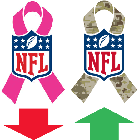
Yesterday afternoon I took part in a panel discussion as part of an NYU sports business class. One of the other panelists was the buyer for a well-known chain of sporting goods stores — let’s call him Mr. Buyer — and he had some very interesting things to say, chief among them the news that the NFL will be dialing back the throttle a bit this year on Pinktober. This has nothing to do with the recent domestic violence issues that have been in the news — Mr. Buyer said the league had already planned to soft-pedal the pink months ago. There’ll still be some pink, but not as much. It won’t be used for any nationally televised games, for example.
On the other hand, Mr. Buyer said the NFL plans a bigger push this year for G.I. Joevember. He didn’t specify what the bigger push would involve, but it can’t be good.
Other tidbits from Mr. Buyer included the following:
• The NBA’s sleeved jerseys are not selling well.
• In general, jersey sales strongly correlate with winning — the better a team does, the more jerseys it sells. The big exception is Maryland football, whose jerseys sell regardless of how the team is performing.
• In terms of NFL merch, Reebok was much easier to do business with than Nike is, because Nike “is all about Nike.”
• Related to the above: Nike doesn’t like to promote non-Nike athletes. For example, they don’t like to push Robert Griffin III jerseys, because Griffin has a deal with Adidas.
• Mr. Buyer nonetheless wishes NFL owners would turn Nike loose on NFL uniforms, because “we’d sell a ton of them.” He doesn’t expect that to happen, though, because NFL owners are too tradition-bound.
• Mr. Buyer doesn’t think Nike will make a run at the MLB uniform contract, for two reasons: (1) MLB requires that all of its on-field uniforms (the ones actually worn by the players, not the retail authentics) be made in the USA, and Nike wouldn’t want to do that. (2) Nike is already getting good brand exposure from its MLB undershirt contract, because of all those collar logos. In fact, Mr. Buyer says customers routinely call his stores asking for “that new Nike Mets jersey” or “that new Nike Pirates jersey,” because the undershirt collars make people mistakenly think that Nike makes the jerseys.
• Regarding the snafu with the Eagles’ green jerseys: With the Eagles wearing white at home and also wearing white for at least some road games, Mr. Buyer worries that he won’t have enough white Eagles jerseys in stock. His biggest fear is that the Eagles will win their first six games wearing white, because then they’ll probably keep wearing white for the rest of the season and everyone will want to buy a white jersey and he’ll be screwed.
• Mr. Buyer often has to engage in “blind buying” — ordering jerseys even though he doesn’t know what they’ll look like. Case in point: He had to order a bunch of Washington Capitals jerseys for the upcoming Winter Classic game, but the Reebok catalog didn’t include a visual of the jersey — it just said “TBD” (“to be determined”). The unveiling for that jersey is slated for next week, but Mr. Buyer still hasn’t seen what it looks like.
• Socks like these have been very popular lately, but Mr. Buyer thinks socks “may be the next tech bubble,” so he’s not ordering too many of them.
• Mr. Buyer hopes the NBA doesn’t put advertising patches on its jerseys. He already has to worry about players getting traded or injured or arrested (all of which can leave him stuck with worthless inventory), so he doesn’t want the added complication of corporate brands thrown into the mix. Just asking for trouble, he says.
• Mr. Buyer says Under Armour will never be able to recoup the financial investment they had to make in order to land the Notre Dame contract, at least not in merch sales. The deal was more about establishing UA’s credibility as a national player on a par with Nike.
• Signs of a generational shift: Sales of soccer “hard goods” (i.e,. balls and other equipment) are outpacing baseball sales.
There was probably more, but that’s as much as I can remember.
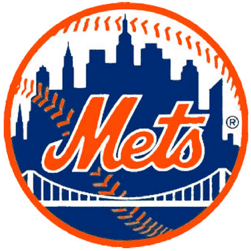
Mets logo update: The kerfuffle over the Citi-fied Mets logo, which I wrote about yesterday, made it all the way to The New York Times. Mets brass claimed ignorance and said no changes are planned for the official logo.
The more I dug into this story, the more it looked like the logo switcheroo was just a mistake, and now reader Steve Dodell has come up with fairly convincing evidence of that. He found a promotional graphic that was posted on the Mets’ Facebook page back in July, and it shows both versions of the logo — original and Citi-fied. I suspect the Citi-fied version was just floating around on someone’s computer (or perhaps several someones’ computers) and was used interchangeably with the original logo without anyone even realizing the distinction between the two.
But it remains unclear when the altered logo was created, or why, or by whom, or at whose direction. I’d still like to know the answers to those questions.
Uni Watch News Ticker
By Garrett McGrath

Baseball News: Following up on yesterday’s entry about the Mets’ logo, Todd Radom has imagined a revised logo reflecting a more contemporary NYC skyline (thanks, Paul). … The Atlanta Braves’ new stadium will be called SunTrust Park (thanks, Brinke). … The curly “W” logo on Nats’ mound has changed from dark brown to red (from Mike Donovan). … The King of Gifts: In addition to a kayak, Derek Jeter got a Don Zimmer jersey from the Tampa Bay Rays before their game yesterday (thanks, Phil). ”¦ Yanks 3B Chase Headley, who took a pitch in the face a few days ago, is now wearing a faceguard on his batting helmet when bating right-handed. No attachment when he’s batting left-handed, however. ”¦ Division championship caps are now being produced by ’47 Brand, not New Era (thanks, Phil). ”¦ Bryce Harper was wearing a personalized DC Fire Dept. helmet during the Nats’ postgame celebration last night. He apparently traded some gear for it (from Brady Phelps). ”¦ If you look at all the Cubs cards on this page, you’ll see that the Cubbies were wearing a logo patch on their left sleeve — except for Lou Brock who had it on his right sleeve (good catch by Phil Chua). This is awesome: Giants infielder Matt Duffy’s bat knob decals show Duffman from The Simpsons (from Phil).

NFL News: The Cleveland Browns new uniforms will not include a logo on the helmet (thanks, Phil). … Nike stores in the Twin Cities have pulled Adrian Peterson merchandise off the shelves (thanks, Brinke). … The Arizona Cardinals are wearing alternate black unis this weekend (thanks, Phil). … “Has anyone noticed that the Packers sideline hats have a small uniform number embroidered on the right side?” asks Shane Canup. “I did some research but couldn’t find anything about it on your site. This picture of Aaron Rodgers has it, and it’s apparently from last year, so they’ve been doing it at least that long.”

College Football News: History is fun: an insightful and inspiring article by someone trying the find the lost uniform of Iowa State legend Jack Trice (from Nathan Gruber). … Adidas has hinted at a possible 1939 Texas A&M throwback uni (thanks, Phil). … Georgia Tech Athletic Department has added its website URL and Twitter handle to the goalposts. … BC will wear those red bandana tribune uniforms for the rest of the season (thanks, Phil). … Throwback helmets for Duke this weekend. ”¦ Yesterday’s Ticker mentioned players wearing helmet decals showing their flags of national origin. One previous example: Rice had several Canadian players in 2012, and they wore the Canadian flag on their helmets (from Mark Hamilton). ”¦ North Crowley High School in Texas has poached UNC’s logo and color (from Jason Brown).

Soccer News: Two from Yusuke Toyoda: Borussia Dortmund manager Jürgen Klopp wore a number from the club’s loungewear collection, a hoodie with the text ‘”Borusse!,” for Tuesday’s Champions League match against Arsenal. … Bayern München is temporarily switching sponsor logo from the usual Deutche Telekom “T” to a magenta pink “1” to advertise a new service from the sponsor.

Grab Bag: You know hockey season is getting close when teams start debuting new designs for their red lines (thanks, Phil).Reunited rock band the Replacements wore Saint Paul Saints jerseys at last weekend’s Twin Cities show (from Jimmy Lonetti). … “In the halls of UW-Eau Claire’s Zorn Arena (Eau Claire, WI) are Blugolds basketball team photos,” says Lukas Hoffland. “Most of the men’s photos have them in regular unis, but the 1978-79 photo had warmups: done with the classic tequila sunrise template on the shirt and pants.” ”¦ Here’s a NCAA-style bracket of Catholic mascots (from Nicole Haase). ”¦ Here’s an Aussie football match featuring yellow vs. yellow! “That’s West Coast Eagles with blue wings, shorts and socks v. Hawthorn with brown bars, shorts and striped socks, from Round 5, 1987,” says Leo Strawn Jr.

Here’s another colour on colour Aussie Rules clash – brown and gold versus brown and gold. Hawthorn of the VFL take on Subiaco of the WAFL in an end of season game in 1986. Due to both teams having brown and gold stripes, Hawthorn wore their plain gold training tops with the “HFC” monogram:
link
I really miss those umpires’ suits.
Without an major helmet change for the Browns, I wonder how crazy they are thinking about going with the rest. Crazy font? Wacky pant stripes? Shoulder yokes?
It would be a shame to modernize/trendify their classic look. So if they don’t go nuts, why bother “changing” at all? They use several top/bottom color combos already.
This is what I’m most worried about.
Or they could make the stripes on the uniform match the one on the helmet.
Fingers crossed that they don’t end up looking as ridiculous as the Buccaneers.
Fingers crossed they do not put that silly looking “B” on the jersey. Put the Elf on them!
Checks! How about checks! They did invent the “Taxi Squad”.
link
There’s really nothing wrong with the existing helmet. In fact, I think the Browns have a top-five uniform. Sure, it’s a little old-school, and casual NFL fans and frat kids at Ohio State are clamoring for “faster” and “neon yellow” kits, but, it’s great as-is. They should put a small Brownie decal on the back of the helmet, and leave it alone. But they won’t. They’ll f*ck it up.
So when does the pressure begin on the Catholic schools to change the Crusaders and Warriors mascots? Former being insensitive to Muslims and the latter has been proclaimed as being insensitive to Native Americans even though the logo looks like a Trojan or Spartan. We can’t have a mascot that might even remotely offend anyone.
There’s a difference between a nickname that references a regrettable time and one that’s a dictionary defined racial slur…
True… one is actually glorifying those who committed atrocities.
There is no right for any person to be free from offense; this is something we enjoy as American citizens. Now, as it pertains to leagues of parochial schools, the separation of church and state might come into play. For instance, a Muslim advocacy group might prevail on a Catholic organization’s sense of fair play to persuade them to change their mascot, but they have no legal right to do so.
Where I come in is that I rue the shrinking palette of team nicknames, seeing “Crusaders” join the touchy list that includes “Indians”, “Braves”, and “Chiefs”. (I’m not going to defend “Redskins”) I want to push teams to use underutilized names, like “Magpies”, “Swifts”, “Thunderbolts”, “Meteors” and the like. Teams nowadays seem to be straitjacketed in this area, being pushed into ever-smaller and smaller corners. Thoughts?
There is no right for any person to be free from offense
One thing I would say is that there’s no right to be free from criticism either. Nor is there a right to be a member of an association that imposes certain standards.
And I haven’t seen anyone trying to legally compel colleges or pro teams from changing their names (it’s a different story at the high school level, of course). I think the message has generally been, “Hey, I don’t know if you realize this, but that mascot’s kinda in bad taste.” The question isn’t whether schools have to change, but whether they want to continue presenting themselves in a way that promotes stereotypes and caricatures of other ethnic groups or glorifies an unfortunate period in your history.
Teams nowadays seem to be straitjacketed in this area, being pushed into ever-smaller and smaller corners. Thoughts?
link would tell you otherwise.
And I haven’t seen anyone trying to legally compel colleges or pro teams from changing their names
Really? You don’t think the trademark lawsuit against the Redskins is trying to legally compel a change? Granted, the team can and probably will keep the name even if they ultimately lose, but the whole point of the case is to put additional pressure on them to change.
You don’t think the trademark lawsuit against the Redskins is trying to legally compel a change?
Jeff, as you well know (because we’ve been thru it so many times), trademark protection is not a right. It is a privilege, which must be applied for and can then be granted or denied, based on certain criteria that are spelled out in U.S. trademark law. One of those criteria is that the mark being protected must not be disparaging.
Even if Snyder loses the trademark case, there’s nothing stopping him from keeping the name without trademark protection. Either way, though, trademark protection is not an entitlement, and a lawsuit about a particular trademark’s merits is not about “compelling a change” to the name — it’s about following well-established trademark law.
You already know all of this. Stop bullshitting about stuff we’ve been thru a million times.
One thing I would say is that there’s no right to be free from criticism either. Nor is there a right to be a member of an association that imposes certain standards.
100% true.
This graphic would tell you otherwise.
Splendid graphic! Perhaps where the top and bottom were lopped off resides the Stephen F Austin Lumberjacks, one of my favorites. But the chart shows me there are way too many teams called Eagles, Hawks, Falcons, and Redhawks (all basically the same bird). And the category of manmade objects (Rockets, Jets) is badly underused.
I know Paul already responded to The Jeff, but a couple of points:
* I think a lot of people on both sides of the debate overestimated the impact of the USPTO ruling. A lot of companies use generic, non-trademarkable trade names, and there’s common law protection for a mark that’s established in use. The impact (and I think) the aim were always going to be symbolic: to show that the word is a slur in that particular context, and it has been for decades.
* The USPTO petition was meant to change the behavior of the government agency, not the football team. Private businesses can do what they want within the law, but taxpayers are entitled to call out government agencies when they’re not acting by their standards.
* Kinda beside the point, but the naming controversy is probably the best thing to happen to Snyder. It’s helped him align with the team’s hardcore fans despite the team’s record and awful gameday experience, and it will likely get him a sweetheart deal in D.C. proper in a low-cost neighborhood for his developer friends to gentrify. So don’t feel too badly for him.
walter, here’s a link to the interactive chart where it originally appeared. Hours of fun await!
link
“…underutilized names, like “Magpies”, “Swifts”, “Thunderbolts”, “Meteors” and the like.” I think this is a fun and worthwhile conversation to have! We’ve all been spending so much time on names that are out-of-fashion, borderline insensitive, or downright offensive. Why not start a conversation about names that might be fresh and exciting alternatives?
I played football for the Ashland (Paul Blazer) High School Tomcats. Our mascot logo has been around since the 1920s, and is a badass alley cat in a letterman sweater and sailor’s “dixie cup” cap. link
That mascot is *tremendous*!
There’s been one example so far that I’m aware of
link
My (Catholic) high school was the Crusaders – once I got a little older and learned about the crusades, I came to believe that this was not a part of our history we should be glorifying. If I still lived in that community or had any involvement with (I live 3000 miles away) I would definitely be pushing for change.
Wheaton College, a conservative Christian liberal arts college in Wheaton, Illinois, changed its mascot from the Crusaders to the Thunder in 2000. The school made the change specifically because of the old name’s potential to be construed as glorifying a period of church history that is controversial even within Christian circles.
link
Interesting – your link was kind of mangled but there are lots of articles out there.
link
What a fascinating idea – doing the right thing of your own accord without being shamed or pressured into it.
Whoops! Thanks for the heads up. I’ll try hyperlinking it instead:
link
Anyone interested in learning about the crusades from a non pop culture standpoint would do well to read “God’s Battalions” by Rodney Stark. It sheds a lot of light on this mostly misunderstood time in history.
“Dungeon, Fire and Sword: The Knights Templar in the Crusades” by John J. Robinson is fantastic. It basically chronicles a thousand years of crusader history, almost by the day.
Is the Majestic deal with MLB up after this year? I wonder if UA will make a bid, especially considering the Interesting tidbit about the Nike collar logo.
Coupla more years, I believe.
I hope not. Between UA and Nike, they are ruining the look of college and NFL. Leave Baseball alone.
I don’t know. I’d love to see a MLB team do something with the gray flannel look that Under Armor has done with college teams…
link
Well, someone has to introduce those crazy designs used for the Turn Ahead the Clock unis and UA are just the ones to do it!
Or are you telling me the TATC uniform designs really weren’t from the future?
Sure those’ll be worn in 2021. As Turn Back the Clock throwbacks from 1999.
47 brand made the division champions hats last year, too
link
link
And in 2012
link
New Era made them in 2012 as well
link
They both have a license so can both make them.
As a buyer in a Québec City sporting goods store I can say that Mr. Buyer is right on all he said (especially the problems with Nike).
As a Nordiques fan who lives in northern CT, I am curious if there’s the kind of sales for the Nords that there are, still, for the Hartford Whalers.
Every team which hasn’t played in 17 years should be so popular at the cash register as the Whalers.
As a buyer here in the Midwest, our baseball gear sales far exceed ANY soccer related gear. But, I do agree with most of his other comments.
This makes me wonder: Are sports gear / merch buyers numerically concentrated here in the UniWatch community?
The North Stars are still doing OK. I think a lot of older Minnesotans would gladly go back to the North Stars should Dallas ever wish to change to the Ice Cowboys or something.
Dallas Cowblades.
We do sell Hartford Whalers jerseys and Ron Francis t-shirts in Québec City.
The browns has said from the day they announced that they’ll be getting new uniforms that the helmet would be left untouched.. and have repeated this multiple times since then
They’ve said no logo, but I think something like a chrome finish or different striping is still a real possibility.
i’d rather maybe a matte finish or a wider striping like the Buckeyes have their alt. helmets.. actually i wouldn’t mind those alternate uniforms in brown and orange..i think Browns fans would eat that up and be happy with the change
“The browns has said from the day they announced that they’ll be getting new uniforms that the helmet would be left untouched.. and have repeated this multiple times since then”
~~~
Yep. My tweet said as much. The article is referencing a tweet yesterday from Cleveland Browns Senior Media Broadcaster Nathan Zegura, who, for whatever reason, felt compelled to reiterate what the Browns have been saying all along. But anytime there is concern over the Browns new unis, people want to be assured the helmet will stay un-logoed (as god intended). Plus, it really pisses off THE Jeff everytime this is reiterated, so that’s always a good thing.
he felt that need because Cleveland area media was trying to say that the helmet might actually get a local with the new unis
Interesting photo of the Flyers ice prep. A close look indicates that the center line isn’t painted on the ice, but seems to be a design printed on a strip of vinyl (look at where the line intersects the referee’s arc).
This isn’t quite an innovation; the Jets center ice logo for one consists of two vinyl halves placed on the ice. I wonder which other teams go for vinyl.
The center ice logo for Edmonton is also comprised of two vinyl halves. Their website recently had a short video regarding ice preparation for the upcoming season.
Thanks for the info. Contrast it with the Blackhwaks, whose logo is hand-painted on the ice (lending itself to a publicity photo of a new signee applying a paint stroke to the logo).
Duh. Should read “Blackhawks.”
This year, the Hawks had a number of child cancer patients help paint:
link
After reading the Arizona Cards article I wish someone could throughly explain the NFL Alt uniform rules. Some say they caon’t wear in on prime time (even though the Panthers are this week), some say after the flex comes in to effect and some say after thanksgiving. Why can’t teams just wear them when ever they feel like it except for the playoffs?
The “no alts in prime time or in final seven weeks” rule was proposed in 2011, but never passed.
The current rule, which has been in place since 2002, allows alts to be worn once in the preseason and twice in the regular season. League-mandated throwbacks are excepted from this rule.
thanks for that. just seems every time there is an article of a team wearing an alt they mention the rules on it and it is always different
Just read on tsn.ca that the NHL is not going ahead with ads on jerseys… yet. They are waiting for one of the other leagues to cave first. The more we wait, the better. I will not be happy when that day inevitably arrives…
If athletes can’t stay out of trouble, we might not have to worry about ads on uniforms.
I’m guessing the buyer you were dealing with is rather high up in the food chain of the store he deals with because he sounds like he knows his ass from a hole in the ground.
When I was working in sports retail, the regional buyers of the company I was involved with where not exactly up to speed on what was cutting edge! Come to think of it, neither was the head buyer!
The Packers have been stitching jersey numbers into their caps for a while now. This image is from the Divisional Playoffs (Jan. 12, 2008) against the Seahawks.
link
Seems odd (perhaps) that they would use same color thread for the embroidery. If it’s supposed to help identify the cap, then why not make it EASY to identify the cap?
Maybe all Packers have better eyesight than me.
If they alter them too much, then the retail versions will no longer be “authentic sideline caps”.
The Packers have been doing so since at least the late ’90s. Sometimes those caps get sold at the team’s annual tent sale. I got one years ago.
Regarding the URL and Twitter handle, rule 1-2-5-e states:
Goal posts shall be padded with resilient material from the ground to a height of at least six feet. Advertising is prohibited on the goals. One manufacturer’s logo or trademark is permitted on each goal post pad. Institutional and conference logos are allowed.
The URL and Twitter handle must not be considered advertising.
well if the manufacturer’s logo isn’t then I can understand that
Paul,
Just wanted to say that your article on the Mets logo snafu was classic Uni-Watching at it’s best. Simply seeing something that no one else does and axin’ the follow on questions about it.
Sartorial style is much more than adding black, or camo, or purple (echh) to be trendy. It is about finding that sweet spot of design that tells the story of a team without saying anything. Not just shilling for shilling’s sake which some Uni manufacturers make to magnify their own brand.
Stories like this is why I am a Uni-Watch fan and follower.
Thanks again and I look forward to the day (sooner than later I think) when the Uni-Watch crew comes down to Dee Cee to celebrate the victory over intolerance WHEN the Washington football team caves in to the 21st century and changes the team name.
Thanks, man — appreciated.
“I look forward to the day (sooner than later I think) when the Uni-Watch crew comes down to Dee Cee to celebrate the victory over intolerance WHEN the Washington football team caves in to the 21st century and changes the team name.”
~~~
Paul & I were down there for a gathering in February of 2013, where we both attended the symposium entitled “Racist Stereotypes and Cultural Appropriation in American Sports.” Were you able to be at that?
Can’t speak for Paul, but I’ll happily re-visit DC (hopefully for another gathering) once the team announces its name change.
And yeah, Paul’s coverage of the Mets logo snafu is what makes UW so damn great. I’m sure stuff like this is exactly why we were drawn to UW in the first place!
Phil,
I was there… drove the getaway car that turned a 5 minute trip into a three hour tour.
You and Paul are always welcome here, (We don’t even need a reason of course). Some of the smartest peeps in the Uni-verse hold forth down here. I am not one of them of course, but I know of em.
And bring the great Todd Radom with you so we can all kiss his custom designed ring.
That was YOU?
*rethinks trip to DC*
;)
Seconded. That’s precisely the type of details that got me excited about Uni Watch in the beginning.
Unfortunately, I’ve noticed that I’ve started to become much less interested since companies have started introducing so many different uniforms.
I liked it much better when the changes were so minuscule that no one noticed. Now, when I hear Nike released a new Oregon uni, or Under Armor a new Maryland uni I could care less because I know they are only going to wear it one time.
On a side note, has anyone else noticed that the Uni Watch Header switches from 15 to the old 7 when you click on the comments?
talk about logo minutia
Enjoyed the lead article. Thanks.
re: Eagles – haven’t they usually worn white at home except at night?
Eagles wore white at home once last year, once the year before, not at all the year before that.
Ah, thanks. I’m clearly not watching enough football.
“I’m clearly not watching enough football.”
~~~
You say that like it’s a bad thing …
Ha ha ha ha! But at least they re-suspended Peterson after un-suspending him.
(reads about Reggie Bush proudly announcing that he physically disciplines his one-year-old daughter)
Sigh.
Attribution for that A&M throwback photoshop goes to link
You have made my day posting the Mats video.
Like the Flyers red line. Now if they would just use a full logo at center ice instead of the back-to-back smaller ones, then we’re talkin’.
They and the Habs are the lone holdouts on that.
Always thought Les Canadiens could somehow work that “H” in their logo into the center ice line/faceoff spot.
I think it would look very odd to have the circle part of the logo not be at the centre ice faceoff dot.
Walked the High Line last trip to NYC. Love inclusion in updated logo. Silhouettes (now, there’s a word I didn’t know how to spell) not so much.
I’d just like for the NFL to stop pimping special jerseys for causes (breast cancer awareness, soldiers, etc.) that they have no real interest in supporting outside of buzz and increased sales. Frankly, this cloak of social concern the league has draped itself in for years is kind of gross at this point.
Just wondering, why is Mr. Buyer anonymous? Did he go on the panel anonymous, or were all of the tidbits provided solely to you and not publicly on the panel?
As wait for Nike’s new Philadelphia Eagles home jerseys to make their debut, I’ll put the over-under for the number of noticeably different shades of “midnight green” on the jerseys at 2.5.
As *we wait
The Eagles don’t have extra stripes like the Jets or anything, so there’s only going to be 2 different shades – the normal jersey color and the sweatboxes. Whether or not either of those colors actually match the green pants is probably irrelevant, since the team hasn’t gone mono-green in a few years.
How about I include the rest of the uniform (helmets and pants) and still keep the over/under at 2.5? Even if the Eagles don’t go mono-green, I suspect there’s a chance the green stripes on the white pants still may not match the shade of green on the jerseys.
Maybe they’ll be atrocious, and that will lead to finally reviving kelly green. But then, I’m terrified that they will let Nike’s design interns dress them like that clownshow in Tampa.
Flipping the field in Minnesota– link
Gotta say, I like Bryce Harper’s DCFD helmet. I just hope it doesn’t become a thing.
“Throwback helmets for Duke this weekend.”
A clear sign you’re getting old is when a team wears throwbacks to an era you distinctly remember and didn’t seem that long ago until you stopped and did the math. Ugh!
The mets logo story also made (friend of Uniwatch) olbermann’s show.
I was looking at some of the Division Champs merch for the Nationals and noticed a shirt wit the slogan “Always October” whose script O looks a lot like the O used by the Orioles. Sure enough the O’s have the same shirt listed in their Division Champs shirts. Great look for the O’s using their font but terrible of MLB not to realize they were using a teams font in all their generic playoff gear.
Nats version
link
O’s version
link
I’m an idiot, while similar upon a closer look it looks like the font used in the Nats shirt is based off their own script. But to be fair the capital O’s do look similar.
I know there was a post about the postseason logos for MLB, but was there ever a confirmed patch? Here’s one as shown on the Orioles home hat.
link
I think all the NFL teams have their numbers embroidered on their sideline caps. Russell Wilson, 9/2013:
link
Does anybody remember an artist that was profiled here years ago? He/she painted (I believe somewhat obscure) deadball era players with some text around them. I don’t remember whether the text was the artist’s own poetry or the portrayed players’ statistics or some quotes by or about the players. Any help would be greatly appreciated.
Is this what you’re thinking of?
link
Today’s rant (abridged version):
1. A&M 1939 throwbacks. Graphic design in its infancy. This one should have been strangled in the cradle.
2. New Browns unis. Please, please, please. No brown pants. No orange pants with white jerseys. The all-white uniform is as close to a perfect look as you will ever have. Do what you will with the brown jersey, but keep the all-white. It ain’t broke. You know what not to do. So just don’t do it.
3. Redskins name change. Gonna happen. Not if, but when. And, I hope, sooner rather than later. Hope they do a complete rebranding, too. New colors, new logos, new uniforms, the works. Although I would approach the colors/logos with some trepidation, given NFL uniform honcho Nike’s penchant for hideous color schemes (Buccaneers, Dolphins) and incomprehensible graphics (Buccaneers, Titans) that can make teams almost unwatchable.
4. Mets skyline logo: Excellent spot….if the Tigers used a similar logo, would part of the backdrop appear to be on fire? After all, orange is in their color scheme too.
5. Special jerseys for causes: If people want to fork over for this kind of stuff, let ’em. What bothers me in the charity business (and it IS a business these days) is how “We’ll donate a hundred bucks for every save recorded by the Blowhards’ bullpen this season!” Why don’t you just donate a specific sum and stop making it contingent on some arbitrary statistic? Never mind, I think I know why.
6. Paul and Phil at the 2013 symposium: Despite its grandiose title and what I presume to be its good intentions, it would amaze me to learn if our esteemed webmasters (and I mean that sincerely — you guys are really good at what you do here) learned anything they didn’t already know or were presented with any aspects of the issue of which they were not already aware. I hope you took with you a healthy skepticism. Even if you are predisposed to agree with folks, they should have the knowledge and strength of their convictions to persuade you objectively, instead of just spewing a bunch of talking points.
Paul and Phil at the 2013 symposium: Despite its grandiose title and what I presume to be its good intentions, it would amaze me to learn if our esteemed webmasters (and I mean that sincerely – you guys are really good at what you do here) learned anything they didn’t already know or were presented with any aspects of the issue of which they were not already aware. I hope you took with you a healthy skepticism. Even if you are predisposed to agree with folks, they should have the knowledge and strength of their convictions to persuade you objectively, instead of just spewing a bunch of talking points.
Personally, I learned quite a bit.
Suggestion: Don’t weigh in with an assessment of an event (or, even worse, an assessment of other people’s impressions of said event) if you didn’t actually attend the event yourself, because people are likely to conclude that you don’t know what the hell you’re talking about.
And they’ll usually be right.
Why don’t you just donate a specific sum and stop making it contingent on some arbitrary statistic?
I’m okay with this. Sure, rich people and organizations could be donating more, but it’s more beneficial for charities in the long term to have a sustained donation base rather than depend on sugardaddies to write the occasional big check. It’s better to have more people with lesser means being invested in a cause than to be anonymous and have a few rich donors.
And tying in the charity to something people are already interested in (the team’s/player’s performance) is smart and perfectly okay.
Those England rugby jerseys with the little Victoria Cross grippy bits mentioned in yesterday’s ticker haven’t gone down too well and the RFU has subsequently had to issue an apology: link
Any possibilty of having Mr. Buyer doing an occasional ‘state of the uni industry’ post?
Wait, Bryce Harper traded his own gear? I can’t wait for BSPN to get wind of this and devote months and months of coverage to this scandal, to the point where Matt Williams will have to resign.
;-)
I just hope the Browns adopt a primary logo that isn’t that damn helmet.
I hope the Browns remain unchanged (as possible) and possibly incorporate the classic Brownie Elf, but not necessarily on the uni.
And this from the UEFA Champions League referee kits. They were so dark that Arsenal was confused against Leverkusen:
link
Forgive me if this is common knowledge, but 45 years ago I got a set of miniature NFL helmets through an offer from the back of Shredded Wheat box. The Cleveland Brown sticker we were supposed to affix had a brown “CB” logo, with the two letters stacked on top of each other,joined together,in a sort of “modern” slanted font. I don’t believe the Brown ever wore such helmets. Were the stickers just an attempt to placate young kids who wanted to stick on stickers? Was the CB logo some sort of official Brown alternate?
The Browns experimented with the “CB” logo back in the late 1960s but never wore it on the field. It showed up in various promotional contexts, including the one you’re referring to.
Not sure if this has been mentioned already, but I didn’t see it in my skimming of the comments. I am fairly certain that Nike’s actual on-field uniforms are, in fact, made in America. I don’t own any Nike gameworn tops, but you can see an example here that includes inner seam “Made In USA” tagging: link I own several gameworn Reebok, Puma, and even Russell jerseys, and all have similar tagging. Usually that tag includes “Made in Berlin, Wisconsin”. I don’t know if Nike uses the same factories that the other brands did to assemble their on-field product, but as far as I am aware, all of the stuff you see on tv is made in the USA. This is, of course, in direct contrast to all of the fan merch. I would love to hear from Nike about this (good luck on that). Perhaps the kind folks manning sewing machines in Berlin, Wisconsin, might be a fascinating wealth of knowledge.
When Mr. Buyer said that thing about Nike not wanting to manufacture in the USA, I actually piped up and said, “What about their subcrontracting arrangements with Powers [which is in Iowa] and Ripon [which is the Berlin operation you just referred to]?”
He didn’t really have an answer. Maybe he was wrong about this particular item.
Nice catch! God, I’m so glad there are other uniform nerds in the world, and it’s not just me nerdgassing my wife’s uncomfortable coworkers at social gatherings. “Actually that’s referred to as a “squatchee” and generally is found in matching colors, but alternate caps often have contrasting-colored squatchees.” *adjusts invisible nerd glasses*
On the embroidered cap that Rodgers was wearing, I saw a similar “ghost” embroidery shown on the TV on the hat Russell Wilson was wearing in San Diego last weekend.
Here’s a link to a picture of Wilson wearing that ghost embroidered cap.
link
The Browns could go back to numbers on the helmets like they had for a couple years in the early sixties.
It’s a simple reversion to go to these for throwbacks, which they have done a few times in the past (although it was so long ago not many people realize this). With new league rules this is a fairly doable change. But I hope the Browns remain unchanged (as possible) and possibly incorporate the classic Brownie Elf.
Re the Catholic mascot bracket: Where is Georgetown? They would fit in nicely into both the “All Jesuit Region” and the “What The Heck Is It?” Region.
Here’s an explanation of Hoya Saxa
link
I’m surprised that the NHL hasn’t figured out that they can “sell” the red lines. I can envision the logotype “COMCAST” written vertically in the opening, going in both directions in Philadelphia.