
By Phil Hecken
Uni Watch (or more specifically, Paul) has covered the topic of flocking on several occasions — we probably best know it as the process by which small fibers or particles are affixed to a surface (sometimes to a batting helmet, but not always), to give the impression of it being a “cap” or similar appearance. It was a technique used by Major League teams in the 1960s and early 1970s (as well as in the 1950s, as plastic batting helmets began to appear on players with frequency). The flocking was meant to emulate the cap, and the results were often mixed.
Paul actually described flocking best, in this article, wherein he described it like so:
Flocking, as many of you probably know, is the process of adhering tiny fiber particles onto a surface, usually to create a slightly raised area and/or a velvety-smooth texture. Remember how Manny Sanguillen’s helmet had that matte finish? That’s because it was flocked — it was covered in a felt-like coating of fibers that were supposed to mimic the effect of a cloth cap. (Here’s a better example, courtesy of Phil.) And flocking can also be used for graphics, instead of screen-printing or embroidery. In the case of the bowling shirt catalog, if you take a closer look at the cover, you can see the textured flocking. It’s really satisfying to the touch, too.
I’ve always been fascinated by flocking, though it pre-dates my uni watching by just a few years. But there are some UWers who remember it well enough to have witnessed it first hand. Today, I’m joined by one of those readers, Harold Mellor, who proposed to me an interesting challenge: “I’d love to see if all readers can compile a list of all MLB teams that had flocked batting helmets, with photos. We know about a bunch of them (Bucs, Yankees, Braves, etc). Did the Senators ever have flocked helmets? Athletics? Cards? A final word on flocking, if you will. ;-).”
With that, I said, “Let’s do this” and we were off. So below, Harold has compiled a list of teams he knows have worn flocked helmets — but there must be more. So we’re giving out a challenge to you fine folks who love and read Uni Watch faithfully — can we find all (or at least some) of the teams not listed below who were flockers? I’ll turn it over to Harold who’ll take it from here:
Flock Me, Flock You Blues
By Harold Mellor
I’ve been intrigued with flocked baseball helmets since I was a kid. I remember seeing Roberto Clemente’s flocked Pirates helmet on display at the Smithsonian and being amazed. “Why the “fuzz” on the helmet” I asked my dad. Why isn’t my Little League helmet like that? I once destroyed one of those souvenir plastic Yankees helmets trying to flock it myself.
Paul, Phil and the Uni Watch community have answered many questions around the history of flocked baseball helmets.
…but I have not seen this question answered: How many MLB teams have used flocked helmets???
We know about the historically obvious (Pirates, Yankees, Dodgers).
But did the Senators ever wear a flocked helmet? Indians? Cubbies?
Look at this as a Uni Watch Community summer research study; I started it below with a few links of photographic evidence of a team having a flocked helmet. Can you add to it? And how complete can we get this list? No time frame, but the flocking-craze seemed to be mid 50’s to early 60’s.
Ok, start your engines!

New York Yankees
Chicago White Sox ?
Baltimore Orioles / St. Louis Browns ?
Detroit Tigers ?
Los Angeles Angels ?
Cleveland Indians ?
Minnesota Twins ?

Boston Red Sox
Washington Senators ?
Kansas City Athletics ?

St. Louis Cardinals

Cincinnati Reds
Philadelphia Phillies ?
New York/San Francisco Giants ?

Milwaukee Braves

Brooklyn/Los Angeles Dodgers
(More examples here, here and here.)

Pittsburgh Pirates
(Many examples exist from the 1960s, such as this, and even into the 70’s.)
Chicago Cubs ?
Houston Colt .45s ?
New York Mets ? (Though, I could have sworn I have seen a picture of a flocked Mets helmet, just can’t find it)
Thanks, Harold! That’s a great start. I’m sure there are more teams out there we haven’t yet identified, so with all the great readers out there assisting, I’m sure we can fill in at least a few more. OK — you’ve been given your charge, dear readers — let’s fill out this list. You can post your updates in the comments below, or shoot me an e-mail (Phil.Hecken@gmail.com). In a future post, I’ll post an updated list with any new flocking we find!
Click to enlarge
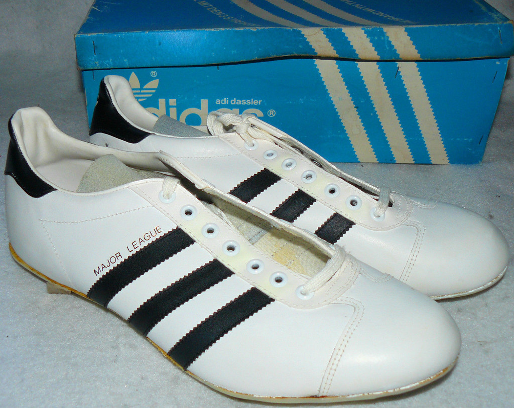
Collector’s Corner
By Brinke Guthrie
We’re talkin’ cleats today. I think the pair shown above were the very model of the Adidas cleats I wore for the Terrace Park baseball team way back when. The design looks rather conservative compared to what they wear now, eh? (And although not auction-related, but how cool are these? I had an Adidas NASL ball, too — was an avid fan of the Dallas Tornado — but I’ve never seen these soccer shoes before, and I woulda worn ’em in a second.)
Here’s the rest of this week’s picks:
• Paul, looks like a local New Jersey manufacturer for this 1970s Mets jacket.
• Now, here’s a nice-looking 1970s Vikes jacket from Shain Of Canada. One of the rare instances of a helmet pointed to the left, too.
• Speaking of the Vikes, this was my first foray into logo-wear back in the day: a pair of Vikings PJ’s — this very design — from Sears.
• Great little MLB pennant-style decal set from the 1970s.
• Like the wraparound letter treatment on this 1970s Steelers serving tray.
• Can’t say I recall seeing this Point-of-Sale MLB helmet display from the 1970s. Granted, I also can’t remember what I had for lunch yesterday, but I usually have an uncanny memory for this memorabilia stuff.
• Love the Winnipeg Jets logo on this pennant.

U.W.F.F.L. Spring League
UWFFL Developmental League – Weekday Edition
By Rob Holecko
Happy weekday to everyone, it’s time for a special Tuesday installment of the UWFFL.
With the NFL preseason kicking off, it is also time for the Fall 2014 UWFFL season to soon begin. We bring for you this weekend the quarterfinals of the “Spring” Developmental League as well as our first Fall preseason game. We’ll present for you here two of the four semifinal games to vote on as well as the kick-off to our Fall season, the Founders’ Bowl.
In one quarterfinal, the (5) Cheyenne Shock (7-0-1) slightly tweak their road uniforms against the (4) St. John’s Stingers (7-0-1), who are presenting jerseys with their unique “Honeycomb” pattern. These two teams share similar color schemes, and it should be an exciting battle to see who advances.

In another quarterfinal, the (6) Toledo Snipers (7-1) are looking for the upset against the (3) Little Rock Diamondbacks (8-0). In this color-vs-color matchup, the Snipers are debuting a new purple jersey with a unique sniper target pattern on the shoulder area, while the Diamondbacks are debuting white pants as they wear yellow-over-white uniforms.

Like the NFL with the Hall of Fame Game, the UWFFL also kicks off its’ fall season with a special event, we bring to you the second annual “Founders’ Bowl”. Two of our original TBFFL teams, the Chicago Cyclones and the Tampa Terror will meet in this year’s contest. Last year in the first ever UWFFL game, the Founders’ Bowl saw Atlanta defeat San Francisco 645-492, in what remains the largest vote total a UWFFL game has ever gotten — It’s been all downhill ever since. Here’s hoping we can at least get 100 votes for this game. Both teams are wearing a Founders’ Bowl patch. (As a side note: if you have any ideas what we could do to get back up to 1,000 votes per game, let us know in the comments.)


Right now, you can head on over to uwfantasyfootballleague.com to vote on the other two D-League Semifinal Games: Charleston vs Yellowknife and Missouri vs. Greenville. We’ll be back next Monday, August 10th, with the D-League Semifinals and a full slate of Fall preseason games to vote on.
Today’s Ticker was mostly compiled by Garrett McGrath — PH

Baseball News: Yesterday afternoon, the Mets (again) broke out their camo uniforms. I had thought this was supposed to be an “evenings” only thing — and, sure enough, it was according to the original plan. If you scroll down, you’ll note “U.S. military personnel with active or retired military identification will receive complimentary tickets to Monday night games for themselves and up to three guests on the following Mondays: April 21, July 7, July 28, Sept. 8 and Sept. 15. The tickets will be available (night-of-game only) in the ticket office lobby in the Jackie Robinson Rotunda, subject to availability.” August 4th was not scheduled to be a “Military Monday.” … Check out this shot of the DiMaggios (all in SF Giants unis!), taken on August 4, 1962 (from Bruce Menard). Also from Bruce, check out this photo of the Chicago Cubs from 8/4/1932, at the Baker Bowl in Philadelphia. … Cespedes Family BBQ found an Orioles cap with a bird with a hat on, which had a logo within a logo (thanks to Mike the Intern). … If Interplague existed back in the day, the Indians, Cubs and Reds would all have had very similar caps (great montage by Todd Radom). … The El Paso Chihuahuas wore awesome jerseys for their Bark at the Park event (via Brandiose). … Derek Jeter’s specialty cleats have “The CAPTAI2” on them (thanks to Nick Pants). … Check out this video of the Toledo Mud Hens vs. Tidewater Tides, from 1984 (thanks to Marc Viquez). According to the teaser, “The Tidewater Tides’ jersey reads ‘WORLD CHAMPIONS’ in the tail of lettering. This is a reference to the Triple-A World Series of 1983 that was played in Louisville against the two other league champions of Triple-A at the time. This was a lot of ‘chutzpah’ for a minor league team in 1984.” … Holy crap — check out this DIY project: A vest made of baseball cards chained together (h/t @InGodsCountryOK). … Cubs prospect Javier Baez has an MLB tattoo on back of his neck, mimicking jersey (via Andrew LInd). Paul notes, “That’s the same guy who’s been wearing the backwards ‘AWOI’ (Iowa) helmet logo.”

NFL News: The Detroit Lions Quarterbacks are going to wear green jerseys at their open practice this Wednesday made out of plastic bottles. Interestingly, each uniform is made out of twenty-one recycled bottles and fans in attendance will get recycled towels (from David Raglin and Phil). Here are the actual green jerseys (from Paul), and a full size (from Phil). … Check out Nate Burleson’s cheetah print Jordan cleats (via Mike Mill).

College/High School Football News: “The Daily News-Journal in Murfreesboro, Tennessee has a photo gallery from a high school football scrimmage between Stewart’s Creek HS (Murfreesboro) and Page HS (Franklin, TN),” says Jason Steinle. “Most of the photos focused on Stewart’s Creek, as they were the local team. But if you look at the two photos with Page players (in blue), it looks like they have some sort of padding attached on the outside of their helmet shells.” Interesting find. … New Texas Longhorns coach Charlie Strong removed the team’s logo off of each player’s helmet to motivate his players (thanks, Paul). … Sporting News is having a fan vote on which team has the best uniform (thanks, Phil). … Here is the patch for the MEAC vs SWAC high school game (thanks, Paul). … Division 2 school University of Nebraska at Kearney has got some spiffy new UnderArmour uniforms. … And here are some shiny new cleats for the Beavers of Oregon State (via Beavers EQ). … Here’s a look at the QB jersey for Notre Dame (from John Roberts). … SB Nation continues to rank college unis, and now they’ve ranked the MAC. … The Oregon Ducks will wear a a blue ringed undershirt to remind the players they’re “blue collar” (thanks to Christopher Hall). … Kentucky is getting more new gear (from Chazz Griffith). … Tulane’s new turf is complete, logos and all (thanks to Andrew Lemoine). … Oops. BYU’s football slogan “Rise As One” is ending because the copyright has expired. … The Washington Huskies are using a slimmer cut of practice jersey to try to match the gameday feel (thanks to Kyle Hanks. … Here’s a closeup of Florida State’s new helmet (h/t Andrew Lind). … The Minnesota Golden Gophers will wear patches on their jerseys to honor All-American Bob McNamara this year.

Soccer News: Interesting infographic rounding up what brands pay for the rights to manufacture and sell Premier, European, and International League shirts (from Mike Richardson). … New kit released for Pompey (h/t C B Schmelter).

NBA News: Ray Allen has a custom golf bag covered with logos of all the different team’s he’s played for throughout his career (thanks, Paul).

College Hoops News: The University of Kentucky will be wearing these uniforms in their scrimmages against Puerto Rico, the Dominican Republic, and France (from Thomas Clouse). … Here’s a look at the new ACC logo on the Smith Center floor (from James Lee Gilbert).

Grab Bag: Paste Magazine took a mid-year look at the best logo trends of 2014 (from Britton Thomas). … The new Bath rugby kits for the 2014-2015 season have been posted (from Adam Ingle).
And that’s going to do it for today, folks. Day 1 pinch-hitting for Paul in the books. Big thanks to Harold, Brinke & Rob, and of course all you fine folks for putting up with me (and for all your great ticker contributions). Hope we can fill in a few of those flocking blanks!
Everyone have a great Tuesday and I’ll be back with more good stuff tomorrow.
Follow me on Twitter @PhilHecken
Peace.

Baez was called up by the Cubs today. Let’s see if the “C” on his helmet is backwards in his debut…
Geez, Paul on vacation not even a week, and we get an apostrophe catastrophe
“shot of the DiMaggio’s”
Shot of the Dimaggio’s what?
All apologies, sir. Now fixed.
Here’s a link to another pic from that day. Interesting that while Dom & Vince wore SF Giants caps, Joe wore a NY Yankees one.
link
FLOCKED: The Kansas City Athletics –Â this looks like an example:
link
Nice find Chris!
Odd. The A on the helmet looks more like the Braves (who were still in Milwaukee and not yet using any form of an A yet) than an Athletics logo. I think we might need to see that in a game photo to determine if it was actually used or just a prop for the photoshoot.
More specifically, it looks like the old Braves batting helmet logo before they switched it earlier this year:
link
It looks like the angle of the horizontal cross line is the main difference between the two.
That’s fascinating about the Tidewater Tides wearing “World Champions” on their jerseys. And sure enough in the 1984 TCMA baseball cards you can also see it.
That was a fantastic looking game! The striping takes an otherwise plain set of uniforms and makes them pop. Love the NNOB…now if the numbers were just a tad bigger.
Pullovers rule!
notice that the Bucks logo on Ray Allen’s bag was not the Ray Allen-Era logo/colour scheme?
The UConn logo’s the current one as well, as opposed to the version from when he went there.
I was not aware that you could make a jersey out of recycled plastic. Neat, but why neon green? Even Mountain Dew bottles aren’t that bright of a green, so the color must be by choice.
Some clothing and hats are being made this way. I know Brand ’47 (or Franchise or whatever) makes some of their hats out of recycled bottles.
You’re right – the green is a color choice.
Nike has been recycling bottles for soccer jerseys has been going on for link, starting with World Cup teams and then moving into link.
Since Nike was one of the pioneers, not surprising it should be introduced to the NFL now.
There’s a stylish-but-cursory video of the process link.
Malden Mills / Polartec was making fabrics from recycled bottles as early as 1993:
link
Obligatory uniform reference: Polartec is widely used in uniforms for cold-weather outdoor sports.
link
Repreve, the company that makes the fabric, uses that same shade of green in its graphic identity, along with the catch phrase “turn it green.” They’re making a big deal out of their partnership with the Lions, as their webpage shows:
link
You can see Repreve’s own stylish-but-slightly-more-substantive informative video here:
link
“it looks like they have some sort of padding attached on the outside of their helmet shells.”
And good thing too, because #26 is displaying the type of tackling that gets player’s injured. He needs to get his head up and his hips down. Of course, the helmet pad wouldn’t protect against the potential neck injury from tackling with the top of his head like that.
On a positive note, great to see a player using his arms to tackle, something that is woefully lacking in college and pro football. And, from the side, that’s a great looking jersey!
I wore that same style Adidas spikes in high school, except that they were white with purple stripes. As soon as I saw today’s post, I thought, “Hey, my spikes!”
Re: the caps on the helmets
I believe it’s a company called Guardian. They claim the caps help reduce the impact by absorbing energy.
link
For those interested in international soccer, the FIFA U-20 Women’s World Cup starts today.
link
Nothing says “blue collar” like wearing a fresh new uniform for every game, complete with chrome hydro-graphics on the helmet.
+1
Someone didn’t read the article…
New US Army Camouflage. Digital pattern is out.
link
Those lions jerseys look like the old Orlando Thunder unis
Do we have any idea when Notre Dame is going to unveil their game uniforms?
August 19 is Media Day.
link
I read somewhere that Under Armour CEO Kevin Plank will be in attendance; I would guess both the normal and Shamrock Series uniforms will be unveiled at that time.
Why do so many of the uniform polls/fan votes continue to use hideous one offs as a representation of a team. When asking “who has the best uniform”, shouldn’t you use the team’s standard template and judge them based on that?
When so many teams are wearing a different uniform every other week, the “hideous one off” IS a representation of the team.
Idea for more vote on the uwffl: put each game every day on uni watch the votes will add up to 1000 over the course of the week.
I’m not sure if Stan Lopata is wearing a flocked helmet or simply a matte one in this shot:
link
What do you think?
Hmm…hard call on that, I could go either way.
I would say definitely flocked – especially with no logo.
If you zoom in on the helmet where the decal should be, don’t you see what looks like a faint outline of the ‘P’?
I say flocked…especially after finding (perhaps) another example, though the picture quality is suspect:
link
My assumption is that any batting helmet from that era that looks like it has a matte finish from a distance is probably flocked.
Another apostrophe catastrophe: “El Paso Chihuahua’s”
Thanks. Now fixed.
Chee-hoowa-hoowas?
The favorite team of Chi-Chi Rodriquez, as pronounced by Les Nessman.
I know the Yankees are already covered in the flocking department, but this photo is worth sharing again
link
That is a magnificent image.
Agreed. Also a terrific caption.
Just in, Bucks have changed their jersey script. All letters are now the same size.
link
Much better.
Flocking gone mad: Manny Sanguillen….
link
Hahaha…there ya go!
No need to flock now…the helmets too often don’t even match the cap being worn on the field.
The flocked helmets of yore didn’t necessarily match teams’ caps, either. Look at the Cincinnati Reds helmet pictured in the article above and the Kansas City Athletics helmet mentioned in the comments.
I remember flocking on Christmas ornaments, wallpaper, toys, and maybe even car roofs and I suspect there were degrees of texture. Probably a pain to keep it looking good. I can’t imagine a batting helmet having the same fuzziness as a dashboard chihuahua bobblehead. link
Random question: what year did Cool-Base jerseys become available for wear in the field for players?
Flocking was used for English Premier League numbers and shoulder patches for some time.
It’s generally very difficult to see the flocking during a match, so here’s a close up photo of some of the shoulder patches.
link
Here’s an article from last year discussing how they were doing away with the flocking.
link
I know other leagues/teams have used them as well. It appears that the shoulder patches for this year’s World Cup were flocked as well.
link
link
Saw Manchester United post this on Facebook overnight (US time); I thought it was a little odd that they had 2 different sponsors for the match and training shirts. Turns out GM is paying nearly $560m over 7 years starting this year for the privilege, and Aon is shelling out nearly $240m over 8 years (starting prior to the 2013-14 season) in a deal that includes sponsorship of the training facility. That’s just mind-boggling to me, that the club is making nearly $110m this year from the 2 companies that sponsor their shirts alone. Looking at the infographic Mike Richardson shared, combine that with the nearly $40m Nike is paying annually to make the team’s kits….
It’s no wonder Adam Silver wants to get on that train (the NBA seems to have the broadest global appeal of the four major pro sports here); if a team could get even half that, the league could either a) have owners hardly spend any of their own money on player salaries, or b) raise the salary cap to such a high level that a few of the wealthiest teams could lure all the best players there, thereby stratifying the league even more so than it already is.
At the 4:50 mark in this link, the Colt 45s batting helmet SURE looks flocked to me!
Nice find! I would vote flocked as well on that one.
I think I see sunlight reflecting off the helmet, but I’ve been wrong before!
I am in touch with someone who has extensive historical photos collection and he does not think they ever had flocked… :( Hope that isn’t true. Best to just ask Aspromonte, I guess.
Footnote to the Pirates flocked helmet:
Back in the 1950s, if I remember correctly, the Pirates started wearing helmets in the field as well.
I know of individual players who have done that (Dick Allen, to name one), but I think the Pirates were the only team. Didn’t last long, though. Probably too hot under the plastic than a traditional cloth cap.
I think it’s been mentioned once, but the padding on that high school team’s helmets look like what’s called Guardian Caps. They’re supposed to lessen the possibility of concussions. I’ve seen a few players in Kentucky wearing them the last couple of seasons.
Adam Ingle thanks for that link! I collect rugby jerseys and this will be a great resource, much to the chagrin of my girlfriend. ;-)
Interesting article in the Washington Post today about Chris Cooley and Mark Brunell removing the “s” from the team name on their jerseys. I was just about to send a link when I realized that Uni Watch was quoted in the article. Cooleey finally answers a question that Paul wrote about back in 2005.
link
link They were from two years ago when they switched leagues IIRC.
NY Giants Felt Helmet (via Ebay)
link
The MEAC and SWAC are conferences in Division I FCS, not high school.
Thanks WC…This needs to be fixed. The SWAC had 2 HOF inducted into the Pro Football HOF on Saturday night. I know most of yall don’t follow the SWAC, MEAC, SIAC or the CIAA, but could they get a little respect.