With the MLB All-Star game approaching, reader Steve Sale has provided some interesting tidbits about a pair of All-Star sleeve patches from years past. Let’s start with the 2002 ASG, which was played at Miller Park in Milwaukee (click to enlarge):
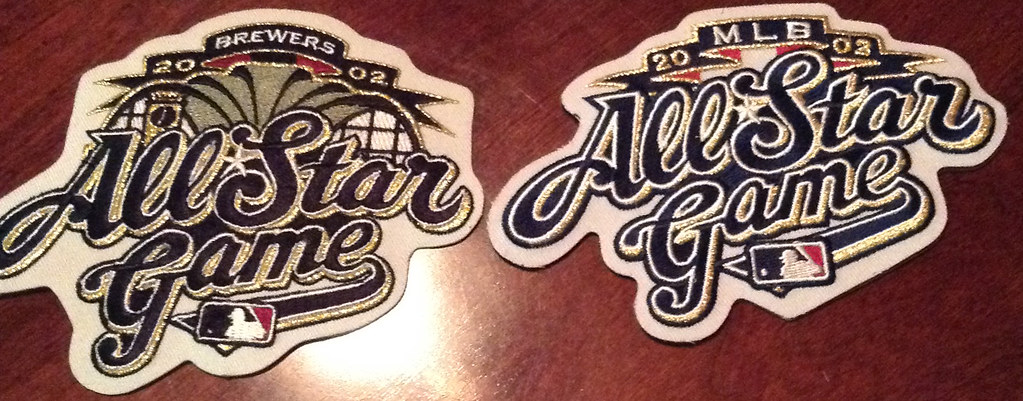
The version on the left is the design the Brewers wore throughout the 2002 season. The one on the right — which doesn’t have the Miller Park roof design and replaces the “Brewers” banner with “MLB” — is what players wore for the ASG. I hadn’t been aware of the two distinct designs. (Incidentally, the Brewers had two players on the National League All-Star squad that year: Jose Hernandez and Richie Sexson. Which version of the patch did they wear? I’m pretty sure they wore the “MLB” version, although I haven’t been able to confirm that.)
The situation was similar in 2011 (click to enlarge):
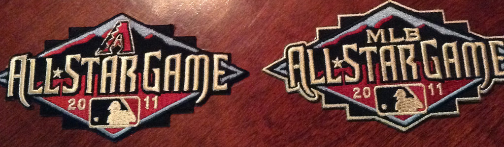
The team-branded design on the left is what the Diamondbacks wore during the 2011 season, and the MLB-branded version — which, interestingly, has a gold border than the other one lacks — is what players wore during the ASG. And this time I’ve confirmed that the D-backs’ All-Star players wore the MLB version of the patch.
Not sure if there are other examples of this, but it’s definitely not a standard thing. This season, for example, the Twins are wearing an MLB-branded ASG patch, and that’s presumably what all players will be wearing for the ASG next Tuesday. (A Twins-branded version of the logo does exist, but the Twins aren’t wearing it.) And last year’s All-Star patch didn’t include the word “Mets” or the “MLB” lettering.
In short, there doesn’t seem to be much rhyme or reason to the ASG patch protocol. If anyone knows more about the thinking that goes into this, I’m all ears.
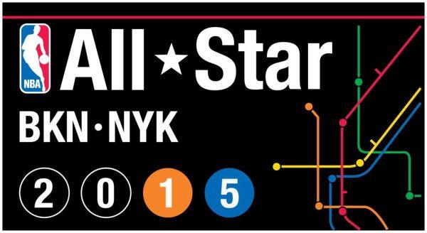
Speaking of All-Star logos, yesterday the NBA released the logo for next year’s All-Star Game, which will take place in New York. Take a look:
A few notes and thoughts:
1. The design is obviously intended to mimic the graphics and signage from the New York City subway system — a nice idea, although I don’t understand the red horizontal line across the top. That line is always rendered in white.
2. The slam dunk and other skills competitions will take place at the Barclays Center in Brooklyn (i.e., a few blocks from my house), while the ASG itself will be held at Madison Square Garden. So that explains why the Nets’ and Knicks’ abbreviations both appear. The thing is, when I see “BKN,” I don’t think “Brooklyn Nets” — I just think “Brooklyn.” So the parallel between “BKN” and “NYK” doesn’t really work.
3. The use of the two arenas is also why the “20” is in Nets colors and the “15” is in Knicks colors. But the “20” color scheme doesn’t say “Nets” to me — it just feels like it fits in with the logo’s larger black/white color scheme. In other words, I see Knicks colors here but I don’t really see Nets colors — another attempted parallel that doesn’t quite work. (There are also two team-specific variations on the logo, one for the Knicks and one for the Nets.)
4. Moreover, rendering the “1” in orange and the “5” in blue will cause major cognitive dissonance for NYC residents, because we’re used to seeing subway lines depicted in very specific colors.
5. Would it have killed them to use the proper subway font?
Granted, items 1, 4, and 5 are the kinds of things only a New Yorker would care about. To a non-New Yorker, the logo will clearly be subway-evocative, and that’s probably enough. Still, that makes me wonder if (m)any previous ASG logos had flaws that a local resident would pick up on, and if I just never noticed because I wasn’t savvy enough about the local culture.
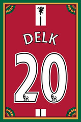
Membership update: We don’t create vertically oriented membership cards, but we decided to do one for Todd Delk’s 2009 Man U treatment (shown at right) because of that vertical stripe above the NOB. If we had done it horizontally, the stripe would have eaten up so much space that the uni number would have been pretty small.
As always, you can order your own membership card here, you can see how we make them here, and you can see all the cards we’ve designed so far here.
Radio news: I don’t much care for the NPR radio show Wait Wait Don’t Tell Me, except for the “Bluff the Listener” segment, in which a contestant has to guess which one of three implausible-seeming news stories is real (the other two are fake). They reveal the answer by playing a recorded snippet of an interview with a person connected to the real story.
Yesterday I got a message from one of the show’s producers, asking if he could interview me for the “Bluff the Listener” reveal on tomorrow’s installment of the show. I agreed, so if you happen to be listening to Wait Wait Don’t Tell Me tomorrow, you’ll hear me revealing which of the implausible-seeming news stories is real. Obviously, I can’t tell you about the story or my connection to it, but I think most Uni Watch readers will be able to solve this one pretty easily.
I also recently taped an interview for KJZZ Public Radio in Phoenix — they wanted to talk about college football uniforms. I believe that segment is going to run sometime today, or maybe tonight. I’ll link to the audio once it’s available.

’Skins Watch: I think it would be fair to say that this Cleveland-area Walmart has no issues with Chief Wahoo (from Kevin Tiessen). ”¦ The Giants are considering a ban on “culturally inappropriate attire at AT&T Park (from Patrick O’Neill). … Here’s the latest on that Pennsylvania high school whose student newspaper editors want to stop using the word “Redskin,” even though their principal has overruled them. ”¦ The DC City Council is going to bestow an honor on Robert Griffin III but will not mention his team’s name (from Bryan Martin Firvida).

Baseball News: All-Star Game fun fact: Due to a mix-up at the 1999 ASG, Sean Casey wore a jersey that he himself had autographed the day before. Casey tells the story in this radio interview (from Mike Slavonic). ”¦ Love this shot of Ted Williams checking out how his autographed gloves were made (from Jonathan Daniel). ”¦ Pirates All-Star Josh Harrison doesn’t know what position he’ll be asked to play at the ASG, so he’s bringing four different gloves — two infield, two outfield (from Harrison Hamm). ”¦ Just what the world’s been waiting for: super-ugly shoes and batting gloves for the home run derby. ”¦ “I think it’s kind of embarrassing to have the USA softball team wearing pink in international play,” says Nate Rischall. “And the umps, too.” They USA team was also wearing these flag-based batting helmets (screen shot by Michael Bialas). ”¦ The Reds and Cubs went color-vs.-color yesterday, which looked particularly vivid when the benches emptied for a 10th-inning scuffle. ”¦ We’ve seen a fair number of RNOBs over the years, but I think this one might have the highest Roman numeral we’ve seen so far. That’s Josh Whitaker V of the Sacramento River Cats (good one from Aaron Wiens).

NFL News: The Chiefs’ website is providing a team-by-team look at old AFL helmets. First up: the Oilers. … Check this out: In this 1967 Saints/’Skins game, the ’Skins lettering in the end zone was oriented to face toward the crowd, instead of toward the center of the field. Never seen that before (good spot by Chris Rocco). … The 49ers’ new stadium now has an inaugural-season logo. Not yet clear if it’ll be worn as a patch (thanks, Brinke). … Also from Brinke: Niners kicker Phil Dawson was wearing Phiten-logo socks the other day. … The NFL has mandated that goalposts must extend five feet higher this season, which is causing headaches for teams.

College Football News: New helmets for USC? Maybe (from Glenn Tanner). ”¦ Here’s one of those “behind-the-scenes” videos, this time for Notre Dame’s new gear (from Charlie Kranz). ”¦ Students at Western Michigan have designed a sensor to measure the force of impacts on a football helmet.

Hockey News: The AHL is adopting a new rule that calls for a penalty if a player’s helmet comes off and he doesn’t immediately put it back on or leave the ice. ”¦ Oh baby, look at this old newspaper clipping that shows all sorts of proposed North Stars logos (from Jimmy Lonetti).

NBA News: Here’s a better look at the USA’s FIBA uniform (thanks, Phil). … New “30 Years in Sacramento” logo for the Kings (from Aaron Davis). ”¦ Got 10 or 15 minutes and a strong stomach? Check out how the Nike people tried to buy themselves a LeBron James puff piece from a magazine and then tried to bully the writer and the magazine when it didn’t turn out to their liking. The whole thing is disgusting.

Soccer News: The ball for the World Cup final will be green and gold (from Jeremy Brahm). ”¦ New kit for Manchester City. ”¦ New home kit for Montpellier (from Brett Stone). ”¦ No matter which team walks away with the World Cup title on Sunday, Adidas is already the winner (thanks, Phil). ”¦ This is pretty good: proposed SEC soccer kits (from Michael, who didn’t give his surname). … Here’s the official poster for next year’s Women’s World Cup (thanks, Phil). … Also from Phil: New kit for Arsenal. Further info and analysis here. ”¦ A mother bought her kid a Luis Suarez Liverpool jersey but now wants a refund from the club because he’s rumored to be leaving soon (from Yusuke Toyoda). ”¦ Also from Yusuke: Here’s a good piece about how a Nike designer got into soccer kit design. ”¦ Rex Henry created a chart showing all the World Cup uni match-ups, and another showing all the uniforms organized team by team. ”¦ New kits for Athletic Club Bilbao (from Ryan Maquiñana).

Grab Bag: The PGA has a kids’ program called the PGA Junior League, in which the young participants wear jerseys. ”¦ Speaking of kids, a new study indicates that the thing that attracts kids to sports is, simply, fun. Key quote: “Swag, such as having cool jerseys or the latest sports gear, or winning medals was rated as the least important determinant of fun.” … Brinke has written a short piece on the old Ellesse tennis brand. … Adidas shirt or “Muslim prayer rug”? You be the judge (from Peter Hoelter). … Golfer Jason Dufner is wearing a memorial patch on his golf bag for former Auburn tight end Philip Lutzenkirchen (thanks, Phil). … I lovelovelove this: a brilliantly niche-specific wesbite devoted to — wait for it — screen shots of people wearing wristwatches in movies (major thanks to the Hungry Hungry Hipster). ”¦ Walmart will add a new logo to products made by women-owned companies. ”¦ Reprinted from last night’s comments: Good article on golf tee markers (from Dan Pfeifer). ”¦ New costume for Batgirl (thanks, Brinke).

The Chiefs’ website is providing a team-by-team look at old AFL helmets. First up: the Oilers.
From that page: 1964: The helmet color changed to a darker blue with white derrick and red and white striping. The Titans returned to this look in 1972.
So much wrong with the 2nd sentence. The ’64 helmet and ’72 helmet are NOT the same. The striping is different and the oil derrick has a red outline in ’72. The team also wasn’t the Titans then, and shouldn’t be referred to as such. I’m not sure that the blue was actually darker either.
Getting an explanation as to why they went to silver helmets made my day.
Yeah, that is kinda neat, if true. Now we just need to figure out why the 49ers, a team named for the gold rush, wore silver for those few seasons.
I’ll bet it had something to do with the availability of quality gold paint.
2009 NHL ASG, the Habs wore a patch in French, but the ASG jerseys had the same patch in English on every jersey, Habs and Habs-nots. Not quite as unique as the baseball players who bring their own jerseys, but yeah.
Didn’t a similar situation to the one mentioned by Sean Casey happen with Ken Caminiti in the 1997 All-Star Game in Cleveland? I believe he autographed his gray road jersey and thus wore a blue Padres jersey in the game. That also may be the last time any player wore anything other than a white or gray jersey in an All-Star Game.
Sean Casey also told his autographed jersey story on last night’s Late Night with Seth Meyers, including a clip where one of the broadcasters noticed the autograph.
The 2012 MLB All-Star logo had 2 versions, as well. At the top, under the 2012, one logo had the Royals script, while the second version had MLB in block letters.
Check out link, for the last few years there have been multiple variants that team specific. I’m sure not all of those made it onto actual uniforms, but they’ve been doing it for a number of years now.
I think 1972 was the first time I ever recall seeing a true MLB All-Star Game logo. All ASG emblems previous to ’72 AFAIK are based on the press pins handed out to various media.
Read the Lebron article…the writer is the douche, not Nike.
I think there’s plenty of blame to go around here. The writer and editor should never have agreed to Nike’s terms. But to suggest that Nike is blameless is absurd — they created the whole nauseating scenario.
I read the article yesterday… funny how two people who read the same thing can have such different takeaways!
Lee
Seriously. The writer did exactly what was (explicitly) asked – be a fly on the wall and give a sense of what it is to be LeBron James.
Which is, a rough, almost dehumanizing and secluded experience surrounded by handlers with an occasional interaction with regular folks – something the writer probably knew that Nike wouldn’t be happy with, and he understood the perils of paycheck journalism going in (though he didn’t know Nike was footing the bill until he had his foot in the door).
Agreed!
Benjamin Markovits (he played against dirk) sounded to me like he was more interested letting us know about his tiny run in hoops (he played against dirk) than lebron. I don’t care for nike but the article was crummy. Btw, did u know he played against dirk.
#heplayedagainstdirk
“Muslim prayer rug” – not “prayer rag”. Rather offensive otherwise.
Fixed.
There were MLB and Mets version of the ASG logo:
link
Not sure if that made it to the game-worn patches though.
Didn’t.
The way the MLB and (especially) Mets are crammed in there looks really forced.
I always felt the one without the Mets script had too much empty space.
I can certainly understand the other 29 teams not wanting to wear a patch with an opponent’s brand on it. Perhaps it has everything to do with the team having okayed the less generic design to put on their own uniforms.
This was exactly my thought.
as a Browns fan…it still doesn’t seem right seeing Phil Dawson in a 49ers uni
As a 49ers fan, it still doesn’t seem right seeing Phil Dawson in a 49ers uni.
:-)
Lee
I thought it looked like a PD logo, for his name.
“Ted Williams checking out how his autographed gloves were made .”
That’s not all he was there to check out!!
Hey-Oh!!
A great picture.
One correction for Rex Henry’s otherwise awesome World Cup uniform chart – Argentina wore black socks, not white, against the Netherlands.
Also, I didn’t realize Mexico wore four unique combinations in four matches.
I noticed a huge error in his uniform chart. He is showing Bosnia advancing to the round of 16 and wearing the French home kit.
It is obvious he just misplaced the French kit as they were the team that advanced, not Bosnia.
Let me correct myself, it is the Greece kit shown listed under Bosnia, not the French kit that I initially thought it was.
Whoops. That last Greece kit is just in the wrong position. Thanks.
To be fair, I still have a hard time believing Greece advanced to the Round of 16 too.
I’m apparently the only person in the world who wonders why goalkeeper kits, which must be a different color than both the teams and the officials, can’t mimic the same design on the jerseys of the rest of the team’s players. Mexico was supplied by Adidas and presumably wore their “Onore” goalkeeper template as did all the other Adidas teams goalkeepers.
In their games vs Brazil (red jersey) and Croatia (green jersey) the keeper wore the link standard Onore gk kit. But against Cameroon and The Netherlands (team wore green jerseys) their keepers wore kits with link as the players wore in their green kits, rendered in red on black! Holy shit! It can actually be done!
As far as I can tell, and I’ve been spending way too much time studying World Cup kits, no other team has bothered or insisted on this very cool continuity. The same applies for pretty much every professional team with the exception of the NY Red Bulls, which may not actually count.
I know it’s late in the day, but Rex Henry’s charts showing the World Cup kits are GREAT! Rex, you may have cut my World Cup uni-obsessed time wasting – I mean “enjoyment” – by nearly half! Maybe.
Thanks. I’ve spent the last month working on this. After the final game I’ll have all of the individual matches up in higher quality.
I have this odd idea of doing the goalies uniforms for each match.
I figured the Ted Williams glove was the 1970 Sears model one I owned as a kid. Which for some inexplicable reason was designed without an opening in the back that you could stick your index finger out of:
link
Except that the photo of Ted looks about 20 years earlier than that Sears glove.
This is the only Batgirl for me.
link
bingo on batgirl.
Now that’s a purple uni even Paul could dig!
Neat All-Star logo, at least it’s interesting and has some culture to it (in this day and age of ubiquitous, forward-leaning, aggressive and/or scripy sports logo design).
Probably would’ve made more sense for it to read BKN NYC. And maybe reverse the “0” so the 2015 are all different (or perhaps use the white on gray style from the chart).
And I don’t see any reason why they’d have NY-exclusive and BN-exclusive logos? It’s not as if either of those teams can “claim” the game, so why bother.
“Here’s the latest on that Pennsylvania high school whose student newspaper editors want to stop using the world “Redskin,”…”
A typo or misplacement of “the world” ; )
Fixed.
The Giants are considering a ban on “culturally inappropriate attire at AT&T Park (from Patrick O’Neill)
Ballparks are controlled environments where ticket-bearers are expected to forfeit many rights they would otherwise enjoy as American citizens. Free speech stops at the turnstile.
I’m just curious exactly how you define “culturally inappropriate”. If the team is going to wear it’s “Gigantes” jersey, does a white fan showing up wearing an oversized sombrero get kicked out too, or are we just banning blackface and Indians/Braves fans wearing feathers?
No more ‘Skins fans taking their act on the road. OOPS!! I almost posted this. Wrong Giants.
Make that Braves fans.
They have fans at Giants games dressed up in Papal tiaras and dressed as rather inappropriate nuns. They aren’t being asked to leave and as a Catholic I DO find them offensive.
as long as I can still wear my BEAT LA shirt. Wait, I can’t afford to go to the games. Never mind.
Hey Paul: I’m a recovering New Yorker (still have a 646 cell number, even though I haven’t lived anywhere near the City for 11 years), so I can relate to your gripes about the ASG logo. The red stripe and the font irritate me, too. Is the MTA font proprietary? That could explain the discrepancy.
Is the MTA font proprietary?
Nope, just Helvetica.
Is it Helvetica? Most of the subway is in Helvetica, but not all. If you are interested in typography and/or trains, you’ll enjoy this article on the history of signage in the NYC subway:
link
And what’s with the subway map in that ASG logo? Why didn’t they use accurate lines of the NYC map?
Hell, there’s a link.
MLB link, even if it was just a secondary logo for the 2000 World Series.
There’s no needless clutter, and the numbers represent the actual lines (with the correct colors) servicing the respective ballparks. It also works out that the numbers represent the format of the Series – best four out of seven.
It also makes sense because it was called “the Subway Series” – subway signage made for a natural choice when it came to creating the imagery.
Here, the subway is just an accessory to add an interborough-ness to it. Maybe one of the East River bridges would’ve made more sense here. With the typeface and the bullets not matching up, it just looks haphazard, like when they try to dress up a movie set like New York and it doesn’t look right.
Moreover, rendering the “1″ in orange and the “5″ in blue will cause major cognitive dissonance for NYC residents
Was my very first thought when I saw it yesterday. “Wrong font” was my second.
Wait Wait taped their show here in Denver at Red Rocks last night. Since the Mrs. is a big fan we went and did hear a certain “journalist familiar with the story” (or something like that). Hard to hear though because of the applause when the listener picked correctly…
Interesting that they waited until just a few hours before the taping to get my little spiel recorded. What would they have done if I hadn’t responded quickly to their request, or if I’d declined to participate?
Congrats on the Wait Wait appearance. One of my bucket list items is to be a panelist on the show someday.
(That just may be one of the whitest sentences ever written…)
Listening to the Wait Wait podcast on my iPhone while walking my Bernese Mountain Dog and drinking a craft beer on Saturday night is one of the highlights of my week.
There, that’s one of the whitest sentences ever written.
Walk the dog, drink a beer and monkey with thee phone all at once . . . how many hands do you have?
Well trained dog can be walked without a leash, you’ve got one of those stylish beer dispensing hats… and you use both hands to mess with your phone. Problem?
Once you start the podcast, monkeying with the phone is no longer necessary. But starting the walk does require some juggling.
[i]Listening to the Wait Wait podcast on my iPhone while walking my Bernese Mountain Dog and drinking a craft beer on Saturday night is one of the highlights of my week.
There, that’s one of the whitest sentences ever written.[/i]
Very tough to out-white that one.
Having been in the news biz for 36 years, when I see BKN, I think of the AP’s shorthand for slugs (titles) on NBA stories.
Others: BBN (NL), BBA (AL), BBM (minors), BBO (other baseball), FBN (NFL), FBC (college football), FBH (prep football), BKC (college basketball), BKW (women’s basketball), BKH (prep basketball), HKN (NHL), HKC (college hockey), and so on.
Funny you posted about patches from 2002, seeing that was the controversial All-Star Game that ended in a tie while Bud Selig’s family still owned the Brewers.
I’m surprised they haven’t made a homerun patch yet with century 21 plastered all over it ugh
Stop giving them ideas.
What a great time: Paul on two of my favourite podcasts, 99PI and Wait Wait. If you can get a guest spot on Jonah Keri, my year will be complete!
link just popped into my inbox via the Ebbets Field Flannels newsletter. I’m sure it’s been posted before, but damn there’s a lot of uni goodness going on: NL league uniform, Foxx’s cut-off sleeves, no NY on the Yankee pins, no A on Foxx’s hat.
Very nice Women’s World Cup Canada 2015 poster.
THE DECISION II:
link
no #6 jerseys for sale yet?
That’s actually a good question… does he stick with 6 or go back to the 23 he originally wore in Cleveland?
I know he’d put in a request to change his number to #6 before he left in 2010, but I’m sure it doesn’t matter since he’s changing teams.
Isn’t #23 retired in Cleveland?
Presumably the Giants’ ban on culturally inappropriate attire would not also extend to the visitors’ dugout, should the Cleveland Indians visit SF.
When I first saw the logo I didn’t pick up on the Nets/Knicks angle, it looked like a weird abbreviation for New York (NYK) that was created just to mirror the three letter abbreviation of Brooklyn (BKN).
What dope is running the Cav website? Guess the team has had no news today, huh.
link
45 minutes later…
*crickets…*
Um… Hello! Anyone home?
Maybe they’re waiting for the contract to be signed and approved?
Was wondering the same thing, and that’s my guess. Wait until he’s officially signed.
Lebron’s website: LebronJames.com .. has picture of Lebron in a #6 Cavs Jersey.
the way the webdesigner’s word mark is set up.. it makes it look like Lebron is a “rehab addict” and that she is part of his life’s road map
Waiting until a contract is actually signed?
they finally got around to it.
link
not a way to run a site. you have the piece ready, and once it goes up on SI, you hit publish. duh.
Those Saints endzones made to read from the stands remind me of when you see a racecar with lettering on rear wing that is made to be read from behind. It’s quite jarring to see it flipped around 180′
link
“We don’t create vertically oriented membership cards…”
link.
I’m famous!!!
The card looks really great Paul. Well done!!
What’s with the Brewers uniforms tonight? Never seen them before.
I believe they are the BP jerseys that they usually wear on Retro Fridays. They are available on their shop site for $80.
The Cavs official website has James jerseys for sale…but they’re number 00.
Is this a mistake, or is he changing to that?
Off hand, I didn’t know where next years NBA All Star game is going to be.
So regarding…
[I]2. The slam dunk and other skills competitions will take place at the Barclays Center in Brooklyn (i.e., a few blocks from my house), while the ASG itself will be held at Madison Square Garden. So that explains why the Nets’ and Knicks’ abbreviations both appear. The thing is, when I see “BKN,” I don’t think “Brooklyn Nets” – I just think “Brooklyn.” So the parallel between “BKN” and “NYK” doesn’t really work.[/I]
The logo made me think the game is going to be in Brooklyn, not Manhattan.
(Sorry about the bad formatting.)
That Levis Stadium logo is about as generic as they come, IMHO.
My wife listens to wait wait don’t tell me and we put it on as we drove to an outing today. Caught the segment with the White sox ponchos.