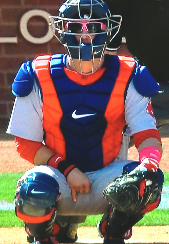
My brother and I spent yesterday with our Mom, so I didn’t see any of MLB’s annual pink-ification. Judging by the photos I saw when I got home last night, the best move of the day came from Bosox catcher A.J. Pierzynski, who painted his fingernails pink (or maybe just used a pink set of those press-on fingernail sticker thingies). Can’t say I’m as fond of his pink sunglasses, but whaddaya gonna do.
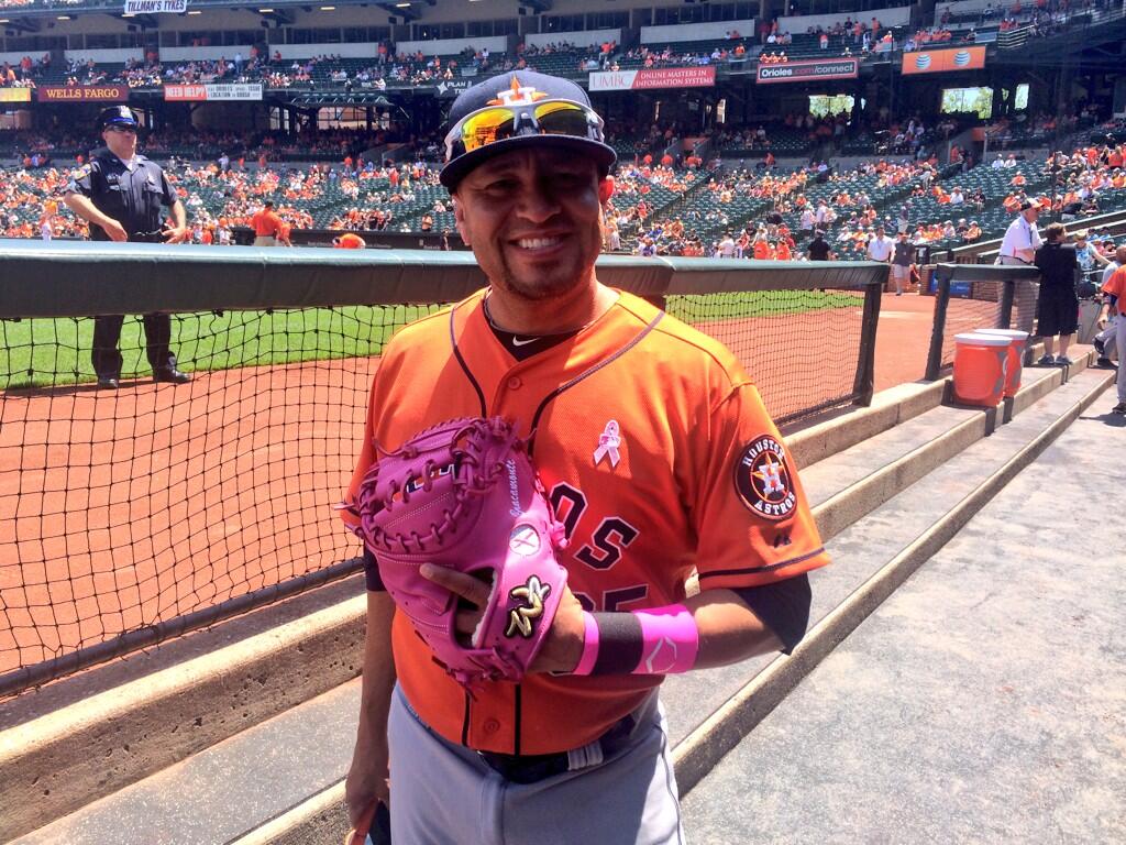
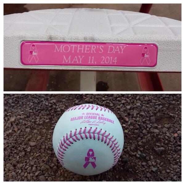
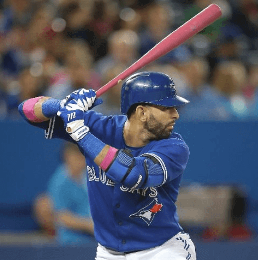
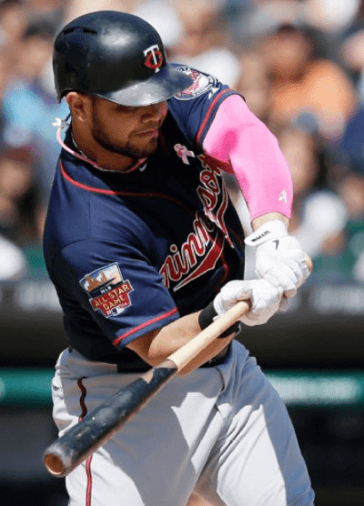
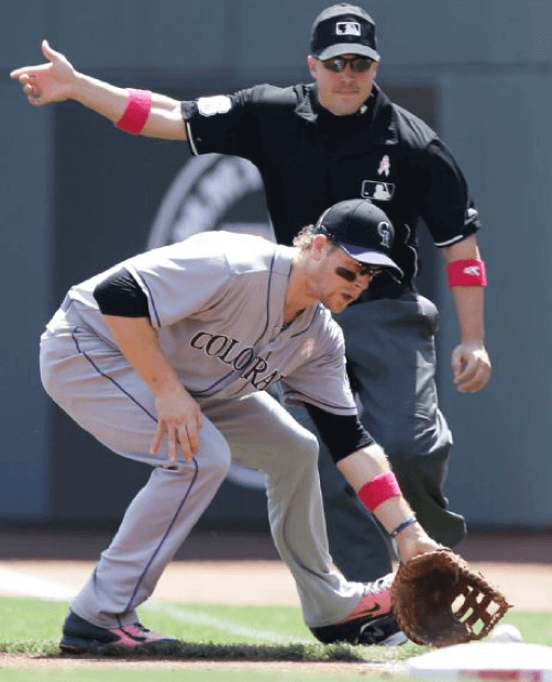
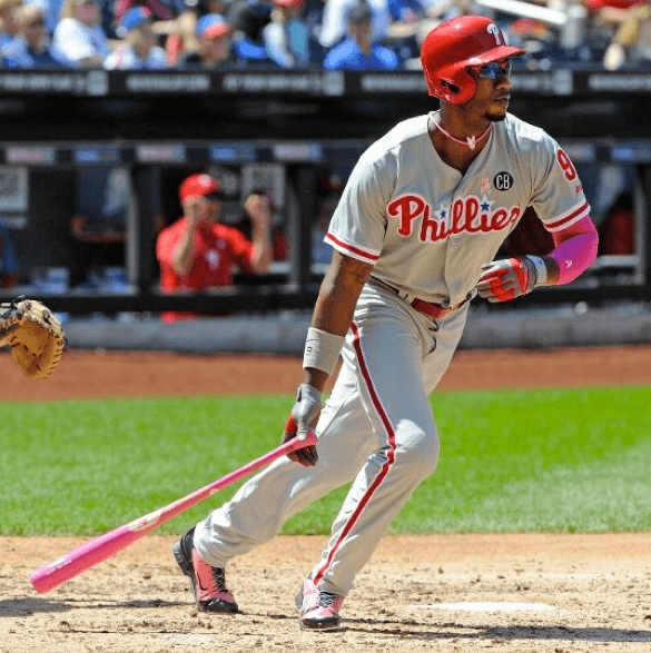
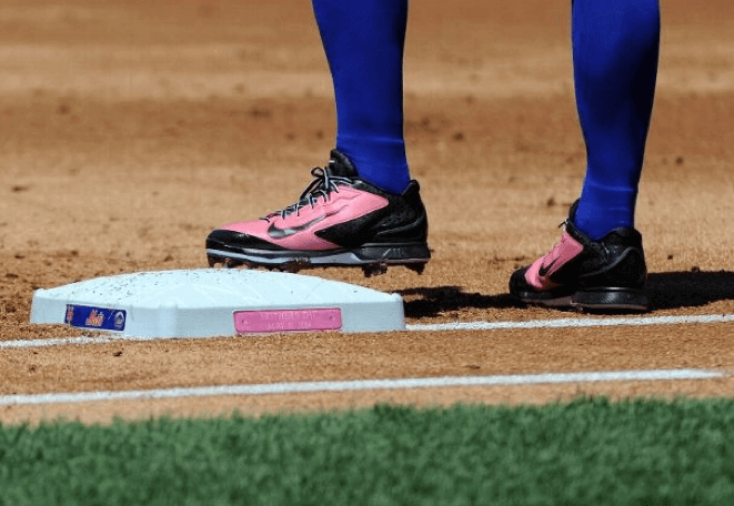
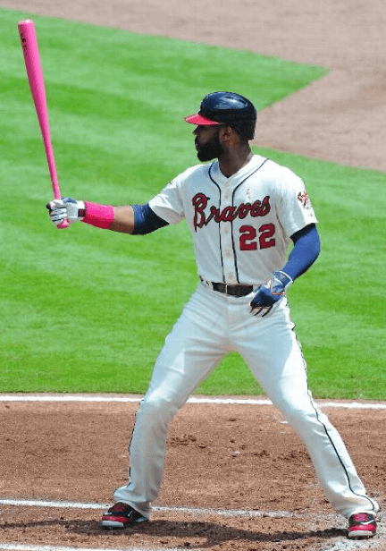
Pretty much everyone and everything else was pink — the now-familiar assortment of pink jersey ribbons, pink wristbands, pink bats, pink-laced balls, pink-trimmed bases, pink shoes, pink arm sleeves, pink Tooth Fairy necklaces, you name it. Here are some photos to give you an idea:
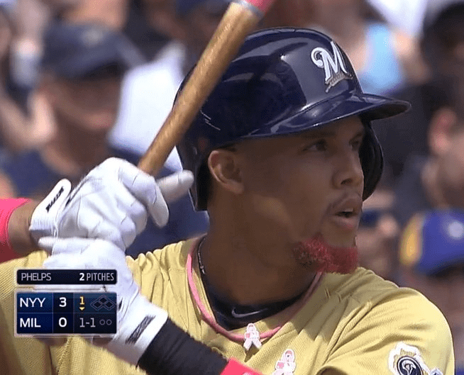
That last shot is Brewers outfielder Carlos Gomez, who dyed his beard pink for the occasion.
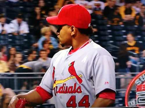
Cardinals pitcher Carlos Martinez had a slight glitch, as his pink ribbon was initially upside-down, but then it was corrected the following inning:

Also: Several mascots had their moms on hand. I particularly like that Bernie Brewer’s mom has a mustache.
Also-also: In case you missed it in Phil’s post yesterday, the White Sox jumped the line on the whole pink thing by wearing pink caps on Saturday. Further details here.
Finally, one storyline we missed from last week: Remember all the bullshit last year about MLB not letting players use pink bats unless they were Louisville Sluggers? In a welcome move, that restriction was dropped this time around. Good job.
(Big thanks to Jordan Caramack, Dave Garabedian, James Mellett, Jared VanderWeele, and of course Phil for their contributions to this section.)
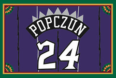
Membership reminder: Remember, people, Purple Amnesty Day — the only day of the year when you can order a membership card with a purple-inclusive design — is this Friday, May 16. So if you want a purple card (like Nicholas Popczun’s Raptors treatment, shown at right), be sure to place your order that day.
Of course, you can order non-purple designs anytime by signing up here.

’Skins Watch: California Congressman Henry Waxman, drawing parallels to the Donald Sterling situation, has indicated that he wants the House Energy and Commerce Committee to hold a hearing on the ’Skins name.

Baseball News: What’s worse than a team in pink camo? Two teams in pink camo. That’s Troy High School’s Flying Horses and LaSalle Institute’s Cadets, both of Troy, New York (from Joe Makowiec). … MLB 14 The Show shows the Indians wearing red helmets with their home alternate uniforms. “I don’t ever remember seeing that in real life,” says Brandon Bush). … Prince Fielder has been using Elvis Andrus’s bat (screen shot by Dave Curs). … Here’s something you don’t often see: orange vs. orange. That’s the Coldwater Cavaliers and Minster Wildcats, both from Ohio (from Razz). … The Lehigh Valley IronPigs went solid-black the other day (Phil again). … You already knew this, but the Yankees are running out of single-digit numbers (thanks, Brinke). ”¦ Bruce Genther made some nice mock-ups of the very nice uniforms worn in the 1930s by the minor league Baltimore Orioles. ”¦ SI’s recent cover photo of Mike Trout showed him wearing Angels-branded eye black (from Adán Encinas). ”¦ The bases in yesterday’s Yanks/Brewers game in Milwaukee had the “Derek Jeter Final Season” logo (thanks, Phil). ”¦ The Mets’ embarrassing “True New Yorkers” email, which you’ve probably heard about, has now led to a line of “True New Yorkers” merch, which is even more embarrassing. It doesn’t even make any sense, because most of the Mets’ fan base is in the suburbs. ”¦ Nice powder blue stirrups for UCLA (from Alex Allen). ”¦ The Indians’ pitchers have bowling uniforms (from Joanna Zwiep). ”¦ Also from Joanna: Reds reliever Aroldis Chapman was wearing an undershirt with “Pro Combat” printed on the back collar yesterday.

NFL News: Here’s a slideshow of NFL draft picks posing for photos with their new teams’ jerseys (thanks, Phil). … Here’s a video on the making of Jimmie Ward’s 49ers jersey (thanks, Brinke). … When the Texans had Jadaveon Clowney pose for photos with his new No. 90 jersey, it looks like they used an upside-down “M” instead of a “W.” Compare that to his NOB on draft night. ”¦ Giants first rounder Odell Beckham Jr.’s jersey on draft night had JrOB, with a period. At LSU he had JrOB without the period.

Hockey News: We all know Criag MacTavish was the last NHL player to go without a helmet. But I didn’t know he did wear a helmet at one point, as you can see in this shot from his time with the Bruins (from Tris Wykes). ”¦ Blackhawks goalie Corey Crawford was wearing his black Stadium Series socks for last night’s game against the Wild (good spot by Mike Engle).

NBA News: Who’s that really tall bellhop? None other than Wilt Chamberlain, who spent a summer working at Kutsher’s Hotel, a Borscht Belt resort (nice find by Alan Kreit).

Soccer News: There’s a new book about soccer jerseys (from Mark Coale). … “Inter Milan wore this sleeve patch in honor of Javier Zanetti’s last home game of his career,” says Andy Dunbar. “Was strange to see a team wear a patch for a current player. And even weirder to see Zanetti wear his own patch. He also wore a special captain’s arm band that said ‘Zanetti 4 Ever’ (and also featured the names of all his teammates), which was also spelled out on his back.” ”¦ Speaking of Zanetti and armbands, here are all the armbands he’s worn over the years (from Yusuke Toyoda). ”¦ West Ham United went BFBS yesterday (from Laurence Holland). ”¦ Two more from Yusuke Toyoda: AC Milan was scheduled to wear its new yellow and green third kit against Atalanta this weekend but was told by officials to wear its all-white away kit instead, and Newcastle United went GFGS, wearing next season’s away kit against Liverpool.

Grab Bag: “Was flying out of Boston Logan on Friday and spotted a plane sporting the defunct America West livery,” says Mike Delia. “After inquiring with US Airways (which bought America West), I was told they fly a fleet of ‘heritage’ or throwback planes to honor their history.” … the Brisbane Lions wore 1987 Brisbane Bears throwback jumpers for their Round 8 match against the Essendon Bombers (from Graham Clayton). ”¦ Short item about flight attendant uniforms (from Leo Thornton). ”¦ Johns Hopkins lacrosse wore a throwback logo helmet decal for their first-round game in the NCAA tourney (from Jared Buccola). ”¦ Good piece on wigs currently used on Broadway. ”¦ Filmmaker Morgan Spurlock (Super-Size Me) has a West Virginia throwback helmet in his office.
Jimmie Ward link is wonky.
Fixed.
Noel Gallagher was running around yesterday after Man City won the Premier Leagur with Vincent Kompany’s captains armband.
MLB the Show 14 also has the Mets still using the black jerseys & caps as alternates and doesn’t have the orange brimmed blue cap or silver lettered blue jersey, at least on the PS4 version.
MLB The Show is limited by what teams put in the style guide, not what they actually put on the field, e.g. the Screaming Brave cap was in the game.
True enough, but actual mistakes can be made too. Madden has had a few uniform issues that weren’t caused by style guides, like giving the 1987 Eagles a blank helmet and inverting the stripe colors on a Panthers jersey, among other things. Regardless, it’s still worth pointing out that the Mets possibly haven’t updated their style guide, isn’t it?
Why?
Legal reasons, presumably. Failing to follow the style guide is likely considered to be “misrepresenting the team” or some such nonsense, and would theoretically jeopardize their contract with the league.
Also, a bad link/coding for the 49ers video.
That cardinals pitcher would be Carlos Martinez
Thank you! I’ll adjust the text accordingly.
Martinez had his ribbon corrected the following inning.
There’s a 30 for 30 short that discussed Wilt at the hotel — I think it was shows on TV with a Uni related short, maybe the one on the Marquette unis?
Here’s a link to the Wilt as bellhope short.
link
The Pinkapalooza was also very evident at the last round of the TPC. No pink balls, but a whole lot of pink shirts.
Kutsher’s is closed. The website may still be up, but all of those “Upcoming Events” are from last year.
The hotel, like most of the Borscht Belt hotels, was sold to company that wants to build a casino. It was the last of the grand kosher Catskills resorts (Concord, Grossingers, Nevele, Granit, etc.) to close.
Kutsher’s had a long history with basketball. There is probably a book about it out somewhere.
Understood. Will adjust text.
Life magazine did a story about Catskills basketball in the August 28, 1950 issue. (You can read it online at Google books.) They have a photo of Bill Bolger working at Kutsher’s.
RE: Crawford’s “Stadium Series” Socks –
1.) While they look similar, these socks are clearly NOT the Stadium Series Socks because Crawford’s stripes wrap around the entire leg while the Stadium Series socks stopped half way:
link
What Crawford is actually wearing is a set of socks the Blackhhawks use for practice skates but were originally designed for the ’90s black alternates.
link
link
2.) Crawford always wears those socks and has worn them for years. Here is a photo from 2013:
link
And it appears like he started wearing these black socks full time somewhere around 2011:
link
Many goalies where black socks so as to better hide the puck underneath them.
Did not know that. Thanks for the supplementary info!
Makes sense the goalie would hang on to old socks. I think when the first EDGE socks came out, the goalies socks were intolerably slippery with pads and straps, so it’s either a special rubberized goalie sock or old stock. Superstitious goalies who are creatures of habit and afforded a wee bit of individuality probably like to spring for the old and more comfortable stuff.
Happy Mother’s Day, mom. In your honor, I’m making you aware of a cancer that pretty much most educated people are aware of already, to the point that there’s debate about whether women are getting too many scans. Oh, and I’m making you sit in a restaurant on the second worst day of the year to eat at a restaurant. Now let’s go make some Komen execs rich.
West Ham going BFBS is nothing out of the ordinary (for this season that is) as that is one of their change kits. Their claret and sky blue would’ve clashed with Manchester City’s.
What’s really notable is that West Ham didn’t wear their third kit until the very last day of the season.
It was BFCS (black for contrast’s sake), not BFBS.
Newcastle’s case seems to qualify for GFGS (or LBFLBS, if the unis were indeed light blue as noted below), though, because their normal kits would have been just fine.
West Ham wasn’t entirely BFBS. Officials consider Man City’s sky blue and West Ham’s claret to be too similar.
West Ham could’ve worn their regular white away kit (though some officials consider sky blue and white too similar too), but the Hammers are still licking their wound from their 6-0 loss against Man City in the League Cup while wearing white.
I hope MLB cracks down on the White Sox for wearing pink on Saturday. We don’t need any of that pink creeping outside of Mother’s Day. It might set a precedent for making a MLB Pink Week or something.
“I hope MLB cracks down on the White Sox for wearing pink on Saturday.”
~~~
What, exactly, are you expecting them to do?
I don’t know this for a fact, but I strongly suspect the Sox had permission from MLB.
I’m trying to decide if this post is serious or tongue-in-cheek.
I had the same experience as Mike Delia back in March while waiting for a flight in Miami, only in my case it was a Pacific Southwest Airlines smiley-nose “link” airplane that made me do the doubletake. A nice, though somewhat out of date, collection of US Airways’ heritage and other special liveries here:
link
re: America West “throwback” planes
How long until No Mas starts making “I’m calling it Continental” and “I’m call it Northwest” shirts?
I’m still calling it Eastern.
pretty soon, you link.
Judging by the logo, United is “Still Calling It Continental.”
Newcastle didn’t need to wear their change kit yesterday. Anyone know why they did?
It’s not uncommon for teams to show off the following season’s kits on the last day of the season. To promote merch sales, obviously.
I’m surprised more teams didn’t do it this year, to be honest.
As a card-carrying UniWatcher, and football fan going to back to original Edmonton Drillers, I shoula known that!
It explains why Newcastle was wearing a light blue, while the Historical Kits shows their change kit as a grey.
I like that when Uni-Watch readers say “card-carrying”, they mean it.
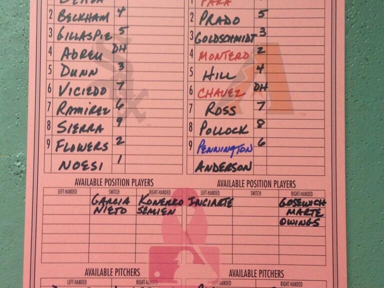
I can’t tell which team filled out that Sox/D-backs lineup sheet, (I don’t know if the home team’s staff fills them all out, or if the visitors fill out the one in the visitors’ dugout, nor can I tell where that one was posted) but if it was Arizona, they should be somewhat embarrassed for misspelling Tuffy Gosewisch’s last name.
No, wait, now I’m sure it was someone from Chicago: they misspelled Gerardo Parra’s last name, too.
Wonder how many Borscht Belt wives Wilt banged that summer? He didn’t get to 20,000 conquests overnight.
Not sure BFBS (or GFGS) really apply, as concepts, to European soccer. Away, or “change” kits, aren’t expected to be in team colors. In fact that’s the whole point, they’re to be worn when the regular colors are too similar to the home team’s. So change kits can be, and are, any random color.
Whatever “random color” is selling well, that is.
Not that I mind it – teams can jump on whatever hot merchandising bandwagon they like and still keep their traditional colors for decades and decades. If we are to have merchandising, might as well find ways to keep it from taking over entirely.
European teams don’t really “jump on whatever hot merchandising bandwagon” that may/not exist.
If that were the case, then every single team would go with black (maybe?). The teams just go with whatever, there really is no clear designation that any bandwagon exists in European change kit design.
Well, teams won’t change their regular colors (for the most part) or the supporters will go nuts, but they definitely chase trends when it comes to change kits.
Sometimes, bright colors are in, sometimes black is in.
Indeed. Some teams have traditional sets of change colours they cycle between. Celtic go between yellow-and-green and black for aways usually. In England, yellow is probably a rough analogue for baseball’s grey – Arsenal, Liverpool, Everton and Spurs would traditionally use yellow, and always bring it back every few years.
Think the main thing with football is that change kits are explicitly meant to contrast the homes, compared with many other sports
But Newcastle wearing gray in that particular match was GFGS – there’s no contrast problem between zebra stripes and red.
re: Lebron and the Manziel jersey.
i know this is from a few days ago but the Heat confirmed it was the jersey that Manziel was handed the night of the draft, not just some customer job.
The “True New Yorkers” thing is embarrassing. Loudly proclaiming something like that is tantamount to admitting you don’t believe it’s true.
The New York Cosmos have been pulling a similar stunt lately as we draw closer to an actual MLS club in New York City. They’ve been running with the slogan link, presumably to contrast with the largely Manchester-owned NYCFC.
Is it really any worse than a team calling themselves the Texans?
There’s a certain irony to a team claiming to be “born and raised” in New York but headed by an Irish CEO and Middle Eastern investors who bought the trademark from a team that became famous by throwing money at foreign superstars.
No, that’s exactly what makes the team the truest representation of New York. “I don’t need to go travelling, man / Open my door and the world walks in / Living in a city of immigrants.”
Michael Sam has the second highest selling jersey for rookies, second only to Manziel.
link
Putting the “Final Jeter season” logo on the bases bothers me. I feel like the bases, being a crucial piece of equipment, shouldn’t have anything identifying any particular player. Maybe I’m wrong on that.
I agree.
But it’s all so they can sell the bases later and say they were used in such-and-such game.
Who the hell buys a base, I have no idea…
If it doesn’t make sense, it must make dollars.
Who the hell buys a base, I have no idea…
The same people that buy game worn jerseys, autographed equipment, or seats from soon-to-be-demolished stadiums.
Ok, why is every post I make getting moderated today? Can’t you adjust that filter to ignore my IP or something? We all know I’m mostly not a troll.
Hey, at least I can sit on the County Stadium seats on my deck. What am I going to do with a single base, pretend I’m Rickey Henderson?
How about pretending you’re Phillip Wellman? but I guess you need two bases link.
Just flat out lazy move by the Texans on the Clowney draft jersey lettering. They used an upside down M for the W. You’ve had how long to prepare that nameplate????
link
How it should be….
link
should have read the entire blog before posting! ha
Still lazy!
Why does AJ’s catcher’s gear look like it is in Mets colors?
link
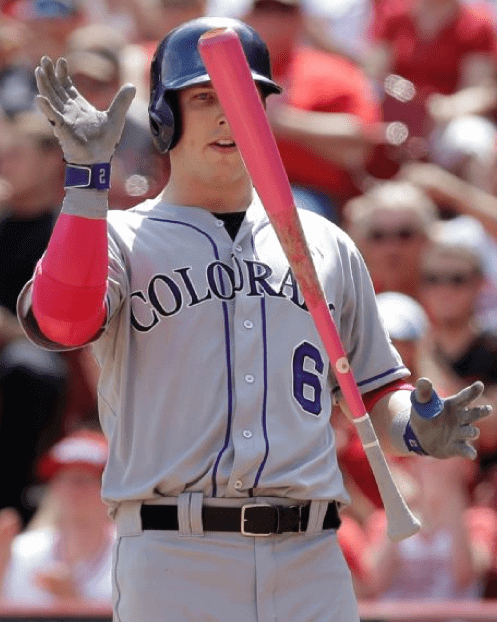
In the Pinkwashing photos, looks like Corey Dickerson was wearing Troy Tulowitzki’s batting gloves. Jersey says 6, gloves say 2.
US Air planes have a sticker as one enters the cabin that honors (or probably more correctly protects the copyrights) to America West, PSA, Allegheny and Piedmont, which have all been merged into US Air.
link
Great point about the protection of trademarks (not copyrights ;) ). I (willingly) read a lot of drivel on various websites wondering why Team X keeps using outdated logos, wordmarks, etc. Merchandising is an easy answer, but it’s combined with trademark protection more than anyone realizes.
The Indians’ pitchers have bowling uniforms
I might have known John Axford would be involved. I miss that guy.
America West actually purchased US Airways out of bankruptcy—the same way the new US Airways purchased American Airlines… In both cases, the corporate name of the Company being purchased was better in the public perception than the airline doing the buying (America Worst and US Scareways being nicknames of the old companies) so the newly formed company took the name of the airline that was brought…
That reminds me of how the brand we know as AT&T Mobility came to be. It was Cingular Wireless, a BellSouth subsidiary, which acquired AT&T Wireless, until it was bought by SBC/AT&T, which was formed when Southwestern Bell acquired the original AT&T.
I’m old enough to remember when USAir was Allegheny Airlines, and everybody called it “Agony Air”.
“It doesn’t even make any sense, because most of the Mets’ fan base lives in the suburbs.”
Ok, granted I live in Denver, CO and may not understand the dynamic at play here, but, if you live in New York State but not in New York City, do you cease being a New Yorker??
Well, I live here and I get exactly what Paul’s saying, but it might not have been phrased exactly as it was.
As you’re likely aware, NYC is actually 5 boroughs (or Counties, if you will) comprising the entire city (Bronx, Manhattan, Staten Island, Brooklyn and Queens), or more appropriately, Bronx County, New York County (Manhattan), Richmond County (Staten Island), Kings County (Brooklyn) and Queens County. Long Island, where a good portion of the fan base is technically Nassau & Suffolk Counties, but the entire Island encompasses Brooklyn, Queens, Nassau & Suffolk.
The suburbs technically are Nassau and Suffolk (although many would argue Queens and even some sections of Brooklyn might fit this category as well). And those are where the majority of the Mets’ fan base is located. Not everyone, mind you, but most.
The Mets are saying “True New Yorkers” as a dig at fans of the Yankees more so than meaning one specific geographic area, but that’s complete bullshit. Not that there aren’t “true” New Yorkers who are Mets fans (likely a dig at bandwagoners or casual, rather than hardcore, fans), but it’s just another stupid, failed marketing ploy by the Wilpons. Saying “True New Yorkers” — at least to me — is just a feeble attempt to tweak Yankees fans rather than to make a geographic statement (at least to me) — but they don’t even get that right, because “True New Yorkers” would more appropriately mean those from NYC (and probably those who have been here at least a generation) — and those fans are probably mostly (or more) Yankees-leaning than Mets fans. So they fail on several levels; geographically and metaphorically.
This probably doesn’t make anything any clearer to you. It’s not as easy to explain as you’d think. Just know the Mets are fuckups at pretty much everything they do (and I’m a long-suffering Mets fan).
“link…”
Y’all are overthinking this. In reality, the Mets have just taken a link and created a whole brand identity around it. Genius!
They are also taking a risk of hacking off their remaining fans from Jersey and, presumably, Connecticut.
Not really though. Fans in Jersey and Long Island and New Haven and White Plains accept that they’re latching onto the Team’s New York-iness. After all, they aren’t called the “Tri-State Mets”, and for a good reason. There’s tacit understanding that their hometown ain’t shit without NYC.
You don’t go BFBS or GFGS in football (soccer). Those are West Ham’s 3rd shirts. They’ve had them all year, just haven’t worn them. In case you didn’t know, football shirts aren’t about the team’s “colors,” like in American sports, but need to be contrasting from the teams you’ll play.
Why would you comment without reading the other comments first or looking at Liverpool and Newcastle’s colors?
Are the white-brimmed Yankees caps a regular thing?
I believe they are wearing these for cancer research awareness.
Ugh… alt caps with the greys? Seriously?
Must wash eyes…. must wash eyes….
New York D-League team will show there new uniform and logo on Wednesday @6pm
Interesting choice by adidas for their “Battle Pack” collection which seem to be current shoes/cleats with the new print.
link