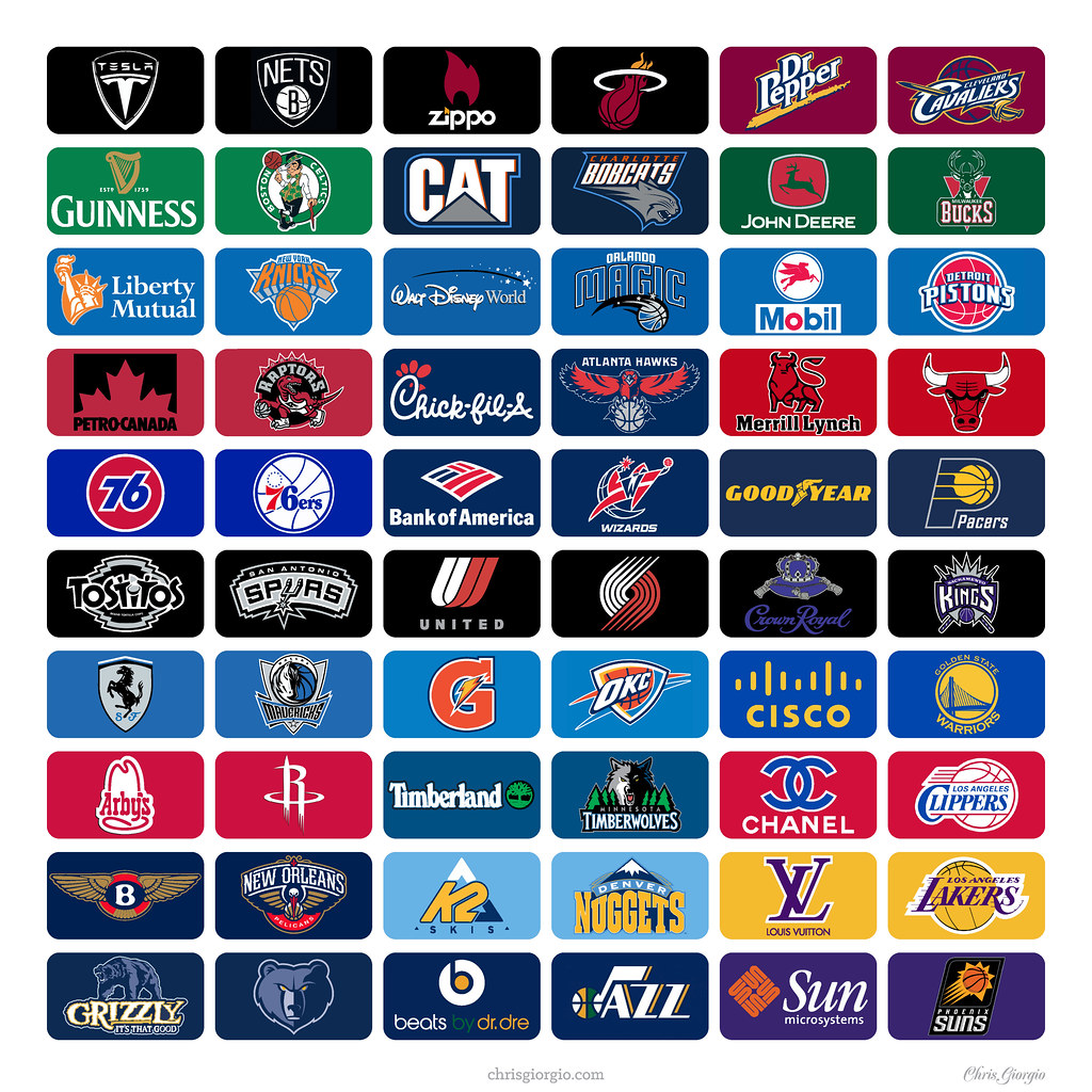
Got a note the other day from reader Chris Giorgio, who’s been pondering the much-discussed possibility of corporate advertising patches on NBA uniforms:
Since the dreaded seems inevitable, at least according to Adam Silver, I got to thinking about which logos and corporations would best fit each team while causing the least aesthetic minimal disruption to the uniforms. Then I chose a potential advertiser for each team.
I based the pairings on several factors, including logo similarities (Bucks/John Deere), team/company commonalities (Pacers/Goodyear), and locality (Warriors/Cisco) and other factors. Here’s what I came up with [click to enlarge]:
.
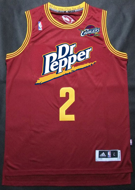
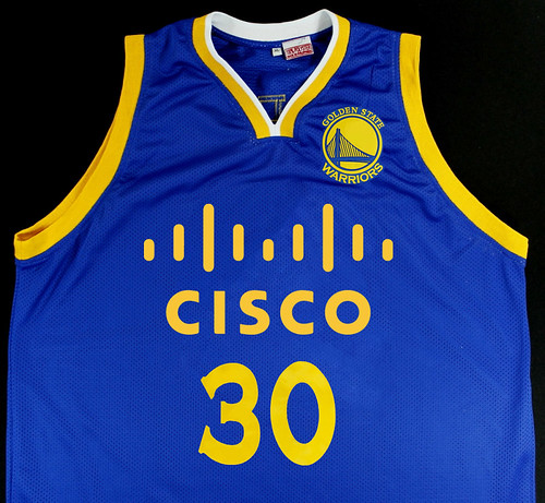
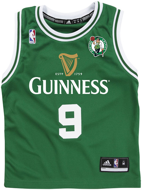
Then I wondered what it might look like if the ads evolved from small patches to full-blown chest ads, like on soccer jerseys, so I did a few mock-ups of those:
Good stuff, Chris. I’ll be frank: I was (and to a certain extent still am) uneasy about posting this material, because on some level it serves to normalize and therefore legitimize the notion of NBA uniform ads. Many of Chris’s ad pairings are so smart, so clever, that it’s easy to forget that the whole notion of uniform ads is something to be reviled, not admired.
I ultimately decided that his work deserved to be showcased, but let’s not lose sight of the big picture: Uniform advertising is unacceptable. #NoUniAds
ESPN reminder: In case you missed it yesterday afternoon, I followed up on the story about the Clippers’ inside-out warm-up tops by whipping up an ESPN piece on other examples of team-wide uniform protests (including last year’s Towson baseball insignia cover-up, shown at right). Most of the examples in that piece came from reader comments that were posted yesterday morning — thanks so much, people. Couldn’t have done this one without you.
One additional team-wide uni protest example came in too late for that column: Reader Darrel Marusek points out that the 1991 Wisconsin baseball team responded to the news of the baseball program’s elimination by wearing black caps, stirrups, cleats, and undershirts.
Tom Shieber, eager to help, did a bit of extra research and came up with some additional uni-related protests that don’t quite fit into the same category because they weren’t team-wide protests, but they’re still interesting. So:
• After the NCAA put Yale’s track team on probation in 1970, a Harvard track and field competitor protested by wearing a Yale shirt while accepting an award at a track meet.
• After Texas Rangers fans protested the team’s poor play by wearing bags over their heads in 1982, some of the Rangers’ players responded by donning bags of their own.
• When the NFL told Seahawks linebacker Brian Bosworth that he had to change his uni number from 44 (which he’d worn in the preseason) to 55, he protested by painting “44” on his cleats.
• When Cavaliers guard Jeff McInnis was benched in 2005, teammate Robert Traylor wore McInnis’s armband in protest.
• When the Bengals cut center Dave Rimington during the 1988 exhibition season, teammate Boomer Esiason protested by wearing Rimington’s number for one day.
Collector’s Corner
By Brinke Guthrie
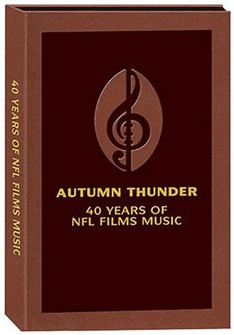
“Autumn Thundah.” You can practically hear John Facenda’s velvety voice providing the narration for a crisp autumn contest between the vaunted offense of John Constantine Unitas and the Coastal Division’s Baltimore Colts, against Ray Nitschke and the tough Packah defence from the Central Division, at Lammm-beau Field. And now that I’ve properly set the vibe, buy this 10-CD set right here. (If you’re truly old-school, here’s the five-LP vinyl set.
Now on to the rest of today’s eBay finds:
• Does anybody really know what time it is? If you’re an A’s fan, you’ll know the time with this vintage 1970s Swingin’ A’s alarm clock. Great detail on this, right down to the Riddell shoes on the logo.
• Look at the artwork on this 1950s 49ers/Little Miss Sunbeam bread display wrapper. (It’s wrapped around foam in that photo, not an ancient loaf of bread.)
• This one takes me back — the practice uniform of former ABA/Kentucky Colonel Cincy Powell. And here’s a signed Colonels 1975 championship anniversary ball. Gotta admit, that KC logo is still great after all these years.
• Here’s a nice vintage Dolphins NFL Helmet Lamp. Do the colors look a bit off, or did they used to have blue rather than turquoise?
• Big lot of 1970s MLB stickers here, but hurry, this listing expires tonight!
• Nice cover art on this American Football Coaches All-American Game program. Redundant, no?
• The gold stripe is rather prominent on this 1970s Falcons bottle opener.
• Got nothin’ but love for the cool graphics on this 1967 SI cover featuring the LA Rams.
Seen something on eBay or Etsy that you think would make good Collector’s Corner fodder? Send your submissions here.
Tick-Tock: Today’s Ticker was compiled and written by Garrett McGrath.

Baseball News: Reader Tony Burke found this 1948 photograph of the Yankee Clipper wearing “gloves to protect his hands during batting practice.” … The Minnesota Twins unveiled the 2014 American League All-Star batting practice jerseys at an All-Star Game press conference yesterday (thanks, Phil). … According to News 12 NJ, Washington Capitals Nationals outfielder Bryce Harper is on DL (from Adam Treiber).

NFL News: New Era has shared some of the NFL Draft hats that the future hopefuls will be wearing when they are on stage at Radio City Music Hall (thanks, Paul). … While watching the NFL network, Jared Buccola noticed the Jaguars wearing new helmets and practice tops with old game pants. … From yesterday’s comments: it seems that New York Jet Michael Vick will wear No. 8 this year, according to a post on his Instagram. The choice is reported to be a tribute to Steve Young.

College Football News: Yesterday, Paul asked what was on the back of Rutgers QB Gary Nova’s helmet. Robert Daniel Lim pointed out that its a part of the Schutt Vision system (the section specifically protects the camera’s electronics). … The pioneer of the football helmet sun-visor, David Langer, passed away last weekend. Hunter Towns sent in pictures including a close up of his helmet with some nice period details.

Soccer News: Nike released the home and away kits for Slovenia to be worn by all of the national teams during the 2014-2015 season of international play (thanks, Phil).

NBA News: CarMax, State Farm, Virgin America, Kia, and Red Bull were in the first group of sponsors to pull their support from the Los Angeles Clippers yesterday, following the controversy surrounding the team and its owner Donald Sterling (thanks, Paul). … Reader Joseph Hiley points out that the Pacers/Hawks series has not yet had the same uniform match-up twice. Game 1 was Pacers in yellow versus Hawks in blue; Game 2, white versus blue; Game 3, blue versus white; Game 4, yellow versus white; and Game 5, white versus red. ”¦ The Heat showed solidarity with the Clippers last night by wearing their warm-up tops inside-out prior to their game against the Bobcats.

Grab Bag: “Over the weekend, the University of Kentucky opened a time capsule that was buried on campus in 1956,” says Josh Claywell. On the left is a copy of the Herald Leader with a Wildcat logo and on the right is a picture of two students in cool university sweaters. Here is the story behind how the national flag of South Africa was designed–in one week (from Tom Mulgrew). … Last weekend, MetLife Stadium in New Jersey hosted a Supercross event. A.J. Cantanzaro wore a New York Giants and Jets split personality helmet while James Stewart’s lid had an NYC subway map detail (from Sean Clancy). … A look at the market leaders in sport footwear and apparel (from Tommy Turner). … Star Wars has spread across the galaxy — or at least from baseball to lacrosse. … Ronald McDonald — not the one from the Taco Bell commercials — has received a makeover (thanks, Brinke).
Click to enlarge

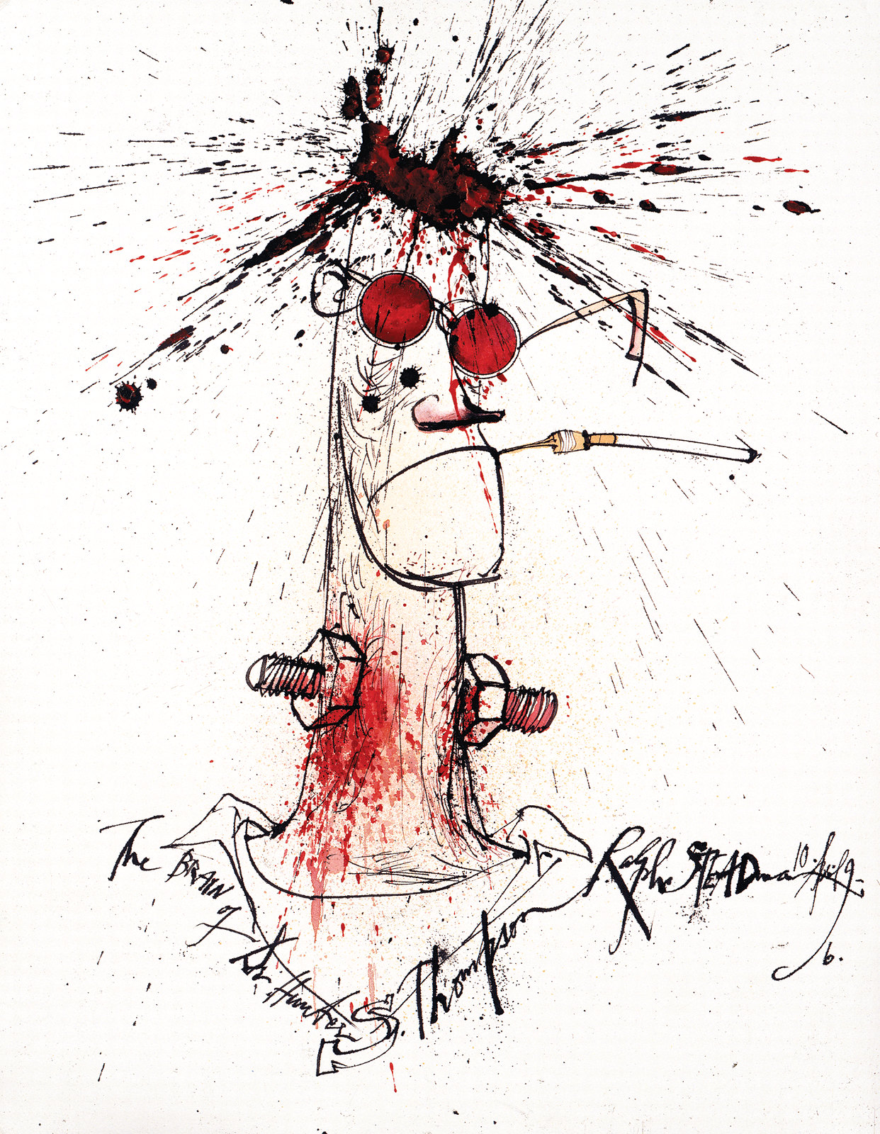
What Paul did last night: I’ve long been a huge fan of the satirical British cartoonist Ralph Steadman, who’s best known for his illustrations accompanying the work of gonzo journalist Hunter S. Thompson. Now there’s a new documentary about Steadman, called For No Good Reason, and last night my friend Jon and I went to see it.
Steadman was (and still is) part of a generation of satirical illustrators and caricaturists, but his work has always been darker than that of his contemporaries. His characters look diseased and psychotic, and his narrative points aren’t exactly subtle. As is so often the case, he turns out to be nothing like his work — a soft-spoken gentleman, a peach, a pussycat.
The film has its weaknesses, but it’s totally worth dealing with them just to see Steadman at work. His technique all splatter and stipple, but the result is some seriously powerful art. Definitely worth seeing. Here’s the trailer:
Oh, man, I bought a bunch of tracks from that NFL films set when it was first available on iTunes for cheap circa 2004. I think only a handful of albums are available now, not the whole box set. Great stuff – that and the soundtrack to Victory at Sea ought to be concert-hall staples of American symphonies.
“Selections from Autumn Thunder” would have been better if it had the full 75 Seasons Suite instead of just the last three minutes of it…
The Bank of America / Wizards thing hits way too close to home. BoA sponsors everything here in DC, so I’d give good odds that when the NBA goes to jersey ads, BoA will be on the Washington uniforms.
Isn’t Capital One more ubiquitous in DC (plus, the colors probably match the Wizards a little better)?
BoA is more of a Charlotte institution, while CapOne is everywhere in Verizon Center.
Good point – I think CapOne and PNC actually do more local sports sponsorships. BoA is sort of more generally ubiquitously present, it seems to me, though this may be a dated impression from back just before and during the Great Recession, when BoA had a number of legislative and regulatory issues before the feds and flooded the area with ads.
I think BoA is just ubiquitous nationally, while CapOne and PNC are more Mid-Atlantic/Northeast specific.
The really weird thing about Verizon Center is how prominent Comcast branding is, considering the two are direct competitors.
Since Dan Gilbert owns both Quicken Loans and the Cavs, chances are that they will appear on Cleveland’s uniforms. Also, one of the Big Three automakers should be on the Pistons uniforms, and the Bucks should have Harley-Davison.
I know BoA is Charlotte based but I thought their logo resembled the weird Wizards segmented logo.
Jerry — it wasn’t supposed to be that direct of a connection. More of an aesthetic thing. Quicken Loans logo doesn’t look like the Cavs logo.
Makes sense, thanks Chris. Though there’s a link.
Nice South African flag story! It is my absolute favorite national flag. All the different colors coming together and improbably working with each other, and a radical departure from the ugly apartheid days. Plus, the nuclear peace sign line was golden.
Far from my favorite flag, aesthetically, but probably the best and most successful new national flag in my lifetime. (Maybe equaled by St. Vincent and Nunavut.) Great to get details behind it – I remember what a big deal it was at the time when, just before the elections, South Africa suddenly had a new flag. It was kind of important too that it was adopted by the outgoing apartheid government, rather than waiting for the soon-to-be-elected ANC government.
Uh, Canada? Or are you younger than the maple leaf flag, whippersnapper?
The Maple Leaf Flag was adopted in, what, 1965? The first new flag of my lifetime is Grenada, adopted when I was a wee toddler.
Yes. 1965 for the Maple Leaf. There were lots of great flags that debuted in the sixties: Barbados, Kenya, St. Lucia and Tanzania partciularly.
I love when a good vexillology conversation breaks out on Uni Watch
The ads are well done, but I’m assuming they won’t blend in as well as the concepts show here.
arrscott – I might be okay with BoA sponsoring the local 9’s radio broadcast to get rid of the incumbent’s awful jingle.
does the NFL Films collection have stuff from the XIII film? I’ve never been able to find most of those except the first piece and War Footing (accompanies Dallas comeback attempt). XIII was probably the best NFL films ever did too, though X is close.
While the work that Chris did finding appropriate sponsors was good, there’s no way any of those companies would change their color schemes to match those of the NBA team. Most big corporations have very strict brand standards, so for example, you’ll never see the John Deere logo rendered in red (if the company has anything to say about it)…which would make many of these pairings not work quite as well.
Not only won’t sponsors want to change color schemes, but the “appropriateness” that Chris put so much thought into won’t be an issue. It will be all about the highest bidder. Period. Most likely, it will be a national (or international) brand whose only affiliation with the team and/or city is buying the space, which is another reason why uni ads are such a terrible idea.
I think, perhaps, you guys are overthinking this. I think we all understand that Chris’ work was mostly a creative/fun endeavor and not a highly researched effort at predicting what the actual sponsorship arrangements would be.
Pretty much.
Major League Soccer’s shirt sponsorship minimum is $500,000 a season. But nevermind that, Volkswagen paid $2.8 million a year between 2008 and 2012 (though they negotiated down to a lower figure for 2013 before making way to a defense contractor).
I have to imagine the floor for NBA jersey sponsorship to be way, way, way, way higher than that, like 8 figures a year. That’s going to rule pretty much all but the top half of Fortune 500, so it’s going to be hard for most markets to find “appropriate” sponsors.
With one of the issues supposedly holding the ads back being how to split the money among the league and maintain the illusion of something resembling parity, I’m wondering if it isn’t more realistic to expect a few league-wide sponsors that everyone wears. Like, Bud Light is the official beer of the NBA so each team has a jersey with a Bud Light patch for a few games, then McDonalds is the official fast food of the NBA so everyone does that for a few games, etc.
Big CK hit the nail on the head. It’s just for fun. I wholly recognize that Grizzly chewing tobacco wouldn’t sponsor the Memphis Grizzlies.
I loves Zippo being the ad for the Heat in Chris’ designs. Very clever.
Nice work on the fake ads.
Chick-fil-a for Atlanta. Gross. Who ordered the hawk tenders?
Can’t say I wouldn’t try a hawk tender with special sauce!
That red blazer on Ronald McDonald looks like something that Captain Kangaroo donated to the Salvation Army Thrift Shop. Trust me Ronald, it’s not you.
Here to point out the United logo no longer exists (and hasn’t for over 2 years now) as they took the Continental Airlines logo in the merger
Good point. The Blazers was actually one of the hardest to think of a logo to relate to because their own logo is so unique.
You were on the right track with United. You just forgot to add the link.
United no longer uses he Trailblazer-esque. They appropriated the link after the merger.
Here’s a call out to the many talented photoshop/colorize people that frequent this site. I am doing some brainstorming work for our local high school concerning a logo (M) initial and have found some examples and need help just changing the colors. I assume that this is a very easy fix for anyone with photoshop skills. If you could help me out please email at link. Thanks!
Has anyone yet pointed out that there is an American approach to this that has its roots in the early days o the NBA? If we’re truly heading toward a new era of uni sponsorship, may it be more like the Ft. Wayne Zollner Pistons: link
Don’t forget the link
Have to admit, I never made the connection that “Cisco” is short for “San Francisco” nor that the lines are shaped like the Golden Gate Bridge.
Doh! Me neither.
Lived here for years and I never knew that.
i have that box set of CD’s…. awesome…. i listen whenever i do my football paintings :)
Though I understand your reservations about providing grease for the slippery slope of ads on uniforms, I admit to being curious about the way they’d be integrated into the design. It speaks to the time in junior high school when I doodled a football helmet in the margins of my notebook with a KISS logo on it– funny how that turned out, didn’t it?
Just saw this through a friend and thought it was Uni-Watch worthy. The Hockey News posted this yesterday – it re-imagines every NHL team logo as a Game of Thrones style banner. link
The NBA advertising bit was very very very witty! Almost all of these are eerily seamless!
Thanks David! Some were harder to come up with than others, but overall I’m happy with the results.
I thought the American League All-Star BP jersey was unveiled a few days ago. I remember seeing something here last week.
Apropos of nothing, folks who don’t read Uni Watch on weekends missed out on this link. We need more uni-matching dye jobs.
The beard is gone. Long live the beard.
link
The Angels wore red belts & shoes with their home whites last night; they had previously only worn them with their red alts: link
“… Nike released the home and away kits for Slovenia to be worn by all of the national teams during the 2014-2015 season of international play (thanks, Phil)…”
My bias in favor of green-and-blue prompts a basic thumbs-up for the Slovenes’ national uni look — not just in soccer, but in other national team sports as well, including the Olympic delegation. And the mountain imagery (which reminds me of the patients’ medical charts hung on the front of hospital beds in old cartoons) is certainly distinctive. The idea that Slovenia’s mountains are “famous” is pretty funny, though.
The idea that Slovenia’s mountains are “famous” is pretty funny, though
We’re still talking about Tina Maze’s features, right?
Anyway, the new shirts are an improvement over the link from 4 years ago, I think.
Having watched Wigan play in Slovenia just a few months ago I would have to say that Slovenia’s mountains are really nice looking, if not actually famous.
What? Those Charlie Brown jerseys were fantastic!
And I think you sort of have to add, for Slovenia to any discussion of “famous” Slovenian things. To the extent that Slovenia is famous for anything, aside from being a country that people outside of Slovenia are routinely surprised to learn exists, the mountains probably top the list. Though possibly only because of people asking why their soccer shirts have jagged lines.
Slovenia: famous for the mountains and for Elan skis.
Also for being famously testy when called Yugoslavian
I don’t get the Tostitos connection to San Antonio – oh, ouch… fiesta???
How appropriate to have Chanel for a Clippers sponsor, as Coco Chanel was a Nazi sympathizer. I’m sure Donald Sterling would be kicking himself for not thinking of that one.
The Raptors wouldn’t be Petro Canada because they aren’t big enough. They haven’t devoured the “qwik-e-mart” stores in Canada.
I love going to Wawa and similar rest stops across the border… so much to buy…
Rogers would end up on the jersey… or Pizza Pizza (orange/white/black) with a Drake owl… I called it here from Toronto…
Drake’s link makes sense, since he’s basically the public face of Maple Leaf Sports & Entertainment, and owls are raptors, kind of.
Either that or Tim Hortons.
I would have gone with Air Canada – the colours are close enough (and the same as Petro-Canada’s) and they’re already the arena sponsor.
Petro-Canada ceased to exist as a corporation a few years ago (they’re now part of Suncor) though the gas station brand survives.
Look at this, now: Vick might not wear #8 after all.
Link fixed:
link
I’m sure when Young heard #8 was in his honor, he said “Bro. No, bro.”
Lee
Just as long as he doesn’t pick #9. Or anyone other number that is in the word “canine”.
If anyone wants a nice big selection of NFL Films music, LMK: I can put some in a Dropbox.
It’s 450 megabytes, that’s a bit big for most of us…
450MB is big? Crap, is it 1998 again? That doesn’t even fill a CD-R, and no one uses those for storage any more either.
well, I have a rather large OneDrive account, like 143GB or something, so I can put em in there.
Sure, 450 MB is a whole mess of floppies, but you can fit the whole collection on just five Zip Drive disks.
Guinness for the Celtics? That might not go well with people who prefer Samuel Adams.
Well, at least it link.
State Farm pulled? Isnt Chris Paul the main spokesman? When’s his LAC contract up. I guarantee you he’s leaving
From the article: “Sponsorships of individual players might continue”. So Paul would still appear in the ads, he just wouldn’t wear Clipper gear. Ditto Blake and Kia/RedBull/etc.
Of course, as of 5 minutes ago, this all became more or less moot…
Chris Giorgio’s work begs the question: What would be the worst / most inappropriate / silliest corporate logo for each NBA team?
At just about the time that the NBA introduces jersey ads, the Clippers will likely be in the midst of a major rebranding effort to restore their image. So, the Miami Heat, sponsored by the LA Clippers.
That, or the Washington Wizards wearing link, would be my choice for worst possible sponsorships.
Paul, thank you very much for posting the Steadman documentary trailer. I’d heard of the film recently but didn’t realize it was out.
And if any readers are even remotely curious about the Thompson/Steadman, um, chemistry, kill a few minutes and read link (posted last year by Grantland — and timely!). Still one of the funniest sports reporting pieces I’ve ever read.
Gotta keep that stereotype that all Irish people are drunks alive…
“I just turned 33 years old and immediately thought, ‘I’m turning Larry Bird.’ Does anyone else thinks of numbers as uniform numbers?”
I didn’t get a chance to comment on this yesterday. My cousin and I have been doing this for about 5 years now since I heard a sports radio show doing it. I thought it was Dan Patrick that did it but Wikipedia (I know, I know) says his callers start by announcing their hieght and weight. Maybe it was another show.
Right now I’m Rasheed Wallace (with the Hawks) and a few months away from being Casey Stengel.
Really don’t see why everyone is making a fuss over basketball shirt sponsors. It works fine for football (soccer), so why can’t it work for basketball?
As a guy who owns more caps than I can count,those NFL draft caps are horrid.Sometimes I wonder if New Era has bring your kids to work day and then lets em just take over
Paul, once the F’NBA realizes how much money they can make, they’ll slather so many ads on their jerseys, they’ll start to resemble Mexican soccer jerseys.
And I’ve got a hashtag for it as well: #Inevitable
Chris’s Sponsor/Team combos are so well done, I fear as if he’s stumbled onto the NBA’s plan for 2028 or something.
are usually known
cheap jersey link
Chanel? But there is a much more obvious sponsor for the Clippers: link