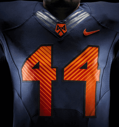
“Custom numbers appear taller and more narrow, mimicking the height of New York City’s skyline. The numbers also feature a unique 44-degree linear ‘V’ pattern. This pattern is mirrored on the uniform pant lines and shoulder panels for unified positioning of the Orange as New York’s College Team.”
That’s the explanation, courtesy of the friendly fabulists in Nike’s marketing department, for the numbers you see at right, which appear on the new Syracuse football uniforms. You can see the full press release on the new uni set here, and there are tons of photos and mock-ups here and here.
The numbers and the explanation for them reflect two of Nike’s core tropes: (1) Every team must have its own custom number font, and (2) every uniform element must have an underlying “story.” The numerals that supposedly evoke the NYC skyline (trust me: they don’t), the obsession with “44” (because of Ernie Davis) — it’s the kind of mythmaking that makes people go oooh and ahhh at an unveiling (or at least makes them stop saying, “What the fuck is the deal with those weird numbers?”), but nobody remembers that stuff once the ball is snapped, at which point you’re just wearing a weird-looking number design. I suppose if some kid gets out a protractor and checks to see if the diagonal lines on the numerals of his Syracuse jersey are really angled at 44 degrees, then Nike will have succeeded in advancing the cause of youth mathematics, so at least there’s that. Otherwise, the whole thing is embarrassing.
Once you get past all the storytelling bullshit, it’s your standard college football set — three helmets and three mix-and-match jersey/pant combinations, including a really ugly GFGS (click to enlarge):
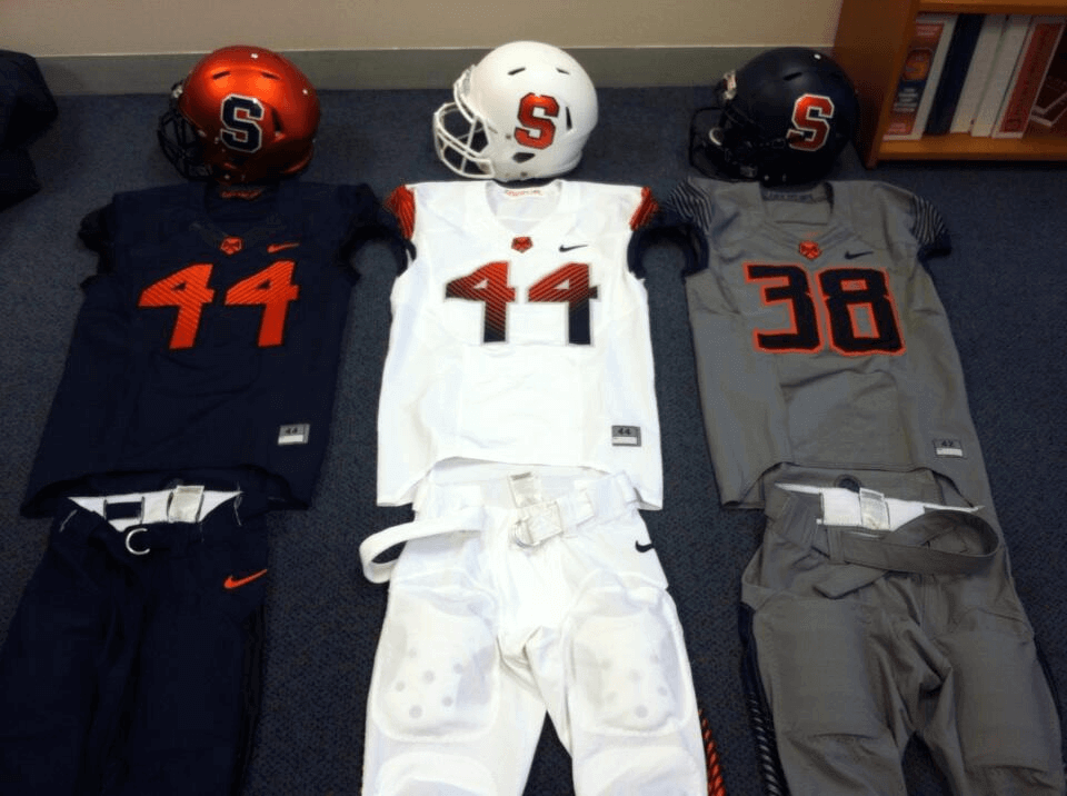
Not sure how or if they’re gonna get away with the gradation on the white jerseys numerals, which seems to violate the NCAA’s current regulations, but why let the rulebook get in the way of a good unveiling?
I do like the orange cap sleeves on the white jersey (especially with those orange undersleeves, although most players probably won’t be wearing that). In fact, the white jersey will probably look decent with all of the pant options. I’m less fond of the blue and gray jersey options.
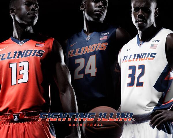
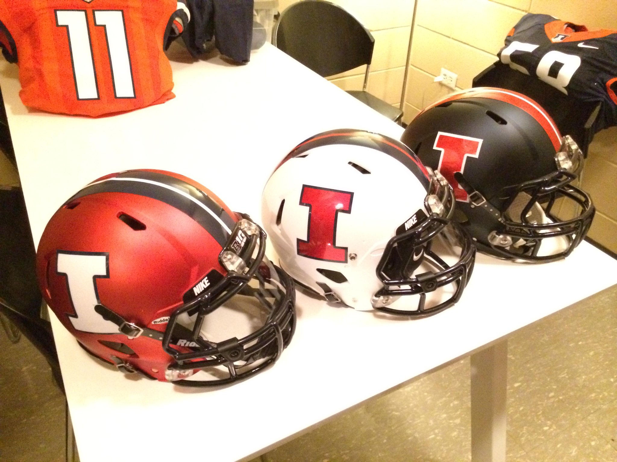
Meanwhile, another school with a blue/orange color scheme — Illinois — unveiled its new uniforms yesterday, although there was less suspense about that one because the designs had leaked the night before (and were in yesterday’s Ticker). Here are the basketball set, the football set, the football helmets, and a close-up of the football jersey patch, all of which you can click to enlarge:
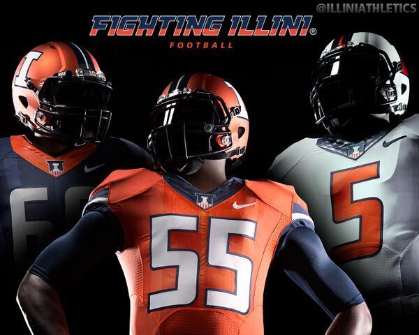

Does Nike have a “story” for jersey patch? Of course it does:
The primary “I” logo is at the center of the badge, encased by two facing F’s that symbolize the fight that Illini embody when they take the field of play. The Victory Badge is grounded by vertical stripes that reference the columns at Memorial Stadium, paying tribute to the original Fighting Illini who gave their lives for their country. The mark ends in a powerful V shape, which stands for victory.
That quote comes from this detailed explainer on the school’s new visual program, which is worth checking out.
ESPN reminder: In case you missed it yesterday, my latest ESPN column is about the new Riddell SpeedFlex helmet, which has a bunch of interesting features. Check it out here.

Mike’s Question of the Week (aka “I Wanna Know”): Each Thursday intern Mike Chamernik comes up with a question for the Uni Watch readership. Here’s his latest:
The other day we saw a Padres redesign concept in the Ticker, and I really liked it. San Diego should totally go back to their brown and yellow logo and uniforms, not just because it’s uniquely Padres.
Brown and yellow isn’t used too much in sports for fairly obviously reasons (use your imagination), but I don’t care. It’s my favorite color scheme in sports, in part because they’re so rare to see together. I might just buy a retro Padres hat and T-shirt for that reason, even though I’m not a fan of the ballclub.
So here’s what I wanna know: What’s your favorite color combination in sports?
Good one, Mike. Post your responses in today’s comments section.
Unmasking the Commenters: I recently invited the site’s commenters to tell us a bit more about themselves and give us a peek at what they look like, just because I thought it would be fun to pull back the internet’s curtain of anonymity. I’ll keep showcasing you folks as long as you keep sending in your photos and quick bios.
Today we’re spotlighting Jamie Dupler, who comments every now and then:
I’m Jamie, 30, from Columbus (Ohio State ’07), and I’m all OSU/Cleveland everything (married Feb. 2012 at the Horseshoe). My favorite jerseys are clean and simple, and I love stripes — especially UCLA stripes. My two top teams are Ohio State football and the Browns, and if the Browns change their unis to a Seahawks or Bucs style I’m going to revolt. I also wish the Buckeyes would go back to the Cooper/early Tressel-era gray stripes instead of this faux throwback Pro Combat crap.
I am diehard Nike and have been since my Reebok pumps blew out every three months in elementary school. I used to be a sneakerhead but now I have a wife and family, so I can’t and won’t spend $150 on retro shoes. My favorite pair of all time is the Jordan III. Unlike another Ohio-based commenter [rhymes with “The Jeff” ”” PL], I love gray facemasks, because all the masks were gray back in the ’60s and ’70s. I hate the leotard look in the NFL and I love the high white socks of college and NFL from the ’70s-’90s. I also love colored visors and arm sleeves.
Hmmm, diehard Nike but hates Pro Combat and the newfangled NFL designs? Sounds like Jamie has some conflicting impulses. But hey, there’s nothing wrong with that. Thanks for chiming in, Jamie — you help make Uni Watch a better place!
Do you want to be featured in “Unmasking the Commenters”? If so, send me a photo and a quick paragraph about yourself. You don’t have to reveal your real name, and the photo doesn’t have to show your face, but you must include a photo to be considered. Send everything this-a-way.

Question Time: It’s been a while — more than 10 months! — since our last installment of Question Time (not to be confused with Mike’s question of the week), so I’m throwing open the floor for questions.
In case you’re new to this (or need a refresher), Question Time works like so: Everyone is invited to ask me one — and only one — question on any topic. It can be uni- or sports-related but doesn’t have to be. Personal questions are fine, although I reserve the right not to answer ones that I think are too personal. Send your queries here, and I’ll do my best to answer as many of them as possible in an upcoming blog post.
Tick-Tock: Today’s Ticker was compiled and written by Mike Chamernik.

Baseball News: The Cubs will hold a 100th birthday celebration for Wrigley Field during their April 23 game against the Diamondbacks. We already knew the Cubs would be wearing Federal League throwbacks for that game, and now it turns out that the D-Backs will as well (from Dave Flapan and Phil). ”¦ The Cubs decorated one of their tunnels with a collage based on their 1965 scorecard cover (from Marc-Louis Paprzyca). ”¦ A Giants fan walked around the stadium in full catcher’s gear Tuesday night. ”¦ Check out this Twitter feed that shares pictures of empty seats at sporting events. ”¦ Paul has featured Left Field Cards on both this site and ESPN, so here’s an interview with the artist behind LFC, Amelie Mancini, and a look into her studio (from Pete Woychick). ”¦ The Cubs and Yankees wore Jackie Robinson Day jerseys for the scheduled night game during yesterday’s doubleheader, not for the afternoon make-up game. ”¦ The George Springer era in Houston is off to a great start! (Thanks, Kenny Ocker and Phil.) ”¦ “These trash bins are placed all around Camden yards,” says Jerry Bruno. “Pretty neat how the helmet serves as a type of lid.” ”¦ A reader and Padres fan named Darick is wondering what’s up with Andrew Cashner’s undershirt. “It looks like camo, which would make sense due to our Sunday alternates, but it also looks like it has lime green sleeves,” he says. ”¦ Yesterday a few hundred people went to New Jersey’s Hinchliffe Stadium, a former Negro League ballpark, for an unveiling of a bronze plaque to commemorate it as a national landmark (from Dave Rakowski). ”¦ The Sugar Land Skeeters send out their season tickets in a home plate-shaped box (from Cort McMurray). ”¦ Journeyman reliever Chris Resop has an interesting behavioral tic: He grabs his crotch after every pitch.

NFL News: Russell Athletic had to put its logo on the 1994 Browns jerseys somewhere (from Alan Borock). ”¦ Caleb Borchers found a landscaping service that uses the Eagles’ old logo. ”¦ The Niners’ new stadium will have some state-of-the-art grass (from Don Silsby). ”¦ Might these be the new Browns unis for 2015? Or is it just another fan design? (From Edward Hahn). ”¦ If Donald Trump buys the Bills, a new logo may be coming (from Robert Silverman). ”¦ ESPN’s SportsNation used a really, really bad Photoshop of Mike Vick in a tweet (from Jared VanderWeele). ”¦ The Lombardi-era Packers got creative with padding in practice (from Gene Sanny).

College Football News: A Hurricanes player wore a helmet camera during this year’s spring game so we can see what it’s like to be a middle linebacker.

Hockey News: Tuukka Rask got a girl with cancer her own Bruins goalie mask, modeled after his own mask (from Matt Bessette). ”¦ As promised earlier this week, Rob Ullman has weighed in with his annual Stanley Cup pin-up picks. ”¦ Whoa! Who’s that wearing Bruins goalie gear? Why, it’s Yogi Berra (cool stuff, Garrett). ”¦ Here’s a cool video on how crews change center ice logos at Rexall Place (from Carla Cadger).

NBA News: Forget NBA logo socks. Pick up some socks with NBA players’ photos on them (from Brad Iverson-Long). ”¦ Timely, I know, but here’s a pretty harsh review of the Wizards’ original logo. ”¦ New Bucks owner Wesley Edens wore a lapel pin of the Bucks’ old logo during his introductory press conference yesterday (from Nick Haering). ”¦ The Raptors posted a teaser video with a brief shot of a husky dog at the end. Is a rebranding on the horizon? The team did wear Huskies throwbacks a few years ago (from Phil). ”¦ This isn’t confirmed yet, but some commentary toward the end of this video clip suggests that the Celtics may wear gray alternate unis next year (from Phil).

College Hoops News: “Cal hired former Tennessee basketball coach Cuonzo Martin on Tuesday,” says John Furstenthal. “At the press conference, they had a basketball uni with number 20, and you can read ”˜Johnson’ backwards on the NOB stitches. There’s no number 20 on the roster and no recruit I could find named ”˜Johnson.’ Where did this jersey come from? And this number makes no sense — he’s the 16th Cal basketball coach, so that’s not it.” Anybody have any theories?

Grab Bag: Check out this Nike annual report from 1981! It contains some great photos of John McEnroe and Dan Fouts (from Kenn Tomasch). ”¦ The sneakerhead scene is a big-money market. ”¦ Arkansas’s new secondary logo looks like the Calgary Flames’ old alternate logo. ”¦ “I watched The Kroll Show the other day,” says Joe Grant, “and I noticed that in one of the skits a football team seems to be wearing the uniforms that the Washington Sentinels were wearing in The Replacements.” ”¦ I was out covering high school softball last evening in suburban Chicago and afterwards I stopped to eat at a burger place called The Sandlot. I found it odd that they used the logo from the film but they didn’t have any Sandlot (or even baseball) décor inside the restaurant. Whatever, the food was good.
Ok, I think it’s really time for the gray thing to die. Every damn team does not need to have gray uniforms now, and that goes for baseball too, dammit.
My response to this: “Yeah, yeah, preach it! Wait… baseball too? Uhh….”
I’m not saying that all baseball gray uniforms should go… but there should certainly be a few teams that wear powder blue, or mono-orange or whatever instead of every damn team having gray pants on the road even when wearing colored jerseys. The Oakland A’s, for example, could totally get by with white or green over white at home and mono yellow or green over yellow on the road.
I’ll definitely vote for a return to light-blue mono road uniforms in the majors, as well as tan mono (loved the Padres’ original road uniforms), navy blue mono (Veeck’s late 1970s Sox road uniforms are an all-time favorite), yellow mono (A’s from the 1960s), etc. I happen to hate softball tops but love a little variation on the gray road uniforms.
I love gray [or grey] uniforms. I understand why some may have issues with it though.
I would push a lot of the blame back on governing athletic bodies on why there is more gray over and over. All of these athletic associations require a “light” and a “dark” uniform. The schools sometimes (or, for the longest time) try to keep to school colors. But, when you insert “light” and “dark” as requirements, that tends to be troublesome…for some reason. Mainly these problems arise with refereeing.
So, schools are forced to be bringing any “light” colors” that may choose — even if it is against their school colors. NFHS is most guilty of this recently, they require all HS soccer teams (maybe all sports?) to wear white tops with white socks. The tops and socks must be fully white — no other colorations unless it’s the maker’s mark, number, school, or last name. That means, no piping or threading can be any other color, OR even sublimations are prohibited.
My high school was navy/gray. We are now forced to wear white. A coaching friend of mine is gold/purple and they are forced to wear white. A local high school was black/red — now forced to wear white. The college I coach at is cardinal/navy — luckily, we do have some gray as an official accent (of course, white too). So, we have gray home kits to wear. I also try to refrain from white because grass stains are miserable to remove from white socks/shorts.
Yep, Ohio State is scarlet and gray. Heck I am wishing Ohio State would simply add the gray sleeves back.
Our friend Todd Radom designed the Buffalo Donalds logo:
link
(While one never knows, it’s hard to believe Trump’s USFL experience wouldn’t scare NFL ownership away from approving him.)
Or his dog-whistle-nonsense political posturing, or his elevation of self-promotion to a level Jerry Jones would find dizzying, or his string of failed businesses…
Alternatively, they could try buying the Buffaslug from the Sabres, since that logo was often compared to Trump’s *ahem* hair.
Love the Illinois football uniforms. I think they are the best of this cycle of uniform updates.
Perhaps that Giants fan was simply expecting to have to throw down at some point, either in the parking lot or stadium. It was a Dodgers/Giants game, after all.
What we learn about Nike and their uniform stories is that it must be easier for Nike to peddle ugly crap on teams by ginning up a good story. A sucker born every minute sort of thing. Give them a good tale and they will buy it! I can hear it the Nike folks meeting, “yeah we will tell Syracuse these ugly number fonts mean the NYC skyscrapers. They will love that bullsh*t. We can tell these gray uniforms represent the clouds over the Adirondack mountains too like we told Tennessee it was the Smokey mountains. No way we could sell this ugly crap without a good story. Ugly gets us notice and lets us sell more stuff to idiot fans too! So, marketing, we need good stories to convince the suckers…er…customers that these are awesome.”
BFBS has officially given over to GFGS in full it seems. Just getting to the point of the ridiculous.
What we learn about Nike and their uniform stories is that it must be easier for Nike to peddle ugly crap on teams by ginning up a good story.
Well, I wouldn’t go that far. It’s very likely that the “stories” are what the designers were briefed with, and they most likely did serve as inspirations for design elements. It’s just that the justifications for those elements are, to most people, how the sausage is made. Consumers just want a good looking sausage.
I think it’s ridiculous that Nike is trying to tie Syracuse’s number design into NYC’s skyline. I’m not from New York at all. But when I think Syracuse, I certainly don’t think of NYC. They’re not even close geographically! Are there that many Syracuse fans in NYC? Obviously, there are going to be some who moved to NYC from Syracuse or returned after attending Syracuse. But come on. I think it’s ridiculous that there is a flagship radio station for Virginia Tech sports in Washington, DC.
Syracuse’s uniforms look like garbage. And, by the way, the school has one official school color — orange — and there is no orange uniform there. If you want to hark back to the Ernie Davis years, wear the classic uniforms he wore. And Syracuse is upstate, not in New York City, so who cares abut the skyline there.
I’ve reached my limit with the ridiculousness of the uni-verse. Incredible garbage trotted out day after day.
It’s part of Syracuse’s recent efforts to brand itself as link. NYC is, by its nature, kind of a vacuum when it comes to college allegiance and Syracuse is trying to tap into the market, as a small town college might (and there is a decent sized alumni base in the city, though you can say the same for every Big 10, ACC and Ivy League schools).
University at Buffalo is doing the same thing by link, though they don’t quite have the financial muscle of Syracuse.
Syracuse has been peddling that for years, but I don’t know if anybody in the city actually takes it seriously.
fwiw – You’ll see more Rutgers gear in NYC than you will Syracuse.
Or for that matter, Michigan or Duke.
Notre Dame has been the football team of New York for the longest time anyway.
Rutgers swung and missed as “NYC’s college football team,” but ‘Cuse has been at it for years. I can remember football games being on local NY TV since before Donovan McNabb, so at least the early 90s.
It made some sense then, NYC is a Big East town, and none of the local Big East schools had football programs. I seem to remember a Columbia game or two being broadcast but that’s about it.
Having moved to DC and experienced the “college football” culture in full effect at VTech, I’ve gotten a little more perspective on NYC and college football, and I don’t think it will EVER really have “a team.” Locals much prefer the pro game, and transplants bring their allegiance with them.
Rutgers swung and missed as “NYC’s college football team,” but ‘Cuse has been at it for years.
I don’t know that Syracuse has been any more successful at it. They’re just more persistent.
I went to university a lot closer to NYC, and no one calls Stony Brook “NYC’s college team”. I find it kind of insulting that Nike would say that. Imagine people who went to Columbia or St. John’s or Fordham, ACTUALLY in NYC.
A lot of Syracuse fans are in the NYC area. I went to a Syracuse-St. John’s basketball game at Madison Square Garden last year (or was it two years ago?) and ‘Cuse fans easily outnumbered Johnnies fans–probably at a 3:1 ratio–despite Syracuse being the designated the road team.
Also, the “NYC Skyline” inspired numbers tie in with Syracuse’s branding as “New York’s college team” which was an answer to St. John’s making a similar claim previously.
Unfortunately for Syracuse, St. John’s is physically in NYC.
Right, but the Johnnies don’t play in a BCS conference, so it’s open season in New York. Syracuse simply has financial might that St. John’s can’t match and there’s not much point in trying to be the home team in upstate.
I cringe when my Monday evening commute is ruined by the slow talking Tech Athletic Director on Tech Talk on 106.7 the Fan. This is a pretty DC regional comment but I hope some others feel my pain and know what I’m even referring to.
“like we told Tennessee it was the Smokey mountains.”
That was Adidas, not Nike.
Yeah, you’re right but Adidas or Nike or Under Armour, these days it’s hard to tell them apart.
Is it just me, or are the Atlanta Braves numbers of the back of the Jackie Robinson Day jerseys larger than normal? Is there any confirmed reason for this, or is it just to take up space since there is no NOB to compete with it?
link
Might just be with that jersey only. Another picture I saw seems to depict the numbers at what appears to be their regular size: link
My favorite combo is orange and blue. Mets, Thunder, Denver, 80s-90s Cavs, Univeristy of Florida, Islanders, Auburn, the Dynamo at one point.
Always looks good.
Those Dutch knew what they were doing when they came up with the national flag (though they tend to be a little too heavy on the orange with their sports uniforms).
Wait, what? Am I not detecting sarcasm? Dutch national flag is red, white, and blue.
Flag of NYC is orange, white, and blue.
The Dutch flag was originally orange, white and blue – the colors of the Nassau coat of arms (plus, the royal family is the House of Orange). But they replaced orange with red because orange dye was unstable and often ended up turning red (plus red is more visible on the sea).
New York City’s colors are taken from the Nassau coat of arms as well, what with it originally being a Dutch colony and named New Amsterdam and all. That’s also why the Mets and the Islanders, who just so happen to play in the -wait for it- Nassau Coliseum, wear the Dutch tricolor.
The explanation for the New York City flag is correct. (And the flags of the boroughs of Manhattan and the Bronx have blue, white, and orange as well.) These are also the colours of the flag of Nassau County, which accounts for the Islanders’ use of them.
But the Mets’ use of blue and orange was not primarily intended to evoke the New York City flag. The expansion team took one colour from each of the departed teams: the blue of the Dodgers and the orange of the Giants. The fact that it turned out to be the City’s colours is nice; but this was not the motivation.
+1 for the Orange and Blue – that’s without my NY bias too. I think Edmonton and Boise State have looked great as well. If we expand it a little more you can throw in ‘Cuse, Illinois, the Tigers and da Bears as well. (Nobody mentioned the Knicks yet either.)
I’m partial to blue all around, and orange is a perfect compliment to it.
Green and white, as in Marshall University. link
If I’m not mistaken, Andrew Cashner’s under shirt is actually an Under Armor undershirt, with scent control, since you need that on the diamond….
link
Cashner is a huuuuuuuge hunter/ fisherman and wears camo all the time because of that.
Fox Sports SD did a little “show us what’s in your locker” last week with Cash & he had camo undershirts, a few pairs of UnderArmor camo shoes, and a camo headband.
I’m fairly certain he’d wear it all the time, even if SD didn’t have a military connection or camo jersey.
My favorite color scheme is green and yellow (call it gold if you will). I have never had a rooting interest in any green and yellow teams, but I have always liked the looks of the Packers and the old Minnesota North Stars jersey was a favorite of mine. I also like the fact that the scheme seems to work for a traditional look like the Pack or radical looks like the A’s and Oregon.
You beat me to the punch–I agree wholeheartedly, though am somewhat biased as a Wisconsinite. I grew up in the early nineties and loved the LaRussa era A’s and Kemp/Payton era Sonics. Oregon used to look great. Another more under-the-radar team that has pulled the look off well over the years is the Beloit Snappers.
I miss the link.
The link look so much like the Muskies that when they wear Muskies throwbacks, you basically can’t link. They don’t even bother changing their caps, their unis are so in keeping with Muskies colors.
Older greens; nowadays everybody’s green is getting stupid dark (my uniform pet peeve, let’s make dark colors as dark as possible and gold/silver as light as possible). The A’s of the Reggie Jackson years had a great green. Oregon looks best when they do that bright green with yellow.
My favorite MLB color scheme is the A’s green and gold. But I also really liked the Padres brown and orange unis from the 80s. That was truly unique. The brown and yellow “Taco Bell” look didn’t work for me, although I give them points for being unique with that one too.
“Soccer, the sport of the 80s, is the new frontier for NIKE.”
Love that :) Also interesting to see how the Timbers used sleeve numbers on the page before.
Crazy they said the “new frontier for NIKE” but Nike didn’t really get their soccer department until after the 1994 World Cup.
I only know that because I know one guy who was one of the original 6 members of Nike Soccer.
Calling shenanigans on the Browns image. It’s got a swoosh shown on the chest and the NFL wouldn’t allow that even in a spec.
We know it’s a fan concept, it even says that…. it’s just supposedly the closest to the real thing, according to some anonymous source who may or may not be full of shit.
Oh, I got that… all I’m saying is that I doubt it even approaches authenticity. Looks like someone took a Nike coloring book from their high school sales department.
Well, it doesn’t look like it was designed by a chimp on acid, so it’s probably not an “official” NFL design.
It also fails to match the previous “leak” which claimed the team was going with orange and silver as primary colors. I think it’s best to pretty much ignore anything related to the Browns uniforms until maybe 2 or 3 weeks before they’re actually unveiled.
If you look at the last several college redesigns involving orange, I think you’ll see the future Browns’ design. Oregon St., Miami, now Illinois and Syracuse all have a less shiny (but not quite matte) and more burnt orange color. I fully expect the Browns helmet to look like that, perhaps with a different striping pattern (like none or wider like the Beavers).
It’s also nearly exactly the same as the current uniform, except with over-complicated numerals that coordinate much worse with the rest of the garb than the plain white ones. The Browns tried this stunt in ’84, only to be rebuffed and switch back the following year.
Didn’t it actually take about a week during exhibition season to realize the orange numbers were unreadable and drop them?
Hmmm, diehard Nike but hates Pro Combat and the newfangled NFL designs?
Not really. Jamie’s a sneakerhead so his sensibilities are likely 80s and 90s retro (as are mine – I love the old Cortez and Pegasus). Plus, their performance gear has nice, clean lines. Their licensed gear, on the other hand, is a totally different beast.
The way the number 4 looks on those Syracuse unis reminds me of how Hasbro made a mess of link for the G.I. Joe: A Real American Hero 25th Anniversary line.
You SAID Bazooka, but I instinctually thought of this: link
Favorite color combination in all of sports has always been Silver & Black but it only works for one team, far as I am concerned! Just win, baby.
It works for the Raiders, White Sox and the Kings during the Gretzky era (before they screwed it all up).
Question of the Week:
Really, my favorite color combination is… Maroon and Gray.
Those were my high school’s colors and I think they look sharp and work well together. It’s just too bad that you don’t see maroon used too much in the professional ranks. Currently, I believe only the Colorado Avalanche and Rapids use maroon. The Phillies really should bring it back. They looked sharp with the road grays (rather than the road powder blues). (Plus, there are 3 teams in the NL East that are red, white, and blue.)
My high school’s basketball team used gray uniforms at home instead of white. So they weren’t GFGS!
How close would you say maroon is to the aubergine color the Mighty Ducks used to wear? I remember the USFL Jacksonville Bulls having that color, it really stood out.
I think I always viewed the Ducks as purple and green. Wikipedia also says purple and green and that the team referred to them as “eggplant and jade.”
Maroon is more common in college. Texas A&M is maroon and white, of course. I believe Mississippi State uses Maroon and Gray.
The Montreal Machine in the World League used maroon and silver (gray). I guess they also used navy and red. (Too many colors!)
Purple, maroon, aubergine, it all reminds me of that Simpsons episode with Lisa in the copy shop:
Lisa: I’d like 25 copies on Goldenrod.
Clerk: Right.
Lisa: 25 on Canary.
Clerk: Mmhmm.
Lisa: 25 on Saffron.
Clerk: All right.
Lisa: And 25 on Paella.
Clerk: Ok, 100 yellow.
Chicago Wolves use maroon, but not gray. Though their 20th anniversary “throwback” set is maroon and white the white looks more like a muted gray than an antique white.
Paul, you wrote “the obsession with “44″ (because of Ernie Davis)” and I have to call BS on you. Clearly you dont know anything about 44 and how it relates to Syracuse. This is not some story Nike made up for a jersey, or “because of Ernie Davis.”
44 is a beloved number at Syracuse. Besides Davis, it was worn by Jim Brown and Floyd Little, among others. There is a DEEP history there. Jim Brown was one of the greatest athletes ever. Davis was first African American to win Heisman. Little is an NFL Hall of Famer.
When it was retired years ago, there was an outrage.
Furthermore, 44 is a part of DAILY life on campus. The telephone extensions on campus are 442 and 443. The zip code for the SU campus ENDS in 44. I spent many nights drinking at a campus bar named “44’s”
We all know you hate Nike and their corporate BS. This time you are out of bounds. If you would like a detailed lesson on the “History of 44” I can set you up with somebody more qualified than I am to give it.
Thanks. I’m sure Ernie, Jim, Floyd, and all their fans are honored and humbled by the stripes on the numbers being angled at 44 degrees.
And when those stripes are scrapped during the next redesign a few years from now, as will inevitably be the case, I’m sure Ernie, Jim, Floyd, and all their fans will be outraged over this supreme honor having been discontinued.
Yup.
No, Paul. You missed the point. AGAIN.
Nobody cares about the angles being at 44 degrees. What you wrote, or at least how I read it, is that Nike is using 44 as a story and we are obcessed because of Davis.
Nike isnt using 44 as a story. 44 IS a story to SU. And not just because of one athlete.
Dont make it sound like Nike made up this whole 44 thing to sell jerseys. They didnt.
I’m not trying to diminish your (or anyone’s) love of 44.
I’m critiquing Nike’s use of that love as an excuse for idiotic gimmickry.
I think we’ve each made our points. Let’s please move on. Thanks.
Hungry Hungry Hipster getting testy!
Besides, everyone knows that the answer to the ultimate question about life, the universe and everything is “42”.
So does that mean the answer is Jackie Robinson?
My favorite “44-ism” are the road signs posted exactly 44 miles from Syracuse, one west of the city and one east. It’s totally stupid and pointless, but I love it. That said, I don’t care about the stripes being 44 degrees, that seems a bit much. And as someone born and raised in Upstate New York – it’s just strange when the Manhattan skyline is mentioned in Cuse marketing materials.
I don’t hate the new uniforms – they’re different but not too garish. But I think the element explanation is overkill.
My favorite “44-ism” are the road signs posted exactly 44 miles from Syracuse, one west of the city and one east.
That’s clever.
A “linear pattern” angled at 44 degrees? Not so much.
Thanks SpartyCuse. I wasn’t aware of the telephone exchanges and ZIP code thing. Seems the numbers were changed some time ago to reflect the passion for “44” and not just coincidental.
Whenever i think of Syracuse, i think Manhattan skyline.
That makes two of us
I love how if you look at the Illinois numbers long enough, you see the Chicago Skyline…
The Solid Verbal is a good college football podcast and the hosts have a running gimmick about how Rutgers is NYC’s team (stemming in part or in whole from their admittance into the B1G 10 being linked to the NYC market) and they light up the Empire State Building in red every Saturday for Rutgers. Maybe they need to extend the joke to Syracuse now.
Yogi put the pads on the wrong legs.
I have no favorite color scheme, but I do have a soft spot for any jersey or logo that incorporates yellow.
Favorite color combo? Coincidentally, it’s navy blue and orange, which makes today’s Syracuse news all the more appalling. I loved their classic football unis, and this new set just takes a massive dump on their storied history.
It’s not a very common combo in the pro ranks. Chicago Bears (for me, the best-looking NFL uni), Detroit Tigers road unis (spoiled by the clunky white outline), who else?
My Islanders toyed with navy blue for a few years before returning to the traditional royal blue.
I don’t see the bad photoshop in the Vick pic. It is him wearing an Eagles jersey… Maybe I’m blind.
Look closer at that “Eagles” jersey. It’s very obviously an Atlanta Falcons jersey that’s been recolored.
Ah yes, obviously I am blind. Thanks for the help man.
It’s a minor detail, but I’m totally mystified by that ESPN SportsNation photoshop. They obviously wanted a photo of Vick in an Eagles jersey – wouldn’t it be easier to use one of the thousands they already own rather than starting with Falcons-era Vick and ‘shopping it?
I do a bit of photo selection in my job, and I think the simplest explanation would be, ESPN has a vast archive of Vick photos, among which is one or two cross-team photoshops from 2009. The editor choosing the photo went into the archive, liked that photo, didn’t notice the discrepancy (or didn’t read the caption or file notes) and selected it. I’ve seen exactly this scenario play out many times, even back before digital photo archives.
Is it not insulting that Nike pushed NYC design elements onto Syracuse? If I were a decision maker there, I couldn’t help but feel like Nike was saying “You guys totally aren’t good enough.”
At any rate, is this a formal challenge to the link?
I’ve said this further up page too, but the link, and it’s the university trying to make it happen.
Also, pedantry: it’s University at Buffalo, not of.
1. My favorite athletic color combo is athletic/royal blue and gold (yellow). Think 1980s Mariners, Pacers, Sabres. Now that everyone went to navy/black, it is vastly underutilized. Honorable mention to green/athletic gold.
2. One of the things I liked to do as a kid was draw sports logos and uniforms. Part of the appeal was that I could actually draw the uniforms. (Even the Blackhawks logo and the old Pat Patriot!) Now that everyone has custom fonts and wordmarks for their uniforms, ridiculous gradient effects and endless combos of tops/pants/helmets, I don’t know how kids can doodle pictures of their favorite teams or heroes. Which would suck.
“My favorite athletic color combo is athletic/royal blue and gold (yellow). Think 1980s Mariners, Pacers, Sabres”
Not to mention the Charlestown Chiefs!
Yes, as a kid, I drew literally hundreds of pictures of real and self-created sports uniforms and I still have a tendency to dislike any design that I couldn’t draw reasonably well myself. It may seem silly, but that’s one of the increasingly rare ways a kid can get hooked on sports for life.
I definitely applaud Syracuse for taking a chance with the elongated numbers. I much prefer those uniforms to Illinois, at least they are a departure from the norm. I think the combination of jerseys will work the best i.e. White Pants/blue top/white helmet for Syracuse.
Fellow brown and yellow fan here. That combo’s definitely in my list of favorites. Also like yellow/gold with any other color, along with double blue (Villanova, Memphis Grizzlies), double green (late 80s/early 90s bucks), burgundy and light blue (Colorado Rapids, Aston Villa) and blue and green (original Timberwolves).
Picking one? Hmmm…that’s tough. I think I’ll consult Moses for guidance.
link
link
Ask me the same question another day and you may get a different answer. But for today, that’s it.
Favorite Uni color combo? I’m gonna go old-timey and say Ecru and Navy.
The only thing worse than Nike’s crap uniform designs IS the BS mythology, the storytelling bullshit as you put it quite aptly. They have taken “for those who get it” and turned it into C-grade Prog Rock. Every sentence of it reads like “I call it ‘Lick My Love Pump’.”
My favorite color schemes have one thing in common: use of both yellow and orange. So it’s easy to see how I geeked over the Padres from the early ’80s, the Canucks of the late ’70’s, the Houston Astros of the same period, and as it turns out, the Baltimore Blast (NASL), the Philadelphia Blazers (WHA), and the Hawaiians (WFL). However there is an exception. I can’t get behind the Oklahoma City Thunder uniforms. If there was ever an opportunity to finally mint a black+yellow basketball team, it was missed.
Let us not forget the Fort Lauderdale Strikers.
Fave colour combo is green and yellow – North Stars, A’s, Seals, etc. Honourable mention to purple and yellow, especially the original LA Kings look.
Having said that, I think black and yellow is the most successful colour scheme ever – seems really hard to screw it up and it always seems to look good.
Grand Slam for Illinois. I think the new unis are beautiful across the board. I love the sheild logo. I love the Bold white Block “I” football decal. It looks modern- YET treaditional. Solid A
SU looks pretty good. I’m confused though. I thought the school was moving away from blue as a primary color since they rebranded as the “Orange”. I’d like to see a Primary Orange uni but overall it looks good
You will never design a more beautiful football uniform than 1966 Syracuse. The SU and Illini uniforms are hideous abominations.
Favorite uniform combo is some form of blue and gold.
UCLA’s basketball uniforms, the Chargers’ powder blues, and the Thunder’s uniforms are nice. But I also like Notre Dame’s home football uniforms, which have darker shades of those colors. The Chargers’ uniforms really bring dark blue, light blue, and gold together well.
Honorable mention: Green and gold (Oakland A’s), and navy blue and orange (Auburn and, until yesterday, Syracuse).
Favorite color combo is Auburn’s burnt orange and navy blue.
Can’t get better than that
”New Bucks owner Wesley Edens wore a lapel pin of the Bucks’ old logo during his introductory press conference yesterday”
Their old logo? It appears the logo is the same one they’ve employed since 2006-2007..
Nah, it’s the purple & green version used from ’93-06 – the outline around “Bucks” is pointier than the current logo.
I was hoping it would be a pin of the original Bango logo – that’s one of the greatest sports logos ever, and deserves to be updated. I wouldn’t be averse to the Bucks bringing back the Irish Rainbow unis in some way or another either. That was one period that seems to have been consistently ignored by the Bucks…
Bring back the real Bango!
Or better yet, link from ren69 on the Chris Creamer board.
Yes, please!
Interesting – he link at the meet & greet.
Wonder which order the pictures were taken in. Did somebody point out that it was old and he took it off? Or was the press conference after, and they scrambled for something Bucks-related for him to wear for the cameras?
Be funny if it was something like he bought it at the airport on the flight in from New York, not realizing they had old stock.
I’m not sure it’s my favorite, but a color combo I love is Tulane’s green and sky blue. Especially fond of the white-white-green football set: link
Tulane’s color scheme is unique and wonderful. Every time I see them, I smile a bit.
Same here, Tape!
I agree with both of you! I’ve never seen Tulane’s set before, but I really like it.
I am with you on any green and blue. I feel it is way underused.
link
I really like these:
link
Also green & blue: FGCU Eagles
Favorite color combo: Red and black.
link
link
link
I have to admit that I’m really confused why your third picture was of some soccer team with white shorts that look terribly out of place with the red & black striped jerseys, and not the Chicago Bulls.
Oh, you!
I have to admit your confusion doesn’t surprise me in the least.
God that Falcons’ set is gorgeous.
Blue and green.
Runners up:
Blue and gold.
Green and red.
Red and gold.
All of these are combos that can lead me to root for a team on the basis of their colors/unis alone.
I’m so glad I’m not the only one who recognized that Nike’s already done the “Official Team of New York” thing.
Perhaps Syracuse is the Official Team of Manhattan and You Know, The Cool Parts of The City, Like Park Slope and Those Safe But Delightfully Ethnic Parts of Harlem. And UB is the Official Team of Staten Island And All Those Othet Places We Never Think About, So Long As The Keep Buying Our Overpriced Sneakers.
With credit to Tywin Lannister, any team who must say it is the official team of New York is not the official team of New York.
I truly don’t get the neck patch on the Syracuse jersey. In addition to displaying the 44, supposedly it invokes – in a militaristic way (!) – the campus quad & walkways (who knew they were iconic, but the same could be said for, I dunno, MOST EVERY COLLEGE EVER).
Well I certainly don’t see the 44 anywhere. In fact, all I see is a pair of stick-figure tomahawks, crossed (presumably at a 44 degree angle).
“When a woman continually brings up the fact she is a lady, chances are she is not.” -Margaret Thatcher
I’m so glad I’m not the only one who recognized that Nike’s already done the “Official Team of New York” thing…..So Long As The Keep Buying Our Overpriced Sneakers.
This has already been pointed out by a few people above me, but it is not Nike that is trying to sell Syracuse as The official team of New York or whatever, link Yes, Nike in turn has used that to make a really stupid design, but you can’t blame Nike for all of it.
At least not for the “Official Team of New York” part, I mean.
What’s up with that new collar logo on the new Syracuse jersey?
I think my definite favorite is green and gold, but navy orange and blue is a very close second.
Someone else above mentioned maroon and gray, and I’d have to agree that’s a very underrated combo. In the city where I went to college, the high school’s colors were maroon and gray and I loved their teams’ unis.
I was never a huge fan of the Padres’ old brown and gold look, I think mostly because I didn’t like it in conjunction with that late 70s/early 80s design style, but that redesign in the link makes it look pretty darn good. I’d love to see them move to something along those lines, because MLB desperately needs more color variance.
Blue (navy or royal) and gold is also up there with navy/orange as a combo for me.
Green/gold, navy/orange and blue/gold are definitely the three on another level from all others, imo.
Re: Mike’s Question
I have always been a fan of the red, white and blue combo of colors, with green, blue and white a close second. My high school was red, white and blue and I think done right (Cubs) it is a classic look.
Re: Question for Paul
When watching MLB games, it seems to me that more and more managers are not wearing jerseys under the shells/hoodies they wear. Do you we are getting closer to coaches not being required to wear jerseys?
Not too long ago, MLB was link requiring managers and coaches to wear jerseys under their pull-overs. Did that get repealed?
I honestly think MLB gave up on trying to enforce it. I know watching a game last season the manager would have a quarter zip pull over on and the zipper would be all the way down and you would not see jersey.
Here are a couple of things about the Syracuse and Illinois “updates” – The blue helmets are both matte finish, and the orange helmets both have the radioactive orange they gave Oregon State.
I don’t like the multiple helmet thing. One, it’s arguably the most important visual element in a team’s uniform. Two, when I was younger, you would work all summer in camp to “break in” your helmet so it fit properly, you’d get the foam set the way you wanted it, and if there were any quirks to it you’d know it.
That’s why the NFL is implementing the one-helmet policy. You break it in, it’s yours, it is broken in to your specific fit, you’re used to it, it’s sized properly. If you’re wearing four different helmets in games there’s no way that will happen. Even different helmets for practices vs. games never happened while I was in college and I think even in the NFL when I was a teenager the player would practice and play in the same helmet. Xenith was pushing a one player, one helmet program that was meant to span multiple years.
I know in the NHL some players practice in one helmet and play in another. You see weird models of helmets on players in practice that you wouldn’t see in a game. Slava Kozlov used to wear a conventional helmet in practice and then put on a Russian antique for games.
I also wonder about all the jerseys they’re giving players. I wore the same blue jersey and white jersey in games for three years in college. We didn’t have six alternates or new jerseys for every game. (They did get laundered, thank you.)
The point of all of this is that all these uniform options are new innovations that really don’t offer that much, and in the case of helmets in football and hockey probably detract from the sport.
My favorite color scheme is definitely blue and gold. Preferably royal blue.
I’m also a huge fan of link. Shame no pro team uses it anymore.
I also like using multiple shades of the same color. link and various link especially.
Can’t believe I didn’t post the link link…
Did anyone really not know that was exactly the blue and gold example you meant? (I kid: It really is the ultimate example of royal and gold.)
I love blue and gold, but I’m pretty much equal-opportunity between all varieties of blue and all varieties of gold. Navy, royal, sky, and yellow, vegas gold, old gold – it’s all good.
I too wish more teams wore brown, but I’m not sold on yellow. Or maybe it’s just that brown is a tricky color. You want it to be deep and dark, but still saturated enough to see it as a color rather than just a shade of dark. Often, to me, as with that Padres cap, bright yellow tends to suck the color out of the brown, giving it the look of just plain dark instead of a color unto itself. Bright light blue seems to me to be a more forgiving accent color for brown, or orange tends to accent the color content of brown.
Yes, I also really like multiple shades of the same color. The Memphis Grizzlies do this. While I’m not a huge fan of their logo or wordmark, they have team colors locked down.
Same here. That’s probably why the Astros’ tequila sunrise unis & the Bucks’ Irish rainbow unis are amongst my favourite of all time.
link
Apparently there is an orange version of the uniform for Syracuse. I wouldn’t be surprised if they’re waiting to debut it during a national game. But, it’s stupid to get the fan base and anyone else who called bullshit on NIKE not having an ORANGE uniform for the Syracuse ORANGE. Stupid all around.
At the very least, it means Cuse can mix and match helmet, shirt and pants and hopefully a decent looking combination comes out of that.
I can’t believe we had these uniforms not even 3 years ago… link How far Syracuse has fallen.
Per Google maps:
Empire State Bldg to Carrier Dome – 249 miles, 4:01 drive time
CN Tower to Carrier Dome – 245 miles, 3:57 drive time
Syracuse – Toronto’s College Team
Beauty! Can I get Tim Horton’s donuts at the stadium?
Nope… the Carrier Dome’s website lists the other guys (DD) under their concessions.
I’m black and gold – Iowa Hawkeyes
But, it poses and interesting question. My favorite color combo is based upon my team affinity. What would happen if a rebrand occurred and they suddenly became, I dunno – Black and Orange. Would my color choice then change based upon my team affinity? Could that tail wag the dog?
Obviously, that’s a bit rhetorical – but some teams (Diamondbacks come to mind) have swapped colors. Do fans change their general color preference based upon their favorite team’s rebrand??
Nah, they’d probably be like me, boycotting merchandise and grumbling until the team brings back its “real colors”…
I sorta went through this with the Caps. I loved their blue and bronze set, even with the slightly too-much black they used. That’s a color scheme I identify with personally, and it’s the most authentically Washington, DC of the local teams in my book. (Blue and gold, which the bronze resembled, are very much the federal colors, not red, white, and blue.) When the team switched back to red, white, and blue, I didn’t object or like the team any less or anything, but their colors are just a little less personally meaningful to me. I actually enjoy the Caps as a team more nowadays, even with this year’s sucking, but as colors, I still prefer the old blue and bronze to the current red, white, and blue.
When BYU ditched the royal blue for navy I guessed there was an uproar on the campus. It’s bad enough when pro teams trade in their colors, I can’t fathom a college redoing colors (colorways?) Same deal with Pitt about twenty years ago.
link
Sucker for Carolina blue when mixed with white or gold. The Carolina blue/gold combo is underutilized, and truly pops:
link
Also underrated is the Carolina blue/brown combo my daughter’s college employs, so long as the brown is used secondarily. Done rightly, it’s sublime:
link
Done wrongly, however, you wind up with an utter monstrosity (what my daughter dubbed a “poop suit”):
link
Must respectfully disagree with your daughter – I think the color balance on those field hockey uniforms is about perfect.
Carolina blue/gold is rather under-utilized, and although I’m technically incorrect, I associate that combination with UCLA. (Google taught me that “UCLA Blue” is a little darker than “Carolina Blue.”)
I also really like the brown and Carolina blue, whichever color is primary.
I’m particularly partial to the navy/carolina blue combo, but not so much when overloaded with white.
Examples:
Not a big fan: link
Better: link
Love it: link
Wow, two opposite examples of design.
Syracuse – so bad
Illinois – pretty sharp
Because of my Tar Heel roots, link
Maybe I spend too much time at Ikea, but I love link.
You can’t go wrong with classic link.
I despise yellow and royal blue. Goes back to my HS days, out of our 9 (and one time, 10) team league, there were 3 teams that had royal blue and yellow as their colors. They were all 10-15 minutes from each other too. Another school located right in the middle of them had royal blue as a primary too.
I saw way too much of those colors in those days.
As we have seen, certain color schemes can be faddish and have a way of taking over when a group of teams doesn’t have much imagination. (See Turquoise, GFGS, BFBS, etc.)
Favorite color combination in sports: Red, white and blue. As in any Team USA outfit, even the national competitive eating team (I don’t like the new red spandex they wear for the ketchup gargling event though).
Blue and green is my favorite combo. It helps when those are your two favorite colors and when they are together it just makes me happy. Also very under used combo.
So in other words, if Syracuse and Illinois football ever play each other it will look exactly like an intrasquad scrimmage. The S’s vs. the I’s.
Does anybody else look at that Speedflex helmet and think “helmet phone”?
Yes!
That was so refreshing to read Robin Givhan’s piece on the Wizards uniform. Now that’s how you do a scathing review! Articulate, detailed and stays on topic. Paul, you could take a few pointers from her.
I forgot to throw baby blue and gold into the mix. link
link
Two more random NBA thoughts:
– I always thought the “W” in the link was suspiciously similar to the link.
– Toronto Raptors fans, have they ever used the “We the North” marketing line before? With the immense popularity of Game of Thrones, I could see them rebranding as the “Toronto North” with a wolf/husky/claws identity rather quickly. It’s not like adapting to a current pop culture animal is far fetched for the franchise.
Though for much of their time under the Wizards name, they have not been nuthin’ ta f’ with, and only on limited occasions brought da ruckus.
For heaven’s sake, it’s been impossible not to shed tearz over that team.
They haven’t won a Pinky Ring since 1978.
One of the tweets under the photo of the Browns mock-ups mentioned they’d want to replace the “B football” with the elf (brownie).
I like the elf. He’s a huge link to their early era. He’s just a little…I don’t know…kid-tastic? Cuddley? Soft? Cute? Not the kind of adjectives for a modern NFL team.
So I went to Google Image Search and typed in ‘scary elf.’ Needless to say there’s not much in the way of scary elves out there.
Quite an artistic assignment. How do you create an intimidating elf, an elf for the 21st Century? That would be a difficult task. What could you do? Go with Gollum from LOTR? Will Ferrell?
I always though link was pretty “elf like.”
There’s plenty of scary elves out there, but they’re usually called imps or goblins.
Personally, I’d much rather see them go with the Dog/Dawg Pound thing and use a dog logo of some kind. I mean, who actually thinks of an elf/goblin when they hear “brownie” rather than chocolate or girl scouts?
Self-promo alert (really old one at that), but I think there is a way to do it: link
Scary elf?
link
Mike, shoot me an e-mail next time you’re covering Maine South. I live in Park Ridge less than a half-mile from the strangely-bereft-of-movie-imagery The Sandlot.
Ha, nice! If you live in one of the beautiful houses on Cumberland, fair warning I hate your guts. Kidding, I’d just be jealous.
If you think the ones on Cumberland are beautiful….you should see some of them that aren’t on a main street! Hate is a valid emotion. Embrace it.
I really like Blue & Gold combos, with my favorites probably being the ones that use lighter, or powder, blues (UCLA, Chargers throw-backs, etc). I think I must have a soft-spot for the use of lighter shades of blue, because I really liked the old powder blue roadies that were so common once upon a time. And I LOVED the Houston Oilers unis, especially during the days of the “Earl-ers”.
And on the topic of possible Padres redesigns . . growing up in San Diego, I admit I was never that crazy (as a kid) about the brown — I did like what they did in 84 (after they had added the orange accents to the brown & gold) by adding belts to the unis and going to button down jerseys — I thought that little change made those sets look about as good as they could. But when they initially dumped the brown and went to Navy in the early 90’s, I thought it looked great. As time as gone by, however, and they’ve continuously made their unis worse (hate, hate, hate the camo’s, can’t stand the alts, hate the road greys), I think it is time to go back to brown. That recent concept that was just posted looks great . . so here’s to bringing back the brown . . as long as they don’t fuck it up in the design!!
SF Giants vs Oakland Athletics are my favs for sports color combos..Mmm Combos deelish.
Those snack crackers are wildly underrated.
Regarding that Cal jersey Martin held up:
Kahlil Johnson, who wore #20, was a freshman on the 2012-13 Cal squad, but he left the team before the start of last year to focus on academics.
I should also include that the announcement that he was leaving the team came the day before the Bears’ home opener against Coppin State, so in all likelihood they had his jerseys for 2013-14 already prepared before they knew he wouldn’t be playing. They were probably just being stored somewhere in the facility when someone on staff decided they needed a jersey for the presser.
Good comments as usual, people. Keep ’em coming.
So let’s talk about that Arizona Diamondbacks throwback …
… first off, ignoring the patches for a second, that’s basically a Kansas City Packers’ 1914 uniform. The Packers were in the Federal League and were the first team to play the Chicago Whales at Wrigley Field, so I get why the Diamondbacks are wearing that uniform.
However, has there ever been an instance where a team wears a throwback that is in no way affiliated with its community or franchise?
When most teams do throwbacks, they’re at least somehow related to some aspect of the team or community — a Negro League team that played there, a AAA team, maybe even a uniform from a previous location of a team (i.e. the Dodgers wearing Brooklyn gear).
This is the first time I can think of a complete disconnect to basically appease the other team.
As such, I think the patch and current hat are actually kind of important additions here. As a franchise, I don’t think you want to completely sell out your identity to, no matter how historic, is essentially another team’s promotion.
My guess is they tried to scare up a contemporary Arizona team, and the search came up fallow. I might have taken the Tampa Bay Rays’ tack and just made sumpthin’ up.
I think the KC Packers is a good call for the 100th anniversary of Wrigley, but if they wanted to look into Arizona’s history (albeit not the Phoenix area) I’d vote for these Tombstone unis. Notice the belt worn by the team captain.
link
The whole idea of Arizona coming in dressed as a Kansas City team just bothers me.
And, of course, MLB just had to have the interleague schedule pit the NL Central against the AL East this year. Otherwise, they could’ve gotten the Royals or the Athletics… y’know, teams that actually have some link to Kansas City (one being the current team, the other being a former team).
One thing that makes me nervous is seeing a modern AZ cap with the throwback. I wonder if this means the Cubs won’t be going with period-specific caps as well. This would really piss me off–why even have throwbacks if you’re gonna cheap-out on the caps.
When the Cubs wore 1948 throwbacks in June of 2008 they totally screwed up the caps-navy blue with an red-ish wishbone “C” outlined in white; totally wrong.
When its done right….red, white & blue!
link
Anyone know of a company that offers basketball uniforms that are in the design of the Boston Celtics? I absolutely cannot find a manufacturer that has that traditional look as an option. Even the custom uniform builder software doesn’t allow it.
Check out Ripon Athletic:
link
Go to “concept looks” and check out the “Bruins” uni – it’s pretty much a dead match for the Celtics’ unis.
Thank you Matt – this is perfect.
I love the orange and blue that the Broncos had in the days of the D helmet.
link
Also, the more I look at the Cleveland Browns’ uni, the more I like their orange and brown combo. I did my own rankings of the NFL unis and was surprised to discover that Cleveland’s set came in at about # 3.
That being said, I’m partial to the burgundy and gold of the Redskins because it’s a relatively uncommon combination. There are a lot of variations on red (aka crimson) and gold, but not many with burgundy. It’s a sharp-looking combo.
link
Additional note regarding the photo of Yogi Berra in Bruins’ goalie gear – he’s actually wearing the pads on the wrong legs.
I can imagine him responding: “Whaddaya mean they’re on the wrong legs? They’re my legs, ain’t they?”
Loved the colors employed by the Warriors from 1997-1998 through 2009-2010: Dark (midnight) blue, orange and yellow:
link
Re: “I Wanna Know”
Green, yellow and red. link
There’s really no denying that Carlow GAA’s rastafarian look is virtually unmatched as a pure chromatic sensation. It’s so good in fact, that it gets its own police escort: link
The New York skyline ‘story’ with regards to the Syracuse number design is, I think, the most stupid uniform ‘story’ that Nike has done to date. But I’m sure that they will out do themselves soon enough.
I agree. NYC is 247 miles from Syracuse. What a pathetic “spin” for stretching a font.
Mike – if you want a really good burger on the NW side – head over to LeadBelly at Irving and Mango. Better than Kuma’s and they make everything from scratch, all sauces, bread, etc.
Wow they have rave reviews and their burgers aren’t super expensive, either. I’ll go there and report back to ya. Thanks!
I’m telling ya…it’s worth it.
Yes. Leadbelly. (now with a second location in Jefferson Park!)
Get an Old Time Religion burger. Amazing.
I’m looking hard at the Easy Rider.
I think red/gray always looks good. And to me for baseball, I think cream colored jerseys look so much better than pure white. I wish teams would go back to using the cream instead. It just looks a little better.
All these new redesigns look the same. I see very little difference in Syracuse/Illinois/WVU/Oklahoma St/Baylor/etc. It seems we’re at the point where the only moving parts are the number font and details that you can’t see when watching a game. Why can’t Nike use their story elements on major (i.e. noticeable) parts of the uniform?
Favourite colour combination – not sure. If I had to pick one right now I’d say maroon (or even burgundy) and gold; one that is sadly lacking in pro sports.
Just bring back some colour; this comment is aimed mostly at MLB teams. I’d say Padres going back to the brown and gold would be a most welcome change. Doesn’t very matter to me if they are “softball” tops or button up jerseys. Wouldn’t mind seeing the Phillies use maroon again instead of red.
Favorite combo is a single dark color and white. Whether it’s red (Detroit Red Wings), blue (TB Lightning, Toronto Maple Leafs), or green (NY Jets), it always looks clean and crisp. Hell, even brown (Lehigh University) looks pretty nice when it’s simplified.
Acceptable substitutes: blue and gold (royal blue, preferably), or red, white, and blue.
Best combination of colours: claret and blue. Does anyone outside of soccer use it?
link
link
link
One criminally underused combination: light blue with light brown.
link
link
Surprisingly, no one has yet said purple and teal:)
… I like purple and teal! I mean, I was a kid in the 90s, so that’s why.
The teal, black and silver/gray of the original San Jose Sharks was a classic from the start! Too bad they messed it up.
Batting helmet trash cans are found in a number of baseball stadia.
Angels (missing the logo on the helmet): link
Las Vegas 51s (with Blue Jays logo on the can itself):
link
Mets:
link
Re: Mike’s Question
I’ve always liked dark red (maroon/garnet…etc.) with light blue (Carolina/Columbia…etc.)
-Aston Villa, West Ham
-Colorado Rapids
Katy Perry approves this post:
link
Great combo, underutilized in the US. But refereeing this Premier League tilt would’ve been challenging:
link
I wonder if Katy Perry would still approve now that she’s no longer with Russell Brand. By the way, check out Russell casually wearing West Ham socks around town.
link
re: question of the day
The color combo really has to do with how well it’s executed. The right amount of each color, and the right location/positioning of each color in the design of the uniform, as well as the saturation of that combination in the sport. Just because I like the colors of a certain uniform better than another doesn’t mean I automatically consider it more aesthetically pleasing. Case in point: I like the red/white/navy combo in baseball a lot, but there way too many teams that have it, and that doesn’t mean that I necessarily automatically consider the Red Sox uniforms to be better looking than the Mariners. Quite the contrary, actually, I think the Mariners are one of the best looking teams in baseball. The best team in my opinion to pull off the red/white/navy combo just right would’ve been the Angels in the mid-90s, with the CA cap logo. Right before they got Disney-fied and added periwinkle.
If we assume that the aforementioned conditions are met…the right amount of each color, the correct placement of each color, and the combination not super saturated throughout other teams in the league…black and silver is pretty impossible to beat in terms of looking just flat-out cool. Navy and White (PSU homer alert) also is pretty tough to out-class, when done without pinstripes.
Re: Mike’s question
red/white/blue – comes from being a Cubs die hard
And I’m with Mike. Taco Bell Padres had a great look. As do the Utah Jazz, their updated palette (green and blue) really works.
Favorite combo depends on the sport. For football it’s hard to go wrong with blue and white (Colts, Penn State) or powder blue and gold (UCLA, Chargers). In basketball I like gold with pretty much anything. In baseball I’m partial to red and white or red, white, and blue. Black and red look great in hockey.
Apologies if this has already been mentioned, but today is the 50th anniversary of when Shea Stadium opened. It may be gone, but I’m still calling it Shea.
My favorite color combination is a tie between red/black and blue/gold.
Mr. Met told the Secret Service would shoot him if he got too close to the Prez
link
I’ve had some encounters with the Secret Service (one of which led to my being groped by Bill Clinton the night before his inaugural, but that’s another story …) and I can say with a high degree of confidence that Mr. Met is A) embellishing the story like I just did and B) misinterpreting things a bit. Secret Service agents on guard detail are not the Queen’s Life Guard; they do speak and interact with the public and they’re well aware of their elite reputation – and they will play on that reputation to get their point across. What communicates the point more clearly: A two-minute lecture on permissible distances and First Amendment perimeters and the details of federal statutes on officials’ personal safety, or winking and saying, “You touch him, the sniper takes a kill shot”?
I ask facetiously, because I’ve had almost exactly that conversation with a Secret Service agent protecting a foreign dignitary. He was obviously kidding to make his point, but also not really kidding. It’s not that a sniper was ever going to shoot Mr. Met, but it is true that he would have entered a world of pain had he tackled the president.
“The former Mr. Met wrote that it felt like the agent wasn’t ‘only looking into my eyes, but also into my very soul with his blank, unblinking stare.’”
No wonder the agent was antsy. Those big googly eyes would scare anyone!
“Custom numbers appear taller and more narrow, mimicking the height of New York City’s skyline. ”
…seriously???
It’s 247 driving miles (or 197 as the crow flies) from Syracuse to NYC. Thats has got to be the biggest BS reason for stretching a font that I’ve ever heard.
Sheesh.
Favorite Color Combo: Orange & White
Late to the game. I love blue and orange, as in the Mets, circa 1969. What Syracuse has right now is more like Almost Black and Burnt Transmission Fluid.
I also love sky blue and white, with a touch of navy; red and green; the elusive orange and green (Philadelphia Firebirds in the 70’s, for instance); and good old red, white and blue, which is a little like the Mexican delicacy mole: done right, there is nothing finer. Done wrong, and there is nothing worse.
I agree about everyone having to have darker blues or darker greens. If we’re talking old school my favorites are:
Blue and gold (original Sabres and Charlestown Chiefs)
Black and gold (Bruins, NOT Penguins. They never could quite get it right)
Green and gold (Finley era A’s, even the California Golden Seals. Who would have thought that those uniforms would look subtle and understated by today’s standards?)
Black and silver, maybe because the teams that wear them have a clean classic look; the Raiders, White Sox and the Gretzky era Kings
Hororable Mention: Blue and green (or green and blue in the case of the classic Whalers uniforms); royal blue, red and white (I have a soft spot for the Cubs)
Hi Paul – where do we send the Question Time question? The general Uni Watch email address – link?
Yes.
Didn’t realize until just now that I hadn’t included an email link in the text!
I don’t necessarily have a favorite color scheme… but I *love* when teams incorporate a cream color into their unis.
I generally hate green. And I think some shades of blue and red are overused.
My favorite color combos almost always include some shade of blue and/or orange. Mets royal blue and orange
Dolphins aqua and orange
Tampa Bay’s old “creamsicles”
Original Marlins teal
Cleveland brown and orange
The old AAA Denver Zephyrs blue and green
The US Naval Academy navy blue and gold and Air Force blue and white…you get the point.
Levi Stadium? Big deal. Now that weed is legal here in Colorado, we’ve had state-of-the-art grass for quite a while now…
In terms of favorite color combination, I must admit, on long drives up to the in-laws to Northern Ont, I’ve killed a few hours by dreaming about if I owned a junior hockey team – what uniform would I give it. (a little bit different from today’s question), but I definitely would go the unique route, I’ve thought a medium shade brown (lighter than what the Browns wear) and grey, this may sound horrible – I’ve designed it on EA hockey – it really doesn’t look bad. The uniform has a brown jersey, grey pants and brown stockings. The striping is three solid white stripes on the jersey and stockings.
Nice to see Jamie as commenter today and the little Buckeye as well
What can we do to get the gray stripes back Jamie?
Favorite color combos;
KC A’s “Kelly Green” and “Fort Knox Gold”
Padres Gold and Brown from the early ’70’s (esp. the all gold uni)
Maroon and White
Yesterday could have been a good day for the Yankees to retire Mo’s number.
Ugh those Syracuse numbers…. ugh. And that gray.
I hate GFGS 1,000 times more than BFBS.
Mike’s Question:
I love Red & White, but really clean Red & White. No extra black lines or shading, just Red & White.
This is Great:
link
These are meh:
link
That little bit of black just ruins it for me. I also like Black and Gold and Gold and Purple. Real Gold and purple, not like where I went to school which was yellow.
Interesting question. I don’t really have a FAVORITE color scheme but the ones I like most are black and gold, black and red, black and silver. I like black, what can I say? I also really like navy and gold along with the Jaguars and Dolphins colors together and lastly the original colors of the Phoenix Coyotes and Arizona Diamondbacks.
By the way, my high school’s colors were purple, green and gold, a seriously jacked-up mix. No color was the primary color, either! They had equal importance. Bad times.
Crazy hockey fan haircut made to look like a hockey player’s face/helmet. They even painted in the Bauer logo.
link
Teams can still have gradient numbers. The color just can’t match the color of the jersey.
Arizona example:
Illegal: home blues with blue to red gradient numbers
Legal: road whites with blue to red gradient numbers
Arizona STate example:
Legal: home blacks with gold to white gradient numbers
Fuckity-fuck fuck these joker uniforms. I’ve been watching college football since Notre Dame tied Michigan State 10-10 and if all these teams are going to dress like clowns and comic book characters I might just stop watching. Just pathetic.
Sharks going black.
Bleh.
I think St. Louis Second Baseman Kolten Wong was wearing gray sanitaries tonight.
I’m just now setting down to watch the game and in the top of the first inning the broadcasters mention Kolten Wong’s Stirrups and the cameras zoomed in for a close up. On my TV it sure looked like they were gray. I don’t want to go looking for photos of him online now since I just started watching and don’t know who wins so I guess I’ll see if anyone sent in a shot to Paul in the morning.
Since the late nineties my personal favorite color scheme in sports has been the Oakland Athletics Green and Gold. I know with commenters on this site I probably won’t have any arguments over anything related to Oakland Athletics styling, the team is probably the one team in baseball that combines classic and modern and gets it right.
I don’t understand the negativity towards Nike’s ‘mythmaking’ and storytelling when it comes to uniform unveilings. I’d much rather prefer some sort of rhyme to reason than just ehhh we just gave them a different number because why not.
Even Nike-ized individuality is way better than say Adidas coming out with new uniforms for March Madness which besides changing the school colors were exactly the same for all teams.
Late to the party because of travel mishaps.
Favorite color combs –
Kelly Green and White
Kelly Green and Silver
Kelly Green and Black
Kelly Green and any combination of the above contrasts.
Best looking sets include U of NoDak, Saskatchewan Roughriders, late 70s to early 90s Philadelphia Eagles, Santos Laguna, Celtic FC, Marshall U, North Texas U.
QUESTION REPLY:
Kelly Green & Gold (yellow) like the 1970’s A’s. Looks great, especially when you win 5 staight AL West titles including back-to-back-to-back World Championships mustachioed and bearded too!
I also like stright up black and white as in Chicago Whitesox, but NOT as in Brooklyn Nets. A perfect example of the same colors looking good in one regard and not in another.
And finally you can rarely go wrong with good old “Red White & Blue”