If you can’t see the slideshow above, click here
A good April Fool’s prank should have three elements:
1. Plausibility: It’s something that could be true.
2. Desirability: It’s something you want to be true. (This doesn’t necessarily mean it’s something you’d welcome as good news, mind you — it might just be something that flatters your ego by confirming all your worst suspicions about some corner of the world.)
3. Credibility: It’s presented so professionally and with such a poker face that you believe it’s true.
In other words, a good April Fool’s prank is a like a really good-looking girl who somehow singles you out from a room full of strangers, comes on to you, and convinces you that it’s because you’re so damn irresistible. (The point when everyone shouts “April Fool!” is analogous to when you find out that the girl was actually hired by your buddies to mess with your head.)
Of the several uni-related April Fool’s jokes that were foisted yesterday, the one that most successfully met this standard was the Colorado Rapids’ late-afternoon announcement that they’d be wearing 1978 Colorado Caribous uniforms — arguably the best and worst uniform in sports history. It was a brilliant idea, masterfully produced. They had a press release, a bunch of player quotes (my favorite, from Rapids defender Marvell Wynne: “The fringe [on the jersey] reminds me of the whiskers on my cat, Finnegan”), and, as you can see at the top of this page, a ton of really great photos.
It shouldn’t have taken anyone long to figure out that it was a hoax (although the Soccerly site was fooled and ran a story about it, which they later took down), but it was a really good, really fun hoax. Kudos to all involved, and everyone else take note — that’s how it’s done. Too bad it wasn’t true.
Here are some other pranks that were circulating yesterday (I’m sure there were others, but these are the ones I’m aware of):
• Our friends at SportsLogos.net had some fun with the idea the Padres running an “English-language” jersey promotion. Nice job on that one, Chris.
• Remember how I said an April Fool’s hoax has to be plausible? A story about Oregon inking a deal with Under Armour doesn’t pass that test.
• The possibility of NBA jersey ads led to this prank item about Kings point guard Isaiah Thomas wearing a “Pizza Guy” nickNOB.
• Washington football coach Chris Peterson kept a straight face while showing his team some “creative” new uniforms.
• Here’s one about the Springboks — that’s the South African national rugby team — changing to red uniforms. I think the humor in that one is more apparent if you’re a rugby fan, but you have to give them bonus points for including a video.
• Finally, The Onion ran a good item yesterday. Of course, every day is April Fool’s Day for The Onion, but this was still pretty damn good.
And now back to our regularly scheduled reality.
(My thanks to Thom Armitage, Caleb Borchers, Jason Hicks, and Phil for their contributions.)
New Sponsor Shout-Out: We don’t have much NASCAR coverage here at Uni Watch, mainly because it’s not a sport I follow (well, except very occasionally). But it turns out there are some Uni Watch fans in the NASCAR offices, and they see lots of potential in the intersection of their sport and our website. After talking with them, I agree with their assessment.
So for the next month or so — or maybe longer, if things go well — you’ll often be seeing a NASCAR banner ad at the top of the site. (If it’s not there now, just refresh the page. It should show up 50% of the time.) The ad links to NASCAR.com’s “Paint Scheme Preview” page, which shows all the new car paint designs for the coming weekend and is updated each Wednesday. I’ve given the NASCAR folks a little feedback on how to make the page more Uni Watch-friendly (and will continue to do so), so check it out — even if you’re not a NASCAR fan, you’ll likely find it interesting.
The NASCAR folks and I have also discussed some other potential partnerships. I hope to have more news on that soon.
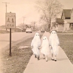
PermaRec update: An artist who paints over the people in old snapshots to make them look like ghosts (as shown at right) is the subject of the latest entry on Permanent Record.
Book deal reminder: In case you missed it yesterday, our friends at Diversion Books have another exclusive offer for Uni Watch readers: The Bill James Guide to Baseball Managers, which is the definitive text on MLB skippers. It’s a great book (I first read it about 10 years ago), and Uni Watch readers can now download the e-version for only $2.99 — that’s 50% off the regular price.

Baseball News: The Mariners appeared to have some serious NOB kerning issues last night. Here’s another view — not good (from Phil and Mitch Mirsky). ”¦ “A few years ago my buddies began collecting signatures to petition the Padres to change the team colors back to brown,” says Brady Phelps. “On Monday night we went to Petco Park and they delivered the signatures to the Padres’ Chief Marketing Officer, Wayne Partello. Pretty cool of him to tweet it.” … Oh baby, this is too good to be true: rare footage of Duke Ellington playing baseball (big thanks, Phil). … Jonathan Daniel turned up some pure uni gold: a 1976 Little League parade! … The Red Sox gave President Obama a jersey with an NOB during their visit to the White House yesterday. … During that same White House visit, Johnny Gomes followed through on his threat/promise to dress like a clown. … Here’s a ranking of all 30 MLB parks, from worst to first (thanks, Brinke). … Mariners first baseman Justin Smoak and his wife tweeted a uni-based pregnancy announcement the other day — nice (from Brad Iverson-Long). … After a bunch of protests, the sports bar in the Cardinals’ new Ballpark Village has changed its dress code (from Brice Wallace). … According to The Wall Street Journal, a Mets fan got very lucky on Monday. ”¦ Oh baby, it doesn’t get much better than this breathtaking 1952 portrait of Satchel Paige (big thanks to Marc Gilbert). ”¦ This year’s All-Star Game BP jerseys have leaked via video game (from Harrison Tishler). ”¦ Yesterday I showed you how the Orioles’ new Tom Clancy memorial patch looks on the team’s home jersey. Here are the road and alternate versions. I’m still reeling from all the thought and energy they put into this one (thanks, Phil). ”¦ “Diamondbacks announcers Steve Berthiaume and Bob Brenly said Paul Goldschmidt’s trademark is having his ear bent under his batting helmet,” says intern Mike Chamernik. “Brenly said, ‘It’s part of his approach. It’s uncomfortable. It makes him mad so he’ll take it out on the baseball.’ No idea if that’s the truth.” ”¦ The Dodgers, who had worn their new alternate road grays for two of their first three games, wore their primary grays last night.

College Football News: Here’s a mother lode of college football program covers, with the biggest emphasis from the early 1920s through the early 1960s. Have fun poking around in there (big thanks to Andy Moursund). ”¦ Also from Andy: this very cool football jersey alphabet! ”¦ New gear for Akron.

Soccer News: The USA away jersey for the World Cup, which had already been leaked, has now been officially unveiled. And Trevor Williams thinks they would have been better off going with this polo design. … Great piece about the typography on England’s World Cup kit (from David Wilson). ”¦ Funny story about the 1994 USA “denim” kit (thanks, Phil).

NBA News: Sounds like an April Fool but it’s not: The Kings are going to host the Lakers will wear Hindi jerseys tonight as part of a Bollywood Night promotion. This is part of the Kings’ recent outreach to the Indian market. ”¦ The Lakers still haven’t fixed the problem of their inconsistent 6s (great screen shot by Joey Artigue).

College Hoops News: We all knew the NCAA doesn’t allow cups or bottles featuring the logos of companies that aren’t official tournament sponsors. But it turns out that they don’t allow any unauthorized beverage vessels — not even a coffee mug with some cats on it. Douchebags. … Here’s a 10-minute video clip showing UTEP’s mid-1980s untucked jerseys (from Jolinko Lassiter). … Here’s a video of the Women’s Final Four floor being installed. “Some graphic elements look to have been inspired by Hatch Show Print, which is now located next door to the arena at the Country Music Hall of Fame complex,” notes Lee David Wilds. ”¦ “This year, a local Winona, Minnesota merchandise vendor won’t just be pumping out official Final Four merchandise but will also produce in-game towels as well as other personalized items,” says Mark Medinger.
.

Grab Bag: New logo set for Austin Peay University. “Reminds me of Mr. Moneybags from Monopoly,” says Lee David Wilds. … Sweaty clothing may not stink as much in the future, thanks to a new technique developed by Kodak. If nothing else, this could revolutionize the environment of hockey locker rooms (from Tommy Turner). ”¦ Big congrats to Two Buckaroo impresario Heather McCabe, whose $2 bill obsession is featured in this article in today’s New York Times.
An English government official called for Nike to lower the price of the English football kit. The “authentic replica shirt” is £ 90. The not-quite autnetic version is £ 60.
Bob Brenly name misspelled. Also Satchel Paige link isn’t working.
Both now fixed.
I was surprised to see that former major league centerfielder Marvell Wynne has a son in MLS.
I instantly thought of the baseball player when I saw the name up there!
So were the Caribous kits photoshopped, replicas or, dare we speculate, the real deal?
Oops. They were indeed real per link.
This article mentions that the unis were borrowed from the Guercios, who owned the Caribous.
Good thing your tags worked, Gregg.
Here is a site with Caribou jersey’s…some differences.
link
Man, the Colorado Rapids thing fooled me and I completely assumed the Lakers/Hindi thing was a hoax, in part because the accompanying image on the link I saw showed one of the players in his college uniform.
The part about the jerseys being “found” amd that the team planned to wear the actual old uniforms is what gave it away for me. If they had pitched it as a throwback in partnership with adidas, it would have been more believable.
What gave it away for me were the short shorts. As soon as I saw those, I knew it was too good to be true.
Maybe it’s my crapass computer at work, but I could not find the footage of the Duke playing ball on the Smithsonian site. I saw photos, but no film/video footage.
foot·age
noun \ˈfu̇-tij\
: scenes or action recorded on film or video
: the total number of running feet of motion-picture film used (as for a scene or subject); also: the material contained on such footage
The video is right there in the middle of the story.
Ah, the wisdom of Solomon, son…
must be sumpthin’ with my computer at work.
me no see.
the springboks changing to red joke is especially funny if you know how seriously south africans (especially white south africans) take the symbolism and iconography of both the springbok and the green and gold jersey.
to put it mildly, it REALLY matters to them, and they don’t like to joke about it. the comments on one south african news site, in particular, were hilarious, since a lot of them didn’t realise it was an april fools prank…
there was so much outrage that asics (the new kit supplier) had to issue a statement saying they are committed to green and gold!
I like how the Rapids’ article repeats several times that the players knew it was only a joke and they quickly returned focused to work. If they lose this weekend I will surely blame it on their utter lack of focus.
BEst part about the Little League parade pictures was the last one and what the 2 adults wear wearing especially the guy in the short cut off jeans. Classy.
Second best has to be the one with a sign for gasoline at 54.9 cents per gallon in the background.
no, the best thing is that it appears that nobody has a jersey number link.
My 6-year-old is starting t-ball this spring and he’s wearing #68. SIXTY-FUCKING-EIGHT!
Wow. My sons play baseball and tee-ball and players on their teams are always issued sequential numbers starting with #1. Never realized how lucky we were.
I was always the smallest kid on the team growing up. Jerseys/shirts were numbered with small sizes first, then higher numbers on larger shirts.
Coach wore number 1. I was number 2 for several years!!
Conversely, I was 6’3″ and 280 pounds at age 15 when playing ball. Because the team had to order a XXL jersey for me, I ended up with the number 90.
Interesting to see the NASCAR info on the site today. Under Armour announced a couple of deals with teams/organizations in the sport yesterday.
link
“In other words, a good April Fool’s prank is a like a really good-looking girl” couldn’t help reading this in a Mario voice
Even though he is named after former Pistons star Isiah Thomas, the current Kings player spells it Isaiah Thomas (with two A’s).
Thanks — now fixed.
Duke Ellington used to work at Griffith Stadium, selling hot dogs or popcorn (depending on the source) during Senators games.
In that video of the Huskies April Fools uniform prank, on the wall they have “You’ll Never Run Alone” little play on words of Liverpool FC motto “You’ll Never Walk Alone”
Do the Caribous really have a player named Marvelll Wynne? Or was that the tip-off?
link
According to Wikipedia, the soccer player is the son of the baseball player. Thanks Google!
Yes. He’s the son of the baseball player.
He plays for the Colorado Rapids.
Mr. Wynne is not only a real player for the Rapids, but one of the better ones.
Yeah, he’s had at least a few call-ups to the US national team, I believe.
Marvell Wynne references his father in his press release quote: “My father was a professional baseball player in the early 1980’s, and I bet these uniforms make him feel like he chose the wrong sport and was just a few years too late.”
Nike shouldn’t have released the USA soccer kit yesterday. It took me a while to figure out that it was NOT an April Fool’s prank.
Didn’t anyone tell Johnny Gomes NO WHITE BEFORE MEMORIAL DAY!!!
“He wears too much white” is, in this modern age, not a valid criticism to level at any baseball player.
Instead of the baloney about wearing white only in summer – which has never actually been a rule anyway, outside of a few snooty Gilded Age opera houses and Eisenhower-era women’s magazines – I propose the following: No wearing softball tops before Memorial Day or after Labor Day. Late May, June, July, August – wear all the solid-color jerseys you want. But April, September, and October: It’s crisp whites and clean grays only, please.
Co-sign
Not uni-related (though ‘Skins-related!), but link would’ve been a great April Fool’s joke.
Good one.
Reigning CFL Most Outstanding Player Jon Cornish is well known for being cerebral and for pursuing a math sciences degree, so the Calgary Stampeders tweeted this yesterday link
City-run Turner Field gets ranked 27th out of 30 MLB stadiums. No wonder the Braves didn’t renew their lease.
As a jaded White Sox fan, I was surprised to see that I Still Call It Comiskey Park was ranked as highly as it was. But, really, any list ranking MLB parks can really just stop at 3, as the top two parks are pretty much always the same ones.
I’m a Cubs fan and I can tell you that I honestly think PNC Park and Pac Bell/SBC/AT&T Park are both better places to see a ballgame.
and in case it’s not obvious what I meant by that, they’re both better than Wrigley.
The copy under the White Sox ranking is full of grammatical errors. Like some kid half way around the world got a few cents to throw it together. Yes, I’m a jaded Sox fan also!
I don’t know what his criteria are, but he does have some nice photographs of each park.
I’ve been to games in 87 ballparks, major and minor and my list wouldn’t look like this.
Yeah, the reviews are all over the place. Not that I expect a Zagat-style breakdown of different criteria, but it would be nice to know exactly what’s being judged, i.e. overall experience, sightlines, aesthetics, etc.
I spent about 2 minutes looking at the rankings and called it a day. 1) To say there’s not a bad seat in the house at Citi Field is false. 2) Even Yankee fans rate Citi better then New Yankee. 3) PNC should be higher.
Any rankings with a dome (Miller Park) in the top 10 are skewed. And the New York stadiums are way too high on the list.
Re: Hindi night with the Lakers and Kings:
My loony bun is fine, Benny Lava!
Minor bun engine made Benny Lava!
Anybody need this sign, Benny Lava?
You need a bun to bite, Benny Lava!
Have you been high today?
I see the nuns are gay.
My brother yelled to me,
“I love you inside Ed.”
Looks like camo is back for MLB’s Memorial Day celebration, but this year the bill and squatchee are team colors…
link
Aesthetically, it’s an improvement, in that it’s less bad than last year’s full-camo versions. More team color is a good thing.
But philosophically, the greater use of team color cap elements tends to normalize the camo. These will be less visually jarring and look more like a normal part of the team uniform than previously, when the all-camo caps looked completely incongruous and out-of-place.
Plus, the team-colored bill will make these less plausibly justifiable as hunting or outdoor apparel, which was the one saving grace of last year’s all-camo caps. (Confession: An all-camo 2013 Nats cap is my go-to fishing hat.)
So these will look better, but they’ll be worse.
Why do you need a camouflage hat for fishing?
Oh, thems fishes am smart. Smart i say!!
link
The same reason the Navy now outfits its sailors on board ships at sea in camouflage. Plus, most of the other guys on the water wear camo caps. Because, um, sheeple or something.
I’m not saying it makes any sense, but it’s at least plausible to claim that a camo hat is useful for outdoor sporting. And I happen to like the look of the cap, even as I object to the asinine bullshit about “honoring” the troops, so that’s the excuse I’m sticking to.
Nice to see a little NASCAR love here finally. Just be sure you don’t say anything bad about them… they have a habit of shutting down websites who do that :)
Something is wrong with the link now. I keep getting “Page Not Found”.
* From the Rapids press release:
““I was born in April of 1978, so I remember the first Caribous match I went to with my family that August like it was yesterday.”
“Knowing that caribous are a species that can’t be found here in Colorado, I’m proud that for this day, we’re the only true Caribous of Colorado.”
* Bollywood Night – I hope they replace the arena music with Bollywood music
The word “video” before the women’s final four floor link is missing the letter “o”.
Fixed.
The NASCAR / Uni-Watch connection was long overdue. Very happy about this development, especially in this day and age where cars seem to have a new look every week. The “iconic” paint schemes of yesterday, like the STP 43, the Goodwrench or Wrangler 3, the Skoal Bandit 33, the DuPont 24… that just doesn’t exist any more.
The jacket displayed on the Colorado Caribous quote page was amazing. You need this Paul: link (Or at least get it to raffle it off to your readers!)
Looks like a 1970s beer ad.
LOL — agreed. “From the land of sky blue wa-ah-ters …”
It really does. “Answer the call of the wild, and cool down with a Caribou!”
The brown satin is still something special.
link.
It does, which only increases the urgency of the need for someone to reproduce that jacket. And/or steal the art for a craft beer label.
Oh, baby!
When the Caribous of Colorado were originally announced, they published a very nice promotional magazine that was distributed with the Sunday papers. I hung on to my copies (one from each paper). I’m still miffed at my folks for disposing of them back in the 90s. Guess I should have kept them on my person rather than at the folks’ place during my nomadic decades.
Besides the Denver Post and the late great Rocky Mountain News, were there any other newspapers of note back then?
No other dailies. There were lots of weeklies for various suburbs (Englewood Herald, Littleton Independent, Aurora Sun) and even a few neighborhoods in Denver proper (Barnum comes to mind), but AFAIK they weren’t in on the promo. The first local “alt” weekly Up The Creek was also extant then.
I suppose the Boulder Daily Camera – always loved that name – may have been in on the promo too.
I greatly appreciate the new NASCAR connection and am looking forward to clicking on the ad daily.
I’m not familiar with the story. Why did Johnny Gomes wear that jacket to the White House? Is it some sort of political statement? His answer to fans wearing jerseys to games? I don’t get it.
He did it to be “patriotic.” He ordered identical blazers for a bunch of his teammates, but they appear to have been wise enough not to wear them.
I guess his idea of patriotic and mine are not in sync.
Manager John Farrell said on the WEEI radio(Boston) today, that there were discussions between the White House, the team, and Gomes regarding whether the entire team would wear the jackets, just Gomes, or no player.
Farrell said the White House people involved in the discussion said, after some time, that it was perfectly appropriate for Gomes to wear the jacket.
It seemed to me that Farrell stretched to make this a historically positive event in Red Sox history, when, most likely, he felt most of the team acted like fools.
Somehow making a signed version of the jacket a gift to the President put some lipstick on this pig.
For me, it is difficult to find even this more “likeable” team actually more likeable. Or maybe it is today’s baseball player in general. It seems when I get to Fenway, I’m not rooting for any team anymore, as I am hoping to see some sort of baseball history made, or something I never saw before (by either team) instead.
Anyone have any issues with NASCAR teams not having uniform paint jobs for each car of the same team?
I don’t have issues with it, but I do like to see continuity in a team’s schemes…
Like the 2 and the 12 at Penske in the late 90s looked similar with Miller and Mobil 1 colors… the DEI cars that all had the “E” design on the door… Evernham’s 9 and 19 had almost identical paint schemes in the early 2000’s… Junior Johnson’s 11 and 12 Bud cars were almost identical in 1984…
Yeah, it bothers me a bit. I know the reality is that companies just can’t pony up the bucks for a full year sponsorship (save for a few). But yeah, I wish there were more uniformity to at least the top-tier teams.
Many thanks to Marc Gilbert for posting the fabulous picture of Satchel Paige!
Big thank you today for both the Satchel Paige photo and the collection of old college football game-day program covers. Man, so many of those program covers are sheer knockouts. I’m old enuf to have witnessed the change from programs with witty cartoons to programs with hyper-bland photos: sad trend.
Andy Moursund, thanks for the college football programs. Those are fun to look at. Also the alphabet page too.
Nice
I have to admit, the immature teenager in me laughed at the Mets newspaper headline (no pun intended).
That ranking of ballparks is invalidated because the stadium that is literally leaking shit into its locker rooms should not be ahead of any other stadium.
(Oakland’s is #29.)
Amusing, sure. But why should fans care about that? Just like it doesn’t matter at all to me that the new Yankee Stadium has bigger locker rooms than the previous incarnation.
Haven’t seen too much about NCAA college football uniforms coming out in 2014 recently Paul. Do any of these rule changes mentioned in this infographic about the 2014 college football uniform new uniforms rules stand out as something challenging for designers? link
Haven’t posted much about new college football uniforms because there haven’t been many of them released, at least to my knowledge.
As for that chart you linked to, there’s not a single new regulation there — all of that stuff was already on the books.
Still don’t like the new US Soccer change kits, but the blue looks better on TV than I thought. Slightly darker than the photos.
I like the blue color but waaaay too much red.