
In the wake of the Bucs’ uniform unveiling last week, lots of observers — some of whom liked the design, others of whom didn’t — have issued a series of statements that more or less reduce to the same basic sentiment: “This is the way things are now. Love it or hate it, but get used to it.”
This happens pretty much any time a newfangled design emerges from Nike or Under Armour. The traditionalists wring their hands and say, “This sucks but whaddaya gonna do,” and the futurists get all excited and say, “Yeah, that’s what I’m talking about!” The underlying message from both camps is the same: Change is inevitiable.
But is it?
There’s no denying that we’re currently witnessing an era of change in uni design, especially as it pertains to football and possibly basketball (I say “possibly” because I’m not yet sold on the sleeves being here to stay). When did it start? I’d say 2005, when Nike brought out the mismatched orange sleeves and the diamondplate. You could argue that it might have started a year or two earlier, but either way I think we can agree that this era of change has been with us for about a decade.
This isn’t the first time we’ve seen an era of change. In the 1970s, baseball uniforms underwent a design revolution every bit as momentous as what we’re now seeing in football. Fabrics changed from flannels to stretch-knits, jerseys changed from button-fronts to pullovers, pants changed from belted to sansabelts, road uniforms changed from gray to powder blue. There was Houston’s tequila sunrise, the Chisox’s untucked leisure suit, Cleveland’s blood clots, and more. If Uni Watch had been around back then, I’m sure we would have seen the same love/hate split between the futurists and the traditionalists, with both sides accepting that “this is the way things are now, because change is inevitable.”
Similarly, NBA uniforms got pretty wacky in the 1990s, especially in Vancouver, Toronto, Atlanta, Philly, Detroit, Sacramento, Cleveland, and Milwaukee. Again, if there had been a uni-centric community back then, I’m sure the responses would have been similar to what we’re hearing now: “It’s the new way — get used to it, because change is inevitable.”
But it’s worth remembering how those other two eras of change played out. By 1993, pullovers, sansabelts, and powder blues had all disappeared from MLB diamonds. And by the early 2000s, all the NBA teams listed in the previous graf had jettisoned their outré designs and replaced them with more conventional looks. In both cases, the radical designs are now viewed with a mixture of “What were they thinking?” disbelief and a fond but condescending sense of nostalgia.
So maybe the real lesson here is that an era of change tends to spawn an era of retrenchment. This theorem suggests that while change may be inevitable, so is the reaction to change. Maybe this is because people get tired of the fancy new thing and end up wanting to re-embrace the familiar thing. Or maybe it’s because futurist design ends up painting itself into a “How do we top that?” corner that leads back to more conventional design. In any case, the historical evidence suggests that when the pendulum swings radically in one direction, it’s bound to swing back the other way.
I’m not saying that’s definitely going to happen in our current era of change, but it’s certainly a plausible scenario, especially since we’re only about a decade into this current era. (The MLB excesses of the 1970s took much longer to self-correct.) Consider, for example, that several teams in various sports have recently gone back to “classic” designs for their primary looks, including the Houston Astros, the Toronto Blue Jays, and the Buffalo Bills — a strong indication that classicism isn’t dead.
But is our current era of change different from those previous ones? Could it be that the pendulum won’t swing back the other way this time? Yes, I think that’s a plausible scenario as well, for three primary reasons, all of which are interrelated:
1. The merch machine. Jersey retailing didn’t yet exist during MLB’s era of change in 1970s, and it was still in its infancy during the NBA’s era of change in the 1990s. The teams, leagues, and manufacturers have now done a much better job of identifying who is (and isn’t) willing to shell out $200 for a polyester shirt. That demographic skews young-ish, so there’s now a greater incentive to create uni designs that appeal to the younger set. There’s no percentage in coming up with something that appeals to, say, 55-year-olds, because they’re not going to buy a jersey anyway. (As an aside, I find this use of uni design as a generational wedge to be very, very sad. Sports are supposed to be for everyone. As most of us have experienced first-hand, sports are among the few things that can unite generations. One of the worst things about our current era of change is that it has created a sense of “us vs. them” generational conflict, whether it’s me complaining about 17-year-olds liking “shiny objects” or younger fans slapping the “Get off my lawn!” tag on traditionalists.)
2. The hype machine. Uniform changes are now part of the media world’s relentless hype-o-rama approach, where every! moment! must! be! filled! with! breaking! news! Meanwhile, more and more teams are seeming to accept the notion that getting attention for anything, no matter how ridiculous, is a self-validating media strategy. All of this points to a greater incentive for outrageous uniforms rather than sedate ones.
3. The sportswear-industrial complex. The previous eras of change were driven largely by the teams and the leagues, not by the sportswear outfitters (or if the outfitters were involved, they were largely behind the scenes). But the changes that are currently afoot are being driven by Nike, Under Armour, and Adidas, who have come up with — and, disappointingly, have gotten teams, leagues, and fans to go along with — the idea that the company brands are at least as important as the team brands. These companies have staked their identities on the pendulum continuing to go in one direction, so they’ll presumably do what they can to make sure it keeps swinging that way.
So what’s going to happen — will the pendulum keep swinging, or will it swing back? Discuss.
Click to enlarge
Collector’s Corner
By Brinke Guthrie
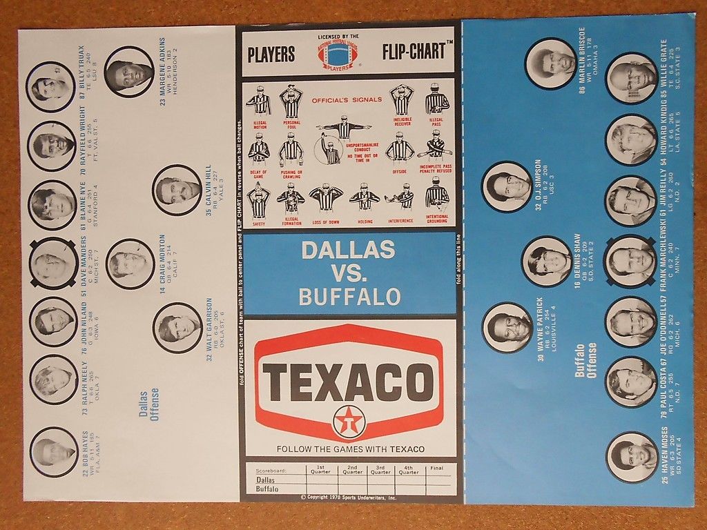
Had this very item, and they were excellent! They were called “Flip-Charts.” You’d go to the Texaco every week and they’d give you one of these for that coming Sunday’s game. You’d fold each side of the chart so the offense faced the defense. Notice it’s an NFLPA item — no mention of Cowboys, Bills, or any team logo. This game was played at Buffalo on Sept. 19, 1971, so I can see myself actually going to the local Texaco around the corner on Marsh Lane, about the 14th or 15th. Amazing.
Here’s the rest of this week’s haul:
• Mixed bag of items today from reader Michael Clary, beginning with lamps for the Houston Oilers, New England Patriots, and that Washington team. Then there’s a rather strange-looking Winnipeg Blue Bombers bobble, a football-shaped seat cushion for the 1974 Philadelphia Bell WFL team, and an overpriced set of 1970-1971 mini-hockey sticks.
• Nice retro vibe on this 1972 Oakland A’s World Series program. (Notice the word “Cincinnati” is missing from the Reds running man logo.) And look at this Reds 1972 Series ticket stub. (I have this one.) The cost of the ticket was $10! To go to the Series! Forty-two years later, the seller wants almost four times that amount — just for the stub!
• Get a Fresh Start With Bart, with this 1960s Packers button. [So unusual to see a left-facing helmet, instead of the usual right-facing! ”” PL]
• If you were an MLB National League Player Of The Week in the 1970s, you know what you got? This watch.
Here’s an “NFL on TNT” promo foam football.
• Well, here’s the 1970s San Francisco Giants bullpen buggy I’ve been looking for. Too bad it’s $75!
• And here’s one for Uni Watch HQ: a 1960s New York football Giants poster. Can’t tell who the artist is, but it’s not Dave Boss. Still nice, though. Staying in the NYC metro area, keep your Jersey on for the Nets with this 1970s bumper sticker.
Seen something on eBay or Etsy that you think would make good Collector’s Corner fodder? Send your submissions here.

Did you ever wonder why pears — and only pears — are often partially wrapped in paper when they’re displayed at the supermarket or green grocer? I did, so I looked into it and wrote an article about it. The answer surprised me, and will likely surprise you as well!
Meanwhile, I’ve also written a new Permanent Record entry, which tells a fascinating story based on a student’s mid-1920s report card. This piece is a follow-up to the piece I linked to yesterday — in case you missed that one, here it is.
Tick-tock: Today’s Ticker was written and compiled by Garrett McGrath.

Baseball News: Bacon sells: The Lehigh Valley IronPigs have sold 3,300 bacon hats and 1,500 bacon-strip scratch-and-sniff T-shirts that promise to smell through at least 10 washings. … Yesterday’s wire photo entry included this shot of Gene Alley and Bill Maseroski “Hoovering” ground balls. Denis Repp commented, “I’m going to bet that the Hoover people had almost nothing to do with this. Legendary broadcaster Bob Prince had a number of catchphrases during his tenure with the Bucs, and one of them was some form of ‘We need a Hoover!,’ often invoked during some late-inning tight situation when the opponents got a man or three on base. With Alley and Maz up the middle, his request was often answered.” ”¦ Another follow-up from yesterday: The photo of Willie Mays’s Minneapolis Millers jersey the with the “Golden Jubilee” patch prompted Frank Fulton to show us how that patch looks in color. … Trevor Bell is a minor leaguer in the Reds system and has memorialized his grandfather’s likeness in a tattoo. The kicker is that his grandpa was Bozo the Clown (from Patrick O’Neill)… The Nebraska Cornhuskers wore an alternate that seem to be inspired by the Astros’ old tequila sunrise unis. ”¦ In a related item, the Peninsula Pilots — that’s a college summer team — have tequila sunrise-esque jerseys and matching socks! (From Gerry Dincher.)

Football News: Texas Tech will be wearing a mini-camera in their helmets this upcoming season (thanks, Phil). … The LA Kiss, the arena football team owned by members of the rock band Kiss, unveiled their uni design yesterday, and it’s about what you’d expect under the circumstances. Let’s hope they have some cool pyrotechnics to distract from the design disaster (from Tom Currie).

Hockey News: Tim Thomas made his Dallas Stars debut in Saturday night’s game against the Minnesota Wild but still looked like he was a Florida Panthers goaltender. He wore his Panthers pads and goal mask along with his green Stars jersey. … On Sunday, Phil covered the Stars retiring Mike Modano’s No. 9 but the current Stars players warmed up wearing Modano jerseys from every era of his North Stars/Stars career (from Kevin Wang). … The goalie for the Pawling (NY) Bantam A’s wore pajama pants under his pads the other day (from Jake Elwell).

Soccer News: The New York City FC is allowing fans to vote to determine the club’s official team badge through Thursday (thanks, Phil). ”¦ “A visual artist named Mark Willis has some cool thoughts and designs on what the NYCFC crest could have been,” Kevin Bailey adds. … Two from Yusuke Toyoda: Adidas and Nike are both developing shoe/sock hybrids, and scientists think the flight of the new World Cup ball will be less erratic than the 2010 version. … Oklahoma City Energy FC, which will begin play this 2014 USL Pro season, have released their inaugural jerseys (from Brandon Ponchak).

Grab Bag: Last week Paul mentioned that Honest Ed’s, a Toronto department store, was selling off its old inventory of amazing hand-painted signs. Here’s a slideshow showing a bunch of those sign designs (from Ben Trattner). … The National Museum of American Jewish History in Philadelphia is opening a new baseball-themed exhibit (from Adam Herbst).
What is going to happen when those people being advertised to right now are grown up in 20-25yrs? Will thier tastes have changed by then or are we going to see 40yr old folks wearing day-glo jerseys(and riding hoverboards)
It won’t matter, because (a) the team will have moved on to a new uni design, so nobody will wear the old ones, and (b) there’ll be a new generatio of younger folks willing to spend $200 on a polyester shirt (or, more likely by that time, $300).
Well hopefully the kids that the “shiny” generation has will rebel against their parents and want more classic simple unis and say no to the pajama look in baseball too.
In this columns’ recent reviewing of the plethora of HIDEOUS major professional sports team uniforms, everyone seems to have neglected to mention the Detroit Piston’s early 1990s radical departure from tradition where they adopted a Turquoise Blue-dominated uniform with multi-color trim/detail and a snearing horse’s head integrated into the chest of the uniform. I say the NBA Piston’s “Khartoom” Horse Head uniforms are as bad as ANY cited here. They make the Raptors’ cartoon unis look downright Penn State football-ish, and put the Raptors much better in comparison ….
Good point. I’ll add that to the NBA list.
I think it was the radical change in color scheme that people disliked more than anything. The logo was not bad at all (the horse motif harkened to a play on “horsepower”).
The logo was recolored when the Pistons returned to red, white, and blue, but it didn’t last long. I suspect that if all the Pistons had done in the 90s was adopt the horse logo in classic Piston colors (while keeping the basic uniforms) it’d still be around.
Speaking of Merch opportunities, see this article (old news I’m sure to most of y’all). Meh.
link
Wow! Those KISS unis are out there, sister!! Even moreso that I could have imagined…and not in a good way. But hey, not the end of the world.
I’d thought they’d make the pants/socks/shoes look like Gene’s dragon boots or instead of flame graphics on the helmets, have them spout actual fireballs. Surprised the visors don’t look like their makeup.
Despite being crazy they are are quite underwhelming to me.
“The kicker is that his grandpa was Bozo the Clown.”
His grandpa was ONE of the c. 60 people who were Bozo the Clown.
Bozo had MANY regional affiliates with there own local guy.
(still pretty cool though)
link
For anyone growing up in Chicago or with WGN as a cable super station, Bob Bell very much IS Bozo The Clown. Yes, there were many regional Bozos out there, but how many of them did it for 24 years?
I can’t second JimWa strongly enough. Bob Bell was a legend. I’m not sure how many of those 60 others made the Clown Hall of Fame, but Bell certainly did.
Let’s just say he’s not *my* Bozo.
Wasn’t the Chicago/JimWa “Bozo” show so popular that the waiting list for kids to get on literally involved parents placing kids on the waiting list Before they were even born or conceived?
That, Nick, is correct. The solved that problem from going from the fun, genuine, locally written bits of Bozo’s Circus (airing live at noon each weekday) to going to the mostly canned cartoon days of The Bozo Show (oh how I missed the magic arrows – which I learned later on from a friend who’s father was a camera operator on the show that the arrows weren’t nearly as random as they wanted you to believe). Don’t even ASK me about the Bozo Super Sunday Show.
Bozo? link doesn’t know what the big deal is …
Guess I should’ve read one more comment before posting, as Padday beat me to it by about 7 hours …
NickV: Indeed. I lived in Chicagoland at the time as a kid. The waiting list was like 3-5 years or more!
Considering both the Trevor Bell ticker item and today’s lede, I think this is very appropriate: link
Two typos in the opening paragraph:
have issues a series of statements
Should be “issued”
Love it or hate it, but get used it.
Missing “to”
Ugh — not a good way to start off a piece. Thanks for the heads-up, Rob. Now fixed.
I confess that I’m mostly a meat-atarian, though I have been coming around to more fruits and veggies as I’ve hit 30. And honestly? I don’t recall ever seeing pears displayed any different than apples, oranges, etc. In other words, no tissue paper. Have I just not been observant enough? Is it a regional thing? I’m in the southeast, FWIW. Most of my grocery shopping is done at regional chains like Publix, Bi-Lo, etc.
Interesting little article nonetheless, Paul.
Depends on the retailer. All pears are shipped with the wrappers, but some grocers remove them before putting them out for sale. Others leave the wrapper on.
I’m with Chris on this. I’ll go double-check at the grocery store next time. But where I am (DC area), I don’t think I’ve ever seen partially wrapped pears. I’m pretty sure that they’re just stacked in the produce section.
Depends on the store. Asian supermarkets are more likely to leave the wrappers on. Giant and Safeway usually take them off.
Here in California, they’re more and more wrapped in a plastic/silicon mesh, which I assume (because it expands elastically) makes it possible to machine wrap them.
However, when I buy d’anjou pears, they come in a bag, unwrapped.
I used to work in produce departments at bigger NY area chains coming up through high school, etc. We displayed the pears without the paper simply for looks and preventing the ensuing mess, I do remember having a box full of tissue paper after we’d pack out pears.
Similar is loose onions. We’d get a 50 pound plastic mesh bag with onions in it, and instead of just pouring the whole bag of onions in a pile, we’d handle each onion to get the papery outer skin off to keep the presentation neat.
Paul, your historical perspective is illuminating and appreciated, especially since you draw parallels and yet also point out the differences. One other possible difference – the end of the “sansabelt” uniforms also coincided somewhat with the trend for retro-ballparks that replaced the astro-turf ovals of the ’70s and ’80s. Throughout my 28 year life, baseball has always been about Americana and tradition. Basketball in my childhood was culturally more about hip-hop and pushing the limits. I feel like the uniforms have reflected that for both sports to a large extent (and in baseball’s case, so have the stadiums).
I’m sure it’s not revolutionary to identify a trend between culture and clothing, even on a sports field. I wonder if baseball in the ’70s and ’80s was as nostalgia-driven and classic as it has always felt to me? With movies like “Field of Dreams” and “The Natural” I feel like it had to be, but the uniforms certainly don’t reflect that.
What is the culture of football? As someone who’s always been very involved with the game, it’s hard for me to step back and look from the outside in. I’m tempted to say that football, as America’s most popular game, pervades so much of American culture that it’s hard to identify a trend of classicism or hip-hop. For every fan of Alabama’s classic style both in uniforms and in play, their is a fan of Oregon, or the U. For every fan of the Packers, there is a Seahawks fan hanging around these days.
But I feel like I’m biased from the way football has enveloped my life and tastes. I’d love to hear your more expert analysis – especially since I’ve always thought you were more of a baseball guy yourself.
I think that what could be significant in this current era of change is that the NFL is the one doing the changing. Over decades, it’s been the “conservative” league. Now, it’s finally starting to pull some XFL designs into play.
Baseball has had its ebbs and flows, but has been consistently conservative (i.e., traditional) for about 15-20 years now. They could use a slight swing back toward the 70s, just to shake out of the rut of blue/red/pinstripe that permeates everything.
Pro hoops is pretty dynamic with its ebbs and flows of traditional versus contemporary/trendy. They’ll always be in motion.
As a brand guy… I think it’s all about how these teams (particularly in small markets) see themselves in the eyes of their fan(customer)base. How can they generate more $. Pushing, then pulling back, pushing, then pulling back. Trends happen. And yet money talks. If “traditional” comes en vogue again, they’ll be right back at it.
I think we may see a “correction” in college football soon. Been too silly for too long. If every school considers themselves a “change agent” like Oregon… then being a change agent isn’t really cutting-edge anymore, right?
I think what happened in the NBA was that “retro” became cool again, even in hip-hop circles. Witness the team owned by Jay-Z going with the simplest uniforms possible. Eventually this will change again and we’ll probably see more garish designs, but for now the NBA is in a pretty good age for uniforms (except for the sleeve thing).
I think the uniform trends are cyclical. The 49ers strayed away from their classic look by adding more black and the red face mask. And now, of course, they’re back to their “Joe Montana” look, which is a lot simpler and classic.
Jim Crane also set the clock back on the Astros uniforms. A lot farther back than a lot of us expected, in fact.
Paul, you could take out the specific references to jerseys and unis and you’ve basically just written an article in Fashion 101. Trends are cyclical, fads come and go quickly, and the classics are always in style. Granted, I don’t have a lot of knowledge about such things, but it would be interesting to try and contextualize uni changes into fashion industry terms and evaluate how the various unis you referenced up top reflected the cultural tastes of their times.
The Dallas Stars conspicuously left out one jersey from Modano’s Stars career
link
Long live the Mooterus!
One of the best bad jerseys in NHL history. I think my personal list of best bad NHL jerseys would be something like,
Coyotes Insanity Pepper
Kings Burger King
Stars Mooterus
Islanders Fishsticks
I’d wear any of those jerseys with pride.
I actually own (and wear) a Modano “Mooterus” jersey! Bought the jersey for $25 at a local (dying breed) sporting good shop in NJ and sent it out to be customized. Looks great!
I don’t think I’ve EVER seen that before. That’s scary.
Little more background? What year?
Mooterus 3rd jersey came out the same year that the NHL switched their dark/home jersey (dark became home) – 2003/04. Used it from 2003-06.
link
Here’s a good post on the Mooterus jersey.
link
Team played an April Fool prank this year. Saying they were going to unveil a new jersey during intermission and came out with the Mooterus.
link
link
* should be prank this past year – 2013.
How about no?
Red does not belong in the Stars’ scheme. Ever. That, even above the logo, is why I hate that jersey.
The scoreboard in the Mazeroski/Alley photo looks like it’s from May 5, 1967. Given the daylight and the time on the clock, it seems reasonable to assume that the photo was shot the next day. Unfortunately, the Pittsburgh Press for those days is missing from the Google archive, while the Post-Gazette has no corresponding photo or mention of the shoot.
Posted late yesterday, Celtics St. Patrick’s day uni set (sleeved)
link
I’m sure they’ve done it in the past, but it seems really odd for the Celtics (of all teams) to do a special uniform on St. Patrick’s Day. Why not focus on a big fan promotion of some sort? If they’re going to do the jersey, draw more attention to the holiday (larger shamrock, leprechaun hat, etc.)? Swapping white letters for gold is hardly out of the ordinary given today’s many wild uniform changes.
That’s the point, though. It’s a subtle change to emphasize the holiday. They could have gone a more substantial route, like the Hornets did in the past for Mardi Gras, but with a classic team, I can appreciate them going a subtle route.
Despite what the eBay text said, that “Fresh Start with Bart” Button is probably from 1974, when Dan Devine was on the way out as Packer coach, and there was a fan movement to hire Bart Starr as coach.
Or even after he was hired.
I remember so many of these optimistic buttons and bumper stickers; before Bart we said “Our Coach is Devine”, then after Bart we were going to be “Out of the Woods with Forrest”.
Goalies wearing pajama pants or track pants under their equipment is quite common when the child is young and playing house league or rec league. But certainly goalies who are playing rep level of any kind should try to look a little bit better by wearing proper team socks.
Paul…technical question here….
I view your site mostly on an iPad or iPhone. When I view other sites, if I haven’t been active on the site, it automatically refreshes to a newer, more recent version of the site. This makes sense. However, your site seems to refresh almost every time I look at a link you’ve posted. I look at the link in the new window, close it, and the whole page refreshes. Certainly not the end if the world, but it can get a little annoying finding where I was in the daily post.
So is this constant refreshing something you have coded, or is it a setting on my devices that I haven’t quite figured out how to fix yet?
I’m out of my depth on that kind of question, but I’ll forward your comment to webmaster John Ekdahl — that’s his department. Thanks for bringing this to our attention.
I have noticed this too, and it is the main reason I don’t read Uni Watch on my iPad.
The rule of thumb in radio used to be (maybe still is, but I can’t vouch for this past about 1997) that whatever pop music you listened to at age 13, that’s what you’ll want to hear on the radio for the rest of your life. Your tastes will grow and change, but if you’re flipping the dial and you hear one of those songs of your early teens, you’ll stop and listen and maybe even stick around through commercials to get another hit of nostalgia. Obviously a vast oversimplification, but true enough for an entire media industry to make money. Thus Top 40 became Mix became whatever they’re calling all the Mix format stations that now play mostly 90s with limited doses of 90s-esque Katy Perry and the like.
And, for what it’s worth, MLB unis just happened to achieve perfection in 1987, the year I was 13.
link?? I’ve got to disagree. ;)
Mariners, Astros, Angels, Brewers, Padres were all clunkers. As was mentioned above late 80s was definitely a transitional time for baseball, a lot of teams were feeling around for an identity.
I don’t really think 1987 was the best year for MLB uniforms. But it’s definitely my favorite year. For obvious subjective, sentimental reasons.
Which illustrates the difference between pretty and good. I still enjoy listening to Def Leppard. But that doesn’t mean think Def Leppard is actually very good. Thus with a lot of sports uniforms.
I gotcha. By that theory, my year would be link, which definitely had a traditional flavor to it. Everybody except the Reds had moved to button down, Expos, Brewers, Phillies all moved to script marks.
As for music: I’m pretty happy A Tribe Called Quest’s 2nd and 3rd albums have stood the test of time.
No. 1968 when I was 11 y.o. !
Nah. There’s no one year that’s best for everybody. Each team has its own ups and downs – well, maybe the Tigers and Yanks are relatively exempt given that they’re so consistent in their looks. For instance the Cubs looked their best while the White Sox looked their worst and vice versa.
What’s your opinion on the Cubs home and aways, throughout the ’60s until 1971? I’m thinking that’s the Cubs looking their best. If you agree, the White Sox, during that era, certainly did not look their worst, and some may argue the red pins may have been their best uni, though I’m partial to any ’60s uni with TV numbers.
I’ve heard the same thing arrScott, but the age I’ve always heard was 17 instead of thirteen.
Things were always best when you were 17. The best movies ever, the best music, the best TV, all at 17.
I’m a weirdo, because when I was 17 I was mostly interested in music at least 20 years older than I was. Part of this was probably a knee-jerk Gen-X reaction of not wanting to go along with the crowd, but even beyond that I think I’ve always been interested in what is “classically cool,” things that stand the test of time.
On a long enough timeline, I think sports uniforms are like that too. You can point at changes throughout the years, but there are also many teams that have always kept the core parts of their uniform designs intact with only minor tweaks, and you can find them in all sports. I think what eventually swings the pendulum back is that sports leagues realize that what keeps them going is fandom being passed down across generations, and if the uniforms keep changing radically they are looking at long-term losses in spite of possible short-term gains.
By the time I was 17, I’d moved on to the music, books, and movies of when my dad was 17. Somewhere between 13 and 17, Bell Biv Devoe came along and a bunch of my best friends got really into them (and Bobby Brown et al) and that was pretty much the end of my interest in/listening to anything resembling Top 40 popular music.
But I hear you. I mostly get nostalgic for the early 1990s (when I was 17 and older) and the late 1970s (before I started first grade). Not my early teens, which is mostly filled with memories I’d just as soon forget!
Paul, I have noticed pears in expandable paper/cardboard wrappers, as well. They almost look like they are wearing thick fishnet stockings.
That type of packaging is primarily used in Asia, for imported Asian pears.
Here in Japan you can find just about any kind of fruit wrapped. It’s more a signal that “we’re trying to justify charging you five times the world market price” than anything else.
OTOH, many supermarkets here will offer you a plastic sleeve, link on all fruits, glass bottles, and anything else that might bruise or break. I’m always surprised when American supermarkets don’t. Don’t they ever get complaints from customers whose bottles break when they’re being carried home?
I spoke once with the longtime editor of a grocery industry trade magazine. When I mentioned how poor the produce seemed in DC versus what I was used to growing up in Minnesota, he said, “There’s a reason for that.” Produce spoilage is a huge deal in the grocery industry, with its razor-thin profit margins. So large retailers and wholesalers track customer behavior and expectations very closely. In markets where a sufficient percentage of customers will pass on or attempt to return produce that has spoiled too quickly – Minneapolis and New York City, for example – the industry prioritizes its freshest products. In markets where people are more likely to buy near-spoiled produce, or less likely than average to attempt to return produce that spoils too quickly – Washington, DC, for example – the industry routes the less fresh, and sometimes already spoiling, produce.
I have to agree with my fellow posters, and Uni-watch faithful and say that these kind of trends come in cycles. While football and basketball seem to be headed towards some kind of weird-marketing driven fashion apocalypse, baseball and hockey seem to be going towards a more conservative, some could fairly argue, opposite extreme of blandness. I think like all things in nature, uniform fashions correct themselves, with the fads dying quickly and the classic living on. Uniform fashions are much like Darwinian evolution; that which works keeps going on, and the rest go extinct. For every Oregon U. Ducks fiasco out there (and contrary to what many say, it is a fiasco and a travesty), there are the New York Yankees and the Montreal Canadiens timeless styles to look upon with awe.
Addendum; notice how we are also seeing the slow and welcomed demise of “black for black’s sake” – Fashion evolution correcting itself
I would disagree with your feelings on BFBS. I think black is being replaced with Gray and the feeling isn’t which color for which color’s sake as much as it’s teams are straying from their official palette. I would argue that fewer schools actually list gray as an official color than black.
Definitely think BFBS in baseball was a way to reconcile the traditional side with the marketing side.
GREAT piece today, Paul!
Thanks, man — appreciated.
Excellent writing today Paul! Sometimes it’s good to step back amongst all the “this sucks” or “this is sick” talk and digest what is really going on with unbiased and keen analysis and that’s what you did here. Well done.
Thanks, Doug. There’s so much uni news floating around that sometimes it’s hard to carve out a little space for analysis and perspective, but that’s what I tried to do today. Glad you like!
A refreshing opportunity to take a step back and breathe. Big Picture. Nice.
Much of what drives change in sports aesthetics comes down to brand identity. Teams like the Yankees, Packers, Red Wings and Celtics have developed brands that sell – literally. The teams that spend the most time making headlines with new uniform designs typically haven’t developed that same level of brand identity. It comes as no surprise that they continuously change their looks to “the next new thing” when they don’t have a strong visual foundation to give them an identity in the first place.
I’m not really sure why you think the current trend started in 2005. We’ve had NFL teams changing uniforms to more non-traditional designs on an almost yearly basis since the mid 90’s.
1996 – Ravens, Patriots, Eagles
1997 – Broncos, Bucs (OMGz! pewter?)
1999 – Titans
2000 – Rams (first NFL team to not have pant stripes since 1964), Patriots again
2001 – Saints (first NFL team to wear monochrome black)
2002 – Seahawks, Bills (also the first year for alternate jerseys)
2003 – Falcons
2004 – Bengals
2005 – Cardinals
2006 – Vikings
2009 – Jaguars
2012 – Seahawks again
2013 – Jaguars again, Vikings again
2014 – Bucs again
(If merely using a custom number font counts, then add the 1997 Jaguars, 2002 Texans, 2007 Chargers, 2009 Lions & 2013 Dolphins)
Broncos and pewter notwithstanding, I’d say most of those changes were more about evolution, not revolution. The real craziness came later, and it came on the college level, not in the NFL.
Obviously, the line between evolution and revolution is subjective, and reasonable people can disagree on this point. I’m not trying to argue against you on this — just explaining where I’m coming from.
I think the Patriots changed before 1996. The first Flying Elvis was ~1993, with the slanted-numeral soccer jerseys appearing in ’95.
Don’t forget the Steelers changing their numeral font ~1997.
What’s odd about this is that it started after the 1994 throwback-nostalgia-fest. A lot of the throwback uniforms were beautiful and/or beloved and/or very well-received — Chargers, Broncos, Saints, Giants, Oilers — but yet the league in general in subsequent years moved in the opposite direction (except, notably, the Jets and Giants, and more recently the Bills).
Maybe what it’s going to take is another team, like maybe the Falcons or Bengals, with an out-there design going back to something more traditional. Look at what the Braves and White Sox did around 1987.
I didn’t list the 97 Steelers or the 93 Patriots because I’d still consider those to be traditional-style uniforms. The same goes for the 49ers, Lions & Dolphins when they made relatively minor tweaks and added black/navy trim.
Also, Paul’s certainly right about it being crazier at the college level (you don’t see NFL teams wearing non-team colors, after all), but I think it started with the NFL (who were likely influenced by the Arena league and the CFL-USA teams who had more out-there uniforms as an attempt to draw attention to themselves), with the NCAA being the copycat. Then it exploded in the NCAA due to there being so many more teams, less regulations, and all of the apparel companies still competing with each other.
OK, that’s fair, but I think the Bucs’ first change (creamsicle to pewter) would also qualify as a “traditional-style” uniform. Even though it lacked any actual tradition with that city or franchise, had a unique color scheme and was radically different from what they had previously, it still had very conventional numerals, striping, logo placement, &c., and no color-monochrome variant.
The second Vikings update is more of a return to traditional style, though. (Certainly closer to it than the previous design.)
Great piece today Paul.
My only concern is whether the Nikes of the world will continue to cater to this “ADD” generation. I’m not referring to people with actual ADD, but just to this younger group who get bored and lose interest in things quickly. Will the Seahawks need an update in 2 years to continue to have “sick” uniforms?
As a kid who grew up in the 90s, I thought those NBA jerseys were normal and eventually thought jerseys became too boring once everyone started shifting back. Now, as a 25 year old, I definitely consider myself a traditionalist of sorts. But I can be the only one who thinks these ugly jerseys are still kinda… Cool. Right? 1990s throwback nights would be better than the “Los” night thing.
Good point, I remember when Sonics and Rockets updated their unis. At the time both looks seemed dated and stale so a change was welcome. However, the legacy probably shows that the classic ones were better. Same with the Suns.
Great piece by Paul today.
I hope that trend continues in the NFL as it did for “powder blue – pullover era” of MLB or “wacky uniforms” for NBA. That is, “just wait it out, it will be over”.
But damned if Oregon and Maryland haven’t been doing this for years and still going.
If it does come back to simplicity and more eye pleasing than eye jarring, it might be awhile. Nike and up-and-comers Under Armour seem to be stubborn.
Fifty five year olds do purchase and wear jerseys although at no where near the rate of younger people. You see some at mlb games. There are more than a few older folks at NFL games wearing jerseys. If anything they seem to wear more autentic and limited models than younger people. I saw quite a few older men and women in jerseys in the heat at the’skins training camp.
I think there are three useful, not entirely compatible, but nonetheless simultaneously true metaphors for what’s going on in unis. There’s the pendulum, in which trends swing toward an extreme and then a reaction pushes away, toward another extreme. There’s the cycle, in which certain things tend to repeat or reemerge on a generational basis. And there’s the ratchet, in which some innovations or changes in degree get “locked in” if they are sufficiently rooted in a change in larger social values.
Right now, I suspect that the ratchet is more determinative of changes than the pendulum or the cycle, and in a way that is changing fundamentally what the terms of pendulum and cyclical fashions are and can be. And, not coincidentally, it’s the ratchet that Paul, more than anyone else writing, has identified and described effectively, including in much of today’s entry. The contemporary importance of merchandise sales, for example, is not a pendulum effect or part of a cycle. It’s a ratchet; barring massive economic disruption at a fundamental, civilization-wide level (always a possibility!), there’s no going back on that. Pendulums (lots of ornamentation versus simpler uni decoration, for example) and cycles (brighter colors versus BFBS, for example) now operate within a totally new context set by the ratchet effect of merchandising.
NBA sleeves: For now, a pendulum. They’ll likely come and go over the years ahead. But making space for advertising on NBA shirts? That’s a ratchet; even if sleeves disappear, NBA jersey design will be transformed by the imperative to make prominent space for advertising display. And more fundamentally, keying NBA jersey design to consumer trends, that’s also a ratchet that’s here to stay even if the particular method of sleeves is for a time abandoned.
NBA sleeves: For now, a pendulum. They’ll likely come and go over the years ahead. But making space for advertising on NBA shirts? That’s a ratchet; even if sleeves disappear, NBA jersey design will be transformed by the imperative to make prominent space for advertising display. And more fundamentally, keying NBA jersey design to consumer trends, that’s also a ratchet that’s here to stay even if the particular method of sleeves is for a time abandoned.
The most radical thing currently taking place in NBA design is not the use of sleeves. It is, by far, the use of team logos, rather than uni numbers, on the chest, as we saw on the Xmas and All-Star unis. That has the potential to completely rewrite the book for basketball uni design. Remains to be seen if they’ll expand that approach.
Might there be something even more fundamental at play than logos-instead-of-numbers? That is, the use of league-wide templates. The NBA has been doing this in drips and drabs for a few years now, and to a greater extent even than MLB’s BP jerseys and caps. When unis are individually expressive of a particular team, you’ll always wind up with a few “radical” outliers that break the paradigms of the sport. (Thus the Canucks put “Vancouver” across their chest, which is a very un-hockey thing to do and would be terrible if suddenly every team did it, but works just fine for me in the one instance.)
When a league puts all its teams in a single template (“nighdentical”), any design innovation on that template risks immediate breakout to paradigm-destroying status. But the powers-that-be seem to think that there’s a lot of money to be made in league-wide template uniforms, so the NBA could very well be at the doorstep of anarchy – fire and brimstone coming down from the skies, rivers and seas boiling, forty years of darkness, earthquakes, volcanoes, the dead rising from their graves, human sacrifice, dogs and cats living together – mass hysteria!
Where does the ability to apply new finishes fit in here? I don’t know the technical details, but it seems like new technology to give just about anything a chrome or gradient finish etc. is as much a reason as any for some of the new designs. Kind of a “just because you can, doesn’t mean you should” kind of thing.
Hegelian uniform epochs: thesis, antithesis, and synthesis. The NBA and MLB are in the synthesis era, while the NFL is venturing into antithesis.
Re: Tequila sunrise.
I’m surprised none of the Adidas baseball schools are merchandising these jerseys.
Second, the Peninsula Pilots are a summer wooden-bat league that plays where the old Pilots used to play, just up Rip Rap Road in Hampton, Va.
And I like those particular Sunrises; too bad the collegiate leagues don’t merchandise!
I’m not convinced that Paul’s principles hold up well between sports. Baseball’s very DNA seems to have a traditional and intergenerational element that’s … not ABSENT from football and basketball, but doesn’t seem as defining or powerful. In other words, I’m not sure that the NFL or NBA possesses the kind of traditionalist undertow that eventually brought baseball unis all the way back from their 1970s nadir. One doesn’t sense the same powerful, organic counterforce to the sort of market factors that Paul cites.
I get a pretty powerful impression to this effect. All the same, it’s obviously a very sweeping, vague thing to say–totally impossible to prove, and it might not even rise to the definition of “observation.” Which means that, God willing and the creek don’t rise, I could be wrong. Sure hope so.
I’m not convinced that Paul’s principles hold up well between sports. Baseball’s very DNA seems to have a traditional and intergenerational element that’s … not ABSENT from football and basketball, but doesn’t seem as defining or powerful. In other words, I’m not sure that the NFL or NBA possesses the kind of traditionalist undertow that eventually brought baseball unis all the way back from their 1970s nadir. One doesn’t sense the same powerful, organic counterforce to the sort of market factors that Paul cites.
If there were true, baseball never would have gone thru its radical 1970s period to begin with.
And I think a *lot* of people here would say that football is very intergenerationally important in their families.
That’s a good point. Consider also the trends in stadium/ballpark design and construction. MLB’s trend back toward more “traditional” uniforms started around 1987, when inter alia the White Sox and Braves ditched garish doubleknits for more subdued retro designs, and the Astros moved the rainbows to the shoulders. Then we got New Comiskey ~1990, a semi-retro new ballpark (and the first new baseball-only stadium built since ??? maybe Kauffman??), and in 1992 Oriole Park at Camden Yards went full retro. Since then it’s been retro architecture and retro materials just about everywhere.
NFL stadiums, by contrast, have become larger, more modern and more high-tech.
I agree with the overall sentiment, but New Comiskey as a “semi-retro”? I don’t really see that at all, or at least I didn’t see it at all until they turned back the clock on the stadium about 7-8 years ago.
Exactly – to the contrary, Comiskey was the last stadium before teams realized the appeal of an old-fashioned ballpark.
IIRC, the original (rejected) plans for Comiskey were dusted off, adapted, and became Camden Yards.
I don’t mean that baseball’s IMMUNE to such forces, Paul–obviously the 1970s demonstrate that. It’s just that something about its inherent qualities seems to guarantee countering reactions in the face of earlier actions. To my eyes, baseball nostalgia seems like a credible match for many market forces, able to (eventually) push back against them in a way that other sports don’t share. As Graf Zeppelin points out, the history of stadium/arena design should be telling us something.
Very good write-up today, Paul! As a person who was a child in the 70’s and looks back on that era with fondness, I do appreciate the styles of that time. But I also much prefer the more traditional looks that harken back to earlier times. But, having said that, a lot of what we discuss and debate here really is a simple function of the variety of personal preferences we humans have. For every uni that gets trashed by someone on this site, there are others who think that particular design is great. Look at some of the makeover suggestions people routinely submit here. In other words, to each is own. I like what I like, regardless of what others think. There are probably just as many people out there who think the Tequila-sunrise jerseys were great as those who think they were terrible.
So, when we see the trend toward “contemporary” design principles by the current merchandising machines, is it really progress? I think it depends on your perspective and taste. There are cleary certain dynamics that control what is being put out there, and I do think merchandising money is the overwhelming factor (it’s all about dollars these days), but who can say whether or not it is really progress?
The most interesting thing, to me, about it is how uni fashion trends continually cycle. The ’70s embraced the more colorful styles (at least in baseball), but then teams migrated back to more traditional looks. Now, with the popolarity of more alternate jerseys, softball-tops, etc., it seems like we are seeing a trend to more color again. Football, on the other hand, may be headed down a road that will never return back to uniforms that “look” older. Maybe that has something to do with the sports themselves and the people who play them? Do we ever think NBA players will wear shorts that barely hit their thighs like they did until MJ popularize longer, baggy shorts? Many golfers these days are wearing patterns, such as plaids, that are reminiscent of the 70’s.
I don’t know . . . things definitely do cycle, for better or worse. But, while some trends seem to return, others may be gone forever. It is interesting to ponder, though.
Thanks for making me think about it this early in the day, Paul. :)
I have to admit, I’m one of those young hooligans that kind of enjoys the change. Obviously I think some of the “newfangled” designs are a bit over the top and ridiculous *cough* the Jaguars *cough cough* But, I think I like the change even more than the modern Jerseys. So it’s fun for me to see a team come out with a terrible design, only to change it back. I think the Bullets/Wizards was one of the first things that got me into the Uni-verse. I loved the Bullets in 94(?) because they had Manute Bol, and they changed to the Wizards, and had awful jerseys, and now I think they have the best Unis in the NBA. Even when the Unis were terrible, it was still entertaining for me. Although, I do prefer that my hometown teams aren’t some of the worst dressed in the sport (Shaking my head at you Cardinals)
Rbk completely rocked the hockey aesthetics world in ’07 with the Edge(Bettman bibs/piping/side panels/reebox/etc). It wasn’t really so much of a trend as is was Reebok waving their hand and saying “now there will be change”. I think management and fans resisted the weird new look and noticed a pretty hard swing of the pendulum back to traditional design in the 5 years after that. Dallas, Edmonton,Islanders, Philly, Tampa Bay,and Toronto have all drastically removed their Rbk Edge futuristic elements in their primary designs, Atlanta’s relocated to Winnipeg brought a traditional design. I could argue that Buffalo, LA, and Florida have toned down some nontraditional elements too. Then some teams (Ottawa/Pens/Calgary/St Louis) have kept their futuristic primaries but have appeased traditionalists with retro or traditional alternates.
When I see a team like the Flyers/Isles/Edmonton looking so ‘right’ after mucking with their looks for more than a decade I have to wonder how long before the powers that be get tired of tradition.
I didn’t care that Cleveland gave up their old wine and gold set. As a kid, in the pre-everything everywhere days, I listened to WWWE from far-away Cleveland,
when the wine-and-gold Cavaliers had been awful for most of their short history. Part of me thinks that there was nothing to lose by redesigning.
However, I concur about there being no particular reason for Philly, Milwaukee, Seattle or Detroit to discard their threads.
And what about the Denver Nuggets? They gave up that rainbow / skyline motif and it’s become pretty generic, to me.
Lukas-bait in droves over at Slate right now.
The United Steaks of America: link
Ridiculous university trademarks: link
B&W photos of old Detroit: link
I just saw the Slate piece on meat and thought the same thing!
Intern Mike Chamernik just sent me the link for that one, for tomorrow’s Ticker!
“mismatched orange sleeves”…GO HOKIES!
Great piece today, Paul!
And also, great discussion here in the comments, everyone!
There seems to have been change, then backpedaling, with so many teams over the years that one wonders whether it’s just an inevitable part of sports.
One thing I’ve noticed from other discussion boards and from personal interactions is that it’s not just older people like me who think that ‘classic’ looks are better. For example, I frequent an NFL team message board and the large majority of posters, most of whom are far younger than I am, did not like Tampa Bay’s latest design, with several calling for a full-time return of their “Creamsicle” look.
I sometimes wonder how much these “new school” uniform designs truly resonate with the younger demographic they’re catered to, especially when one considers the popularity of throwback designs across the board, even with younger fans.
That’s a keen insight. Until recently, when the Phillies would come to DC and 20,000 Phillies loyalists would fill the ballpark, a Martian observer looking at the crowd would likely have assumed that the Phillies’ team colors were powder blue, burgundy, and midnight green. And the raucous Philly fanatics tended to skew young for baseball – lotta 20- and 30-somethings, folks barely or not at all old enough to remember the burgundy-era Phils.
“Until recently, when the Phillies would come to DC and 20,000 Phillies loyalists would fill the ballpark…”
It’s good to see that some solid baseball being played in our nation’s capital recently has helped reverse that trend.
I think without change there is little to discuss here. If teams’ (some not all) uniforms weren’t evolving we would be stuck with the same sets year after year, which would get boring. I am more of a traditionalist now but enjoyed modern jerseys says 10 years ago. People’s tastes change, cultures change, and teams too can change. Some teams should remain classic, but others can adjust to the times.
Two points:
1) There will always be uni-related things to discuss. But even if somehow there weren’t, then tough shit — the uni-verse doesn’t owe us discussion fodder. The uni-verse should simply be trying to be the best-looking uni-verse it can be.
2) In any case, the question here isn’t whether there will be change, but whether there will be radical change. That’s what we’re really discussing here today.
Dwight D. Eisenhower said it best: “In the locker rooms of sports teams, we must guard against the acquisition of unwarranted influence, whether sought or unsought, by the sportswear-industrial complex. The potential for the disastrous rise of misplaced power exists and will persist.” I put 90% of the blame on The NUAAâ„¢. (Nike, Under Armor, Adidas.)
NUAAâ„¢ bought their way into the college level. They saw a world of petty rivalries that could be tilted by infusions of cash and swag. Thus were created the NUAA Youthâ„¢. And when those kids, hypnotized by diamond plate made it to the big leagues and the board rooms, we got to the crisis at hand.
This is not Bill Veeck pulling everyone’s peg-leg. I fear their hegemony will spread to the mass fashion world. Who can forget the horrors of Bell Bottoms II in the 90’s? I have a nephew suffering from Post Epaulet Embarrassmentâ„¢ syndrome right now! Where will it end? I say watch the suits. When the announcers and NBA & NHL coaches start showing up in clearly branded clothing we’ll know the last logo-free zone has been invaded and all is lost.
Echo all the sentiment about today’s great story. I’ve recently been thinking the same thing, to some extent…that the ridiculousness must eventually reach its apex (or nadir, I suppose) and the pendulum swings back toward the traditional.
But on another topic, boy, does Tim Thomas ever strike me as a guy who just absolutely can’t be bothered to give a single solitary shit. He’s the kinda guy who farts on crowded elevators and leaves his empty trash cans out on the curb all week.
(I originally used “recycling bins” for that joke but changed it because nogoddamnbody’s making Tim Thomas recycle)
Arsenal away jerseys tonight against Bayern Munich have a different NOB and block letters then they have all season.
Couple of things about the 1971 Texaco flip chart.
First, there’s a typo. Buffalo went 3-10-1 in 1970.
Second, Tom Stincic is listed as Dallas’ starting middle linebacker. Was Lee Roy Jordan injured for that game? Also, the infamous Margene Adkins is listed as the starting flanker (Z receiver) opposite Bullet Bob Hayes. Guessing Lance Alwowrth may not have had time to integrate fully into the system just yet.
Third, the paucity of talent the Bills had in 1971. Are there any recognizable names for the casual football fan beyond Orenthal? Dennis Shaw was Rookie of the Year in 1970 but would lose his job to Joe Ferguson in 1973, and of course, there was Orenthal’s famous driver, AC.
I always thought the worst uniforms of the 90s were the Houston Rockets during the Barkley/Pippen era.
I think that “Fresh Start with Bart” pin is from the ’70s (I know the eBay description says ’60s…) as he was named head coach in ’75. SI had a story about it: link
My family were pear farmers (and peaches and cherries and other tender fruit.
The interesting thing about pears is that they’re the one fruit they haven’t managed to “industrialize”. Apples of a variety mostly have the same size and shape. Same for peaches, cherries, kiwis, oranges you name it. But for the most part pears are pretty motley looking. Some are kind of mottled (bosc) and some are kind of lumpy (anjoy).
I think pears are awesome, but for a long time they didn’t fit well with the “perfect fruit” ideal that supermarkets were trying to sell.
1987 was a terrible year for MLB uniforms and I honestly don’t think baseball ever recovered. The return of nonsensical button-front jerseys and other “traditional” elements coincinded with baseball’s demo aging even more, if that was even possible.
Could you please explain how baseball’s demographic aged “even more” in 1987 than it did any other year?
Oh how I hate to get all philosophical, but Change Is Inevitable, and Inevitably is Permanent, which means that change is permanent, as it will also happen. I can’t think of one sport more than 30 years old where uniforms/gear/styles haven’t changed over the years.
Even if they change “back”, they’ll keep on changing. Baseball uniforms on the Yankees, while remaining generally the same for 100 years, have gone from nearly long sleeve and baggy to tight enough to tell players’ religious beliefs to falling off them if they swing the bat wrong.
(Climate)Change Is Inevitable – But Is It Inevitably Permanent?
link
Hey Paul,
Looks like the artist on the Giants poster in today’s post is “T. Smith.” If you look closely, you can see the signature on the left, next to what looks like Allie Sherman’s head.
I worked on Nike marketing for 6 years, my GF works at Under Armour, and the biggest difference between 70s baseball, 90s basketball or late 90s/early 00s is the Internet and social media. Brands are content creators. Nike and UA need to stay at the top of your feeds and loved or hated uniform changes are a great way to do that while “telling a brand story”. The pendulum will swing back in terms of some of the awful style elements but the constant changes, and throwbacks, and “special uniforms” probably never will because there’s literally nothing UA or Nike get out of doing nothing.
Great read today.I understand the thought about younger fans buying jerseys.But there is so much ugly crap a kid will buy.Maybe the older fans are just more traditional