If you can’t see this slideshow, click here
The big news yesterday was that Adidas released a bunch of March Merch Madness uniforms, all of which are shown in the slideshow above. I offered some thoughts about them in this ESPN piece, which went up yesterday afternoon, shortly after the designs were released.
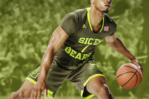
Baylor got the worst of it — sleeved Day-Glo at home, sleeved G.I. Joe on the road, and an idiotic slogan (although at least the apostrophe is facing the right way [but then again, why no space between Sic and ’Em?]):
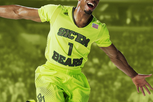
And it looks even worse on a certain quarterback.
As I mentioned to an ESPN News anchor later in the day, Baylor is in a unique position, because it’s the only major school with different outfitters for basketball (Adidas) and football (Nike). So the Bears have the dubious “privilege” of wearing the latest newfangled nonsense from two different loathsome companies — a pretty neat trick! In fact, Baylor’s football and basketball uniforms have been so awful in recent years that I’ve started to think Nike and Adidas are going the extra mile to make the school’s uniforms extra-ridiculous — maybe in an attempt to outdo each other, or maybe as a way of telling Baylor, “If you don’t sign an school-wide exclusive with us, we’ll keep making you wear crap like this!”
And as a bonus, as reader Josh Lassieter points out, Baylor’s baseball team is outfitted by Under Armour. Trifecta!
Unmasking the Commenters: I recently invited the site’s commenters to tell us a bit more about themselves and give us a peek at what they look like, just because I thought it would be fun to pull back the internet’s curtain of anonymity. I’ll keep showcasing you folks as long as you keep sending in your photos and quick bios.
Yesterday we featured DenverGregg, a frequent presence in the comments section. Today’s commenter is RoccoT, who’s more inclined to pick his spots. Here he is (click to enlarge):

My screen name, RoccoT, is just a nickname I picked up along the way from SCTV. I live about 45 minutes south of Toronto and work as a graphic designer. I have done some sports-related designing of logos, uniforms, etc. for local teams and other uni-centric websites. My previous job was painting hockey goalie masks, a couple of which made it to the NHL. When not reading Uni Watch, I play hockey and golf and am involved in my son’s baseball team. (Yes, he wears the high socks — only kid on his team to do so. Sigh.) This photo is from one of our annual pond hockey weekends. Two teams, 12 guys, 12-plus cases of beer, BBQ, curling. Each participant gets a set of personalized hockey cards, a program, and a VIP badge. It’s a great DIY project that I do every year.
Thanks, RoccoT — you help make Uni Watch a better place.
Do you want to be featured in “Unmasking the Commenters”? If so, send me a photo and a quick paragraph about yourself. You don’t have to reveal your real name, and the photo doesn’t have to show your face, but you must include a photo to be considered. Send everything this-a-way.

’Skins Watch: The ’Skins are currently running a marketing campaign to bolster support for the team name, but our friends the Indian Country Today Media Network are having none of it (thanks, Phil).

Baseball News: The A’s are once again giving away a series of pins for Throwback Thursdays, and this year’s batch features some real doozies from all three cities in the franchise’s history. Man, Harvey the Rabbit and Charley O. the mule — gotta like that (from my old zine pal Tom Lupoff). ”¦ Lee Mazzilli wore No. 13 during his second stint with the Mets. Now his son, currently in camp with the Mets, is wearing that same number. … Now that’s a rally cap. From a recent TCU game (from Chris Flinn). … Dodgers OF Carl Crawford is changing uni numbers from 25 to 3, because he and his wife are expecting their third child and 25 “just didn’t feel comfortable” (from Chris Cruz). … We’ve seen these before, but once more won’t hurt: Here’s a great slideshow of old Life magazine photos from the Dodgers’ 1948 spring training camp. Satin unis galore! (From Sean Walsh.) … David Feigenbaum notes that Phillies reliever Jonathan Papelbon was wearing a regular game cap, not a BP cap, for yesterday’s spring training game. … Abilene Christian’s uniforms yesterday were, uh, I don’t even know where to start. That’s a lot to take in! (Thanks, Phil.) ”¦ Oooh, check out this Ray Kroc 80th birthday Padres cap (from Douglas Ford). ”¦ Love the new Mets luggage decal that Pro Helmet Decals honcho David Surlecki came up with. … Frank Jobe, the surgeon who pioneered the Tommy John procedure, died yesterday. Will the Dodgers, for whom he was working at the time, wear a memorial patch? Will pitchers who’ve had the procedure wear their own tribute? Will MLB come up with some sort of gesture for the man who saved countless pitchers’ careers? … Today it’s all Expos, all the time on the SI Vault Twitter feed.

NFL News: Uni Watch is about what the players wear, not what the fans buy, so I don’t generally give a shit about whose jerseys are moving the most (or least) units. Still, I have to admit that it’s interesting to learn that the Seahawks’ “12th Fan” jersey has become a top seller.

Hockey News: Joacim Eriksson, who tends goal for the Utica Comets (AHL), has a very cool mask design (from Andy Bronson). ”¦ The Red Wings retired Nick Lidstrom’s number last night, which means they did the “Let’s all wear the retiree’s jersey” thing for the pregame ceremonies.

Soccer News: Yesterday’s MLS roundup didn’t mention the new New England kit (from Tom Mulgrew). … “New York City FC (NYC’s new MLS club) was supposed to unveil a logo set last week but had to push it back when the Yankees, one of the soccer team’s corporate owners, expressed a concern that one of the designs infringed on their intellectual property,” says Chance Michaels. “A lot of us are speculating that this means there was an interlocking monogram, but we don’t yet know.” … Here’s a gallery that features a good look at all of the home jerseys for the new League of Ireland soccer season. “Also of note in that gallery: the new ball with that retro feel and the slightly bizarre etching of our glorious president Michael D. Higgins’s face on a medal,” says Patrick Fleming. ”¦ A Wolverhampton fan bought a jersey that had an upside-down logo patch, wrote a letter of complaint about it, and received a very amusing reply (from Marc Bauche).

NBA News: The Heat and Spurs did the “Los”/”El” thing last night. After the game, LeBron James blamed his poor shooting performance on the sleeves (and also, according to that story, discarded his mask after the first quarter). How many players have to complain about the sleeves before the league does something about them? ”¦ The Raptors will wear their old purple dinosaur uniform as a throwback next season. Although this is arguably the worst uniform in NBA history (and was a major missed opportunity for an infinite regression!), it totally works as an anniversary throwback — embrace your history, even your ugly history! ”¦ The Nets will wear shooting shirts with THOB on Monday.

Grab Bag: Johnny Football has signed with Nike. ”¦ The Bay Area Sea Lions (A11FL) have posted some uniform concepts and helmet designs (from Eric Wright). … New F1 livery for Williams Martini. “To me, it is gorgeous,” says Carlos Ahmed Jalife Ruz. “Excellent to have back one of the best racing schemes in motorsport.” ”¦ With Scotland taking a vote on possible independence, the UK may have to rethink the design of its flag (thanks, Brinke). ”¦ Good story on how the evolution of women’s tennis apparel has been driven by cultural trends (thanks, Phil). … An old department store in Toronto is selling off a bunch of its magnificent vintage signage (from my pal and cat-sitter Laura Forde). ”¦ Just what the world’s been waiting for: G.I. Joe condoms. “Flag-desecration condoms are next,” says Mike. ”¦ Here’s a 1958 Life magazine spread showing stewardess uniforms from 53 airlines (from Bo Baize). … The boys’ teams at Community High School in Tennessee are called the Vikings, while the girls’ teams are called the Viqueens (from Andy Bartsch).
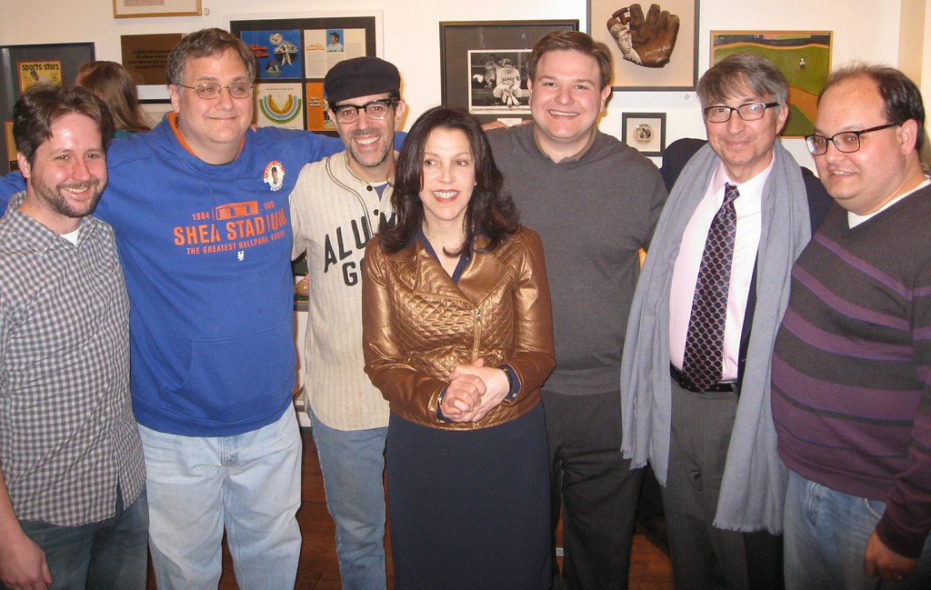
Photo by Heather McCabe; click to enlarge

What Paul did last night: Great time last night at the “Baseball as Good Medicine” event at the Bergino Baseball Clubhouse in Manhattan . There was a bunch of really great storytelling, we raised a lot of money for the excellent Photo ID Foundation, and at least one participant heartily enjoyed the free beer and Cracker Jack.
Pictured above is the event’s coordinator/curator, Annie Levy, standing in the center of the evening’s storytellers (l-r): Ben Hill of MiLB.com; Greg Prince of Faith and Fear in Flushing; myself; Peter Schwartz of Bloomberg News; Rabbi Jeffrey Sirkman; and Dr. Ivan Oransky. Everyone did a great job — lots of very entertaining stories told by interesting, engaging people.
My own story — which had nothing to do with uniforms, sorry — was about one of my favorite baseball-related moments from my childhood. Here’s a video of it — crummy lighting, crummy sound, and I pretty much just sit there, so it’s not very compelling to look at, but at least it’ll give you a sense of what the event was like (video shot by Heather McCabe):
Paul, GREAT shirt you had on last night! Love that.
As for the adidas tournament uniforms, I think their design teams are running out of ideas. Whatever happened to schools having their own unique look? Like Kansas used to wear the Western/Clown font (think Danny Manning days) and it was unique for them. The Baylor set is SICkening.
Sometimes, I think by accident, one of the loathsome companies get it right. I thought the Kansas alternate home uniform set looked good. Simple and uncluttered. The Jayhawks in script across the chest was classic. Then came the Phog set and gag.
Thanks for the kind words about the jersey, Jim — it’s my Very Favorite piece of vintagewear.
Here’s a better look:
link
This was for the factory team of a firm called the Aluminum Goods Manufacturing Company, which was based in Wisconsin. They’re still in business today as a pots/pans company, known as Mirro:
link
Bought the uniform (which includes pants and stockings) in Wisconsin back around 2002. Such a beauty, and sooooooo much better than a $200 polyester shirt…
Good work, PL!
PS: “Faith and Fear in Flushing” ranks high on the all-time list of excellent periodical names.
Yeah, that Aluminum Goods jersey is a treasure.
Magnificent Jersey Brooklyn man!
Wow, the close up look is awesome. What a jersey and what a piece of history back when factories had teams. Love the mid-level stop of the piping.
Hey Paul,
Here is the 1924 Aluminum Goods squad, oddly enough wearing two different kinds of unis.
link
And then, with the unis a bit harder to see, here is the 1921 team.
link
I am from Manitowoc and just wrote a book on the city with my dad – I actually met you in Milwaukee last summer and we talked on this a bit. Sadly, the city just tore down Mirro’s main production plant in Manitowoc this past week after it had been vacant for many years. But that is awesome that one of those jerseys still exists today.
Augh. Ok HERE is the 1924 pic –
link
Kansas already has really nice vintage unis they’ve been wearing this year, why change? Which of these programs thinks it’s a “good idea” to wear these stupid templates that are identical across institutions? Mind-boggling.
Meanwhile, half (or more) of the programs adidas is showcasing… WON’T MAKE THE DANCE. That’s the hilarity of it all.
Kansas already has really nice vintage unis they’ve been wearing this year, why change?
Kansas coach Bill Self, speaking about the Fruit Stripe uniforms a year ago: “[Wearing them] for a game or two, I don’t think it’s that big a deal in the Big 12 tournament. Sometimes you gotta be a team player, and Adidas has certainly been good to us.”
In other words, the schools are owned by the apparel companies. There’s a simple word for this: scandal.
Scandal indeed. The apparel companies are paying the coaches and probably subsidizing the non-revenue producing sports so the school’s sell their souls to the apparel companies and do what they want. Then add in one of the most corrupt institutions of our time, the NCAA, and you really have the double whammy.
You ask the same coaches if players should be paid and they lose their minds. It’s only a business when it suits their bank accounts.
ScottyM, that cream vintage was simply amazing this year. I think adidas had a happy accident because usually their designs stink. That one, though, was awesome. The new shooting shirts Kansas wears with the script are awesome too. But, I heard that KU fans can’t buy them or the jerseys, should they want one, until this FALL. WTF?
Unmasking the commentators is a great feature. 45 minutes south of Toronto should put RoccoT in the middle of Lake Ontario.
In soccer news, Westhampton should be Wolverhampton (Wolves)
Close. I can walk to it.
You can walk to everything if you have enough time :)
Seriously – good profile. I grew up near there, if you’re near “Pig and Whistle Inn” on the Lakeshore.
I didn’t expect a “Days of the Week” reference today. Always appreciated.
It’s Wolverhampton (known as Wolves), not Westhampton (who don’t exist AFAIK), with the upside-down jersey crest.
Right. Now fixed.
I think the Wings should’ve done a mix of jerseys like they did with Steve Yzerman’s jersey retirement, where link.
For Lidstrom, I’d have gone with link (representing his role on a gold medal-winning team), link (as captain of “Team Lidstrom” in the first draft-based ASG), and link (representing his rookie season).
The Dallas Stars are retiring Mike Modano’s number tomorrow. The Stars are playing the Wild tomorrow at the American Airlines Center.
I’m not much of a baseball guy in terms of all the minutae that goes on within the sport (hey, I got my own sport to follow! lol), but I was surprised there was no mention of the following: Dr. Frank Jobe, who should be remembered for his groundbreaking work with his innovative Tommy John reconstructive elbow surgery, passed away at age 88.
Many players’ careers have been extended thanks to Dr. Jobe’s medical knowledge, and we should be thankful for a guy who never asked for the spotlight in coming up with this procedure. RIP, Dr. Jobe.
minutiae* (damn spelling)
Right there in the Ticker. But I added it maybe two minutes after the initial post went up.
Bah, sorry Paul. Should have refreshed. That’s what I get for opening UW, doing some work, then coming back with my thought.
Two “girls team names” of note from Wisconsin:
When the Neenah Rockets added girls sports, the girls teams were known as the “Rockettes.”
And at Milwaukee Pius XI, known as the Popes, the girls teams were, of course, the “Lady Popes.” Well, maybe someday…
Here in South Jersey, we have the Washington Township Minutemen and the Minute Maids. (Cue the orange juice jokes.)
At Madeira High School outside of Cincinnati the boys teams are known as the “Mustangs” and the girls are called the “Amazons.” The name “Amazons” for the girls’ teams was apparently started in the ’70s in response to what was perceived to be a patriarchal society. Some in the community want to ditch the name as it’s meaning is now perceived somewhat different. link
They can’t change the name – it’s about to become link!
Feel sad for those parents who “do not want … their daughters (to) be called Amazons”. And sorry for their daughters.
And the fact that it started as an epithet (even a silly one) that they owned and turned around is even better. That’s link.
Hopefully the superintendent pays heed to the 70% of people who voted to keep the Amazons name. In particular, the one who commented “If your daughter can’t handle the name, how’s she going to be tough enough to play the sport?”
I thought you were going to say “Poontangs”!
They oughta keep Amazons. But Mustangs is trite and cliche at the HS level. The obvious solution is for the boys teams to change to Amazons. Or Gentlemen Amazons, in light of all the “Lady Nickname” teams out there.
Relative to this topic, It’s a small peeve of mine that schools will often put the word “Lady” in front of their girls’ team names. An old friend of mine was a gymnast at Penn State many years ago who told me she and her teammates would not wear the “Lady” Lions gear because they thought it was patronizing. My local high school, for example, labels all of our girls’ teams the “Lady Explorers”. Why? Is the word “Explorers” gender (male) specific? …just bugs me
what? I never knew they had different names! (Went to Mariemont)
“12th fan” is like nails on a chalkboard to me. The NCAA (or somebody) recently held a contest between schools for hoops called “6th fan”. Aren’t there thousands of fans?
Yeah, but they’re looking for a fan that’s better than almost all other fans, except five. First, second, third, fourth and fifth fans don’t deserve shit.
Re camo condoms: I remember seeing a similar item,Stealth condoms, someplace a few years ago: their tag line was “They never see you coming”
for hiding in the bush?
Hey-o.
if an nba player doesnt like sleeves than why cant he roll them up
Not sure how rolling up solves the issue of reduced mobility. In fact, it would seem to exacerbate the problem.
“… Here’s a gallery that features a good look at all of the home jerseys for the new League of Ireland soccer season. ‘Also of note in that gallery: the new ball with that retro feel and the slightly bizarre etching of our glorious president Michael D. Higgins’s face on a medal,’ says Patrick Fleming. …”
“SSE Airtricity League” is the new moniker, the jerseys feature corporate ads, and the trophies are large and unattractive. This isn’t some backwater, you know.
I first read that as “SSE Atrocity League”.
I first read that as “SSE Atrocity League”.
Well that largely depends on whether it was your team or the opposition that just got screwed over by the ref.
Irish soccer is kind of a backwater, isn’t it? Most Irish players of repute end up in England or Scotland by the time they’re 18, and it’s not quite as big as Gaelic football.
All very true but then again those same conditions existed back 30 years ago and yet the league was thriving then. What really damaged domestic soccer in Ireland was the Celtic Tiger. With everyone in the country becoming middle class overnight, the traditionally working class culture of the league was suddenly the wrong income bracket. Great swathes of the Irish nouveau riche, eager to disassociate themselves with every last remnant of “the bad old days”, jumped ship and joined the English football bandwagon which was now delightfully bloated with Rupert Murdoch’s cash. At the height of the boom, there were probably as many people hopping on flights and ferries to go to Anfield and Old Trafford as there were people going to their local LOI ground every weekend. When the Irish teams tried to push back in the mid-2000s, they only ended up driving themselves to bankruptcy mostly, damaging the reputation of the league even more.
Thanks for that, Padday. Since there doesn’t seem to much an LOI bandwagon, I’ll jump on it. Up the underdog!
Yeah, thanks Padday. Didn’t expect to learn something new on a Friday afternoon.
Dear adidas: STOP. It’s all just awful – the boilerplate design, the yearning to be different for the sake of being different, the “HEY LOOK AT ME” attitude of putting company over school, the sacrificing of traditions and school colors, the sleeves… just stop. You make Nike and UnderArmour look competent by comparison. Isn’t that damning enough?
Love that link
I’m curious the reasons for having different outfitters for each squad. Wonder if it was a better deal for the school? Wonder if BU athletics dept is smart enough to play them off of each other?
They once told me that it simply “makes more sense for us financially,” or words to that effect. Couldn’t get them to elaborate on it, or to explain why they’re the only school that operates this way.
Strange. You’d think that if it made sense for them, others would get on board. Do we know for sure they’re the “only” one?
Just poking around their athletics site – men’s golf is sponsored by Ping (women seem to be unsponsored), men’s tennis: UA, v-ball and track/field Nike again.
My guess is that only a few major programs can get premiums on the whole-school deals like North Carolina or Michigan. Alabama can require sponsors to cover all sports if they want to outfit the football team, but a Baylor has less leverage.
I could totally be wrong, but I thought I heard the basketball team switched from Nike to adidas following the bit of unpleasantness in the early 2000s. Doesn’t explain why other sports are neither Nike nor adidas, though. Maybe their getting away from Nike in hoops led them to seek different apparel companies for other sports as well?
Intriguing discussion about just this topic on a Nike forum:
link
Adidas, Adidas, Adidas…
This crap just makes me hate you guys more.
There are a few graphs in this blog post discussing O’s prospect Jonathon Schoop’s general lack of batting gloves during games, though he does wear them for batting practice – link
Based on his vague answer it seems like one of those things he tried once, it worked, and he’s kept doing it ever since.
Great story!
So “Viqueens” is finally seeing use outside Minnesota. Nice to see that.
With all the shitting we do on Nike you have to give them credit for creating uniforms that actually perform well for athletes. It’s quite obvious the same can’t be said for Adidas and Under Armor.
Good point Alex. But, I guess the idea is that the uniforms work for Adidas and Under Armour not for the players.
I can’t speak for the professional level gear, but I’ve been happy with Nike and Under Armour clothes for my running and gym workouts (and I like UA because their outlet prices are pretty comparable to discount brands like Target’s Champion/C9).
Baylor Bears is having identity crisis with ALL sports uniforms! Is shame because green/gold is very good color combo, and is no need to behave like Texas version of Oregon Ducks! Commie Football is complaining about Baylor blackout football uniforms this past season (link) but problem is not just blackout uni – is general desperate attempt of Baylor to be looking like “cutting-edge” school! Is trying too hard and instead is looking like clown school!
The black on black is awesome.
One thing I’m curious about regarding commenters is why some of you are willing to capitulate to Adidas and their preferred style of rendering their name in lower-case.
I’ve noticed Paul capitalizes Adidas, as any other proper name would be capitalized. In fact, the vast majority of English language news outlets, as far as I can tell, render the name Adidas in that fashion. The only outlets I’ve ever seen using the lower-case form are Adidas and their partners (such as the NBA).
ESPN house style is “adidas,” so that’s what I use when writing for them.
But here on this site, it’s Adidas.
Didn’t notice that (I admit I haven’t seen the latest ESPN article yet – which I’ll rectify as soon as I’m done with this reply).
But then again, ESPN is heavily linked to the NBA, so it makes some sense that as the NBA goes, so would ESPN go, so long as that much money is involved.
it makes some sense that as the NBA goes, so would ESPN go, so long as that much money is involved.
You’re off-base on that one. Plenty of media outlets use “adidas” because it’s the company’s preferred styling of its own name.
Style rules vary from media venue to media venue, but I’ve written for a LOT of magazines and websites over the years and can tell you that style rules are not governed by business considerations. They’re governed by the editorial sensibilities of the copy department, period.
Well, it’s not the first time I’ve been wrong…
Though I’m still curious about the commenters here.
That’s interesting. So why don’t you use the lower-case?
I’m intrigued by how we deal with these now that more and more companies are adopting the e e cummings treatment or worse. eBay is a particular offender, especially since their link never reflected their link. Reuters, for one, link their preferred lower-case “e”, unless the name starts a sentence.
So why don’t you use the lower-case?
Because insisting that your corporate name begins with a lowercase letter is annoying and pretentious (plus it looks like shite, because we instinctively expect company names to be proper nouns), and I decline to play along with that crap.
Something getting lost in my inaccuracies regarding professional style guides and all:
What about the commenters using the lower-case form?
Rob, most people are reallyreallyreally inconsistent about capitalization. They capitalize random words for no reason, fail to capitalize certain proper nouns for no reason, etc. This is nothing new (all part of our society’s growing illiteracy), but email and texting have made it worse. So I wouldn’t read too much into people using “adidas” instead of “Adidas.”
[random capitalization is] all part of our society’s growing illiteracy
I beg your pardon?
link
We’re living at the end of a 150-year golden age of standardized capitalization. But this era is the exception, not the rule, in the history of written English, and the reversion to traditional, freer capitalization is less a sign of “growing illiteracy” and more a sign of renewing linguistic democracy. The centralized, authoritarian grammar of the industrial age has always been a poor fit for our polyglot lingo of the public house and the trading floor.
Anyway, “adidas” is no more pretentious than “ee cummings.” I say that the true anti-pretension stance is simply to call everyone what they wish to be called. The other guy calling himself something silly is just as pretentious either way, but arguing the point is a form of pretension. On the other hand, capitalizing more than one letter inside a word with no spaces? Fuck that, and yes, I’m talking to you, PriceWaterhouseCoopers, and I don’t care how pretentious it makes me to say so.
Anyway, “adidas” is no more pretentious than “ee cummings.”
Yeah — they’re BOTH fucking pretentious.
Still, there’s a difference between a person engaging in this behavior and a corporation doing so. When you get down to it, there’s really nothing more personal, and less anyone else’s business, than what a person chooses to call himself. That’s as true for ee commings as it is for Metta World Peace. I’ll always respect a person’s choice in that regard, no matter how silly I might think it is.
But a corporation just looking for a point of difference? Fuck that. Citizens United notwithstanding, corporations are not people.
The new March Madness jerseys are not any worse than what they have on the NBA store site. They look like fruit stripe combined with leopard print.
link
The boys’ teams at Community High School in Tennessee are called the Vikings, while the girls’ teams are called the Viqueens (from Andy Bartsch).
Um, no, THIS is the Viqueens! link
All
Day
I
Design
Absolute
Shit
Ha!
Killer Mike is going to sue your ass.
link
you must a young youngster…..
the “A.D.I.D.A.S” abbreviation game has been going on for decades.
But thank you for pointing out anouther reason I don’t care much for rap. I didn’t say I hate. I just don’t care for much of it.
FWIW, Killer Mike is a talented fella. But yeah, “all day I dream about sex” has been around for at least 30 years now.
A much, much better rap tribute to the German shoe manufacturer:
link
Yankees, one of [NYFC’s] corporate owners, expressed a concern that one of the designs infringed on their intellectual property,” says Chance Michaels. “A lot of us are speculating that this means there was an interlocking monogram
The article mentions pinstripes, I’d bet that’s what it was.
Visually, the interlocking NY would be hard to translate to NYFC and a pretty blatant infringement. I don’t think they’d write the whole name out in the Yankees style script either. Pins on the other hand would translate well to soccer jerseys or crests.
I seriously doubt that it’s pinstipes. Partly because the Yankees have never (to my knowledge) objected to other sports teams using pinstripes, even in their own league, and partly because they’re not talking about uniforms. The uniforms are in all likelihood still a year away, and in any case will be designed in partnership with Adidas, which isn’t mentioned anywhere. This issue seems to only be about logos.
I suspect that the logos might have been along the lines of link from NYC-based designer Milo Kowalski. He has an link and a link that could easily be claimed to infringe upon the Yankees’ marks, by the standards link.
It’s a shame because I think Kowalski has a brilliant design, and really want to buy link.
Should have included this in the Ticker (and will add it now): Over on the SI Vault twitter feed, they’re running all Expos photos today:
link
Oooh! I’m headin’ right over. Thanks for the tip.
In all seriousness, this is one of the best photos I’ve ever seen:
link
And only partly because the old racing-stripe Expos unis were so beautiful.
In all seriousness, I agree. And I also seriously aime les Expos.
That would be the “expos”.
Adidas, Under Armour and New Balance’s Warrior brand all submitted bids for Manziel’s marketing rights.
Warrior? Aren’t they like a lacrosse brand? Since they could never show their logo on field, why would NB try this?
They started doing soccer two years ago with the Liverpool sponsorship. I’m guessing they want to expand to all team sports.
Also, Warrior would try to get Manziel for the same reason UA started signing NFL players – they can still appear in ads.
Isn’t Under Armour an underwear brand?
Why is Baylor’s new road uniform considered G.I. Joe?
Because Adidas stated that they used “army green” as a nod to the school’s “strong military history.”
Thanks, didn’t see that.
Because it’s been explicitly identified as “Army green” instead of their usual shade.
Paul beat me to it…
Didn’t “Army green” used to be known as “Olive drab?”
Yeah, but that didn’t sound pro-military enough, so they had to make it sound sexier.
Could be worse. They could have added BGFBGS (Battleship Grey For Battleship Grey’s Sake).
In these modern days, do the kids even know that green is a color that soldiers might wear? “Camo” is the only color most folks younger than Operation Urgent Fury have ever seen an American soldier wear. “Army green” isn’t a tribute to the troops; it’s a reference to Toy Story.
The Lidstrom patch on the Red Wings Captain & Alt Cap’n sweaters sure looked crowded. As much as I complain about the Rbk Edge, I love that nuance the tighter sweater created for the Wings with their reverse captaincy patches.
USA away kits leaked:
link
meh, I liked the “link” better. Scroll down that link, there’s a gorgeous crest concept in the comment section.
Oh for the love of … While it’s a perfectly fine jersey,* it’s yet another completely new style for USA with little root in our soccer history. The lack of a consistent style for USA is not only a problem with building domestic support for & identification with American soccer, it’s actually a problem on the field. Sure, most of the disrespect USA gets from the global soccer community, including the officiating corps, is based on old-fashioned anti-American resentment. But some of it is based on USA’s reputation as a second-rate upstart. Used to be true! But for at least 12 years, USA has played like a serious world soccer power. But FIFA, other teams, and refs by and large still treat USA like a joke. And it doesn’t help that Team USA dresses like a second-rate upstart joke still in search of a look. This lack of respect has real on-field effects; among other things, it cost USA an almost sure shot at the World Cup final game in 2002. If Germany commits that handball against, say, England or Argentina, it gets called, and Germany doesn’t win the game to advance to the semis. But it’s USA, and you get the benefit of the doubt against USA, so the handball isn’t called and Germany advances.
Settling on a basic signature look for USA won’t instantly get the rest of the soccer world to act like they believe USA belongs on the field, but it will help on the margins, and USA soccer needs all the marginal help it can find.
*For France, that is.
“*For France, that is…”
Exactly.
I thought we were on to something with the thick red hoops. Guess not.
Want Waldo!
I get what you mean regarding a distinctive look for the home jersey, but the away? Hardly any of the teams at the upcoming World Cup have a distinctive away look. The only exceptions I would say are Brazil and Croatia and perhaps some of the more minor teams. But Spain, Netherlands,Russia, Germany, Argentina… do any of those away jerseys speak to roots? It just seems like your stretching your premise waay too far here.
In fact, I’d be willing to say that it’s this kind of attitude which more than anything else keeps USA soccer from being properly respected. It’s an inferiority complex, it’s this creeping paranoia that the entire world thinks you’re a joke because you don’t conform to some specious set of standards that absolutely nobody else in the world conforms to. You want to know what US soccer roots are? They’re faux denim, they’re indoor soccer, they’re a 35 yard “blue line” for offside, they’re USA-1 England-0 in 1950, they’re footballs with stars on them, they’re Pele and George Best walking their zimmer frames through defenses… The story of USA soccer is varied and it is strange and essentially what you want is to deny all of that because you think maybe then the cool countries will stop flinging spitballs at you.
A lot of truth in that. But. Take a step back: If the red-white-and-blue shirt is the “away” jersey, then the nearly unadorned plain white is the “home” jersey, and plain white with minor red stripe accents is perhaps the most un-USA home jersey design imaginable. Seriously, do the people dressing Team USA not know what country’s monarchy the United States formed in rebellion against? Or what that country’s national soccer team wears as its signature home uniform?
So even with your point taken and granted, I think my point stands.
I agree that the home is a pile of crap but I simply put it down to lazy and uninspired design. If anything I think it’s analogous to the March Madness jerseys – Nike, like Adidas, had a brand vision and that brand vision trumped considerations for how the jersey would look on its own or how appropriate it would be for the particular team. To draw it out as some kind of elaborate allegory on the state of US soccer seems like just too fanciful a reach. Most of all though, as I said before, your point of view is indicative of an inferiority complex in US soccer which I think is detrimental to the vitality of the sport there in that for every attempt to bring the culture in line with some perceived notion of the norm, the greater the risk of it simply descending into parody. The more US soccer focuses on building from within, rather than on some superficial facade to appease the outside world, the more it will be able to impose a real and tangible presence both on the field and on the culture as a whole.
Seems like the way the NBA should go with sleeved uniforms is the soccer model. Make both sleeved & unsleeved with the same design & allow the players to decide what they want to wear.
Given the option most will probably go sleeveless at least initially, but there will be some who will go with sleeves.
But that gets in the way of Adidas’s grand plan to get people to buy more stuff.
Also, the construction of a tank top is different from a sleeved shirt, long or short, specifically the shoulders and the armhole.
re: Raptors
Here’s link that doesn’t require watching an ad.
Kudos to the A’s for acknowledging all eras of the team by including Rube Waddell, Connie Mack, and Mickey Cochrane in their promotion. This is the correct approach to history, as shown also by the Braves with their statue of Warren Spahn.
As a lifelong A’s honk, I completely agree.
Funny how Connie Mack looks (to me) a bit like link too … must be the hat.
N-Now
I-Inveigling
K-Kids
E-Everywhere
Ok, now do one for Russell Athletics.
Baylor uniforms are horrendous; worst ever, and sleeves and neon have nothing to do with it. Anything with a slogan or something like “MIZZOU” comes off small time, woeful.
Viqueens?
link
link
link
Since I brought up writing style before, there’s a related item regarding this site that, well… just annoys me, really. And it’s bugged me for a long time, but today I feel like I should finally get it off my chest.
To me, “G.I. Joe” is not a generic term. Every time I see that name, I think very specifically of the 1980s franchise, featuring brightly-clad characters fighting against a masked megalomaniac with a snake fetish.
I get that when Paul uses it, the intended message is that sports teams that tie heavily into pro-military messages are being equated to children playing with toy soldiers. But my fond memories of the comics and toys (and not-nearly-as-fond memories of the goofy-ass cartoon) will make me think of that franchise every time.
It’s really a mild annoyance at best – I’m not here to say “You can’t do that!” or anything. It’s just one of those little things.
Honestly, I don’t even know what “the 1980s franchise” you’re referring to is.
link
Here’s a site with the toys, comics, etc from 1982 to present.
At one time, GI Joe had a partnership with pro wrestler Sgt. Slaughter. They created him into a character in the series
Give me a 12″ talking GI Joe with life-like hair, kung fu grip and Adventure Team paraphernalia any day!
LOL!
At one point they were going to include Rocky Balboa into the series as well, but the licensing deal fell through. They still came out with the character intended to be his rival on Cobra’s side, “Big Boa”.
Don’t forget link.
Rob S./Mike M. – you guys do realize that 1980s G.I. Joe was a reboot of a toy first introduced near the height of the Vietnam War era, right?
link
Man do I feel old…
I’m fully aware of it, and Hasbro is in fact celebrating the 50th anniversary of the entire franchise this year.
In fact, it was the Marvel comic series (and its writer, Larry Hama), who reintroduced the original Joe into the 80s franchise, giving him a full-fledged character and identity of “Joseph Colton” for the first time, as the original toy was a generic character for kids to insert themselves into as a role-play.
In fact, the “kung-fu action grip” and “life-like hair” came about at the same time Hasbro retooled the original lineup from its military roots into the “Adventure Team”. But, interest in the line waned, and kids in the mid-70s flocked to licensed toys from other companies.
It wasn’t until Kenner enjoyed sustained success with their smaller Star Wars figures that Hasbro decided they needed something to counter that, and by that time attitudes had changed, so Hasbro teamed up with Marvel Comics (and specifically writer Larry Hama) to re-envision G.I. Joe as an anti-terrorist team with a clearly villainous opponent not tied to any real-life nation or organization.
And then the cartoon came along and made everything… cartoony. Red lasers vs. blue lasers (which completely marginalized characters that were designated laser weapon specialists), crazy sci-fi plots, and an insane military budget that allowed for dozens of multimillion-dollar planes to be shot down every other mission (and yet everybody managed to parachute to safety), not to mention the ridiculousness of a gigantic base with a gigantic cannon that was locked in only one direction. And don’t even get me started on the animated movie, though I will concede that the opening title sequence is crazy-awesome.
One amusing anecdote relating to G.I. Joe; back in the early 90s, when I was in high school, I was also in the Boy Scouts, and one day while waiting outside to leave for a meeting, a couple of younger neighbor kids approached me, and seeing my link, asked if I was link. I wasn’t wearing a neckerchief, but I also wasn’t wearing a bandolier (and I’ve never been blond).
It’s kind of funny, to think back that I grew up with such series as G.I. Joe, Transformers, and Star Wars, all very war-intensive… and these days I count myself among the fandom of My Little Pony: Friendship is Magic.
I’m just one crazy nerd who just also happens to be a sports fan with an eye for uniforms. Maybe I ought to submit a profile for the UtC segment!
The baseball uniforms of Albilene Christian look more like something I’d expect from a 1980s version of the Colorado Rockies.
I like! How much? (/borat)
Southern Miss is tweeting out all kinds of new football helmet designs.
link
Touching story, Paul. From sound of the clapping, there were a few folks there to hear it, too. Yay! Great jersey.
20 years later the Raptors radical uniform design is being recognized and embraced as a defining “cool” look of a much more interesting and dynamic time for NBA uniforms. Just because the blogger/author is fascinated with King Louie bowling shirts and poor fitting wool flannels doesn’t mean cutting edge far forward designs are ugly. The author might want to look into the mirror before they leave to house to truly understand ugly.
The Raptors will wear their old purple dinosaur uniform as a throwback next season. Although this is arguably the worst uniform in NBA history (and was a major missed opportunity for an infinite regression!), it totally works as an anniversary throwback – embrace your history, even your ugly history! …
Just because the blogger/author is fascinated with King Louie bowling shirts and poor fitting wool flannels doesn’t mean cutting edge far forward designs are ugly.
True enough. By the same token, just because an internet troll hiding behind a pseudonym thinks something is “cool,” “interesting,” “dynamic,” “cutting edge,” or “far forward,” that doesn’t make it so. (When the pseudonymous troll resorts to personal insults, that usually doesn’t help his case.)
Tastes are inherently subjective, and we’re all free to disagree. But I’m a cultural critic, which means I don’t just express my tastes — I explain and contextualize them. You’re free to disagree, but it would be helpful if you could try to explain and contextualize YOUR tastes, so we could have some basis for stacking up your opinion against mine. Otherwise, you’re just a heckler with nothing constructive to offer. Your chief complaint seems to be that the guy who runs this site is, um, the guy who runs this site.
I for one look forward to hearing you explain how the Raptors purple dinosaur jersey is a masterpiece of design. Bring it!
link
link
link
Good thing that the fans have a voice in determining what’s ugly or not?
Ugh, the censorship is worse than in the Ukraine.
I beg your pardon?
That NYCFC crest looks great. Since the Yankees are part owners, and the team will be playing at Yankee Stadium, Im surprised the Yankees dont want to implement their branding into NYCFC.
I don’t care for most of the uniform designs that have come in the current sales-driven fabric explosion. But it literally breaks my heart that Indiana Basketball is now participating.
Agreed. I’m surprised that nobody has tried to figure out the last time any Indiana University men’s basketball team wore anything other than an arched “INDIANA” and the number on the front and back for both home and road.
Indiana’s uniforms are like Carleton Blues, Detroit Tigers, New York Yankees, Montreal Canadiens. Don’t mess with them.
It’s kind of interesting to think of that next to Paul’s list of NFL teams that were theoretically Nike-proof. If IU hoops can bend to the whim of the apparel manufacturer (granted, even for just a few games), what’s to stop Nike from digging its claws into traditional NFL teams?