One of the sadder aspects of covering the uniform beat is that it’s my job to watch the Pro Bowl. And that aspect of the job was never sadder than last night. I had considered getting one of the interns to handle it, but that seemed too cruel. So there I was last night, along with the Pro Bowl’s 23 other viewers, parked in front of the teevee. Sigh.
You know the drill: The uniforms featured highlighter colors and GFGS and generally looked like what some D3 school would wear if they’d ordered cut-rate “rivalry” uniforms from the Nike catalog. I’m fairly certain the following words have never been said before (at least not truthfully): You’d have been better off watching the Grammys.
Still, a few details worth mentioning:
• Each player wore small stars above his NOB, denoting how many Pro Bowls he’d participated in. This looked fine during close-ups, but from a distance the stars often looked like dots, making it seem like NOBs all over the field had sprouted a bad case of umlauts.
• Josh Gordon of the Browns wore an orange visor. Between his helmet, his visor, and the white uniform’s orange trim, he was probably the most color-coordinated player on the field. (My thanks to reader Aaron McHargue for this one.)
• Another rare player who didn’t look completely embarrassing: Cameron Wake of the Dolphins.
• All players wore a silver/black version of their team logo as a sleeve patch. Naturally, this posed a problem for the Browns, whose players wore a plain silver helmet. Lame. Why not use a silver version of Brownie the Elf? (That sound you just heard in the background was The Jeff screaming for the Browns to get a helmet logo already, but just ignore him.)
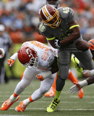
• Greg Hardy of the Panthers likes to call himself “Kraken,” and he wore that nickname on the back of his helmet last night. But his handwriting sucks, so it looked more like “Krakew.”
• Both teams wore silver-ish numbers that were often hard to discern, depending on how the light was hitting them. But Jerry Rice and Deion Sanders, who chose the two rosters, were wearing sideline T-shirts with solid-colored numerals that were much easier to read.
Also: Several readers, noting that the two teams weren’t selected until Wednesday, wondered how Nike got the jerseys made in time. Maybe it’s just me, but four days seems like plenty of time to get 86 jerseys set up. Or maybe they just had two jerseys made ahead of time for each player — one white and one gray. Either way, doesn’t seem like rocket science.
(My thanks to all contributors, including Joshua Buksbaum, Brian Engle, Jacob Kennedy, and Aaron McHargue.)

Meanwhile, on the ice”¦: The Rangers and Devils had their Stadium Series game at Yankee Stadium yesterday. A few thoughts:
• The Rangers would’ve been better of with their standard white uniforms. The Stadium Series version has that annoyingly shaped shoulder yoke and the “metallic” lettering that doesn’t look at all metallic. Textbook case of fixing something that wasn’t broke.
• One interesting thing about the Rangers’ uniform, though: It was kinda cool how the diagonal sleeve stripes often ended up being parallel to the ice surface based on the way the players moved. Nice visual effect.
• Reader Alan Kreit spotted something new: Rangers goalie Henrik Lundqvist has a tattoo on his back.
• As for the Devils, it was great to see them trimmed in green again — or it would have been if they had used a consistent shade of green. As it turned out, the green on the jerseys was much darker than the green on the pants and socks. Pfeh.
You can see dozens of additional photos here.

’Skins Watch: Oneida Nation representatives met on Friday with the United Nations’ Assistant Secretary-General for Human Rights to discuss the human rights implications of the ’Skins team name (from Tommy Turner).

Baseball News: Check out this gorgeous Babe Ruth pocket watch that’s up for auction (from Bruce Menard). … Three Japanese baseball items from Jeremy Brahm: The Yakult Swallows will wear green jerseys for seven home games this summer; new road uni for Yokohama DeNA; and the Hanshin Tigers have a new logo for the 2014 season. ”¦ Here’s a shot of Dodgers first base coach Manny Mota wearing the team’s 1980 All-Star Game patch. The thing is, that shot isn’t from 1980 — it was taken from the second game of the 1981 season, when Mota should have been wearing the team’s Los Angeles bicentennial patch. You can see for yourself at the 1:10:42 mark of this video (great catch by Dave Traub). ”¦ Also from Dave: Brooks Robinson appears to have been wearing a logo-less batting helmet in the 1971 All-Star Game. ”¦ Check out this shot of Nolan Ryan in his Little League uni. See that line toward the bottom of his left pant leg? James McNamara is wondering if that might be a “blouse here” indicator. I kinda doubt it, but it’s an intriguing thought. ”¦ Who’s that one the mound? None other than Darryl Strawberry, pitching for his high school team in 1980 (thanks, Phil). ”¦ “I just returned from Tucson, where I managed one of the four teams in the Dodgers/Angels Fantasy Camp last week,” says ex-MLBer Jerry Reuss. “Thought you would like to see the socks worn by camper Greg Rothman in Saturday’s All-Star Game.” I see he also chose a significant uni number! ”¦ “During the Brewers’ fanfest on Sunday, the team announced it had signed free agent Matt Garza,” says Dan Cichalski. “Garza usually wears No. 22, but Brewer Logan Schafer already had that number. Well, Schafer gave up the number for Garza and got a new jersey during fanfest!” Here’s Schafer wearing his original No. 22 at fanfest, and here’s a shot of him after the number switcheroo. ”¦ We all know that the A’s wear white shoes, but apparently nobody told Joe D. (from Richard Paloma). ”¦ Holy moly, look at all the advertising patches being worn by these umpires (from Mitch Barbee). ”¦ SABR member Amy Tetlow Smith has written a research paper titled “Scorecard Advertisements as Social History.” The good news is that it’s available here. The slightly frustrating news is that the text refers to dozens of images that are all in a separate file, here. Too bad they weren’t integrated into one, but it’s still fascinating stuff (big thanks to Jerry Wolper).

NFL News: Wilson — the company that makes the NFL footballs — has produced a series of minimalist graphics that document key Wilson-driven moments in Super Bowl history. Okay, so they’re basically corporate propaganda, but the graphics are pretty cool. They’ll be adding a new graphic each day from now up through Super Sunday. … Here’s a good piece that breaks down Super Bowl results — and predicts this year’s winner — based on team mascots. … Brady Phelps got in the Super Bowl spirit by making himself some Seahawks and Broncos pancakes. ”¦ Meanwhile, ’tis the season for Super Bowl-themed soda displays, as seen here, here, and here (thanks, Phil). ”¦ Each student at a Seattle elementary school received a free Seahawks jersey last Friday.

College Football News: “This photo of an updated Louisiana-Monroe helmet has been circulating among boosters and alumni,” says Michael Cossey. “The gold facemask and gold accents on the center stripe are both new. It also looks like the warhawk head on the side is more metallic than in years past. If this makes it to the field in 2014, it would be the first significant helmet change since the ULM Indians became the ULM Warhawks in 2006.” ”¦ What’s with the big sun patch? “That’s the jersey worn by running back Hascall Henshaw of Arizona State University (then known as Arizona State College) in the 1940 Sun Bowl,” explains Raymie Humbert.

Hockey News:
Here’s a good breakdown of which brands of gear are being worn by the players on the U.S. Olympic hockey team (from Tom Mulgrew). ”¦ Remember the uniforms the Lake Erie Monsters wore for their recent outdoor game in Rochester? They wore them again on Saturday night (from Tom Pachuta). ”¦ The Cedar Rapids Roughriders are celebrating their 15th season. But instead of wearing a patch, they’re using their anniversary logo as their jersey crest (from Al Gruwell). ”¦ Here’s the mask that Stars goalie Kari Lehtonen will be wearing while playing for Finland in the Olympics (from Mike Engle).

Soccer News: New kits for the Japanese team Vortis Tokushima. The sponsor, Pocari Sweat, is a sports drink. I’ve always loved that they use a Coca-Cola-ish wave in their package design (from Jeremy Brahm).

College Hoops News: As you probably know by now, Marquette wore pink uniforms on Saturday. Boston Globe columnist Bob Ryan initially Twitter-trashed the pink look but then beat a hasty retreat after hearing it was part of the Coaches vs. Cancer initiative. Should’ve stuck to your guns, Danny boy: Good cause or no, it was a brutal look.

Grab Bag: This article about corporations recognizing that global climate change is affecting their bottom lines includes a few grafs about how Nike is dealing with the problem. ”¦ The Pentagon has announced that Sikhs and Muslims in the U.S. military will now be permitted to wear beards. ”¦ Same shit, different douchebags: Under Armour has come up with an answer to Nike’s “Just Do It” slogan (from Willard Kovacs). ”¦ Lots of great-looking striped socks — intended for rugby, I think, but suitable for everyday wear — here. Plus that company has an animated scrolling favicon! (Big thanks to Brian Wulff.) ”¦ Auto racing news from David Firestone, who writes: “In the Rolex 24 at Daytona, driver Richard Westbrook was wearing a helmet that had both a side and a top ventilation port, which is something I have never seen. Most helmets have one or the other.”
You should listen to this: By far the best new album I’ve heard in recent months is Year One by the Columbus band Connections. It’s actually an anthology of the two LPs and one EP they released in 2013 (yes, they’re productive little buggers), and it’s pure gold. Haven’t seen them live yet, but I’m hoping they come to NYC super-soon. Until then, I’ll have Year One on heavy rotation, and I strongly recommend that you do the same. Dig:

What Paul did last night two nights ago: On Saturday the New Girl and I went over to our friends Michelle and Mark’s house, where we had dinner and then watched the David Cronenberg film eXistenZ, which is about virtual reality gaming (and which I hadn’t seen since its original release in 1999). Given how video gaming has gotten much more “real” in the 15 years since eXistenZ was made, the film is remarkably prescient. It also has a connection to The Matrix (just like in that film, people in eXistenZ are fitted with surgically implanted ports so they can be plugged directly into virtual reality settings), and its exploration of our relationships with technology prefigures some of the current cultural dialogue regarding Her. Plus it has all the usual Cronenberg creepiness. Not in Cronenberg’s upper echelon but still recommended.
I recall Brooks Robinson wearing a logo-less batting helmet with a short visor thru-ought the 70’s…
I thought the numbers were perfectly readable most of the time.
…and yes, the Browns do need a helmet logo, or at least a half decent secondary logo to use in cases where a helmet doesn’t really work (like on a jersey patch).
Haven’t they used a dog before? I think they should stick with that as a secondary logo.
rather they stick with Brownie.. the dog logo is too generic and they have gone away from the dawgpound connection the last few years
Brownie the Elf is a great secondary logo to use to things like the Pro Bowl Jersey
I really don’t like the Brownie for some reason. He just looks like he should be trying to sell cereal or baking cookies, not representing a football team. At the very least, he needs an update of some kind. I don’t think he needs to be “tougher” like so many new logos today, just… drawn better.
Of the team’s recent logo attempts, I definitely prefer the dog.
/Of course, the Browns best logo was when they changed their name and switched to that winged shield. That was a great logo.
“/Of course, the Browns best logo was when they changed their name and switched to that winged shield. That was a great logo.”
i am going to barf now
On your Brooks Robinson note, he wore that logoless helmet through a good portion of the early 1970s. His helmet was also sans logo in the 1970 World Series (check it out about 46 minutes into this clip: link) and again in the 1971 Series (link). The logo was on Robinson’s helmet in the 1969 World Series (about 26 minutes in: link). Uni Watch has already taken on the most interesting feature of Brooks’ helmet, the short brim (link)
I knew about the brim, for sure. But I didn’t realize he routinely went without the logo. Very odd — what would the reason be for that?
Of greater note might be Norm Cash wearing his cap while batting in the 1971 All Star game. I think he may have been the very last player to wear his cap and and old inner liner that they used to wear while batting.
I’m surprised by how very much I don’t dislike the Pro Bowl uniforms. In twenty years we’ll look back and admire the restraint and taste of mid-twenty-teens special event uniforms, compared with what every team but the Cowboys wears.
On the other hand, the uniforms clashed with pretty much every helmet. Would the game be playable if everyone wore their regular team uniform, either light top/dark pants or dark top/light pants?
On the other hand, the uniforms clashed with pretty much every helmet. Would the game be playable if everyone wore their regular team uniform, either light top/dark pants or dark top/light pants?
Playable, yeah. Watchable? I’m not sure. I know I’m always screaming about wanting more color… but I’m not sure if 6-7 Different Colors vs White is a good idea.
Pro Bowl uniforms have always clashed with most of the helmets anyway.
The Pro Bowl is “watchable”?
Compared to everything else on TV at the same time? Yeah.
What is this “Pro Bowl” people speak of?
I agree with arrScott. I didn’t mind the uniforms at all. In fact, I thought they were much better than the generic red/blue/stars unis they’ve worn up until now. And yes, the helmets clashed. Most of them have always clashed. That’s the price you pay for having players represent their teams with their regular helmets. I much prefer that to a Pro Bowl helmet for all.
I also liked the way they chose the teams. I thought the pickup nature of the selection was interesting and made the game more fun. Felt like a bunch of guys got together, picked teams, and played a kid’s game. Much better than trying to give it “meaning”, as MLB has done with their All Star game.
The one thing about the Pro Bowl that wasn’t broken, was how the teams were picked. I don’t usually watch the game anyways, but to me, by having random players on random teams, it would just make me care that much less.
Anyways.
Lee
The two Kraken links are identical — missing the image from the game
Thanks — now fixed.
Here’s the proper link:
link
Yep, looks like Krakew.
RELEASE THE KRAKEW!!
Someone had to say it…
Kraken guy sounds a bit odd. I’m not familiar with the guy at all, but that little interview gives me the feeling that it’s a matter of time before he goes off the rails.
Panthers fans are pretty familiar with him, and it’s really all in good fun. It’s hard to dislike a guy with link
It’s not the first time he’s gone DIY, though link there.
I am not a hockey guy, but the the most wonderful words I read this morning were, “Meanwhile, on the ice…” because they signaled the end of the Pro Bowl entry!
btw: I watched neither the PB nor the Grammys.
I watched The Bachelor Wedding with my wife. Then later, I remembered that the Pro Bowl was on that night. And I didn’t care.
I went to a Kurosawa double feature at the Castro (San Francisco).
I made the right choice.
Lee
When, exactly, is that not the right choice?
Why would anyone watch either the Pro Bowl or the Grammys, when the 2014 Continental Cup of Curling was on the air? North America defeated the World for the second year running. Sadly, Norway was wearing plain black pants like everyone else.
Some Pro Bowl. Some curling. There isn’t enough money on earth to pay me to watch award shows.
Award shows are literally the worst.
Lee
A-frickin’-men!!
The mark on Nolan Ryan’s pant leg (his right, not left) looks to be a blemish on the photograph, not a mark on the pants themselves. The picture is dark but you can see a blemish, pen or pencil mark, that continues on the same line up to his right.
I initially thought that too. But then I realized that the “continuation” of the line is actually one of many diagonal lines from the chain link fence behind him. And if you follow the arc of the line on his pants, it doesn’t quite match up with that other line.
Seeing how his pants aren’t *that* dissimilarly bloused, I would think you would see a similar line on his left leg as well if it were a blousing indicator.
I have to go with photo blemish.
Re: Those striped socks.
They’re from O’Neills, the biggest supplier for Gaelic sports.
Two big likes this morning: Greg Rothman’s Dodger Blue-and-white striped socks and Kari Lehtonen’s goalie mask for the Olympics. The Finland Lion is a beaut, and I’ve always been partial to names of non-Indo-European-language countries that bear no resemblance to their English version (Suomi/Finland, Magyarorszag/Hungary).
Couldn’t get a screenshot, but on NBC they showed a closeup of Tony Gonzales’s jersey stars. Since it was his 14th Pro Bowl, the stars went all the way across the top of this nameplate.
I’m a big hockey fun, but I was totally unaware that the Stadium Series was yesterday.
It was also Saturday night at Dodger Stadium.
Ah. I’m totally out of the loop. But my Capitals weren’t playing, so that might be part of the reason why I wasn’t as aware as I should’ve been. I did know that they were setting up the rinks. I just didn’t know when the games were.
Rangers/Islanders Wednesday night at Yankee Stadium.
So a company’s adoption of a marketing slogan now constitutes “corporate douchbaggery”? Perhaps the slogan’s tweaking of a competitor qualifies it as such? Or does it simply reflect dislike for the actor?
Regardless, the characterization’s a facile one.
So a company’s adoption of a marketing slogan now constitutes “corporate douchbaggery”?
Not at all. But when two companies that have had similarly deleterious effects on the uni-verse engage in this sort of tit-for-tat sloganeering, and when one of those companies has clearly modeled itself on the other, I’d say that’s pretty much definition of “Same shit, different douchebags.”
Under Armour has had that “I Will” tagline since the middle of last year; I recall that appearing in some ads featuring their athletes.
Both companies definitely seem to have a “you did this? Well, we’ll do *this* thing going, for sure.
“I Will” is much older than last year. Maybe ten years old. Used it in the first commercials for the company. This is a good place to start. link Although one may feel that “I will” was not used in such manner at the time of this commercial, I would argue that “I will” steps from this time period. I’m not sure if that commercial was the first either. It’s from, at the latest, 2006.
Got it. Anything Nike/UA do is a douchebag move unless you deem otherwise.
Thanks for confirming … I mean, clarifying.
Anything Nike/UA do is a douchebag move unless you deem otherwise.
Essentially, yes. I’m not sure why you have a problem with that. I mean, you’re free to disagree with my opinion, but I can’t imagine why you’d have a problem with me expressing that opinion, esp. on my own website.
4 days to turn around Pro Bowl uniforms. Yet, Nike often has a 2-year lag for universities to change their uniforms. Hmmm…
Also, “Just Do It” was a revolution (literally). “I Will” … comes across as “We’re #2, so we try harder.” Ala, Avis’ response to #1 Hertz. A little advertising history lesson for you. Ha.
For whatever reason, Nike’s rivals have had trouble coming up with a tagline that competes with “Just do it”. Adidas’s “Impossible is Nothing” got close, but it was a little too clunky, and the current “All In” doesn’t really resonate. I think “I Will” gets closest as a mission statement, and it fits Under Armour’s positioning as the upstarts (even if grandpas are wearing UA polos nowadays).
The worst attempt was the late-80s link.
So the Wieden and Kennedy guys were at a bar one night, brainstorming, and literally one of them said, “I wonder how many sports Bo knows?”
(click, lightbulb goes off.)
4 days to turn around Pro Bowl uniforms. Yet, Nike often has a 2-year lag for universities to change their uniforms. Hmmm…
I don’t think there’s a comparison to be made there. On one hand, we have four days to sew names and numbers on the backs of jerseys. On the other, a two-year lag in part so the schools can clear out existing merchandise stock. Not the same thing at all.
Nah, you’re missing the point. When a coach/school requests a redesign of their uniform… it takes 2 years for Nike to fulfill that request.
That has nothing to do with clearing out the excess merchandise. It’s about prioritization. NFL and Oregon get it. Everybody else has to wait.
I’m still not sure what that has to do with sewing names on the backs of jerseys. It’s not like they designed two whole new sets of uniforms in that four days.
“Nah, you’re missing the point. When a coach/school requests a redesign of their uniform… it takes 2 years for Nike to fulfill that request.
That has nothing to do with clearing out the excess merchandise. It’s about prioritization.”
The time difference between a coach asking for new uniforms and actually getting new uniforms has to do with picking a design that works and is agreeable to the school. Oregon is on a 2-3 year cycle (usually its 3 years but the previous design only lasted seasons), so Nike is constantly looking towards the next design. There is a branding process that needs to happen, some schools just want a new look (HBCs are probably the best example of this, constantly changing, and usually their home and away uniforms are completely different in design), others want new uniforms that they can brand around (OK State, Arizona State, Washington State, etc.).
Its a difference in cycles and a matter of the amount of input the school wants on the design, production, getting rid of merchandise, and developing a new branding campaign (especially if it is a large re-brand), not that Nike prioritizes one school over the other (they have dozens of designers working on these things its not like they devote all resources to one school at a time).
By the way Nike didn’t have a pro bowl uniform read for last year, they used the same design that Reebok had in their final year of the contract. They were the official supplier for the NFL for a year and a few months before they unveiled their first pro bowl design. They unveiled the designs in the fall, and literally all they had to do was apply the numbers, logos and lettering to the uniforms. The only priority that was given was to make sure that the uniforms were ready before the game started, similar to any school that would need their new uniforms prior to their first game of the season.
On the subject of the 4 day turnaround, I’d be more inclined to believe that they’ve known since the minute that the Pro Bowl votes were counted which players would be on which team, and the nonsense about Sanders and Rice drafting teams was just another ridiculous attempt to get people to give a damn about the game.
The Oneida con men meeting with the UN Circus. 2 joke organizations getting together for a pow-wow
it’s a dead issue. The Redskins name isn’t changing. Now you’re really scraping the bottom of the barrel trying to keep this issue alive
you’re really scraping the bottom of the barrel trying to keep this issue alive.
When a major newspaper reports news on this topic, I pass it along. I’m not sure how The Washington Post qualifies as “the bottom of the barrel,” but keep on thinking that if it makes you feel better.
The native media itself seems to think otherwise.
link
No photo, but if you pull up closeups of Deion/Rick, you’ll see a silverized logo of the team they played on… Interesting for Deion, it’s the Cowboys star.
Also, his NOB was “Prime” last night.
On the mascot analysis, how is a charger a fantasy creature? It’s a horse. If I recall correctly, there’s a horse in the SD Chargers’ crest.
It’s not just a horse, it’s a horse imbued with the power of lightning. So, it’s more like a pokemon, which makes it fantasy.
There is an actual Pokémon for that:
link
“Blitzle (Japanese: シママ Shimama) is an Electric-type Pokémon. It evolves into Zebstrika starting at level 27.”
NERD ALERT!!
;^)
Thank you, The Jeff…I chuckled out loud to that one!
The Rangers and Devils uniforms were so…disjointed.
That side panel on the Rangers sweater looked jarringly out of place and–to my admittedly color blind eyes–the Devils sweaters and socks were red and BLACK.
A shame the clubs didn’t go with the vintage looks these outdoor games usually feature.
(I’ve got a sports related post on my blog today).
(I’ve got a sports related post on my blog today).
Beautiful work, Jim. And kinda heartbreaking.
Very nice.
Thanks, guys.
Nice, Jim!
Was the Slaughter card just “there” or was it prop placement? Either way, fantastic image(s).
As to the Rangers uni — it looked black to my eyes (and I’m not colorblind) as well. I’m almost wondering if they made it “Midnight Blue” (or whatever the Yankees call their deep, dark navy). The Ducks had this feature on their SS unis, but the Kings didn’t. You can check it out if you want on my piece from yesterday.
Thanks, Phil.
No set up. I was traversing the very narrow pedestrian walkway of the bridge when I spotted the Roberto Kelly card. 800 or so feet later, there lays the Webster Slaughter card. Two late ’80’s(?) cards, two different sports, in the most unlikely location.
What a world.
On the plus side, very few fans wore the Rangers’ stadium series jersey yesterday. I didn’t like the jersey they wore against the Flyers in the Winter Classic either, but that shirt has a bigger following among fans, for sure.
Yes, I agree, the darker-color trend away from the actual team colors is most unfortunate.
The one plus on the Rangers’ uniforms was the elimination of the jersey waist stripes. I’ve always considered them to be vestiges of the older sweater type of jersey. The untucked shirttail look seems to be sloppy and is accentuated all the more when coupled with the waist stripes.
The Devils did wear a vintage look as these were their original uniforms when they moved to New Jersey.
The sleeve stripes seemed a bit off of what I remember.
It seemed like New Jersey was the “home” team yesterday which seemed odd.
NJ was the home team, and the Islanders will be the officially designated home team on Wednesday too.
This article suggests reasons why this is so:
link
eXistenZ and Matrix came out roughly at the same time in theaters in 1999 but Matrix obviously was the more popular one. I watched eXistenZ maybe a few years ago and I would say it’s a good movie for those who are interested in a dark, philosophical sci-fi storyline. It definitely had a nice twist in the end.
Highlighter fad…here to stay or sticking around only after the buzz wears off?
Thanks for the tip on Connections. Reminds me a lot of their Ohio-mates, Guided By Voices in terms of production and hooks….excellent!
Yeah, they’re *totally* GBV-ish, in the best kind of way.
The COTD really is astounding. How many X-Acto blades did the guy go through?
Great, great COTD!
Fantastic C.O.T.D.
Paul, how much new music do you get into these days? I believe you’ve mentioned on this site that you used to be a records collector and wrote some zines, but I get the feeling you aren’t as passionate about music as you used to be. Is that the case?
I was a fairly serious record collector and an occasional rock critic (wrote for Spin, Rolling Stone, Newsday, Trouser Press Record Guide, etc.). And yeah, that part of my life has receded a bit. Most of the music I purchase these days was recorded before I was born. But I still see live bands, still get into new records, still keep track of what’s going on on the scene, etc. Just not as much as before.
Of course, one could easily say that the Connections album I embedded on the site today is essentially ’90s music in terms of its conception and execution. I don’t think of that as a “retro” sound — to me it still sounds and feels contemporary, maybe even timeless — but you could easily say it’s a sign of me being stuck in the past.
I don’t have a screen shot, but, did anyone else notice JJ Watt’s Riddell Revolution helmet. It was a standard in all area except what appeared to be an air valve right in the “forehead” part of the helmet, just above the nose bumper.
I personally like the Pro Bowl for a different reason. This is one time a year that we get to hear into the huddle. I love hearing play calls and the complex nomenclature or even how simple it may actually be. Maybe that’s just me.
The Rolex 24 Hours of Daytona is not a NASCAR event, just FYI…
THanks. Will adjust text.
I’m not a big fan of the Pro Bowl, either (though I watched the last 3 minutes online), but it apparently got a 6.7 overnight rating, which means more than 24 people were watching.
(The crowd, on the other hand, announced at 47,270 paid, was very slightly higher than last year’s, which was the lowest announced attendance since 1978.)
Is that Brownie the Elf on the tabs of Josh Gordon’s visor? I thought I spotted it last night but wasn’t sure.
Yes. The Browns have been wearing Brownie on their visor tabs for several years now.
I figured it was old news. I just never noticed it before.
The Packers link in 2010 – was that part of a larger trend?
If Nike went with the “make two sets of jerseys” plan, does that mean the unused ones were given to developing countries to clothe the need (a la “Patriots Super Bowl Champion” tees from a couple years ago)?
Don’t want to pile on, but: Haven’t those folks suffered enough?
Well, you don’t get the 100,000s of shirts that you do with discarded championship t-shirts, and it’s not particular embarrassing for the concerned parties to have the unused jerseys lying around. Plus, XXXL-sized football jerseys are less useful than normal people-sized cotton t-shirts.
My guess is that either the players got both sets, or Nike is keeping the unused ones. Either way, they’re not going to take up that much storage room, and if you wanted to be charitable, auctioning them is going to net bigger benefits.
I don’t know that these would be uniforms I would create from scratch myself, but I actually don’t have any major problem with them – ESPECIALLY when put up against PB uniforms of past years. I actually love the fact that the “team” colors ended up being representative of those who will be playing NEXT week.
Not surprised that “The Clipper” refused to wear white shoes. He seemed to always be compulsive about his appearance, both on and off the field.
He must have found the rest of the uniform link.
I actually watched the probowl and really enjoyed it. Both the unis and the game. Deion looked pretty cool.
I concur … and what are the chances that next year (if the captains stay the same), Just For Men will become a major sponsor?
When I was a kid the Pro Bowl seemed to mean a lot more to a lot more people–especially the players. Nowadays the player can BUY Hawaii, so why get excited about a trip there.
Also, as a kid I liked seeing the players in their own helmets with the PB uniform. I saw some highlight of this year’s game online, and seeing teammates tackling teammates (same helmets) was really weird for me. Confusing too.
Whatever.
When I was a kid it seemed like a bigger deal as well.
Maybe because it was after the Super Bowl – you were watching it knowing “this is the last football we see for 9 months” – kind of savouring the last little bit of it even though it was crappy.
To be fair, for most players, the Hawaii trip is still a big deal. Unless you’re a QB or a top of the line RB or WR, you’re not making crazy money, but simply good money that may or may not be enough to live on once your career’s over.
The Indians are holding a “Fan Created Tshirt” contest
link
In Amy and David Smith’s SABR paper on scorecards [which I saw in Philadelphia last summer], everyone loved the ad for Austin’s Dog Bread on the first scorecard pictured. Never heard of ‘dog bread’–wonder if other companies made it too, and for how long? Even Google never heard of it.
The contrasting stretch panel on the Devils green pants makes it look like Volchenkov did something nasty in his pants.
Dark City preceded both The Matrix and eXistenZ by a year or two and, for me, better tham either.
So true.
Btw, here’s the actual auction page for that Babe Ruth watch from Heritage (bids are presently at 220K): link
In the Pro Bowl I noticed that Eddie Lacy was wearing Nike template instead of the Reebok/Packer template. Is he the first Packer to wear the Nike template and if so how did he enjoy it? I remember when the Nike template first came out that the Packers didn’t like them so the told Nike to keep making the Reebok template. and how the players didn’t like that they didn’t get to wear the new stuff. I could be wrong though.
I don’t check the site every day, but I looked through the past entries and didn’t see anything about Henrik Lundvist wearing Yankee pinstripe pads for the Rangers game at Yankee stadium. Here’s a pic.
link
Was definitely in the Ticker a few weeks ago.
eXistenZ was a fun movie. Interesting to watch as part of his progression from horror to more conventional movies.
As a Canadian, it contains the who’s who of Cancon for that era – Don McKellar, Sara Polley, Callum Keith Rennie.
If you liked eXistenZ, I’m pretty sure you’d like Last Night (with a lot of the same cast):
link
One positive (at least from my eyes) uniform aspect on the Pro Bowl: I thought the Team Sanders jerseys went very well with the Buccaneers helmets.
So, I suggest pewter jerseys for the Bucs come the 2014 regular season!
i thought the same thing
The scorecard site is amazing. I could browse thru it for… well, see you all in a few months!
Non-uni-related Pro Bowl thoughts:
I actually watched almost the entire game, just to see if the rule changes (the only one I really knew about beforehand was the new team format) helped, and it seemed like they did. I don’t know if it was playing “for” a couple of HoFers, or the fact that they relaxed some of the stringent rules on the D-line, but it seemed a helluva lot more competitive than that fiasco a couple of years ago.
I liked how they changed possession after each quarter, so there wasn’t that lull as the teams would run the clock out before flipping the field. I thought the two-minute warnings were unnecessary, though; why not just give each team 2 time-outs per quarter, instead?
I actually liked watching players blow up their (regular season) teammates. Especially when Derrick Johnson got to Jamaal Charles.
Looking back at the box score (kickers 0-3 on FGs, more INTs than TDs, several fumbles) you might conclude the game was pretty awful, but I found the changes overall for the better.
Uni-related thoughts:
– The worst combo on the field was Sanders’ Chiefs. Generally, Rice’s guys looked pretty okay (at least as far as clash of jersey/pants & helmet colors), so it was probably just a case of the grey looking pretty bad in several instances (the Chiefs weren’t the only team that looked bad). Given that regardless of what color combinations Nike would use in the future, some teams are going to look worse than others, what if the NFL went the route MLB does–one team wears their regular dark jerseys & light pants, while the other dons the opposite? Or would that be too much of a visual clusterfuck?
– I also thought the stars on Sanders’ jerseys looked like umlauts in many cases; you couldn’t tell unless up close that Rice had them, but Tony Gonzalez sure looked like a bad-ass with his 14 stars.
– I saw a couple of other people mention this, and it reminded me that I, too, thought the Bucs’ helmets looked like an almost-perfect match for Sanders’ unis.
“what if the NFL went the route MLB does—one team wears their regular dark jerseys & light pants, while the other dons the opposite? Or would that be too much of a visual clusterfuck?”
It probably would be. It works better in baseball because uniforms don’t matter as much functionally. You could put both teams in the exact same uniform without affecting the game much (it would confuse the hell out of announcers and fans, though).
Also, MLB hasn’t allowed players to wear alternate jerseys in the last few All-Star Games, so it’s just been white versus gray.
Why does the un care about American football. They should worry about the killings in Syria, Africa, Middle East and elsewhere. How about food, medicine, etc…
Do you actually think that the UN is only capable of working on one issue at a time and that the UN is putting no effort into worrying about the Middle East and public health issues?