I had meant to mention this on Monday (and I thank reader Nik Streng for reminding me): As many of you probably saw over the weekend, Pepsi was running a really great commercial during the NFL divisional playoff games. It features some terrific leatherhead-era uniforms with spectacular texture. It’s definitely worth using the full-screen option for this one.
The interesting thing about this ad is that Pepsi rarely trades on nostalgia, or even acknowledges the existence of the past. It is — and has always been — a completely forward-looking brand. (I wrote about this, and about how Pepsi’s approach differs from Coke’s, here.) Yes, they’ve done that “Pepsi Throwback” thing in recent years, but that was to take advantage of the recent foodie preference for cane sugar over high-fructose corn syrup. On balance, Pepsi’s marketing is still all about youth and the future, which is what makes this leatherhead ad so surprising. I’ll be curious to see if they do more of this. And if it gives us more commercials featuring gorgeous old uniforms, so much the better.
Meanwhile: New ESPN column today, about assorted NOB variations — first initials, accents, full names, first names, etc. Check it out here.
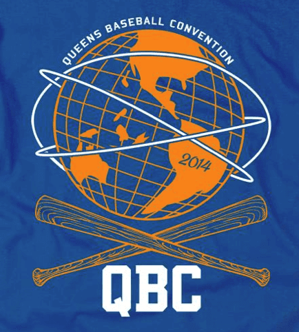
QBC reminder: The Queens Baseball Convention — basically an all-day Mets-apalooza– is coming up this Saturday at McFadden’s, and it’s shaping up as a great event. Among the highlights:
• There will be a panel discussion on the subject of uniforms in general and Mets uniforms in particular. Panelists will include myself, Phil, uni designer Todd Radom, Jon Springer (who runs the excellent Mets by the Numbers site), Russ Gompers (who runs Stitches, the shop that does all the Mets’ sewing and embroidery), and other luminaries. Should be awesome.
• There will be a “jersey parade,” in which fans can wear their favorite (or most obscure, or whatever) Mets jerseys. I’ll be taking part in the judging to pick the best and most interesting jerseys of the day.
• There will also be lots of non-uni stuff, including autograph sessions with former Mets Ed Kranepool and Ron Darling; presentations by Faith and Fear in Flushing blogger Greg Prince and ESPN.com columnist Mark Simon; a scavenger hunt for kids; and a lot more. The full schedule of events is available here, and you can purchase tickets ($35 for adults, $10 for kids) here.
Raffle reminder: I’m currently raffling off a game-used Bengals jersey. For details, look here.
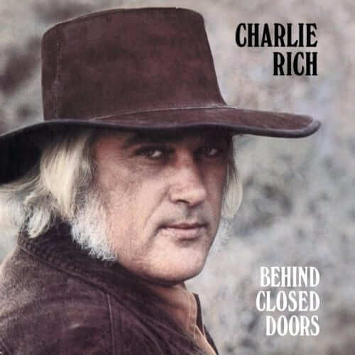
PermaRec update: Lots of star-struck girls wrote fan letters to Charlie Rich in the 1970s. A journalist recently came across several dozen of those old fan letters and decided to track down the people who wrote them. Get the full scoop in the latest Permanent Record entry. (And in case you missed it yesterday, I’ve also posted an interview with a guy who found a bunch of PhD program application files in the trash and made a cool art project out of them.)
Slate/tooth update: Another thing you may have missed from yesterday: My Slate article about parents who pull out their kids’ loose teeth by using a string and a moving object (a door, a baseball, a cat, whatever) is now available for your enjoyment. It’s loaded with very short but very entertaining videos.
Troll update: There’s also a new post on My Pet Troll — an interview with the writer Amanda Hess, who discusses her stalker troll.

’Skins Watch: This is fasincating: Someone on eBay is selling a bunch of photo negatives from 1992, showing people in Naperville, Illinois, campaigning to keep their high school’s “Redskins” team name. “A quick Google search shows that the name was changed to ‘Redhawks’ shortly thereafter,” says Michael Clary.

Baseball News: Good news from Auburn, which is adding stirrups and scrapping the GI Joe cap (from Clint Richardson). … Cardinals players were issued new jerseys for the last year’s World Series — except for Yadier Molina, who stuck with his regular season jersey (from Kevin Eckhoff). … A Long Island bank robber has been wearing an old Blue Jays cap for all his heists (from Tom Mulgrew). … New uniforms for Fresno State (from Richard Paloma). … All that backlash against the Cubs’ new mascot character didn’t go over too well with team officials. Personally, I’m happy to see a mascot that doesn’t pander by looking “intimidating” or any of that crap. I just don’t understand why the bat he’s leaning on is bent. Like, is it made of rubber or what? … Meanwhile, here’s a history of bad Chicago mascots (from Trevor Williams). … And in yet another mascot storyline, one of the NSFW versions of the mascot that appeared on Deadspin somehow showed up on Comcast SportsNet last night. ”¦ Appalachian State is incorporating its new logo into batting helmet and bat knob decals (from David Sulecki). ”¦ Josh Murphy notes that the 1978 Quad Cities Angels appear to have had a tequila sunrise-style design on the front and a solid color — maybe red? — on the back. Would love to see some full-body color shots of this team.

NFL News: Yesterday was the anniversary of Super Bowl II, so Jeff Ash came up with some great photos from The Green Bay Press-Gazette’s archives. First, check out the script on the back of this NFL Films camerman’s shirt — complete with the term “Super Bowl,” which wasn’t officially in use yet! And then check out the logo on the pocket of Vince Lombardi’s blazer. … I think we may have seen these before, but just in case: Someone on eBay has used old team logos as the basis for some throwback helmet concepts for the Pats, Colts, Chargers, and Eagles (from Frank Bitzer). … Adam Herbst’s son attended one of the Super Bowl Host Committee’s “Huddle Tour” events and came away with some wristbands and eye black. … Reprinted from yesterday’s comments: Check out this crazy old Browns facemask (from Larry Bodnovich). … Concussion discussion: Athletic safety experts and researchers will be gathering this Friday in Phoenix for the National Operating Committee on Standards for Athletic Equipment (NOCSAE) board meeting, which will feature lots of new concussion research findings. … Niners coach Jim Harbaugh’s wife is not a fan of his pleated khakis (thanks, Brinke). … Ooooh, check out the super-wide-spaced NOB lettering on Daryle Lamonica (from Brian Anderson).

College Football News: HGI’s Facebook page includes photos from a trade show that appear to show a mannequin wearing a maize Michigan jersey. Doesn’t necessarily mean anything, of course, but it’s still interesting (from PJ Kuzdal). … For reasons that aren’t entirely clear to me, Washington State’s athletics department chose mid-January as the time to release a video showing the football team’s uni combinations (from Ryan Dingle).

Hockey News: Here’s a rendering of how Dodger Stadium will look for its upcoming Stadium Series game (thanks, Phil). … Yesterday’s Ticker included a locker-room photo of the Dodgers-themed warm-up jerseys that the Kings wore prior to Monday night’s game, but here’s a shot of them in use during the pregame warm-ups (Phil again). … The Penguins hosted a charity bowling tourney, complete with custom bowling shirts (from Brendan Donohue).

Soccer News: New kit for Kawasaki Frontale (from Trevor Williams). … On Monday I asked about the button on Stoke City manager Mark Hughes’s jacket collar. Daniel Bevis reports that it’s the “Kick Racism Out of Football” logo. … New camo uniforms for the J-League’s Urawa Red Diamonds (from Thomas Fiers). … Real Salt Lake’s new kit has leaked. “A major step backwards from what had been the class of MLS,” says Markus Kamp. … Ricardo Carvalho of Monaco wore his shirt backwards the other day (from Yusuke Toyoda). … Also from Yusuke: Good article on an old UK kit man. … New kits for Mozambique and Chiapas (from Trevor Williams).

NBA/WNBA News: Chelsea FC welcomed the Nets to the UK by giving them a set of custom Chelsea jerseys, and the Nets returned the favor (from Phil and Yusuke Toyoda, respectively). … The WNBA’s San Antontio Silver Stars are dropping the “Silver” from their name (thanks, Phil). … Did Bob Weiss of the old Buffalo Braves shave his beard in the middle of a photo shoot? Maybe — look here and here (from Brian Mazmanian).

College Hoops News: Maryland will have new uniforms for tonight’s game against Notre Dame. Rumors that Northwestern’s players designed these are almost completely untrue. Further info here (thanks, Phil). … In the What Took Them So Long? department, Oregon is planning a Phil Knight bobblehead night on Feb. 1 (from Ryan Lindemann).

Grab Bag: The 2014 Boston Marathon gear, thankfully, is not a giant memorial to last year’s bombings (from Dave Levy). … Lleyton Hewitt’s shirt at the Aussie Open has a tennis court motif, and Tomas Berdych’s shirt resembles Agentina’s soccer jerseys (from Phil and Yusuke Toyoda, respectively). … Who’s that wearing No. 11? None other than Jack Nicklaus, playing for his high school hoops team in the late 1950s. Also, note the vertical striping on the home socks — unusual! (Great find by Kevin Mueller.) … Reprinted from yesterday’s comments: Lots of rumor about Syracuse possibly getting a new arena. … An Oregon man has found and sold an early Nike prototype shoe. … You know what arena football really needs? Helmet cams (blame Phil). ”¦ New logo for Cadillac (from Paul Lee). ”¦ Check it out: Socks that look like Chucks! The shoelaces are a particularly nice touch (from Chris LaHaye).

What Paul did last night: Yesterday evening I met up for a beer with my friend/hero Jamie Jensen (the guy behind the greatest travel guide ever written, Road Trip USA), who told me something pretty amazing: When he was growing up in L.A. in the early 1970s, his next-door neighbor was the guy who made NFL helmet carts!
I’m not sure why he never told me this before, but when I got home I immediately called up this 2008 Uni Watch entry, which featured a 1972 trade magazine article about the making of the helmet carts, and sent the link to Jamie to see if his neighbor was one of the guys pictured and/or quoted in the article. Still waiting to hear back from him — stay tuned.
Meanwhile, after a quick drink we went to see The Great Flood, a new movie that uses archival film stock and a great score by the jazz guitarist Bill Frisell to tell the story of the 1927 Mississippi River flood, one of the greatest natural disasters in American history. Here’s the trailer:
The movie is really, really good. Highly recommended.
Link for Broncos helmet goes to a Colts helmet.
And the story about the Chicago team officials’ reaction to people’s opinion of the bear mascot is a 404.
I’m not having any problems with the Cubs link.
Cubs link now fixed. Couldn’t find the proper Broncos helmet link, so I deleted it.
Yes HAVE seen these helemts here before…..and the Pats one STILL has Massachusetts backwards one the left side of the helmet!!
There’s also this doozy!!
link
Couple of ticker-like items I came across early today:
Miami Heat gave President Obama the link when the team visited the White House.
link.
Miami Heat gave President Obama the nickNOB treatment when the team visited the White House.
Seems to be link.
Here are the Red Sox, twice giving George W. Bush a jersey with the name BUSH on the back. First, to celebrate their victory in the 1943 World Series:
link
And the second time, in honor of Bush being the seventh president of the United States:
link
I laughed until I cried when I saw the Comcast SportsNet clip. That some idiot didn’t notice, and that it was then on-screen for approximately 9-10 seconds, even after the anchors notice, and with the lines the newscaster was reading going in hand with the image in all the wrong ways. I had to stop watching it because I couldn’t stop laughing at how terrible it was.
What I don’t get is why it’s evidently so hard for a news organization in a major metro area to simply call up the media relations people at the Cubs to ask for the original graphics. Or there isn’t someone in the national Comcast/NBC Sports that can handle something like that for the local affiliates.
I work in a communications field (but not television) and I would never ever put something that I grabbed off the web in front of the public. That’s just unprofessional.
Missing link for the Chucks socks.
Now fixed. Here’s the link:
link
very cool. I’d say they are knit slippers though & not socks.
Is there any documented evidence of musicians using QB play-calling wristbands for their set lists?
Oooooh, Good one. I might have to try that one! I hate setlists flapping in the wind when taped to mic stands, and when they’re on the ground these old eyes sometimes have a hard time seeing–especially on dark stages. Hmmmmm…..
I usually tape mine on top of my amp, but I don’t like turning around so often to look. I wear a sweatband anyway. Might as wll put a setlist in there, right?
The Fresno State baseball jerseys on the left and the right of that photo are new, but if you notice the different number style on the gray jersey in the middle, it’s a little different. This is the first time I’ve seen a numbering style any different than the old style seen on this gray uni, which is modeled after the Angels’ unis shortly after Coach Batesole was hired in ’03. Batesole, a southern California native, liked the ‘points’ in the middle of the each number. The letters on the unis featured this same pointiness as well. All that said, I like the new block style numbering and lettering, though nothing will beat the old red unis we wore in that dog pile at Rosenblatt.
Gotta say, those App State baseball applications are a treat! The silhouette is EXACTLY how they should use that hillbilly icon henceforth. It eliminates the juvenile features of the illustration, but keeps the feel and authenticity of their overall identity.
I hope they realize they’re onto something. Well done.
Agreed about the silhouette. It’s the perfect use of the logo.
But on an adaptation of the MLB logo? Just makes it look like the hillbilly is about to take a bean ball to the head.
Chin music, indeed.
I have to disagree… without knowledge of the full logo, one would have NO idea what the silhouette is.
Oh, the irony, Phil Knight finally gets his own bobblehead… and he probably paid for it, too. (in some circuitous way)
Here is the complete line of Bloomingdales helmets (all 48! of them) that were previewed a few days ago.
link
Wow, a few that are actually not bad. As in, I could see an actual team adopting similar helmet styles to good effect:
link
link
link
This one would have to be paint/decal instead of actual leather, but this would be a terrific way to adapt the look of leatherhead-era helmets to modern shells:
link
Similarly with this, but it’s not quite as striking a leather treatment as the above:
link
I for one like the new Real Salt Lake jersey. Definitely an improvement from last season. The gold band makes it look downright, uh, regal.
Yeah, I definitely agree with you there. Can’t quite comprehend how it’s “a major step backwards”. I’ll agree it’s perhaps a lot simpler than quite a few other MLS jerseys out there, but less is definitely more in this instance.
Let’s just say I Real-ly like it… I’ll see myself out.
MLS in general needs more less-is-more. Real’s previous one-blue-sleeve thing was one of the better looks in MLS, for sure, but the gold bar is even better. Maybe my favorite jersey in the league at this point. Based on this one photo, anyway.
I was channel surfing last night and came across the Philly / Buffalo hockey game. This was the first time I saw Buffalo’s new 3rd unis in action. My god, the complete disregard for humanity. Without a doubt the worst look in the league (yes I realize the Islanders are still in the league). Never thought they could out-crap the Buffaslug, but bless their tasteless little hearts they did it. Literally hard to watch.
link
Why they scrapped this sweater is beyond me…
link
I must not “get it”, because to me the Flyers look far worse with the black nameplate and those shoulder/sleeve numbers being wider than the orange strip they’re on top of. Buffalo looks fine, unless you’ve got some kind of illogical hatred of yellow.
I agree with the black nameplate, it annoys me. But the rest of the jersey isnt hard to look at. Those Buffalo 3rds hurt my eyes. The two different front/back colors and the random looking gray thrown in there, it just looks like a patch work and not uniform at all. Plus the crest is nice, but gets lost almost in all that yellow.
I agree that the Sabres jersey is bad. However, it is pretty much the same as Nashville’s regular home jersey.
I actually thought they were Nashville at first.
Buffalo has a good color scheme and a good crest and could easily have one of the best uniforms in the NHL. Even when they went to the black/red/white scheme 15 years ago it worked. These yellow/front blue/back alts aren’t that bad because at least it’s a good color scheme.
The buffalo head they used during the black+red years was overdone and strange.
What I didn’t see on the Sabres’ sweaters were the C and A patches. Did they move them to some out of the way place perhaps?
They are on the shoulder.
They really botched that rendering of the Dodger’s stadium for the hockey game. No way the stands will be that full.
No game for Minnesota, Winnipeg or Calgary, but we get this bombastic dookie fest in LA (As for the games in NY; those are fine, it is a good hockey town.). Bettman has made this league into a joke. As someone who played shinnies as a kid, this didn’t give me chills like when they showed Commonwealth Stadium being readied for the Heritage Classic in 2003, this abomination ruined my appetite.
RE: Charlie Rich letters…..
I was going to say “If any of those letters were written by any lady under 35 I’d eat my hat.” Good thing I clicked the link. A 15 year old???!!! Really. Whatever. Old guys rule!
Just good to see the “Silver Fox” in UniWatch.
Some of his hits include:
“Behind Close Doors” link
and “The Most Beautiful Girl in the World” link
I’m from south Louisiana, and my grandmother was 6 at the time of the 1927 flood. She used to tell me that she and the rest of the children in her age brought food to some of the flood refugees (and there were thousands of them). It looks like an interesting film.
There’s a pretty good book about the 1927 flood entitled Rising Tide. It mostly tells the stories of Greenville, Mississippi and New Orleans, but there are other areas talked about. Amazon link is link in case anyone is interested in checking it out.
Sensational book. Uni Watch’s highest rating.
Can’t forget “Louisiana, 1927” on Randy Newman’s wonderful Good Old Boys album.
Yes, it’s been recommended to me many times, but for some reason I read histories about far-off places rather than what happened in my own back yard. I’ve never been able to figure out that part of my personality.
The subtitle of “Rising Tide” overpromises, but overall it’s a fine read, especially the initial section about its exploration by James Buchanan Eads. The image that sticks with me is that the river was moving at such a rate of force that at one severe bend the water was two feet higher on the far bank than it was on the near one.
Hopefully at some point the documentary finds some way to utilize the granddaddy of flood songs:
link
I’d like to be the first here to completely agree with the Cubs management…Deadspin and its contributors to that Photoshop of the new mascot ought to be ashamed of themselves. A mascot meant for kids and they create those images.
I’m not a farty old man but that isn’t even funny. Shame on them.
A mascot meant for kids and they create those images.
As I recall it from my own youth, kids were usually the ones creating those types of images to begin with. I suspect that hasn’t changed.
Wow, if kids are making photoshops like that I must be way behind the times.
wait a second…adults can act like… AHHH, I see what you did there Paul, very clever ;-) haha
It’s always bugged me that cartoon bears wear shirts, but almost never wear pants. It’s not Deadspin’s fault if bears don’t have the decency to cover up their private parts.
That’s an interesting topic. First bear to wear a shirt and no pants. Pooh? Did he even bother with a shirt in the original book or is that a Disney thing? Do we have Donald Duck to blame for this animals not wearing pants thing?
Then there’s the hat and tie and no pants look. Bears are just flaunting their lack of pants.
The original (pre-Disneyfication) Pooh did not wear a shirt, or anything else:
link
There’s a great Tony Millionaire cartoon where the original Pooh is walking thru the forest, encounters the Disney Pooh, and beats the crap out of him.
Good question – Yogi Bear wore a shirt collar and tie, but no shirt or pants. Boo Boo wore even less, wearing a bowtie and nothing else.
Paddington Bear might be the original pantsless bear, with the iconic duffel coat and nothing on the bottom, but I’m probably wrong.
For what it’s worth, Mickey Mouse wore pants and gloves and no shirt, while Donald Duck wore a shirt and hat but no pants.
link, methinks.
Are there any cartoon bears that do wear pants? I honestly can’t think of any.
Berenstain Bears wear overalls. Does that count?
Only pants-wearing bear I know is link. Not very cartoon-y, really — but always seems to be shown standing up.
Br’er Bear wore shirt and no pants in Disney’s Song of the South:
link
Even though the other bipeds (Br’er Rabbit, Br’er Fox, &c) wore pants. Is bears without pants a general cultural thing, or just a Disney thing?
Paddington Bear wore a duffle coat, a hat and occasional Wellingtons, but I don’t think he wore pants/trousers. (That description sounds awful pervy when I read it back.) The first book was 1958 so potentially influenced by the no-pants Disney animals.
Well, Hanna-Barbera’s Yogi and Boo Boo Bears were both pantsless (and shirtless, though they wore ties). Paddington Bear was also naked aside from his iconic Duffel coat.
And Disney’s weird, because Mickey Mouse wore pants, gloves and nothing else, while Donald Duck was fully dressed aside from pants.
Yogi and Boo Boo are also without pants, as is Paddington Bear, so it’s a general cultural thing, I think.
There’s a term for this. link
Norway offically showed off the designs for their 2014 olympic hockey jerseys. link
Disappointed with the too-small too-diagonal “NORGE”… Say it loud, you nasty Nordic dudes…
Also, where’s the vertical stripe? On the red sweater especially, they’re already mostly wearing the national flag. Don’t half-ass it; if you’re going to wear the flag, wear the flag!
Haven’t seen a mention of this- from the always reliable Chris Botta—
Some of the Stadium Series teams asked NHL permission to wear those jerseys at a few home games later this season. Will be granted.
Link?
As a Blackhawks fan, all I can say is please NO, please NO. Do not let those jerseys infiltrate the UC.
Shame Norway isnt/cant use the sweater wih the polar bear logo.
I like the Pepsi commercial, only because of the banter between the two players:
“What if we take, like, fifteen minutes?”
“In the middle of the game?!?!?!?”
“Dude, they got Pepsi” (probably because saying “Dude, it’s a car full of babes” didn’t sell the product well enough)
(probably because saying “Dude, it’s a car full of babes” didn’t sell the product well enough)
It’s funny, though I think that kinda speaks to Pepsi’s weakness (as weak as the #2 brand in a lucrative category can be, of course). Coke doesn’t have to be obvious – if it sells “good times”, then it’s already selling itself. In the universe of Coca Cola, if people are having fun, then by default, they’re already drinking Coke.
Love the Design of the black and orange jersey…
link
I’d bet that Pepsi commercial costume designer rented from Universal’s stock. Those appear to be from George Clooney’s Leatherheads; the link and link.
Good catch. I’m always amused when I see the uniform from The Replacements show up in comercials
Well played, sir.
You are absolutely correct. Those are great jerseys. I have purchased a few via Ebay from the costume house, they are actually made of real wool from a company called Broadway Knitting Mills. The friction strip jerseys are less impressive than the chest-numbered jerseys, as the strips are too stiff and frayed. But the wool is awesome stuff. I continue to believe that well produced versions of these early football jerseys would sell well, but no one ever ties to sell them.
Here’s the link for the stadium series unis. It’s also on Botta’s Twitter @chrisbottanhl link
Oh, Paul… speaking of your movie recs, a couple months ago you mentioned AKA Doc Pomus. I went solely based on your blurb about it here. Loved it, and learned some stuff. I wouldn’t have seen it probably if it hadn’t been for your little write up.
Meant to mention it a long time ago.
Thanks!
Lee
What was “great” about that Pepsi ad? Okay, they get credit for at least being diligent enough to replicate period specific uniforms and clothing. However, the premise was neither original nor clever. Here’s a way better example (unfortunately I couldn’t find the classic Abner Doubleday ad) link
Worse still, of the 16 or so actors in the commercial, they were only bothered to throw in one token person of color. It’s a reminder of a shameful era of sport and society, compounded by shameful casting.
It’s just a by the numbers, routine ad for toxic sugar water, made less believable by the gleaming white smiles of the actors. It’s a painful foreshadowing of the overhyped (heck they even take joy in saying “get hyped for halftime”) halftime show. Is it possible that these people might one day understand that the event might just be sufficient. Making things louder and more elaborate does not yield better results. Give me some local high school marching band, or Up With People for goodness’ sake, a few highlights and get back to the game.
FWIW, seems pretty clear they didn’t replicate anything. Louise Frogley did, as costume designer for Leatherheads (see couple comments up).
Your link goes to the Ben Franklin ad. ???
“Don’t take the world so serious. That’s it! The Worlds Series!”
Personally, I got a kick out of the player taking a “selfie” with one of these: link
What I really hate about the commercial is that the football players drink the young ladies’ Pepsi, take some selfies with their old-timey cameras, and then head back to finish their game. No evidence that they actually helped fix the car. Jerks.
“Worse still, of the 16 or so actors in the commercial, they were only bothered to throw in one token person of color. It’s a reminder of a shameful era of sport and society, compounded by shameful casting.”
—–
A total of 9 Black players were in the league from 1920 to 1926, only a handful more would play before the league was segregated. So having 1 player between 2 teams is not absurd.
I really don’t get this particular criticism because you mock them for not having more blacks represented, while simultaneously saying there were barely any blacks playing during that time. The casting wasn’t shameful it was accurate.
Its a commercial, they tend to be absurd (like Ben Franklin comparing the weight of 2 chewing gum products that wouldn’t come around for 2 centuries and some random lady knowing what electricity is the moment Ben Franklin “discovers it”, and then he gets the name for the city that won’t exist for roughly 40 more years wrong and the same lady corrects him Groucho style, despite having no reference for it: DC isn’t a place yet and Power has yet to be harnessed, so there is no need to convert AC to DC – additionally the band would not be formed for another 220 years or so in case they were making a reference to the band and not a further joke related to power), so don’t look at them as you would a classic film.
This commercial is just as absurd as the one you linked to.
“… … New logo for Cadillac (from Paul Lee). …”
I miss the ducks.
Thanks to Peter Greenberg and to Paul for posting the Permanent Record piece on Charlie Rich. I really enjoyed reading the back stories of many of his lesser-known, yet wonderfully personal songs, in the Oxford American article as well. Great stuff, Paul — thanks!
Peter Guralnick’s essay collection “Feels Like Going Home” (itself titled after a Charlie Rich song) has a heartfelt (and heartbreaking) chapter on the man. A brilliant talent totally uncomfortable with success and his own worst enemy, whose greatest commercial success was hardly characteristic of his talent but nearly proved his downfall as well. As quoted from in that article, “his face always looks slightly heartbroken” – and just try finding an image grinning in a picture, even a publicity shot. You can’t.
Guralnick produced Rich’s last album, the very fine Pictures and Paintings. Recommended.
KU Jayhawk Uni News:
“Going forward, our uniforms are going to be solely traditional and we’re not going to have any of this stuff other schools are going to,” Self said, ostensibly referring to some of the camo/neon uniforms teams like KU sampled last season.
link
““Going forward, our uniforms are going to be solely traditional and we’re not going to have any of this stuff other schools are going to,” Self said, ostensibly referring to some of the camo/neon uniforms teams like KU sampled last season.”
My admiration for Bill Self has just grown exponentially. God bless that man.
Of course Self said this while telling everyone that the Jayhawks will abandon their “normal” uniforms for the rest of the season, while wearing the new alternate jerseys (with some Adidas-styled mesh holes and tiny “inspirational word pinstriping” on the road jerseys)
I suspect someone at adidas is looking for the Pepto right about now.
When the coach of one of your flagship programs goes public with his dislike of your product, that’s not a career-enhancing move.
Today’s ESPN column is up:
link
I’m surprised you didn’t include Marty Howe in with Gordie and Mark.
Not to mention link (when he and twin Ron were on the Blues together).
And, as a Lions fan (sigh), I’m surprised a couple of SrOBs didn’t make it – troubled ex-Lion link, and current Lion link
I’m glad Young and Leshoure went with “Sr.” on their jerseys considering how easy it is to mistake them for their baby sons.
link
Just asked my editor to add those Lions guys. Also asked for Karlos Williams Sr.
Ballin’!
Anyone remember how Mark and Mike Mimbs, twin brothers who pitched for the Dodgers in the 90s, had their NOBs? I failed to turn up any photo evidence with my Google searches.
As a Habs fan, I’m surprised that your diacritic section failed to include how the Habs were the first in the NHL to use them. See Brière, Daniel.
Self-follow-up, you did showcase a Hab after all, but Jérémie Grégoire is a really obscure example! Due to quirks in preseason lineups, Erik Nyström was the very very first Hab to get a diacritic, but only Daniel Brière truly made the team this year. Grégoire is kind of in the middle.
…and here’s another Pooh vs Pooh courtesy of the comic strip “Lio”…
link
link
You mean Levi’s couldn’t throw in a couple of pair of pants along with the Stadium naming rights?
And as another aside on hockey diacritics, umlauts are not uncommon in IIHF and Euro play (even though the NHL has yet to see an umlaut). Olli Määttä is in a crowd of triple-umlauts, along with link and link.
for the record… Michigan doesnt wear maize anymore. So technically thats a SUN colored jersey
Wow! The Naperville Central Redskins thing! I went to that school in 1992, and was there when the name changed (they did successfully change it to Red Hawks, FYI).
I was even interviewed for a Chicago newscast (my cut didn’t make the broadcast- mostly because I really didn’t care at the time. I hated the school regardless.)
RE: the bad Chicago mascots…. come on, don’t rip on Andy the Clown. Kids (including myself) loved him! Met him many times at White Sox games.
Pepsi Throwback sponsored Jeff Gordon for a race a few years back, this was the car, link and this is the driver suit link Read the whole list, because I can’t disagree with anything listed… link
ESPN column
Paul, you neglected to mention the 1960 Raiders and their FNOBs… tut-tut! hahah
Hey Paul….about that photo from Super Bowl 68….If I’m not mistaken the cameraman is none other than Steve Sabol. I remember watching NFL lost treasures about the Super Bowl and there was a shot of Steve in the end zone manning a camera with that jacket on…I could be wrong but….!!
I’m sorry but Real Salt Lake’s kits weren’t and have never been the class of the MLS. They have never been the worst in the league but their one armed kits from the last two years were the worst renditions of their kits to date.
Sorry is this is late, but the consensus among uni-watching MLS fans is that that RSL kit is a warm-up, based on a similar template being used for Chelsea’s warm-up