
It had previously been announced that the Bengals would be wearing white pants for yesterday’s playoff game against the Chargers, so it was a surprise to see them taking the field yesterday afternoon in solid black — all the more so when you consider that the last time they wore solid black in the playoffs was the game Carson Palmer tore up his knee on his first pass of the game.
God, it’s such a miserable look. And although I’ve been calling it “solid black,” that’s actually a misnomer due to the white side panels on the jersey. Those have never made any sense. They look bad enough when the team is wearing the white pants and even worse with the black ones. Get rid of them already!
Other NFL notes from this past weekend:
• Packers running back Eddie Lacy wasn’t wearing a visor in the first half of yesterday’s game against the 49ers, but he added a tinted visor for the second half.
• As it typical for an extreme-cold weather game, there was some decal chipping.
• Speaking of the cold weather, 49ers coach Jim Harbaugh defied the elements by wearing his usual outfit — a black pullover (in this case with lots of layers underneath) — in the first half. After halftime he gave in and donned a parka.
• According to this article, “The 49ers packed 2,500 extra pounds of clothes, and three pairs of cleats for each player.”
• Why did the Niners waste a timeout at the beginning of the second half? Because quarterback Colin Kaepernick forgot his play-calling wristband.
• Speaking of Kaepernick, he has a bit of a history at Lambeau — but not in a Niners uni:
5-yr-old Colin Kaepernick posed w/ his cousin at Lambeau Field…in a Brett Favre jersey. (via The Kaepernick Family) pic.twitter.com/tioJSX0RLn
— SportsCenter (@SportsCenter) January 5, 2014
• Odd scene during Saturday night’s Eagles/Saints game, as Saints defensive coordinator Rob Ryan’s play-calling sheet, included a photo of his dad, Buddy Ryan, in an Eagles cap.
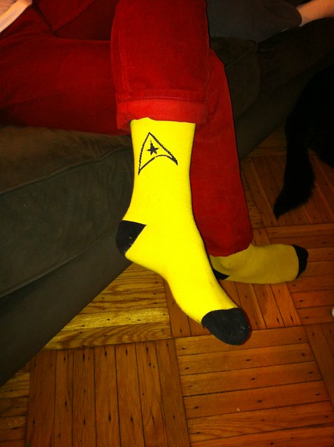
One final note: I watched the Niners/Pack game in the home of longtime Uni Watch readers Marty Buccafusco and Jessie Davis, who live a few blocks from me (and served up some excellent chili). Marty wore some very cool Star Trek socks for the occasion:
(My thanks to Vinny Bove, Brinke Guthrie, Cory Harrington, and Jerry Peterson for their contributions to this section.)
A heritage of confusion: Last week I Ticker-linked to a story that cited an anonymous source who said the NBA would be adding sleeves to all “heritage jerseys” next season. There was no explanation of what qualifies as a “heritage jersey,” although Portland’s “Rip City” design and Detroit’s “Motor City” design were mentioned as jerseys that would get the sleeved treatment.
Will throwbacks qualify as “heritage”? What about something like Denver’s rainbow-striped alternate? Adidas has already told other media outlets that they’re not commenting, so I asked the NBA. Here’s the response I received:
Unfortunately, we cannot confirm any plans for next season at this time.
In terms of designation, Detroit’s “Motor City,” Portland’s “Rip City,” LA Lakers’ “Hollywood Nights,” LA Clippers’ “Nautical Pride,” and the San Antonio’s “Camo Pride” uniforms from this season are all “Pride” uniforms (not “Heritage” or “Throwbacks” — we don’t currently have a designation for uniforms under those titles).
The Magic [have just] launched their “Hardwood Classics” uniform.
Pride uniforms are unique uniforms worn by some but not all teams. They utilize indigenous design elements or phrases or colors that are linked to their past, their city or some local culture in a manner that extends the team’s identity and/or creates a more unified link with the city or region.
Okay, so that’s not very illuminating. What it really means is that the anonymous source at the heart of this story was tossing around a term that actually has no currency with the NBA. This could mean that the source didn’t know what the fuck he was talking about, or it could mean he just misspoke regarding that one term. Either way, it doesn’t get us any closer to figuring out what the NBA will be doing next season.
Troll update: As most of you know by now, I recently created a new website, called My Pet Troll, to serve as a repository for the Big Cock Johnson story (if you’re not clued in on the new site and/or the Johnson story, you can get the full scoop here). When I launched the site, I wrote, “Should further developments warrant, I’ll post additional troll-related news here on this site, although I don’t expect that to happen.”
Naturally, it’s already happened. A My Pet Troll reader (who also happens to be a Uni Watch reader) got in touch with a trolling story of his own, so My Pet Troll now has something I wasn’t sure it would ever have: a second entry.
I wasn’t really planning for My Pet Troll to become a forum for internet miscreants, but I’m curious to see where this project might lead. If you’re a troll, or if you feel you have some insights to offer on the subject, let me know. Thanks.
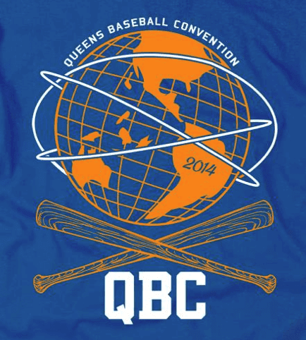
QBC reminder: The Queens Baseball Convention — basically an all-day Mets-apalooza– is coming up on Jan. 18 at McFadden’s, and it’s shaping up as a great event. Among the highlights:
• There will be a panel discussion on the subject of uniforms in general and Mets uniforms in particular. Panelists will include myself, Phil, uni designer Todd Radom, Jon Springer (who runs the excellent Mets by the Numbers site), Russ Gompers (who runs Stitches, the shop that does all the Mets’ sewing and embroidery), and other luminaries. Should be awesome.
• There will be a “jersey parade,” in which fans can wear their favorite (or most obscure, or whatever) Mets jerseys. I’ll be taking part in the judging to pick the best and most interesting jerseys of the day.
• There will also be lots of non-uni stuff, including autograph sessions with former Mets Ed Kranepool and Ron Darling; presentations by Faith and Fear in Flushing blogger Greg Prince and ESPN.com columnist Mark Simon; a scavenger hunt for kids; and a lot more. The full schedule of events is available here, and you can purchase tickets ($35 for adults, $10 for kids) here.
Shannon Shark, the Mets Police honcho who’s putting all of this together, is a smart, can-do guy who makes stuff happen (he pretty much single-handedly convinced the Mets to bring back Banner Day). He also put together this little video clip to help promote the event:
Should be a good time — hope to see a bunch of you there.

Membership update: We both know that one of your New Year’s resolutions was to finally sign up for a Uni Watch membership already. That’s gotta be way easier than losing 20 pounds or reading an entire book or any of your other resolutions (let’s face it, you’re never gonna do any of those), so what are you waiting for? When you finally sign up, you’ll join over 1,500 other card-carrying members, including Tony Wotzka, whose card, based on Minnesota’s “brick-numbered” gold jersey, is shown at right.
As always, you can see all the cards we’ve design so far here, and you can sign up for your own custom-designed membership here. You’ll probably feel so good about fulfilling one of your resolutions that you’ll say, “Eh, I don’t really need to lose 20 pounds or read a book after all,” so it’ll be a win-win-win!

’Skins Watch: The Washington Post’s editorial board is renewing its call for Daniel Snyder to change his team’s name (from Tommy Turner). … Small item at the end of this article indicates that Sen. Richard Blumenthal (D-Connecticut) thinks the ’Skins should change their name (from John Dankosky). … Mike Raymer stopped by the Braves Hall of Fame and saw some seriously questionable material, like this and this.

Baseball News: About two years ago I linked to a photo of Babe Ruth and Al Devormer wearing Yankees cardigans. Now Hall of Fame curatorTom Shieber has done some crackerjack research to figure out when and where the photo was taken. … Check this out: Looks like the Pirates were wearing a pillbox-style cap without the horizontal striping. Also, note that Dave Parker — second from left — was wearing a Star of David pendant. “He famously wore a Star of David because ‘My name is David, and I’m a star,’ says Jerry Wolper.

College Football News: A while back I published a report on Nike’s contract with the University of Memphis. Now Matthew Kish or the Portland Business Journal has done an analysis of over 100 universities’ contracts with Nike, Adidas, and Under Armour, and the results are eye-opening. Start here, and then go here (thanks, Phil). … Here’s a look at the Auburn end zone for tonight’s BCS title game. … We’re several days late on this, but Oregon RB De’Anthony Thomas was wearing a wristwatch during pregame warm-ups for last week’s Petroleum Bowl (from Jay Schmitt). ”¦ Interesting article on the psychological underpinnings of Clemon’s use of orange pants (from Adrian Brashier).

Hockey News: Capitals C Mikhail Grabovski played Saturday night’s game against the Wild with a misspelled NOB. The same thing had happened to him a month ago, almost to the day, only that time it was just for pregame warm-ups (from Mike Engle). ”¦ “No photo, but for the Frozen Fenway game, each Merrimack player wore the flag of his home country above his nameplate,” writes Bobby Pinkham. “Of course, almost all the players are American, but there are a few Canadians, and there’s Finnish goaltender Rasmus Tirronen, so I guess it’s a nice touch. As for Providence, they had their Frozen Fenway patch in that same area, as did Notre Dame in the nightcap. Speaking of patches, Patrick Brown, BC’s captain, had a very crowded sweater.” ”¦ Here’s a seriously long NOB. That’s Tyler von Engelbrechten of the Canadian college team the Toronto Varsity Blues. “His NOB lettering was smaller than everyone else’s,” says Will Scheibler. ”¦ Trevor Heinzerling, equipment manager for the CHL’s Denver Cutthroats (who are named after Colorado’s state fish, the cutthroat trout), got in touch to inform us that the team played this past weekend in Aspen and will play later this month in Vail for what our team is being called the “Colorado Mountain Tour.” They’re wearing Colorado flag-themed jerseys for these games.

Soccer News: New kits for two World Cup nations — Switzerland and Italy. Among non-World Cup national teams, there are new home kits for the Czech Republic, Austria, and Venezuela. And for club teams, there are new kits for the Mexican teams Chivas and Puebla, the Argentinian team Racing Club de Avellaneda, and the Chilean team Universidad Catolica (all this from Trevor Williams). ”¦ “This past weekend, England’s club teams took a break from their league matches to play in the FA Cup, which essentially throws every team in England — from the Premier League down to the semipros and the part-timers — into a single knockout tournament,” says Yusuke Toyoda. “That meant some uniform oddities, like a special captain’s armband with the FA logo and ‘Respect,’ Arsenal wearing Nike number fonts while other teams wore the standard Premier League font, Tottenham shirts sponsored by AIA instead of the usual HP, and some teams wearing black armbands in honor of the great Eusebio, who passed away this weekend. Oh, and viewers were less than impressed by the mango-colored ball, which looked pink. Usually, red and orange balls are reserved for better visibility in snowy conditions.”

College Hoops News: UNC wore their road uniforms at home last Tuesday. According to this article, it’s only the second time the Tar Heels have done this, the first one being on Dec. 6, 1990 (from Mitch Barbee). ”¦ And speaking of UNC, they went color vs. color last night at Wake Forest (from Duncan Wilson).

Grab Bag: While looking for something else, I came across this amazing piece of century-old letterhead. Spectacular! … Jody Michael reports that Sports Illustrated’s recent article on golf phenom Jordan Spieth included a few paragraphs about Spieth’s Under Armour endorsement deal. Sample passage: “Meeting with a half dozen clothing designers, [Spieth] looked over his latest options for 2014. Under Armour is not known for its restraint; one staffer said the company was going for more of an ‘oh, s— factor.’ Spieth nixed anything in neon colors or with busy designs. ‘I kind of like what I grew up with,’ he said. Sensing the deflation in the room, he added, ‘I’m sorry about that. Hey, I never thought I’d wear a red hat. See, I’m coming around!'” ”¦ The New York Times’s Neediest Cases Fund recently supplied the funding to provide school uniforms for a Manhattan school with many disadvantaged students. ”¦ Now that’s a swimming club! “If only Michael Phelps had been thusly clothed,” says our own Scott M.X. Turner.
I thought the Bengals looked spectacularly awful. The number font especially looked horrendous against the contrasting colors and stripe patterns and the whole thing just looked terrible, like a 14 year old thought it would look cool so an entire NFL franchise just went for it.
I like the helmet and team colors, but those uniforms need a drastic overhaul.
I’ve never been a fan of the helmet even. And like the Chargers and their lightning bolts all over their unis, the Bengals just have too many stripedy parts on theirs.
Should be “Tar Heels”, not “Tarheels”.
Every UNC undergrad is made aware of the proper spelling in no uncertain terms at freshman orientation.
Shame on me. Now fixed.
Credit goes to Jerry Reuss for the 1976 Pirates photo. It would be nice to find out whether those caps were a step on the way to the striped caps, or were supposed to be an end in themselves.
BurghFan, those blank pillbox caps were shown in the 1976 Pirates Yearbook, so it appears a very late decision was made to add the black stripes for the 1976 regular season.
If I had to guess, the blank pillboxes were originally intended to be an end in themselves, but once the club saw them in spring training, a wise decision was made to add the stripes.
I thought tinted visors wre only allowed for “medical” reasons. Seems so many people are using them they should just allow them without a doctor’s note.
Regarding Mikhail Grabovski and his misspelled NOB: I think there’s plenty of room for variation in his name. He was born in Germany to Belarussian parents and can thus spell his name with the Latin alphabet, Belarus Cyrillic, or Russian Cyrillic.
Wikipedia gives all his names: “Michail JurjeviÄ HraboÅski (Belarusian: Міхаіл Юр’евiч ГрабоўÑкі … better known as Mikhail Grabovski (Russian: Михаил ГрабовÑкий)…”
If you use the Russian alphabet, “Grabovsky” is understandable because that’s a conventional way to Romanize the -ий ending (i followed by short i; it can be “-ii”, “-iy”, “-y”, or even “-ij” or “-iÄ”).
Valeri Kamensky comes to mind as a player who spelled that ending two different ways; in Russian, both his first name and his last name end in -ий.
The most diplomatic solution, of course, is to just ask him how he wants it spelled and then spell it that way all the time.
Thing is, I’m sure that that has happened! Grabovski is a veteran, and he has used the I at the end exclusively, except for Washington’s mistakes.
Should we really be shocked, though, that there’s a jersey mistake in Washington?
Well, it’s a local coincidence, and not a natinal circumstance…
Which reminds me of a story once told to me by a former NHL executive. You remember Sergei Fedorov, right?
It was told to me that you’d properly pronounce his name something like “Fyed-ore-ov,” but that, America being America, it became the generally Anglo-acceptable “Fedd-er-ovv” when he got here. When my friend the NHL guy asked Fedorov why he didn’t correct people, Sergei supposedly said (in Russian accent): “F*** them. I am rich.”
Does anybody know what the lapel pins that the Fox studio guys (Terry, Howie, etc.) were wearing? It looked like a bowl from a ramen noodle package! I never saw it up close or heard them say what it was.
thanks.
In the article about “Clemson’s use of Orange Pants”, it states: “Ford played for Bryant at Alabama and Bryant would let the Bama players wear crimson pants on occasion.”
Can anyone find visual evidence of this? Ford played there from 1967-1969
Picking a nit: “…on the psychological underpinnings of Clemon’s use of orange pants…” (Clemon’s is missing an “s”).
Maybe it was Clarence Clemons.
Or Michael “Pinball” Clemons.
“my pet troll”? Wow get over yourself man.
I beg your pardon..?
I noticed Andy Dalton does not wear a pad/thing on the back of his helmet at all. It was an odd look to me. Sort of old schoolish.
(sorry I didn’t get a photo)
You mean he has no neck bumper?
Sure enough, he doesn’t:
link
Good spot!
Some helmets have internal padding that apparently eliminates the need for a neck bumper.
Many teams just link, but then there’s the Packers, who put link on the back of any helmets without them.
To be fair, while aesthetically displeasing, the white side panels for the Bengals *do* make sense if you think about actual Bengal tigers having white underbellies. I guess I’m just saying I get where they’re coming from.
They make no sense at all! Underbellies are on, you know, the BELLY, not the sides!! And a tiger isn’t black, so it’s hard to claim you’re mimicking the white underbelly when you aren’t even doing a good job of mimicking the rest of the body.
And there’s a larger point: Just because a design element is supposedly based on a real-world element, that doesn’t automatically mean it works as a design element. We see this all the time in uniform design now — elements that supposedly “tell stories.” That’s fine (or even better than fine) if the design element works aesthetically, but it doesn’t mean shit if looks bad.
“They make no sense at all! Underbellies are on, you know, the BELLY, not the sides!!”
Right. Of course, if they were literally dressing up like tigers, the front of the jersey and inside of the pants would be white, and the back, shoulders, and outside of the pants would be orange and black striped. But wouldn’t that be even more ridiculous?
And I agree it doesn’t *work* but you have to admit it’s pretty clear what they’re attempting, right?
And I agree it doesn’t *work* but you have to admit it’s pretty clear what they’re attempting, right?
And this is relevant because..?
Just because you can identify the source of a bad design doesn’t make it any less of a bad design. In some ways, it makes it worse, because it suggests that they willfully tried to shoehorn a “story” into the uniform, even though it clearly doesn’t work.
What they’re attempting may be clear. What they’re attaining is clearly lame. It would be no better if the Eagles or Cardinals started to cover their pants in feathers.
In this case, it’s relevent because I’m willing to give them points for trying. Tigers have white bellies, and Cincinnati Bengals have white side panels. I think the extension is logical and not shoehorned.
What you’re describing sounds more like what Jacksonville tried to do with the two-tone helmets and the “Jaguars stalking in the dark” bullshit.
it’s relevent because I’m willing to give them points for trying.
Why?
There’s no “A for effort” in design — it works or it doesn’t. You’re basically giving them a participation medal.
What you’re describing sounds more like what Jacksonville tried to do with the two-tone helmets and the “Jaguars stalking in the dark” bullshit.
Yes, that’s exactly what I’m saying. And it looks just as bad.
“There’s no “A for effort” in design – it works or it doesn’t. You’re basically giving them a participation medal.”
I guess after 23 years without a playoff win, a participation medal is better than nothing.
But also, I think there’s a lot to like in what they have going (primarily pants striping and helmets), so even though the stripes may look out of place, for me, the good outweighs the bad and I know why it’s there, so I give them a pass. And honestly, I think the white panel actually looks good on the orange alts.
There was a time when the team sported a uniform that didn’t necessarily scream, “I am a tiger. Beware!”….but it sure looked good.
link
And although I’ve been calling it “solid black,” that’s actually a misnomer due to the white side panels on the jersey. Those have never made any sense.
Paul, you’re arguing past yourself here. Your original claim, above, was that the white panels make no sense. Then, when others argued that they do make sense, you respond by saying,
Just because you can identify the source of a bad design doesn’t make it any less of a bad design.
Which is beside the point. Look, I agree with you that the side panels don’t work, even with the white pants. But if the question is, “Do the side panels make sense?” then the answer is not a clear and obvious “no.” It’s at least “maybe,” possibly even a qualified yes.
Whether it’s any good, either as a matter of aesthetics (do you think it looks pretty) or design (does it work), is a separate question. You’re defending a claim that the side panels make no sense by asserting that they look bad. Which, as a logical proposition, makes no sense.
I meant they make no sense from an aesthetic perspective.
I don’t actually buy that they’re supposed to represent the white underbelly. Has that ever been documented or substantiated? But I accepted Adam’s point on that issue for the sake of the larger argument, which is that it doesn’t matter what the inspiration for the side panels is. What matters is that they look like shit.
I say if they want to mimic the actual animal they need to go all-out with ears and tails and a quiet, majestic grace and power. Also, they should beat the Lions whenever they play them.
What about the Bears? Oh my.
I’m thinking just put a lot of hair on the chest and back areas.
…and Wizards? (oops, wrong league)
The infraction, as far as I can see, is trying to cram an additional detail onto a uniform which is already filled with them.
I have those same Star Trek socks. They are my favorites. Also come in blue and red to match your mood.
. . . or, given what tends to happen to redshirts, you could give the red socks to someone you really dislike . . .
Link for UNC road unis links to a picture of Rob Ryan instead.
Thanks. Now fixed.
I don’t understand all the uproar about the redskins name when there are other brands out there that are the same… for instance red man tobacco
Plenty of people think Red Man tobacco should change its name/branding too.
But let’s say, for the sake of argument, that nobody cares about Red Man Tobacco. For some reason, let’s say, Red Man Tobacco “gets a pass” from the anti-’Skins movement. And let’s further say, again for the sake of argument, that this means all the people in the anti-’Skins movement are hypocrites, or intellectually inconsistent, or something along those lines.
Would that suddenly invalidate all the things that have been said about the ’Skins name? No, it wouldn’t. It might say something about the messengers, but it would say nothing at all about their message.
Stick to the issue at hand: the ’Skins name. If you think it’s fine, say so; if you don’t, say that; if you don’t care, say that. But bringing up something like Red Man tobacco is just an irrelevant off-point distraction.
Speaking of irrelevant distraction, Bob Newhart’s skit about Sir Walter Raleigh explaining tobacco to his London investors:
link
don’t even have to open the link.
A beautiful bit!!
Frozen Fenway patch link doesn’t work…then again with how cold it is, I don’t want to either! -14 in Evanston
FYI The Chivas and Puebla links in the soccer ticker are directed to the same page.
Thanks. Fixed.
Here’s the proper link:
link
Trevor Heinzerling, equipment manager for the CHL’s Denver Cutthroats (who are named after Colorado’s state fish, the cutthroat trout)…
You know what? I find the name of this team in amazingly poor taste. Yes, I know it’s named after a fish, but the name of the fish is in poor taste too. I can’t read this without thinking of poor Clint Malarchuk! (sp?) Maybe I’m easily offended, but did anyone else reading this have the same reaction?
No.
But did you know Utah’s state fish is ALSO the cutthroat trout?
I’m going to Colorado next month and hope to check out a Cutthroat Trouts game.
Kapernick forgetting his wrist band reminds me of Thurman Thomas misplacing his helmet at the start of SB XXVI.
I saw Kap (as the SF fans apparently call him) and his backup(?) laughing on the sideline during that timeout. Didn’t seem like a laughing matter at the time. Now I guess it’s amusing.
Shows how much of a crutch that wrist band is though. He couldn’t get through a single play without it???
I don’t think it’s just one play that’s affected. He needs the wristband for subsequent plays should they go no-huddle or if they need to signal in an audible once they’re at the line.
Yeah, but someone could have trotted it out to him after 1st down.
Enjoyed the new My Pet Troll entry. As some who rarely, but occasionally trolls, I get it. I see it as a protest against sports fans who blindly parrot the lazy “Who is ELITE?” or overrated/underrated narratives and end up clogging the internet and killing brain cells.
Inoffensive, non-personal trolling is way healthier than most of the comments you see on Yahoo or Facebook.
Much ado about Kaepernick’s bare arms: link
I find Joe Staley’s explanation plausible.
And some pre-game sleeve talk: link
I was just commenting about need man since I don’t understand why that didn’t get more coverage in general. But I don’t think the redskins name is bad. I just think people need to calm down and stop bieng so politically correct
You seriously don’t understand why a packaged goods in a small niche segment of the tobacco industry doesn’t get the same coverage as a franchise in the country’s most popular sports league in the country that gets year-round news coverage and doubles as a civic institution in the nation’s capital/a huge metro area?
Also, must be nice to dismiss people you disagree with as needing to “calm down” and “politically correct” (which is really code for “I don’t like having my world views and preconceived notions challenged”).
I have no issues with my world views being challenged as their is always two sides to every issue I just really think the world needs to calm down and take a step back about some issues
So you’re cool with dissenting opinions as long as they’re not expressed. Got it.
The Bengals announce white pants then wear black. Does the league fine a team for doing this?
Not to my knowledge. There are no regulations regarding pants, or notice about same. Only jerseys.
It’s always fun to see the lengths HOF curator Tom Shieber will go to while researching a photo. Cool that he used my version of the photo for his “best version”…but I could have saved him some time. I already knew that the photo was in front of the Majestic Hotel in Hot Springs (1922) from another project I was working on. Btw, I have another photo that was snapped a second later and I made an animated gif of it, I just haven’t posted it anywhere yet.
Cheers!
~Bruce
[Re first item in today’s Baseball News ticker]
Bruce, you deserve tons of credit. Sharp image. That photo has its own sanctuary niche in the Pantheon of of Athletic Sartorial Magnificence.
I love the sweaters and I love the poses struck by Devormer and The Babe. So metrosexual!
Thanks Connie DC!
The animated version coming soon…
“What about something like Dever’s rainbow-striped alternate?”
Denver would like their n back, please.
Thanks. Now fixed.
I’ve seen other pics of those Pirates pillbox sans stripes caps in their 1977 yearbook. My gut says they were only worn in spring training 1976 and the stripes were added later.
In my book, the Bengals have terrible uniforms, but they’re also very close to having good uniforms. Just a few tiny changes are needed.
1. Ditch the jersey side panels.
2. Change the shape of the pants stripe to a uniform-width, hem-to-hem tiger-stripe panel.
3. Never, ever wear monochrome.
Presto, decent uniforms, even with the leisure-suit collar.
Oh, and maybe 4. Render the Nike swoosh in black or orange, never white.
Agreed on 1 and 2, but I actually think the ensemble would work better if they stick to all-black and all-white. The black/white is too top-heavy to work and white/white isn’t too shabby.
I know it was yesterday’s post, but:
I don’t care for that crystal football trophy. I don’t even like the link so very much, but I’d rather them than the crystal football.
(And that clip of watching it drop is funny.)
Is there a UniWatch ranking of the trophies, plaques and cups awarded for various victories?
The crystal ball is really lame especially since the giant black box base with the current sponsors logo on it can’t even be raised. I also have trouble with something as delicate as crystal being awarded for a winner of a football game, it just doesn’t fit. Hopefully next years playoff will bring with it a new trophy. The new logo link would lend itself well to a modern design like the new Hunt and Halas trophies link
The NCAA championship trophy may not be inspiring from an aesthetic standpoint, but its virtue lies in its practicality and egalitarian nature. By itself it’s appropriately-sized to stand out in a school gymnasium’s trophy case without overwhelming whatever items surround it, while at the same time making for an impressive display of hardware at schools with the good fortune to have won multiple championships. Plus the fact that each member of an NCAA championship-winning team, regardless of the sport or the division in which it’s contested receives an identical scaled-down (approx. 1′ tall) replica for their personal enjoyment bespeaks an egalitarianism that in collegiate sports is observed more typically in the breach.
“God, it’s such a miserable look. And although I’ve been calling it “solid black,” that’s actually a misnomer due to the white side panels on the jersey. Those have never made any sense.”
That’s never stopped teams from adding unnecessary and pointless elements before.
Bengals improvements:
Orange top socks, no side panel, conventional number font, no monochrome look. there. how easy is that?
Now, about those stupid Niner sleeve stripes…
I’d get rid of the orange shoulders on the white jersey. I notice nobody else suggested this modification.
If I’m not mistaken this is the first time Italy will be wearing pinstripes for the World Cup, nevertheless they look good.
I get the sense that Puma treats Italy as the showcase team, and everyone else gets the template treatment, sort of like Brazil is for Nike.
Also, link?
That Mexico shirt is criminal. Not just the orange – the monochrome black deco is also all kinds of wrong for that team.
The Varsity Blues are NOT a college team. The University of Toronto is the school. University, not college.
That’s not exactly a Nike font for Arsenal. It’s the same font they use for Champions League matches. And you can get kits in a similar font from their site, except they have cannons at the bottoms, like the lions in the EPL numbers. (upon further review I see you can’t get the Arsenal #s currently, but they were available last time I looked at the site.
The Home kit numbers are pretty plain, the away kit numbers, not so much.
Tottenham is wearing a 4th kit this year in all Cup Tournaments (FA Cup, Europa Cup) This is the same as the home whites but with the AIA logo as opposed to the Premier League sponsor Hewlett Packard
link
Sorry mate, you’re a little slow on that one.
I’m calling shenanigans on Alabama football wearing crimson pants unless I see a photo. As far as I know (which admittedly may not be that far) the only uniform options the Bear had were white instead of crimson helmets.
Dunno if this has been posted yet… guy on northwestern wore a yarmulke during the game for the first time in big 10 history.
link
I wrote about that guy a year ago!:
link
I am loving that Auburn sweater vest!!!
I don’t know who it is on Auburn but someone is wearing socks on their arms!
We gotta arrow malfunction on #15 of FSU!
The greatest Portuguese soccer player, and one of the world’s best ever, Eusebio, passed away yesterday. Now some fans are asking Benfica to wear a throwback to Eusebio’s playing days on Sunday. Benfica is an Adidas sponsored team, but hopefully both sides give this idea the OK.
link
The Sleeved Jerseys are terrible and god awful. I cannot express how much I hate them….Epic Fail for Adidas and NBA
Color on color Maryland @ Pitt.
Can someone tell me what is up with this mouthguard?
link
Why did the Chargers announce what the Bengals uniform would be?
Regarding the Chargers announcement, it actually has me wondering who actually is making these decisions for football teams? I assume it varies from team to team and may involve someone from the front office, coaches, team captains or some combination.
Has this ever been asked? I’m sure it probably has, but I haven’t seen it.