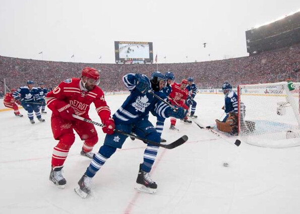
If there’s one thing Gary Bettman has gotten right during his tenure as NHL commish, it’s the Winter Classic. Over 100,000 people packed the Big House yesterday the latest installment of the annual New Year’s Day event — pretty amazing.
The color-on-color game featured most of the elements we’ve come to expect, including eye black, balaclavas, old-school brown leather goalie gear, a goalie in a toque, varsity-style jackets for the coaches, a steady snowfall that necessitated shoveling breaks, and so on. By this point, these things are old hat, but they’re still plenty enjoyable. (You can see nearly 500 more photos here.)
A few additional items of note:
• There was an inconsistency in the Red Wings’ pants striping — some players had stripes and some didn’t.
• The Leafs had some discrepancies in the spacing between the Reebok logo and the NOB.
• The Wings wore their captaincy and alternates’ designations on their left sleeves.
(My thanks to Rick Cuzzetto, Benjamin Gorbaty, and Seth Moorman for their contributions to this section.)

Bowl roundup: Lots of college football bowl action over the past two days. Among the uni-notable moments:
• Baylor alum Robert Griffin III showed up at the Tortilla Chip Bowl in in an Adidas-branded Baylor shirt. Wonder who’s most upset about that — the NFL or Nike (which outfits Baylor and the NFL).
• North Texas debuted a new helmet design for the Heart of Dallas Bowl. Here’s a closer look.
• In that same game, UNLV had NOBs — a change from their usual NNOB look.
• Pretty gross bit of corporate-ism by the Stanford marching band, which formed the Snapchat logo during halftime of the Rose Bowl. Not exactly “script Ohio,” is it?
• In an exceedingly disappointing move, UCLA went BFBS in the Auto Manufacturer Bowl.
• Speaking of UCLA, linebacker Deon Hollins, who usually wears No. 8, was wearing an NNOB No. 43 jersey on Tuesday. Not sure if that was a special teams play with a duplicate-number situation.
• As briefly noted in yesterday’s entry, Rice had a new Oregon-esque helmet for the Auto Parts Bowl.
(Special thanks to Trevor Blank, Andy Henderson, and Phil for their contributions.)

Baseball News: Someone on YouTube is compiling a goldmine of old MLB footage. Who knows how long it’ll be up there before the MLB police shut it down, so check it out now and make screen shots of the good uni-relevant bits, pronto! There’s a ton of footage there — way too much for any one person to view — so pick the bits you find most interesting and report back with your uni observations (big thanks to Roger Faso for the tip). … Red Sox infielder Xander Bogaerts is changing his uni number (from Andrew Cosentino).

NFL News: The Chargers and Bengals will be wearing what you’d expect for this weekend’s playoff game. … William Moore of the Falcons was wearing a heart rate monitor during last Sunday’s game (from Douglas Ford). … The Panthers have a bye this week. But when they host their divisional-round playoff game on Jan. 12, they’ll be wearing solid black. … Benjamin Pickett spotted this 1990s NFL helmet poster at a gas station in Mauston, Wisconsin. The most interesting thing is that it includes a Browns helmet with a Ravens logo, although it looks like the logo was slapped on after the fact. ”¦ The Bengals have a doppelganger: Riverside Community College in California (from John Alexander).

Hockey News: Very cool move by the Lightning, whose players dressed in their junior and college jerseys for a recent road trip. Wouldn’t it be great if every team did this? (Big thanks to Bobby Pinkham.)

Soccer News: “In the Dec. 30 Arsenal/Cardiff City game, Arsenal winger Theo Walcott tucked his sleeves to display only the red portion of the sleeve striping,” says Nate, who didn’t give his last name. “His sleeves became untucked as the match went on. Not sure if this was just a comfort thing, or something to do with the ongoing protests against Cardiff’s change from blue to red. And in that same game, Arsenal’s Mikel Arteta’s shoe came off, revealing that the team’s socks have orange heels and toes.”

NBA News: The Nets have prepared the jerseys for next week’s nickNOB game against the Heat. ”¦ Starting next season, all NBA “heritage jerseys” — which seems like a fairly flexible term — will have sleeves (thanks, Phil).

College Hoops News: I glanced up at a TV on Tuesday afternoon and did a double take when I saw what Eastern Michigan was wearing. Click on some o those thumbnails to get the full effect. Personally, I kinda like it. … It had been announced that St. John’s would wear new jerseys with embarrassing “Beast” NOBs on Tuesday against Xavier, but there must have been a change of plans, because they went with their normal NOBs.

Grab Bag: A few months ago I was a featured participant in Jody Avirgan’s excellent Ask Roulette series. The podcast of my segment is now available at the top of this page. … More skiers are wearing helmets, but brain injuries and deaths haven’t decreased. … Newly inaugurated NYC Mayor Bill de Blasio was wearing an American flag lapel pin during his first day in office. It’ll be interesting to see if that’s a one-day thing or his new standard look (good spot by Phil). ”¦ And in a related item, here’s an article on what the de Blasio family wore to yesterday’s mayoral inauguration. … Here’s a gallery of assorted new pro cycling kits (from Sean Clancy).
1990’s NFL Poster link in the NFL section of the ticker brings up a “restricted content” error page.
Fixed.
link
Since it has the Jaguars, Panthers and Bucco Bruce on there, it has to be from ’95 or ’96. Same vintage as Rob Ford’s tie…
It pretty much has to be 1995. The Eagles went to midnight green in ’96, and the 49ers added the black trim that year as well. It could be ’94 if it was made with the intent of being accurate for the future, but I’m not sure if the Jaguars helmet design was finalized then.
Specifically ’95, since it originally had the Browns helmet. I’d guess around ’96 is when the vandal slapped the Ravens sticker on it.
And they got the Steelers helmet wrong. I absolutely HATE it whenever ANYONE posts the left side of the Steelers helmet and it has the team logo instead of being blank.
And the Panthers wearing the “Greatest Uniform in NFL History” in the playoffs? Hope they get bounced by whatever team ends up playing them–unless its San Francisco, who I don’t want tying the Steelers on Lombardi trophies–just to end the monstrosity.
Well, Adidas does have the Baylor basketball contract. Of course, RGIII could have probably gone out and easily found a Nike Baylor t-shirt to purchase.
Since Griffin’s contractually tied to adidas, that company wouldn’t have been happy with him wearing anything with that Swoosh.
Ridiculous, ala MJ’s flag shanahan-igans…clever, huh?
True – and their women’s soccer team wears Under Armour.
Definitely a strange arrangement with their vendors.
Are other schools mixed like this?
Not too many, especially at a major conference school such as Baylor.
Most schools even though they have an agreement with an on field provider, give licenses to the other brands. You’ll find Indiana Under Armor product pretty easily. Stop by Oregon State’s bookstore and you’ll find a number of Adidas apparel products.
A lot of times, the bookstore is operated by an outside company. I am sure that has a way of garnering additional brands.
Loved the color vs color in the game yesterday.
To all the on-ice and uni elements, add the snow and the fact that a football stadium makes a better setting for hockey than a baseball park, and in my mind yesterday’s classic was the best-looking hockey game I’ve ever seen. About the only way I can even imagine improving on it would involve a time machine and bringing some combination of the North Stars, Whalers, and Nordiques forward from the 1970s to play the game.
What Scott says.
Pretty much spot on agreement there. I think the Leafs and Wings have two of the best unis in all of sports, and yet they somehow managed to look better yesterday. I prefer the modern leaf crest, but that old-timey one grew on me to the point that I want one of those sweaters now. And I wouldn’t mind if Detroit switched to those permanently, provided they dumped the wordmark from the front. The Wings look awesome anyway, but that might make them the best looking team in any sport. Possibly the most perfect and best hockey game of all time, at least for 65 minutes. The shootout ruins it. I’m a Leafs fan, so I’m happy with the result, but sometimes a draw is a fair outcome, and I’d sacrifice a few shootout wins for the simplicity of the way it should be. Although I do think the NHL should adopt the European soccer scoring system. Three for a win, 1 for a draw, zero for a loss. There’s your motivation to go for it at the end of a tie game.
I agree about the points and the shootout. Thing is, in the abstract, I’m OK with NHL shootouts. But it feels like for the last year or so, half the games I watch end in shootouts, and that’s too many. If it’s not going to be rare, then I’d rather not have it at all.
arrScott does that mean you favor the next Classic at Snyder’s disaster in Landover or Nat’s Park as it’s been rumored? RFK would be a great choice, I’ve seen some great soccer there but everything from the concessions and parking are so outdated that it doesn’t have a chance.
Oh, sure, demand that I stand on principle or something. I’d definitely take Nats Park over FedEx Field, but that’s mainly due to personal preferences regarding the two stadiums and parking, and a white-hot hatred of Dan Snyder. A Winter Classic at FedEx would be more photogenic, but a game at Nats Park would be a better experience.
Still, all in all, what I’d really like to see is a Winter Classic at TCF Bank Stadium. Winnipeg vs. Wild.
Winnipeg v Minny isn’t a big enough draw. Avalanche v Sharks at Mile High… Or Chicago at Colorado. Not sure of Santa Clara Weather Conditions in January, but Levi’s could host the WC, a few hours later, of course.
At least two of the bowl logos (Holiday and Insight) in the compilation above have out-of-date sponsors. Also this year’s BCS game isn’t Tostitos and IIRC New Orleans Bowl has a new logo.
Yeah, I just grabbed a collection of bowl logos. Didn’t/don’t really care whether they’re current.
The Rice Oregon-esque link is bringing up the Brett Hundley photo.
Fixed.
link
Any details on WHY that guy is wearing a heart rate monitor??
Necessity? Experiment??
I’m shocked that everyone isn’t doing it these days in professional sports.
Minor nit-pick, the Arsenal-Cardiff City was yesterday, not December 30. I’m still trying to get the image of Cardiff owner Vincent Tan wearing the Blue away jersey out of my head…
There are 3 types of marching bands:
1) Corps style–High precision, blow your hair back, etc.
2) “Boogie Bands”–Furry hats, pony-stepping, too many majorettes, too much dancing.
3) Schlopp bands–sunglasses, tennis shoes, make a fish and play scales, (see Stanford).
There are many, many college bandsmen (bandspeople?) out there who would be insulted if you called what they do “Corps Style”.
College bands were doing much of what they do (especially the precision and volume) long before what we now call “Corps Style” came to be in the mid-late 70s.
(I would argue that “Corps Style” as currently practiced by many members of DCI is well on its way to becoming as esoteric, elitist, and inaccessible as opera, but that’s not a discussion for this blog.)
I attended RCC for a few semesters. I didn’t even know we HAD a football team.
UCLA’s recent love affair wtih black is ultra stupid. I hope they come tot heir senses someday. I don’t even care about the college; I just hope someone wakes up and goes back to the classic design that made UCLA so iconic.
“UCLA’s recent love affair wtih black is ultra stupid. I hope they come tot heir senses someday. I don’t even care about the college; I just hope someone wakes up and goes back to the classic design that made UCLA so iconic.”
I couldn’t agree more, Jonathan. I do care about UCLA athletics, and the recent BFBS trend is an unmitigated disgrace. UCLA has way too much pride and tradition for this to be their “new normal.” Embarrassing.
And UCLA’s Blue and Gold is one of the best uniforms in college football, and I’m a USC fan.
That’s the worst thing about the UCLA BFBS unis – their regular set is one of the best and most recognizable uniforms in college sports.
It’s just their one-offs that they wore for one more game. They already gave them away to the players after the bowl game. The school’s boosters are too traditionalist for anyone to ever change the main blue and gold uniforms in any significant way.
oh, don’t be so sure. michigan’s boosters and fanbase are probably the most hidebound, traditionalist group out there (yes, i can say that as huge fan and 2-time alum)…and yet, the athletic department, in its never-ending search for whatever revenue stream they can glom onto, has changed unis and helmets CONSTANTLY over the last two or three seasons.
eventually, one-offs become the norm; if you think it’s not coming, i’m not sure what i can tell you.
don’t forget, a kitten dies every time a great uni gets “updated”
The black on black was so purdy. I loved it.
Here’s the link for the background on the monitor Moore wore.
link
i’m sure you know this, but the stanford band probably didn’t do the snapchat logo as a corporate sop…it’s FAR more likely that they did it specifically to annoy people, as is their general MO.
i’m guessing that if snapchat had asked them to do the logo they would have gone out of their way to ridicule them, as smug, snotty rich kids are wont to do.
i’m sure you know this…
No, I did not know that.
sorry, man…i guess i was assuming that my own personal obsession / irrational disgust with that particular band was shared by all. ;-)
It’s not irrational at all.
I believe the Stanford “band” is still barred from playing in South Bend as a result of its 1991 halftime show where the Cardinal “drum major” dressed as a nun and led the band with a crucifix instead of a baton. As I recall, the “band” needed a police escort our of the stadium to their bus. Also in 1997 in Palo Alto, the “band’s” half-time show featured a parody of the potato famine together with various “band” members engaging in portraying Irish and Irish-Americans as drunkards.
link
I also recall them insulting BYU and USC at various times.
Few things are more tedious, in my experience, than the halftime smart-alec displays by most Ivy League bands. It would be OK if they were funny and disrespectful, but to be lame and disrespectful is the worst. Not surprised that the Stanford band is the same. Ooh, so naughty!
Once the stupid on-field halftime show is over, however, I move to heaven when many of those same bands come to the sidelines and serenade students and alums with a medley of stirring fight songs. OMG, how I love that. Cambridge-Allston A&T has a rich lode of songs featuring pulsating music and upliftingly ridiculous lyrics, which I know by heart.
Contrast this with the Rice band (Marching Owl Band AKA MOB). They’re a “scramble” band like the Ivies and Stanford, but they add the best ingredient possible to an irreverent, smart-alecky persona: self-deprication.
Back in 1988, Rice played at Notre Dame, and added many references to their humorous pre-game show about how they were about to be destroyed by the soon-to-be-top-ranked Irish. They left the field to standing ovations after both their hilarious pre-game and halftime shows. I suspect the MOB will be on the sidelines on August 31 when Rice returns to ND.
As long as we’re talking about the bands, I think my favorite all time tradition is that Harvard’s band plays “Fight Fiercely, Harvard” by Tom Lehrer. The fact that the song skewers both “high-falutin'” academics of the 1950’s and the game itself… love it!
link
Oregon should be the only college allowed to have the wings in the helmets. Rice looked horrible!
I’ll agree that Oregon should be the only school with that style of wing on the helmet… but if one of the other bird teams wanted to rip off the Philadelphia Eagles, I’d be ok with it.
Last year, the lacrosse helmet manufacturer Cascade, which is now owned by Bauer, along with HeadWrapz, made waves by creating a similar helmet for the Johns Hopkins squad:
link
Chrome:
link.JPG
Sorry…HeadWrapz made the decals in the first link above.
ZimaGear made the chrome decals in the following link:
link
Stevens is another Lax power that uses helmet wings for their Duck nicknamed team:
link
Rice link link
Any school with a bird mascot can have wings on its helmet, provided the wings in some way reference the team’s actual mascot bird.
Oregon, for example, has helmet wings that in no way resemble or bring to mind any species of duck. Therefore, Oregon should be first in line to ditch its helmet wings.
But Rice should be close behind, just on the general principle that if you asked 100 people how you can identify an owl, zero of them would say, “the wingtips.”
It looked bad because the feisty Night Birds should have worn blue hats with white wings.
There was a small bit of merchandise released that bore the name “Baltimore Browns”. I guess this was in that brief period of limbo when people didn’t know if Modell was taking the name and the history
link
Having skipped over the NFL portion of the ticker as I usually do, I clicked on the link hoping that it would refer to the baseball Browns. Alas! Still, I have no memory of anyone in DC talking about the team keeping the Browns name in Baltimore, so that’s a great find.
I was at the Rose Bowl. What a beautiful event. The surroundings, the uniforms, everything….. Except Stanford’s band, they are an embarrassment. It’s a shame that they didn’t put on a better show for the national stage.
I don’t know if this is a new thing, but it’s the first time I’ve seen it. Along with Fiesta Bowl Champion hats, the UCF players last night also were given matching jerseys, complete with Nike swoosh and custom school slogan.
link
Here’s a screenshot, notice the guy at the far right with a stack of them handing them out.
link
Nike has been doing that for a few years with the Bowl games.
I remember after Oregon’s Chrome Rose Bowl win, they wore shirts that read “Won the Day” as a play on their Win the Day slogan.
Do any of you recall a game when a team elected to wear BFBS (or any other non-school color), and by doing so ended up wearing their opponents colors? I realize black is used in accent at times, but I found it interesting that Baylor would forgo their school’s identity by choosing uniforms that could have been worn by UCF with not much more than a modification to the helmet decal.
(I believe the NCAA should require school colors be worn in a bowl came, but that’s a different discussion).
The Baylor helmets were definitely cool, but unnecessary.
I said it yesterday in the comments, but Nebraska’s helmets were absolutely gorgeous and made Georgia’s look clunky and way busy!
SMU wore black once against and “in honor” of the USMA aka Army Black Knights. Dumb.
Still a source of amusement among SMU fans. Even last night the SMU boards were joking about BU “honoring” UCF.
BTW – the SMU jerseys worn in the Armed Forces bowl were ordered long before the opponent was known. The “honoring Army” BS was just spin to try to quell the backlash from SMU fans once word got out the team would wear black.
I was thinking that maybe Baylor was mocking UCF by wearing all black and gold.
Considering that black is not part of their color palette, it’s embarrassing that they wore their opponent’s colors. Just plain stupid that they eschew their own school colors… but then to wear their opponent’s colors? Off-brand. Embarrassing. Classless.
Bear looked just fine. I wish they would have worn the black matte hats thought….that would have been beautiful.
Oh, and I just remembered one of my uni pet peeves from two weeks ago.
Besides despising white socks, dark sneakers/cleats….I hate when schools like UNC, LSU,Lehigh or Texas wear accessories that don’t match their uniforms:
link
As a remedy to my pet peeve:
link
link
Georgia wearing team exclusive Nike Vapors:
link
Pics of what a football game should look like:
link
Except for the final score, I’ll agree in general.
Arsenal’s Mikel Arteta’s shoe came off, revealing that the team’s socks have link.”
Interesting – the link are grey. But also interesting is that the socks Arteta is wearing don’t seem to have all the cushioning/colored panels Nike puts on their link.
That’s because many pro soccer players cut the feet off their team issue socks so they can wear their preferred option from the ankle down. They then use tape to cover the juncture.
Here’s an older article that explains the practice.
link
You can particularly see Arteta’s cut job on his standing foot in that picture.
SB
The muted brown goalie pads should come back.
I]ve always found the bright, over-designed, contemporary pads visually jarring.
Yesterday’s game was like a breath of fresh air.
…oh, and while I *want* to like color-on-color games, I have to admit that white jersey vs. color jersey makes it easier to follow the action and differentiate teams. Maybe it’s becasue I’m color blind, I dunno.
Ignore this comment. Resetting my desktop preference on my phone.
It looks like the Youtube link for old MLB footage is just ripping off videos from the legit MLB.com Classics account.
link
They both have the exact same video for Randy Johnson’s perfecto against the Braves, for example. And now I’m going to settle in and listen to Skip Carey call a game…
Who knows how long it’ll be up there before the MLB police shut it down
One of my “best-kept-secrets” on the internet is link – you can download any YT video (or just the accompanying audio) and hold on to all those fleeting videos in perpetuity. They’ve even got browser plugins, and a functioning mobile site. Use it wisely.
I’ve been watching old games on YouTube for a while. There looks to be three channels: MLBclassics, which appears to be sanctioned by MLB, classicmlb11, and classicmlb1122. They appeared about the same time the Baseball’s best collection disappeared off the MLB.com website.
A lot of the games were shown on the MLB Network when they used to air old games instead of Kevin Millar shouting “Got HEEEEEEEEEEEEEEEEEEEEEEEEEEEEEEEEEEEEEEEEEEEEEM.”
On classicmlb11’s youtube list…
I believe that 60 Minutes story shows Tampa Bay Giants concept uniforms.
link
(got that from the Creamer boards)
The Jeff, I didn’t get a chance at the time to follow up on your post in link about the Denver Broncos’ old bucking horse logo on blue helmets. I doubt too many of us make a point to keep checking the comments sections from a couple of days back, so I’ll take the liberty to continue the conversation today.
First off, thanks for posting link. That’s an amazing find. Do you mind if I ask where you came up with it?
Secondly, its seems likely that your photo is from the 1968 season. It can’t be any earlier, since the Bengals debuted in 1968. Also, 1968 was the first year the Broncos wore the “D” logo on their helmets.
It’s interesting that the Broncos would paint a helmet featuring the old bucking horse logo on the field a good two seasons after they stopped using that design and during the inaugural season of their new “D” logo. It seems to reinforce the notion that the team was going to wear the bucking horse logo on their helmets in 1967 before abruptly reversing course.
Why they would use a never-actually-worn helmet design as a field emblem is perplexing. Could it be that the team didn’t have a painting stencil available yet for the “D” logo? That seems plausible, but why would the team continue using a logo in 1968 that they so clearly chose to jettison prior to the 1967 season? Why not just leave the field blank in that spot? Or paint it without a logo, mimicking the look of the 1967 helmet?
This is almost as strange of a mystery as the old debate about link on their 1962 helmets.
Wow – so much goodness I missed over the past couple weeks….
Here’s another little tidbit adding to the mystery of the Broncos’ logo transition from 1966 to 1968. link (be sure to scroll down to see the full listing) shows a Denver Broncos pennant with a link. Note that it shows a helmet with the “D” logo, which the Broncos didn’t start wearing link. (It also shows the helmet with an orange face mask instead of the actual gray, which I’m guessing was done to keep from adding an additional color to the screen printing process.) As previously noted, the Broncos wore a link in 1967.
Meh. Never mind about that pennant. It just occurred to me that the trademark date of 1967 is accompanied by the old NFL shield logo. The Broncos were still in the AFL in 1967. Granted, the leagues had agreed to merge in 1966, but the merger wasn’t complete until 1970. I suspect that any Broncos pennant that actually was from 1967 would still have an AFL logo on it rather than the NFL logo.
I realize EMU probably doesn’t have a large uniform contract like Syracuse and other “power-conference” schools, but why is #23 wearing blue socks, instead of white or green? Looks very rec-league to me.
Snapchat was founded by two Stanford students, so I imagine there was a theme of past student accomplishments with a weird twist.
I don’t think it’s a big deal for RGIII, pro players are permitted to have endorsement deals that aren’t Nike.
Would Baylor have a problem? Perhaps, but I don’t they’d make a stink.
Are hockey players been wearing different color pants/shorts/breezers(whatever the hell they’re called) for a long time?
I always thought they were the same (assuming same maker as the jersey) but during the winter classic yesterday I saw an assortment of brands.
Players’ individual sponsorship deals would determine the maker of their shorts. Same as gloves/helmets/skates/stick. Only the jersey is made by league supplier
A short postscript on the Snapchat logo by Stanford band, link
Here is info on Deon Hollins # change:
Deon hollins â€@hollins_deon 1h @willardkovacs he was on the Kickoff team & so was J.Ortiz & they both wear#8 so they gve Deon alternate43 so he cld be legal he’s still #8
link
A special treat from the Winter Classic color-on-color was the “cream vs. white” accents.
I really like royal blue with crisp white. Then to contrast that with bright red and cream… such contrast!
Just thought of this when I looked at the bowl game Icons. Shouldn’t the Military Bowl have to change their logo since they moved it out of Washington DC to Annapolis?
As an EMU grad…
… Can somebody tell me when gray and highlighter yellow became school colors?
Those jerseys were bad – just as bad as the whole gray set the football team uses (which needs to stop).
The school colors are green and white. Like Michigan State’s color scheme (but one of the two greens, I think EMU’s, is actually darker somewhat?). I would like to see EMU go back to the standard green road and white home and use green and white alternates with the block E. With the football team, I’d go with the green home and white road and play mix-and-match with green and white helmets, shorts, and socks for variety.
The number font for the Maple Leafs and Red Wings were the best I’ve seen in a long time.
Also a great idea having C/A on the sleeve, never seen that before.
anyone watching this under armour game? one of the teams has a uniform that looks like a bottle of 5 hour energy:
link
link
Wow, I almost embarrassed myself pointing out that the NFL helmet poster had the Seahawks in the AFC. I had no idea they switched conferences when Houston entered the league.
My 13yo kid caught that Ty Montgomery wore an Oakley visor with Nike stickers. You can tell the stickers arent rounded to match the curve of the tab. My son is certainly a future Uniwatch poster.
link…
(mistakenly posted this in an old thread- apologies if anyone rereads it …)
I loved the overall look of the Mean Green on NYD. Those black hats with the Green Eagle were perfect.