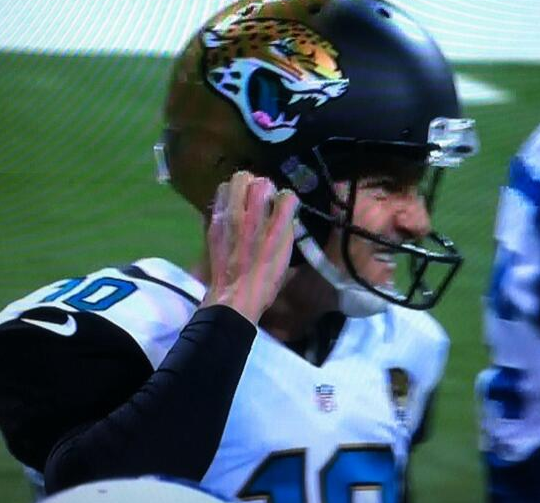
Do jaguars chew gum? One of them appeared to be doing so yesterday, as Jags placekicker Josh Scobee apparently stuck his gum on the side of his helmet — right in his logo decal’s mouth. Scobee’s little maneuver may cause a temporary spike in airplay for a certain novelty song but it probably won’t help kickers in their long-running campaign to be taken seriously as football players.
In other news from around the league yesterday:
• The Cardinals once again went full bloodclot, but this time they didn’t win.
• Speaking of the Cards, looks like quarterback Carson Palmer’s nameplate was coming loose.
• The Bengals wore solid black. (Also, I hadn’t realized that they had tiger-striped goalposts.)
• This probably isn’t a new thing, but Colts coach Chuck Pagano was wearing a windbreaker with the old bucking colt logo. Too bad that was cancelled out by the BFBS cap, though.
• The Saints wore their black unitards.
• And speaking of the Saints, defensive end Cameron Jordan had a mild decal glitch.
• In that same game, a bag of footballs on the sidelines was labeled “Pudge.” Maybe Ivan Rodriguez or Carlton Fisk was moonlighting?
• Quite a few readers asked about the cross-hatched stitching on the shoulders of some of the Eagles’ jerseys. The Eagles have been doing this for years — it’s an aftermarket modification they make to reinforce the shoulder area of their jerseys.
Before we wrap, I’d like to circle back to the Jags’ helmets (without the gum this time). Consider: Sometimes things that initially seemed radical or ridiculous can end up looking more normal after we’ve had a bit of time to get used to them. But with a full season now in the books, Jacksonville’s two-tone helmet still looks absurd, at least to me. I haven’t warmed up to it at all, not even a little bit. Does anyone out there like it yet?
(My thanks to all contributors, including Blain Fowler, Wayne Koehler, Seth Moorman, Clint Richardson, and of course Phil.)
And we’ll even put a mint under your pillow: As you know, the Super Bowl is fast approaching, and this year it’s taking place in the New Jersey Meadowlands. Naturally, all the hotel rooms here in NYC were already booked solid ages ago. If you’re lucky enough to have reserved one of them, good for you — we look forward to taking as much of your money as we can grift out of you showing you a wonderful time in our city.
But what about the rest of you — the procrastinators, the foot-draggers, the last-minute planners? You’d like to attend the big game, and maybe you even have an inside connection who can score you some tickets, but where can you stay when there’s no room at the inn?
Fear not, people — I have a solution for you. It’s called My Fucking Sofaâ„¢.
My Fucking Sofaâ„¢ is conveniently located a mere stone’s throw from the big game. Remember how Sarah Palin could see Russia from her porch? You can totally see the Meadowlands from My Fucking Sofaâ„¢. In fact, Google Maps says it’s only a 34-minute drive from My Fucking Sofaâ„¢ to the stadium — and it’ll probably be even faster on game day, because everyone knows there’s never any traffic on Sundays! Hell, My Fucking Sofaâ„¢ is so close to the game that you can can even walk there if you like.

You can be assured of getting a good night’s sleep on My Fucking Sofaâ„¢, and I should know — I’ve fallen asleep there many times myself and can personally attest to My Fucking Sofaâ„¢’s superior levels of comfort and support. Many guests over the years ”” some of them famous indie-rock stars! ”” have given similarly positive reviews.
My Fucking Sofaâ„¢ comes fully equipped with several pillows, a flat-screen TV, WiFi, and three housemates (one human, two feline), all at no extra charge. The facility is decorated with lots of interesting art and collectibles, including the famed pencil sharpener collection. Guests will have full access to the refrigerator and kitchen, although a strict mayonnaise prohibition will be firmly enforced. The space is well heated (in fact, the radiators clank extra-loudly, just so you know they’re working), and water pressure in the bathroom is superb, at least when the chick downstairs isn’t showering.
If you’re looking get a taste of New York life, My Fucking Sofaâ„¢’s concierge will be happy to arrange a program of activities for you. For example, you can get into the spirit of New York apartment living by watering the plants, feeding the cats, doing the dishes, taking out the garbage and recycling, shoveling the steps and sidewalk, and changing the litterbox. It’s all very “authentic” in that gritty, urban way you’ve probably heard about. If you want to get a little more adventurous, the concierge may let you move his car on alternate-side parking days. There is no surcharge for participating in these activities, although a thoughtful tip to the concierge is always appreciated. (For a nominal fee, the concierge will take photos of you while you engage in these activities. Imagine how envious your friends back home will be when they see them!)
Complimentary wake-up service will be provided by two of our most experienced hospitality associates, who will gently rouse you from your restful slumber with a playful lick on the ear and a considerate paw on your eyelid (usually but not necessarily in that order). You can be assured that they will do this, without fail, at 6am, so you don’t have to worry about oversleeping. Should you somehow resist their initial invitations to join the land of the wakeful, they will sit directly on your bladder and patiently stare at you until you’re ready to rise and shine. As you rub Mr. Sandman’s sprinklings out of your eyes, you’ll no doubt be thinking about all those poor saps who paid premium hotel rates and only got a conventional wake-up call — suckers!

Now, I know what you’re thinking. You’re thinking, “My Fucking Sofaâ„¢ sounds like a first-class operation, no question about it. But will it fit within my budget?” No worries, friend. My Fucking Sofaâ„¢ is proud to offer four-star accommodations at a two-star price — and for Uni Watch readers, we’re willing to lower it to a one-star price. That’s why My Fucking Sofaâ„¢ is reducing its usual Super Bowl rate of $400 a night to a bargain basement price of $395. If you can find anything in town that’s cheaper than that, My Fucking Sofaâ„¢ will cheerily match any competitor’s price, although a “rate-readjustment fee” may apply.
Ready to book your room and kick off your Super Bowl experience? Of course you are! Our friendly staff looks forward to meeting you.

Culinary Corner: About two months ago, while killing time in a motel room in Wisconsin, I read a story about a woman who had invented a “marinating stick” — essentially way to infuse roasts and other large pieces of meat with herbs, spices, and other aromatics from the inside out. I was intrigued, and thought about buying one, but the whole thing seemed a bit too Home Shopping Network, if you know what I mean, so I couldn’t quite bring myself to pull the trigger.
But now someone has pulled the trigger for me, because Kirsten got me a set of marinating sticks — a big one and a little one — for Christmas.
I’m veeeeeery curious about using the seasoning sticks, but I’m still living on holiday leftovers, plus I’m likely gonna shift into “eating light” mode for a week or so after the New Year (gotta recover from all the holiday bingeing), so I probably won’t be using them right away. Anyone else ever use them? Any tips, pointers, etc.?

Troll reminder: In case you missed it on Friday, I’ve created a new website, called My Pet Troll, to serve as a repository for the Big Cock Johnson story (which was originally posted here on Uni Watch back in April but then, for reasons not worth explaining, had to be taken down over the summer). If you weren’t around for that very unusual chapter in Uni Watch history, or if you just want to refresh your memory, I urge you to check it out. (And for those of you who looked at My Pet Troll back on Friday, when I first linked to it, I’ve made a few design improvements to the site since then, so take another look.)

’Skins Watch: In 2006, the Spokane Indians collaborated with a local Spokane Indian tribe to create a team logo in the Salish language. That logo has appeared as a sleeve patch, but now the team is going to use a Salish-lettered chest insignia. Great example of how Native imagery in sports can work if a team does some local outreach (from Jim Wagner). ”¦ The Boston Globe has published a reasonably good overview of the ’Skins name debate and how it stretches back to the team’s time in Boston (from Dave Garabedian). ”¦ Will 2013 be the year of reckoning for the ’Skins name? Could be (from Tommy Turner).

Baseball News: Been a while since we had any additions to our photo collection of the 1956 Portland Beavers, who had Cardinals-style sock striping on their undersleeves, but now Dave Eskenazi has provided four new photos. They’re the first four images in this set.

NFL News: The cover of the Houston Oilers’ 1993 media guide drew an odd visual comparison between the Pro Bowl and bowling. Love the team-logo ball! (Nice find by Douglas Ford.) ”¦ Chris Flinn got this cool NFL pennant-style tray a few years ago at a Pottery Barn, of all places.

College Football News: Here’s our best look so far at Oregon’s jersey for tonight’s Petroleum Bowl. As you can see, they have an idiotic slogan on the inner collar, but whatever. Meanwhile, here’s the helmet (thanks, Phil). ”¦ “Notre Dame OT Zack Martin obviously had a jersey malfunction at some point during [the Baseball Cap Bowl],” says JJ Sledge. “You can tell by the coloration and by the lack of the Adidas ‘stretch marks,'” he says. ”¦ Rice will have a new helmet for the Auto Parts Bowl (thanks, Phil). ”¦ I’m not sure why anyone would spend $350 on six Oregon caps, but if that’s your thing then knock yourself out. “It includes the exclusive Rose Bowl celebration cap!” notes a skeptical Trevor Williams.

Hockey News: Here’s the Frozen Fenway jersey that Providence will be wearing on Jan. 4. “It’s based on the jerseys they wore in the early 1960s,” says Erik Sundermann. Note the maker’s mark — that’s the logo for Gemini Athletic Wear, a manufacturer I know nothing about. Do they outfit a lot of college hockey teams? ”¦ Look how Jim Kyte’s helmets were reinforced around the ear. Why? Because Kyte was deaf and wanted to protect his hearing aids (from Graham Clayton).

Soccer News: Gaston Ramirez of Southampton gave his jersey to a fan after scoring a goal the other day and then had to play the rest of the game in a numberless jersey (from Nolan Brett). ”¦ You can see all of the MLS All-Star Game logos dating back to 1996 on this page (from Leo Strawn Jr.).

College Hoops News: You might not think Texas A&M Corpus Christi could fit its entire school name on a basketball jersey, but you’d be wrong. They also have a player, Rashawn Thomas, who’s been wearing some sort of headgear (from David Teigland). ”¦ UMass wore sleeved GFGS alts on Saturday. “At least it looks better than the Fruit Stripe sets from the tournament,” says James McNamara.

Grab Bag: Whoa, check out the awesome bowling uniforms shown on this old newspaper spread (from Matthew Prigge). ”¦ Fun note from Billy Jones, who writes: “I graduated from high school 15 years ago and found my varsity letter in the basement of my parents house. At the time, I didn’t get a jacket to go with the letter because a) it cost $200, and more importantly b) the only option my school offered was a generic navy blue with white leather sleeves, and that just wouldn’t cut it. Fast forward 15 years, and I find out about Stewart & Strauss’s $99 deal from Uni Watch. I designed this beauty. I’m quite pleased with how it came out!” ”¦ NSFW: If you’re still mourning Screw founder Al Goldstein’s death, you’ll like my friend Danny Hellman’s Screw cover art blog, which features tons of spectacular — and spectacularly salacious — artwork by a rogues gallery of killer NYC illustrators.
Jags helmet looked stupid when it was introduced and still does.
For some reason I have a soft spot in my heart for the Jags. I really wanted to like their new look–and DO like the uniform. But the helmet is horrible. Syracuse pulled off the two-tione thing much better.
link
I think the problem with the Jags is not enough gold on the rest of the uniform for the half gold helmet to work. The Ravens with a purple/black helmet would probably be fine, but it just doesn’t work for Jacksonville.
On the one hand, I completely agree.
On the other hand, I suspect that the Jags could be kidnapped and paint-murdered by Goldfinger, and still the two-tone helmet wouldn’t work.
I still hate the Jags’ two-tone helmet, too.
It looks ugly and gimmicky. The two-tone thing is something I’d expect to see in lacrosse.
They remind me of auto body work that wasn’t repainted properly, just covered with primer.
I said it when they were introduced, and still believe it today: The Jacksonville Jaguars have the worst uniform set in major professional American sports right now.
Tacky, poorly executed, garish, minor league.
Lee
I disagree. Most minor-league teams in North America have much better uniforms than the Jags! Call them what you will, but they’re not “minor league.” They’re much, much worse than that.
What the Jags uniforms are, is an average fantasy football fan’s notepad-doodle image of his team, come to life.
I’m not a fan of the two-tone generally speaking, but it has been executed link than what the Jags did.
As for the uniform, it grew on me once I saw it in action but like the other Nike overhaul in the Northwest, it suffers from too many elements just thrown on to it. Eliminate some of the superfluous doo-dads (gradients, sublimation, patch, truncated stripes, pointys) and link is not so bad. Not sure if anything can help link though.
If they return to a solid-black helmet the uniform will be much improved.
Has any team ever tried that paint that reflects a different color depending on the angle of the viewer?
There is literally no redeeming aspect of the Jaguars helmet design at all. It’s awful.
Also, the Colts have been using the bucking horse logo more and more on the sidelines in the last couple years. I’m actually not a big fan of it. To me, that logo really belongs to Baltimore, whereas the horseshoe logo feels more like Indianapolis. I know that is not technically true, but I can’t help but feel that way every time I see it. And, well, as I’m sure everybody is aware, the Colts leaving Maryland was not exactly a mutual agreement. Best to stick to the horseshoe, in my opinion.
Never thought of the Baltimore/Indianapolis separation regarding the bucking Colt logo. I guess I see your point. But I also really like that logo, so I enjoy seeing it.
Lee
Was gonna say, I had seen the buckling horse logo on sideline caps on Colts highlights earlier in the year. It’s made a comeback similar to that of the Brownie Elf in Cleveland.
With that said: yes, the Colts quit using it when they left Baltimore, but with the 30th anniversary coming up in March (in 2015 the Colts will have actually played in Indianapolis longer than Baltimore), Peyton Manning said it best: fans need to get over it. Baltimore got another team, almost in the same fashion as how they lost the Colts, so at this point they have no room to talk. They’re almost as bad as the 80 year old Brooklynites who want the Dodgers to come back to Brooklyn even though they’ve had more success in LA and as of this past season have now been in LA longer than Brooklyn.
I redact the comments on the Dodgers now being in LA longer than Brooklyn, as I did my math wrong. They still have another 20 years before they reach that point. But still, people in Brooklyn old enough to remember the Dodgers playing at Ebbets Field are beating a dead horse.
The Bengals’ goalposts aren’t striped, the padding at the base of the goalposts are striped.
I’m not a big fan of the jungle motif that surrounds the Bengals field. I mean, I get it…..I just don’t like it.
link
The Bengals have been pushing the tiger/jungle theme to the extreme for a while now. Man, that is one mess of a uniform…
link
It could be worse in Cincy. link
The name “The Jungle” goes back to the days of Riverfront Stadium. The Bengals took the name with them to Paul Brown Stadium. I agree that the uniforms are a mess. There’s a growing sentiment (unofficial) that the uniform needs an update starting with the helmet.
Does anyone agree the post-1981 helmet paired with the pre-1981 uniform would be the optimal appearance for this team?
More specifically, when the Guns and Roses song came out, they started blasting it on the PA- and unfortunately, it stuck.
Oilers….Pro Bowlers…..
Oh, I see what you did there.
The Jaguars uniforms except for their helmets have grown on me, just like the Seahawks uniforms did. However their helmets are still very garish and until someone out does them they will be the worst looking in the league.
It appears that Gemini Athletic is exclusively hockey, from the college to high school, based in Minnesota. According to their website, I can see St. Cloud State, Harvard, Alaska, North Dakota, Denver, Minnesota State-Mankato, Edina HS (MN), and Minnesota-Duluth.
Here’s a link to an article from their website
link
Here’s a link to an newspaper article about their company, which you can find on their website
link
Union College (NY) also uses Gemini Athletic for their Hockey sweaters. They’ve used them for years now from what I’ve noticed. I even have their thwoback sweater from when they were at Frozen Fenway a couple of years ago.
I have a couple of Quad City Mallards jerseys that were made by Gemini. They must’ve used them for a couple of years back in their United Hockey League days.
Glad to see someone place accountability for the Redskins name where it belongs. When Snyder changes the team name, the owners of the Red Sox should be on the hook for most of the re-branding costs.
Jim Kyte’s ear protection he wore to protect his hearing aids were the normal protection Cooper offered for those helmets for minor hockey players as it was a rule for players to have them. It was not seen in the NHL as player’s did not wear them. link
So you’re saying it was the hockey equivalent of double-flapped helmets in MiLB vs. MLB?
I’m not convinced that’s the case… Sure, in Jason’s photo the padding inside the helmet is there to protect the ears.
But the Jim Kyte photos show the plastic shell extending over the ears, not just the padding.
Occasionally, some did.
link
The blue helmet looks like it’s been home-modified, bu the white one came with those ear flaps.
And yes, I know a guy who got his ear smooshed when his head hit the boards and his ear was a bit outside the helmet hole. i know another guy who got his ear sliced by an errant skate, so there was legitimate claim for Cooper’s modification to the SK 2000.
One of the Sedin twins took a puck to the ear in warm ups last night. Several stitches worth.
I believe most players removed the protective plastic because they couldn’t hear very well with them on. On ice communication is pretty important.
As long as you keep the number of days you rent your house or sofa under ten days, there is no federal tax on the money. It’s called the “Augusta Exemption,” because it was passed for people here in Augusta who rent their homes during Masters’ Week. I thought the law absurd, until I looked into renting my place for Masters Week.
Josh Scobee said on Twitter that it was Big League Chew.
Re transportation from Paul’s sofa to the Meadowlands: I don’t have the link right now, but I read a story a couple of weeks ago that said that no fans would be allowed to drive or walk to the stadium, i.e., all fans would have to use some form of public or chauffered transportation…
That is false. You are welcome to drive if you have a parking permit.
You can drive there – with a permit but you cannot walk to the game.
link
So they expect to actually be able to stop people from walking? Was this “story” on the Onion, perhaps?
Why assume it’s false? Dan Snyder has already done effectively that at Washington’s NFL stadium. See, for example, this from 2009:
link
Snyder persuaded local government to effectively outlaw walking to football games and forces everyone to pay for parking, whether he drives and parks in Snyder’s lots or not, in part to win a several-thousand-dollar dispute with a local church. Because “Redskins” is about honor and virtue, or something.
Snyder did that….and less than a year later the public outrage had the local politicians running scared and the “public safety rule” overturned. You’re welcome to walk up to FedEx now any time you want for a game. If you’re doing so, I’ll assume you’re not from around here.
(See cause our team is terrible….)
He’s right, 3 ways to get in and walking isn’t one of them.
Paul- As to the post on Providence hockey jerseys. Gemini is a company based in Minnesota. The high school team I coach at we use Gemini for our jersesys. They do alot of the high school teams in the Twin Cities metro area and many college teams. Let me know if you want info on the company.
Gemini has some nice stripage going on.
link
Gemini sounds like the feel-good uni story we desperately need in January!
Is the well washed state of Demarcus Ware’s shoulder stripes an old story?
link
Paul,
Brilliant writing about your sofa and offering Uni-Watch HQ as a lodging alternative. Great stuff! Laughing throughout!
I respectfully disagree. The commercialization of Paul’s secondhand furniture has gone too far! I’m turning in the UW membership card that I do not possess. /s
The Colts aren’t the only teams to have a vintage jacket from Nike. The Buccaneer’s, Bears and Patriots are the other teams with vintage jackets by Nike.
I like the Jags helmet. Not for every team, but it’s a good contribution in a league with a nice diversity of helmets/uniforms.
“Many guests over the years – some of them famous indie-rock stars!”
I smell a contradiction.
Oh man, that Southampton home kit has all the potential to be an absolute beauty – but that top. Them ugly flailing sleeves with weird chunky angled white stripes fail the whole jersey! Whyyyy, uni-verse, why?!? Ah well, at least the socks are nice. No, they are *glorious*.
again you’re propagating ray halbritters drivel. People are sick of your manufactured Redskins name scandal
it’s over. the name isn’t changing. you lost
it’s over. the name isn’t changing. you lost
Potentially powerful, if proven.
Irrelevant when asserted.
I’m pretty sure it will change at some point. Public sentiment against the name (and others like it) is simply becoming too strong and shows no sign of weakening. That, and Daniel Snyder will eventually realize that new branding and the associated merchandise would give him yet another opportunity to fleece the team’s fans. Heck, I wouldn’t put it past him to change the name then ban anything with the old logo from the stadium.
Re. Texas A&M Corpus Christi: Look closely. The entire name is on the jersey, just with some really weird capitalization and kerning.
You might wanna go back and re-read that Ticker item.
Yes, they could fit the whole name on the jersey. The issue is, should they have? I would have opted for economy.
There’s really no amount of money I would not pay for Big Cock Johnson to be Paul’s guest for several nights, followed by an outing together to the Big Game.
Paul: You need any more blankets or pillows?
BCJ: I &$*%$* your girlfriend.
Paul: I’m going to get a beer; you want one?
BCJ: I have a big $*&$.
Having Big Cock Johnson booking a reservation for My Fucking Sofaâ„¢ would indeed be an epic hospitality experience.
Joe, if you’re reading this, we’ll put TWO mints under your pillow!
Creamer’s posted a link review on his site.
I don’t remember seeing this at all when it was unveiled, but holy-moley, the link
(Jags helmet took 3rd worst of the year.)
(Jags helmet took 3rd worst of the year.)
Seems like they bent the rules for that one. Yes, the helmet is awful, but the *logo* isn’t awful. On the contrary, the logo is quite good. It just happens to have been applied to a very bad helmet shell.
Not sure if the entry about Zack Martin was meant to be sarcastic or not, but all ND players had the option of wearing the tread-mark jerseys or more conventional jerseys. Most offensive and defensive linemen wore the normal jerseys, including Zack Martin for the whole season (as far as I can remember).
Two items to share from the rather pointless Helicopter Bowl (which assumes the other bowls have purpose)…
1. In what was a rather chippy affair, the Navy quarterback added a visor after being poked in the eye, a poke that appeared to be deliberate. The broadcast included a shot of the equipment managers adding the visor, to which the announcer added something like, “As you can see, the visor is screwed under the facemask.”
2. Late in the game, the announcers threw it down to the sideline reporter who shared something “cool” with us. What was so cool? Turns out that the game trophy is made from actual weapons used in Iraq and some other authentic materials I have since forgotten (mostly on purpose). I wanted to puke.
More in this story from last year, which includes video. As the headline reads, it must be the “coolest” trophy. Barf.
link
Whenever someone says “for reasons not worth explaining” I immediately want the explanation.
The first I’ve seen of the cross-stitched shoulders was from the Buccaneers around 93-95… I think the Cowboys also did it. Whether or not it appeared prior to this, I’m not sure. Perhaps Terry Procter can answer that, since they were both Russell teams in the 90’s. Was it a Russell innovation or from the Ripon factory?
Love this feature; always wanted to upgrade a retail jersey, but it is done prior to adding tv numbers/nameplate…
RE: Oregon.
As I’ve said before, kinda like the helmets.
But the shoulder stuff still looks like my Aunt Christine’s lace doilies (google it).
She wore her nylons tied at the knee, Eleanor Roosevelt shoes, and her hair so tightly pulled into bun it hurt to look at it.
So you can understand why I don’t have a positive reaction.
And her apartment smelled of mothballs.
Ricko!
that pencil sharpener collection is worth $1000 a night easily. holy shoot that is PHENOMENAL!!!
of course there is a MUSEUM for PENCIL SHARPENERS
link
i think paul’s looks better than the rev anderson’s.
anyone ever seen a DOUBLE Brannock?
link
Military precision. None of this “one foot at a time” nonsense!
Shoe-Fitting Fluoroscope, anyone?
link
On the Notre Dame jersey entry, most of the offensive and defensive linemen wear the traditional mesh jerseys rather than the adidas TechFit jerseys. They’ve done it all year, even in the Shamrock series game.
Paul, I was wondering if I could join your staff at My Fucking Sofaâ„¢. I have approximately two years night audit experience at two hotels in Hershey, with rates that run approximately similar to yours for the Super Bowl. I can bring the lot of quality spreadsheets over to My Fucking Sofaâ„¢ which would make any night audit procedures improved over…any night audit procedure otherwise in existence.
Thanks for your consideration and Happy New Year!
Isn’t the Marinating Stick basically the same thing as Ronco’s Showtime Solid Flavor Injector?
link
I never got a chance to write my Pet Peeves list, but if I had, I would have listed the fact that Plymouth Argyle does not actually wear argyle as one of my pet peeves. Not that I would really expect it on the shirts expect as perhaps a stripe (similar to North Carolina’s diamond side panels), but I think if they wore green-and-white Argyle socks, that would be awesome.
A little late with this, but Plan B. Brading (now Brandiose) did the Spokane Indians rebrand with the Salish language logos and I really love how they did them, they look wonderful and are respectful and something to be proud of.
However, on the Brandiose blog, The Clink Room, those guys didn’t seem to learn much of a lesson from their experience. In their last “collaboration” with users of the site, they ended up picking three winners that featured Native American imagery that is pretty regressive. Take a look here…
link
And more recently, they released a hat that features a red skinned Native American in full headdress with a really awful Native American print themed brim…
link
After giving them a lot of credit for doing something so great with the Spokane Indians, it is really frustrating to see that those guys still don’t get it and have seemingly gone backwards since then.