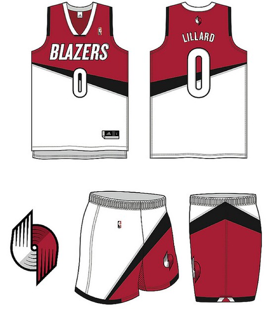
What you see above is one of the more interesting design submissions to my recent “Let’s Redesign the Trail Blazers!” contest. This one was submitted by Aaron Vaubel, and it’s one of the featured designs in my latest ESPN column, which was posted yesterday afternoon. (I thought it was going to be posted today, but then my editors decided to run it yesterday, which is why I didn’t initially have a “New ESPN column today” notice in yesterday’s blog entry.)
When I posted a link to the design contest results on Facebook yesterday, reader Worthy Evans immediately commented, “They should have put a bird on it.” Sure enough, that would’ve been a genius design, and I would have named it the winner based on clevertude alone, and now the whole project feels like a failure because nobody thought of that, hrmmmph. For those who don’t know what I’m talking about, look here:
Raffle reminder: In case you missed it, yesterday’s entry was our annual year-end reader-appreciation raffle. Lotsa good stuff this year — check it out. Deadline for entering is next Monday.
Pet(ulent) Peeves: Got a note last night from reader Anthony Bruno, who felt the need to share his top-10 list of uni-related peeves:
1. Fans who are older, wearing a shirt of a younger athlete. I recently saw a 50-something man in a Sydney Crosby jersey — creepy. My rule that I live by: Fans should only wear game jerseys of players who are older than them (their own children notwithstanding).
2. People who buy an authentic jersey and have it lettered and numbered with the wrong font and/or material. This happens often with soccer kits.
3. NBA and MLB Latin Nights. The unis have “Los” or “El” in front of the team name. During regular games, the jerseys do not have “The” in front of the team names.
4. Pajama pants and flat-brimmed caps in baseball.
5. College football players on the same team wearing the same number (offense and defense). It’s usually the starting QB and a star DB wearing the same number.
6. Championship T-shirts and caps for winning a division in the NFL. Wow, you finished first out of four.
7. Colored alternate jerseys on both teams in an MLB game. (Color vs. color looks good in other sports, though.)
8. Turning on an NHL game and not knowing who the home team is. White at home?
9. The three different stripes on the Detroit Lions’ uniforms (helmet, sleeve and pants).
10. All Under Armour uniforms, in any sport. Too much on every uniform. As I tell my children, sometimes less is more.
A few of these strike me as transparently absurd, but whatever — I get to have my daily say about my uni-related peeves (you surely know what they are by now), so why not let someone else have his turn? In fact, why not let all of you have your turn: At the risk of opening a great big can of stupid, I’m hereby encouraging everyone to list your top 10 uni peeves in today’s comments. Go ahead, knock yourselves out.
A few ground rules: Please do not email your peeve lists to me; please restrict your lists to 10 items; please stick to uni-related issues; please do not include things like “peeve lists” or “websites that publish peeve lists” or other things you think are clever (they’re not). Thanks.

’Skins Watch: “Wapakoneta High School in Ohio uses ”˜Redskins’ as its nickname,” says Kyle Shaner. “What makes Wapak unique, and could make a name change appealing to a national audience, is that Neil Armstrong was from Wapakoneta. With the 50-year anniversary of Armstrong becoming the first man to walk on the moon is approaching in 2019, the school might be open to changing its nickname if it was done in the framework of honoring Armstrong.” ”¦ Wisconsin Gov. Scott Walker has until tomorrow to sign, veto, or ignore (and thus allow to pass into law without his signature) a bill that would make it easier for the state’s schools to retain their Native American mascots, and now it’s looking like he may sign it. Wisconsin native Chance Michaels offers some personal context:
My own high school — Wauwatosa East High, from which I graduated in 1990 — was at the center of such a controversy. We were known as the Red Raiders and this was our mascot:
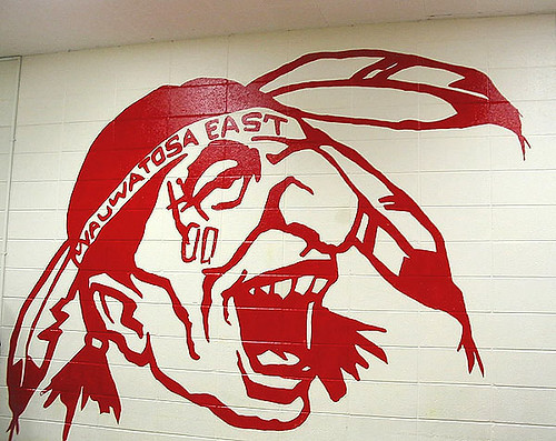
Just to give you a sense of scale, that particular version was painted on the cinderblock lunchroom wall. Huge. Loomed over us.
When I was a sophomore, we started a campaign to ditch the logo. I don’t know who among the students first realized that this was an issue, only that it wasn’t me. We were ultimately unsuccessful, and we graduated with the name and logo plastered all over our commemorative stuff.
My brother entered as a freshman the year after I graduated, and his class took up the fight. They were able to get something done. They might have been helped by Marquette’s decision to drop its native mascot right around this time, which raised awareness. Anyway, the administration agreed to change the logo, but not the name, and a contest was held to choose a new logo from a group of student submissions. This was the winner — a halfway step at best. There were non-Native-themed submissions, but my brother called the process “totally political and doomed to fail” because of the insistence on “improving,” rather than scrapping, Native imagery.
I haven’t kept up with the old place, but I do know that around 2006 the school rebranded again, this time moving away from Natives and toward some sort of swashbuckling or knight-themed imagery. Finally solved the issue.
So it only took 20 years and a half-hearted compromise to effect real change. I wonder if Marquette would have their lingering resentments if they had just said “From now on, ‘Warriors’ means Spartans,” or pirates, or something similar. These names are generic enough that they can stand without the Native iconography.

Baseball News: I just won this very nice vintage jersey for literally next to nothing. More info once I get it in the mail from the seller. ”¦ Fun news out of San Diego, where the Padres will be wearing 1984 throwbacks for a four-game series against the Cubs. “Not sure I’ve seen a team wear throwbacks for an entire series, but they really seem to love wearing their ’84 jerseys against the Cubs to rub in their NLCS victory,” says David Linder. ”¦ What if Santa and his crew had their own baseball team? Might look like this, and Rudolph the Crimson-Schnozzed Reindeer would get his own entry at Baseball-Reference.com. Note the first line of his career stats (from Duncan Wilson). … The Richmond Flying Squirrels have partnered with a local brewery to create Chin Music Beer (from Tommy Turner).

NFL News: Here’s a good series of charts and infographics on NFL penalties since 2009. … Concussion discussion: All those NFL concussions are tough on the players (duh), but they also take a heavy toll on the players’ wives (thanks, Phil).

College Football News: “There’s an Xfinity/Comcast commercial that features Michigan State,” writes Zach Conrad. “During the player huddle, most of the players have the correct B1G patch on their jerseys but one player has the patch that belongs on the away jersey.” … Here’s UNC’s patch for the Department Store Bowl. Man, does that logo look like it belongs on a 1970s roll-on deodorant dispenser or what? Meanwhile, the school is letting fans vote on the helmet and pants for that game. ”¦ Here’s Duke’s patch for the Chicken Sandwich Bowl, and Clemson’s patch for the Credit Card Bowl. ”¦ Planning on buying a game-used jersey to support the Wounded Warrior Project? Might wanna think again: According to Veterans Today, the WWP has a top-heavy management structure that results in most donations and contributions staying within the organization (from Caleb Borchers).

Hockey News: The Flyers are saluting the Philadelphia Police Dept. by wearing a patch during pregame warm-ups tomorrow (from Chris Flinn). It’s interesting that the NHL always restricts this type of stuff to warm-ups and keeps its uniforms relatively pure for the actual games — a good approach.

Soccer News: New pink jersey for Real Madrid, and new kits for Roma as well (both of those from Trevor Williams). … DC United is letting fans vote on a team-branded beer can design (from John Muir).

NBA News: We already knew the NBA was planning several games — all involving the Heat — with nickNOBs. What we didn’t know was that at least one of the nickNOBs will also include FIOB. Details here. “And just in time for Xmas,” notes Phil.

Grab Bag: The Chisholm High School basketball team in Minnesota still wears old-school striped socks (from Barry Brite). … Apparently there’s some commercial for Jared — the jewelry people — in which a guy gives his galpal a blinged-out jersey instead of a ring (screen shot by Chris Flinn).

What Paul did last night: Late yesterday afternoon I went to a Manhattan radio studio and sat down for a lengthy interview about Uni Watch in general and baseball hosiery in particular. The interview will end up being part of a segment on the excellent design/architecture radio show and podcast 99% Invisible. The unusual thing is that the guy interviewing me wasn’t 99% Invisible host Roman Mars — it was Jesse Thorn, who’s a radio/podcast star in his own right (he’s the guy who does the pop culture show Bullseye, formerly known as The Sound of Young America). Turns out Thorn is doing some work for 99% Invisible now. Anyway, the interview went really, really well — I left the studio in a great mood, and that was only partly due to all the free Christmas cupcakes they had in the reception area. I’m excited to hear how it all turns out. Not sure when it’ll run — will advise when I know more.
After the interview, I walked to a movie theater and saw Inside Llewyn Davis. It’s very, very beautiful — tons of gorgeously lighted and framed scenes. A few very funny moments, too. But the characters and narrative left me cold. Bummer.
Pet Peeves: Eagles abandoning kelly green/silver back in 1996, Lions number font, Broncos post 1997 uniforms, I could go on forever, but I have to get back to work.
My pet peeve is misaligned helmet stickers. I see it a lot with the newer Riddell 360 helmets. As an example:
link
Maybe dude’s head isn’t alligned properly!
Ditto, but that’s a Schutt…just sayin!
Yeah I know it’s a Schutt, but the only photo I could find (which in this case, I took from a TV broadcast) was UW’s helmet.
Pet Peeves: People wearing Team Jerseys to a game in the same league where that particular team is not playing. BFBS. Under Armor. Vanishing College Football uniform traditions. “Intel Inside” Barca’s kits. Any jersey in any sport with a contrasting sleeve. National Teams in soccer without a distinct Uni identity (see U.S.). Weird number fonts particularly in Bundesliga and La Liga. Camo. Cycling jerseys that look like something out of Ed Hardy or Affliction (or anythin for that matter). Martial Arts uniforms that aren’t White.
Did the Padres actually wear brown uniform tops at home in 1984? I hope the team will get the details right and actually wear 1984 home turn-back-the-clock uniforms for a series that is being played at home, but I fear that they’ll botch it and instead wear their 1984 road jerseys.
They’re worn the brown ’84 tops at home previously, so you might be right. Or maybe they’ll wear the home white, the road brown AND the alt yeller of ’84.
But camo, apparently, must never be pre-empted:
@RJsFro
FYI Rumor has it the ’84 uniforms will technically be worn 3 of the 4 games only. The camos will still be worn for the Sunday game.
If this pet peeve thing is actually encouraged, I’ll avoid the comments today. See you tomorrow.
Pet Peeves: The Dallas Cowboys home uniforms. Are you royal or navy?
thank you, i agree. pick a blue
The 2002 “Viagra” turn-back-the-clock promotions lasted entire series, I believe…
That’s definitely longer than 4 hours.
No link to first NFL entry. ???
There’s link missing on the first line of “NFL News” I think
Shit, can’t find the link now. Have deleted that item, sorry.
I’ve always loved the term “chin music”.
However, the pitch depicted on that beer can can hardly be considered “chin music” as it is coming in waist high.
NFL penalty infographic:
Someone will have to explain “illegal forward handoff” to me.
????
I’m guessing that would be the QB handing the ball to a pulling offensive lineman, maybe? Given the 0 calls listed, it’s probably just a holdover rule from the ancient era and doesn’t really happen.
I miss the days when the ref would actually walk-off penalty yardage then signal the infraction rather that the call and ball-spotting that goes on today.
A forward handoff which occurs past the LOS!
who knew??!!
(c) A forward handoff occurs when the ball is handed (regardless of the direction of the movement of the ball) to a player who is in advance of a teammate whose hands he takes or receives it.
1) The inconsistent Seahawks logo – The back of the head curves upward on the field and on merchandise, but on the helmets curves downward.
2) The black outline on the Chiefs helmet logo and having no yellow present on the helmet. While the jerseys and pants have no black and plenty of yellow throughout. I can’t help but think how good it would look if that black outline on the helmet were switched to yellow.
Re Chiefs helmet logo – glad I’m not the only one! I’ve been saying that for years!
The Rbk Edge template, ruining many NHL sweaters in 2007. Including my hometown Flyers.
Before:
link
After:
link
At least that has since been rectified. But for a few years, they were horrendous looking out there.
Pet peeves: The thick helmet stripe on the Seahawks helmet on anything but the Revo Speed, the fact that soccer uniforms are called “kits.” They’re uniforms, darnit. And I fully agree with Anthony Bruno’s #10.
Pet Peeves:
1. “Black outs,” “white outs,” “pink outs…” Whatever you call ’em. The team and the fans look like one giant united douche.
2. Baseball players who leave their sunglasses on their hats while playing defense (especially in the sun).
3. (Football) white uniforms at home.
4. Pine tar on the helmets!
5. Half-arm sleeves. (Dwight Howard)
6. Camo and the color pink.
7. A generic championship logo patch. (NBA Finals & Super Bowl).
8. Eye tape instead of eye black. There’s a difference!
9. Adidas- NBA & College Football
10. Any kind of MLB softball top.
I had a couple about playing field logos, but I wasn’t sure they were “uniform related” so I just removed them.
1-8: not buttoning at least one of the top two buttons on a baseball jersey. Lookin’ at you, Mike Napoli.
9: When the Red Sox switched back to a more old-school looking road uniform, but kept red undershirts/long sleeves. It looks horrible. Bring back the navy.
10: just a retail gripe, but ever since Reebok took over, NHL replica jerseys feel like they’re made of tissue paper. I’ve a closet full of CCMs that could probably withstand a few games, but these don’t feel like they’d last a gentle spring breeze.
“It looks horrible. Bring back the navy.”
I would have them wear navy sleeves at home, too. The navy hat looks out of place with link.
Very weird to think we “older” fans shouldn’t wear a jersey of a current player. Why is that creepy?
My uni pet peeves:
1) Wearing a jersey/T shirt of a 3rd team at a game, such as, a Reds jersey at a Cubs-Cardinals game. Or a jersey of a different sport. A college logo at a pro game is OK.
2) Colored [not white or gray] alt jerseys in major league baseball.
3) Jerseys that look too much like those of another unrelated team, like the Nationals uni that strongly resemblance the Reds’, or the Durham Bulls new jerseys that seems to copy the Texas Rangers.
4) Pretty much everything about NFL uniforms
5) The culottes on male basketball players. We don’t have to go back to the hot pants era, but something in between
At the Bucs – 49ers game on Sunday a guy in front of me was wearing Pats gear, and a guy behind me was wearing Browns gear. Why?
If you don’t have any rooting interest in the two teams playing but still want to go to the game, I don’t see the problem.
Background: I have over 70 Hockey Jersey.
So when I go to the Caps games I might wear 1) a Caps jersey (old or new) or 2) a franchise jersey (ex: Kansas City Scouts jersey when New Jersey comes to play) or 3) a let’s remember (wearing a Blackhawks jersey to a CAPS/Flyers game) or 4)the other teams colors or 5) a certain player jersey even though that team isn’t playing but he is there (ex: my Patrick Roy Canadiens Jersey when Colorado comes to town because he it the coach) or 6) time of year (my santa jersey for games in the next two weeks)
I travel to games around the country, because I like to see different teams in different leagues and different stadiums. I don’t have a jersey for every team, but I do like to wear jerseys to games. So I’ll wear whatever I feel like, and it won’t necessarily be a team that is playing.
My pet-peeves:
1a. Players changing into championship hats/t-shirts *immediately* after winning something. I’d like to see guys hold the trophy in the jersey they wore all year. And the team photo shouldn’t be a bunch of guys in uniforms covered with t-shirts. Stupid.
1b. Celebrations (and resulting championship t-shirts in Modell’s) for division/conference/semi-finals whatever. There’s only one game worthy of such celebrations, and it’s the last game of the year.
3. Any hockey jersey from the last decade or so. Apron-stripes, scooped hemlines, jerseys made of numerous “panels,” cheap fabrics, printed crests/patches that didn’t even pass on replica jerseys 10-15 years ago when all were embroidered… Cheaper product, but now produced in far-away lands and sold at astronomical prices.
4. “Jersey T-shirts” with player name and number on the back now cost the same as actual replica jerseys did 15-20 years ago.
5. Mismatched uniforms in baseball. Want to wear dark on top? Fine, wear dark on bottom too. Then, your looks will be “uniform.” Or at least go dark shirt/white pants/dark socks. But who shows their socks anymore?
6. Hockey jersey collar laces (and I don’t mean the Olympic jersey faux laces, I mean actual laces on jerseys right below the NHL shield where nothing can be tightened anyway) just for looks. It’s not cool, it’s not retro, it’s just stupid.
7. All of this year’s Olympic hockey jerseys.
Why?
Why not? Why can’t someone express himself however he wants (or just grab whatever shirt happens to be at the top of the dresser drawer)? Why does he have to follow some sort of program? Maybe he just likes that jersey. It’s all just dress-up anyway — only the players have to follow any rules.
Or at least that’s how I see it.
Agree w/ Elena, why wear a Reds jersey at a Cards/Cubs game unless you are intentionally being an ass to say “look, I’m here but like THIS team, I’m so rebelous”…just seems like a D-bag move
How is what someone else wears your (or anyone else’s) business?
As far as I’m concerned, this silliness just proves what I’ve been saying all along: Jerseys shouldn’t be allowed for sale, because it turns everyone into idiots.
I guess I’m a DBag because I would definitely wear Reds swag at a Cardinals/Cubs game!
I’ve been to too many Yankees/Rays game where a Red Sox fan shows up just to yell “Yankees Suck”, same goes for Yankees fans at a Bosox/Rays game. I’ve personally sat next to fans who show up at a game in a 3rd team’s gear and do nothing but watch the scoreboard. In this day and age of NFL Sunday Ticket and MLB League Pass why bother? You wanted Pet Peeves, you’ve got mine. Plus this started with the one about wearing a jersey of someone younger than you, in that case I’ll clean out my closet and get a Hank Greenberg jersey.
“…I’ve personally sat next to fans who show up at a game in a 3rd team’s gear and do nothing but watch the scoreboard. In this day and age of NFL Sunday Ticket and MLB League Pass why bother?…”
So you really think the guy couldn’t afford to buy cable TV or goto a bar, but instead goes to the stadium, buys a ticket to watch the scoreboard all game?
Yep, at least in Tampa/St. Pete
I’ve always espoused #1 as my #1 rule as well. To me, wearing a player’s name and number seems to be aspirational – “When I get older, I want to be like this guy.” Now that I’m older than anybody in any pro league, I’d feel uncomfortable to be wearing the jersey of any of them.
When visiting Boston a few years ago I really wanted to see a game at Fenway. Of the 9 days I was there there was only one game on the schedule (actually it was a make up game) and it was against the Yankees. As an Orioles fan there was no way I was going to wear any Red Sox or Yankees gear. So I went to the game and wore my Orioles hat. I did the same thing at a Yankees/Tigers game at (the new) Yankee Stadium a few years later.
The thing about wearing an Oriole hat outside of Baltimore while they were in the middle of 14 straight loosing seasons is that people realize that you’re a baseball fan. My hat has started hundreds of baseball conversations because when you wear the colors of a shitty team people assume you must really really like baseball to stick with a team that bad.
I’m sure there are plenty of other fans who don’t wear their teams colors all the time, and that’s fine, but I bet they miss out on a lot of good baseball talk.
@duker, thanks to providing a different perspective to my peeve about wearing a 3rd team’s jersey to a game. I’ve engaged a lot of other team’s fans in good baseball, football, and soccer talk in the past. Given the lack of “local” fan support of teams in the TB area the peeve may be a product of my own frustration. I became jaded when I heard one too many “Yankees Suck” chants and saw people sitting in the stands at Ray J watching another game on their smart phones. This gives me a chance to re-evaluate how I feel about other fans and maybe some great conversations will grow out of it!
Unless it’s the London Games. Then you’re excused.
Well, let’s see…
Gray facemasks if gray isn’t a team color – I’m looking at you Colts & Browns.
The insistence on calling a certain color “athletic gold” instead of “yellow”.
The wearing of a throwback uniform by only one team in a game. C’mon, if you’re going to do it, then get both teams on board.
The lack of colored baseball pants.
Wearing a football helmet with no logo.
College teams wearing non-school colors. I don’t care if Oregon wants to wear 256 different uniforms, but they should all be green, yellow & white, not black, silver or carbon.
Vegas Gold used as a “dark” color against a team wearing white. Stop it, seriously.
Every single decal on the back of a football helmet that isn’t a player number or team logo. We don’t need flags, or league logos, or that warning sticker, or pink ribbons, or…
Teams wearing memorial patches or decals for an event that has absolutely no connection to the team.
Ads on jerseys which are larger than the team logo.
Well, since you went there, I’ll make my list of one:
The insistence that link and link are actually the same color. ;)
Good call. Yellow & gold aren’t the same. Gold is 49ers, Notre Dame, Saints. Yellow is Steelers, Packers, Cal, etc…
Of course, I have noticed schools switching it between sports. Example…what Baylor wears in football is clearly gold, what they wear in basketball & baseball is clearly yellow.
you have posted two different shades of yellow probably PMS 123 and 1235
“Gray facemasks if gray isn’t a team color…”.
I’d be fine with those, provided that the NFL lift the single-bar ban and limit their use to kickers.
How would Gary Anderson react?
link
Pet peeves:
-Pinstripes on gray baseball uni’s
-Gray baseball pants at home (yes, I’ve seen it,and it makes me sad)
-Jets’ mono-greens
-Dallas Cowboys’ blues and grays
-OKC Thunder’s road uni’s. Too crowded
1) Pajama pants in baseball.
2) Flat brimmers (players and fans).
3) Pulling out shirt tails after wins.
4) Faux lace-up hockey sweaters.
5) BFBS.
6) Camo gear for any occasion.
7) Catchers not allowed to personalize masks. (I know it’s a contractual thing, but still.)
8) Outfielders who wear sunglasses on their caps, in full sunshine.
9) Logo creep to the extent manufacturers direct teams where logos can be placed on unis.
10) Baseball managers and coaches in full uniforms.
1. Camo
2. The Panthers not wearing blue socks with their blue alternates.
3. Pajama pants in baseball.
4. Pinktober
5. Baseball players that wear their hats crooked.
6. Overuse of sleeve patches.
7. College Football teams that change their uniform every week.
8. The sleeved NBA jerseys.
9. The Cowboys refusal to pick a shade of blue.
10. The Steelers only having the logo on one side of their helmet.
1. Lighter (non-white) jerseys on top of darker pants in football. See Ravens purple on top of black.
2. Any Adidas college basketball uniform in last 2-3 years.
3. Eagles’ dark green anything, go back to Kelly green and silver.
4. Notre Dame’s helmet and pants not matching.
5. Pittsburgh Penguins using Vegas gold instead of the normal Pittsburgh gold.
6. Mono-chromatic (with exception of all white) in the NFL. Leave that to pee wee, high school and college.
7. Dallas Cowboys blue on helmets being different than jerseys/pants/socks.
8. UCLA continually messing with their football uniforms. Don’t change a classic, see your rivals USC for guidance.
9. The NASCAR effect on college uniforms – uniform manufacturer patch/logo, conference patch, name/logo all across the collarbone area. Too much and we won’t even talk about having to put a bowl patch on.
10. Steelers’ round numbers. Go back to the block numbers. Block numbers seem more appropriate for a team named after steel.
>>3. NBA and MLB Latin Nights. The unis have “Los” or “El” in front of the team name. During regular games, the jerseys do not have “The” in front of the team names.<>4. Pajama pants and flat-brimmed caps in baseball.<<
Absolutely agreed, especially about the caps. How is it cool to look like Scotty Smalls's "before" picture?
Shane, agreed about the Sox' red sleeves, both away and at home. The navy was so much better looking.
The Jeff, I do NOT want to see Prince Fielder in colored baseball pants. If he'd played for the 1979 Pirates he'd have blotted out the sun.
>>3. NBA and MLB Latin Nights. The unis have “Los” or “El” in front of the team name. During regular games, the jerseys do not have “The” in front of the team names.<<
Oops. Meant to mention here that nouns in Spanish usually take an article. So this dinna upset me overly.
My pet peeves in no particular order, but still numbered because I’m OCD
1. The Reebok lettering wordmark, as opposed to the vector logo on NHL jerseys.
2. The Nike word shirts. (Fear the fork)
3. Half and half jerseys.
4. The San Diego Chargers current uniforms. I’m a sucker for the 06 versions
5. Any jersey that The Oregon Ducks wear, except for baseball
6. Generic jerseys or jerseys with no wordmarks in commercials
7. Glitter or pink jerseys for women
8. Teams that think their identity is the best thing since sliced bread and take a snob approach. (Yankees, Cowboys, Lakers, Maple Leafs)
9. Teams that charge you up the ass for “game used” gear from 7 years ago. $10-90 is ok, but past that is dumb.
10. People who do jersey surgery or modification in order to look current.
Pet peeve:
Teams who’s throwbacks are better than their everydays. Just switch back.
Broncos. Patriots. Falcons. Eagles. Titans/Oilers. Bills. Cardinals.
Can I add the Bucs to that list?
And the Rams.
…and the Chargers.
And the Broncos.
…Broncos was the first team that the original poster mentioned.
…but the Broncos are worth repeating, and some of these are definitely worth repeating, like the Patriots, and the Patriots, and the Patriots. Seriously, I couldn’t agree with these more.
NOB for home MLB unis. You’re supposed to know who YOUR players are.
NOB for any Yankee jersey.
Agreed with Brandon about the Eagles. Those simple unis from the late 1980s with the kelly green were just awesome. Similarly the Cardinals. I’ll give ’em the Arizona flag on the sleeve, though.
Broncos aren’t sooooo egregious now that they wear mostly the orange jerseys.
Which Falcons look do you mean? Glanville all-black, red and silver before that, or the black jersey, red helmet look from the 1960s?
Since it’s football season, they’re all football.
1. minimalist sleeves on jerseys;
2. jerseys that emphasize their own construction by sweatboxes, weird contrast piping, etc;
3. jerseys worn so tight they emphasize equipment worn underneath;
4. numbering that has substantial variation in thickness of components (eg. Falcons, Ravens, Patriots) especially when combined with drop-shadow or multiple outlines;
5. pants and socks of same color without something to break it up;
6. transparent pants;
7. short socks – Elmer Layden was right;
8. too much contrast between helmet and facemask;
9. tarting up a good logo with excessive ornamentation (e.g. Falcons);
10. patch clutter, particularly league patches.
Whatever the winning design, I’m going to make a pickle out of it. Because WE CAN PICKLE THAT.
1. The NFL’s “One helmet all season” rule that prevents teams like the Falcons and Bills from wearing their far, far superior alternates.
2. Pretty much everything about Nike’s design of Georgia’s football program.
Nike’s RE-design*
I agree completely with the Nike design of UGA’s football uniform. What an atrocity! I hate the jersey collar and the number font.
Why not go back to those beautiful 1992 uniforms? Or the early 1980s uniforms?
The Nike redesign makes me ashamed to be a Dawg fan.
1. the leotard look in football..when teams like the ravens wear black socks with black pants
2. nike flywire collar football
3. nike system of dress basketball. the tight top with the ridiculously baggy shorts
4. hockey teams wearing colors at home. Go back to white!
5. Los Bulls, El Heat
6. colored numbers on football home jerseys. numbers should always be white to provide a sufficient contrast.
7. Lakers wearing white at home on Sundays. they should always be in yellow
8. football teams that wear their white jerseys at home in september because of the heat but their pants are colored…see Philly wearing white jerseys with green pants. Doesn’t that defeat the purpose?
Don’t know if it would make a significant difference in terms of player comfort – but the Eagles white-top, green pants combo is their best look, in my opinion.
They need Kelly green/silver back yesterday, but with the colors they have to currently work with – I think that’s the best.
6. colored numbers on football home jerseys. numbers should always be white to provide a sufficient contrast.
I don’t know about that one. I can see like, red numbers on a blue jersey being a bit of an issue, maybe, but the Raiders silver numbers or the Saints gold ones are perfectly readable.
I really don’t have that many pet peeves. I do detest the use of a specialized font for NOB and number. For example, Texas Rangers, Reds. I can’t believe people don’t seem to mind this abomination. Also, the use of non-standard colors – burgundy in the old Phillies unis, the burnt red color in the old Astro unis, and TEAL! All of the leagues need to crack down and come out with some type of standardized color and font legislation. Yes, legislation. Maybe then we wouldn’t see those crappy fonts on the Vikings, Lions, and Ravens jerseys. The Dallas uni set bothers me as well with the colors all over the place – I would blame the asshole owner but it was like this before he got there. One last one. Plain vanilla logos. I mean, can you please put some thought into your logo and make it both relevant and visually appealing? How difficult is that?
So you don’t want plain logos, but god forbid a team wears a color other than red or blue
1. people that customize a jersey with their own name.
2. Pink jerseys/The entire month of October
3. Pajama pants in baseball
4. unitard look in football
5. Camo gear
6. The Pirates lack of the little serif on their P
7. Pens going Vegas gold
8. No white at home in NHL
9. Throwbacks that are not true to the actual jersey they are throwing back to
10. Sloppy look of most NFL coaches. They essentially dress like they are going to the gym. Wear a tie hippies!
Why don’ t you guys get an original list instead of rehashing what the first guy wrote.
Pet Peeves:
1. Jersey’s and Helmet color not matching on TV (new Vikings stuff – maybe they match in person but not in photos or on TV).
2. Super Baggy baseball pans (I don’t mind lose fitting, but pajama pants is a great term for a terrible uniform trend).
3. The Saints Nike Collar (and most of the NFL in 2012-2013). It looks like a polo shirt.
4. Camo uni-anything (except Army, Navy, Air Force).
5. Clippers “patch” logo on uniform. Yuk.
6. Flat brimmed hats in MLB as well as those fools who wear the hat crooked.
7. Special Christmas jerseys (NBA). Really? $$$$$
8. Inconsistent color on NFL jerseys when sweating (Lions are particularly bad), this could go for some of the college basketball uni’s I keep hearing about as well.
9. New NBA shirt jerseys.
10. The Nike Swoosh facing the same way on both shoulders of NFL jerseys instead of just the corporate way as God intended LOL.
Your first pet peeve is my only one, mismatched colors. Tends to be limited to teams with purple; Vikings, Lakers, University of Washigton.
Purple is a tough color to match across different materials, lighting conditions and media. Just can’t be done, apparently, because every time it’s used there are issues.
“I don’t have pet peeves; I have major psychotic expletive deleted hatreds”
– George Carlin
Too many patches (conference, logo, brand) on the front of college football jerseys
GFSG – gray for the sake of gray facemasks (Browns, Indy, USC)
midnight green and black – if I’m “forced” to watch the Iggles twice a year, they ought at least be wearing kelly green and silver
Yale’s new pants – bring back the double stripe!
Pajama pants on baseball teams
Color jerseys during day baseball, especially Sundays and Opening Day
Non-black shoes on anybody other than Joe Willie Namath or L.C. Greenwood
Non-block numbers on football jersey other than the Chicago Bears
Numbers on the front of hockey sweaters
Leotards on football players
Hard to limit it to 10, but others have shared mine.
“At the risk of opening a great big can of stupid…” Great line that I will be using going forward.
Paul,
They already “Put A Bird On It”!!
link
Terence M.K.
Ha — awesome!
And Aldridge was on the show
link
GREAT!!!!
– Miami MLB team’s decision not to wear gray road jerseys.
– The near-constant use of alternates by the Milwaukee MLB team.
– The Philadelphia NHL team’s black nameplate on their white sweaters.
– The Richard Petty Motorsports #9 team’s number and font.
– The lack of an white outline on the Cleveland Indians’ “C” caps/helmet.
– The Washington MLB team helping themselves to left-over DC baseball uniform history.
– MLB ballparks with gimmicky manufactured dimension/field of play ‘quirks’.
– Hockey-goalie style catcher’s masks.
– Chief Wahoo.
– MLB teams who throwback to minor league teams.
1) MLB pajama pants
1a) Even those who go high cuff don’t wear stir-ups
2) BFSB
3) MLB softball tops white home gray road
4) any and all 3rd jerseys. A once a year “throw back” isnt so bad, but a third current shirt is dumb.
5) GI Joe anything except GI Joe dolls
6) MLB hitters who wear a suit of armour get hit in said armour and act like they have been shot. IMHO a hit in the armour at most should be a ball.
7) The Vikings sleeve stripes seem to have a cut out designed for the nike logo creep.
8) Long shorts / short socks in hoop. The old shorter shorts looked better.
9) The Heat’s white out look, you can’t read those numbers on TV
10) NFL teams going mono-chrome. All teams all colors.
10a) Especially if it is Black.
On your number 7, it was described locally here as a ship, or to represent a curvature of a ship that Vikings typically/theoretically used for transportation.
That particular stripe drives me insane. Come to think of it, I could use the Vikings uniform for a good number of pet peeves.
1. Odd White Stripe on sleeves.
2. Odd striping on pants (one thicker than other)
3. OH MY GOD THE UNIFORM NUMBERS!!!! UGH!
4. Black for Blacks Sake (facemask, highlighted around horn, in horn on helmet).
No pet peeves here, so this is slightly off-topic, but I’m hoping to point out the final item to let you all know that both Bullseye with Jesse Thorn and 99% Invisible with Roman Mars are very fine radio shows/podcasts. Fans of Paul and this site, if you also like culture, design, and not just the uniform-ology of things, you’ll be in for a treat.
My pet peeves (some that may have been expressed already):
1. Majestic’s (or team equipment managers’?) insistence on subtly radially arched NOBs. The Dodgers in particular seem to have names that link. When other manufacturers were making jerseys for MLB (particularly Russell), it seemed that the arched NOBs actually had arching.
2. The growing number of alternate uniforms in college football. I’m getting tired of it.
3. Design trends with Reebok’s NHL jerseys–basically the excessive piping (or “speed lines” as I derisively call them), half stripes, alternatell-colored nameplates (the black nameplates on the Flyers’ whites kind of bother me), and “tail” at the back of the jerseys.
4. The increasing number of circular “roundel” logos in MLB. The Pirates came up with one as an alternate a few years ago that looked completely too bland and plain to me. Thankfully, they did not upgrade that to be the new primary.
5. Soccer kits with ads on shoulders, sleeves, upper back, lower back, back of shorts(essentially making it look like a tramp stamp), and front of shorts.
6. The Padres essentially looking like a lesser version of the Yankees with their block numbering and dark blue. Probably one of the most boring identities in MLB.
7. Adidas and its agenda with sleeved NBA jerseys. Heck, anything Adidas has done with the NBA uniforms (BIG, the Christmas jerseys) and attire (why are the three stripes so massive now?).
8. The increasing use of blue as a “safe” color, especially in the NBA. So many teams have changed to blue-based identities, it’s getting old.
9. When a customized jersey has the incorrect NOB or number fonts. Or if the numbering and naming is correct but applied incorrectly. (too much or too little kerning, for instance)
10. Counterfeit jerseys being worn at games. This always bothers me, especially when people justify it by saying they’re cheaper than the authentics.
Can’t list 10, but if I am czar of all sports, the special patch/logo added to a uniform or hat to commemorate the game which is to be played would be outlawed.
No Super Bowl patches, no World Series embroidery on the hat or sleeve patch. No garish Belk Bowl patch. No Larry O’Brien trophy sewn on the Finals uniforms. Have always thought this looks awful and just clutters up uniforms for a blip of increased merchandise sales.
So I’ve been thinking..
Up until about an hour ago, I was on board with most of these pet peeves. Then I got to thinking about a few things. There are roughly 130 teams in d1 football, 250 in d1 basketball, 250 in NCAA hockey and baseball, over 130 teams in the 4 major sports, 200?300? Professional and international soccer teams and endless amounts of d2 and minor league teams… So we consider over 1200 different teams on any given random day, each having on average 4?… 5? Different jerseys… Under estimating that’s 4800 up for debate, viewing, purchase, enjoyment on any given day. So SOMEONE has to be different, someone has to be a bit off, that’s why I appreciate more the oregons, Marylands, slightly green cowboy pants, Seahawks of the world.. I don’t have to like those unis, but at least they tried. So I no longer am that bothered by someone going blue over yellow, or trying to do something a bit off to seperate themselves from the competition to either make a buck or grab a recruit (which is still making a buck) so I thought about what peeves me, that doesn’t have to do with a teams identity.. Or, that was/is a simple lazyness on the designers part for instance the striping is different on the lions helmet, jersey, pants, socks… That’s fixable and would argue it would sell more because it is more aesthetically pleasing… The shoulder ucla striping that doesn’t go all the way around.. that is fixable and is lazy on nike’s part… Appreciation jerseys that 100% of all profits that don’t go to said cause…(wounded warrior, breast cancer) I mean come on.. As if your 4 different jerseys and tickets and menorabilia weren’t enough? Now you lie to me and say it’s in support of breast cancer when only 10$ of my 100$ goes to it? So where does the rest go.. Baggy baseball pants… Teams who stick to a template because Adidas or Nike said so.. Throw a stripe in there for f’s sake…
That was a mouthful… But after all these peeves… How much better are we as a uni centric society that in the 80’s… It’s a great time to be a uni fan…
[i]1. Fans who are older, wearing a shirt of a younger athlete. I recently saw a 50-something man in a Sydney Crosby jersey – creepy. My rule that I live by: Fans should only wear game jerseys of players who are older than them (their own children notwithstanding).[/i]
I kind of enjoy seeing an 85 year old woman in a Ray Lewis jersey.
1. Truncated UCLA football stripes. BY FAR No. 1.
2. All the stickers now on the front of college football uniforms – there are routinely up to 6 of these stupid patches, maker’s marks, tiny team names, etc.
3. Template uniforms and one brand making unis for an entire league. If each team is supposed to be “franchise”, they should be allowed to go get their own uniforms from anyone. Design can still be approved by the league.
4. The same dinky little emblem on the shoulder as on the helmet.
5. All black NHL unis that all look the same on TV so you can’t even figure out who’s playing.
6. More than three unis per team and the alt worn more than a regular home/away uniform. Any sport.
7. Sleeves on NBA uniforms.
8. Spiky center helmet stripes like the Panthers/Titans/Broncos
9. Unitards such as the Ravens/Saints. Sock tops NEED to be a different color than pants, and preferably have stripes.
10. Rams all blues. Egad.
#1 just may be #1.
Wish I had thought harder!
1. The total drabness of the St. Louis Rams uniforms. I see those and instantly get depressed.
2. Any hint of military/troops/camo on team uniforms. (Military academies each get a pass on this one.) It’s getting to the point where former Soviet citizens are probably mocking us for this constant over-the-top propaganda nonsense.
3. The foolish small front number on any hockey jersey. (Sabres…I’m looking at you.)
4. The ongoing “grey” trend.
5. Football helmets with a lot of text.
1. “Vintage white”/”Antique white”/whatever the fuck the NHL/Reebok wants to call that shit these days. I’m especially peeved that the Red Wings are using it on their Winter Classic fauxbacks, while the Maple Leafs (who are using a slightly modified, but genuine, throwback design) are sticking with normal white, and thus will look a hundred times better on the ice.
2. Collar laces. Though, if I were to receive such a jersey, I could just rip them out like link did back in the day.
3. Reebok Edge jersey templates. Especially that stupid waistline. (Special demerit for the Stadium Series template.)
4. Nike football templates. That dumbass collar, those annoying sweatboxes…
5. The Dallas Cowboys’ overwrought color palette.
6. Football players whose pants don’t cover their knees.
7. Baseball pajama pants.
8. The Buffalo Sabres 2013-14 third jersey. KILL IT WITH FIRE!
9. Wordmarks over logos on hockey jerseys. This includes football-style below-the-collar tags as well as big ol’ city names over a standard logo.
10. The Columbus Blue Jackets third. That it includes #1 and #2 on my list is bad enough, but add that ugly number font, and the whole “bad fauxback” vibe… it fucking sucks, it sucking fucks, it fucking blows, it’s a piece of shit… and I don’t like it.
Lighter tops than the pants (other than white) in football i.e: MIZZOU gold top w/ black pants (full disclosure, I’m a MIZZOU fan!)
The NBA is doing the NNOB for only the Heat games? Wow. The NBA never ceases to amaze me on how much they depend on the Heat to market the league for them.
Hey Anthony Bruno – showing your age, man. Hockey jerseys, why WHITE at home? I grew up when the home teams wore white. STILL NOT USED to home teams wearing colour!
That bothered me as well.
Maybe the bigger issue is that the league has been so inconsistent with its jersey requirements.
My uni pet peeve is the Dallas Cowboys’ current home whites. Different shades of blue on helmet, jersey, and pants, jacked-up green-tinted pants not matching silver helmet. Need to recapture the look of the late 60-early 70s.
I find it ironic that it is so terrible for minorities to be depicted as mascots, but it is racist to have a jolly fat guy be white. I always thought it was more racist to have all the mascots (like the Patriots, Celtics, 49ers)
always be white, then have minorites be mascots…. I mean those mascots are caricatures of white people… But I guess that is ok. I can understand the debate over Redskins(though I vehemently disagree), but too get rid of all Indian iconography is actually the same racism that some were complaining about it the “Black Santa Claus” controversy. It’s ok to have a “white” person cannon as a mascot, but not ok to have an Indian tomahawk,… It’s ok to have a Greek helmet, but not ok to have an Indian featherhead….
I thought multic-culturalism was a goal, but I guess when people are complaining from both sides… It makes it practically impossible
There is sooooooooo much failed/flawed logic in the above comment, it’s hard to know where to start.
So I’ll just stick to this: Um, Santa Claus ISN’T FUCKING REAL.
The rest of you can take it from there.
Paul Lucas your response is soooooooooooo juvenile and shows how weak your thought process is that you can’t recognize any other point. My point was never about the “reality” of Santa Clause(obvious to any sane person)… But the argument by “liberals”(and I hate to use that term) is that it’s racist for Santa(I know a fictional character, thanks for pointing that out) to be always depicted white( I know crazy that a fictional character who lives in the North Pole with reindeers and elves{real or not??? Help me Paul} might be depicted as white bc Swedish, Norwegians, etc… Are so dark skinned)
That this makes minorities kids feel bad bc it makes them feel as an “other”…. So for that reason Santa should be represented as black, chinese, arabian, indian, penguin…That is 1 argument made..
The other argument made is that mascots using Indian or other culture iconography is “cultural appropriation.” Therefore we must get rid of all “native iconography” or face the wrath of the Houston school board or the NCAA… Therefore, my point was therefore all mascots are white(which was racist when all Santas are white) and all symbols will be depicted as white/European culture. (Cannons, banyots over tomahawks spears, Spartans helmets over headdresses) therefore you are making all mascots represent white culture if there not mascots like the panthers, heat, or reds, etc… Therefore what is happening by this is that minority culture is not represented within the sport uni/mascot community,eliminating it from the consciousness of the culture, at least sport culture.
And my logic is soooooo flawed that
Michael Lazarus, a Native American, in his essay Anti-racist Measures Take Culture Away From Sports published by the Lowell Observer writes that the use of an ethnic symbol by a sports team is a progressive, liberal act that can be used by a culture to embrace history rather than hide from it.
Please next time be a little bit more respectful to a commenter on your website. I really enjoy the website, but as someone who vehemently disagrees with your view on the native imagery in sports(as little importance this issue is with the real problems we have in this world) every time I look at uni-watch, I have to look at the Redskin watch and see the commentary, I finally make a comment about it and the site owner acts like an immature brat.
I am sure you are tired of looking at comments that disagree with your view, but I am also tired of looking at Redskins watch.
I find your handle ironic.
What is so ironic about my handle?
1. NFL one-helmet rule
2. MLB one-helmet rule
3. NFL teams wearing white at home
4. Teams that have a jersey color that’s not part of the their color scheme (blacks & grays)
5. The ridiculously excessive pink in the NFL in Oct. I understand it’s for a good cause, but it’s become over-the-top.
6. Little League style jerseys in MLB … go white at home, gray on the road, and end it.
MLB one-helmet rule?
The supposed reason for the Indians not having both a C and a Wahoo batting helmet, remember?
I believe it is is just a “one logo” rule…but you can have multiple helmets as long as the same logo appears on them.
Wearing green St. Patrick’s Day jerseys and gear to a game in December, when your team colors are red/black (Blackhawks).
1. Jerseys with numbers the same color as the jersey (Angels, Braves and Heat come to mind).
2. College football’s love for alternate uniforms. It was fun for a while with Oregon, but there’s something to be said about logo branding like Alabama or Penn State.
3. NFL throwback uniforms that go to a previous franchise. I get it might be a team from the same city, but the Packers throwback is a bit of a stretch.
4. Flat-billed caps.
5. Pine tar on batting helmets. Looks like trash and seems disrespectful to cover up your team’s logo.
6. Hats/helmets that don’t match uniform color. Vikings are a prime example.
7. Lack of belts on football pants. Cover up the crack, men.
8. Sleeves on basketball jerseys.
9. Football and basketball coaches who don’t wear a tie. I know the NFL has strict rules, but I would think a coach could wear a tie or at least something nicer than a hoodie with sleeves cut off.
10. Cowboys wearing white at home.
3. NFL throwback uniforms that go to a previous franchise. I get it might be a team from the same city, but the Packers throwback is a bit of a stretch.
What the hell are you talking about? The Jets & Titans have worn throwbacks to a time when they were known by a different name (Jets-Titans, Titans-Oilers), but not a single NFL team has ever thrown back to a different franchise. The Green Bay Packers have always been the Green Bay Packers.
Yeah, I don’t know about seeing that in the NFL, but I know other sports do it. You’ll see Seattle Rainiers, Oakland Oaks or Tampa Tarpons throwbacks in baseball.
1- Arizona State’s white helmet.
2- BYU in Navy instead of traditional royal.
3- UCLA and UNC with navy instead of powder blue.
4- Any team that has an alternate color helmet. This includes white at Boise State, A&M, Kentucky, WVU, Nevada, Wake; non-gold Washington helmet, gray Wazzu helmet.
5- White on white uniforms in football, except Penn State’s roadies, or if you have to play AT Boise State.
6- Any uniform Oregon has that doesn’t involve forest green as the main color and their yellow as the accent.
7- Black uniforms for the sake of having a black uni.
8- Monochrome football uniforms (exceptions: Boise State, Utah, Kentucky)
9- Gray road unis in MLB.
10- Cowboys, Dolphins, LSU wearing white at home.
HONORABLE MENTION:
MLB batting practice gear with alternate logos
Non- colored end zones on college football. My alma maters (BYU and ASU) really need blue and gold respectively in their end zones.
MLB road unis that just say the city name. While I understand some teams might have done this forever, it kills me when I see “Los Angeles” on a Dodgers road uni, for example. Cursive Dodger font in white on a blue uni, please!
Idaho having an “I” on the helmet instead of the cursive “Vandals”.
>>Non-black shoes on anybody other than Joe Willie Namath or L.C. Greenwood<<
Well, stipulate Billy Johnson. But, yeah.
Exempt Joe Washington!
I’ll allow it
What’s with all the hate for White at Home in football? Have you ever stood on a field in mid-day 90 degree heat? Make the Road Team suffer, it’s part of the game.
1. BFBS. The black fad left when the Raiders left LA (too soon?).
2. Advertising on uniforms. Fans pay more combined than most corporate sponsors, but you don’t see their names on the player’s jersey.
3. Inconsistent pant cuff height in MLB. Either all high cuff or all low cuff, the whole team should try to make their uniforms look “uniform”.
4. Pink-tober. I think we all know by now that breast cancer exists and it’s not a good thing.
5. Camo. Even soldiers find it embarassing.
6. Tinkering with a great jersey only because it hasn’t changed in 3 weeks.
7. The leotard look in NFL. You’re football players, not dancers.
8. Teams removing team-specific elements from uniform designs to make them look more vanilla. (i.e. Carolina Hurricanes removing the flag trim)
9. Alternate jerseys that make you guess what team you’re watching.
10. Teams changing a signature uniform style only because it didn’t fit with a new manufacturer’s template.
Looks like the Belk Bowl will be color-on-color. Cincinnati is wearing red-black-red and UNC will be wearing white/black/Carolina-Carolina-white/black/Carolina.
1. Pink equipment. Im sick of it, just put a pink ribbon on the field instead of seeing pink for a month. Why just breast cancer? Why not all of cancer like nhl does? (hockey fights cancer)
2. Teams wearing black when its not in their color BFBS
3. Grey for Grey’s sake, becoming the new trend
4. Islanders third sweaters, you have a great set, 3rd ruins it
5. NFL one helmet rule, thanks for lack of throwback unis now
6. Buffalo’s thirds, you had a great 3rd in the royal throwback. another 3rd ruining the set
7. UNC Football using black as second color now. Carolina blue and navy go better together. Carolina blue plus black are the Panthers
8. AHL teams incorporating same sweater design as NHL team
9. Jerseys and Pants that show a half-stripe mark, looks stupid (ohio st fb rivalry jersey, San Fran jersey stripes)
10. Numbers in front of the hockey sweater.
How about Carolina using *navy blue*, which is basically Duke blue? Always seems like they realized Duke’s blue is better and are trying to co-opt it :)
In no particular order:
1. Teams glorifying their throwbacks but keeping their boring modern look year after year. The worst examples being right here in San Diego. Virtually every Padres fan hates the current set and loves brown, but ownership insists on the knockoff Dodgers look. Honorable mention to the Phila Eagles and St. Louis Rams.
2. Jerseys on fans ‘fixed’ with a current player’s name affixed with gaff tape or the like. Why this is ever photograph- or note-worthy, I have no idea.
3. Fans wearing jerseys to a game in which that team isn’t playing.
4. Panels, swooshes and unnecessary accents. The Broncos goat-horn things, the AZ Cards colored panels, the horizontal stripe on the Seahawks jersey, ad nauseum.
5. NFL restrictions on alternate jerseys. Can’t wear them more than twice per season, can’t wear an alternate helmet anymore, can’t wear an alt in the Super Bowl…No Fun League.
6. Pink breast awareness month.
7. Camo/military/Stars n’ Stripes glorification in all its forms.
8. Truncated stripes due to modern jersey construction. UCLA being the saddest example.
9. Almost everything that Under Armour does with college football uniforms.
10. The Lakers’ Sunday whites.
To your #2, there’s actually a store in Michigan that has an employee uniform shirt with that concept – employee name scrawled on a piece of tape on the back of their shirt – though I didn’t get a good enough look to see if it was actual tape, or a screened-on effect. Not sure which would be worse, actually.
Screened-fake nameplates are so ironically DIY! Blerg
1. Schools or teams wearing colors that aren’t official colors(This includes pink and camo.
2. Historically inaccurate jerseys.
3. Player jerseys that they never wore.
4. Wearing team colors to a game that team is not playing in(I’ve read the comments and see that this is freedom of expression, I just don’t like it because those people are usually just looking for someone to ask them about it or in some cases start a problem).
5. Flavor of the month jerseys or shirseys (guys a real fan would know isn’t going to be around for more than 5 minutes).
6. Knockoffs
1. Pajama pants in baseball.
2. Flat brims.
3. Wearing black (or gray, or whatever) when it’s not a team color.
4. NHL wearing dark at home.
5. Softball tops — white at home, gray on the road please.
6. Batting gloves. Well, I have no problems with them per se, but the need to constantly fiddle with them slows the game way down, so just ban them.
7. Sleeveless football unis.
8. Knee-length basketball shorts. Although after 20 years, they’re almost starting to look normal, god help me.
9. Alts.
10. Camo.
I’m just going to go with my biggest one. Logos and uniform styles that have nothing to do with the team name. Like the Padres current look. Either change your name to something more ocean themed and keep the wave motif, or bring back the brown and embrace the name Padres. Or Vancouver. I like the whale as a logo, but it has nothing to do with Canucks.
I know no one will like this idea, but I realized the other day that the Cowboys and Texans need to swap logos. The Texans would get the Texas lone star to go with the Texas colors they already have, and the Cowboys would get a steer skull, which is more appropriate to the name Cowboys. It won’t happen, but my anal retentive self can dream, right?
I also can’t stand letter-only or wordmark-only logos. They look generic and cheap, especially on professional teams. And I hate the helmet numbers on Bama or the Charger throwbacks. No one ever said I was a well man.
You’re as normal as I am- faint praise, indeed.
3. NBA and MLB Latin Nights. The unis have “Los” or “El” in front of the team name. During regular games, the jerseys do not have “The” in front of the team names.
5. College football players on the same team wearing the same number (offense and defense). It’s usually the starting QB and a star DB wearing the same number.
Agreed on #3, shrugged on #5.
Like, in Mexico, the teams aren’t called “Los Chivas” or “Los Pumas”, they’re “Chivas” and “Pumas”. And the names would be way cooler if they translated the names into Spanish like the link.
But with college football, what can you do? When rosters are bigger than 99, you’re going to have duplication.
Yes! I’m glad someone pointed this out. The Brewers totally get it.
1. Baseball pajama pants
2. Minor league “theme” night jerseys
3. Ads on jerseys (especially European hockey jerseys, equipment, and ice)
4. NHL piping and the Reebok template
5. Related to 4, excessive hyperbole used by manufacturers during a rebrand or new product reveal.
6. Everything with the current Buffalo Sabres kit: gray armpit stains, their current third, “silver” piping. Pegula got all teary about the glory days when he bought the team, bring back that magnificent blue and yellow.
7. Twelve college football costumes for twelve college football games. I exclude Oregon, since that is their bag now and twelve-for-twelve is an exaggeration in most cases, but it is getting out of hand.
8. A wide range of colors being okay for minor leagues, junior hockey, and college, but when it comes to the majors, black and shades of blue and red are relied on too much.
9. A distinct lack of brown. Padres should bring it back and anyone who has watched Mystery, Alaska knows how brown sweaters could be done tastefully.
10. A fear more than a pet peeve, but the 90s being “retro.”
How did I forget it!? The Cowboys and their lack of a standard color palette.
Agreed on #8…how is it that almost EVERY team has red &/or blue, but there’s only one green team in MLB? And no burgundee/maroon? And only one purple?
In the spirit of Festivus… a few grievances:
1.BFBS
2.Other non-school colors… wtf is Anthracite??
3.Pajama pants
4.High cuffs w/ non-stirrup socks or a stirrup less than 1″ above the shoe top
5.Generic minimalist hoops jerseys with plain flat team names and tiny little uni numbers
6.Everything Maryland since UA purchased their souls.
7.Commenters on Uni-watch who think Penn State has an awesome uni design that should be replicated… yes it’s traditional, maybe even classy. But not really a design.
8.Truncated shoulder loops and other corrupted and bastardized classic elements.
9.Sweat boxes… pit stains… other odd discolorations…shiny pants that are not silver or gold
1. The swoosh on the front of CFB and CBB jerseys.
2. NOB of road greys that are unreadable (That’s YOU Phillies, Brewers, Reds, Rangers and Indians)
3. Reebok Edge apron strings.
4. NHL skaters (not goalies) wearing numbers from 30-98.
5. Fernando Rodney’s cap.
6. Why can’t basketball and hockey coaches dress like football coaches?
7. Or can’t they at least loosen their tie and open their collar?
8. Replica Yankee and Red Sox home with NOB.
9. The Rams blue on blue. Fugliest of all monochromes.
10. Padres camo top. Not looking forward to the Mets 2014 one.
Top 10 Uni Peeves:
1. Sacramento Kings: have team name “Kings” on away jersey and city name on home jersey. Should be reversed.
2. Carolina Panthers: stripes on shoulders gor all the way underneath the arm for some players and not for others…and the pointy pants/helmet stripes need to go.
3. Pittsburgh Steelers: Incomplete sleeve stripes. If Nike can do it for Iowa, why can’t the do it for the Steelers?
4. San Francisco 49ers: See above
5. Wichita State men’s B-ball: Arguably a top-10 program, yet you have 3 jerseys with 3 different templates with 3 diffent name and number fonts…what?
6. Miami Marlins: Orange??
7. Denver Broncos: Scrap the dated, orange, pointy side stripes.
8. Teams who have Navy blue as a primary color and have a BFBS uni-combo…why? (Football – Toledo, UNC, Fresno St., Houston; Basketball – WVU, Butler)
9. Washington Redskins: Garnet and white pants (2 stripes) have different pattern than gold pants (3 stipes).
10. Dallas Cowboys: Inconsistent blues and silvers…pick ONE shade of blue and ONE shade of silver and stick with it!
1) Teams that completely change color schemes.
2) Roman numerals, Jr., Sr., etc. On the backs of jerseys.
3) The MLB logo patch on the back of fitted caps.
4) Yankee fans who have replica jerseys with player names on the back.
5) Flat brims.
6) The 49er truncated sleeve stripe design.
7) Quarterbacks wearing the #2.
8) Wacky helmet striping (Panthers, Titans).
9) Football players with hair so long it covers up the NOB.
10) The light blue accent on the Lady Vol hoops unis.
Your #7…”le Peeve de Résistance”!
#7 is an intersting one. What’s wrong with a QB wearing 2? How do you feel about them wearing 1 or 3?
1 and 3 are fine. 2 should be a kicker. Seems to be a recent thing, too. Hopefully it’s just a phase – like, there for a while, every other QB in the NFL was named ‘Trent’ and now they’re mostly gone.
Pet Peeves:
1) “Fashion” caps in colors not used by the actual team. The New York Yankees have not, do not, and , God willing, will not ever wear lime green.
2) Speaking of the Yankees; Replica Yankees jerseys with NOB’s. This is basic sports knowledge people, you look ridiculous.
3) Pinktoberâ„¢ Really, we need more awareness for breast cancer? Are there vast swaths of the population who are still unaware of its existence? How about we take all of that money used to make pink jerseys, and caps and fucking endzone pylons and actually donate it to cancer research. We do that, and we find a cure for cancer inside of five years, I guarantee it.
4) Holiday themed Jerseys for minor league Hockey teams. There is not a single instance of these looking good. Ever.
5) Minor league Baseball logos that are a bastardization of the parent club. Yeah, we get it Pawtucket Red Sox, you took the bottom loop off of the iconic Red Sox B and made it a P, very clever. Now use some imagination and brand your own damn team identity.
6) Number fonts that are aesthetically and philosophically at odds with the history or reputation of the team. Looking at you Detroit Lions. You’re a storied (if not terribly successful) franchise, you play in the NFC North for god’s sake. That swishy, curvy font might fly in Miami, but you’re in Detroit goddamnit.
7) To steal from Anthony Bruno, the NHL needs to go back to white at home. Seriously.
8) English Premiere League away kits that bear no resemblance to the home kits, or utilize none of the team colors. Why is Arsenal wearing Yellow on the road? I have no idea.
9) Team nicknames on uniforms. I love my Charlotte Bobcats, but that ‘Cats uniform has got to go.
10) Not specifically a uniform issue, but it deals with sports aesthetics: Whiteouts, or Blackouts, or Tealouts, or any time a team urges fans to color coordinate. Yeah, it looks pretty on TV, but it seems a bit desperate. Also, when the Carolina Panthers went Blackout a few wekks back, it looked like half of the stadium was empty.
English Premiere League away kits that bear no resemblance to the home kits, or utilize none of the team colors. Why is Arsenal wearing Yellow on the road? I have no idea.
Many English teams have “traditional” away colors. For Arsenal, that’s yellow/blue, for ManU, that’s white/black or all blue, and light blue or yellow for Tottenham.
The point of “away” unis is to avoid clashing with teams that wear the same colors, so you actually want to get away from their usual colors. And for Arsenal, yellow is a de facto team color.
1. Loose fitting long sleeve undershirts in football.
2. More than one helmet design in a season (College Football)
3. The Vikings number font
4. The Jaguars entire uniform (love the new logo though)
5. Team nicknames on uniforms (eg. Rip City)
6. Pinktober (wear a ribbon patch if you must, not pink accessories)
7. Matte football helmets with gloss logos
8. 49ers sleeve strips
9. The lack of orange in the Miami Dolphins new unis
10. One long sleeve, one short (RGIII)
Noticed that during the Fins-Pats game Sunday. All that navy trim should be orange.
1 (and 1a). Fashion baseball caps not in appropriate team colors (NY Yankees caps should never be pink, kelly green, or carolina blue!) and the people wearing them not correctly curving the brim.
2. Cowboys home-white uniforms.
3. NFL’s new 1-helmet-only rule.
4 (and 4a). Chargers 3/4 shoulder/bicep lightning bolts and 49ers sleeve stripe and a half.
5. Total disregard for uniformity with NFL cleats but players still getting fined for them.
6. Ads on jerseys/uniforms. I’ve never cared for soccer and, unfortunately, I totally envision the “Tropicana Buccaneers” – or “The Tampa Bay Buccaneers presented by Tropicana” within the next 10 years.
7. Putting a small player number on the collarbone area of a jersey front.
8. Obnoxious ‘unique’ number fonts.
9. NHL needs to go back to wearing white at home.
10. The bib-shape at the bottom of hockey jerseys.
Oh and I’m adding #11 just because.
11. Calling yellow gold. The Steelers, Packers, and Redskins wear yellow pants. Not gold.
You have hit the nail on the head! Before long I anticipate the Hallmark Royals and the Dunkin’ Donuts Celtics. How else will they be able to pay LaCarpetron DeMarriott $100 million a season?
Almost seems like everyone has something listed that I can’t stand.
1: NHL not wearing white at home.
2: Jr./Sr./III etc. on the back of jerseys.
3: First initials on the back of jerseys. The number will tell you apart.
4: NFL monochrome jerseys.
5: Oregon Ducks football.
6: Philadelphia Eagles not wearing Kelly Green.
7: Pajama pants and flat bill caps in baseball.
8: The lack of a proper stirrup in baseball.
9: Not enough vertically arched lettering.
10: Counterfeit jerseys. They look AWFUL. I have never been fooled by one yet.
Nice, I like the idea of a peeve list. Here’s mine:
1) I don’t mind MLB teams in alternate tops, as long as the two teams in a game have different colors. Seeing two blue teams really bugs me.
2) White at home in football. I know, it’s tradition for a lot of NFL teams, but I still don’t like it. I guess I’d feel better about it if they were completely consistent– if, say, the Dolphins never wore the aqua tops at home. Dallas is the best at this, aside from Thanksgiving.
3) Yellow in basketball. Is it a home uni? A road uni? An alternate uni? Sometimes it’s all three.
4) Very light jerseys on home teams in football. Too many teams go with light gray or pale yellow for a jersey, and it doesn’t give enough contrast with the team in white.
I’m sure there are more, but those are the biggies.
Had to comment on two things today. First, re: the pet peeves. YES, YES, YES to #10!
Second, re: Chance Michaels…I went to Nicolet, class of 95…check out my 15 seconds of fame against your Red Raiders….
link
Best….post….EVER!!!!
1. When teams use a gold that’s so light it’s beige.
2. When you buy a shirt and there’s more manufacturer logos than team logos.
3. Pajama pants in baseball.
4. 2-in-1 stirrups.
5. That the Raiders don’t have black pants.
6. The logo LSU baseball uses on their caps.
SKINNY STIRRUPS!!!!!!!!!!!!!!!!!!!!!!!!!!!!!!!!!!!!!!!!!!!!!!!!!!!!!!!!!!!!!!!!!!!!!!!!!!!!!!!!!!!!!!!!!!!!!!!!!!!!!!!!!!!!!!!!!
1. Steelers numeral font. Go back to the block!
2. “Rivalry” uniforms… Remember when Ohio State-Michigan looked traditional?
3. Under Armour’s football uniforms (Toledo alum here..)
4. Cowboys various blues on the home unis
5. Numbers with excessive “jazz” – (Angels, Rangers, Vikings, etc..)
6. NFL unitards – if you wear a colored pant, wear a striped sock. What’s so hard about that?
7. Reebok’s NHL jersey template. CCM had it right.
8. Pajama pants in MLB
9. Eye black with writing on it – defeats the purpose of wearing it and admits to the world that you just want to look good
10. Those damn NCAA football gloves…
1. Stamp out forced conformity at sporting events. Wear what you want, you’re adults. No blue-outs, green-outs, etc.
2. One or two baseball teams should be allowed to wear pullovers and sansabelts, preferably teams born of expansion.
3. No league, maker’s mark, conference, charity or military patches. A team should advertise one thing: itself.
4. On Latin Night, the word on the front of the uniform ought to be in Spanish.
5. Get rid of the tiny player number on the front of a hockey sweater, unless you get rid of the TV numbers.
6. Please have more teams vertical-arch their player names.
7. Let hockey teams have different home & away breezers.
8. Get rid of obvious templates for college basketball uniforms. I hate noticing that Michigan is just Notre Dame in different colors.
9. Get rid of lumpy letters on baseball caps.
10. Get rid of camouflage.
Wow, a lot of hatred today!
Alright then, time to join in.
1. White socks with black shoes!!!!!
2. Reds in black cleats, not red.
3. John Stockton’s shorts.
4. Brett Favre/Aaron Rodgers chin straps.
5. Bicep bands.
6. Wrist Coaches.
7. Riddell VSR-4
8. Eddie George’s TV Numbers:
link
9. Craig Sager:
link
10. White Socks, Black Shoes
Sorry…Although I do DETEST white socks, black shoes, #1 should have been Ultimate Warrior facepaint eye black!
A lot of the things being listed here are not Pet Peeves. They are just things that people don’t like about sports uniforms. BFBS isn’t a pet peeve. It isn’t something one individual finds more annoying than everyone else. Especially on this site.
My pet peeve is the Detroit Tigers road cap. Why does it have an orange squatchee? The home cap doesn’t have a white aquatchee. The squatchee should match the bill color. It seems like they just decided that, “Hey, the road cap looks a little dull. Why not add a spash of color on the top!” Makes no sense! ARGH!
Peeves, rants, gripes — all fair game today.
Tigers road squatchee = good one!
Per Dictionary.com, Pet Peeve is defined as “a particular and often continual annoyance; personal bugbear.” Not sure how these lists don’t fall into that definition…
I’m only going to list one pet peeve: marketing geniuses who try to ascribe meaning to different elements of a team’s uniform, usually as part of an overblown ceremony.
“These stripes represent our respect for our heritage. These stripes represent our fans, the best fans in the game. The colour orange represents our forward-thinking vision for the future. The circle represents synergy.”
I hate this too. When the marketers and designers talk to me about this stuff, they always — *always* — describe each of these elements as a “story.” It’s become part of the uni-verse’s marketing newspeak.
Agreed. What happened to using something because you like it?
I don’t have a problem with things like the Carolina Hurricanes triangle logo from a few years ago, representing the technology triangle (or something like that), as well I think the Coyotes did something similar with mountains on the coyotes head logo, same thing with the Wild’s north star, etc. When it’s unique and tells a story, that’s good, and sometimes telling a story through the design helps lead to unique and good design. That’s not just in uniforms you’ll find that all over.
What is pet peevish though is exacly what you mention. This circle represents synergy…our fans are the best in the game, this star denotes our excellence on the field, etc. Complete garbage but you’ll find it everywhere.
And somewhat related on an athletics aesthetics level is team websites. I hate that a team can be the last in the league in complete turmoil, and you go to the team website and there isn’t any mention of a team in total disarray. Just once I’d like to go to my failing team’s website and see an honest critique of how bad the team is in lieu of a schedule of Sparky’s exciting mall appearances.
Agreed. When a uniform element actually represents something, that doesn’t bother me. Its the made up marketing speak that irks me.
1) The endless revolving door carousel of every single god damn NCAA uniform. Even the non-special ones get changed every year or two. Terry Duroncelet is a saint for covering it all.
2) Pinktober and GI Joevember conspiring together to ruin two solid months of the NFL. MLB only gets corrupted a handful of times.
3) Reebok’s reinvention of the hockey jersey. Straighten the bottom hems yesterday. What a disgrace.
4) Merchandise is too damn expensive. Long live eBay.
5) Matching the main jersey number color to the jersey body, effectively only leaving an outline. I’m looking at the Atlanta Braves navy tops, the Tampa Bay Rays navy tops, and every single god damn NBA Big Color Xmas jersey from last year. The scorekeepers must despise them, and so do Jim Vilk and I.
6) The stupid new NFL rule where you have to have the same color helmet shell throughout the year. Facially useless. Free Bucco Bruce!
7) The Dallas Cowboys. Get your colors straight. This is the era of HDTV, you are fooling nobody, and you look like you are colorblind.
8) God Bless America as the new standard seventh inning stretch song. Rah rah jingo Domingo, you have a pre-game national anthem. Free Take Me Out to the Ballgame!
9) The Detroit Lions’ use of black. Can’t help but think of Matt Millen and his tragic and overexposed incompetence.
10) Front jersey numbers on NHL jerseys. Now that numbers are on the fronts of the helmets as well as the backs, the front jersey numbers are needless clutter. If the hockey gods Get It(tm), the San Jose Sharks will not win the Western Conference until the team clears room for the resulting Stanley Cup Final patch!
Also – I’m really looking forward to the podcast. 99% Invisible is one of my favourite podcasts and its one of the few that I listen to that regularly changes the way I look at things. Looking forward to it a lot.
Uni Pet Peeves
1. College basketball teams with players wearing 3, 4, 5 different shoe colors on the floor together
2. NFL’s one helmet rule
3. College football’s complete lack of regulation on number of helmets / uniforms
4. Nothing on the Cowboys home uni matches: white, silver, blue silver, royal, navy, black.
5. The Cowboys
6. AZ Cardinal’s traditional helmet with modern uniform
7. NFL sweat box on jersey and transparent pants
8. Asymmetrical undershirts, I.e. One long sleeve in any sport
9. Football pants that are any color other than white, gray or gold
10. Football shoes that are any color other than black or white
So now the term Red Raiders is also a derogatory name?? Stop with all of this. It’s interesting these days that words and phrases are constantly highjacked by “groups” and deemed to have only a meaning pertaining to what they decree. Historical usage ,be damned.
Um, before you get yourself all in a lather about “groups” that are “highacking” by “decree,” I think you might want to go back and re-read the text, which had nothing to do with the “Red Raiders” name.
Reading. Comprehension. Lessons.
that’s nice, but who are the “Ed Raiders”? link
The play in the same league as the “Chefs”.
Great googily-moogily.
1. BFBS/GFGS
2. Italicized and/or cartoonish number fonts
3. Pink anything
4. Pajama pants in baseball
5. Silly cartoonish number fonts
6. The “ballet tights” look of football pants/socks being the same color
7. The neon-ization of yellow (worst offender — Michigan)
8. The god-awful state of NCAA basketball and football uniforms in general
9. Teams who keep beautiful uni’s in the closet in favor of clown suits (Eagles, Chargers, Falcons, Rams, etc)
10. Red Sox wearing red undersleeves instead of proper navy
Not really sure where all the hate for wearing the jersey of a team that isn’t playing to a game comes from.
I’m a sports fan, you invite me to a sporting event I’ll go, I don’t care who is playing, I enjoy the atmosphere, having a few beers and watching the game. I have “my” teams, not sure what the big deal is wearing the jersey of a team who isn’t playing is.
I guess I can see the reasoning in bigger/historic market areas. Like wearing a twins jersey to a Rays@Yankees game. I can see where a yankee fan might be a little taken aback.
But in places where you have newer teams (say Orlando) this place is a mishmash of people from all over the place with their own prior devotions. If I got to a Ducks@Lightning game I’m still wearing my NYI jersey, I like the sport, don’t care about either team but hey here’s a hockey jersey for you.
Off topic but I’ve been reading about the high school in Jacksonville that is named for a Confederate general, Nathan B. Forrest. Apparently it was recently ‘discovered’ that post-Civil War he became Grand Master of the Klan and the district’s School Board voted 5-2 to change the name of the school after a Change.org petition was brought to them.
link
That’s my school (class of ’80) they are talking about changing the nickname from “Rebels” and the colors from Red and Gray. I am trying to find how I as an alum can vote for a new name link
My pet peeves (numbered but not in order)
1. teams wearing colors that are not ‘official colors’ (camo, BFBS, pink, etc…)
2. the Dallas Cowboys uniforms (inconsistent coloring)
3. the leotard look in football (socks & pants being the same color)
4. panels, piping, etc on football uniforms
5. gray facemasks
6. pajama pants
7. that the Washington football team has 4 different striping patterns.
8. that uniform design is completely driven by marketers — and that it works.
9. football players in bicycle pants
10. proprietary fonts
Thats a quick & dirty… I am probably leaving out something I just happen to not be thinking of right now.
Thanks for the opportunity to rant a little, looking forward to reading everyone else’s rants!
Lee
11) More MLB the Brewers and Padres and Rays home whites are just about interchangable. Bring back the Brown and Green
12) This is usally a hockey thing but could be others, many teams “5” is just a upside down “2” or are “2”‘s upside down 5’s
FEAR THE ANYTHING!!! Especially blood from a horned frog… it is a defenseless reaction when all else is lost. Get it right, already!
1. Abundance of angry team logos. (lack of fun, whimsical, old school mascots)
2. Cowboys inconsistant palette
3. NBA teams wearing non-matching or non-team colored accessories (i.e. Knicks, Celtics, Lakers with black head bands or armbands)
4. NBA logos or alternate logos on the backs above the name plate or on the butt (worse).
5. Truncated stripes on NFL sleeves
6. NFL socks the same color as the pants
7. Basketball teams without consistent colored shoes. (mix of black, white, & color)
8. Lions’ black accents, Dolphins’ lack of (more) orange accents.
9. Too many non original color combos in pro sports (MLB needs a maroon team, NBA less blue, etc.)
10. Pinktober
I’m with you on #1. More whimsy! I just snagged this tee and it’s definitely the whimsical that drew me to it. link
The best part about being a Yankees fan, and buying a Jersey is either the number will be retired or if you wait long enough your Bucky Dent jersey did in fact become a Jorge Posada jersey
1. QB’s wearing gloves
2. Ditto on the old guys with jerseys
3. Same #’s, I get with 150 players some will have to double number, but not two starters please.
4. Patch crowding on football jerseys.
I liked the pet peeves discussion. I very much agree with the restriction wearing jerseys based on era and age. I do think there should be an exception for all time greats. For instance, my dad should be able to wear a Walter Payton jersey even though he’s older.
As I’ve said many times, I think the uni-verse was a much better place before fans could buy jerseys.
HOWEVER, once you allow people to buy and wear them, lots of you really think that privilege should only be extended to fans 40 and under?
The sense of youth entitlement in this country is astonishing.
I wonder how many people complaining about “older people” wearing jerseys are also complaining about Nike’s designs that are designed to appeal to 17-year-olds.
As someone over 40, I’m happy that I can buy a jersey. I mentioned my dad in the post above. I think his position on this would be that he can buy whatever jersey he wants and f anyone who says otherwise.
It does look funny to me when I see older folks wearing a 22 year old kid’s jersey, but to each their own. Fans are fans. People who wear cheese head caps are weird too, but I defend their right to do it.
1. The ubiquity of scarves in the MLS. Scarves exist because necks get cold in bad weather. In say Glasgow, or Liverpool, or quite a lot of Northern Europe where the soccer leagues go through the winter, scarves naturally get worn. MLS teams have skewed this, pushing the mythology that scarves are attire for “real” fans in order to push yet more over-priced merch on credulous dingbats.
2. People who do concept designs for soccer jerseys and include an advertising logo. At best, this stems from an erroneous understanding that advertising is a necessary part of soccer jersey design (see: international jerseys), at worst, it’s a way of lazily shirking off having to make design choices for a significant portion of the jersey front.
3. New stadium design. In recent times I have seen the place I loved to be most in the world torn down and replaced by a soulless mess. That place is Lansdowne Road, the national stadium for rugby and soccer in Ireland. The old place was a dank, uncomfortable, Frankenstein’s monster of a sport venue, but it was never dull. In contrast, the new Lansdowne Road (aka Aviva Stadium) is new, shiny, modern, comfortable and absolutely bereft of atmosphere. They have to compensate with tacky fireworks and piped in cd music which effectively acts as a fan prompt: “cheer now” “sing this song now”. At a recent game the wave was the most organic piece of fan interaction – it’s that bad.
But North American winters are (generally) harsher than British winters, and MLS season goes into October, with the playoffs extending into December. That means ice on the pitch at this year’s MLS Cup Final, or link.
Meanwhile, link.
I am basing this primarily on Seattle where I spent a year and where cold weather was definitely the exception. In general, I think it’s safe to say that the majority of scarves worn at MLS matches are not worn for comfort. Besides, this isn’t so much about the appropriateness of the scarf but about how it’s been fetishized in the MLS. I was very firmly struck by how much being a soccer fan in the U.S. was based in empty gestures of half understood European (and some Latin American) practices. The scarfs, which you would see on people in the middle of what was a very hot Seattle summer, just struck me as the most absurd example of this.
What is most disappointing is that the MLS, rather than create an identity of it’s own based on America’s unique sporting culture and even soccer’s slightly oddball history in the country, went and lazily pilfered the most visible aspects of other cultures. It’s essentially tryhardism. And nobody likes a tryhard.
To be fair, “the” MLS didn’t do this, but fanboys did.
At launch, “the” MLS tried very hard to be American, to a fault. It wasn’t well-received by those who eventually yelled the loudest and tugged new teams (and, eventually, established teams) in that direction.
“The” MLS’ attempts at an identity of “it’s” own included shootouts, clocks counting down, cheerleaders, 3+1 substitutions, the Kansas City Wiz, Tampa Bay’s mutant bat and many other things that are no longer with us.
And scarves – which surely had their origins in keeping one’s neck warm during European winters – have eff-all to do with that for most fans in this country. And probably are only a side benefit elsewhere in the world. Doesn’t matter how hot it is.
Re: The ubiquity of scarves in the MLS. To me it’s an international thing not just the MLS. Darn near every warm weather climate Soccer game has them now. Look how many scarves will show up in tropical Manaus in the upcoming World Cup.
Though folks in Japan, which also plays a spring-winter schedule, came up with a solution: link.
You can hold them to show your support and wipe your brows in the humid Japanese summers.
I love scarves. I’m glad it is part of the WORLDWIDE soccer culture. It works for the rest of the world, why can’t it be utilized for MLS teams too? Why can’t it be utilized for MLS fans too?
Oh, we are ‘Muricans and we must be original. I forgot. I’m from Ohio…it gets cold there. I live in Kansas, I went to the MLS Cup final…it was cold there. Was it okay to wear a scarf then?
The beautiful game is the same across the board in all the world. No need to differentiate ourselves.
Well your entire second paragraph is nothing but straw-man. I fairly explicitly said that wearing a scarf when it is cold makes sense. Wearing a scarf when it’s 88 degrees purely because you’ve been fed some fiction that it’s part of a “worldwide culture” (just watching the Manchester United v. Stoke game there and actually very few scarves in any crowd shots even despite a hail storm during the game).
The only culture here is a consumer culture. Fandom is being defined by an empty ritual: a piece of cloth that really symbolizes nothing but the fact that you were gullible enough to buy a 10 cent piece of cloth for $20+.
I take supporters gear with me regardless of the temperature. I venture to say the rest of the soccer fans do the same.
I seek to buy a scarf as the first piece of fan gear I buy. I usually get a shirt too. So, when I go to a game, I have a scarf and a shirt…no matter the temperature. So, if I go in August, I have a scarf and a shirt. If I go in December, I have a scarf and a shirt (but, I probably wear a jacket this time).
Isn’t everything we buy marked up by large percentages? Isn’t it that way all over the world too? I don’t get what your “consumer culture” paragraph is getting at. I spend my money on scarves. Others may spend theirs on alcohol, cars, guns, DVDs, houses, clothes, shoes, etc. It’s entertainment.
Your buying habits are nice to know, but I fail to see how this justifies the cultural mythology that scarves are an integral part of the soccer experience.
Let me put it another way, you know how the term “artisan” is used in marketing these days to describe things which are, by the very definition of the word, not artisan in order to appeal to a certain crowd who will buy anything that makes even the most spurious claim to rustic, old fashioned sensibilities? It’s the same with American soccer where terms like “tradition” (D.C. United link in the ticker) and appeals to how “real fans” in the rest of the world participate in soccer. It’s all about marketing. Telling fans that they need to BUY something in order to be a real fan serves no culture other than a consumer culture.
Yes, things at retail get marked up. But the markup on an “official team scarf” (like most “official” gear) is ridiculous. You could probably find a nice yellow and black scarf (Columbus Crew colours of course) for $5-$10. Why then, do people go out and buy the overpriced “official” one that costs $20+?
And to finally address a point you made earlier about originality, it’s not that MLS isn’t original or unique already – it very much is in many ways – it’s that that uniqueness is being plastered over with mindlessly appropriated bits of other cultures. The last Sounders game I was at before I came home featured an incident which really drove this home. With about 15 minutes left to go and Seattle up a goal, a Portland player went down injured. He started to be booed. He continued to be booed even as he was being taken off the pitch on a stretcher. Why!? The stoppage was good for Seattle, it took time off the clock. If anybody in the stand had been thinking about it, rather than pulling their best “how I saw fans in this game I saw once” act they would have realised how sickeningly awful it is to boo a guy who is possibly seriously hurt.
I guess I’d have to go through the history of scarves in soccer to determine how, when, where, and why they became an integral part of the supporters culture. I cannot answer that. I just enjoy it. I know a lot of fans that enjoy it. It’s something that is “unique” to soccer, maybe.
What’s wrong with that? No one is telling me I need to buy it — in terms of business. When new teams come about in the the US, some of the first comments are, “where can I get a scarf?” or “are they going to have scarves?” Maybe part of that consumerism is scarves are cheaper than kits. Maybe because people may wear scarves more regularly than they’d wear a kit.
It’s no different than people buying a hat to support their favorite baseball team. It’s no different than people buying a shirt to support their favorite football or basketball team. But, it is “unique” in its own right that soccer has scarves and no other sport (maybe) has something that they can identify with either.
1. Oakland Raider Shirt/Jersey and SF Giants Hat. Pick a side, either side, but it better be the side you grew up on.
2. Small Crown Baseball Caps. It’s a scale thing. They make ears, nose, eyebrows, hair and everything else look too big for the hat. They’re almost yarmulkes with visors.
3. Pajama Pants on ballplayers. They look untailored and unathletic.
4. Intrusive manufacturer and league logos on uniform elements. It disrupts design.
5. Player’s names on fan jerseys from the wrong era. Or names on team jerseys that don’t put names on jerseys. Examples: “Montana” on a jersey that has the SF logo on the sleeve stripes. The name “Mantle” stitched on a Yankee jersey. The number should suffice.
6. Black on any NFL team not named Raiders or Steelers. Including the Ravens.
7. The overuse of the color Red in baseball. Too many Red teams.
8. Pinktober.
9. Football helmets should match the pants.
10. Over-aggressive messages on children shirts, that imply they are some kind of badass at sports. Same goes for adults. You look stupid.
6. Black on any NFL team not named Raiders or Steelers. Including the Ravens.
That’s gotta be the weirdest one I’ve seen today. Ravens are black birds. Bengals have black stripes, Jaguars have black spots, and Panthers are genetically glitched jaguars that happen to be all black. All of those teams are perfectly justified in wearing at least some black. Now, the Falcons, Eagles, Lions & Saints could all theoretically drop the black and still be ok, but c’mon man.
You’re right. If given the opportunity to change my stance, it would be that only the Raiders and Steelers can have black jerseys and/or helmets. Everyone else can have black “elements” to their design, but not as a primary color.
If anybody in the NFL has the right to wear as much black as they want, it ought to be the Ravens.
“Ravens” is really just a word. There’s no real sense in which the team embodies the mythical qualities of the raven, just as Cincinnati doesn’t consistently, if ever, exemplify “bengals.” It makes far too much of team names to assume they impose various forms of literalism on the team, foremost on the colors they wear.
1. Drop Shadow on numbers.
2. When the sleeve striping on NFL jerseys gets cut off because of the cuff placement.
3. The mismatched silver and blues of the Dallas Cowboys, or the mismatched colors of any team for that matter.
4. When people use Black For Black Sake to describe a uniform for a team that already has black in their color scheme (for example the Arizona Cardinals alts) or a secondary soccer uniform.
5. The new Gray trend.
6. Sleeved basketball jerseys.
7. When I played sports I always tried to match my basketball shoes/soccer cleats to whatever the color of the uniform was. I dislike when they contrast.
8. People thinking the Yankees have the best uniforms.
9. When NFL players have their legs showing during a game.
10. Anything related to the Seattle Sounders. Rose City ‘Til I Die!
1. Even the ones on the Lakers’ ’80s jerseys?
re: DC United beer can design
I generally like DC United’s motifs, but the eagle combined with the red/black color schemes lend way too easily to a Third Reich-y feel. The first design is fine, but the other two make me a wee bit uncomfortable.
The Third Reich had really great fashion sense. It’s ok to look sorta like that, as long as you aren’t also being really really evil at the same time.
Tell that to the Padres. They need to bring back the brown shirts.
The current logo is not at all Third Reich. This is the Bitchin Camaro (I know, it was the Firebird that actually had a bird) logo. Now the 1st DCU logo, that is another story and don’t even ask about the rejected concept.
The Nazis don’t own the eagle or the colors red and white. CONTEXT people, it is all about context.
The logo by itself is fine. But did you look at the link?
My Top Ten Uni Watch Pet Peeves
1-Celebration goggles. It used to be cute when a player would wear little swim googles to avoid getting the bubbly in the eyes. Watching the Red Sox celebrate just was too much..full sized ski goggles? Really?
2-God Bless America. After 9/11 everybody started doing this during the 7th inning stretch. I’m tired of this already..we do the anthem when the game starts. I am at a baseball game. I’m a patriotic American. Get over it!
3-Carmelo Anthony’s sleeves. If he actually dived for a ball I could understand. Rodman could have worn body army back in the day..I could understand. Melo does not dive or get physical at all. What’s the point of all of it. And Dwight Howard looks like a fucking android going to a robot prom. Enough of this. I blame Iverson for it all..but at least it served a purpose for him. Not these guys.
4-Double Nike baseball shirt. No need to double them up guys..one is enough. And it looks stupid.
5-Look like a pro! Especially the Dodgers..Ramirez and Puig take note. Button your fucking uniforms..half of the time we see the T shirt more than we want to.
6-Sweatshirts and Windbreakers on Managers. Joe Maddon take note. It looks fucking stupid. Managers should set an example for the on field guys as well. Dump them! You look like you don’t care about the game. And fuck you Buck Showalter. You are not human..no jackets during the summer okay?
7-Stirrups or Socks must be worn always. The pajama pants look is played out..dead. Looks like shit. If they tapered like they did early on like the 80s at least it would have a cleaner look. Fact is most of these guys look like they rolled out of bed to play baseball. I hate it with a passion. The socks or stirrups is evocative of the game..and it makes the uniform look beautiful..
8.-Pre game dance rituals on the football field. I got Jet season tickets and the defensive unit does a little dance during warm ups. It is not doing you any good. Stop this crap at once! And when a QB gets sacked…celebrate in good taste. I saw a Panthers lineman do a bump and grind and I wanted to punch him in the face. It made me sick..no place in the NFL for that crap.
9-Autographs before a game-at least once a month all teams in every sport should set aside a day where they can be available for autographs. Damn Steiner and and their competitors..for once a kid should have contact with their heroes. If you want to charge for it..give the money to a charity.
10-Let the fans exit games on the field. Once again..at least one game a month. I did this as a kid in old Yankee Stadium. One of the greatest thrills I ever had. Are people that crazy it can’t be done orderly once more?
I know it’s traditional, but old fat guys (managers) wearing baseball uniforms is redonk. Can you imagine that in other sports? How about Bill Parcells in a full football uniform or Rick Majerus in a basketball uni? Yikes!
Baseball for me is more of a traditional sport..but I hear ya..Don Zimmer is not exactly a poster child for a uniform or suit for that matter..
Peeves:
1) Any football team wearing mono-color (same color helmet, shirt, pants). This does not apply to white-white-white, however. I would also add any situation where it’s not totally mono, but the shirt and pants are the same color.
2) Fans wearing jerseys to a game where the team in question is not playing. I always want to stop them and say, “you know, xxx team is not playing here today.” Never actuall stopped someone to say it, however, ’cause who really cares?
3) Football pant stripes that either do not go from top to bottom or are incomplete. See this in college a lot.
4) This is a really stupid one: Teams with helmet-shirt-pants combos that are three different colors. I.e., the Falcons at home (black – red – white).
5) The leotard look in football (see Ravens, Baltimore). Damn you Paul, I’d never have noticed that until you pointed it out!
6) The Auburn shirt/pants/helmet stripe inconsistency. Again, I have Paul to blame! Now I can’t look at the pants without asking why they don’t match.
7) Everything about the Dallas Cowboys’ white unit combo. By contrast, the blue/away combo looks great.
8) Black for black’s sake. Although it’s not outlandish, I hate the Lions’ black striping.
9) The whole gray alternative thing. If it’s not your school colors, don’t use it!
10) Peoples peeves (including my own).
Shit, forgot my two biggest. To replace #9 and #10, first, PINKTOBER (stupid) and UCLA stripes that don’t go all the way around (a big, steaming mass of stupid).
1)Anything camouflage on any team that is not a military academy.
2)NBA team logos/wordmarks that incorporate a basketball. I get it, you play basketball.
3)All of the shades of blue and silver the Dallas Cowboys wear. Pick one of each. Move on.
4)Most “outfits” worn by golfers under 30. Orange pants? White belts? Rodeo champ belt buckles?
5)Almost every alternate jersey worn by almost every college football team.
6)Black for black sake. Take my Tar Heels football team for example, a crime.
7)$300 for an NFL replica jersey.
8)Teams randomly changing colors. Diamondbacks, Padres, etc. Steelers are looking at going teal and purple.
9)Jerseys that try to incorporate every design element. See Patriots. What did they leave out? Ruffles?
10)All “_______ outs” at every school — white out, black out, brown out. Wear the school colors to the game. That is enough.
11)Jersey ads. Don’t particularly keep up with soccer, but am a huge fan of the Emirates.
I could only think of 7 without wasting any more time at work; in no particular order:
07. A different uniform for every frigging game on the FBS schedule.
06. Ill-fitting baseball uniforms–not just PJ pants, but baggy jerseys too.
05. Home-jersey replicas with NOB, even if the team doesn’t wear them.
04. Accessories-for-a-cause overkill (e.g. Pinktober, Camovember, etc.).
03. Camo uniforms (not just accessories) to “Support Our Troops©.”
02. Coaches in ugly suits–to be clear, not an issue with coaches in suits, just with their typically outdated fashion choices. Get ’em a stylist, bring some class back into it!
01. This will probably get me crucified here, and I know that if ever implemented it would lead to some horrible, horrible designs, but it’s always bugged me that MLB all-stars wear their own uniform during the game.
Number 02 gets a very special shout-out to Erik Spoelstra’s hair. Bro, you got to be there while Lebron coached the Heat to back-to-back championships; I think you can probably do better than Supercuts.
1) Excess literalism about team colors. It’s really not unconscionable for the White Sox to wear other than white socks.
2) Football uniforms where pants are much darker color than jerseys. Darker colors are “heavy” and should be elevated, in the shirt, rather than “weighing down” the player in the pants.
3) Shiny football pants.
4) Drop-shadow numbers and letters.
5) complaints about Cowboys “inconsistent palette”. Those are their colors. If only the blue jersey would eliminate the outline and go back to the beautiful look from the Super Bowl with the Colts, it would be truly cool on the relatively rare occasions they wear them.
6) Reflexive Traditionalism … where everything was better roughly pre-1970. Among other things, this results in a failure to appreciate uniforms that are perfectly suited to their teams, such as the “tequilla sunrise” Astros, with uniforms entirely in the spirit of a new, modern team at the frontier of an expanding league.
7) Risk Aversion E.g., The Padres have had various innovative uniforms, but abandoned all of them and landed on a set completely lacking in imagination. The “taco bell” brown uniforms were distinctive and harmonious with the architecture and nature of that area, and the “sand” road uniforms they had a few years back were attractive, distinctive, and vastly superior to just slouching into the same grey as everyone.
8) Flat Brims/Skewed Hats Trying too hard to look like you’re not trying.
9) When a team with perfect football uniforms like Stanford suddenly turns up in an idiotic black monstrosity. On the other hand, constant diversity and experimenting is a good fit for Oregon. Essentially a species of Reflexive Traditionalism.
10) Comments on Paul’s ESPN articles suggesting only an effete, non-athlete could care about uniforms, much less remember the precise sequence of hats and uniforms the Milwaukee Brewers used from 1971-75 despite living in Maine, being 6 years old, and the Brewers almost never being on TV.
Cowboys’ unis – What are their colors? Royal Blue, Navy Blue, Silver, Black (see outline on white jerseys) that silver-steely color on the home pants? I think that’s everyone’s point!
My point, too. What’s the right number of colors? It depends. For me, this combination works; shirts are different colors, pants can be different colors. Others dislike it. That’s not lost on me, and in that the reasons for liking it are essentially the same as the reasons for disliking it, that’s clear enough, too. Irrespective of what might be said about their “colors,” their look is coherent and distinctive. That’s just my visceral reaction to it, despite also being able to enumerate the several colors that are involved.
I’ll leave it at one, just because I hate it that much.
People who wear a New Era hat and leave the size stickers on them.
Agree; that one covers a lot of ground. And maybe it could make a positive statement if the people who do it that way weren’t so consistently lacking in anything like style. Typically this is part of a lame attempt to come off very bad-ass and urban.
In no particular order:
1) Flat brims. There’s a way to wear a baseball cap. That ain’t it.
2) Fernando Rodney’s jaunty angle. That ain’t it, either.
3) Wordmarks on NFL jerseys.
4) NFL captain’s patches.
5) Nikelaces.
6) Monochrome jersey/pants combos in the NFL.
7) Pajama pants.
8) Shrink-wrapped football jerseys.
9) BFBS.
10) MLB teams looking like softball teams.
1 Military appritiation uniforms looks like 1970 Soviet Union
2 AIG logo on All Blacks jerseys
3 FC Barcelona claiming to be “More than a Club” now they have sold every part of there jerseys including the inside.
4 Brazil wearing blue socks with there home kit should always be Yellow over blue white socks.
5 shirt sponsorship in general although it’s accepted in all sports outside North America nowadays
6 people on the street with the stickers still on there New Era Cap
7 all of Adidas World Cup 14 kits
8 all or Warrior sports Liverpool away kits
9 the Springbok gradually being phased out from the South Africa rugby jersey
10 Saints in black Unitard pants stay Gold and Stay Classy
Les
I wish you would’ve just said “Warrior soccer” because they haven’t done one thing right.
1. calling it the credit card bowl when it’s the orange bowl.
Moreover, the way sites like ESPN slavishly use these often clumsy, asinine extended names. There’s no law requiring that anyone not just call it the “Rose Bowl”. It’s just a function of being excessively worried about alienating an actual or future sponsor. It’s fine if that’s what ABC calls it when they cover the game; but for the rest of the world it’s just the Orange Bowl or rose Bowl or whatever. Call the games what regular people call them.
Pet Peeve: 47 brand adding their logo to the side of their hats.
Just about anything on the side of a baseball hat looks like crap. It’s asymmetric, fights with the main logo, and lacking any aesthetic purpose is just a monument to mindlessly chasing after every last nickel.
My Pet Peeves:
1. Pinktober
2. Camo uniforms
3. Eye-black stickers
4. People who wear a jersey of a team not playing in the event. Its done to antagonize. Perfect example is the guy who wears the replica yankee jersey with jeter on the back to shea just to piss off mets fans.
5. College football alternate uniforms. Every team other than Oregon should be restricted to one alternate per year. Oregon gets a pass since they started the trend.
6. Color on color basketball games. Need contrast in a confined space.
7. NHL not wearing white at home. Its better for the fans at home to see all the different colors come to town.
8. Template uniforms in college sports. Teams should have their own identity not Nike, Adidas and Under Armor
9. Non-red boxing gloves.
10. Logos on the palm of football gloves and the hand gestures that go along with them.
Happy Holidays everyone!
Top 10 Pet Peeves:
10. Football teams that wear more than one color of pants (my sensibilities were forged in the mid ’60s when not a single pro team changed pants colors).
9. Football facemasks that are any color but gray (again, mid ’60s sensibilities).
8. Any college football team that has more than one helmet, more than one pair of pants and more than two jerseys. To me, anything more is conspicuous consumption that’s in poor taste given skyrocketing tuition and the enormous problem of college-loan debt.
7. The fact that no NBA team regularly goes two-tone (like the classic red-blue 76ers uniforms I loved in the mid ’60s).
6. “Armpit Stains” (blotches of color extending down from the armpit.
5. All other irregular, wandering, asymmetrical, untraditional blobs of color (such as those found on the current Falcons, Cardinals and Bengals uniforms).
4. Baseball’s pajama pants; basketball’s long, baggy pants.
3. Sterile “corporate”-looking logos / “mean”-“angry” logos
2. Colored “softball tops” in baseball.
1. Flying Elvis replacing the best logo in sports history, Pat Patriot
Pet Peeves: Button-front baseball jerseys. Enough already. Long, baggy, baseball pants. No mas.
Pet peeves: Josh Outman being traded to Cleveland.
Pet Peeves / Grievances:
These are in no particular order. Also, it seems we can all agree that Pinktober, pajama pants in baseball and truncated UCLA stripes suck.
1. The Steelers having their logo on only one side of the helmet.
2. Dolphins lack of orange in their new unis. On the whole I like the set, but it needs more orange.
3. The Saints and Ravens leotard look. Especially annoying since the Saints’ white over color look would be just about perfect, if only they’d get rid of the neck roll.
4. The Nikelace
5. Glossy helmets
6. Matte helmets
7. Every part of Bill Belichick’s side-line appearance. Tom Landry must be spinning in his grave.
8. The Terrapins’ uniforms since signing with Under Armour.
I reserve the right to come back and add two more if I think of them.
Building on #7: The hard rule that requires NFL coaches to wear hideous pseudo-golf gear rather than the clothes that real humans wear. Completely losing the flair of Tom Landry, Mike Nolan, etc. because some marketing douche had to prove he really, really comprehends the concept of ‘branding.’
The Denver Nuggets alternate yellow jersey. They used the great skyline from the 80’s but the color is horrible. Also as said many times here the Broncos need to go back to their 80’s uniform too.
Better late than never:
1. Sweat-bellies (NFL jerseys)
2. QB’s not holding for kicks anymore (Romo put the final nail in that coffin!)
3. Super long hair hanging out of helmets
4. Football pants not covering the knee
5. Visors on football helmets
6. Steelers font (seems everyone hates that!)
7. Redskins “tucked” feather logo
8. Slam dunks over the crossbar after TDs
9. “Witty” number/name on jersey guy
10. Trademark “R” on any actual uniform logo
This should be a Uni-Watch Festivus tradition – The airing of Uni-Grievances!
1.Adidas techfit football jerseys
2.nockoff jerseys
3.Nike fly wire collars
4. BFBS and GFGS
5. Personalized jerseys that aren’t of the players on the team
6.padres not using brown
7. White not at home for hockey games
8. Vegas Gold
9. Cowboys blue
10. Sleeves basketball jerseys screw you adidas
Ooh…pet peeves. It’s too bad we are limited to 10.
1. Since this is in my wheelhouse, this is number one: Stepford courts for the NCAA Tournament. It’s so difficult to tell which games are being played where now, especially with the arena/city names being painted on the court in blue on a black surface. Horrible combination.
2. Pink accessories, especially of the Pepto-Bismol shade.
3. The militarization of everything.
4. Monochrome white unis in football without pant stripes…teams look like they’re playing in long underwear with this look.
5. Football pants sans stripes in general. They resemble yoga pants. Looking at you Baltimore and Cleveland (now that you’ve worn the brown pants regularly) in particular.
6. MLB teams wearing the same color softball tops in a game.
7. The 2014 Olympic hockey jersey collection.
8. Basketball courts with ridiculous features painted on them to make them more unique (San Jose State, James Madison). Notice this is done primarily by teams that don’t have much going for them during the season.
9. BFBS/GFGS
10. Team merchandise made in rival team colors. For example, when I was a teaching assistant in grad school, I had a student who showed up to class every day in a UNC hat that was in N.C. State colors. For shame.
Probably an unpopular view, but I found the Red Sox beards tiresome; the kind of thing that everyone feels obligated to talk about, with a fake bemused chuckle, long after there’s anything to say.
DENNIS KUZMIN’s BLAZERS DESIGN IS AWESOME!!!!
UNI PET PEEVES
1 filthy batting helmets riddled with pine tar
2 pajama pants
3 dreadlocks outside the helmet
4 big baggy nba shorts
5 MLB teams wearing red jerseys every friday/sunday
6 MLB teams wearing red jerseys – PERIOD
7 the dumb collars on NFL jerseys
8 swoosh stripes on NFL uniforms
9 college teams with more than 2 UNIS – just have home and away
10 head college football coaches wearing gear as mandated by their corporate master instead of ties or blazers
Not really inform related, but I’ve started seeing it a lot on apparel:
“{insert team)Nation”
How/why did this start? I’m a University of Oklahoma alum and big fan, but I get sick of constantly hearing “Sooner Nation”. Now, I’m see t-shirts and hats with that saying. Just a pet peeve.
*uniform
1. Bruins away has way too much black, not enough yellow:
link
when it should be:
link
notice the subtle change on the arm and hem sleeves that goes a hell of a long way.
2. NY Giants away uniform and gray pants
3. Most dark pants in football (Saints, Ravens, Jets, Patriots, Rams, etc.) except some red pants, orange, and certain blue pants (Bills away pants are growing on me).
4. Team logo on sleeve caps instead of stripes (Dolphins, Saints, Eagles, etc.)
5. When helmet, jersey and pants are all different colors.
6. The no tuck rule in NHL.
7. Adidas. Just. Adidas. Look at what they did to Notre Dame. And the NBA. Ew.
8. Packers having only 3 stripes instead of 5:
link instead of
link
9. Baseball teams not wearing team name at home and city on the road (lookin’ at you Texas)
10. The Redskins helmet stripe. I don’t know what I want, but I know that what they have is just so off.
I noticed a lot of people rip on the Cowboys, but I love their quirks. I hate them just like every good American, but they outfit themselves very well. Just make the blue jersey match the white one and bring the serifs back.
Don’t know about you, but link where a person should be able to wear any team’s or player’s shirt to a ballgame regardless of the “rules” some of you have posted. Watch the game instead of checking out what other fans are wearing.
Will someone post a link on how they did a basketball uni tutorial? Trying to get into it but can’t seem to find out how.. Thanks!
Not uni-related but a pet peeve of mine and very annoying nonetheless, it’s the Christmas season why are there no Christmas movies on television!!
Uni related.. a franchise introducing new uniforms like the ATL Falcons AZ Cardinals-ugh also Cubs current home & away.
Don’t know where this fits but the Giants never using “the Giant” throwing the ball over the stadium logo anywhere.
1. TOPS: Hockey teams with plain pants. It makes the uniform look incomplete. C’mon Avalanche, Bruins, Caps, Jets, Sabres and almost every other Pro and semi-pro team, put some type of stripe on your pants. It complements the uniform. Even the flyers, who have never had a stripe on their pants, would look so much better if they had one.
2. Stripes on the hems of hockey jerseys. We need them. Baseball isn’t the only sport where the uniforms are starting to look like pajamas.
3. Camo uniforms, pink uniforms, patches because it’s the 100th game played in the America Trust Stadium, enough already.
4. Baggy baseball uniforms on fat players. Lose some weight, guys.
5. Stripe those hockey pants, hockey teams!
6. Those bland, blah Red Sox road uniforms. Put some red in there, please. Make BOSTON or the numbers red, please.
7. Silly looking cartoon mascots with silly names like Mud Bugs or Road Hogs.
8. White shoes in baseball on any team but the A’s. Wear black, everyone else.
9. White shoes on the A’s. Get green shoes. I detest white shoes in baseball.
10. If I haven’t mentioned it before, hockey teams, stripe those pants and stripe the hems of your jerseys, and no silly looking cartoon mascots with insipid names.
Oh, I forgot — the striping on the Brown’s white pants should be consistent with the striping on the helmet. Now although the helmet is orange and the striping is brown/white/brown, the striping on the white pants should be brown/orange/brown.
And it would be great if the Falcons could wear the red helmet, red jersey, and grey pants with black and red striping of the past.
Pet-Uni-Peeves
1. Movies that mess up the Yankees logo (and I’m not even a Yankees fan).
2. Pinstripes on away unis.
3. NFL jerseys that you buy, that do not have numbers on sleeves.
4. Long chin-strap ends that cross over the helmet logo.
6. Baseball players who wear high socks, but they’re not even stirrups.
7. College football fields that have the yard numbers on every stripe, 10s and 5s, instead of just every 10.
8. College football all-star games where the players swap helmet stickers.
9. Team name on helmet, rather than a logo.
10. Nothing on helmet.
4. YES!
7. LSU!
8. YES!
10. YES!
I only have one pet peeve: tags hanging out of arm sleeves.
I hate so many of the same things that Uni Watch abhors that I couldn’t come up wtih anywhere near 10 pet peeves that weren’t the same as the rest–BFBS, Flag Desecration, camo, purple, any topic relating to soccer, and so on.
But the one UniProblem that irks me to no end is the increasing trend of uniform “designers” to ignore the basic rules of heraldry in uniforms–specifically, the rule of tincture, the placement or colors and metals on uniforms. Purple on black, red on blue, white on gold or silver and the like are not only ugly, but downright disrespectful. Uniforms, flags, and coats-of-arms are all based on the same system. It’s not just about throwing colors that people like onto a jersey, cap, helmet, or pair of pants.
I have long thought that this would be a fascinating topic for the site to explore in some depth, and a worthy object of Paul’s prodigious research and writing skills.
Ray Allen to wear link jersey for first Heat “nickname” game.
So this whole wearing a team’s jersey that isn’t playing in the game you’re at. Would this apply to me showing up in a Mets jersey and hat at a Colorado Springs Sky Sox vs. Las Vegas 51s game?
As a side note, in April at Coors Field in Denver, I saw Ruben Tejada field a ball and totally overshoot the first baseman allowing the go ahead runs to score. In September at Military Service Field in Colorado Springs, I saw Ruben Tejada field a ball and totally overshoot the first baseman allowing the go ahead run to score. Apparently, Tejada is a bit of a slow learner…
My pet peeves:
1. Adults wearing sports jerseys to their place of employment if said place of employment is not a sports bar.
2. Adults wearing football or basketball jerseys to a sporting event. I can tolerate baseball, soccer, and especially hockey.
3. Baseball pajama pants. Also see: Flat brim and high-crown hats.
4. DCI-inspired college marching band uniforms.
5. MLB’s BP hats and uniforms.
6. Camo anything in a non-military or hunting context
7. People who wear silly costumes to sporting events. Yes, that means you, student sections.
8. The advent of the coach’s polo taking the place of shirts and ties.
9. Sports uniforms that are predominantly not a team color (aside from white, and in 1980s MLB, powder blue).
10. Brown artificial turf anywhere on a baseball field that should normally be dirt.
Honorable mention: Hashtags and twitter handles on playing surfaces, uniforms, etc. Hell, twitter in general is pretty terrible.
1) Camo (in general)
2) Pink
3) the “los”, “el”
4) random unnecessary jerseys (I LOVE the Lakers, but we don’t need a Hollywoods Nights Jersey)
5) the all-star game/christmas jersey BS. why can’t we go back to the everyone wear your own teams jersey (although I did like the stars) [http://i304.photobucket.com/albums/nn200/nbacardDOTnet/zz%20NBA%20Photo%20Gallery/y%20NBA%20etc/Eddie%20Jones/All%20Star%20Game/677a0e76.jpg]
6) again, 800 alternates (yes, Oregon, I’m looking at you.)
Pet peeves:
1. Red and yellow color combos (Chiefs, USC, Iowa St, all gross)
2. Flat brimmed baseball caps OFF TO THE SIDE
3. The football Giants away uni, why so much red?
4. Outfielders who wear their sunglasses on their hats instead of on their face
5. How Ovechkin used to tuck his sweater in and exposed that outrageous butt pad
6. Half tucked, half untucked hockey sweaters
7. Prince Fielder
8. NMSU’s pink football jerseys
9. All white goalie pads
10. Yellow skate laces *cough Jagr cough*
White goalie pads are there because its harder for the shooter to find the spot in the holes, therefore helping the goalie. Marc-Andre Fleury used to use yellow pads and got scorched until he switched. So it’s not a fashion thing, it’s strategy.
4. YES
Any man wearing a Jeter jersey.
1. The riciculous amount of Nike alternates and Pro Combat unis taking over college football. So many teams steeped in tradition have fallen by the wayside for money.
2. Nicknames on Unis for teams. You’re not the ‘Wolves, ‘Rip City, ‘Motor City, ‘Mavs, or ‘Cavs. If you want that name, then just end it there, don’t try to tip toe your proud team’s name.
3. Black alts: Too gimicky, and no, it does not make you look “tough”
4. Speaking of black, how about too much black trim on once classic looks. I’m looking at you, Lions and Cardinals.
5. Needing a “mean” looking mascot. Why? If your mascot is tough on your uni or logo, does that help you win. Some of the best mascots were goofy, i.e. the SD Friar, the old Hornet logo, the old Milwaukee Buck in an ugly sweater. Great looks.
6. SD teams insisting on Navy. C’mon, the brown in baseball and powder blue in football were great, and should be all the time, not just once in a while. And tying in SD are the Clippers. Please please please stop mimicking the Lakers while incorporating the generic red, white, and blue. Why not get a color scheme that is unique to you, get rid of the generic logo, and set yourself apart from everyone.
7. The NHL Reebok edge palates need to go. I know most have changed, but the few that are left; Pit, Ott, etc, look dull. I love the Pens’ outdoor style, that should be a permanent design (sans chrome logo).
8. The MLS should scrap “kits” and brand themselves as an American league who doesn’t look up to the European elite leagues. Make uniform designs that don’t look like traditional European unis, rather something the common American fan would wear and support. Sporting Kansas City? C’mon get a better name that that, this isn’t Barcelona for petes sake.
9. Teams (like said SD above) changing their colors to darker and “tougher” colors. Like the mascots, teams should not balk tradition to look more engaged astetically. The Brewers, Rams, and Penguins changed their yellow gold to a more traditional gold to look less cartoonish. Success on the field/rink? Nope. Same as before, only looking a little more boring. Best Uni change TO yellow? The Nashville Predators to the mustard. That uni pops everytime on the ice and in the stands. You definitely know you are in Bridgestone Arena in the playoffs.
10. Lack of stirrups in MLB. Same as pajama pants, but I think the lack of stirrups is the worse culprit, because it then lacks that extra color and stripe pop that those of us who look back at old baseball cards can’t help but pleasantly see. It adds a definitive flair to and old past time, and should be the norm again.
Paul Lucas your response is soooooooooooo juvenile and shows how weak your thought process is that you can’t recognize any other point. My point was never about the “reality” of Santa Clause(obvious to any sane person)… But the argument by “liberals”(and I hate to use that term) is that it’s racist for Santa(I know a fictional character, thanks for pointing that out) to be always depicted white( I know crazy that a fictional character who lives in the North Pole with reindeers and elves{real or not??? Help me Paul} might be depicted as white bc Swedish, Norwegians, etc… Are so dark skinned)
That this makes minorities kids feel bad bc it makes them feel as an “other”…. So for that reason Santa should be represented as black, chinese, arabian, indian, penguin…That is 1 argument made..
The other argument made is that mascots using Indian or other culture iconography is “cultural appropriation.” Therefore we must get rid of all “native iconography” or face the wrath of the Houston school board or the NCAA… Therefore, my point was therefore all mascots are white(which was racist when all Santas are white) and all symbols will be depicted as white/European culture. (Cannons, banyots over tomahawks spears, Spartans helmets over headdresses) therefore you are making all mascots represent white culture if there not mascots like the panthers, heat, or reds, etc… Therefore what is happening by this is that minority culture is not represented within the sport uni/mascot community,eliminating it from the consciousness of the culture, at least sport culture.
And my logic is soooooo flawed that
Michael Lazarus, a Native American, in his essay Anti-racist Measures Take Culture Away From Sports published by the Lowell Observer writes that the use of an ethnic symbol by a sports team is a progressive, liberal act that can be used by a culture to embrace history rather than hide from it.
Please next time be a little bit more respectful to a commenter on your website. I really enjoy the website, but as someone who vehemently disagrees with your view on the native imagery in sports(as little importance this issue is with the real problems we have in this world) every time I look at uni-watch, I have to look at the Redskin watch and see the commentary, I finally make a comment about it and the site owner acts like an immature brat.
I am sure you are tired of looking at comments that disagree with your view, but I am also tired of looking at Redskins watch.
I used therefore a lot in that rant
May I suggest “hence,” “consequently” and “as a result”? :)
10) Camo – can we support the military without new $150 jerseys and acting like North Korea?
9) Pinktober – glad we’ve cured all other diseases so we can make every sport about this one.
8) Sweatbellies – um, why?
7) Caps askew – damn, you’re cool.
6) Monochrome in the NFL – all white is OK, but the Seahawks look like a high school team.
5) Cowboys’ mismatches – Especially the green pants at home. The old charcoal pants were awesome! But what do you expect for an owner who keeps the roof closed on 70 degree days?
4) Blue – Can we get some more blue teams? Preferably in the same shade as every one else? While we’re at it, let’s do away with the Eagles’ kelly green in favor of darker, the A’s bright green in favor of forest, Broncos’ medium blue? NO, navy! Thank you Pelicans for keeping it boring.
3) MLB alt tops – If you wear your colored top every day it’s not an alternate. Your gray and white are your alternates. And why would you do that?
2) ACFACS – Any color for any color sake. Let’s all wear black. And gray. And pink. And camo. Aside from my pink and camo pet peeves, maybe everybody can wear yellow! Orange! (who am I kidding; everybody wear the exact same Pantone navy blue).
1) Vegas gold – Gold? How about tan? Or even off white? What is the obsession with making gold as light as possible? Saints, you used to have gorgeous old gold helmets. You too Baylor. Uh, Georgia Tech, you look washed out these days. And FSU? I’ve got white t-shirts a darker gold than your pants.
Damn I sound old.
1.Modernization of teams with strong heritage (ex: Philadelphia Eagles “angry emerald” logo)
2.The carousel of uni combinations in college football. I went to Arizona State University — hated Sparky, by the way, and for years wanted a pitchfork a la the Seminoles’ spear — but the redesign opened Pandora’s box. Thanks Oregon, for making this trend ‘cool’
3.That being said, I grew up in Pennsylvania and am a Penn State fan. Take off the NOB.
4.Premier League (and every other league for the most part) changes their kits every single year to sell more jerseys
5.BFBS, GFGS
6.Pinktober and GI JOEvember – I get it, but it’s over-saturated
7.NFL coaches in sweats. Bring the suit back.
8.Sort of related to number two: chrome helmets and matte helmets — though if a team wants to go matte, then go matte always. I sort like matte on certain teams like Mizzou.
9.Minor league team names who have combined words and left the capital letter. I know this is called something, but am too lazy to figure it out. And I know this isn’t necessarily a uniform problem, but a branding problem. I’m talking about teams like SWB RailRiders.
10.I like third alternate jerseys in pro sports. However, any jersey beyond number three is overkill. Teams like Miami Heat don’t need 10 combinations.
Nail on the head with #5 & #7!!
Loved sparky
Love Aaron Vaubel’s Blazers design! One thing that jumped out at me, though, is how much it reminds me of a Pokemon Pokeball ;)
Not sure if the league would allow a bi-colored jersey, but if they did, would it be a home or away jersey? If home, then how would they handle playing a team whose away jersey is red? If away, then would it be confusing if they played a team whose home jersey is white?
I mean basically every team wears home whites, except on special nights (e.g., Noche Latina, St. Patty Day) and those teams wearing gold/yellow, e.g., the Lakers (most of the time) and the Pacers (sometimes), or gray/silver (Spurs).
Main Pet peeve: The correlate to Black For Black’s Sake, “Dark Blue for Dark Blue’s Sake)”. This is the trend over the past twelve years, in uni changes, that take what used to be a nice, royal blue and make it into either navy or some other dark shade of blue. This is usually done for no reason whatsoever, and in all cases except one, it is clearly much worse than the original blue. There is only one instance of this I can think of that could be seen as an improvement: The STL Rams after their super bowl season (But even this is iffy). Offenders, off the top of my head:
BUF Sabres (Twice! Buffaslug, and current unis),
EDM Oilers,
NY Islanders,
NY Rangers (for third jersey),
STL Blues,
WAS Capitals (their new red/white/blue versus the old one pre mid 90’s)
WIN Jets
BUF Bills
NE Pats
SEA Seahawks
MIL Brewers
PHI Sixers
GS Warriors (the Jason Caffey era)
Fortunately some of these have been reversed: Islanders, Oilers, Warriors, Sixers, Bills.
Secondary Pet Peeve: The trend of mixing navy with sky blue or teal. This sucks so bad. Offenders:
BUF Bills (for a while)
STL Blues
SD Chargers
WIN Jets
Tertiary Pet Peeve: Silly fonts for numbers/NOBs for no reason. Too many offenders to name, but this has made the most detrimental impact on: DET Lions, TOR Maple Leafs (before the last few years), MIN Vikings, LA Kings.
Quaternary Pet Peeve: Making a ring around the letters of a NOB in a secondary color. Worst example: Bulls—letters are black with a white outline on a red jersey; unreadable unless you’re right up close. The old way, plain white directly on red (a la Blackhawks), looks better and most importantly is…legible!