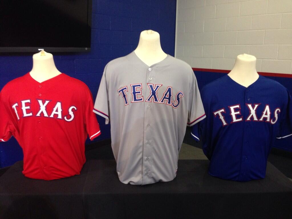
Click to enlarge
The Texas Rangers introduced Prince Fielder to the media yesterday and used the occasion to showcase some jersey tweaks for 2014. The changes are subtle but notable. Let’s take a look:
• The new home jersey: Unlike the team’s other new jerseys, the new home white is not shown in the photo above, but here’s a before and after showing what they’ve tweaked (for all of these, you can click to enlarge):

Basically, they’ve scrapped the block drop shadow from the lettering and swapped the sequence of the white and red outlining. Definitely an improvement.
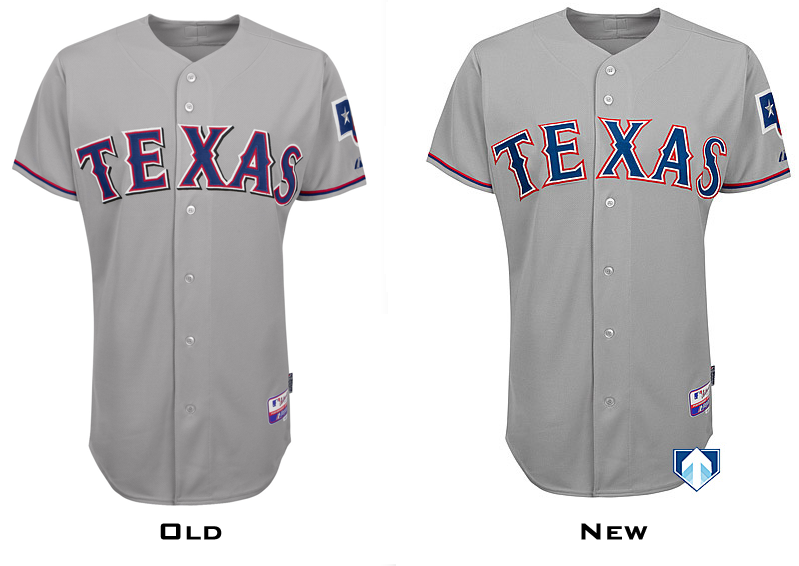
• The new road jersey: They’ve essentially made the same changes to the road jersey, as you can see here:
While the chest lettering looks better, the real improvement can be found on the back of the jersey. Here’s what I had to say about that part of the Rangers’ uniform a few months ago in the Uni Watch Power Rankings: “The team’s typeface has too many spikes and bumps and color layers, which creates a jumbled mess on the back of the jersey.” But that was then — look at it now:
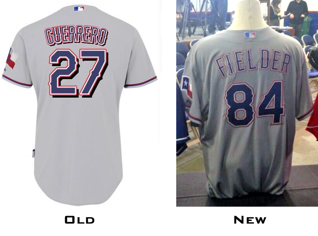
So much better! It’s still a ridiculously overdesigned font, but at least the removal of the drop shadow will make it look less clunky than before. You can get a glimpse of the similarly streamlined home whites here. (And yes, Fielder will be wearing No. 84 — based on his birth year — for the Rangers.)
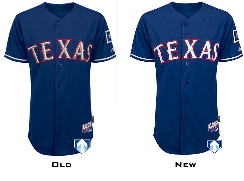
• The new blue alternate: They’ve removed the beveling from the interior of the letterforms:
• The new red alternate: They’ve removed the beveling here as well, plus they’ve added a layer of red between the letters and the blue outlining:

You can get a better sense of the changes to the chest lettering in this graphic that Chris Creamer created. Meanwhile, the backs of these jerseys appear to be unchanged from last season.
These changes don’t solve all of the Rangers’ uniform problems, of course. It would nice if they’d put their team name on at least one of their jerseys, and even nicer if they’d stop wearing red caps, sleeves, and socks with their blue-lettered home jersey. But these changes, while they don’t go far enough, all strike me as net positives. On Uni Watch’s patented (read: not patented) good-to-stupid scale, they’re solidly good.
(One odd footnote to all this: While the Rangers were ditching the drop shadow yesterday, the triple-A Durham Bulls unveiled their new uni set, which uses the Rangers’ font and includes the drop shadow. The weird thing is that the Bulls are not — and have never been — affiliated with the Rangers, so I have no idea why they’re using that font.)
The Rangers weren’t the only MLB team making news yesterday. The Royals have changed their blue alternate road jersey:
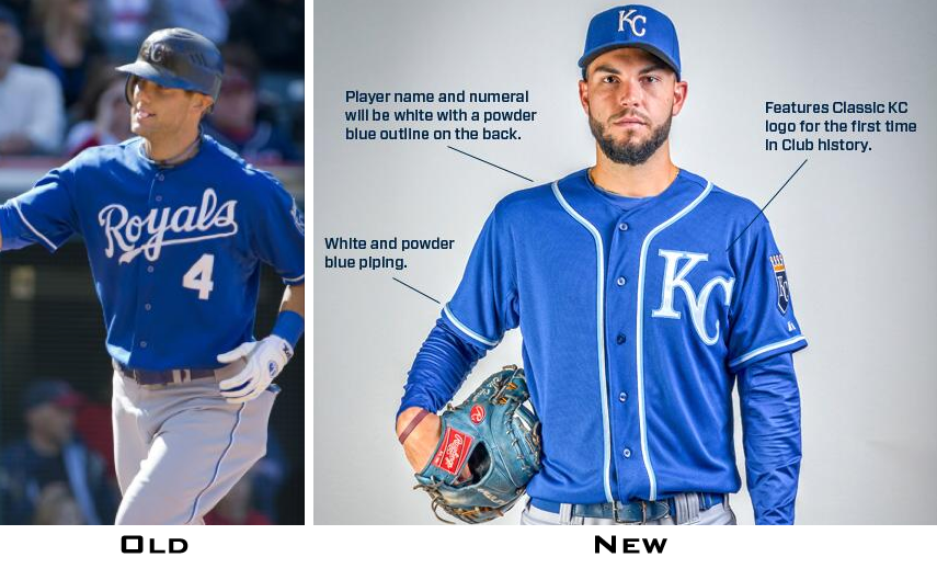
First things first: Yo, Eric Hosmer, you missed a belt loop! As for the jersey, the basic template is fine, but I don’t like that all of the white elements — including the placket piping — are rimmed in powder blue. That feels like overdesign. Not a disaster, but ultimately stupid.
Collector’s Corner
By Brinke Guthrie
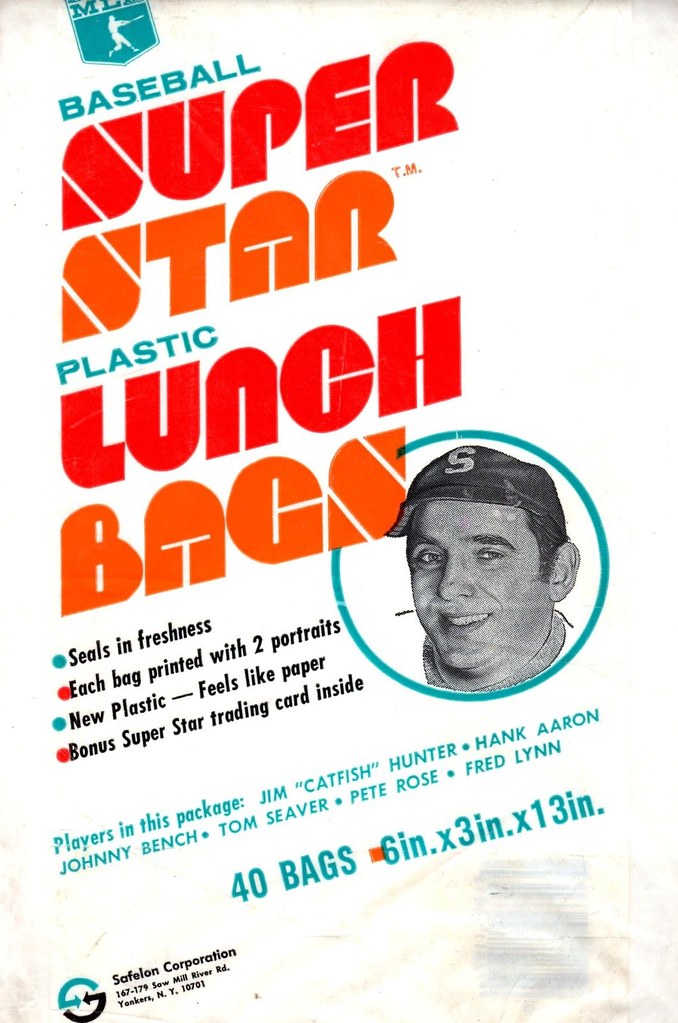
Never seen these before: MLB Super Star lunch bags, from 1976. Should be perfect for bagging turkey sandwiches made from your Thanksgiving leftovers! You also get a pair of baseball star portraits in each bag, like Rose, Bench, Aaron, and Catfish. But who’s the dude on the bag in the ad?
Here’s the rest of this week’s eBay picks:
• Way back when, the Packers beat the Chiefs in the first Super Bowl. Er, make that, Super Bowl I. David Firestone passed along this dual helmet plaque signed by both starting QBs in the game, Bart Starr and Len Dawson.
• Good-looking set of 1970s-1980s MLB logos in this sticker set.
• Cool vintage artwork on this Jerry Grote/Mets T-shirt.
• This 1972 Chase & Sanborn NFL sticker set looks to be in great shape!
• You can just hear the echos of John Facenda with this set of Music From NFL Films albums! (Turntable not included.)
• Nice graphics in these 1970s NFL sheets. I think the No. 30 shown is Giants RB Ron Johnson, no? Once you have that, go ahead and pair it with these Sears NFL drapes.
• Definitely a 1970s look to this Chicago Bears helmet serving tray.
• Couple of nice Ray-duz posters here and here.
Seen something on eBay or Etsy that you think would make good Collector’s Corner fodder? Send your submissions here.
Blazers contest reminder: In case you missed it yesterday, I’m soliciting entries for a Blazers redesign contest on ESPN. The deadline is Dec. 9, and the results will be published on ESPN soon after that. Get crackin’!
Tick-tock: Today’s Ticker was compiled and written by Garrett McGrath, except for ’Skins Watch, which was handled by Paul.

’Skins Watch: The use of Native American mascots was the subject of a mock trial at Weber State (from Brice Wallace). … Black and Latino groups protested the Skins’ name outside of FedEx Field prior to last night’s ’Skins/Niners game, thereby proving yet again that only white people care about this issue (from Tony Turner). … Once the game started, the ’Skins figured out a sneaky way to participate in GI Joevember while implicitly pushing back against the movement to change the team’s name: by honoring a group of Navajo Code Talkers. But as commenter terriblehuman points out, why didn’t Dan Snyder introduce them as “Redskins”? Come on, where’s the honor?

Baseball News: Former MLBer Ellis Valentine had his stolen game-used jerseys returned to him by a journalist from Pennsylvania (from Tyler Kepner). … New York City will invest $3 billion in renovating the area around Citi Field in Willets Point, Queens (from Gordon Blau). … Whoa, check out Padres catcher Yasmani Grandal’s new mitt (from Andrew Domingo).

NFL News: Chargers will wear powder blue uniforms to honor the 1963 AFL champions this weekend. … Eagles are wearing black jerseys on Sunday when they play the Cardinals. … Philip Johnson notes that several NFL players have raised oval logos on their nose bumpers. Is that the Oakley logo? Something else? … Here’s a video of the Chargers’ equipment staff preparing Shaun Phillips’s equipment for the 2011 Pro Bowl (from Andrew Domingo).

College Football News: Army and Navy will play each other on Dec. 14 and will not be wearing camo. Navy’s unis are very similar to the one they wore in their 2012 game against Army. … Winsipedia has a football rivalry ticker. … Baylor will wear 1950’s retro throwback uniforms including this Floyd Casey Stadium patch on 12/7. … Here is an admission ticket from the 1926 University of Pennsylvania-Cornell game, 87 years ago yesterday. 65 bucks in 2013 dollars, not bad for Row 8 (from Jim Santel). … We mentioned that Clemson was in purple on Saturday, but we didn’t tell you that it was to honor Purple Heart recipients on Veterans Day (from Andrew Pitt). … Texas A&M apparently has something unusual planned for this weekend, and it doesn’t look promising (from David Wilson).

Hockey News: Concussion discussion: A group of former NHL players is suing the league over its handling of concussions. Given how concussion-related litigation has affected the NFL’s helmet regulations, it’ll be interesting to see how the NHL responds. … Dana Heinze, the head equipment manager for the Penguins, has an interesting Twitter account, complete with this look at the Bruins’ visitors’ locker room floor (from Christopher LaHaye).

Soccer News: No picture but David Raglin says, “DC United is an adidas customer and they won the US Open Cup, run by US Soccer, a Nike customer. Because of that conflict, DC United cannot offer a DC United Open Cup Champions shirt.” The DC United Team Store Twitter account confirmed.

Basketball News: Reprinted from yesterday’s comments: Yesterday Paul mentioned that the Nets’ new blue/gray sleeved alternate jersey might be a Brooklyn Dodgers shout-out. Now it turns out that the Nets are hosting the Knicks on April 15 — Jackie Robinson Day. Seems like a pretty good bet that the new jersey will be worn for that game. … Wyoming wore grey uniforms last night (from Jon Jenspen). … The OSU Beavers will wear turquoise unis tomorrow. … Colorado State wore new gold unis last night (thanks, Phil). … Nathan White notes that Arizona State center Jordan Bachynski started last night’s ASU/Marquette game in his usual No. 13 jersey but ended it wearing No. 42. Maybe the latter was a blood jersey..?

Grab Bag: Here are the 15 worst logos of all-time (according to someone on the internet from Jared Buccola). … Check out Extra Innings, a Tumblr highlighting an exhibit called Hometown Teams featuring old footage of the 1929 Bears, Blackhawks and the 1929 Cubs vs. A’s World Series (from Carlos Velazquez). … Can you tell which team wears which shade of blue? Here’s a site to put your blue knowledge to the test.
The oval marking on the nose bumpers is where the Rawlings logo was placed but removed by the equipment staff. It’s the same as them covering the Schutt logo on their other helmets.
With the expiration of the NFL-Riddell exclusivity contract coming up, I assume other helmet manufacturers will be able to have their names displayed on helmets again?
The DC United/US Open Cup item may set a new record for douchebaggery. If I want to buy a T-shirt commemorating a championship, it doesn’t matter what lifestyle company’s logo is affixed to it. (No logo, of course, would be ideal.) To be unable to get a shirt because of this kind of conflict is ridiculous.
Why in the world is there suddenly the expectation that championship winning teams get to have officially licenced commemorative tat?
Why in the world would anybody want to spend money so that people know that you know your team won a thing?
Considering the season (and really, the half-decade) that DC United has had, you can’t really blame the fans for wanting a memento for the one good thing* that’s happened in the last year?
*You know, since Buzzard Point is far from done.
Isn’t the whole of MLS Adidas customers? Therefore in the highly unlikely event a non-MLS team withs the US Open cup (last time was 1999), they can probably never have a commemorative shirt
It’s weird because I know the Seattle Sounders, back when they won US Open Cups, sold shirts. (Here’a link to one: link)
Was the tournament not always sponsored by Nike?
I don’t think the cup itself is sponsored by Nike – it’s more that USSF is a big Nike beneficiary. Maybe that shirt was okay because it doesn’t have any Adidas branding, but that doesn’t explain why a DC United shirt would be a no-no.
Oh, but then I found link that every member of the 2009 Cup-winning Seattle Sounders got in the locker room.
This photo is illuminating. As you can see, championship shirts featuring swooshes. link
How awful does that scene look though? Why can’t they just wear their bloody jerseys? They’re holding the cup and have a medals around their necks, why do they need a cheap looking shirt with gaudy printed graphics also announcing them as champions?
Yeah, it’s dumb as shit, though I’m wondering if the USSF could do anything stop DC United from printing a shirt that says “2013 Cup Champions”.
Though this is kind of an uncharted territory for North American sports, since championships are generally played in a closed garden under one sanctioning body. It’d be like NBA teams played a second competition under FIBA that also included NCAA and Eurobasket teams.
The Packers/Chiefs helmet plaque would be el primo if it featured two-bar facemasks.
I think its already pretty ‘primo’. And $250 isn’t a bad price for a piece that tells a historically significant tale and is autographed by two hall of famers.
Wish I had the $250 laying around. . .
That Royals alt jersey reminds me of a spring training/ batting practice jersey the Dodgers had several years ago.
it’ll be interesting to see how the NHL response.
I think you meant “responds”…
I actually liked the Rangers drop-shadow. Would have been better, I suppose, if it had been navy, instead of black. Still, the letter forms are so decoratively complex that the drop shadow was generally better for legibility than the double-outline format. The exception is in the NOB, but that shouldn’t have any treatment anyway: For small, tightly spaced letters like a NOB, the general rule should be one color, no outline or shadows.
Still, nice to see the tide of BFBS receding a bit further in MLB.
Also, Paul has dropped hints about more teams going full-camo like the Mets in 2014, and I sort of assumed that the Rangers would be on the list. On the one hand, nice to see they’re not. On the other hand, the odds that other teams I care about are on the list just went up. Ugh.
As for KC, the new alt is terrific on its own, but it bugs me when teams adopt completely unrelated styles of basic uniform decoration. Whatever the basic pattern of piping/pinstriping/etc is, it should generally be consistent across uniform types. The underlying pattern of the uniform is what makes the uniform, well, uniform. It’s how we recognize teams at a glance on highlight shows or game recaps. The 2014 Royals will be marginally harder to identify at a glance than the 2013 Royals, which maybe wouldn’t be such a bad thing if they weren’t already the epitome of a nationally overlooked small-market team that most people can’t recognize anyway.
Paul has dropped hints about more teams going full-camo like the Mets in 2014…
This implies that I know which team(s) will be doing this, and in fact I do not. I simply linked to Chris Creamer’s report two weeks ago, which stated that one unnamed team will be adding a camo jersey and another unnamed team will be adding a stars/stripes jersey.
Such implication was not intended. I guess “has repeated rumors” would have been better word choice than “has dropped hints.”
With the bevels and shadows disappearing, my first thought was “Texas has jumped on the “flat-design” bandwagon.” While I think “flat” makes sense for computers and screens, I’m not sold on these Rangers changes, beyond the uncluttering effect.
I think the previous Rangers design was better. The uniform lettering was fuller and more bold.
Gigantic and I mean GIGANTIC improvement for Texas. Just goes to show that good design shows restraint where appropriate. It was needed with all those drop shadows and bevels.
4 colors for numeral and type outlines? That’s preposterously overdone.
A little restraint and, viola, much easier to read. If only the Durham Bulls got the memo…
As A longtime Rangers fan,I gotta say I like the new uniform. The new lettering gives the jersey a clean look. Now if they can go back to wearing “Rangers” on the home whites.
I’ve gotta go with ‘Good’ for that Royals alt. It’s pretty slick looking.
Not sending in any corrections today, but I agree that the Texas Texases needed those tweaks.
I don’t know why Snyder didn’t show the Navajo Code Talkers proper respect and introduce them as “redskins”. Where’s the honor?
Oooh, nicely put. I’m gonna steal that!
Is there a reason that the center button on the new Royals’ jersey is different than the rest of the buttons?
Just a reflection (or lack of one), methinks.
I think the guy in the ad is Johnny Bench, just wearing a generic “S” hat because of the name of the bad company is my guess!
Looks more like Dick Van Dyke’s neighbor Jerry Helper (played by Jerry Paris) to me. Definitely not Johnny Bench to my eye.
link
Judging by the hat, I think he’s a time traveler from 1935.
re: Willets Points
Slate had a link just around the corner from Citi Field, too. It really feels like the setting of a dystopian fantasy flick.
And the Times had an awesome story on Sunday:
link
Thanks for that link, Paul. Fascinating and poignant stories and wonderful photographs.
Look for the 2007 movie, “Chop Shop.” It was filmed in Willets Point and it’s good. (It’s streaming on netflix.)
I guess I never noticed it because old Shea was an island surrounded by parking lots, but the new one was built at the edge of that piece of real estate, making the confrontation unavoidable.
It’s a bizarre juxtaposition to find in the United States, a billion-dollar palace right across the street from a collection of wrecked cars and unpaved streets.
I doubt it was part of Robert Moses’ vision. Then again…
“… … Once the game started, the ’Skins figured out a sneaky way to participate in GI Joevember while implicitly pushing back against the movement to change the team’s name: by honoring a group of Navajo Code Talkers….”
… Some of whom said “Go, Redskins!” on cue. I was there last night. And, yes, I agree that their appearance at the field carried a message from Management. Putting aside for a moment the stark inadequacy of the football team, last night at FedEx Field was a total downer. It was “Salute the Troops” with a vengeance. Lots of ceremonies pre-game and half-time, lots (and lots!) of JumboTron appearances by football players saying how much they appreciate, even venerate, the military, and by military personnel stationed in faraway lands telling us how much they loved the Redskins. Old Glory motifs were everywhere and frequent.
OK. This country is not at war (cf US Constitution). No one — not China, not Russia, not China and Russia combined, not nobody — presents a viable military threat to the US. Is there a terrorist threat? Yes. Is it addressed through massive military deployments around the world? I’d say no, you might say yes. But for God’s sake, what is the purpose of all this jingoism?
And, as I said, the team stunk too.
Connie, having several family members both active and retired in the military, as well as talking to other military personnel, you’d be surprised how many wars the U.S. actually IS involved in. It just doesn’t get the mainstream coverage that Afghanistan and Iraq did in the last decade.
A troop deployment — and even an armed conflict — is not the same as a war. War is a very specific status.
Except actually it’s not. In the American republic, yes, the Constitution specifies that “Congress shall have the power … to declare War …” But whether Congress passes a joint resolution declaring that a state of war exists with another country, or a joint resolution authorizing the executive to use military force against that country, the same effect under the domestic Constitution and international law is obtained. The war powers clause in Article I is about ensuring that Congress, not the executive, has the power – it’s not about requiring Congress to use any particular word when exercising the power.
Note that at the time the Constitution was adopted, Congress had recently started, fought, and concluded an eight-year war without ever issuing a formal declaration of war. War is war, even when Congress is too chickenshit to use the word in the resolution making it so. For a detailed look at the relatively minor, technical differences between “declaration of war” and “authorization for the use of military force” under U.S. law, see this CRS report:
link
Note that most of the executive war powers that may not automatically come into force under an AUMF do come into force if the president simply issues an executive order stating either a national emergency or the existence of armed hostilities.
Under international law, the laws of war come into force whenever armed conflict takes place and do not depend on any belligerent having declared war.
As it stands, under both domestic and international law, the United States very much is still at war in Afghanistan and more generally against al-Qaeda.
This depends on your perspective. You are correct that ‘war’ and ‘troop deployment’ and ‘armed conflict’ have very different dictionary definitions, but if you tell my buddy’s widow that her husband and the father of her daughter didn’t die in a war but rather in a mere armed conflict while a part of a simple troop deployment, you’d better be prepared to defend yourself.
Well, Joseph, as a former professor of Military History who keeps abreast, I’m aware of those deployments. I admire the hell out of the men and women in harm’s way, but those sometimes-deadly deployments are not wars.
those sometimes-deadly deployments are not wars
Which is, I think, a significant reason why we’ve allowed them to go on for so long. Wars might actually make us stand up and take notice, or worse yet pitch in.
Between the game and the weather and the pure awfulness of the FedEx Field experience, I can’t think of a worse (first world) place to be on a Monday night.
But to your point, coming from a culture where the military is all but ignored, I think it is A Good Thingâ„¢ for the country at large to recognize that the members of the military make great sacrifices even when they’re not stationed abroad, and that their choice to serve is appreciated. My kids are too young to really understand war and terrorism, but I am trying to teach them to think about their sacrifices. And frankly, we need to do more to recognize the issues affecting veterans like brain injuries, mental illness and unemployment. I’m not sure all the GI Joe stuff is helping though.
What bothers me about all this is that I don’t see any sign that we are “recognize that the members of the military make great sacrifices” in any fashion at all.
We’re saying how great the troops are, but in a sanitized rah-rah-sis-boom-bah way that minimizes the real dangers service members face.
We refuse to acknowledge or even address the very legitimate issues you raise, because they can’t be reconciled with our “Everybody wear camo today! Because that makes a difference!” attitude.
If the NFL had any interest in actually recognizing or honoring the sacrifices of our military, this nonsense might begin to be okay. They might help raise awareness of post-traumatic stress. Or perhaps if the League railed publicly against the years-long wait soldiers endure before receiving treatment for the injuries they sustained in wars we don’t like to think about. If only they would use some of that advertising space and national television time to tell the story of the thousands of military families forced to live on food stamps (and how those crucial benefits are being cut by the House). Until any of that happens, this flag-wrapped drag show isn’t just inappropriate, it’s downright offensive.
I agree with you 100% Chance. I do have to give college football credit (that’s not a typo) for at least being involved in the Wounded Warrior Project, although I do think WWP places too much emphasis on physical injuries and not psychological. There’s probably a lot more troops that have post-traumatic stress or, in the case of Vietnam veterans in particular, substance abuse as opposed to missing a limb or two. I know way too many military veterans that have ended up as alcoholics due to what they have seen in combat, especially in my own family.
I know that its probably too late in the evening for many people to see this comment, but im going to type it out nonetheless(on my tablet, so forgive any grammatical/spelling/punctuation errors).
Many regulars here are aware that I am veteran. The details arent important, really, but the general idea is that i was discharged medically after just over 4 years of service in the submarine force (Go Deeper, Stay Longer!). No big deal, except that it was my life/career path goal. I got married and had a child while in active duty, nd just before my wonderful son was due to be born I was discharged. I fought tooth and nail to stay in, going through one medical board after another, until I reached the end of the rope and was forced out with a a simple severance check. I am a fairly intelligent man, so believe me, I did my due diligence in preparing to transfer to CIVLANT(civilian life), but the storm that came next was impossible to predict. Depression, separation anxiety, and of course PTSD all hit shortly after discharge, right when I should be experiencing the best moment of my life, the birth of my son.
Long story somewhat shortened, I am now divorced and living with family while I try to get back on track, straighten out my life, and keep from recurring suicidal ideations. A fucking camouflage uniform and a flag at midfield doesn’t do shit for me, and I dont appreciate it being associated with my real-life struggles as though they are comparable.
/rant
sorry for the seriousness.
I think the picture that was linked for the ‘Bruins’ Visitors’ Locker Room’ is actually the Bruins’ Locker room itself. According to the below tweet, the Penguin’s Equipment Manager explains how the Bruins allowed them to dry their equipment in their locker room and then later on in a different post he shows them setting up an entirely different room and says that is their locker room for the game.
link
You would be correct, that’s the recently renovated Bruins locker room. The visitors locker room is far more Spartan.
Guess the NHL doesnt neee to worry about anyone in canada discussing the concission lawsuit today, with news breaking of a massive new TV contract that shuts out Tsn.
I do agree that the Rangers revised unis are an improvement. They remind me of what the Indians did a few years ago: less is more. However, I do like the Royals new alt. Is it just me, or are teams starting to copy the basic look that the Tigers and Yankees have had for only a century (Nationals, Pirates, etc…) by having the cap logo on the chest? Speaking of the Pirates, any word on when the Bucs are releasing their new logo?
As far as logos are concerned, the Logos Fail link is dated (Pepsi Max now uses the regular Pepsi Globe), but some of them are pretty amusing. Being a cat person, Paul probably likes the CatWear logo.
Considering that link of link have used link link link, I wouldn’t call it link
Pirates actually have a long history with having the cap logo on the chest. Did it in 1907, 1911, and 1915-1922.
Look for the new logo to be released during the Pirate fan event on December 14-15. The iconic cap logo isn’t going anywhere, it’s a new Pirate logo which will be unveiled.
True, but it’s a look that fell into disfavor until recently. A couple teams held on throughout, but more are picking it up now.
As for the Pirates, surely they’ll announce it soon. Can’t believe they’d miss the opportunity to sell tshirts to Christmas shoppers, even if they are about to blow right by Hanukkah.
Meh, outside of Squirrel Hill, Pittsburgh has a relatively low Jewish population. I’ve probably ran into more Muslims and Hindis over the years than Jews.
As a yinzer, for as diverse Pittsburgh claims to be, it’s ethnically diverse compared to West Virginia. It’s got nothing on truly cosmopolitan cities such as New York and Chicago.
Not only was the Penn-Cornell ticket a good price, the seat was at midfield.
‘by honoring a group of Navajo Code Talkers’
Thereby proving yet again that the Redskins nickname is offensive to all Native Americans.
Straw man argument and false equivalence — both at the same time!
Nobody has claimed that the name is “offensive to all Native Americans.” But lots of people have claimed that only white people care about this issue.
That’s where I was taking issue. I don’t recall anyone claiming that ‘only white people care about’ this issue. Many of us have pointed out that the issue was being driven primarily by white people and that it seemed to bother a majority of white liberals more than it bothered native Americans, but that is very different than saying only white people care about it.
I don’t recall anyone claiming that ‘only white people care about’ this issue.
Then you haven’t been paying very close attention. Which is fine. But trust me, plenty of people have said that.
My new rejoinder: Only white people seem to want to *keep* the team’s name.
Many of us have pointed out that the issue was being driven primarily by white people
And that’s where you’re wrong.
Do the white commentators get more press? You betcha! But as Paul keeps pointing out, they’re are not the ones actually driving this issue. They’re not the ones who’ve been fighting for decades to get the name changed, and pretending that they are does everyone a great disservice.
If anything, I’d argue that the right wing’s media has hijacked the debate by framing it as a liberal vs conservative fight. Until the debate grew in the past year or so, it was pretty nonpartisan (and dictionaries have labeled “redskin” as “offensive” for as long as I can remember).
It’s only in the past year that I’ve started hearing that the term is a show of “respect” and “honor” and that it’s part of the liberal agenda. And the “WHY DON’T YOU ASK THE INDIANS” brigade seem to ignore folks like Suzan Shown Harjo and Ben Nighthorse Campbell. And yeah, you hear it from white sportswriters because, well, people who write about sports and issues surrounding sports are, wait for it, generally white sportswriters. Shocking, right?
Wyoming wore all yellow…including some sneakers against the Buckeyes last night
link
Not everyone wore yellow sneakers:
link
I did say “some” :)
Those Rangers updates are sharp. The Reds would be wise to follow suit. I think thier current set would be pretty boss if the unnecessary black was removed.
They share one other problem with the Rangers: a clunky, overdesigned custom font.
But yes, scrapping the drop shadow would be a good start!
I think the official name of that font is “Leprosy Drop Shadow”, but I could be wrong.
I always thought they cribbed their font link
In these days of corporate sponsorship got to love that Wyoming plays at the Arena-Auditorium. Rumor I heard while attnding UWYO in the early 90’s was athletic director while facility was being built purposely wanted a generic name so they could re-name it after him when he retired.
What’s the significance of turquoise for Oregon State? Is is TFTS or for a specific cause or reason? Or just because they can? The uni does look pretty good but turquoise is definitely not in their palette AFAIK.
link
Oh, I see. Turquoise is the new grey. Now I hate it a little bit.
Oh jeez.
Lee
That footage of the 1929 World Series at Shibe Park (mentioned in the “Grab Bag” at the end of the post) led me to watching an hour of someone’s home movies (on YouTube) from the late 20’s/early 30’s from the Atlantic City/Ventnor, NJ area. Having spent a lot of my youth there, it was interesting to see things as they were some 85 or so years ago.
The jersey that the Brooklyn Nets wants to wear that on Jackie Robinson Day, shouldn’t the number in front be red?
Yeah, a few folks have mentioned that to me. And I agree!
Actually, for the slight majority of his career with the Dodgers, the front number was not red. If I remember correctly, there was a story about that here a while back – the number changed to red in anticipation of the ’51 WS, but then Bobby Thompson happened. The dodgers just used those going forward in ’52.
I guess it could go either way, since it was almost a 50-50 split.
Well, for the majority of his career there was no number at all. But when there was a number, it was red, not blue.
True. But with the lacking of anything, blue would have been the go-to.
If they really wanted to go for something cool, I guess they’d go blue on the back, red on the front.
Well shit. After a quick google search, it was 5 seasons a piece.
Saturday, I made a quick mock-up of how it would look with link (the font is only an approximate match, since I did it in MS Paint).
Nice!
I feel like the Royals want to go back to a full link but they are afraid to commit, so they settle on subtle-yet-redundant powder-blue accents here and there… KC, let your freak flag fly!
Seeing the bo jackson/george brett royals unis make me so happy!
While living the last couple of years in KC, I grew to love the old Royals look. While I think the new alternate jersey is fine, I’d rather see them adopt the powder blue jerseys with the traditional “Royals” wordmark that they wear on Sundays as their alternate jersey and ditch the royal blue one. While I think the powder blue jerseys and pants would be cool and distinctive as the road uniform instead of the grays, I don’t think they’d work with the modern uniform style. Blue looks awesome with 3/4 baseball pants and royal blue stirrups (even solid blue stockings would work, but powder blue pajama pants would look dumber than the white ones.
link
Woof.
I’m not going to excerpt anything from the link because the whole thing is a good read.
I don’t get it. I *sort of* get why the ‘Skins would have a code breaker shirt, but why the Steelers, and everyone else???
T-human’s link won’t open for me here at work, so I don’t know what he is referencing.
I don’t get it.
Oh, I didn’t realize it was a league-wide thing. I guess it’s just a stupid design. Don’t mind me.
A hugely popular, nationally televised game, & both teams opt for no camo & no pink? Why, that just seems un-American …
Yes, I think it’s time to ask a very important question: WHY DO THE SERVICE ACADEMIES HATE THE TROOPS?!? (Question 1A: Why do they hate breast cancer awareness?)
I know Wales rugby team’s GFGS kit was mentioned here earlier, but here’s a slideshow of link along with, oddly enough, the New York Yankees’ “kit”.
Winsipedia is a tremendous time-suck…Thanks for sharing!
I hate the Cowboys but LOVE that they’re wearing the blue jerseys Thursday. Much better look than the whites.
Agreed. I’ve never understood why, exactly, the color of the pants and numbers/stripes on the home set don’t match what’s on the away set, or on the helmets, for that matter. I suppose the blue-tinged silver is a good concept, but the moment the player starts sweating, they start to look more like something the Dolphins would’ve worn up until this season.
I hope they wear the regular blue uniforms. I don’t think the throwbacks will look good with the silver helmet.
The Baylor Football 1950 throwbacks remind me that Baylor SHOULD wear their traditional, decades-long unique uniform as their main uniform – and quit the ongoing, Oregon-inspired BFBS, then Chrome, then White helmet-for-no-good-reason ridiculous Uniform Carnival. The “Baylor Look” – Old Gold helmet, Green jersey, White pants, is a unique look to the school/team and to wear that uniform NOW would honor decades of previous tradition and the teams, players and students that cheered for that very uniform for DECADES when times were not so good.
They should wear their traditional uniform on a regular basis – not as plainly undetailed or simple as the 1950 Throwback – but in the iconic combination that represented that school for DECADES.
Why not?
So I’ve known over the years that Paul doesn’t like the Rangers using red caps and trim with blue text home white jerseys – the intent of that being somewhat similar to the 90
s era home uniforms. Now that they dropped the drop shadow after all these years (finally!) they should possibly consider bringing back the red text RANGERS home whites from 1994-2000. (Simple tweaks to the 2000 version would put it right up in line with the current style). But also I wanted to know peoples’ takes on the Rangers original 70’s home uniform – red text with a blue hat (albeit red bill.) My guess is that people may like that look better because of a stronger balance of red and blue…and could a cap like the bp cap (blue with red bill) look good on the current home whites?
Anyone else find it weird that some people seem to like blue caps with red lettering but not red caps with blue lettering? Its essential the same principle, why does it work with the former and not the latter?
Red is a warm color and blue is a cool color, so red will tend to stand out more.
I don’t mind blue lettering with red caps, though.
I’d always liked the Jeff Burroughs-era Rangers’ uniform, but didn’t appreciate that the number on the back didn’t match the lettering on the front- a pet peeve of mine.
The Heat wore their Imperial Royal Guard uniforms: link
I love love love love the Royals old uniform set. That blue and white I love it (pretty partial to the Dodgers too). But I do love the template they used for the new KC jersey (with the white piping), but I do agree that powder blue outline detracts from it. Being from Minnesota, I wish the Twins would do the same template with TC on home white’s/no pinstripes.
Oh I wish they would just get rid of the powder blue outline. Otherwise, very solid.
The Royals’ and Rangers’ new looks are boring, generic and uninspired. Typical baseball.
Complaining about baseball for looking like baseball is like complaining about water for being wet.
You have not offered a critique; you’ve simply made it clear that you don’t like baseball. Nothing wrong with that per se, but it doesn’t really add to the discussion.
Can you offer an example of a baseball uniform which you find exciting, unique, and inspiring? Genuine question.
I bet he likes this one:
link
I might suggest that the incessant quest to make uniforms “exciting, unique and inspiring” is exactly what has led us down the perverse rabbit hole of college football and basketball today. In other words, perhaps those shouldn’t be the adjectives to which uniforms (and their designers) aspire. The end result is a parade of costumes that are unexciting, repetitive/derivative, and neither inspired nor inspiring.
I’ve learned making, say, baseball suits inspired by hockey uniforms, or basketball unis that take their cue from football uniforms is a fool’s errand. Each sport has peculiar aesthetics that make cross-pollination unworkable.
Why should the city of New York invest a penny more in the area around CitiField until ownership invests in a reasonable roster?
I see where the Cowboys are wearing their normal blues this Thanksgiving since throwbacks are out due to the new NFL helmet rule. Which makes me wonder if the Jones family is colorblind? If I owned them, my first call would’ve been to Nike so I could tell them I needed jerseys and pants like this:
link
It appears the logo on the helmets are Rawlings logos that have been removed. Here is the link to the Rawlings website: link
NNOB’s in tonight’s NIU-WMU game. Northern has some shiny red numbers on black jerseys, but above them all players have “THE HARD WAY”. Western Michigan has something in place of their NOB’s also, but I can’t make it out because it’s gold on white. “TECATE”?
It’s definitely hard to tell, but I think they say “Row The Boat”
I just got home from the game. NIU’s said “The Hard Way” and Western Michigan’s did in fact say “Row the Boat.” They are motivational sayings that each team uses. I can’t speak a whole lot for Western Michigan but NIU’s helmets have “The Hard Way” on the back bumpers.
I remember watching a program explaining why Detroit and Dallas are the only two cities in the NFL to host the Thanksgiving ball games.
Interesting to me as I always wondered why?
Wait till you see the horror of the NIU/WMU game…. looks like a bunch of kids having a glitter fight
That Western Michigan number font makes Belotti Bold look like Times New Roman.
I just got home from the game. That was brutal on the eyes.
I just got home from the NIU/Western Michigan game. I was a little nervous going in because I knew NIU (my alma mater) was wearing special “blackout” uniforms (which were basically the same exact jersey they wore in the Orange Bowl last year, just colored differently) from Adidas. When I saw them on the field, I didn’t mind the helmets but I HATED the rest of it. I hate those reflective numbers. With that said, I thought the NIU uniform set looked like a classic set once Western Michigan came out of the locker room. I was in row 13 in the stands and could not read the numbers on their jerseys. I don’t know how it came across on tv. That number font was brutal. Then they busted out another little detail that I wasn’t expecting. Instead of sporting last names, on the back of the jerseys, both teams sported motivational slogans. NIU’s said “The Hard Way,” which it says on the back bumper of their helmets and Western Michigan’s said “Row the Boat.” That’s a trend that I really hope doesn’t take off, but sadly, I think it probably will. Adidas really provided us with a rough looking game tonight.
The Royals have actually used that basic design, but in a pullover as a batting practice jersey before. And as for the plaque featuring Super Bowl I….It looks chinzy. And as another reader noted, the facemasks should be two bar. The worst offense though is that there should also be an AFL logo as well as the NFL logo. Even the plate does not denote the Chiefs as being from the AFL. Like I said, chinzy.
I don’t understand the Texas uniform change. Side by side with the previous jersey, the fact that they removed the drop shadow does not look as good. I often like a slight tweak or modification from team’s every once in a while however this doesn’t do it for me. Are these tweaks ploys to sell new merchandise, or what is the general motive when teams do this?