[Editor’s Note: Today we have a guest-written entry by reader Nik Streng, who recently completed a fun DIY project. ”” PL]
By Nik Streng
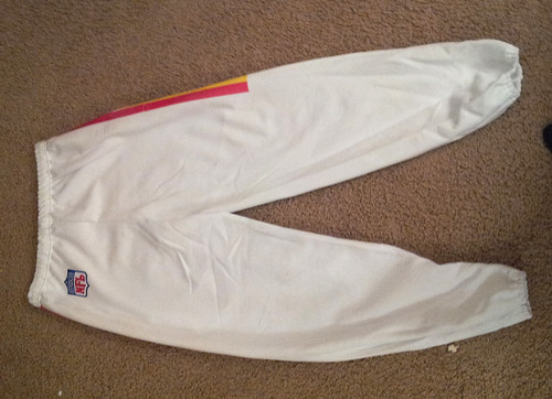
It’s gotten cold here in Oregon. And for me, cold NFL Sundays call for sweatpants. After seeing the Colin Kaepernick DIY jersey that was featured on the site a year ago, I decided I wanted to make a set of Kansas City Chiefs-themed sweatpants for myself.
I started by buying a set of plain white sweatpants:
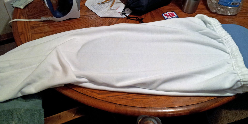
I know you like the Chiefs’ red pants, Paul, but I decided to go with white because I don’t want to create the blood-clot look by wearing my red Chiefs jersey with a pair of red pants.
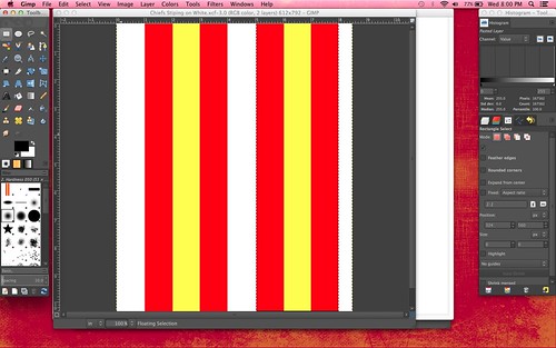
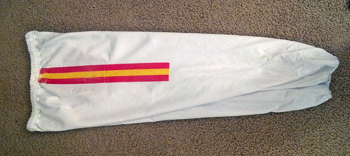
Next, I designed the Chiefs’ pants stripes on GIMP with every line being one inch wide:
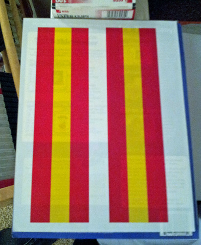
Then I printed the stripes on some iron-on transfer paper that I’d purchased from a local craft store, ironed the stripes onto the sweatpants, and kept repeating until I was happy with the length of the stripes:
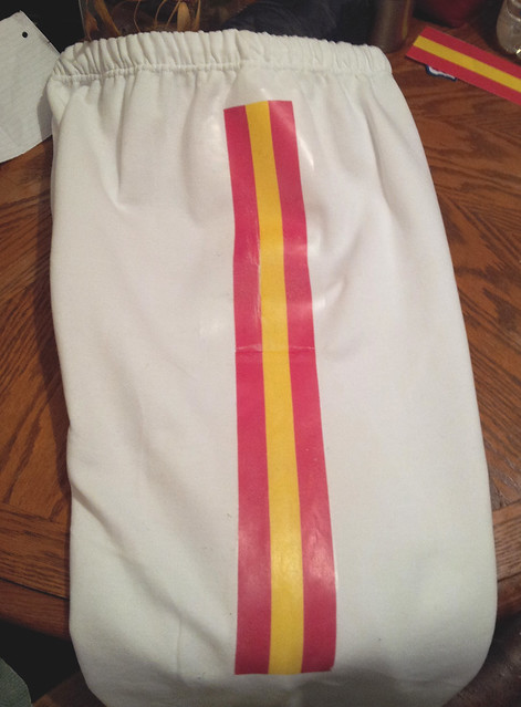
I only had the striping go down to around the knees, because that’s the length of the stripes on the Chiefs’ game pants. I was originally going to try to to put the team’s sock striping on the lower part of the pant legs, but that seemed like something I’d probably screw up, so I let it go:
I also bought an NFL logo iron-on patch on eBay to put on the hip. I put parchment paper over it to make sure I didn’t burn it with my iron:
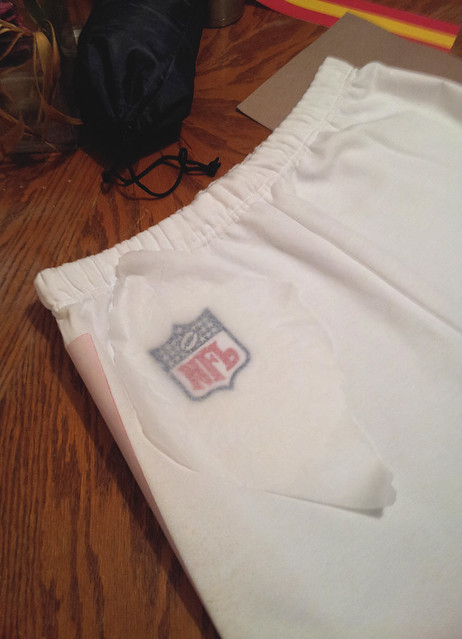
I know I could have just printed out the logo, but I’m a sucker for feel of and embroidered patch, and it looks so much cooler that way. I realize it’s an old NFL logo with 25 stars, but I don’t care (it was also the cheapest one I could find at the time):
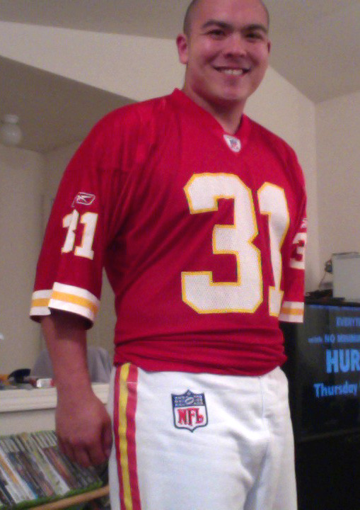
Here I am wearing them — not bad:
ESPN reminder: In case you missed it yesterday, my latest ESPN column is a follow-up to last week’s college hoops season preview piece. Enjoy.
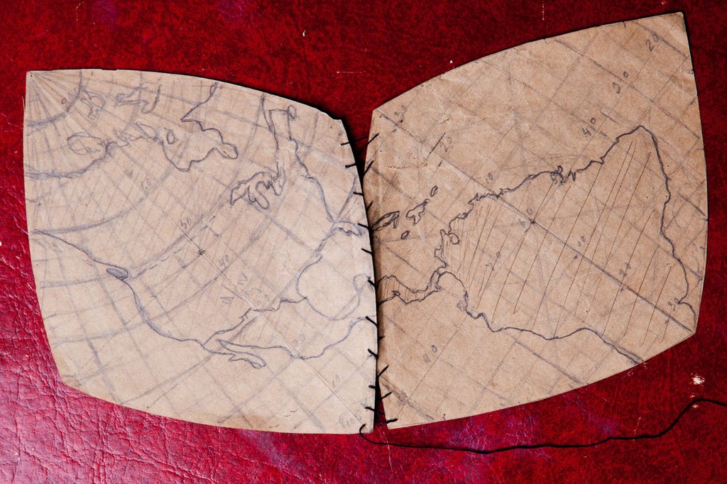
PermaRec update: It’s been ages since I posted anything on the Permanent Record Blog, but I’m finally catching up on old material that’s been piling up. The new post features several really fascinating objects (including the beautiful map shown above, which you can click to enlarge) that were found inside an old wooden box left in the trash. There’s also info regarding a message in a bottle and a Civil War medal found in an old book at a thrift sale. Check it out here.

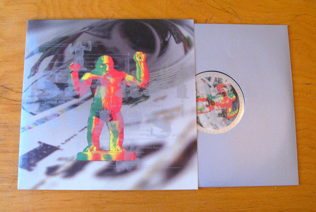
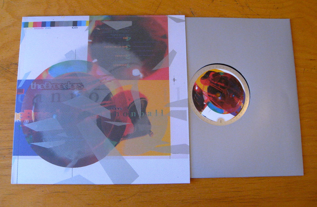
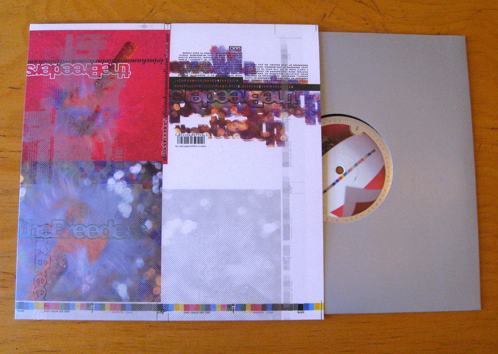
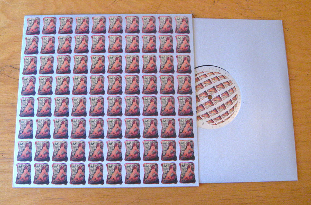
Big heavy thing for sale: I was recently on the winning team in a music trivia contest, which entitled me to a very cool prize: LSXX, which is a limited-edition deluxe seven-record box set to mark the 20th anniversary of the Breeders’ awesome Last Splash album.
At first I was very excited to get this box set. But then I remembered the problem (or at least my problem) with box sets: They look cool on the shelf, but they’re so big and cumbersome that I never want to bother taking them off the shelf. Plus they have so many discs, or LPs, or whatever, that I never know where to start. Plus-plus this particular box set came with a digital download code, so I was able to load the whole thing onto my iTunes and listen to it without worrying about the big, cumbersome box.
So: Now that I’ve made this box set sound not particularly attractive, anyone wanna buy it from me?
Seriously: It is attractive — like, very attractive, as I’ll show you in a minute — but I can already tell that I’m never gonna play the vinyl, especially now that I have the digital version. So I’ve decided to sell it. I could put it on eBay, but I’d like to give Uni Watch readers first crack at it.
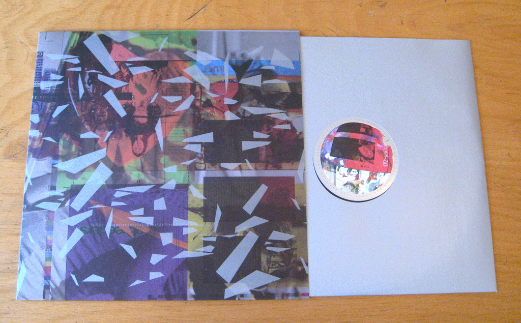
Here’s what the box set includes (for all of these photos, you can click to enlarge):
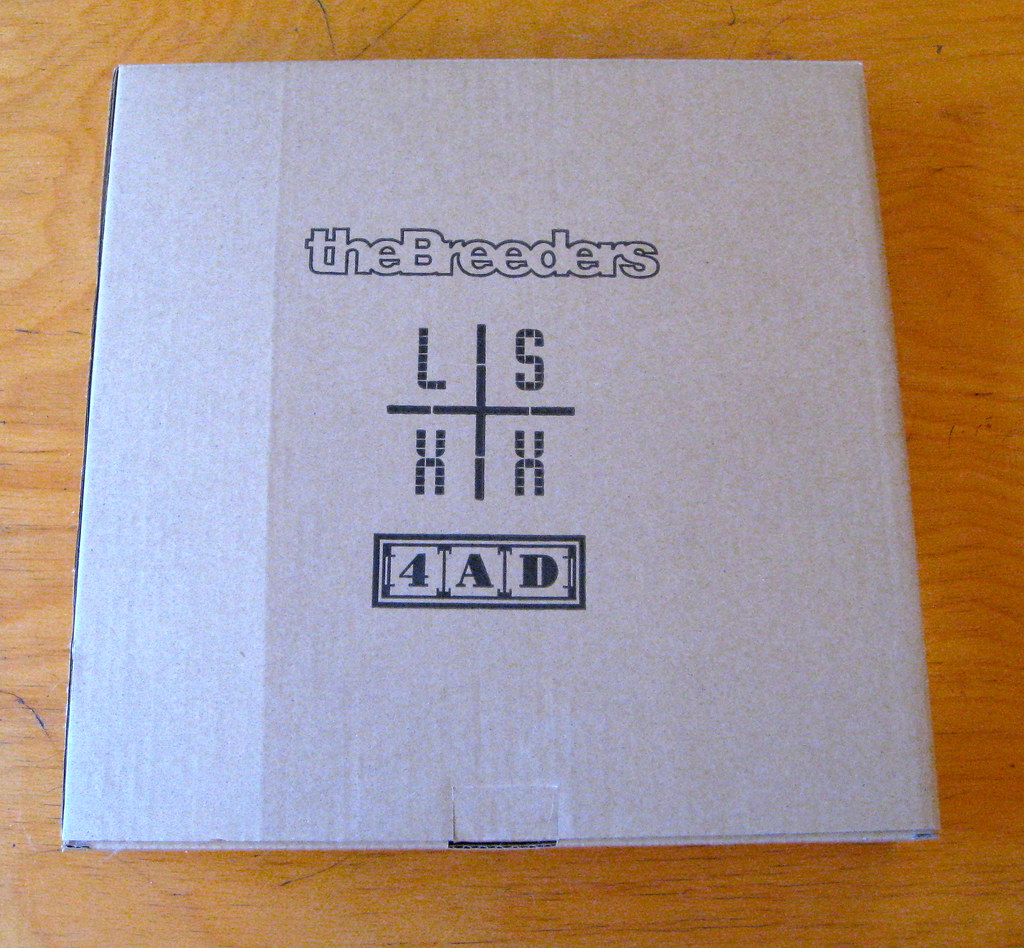
1. The outer box. The whole package is housed in a corrugated cardboard box, which measures 13.5″ by 13.5″ by 2.25″ — about the same as the box for a medium pizza.


2. The inner box. Inside the cardboard box is a very nice box partially covered in green velvet.

3. The booklet. This is a 24-page booklet filled with photos, stories, and journal entries about the making of Last Splash, including short essays by Kim Gordon and J Mascis.
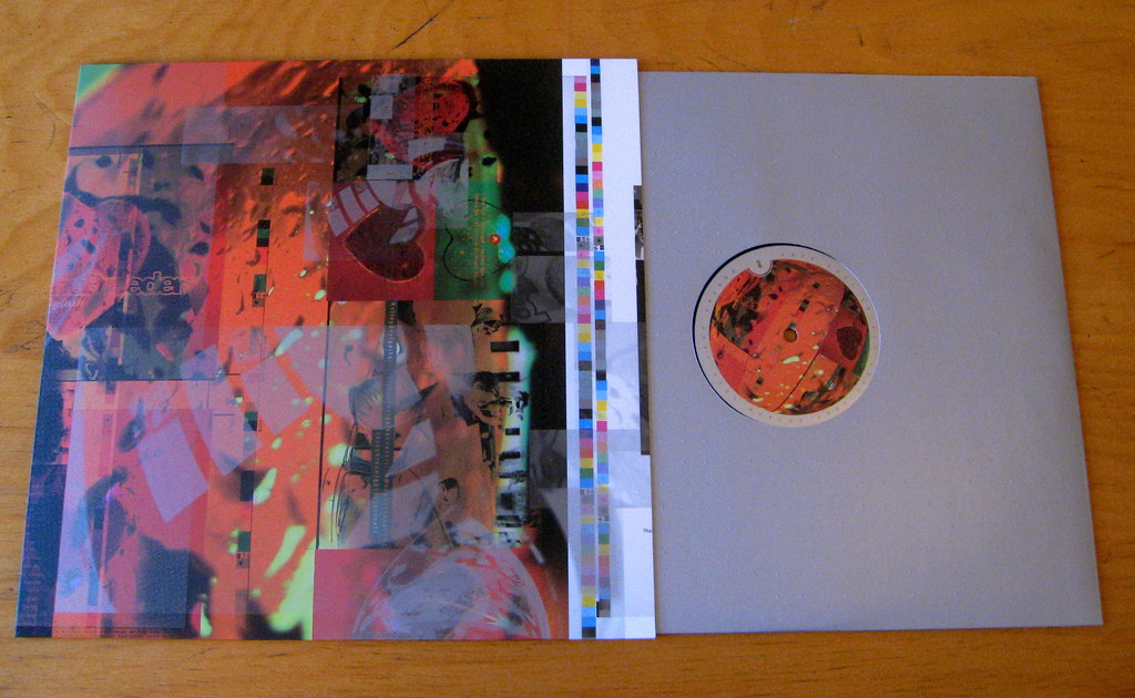
4. Last Splash LP. This is the album on which the box set is based — remastered, on high-grade vinyl, blah-blah-blah. Here’s the track listing (which includes the song “Mad Lucas,” the spelling of which has always annoyed me):
1. New Year
2. Cannonball
3. Invisible Man
4. No Aloha
5. Roi
6. Do You Love Me Now?
7. Flipside
8. I Just Wanna Get Along
9. Mad Lucas
10. Divine Hammer
11. S.O.S.
12. Hag
13. Saints
14. Drivin’ on 9
15. Roi (Reprise)

5. Stockholm Syndrome LP. A live LP documenting a 1994 show in Stockholm. Seven tracks from this LP originally appeared on a fan-club-only CD; the other nine tracks are previously unissued. Here’s the song listing:
1. Shocker in Gloomtown
2. New Year
3. Hellbound
4. Saints
5. Hag
6. I Just Wanna Get Along
7. S.O.S.
8. Roi
9. Head To Toe
10. Happiness is a Warm Gun
11. Cannonball
12. Invisible Man
13. Doe
14. Drivin’ on 9
15. Don’t Call Home
15. Limehouse
6. Demos and Rarities LP. Pretty much what the title suggests. Track listing:
1. No Aloha (BBC Session, previously unreleased)
2. Flipside (same as above)
3. Divine Hammer (same as above)
4. Hag (same as above)
5. New Year (1992 demo, previously issued as a bonus 7-inch with original vinyl pressing of Last Splash)
6. Grunggae (same as above)
7. Invisible Man (previously released on 4AD label compilation 13 Year Itch)
8. No Aloha (1992 demo, previously unreleased)
9. I Just Wanna Get Along (same as above)
10. Mad Lucas (same as above)
11. S.O.S. (same as above)
12. Saints (same as above)
13. 900 (same as above)
14. Iris (previously issued on the No Alternative compilation)
7. Safari 10″ EP. Track listing as follows:
1. Do You Love Me Now?
2. Don’t Call Home
3. Safari
4. So Sad About Us
8. Cannonball 10″ EP. Track listing as follows:
1. Cannonball
2. Cro-Aloha
3. Lord of the Thighs
4. 900
9. Divine Hammer 10″ EP. Track listing as follows:
1. Divine Hammer (single version)
2. Hoverin’
3. I Can’t Help It (If I’m Still in Love With You)
4. Do You Love Me Now?
10. Head To Toe 10″ EP. Includes a Guided by Voices cover and a Sebadoh cover:
1. Head To Toe
2. Shocker In Gloomtown
3. Freed Pig
4. Saints
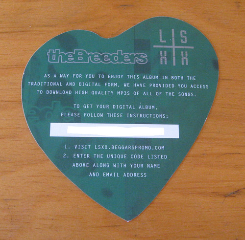
11. Digital download code. I’ve whited out the code here, but you’ll be able to download all of the music to your computer for playback on your device of choice.
That’s it. 4AD is selling it for $90. I’ll sell you my copy for $85, and I’ll throw in a few Uni Watch trinkets to boot. If you’re interested, gimme a shout. Thanks. Now sold. Thanks to all who inquired.
Today’s Ticker was compiled by Mike Chamernik.

Baseball News: Yesterday’s main entry on MLB prototypes from Tony Cocchi’s collection prompted the following from Steve Vibert: “Tony is not only a great uniform historian, he’s also a great teammate of mine on my Atlanta-area MSBL team. Here’s a picture of him (on the left) and me (with stirrups!) wearing actual Gwinnett Braves road grays that were rejected by the team because the sleeve gussets go all the way to the neck. Wilson had to remake the jerseys and we managed to score the rejects.” ”¦ Jared Wheeler found an auction listing for a 1940s Philadelphia A’s prototype uniform. ”¦ The Aberdeen IronBirds, an Orioles affiliate, are changing to an orange-and-black color scheme. ”¦ The newest Korea Baseball Organization team, the KT Wiz, revealed their logo, colors, uniforms and cheerleaders. More details here (from Dan Kurtz). ”¦ “Did you know Red Auerbach’s brother was a sports illustrator and graphic designer and that he designed the Boston Celtics’ leprechaun logo?” asks Hungry Hungry Hipster. I did not! Go on. “Here’s the story how he was responsible for getting the Nationals to officially change their nickname back to Senators in 1956.” HHH also passed along a Senators yearbook with cover art by Zang Auerbach.

NFL News: Many readers sent in a site that shows NFL teams redesigned as soccer clubs. ”¦ ESPN.com’s advertisement for this week’s Monday Night Football game has the outdated Panthers logo (from Joe Bozek). ”¦ On third downs for the visiting team at Browns games, the theme to the movie “Halloween” will play and a picture of Michael Myers wearing a Browns mask will flash on the scoreboard. Thomas Moore interviewed the graphic designer who created the image. ”¦ Alex Allen came across an old Life magazine with an excellent (and now semi-eerie) cover. ”¦ If you look through the Gridiron Uniform Database’s entries for the Lions, you’ll see that Detroit has almost always worn silver helmets. One of the few exceptions was 1953, when they wore gold. But Bruce Menard has found a 1950s photo of the Lions wearing silver and gold in the same game. Hmmmm.

College Football News: Virginia Tech might wear their Hokie Stone helmets this weekend. The helmets may be a little different from the first time they wore them, though (from Andrew Cosentino). ”¦ The University of Missouri is trying to force an Arkansas high school to change its tiger logo because it kinda-sorta-maybe looks like the Mizzou logo (thanks, Jesse Nienke). ”¦ Arizona went SNOB in 1977 (from Robert Marshall). ”¦ “The Ohio Bobcats are having a ”˜blackout giveaway’ for the Kent State game on the 19th,” says Leo Strawn, Jr. “One can only assume the ‘Cats will be wearing their black jerseys.” ”¦ Kennesaw State will reveal its football helmets on Friday (from Chris Wheeler). ”¦ Marshall will wear “75” on its helmets for Thursday’s game against Tulsa, in remembrance of the 1970 plane crash that killed 75 people. ”¦ Hawai’i made a video to show off its throwback rainbow uniforms. ”¦ “The Miami (OH) jerseys are tough on the eyes,” David Greenwald says. “Maybe they will confuse opponents. I do like the ”˜Miami’ across the shoulders.”

NBA News: The Spurs’ camo uniforms made their debut last night. ”¦ Derrick Rose modeled the Bulls’ Christmas uniform. Scroll down to see the Clippers’ Christmas jersey (or just click here, whatever). ”¦ Better yet, here’s Rose, Kevin Durant, Stephen Curry, James Harden, Steve Nash and LeBron James wearing their respective Christmas unis in an NBA Store commercial. ”¦ Michael Jordan’s shoes from his famous Flu Game in 1997 will be auctioned off. ”¦ Also in Jordan news, MJ was photographed playing beer pong a few days ago. Might this image become as iconic as the Jumpman? ”¦ Manzell Blakeley found a charming Blazers knit cardigan for sale. Does anyone know if the score listed on the shoulders (“Home 109, Visitor 95”) is significant in any way? No Blazers playoff wins ended with that score. The biggest game in Blazers history, Game 6 of the 1977 NBA Finals, Portland won 109-107.

College Hoops News: Jim Ullmer stumbled upon this photo of the 1964 Dayton Flyers basketball team. “I have never seen warm up capes in basketball before,” he says. “They look like sideline capes from football but they don’t seem to have any arms.” ”¦ Florida State will wear turquoise jerseys this Sunday while New Mexico will wear turquoise on November 30 (from Phil). ”¦ Dan Madigan attended a UConn game on Monday and noticed the mascot was wearing a gray alternate uniform. “Does this mean that UConn is going to unveil a gray alternate for this year?” he asks. “They’ve had one in the past, but haven’t in the last 2-3 years.” ”¦ UMass wore gray jerseys with sleeves on Tuesday (from Louis Castellano). ”¦ Eastern Michigan saw UMass and two-upped them. “DayGlo, gray for gray’s sake, sleeved basketball unis, and a chest logo!” says Joe Jordan. ”¦ Temple Instagrammed a photo of someone wearing Northwestern-style flag desecration socks (thanks, Patrick Reynell). ”¦ Color on color matchup on Wednesday night between Seattle and Cal State Fullerton. “Also Seattle’s shorts are red in front, black in the back,” says Frank Mercogliano. “Wowzers.”

Grab Bag: Adidas released the World Cup kits for Germany and Spain. ”¦ New clash jumpers (is that the right term?) for the AFL’s Greater Western Sydney Giants and Geelong Cats (thanks, Leo Strawn, Jr.). ”¦ Tom Mulgrew sends in an article on a guy who collects pizza boxes. The pizza box artwork in the slideshow is great. ”¦ Three items from Tommy Turner: Patagonia, the established outdoor clothing company, is entering the craft beer business; revenue is growing in the sports world, mostly due to media rights but also merchandise sales; and “Sign Painters” is a documentary about, well, the people who paint signs. The film’s screening tour is winding down, but there are still some major cities left on the slate. ”¦ Here’s a poster of over 1,000 wrestlers all in cartoon cube form. ”¦ People who play tennis, baseball, softball or golf can now track their swings with a motion sensor (from Ben Fortney). ”¦ KDKA in Pittsburgh used the Buffaslug logo when mentioning the Sabres on Wednesday night (from Nolan Petote). ”¦ Rio 2016 has released its pictograms, the simple stick figure drawings representing the Olympic events (from Kurt Esposito). ”¦ “Methinks this young fellow needs an exorcism,” says David G. Firestone, “as he shows the Mark of the Beast.” ”¦ The Oklahoma Sports Hall of Fame logo has gone from bad to worse (from Paul Deaver). ”¦ A UK TV newscaster has found herself in the middle of a controversy after she chose not to wear a Remembrance Day poppy on the air (from Kirsten Hively). ”¦ Note for Seattle-area readers: Membership card designer Scott M.X. Turner’s band, RebelMart, will be playing on Friday, 9pm, at the Mix in Georgetown. You know what to do.

What Paul did last night: Went out and saw that lesbian movie everyone’s talking about. There are all sorts of sociological things I could say about it, but instead I’ll say this: I have never seen (and hope I never see again) so much mucus in one movie. Seriously, people, we’re talking rivers of snot. Like, did they forget to budget for tissues or what? Ewwww.
About today: I’m going to be off the grid from about 2pm until fairly late in the evening. So unless you have breaking news that can’t wait a day, please go easy on the Ticker submissions. Thanks.
According to basketball-reference.com, the only 109-95 home victory in Trail Blazer history was over the Warriors March 18, 1982. I’ll leave the question of the game’s significance, if any, to Blazermaniacs.
I sorta hope there is some significance. I’ve just wasted an inappropriate amount of time at work searching and came up with bupkis. Now it’s bugging me.
Any chance that the cardigan was produced in 1995 and that was their roundabout way of dating it? Long reach, I know…
That Breeders set is available new and sealed from the label for $90 with free shipping, FYI: link
Oh — I thought they’d sold out.
OK, then, I’ll lower my price accordingly!
The Breeders were a great band. When I was in law school we used to run into Kim and Kelley Deal quite a bit. Two really cool chicks who liked to rock.
yes, clash jumpers is correct…or clash guernseys…
the term originated when clubs had similar jumpers and played one another, thus they clashed, so a jumper that didn’t clash was created (misnomer?)…vfl (now afl) clubs did not have home/away kits, just one for all occasions, so with the advent of larger stadiums (in recent years, and originally, the melbourne cricket ground, which expanded over and over throughout the years to eventually hold over 100k people) and television, it became more difficult to tell some of the squads apart from a longer distance or small b&w tv screen…usually, but not always, clash kits (and most away games) feature white shorts…
now, of course, it’s like every other sport, and it’s more of a way to sell new merchandise each season…
On third downs for the visiting team at Browns games, the theme to the movie “Halloween” will play and a picture of Michael Myers wearing a Browns mask will flash on the scoreboard.
Leave it to the Browns to be a month late. Otherwise that’d be kinda cool.
…and the NFL re-imagined as a soccer league just reminds me how much I hate the “FC” thing that so many soccer teams do instead of using a real name.
The Browns have been doing it all season, it wasn’t just for games in October.
When you say you hate the “FC” thing do you mean in general, or in relation to new teams that adopt it as a sort of team name syllable filler (eg. FC Dallas, Toronto FC)? In general, you’ve got to remember that in the early days of organised sports in Britain, designations such as “FC”, “AFC” (Athletic Football Club) and “RFC” (Rugby Football Club) were used to distinguish from the various forms of social and recreational clubs which sprang up during the Victorian leisure boom.
For those clubs that were conceived during this era, the FC thing is vestigial – a quaint hangover. For clubs conceived in more modern times it is a brutal anachronism. It’s as much an anachronism as the prevalence of scarves in the summer league MLS is an affront to climate appropriate dress.
When I hear “Club”, I think of things like a book club or a chess club or whatever where it’s just people with a common interest meeting up and discussing/playing/whatever casually. It just doesn’t seem fitting of a professional team name to me, especially when they’re among the highest level teams on the planet.
It’s definitely worse for the modern teams though. I mean, FC Dallas is an absolute joke, because even if you disagree with my view on “club”, the only “football club” in Dallas isn’t kicking a round ball. Maybe if the league called itself MLF… but, you know, they don’t. You are not a football anything when the league you play in officially calls itself a soccer league, regardless of the sport being called football in other countries.
Also, I get that plenty of teams are still officially known as clubs for business purposes… but that doesn’t mean it needs to be part of their commonly used name. The Yankees might officially be the New York Yankees Baseball Club (I don’t know if they are, just an example), but no one is ever going to call them Yankees BC.
There’s a very interesting discussion to be had about the cultural difference between American sports and European sports in relation to the notion of “club” i.e. a community social setting for people with mutual interests. But for now I’ll just emphasise the fact that many of these teams at their inception were just social and recreational clubs which subsequently developed into professional, commercial enterprises. Many teams just below the top level of English football are still, even today, more the former than the latter.
That’s really what makes that kind of cultural imitation so insidious: it appropriates some mythical past or rootedness that bears no resemblance to the reality. It’s commercialised ritual.
The “club” thing speaks to how soccer fans view their clubs differently from fans of Big 4 sports. While soccer clubs are nominally owned and operated by their chairmen/owners, fans are considered a part of the organizations, and they tend to have a voice in how things are run (especially so in cases like FC Barcelona or Real Madrid, where the fans are shareholders and they elect the president). This is the case in MLS as well, and in Europe, it’s a relatively new phenomenon for owners to run clubs like corporations.
As for your Dallas example, not really. “Soccer” is short for “association football”, so it’s perfectly appropriate for a roundball-kicking MLS team to call itself “FC”. Plus, “FC Dallas” doesn’t imply a monopoly on football in the Metroplex. It’s just a football club named “Dallas”, just like Torino F.C. coexists with Juventus F.C.
Soccer may once have stood for association football, but language changes. Soccer now stands for association football in America. It is a standalone word meaning “not American football”. This is perfectly reasonable, even appropriate. Soccer is American for football just like faucet is American for tap and sidewalk is American for footpath.
Taking this into consideration, the Dallas soccer team really should have called itself SC Dallas if they wanted to keep with convention. But they translated it, they adopted a foreign word. Why? Why did the Catholic Church insist upon conducting services in Latin for centuries? Same reasons: myth, ritual, intrigue, elitism.
Or, to use a less abstract example, why the fuck would a team in Utah, a state which recently showed 71% in favour of stricter boarder regulation, have a team called Real Salt Lake?
Even if no one makes the linguistic connection between “soccer” and “association football”, the fact remains, soccer is *a* branch of football, no less or more so than all the footballs out there. A soccer club is, by definition, also a football club. One just happens to be more specific.
Plus, if we both agree that language evolves (and I do agree), we can reasonably argue that “FC” is a term that signifies “organization that plays soccer”.
It’s done deliberately. Children who grow up with it won’t think it’s weird at all, that’s what they’re playing at, it’s a long game for them.
Certainly “FC” can signify “organization that plays soccer.” But that’s not why FC Dallas uses it. If they wanted to signify that then they would have used the word “soccer” rather than awkwardly stub its toe on the cultural minefield that is “football”. The real reason they did it is to evoke some kind of false connection to a culture they don’t share. It is superficial mimicry, artless copycatism. Dressing in lederhosen does not make one German and wearing a $20+ scarf in 80 degree heat does not make one akin to a Liverpool fan seeking a practical solution to the freezing December weather on Merseyside. It is the definition of crassly abstracted and commodified culture.
Copycatism is a great, global tradition in soccer. Just ask Liverpool of Uruguay, Everton of Chile and Arsenal of Argentina. Or just look at those clubs in England who call themselves “United”, yet have never gone through a single merger. Or how about those Anglophiles in Milan who’re too snobby to refer to their city in their native language, and same goes for the Euro-fetishists in Buenos Aires who are too good to say “RÃo de la Plata”.
There’s so much self-loathing in American soccer, there’s no way to play it right. Come up with an “original” nickname then you have yahoos complaining about “Americanizing” a global sport. Go the other way, and accusations of Europosing fly. I say fuck the whiners – just go with what you want.
Anyway, just as people don’t think “association football” when they see “soccer”, they’re not actually thinking “football club” when they see “FC”. It’s just a naming convention.
Ok. So it’s rampant. Does that make it any better? Of course not. If an Argentinian team jumped off a cliff would you? I’m critiqueing American soccer as a work of cultural production and in this critique for all of the above stated reasons (plus more) I find it lacking. You’ve merely given excuses as to why this is so.
Actually, American soccer as a whole is not lacking. Last year in Seattle I saw some university of Washington matches. They were bizarre. Strange rules, strange jerseys, strange scoreboard and generally strange play. But you know what? It never felt unnatural (unlike the Sounders games I went to). It felt like American solutions to American problems rather than pandering to some mythological football ideal. First time I’ve ever attended a soccer match with a marching band anyway.
I dispise the word “club” being used at the major and minor league level. “Club” teams to me are pick-up leagues, intramural sports, etc.
Same with soccer team naming protocols. I don’t care for the FC treatment or other conventions taken from across the pond. Also some other bizarre naming conventions. The minor league soccer team in Orlando is called “Orlando City”. I’ve lived here for over a decade and never once heard the term Orlando City. They tried too hard.
never once heard the term Orlando City
The same can be said in Manchester or Coventry or Stoke – that’s just what the team is called. You’d never hear “Manchester City” except in reference to the team.
As for “club”, it actually signifies the opposite – it implies an organization that’s bigger than a team of players slapped together.
All this vitriol for the term “club” to describe a professional sports team surprises me. After all, it’s a pretty common expression. “Ball club” has been used as a synomym for “baseball team” link.
A. BEISBOL: Great to see my dreamboat Tony Cocchi in the flesh. Big dude. He should model that sweet 1940 Phila A’s prototype. And Zang Auerbach?! That 1957 Washington Senator he drew is an excellent example of the “Senator” as a white-haired stem-winding Dixiecrat, outdated already in 1957, but it was a stereotype with pop culture resonance. [cf “Nadine” by Chuck Berry, in which the singer describes how he loudly pursued his wayward girlfriend down the street: “… (T)rying to get where she was at / I was campaign-shoutin’ like a Southern diplomat…”] So what does a Senator look like today? Ted Cruz?
B. FUTBOL. Nice Spain jersey. But that German shirt is a disaster. Not in itself, so much as in contrast to the awesome tradition of Germany in simple white and black, with maybe just a touch of red and gold around the fat black eagle. That red chest is a terrible innovation. Also worried that the drift toward monochrome World Cup unis (discussed here yesterday by our experts in residence) won’t allow the classic German white top / black shorts motif. Or, God forbid, prompt the Germans to wear that all-green outfit. Just because they’ve worn green in the past doesn’t mean that I will stand by and let them do it again.
Rumor is that the German change kit will be red (possibly two-tone or crimson) with black trim.
Here’s the not-quite-confirmed Germany change kit.
link
Guh. At least it makes a white/black/white combo possible.
I’m unhappy about Spain’s monochrome too – they look like Bayern in disguise. Though a little birdie tells me France is going back to les Tricolores after wearing tout-bleu for the last cycle.
Re complete line of German World Cup togs: The horror…
That’s right…now I remember. First time I saw it, I thought “I wonder if Germany is deliberately going to a design that looks like Flamengo (perhaps Brazil’s most popular club team).
So what does a Senator look like today?
Median age of the US Senate is 62, so Cruz is on the young side. Regardless of age, your typical senator would be a white male with money bursting from his pockets. (Average net worth in 2011 was $14mil+)
Whoa.
So, in sports logo terms, the Monopoly guy, but snarling and angry.
Sans the top-hat.
So link.
I’m all for mascots, but some things just don’t work as a fun mascot. United States Senator, alas, is on the list. Besides, the Nationals already have not one but five awesome mascots, the Racing Presidents (Washington, Jefferson, Lincoln, Teddy Roosevelt, and Taft.) They just need to use them more. A line of mascot cap logos of the Racing Prezies similar to link would rock, especially if used as actual BP caps. (Marketing gold: Not one, but five BP caps, all worn interchangeably by the players.) Give Washington and Lincoln bats, Teddy and Jefferson fielders’ gloves, and Taft the tools of ignorance.
Nik, I love that you stopped the stripes short of the full pant length, just a nice touch and they look great!
I wonder how long it will be before we hear news of someone being sued for a DIY jersey? “Dear Mr. Sports Fan, your aforementioned shirt infringes upon the copyright of our NFL club’s copyrighted design and has a direct negative impact upon our merchandise sales.”
The big league lawyers on retainer have to do something with their time.
Paul should ask each creator of a DIY projects to wear a Guy Fawkes mask, just to be safe.
Paul should ask each creator of a DIY projects to wear a Guy Fawkes mask, just to be safe.
Unless, of course, they’ve made a DIY England shirt.
I consider myself a lifelong Braves’ fan and usually like their look but man are those rejected G-Braves’ unis rough.
Disagree. Those are dy-no-mite. I love the color all the way across the shoulder. That’s an innovation I could get behind.
The Gwinnet lettering, in athletic block type set way too far above the tomahawk, absolutely.
The contrasting raglan sleeves going all the way up to the neck? That’s a thing of beauty. All kinds of wrong for the big-league Braves, but for a minor-league Braves, it’d be a fine look. Provided they got a real script.
Re Steve Vibert: I am in the Atlanta area…any chance I can purchase one of those G-Braves prototypes off of ya?
Turtle, I don’t own the lot, but I’ll find out if there are any left.
…give me your email address and I’ll contact you directly.
link
I always enjoy Paul’s off-topic posts, but when he talks music, I never know if he loves really obscure stuff or if I’m just horribly out of the loop (probably the latter). I never know any of the bands he discusses. Today is no exception.
Steve Vibert, your picture just made me sad that the Big Braves don’t wear those beautifully awesome stirrups. Every time they break out a throwback that uses those, I shed tears of both joy and sadness. I wish we could see them on the field all the time.
The two bands I mentioned yesterday — Railroad Jerk and The Scene Is Now — are pretty obscure, at least by most mainstream standards.
But the Breeders’ Last Splash album (the original version from 1993, not the big box set I’m selling) went platinum, meaning it sold over a million copies. In other words: Not obscure.
Chris, I get TONS of comments about those stirrups. One time, we played a game right after the high school team had a practice. Half those kids commented on the stirrups, and a Mom even asked where she could get them. Comrade Marshall got a shout out!
Boxcarvibe check out my post above, please.
Awesome! Need to teach the kids early.
…and speaking of those stirrups, Braves pitching prospect Sean Gilmartin wore that style when he first arrived in Triple-A in 2012. I saw two of his starts. Then someone, not sure who but I gotta find out, stopped him. He went solid blue stirrups, then last season appeared to go all sock, though still high cuffed.
Two brief observations:
First, the mention of the Lions wearing both silver and gold helmets in the same game made me instantly think of Yukon Cornelius.
Second, am I the only one who loves those Hawaii throwbacks and who thinks they should go back to wearing those full-time? I hope not. (Only problem with that video — didn’t see the helmet. Hope they get that right.)
I really like the Hawaii socks and gloves. I usually hate the hands-up glove style for other teams. I agree this jersey is way better! I hope we at least see it more often if not full time.
Only problem is, either UA dropped the ball or just got lazy with the gloves and left off the red stripe – thus triggering my OCD and ruining my entire day.
“Only problem is, either UA dropped the ball or just got lazy with the gloves and left off the red stripe — thus triggering my OCD and ruining my entire day.”
The gloves look like an accurate representation of link, which had only four colors (red, yellow, green, and blue) in its rainbow. I think the colors on the video might be just a little bit off, and what’s supposed to be the red stripe looks more like orange.
Hawaii’s throwback looks more like a fauxback mash-up of its uniform styles from link (note the five-color rainbow pattern on the jersey shoulders, with an orange stipe), link (four-color rainbow stipe on the pants). I prefer the inclusion of the orange, so I don’t mind the discrepancy.
Whoops! Wrong link to Hawaii’s ’80s and ’90s uniform. Here’s the link.
Color me red BvK1126, I didn’t even notice the gloves were a nod to the UH logo; kudos.
I rarely comment, but felt obliged to point out how beautiful those are. Juxtapose them with their current uni set and I think someone should be fired over there. Okay, maybe that’s a bit extreme, but you get my point.
I typically don’t like shiny cleats like that, but the rainbow reflection they provide is a nice touch.
“Second, am I the only one who loves those Hawaii throwbacks and who thinks they should go back to wearing those full-time? I hope not.”
You’re not the only one. I think they’re outstanding (at least what I’ve seen so far). I would love to see them go back to something like this on a full-time basis.
It seems like Under Armour gets a lot of criticism around here (most of it deserved) for any number of their uni shenanigans over the last couple of years. But I’m willing to give them credit when it’s due, and I think they’ve hit a home run with this Hawaii throwback design.
Quote from the British newscaster refusing to wear th epoppy onscreen:
“Offscreen in my private life — it’s different. I wear a red ribbon at the start of December for World Aids Day, a pink ribbon in October during breast cancer awareness month, a badge in April during Bowel Cancer Awareness month, and yes — a poppy on Armistice Day.”
That lady wears a lot of flair.
Senators over Nationals? Yes, please.
The team could be anthropoÂmor-phized. An artist could come up with a caricature of an old-time Senator who would be throwing balls, batting and catching.
And that, kids, is why mascot logos rule.
NBA finally “unveils” Xmas jerseys that we’ve all known about for a week:
link
One of the few exceptions was 1953, when link. But Bruce Menard has found a 1950s photo of the Lions link. Hmmmm.
Amazing photo – beautiful colors. I think it lends a great deal of credence to the link that the “gold” helmets were older silver helmets whose translucent plastic shells had started to oxidize.
I want to see Blue is the Warmest Color, but I’ll probably have to wait until it comes out on home video (depends on the format I want to use–DVD, Blu-ray, Netflix, etc…), since no movie theater in these parts wants to play an NC-17 movie.
As for
CBS 2 PittsburghKDKA-TV using the Buffaslug logo–the Pens aren’t even playing the Sabres this month, so I don’t even know what the story would be about. IDK, you would think a CBS owned-and-operated station that served as a flagship station for one of the nation’s top syndicators before putchasing the network it was affiliated with (Group W) would be on top of things when it comes to a logo change. Then again, when I do watch local news I prefer watching Youngstown, Ohio TV stations, since they air news. Pittsburgh stations (ALL of them) tend to air which Steeler is taking a dump at the moment over something important, and the “important” stuff they do air link Of course, the print media options that you can read online they’re starting to charge, so thank God for Yahoo! and other online sites.And BTW, I’ve met Bob Pompeani in person back when I was in high school. (He’s the one in the picture linking to the Buffaslug.) He’s a lot skinnier in person than you would think.
Bob was probably reporting that the Sabres had fired their coach and GM (which the Sabres should have done in the off-season).
no movie theater in these parts wants to play an NC-17 movie.
Joseph, just cuz I’m curious, where are “these parts”?
I’m talking about Western PA. Last time I checked, the movie was on a limited release in New York and LA due to its rating, so I doubt it’s going to be available around here until its released on home video.
Oh wait, never mind, it opens tomorrow in Pittsburgh.
I feel your pain, buddy. Pretty sure I’m not going to get to see Dallas Buyers Club anywhere in WV. Anywhere.
Scotland’s new soccer uniform has a link. Which feels apropos since they’ve missed 6 major tournaments now, and maybe they’ll make one on the 7th try.
And the only reason I know about the legend is because my daughter just read a book about Robert the Bruce and the spider in her first grade class. Wait, they’re teaching 6-year-olds about hostages and POWs?
Forget the spider, +1 for the link!
Scotland link, but it wasn’t as subtle or pretty.
That white kit hurst my eyes.
Why exactly did Nik use the old NFL logo?
To be fair, he’s also wearing a Reebok jersey… so, um… it’s a throwback uniform?
From above:
I realize it’s an old NFL logo with 25 stars, but I don’t care (it was also the cheapest one I could find at the time)
Apparently, stars don’t come cheap.
“If you look through the Gridiron Uniform Database’s entries for the Lions, you’ll see that Detroit has almost always worn silver helmets.”
Now, if they’d only get rid of that damn black trim.
A note about the box set: those digital download codes you get with vinyl records these days are sometimes only good for one download. That is to say, the code may already be expired.
I forgot to add that that box set does indeed look awesome.
That Kennesaw State article is from September (9/11 to be exact), the gold one in the picture won. Here’s the link to that:
link
The next unveiling they will do will be the uniforms, which I believe are set for sometime in February.
I just checked their site and they are announcing something today at 5:30 PM (EST), no idea what it could be (stadium has been built for years, and its already been renamed after a corporate sponsor (uggh!), coach and his staff are already signed, football-only conference has been joined, and the unis are set for February).
Maybe it’s a stadium expansion? It currently seats around 8,500 but was built with expansion in mind. Or maybe they pushed up the uniform unveiling.
That is correct. Screwed up my dates on that one.
I’m not sure if this applies to all 4AD downloads, but I just bought the new The National record, which is also a 4AD release, and the download code that came with it was good for a total of 6 downloads (3 in MP3 format, 3 in FLAC).
yeah, that was supposed to have been a reply to Nate’s comment posted at 11:20 am.
Yeah. But I just downloaded it once. So there are five left.
I assumed this was the case. As I said, I meant to reply to a comment that said most codes are only good for a single download.
Nice, I don’t like one-time, one-format downloads. I like to get the FLAC and convert it myself if I need to.
Could those Dayton “warmup capes” perhaps be graduation gowns for Senior Night? Not all players are wearing them.
To me they look like they might be repurposed football sideline capes. While they do not appear to have sleeves, they do appear to have a lot of excess fabric in the shoulder area, as if they were cut to fit over shoulder pads.
The link to the college hoops season preview follow-up links to the original article from last week, not yesterday’s follow-up.
Oops — fixed.
A day late, but I gotta thank you, Paul, for the link to “Uncle Marce”‘s letters…..
Why couldn’t they just be published as “Letters from Uncle Marce”? Ugh…..the short-sightedness of some people.
Why couldn’t they just be published as “Letters from Uncle Marce”?
Right? They’d be so good just collected as is!
Glad you liked them, Jen. I think they’re really, really special.
The NBA Christmas jerseys are kind of ridiculous, but I think they’d be more fun if they took a page from MLB and called them Turn Ahead the Clock unis.
I agree and I have a feeling the NHL is going to unveil something equally Turn Ahead the Clock feeling after seeing their Stadium Series “chrome” logos.
I know the Lakers treat white as a special color but their jersey somehow looks worse in solid white than the others in color. I think it’s because I instantly got a V-neck undershirt vibe from it.
In today’s CFL-uniform-notable news…
Mayor Rob Ford said a variety of dumb things today while wearing an Argos jersey (the Argos host the Tiger Cats on Sunday).
link
The Argos took to twitter to (how do I put this gently) distance themselves from him
link
link
So, just out of curiosity, how did Ford get himself elected in the first place?
I don’t live in Toronto so I’m observing this from a distance, but I understand that he ran on a right wing low tax platform, and after 8 years of a mayor that was largely perceived to be tax-and-spend people bought that message without thinking too hard about the person himself.
Here’s another sports tie-in for Ford (being introduced at his first council meeting by Don Cherry):
link
Not a uni-watch story, but thought I’d share with fellow readers who enjoy the reading classic sports journalism:
link
Here’s a story written by O.B. Keeler for an Atlanta paper on the 1915 Auburn vs. Georgia game that blasts out great lines like “…for all the world was one smear of sound and fury…”
And “…When a Georgia rooter inadvertently beaned an Auburn fan in chucking a pop bottle out of the stands, the embryonic combat was thundered into good humor by cheers of the rival factions, for each other, and for the victim of the mishap, who rubbed his damaged knob and finally worked up a very respectable smile while the offending Athenian came down to shake hands with him…”
Cool “Football as Football” project, but I sort of wish they’d have provided a little blurb with each as far as (a) why they chose certain design elements, and (b) what makes each design German, English, Italian, or Spanish.
Titans are wearing Columbia blue jerseys with white pants. I think that might a first. I wonder if it is a tribute to Bud Adams and the Oilers? Much better look than the navy pants IMO
I think it is a first. Been wanting to see that look for quite a while. Of course they would look much better against someone other than Indy. Almost no contrast between those two. But yes, reminds me of the Oilers for sure. But they should own this look. If the Chargers still refuse to make powder blue their primary home, then the Titans should embrace this look. Their Columbia/white combos are much stronger than their other combos. And I think this may be the last possible combo of the 9 possible to make an appearance.
News filtering out of SMU today saying the Mustangs will wear red helmets against UConn this Saturday – but the helmets won’t be red or painted, it will be some sort of plastic wrap.
Has anybody heard of this and has it been done before? It sounds like there is no way it would work.
Also of interest, June Jones claims the team was going to vote today about whether to wear the regular red jerseys or the blue throwbacks from the Rutgers game. I think that’s probably BS but that is what they are saying.
Very curious about a helmet wrap though! I can see it being a disaster personally.
Can Mr. Cochin find out who wore #40 for the Montreal expos back in 1973. I have this road jersey, but cannot find out who wore it. It has good wear on it.
According to baseball almanac, nobody
link
The first player to ever wear 40 for them was Don Carrithers in 1974
It’s always possible that the number was worn in spring training, by a coach, or was added as the jersey made its way through the minor leagues.
If you look at the SNOB Arizona jersey photo, you’ll also see that the BYU running back receiving the handoff has visibly different shoulder stripes compared to his quarterback and the offensive lineman on the ground. Perhaps a uniform from a previous season remained in action or had to be recalled to action for some reason.
Didn’t Evansville wear capes like Dayton at some point in the past? If not capes, maybe robes similar to boxers. I thought that I saw those on here but I can’t find it.