Guess.
How long until November?
Meanwhile: New ESPN column today — my annual World Series preview.
Collector’s Corner
By Brinke Guthrie
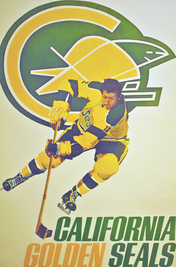
As you can see above, one of my favorite Collector’s Corner categories ever — those awesome 1970s NHL posters — is back. In addition to the Golden Seals, we also have versions for the North Stars, Bruins, Sabres, Canucks, Flyers, Blues, Canadiens, and Rangers. These were all submitted by a fellow named Matthew Miskelly, who also happens to be the seller. According to his eBay listings, his father “owned a company called Sportsgraphics, which produced these for the NHL in 1972-73.” That presumably explains why he has large quantities of most of these.
Here’s the rest of this week’s eBay haul:
• Cool 1960s megaphone — Go With the Eagles! Like they’d let you in the stadium with one of these now.
• Ah, I remember these — team pennants that feature the team photo! This one features Johnny U. and the rest of his 1960s Baltimore Colts teammates.
• Before New Era, Reebok, Starter and Nike got their clutches into NFL gear, there was AJD. And it was good. How ’bout dem Cowboys?
• This 1970s NBA gumball basketball kit includes the Midwest and Pacific Conferences.
• From reader Jake Elwell, we have this pair of Roberto Clemente-endorsed sneakers, originally sold only in Puerto Rico.
• Chiefs fans, here’s a cool 1975 game helmet with the classic Jim Otto-style noseguard thing. Plus we have nice-looking vintage Cliff Engle Chiefs sweaters in red and white.
Seen something on eBay or Etsy that you think would make good Collector’s Corner fodder? Send your submissions here.

’Skins Watch: As the ’Skins controversy stretches on, there appears to be more attention being paid to Chief Wahoo as well (thanks, Phil). ”¦ Unlike most pro-’Skins writers, political columnist Pat Buchanan doesn’t accuse the anti-’Skins movement of being driven by white people or cite poll numbers indicating that many Natives don’t care about this issue. Instead, he simply tells the Oneida Nation to man up and shut up. Refreshingly direct, if repugnant (Phil again).

Baseball News: Sorry to hear about the retirement of Jim Leyland, who was going high-cuffed right up to the end. Here’s hoping (but not expecting) his successor does likewise. ”¦ “I found a children’s book about Roberto Clemente, with a cover illustration showing him wearing a 1970-72 pullover jersey with a black cap,” writes Marc Viquez. “But the Pirates wore their mustard caps with that jersey.” ”¦ Yesterday I mentioned that I’d found a beer stein showing the evolution of the football uniform in a Milwaukee antiques shop. Noel Fliss has this same stein, along with a baseball version.

NFL News: The Buccaneers’ socks are black on top and white on the bottom, but WR Mike Williams wore his socks the other way around on Sunday. Looks like he may have violating the new pads rule too (from Marc Mandin). ”¦ “NBC posted a ‘Countdown to Sunday Night Football’ video,” says Tony Crespo, “and I noticed that the Cowboys players were wearing numberless blue jerseys for their interviews.” ”¦ The Cowyboys — and other teams..? — are selling camo jerseys. “As a current member of the military, I find this ridiculous,” says Jared Sloan, an Army Reservist. “It doesn’t ‘honor’ me. It’s embarrassing.” ”¦ JH notes that Eagles QB Matt Barkley is wearing a Qalo ring (that’s the “functional wedding band for an active lifestyle,” don’tcha know). ”¦ With yesterday’s passing of Titans owner Bud Adams, Ricko recounted this story: “In the early ’70s I briefly worked on a project with the guy who’d been the Houston Oilers’ first PR director (his name escapes me — Jack Harrigan, maybe?). I steered the conversation toward unis and he said his original thought was that the OIlers should wear black and gold. ‘Y’know, black gold.’ But when he mentioned that idea to Bud Adams, the Oilers’ owner held out his hand and pointed to the turquoise stone in the ring he always wore. ‘No,’ he said, ‘my team’s gonna wear this color.'” ”¦ Last night’s Monday Night Football telecast included a graphic showing Adrian Peterson wearing last year’s Vikings uniform (screen shot by Dave Rakowski).

College Football News: I bet most of you know this already, but I was traveling over the weekend and missed it: According to this article, one of the complaints from the players at Grambling, who boycotted and forfeited their game last weekend, is that several of the players have developed staph infections due to their uniforms not being cleaned well enough. ”¦ Two from Phil: Fresno State is going BFBS on Nov. 2, and Ohio will wear brick-patterned whites this Saturday. ”¦ Nevada and UNLV will go color-vs.-color this weekend (from Brian Catlett). … Here’s Wyoming’s uni combo for this week. … An Oregon fan thinks the team’s recent Pinktober uniform is an example of football becoming “politicize[d] and feminize[d].” ”¦ The NFL briefly had a team called the Brooklyn Dodgers. Here’s a priceless letter, on sensational letterhead, from their 1944 coach, Pete Cawthon, to a new player (“Playing in Brooklyn appeals to most men” — indeed!). So why am I putting this old NFL item in the college football section? Because it turns out Cawthon played a uni-prominent role in Texas Tech history. According to this page, “In the fall of 1934 he outfitted his team in red satin uniforms and set out to build their reputation by scheduling games across the nation. As a result, sportswriters began referring to the Matadors as the ‘Red Raiders.'” Never knew that story (great stuff from Dave Wilson).

Hockey News: Pinktober jerseys for North Dakota. “Could be worse,” says Eli Swanson, although I’m not sure I agree. … “I currently reside in Marquette, Michigan, in the beautiful Upper Peninsula,” says Alex Nye. “We recently got a new junior league hockey team called the Marquette Royales. Their uniforms are really intriguing with the crazy sleeve striping.”

Soccer News: “Soccer fans were mesmerized last weekend by Zlatan Ibrahimovic’s ridiculous backheel volley,” says Yusuke Toyoda. “But I of course noticed the GI Joe unis worn by the opposing team, SC Bastia.”

NBA News: No photo yet, but the Spurs are jumping on two bandwagons simultaneously by adding a sleeved GI Joe alternate. As the pseudonymous terriblehuman pointed out in yesterday’s comments, “Sort of ironic that they’re going “U-S-A! U-S-A!” with the most international roster in the NBA, which has only four players born in the 50 states (five if you include that U.S. Virgin Islander).” Roster demographics notwithstanding, we’re rapidly approaching the point where at least one team will be playing dress-up-soldier every single day of the year, which is a grim state of affairs. … We already pretty much knew that the Knicks were adding an orange alternate uni, and now we have official confirmation.

College Hoops News: New centennial patch for Louisville (thanks, Phil). … Also from Phil: New uniforms for Colorado State and Memphis. ”¦ Good luck being able to read the uni numbers on UTEP’s new uniforms. You can get a better idea of what I mean in this team portrait (from Matthew Leahy). ”¦ I’m sooooo tired of the “Fear the [whatever]” trope, but it’s actually pretty funny when your mascot is a clam. That’s the practice jersey for the Evergreen State College Geoducks, who, sure enough, have a clam on the front. They have a good slogan, too. Also, in an unusual move, they have a gay pride flag hanging in the gym. “After some conversations, it just seemed to make sense to hang it,” says Evergreen alum Andrew Beattie.

What Paul did last night: Went out and saw the new Tom Hanks movie, Captain Phillips, which is very, very good. One of the early scenes is set in a poor village in Somalia in 2009, and I was wondering if any of the villagers would be wearing phantom American sports apparel (“Arizona Cardinals Super Bowl XLIII Champions,” or whatever). No sign of that, alas, although one guy was wearing a T-shirt with striped sleeves and a few other unmistakably sports-evocative touches. Some good nautical and Navy uniforms in the movie, too.
What’s wrong with a purple uniform?
It’s Mr. Lukas’ least favorite color.
I will say this. Its one of the few uniforms that works with the pink gear.
Yeah. All things considered, it doesn’t look that bad.
BRONIE ALERT!!
Is there any rhyme or reason to Pinktober? Last week, the Cowboys were pink-free. At Philly, they looked like they belonged in Barbie’s dream house.
I think Paul or someone else mentioned earlier that everyone goes pink on the first weekend of Pinktober, but after that, it’s optional.
I love the typo in the Brooklyn Dodgers Football Club letter – Debets field.
Yeah, how does one get that wrong???
Also, the signature looks like a stamp. But I AM going to start signing stuff at that rakish angle!!
How does one misspell “NAVY” on a jersey? But you saw it here on Uni-Watch a while back.
I wonder if David Young declined the offer because of the typo or if he accepted it, got lost and missed his big break because of it.
The Brooklyn NFL franchise was re-branded prior to the start of their 1944 (and final) season in the league…at the sole discretion of the owner and not the result of outside influence?
Love the Evergreen Geoducks. Goes to prove my theory: Any original school logo is better than any pro-copycat school logo.
I understand it’s pronounced “gooey-duck,” not “jee-oh-duck.” Oughta be the mascot of a cooking school.
Ah, you’re right. I had heard once upon a time that it’s “gooey-duck.” Reading it, I instinctively said “jee-oh-duck.” Thanks for pointing that out.
The Geoduck wins the day, hands down. Even more so now that I know it’s Gooey-duck! Some amazing photos when you link it.
Gotta love the fight song and mascot costume!
I love that a school named their team the geoducks, something I’ve only seen in weird cooking shows, but not happy that they jacked the “fear the…” from University of Maryland.
Fear the Turtles!
I’m not super quick to give a pass to teams for their GI Joe shenanigans, but the Spurs actually do quite a bit for the considerable military community in San Antonio. Actual appreciation nights, discounts, free tickets, appearances on base…I became a fan while I was stationed down there, because they really do reach out to the military and do in ce things with and for them.
That’s all great.
So why do they have to play dress-up soldier?
I think pretty much everyone agrees that it’s wrong to wear or claim a military medal one was not actually awarded. It’s known as “stolen valor” and state and federal legislators have been struggling to find a way to outlaw it without violating the First Amendment. But why is it wrong? Because a military honor is something one earns.
Why would it be wrong for civilians to wear military medals but OK to wear elements of military uniforms? Only the assumption that military uniforms are not earned permits the former to be wrong and the latter right. If the uniform is something one earns the right to wear, then any civilian sports tram’s GI Joe stunt is wrong – it’s a lesser form of stolen valor. Just as you can’t buy the right to wear a Bronze Star by sending lots of care packages to the troops, you can’t buy the right to wear the uniform by giving away lots of tickets to the troops.
And just as it’s wrong to pin a fake imitation military medal like a Bronze Cross or something to your chest and implicitly lead people to assume that it’s a real honor, so too, though to a lesser extent, it’s also wrong to wear camo in a way that’s merely like a military uniform, if you did not earn the right to wear the uniform.
Unless the uniform is not earned, that is. But if that’s the case, then wearing the uniform wouldn’t show honor to the troops, since the uniform isn’t actually a symbol of their service.
That may be the best assessment of the subject I’ve read to date. I have always been disgusted to see any part of an actual uniform worn by someone who didn’t earn it, and even worse, in a casual and stylish “look at me in my cool military garb” sort of way.
The uniform isn’t a status symbol, it isn’t an accessory, it is a tool; which is just what people look like when they dress in garb they have not earned, and better yet, do not understand what it means to wear.
So….
Yea or Nay?
I’ve understood Paul’s views on the camo uniform issue. I guess I have been a fence-sitter on it and don’t have a particularly strong opinion on either side.
I asked a high school friend who is/was an athlete and just retired after 20 years in the Air Force what he thought of the camo uniforms. He said that he loves them and appreciates the recognition that sports teams give the military.
I’m sure Peace Corps members, teachers, social workers, emergency room doctors, and others would also “appreciate the recognition.”
Once teams start saluting those folks, we can talk. But as long as the sports world keeps repeatedly celebrating the military to the near-exclusion of all other sectors of society, it’s just cheap pandering.
Not all soldiers are heroes, not all heroes are soldiers.
On September 11, 2011, my youth football organization chose to honor the day with recognition of our local first responders. We had local firefighters, ambulance and police recognized at the start of each of our games (we have 3 each Sunday). We also gave a donation to our volunteer firefighters & ambulance companies.
Just because it isn’t on the national stage, don’t assume it isn’t happening. “Think globally, act locally.” Youth sports is part of the sports world, even if only small part.
Very true and valid points. Thanks.
Honestly, as a son of a veteran, even I am a bit tired of the “support the troops” campaigns all over the place. So similar to pink fatigue, I have a bit of military fatigue, too. (No pun was intended. Just happened.) The Nationals always recognize veterans who have returned, so recognizing the military is a regular deal in DC. The Nationals just haven’t done the camo uni thing outside of the league-wide caps.
A big problem I have with the “support the troops” and “support breast cancer awareness” causes is why wouldn’t I (or anyone else) support our troops or want to fight against breast cancer?
I mean, I know there are many people out there that don’t support our decisions to go to war, or to go overseas, but do they really not support the men and women fighting?
Well, a lot of them didn’t during the Vietnam War…
Could it just be as simple as while wearing many sorts of other military-ish stuff (uniforms, insignia, medals) could be seen as “stolen valor” since it is only worn by the military, camo is the one military-ish sorta thing that is also worn by hunters who just want to blend in in the woods, so it is seen as something military-ish that could also be worn by non-military without disrespect?
I think most reasonably people can agree that there’s a world of difference between functional camouflage and decorative camouflage that mimics a military uniform, which is what the G.I. Joe jerseys are.
The Packers have long offered link for hunters and “outdoormen”. Nobody confuses them for the Beetle Bailey things.
Is there that much of a difference between military camo and other camo? I mean, camo is camo, right? Or are we just looking for reasons that the G.I. Joe crowd is wrong because we want to?
There is a big difference between military and hunting camo patterns. It’s a fascinating subject! Hunters have traditionally used mimicry. Starting with, for example, strapping branches and leaves to their jackets or hats. Military camo, which for Americans really came into play in a big way in the Pacific Theater of WWII, is usually more about pattern breakup. A hunter wants to look like his background (typically, trees and brush) so as not to be seen. A soldier isn’t trying to hide from view (usually; snipers will use mimicry), he’s trying to be hard to aim at when seen. Plus, mimicry only works if you’re standing still or moving very slowly, as a hunter does. A soldier needs to be able to move quickly and still get some hard-to-aim-at benefit.
After WWII, American hunters widely adopted military-surplus camo, particularly the link. That’s what my grandpa wore pheasant hunting when I was a kid, and you still see a few folks wearing that pattern (mainly fowlers). Easier to buy a coat or a poncho at the Army/Navy surplus store than rig up a bunch of twigs and leaves, back in the 1940s or 1950s when those were the only choices.
In the 1980s, several printed camo patterns based on mimicry – tree bark and leaves, mainly – came on the market, and hunters largely switched back to mimicry camo from pattern-break military camo.
Just heard this on the radio – apologies if it’s already been in the ticker and I missed it. Columbian soccer team arrived for a game with the wrong jerseys, home team refused to change, so a coach want out and purchased knock-off jerseys from street vendors and applied names and numbers with a Sharpie:
link
Further info here:
link
Can you imagine how the NFL’s head would explode if something like that happened??? Hell, their head would explode if a team forgot their socks and had to wear something else!!!
It’s surprising that this happens at relatively high levels of soccer – just in the last 6 months, two teams in the Championship (a level below the Premier League) fail to bring kits that didn’t clash with the home team’s.
You say that like it’s a bad thing! ;)
After those Grambling pics came to light, the school fired The Gramblinite’s online editor and suspended its opinion pages editor.
link
That Seals poster was the centerpiece of my bedroom as a young fan in the 70’s. I bought the Western Division set of posters from the back of a Wheaties box and the other teams were displayed also. Somewhere I have old photos of my room with the posters in the background.
Interesting in that the Seals artwork is based on their 70/71 uni – the year they wore the green skates with yellow trim (and also yellow skates with green trim).
-Jet
I still have the Sabres poster, which features a beautiful painting of Roger Crozier. It’s my all-time favorite sports poster! Even though the players were not supposed to be specific players, you can recognize some of them. In addition to Crozier, I think the Canadians’ is Serge Savard, the Blues’ is Gary Unger, the Bruins’ is Phil Esposito… maybe?
Because my brothers & I read so many hockey magazines, we could identify the photo source for many generic hockey illustrations, even if the team’s uniform was changed.
I had ’em too, Jet. Different from NFL posters at the time in that there was a uniformity of design here (white background, large logo with one player in action, team name in lower corner). So striking.
These beauties were the only artistic renderings of the NHL (besides those little comic books included in O-Pee-Chee cards one year back then) around. It’s all we young sports unifom geeks had access to.
Oh my golly gosh, how sweet those posters are. Thank you, Brinke! All teams are good, many great. My personal fave is Montreal, but it’s also that the Habs are my default favorites for anything NHL-ish.
Good call Jimbo, the Sabres one with the Crozier-goalie was indeed a beaut. I agree that the Montreal player is Savard. The Boston player does look like Espo’s body but with different head. The Blues guy I don’t see as Unger, at least not with the big head of blond hair.
I always loved the motion captured in the Rangers one.
For a young NY-based Seals fanatic like myself (and a fan of all the Western expansion teams for that matter), these posters were cherished.
-Jet
They don’t. I was merely pointing out that with some teams, its merely a stunt – a PR/merchandising ploy. While that is probably the case here too to some degree, their track record of military appreciation leads me to believe there’s a hint of sincerity behind it. I don’t care for it either, but I’m willing to forgive a team that actually does many, many good things for the local military members. That’s all.
Gotcha — well stated.
I too went out and saw Captain Phillips last night (with the New Girl of course) and easily one of the best movies Tom Hanks has done in awhile. But you have to give credit to Barkhad Abdi tho.
I wanna see da boat movie.
(anyone that gets the reference earns an intertubes cookie.)
Nice. There’s a tree on my house.
Now I have to sleep in my battery car since I gotta tree on my house.
The NFL has been making camo gear for awhile. Have they switched to a digi- camo ?
I hadn’t noticed that Jim Leyland always goes high-cuffed. (I don’t watch the Tigers that much.) But I’m glad he does. I don’t understand how anyone can play baseball in long pants.
Bring back the stirrups!
Does anyone else find it ironic that Paul bitches about pink accessories and other like movements in sports as being “look at me” tactics and then uses space on his blog to write things like “what I did yesterday?” And isn’t pontificating about the Redskins’ name and Chief WAhoo and the like the most “look at me” tactic going in media right now? LOOK AT ME I DON’T SAY REDSKINS!
Yeah, imagine someone talking about himself on, um, his own website. That’s crazy!
“Someone get this Bedlamite to an Alienist!”
C. Montgomery Burns
Some of us (I would say most of us) enjoy the fact that Paul includes some personal info on his blog. It’s why a lot of people like Peter King’s MMQB column as well – it’s not just the rote football stuff you read elsewhere, he injects it with his own personal stories and thoughts. To me, that makes for a more interesting read.
Also, Paul was discussing the appropriateness (or lack thereof) of Native American imagery in sports long before it became a hot button issue again lately.
Dude, those marquette jerseys are sweet. All three.
I like the 5 stripe Marquette sweater,the other ones? Notsomuch.
The way I look at the uniform:
When I was in the Air Force, I wore a flight suit and leather jacket. I had a patch with my name, rank, and wings on both.
The flight suit? I know plenty of dumbasses that got to wear them. Sign up for the right job, boom, flight suit. Wouldn’t call the flight suit an “honor” necessarily. But that leather jacket and those wings? I earned those. Lots of hours, hard work, time away from home. Those are an honor.
I have quite a few military friends, and not a single one of them thinks of the camo, the flight suit, the dress uniforms as an “honor.” For most of us, it boils down to intent and execution. Are you intending to pass yourself off as a military member/veteran? If so, that pisses me off. Are you camo’d up to go play paintball in some shit you bought at the Army/Navy store? Totally fine.
You rock, Larry.
I agree, Larry. While I believe it’s right to honor our troops and am no fan of the “G.I. Joe” camo uniforms, I disagree strongly as to what constitutes “stolen honor”. Some here have suggested that wearing any piece of military clothing falls into that category. I would put wearing medals I didn’t earn or dressing up like an Admiral and walking around the streets stolen honor (and possibly illegal, I don’t know), but I own a USAF parka that’s rated to 20 below zero and has a nice fur trimmed hood. There are no Air Force markings, I bought it because it’s warm and efficient. The same goes for a genuine issue pea coat I bought at the Army and Navy store years ago. I’m not trying to pass myself off as a member of the US Navy, it’s just a great, practical and durable coat. I also have a leather Air Force A2 jacket that I picked up at a second hand store for a song. I’ve wanted one ever since I watched all those WW II movies as a kid, 12 O’Clock High, the Great Escape, even Hogan’s Heroes (maybe echoes of a past life). The Air Force reissued them a while back to their pilots and some are sold in the civilian market. Again, a plain jacket, no insignia, no wings. I no more think of that as passing oneself off as military as I would wearing a Red Sox warm up jacket as passing oneself off as a player.
About that 1975 KC Chiefs helmet mentioned in Collector’s Corner:
Weren’t the Chiefs wearing white facemasks by then?
Yes, they started wearing white facemasks in 1974.
Sorry, happy send finger…
Basically, if you wear something that denotes or implies rank, achievement, or status that you didn’t earn, then you deserve an ass whoopin’. If the Spurs warmed up in full camp with rank and medals, I’d be pissed. They aren’t. They’re making a nod, however token you may think it is, by wearing camo.
What if those ranks and medals were related to on-court achievements? i.e. Championships,MVP’s,6th man award….etc.
They would never do that.
link
Hey, I never noticed the little star cutout on the bottom right of that velcro square. Nice touch to a stupid idea.
Or this:
link
Those are exactly what I was talking about, just wanted Larry’s opinion on them.
When I was a dumbass teenager I had a blue Navy(?) jacket with stripes on the sleeve that I wore. One day I woke up and said to myself, “Why am I wearing this?” Just to be a cool I guess. I realized/felt it was a slap in the face to those men that REALLY earned those stripes. My Dad was a career Marine and I hadn’t even thought about how HE might feel about it. Some other dumass teenager probaly bought that jacket from Goodwill afetr I donated it.
Thank you for your service Larry!
I wonder how the use of arm stripes and ‘scrambled eggs’ by the first Seattle MLB team would be received/viewed if they were introduced today.
im glad memphis has grey basketball unis again.
i believe, the last time memphis had grey basketball unis was when they played drexel in the 1996 ncaa tourny
link
Being from Memphis originally, has looked like over the past several years the school colors of Blue and Grey become Blue and Black. The Grey uniform for Memphis is at least a school color whereas other teams just wear GFGS. I recall the Keith Lee era greys. Those were sharp with the blue lettering with white trim.
i totally agree. i’d love to see memphis incorporate grey more in their uniforms. esp in the new style. they have a flag now that is blue background with black tiger stripes- i’d love to see what it would look like with grey tiger stripes.
louisville uses black alot, but thats because black is their secondary color.
but maybe its a recruting thing and the kids like bfbs
I would still have a problem with that.if you were to put something like that on top of camouflage,it makes it seem like you think an MVP award is on par with a Bronze Star.
More disturbing than Buchanan’s piece are some of the comments. Pat, this isn’t about PC. It isn’t about politics at all. It is about being respectful to people. Most, even Native Americans, don’t mind Indian names for teams when they are done respectfully and well. Example of that is Florida State for instance. But Redskins is beyond the pale and so is Chief Wahoo. To me it is a Golden Rule object lesson at play. Do unto others as you would have them do unto you.
What he said!
I was thinking about this a bit more on the way into work, and came to a conclusion.
For me, the argument that not all military members are heroes (soldiers is not the right word, when military people see the word soldiers, they think Army) is the most valid. I knew some serious clowns that “earned” the right to wear the uniform by signing a piece of paper and barely passing boot camp. That doesn’t make them heroes. In fact, I don’t consider myself a hero. I did some awesome and brave things, but never anything truly heroic.
The people that served that get incredibly up in arms about camoflauge, and “you didn’t earn that” type stuff as it relates to it are typically the people who didn’t serve for long and got discharged. They tend to try and validate themselves and their “service” by pretending that the camoflauge puts them on a pedestal. I have met literally hundreds of people like that.
The military members that these teams think they’re recognizing don’t care about recognition.
In the end, it doesn’t excite me nor offend me when teams to this. My informal data tells me that a lot of vets are probably the same way.
Wow. Stated better than I could ever hope to. Well said.
Wow. You’ve got to give Buchanan credit – he’s reached a new level of incoherence.
What exactly does Pearl Harbor have to do with this issue, except give him a change to throw around a completely different racial slur?
Hurt? Native Americans are “hurt” by the Redskins’ name?
If you wanted to build a comprehensive compendium of logical fallacies, you could just reprint Buchanan’s column and annotate every sentence.
Who is really lacking in tolerance and mutual respect here?
Apropos, then, that even some of the particulars of the football game he describes are wrong. The Redskins-Eagles game at Griffith Stadium took place several weeks prior to the 1948 Presidential election, not shortly after it.
link
I hate Pinktober but the NORTH DAKOTA jerseys are interesting because according to the UND Code of Student Life: “The colors pink and green, which remain the University’s official colors, were chosen by the student body in 1889 when planning for UND’s first commencement exercises. The choice was inspired by the pink and green of the prairie rose, North Dakota’s official state flower, and “suggestive of our green prairies and rosy prospects.” The official athletic colors became green and white when it was determined that green and pink would not elicit a proper measure of respect from UND’s opponents. In practice, the green and white is expressed in several different shades of green and the occasional substitution of gray or black for white.”
And on top of honoring UND historical tradition, the color scheme and design of the jersey are quite tasteful, actually. One of my favorite pieces of apparel is a rugby in just that color scheme that bears the logo of a friend’s store (though mine’s striped and not blocked like in the link below).
link
Interestingly enough, the only UND sports teams to include pink as a regular feature on their uniforms in the last 60 years were the men’s and women’s hockey teams. Pink was featured in the “Indian Head” logo designed by Bennett Brien–an Ojibwe artist–in 1999.
Rob H. – that’s my exact point. Camo doesn’t equal stolen valor. People do wear it functionally. For style, I think it is silly and tool-ish…but not offensive at all.
It remains my position that a caricature, even a toothy one with a big nose, can be respectful. Cartoons are just cartoons. In the sports world, there are are a myriad of cartoon-ish representations of white people, and only a select few of minorities. Look at the Wake Forest Demon Deacon, the Notre Dame Fightin’ Irishman, the Padres’ swinging friar, and many, many others. I respect the fact that you, my fellow readers, may disagree. Please respect the fact that others may disagree with you.
I submitted the following idea once before, and I believe the comment was deleted for some reason, but if we’re going to have occasional comment sections that are not to deal with this issue, WHICH I FULLY SUPPORT, then I think it’d be nice to not have the “‘Skins Watch” featurette in that day’s post. It seems silly to include a bunch of content in a post and then not permit the reader to comment on it.
Today’s ESPN column is up:
link
Since my employer restricts social media access, the espn article comment will have to appear here. Great piece Paul. I really love that this years final four playoff teams were all traditional uniform designs. Even better news is that the red sox wont be able to wear the softball tops they sport on friday’s. i love the idea of the 3ed jersey, but I feel it should be more of a cream alternate like the Phillies or Cardinals alternates, a throwback uniform, or a different logo design or representation, like detroit wore this year, or as Boston did after the bombings. the softball top has made its way into the game, but the fad has passed. The only way I can see it working on a league level is if all teams were required to have a softball top and wear it, i.e the battign practice/new material caps they wore during rivaly games in may
Good piece — while I agree the Cardinals have some of the best uniforms in sports, the Stan Musial patch continues to distract from the set for me. It clearly reads as a ‘C’ instead of a ‘6’. From a graphic designer’s viewpoint, that detracts from the overall look for me.
Don’t worry, Paul, October will be over in 10 days, so we’ll be rid of the pink soon … just in time for the flood of hideous and ridiculous Movember mustaches on sports figures.
It’s actually gonna be GI Jovember in the NFL. Ugh….
I refuse to call these things GI Joe, since that’s exactly the attitude they’re going for. An action-hero perspective on the military, explosions and laser beams, safe and clean and free of hard moral choices or real consequences for anyone. I think that attitude towards the military, from random civilians and politicians alike, is one of the significant problems with our society.
I still call it “Beetle Bailey.” Let them try to glamorize THAT.
When it comes right down to it, and someone above alluded to it, it is preposterous that caring, awareness, and appreciation are date limited. Not just by sports leagues, but by Americans at large.
“Why aren’t you wearing purple for anti-bullying day?”
“Because as a rule, I think bullying sucks 364 other days too.”
I just get annoyed with the “me too” cause du jour that people only pretend to give a shit about for a limited time. Pinktober being a big offender, but many others also annoy the piss out of me.
I contribute to causes with time and money throughout the year – veteran causes and mental health causes. So, when someone tells me that I should wear green during mental health awareness week – I go into an internal fit of rage.
“when someone tells me that I should wear green during mental health awareness week — I go into an internal fit of rage.”
~~~
um…
Very well said Larry.
The MLB playoffs are going on right now. Why aren’t they wearing pink? They must love breast cancer.
You don’t have to wear pink, or any other color for any other cause to support that cause.
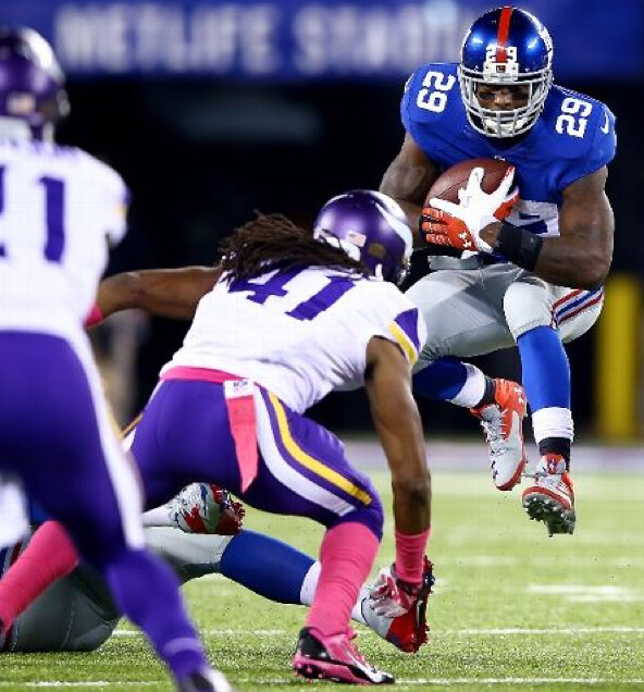
I’m ready to be done with pink, but I did think the Viking’s matte helmets looked really good. Too bad the rest of the purple on the uniforms doesn’t quite match the helmets.
agreed… I really enjoy many of the matte finished helmetes
I like the IDEA of the matte helmets, but in the Vikings situation, it makes their helmets look almost lavender. Maybe I’m going colorblind, but because of the coloring difference between helmets and pants, I had to do double takes a couple times as the pants looked practically blue on my TV screen.
The non-matching thing is partly due to the fact that the Vikings use purple. That’s the one element of Paul’s purple phobia that seems valid to me: It’s a more difficult, less forgiving color for sports uniforms than just about any other. Matte or gloss, the helmet is never going to match the uni fabric. Get them to match in one lighting condition, and they’ll clash in every other lighting. And even if you could make every element match, purples easily slides into blue or red if you’re not extremely precise about it. About the only way to be sure your purple really looks like purple to spectators and TV viewers is to lean more toward lilac than plum, but that’s basically pastel and American pro sports are afraid of pastel, other than pink in October.
Just to clarify: I do not have “purple phobia.” I do not fear purple; I loathe purple.
If anything, purple should fear ME.
Yeah, but purple hatred doesn’t alliterate. Should we call it Lukas’ lavender malevolence? Paul’s purple paradigm? Mulberry malice? Orchid abhorrence? Mauve militancy? Plum pique? Lilac loathing?
Scott, you know alliteration is the next-to-last refuge of a scoundrel.
Or the penultimate ploy of a profligate?
Those UND jersys are the most tasteful pinktober things I’ve seen. Granted the jersys arnt what they use to be with the sioux head on them, glad I nabbed mine before they discontinued them. But as for a special occasion sweater they did it right in my opinion, simple and tasteful.
Phil – Ha! Oops! Perhaps I should be more aware of my own mental health!
Wear more green.
El Paso is going to reveal their name and logo tomorrow for their AAA team. Also, Brandiose is revealing a new logo for the Arkansas Travelers and an unnamed team.
An unnamed team? Talk about a difficult branding challenge!
Say, how long have the Travelers used LR caps and Little Rock road script instead of Arkansas?
The Travelers actually have a NORTH Little Rock road script & hat. The folks in North Little Rock are awful touchy about distinguishing themselves from Little Rock. They probably need to change the name of their town if they are so intent on being their own entity. Back to the original question – I do not have a for sure answer but I wonder if they went to the North Little Rock hat & script when the Northwest Arkansas Naturals came into the Texas League and they could no longer claim the entire state of Arkansas.
And in answer to Pat Buchanan, there’s this:
link
Can always count on them to come through.
The Pirates changed uniforms mid-season in 1970. The Clemente drawing shows him in the old cap and the new jersey.
Here is a shot from that year showing Clemente in the new uniform, standing next to a statue of himself in the old uniform:
link
Sorry to reply to myself, but I just stumbled upon this photo of Clemente in a game wearing the new uniform with the old helmet:
link
I had never seen this before. Usually, we see the new uniform paired with the new helmet:
link
So maybe the hat/uniform combination shown in the drawing was actually used in a game.
Sorry I’m so late, but the Pirates wore gold caps with the new unis when they opened Three Rivers. They didn’t bother to update the helmets until ’71, and stuck with the gold helmets until 1987 even though they stopped wearing gold caps in ’84. I’m not aware of them ever wearing black caps with the 1970-76 uniform.
Loved the World Series preview.
However, the most controversial part of the Cardinals uniform wasn’t discussed – the caps.
Last winter the Cardinals polled fans if they wanted blue caps on the road, or red. One option was blue caps only when the opponent wore red caps.
The fans overwhelmingly voted to keep the status quo – red at home, blue on the road.
Despite the poll, and the fans’ wishes, the Cardinals decided to go with the blue road caps only when the opponents were wearing red this year.
Thus, one of the most beautiful caps in baseball, the navy blue cap with the Red STL logo, will not be seen in the World Series.
“one of the most beautiful caps in baseball, the navy blue cap with the Red STL logo, will not be seen in the World Series.”
~~~
It’s funny — much like the ‘skins question, this seems to be one in which people really dig their heels in and will not budge. I, for one, always liked the red cap on the road (maybe because it’s what I grew up with). Others love the blue, regardless of opponent. It seems very few were happy with the red/blue compromise.
Both, obviously have historical precedent (as does the red bill/blue crown mix (which is similar to their Sunday home cap).
While not my first choice (which would be solid red), I actually like their BP cap better than either the Sunday cap or their blue cap. Perhaps this would make for a better compromise for a road cap (and in this year of honoring The Man, is a lot closer to what he wore than the Sunday home.
I’m glad we’re seeing the red on road (just personal opinion), but if the Cards must have three caps, I’d prefer they at least change up the Sunday cap to the BP cap, and consider that as a permanent road cap.
Like you, Phil, I love the BP Cap (Just not with the raised navy blue outline which obscures the red STL.)
I often wear my BP cap with my Saturday creal alternate jersey because I think it looks more like the Musial era look which I always liked.
I would love them to go to
a) red caps at home
b) navy caps on road
C) BP caps on Saturdays with cream jerseys.
That would be a system that nicely ties in all of the different historical looks (with the exception of the ill-fated 1956 disaster
Wonder if Pat Forde struck a nerve in comparing the plight of the Grambling football program with the conspicuous consumption evidenced by Oregon:
link
Ugh. World Series logo creep now extends to the bats. You’d think the players would prefer bats that they’ve used for the last month or so.
link
Luckily you won’t see those with most of the Cardinals. The majority of the Cardinals hitters use Marrucci bats. Matt Holliday uses Old Hickory.
You can see more Evergreen Geoducks basketball photos here…
link
It’s where my original pictures in this post were taken from and edited so the watermark doesn’t appear and doesn’t link to my website. Oh well.
By the way, the Pride flag flies next to the POW flag and the State of Washington flag. I love it, especially since there are a bunch of very religious schools that play in the Cascade Collegiate Conference that probably aren’t too keen on the idea.
If I’m the Cleveland Indians and I look back in the vault and see the Cleveland team was once named the Spiders, I wouldn’t hesitate to change the name. Seriously, how awesome and unique would that name be? Plus, with design technology today, I’d have the most bad-ass logo in all of sports! What’s the hold up here???
if they change their name.. i hope it’s nothing as generic as the spiders
How is Spiders any more generic than Indians?
I’m not advocating for Spiders; I just don’t get the “generic” critique.
Well…there was a Uni Watch contest to rename the Indians, and of the 12 finalists, there were quite a few “Spiders” submissions.
And the winning submission was for “Spiders”.
Clearly, that would be a popular replacement name.
Man, those pant stripes are brilliant.
Here’s one potential uni aspect for the World Series that didn’t make Paul’s ESPN column.
If the series reaches five games, meaning all three games in St. Louis are played, the Cardinals will three unique outfits in their three games.
Saturday (Game 3): cream “St.Louis” alts
Sunday (Game 4): regular uni, Sunday home navy “bird on bat” hat
Monday (Game 5): regular uni, regular home red hat
Wonder if that’s ever happened before in a World Series.
Ah, excellent point!
Pretty interesting bit about Adams & the Oilers’ team colors. Since the team more or less kept their colors when they moved to Nashville (well, Memphis) and after they changed the name a couple of years later, I wonder what the odds are we’d have a black & gold Titans. That seems a little more badass than sky blue, navy and white.
Also, you can rearrange the letters to spell sainTt.
Lamar Hunt originally wanted Columbia blue for his Dallas AFL franchise. Adams laid claim to that color before Hunt had the chance to make his choice known, and I thank Bud for doing so. I could not imagine the Kansas City Chiefs in anything other than red.
Everything I needed to know about geoducks, I learned from Mike Rowe
link
Having not seen the ‘Captain Phillips’ movie, I’m assuming the shots of Somalia are actual archive footage in Somalia and not a set dressed for Somalia. I can’t think of a director who would dress his extras in phantom sports apparel just to make it look more authentic for the few uniform experts in the audience.
MiLB’s Hagerstown Suns are relocating to Fredericksburg, VA. The team had filed paperwork with baseball for the move earlier in October, but word tonight is that an agreement was reached today regarding the purchase of land for the stadium, which pretty much makes it a done deal. I haven’t found any linkable stories on it yet, but it’s been reported on local radio tonight. Incidentally, the land to be used for the stadium is the site of the once-planned national slavery museum. No idea what the timeline is, but probably opening in 2016.
As the childhood home of George Washington, I’m hoping for the Fredericksburg Founders.
I saw a few weeks ago that due to stadium readiness issues, the Atlantic League’s Loudon County franchise wasn’t added to next season’s schedule but should begin play in ’15.
With all the minor league options (existing and pending)available for Northern VA residents, I wonder if that will have an impact on the Washington MLB franchise’s viability down the road.
Here’s tomorrow’s WaPo story: link
Watching Predators/Wild on NBC Sports, all the board ads are purple. I’m assuming this is related to the Hockey Fights Cancer initiative?
Correct. Hockey fights all cancer, not just breast cancer. :o)
Funny, the “Dodgers” is kind of a fitting name for a sport where the offense’s goal is to avoid (or “dodge”) defenders.