For years now Cleveland fans have been asking me — sometimes with dread, sometimes with anticipation — “Are the Browns gonna bring back the brown pants?” My answer has always been the same: “I have no idea.” Throughout all of these back-and-forths, however, I had assumed we were talking about the brown pants being worn with the white jerseys.
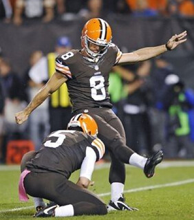
Shows what I know. The Browns lived up to their name during last night’s game against the Bills by wearing solid brown for the first time in team history. What shall we call this look: Full-Turd? UPS Driver? Brown-out? Chocolate City? Perhaps the best name is the simplest one: Shitty.
The full-on brownitude would have been bad enough, but last night also marked the first NFL game of October, which meant the players were wearing all sorts of pink accessories. If you tried really hard, maybe you could come up with a worse color combo than brown and pink, but it’s tough to imagine what it would be. (Now we just need a color-on-color game between the solid-brown Browns and the solid-red Chiefs — with pink accessories, natch — and we can probably make get every TV in America to explode.)
Cleveland.com quickly put together an online poll to see what Browns fans thought of the new look, and the results were surprisingly positive.
Uni Watch readers took a less charitable view. All of the many emails I received were negative. One of the best reactions came from Aaron McHargue, who said the players looked like this guy with orange helmets. Then there was Phil, who was more succinct. All jokes aside, though, the Browns won, which means there’s a decent chance we’ll see them do this again.
Meanwhile: In addition to all the pink gloves, wristbands, shoes, socks, towels, mouthguards, captaincy patches, officials’ whistles, penalty flags, and so on, there were also pink ribbons on the helmets and a pink ribbon on the ball. For good measure, the NFL Network’s first down marker was you-know-what. (You can sere more game photos here and here.)
Sigh. It’s gonna be a long month.
“Help Wanted” reminder: In case you missed it yesterday, I’m currently in the market for a Ticker intern. Details here.

’Skins Watch: When the NFL holds its annual fall meetings next Monday at the Ritz Carlton in Washington, the Oneida Indian Nation will be holding a public “Change the Mascot” conference in that same hotel. … Yesterday’s Wall Street Journal included a letter to the editor from someone who claims he once met a Native American who had no problem with the Braves or the ’Skins (from HT Adjemian). ”¦ “I happen to be in Atlanta for work and scored tickets to Game 1 of the Dodgers/Braves NLDS,” says Patrick Runge. “In the crowd I see some dude rocking the ‘screaming brave’ cap MLB had to pull this preseason — and wearing a John Rocker jersey.” That’s a hell of a double-whammy.

Baseball News: A’s pitcher Jarrod Parker appeared to be wearing a long-sleeved undershirt last Saturday, but he was actually wearing removable arm sleeves (good spot by Andrew Tucker). … “I follow Jack McDowell on Facebook,” says Joe Nocella. “He posted a photo of his old American Legion jersey and made a comment about it being a premonition of his baseball future.” ”¦ Oh baby, check out this awesome photo of Pops and Stretch (big thanks to Adam Garrettson). ”¦ Jerry Miller posted this on the SABR-L listserv yesterday: “Last Sunday I attended the last game of the season between the Dodgers and Rockies. At one point the opposing pitchers for the respective teams were Brian Wilson (who wears number 00) for the Dodgers, and Adam Ottavino (who wears number 0) for the Rockies. So unless MLB authorizes the use of negative integers, this is a record for the lowest combined numbers for opposing pitchers that will never be broken.” ”¦ Pieces of the Fenway Park infield tarp have been repurposed to make a bunch of L.L. Bean boots (from Tommy Turner). ”¦ I’ll be at the Bergino Baseball Clubhouse this evening to check out the opening reception for a display of Sean Kane’s amazing glove artwork. Looking forward to meeting Sean, and hope to see some of you there too.

NFL News: The Jets have considered having QB Geno Smith wear a color-coded wristband. … Here’s a rare view of the 49ers’ gold/red/gold sleeve striping from 1957 (from Cas). … Eugene Monroe, newly acquired by the Ravens, will wear No. 60 instead of his usual No. 75, because 75 is off-limits due to its association with Jonathan Ogden (from Andrew Cosentino). … If you go to the 2:07 mark of this video, you’ll see Texans LB Brian Cushing expressing his distaste for baggy jerseys (from Suvo Sur).

College Football News: The biker shorts look is even worse — a lot worse — when you’re a bare-legged college player. That’s Iowa State punter Kirby Van Der Kamp (from Chris Perrenot). ”¦ Speaking of Iowa State, here’s something you don’t often see: The Cyclones have two players named Sam Richardson, so they both wear MIOB (screen shots by Ken Tobler). ”¦ Maryland will be wearing solid white this Saturday; Florida will wear solid blue; and Missouri will wear black/white/black.

Hockey News: The Rangers’ roster includes John Moore and Dominic Moore, but only John is going with FIOB (from Bill Stewart. ”¦ Here’s a list of fun minor league hockey team names (from Yancy Yeater). … Red Wings goalie Jimmy Howard is breaking in a set of pink pads, which he’ll be wearing on Oct. 12 (from Michael Hersch). … Alan Kreit’s son plays on a youth hockey team, which is — of course — wearing pink. … “With the changing of the seasons, I switched from a Nationals browser theme to a Capitals one,” says Wililam Yurasko. “I noticed that it includes two players, Tomáš Vokoun and Alexander Semin, who haven’t even played for the Caps in two seasons. Also, Ovechkin’s sweater is tucked in, so they better change that too.” ”¦ This is pretty great: Back in 1991, the Bruins opened the season by wearing 1930s throwbacks, in honor of the NHL’s 75th anniversary. You can see video from that game here (from Josh Tremblay).

Soccer News: This is so awesome — ladies and gents, the world’s first (I’m assuming) broccoli-themed kit! … New crest for Everton. Further info here (from Mark Coales and Brent Kivell). ”¦ Ryan Robey was at Wedneday night’s Ohio State/Louisville game and was surprised to see Louisville wearing black. “I asked the goalie if they normally wear black and he said no, that it was a special occasion,” he says.

NBA News: Stephen Curry of the Warriors has signed an endorsement deal with Under Armour (from Tom Mulgrew). … New logos for the Trail Blazers’ arena (from Maks Skuz).

College Hoops News: New uniforms for Arizona State. As you can see the pattern on the back is supposedly a “pitchfork design,” but to me it looks more like a basketball net (thanks, Phil).

Grab Bag: Rugby Ohio, an organization to promote youth and high school rugby in the Buckeye State, has a new logo (from Kevin Mueller). … I love this: a series of infographics about a book about infographics. ”¦ New logo for the San Diego Public Library (from Daron Nowak). ”¦ They Deserve Each Other Dept.: One douchebag-ish corporation whose logo includes a double-X is suing another douchebag-ish corporation whose logo has a double-X (from Paul Lee).
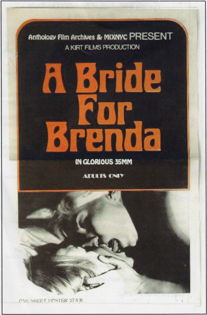

What Paul did last night: Some people, including a few friends of mine, absolutely live for kitschy, low-budget sexploitation films, but I rarely have the patience for them. They’re usually fun for about seven or eight minutes and then the lousy acting and painfully bad dialogue tend to render them unwatchable. I spent too much of my 20s sitting through this type of movie and thinking, “Jeez, how much long till this is over?” before I finally wised up and moved on to other trash-cultural pursuits.
But last night I was invited to Anthology Film Archives to check out something that sounded so good, it overcame my usual skepticism:
A Bride for Brenda (1969) is a lesbian-themed grindhouse cheapie set against the now-tantalizing backdrop of late-’60s Manhattan. Shot in Central Park, Times Square, the Village, and elsewhere, it narrates (quite literally — the story is told via female-voiced omniscient narration rather than dialogue) the experiences of NYC-neophyte Brenda as she moves into an apartment with Millie and Jane. These apparently unremarkable roommates soon prove themselves to be flesh-hungry lesbians, spying on Brenda as she undresses, attempting to seduce her, and making her forget all about her paramour Nick. As the narrator intones, “Once a young girl has been loved by a lesbian, it’s difficult to feel satisfaction from a man again.”
Sounds good, right? And I’m happy to report that it is good. The use of a voiceover narration turns out to be a stroke of genius. There’s literally no dialogue in the entire film, which cuts down on the cringe factor. The acting and production values are still laughably bad, but the woman doing the voiceover is reasonably competent, and her script is a hoot. The whole thing is an enjoyably trashy romp, capped of by a lesbian wedding-orgy scene that had the whole theater in hysterics. Recommended (but good luck finding it).
3 or more helmets:
Indiana
Oklahoma State
Tulsa
Arizona
And Oregon State & Maryland
Nevada, Texas Tech, Memphis, La-Lafayette, & Wisconsin (if they roll them out…)
Others that might…
Utah, South Carolina
Nevada has 3 helmets? Only a white helmet, and a navy helmet.
said IF they roll them out…
they have a silver one too.
link
That helmet never got the green-light. So, as of now, only two.
The University of Washington has four helmets (that I know of): traditional gold with the purple W; white with the purple W; shiny “metallic” gold with the purple W; and black matte, which they have yet to wear.
They’ve rolled out a white helmet with a stars-and-stripes pattern in the W–no word on that yet. Maybe it’s been retired like the UW helmet car.
Sheesh. That’s a lotta lids.
So… in the past decade, Cleveland has worn 2 different sets of white pants, orange pants with both jerseys, an orange jersey, brown pants with the white jersey, and now the dreaded mono-brown (and they didn’t even have the decency to wear it with striped socks). Can we please stop pretending that this is a team with a sacred uniform?
It’s time to put a logo on the helmet.
All of those uni combinations you speak of… what other helmet did they wear? No one claims the uniform is sacred, but the helmet is classic (Even if it’s not great, it’s unique).
No. The absence of the logo is the logo.
>Boom!< (that's my head exploding, man)
In the 21st Century NFL (money, profit, greed), it surprises me that you can put a brown stripe/ white stripe/ brown stripe on anything orange and it’s a Browns souvenir. I don’t know if a logo on the side is in the cards, but I can see them doing something unique on the front of the helmet to make it unique/profitable.
Also, brown pants and brown socks on some of the players looked…how can I say this…naked.
Oregon State with their new unis is also on that list. though we’ve only seen 2 of the new helmets this season. technically, Utah would also be on it. is TCU still wearing different helnets. and of course, Maryland.
I like the all-brown look, but i’d like to see a stripe on the pants and regular colored accessories.
and it is NOT time to put a logo on the helmet
I came here just to say this about the stripes, and maybe some sock stripes, too. The white and orange pants have stripes, why not the brown? Then they wouldn’t look so mono-tardy. (or in this case is it mono-turdy?)
how about this: link
Looks a little less like Mr. Hankey or an orange-tipped shitsickle, but it’s still aweful with the brown on brown. Full-on turd indeed. I don’t like the monochrome route in general, but brown on brown is just nasty.
I agree with both of you entirely. Plus, brown is a classic Fall color. It was a ballsy move by the Browns and I’m glad they opted for the mono brown in primetime.
I got tipped off to the mono look via the radio pre game show here in Cleveland (they really kept this hush hush) otherwise, I would have pulled the Fred Sanford fake heart attack upon looking at those tootsie rolls for the first time!
My thoughts exactly, how about some stripes on the socks and pants, and also, why not wear the orange pants with the brown jersey? I’ve always liked that look!
Question: Could the Browns possibly go the route (next season when they are changing their look) of Oregon and West Virginia and go with multiple colors and combos, or would the NFL disallow such a move? Just curious.
The NFL won’t even allow teams to wear throwback uniforms if they have a different colored helmet now, so the Browns won’t be able to mimic NCAA teams even if they wanted to.
They can only have three jerseys (white, color, and an alternate or throwback that can be worn no more than twice per season) and one helmet.
But there are no restrictions on pants. They can have as many of those as they want — white, brown, orange, black, gray, whatever.
I thought the NFL put the kibosh on multiple pants last year with the new Nike deal and capped it at three per team? I thought that was why the Rams dropped their metallic gold pants and the Potomac Drainage Basin Indigenous Persons dropped their burgundy pants.
Looks like I’m the 6th or 7th one to the stripes party. I like the all brown look but a white/orange/white stripe on the pants would rock.
Brown pants with orange-brown-orange stripe. Brown is beautiful, baby.
The Browns were just fine last night. I loved it.
Same named player question. I remember that in the 70s the Longhorn football team had two players named Johnny Jones and that one was called Johnny Jam Jones and the other Johnny Lam Jones, but I don’t remember their NOB practice. Any other oldtimers (or UT fans) who do remember?
i do recall those two names. other than that, i’ve got nothing.
There were three: Ham, Lam, and Jam.
link
The Ravens don’t have any retired #’s at all. I get not letting Monroe wear 75 if Ogden retired a year or two ago. I know JO was great here but he’s out of the league for 5 years now. Let Monroe wear 75 for cripes sake. Do other teams use this same philosophy of not retiring numbers…but retiring numbers? Besides, 75 just simply looks better than 60 on a jersey.
Yeah, the Redskins have a bunch of unofficial retired numbers.
Only #33 is retired but 7, 9, 21, 28, 42, 43, 44, 49 and 81 don’t get used.
Now that is ridiculous. I’m turning 33 next month, so now most NFL players are younger than me (sad face).
I used to think retiring numbers was cool. It seems so douche-y now to me. It would be a huge compliment to see my number on a star player, or even better, a player who wants to honour me.
So many guys are having their number retired – like giving every kid a trophy.
I want to add that it would be a good marketing gimmick to have special numbers given on merit (like Peyton Manning in Denver) on a permanent basis, or a one game promotion.
That would be way better than NBA nicknames, or Hitner jerseys. Plus, they won’t have to wear throwbacks; but they should…
The Steelers only have one officially retired number (Ernie Stautner’s 70), but after Todd Seabaugh had one unsuccessful year wearing Jack Ham’s 59, a bunch of numbers have been de facto retired. 12, 32, 52, 58, 59, and 75 come to mind. By not officially retiring them, there’s no debate about whether Lynn Swann deserves the same recognition as Jack Lambert.
Even though they’re not officially retired don’t expect the ravens to give out 19, 20, 52, or 75 for the foreseeable future.
Despite the Ravens trying to reach out to old-time Baltimore Colts (who are starting to drop like flies now anyways), the current club in Indianapolis is the only one with a claim to the Colts history in Baltimore (which, in 2015, will be longer in Indianapolis). In any case, I’m pretty sure Scott Mitchell had no issue link
Nobody has worn #4 for the Packers since Favre retired/was traded, because that number will be retired eventually.
This is not uncommon, where teams are not ready to retire a number just yet but still take it out of rotation. All it means is that the number is off limits until a formal ceremony occurs, teams don’t want to retire a number being worn by a player currently on the team.
Chelsea does that with Gianfranco Zola’s #25.
I like that the Cleveland Browns wore all-brown for Jim Brown Day. Regardless if it looked bad or not, that fact they went all-brown for the first time ever for a living legend is a pretty cool tribute.
Wouldn’t it have been a better tribute to wear a uniform combo that Jim Brown actually wore, instead of one that he never wore?
How is that a tribute? Wouldn’t a better tribute have been to wear a uniform that Jim Brown actually wore? Perhaps one of late 50’s versions with helmet numbers and a single white stripe?
Or this…
link
Sticker up the current helmet and there you go.
Well at least they wore it because his last name is “Brown” and not because of his skin color. I’m sure some would consider that racist.
#notsureifishouldpostthisornot
Well at least they wore it because his last name is “Brown” and not because of his skin color. I’m sure some would consider that racist.
Even better, at least a group of fans didn’t paint their faces in the team’s main color in his honor. ;-)
Wow! Paul and The Jeff are in complete agreement on something. Did the world just end while I wasn’t looking?
Check out slide 6, link .
Corporate-jingoism-on-ice!
Don’t forget the link. Now, if we can add BFBS hockey jerseys, we’ll have a trifecta of Uni Watch pet peeves in Sochi.
That gloves are unnecessary, but they don’t get worn on the ice. Ever.
Though I could see them getting air time during the opening ceremonies.
Check out slide 6, link…. .
Corporate-jingoism-on-ice!
It took me a while to figure out you were talking about the gloves. These days, I’m so used to seeing flag desecration designs and Nike’s goofy “look at me” gloves that it didn’t even phase me. I guess that means I’ve been assimilated…
You liked that old Pirates picture?
Then you’ll love this one:
link
My 8 year old daughter cheers for her school’s third grade football team. Yeterday, their coach handed them pink socks with ribbons and told them they had to wear them for all of October. They said the boys’ football team will be wearing them too. One of the girls asked, “why?” The coach told her it was for breast cancer awareness. The girls then asked what is breast cancer. We tried to tell them it was a disease that some people get…to which another girl responded, ” that seems like a terrible thing to support, why would we want more people to get a disease?”
Go pink…
Same type of story at my 11 y-o nephew’s football team’s pratice the other night.
Coach says “If you don’t have your pink socks yet, they’re 5 dollars. Make sure you have them by this weekend. Everyone has to have them.”
My nephew gets in the car after and says “We get to wear our pink socks now, cuz’ it’s October.” He went on later to mention BCA, but you see what his first thought was.
…but you see what his first thought was.
That we’re at a point where we can confidently move away from raising money for awareness because, after all, breast cancer is now being detected earlier than ever and has become one of the more safely treated cancers, due no doubt in great parts to campaigns like SGKFC’s pink ribbons, and putting more energy towards research? That, as a result of its success, wearing pink has become the ultimate act of slacktivism, where participants put little effort or resources and feel good about themselves, while doing very little than to line the pockets of corporations and finance yet more awareness for a cancer that gets more awareness than pretty much all other cancers?
Either that, or BOOOBIEEEEES!
Wall Strret Journal Article in “Washington Team Name Replacement” Watch isn’t working.
Thanks. Fixed.
I would argue the letter doesn’t work no matter if you can read it or not. Some guy’s anecdote (which has almost no way of being proven) is a really terrible argument to make, especially when articles posted on this very website have called b.s. on his claim.
Individual pro-Redskins anecdotes are just as meaningful as individual anti-Redskins ones.
It’s a good thing anti-Redskins arguments tend not to rely on anecdotes!
Also, “I found these people who don’t have an issue.” is a poor counter to “There are people who have an issue.”
No, they’re not. Look, I’m sure that if you asked enough blacks, we’d find some who wouldn’t care if there were a team named the Darkies. Or some Jews who couldn’t care less about a team named the Kikes.
But their opinions do not matter as much as those blacks or Jews who do care. End of story.
I don’t know, I think it’s always an effective argument when you say, “There was this one time, I met these specific people who said this thing, which I assume without evidence to be representative of a group of people who have some things in common with them, and such, it clearly illustrates something I imagine another group of people I dislike are thinking. Also, I will sign off with my favorite team’s slogan, to show that I am capable of thinking critically about the issue.”
Loved the brown on brown look. Some stripes on the trousers/socks would have been nice, but overall I thought it was great. Except, you know, for all the pink everywhere.
Fabulous photo from Lose Rem.
Oh, come now — we’ve all seen that photo a jillion times. I linked to it myself in my Stargell Stars piece earlier this week!
Yeah, of course. Just seeing if you’re on the ball, coach.
(Cough)
Browns = The Brown Note. (google it)
BTW, I turned on the game for a minute when I got in bed. My wife immediately says, “Those uniforms are horrible! I like the white ones though.”
the pants are in dire need of a stripe
Biker shorts on barelegged football players. If only the half-jersey were still in style too! Ooh-La-La!
Maryland
Texas Tech
Oklahoma St.
i like to refer to the pants as “UNITURDS”
the browns pants that is
Couple of ticker-ish items that may not be that ticker-ish:
* Newborns at St. Clair’s Hospital in Pittsburgh are link
* The YES Network posted link – the picture of Mariano Rivera is a little jarring, because you almost never see “YANKEES” on a pinstripe jersey, but link.
I’m surprised this wasn’t submitted as a ticker item – newborns in Pittsburgh’s St. Clair’s Hospital dressed in link.
Also, YES Network posted link – the Rivera pic is a little jarring because you almost never see “YANKEES” on a pinstripe jersey, but then, you probably didn’t watch link.
I thought the bare-knee look was illegal. Earlier this year, the kicker for Fort Scott Community College was penalized for not having knee pads on, even though the uniform pants covered his knees. The officials walked off five yards ands Fort Scott had to use a time out in order to keep him eligible to be able to kick the field goal, similar to how a team has to use one of they don’t want a player who lost his helmet to be eligible for the next play.
He (like many NFL players) has knee pads in his pants. They just aren’t near his knees.
By yeah, he’s upposed to have his knees covered also.
Ohio University and Boise State also have 3 helmets.
Washington State
Wyoming
Washington State has only two helmets (crimson and gray), not three or more. As most of you know, for a long time, WSU was the only team with more than one helmet.
Wazzu had a gray helmet with a darker gray logo in place of the crimson one for one year, back when Nike did their big re-brand. I don’t think it lasted any longer than that first year, though.
It would surprise me if they took the two-tone gray helmet off the table after only a year, but if they did, so be it.
All of the “Original Six” NHL teams wore 1920s/1930s “turn-back-the-clock” jerseys in 1991-92. Those jerseys remain the best historic jerseys that anyone in the NHL has worn since.
Seconded.
Yup. Ran into a guy at a Bruins-Wings preseason game wearing one of the Detroit throwbacks. Thing of beauty.
91-92 was the first year I followed the NHL (age 6), and i remember thinking it was weird but cool that the red wings wore those odd uniforms.
I always figured the NHL would do something big like this for the NHL Centennial, but with the advent of the retro alternate and the winter classic retro uni tradition, I don’t think it will have the same impact.
Even Baskin-Robbins got out of the brown and pink color scheme.
Hahahaha. Well played.
Memphis has 3 helmets now
1. Normal Jumping Tiger Logo
2. Blue with Chrome numbers
3. Chrome with block blue M
Vandy has 3 helmets too I think
Gold, White, Black
Paul,
I have to get your opinion on this vintage uni
link
It’s not a uniform unless at least one other person is wearing it, right? Let’s hope nobody else was.
Not a fan of the mismatched socks.
When I tailgate U-Mich games, I often see girls wearing these mismatched socks. link
I actually think they are a good design, but the uni-compulsive side of me makes me wonder why they can’t just sell them as a 4 pack so you could properly color match.
Well, they could just buy two pairs.
Until I saw this link I’d forgotten that, for about 15 minutes in the early 90s, “Black Bart” Simpsons knockoff t-shirts were the thing.
They tended to be sort of casually almost racist, but the most popular ones were link-inspired ones.
There’s a whole Facebook group dedicated to link shirts and paraphernalia. Cringe worthy enjoyment.
I just went to the Riddell website to look for some info and discovered that their site has something unusual: an animated/scrolling favicon!
link
South Florida has three helmets
The 49er Jerseys are absolutely, beautiful…
Clean, crisp, stunning…
When the NFL was a game…!!!
Is Davone Bess wearing link
Actually, if you’re talking dress clothes… brown slacks with a soft pink dress shirt looks very crisp. However, with the shade of pink we see in October… not so much.
Brown-a-tard? Turd-a-tard?
Whatever you call it, it looks plain awful.
There is absolutely nothing wrong with link.
Seriously. link.
how could i forget neapolitan?! one of my faves.
One of my favorite Simpsons moments: “MARGE! We need more vanilla chocolate strawberry ice cream!”
link
Temple has 3:
White with some weird pattern, Red Block T and mask.
All cherry with white ‘TEMPLE’.
Cherry with white block T and white facemask.
Since we’re on the Browns (who sometimes have orange pants to go with their helmets) I want to know if there’s a change in the NFL teams who, starting or stopping this year, do not have a same-helmet-and-pants scheme available.
The Washingtons, for example, I seem to remember preferring burgundy pants and white jerseys at home during the Joe Gibbs era. But now aren’t they sticking to burgundy over gold at home? What other images from a lifetime of watching the NFL no longer hold true?
(Trying to start conversation? Didn’t do my homework? A little of each.)
Aargh. Close ital.
Cincinnati has three…so far.
White with black outline (vs Purdue)
White with filled in paw (vs Illinois)
Black (usual helmet)
Maybe more…
Wake Forest, Kansas, North Carolina, Eastern Michigan
Brown and pink look fine together. Come to think of it, combined with the orange, this look should be called the “Dunkin’ Donut.”
Either way, as long as we can stay away from the turd jokes, I’m on board. We’re not 7 anymore. I actually like calling it the “UPS driver” for non-October games.
My wife’s bridesmaids dresses were brown with a pink sasche. The color combo looked nice in that situation, but it wasn’t the same shades the browns used. I agree with the above though, get stripes on those brown pants and maybe wear contrasting socks to kill the leotard look at least. I wouldn’t mind seeing brown pants with the white jerseys though.
Bride for Brenda, huh? Fully expected someone else to already comment on your evening last night. It just came out of left-field.
I think you need to forget about this passing interest in sports uniform design and commit yourself whole-hearted to writing reviews for low-budget sexploitation films of the lesbian variety. You made me want to search out and watch Bride for Brenda!
I tried. No luck.
Have to say I was very disappointed to see the “Bride for Brenda” piece on here today.
Give the ASU basketball jersey photo another look. The pitchfork is behind the number. The net/webbing design is the standard background for many of the elite jerseys this season.
Saw this in the Billings Gazette photos. Not sure why his pants are cut in half…
link
Might have something to do with the knee brace and enormous amount of padding below the pants…
Perhaps because he’s wearing a prosthetic?
Ha! He is! I thought I was seeing a knee brace, padding and some sort of optical illusion with the foot. But I think you’re right.
It is in fact link. Pretty cool story, really. Worth the read.
FEAR THE CHOP? That Braves slogan and Tomahawk chant is the single most repulsive example of Native American racism out there. Makes the Redskins name seem PC.
“Fear the chop” just makes me think of this:
link
And that reminds me…
Bring Back Culinary Corner!
Mmmm… link
I warned the other day about Breast Cancer pink everywhere. I support the breast cancer effort but it is just so overdone. Wearing a pink ribbon on the jersey should suffice but all this extraneous pink is just too much.
Looks like Gatorade creep has link.
Somewhere in that lovely shot of corporate logos there lies a soccer/football team… I think.
And look at the size of the squad and the staff – you can barely make out the individual players. Now, compared that to the team photo from link – there’s a single Adidas ball, just 21 players (not including Dalglish), the gaffer and two assistants.
I got home last night from work and saw that the Browns had the all-brown look. I immediately thought, WTF?
As far as the pink accessories go? If you took the orange out, it makes the Browns all-brown uniform with the pink accessories look like link
I, like a lot of the commenters today, wonder why the Browns’ brown pants don’t have the stripe? Not a big fan of the all brown, but the white jersey with the brown pants (with the stripe) is one of the BEST looks in the NFL. Never understood why it didn’t catch on.
I hope the Browns keep winning, so that people like the uniform again (rolls eyes). Sad that it works that way, but its better than ruining a great set; even if they do wear monobrown. The only change they need is to remove the redundant wordmark on the chest, along with the rest of the league.
I think the NFL does that for copyright reasons, since some designs get mimicked by college football, like the Steelers with Iowa (which the Rooney family did officially sanction) or the 49ers with Youngstown State in the early 2000’s (No picture, but YSU did wear similar uniforms to the 49ers then-current uniforms in the early 2000’s. Considering the DeBartolo family’s ties to the Youngstown area, I would imagine that the 49ers sanctioned theirs as well.), as well as countless high school uniforms that use their NFL counterparts if they have the same team nickname, with only maybe team colors being adjusted.
That might explain why the Steelers added their logo on the left side of their jersey in 1997, around the time most NFL teams started adding their script logo to the collar.
I see your point, but they have enough NFL logos, tail tags, etc. to accomplish that. They don’t need to ruin the aesthetics because of some dumb lawyer advice or marketing ploy. The NFL & NCAA have evolved enough from those times that it wouldn’t be a good idea to completely mimic a uniform like Iowa did a long time ago. Those were different times…
I don’t think it’s so much other football teams as it is vendors and unlicensed use in media.
It’s easy to create unbranded jerseys with the same stripes and play the plausible deniability card. The unlicensed vendor outside the stadium can sell authentic-ish looking jerseys, and TV shows and commercials can make them look like the real things too.
But sports fans tend to like authenticity, and the collar wordmark is an easy way to differentiate between licensed and unlicensed.
I also see your point, but can you really say the wordmark has made any significant dent in the licensing issues?
If the focus groups say they like the wordmark, then so be it. I would rather accommodate the paying customer than fight a losing battle with counterfeiters. That strategy isn’t winning the sales war.
The Browns monochrome look reminds me of one Mr. Hankey, the Christmas Poo.
link
Anyone care to tell rich franklin that brown and pink are a bad combination (to his face)?
There is no doubt ithese links won’t work, but no harm in trying….
link
Heeheehee! Brown is the color of doo-doo! And the Browns were wearing all-brown! Heeheehee! They looked shitty! Hee hee hee!
Thank you for the mature, insightful analysis, Paul, as usual.
There isn’t much precedent for an all-brown uniform, so I suggested some cultural references, including UPS uniforms, chocolate, and, yes, shit. Because shit, like it or not, is one of the things people associate with brown. I didn’t belabor the point, I didn’t keep referring to shit throughout the piece — it was just one thing, among several, that I mentioned.
Among the dozens of emails I received last night, most of them made some sort of Browns/shit connection. Does that automatically mean my own reference was correct or valid? No. But maybe it means I wasn’t so far afield, eh?
But I realize it’s more fun to single out an isolated line than to view it in its fuller context (especially when you’re a coward hiding behind a phony name and a phony email address), so knock yourself out.
The brown unitards do look like shit! I am shocked at all of the positive reviews for them. I shudder to think what is in store for The Browns next season. :-(
White facemasks would look great.
Here’s hoping!
The associating of brown=shit owes to human nature always sinking to our lowest expectations. But I like to associate brown with coffee, chocolate, autumn, and hopefully, skin coloration.
I think the all brown uniforms should be called the”Pink and Stink” unis
Shouldn’t that be a uniform for the Wichita State Shockers?
Softball game at Fenway this afternoon. Or, perhaps a bunch of fans on the field wearing souvenir t-shirts from Modell’s I guess I am a traditionalist.
So no one liked the Browns just the way it was presented last night. I thought it was the perfect look. I know all the NFL britches have stripes, but I am not a fan of stripes on britches at all. Just a solid color.
Those laughing Indian caps have been sold in the Turner Field cap store for the past few years. Just one of many options. Far from the most popular cap, but you see them every now and then. There’s a guy wearing a blue cap sitting behind the Braves’ dugout tonight.
I am all for Pinktober and breast cancer awareness but for me personally I wouldn’t feel obligated to wear pink unless breast cancer had affected me in some way (which it hasn’t.) I feel like the same should go for the NFL. If these players know someone who has been diagnosed with, defeated, or died from breast cancer go for it, wear pink everything. If you still want to help but you don’t have a connection to a breast cancer patient but still want to help raise awareness donate money to research or do something that actually helps. You have more money as an NFL player than most of America does so why settle for wearing pink like everyone else?