First and foremost: If you’ve been having any technical trouble with the site, please try clearing your browser’s cache. Should solve it. Sorry for the hassle.
Now then: As daily readers are aware, lately I’ve been following the phenomenon of MLB teams sharing memorial patches. It appears to have started last season, when the Angels wore the Red Sox’s Johnny Pesky patch for a game at Fenway on Aug. 21. It has shown up again three times in the past month or so:
• June 20: Felix Hernandez, Raul Ibañez, and Kendrys Morales of the Mariners wore the Angels’ Lewis Yocum patch for a game in Ahaheim.
• July 1: The Angels wore the Cardinals’ Stan Musial patch on their BP jerseys when the Cards came through Anaheim for an interleague series.
• July 8: John Lackey and Mike Napoli of the Red Sox wore the Angels’ Yocum patch for a game in Anaheim.
As you can see, the Angels are the common denominator in all of these examples — sometimes as the patch sharer, sometimes as the sharee. I wanted to know more, so I contacted the Angels and asked to interview their equipment manager, Keith Tarter. Keith declined my request for a phone conversation but consented to an email interview. Here’s how it went:
Uni Watch: To my knowledge, the first case of a team wearing another team’s memorial patch was last year, when the Angels wore the Red Sox’s Johnny Pesky patch. How did that come about?
Keith Tarter: Johnny is a baseball icon, especially in New England. Our team president, John Carpino, felt that wearing the patch would be a nice gesture as a sign of respect to the player and to the entire Red Sox organization.
UW: This season, I’ve seen several Seattle and Boston players wearing the Angels’ patch for Dr. Lewis Yocum. I realize that many of these players are either former Angels or had been treated by Dr. Yocum. Whose idea was it for them to wear the patch? Like, did they contact you, or did you contact them, or what?
KT: Dr. Yocum worked for the Angels for over 36 years. However, he has consulted with, operated on, and extended the careers for countless MLB players — not just Angels players. Those players are very grateful to Lew for what he did for them, and wearing a patch is the least they can do for such a great and gifted man. Those players asked us for a patch to honor Lew.
UW: I’ve also seen that Torii Hunter of the Tigers has a Yocum patch displayed in his locker. Again, did he contact you and request the patch, or have you made it known that you’ll supply the patch to former Angels, or what?
KT: He also asked us for a patch. Torii was with the Angels organization for five seasons and developed a close bond with Lew. Dr. Yocum also helped Torii’s son (a Notre Dame football player) when he was injured.
UW: Do you expect to continue sharing the Yocum patch with additional players as other teams pass through Anaheim during the rest of the season? Have you made it known that you’re willing to do this for anyone who asks?
KT: Anytime someone wants to honor Dr. Yocum, we will assist in any way possible.
UW: Who applies the Yocum patch to the other teams’ jerseys — your staff, or the other team’s staff?
KT: We give the patch to the player. I would assume they put it on themselves.
UW: When the Angels wore the Stan Musial patch, why did you choose to wear it on your BP jerseys, rather than on your game jerseys?
KT: We already have a memorial patch on our game jerseys [for Dr. Yocum]. It would have been too much to have multiple memorial patches.
UW: Do you have to get MLB’s permission for all of these patch-sharing situations, or do you just go ahead and do it? (If you do have to get permission, have you ever asked to do a patch share that they decided not to allow?)
KT: We get MLB approval for any and all changes to uniforms, including these patch situations. They have never denied us an opportunity to wear a patch.
UW: This whole notion of a teams sharing their patches is a fairly new thing. Do you think it’ll spread? Do you think it should spread?
KT: We wear patches to honor someone who passed away, so we never look forward to wearing a patch because it represents a great loss to an organization. As far as “sharing” patches, each case is individual and is dealt with by each team. The MLB family is very close, and when someone from another family passes away, all of us share the loss. Showing respect can also be done in other ways, such as the Yankees did for the Boston community when they played “Sweet Caroline” at Yankee Stadium after the Boston bombing.
———
My thanks to Keith for sharing his time and expertise. I’m intrigued to see if we’ll see more patch sharing this season.
Click to enlarge
Collector’s Corner
By Brinke Guthrie
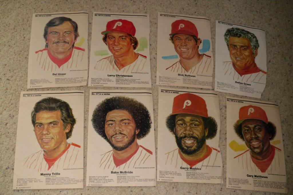
Ever seen these before? Not me. Some really terrific-looking Phillies portraits, circa 1981. It says “Television Sports” at lower left. Were these in a magazine? Or were they a gas station giveaway like Volpe/Marathon’s “Pro Star Portraits”? Either way, well done.
Now, more CC stuff for you to consider:
• Check out this set of 11 Dubble Bubble MLB transfers from the 1960s. I like this a LOT.
• Always love these 1970s Sears NFL helmet plaques, but doesn’t the Colts horseshoe here look a little off?
• Detroit Tigers fans! Here’s a great set of 1966 Volpe thermal cups.
• Nice-looking pair of 1970s NFL standings boards.
• Take a look at this 1968 Redskins/Eagles program. Look at how timeless that Eagles look is. And not a hint of black, either.
• You too can become a Stargazer — a member of the Minnesota North Stars fan club, that is — if you’re wearing this pin.
• Here’s a 1960s St. Louis Blues pillow, still in the package.
• Who didn’t have these NBA team logo magnets back in the day? Between the NFL, NBA, MLB, and NHL, our fridge was crowded!
• From reader Mike Cole: Looking for a Montreal Expos yarmulke? Mazel tov!
Seen something on eBay or Etsy that you think would make good Collector’s Corner fodder? Send your submissions here.

Summer Break reminder: My annual summer break begins on Thursday, which means tomorrow will be my final day on the site for a while. I’ll be back on Aug. 26.
Phil will be handling all the site’s weekday content while I’m on break, and webmaster Johnny Ek will handle the weekends. The Uni Watch email address will be forwarded to Phil during my break, so all Ticker submissions and such will end up going directly to him. If you have a specific question or issue that only I can deal with, he’ll send those emails back to me.
I’ll still be writing things for ESPN work during this period (Phil will provide links, of course), including a new edition of the Uni Watch Power Rankings, which will roll out in mid-August.
I’ll also be working on my annual college football season-preview column, which will appear on ESPN on Aug. 27-ish. I’ll be watching the site (and other sites) for college football news, natch. But if you’re submitting any college football Ticker items to Phil while I’m away, it would be great if you could cc me at newcollegeuni at gmail. Can do? Thanks.

New sponsor shout-out: If you scroll down a bit, you’ll see a new ad in the left sidebar, promoting “Unis of the Day.” That’s from the new site Uniform Critics, which is run by Drew Roberts. I’ll let him explain what he’s up to:
I’ve been following Uni Watch for the past few years as my go-to source for news about sports uniforms. I’m a website programmer and enjoy building brands around the world of sports. Uniform Critics, which launched at the end of June, is my latest project. It’s designed to complement websites like Uni Watch and other sports sites to meet the need of having a good place to link to when mentioning a specific uniform design.
I’ve noticed over the years that although there are great databases documenting historical sports uniforms with template sketches, there is no online profile for each uniform design with quality photos and the ability to discuss and rate the uniform like IMDB does for movies. Whenever I have mentioned a uniform in a blog post, I’ve always been forced to just link to a single online photo of the uniform. With Uniform Critics, we decided to meet that need by licensing photos and have been working over the past six months to create profile pages for individual uniforms. We currently have over 3,500 unis for college football, NFL, NBA, and college basketball (and we’ve begun indexing uniforms for baseball and hockey). Those links take you to the team profile pages listing their different combinations and designs over the past 10 years. We just finalized a deal to license older photos and are working to index older uniform designs.
One of the interesting things about this project is that after we reach a decent sample size of users rating uniforms, we can do some creative things with that data to create rankings and other popularity metrics. An example of that is the new “Unis of the Day” sidebar section on Uni Watch. We created a formula for selecting three random uniforms each day that exceed a threshold of user engagement for having a more unique and controversial design. Each morning a new set of uniforms will be displayed as the “Unis of the Day,” including the “Mystery Uniform” of the day. We hope you find this entertaining and would enjoy having you rate and comment on the profile pages of any of these daily uniforms. It is currently limited to just football uniforms, but other sports will be added to the formula in the coming months.
Pretty cool, right? I’ve enjoyed getting to know Drew over the past few weeks and am impressed by his entrepreneurship and creativity. I hope you’ll check out his site.
Uni Watch News: Lots of college football news, beginning with new football helmets for Nevada, with new jerseys to follow shortly (from Brian Catlett). … Here’s our best look yet at the new Houston football uni (from Blake LeBlanc). … Changes in the works for Tennessee football. And wait, here’s a look at the state-outline patch referred to in that article (from Levi Buck). … Mississippi State may have a metallic gold helmet for the Egg Bowl. Or they may not, who knows. … Texas A&M may have a silver helmet in the works. Or they may not, who knows. … New white helmet for Arkansas. Additional changes summarized here. … New jerseys for Louisiana Monroe (from JJ Sledge). … Here are Kentucky’s uni combos for 2013, not counting the helmets (from Josh Wren). … Here’s how the new Conference USA patch looks on the Marshall jersey (thanks, Phil). ”¦ “I rode on an elevator with rookie pitcher Taylor Jordan on Saturday at Nats Park, and I took the opportunity to ask him a few uniform-related questions,” says Max Weintraub. “First, what’s his favorite Nats’ uni? He likes the red jersey, white pants, regular combo. He added that he doesn’t like wearing cleats when he doesn’t pitch (this came up in the context of “Do you ever hope they bring you in as a pinch-runner or a spot bunter late in a non-start?”). Next, do you wear socks or stirrups? He lifted his pant leg to reveal ankle-length red socks. He disclosed that he doesn’t like the constrictive feel of high socks and wears the shorties even when he pitches.” ”¦ No more dreadlocks for Manny Ramirez, who has a shaved head down in triple-A. ”¦ “I was stuck in traffic in New Jersey yesterday and noticed the NJ license plate uses three different fonts, which bugged me,” says John Gogarty. “I started thinking our state plates are kind of our car uniform (color and number). Which state has the best plates, and which has the worst? Might be an interesting project to tackle.” Indeed. … Team USA a the Inline Hockey World Championships had some pretty brutal uniforms. “Ugh!” says Gretchen Mittelstaedt. … Now that’s a Little League uni! (From Dennis, who didn’t give his last name). … Here’s a pretty bad article — troll bait, methinks — about hockey logos (from CM, who didn’t give his real name). … Here’s the latest not-very-revealing uniform tease for the Suns (from Keith Winney). … Reprinted from yesterday’s comments: New football uniforms for North Dakota. … David Wright has a NY Giants helmet hanging in his locker (from Ben Fortney). … In a move that will likely result in some traffic accidents, the streets of Fairfax, Virginia, will soon be festooned with big, bright George Mason logos (from Tim Haller). … “My nephew played in Wisconsin’s all-star prep football game on Saturday,” says eff Ash. “Their helmets were all different colors, with decals from teams from throughout Wisconsin. My nephew’s helmet is the white one with the blue facemask.” Game photos can be seen here. … In case you didn’t already know (and you really should by now), public financing of sports stadiums is almost always bad public policy. … Someone has put together Tecmo Bowl-style renderings of the new Dolphins and Jags helmets (from the Hungry Hungry Hipster). … The city of Elizabethtown, Kentucky, is holding an online vote to choose a new logo (from Josh Claywell). ”¦ Hmmm, do these UGA pants look more white than silver/gray? Maybe it’s just the lighting (from Preston Feiler). ”¦ Thanks to what is presumably some very enthusiastic stuffing of the ballot box, the Panthers appear to be poised to win that “Best Uni Ever” contest on NFL.com. ”¦ Pretty great “Xmas in July” uniforms last night for the New Britain Rock Cats. ”¦ You want your team to have uniforms numbers? Okay, here are your uniform numbers. That’s Paul Stave’s daughter’s volleyball team, from Medical Lake High School in Washington State. “I think the spray painted numbers rock,” he says. ”¦ This is pretty awesome: color footage from a 1957 soapbox derby (big thanks to Rob MacDonalad). ”¦ New away kit for Manchester City. “If Cher had ever done a Vegas revue called ‘Sports!,’ these are the outfits her dancers would have flounced about in,” says a very nonplussed Cort McMurray. ”¦ Former Giants RB Joe Morris will be one of the NFL’s knee pad cops this season (Phil again). ”¦ Dig this old Providence Reds team portrait. You can get a better sense of what the jerseys looked like by checking out this super-cool replica (from Zack Carceau). ”¦ Aesthetically pleasing match-up from last night: Ubaldo Jimenez pitching to Brad Miller (screen shot by Kevin Bresnahan). ”¦ Several sources, including the Gridiron Uniform Database, say the 1953 Cleveland Browns wore orange jerseys only for preseason games. But Matt Reaser and T.J. Troup say this shot is from the National Pro Highlights film of Week 3 of the 1953 season. If so, it would mean the Browns wore orange in the regular season. … Writer Stefanie Loh attended yesterday’s Mountain West Conference Media Day shindig and tweeted several uni-notable photos. I’ll just embedded them all here (with an assist to Brady Phelps):
Helmet display at @TheMWC media day pic.twitter.com/tcimvvhUWS
— Stefanie Loh (@StefanieLoh) July 22, 2013
I'm digging Utah State's cool matte black helmet @TheMWC #mwfb pic.twitter.com/386JAYLCe2
— Stefanie Loh (@StefanieLoh) July 22, 2013
Boise state also has a cool looking new helmet #mwfb pic.twitter.com/U59q9XEnV9
— Stefanie Loh (@StefanieLoh) July 22, 2013
Here's a close up of SDSU's new helmet logo, with @TheShowSDSU logo on the back pic.twitter.com/CrlQhTZqCJ
— Stefanie Loh (@StefanieLoh) July 22, 2013

Bizkit: 2000-2013
The photo at right (which you can click to enlarge) is of Uni Watch weekend editor Phil Hecken and his Jack Russell, Bizkit. It was taken yesterday morning, just before Phil took Bizkit to the vet to have the little guy put down.
This was the end of a long, rough stretch for both of them. Over the past two years, Bizkit has come down with diabetes, suffered three strokes, and endured assorted other maladies. There were times when things looked grim — I’ve lost track of how many times during this period Phil told me, “I think this is it, I think he’s done,” only to have him then tell me that Bizkit had rallied and still had some fight in him.
Phil was a great doggie daddy throughout this period, giving Bizkit daily insulin shots, carrying him when he had trouble walking after the strokes, and more. But I know he was always worried about Bizkit being in pain or discomfort. On Sunday night the little fella appeared to have had another stroke and couldn’t stand. He hadn’t eaten for 24 hours and could only drink water, which he couldn’t keep down. Phil knew it was time. I’m sure Bizkit did too.
If you’ve ever had to put down a pet, as I have, you know how hard it is. So give Phil a big virtual hug today — I’m pretty sure he needs it, and I know he’ll appreciate it.
Deepest condolences and a virtual bear hug to Phil. Cherish the memories, and take comfort in having given the little guy a good life.
Copy that. Deepest condolences Phil. As a fellow dog-lover and owner, I will soon endure what you’re going through. Be happy knowing you provided a loving home and happiness to Bizkit.
Three cheers for Bizkit, may he rest in peace. I feel for you, Phil. Take good care of yourself in the transition.
My heart is with you, Phil. I had the same thing happen with our border collie, Henry, about 18 months ago. I give the vet’s office credit for even understanding what I was saying when his time had come, as I was a blabbering mess.
Big virtual hug Phil. Try and keep your head up
Condolences Phil. It’s a terrible thing to lose a dog. I gave each of mine an extra biscuit today in honor of Bizkit.
So sorry Phil. Hang in there. I am sure Bizkit is having fun in the big doggy park in the sky.
Really really sorry to hear that, Phil. Condolences to you.
Sorry about your loss Phil.
A dog owner knows the meaning of “unconditional love” and “loyalty”. As humans, we spend vast amounts of time striving for it, and pretty much utterly failing to reach it.
For dogs, it is a natural state, as natural to them as breathing, barking and basking in the sun.
Condolences
Amen!
Condolences to you on the loss of your little friend! There is no way to describe the bond between one and one’s dog. I hope you are comforted by the outpouring of sympathy. Don’t worry, Bizkit is in good hands.
We love ya Phil. Hang tough.
Sorry for the loss of your good friend, Phil.
Condolences, Phil.
So sorry to hear it.
I had a dog who was insulin-dependent for the last several years of her life. We spent so much time thinking about the end, but it didn’t make it any easier when the time came.
Take care, Phil.
Condolences to Phil in this sad time.
condolences as well to phil.. may bizkit rest in peace
R.I.P. Bizkit. Condolences Phil.
I’m terribly sorry for your loss, Phil. Bizkit was a lucky little guy to have a caring owner like you.
Condolences, Phil. Your kindness to Bizkit is a great measure of your humanity, which I am sure was much felt and appreciated.
Sorry to hear about Bizkit. He was lucky to have had you as his human.
Very sorry for your loss Phil. All we can do is make our pets part of the family and give them the best life possible. Bizkit was lucky to have you.
All the best, Phil. Bizkit was truly a man’s best friend.
Best license plates: Colorado, then Oregon, then…a few others that I forget at the moment.
And these are strictly “regular” plates I’m talking about. Every state now has a million special plates (I even just saw a University of Florida logo on a Tennessee plate while driving through the Volunteer state two weeks ago).
I know there are state laws on the books that allow out-of-state universities to appear on a state’s plates, but I still think they are an abominations. I’m glad Florida hasn’t allowed it to add to their smorgasbord of plates. Just my opinion… Also my state of Florida’s regular plates suck, but not as bad as those pee-yellow New York numbers. As for others, maybe I’ll hang out in the Goofy section of the Disney world lot and give my report.
I have a thing for the newer Kansas plates. Best designed out there, I think
Tennessee has a ton of university plates. I have a ‘Bama plate. I’ve seen Auburn, Clemson, and others from around the southeast. The strangest one had to be Purdue. Can’t be THAT many Boilermakers around here…
Actually, I think all it takes is 1000 people pledging to buy the plate to make it happen. I’m currently working with a group that aims to save the sites of Civil War battlefields from development, and we just topped the 1k mark and will be receiving plates soon.
Best looking license plate that I’m aware of isn’t from a state or even a province it’s from the Northwest Territories (and since 1999 also Nunavut).
link
link
Speaking of license plates, I saw the “lowest” numbered/lettered one I’ve ever seen the other day here in South Carolina. Over on the left half of where the numbers & letters usually would be but you might see “Government Official” or “Pearl Harbor Survivor” or “Prisoner of War” or some other qualifying designation, this one had (either, can’t remember for sure) “State Supreme Court” or “State Circuit Court” and on the right half for the ‘number’ it had merely “7”. Never seen a single digit license plate before.
Tags in the “New Sponsor Shout Out” section are broken.
Gonna try to do this Connie style.
The article argues that stadium subsidies have a bad return on investment, but that doesn’t necessarily make them bad public policy. Museums, libraries, prisons, all sorts of things have poor return on investment, but are often nonetheless good public policy to fund. I’m generally opposed to stadium subsidies, but still, let’s be clear on our terms.
Love that Tarter shows some restraint with regard to putting multiple memorial patches on the same jersey. Don’t love that he seems not to realize the fundamental problem of memorial-patch escalation.
Expos yarmulka is great, but it shows how that logo needs an outline when placed on a background that matches any of its three colors.
License plates as car unis: Great metaphor, especially given the proliferation of commemorative or “alt” plates in many states. Plus, I find that I pretty much always prefer the simpler plates states had when I was a kid to the more sophisticated designs they have today. For standard-issue plates, New York, Hawaii, and Alaska are terrific. Virginia, with its hard-to-read serif plate font, must be in the running for worst in the nation.
Strange, it’s appears that today’s citizen is unwilling to spend tax dollars on infrastructure and community facilities.
Whereas, how the hell do we think things got built in the 20s, 30s, 40s, and so on? Do we think bridges built in 1950 will last forever? Or that auditoriums and, yes, sport stadiums were never built with public money?
As long as the venue has multiple uses, I’m in favor. The ones that are bad investments are football stadiums used 8 times a year. Baseball, basketball, hockey … different story because of the amount of usage they get per year (40-80 times). Plus, you add concerts, etc.
It took tax dollars to built train stations, skyscrapers, subways, coliseums and the like in years past. Why should it be any different today?
There’s a big, big difference between a bridge, which is a public works project for the greater good of all, and a stadium, which is usually for the benefit of its primary corporate inhabitant (i.e., a privately held team).
And that’s where the comparison to museums breaks down, as very few of those are for-profit entities.
Obviously, I get that. But the key argument in today’s discussion is that communities treat a stadium as if it’s only used for private-only consumption. Whereas, in 1920, a Chicago Stadium was considered a public venue (more in line with a bridge, court house, park, etc).
The difference today is the greed associated with different venues for different sports. i.e., a football-only stadium that gets used, at most, 12-15 times a year (for high school championships, bowl games, NFL, and the occasional monster truck show).
Whereas, a Chicago Stadium (arena) gets used 41 times for hockey, 41 times for NBA, 25+ concerts, the Democratic Convention, among many other uses. <<That really shouldn't have anything to do with "rich corporate owners" like so many argue.
Where else am I supposed to go to see the Tool rock show? Or, the classic car show? Or, the boat 'n RV show? Or, my kid's high school graduation?
Believe me, I get it. Charlotte tore down the 12 year-old coliseum in the suburbs to build Time Warner Cable Arena downtown, because it didn't have luxury suites, and was built in the wrong place the first time. Ridiculous.
Indy tore down the Hoosier Dome, a venue it still owed $20 million on, to build Lucas Oil.
Two things:
The value of the tourism dollar is nowhere to be analyzed in this linked article. For e.g., the NHL Finals in Raleigh in '06 … where announcers mentioned the city, showed tons of downtown shots, etc., can be measured in the MILLIONS of dollars of tourism "advertising" for a hot, growing region. So hot, it earned the All-Star Game 3 years later.
So, it really depends on the city. Smaller metros such as Durham, NC; and Fort Wayne, Ind., and many others have hugely successful minor league ballparks with burgeoning housing/restaurants/nightlife around their venues. It's a much more valuable investment than, say, $150 million on a grand, new library that nobody uses (sadly).
How is a well-planned sports & entertainment venue different than a performing arts center? It's not, it's a cultural amenity.
I agree that many of today's projects are beyond ridiculous. It grinds my craw when a venue lasts only 15-20 years, because it was poorly designed (and in the wrong place) to begin with.
What I'm arguing is that not ALL stadiums are bad for the economy. Just like not all public works are fully utilized (again: libraries, rural bridges, ferries, parks, and so forth). Most authors of articles such as this fail to fully examine the impact across varying size cities, venues, sports, etc.
Chicago Stadium and its brethren from the first half of the Twentieth Century were privately financed. If you wanted to put a team in a city, you had to build or rent a venue. (That’s why so many football teams played in ballparks.)
For a while, franchises were worth less than what new buildings cost. If leagues would have let them, it would have been cheaper for governments to buy the team and keep them playing in their old building.
Now, of course, the venues are built with public dollars, and as part of the deal, the prime tenant gets the rights to run the facility. If teams had to build their own venues, the revenue stream would look the same, but the millions of taxpayer dollars that go into construction could be used to make sure public transit is available after the event, etc.
Also keep in mind that for the most part, the demand for public dollars for stadiums and arenas is to replace stadiums and arenas that are still relatively new (as infrastructure goes).
Public dollars to replace stadiums that are sound, safe, with lots of life left, but which are economically obsolete.
How long did the last round of stadiums last? 30 years or less?
If were were blowing up perfectly sound bridges and train stations after 30 years, nobody would stand for that.
“… Gonna try to do this Connie style…”
Well, Scott, maybe it’s not such a good idea. As your experience today confirms, the trouble with Connie Style (TM) is that other posters either don’t comment at all or else only one item of the multi-item coverage prompts any response. It’s a problem for us wide-ranging dilettantes, er, polymaths.
However:
1. Stadium subsidies make sense when the business model is the Green Bay Packers. Which is the best business model. Municipal sports socialism is the way to go.
2. “…Don’t love that he seems not to realize the fundamental problem of memorial-patch escalation…” Precisely.
3. Can someone instruct us as to the origins of the yarmulke? To evince humility in the presence of the (eternal, ubiquitous) Lord God?
4. In the family barn in Massachusetts, there’s a gorgeous fifty-eight-year-old license plate nailed to a post by the door: white numbers on a maroon background with “MASS 55” in a small font at the top. Fast forward to current red-white-and-blue banality with “Massachusetts The Spirit of America.” Oy gevalt.
Speaking of maroon relics, how about state patrol and police car liveries? Cop cruisers used to look like cop cars. Now they mostly look like mall security, at best. I mean, Minnesota has gone from link to link. At least they kept the maroon, but sheesh.
Police cars are supposed to have dark colors with contrasting light panels. They just are. Get rid of the contrasting panels, and you might as well rip the sleeves off football jerseys or curve the hems of hockey sweaters. Oh, right.
scroll down to the very bottom of your link. The new MN state trooper cars have them same design as the old ones.
Sorry for your loss Phil, my favorite companions have all been dogs, and my heart breaks when I see someone lose their best friend. It’s obvious you were a great father to him and hang on to the good memories and put all his pictures in one place so they will always be together and can be a source of happiness when the grief wears off..
Having spent many years in New Jersey as a kid, I noticed two things about NJ license plates:
* The newer plates, with the yellow-to-white gradient and black letters/numbers, changed the number zero from the standard “varsity block”-like font that they use for everything else, to a rounded font. Probably because it would have been confused with a capital O, but still, it throws things off. They also did this with the letter Q, which doesn’t appear at all on standard plates; only (I think) on the “QQ” that antique cars have.
* There are no leading zeroes on NJ plate numbers. As far as I know, when they get to (say) ABC-999, the next one is ABD-100, not ABD-001 or ABD-000. No idea why this is.
I think the lack of leading zeroes is to reduce possible confusion between zero and letter O. If there’s an intervening numeral after the last letter, people are likelier to pick up that it’s a zero rather than an O.
A friend has a license plate that starts with “BFD”. I tried to buy it, but to no avail.
Supposedly New Jersey only recently banned “WTF”!
“UW: Who applies the Yocum patch to the other teams’ jerseys – your staff, or the other team’s staff?”
“KT: We give the patch to the player. I would assume they put it on themselves.”
Yikes! Really? I can imagine 24 different methods of applying a patch, from a heat-gun, needle and thread, a hot iron, pine-tar, etc. The guy who repairs all the gloves probably gets patch-duty as well.
NY’s old statue of liberty plates were the best. the current yellow ones look like they were designed by a blind man.
I don’t know why they ever got rid of those. They were the best. The new orange looks so boring; it’s what they had when I was a small child. The Statue of Liberty design is and always will be the best.
Both the Liberty design and orange/blue are infinitely better than the bland blue/white style that appeared in between.
Ben is correct. Orange-and-blue is a) distinctive; and b) historically apt. NY’s official colors are derived from the Dutch flag of the 17th Century. It grieves me that Mark in Shiga, usually a source of discernment, is so hideously mistaken in this instance. My surmise is that something terrible, unspeakably terrible, happened to the young Mark while he was looking at the gorgeous orange-and-blue plates on the family Fairlane.
Sorry, Connie, but link. The Statue of Liberty is New York. Blue and orange may be the Dutch colors, but you can’t beat the symbol of a city and a nation. “Give me your poor, your tired, your yearning to breathe free, your people who can’t parallel park, bring them all in here, because we want ’em,” right?
Maybe they could make white Liberty plates with blue printing and an orange flame on the torch. The orange flame could glow in the dark, or be made of translucent orange/gold plastic with a light behind it. Then you’d have the right colors without all that dull orange dominating everything, and with the Liberty image instead of that dull little New York state shape in the middle. That looks way too New Jersey-ish.
I love the new Empire Gold plates. Bold, easily identifiable. Among link.
I do miss Lady Liberty, though.
Didn’t New York get rid of the Statue of Liberty plates because people in upstate didn’t feel it represented them? Or is that an urban legend?
You guys are all crazy. The 2 color blue & white that they got rid of a couple of years ago were the best followed by the Liberty. Yellow is an ugly color.
So sad about your loss Phil. I know that your pet will never be truly be replaced, but I hope you give it another shot someday.
Sorry for you loss Phil . . . we had to put down one of our cat last week. The loss of a pet is always devestating.
Paul, the UGA football pants do look white but I believe the ‘Dawgs refer to those pants as “britches” no matter the color.
@Brinke: Those portraits were from the TV Week section of the old Philadelphia Bulletin, which had a weekly sportas insert, one of the first in the country in a town where cable TV didn’t arrive for the entire city – save for a small part of South Philadelphia – until 1987.
I have to agree that the idea of not walking on a team logo that’s on the freaking floor is pretty stupid. You don’t want people to tread on it? Don’t put it on the ground in the middle of a high-traffic area!
Wiping my shoes on it? Yes, that would be disrespectful. Sliding across it on my butt? Stomping up and down on it? Sure. But simply taking the shortest route across the room? No.
It’s not a flag. (And a flag shouldn’t be on the ground anyway.) It’s a corporate symbol owned by the league. Get over it.
Well said, Rob. Superstition and peer presure are not the same thing as respect for one’s team.
On the money Rob!
I’ve seen school seals/symbols (university) that are inlaid inside of an entrance to the school, and the symbol or seal is typically roped off. That, I can understand. Typically, the room is very large, and the inlaid symbol is part of the architectural design. Those rooms allow plenty of room for pedestrian traffic to flow with ease. Putting a logo in the carpet of a tiny locker room and expecting people to stay off of it is dumb.
I like the idea of a knee pad cop walking up and down the sideline randomly whacking players’ kneecaps with a nightstick to make sure they’re padded up.
ala the ol’ “cup check”.
Oh Cort, the Citeh away kit isn’t so bad. It’s a nice contrast to the gorgeous home kit, and the shorts and the socks can be combined with the home shirt against teams that wear white shorts and/or socks.
Plus, you don’t support Liverpool like I do. You’ve seen our away and 3rd, right?
I beg to differ. The Liverpool 3rd kit is clearly the work of an unsettled mind. It is jarring, and disturbing, and strange, but it that because it’s bad, or because our puny minds just can’t handle its transcendence? Is it the polyfiber version of “Rite of Spring” — will future generations regard it with reverence and awe, even as we tear our hair and rend our garments in horror?
I love City. It is no small thing for a large, somewhat cushiony middle-aged man to wear sky blue shirts that proclaim “FOREVER MAN CITY!” (out of context, it’s a declaration that raises eyebrows), but I do, frequently and with gusto. Despite that, this gold and black nightmare, this shimmery monstrosity, this vile swooshified fabric, will never find a home on my back.
It’s awful. It’s unseemly. It’s the Stardust Hotel on the Vegas Strip, circa 1985, cheap and tawdry and down at the heel, and poor Messrs. Milner, Lescott, Zabaleta and Nastisic are just a pompadour and some wraparound sunglasses away from looking like Elvis impersonators.
Other than that, it’s fine.
“…clearly the work of an unsettled mind.”
I love that.
Reminds me of Carlins bit about state mottos onnlicense plates.
“There has to be a happy medium between Live Free or Die and Famous Potatoes.”
Calvin Trillin said that if license plates mottoes were honest, Nebraska’s would have to be “A Long Way Across.”
If you want to see more of those crazy-quilt Wisconsin prep all-star football helmets, here’s another photo gallery.
link
Awesome.
So the helmet wasn’t designed that way, it’s a collection of other school’s decals. Just like one or two of the college “all-star” games do.
I’m sure the school’s equipment manager gives the kid several extra decals to trade with other players. I always thought that was a cool thing in the college games.
I think part of the problem with taxpayer subsidies is who it is really benefitting. The argument is that its going to billionaire owners who have millionaire players taking advantage of the fancy digs. I think, though, there has to be some portion of public investment, if only for upgrades to roads and such surrounding the venue. I would hope that the days of 100% public funding are over and that a significant portion is coming from private sources. At least, that seems to be the trend in the NFL and other major leagues that build these structures.
But why does there have to be *any* public investment? Why can’t the teams pay for the infrastructure upgrades too? It’s a private enterprise with demonstrably little benefit to the public. They’re poor use of taxpayer funds no matter what you think of multiplier effects.
Paul’s attempt to distinguish between “private” business facilities and “public” facilities like bridges assumes the answer to this question. All transport infrastructure disproportionately benefits some private businesses and their customers, including roads and bridges. We pretend that we choose whether and where to span a river out of a purely altruistic desire to help the common man cross to the other side, but that’s a happy delusion. If there’s river between a major employer and its customers or workers, we build a bridge. If not, we don’t. It’s very nearly as simple as that.
So just as we ought not give sports teams special benefits in the form of building their facilities for them, neither ought we subject them to special sanctions in the form of refusing to improve public infrastructure around their facilities.
I think there’s a difference between building a bridge because it reduces the driving distance between Point A and Point B, and building an off-ramp specifically to facilitate a stadium or an Ikea. It’s unlikely that we’re building a bridge for a single business.
Sure, a bridge benefits private enterprises, but there’s at least a degree of difference between one that accommodates the public at large and infrastructure for the benefit of one business.
But the off-ramp for that Ikea does not only help Ikea. It creates reliable traffic flow that will benefit other businesses around the Ikea. It takes drivers off the roads they’d otherwise have to overload to get from the highway to the Ikea, and thus reduces traffic congestion in local residential and light-commercial areas. (This last is a big problem for urban residents when dedicated highway access to city-center attractions is not built.)
We build infrastructure where we want or need the traffic to go, and if that means building an off-ramp into a stadium parking lot or into roads that mainly serve a new “town center” retail development, so be it. It’s no more or less justified to build an off-ramp into a stadium or an Ikea than it would be to do so for a collection of smaller businesses that have a similar aggregate effect on the economy and traffic.
But a town center development serves a purpose beyond housing businesses – they aim to improve traffic flow and make streets safer for pedestrians.
That’s different from an off-ramp for one business – especially a stadium that offers demonstrably little value beyond maybe, possibly civic pride.
How many off-ramps lead directly and exclusively to one private business?
No, the number of businesses served by an infrastructure upgrade, whether one (Ikea) or dozens (a new mall) is immaterial to whether funding the upgrade is good public policy. It doesn’t even matter how wealthy or profitable the businesses in question are. What matters is how much traffic must be accommodated, and how that traffic will flow if infrastructure is not upgraded.
If we enact a rule, “No paying for a dedicated off-ramp for new stadiums,” it’s not the team owner who will suffer. People will still drive to see his team play. But ordinary people who use the roads near and around the stadium will suffer, with massive traffic obstruction before and after every home game. Emergency response times to addresses on those roads will increase. Commercial activity along those streets will decline.
As somebody who lost a pet of seventeen years just a few months ago… my deepest condolences, Phil.
I’m not a Kentucky fan, but I’ve always loved their colors. Why in the world do they think they need a black AND a gray jersey this year? I actually like the gray, because I think it pairs well with their shade of blue. But my gosh, that black is terrible. I’ve always thought black and royal blue is a terrible color combination, and those jerseys do nothing to change my mind.
Interesting that Tennessee will be doing TNOF (team name on front). That’s a look the college world had seemed to get away from. Might be an interesting look, combined with the checkerboard numbers.
Sorry for your loss Phil. The bonds with our pets are truely unique and very hard to break. Hang in there.
Re: Cleveland Unis
If it was regular season, it looks to be week 4, against Washington. Not week 3, against Philadelphia.
My condolences to Phil. Losing a friend is hard. Sorry to hear.
Sorry for the loss, Phil. I still think about my little buddy that we had to put down five years ago.
For state tags, I would say the 80’s Blue w/ tan lettering New Jersey plate is my personal favorite.
1981 Phillies. These pictures were inserts in the TV Guide that was included in the Sunday edition of the Philadelphia Bulletin newspaper. The Bulletin was the leading paper, until it went out of business in 1982. Famouse slogan, “In Philadelphia, nearly everybody reads The Bulletin.”
I attach a link of an older EBAY auction that has all the prints.
link
RIP Bizkit :(
From reader Mike Cole: Looking for a Montreal Expos yarmulke? Mazel tov!
That Expos yarmulke would have been the coolest thing ever if it had been done in the old tri-color pinwheel style.
My thoughts exactly!
Sorry for your loss Phil. You did the hardest thing any pet owner has to do. Bizkit will be waiting for you at the Rainbow Bridge.
I’ve been a fan of that Uniform Critics website since you mentioned it in an article a few weeks ago. I really like this UNIS OF THE DAY section that they are doing on here.
Jeff Ash, you tell Beau I said GO COMETS!!
Always. But now it’ll be GO TITANS!
My condolences to you, Phil. Biizkit will be in my prayers.
The thing with Manny shaving his head isn’t news. As part of his minor league contract with the Rangers, he was required to at least cut off the dreadlocks. The Rangers have a rule prohibiting long hair in their minor league system, but allow it at the major league level. In any case, Manny was due for a haircut ten years ago.
Phil, the way you’re cradling Bizkit so lovingly in that photo brought tears to my eyes. It’s also obvious from the photo that Bizkit could feel the love you had for him. You have my heartfelt sympathies.
Panthers cannot even come close to competing with the Niners classic beauties. I am making sure all my Niner fans go vote today on that.
Sorry for your loss Phil, that is tough stuff. Uniwatch hugs to you.
Seems like most people agree that the current New York license plates are ugly. But that’s beside the point. The purpose of a license plate is not to look pretty, it is to make the plate number and state as easily recognizable as possible. As such, the current New York plates are among the best plate designs in the country. They’re much more readable than they have any right to be, given the high saturation of the yellow background, and it’s impossible to mistake them for any other plate on the road.
I see a lot of New York standard, Alaska yellow standard, and Virginia yellow “Don’t Tread On Me” plates on the road, and as similar as all three are, I have never failed to recognize a New York plate as a New York plate, and I’ve never confused the other two for New York. Compare that to, say, Florida and Georgia standard plates, both of which are attractive, but which are easily confused if you don’t have the familiarity of a local resident.
It’s a very short list of states that have standard plates as well designed as New York. I’d put Idaho and Hawaii on the list; maybe New Mexico. Plenty of states have attractive plates, and many have either highly readable plate numbers or very distinctive state designs, but very few achieve both. New York does, no matter how ugly it may be.
NJ’s baby blue plate used to be distinctive. Then they went to a shitty yellow gradient. Lame.
I agree, ArrScott. New york plates are supposed to be yellow and navy blue, the way they were when I was a kid, the way they are in the original version of “The Taking of Pelham 1-2-3”. It’s what makes them New York plates.
Texas plates should be black on white, with a Lone Star. Utah plates should be black on white, with a little beehive. Jersey plates should be that light blue with pastel yellow lettering, as Ben describes.
License plates shouldn’t be commercials for the state travel and tourism bureau.
Like link
I’ll be more than happy to tackle a license plate project on here, perhaps even do it during Paul’s summer break. (Though it would have to be after the first week of August. I’m preoccupied with other things at the moment.) Being a collector with HUNDREDS of plates worldwide, I am more than willing to help.
I think that would be a fun thing to read! (The guest entry, not the PA plate)
I feel the same way about link. Distinctive colors, can’t be confused with any of the neighboring states.
True about those old Sconsin plates. Iowa’s link are among my favorites. Just looks like Iowa to me. And props to Minnesota for consistency; link with minor variation since 1977. Though they recently substituted black letters for blue, which makes for better contrast, but it’s an aesthetic downgrade on a par with the Mets wearing black jerseys.
As a collector of license plates, I actually like the current New York set. Gives it a throwback look, since it combines the 1970’s-1980’s style New York plates that are shown in a lot of movies in that era (e.g. Ghostbusters). One of my favorite plates right now is the link
I’m glad Ohio changed as well. Literally anything would have been an improvement over the “Farmville” plates Ohio just had.
Sorry to hear about Bizkit Phil. RIP.
I *hate* the state license plates with websites on them. It reminds me too much of a sponsorship patch or something. Luckily, I live in a state without a website, but if I ever do, I’m going to cover it up.
Then move to West Virginia. They actually added the state’s official web site to their current-style plate (1996-present) in the mid-2000’s, only to remove it after a couple of years.
Not only do (some) Florida plates have a website on them, some also have “IN GOD WE TRUST” on them.
Not sure how I feel about it.
link
RE: State tags
Delaware license plates are kind of plain (or classic, as we prefer) but I’m not sure there is a state’s population more fanatical about what’s on the tag. Years ago the state contracted the manufacture of the plates to an outside firm (Canadian, I believe) who reassured nervous Delawareans that the look would not change. The font did change, however, and folks here went apeshit.
…Don’t even get me started on our obsession with low numbered tags. You, too, can own a single digit Delaware plate, provided you’re in the will of the current owner or you have about a million bucks lying around. I’m not even lying.
I’ve always liked the black and white DE plates. The regular blue/gold are okay.
Rhode Islanders are like that with the low plate numbers, too.
Any chance tomorrow’s entry is about pine tar?
The Acme plate generator is a pretty cool site, and their database is pretty complete.
link
Pretty unoriginal, but I dig NW Territories and Colorado the best. I’ve always like Aruba mainly because I’ve always dug the “ONE HAPPY ISLAND” slogan.
My brother’s a big plate collector, the NW Territories is his holy grail as he pretty much has everything he wanted via auctions, yard sales, etc. Including Black Californias.
I picked him up a Wyoming during vacation at Myrtle Beach this year, that’s a pretty neat plate.
Speaking MBSC, if you find yourself in the Surfside area, grab a meal at River City Cafe… great burgers and plates EVERYWHERE!!!!
I’ve spent hours on that website in the past. I’m a loser…
I agree that there are plenty of parallels between uniform and license plate design. In both realms, there is certainly a lack of consensus on which one is best–my vote goes to the Maine regular issue, with the turquoise New Mexico one a close second.
To me, the biggest abomination in license plates is the development of the flat, non-embossed printing technology that has been adopted by 17 states. The loss of the tactile embossing makes a huge difference in how a plate looks.
Marlin and Rockies went color on color ( Orange vs Purple) last night. lets just say it was colorful.
As a long-time license plate collector (since the mid-1970s), let me send out a shout out to the Automobile License Plate Collectors Asociation (www.alpca.org). Every year since 1970, ALPCA holds a vote among its members for the best new plate of year. It’s worth checking out.
Just a note of clarification on Nunavut/NW Territories plates: Nunavut no longer uses the polar bear plate. There was a dispute between the two over who ‘owned’ the plate. Nunavut now has a rectangular shaped plate, however it is a bit on the interesting side. Probably has a bit too much purple for Paul’s tastes…
Any recommendations for good websites to pick up old license plates at a reasonable price?
If you live near any flea markets, some of the vendors there will sell a bunch of them for like $10-20. If you live near the Pennsylvania-Ohio border, Roger’s Flea Market in Roger’s Ohio has a lot of these. I’ve gotten plates from yard sales, too. Those tend to be the two cheapest–people selling them there are usually just trying to get rid of them and will take anything for them. Antique shops tend to be the most expensive, since they understand the value of them. If you go on eBay, they’re priced about their average worth.
All the action is on Ebay these days (search ‘license plate’ and you’ll find thousands each day!) The prices go from .99 into the hundreds of dollars, but I’d say the default starting price is $9.99. Most sellers will combine and mail plates together so you save postage.
I recommend going to an ALPCA meet near you some Saturday morning. Plates will be cheaper and obviously you save on postage. I don’t think you need to be a member to go and they have an auction around noon to raise money for the next meet. Here’s where the newbie can score an arm-full of plates for a pittance! Be warned – they’re “morning people” so if you show up in the afternoon, the place may be deserted! The collector’s age varies and you’ll even find women. Though more times than not it’s someone’s better half making SURE the collector follows thru on selling them. You know – “You’d better get rid of these!!!”
After the auction plates surprisingly go on sale, sometimes for 50% off! (See last paragraph!) And most are not junk – 40/60 year old plates in great condition is the norm. Go!
I’ve looked at joining the ALPCA in the past. I think their annual dues are too high. I’m not ruling out joining them EVENTUALLY, but I can still enjoy collecting them without being a member.
I know stirrup-on-stirrup is a win, but link would be so much better if the Seattle ‘rups matched the jersey color.
Also, never seen the Sawks fint used link
One off, or was that used anywhere else?
The practice in hockey of not walking on the team logo in the middle of the locker room floor reminds me of a link among students at Iowa State University. The architect who designed the link included a zodiac on the floor of the main foyer. He designed the zodiac with symbols rendered in raised bronze so that the footfalls of students walking through the foyer would eventually wear them down to the same level as the floor.
But superstitious students decided it was bad luck to walk on the symbols. They developed a custom of walking around the zodiac on either side rather than directly through the foyer. The tradition link, and the bronze zodiac symbols link link above the surrounding marble floor.
Definitive, not-at-all-thought-through ranking of state license plates (standard only):
1. Colorado
2. Vermont
3. New Mexico
4. Delaware
5. Montana
6. North Carolina
7. Rhode Island
8. Pennsylvania
9. New York
10. West Virginia
11. District of Columbia
12. Michigan
13. Oregon
14-51. The rest sucks
I’m actually okay with the War of 1812 plates for Maryland, and I like the old, powder blue and cream New Jersey plates and blue/gold California plates, but I rarely see those.
How can Pennsylvania be on the list and not Alaska? Whenever I see a PA plate I think it’s an AK plate until I get close enough to see the text. Old Wyo is also a top-ten-worthy plate.
Alaska and PA’s current design are nothing alike. If we were talking about the late-1970’s-early 1980’s, different story.
I guess I was thinking the AK gold rush plates (very commonly seen in these parts from around 2002 onward) to the PA plates that were current around 2005 when I had a few business trips to Philly.
PA hasn’t changed their plates since about 2004, even then it was relatively minor. Any regular plates (this doesn’t count the specialty plates they have) issued from 1999-present are valid with current registration.
Blue across the top, yellow/gold gradient across the bottom, white in between, dark numbers. Small graphic design centered on the white portion. To me that seems similar.
I somehow missed Alaska. I’m placing it #6, after Montana.
I HATE the fonts on the DC plates! They look like they came off someone’s printer at home.
Also, no love for the other Washington?
Washington? The background is just faint enough not to work as a state-identifying symbol, but just dark enough to reduce the letter/background contrast. Also, doesn’t Washington put both the year and month tabs on the same side, instead of balancing them left and right? Bush league.
Oregon, now there are some good plates on the left side of the map.
Mt. Rainier is a better background than Oregon’s generic, gray clip art mountains. And is that a pine tree or something from a Rorschach test? And Washington’s tabs are balanced by the state name pretty well, I think.
I picked Oregon in my Top 14 or so because the tree actually reads like a tree on the highway. Washington is like the other ones that didn’t make my list – the design doesn’t consider the medium and looks very generic.
Just a reminder that the Reds play a “home” game in the second game of a doubleheader agains the Giants today in San Francisco. Because it will be a night game, they should be wearing their home whites as opposed to their home reds which are usually reserved for day games. To Paul’s point earlier this month, because its a make-up of the July 4 rainout at Great American Ballpark, there is a chance that the Reds will also wear the “Stars and Stripes” lids, although the Reds wore those caps on July 5th against the Mariners.
As far as the home-road placement of teams designations are, I think the only thing that would really matter is that the Giants would have the unusual distinction of batting first at home.
According to the Reds’ beat writer at the Cincinnati Enquirer, the Reds will be wearing their softball tops.
link
RIP Bizkit.
My sister’s longest companion was her rat terrier–coincidentally 13 y.o. also. Longer time with that dog than any three of her boyfriends combined.
The bas-relief (correct term?) magnetic helmet standing boards hold a fascination to football fans of a certain age. Loved how fans of awful teams tended to put theirs at the top, when it hardly ever happened in reality.
New Tennessee football uniforms, leaked via video game:
link
Blech…
The new Adidas fabric looks especially bad (at least in the game). Something about the power T logo on the front right underneath the Adidas logo looks weird and cluttered. Looked better on the collar.
Some players wore those sleeve things last season – assuming it will be a player option again. I don’t remember it looking that bad last season, but in these game renderings it sure does look loud/tacky.
But hey, putting an outline of the state of Tennessee on the back collar of the jerseys totally makes up for the rest of these aesthetic missteps. (…right?)
it’s inline hockey, the uni’s are SUPPOSED to be brutal
Phil, I am so sorry about Bizkit. I have an Old English Sheepdog named Bob who is about 2 1/2. I had been wanting that breed for about 35 years, and now that he is here, I am loving every day with him. The thought of losing him – even 10 years or so from now – makes my heart stop for a moment, and having lost pets before, I do know the pain. My fellow sheepdog owners and I will tell you to remember the many happy years you had, and know that Bizkit is waiting for you at the Rainbow Bridge. You are in my thoughts, pal.
So heartbreaking to read about Bizkit. My condolences Phil.
I’m so sorry about Bizkit. There’s nothing anyone can say to make you feel better when you lose your furry sidekick. I’m glad for him that his human (you) loved him and cherished him and gave him the forever home he deserved.
I’m sorry Phil.
in case i’m not available to comment on here tomorrow, let me say today…
hey paul, enjoy your summer break!
If I was Mr. Dameshek I would just toss the whole contest out. It was clearly spammed by a bot from a Panthers fan and is a joke. Similar thing happened when CBSSports tried a greatest mascot of all time contest.
Phil… One of the hardest decisions we ever have to make is to put a beloved pet to sleep. I hope you’re remembering all of the good times and resting in the fact that you gave it all you did and could. Best thoughts.
One of the hardest decisions I ever had to make was peeling my Oregon license plates off and putting Washington license plates on. Man, that sucked.
YOU decided that??
Seconding (thirding) Northwest Territories as the best plates.
Nunavut plates are awesome – but you never, ever see them on the road. Nunavut is bigger than Alaska and has only 850 km of roads, none of which connect Nunavut to the outside world.
I did buy an unofficial one as a souvenir at the Toronto Airport about a decade ago, so you see them on the front of some cars (I think I still have mine, it’s got some wear though…)
Fair enough – I wasn’t thinking about souvenir plates or old plates on front bumpers
Sorry for your loss Phil. You have been a wonderful owner all these years. What was written speaks volumes about what a gift you were to Bizkit. And him to you. I firmly believe your past pets, lead you to your next pet. Listen and watch, and one day he’ll place you with your next pal. Everyone tells me and my wife that when they die, they want to come back as one of our cats. It’s obvious to me, it wouldn’t suck to be your dog. Peace be with you Phil.
Sorry for your loss, Phil.
Hang in there, Phil. Lost my guy two years ago. Toughest thing ever, yet a very comforting time, thanks to friends:
link
Sad news Phil. Hang in there my friend, and take some comfort in knowing your little buddy is no longer in pain.
Phil, sorry to read about Bizkit. I just had to do the same thing with my diabetic (and otherwise-comprimised) beloved 12-year old pug, Baxter. May they be romping together at the great dog park in the beyond.
Re: Stadiums
Has there ever been a publicly (or more realistically, publicly subsidized) stadium that was pushed through without a vote from the people? I can’t remember any instance.
Some people may feel that stadiums are a waste of tax dollars, or that there are better uses of those funds (I agree with both), but we live in a democracy. WE all get an opportunity to vote on those issues, and like electing political leaders, not everyone is going to be happy with the outcome.
In the end, even the folks that aren’t happy with the approval to spend tax dollars on stadiums, surely understand that the majority rules.
Live in a place that approved tax dollars for a stadium, and you just can’t stand it? Move. The USA is crazy like that.
I’m pretty sure whatever mutant gene compels readers of this blog to examine and enjoy sports uniform design is possibly the same or close to the gene that makes license plate collecting an enjoyable hobby. Here’s a couple of sites that do a decent job of tackling the license plate world:
link is updated weekly and there’s a chance the plate that just passed you on the interstate is represented here. Low numbered link link
The other is: link though there’s many others like it. Even Wikipedia even has a linkwhen it comes to plate info. License plate collecting is a good sized hobby but small enough that the membership is reasonable and friendly.
The major issue in the U.S. over the last twenty years is to link or stay link Many sate have been sold on the link which locks them into flats for the immediate future. State legislative members and Secretary of State offices seem easily duped by the numbers presentation’s from 3M and the like, insisting that they’ll save the state money once the new equipment is installed. I’ll admit it is easier for a manufacturer to print up a random number or vanity plate, but I’ll still take the look and feel of an embossed, or linkplate any day.
As far as fonts, Indiana was one of the first states to go flat, and their first issue really sucked. The manufacturer since has come up with a better font, and I’ll admit the last IN issue wasn’t bad. That’s because with reflective sheeting light letters on a dark background are rarely seen. But it link Yes, that’s reflective black. Here’s a link that goes into more detail concerning license plate link
Another obstacle these days is: “everyone’s a critic!” Plate designs stay on the road for seven to 15 years or more and people just aren’t easily satisfied. In the old days, a strange color combo had a year on the road and was replaced. Now link Which lead to link Seriously. Get a new set of plates in Texas and you get the Texas “classic” (unless you’re in a county that still has some of the older ones in stock.) That beveled star in the upper left corner? It may not be the DPS saying, “Fuck you!” to the state’s cry-babies, but I’ll bet there’s a few tattooed topless dancers that feel just a little more at home in the lone star state!
So I collect license plates, have most of my life and I hope there’s no link glitches in this post!
That info-laden Leeward link was absolutely fascinating; thanks!
Great post! I think you’re right about the “uni watch” gene and the “license plate” gene being one and the same.
Those Eagles unis from 60s do look sharp
And for the helmets SD State that color red and the black look great to me.
Great find with the Brown wearing orange unis in 53.
Reds wearing red alts and road (black) Mr Red BP caps for the “home” game in SF tonight. link
I also noticed that in the box they have CIN as the home team with the Giants colors
I believe it was the first time since 1977 that the Giants wore a jersey with “San Francisco” on the front for a regular season home game. That year they had a doubleheader against the Mets and wore their orange “San Francisco” road jersey for the second game.
Rally on Bizkit!
There has got to be a way someone, anyone, can stuff the NFL uniform contest for the 49ers. The Panthers all-black winning would be abhorrent.
My condolences Phil. I went through the same thing two years ago with my Mikey, also a terrier. Haven’t gotten over it yet. Rest assured Bizkit is in heaven, in pefect health, waiting for you. Remember, the bond will never be broken. Take care and God Bless.
Phil-My condolences for your loss.
I am so thrilled I stumbled upon your site. I really found you by accident, while I was browsing on Google for something else. Anyways I am here now and would just like to say thank you for a useful post and an all round inspiring blog. (I also like the theme/design), I don’t have time to read through it all at the moment, but I have added your website to my favorites, so when I have time I will be back to read more. Please do keep up the awesome job!