Yesterday I mentioned that I’d never seen the cartoon tiger logo in the center of this 1980s Tigers placemat. As several readers quickly explained, the cartoon tiger was a staple of Tigers TV broadcasts at the time. See those two videos embedded above? If the Tigers won, they’d run the animation in the upper video; if they lost, they’d run the lower one.
“It became a visual icon locally,” says reader Dan Kennedy. “Even when the game was over, you could never turn off the TV until you officially saw the outro. It kinda became part of the game.” Love it!
New ESPN column today, about the MLB All-Star Game. Enjoy. ”” Paul
Membership update: Several new cardbacks have been added to the membership card gallery (including David Firestone’s card, shown at right, one of the few auto racing-themed cards in the membership program’s six-year history). We have one slot open in the current production batch of cards, which means the next person to sign up will get his or her card very quickly.
Would you like to be that person? As always, you can sign up here.

PermaRec update: A message in a ginger ale bottle, shown at left, is the subject of the latest entry on the Permanent Record Blog.
Uni Watch News Ticker: The Padres will wear Pacific Coast League throwbacks tonight (thanks, Phil). ”¦ As you probably know, knee and thigh pads will be mandatory in the NFL this season. But here’s a twist: Players who don’t comply won’t be fined — they’ll be removed from the game (from Tommy Turner). … Also from Tommy: Here’s the latest story about auto racing engineer Bill Simpson’s efforts to create a better football helmet. … Louisiana Tech will wear this flag-desecration helmet on Sept. 28 against Army. … New football uniforms for Wabash College. Additional views here and here (from Aaron Parrish). ”¦ The Danville Braves went G.I. Joe back on Monday (from Jason DeHart). … This obit for former Mississippi State basketball player Leland Mitchell contains the following line: “The Mississippi team was named the Maroons, an old Southern term for runaway slaves, which eventually gave way to Bulldogs.” Wow. Never knew that. Well, I’m sure it was meant in a respectful way, just like Redskins (from Adam Herbst). … “It looks like the new NHL 14 video game has a NHL ’94 game mode, and they have Jeremy Roenick back on the Blackhawks but in the wrong uniform number,” says Alexis Melendez). … Here’s what more golfers will be wearing for the British Open. … Speaking of golf, earlier this week I Ticker-mentioned that the flag at the 18th hole of the Greenbriar Classic had an American flag. That prompted the following from Chris Wells: “To my knowledge, the regular PGA Tour events (non-majors) usually have one designated hole with an American flag in lieu of the normal tournament flag. The flagstick is tended by some member of the U.S. military, with the marshals on the hole also usually fellow military men and women. I believe it’s not connected to a charitable effort, but more of a thank you effort.” In other words, even the PGA has found a way to connect with the military/patriotism/sports industrial complex. Incredible. … House on fire? No biggie — the game must go on! “That’s North Mount Herman School in Massachusetts,” says Ben Fortney). … The Red Sox celebrated David Ortiz’s all-time base hits record for DHs by leaving a bucket of champagne in his locker — but the bucket had an outdated Red Sox logo (from Tom Adjemian). ”¦ Check out this portrait of the 1950 Baylor baseball team. Note the non-matching jerseys — looks like they tried to hide the non-script jerseys in the middle row (from Kate Morrison). ”¦ A bunch of rare baseball newsreel footage will be screen on July 24 on Long Island (big thanks to Alan Kreit). … It’s nice to know that the American public thinks so little of my profession. On the plus side, we’re ranked higher than business executives, so that’s something. … Nothing particularly unusual about this game-used Bryce Harper bat — except that the barrel says it was “handcrafted for Chase Utley (from John Childers). … Buncha good stuff from the Hungry Hungry Hipster: (1) Check out the logo on Flipper Anderson’s undersleeve. “That’s the logo for Body Glove, which makes surfing gear,” says HHH. “I’ve never seen a football player wearing surfing gear before! Makes you wonder if he was wearing it for warmth, traction, or for another reason.” (2) Here’s a basketball team comprised of Pacific Southwest Airlines flight attendants. (3) This has gotta be one of the longest team names ever to appear on a basketball jersey. Those last two photos, incidentally, come from this excellent page of old team portraits. … Kudos to the Diamondbacks, who are not only doing a Native American Recognition Day promotion tomorrow but are also broadcasting the game in Navajo — an apparent first (Phil again). … Back in May I did an ESPN column about the Metropolitan Museum of Art’s baseball card collection. Here’s a big feature on the latest exhibit drawn from those cards, plus a slideshow (Phil yet again). … Here’s a decent look at the Clippers’ uniform history (from Jonee Eisen). … I confess that I had never heard of the World University Games until yesterday, when several readers told me that the Aussie players in last night’s USA/Australia basketball game had black tape over their NOBs. Anyone know what that’s about? … Yesterday I wondered aloud about whether average MLB uni numbers are increasing. While we don’t yet have a definitive answer to that question, Jason Allen has taken an interesting approach: He’s tallied how many players wore No. 61 or higher for every season from 1937 through 2012. As you can see, there are way more high-numbered players now than there were back in the 1930s and ’40s. But it’s worth remembering that roster sizes were smaller back in the day, and there were no September call-ups, so teams didn’t need as many uni numbers. Still, it does seem like the numbers have been getting higher lately. … The Braves just called up Joey Terdoslavich, whose NOB, as Jay Francis points out, has 12 letters, with none repeated. Is that an MLB record, I wonder..? … What’s that peeking out behind Torii Hunter? It’s one of the Angels’ memorial patches for Dr. Lewis Yocum, which Hunter, now with the Tigers, apparently displays in his locker (great spot by Brett Crane). … The Wilmington Blue Rocks did the pink jersey thing last night (one more from Phil). ”¦ I’m going to be out and about for most of today (going to that All-Star FanFest thingie during the day [I’ll be the one not wearing a grossly overpriced polyester shirt] and then tonight I’m heading out to Coney to see a free show by a bunch of geezers in a glorified oldies band Cheap Trick), so pleasepleaseplease go easy on the Ticker emails unless you have major news to share — thanks. Everyone have a great weekend and I’ll see you next week.
Interesting on the Tigers. Kinda like what some teams do at the ballpark. Should bring it back to TV.
Those Tiger toons made my day. If I had grown up in Detroit I absolutely would have watched ’til the end of the broadcast just to see them.
-Jet
the tigers animation explanation is not totally accurate. when i lived in detroit from 1980 to 1985 and adored these as a kid the animation that is shown as the tiger winning outro, was actually the broadcast into. clearly the animation was intended that way too since he is picking up the bat, and getting ready to play. as you can see at the beginning of link broadcast from 1987.
then if the tigers lost they would show the wounded kitty that still isn’t ready to give up with the little roar. while if the won, rather then show the tiger batting they had a series of animations, one for every team that would show him ripping up a pair of red socks, or burping out blue jay feathers, whatever. you can see an example of that style of animation in link 1980 broadcast. you can watch the full ending link without the time signature, it is pretty good.
so maybe they eliminated the awesome winning animations in the late 80’s and made the intro the outro, but if we are going to be persnickety and accurately identify why these animations were created the and originally run , well that’s the story.
I watched a whole lot of Tiger games through the 80’s. I don’t remember the winning animations you speak of at all. It must have been before ’84 when I really started watching a whole lot of games. These 2 are the end of game winning & losing animations that I remember well.
Dan K. is right; we never turned off the game until we saw the kitty, win or lose. If the Tigs lost, that little growl the Tiger gave out at the end was always worth the wait.
These video clips brought back a lot of good memories!
Can’t say I recall the opponent-specific animations, though I didn’t start watching the Tigers regularly until they made the World Series in 1984. I was still a kid back then, and staying up late for night games wasn’t always an option, plus I didn’t start getting into sports in earnest until that particular pennant run.
I listened to most of the games on the radio, though; Ernie Harwell and Paul Carey calling the action on WJR. Those were the days…
they still had them in 84.
tony~
i appreciate that maybe you don’t remember the original exit animation, but that doesn’t mean they didn’t exist(i showed one above). nor does it take away from the fact that that tiger grabbing the bat is getting ready to play, and not intended by the artistic team to be a post game tiger.
to some degree who cares, it is your memory of the pre/post that is important as far as the use of the animation, not the intent, and this is exactly why the original closing animations mean so much to me and my memory. so i am not saying you or dan are wrong to love it as a post game animation. i was merely pointing out that even though the animation was later used in closing, that it’s original design was that of the opening, which is a fact, and that it is that sort of attention to detail that this site puts forth every day. does it matter that much? heck no, but that tiger eating the oriole is pretty great, and i would love to be able to see the whole series of them again if i could find them, that’s all. but i for sure wasn’t picking on dan, or finding fault with dan because he is not old enough to remember the original winning outs.
Compare these animations to, say, the robots on Fox.
This is quirky, and clever, and completely entertaining. It’s what happens when talented local people have the opportunity to create something. Once something goes national, it gets more corporate, slicker, more obnoxious.
I’ll take quirky and clever over slick and corporate every time.
Very true. This also includes videos at the park in between innings. Look at the Pittsburgh Pirates link that they used back in the 90’s at Three Rivers Stadium. (Is that link shoveling baseballs into the furnace?) They still play it infrequently at PNC Park, but it seems like teams have more giveaways in between innings sponsored by corporations anymore than videos like these. I like the videos better.
that is out of control awesome!
I remember being 3-4 years old (around 1987) and just starting to cut my teeth on baseball and the Tigers. My older brother was 13 and a huge Tigers fan so the games were always on our TV. I wanted to follow baseball to be like my brother, but didn’t understand the game much then. However, I remember a huge draw to watching was to see the end of the game to see the mean victory tiger animation, while running out of the room when the tiger was sad.
that is a great story.
At least you aren’t a politician. They didn’t make the chart.
Angels’ meorial patch should read Angels’ memorial patch.
Those Tigers’ animations are quite fun.
Looks like they used the wrong Bruins uniforms in the NHL14 trailer. They have them in the ’96/’97 sweaters.
They also have the Stars in North Stars sweaters, but left Colorado without Nordiques ones. Boo.
Circa 1967-75 North Stars unis, too. And they were the Dallas Stars in NHL ’94 (even if the roster in the game was primarily the 1992-93 North Stars, minus anyone from the Expansion Draft going to Florida or Anaheim).
They don’t have the Bruins sweaters from that era in NHL13 unfortunately. I doubt they’re going to add many new unis with the impending upgrade for the next gen systems for NHL15 coming
Also if you look close towards the end they still have the Devils in the Red and Green. ’92 was the first year they started to dress in the black and red.
This new Stevie Johnson jersey has a full white collar. Only jersey on the site with the full collar. Weird?
link
Did players have as much say over what uniform number they would wear back in the day? Would Manny Ramirez and Turk Wendell have been allowed to wear 99 back in the ’60s even if they wanted to? Even Carlton Fisk’s choice to wear 72 with the White Sox in the early ’80s was very outside the box for that era.
Regardless of the flag desecration, from a purely aesthetic point of view I think that La Tech helmet is gorgeous. It’ll look great if it’s paired with their usual blue jersey.
Typo on “handcrafter for Chase Utley”. Should be handcrafted.
Got it. Thanks.
Why is everyone making such a big deal over the NHL ’94 rerun?
We still hold an NHL ’94 tournament every year at the university, and now, being part of the radio station, we have even more fun with it. We even give out link.
Everyone speaks as if NHL ’94 is dead, but it’s more alive than it ever was in our neck of the woods. We’ll be running the tournament again in late October if anyone will be in my city during that time!
Well, yeah… but now you can play it with current players. (I assume, that’s how they handled Madden 93 on the collector’s version of Madden 09.)
You have the same sort of communities for Tecmo Super Bowl, but everyone would still jump at the chance to play an official updated version rather than rom hacks.
1000% disagree, Jeff. Yes, 1000 percent.
The reason NHL ’94 is so awesome is beccause the vast majority of those who play it still grew up with the Roenicks, Yzermans, Lemieuxs, and Gretzkys. While having updated rosters is nice, I want the old Jets, Whalers, and Nordiques back. Gimme Selanne, Sanderson, and Sakic on those teams.
No Atlanta Thrashers, no Nashville Predators, no Columbus Blue Jackets, no Minnesota Wild. Where do those players end up if they are truly bringing back the 26 team NHL? Doesn’t matter. They, like they teams they are currently on, weren’t part of the NHL landscape in 1994. To include them is egregiously wrong.
And updating the rosters is nothing more than a hack of NHL ’94 at best, and there are a ton of people who do it online for nothing already. Blow your $70 on a new game with a free hack, but you could hit an auction site and get the real NHL ’94 and a Sega Genesis for about the same price.
The reason it’s so good and ultimately revered? Because it’s all about the nostalgia of when hockey was still awesome, the wrap-around goal was the ultimate cheat, and a left-right-left head fake yielded hundreds of breakaway goals.
I’ll stick with my Genesis copy. Sorry, EA, but you haven’t swayed this retro gamer. The historical aspects of NHL ’94 override any “benefit” that EA can spout.
Ahem… link. Not hard to find. Makes the computer-emulated version entirely customizable. Pretty sure EA’s guys know about this stuff.
Marketing the updated “retro looking” game as “NHL ’94” is not only marketing under false pretenses (since it has all 30 teams in it), it’s entirely wrong.
Yeah, you can edit everything, but it’s also really time consuming. While there’s plenty of people that will to do that and play a rom hack, there’s a ton more that aren’t exactly computer savvy who are going to be more than happy to give EA their money to play the updated game. It’s not really much different than any of the various retro downloadable games on the current consoles. Heck, I’ve got a couple of Sonic games and Final Fantasy games on my PS3 (they were free, but not the point). It’s all about convenience. Not everyone still has an NES/Genesis/SNES/etc they can dig out, and with an emulator, many are still stuck at a desk with a smaller screen. Besides… if you’re already planning on buying NHL 14 anyway, then having the extra retro game is a nice little bonus, even if it isn’t accurate to 1994.
It is NOT a retro game. You cannot update rosters on teams that did not exist in 1994. It is a RETRO VERSION of NHL ’14. HUUUUUUUUUUGE difference. Let’s not confuse the two.
They are marketing this entirely wrong.
In the NHL 12 game (i boycotted last year’s game becauseof the lockout), one of the controller options was NHL 93/94, which at least made it feel like the old Genesis game for me.
The feature is not a huge deal, but i think it’s kind of fun. I bet it was added in last minute coming out of the buzz of those NHL94 web videos where people turn actual NHL highlight into NHL94.
I think it’s cool they added 94 genesis sound effects and soundtrack (I wonder if they shied away from Beatles Birthday on the organ?).
Actually NHL06 had NHL94 playable in the game. It was kind of a let down (no retro player names, no whalers license, and the emulation controls weren’t perfect copy of original).
NHL didn’t own the Whalers licensing in 2006. City of Hartford did. That’s why it was missing.
Today’s ESPN column is up:
link
Does Harold Baines wearing a blank Angels helmet in the 1989 All-Star Game count? And didn’t Willie Mays wear several helmets in the 1965 game?
Totally forgot about Baines! But you’re right:
link
Also forgot about Mays. Ugh! I knew more examples would come out of the woodwork once that piece was published.
I’m on my way out the door, so no time to update today’s column. I’ll run a follow-up piece next week.
This isn’t really a helmet “mix up,” but during the 1997 MLB All Star game I remember Larry Walker wearing his helmet backwards (and perhaps even jokingly attempting to switch hit) as he faced off against Randy Johnson.
I’d count it.
link
Great link for Wabash! Go Little Giants! WABASH ALWAYS FIGHTS!
Except that we’re using these awful gloves and apparently going with the leotard/stormtrooper look. Wabash Always Fights, indeed, but apparently we don’t always look good doing it.
Isn’t Wabash College Jimmy Chitwood’s Alma Mater?
Only if he keeps his grades up. Seeing as he stuck around on the basketball team, I’m guessing that didn’t happen.
(It’s the 4th quote down here: link )
Of couse as every kid in Indiana knows, the real Jimmy Chitwood is Bobby Plump who played at Butler.
Where I’m sure he’ll be happy to tell you all about it at his restaurant up in Broad Ripple.
The PGA/flagpin is a good idea. You might be against the military connection, but it seems fairly quiet compared to the other major sports. It had to be researched to be discovered, completely unlike the other leagues’ un-your-face military campaigns.
I’ll go along with this, for sure. It’s a relief to read about a “soft patriotism” detail, for once. Sure beats the bumper-sticker patriotism we are ordinarily subjected to.
Seconded. I don’t believe I’ve ever seen the flag “tended” by military personel as indicated in the ticker. As a former caddy I think of “tending the flag” having a specific meaning which involves the player putting from a distance or direction where he can’t see the cup and the caddy taking hold of the flagstick during the stroke. The caddy tending the flag removes the flagstick from the cup, replacing it back in the cup at a slight angle away from his or her player’s line wile holding the flag itself so it does not flap in any wind or make noise while the player is putting. The tending caddy should also make sure that he is not stepping in another player’s line while tending and also taking care that your shadow does not cross the hole or your player’s line. The flag must be removed if the player’s ball is going into the hole or else it results in a one-stroke penalty.
The military reprenstatives at PGA events are not “tending” the flag. At least not as described above. What usually transpires is that one of the players’ caddies removes the pin, and hands it to the military personnel standing just off the green. After all you don’t wan’t military boots or dress shoes trampling the green during play. After the players have putted out, the pin is retrieved from the military member returned to the hole by the caddy. The individual players then go and shake hands with the stationed personnel and engage in some small talk on their way to the next hole. The US flag and the military personnel’s interaction usually only involves one hole (normally the 17th hole)and is understated and respectuful. It does not hold up play and is definitely not hyped by the PGA or the televising network in any way.
Question: On a normal hole, is the flag ever set down on the ground when it’s removed, or is it always held by a caddy or some other person?
Arr –
A normal golf flag attached to the pin can be placed on the ground but never on the green itself. Usually it’s placed on the collar/fringe. Always set down, never dropped. You don’t want it to make any noise. (same thing when you put the player’s bag down, you lay it down don’t drop it!)
I’m o.k. with this move by the PGA. I agree with the opinions stated above that this is nowhere near as “in your face” patriotism as is often (And appropriately, I would argue) decried here in Uni-Watch. I’ll save my outrage when the caddies start wearing camo or the golfers start draping themselves in the flag (Nobody show that to the PGA!).
“‘ I believe it’s not connected to a charitable effort, but more of a thank you effort.’ In other words, even the PGA has found a way to connect with the military/patriotism/sports industrial complex.”
I see. Any pimping of US service personnel – or Old Glory – by professional sports should be viewed with a conspiratorial eye.
I wonder if Ike would concur?
Remember the time Chevy Chase came back to host SNL, and for his monologue, did nothing but milk the audience for cheap applause? That’s the way I feel about pimping the military at sporting events: wrap yourself in the flag, and nobody dares to boo.
Hmmm…and you’re certain others would boo as you do?
Body Glove also makes knee braces and the like.
Flipper could’ve been wearing and elbow brace or maybe just a sleeve to avoid thae aweful late ’80’s turf eash.
Yep. Body Glove = surfing = wetsuits = neoprene = product expansion = knee/elbow braces.
Tom Brady’s been wearing a triathlon wetsuit since 2003 under his football gear to stay warm on cold and snowy days.
Body Glove–
Wetsuits–
Diving–
Swim Fins–
Flippers–
Flipper Anderson–
“The ciiiiircle of liiiife…….”
Whether trying to hide them or whatever, I appreciate the Baylor team putting all their “misfits” in an asthetically pleasing arrangment in that photo. If they’d been dispersed willy-nilly it would look horrible.
I was listening to the Scott Van Pelt show yesterday. He and the guest host ranked their favorite NFL uniforms. Van Pelt mentioned that he “asked the guy who runs Uni Watch” for input, but evidently it was “too hard” for him.
I spent a good portion of the day trying to figure out that comment.
“Here’s a decent look at the Clippers’ uniform history” – Nope, not even close. It’s missing the ’70-71 Braves unis (as well as the round-neck version of the ’74-78 unis), as well as the unis worn the last year in San Diego.
Hell, the article talks about alternate unis but completely neglects to mention that the Clippers wore 2 different road unis for the ’84 season.
The worst part? The NBA just doesn’t give a fuck about getting this stuff right, and probably never will.
Rant over…
I agree completely.
It was a pretty shoddy piece.
Also from the piece….
According to Clippers Vice President of Sponsorship Sales Christian Howard, it was a “performance fabric that changed the game.”
Changed the game? Um, yeah, right.
Wow. Hadn’t seen those Tigers outros in years. I grew up a Blue Jays fan in Detroit, but I still watched a ton of Tigers games, because hey, baseball, and I loved that little end of the game bit. Strikes me as the type of fun thing they wouldn’t do now, since everything is licensed and copyrighted and controlled.
In a similar theme, I remembered that the Tigers’ scorebooks and yearbook used to have some fun with their TV schedule as well, where they’d have the tiger eating the logo of the other AL teams. Found this one from the 1980 season. I know they did it for several years in the 80s, though.
link
Brilliant. I love those.
When you mentioned long NOBs that reminded me of the two longest names I ever had to apply to high school football jerseys. One was “SCHNECKENBURGER” while the other was “DZIERZANOWSKI.” The coaches thought we would shorten them to just “SCHNECK” and “SKI” but with a pair of scissors and a little creativity we got them both on there in full NOB.
Did you ever see the SCTV “Movie of the Week”, where John Candy played, Billy Stempovolitchky, star of the Toronto Bay Leafs?
His NOB started at one elbow, and ran around to the other elbow.
Like most things on SCTV, the whole thing was pretty darn funny.
I remember the “Bay Leafs” (wasn’t it “Bay Leaves?”) but don’t remember the name thing. Could it have been a shot at Pal Hal who first put the real Leafs NOBs on in the same color as the sweater. Cheap old SOB.
I think you’re right, it was Leaves, not Leafs. I do remember that Rick Moranis did a very credible Davey Keon impersonation, and John Candy had Darryl Sittler’s perm.
They’d always show Ballard in his box on hockey Night in Canada, sitting next to the ancient King Clancy. He always reminded me of Mister Potter from “It’s A Wonderful Life”.
Cort, DYR when Ballard owned the Ti-Cats for a while? He then bought the Central Hockey League Cincinnati Stingers who moved to that league after the NHL-WHA fiasco, and changed the name to the Tigers. Cinci’s big rival was the Birmingham Bulls who were the transplanted Toronto Toros. Ballard hated Bulls owner John Bassett whom he had nickled-and-dimed out of Toronto and the Gardens with his bullshit charges like an extra fee for turning on the TV lights, extra charge to place the cushions on the players’ benches and building new dressing rooms for the WHA teams at MLB and making Bassett pay for them. Then when the Bulls moved out Ballard used the rooms for the visiting NHL team and officials. He turned the old NHL visitors room into a media lounge. Ballard is the reason the Leafs haven’t won since ’67. I wish the team would lose the current 1970s-era logo that I call the “Ballard Buzz-cut Leaf.” Time to finally get rid of the last vestiges of that cheap old SOB.
I knew Ballard owned the Ti-Cats, and I knew about the way he tried to make life miserable for the Toros.
Him owning the Stingers is news to me.
I loved those 70’s Leafs teams. Sittler, Salming, Mike Palmateer…I probably saw more Leafs games (on TV, of course) than Sabres games.
“Will you welcome Epic recording artists…Cheap Trick!!”
-Budokan ’78
Epic doesn’t only refer to their record label at the time.
“Hello there Ladies and Gentlemen. Hello there Ladies and Gents…”
When the band was still unknown, Rick Nielsen used to wear a Cubs (and sometimes Point beer)cap as his cap of choice. Of course, after they hit it big, he naturally started wearing custom caps.
This photo was on the site last year:
link
Notice that on the batting helmet the “O” in the S-O-X is round not square like it was on the cap.
link
not just the O, the S and X are different as well.
Is that John C. Reilly???
That’s the late Moose Skowron, God rest his soul…
With the MLB All-Star Game approaching, it reminds me of at least two times when representatives of the same NL and AL teams wore different uniforms to the same game. The Indians had a year of more than one player or coach selected during the red/blue multicolored era, and one person wore a red jersey and the other went blue.
In 1977, the Pirates had three players selected, and each wore a different uniform. Future Hall of Famer Goose Gossage wore black monochrome with a yellow hat. John Candelaria and Dave Parker wore all yellow, but Candelaria had a black hat, while Parker had the yellow hat.
Athletics also wore various uniforms in one of the mid-1970s games, perhaps 1975? And I believe in 1997, Ken Caminiti wore a blue Padres jersey in the game while Tony Gwynn wore a gray Padres jersey.
i saw Cheap Trick at the HOB in Boston a couple of years back. incredible. great set list, great energy.
they’ve been opening big tours w/ crap bands so i haven’t seen them since.
i’m super jealous that you’re going to see them tonight. have fun!
s
Bill Simpson loves to talk about his innovations and how great they are, and how anybody who doesn’t use them is an idiot. Congratulations on your better football helmet, Bill. Now get your patent and show us the damn thing and tell us why it’s better.
I agree his talk of his ‘legacy’ was a bit much but less weight bodes well for the head (as he mentioned) as well as the neck. Michael Princip, I am sure, could expound further upon the subject. Bulwark (Orsen), come in. Come in Bulwark (Orsen : )
BTW, I know the name of the Maroons from Jamaica was a transliteration of the Spanish word, Cimarron, for fugitive which is similar to the usage for Mississippi State. Wonder if the term was seen as inflamatory and therefore changed in a similar fashion with Ole Miss and the Colonel mascot?
Paul, enjoyed the ALL Star Game story on SweetSpot, except, “the 1964 game when Johnny Callison of the Phillies hit a walk-off homer in the bottom of the ninth.”
What’s the reason for so much allegiance by broadcasters and writers to the modern, now forced, contrived, and used out-of-control slogan “walk-off” when “game winning” would do just fine?
Especially talking about the 1964 MLB All Star Game when the term wasn’t even in existence. To these eyes, it makes the sentence laughable and silly, and yes, forced and contrived.
“Game-winning homer” is less precise a term, though. That sort of home run could come in the first inning or the ninth inning… So even if “walk-off homer” is a modern term, I appreciate the precision it offers.
Technically, a lead-off homer in the first can be the game-winner if the score remains 1-0. Walk-off implies, “with this run, the game is now instantly over,” in a way that won’t happen with a lead-off homer in the first.
Ironically, “walk-off” used to be a negative term. Dennis Eckersley coined the term to mean, “I’m the closer, I messed up, and now my teammates and I are walking off the field in shame.” So in reality, walk-offs shouldn’t be “celebrated,” but they are.
As for the anachronistic use of the term, I’m not bothered by it. Based on what happened then, a modern word fits it perfectly. If you found a prehistoric piece of meat in between prehistoric wafers, you wouldn’t use the term “sandwich?”
As a writer myself, I would argue that the term “walk-off” is much more specific than “game winning.”
Walk-off refers to a specific situation – home team, bottom of the ninth (or later), ending the game with said hit/walk/whatever. It’s a term you use in that situation, never anywhere else.
“Game winning” could mean a lot of things. If it’s a 1-0 game, the game-winning hit could come in the first inning to score the lone run. It’s simply too general.
As far as its use being out of control, that’s as subjective as anything else on this site. I grew up with the term, nothing about it sounds forced, contrived or out of control. It’s simply a part of the vernacular in which we discuss baseball.
Agree with all the above. “Game-winning” is insufficiently precise.
“Game-ending” would work. It’s synonymous with “walk-off.” But I see no reason to prefer one over the other.
re: aussie jerseys…
i don’t think those are nob’s…likely sponsors…they are playing in the world univ games in russia, so it may be that there is some rule about not wearing sponsors (esp. since these are amateur players)…
if i get any concrete info, i will pass along, but that’s the best guess i can make…
William VanLandingham trounces Joey Terdoslavich with 20 straight non-consecutive letters in his last name.
link
Uh… non-consecutive doesn’t mean the same thing as non-repeated. VanLandinham has 3 Ns and 3 As and isn’t even worth mentioning in comparison to Terdoslavich.
Being a Mississippi State alum, this is the first time I have heard of the slave reference for the Maroons nickname. I was always told the nickname was for the school’s uniform color.
So this is a reverse of the (football) Cardinals’ scenario?
Too bad Bun E. Carlos isn’t touring with CT anymore.
True…but Rick’s son, Daxx, is doing a pretty good job in his place. :-)
1. Uniformed military flag holders – thumbs up.
2. Redskins name – two thumbs sideways. Don’t care.
3. Hot ’60s stewardesses in belly shirts playing hoops – sign me up!!!!!
Big Black reference?
Another All-Star helmet switcheroo — Lance Parrish wore an Indians helmet in 1982.
link
And then there was the Lou Whitaker uniform caper in ’85. He ended up with a Tigers helmet, but I’m pretty sure it wasn’t his.
4. Seeing Cheap Trick opening for Blue Oyster Cult at the Baltimore Civic Center in 1978 (US leg of the Buddokan tour)…. truly priceless. Actually about $10 plus fifty cents to Ticketron.
Didn’t Lou Whitaker have to wear a replica jersey one year from the souvenir stand?
You’re correct. I think it was Minnesota, and he had to use a laundry marker to color in #1.
I’m still calling it link.
“… This obit for former Mississippi State basketball player Leland Mitchell contains the following line: ‘The Mississippi team was named the Maroons, an old Southern term for runaway slaves, which eventually gave way to Bulldogs.’ Wow. Never knew that. Well, I’m sure it was meant in a respectful way, just like Redskins (from Adam Herbst)…”
Time out. I don’t know beans about Mississippi State, much less whether their old nickname came from the school color or from the historical (mostly male) population of African-Americans called Maroons. But I do know this: the Maroons were heroes, and inspirations to the still-enslaved. “Runaway” is correct, of course, in a literal sense. “Escaped” is better. “Self-liberated” even more so. Most Maroons found refuge among Native American populations. The most famous example of the phenomenon was the Seminoles, not a pre-Columbian tribe, but a fusion of Indians from many tribes with escaped slaves and the odd weird white guy. Throughout the 19th Century and well into the 20th, especially in remnant native populations in the Eastern US, large numbers of African Americans settled in, to the extent that contemporary self-described Indians of the Northeast (Pequods, for example, or Wampanoags) can look distinctly more African than Native American.
Like I say, I have no idea if white athletes at MSU thought they were nicknamed in honor of escaped slaves, and whether that was thought a cool thing or not. But three cheers for the (original) Maroons.
“Runaway” is correct, of course, in a literal sense. “Escaped” is better. “Self-liberated” even more so.
On that note, I’ve noticed that the staff and historical interpreters at George Washington’s Mount Vernon estate have, in the last few years, largely switched from using the word “slave” to the phrases “enslaved laborer” or “enslaved person.” Which I applaud. It treats enslavement as an external condition, not an inherent characteristic of the individual person. (Also, how many times have you ever heard of antebellum white Americans referred to as “frees”?)
You make a great point, ConnieDC.
Miss State wasn’t integrated until the mid-60’s. They stated calling themselves “Bulldogs” in the early 60’s; according too the Interwebs, they were “Aggies” and “Maroons” before that.
To suggest that a segregated, all-white university in the Deep South had named its athletic teams to recognize slaves — runaway or self-liberated — is beyond the pale.
It would have been like Nazi-sympathizing Freiberg University announcing in 1936 that its sports teams would be known as “The Fighting Maccabees.”
“…It would have been like Nazi-sympathizing Freiberg University announcing in 1936 that its sports teams would be known as ‘The Fighting Maccabees’…”
Ow, that’s good.
In contemporary Jamaica the equivalent of a reservation exists for the descendents of the historic Maroons. It is in an area called “Maroon Town”, deep in the interior of the country, believe it was the Windward side (though my nautical references are not to be trusted : ) Also, similar to MSU’s leadership using the name Maroon, the Jamaican Maroons had the named bestowed upon them by colonial powers, the English (& Spanish prior to them), so it is doubtful they had a complimentary tone when using the term.
I wonder if the Maroons nickname was indeed just a color (not uncommon) and the school changed it because of the secondary meaning of the word. It is easy to imagine that other schools in the deep south would have made fun of MSU through use of the secondary meaning much in the same way opposing fans will make fun of schools that are The Trojans (condoms).
I might be wrong, but did I see a quick shot of Sidney Crosby in a “Back To Back Cup Era” Penguins jersey in that NHL 94 Clip? at around 0:45?
Which, I know that it might be the throwback thing, but the Pens had the flying triangle uniforms by then…
New third, maybe?
Yes you did. Also, the Flyers are in their current ‘retro’ sweaters, and not the 80’s – mid 2000’s look that they should be sporting for a 1994 season.
“Errors” all over the place. The Dallas Stars are wearing North Stars garb without an ounce of black, which is incorrect for 1994. Also, the Colorado Avalanche are…themselves, and not the Quebec Nordiques.
Yep, and now that I think about it – I believe pittsburgh’s road unis simply had ‘PITTSBURGH’ in the NY rangers style at that time.
I understand if there are cases where old team names/logos can’t be used because of trademarks or whatever, but to get some of the easy details wrong is pretty sad.
…and they have the devils in their christmas sweaters, which were gone by ’94. Jesus, I’m a Flyers fan and I can even pick out all of these details. Put me on the payroll, EA…
That Remembrance of Teams Past link is chock full of colorization candidates.
I especially like the Montreal Shamrocks hockey team with the talaria (Mercury’s winged sandal) on their sweaters:
link
The Massachusetts school in the “fire” entry is called Northfield Mount Hermon (with an O), not North Mount Herman (with an A).
Right you are, Brendan, though from the looks of that (pretty damn funny) photograph, I would say that it captures a pre-1971 event, which means that the Northfield Seminary and the Mount Hermon School (named after the ridge mentioned in the Bible, and sacred to many cultures) had not yet merged. The Mount Hermon School was big on imbuing a sense of Protestant industry and discipline, and the boys had to milk cows, cultivate fields, and basically do the whole farm thing. Which may help explain why it was thought important to continue a football game even while the roof of a house next to the bleachers was on fire. Mind you, I agree with that philosophy. Hell, the firemen are taking care of the house, we got a football game here. Probably against Deerfield.
What a great looking card design choice by David Firestone!
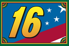
The #16 looked so much better before the Biffle era began; even the clunkly-numbered Wally Dallenbach Keystone car was better than what’s out there now!
Wrote a blog about that a few months ago.
link
I heard back from one of the players on the team….the black tape is covering a sponsor logo.
Not uni-revelant, but i love the designs of the kaiju and the mechas in Pacific Rim.
Kurt Rambis and some other Lakers in the 1980s would wear Body Glove braces and pads sometimes too.
link
Magic with a Body Glove ice pack:link
“(2) Here’s a basketball team comprised of Pacific Southwest Airlines flight attendants.”
Yowza’!
PSA ruled in the 70’s, as a kid, I used to fly between Sacramento and San Diego by myself, and the flight attendants would just dote on me the whole time, it was the best.
In response to your ESPN column, at least Dave Parker, Dennis Dennis Eckersley, and Joe Torre wore different batting helmets of teams they played and/or coached for in the past or, in Parker’s case, would go to play for later in his career.
Had an idea for a Uni-Watch project, Best and Worst uniforms from defunct sports leagues. This would be a once a week thing, where each week, a sport is chosen, and Paul’s choice for the best and worst uniforms from the defunct leagues of that sport are shown.
XFL: They all stunk. But I kind of liked the Birmingham Thunderbolts’ helmets, with the logo on the front instead of on the sides.
There’s a 7-way tie for the worst, but the top spot belongs to the Las Vegas Outlaws:
link
XFL uniforms most definitely did not all stink. Only the Orlando Rage’s uniform sticks out as awful. The Chicago Enforcers’ set wasn’t too good, either, despite a great logo. The rest, including Las Vegas, had overall good looks.
If you take logos alone, then Chicago, the San Francisco Demons, and our Hitmen had a great ones. Two were terrible: Orlando, and the Memphis Maniax.
Georgia State unveiled its new unis via Youtube today-
link
12 different combinations of helmets, jerseys, and pants.
link
Didn’t Tom Seaver once use a Dodger helmet while batting in an All-Star Game?
A’s will wear these on July 27 for their 1969 throwback game
link
Heaven forbid that a team would choose to be patriotic and incorporate the flag into their uniform for a game. It’s not the end of the world.
Nobody said it was the end of the world. But some of us think it’s a lazy, unfortunate trend that needs to stop.
Padres are looking great in their PCL throwbacks, at least the players that chose not to disgrace the uni by wearing pajama pants. Those stirrups are awesome.
I’m disappointed the Giants couldn’t dress as the Seals, or better yet, maybe the Mission Reds since I believe they became the PCL Padres ultimately. It would require a mixing of eras,
But would have looked great.
The Red Sox vs the Oakland A’s are playing Color on Color, Navy Blue vs Dark Green… Seems a bit different to me because the two colors are so dark… Isn’t one of the teams supposed to be wearing a contrasting shade?? (i.e. Dark Green vs Grey, White vs Navy Blue, or even Dark Green vs Red…)
The pink jerseys the Wilmington Blue Rocks are wearing look more like racing silks than baseball uniforms.
Simply wish to say your article is as surprising. The clearness in your submit is simply excellent and i could suppose you are knowledgeable in this subject. Well along with your permission allow me to grasp your feed to keep updated with forthcoming post. Thank you 1,000,000 and please keep up the rewarding work.