
Click to slightly enlarge
Word began circulating yesterday that a new Phoenix Suns logo set had leaked. Here are some thoughts:
• I’m always happy to see less purple in the world, but come on — black? Seems like a team called the Suns should be about the last franchise to emphasize black. Can a black alternate uni revival be far behind? Yeah, I know — black light, midnight sun, black to the future, blah-blah-blah. Those will all make snappy marketing slogans, which I’m sure will have great appeal to 17-year-olds. But what about the rest of us?
• I really hate the notched lettering.
• I also really hate the secondary logo with the black sun inside the S. Awful.
• On the plus side, I think the updated “PHX” lettering on the “rising phoenix” logo is an improvement.
• Meanwhile, here’s an interesting detail: On the primary logo, the basketball has been rotated slightly — look at the stripes. It now looks more like it’s “facing forward” as it moves. A small but thoughtful upgrade.
Or at least that’s my take. What do you folks think?
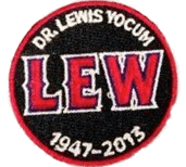
Equal opportunity memorial: As you’re probably aware, the Angels have been honoring former team orthopedist Dr. Lewis Yocum with a chest patch. Nothing unusual there. But with the Mariners in Anaheim last night to wrap up a four-game series, reader Peter Chiappinelli notice something odd: Three of the Mariners — Kendrys Morales, Raul Ibañez, and Felix Hernandez — were wearing the Yocum memorial patch (click to enlarge):
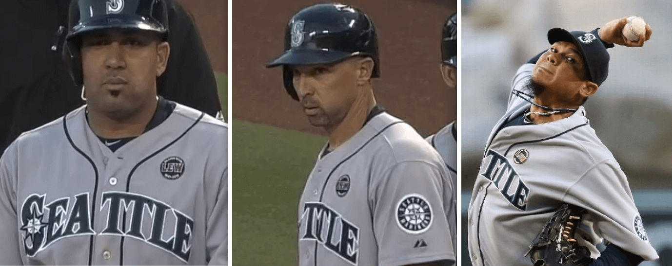
None of the other Mariners in the game were wearing the patch (although I suppose there could have been some players wearing it on the bench). “I can understand Kendrys wearing it, given his history with the Angels,” says Peter. “But I’m not sure of the Ibañez or Hernandez connection.” Neither am I. (Update: Here’s an article about Hernandez wearing the patch. Has some good background info but mistakenly states that he was the only one wearing it.)
Hernandez, of course, is a starting pitcher, so he would not have appeared in any of the three previous games in this series. But what about Morales and Ibañez — did they wear the patch on Monday, Tuesday, or Wednesday? I went back and checked the video, and they did not wear the patch on those days. So their patches were added just for last night’s game.
All very interesting. Can anyone else recall a team’s memorial patch being used selectively by players on an opposing team?
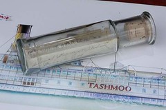
PermaRec update: A century-old message in a bottle, shown at right, is the subject of the latest entry on the Permanent Record Blog.
Uni Watch News Ticker: Latest school to drop its Native American mascot: Radnor High School in Pennsylvania. Slowly but surely, people (from Bill Waldron, Jr.). … Matt Holiday of the Cardinals gave new meaning to the term “big fly” last night, as he hit a home run with his fly unzipped. Further info here (from Ryan Bowman and Patrick Walsh). … Good article about LeBron James’s headband. ”¦ New kits for Maccabi Tel Aviv FC (from David Ariel). ”¦ The Akron Aeros wore 1980s Cleveland Indians throwbacks on Wednesday. Is that common, for minor league teams to wear big league throwbacks? (From Jeff Moulden.) ”¦ You don’t often see color photos of the Packers from the pre-“G” era (from arrod Leder). … If you’re gonna have matching outfits, this is how it’s done (from Brady Graham). … Here’s the logo for the 2018 Winter Olympics (thanks, Brinke). … New home kit for Celtic (from JK Chaney). … According to this obituary, former Phillies catcher Stan Lopata wore sunglasses behind the plate back in the 1950s, and he and Cards catcher Bill Sarni played without chest protectors during a particularly hot game in 1954 (from Kurt Esposito). … Yesterday I Ticker-mentioned that Abilene Christian had new football uniforms. What I didn’t mention, because I didn’t notice it until just now, is that their new helmet logo has a squiggle on tiger’s forehead that looks somewhat like a Nike swoosh — surprising, given that the new uniforms are from Adidas. … You know the country has officially gone loony-bin for this camouflage nonsense when the Nats’ racing presidents goe G.I. Joe. Enough! (From Max Weintraub and Hal Gordon.) … Did you know Auburn football wore green jerseys for two seasons in the late 1930s? It’s true (from Clint Richardson). … New home kit for FC Anji (from Lucas Ehrbar). ”¦ The Brooklyn Cyclones wore very odd-looking “Irish” uniforms last night. Even weirder from behind.
Just to clarify the thinking by the Nationals (not justifying the G.I. Joe unis on the Presidents), it WAS U.S. Army Appreciation Night last night at Nats Park. They even held a public re-enlist event on the field before the start of the game.
Oh, for fuck’s sake… EVERY NIGHT is now “U.S. Army Appreciation Night.” Or Military Appreciation Night. Or Armed Forces Night. Or Military Industrial Complex Night…..
“I presume you’re advocating for Lion Tamers Appreciation Night”
That depends. Will they be giving out free whips? Or better yet, live lions?
And three of the presidents they represent served in the Army in one fashion or another. The thing is, on the mascots is exactly where this kind of thing belongs. Players should wear their normal uniforms to play a game; if the players want to wear camo, they should attend the pre-game enlistment ceremony and join the Army for real and actual. But the mascots? Who wouldn’t want a photo of their kids and camo-George to remember Army Appreciation Night?
Please tell me you’re joking. OK, so Washington served in the Army — but did he wear camouflage? NO! This is just another lazy, reflexive way of making camo an all-purpose signifier for patriotism. It blows.
Paul, I think you’re reacting here to the general trend, not the particular case. Though yes, I was joking about the presidents – Lincoln’s “service” in the Black Hawk War was something Lincoln himself mocked: “If he saw any live, fighting Indians, it was more than I did; but I had a good many bloody struggles with the mosquitoes, and although I never fainted from the loss of blood, I can truly say I was often very hungry.”
But in the particular case, the Nats weren’t using camo as a lazy signifier of generalized “patriotism” last night. They dressed their mascots in something very much like actual Army uniforms for Army Appreciation Night. This was the first home game after the Army’s annual birthday celebration, which is kind of a big deal in Washington. There are places in America where the military, or one uniformed branch, is effectively a local industry. Washington is one of them. Army Appreciation Night in DC is no different from Quaker Oats Night in Cedar Rapids, Iowa. And to the extent that the team is going to do an event like this, dressing up the mascots, not the players, is exactly the right way to do it.
Week after next, when the Nats will no doubt do camo crap as a lazy stab at “patriotism” for Independence Day, I’ll be right there with you bemoaning the death of republican virtue. But it’s important to take each case for what it is, and in this case, the Nats did things exactly as I wish every team would handle military tributes. On its own day, not appropriating another holiday, and confined to “in the stands” stuff like the mascots, not on the players’ unis on the field.
Aw, c’mon, PL, it WOULD be funny if the ridiculous (in a good way) Washington mascot guy dressed up in camo. Scott’s got it exactly right, imo: players wear regular unis, silly mascots wear whatever. I too have problems with the relentlessness of let’s-celebrate-the-armed-forces occasions, but it’s basically become just another way to goose the box office and build a fan base. Mascot territory, in other words.
Speaking of Geo Washington, you can go back to the late innings of yesterday’s comment board to see how unhinged I can become at the mere mention of his name. It’s a problem, and I’m sorry.
There are places in America where the military, or one uniformed branch, is effectively a local industry.
But there are no other “local industr[ies]” that get this honorific treatment. Do the Tigers dress up in factory overalls for “Car Industry Night”? Do the Mets dress up as stockbrokers for “Wall Street Night”? (Note to Mets management: This question is strictly rhetorical.) Do the Dodgers dress up as actors or agents for “Hollywood Night”?
Only the military gets this rubber-stamp celebration. It used to be a limited thing, but now it happens all season long. EVERY FREAKING DAY is military appreciation something or other at some ballpark. It’s absurd. Along the way, the trend has turned camouflage into an all-purpose signifier, a code, a dog whistle. It’s ludicrous, and it promotes that nonsense notion that sports are “battle” and players are “soldiers.” As I’ve said many times before, if they insist on doing some sort of uni-related military tribute, there’s a better and smarter way to do it: Wear throwback uniforms from military baseball teams.
You say you have to take each instance as it comes; I say you have to take all the instances in the broader, cumulative context.
Meanwhile, it’s worth remembering that not all soldiers are heroes and not all heroes are soldiers. Where is Peace Corps Appreciation Night, Teachers Appreciation Night, EMT Appreciation Night, Literacy Volunteers Appreciation Night? Just askin’.
I’m wondering where the wearing of first responders’ caps sits in the context of this discussion.
I do believe there is a qualitative difference in between the military and say, the Wall St. example, in that stockbrokers don’t normally put their lives at risk as part of the job. The same, however, cannot be said for police, firefighters, EMTs, etc.
That being said, I am tired of all the camo gear.
I do believe there is a qualitative difference in between the military and say, the Wall St. example, in that stockbrokers don’t normally put their lives at risk as part of the job.
But Scott didn’t claim risking one’s life as qualifier for honorific treatment. He simply said the military is “a local industry.” So I took that logic and ran with it. Now you’re trying to move the goalposts.
If risking one’s life as part of one’s job is the new standard you’re proposing, then I presume you’re advocating for Lion Tamers Appreciation Night, High-Wire Walkers Appreciation Night, Skyscraper Ironworkers Appreciation Night, and so on — right?
I didn’t intend to “move the goalposts” as you say. Just to state what I myself saw as the qualitative difference.
Your counter-examples make me think of another distinction. None of those things are seen as a “social service”.
I’m not arguing that there should be military appreciation nights. I just understand why people feel the need for them and why they think they’re okay.
Me, I’d have no problem with Left-Handed Soft Rock DJs night.
The Nats have had Peace Corps night previously (Adam Dunn his final DC homer in a walk off against the Phillies at one that I attended) but don’t they have one listed this season.
Based on the photos I saw of a friend and his PC colleagues in West Africa, the Peace Corps “uniform’ would be loose fitting white button shirts and tailored khakis with boots.
Paul, I think maybe we’re talking past each other here. I’m saying it’s good that the Nats did this without dressing the players in camo. You’re saying it’s bad to dress players in camo. We agree!
And yes, as a matter of fact, I’ve seen minor league teams dress their mascots in, for example, Scout-like uniforms for Scouting Night. Dressing the mascot in a silly outfit is appropriate! Especially when it’s done in lieu of dressing the players in GI Joe outfits. As I mentioned above, any player who wants to wear camo should enlist in the Army. That crap never belongs on the field of play. Dressing up the mascots, but not the players, is how teams should do this sort of thing. None of the stuff that you actually cite as objectionable – all of which we agree on – actually took place at Nationals Park last night. No real holiday was appropriated or twisted into militarism night; no players dressed up in pretend soldier clothes; military tribute was not used as a stand-in for generalized patriotism; heck, it wasn’t even a generalized military tribute at all but a specific Army tribute on the game nearest the Army’s major annual institutional celebration.
Bottom line: The players didn’t wear camo on the field of play. This is a good thing!
The Nats have had Peace Corps night previously…
Seriously? That’s great!
Winter: Your new standard, “social service,” isn’t a bad one. As I think you’d agree, there are many, many kinds of social service — most of which are not honored at the ballpark — besides military service.
And frankly, I don’t think most of them need to be honored at the ballpark. All this stuff gets a bit overdone.
OK, I have to work on some actual work-related stuff now. Good discussion!
I don’t think honoring the military as a social service is a bad thing, per se. In fact, it’s great! I come from a culture where military sacrifice is rarely acknowledged, so it’s something appreciate.
That said, I do have the same concerns as Paul – the show of appreciation can turn into rah-rah nationalism and a martial celebration of military might.
I don’t think honoring the military as a social service is a bad thing, per se.
To be clear: Neither do I.
But I do think that doing it over and over and over and over and over again, while virtually every other form of social service goes ignored, is culturally and civicly unhealthy.
Just want to make a note. In combat conditions soldiers risk their lives but not every soldier takes such a risk every day.
In 2012 there were 212 American combat deaths. There were 127 police fatalities (down 25% from the previous year) and 82 firefighter fatalities. So last year, nearly as many first responders laid down their lives in public service.
Obviously we do see days in sports which recognize their sacrifice but nowhere near as many nor as visible as for the military.
Can you complain more about the Chicago Blackhawks, Cleveland Indians, Atlanta Braves, and the Florida State Seminoles for consistency sake? My god the “You might like” section on this website is starting to filter in Glenn Beck links.
I linked to a piece about the Blackhawks yesterday; I’ve had plenty to say about the Indians and Braves; I’m fine with the Seminoles, since they have a deal with their local tribe.
Glad we cleared that up.
I see many people making the same comparison between the Redskins and other Native American-themed teams, but they all seem to miss the HUGE difference: “Redskins” is an offensive term.
The difference between the Washington Redskins and the Chicago Blackhawks is as stark the difference between the New York Jews and the Florida Kikes.
Your analogy is flawed, as the “Blackhawks” name is a reference to a specific human being, not an American Indian nation. If you want to create that analogy, substitute “Indians” for “Jews” in your example.
I won’t miss the Redskins. They’re going to go with a very low-impact upgrade; maybe changing the name to “Reds” or “Redshirts” and putting a “W” or “R” on the helmet in a design mildly evocative of Indian feathers. It’s reckless to squander the emotional equity fans have put into their favorite football team.
Changing the Blackhawks, though, would be a crime against art and good taste. Hell, it would be a crime against color, too. Does any team use a broad palette as judiciously as Chicago? The Blackhawks seem to be better custodians of Indian iconography than the Braves, Seminoles, etc. They know what they have in their hands is precious, if you ask me.
Slowly but surely, people. This site has become such a joke. Keep the political views out of the topics. We ALL know how you feel about this issue. We don’t need your smart *ss comments.
Being anti-racism isn’t a ‘political view’, it’s common fucking sense.
The Nats ought to wear a “LEW” patch for rebuilding Strasburg and Zimmermann’s arms
The Aeros are probably wearing uniforms from when they were the Canton-Akron Indians. They were pretty much identical to the parent club’s, with the exception of a sleeve patch.
That’s a good point. If minor league teams throw back to the 1980s, many of them will likely be wearing exact copies of the uniforms their big league partners wore at the time.
I know the Tri-City ValleyCats and Brooklyn Cyclones played a turn-back-the-clock game a few years ago in which the ValleyCats’ uniforms mimicked those of the Astros rainbow uniforms and the Cylones wore 1980s-era Mets uniforms (I believe the ValleyCats uniforms actually had their nickname on the jerseys, while the Cyclones’ jerseys had Mets).
They do get points for using an ambigram for the SUNS wordmark.
Good point, McGee, and it does you credit as a judicious observer. I was prepared to hate the whole detestable graphic atrocity, but I certainly wouldn’t want to insult the ambigramophillic community.
The Suns have used an ambigram for much of their history; going back to it is one way to provide some continuity.
In reference to the colors, although black seems to be newly enhanced, I wonder if the Suns will be wearing orange uniforms on the road.
DJ, it’s already been confirmed that the Suns will have BFBS road unis, with sleeved orange alts:
link
What wordmark? I just see a vase.
Hernandez/Yocum connection.
sports.yahoo.com/blogs/mlb-big-league-stew/felix-hernandez-wears-angels-patch-dr-lewis-yocum-045717407.html
Thank you! I”ll add that link to the main text. But that article mistakenly states that no other Mariners were wearing the patch…
For Morales:
link
Maybe he did the same for Ibanez???
Saying the squiggle on the head of the Abilene Christian logo looks like the Nike logo is quite a stretch (just like saying the stripe on the old Broncos pants looked like the swoosh). No need to look for signs of the Nike logo when it clearly isn’t there.
I wasn’t looking for it; it just jumped out at me. If it doesn’t look that way to you, that’s fine.
Sometimes a cigar is just a cigar.
Not surprising that the Suns chose to go with the ambigram.
As far as NBA changes go, I’m looking forward to seeing the Pelicans (and that’ll be a fun mascot)
RIP Purple Suns, should have seen this coming with the black but not purple Sunburst throwback. Black and Orange is not the Suns from my childhood
Phoenix gets its name from the Phoenicians, who got *their* name from the color purple they used to dye royal cloths.
Sarver makes me long for Jerry Colangelo and I think Jerry is one of the more loathsome people in existence.
Change for change’s sake, for f*ck’s sake.
I thought it was named after the Phoenix, the mythical bird that rose from the ashes.
The notched lettering on “SUNS” gives it a 32-bit video game feel:
link
32? I think you’re looking at 16-bit there.
What a shame. If any team should resemble the “Astros” color scheme, it would be PHX. Would’ve been a great opportunity to update the palette to a combo of orange-red-yellow.
But to replace the traditional purple with black?
How unfortunate. Designers were drunk.
Orange-red-yellow would be great. I wouldn’t mind seeing a tequila sunrise Suns jersey.
And don’t forget with yellow – they can introduce a day-glo/highlighter alternate! /sarcasm
Who is “arrod Leder”?
Forgot the first letter of the first name of the dude who gave the Packers photo.
Setting aside purely aesthetic “do I think it’s pretty or ugly” considerations, the new Suns logos are all kinds of terrible. There’s no consistency among them, not in form, not in colors, not in type, not in the use of details like beveling. It’s as if each of the three marks was designed by a different firm, with yet a fourth hired to create a new wordmark based on the primary logo. The primary logo strongly suggests the shape of an S, yet the standalone S logo uses a different shape that doesn’t even match the wordmark’s S. Bevels everywhere except the standalone S logo. Black and orange dominate, except the secondary logo where the team reverts to orange and purple. Every element of the identity now shares a common italic skew, except the one major element that doesn’t. Every element has become more naturalistically rendered, except the major new alt that’s highly abstract.
Taken individually, I actually like just about everything the Suns have done here. (Except for the too much beveling. This ain’t Texas! Enough with the bevels.) But taken together as a unit, this is pretty much everything that could go wrong, did. Just bad.
Plus, didn’t the Supreme Court just rule that Arizona is required to have brick red, black, and tan for all pro sports teams?
The Phoenix Suns’ choice of purple is odd since purple happens during sunsets. Of course black is worse. Gold/yellow or even red would make more sense.
I think it’s a shame they’re de-emphasizing (if not outright eliminating) purple. I personally love the color, sort of have to since my alma mater uses it. Plus, it’s rarely seen on the professional level. If nothing else, it’s used less than orange and black. Pro sports need more unique color schemes – not more of the same.
Exactly. I am MASSIVELY disappointed that the New Orleans Pelicans color palette is navy, red and gold, especially given the wonderful possibilities that New Orleans culture offers.
How many blue and red teams do we need? We’ve already got the Wizards, Sixers, Pistons, Clippers, and Hawks. That’s an entire division’s worth already, and now there’s going to be another. Great.
My initial reaction to the Korea Winter Olympics logo was “Blech.” But I’m open to it. It’s super simplistic, but I think there is good reasoning behind it and it’s growing on me.
Comments on that page are very negative. I think one person said it best, though, when he said that it’s better than Lisa Simpson giving a BJ. Which I fully agree with. Logos don’t have to be super stylish. I think that they can be simple, especially if there is reasoning behind the design.
So, my take is that it’s not the best, it’s better than some (*coughLondoncough*).
Left out of the discussion is: though we have misgivings about the Suns’ new branding, the current uniforms suck rubber donkey lungs. Way too much grey on a team named after a star, clunky font, the only cool detail is the player number passing through the hoop. Also, though I miss the purple, black+orange is a colorway:) currently unused in the NBA. Do I think the new uniforms will be as good as the ones with the circus fonts and the setting suns on the shorts? Probably not, but they’d have to be abominable to be worse than the last two.
I always thought the orange and gray uniforms that they had reminded me of Home Depot.
I have to believe that the Suns are going to have a modified version of the fireball uniform, otherwise all hope is lost.
The sales on the HWC throwbacks were through the roof, as the team store sold out right away, and I can’t think that Sarver and company wouldn’t recognize that cash cow.
Right? RIGHT?
Cool “through the years” photo montage of some soda cans:
link
Awesome link. I love the old Pepsi cone tops.
The new(er) “SUNS” wordmark has been used on their court all season long, I think? I don’t follow the NBA at all, but if you do a quick google search of “phoenix suns court” you’ll see it.
I’m pretty certain it was posted in the Uni Watch ticker sometime before the season. I was confused when the season started and they didn’t have new uniforms.
I don’t at all like the Suns ditching the purple, but their uniforms were an absolute embarrassment, so at least some good will come of this. (To be fair, the rising phoenix logo still has purple.)
I see the Suns new logo and all that comes to mind is Soundgarden’s “Black Hole Sun.”
I’ll take the Suns’ Western font of 1973-92. Always thought that looked cool and distinctive.
link
Right you are, Jeff. I’d up the ante and propose they use the cool numeral font from that Sand-Knit prototype.
One of the best uniforms in the history of the NBA.
Wasn’t the sleek Suns design unveiled in conjunction with their acquiring Chas. Barkley? It always looked a little tired, even when it was brand-new.
An absolute beauty. Polar opposite of the joke uniform they’ve been wearing.
The Suns new logos are better because they have less purple, less chunky lettering and the new secondary logo, while resembling some sort of 1970’s indoor soccer team patch, is way better than that nasty old comic book looking one it replaced. Not to mention the two basketballs are now the same where as before each of the three logos had three different basketballs.
That being said, I agree with Jeff and prefer they not go away from their identity…the Western font of 73-92.
Borrowing a memorial decal from another team. Going off memory and away from a computer, so Teens, back me up?
When Wade Belak died, the Nashville Predators had a helmet decal in his memory. Pittsburgh Penguin Steve Sullivan (recently moved from Nashville) may or may not have had the decal by himself during the year. But when the Penguins visited Nashville, all of Sullivan’s teammates donned the decal in solidarity.
link, Mike.
Teens? I hope I’m not called that often. LOL
Autocorrect doesn’t recognize Teebz’s name…
So, that AZ central article says the uniforms will be unveiled in late September.
Fantastic…
The Suns’ secondary logo of the black sun inside the S…
if you look at it as negative space, it looks like two black spiked torture devices against an orange backdrop.
Ugh.
-Jet
That Packer’s link serves as a reminder that the Pack NEED to add stripes to their socks! What’s the freaking hold up????
This. It hurts my heart every time I watch a game now. Then again, so does the Pack’s lack of a run-game…
Re: Cyclones’ Irish jerseys
I actually like the design scheme as a one off (if we’re going to be stuck with one offs). I like the broad stripe wrapping around and giving way to a large logo on one side of the front. I don’t think the color scheme worked here (green and orange jersey with white pants) but I think it could look pretty good with the right color/logo combo.
I was thinking the same thing, and not even as a one-off. Could be a fine look for a team’s regular unis.
overall, I like the jersey, but why is the shamrock ORANGE, for fuck’s sake?
Maybe because it’s on the flag? And orange plays a significant part in Irish history?
I like ’em. Weirdness with a old-timey feel.
Interesting about Auburn wearing green jerseys. I had some color screengrabs of the Tigers practicing around 1947 and some guy wore green.
link
link
Couple of notes regarding the Astros which I didn’t see mentioned today which I thought were note worthy uniform/equipment wise:
1) In the top of the eighth of last night’s game, Alan Ashby told a story about when he was on 1977 Blue Jays. Doug Rader apparently was unhappy with the expansion team’s roster and uniforms so one day when both the GM and owner were in the locker room he held up the jersey and said loudly “If I play well enough, will I get called up to the big leagues?” Astros Announcer Bill Brown found that very funny.
2) Also in the top of the eighth, Jose Cisnero tried to pick off Carlos Gomez at second. The throw broke threw the webbing of Jose Altuve’s glove and went into center field. Ashby and Brown first called it a botched catch then after clearly seeing the ball go through the webbing and Altuve looking at his glove, agreed the error should be charged to the manufacturer.
3) In the top of the 6th, on Jonathan Lucroy’s home run to right center Trevor Crowe tried to make a leaping catch, hit the wall, and lost his glove into the second row of the stands. He was injured on the play. Video can be found here: link
RE: Minor League clubs wearing Major League Throwbacks
It appears in the below photo of Jonathan Singleton, he is wearing a throwback Colt 45’s jersey and a Corpus Christi Hooks helmet.
link
I don’t know when the game is from, but as he hasn’t made his major league debut yet I would imagine it is from a minor league game. If it is from one of his 18 spring training games from the last 2 years with the Astros it is even stranger he is wearing (what appears to be) a CC Hooks helmet.
Don’t know if this has already been posted, but they’ve an interesting new proposal on what to do with the Astrodome.
link
It’s interesting. Coupled with the ongoing improvements to the facilities at University of Houston, it would give the city three domed facilities, an MLS soccer stadium, two college football stadiums, and three D-1 basketball arenas (Rice, UH, and TSU), all within about a five or six square mile area.
It works out to something like 225,000 seats. Local boosters have dreamed for years of hosting the Olympics — this is probably part of an effort to mount another bid.
The plan calls for removing the four ramp towers that were added as part of a late 1980’s $100 million upgrade, completed in effort to keep Bud Adams from relocating the Oilers to Jacksonville. They still aren’t paid for, and we’re going to float new bonds to tear them down.
Meanwhile, in Seattle, the tax payer financed Kingdome, blown to smithereens in 2000, won’t have its debt erased until 2015.
The Yankees’ Old Timers Day caps will have a hashtag on the back, above the MLB logo.
link
BP hat material, patch on side, AND patch on back. Patches look to be pressed on, so it’s possible to peel them off with effort…
Is Billy Crystal now considered a Yankees old-timer? He shows up at all the old-timer events.
Bevels, black, “action,” grey, clunky font…yeech.
It used to be so simple, so good….
link
link
Are we sure that the Akron Aeros jerseys were throwbacks to the Cleveland Indians and not the Aeros predecessor the Canton-Akron Indians? If I recall correctly, those were the jerseys that the Canton-Akron Indians wore in the late 80s/early 90s.
Update from Calgary:
We’re getting demolished here. Downtown is underwater, 75-100k people evacuated. Its still getting worse.
The Saddledome is filled with water to the 14th row of the lower bowl. Everything below that (including the jumbotron, the dressing rooms, electronics) are destroyed.
Follow #yycflood on twitter for updates on a natural disaster in progress
I trust you’re posting from high enough ground. Best wishes to you and everybody in Calgary.
I need a ruling.
Can I say that I love the Blackhawks’ name and logo for completely illogical fan reasons while agreeing in principal that poached Native American imagery is a bad thing?
If purple-phobic Paul Lukas can give a raving two thumbs up to the New Orleans Hornets’ Mardi Gras alternates, then anything is possible.
//For the record, I’m with you.
If you feel that all Native American imagery in big-time sports is a bad thing, then no. No, you can’t.
If you feel that certain uses are acceptable and that the Blackhawks meet one or more of these criteria, then knock yourself out.
in case it’s not obvious, I was trying to reply to Thomas Juettner here.
I dont recall it being discussed here yet, but isnt the Mariano Rivera “memorial” patch a little odd for a player just retiring, not passed away?
(Apologies if this is a double post, but looks like my first post isnt showing up)
Dont remember it being discussed yet, but isn’t the Mariano Rivera retirement patch a little too much like a “memorial” patch as if he died and not just retiring?
The Suns’ purple and orange comes from the colorful desert sunsets we see regularly here, where the setting sun is an orange ball and the clouds have hues of purple. Rumors are Colangelo, coming here from Chicago, saw the sunsets for the first time and influenced the colors in 1968. The black stinks, and completes the BFBS here in PHX, Suns, D-Backs, Cardinals, Coyotes (if they stay here) and my beloved ASU Sun Devils who even tried to change Sparky (unsuccesfully) to black and gold.
Also, as a current resident of Alaska, I’d be highly offended if Arizona makes a claim for the midnight sun (sarcasm…kinda)
Hey Paul, you often mention that you’d like to see teams honor the military by wearing “throwbacks” of old military teams. While I think this is a great idea, I was wondering if you were aware that there still ARE military teams (and I’m not talking about the academies). I had the priviledge of playing on a military football team, and was wondering if you were just unaware of them, or if you specifically would prefer to see the older throwbacks on the field as opposed to the current uniforms (which are thankfully not camo).
Jose Reyes finishing his rehab in Buffalo, but wearing his usual Jays cap and helmet. Is this normal for guys rehabbing?
link
#1 on the jersey, #7 on the helmet
Very common for rehabbing major league players to bring their own helmets. As for the #1 jersey, he probably didn’t feel like renting the number from Buffalo’s regular #7 for the short time.
Photo 1: I thought chew was banned in the minors?
Abilene Christian’s mascot is the wildcat, not a tiger.
That secondary Suns logo. Ugh. Pick a theme forchristsake! Either the sunbeams OR the racing stripes! Not AND! You’d think one of these clubs would hire an actual graphic designer at some point.