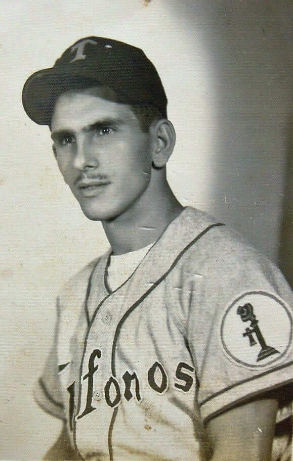
Reader Dennis Hasty sent me something completely awesome the other day: an old photo of a Cuban baseball player who played for a team owned by the local phone company — complete with a totally cool telephone sleeve patch!
I immediately forwarded the photo to uniform designer Todd Radom and Baseball Hall of Fame curator Tom Shieber, the latter of whom promptly quipped: “It immediately joins the list of top ten baseball patches. Actually, that might be a fun Uni Watch survey: What is your favorite baseball patch? Or: What is your favorite obscure baseball patch?”
Not bad. I have to say, this telephone patch ranks pretty high. I also love the chain-stitched rose patch on this florist’s team’s jersey, which I’m lucky enough to have in my personal collection.
As for MLB patches, I’ve always liked the Boston tricentennial patch, the Illinois sesquicentennial patch (here’s a close-up in color), and of course the trylon and perisphere World’s Fair patch. The St. Louis Browns’ Brownie patch is nice, too.
Memorial patches are trickier, because a simple black circle with the deceased’s number or initials is often enough. But if you’re gonna get creative, you could do a lot worse than the Harry Caray memorial patch.
I realize I’m just scratching the surface here. Care to nominate some favorites of your own? The floor is open.
OMFG: My latest One-Man Focus Group column is about the logo for the newly disclosed PRISM surveillance program. Enjoy.
Uni Watch News Ticker: NFL commish Roger Goodell has offered a qualified defense of the ’Skins name (from Brian Mazmanian). … Goodell’s remarks were quickly labeled as a “statement of absurdity” by a Congresswoman (thanks Phil). … Meanwhile, there’s an excellent piece about high schools that use the Redskins moniker here. … And here’s more about the Republican political consultant who’se been hired to assess the palatability of the ’Skins name, which I first mentioned yesterday (from Matt Shepardson). ”¦ Wanna see just how bad every MLBer’s taste in music is every MLBer’s walk-up music? Look here. … Someone on the Diamondbacks — it’s not clear who, at least to me — is wearing a wedding band on the field (from John Sheehan). … Adam Garrettson is interested in batter’s eyes. “A Philly friend told me they used to remove the batter’s eye when a potential sellout was going to occur, especially if the Reds or Dodgers were in town,” he says. “Then I came across this 1980s picture of Tiger Stadium — again, no batter’s eye.” This sounds like a subject for further investigation. … MLB All-Star Game apple sculptures are showing up around NYC. … Hu’s on first! (Thanks, Ricko.) … You’ve heard of playoff beards? Here’s a playoff lawn (from Alan Kreit). … A race car driver has an Ohio State-themed helmet. … Someone out there wants to create a line of “ergonomically correct” baseball bats, which look a lot like those axe-handled bats we’ve already seen (thanks, Phil). … The NBA’s draft caps are here (Phil again). … Also from Phil: New 75th-anniversary logo for the Baseball Hall of Fame. … Here’s approximately the worst of all possible worlds: G.I. Joe with purple trim. That’s Christian Brothers College High School in Missouri (from Joe Nguyen). … Here’s a story about Gatorade’s sponsorship of the NBA Finals. Of course, it neglects to mention that many of the cups, bottles, coolers, and other Gatorade-branded receptacles on view during the games may actually contain something other than Gatorade (rare non-DC-centric contribution from Tommy Turner). … Excellent illustrated history of the College World Series here (from John F. Jacobsen). … A reader who prefers to remain anonymous offers this story about Kentucky basketball: “My boss served as a UK basketball manager in the mid-’90s. I asked him why UK was willing to go with the infamous denim uniforms, and his response was simply that Converse was willing to pay to have UK wear them. Then he said Nike had been trying to get UK to wear black uniforms as early as the mid-’90s, but Bill Keightley flat-out refused. Mr. Keightley told Nike that black wasn’t a school color and therefore the Wildcats weren’t going to wear black uniforms on his watch. The story is even more appalling/ironic when you consider that UK finally broke down and wore black uniforms in 2008 specifically to honor Mr. Keightley.” … New logo for the Minnesota Wilderness (from Dan Schneeman). … The NFL Players Association has begun selling a line of LGBT pride T-shirts. Good for them. … I think we already knew this, but just in case: The Angels and A’s will wear 1969 throwbacks on July 27 (from Rich Paloma). … Here’s a closer look at Darnell Dockett’s rather intense-looking facemask. Keep in mind that he won’t be able to wear that rainbow visor in a game — only during practice (thanks, Phil). … Check out the design that the Boston Globe sports section cooked up for last night’s Stanley Cup Final opener (from Charles Noerenberg). … Think you know how to cook a steak? Maybe you do — or maybe you’re buying into a bunch of myths and falsehoods. Highly recommended reading (thanks, Kirsten). … Twins pitcher Brian Duensing is sponsoring an American Legion baseball team in Nebraska, so they’ve named the team after his uniform number (from David Westfall). … Looks like the Ravens may be going without the neck roll and without the Nikelace this season. Yes, I realize that’s a practice jersey, but the Ravens have traditionally used game jerseys for practices, because coach John Harbaugh wants to duplicate gameday conditions as much as possible (from Michael Strittmatter). … Check this out: a tequila sunrise, logo-creeped socks, and eye black on a pitcher — all in one player (from Cort McMurray). … Gabe Ortiz notes that Pirates 3B Pedro Alvarez wears his cap over his ears. ”¦ The Twins’ scoreboard “action” shot for Oswaldo Arcia is from Jackie Day, which is an odd choice (as noted by Brett Stone). ”¦ Patrick Corbin of the D-Backs has been wearing a mouthguard (good spot by Matthew Gunderson). ”¦ Mick Jagger had a Blackhawks jersey for one of the Rolling Stones’ recent Chicago shows (from Steve Mandich).
I’ve read that the guy with the wedding band getting slammed into the railing is Arizona’s assistant hitting coach, Turner Ward. link…33004.33978.1.34748.8.8.0.0.0.0.127.606.6j2.8.0…0.0.0..1c.1.17.psy-ab.h_WApdsqdb8&pbx=1&bav=on.2,or.r_cp.r_qf.&bvm=bv.47883778,d.eWU&fp=49d250d6fead67fa&biw=1280&bih=679
(Sorry for the horrible looking link.)
I like the Dodgers bicentennial patch they wore in 1981.
Came across link while watching MLB Network a few years ago. In my mind, I can’t shake the fact that it sort of resembles the logo for Marvel comics link.
If it’s a tribute to the ’32 coach, how about the Washington Lone Stars?
link
Maybe the Dallas NHL team holds the trademark to that name?
Redskins it is, and Redskins it shall remain as long as the franchise is ownder by Dan Snyder.
Personal bias, and it was overshadowed by the fact that the Tigers were also wearing their link that season, but I always liked the link The Tigers wore a very similar patch 50 years earlier for link.
The Tigers’ link was also very well designed.
Don’t forget the patch worn by “The Bird” in ’76…
link
Now that the Stones are in Boston, link.
I’ve always liked link, which the Penguins wore in 1990.
this patch is my favorite, wish they’d go back to it every year:
link
It’s relatively new and pretty gimmicky, but I’m very found of the Rays 1979 fauxbacks with the City of St. Petersburg sleeve patch.
I know Paul and this website in general aren’t much into sports merchandising, but I’ve been trying to find a place to buy this patch without dropping $250 on an “authentic” jersey. Anyone have any tips?
link
Try websites/stores that cater to police/municipal workers. Seems like something that would show up on their uniforms.
I really liked the Twins’ “Eloise” patch the year after Carl Pohlad’s wife died. But that’s largely sentiment, as I found it romantic.
link Three versions to match the cloth color of the uniform (but not the pinstripes).
I guess I’d have to nominate Mr. Redlegs as my favorite full-time (non-memorial) patch.
For a Memorial patch, showing my Ohio bias with the Bob Feller one:
link
ed
I’m a bit partial to the Musial memorial patch the Cards are wearing this season; simple, classic look that honors the man without making the players look like NASCAR drivers. I especially like that they have three different versions for their three different unis.
In fact, I think the patch looks so good on their new alts that it could be a permanent part of the design (similar to the Bears’ GSH tribute)…and no one would be more deserving of that kind of honor from his organization than Stan.
Couldn’t agree more with the idea of making the patch a permanent part of the alternate.
I was struck by how good it looks onfield, while watching them play the Mets last night.
The Phillies Liberty Bell patch against the burgundy stripe really made those jerseys stand out to me.
Walk-up music. Uggh.
agreed.
Some nice (albeit b/w) Tequila Sunrise unis in the CWS photos.
Go to 1981, the year Arizona State won the whole shebang.
Perhaps, given the proliferation of Rainbow Guts thanks to Rawlings, it needs a revival in Tempe!
I liked the simplicity of the Pirates’ patch memorializing the late Pittsburgh mayor Bob O’Connor, not with his initials, but with his link.
Is it possible the name on the front of the jersey of the man in the photo is “Telefonos?” If so, that would elevate the awesome factor of the photo tenfold.
I agree. And somebody at Ebbets Field Flannels ought to be working on putting this into production.
Agreed! I’d buy one.
I really like how the font resembles the Firestone logo font.
link
It does indeed say “Telefonos.” No word on whether the patch also appeared on their link
For baseball anniversary patches, I find the NL 75th in 1951 to be my favorite. Memorial patches get a bit overlooked by myself, but the Bill King mike was nice.
Missing link for Patrick Corbin in the ticker.
Thanks. Now fixed.
My biased picks for best patches include:
Milwaukee Brewers County Stadium patch –
link
Milwaukee Brewers Home to Heroes patch –
link
link
Not a clinker in the bunch. Nice!
Unless there’s a medical reason for that facemask Darnell Dockett’s sporting, it looks ri-damn-diculous.
There’s a fine line between intimidating and ridiculous. I think his falls into the latter category.
On function, it’s awesome. Nothing for a lineman to grab! You’d rather have an improved chance to sack the quarterback or make the play, as opposed to just setting the offense back 5 or 15 yards on a facemask penalty.
On form, NOT A FAN.
On the point of function, I’m sorta surprised that football helmets haven’t become indistinguishable from motorcycle helmets yet.
Raiders should wear link and Steelers link.
I’m really torn about that idea. Plenty of Raiders fans already wear that, or similar, so it completely fits with the team image… but something about seeing the my Raiders in a helmet that isn’t silver just seems wrong.
Ugh, damn indecisive brain.
“the my Raiders”
Good job, Jeff.
You had better be the best defensive end in the history of football before you take to the field wearing something that stupid-looking.
There is nothing that looks worse than some guy who goes all Mad Max: Beyond Thunderdome getting his head handed to him by a superior player.
Memorial patches start and end with Tom Landry’s hat.
For regular patches, I like the Ravens’ shield. Really makes those otherwise plain uniforms special.
While the sentiment and creativity were nice, I’ve always thought the execution to be poor….It was oddly sized.
From what I remember, it fit fine within the confines of a Cowboys jersey. I will grant you that a football jersey will make for some cramped dimensions, though.
I love the Twins Minne and Paul shaking hands over the river patch!
Ditto!
Agreed.
Hard to beat.
The batter’s eye was something that I wasn’t aware of until this last decade (before 2010, I mean), or so. I was going to say that I thought it was a more recent innovation, but the Wikipedia says that it goes back to the 19th century. Having said that, the Wikipedia also mentions how old Yankee Stadium and Fenway Park had to remove or cover seats up. Wrigley Field also removed seats for a batter’s eye. So even though it might go back to the 19th century, the older stadiums had not incorporated them.
I think the batter’s eye history would be an interesting research project. Obviously, all new stadiums incorporate them from the beginning. Nationals Park is one that has rotating ads. I believe it was last year that the ad sign malfunctioned and they had to put a green tarp over it.
(Grammar Police note: I intentionally used the article in front of Wikipedia just to be goofy.)
At Cleveland Municipal Stadium, the center section of the bleachers was painted darker blue than the rest and fans were prohibited from sitting there:
link
Fortunately (?), for most of the Tribe’s tenure there, it wasn’t much of a problem:
link
Ha ha! I went to so many games there with “crowds” like that. It was kind of a blast. There were so few people, you’d basically have your own personal vendors.
one of my fondest memories as a kid was at that stadium. My dad took my brother and me to a Tribe vs Mariners game. there weren’t that many people there that day(think it was one of Griffey Jr’s early career games). my brother drops his popcorn and lets out this bellow of NOOOOOOOOOOOOOOOOOOO…and then starts to cry. everyone in the stadium turns and looks at us.
I can believe it. You could hear everything in that empty place. My favorite Municipal Stadium koan: What is the sound of one fan clapping?
I think the Red Sox, who use a tarp to cover the CF bleacher seats for day games, have on occasion, had to give fans tee-shirts (green) when they need to use those seats on day games. A few years ago a night game was rained out and moved to a day game, so the fans who had night-game tickets to those seats sat in the batters eye during the day game… I can’t find a picture right now, but it’s an odd sight.
Yeah, Wikipedia includes that bit about Fenway.
So, I’m not crazy! I was sure that there were seats in (most) center fields.
Old Yankee Stadium had the distance to centerfield in black instead of white as part of the batters eye.
Stargell’s Star patch. Not so much for aesthetics, but for symbolism’s sake.
link
not sure if it has been said, but: i’m loving the fact that these big, mean, tough, intimidating NFL players are moving towards these big, mean, tough, intimidating masks… and the NHL is bitching at the thought of mandatory visors
one sport has composite stick blades, and a 6oz chunk of rubber flying around… the other sport has… i don’t know, help me out here?
Rugby: Football, for men.
…with odd-shaped balls.
…and ears.
Rugby: less is more!
I don’t have a dog in this fight, but I’ll say this – in NHL, the scary shit that could happen (other than the fighting and getting smashed in to the boards) is accidental and comes from inanimate objects, while in the NFL, it’s people (who happen to be big, strong and fast) whose intent is to put you on a stretcher. They’re both scary sports, just in different ways.
i guess what i’m really trying to say, is that all these new “scary” NFL masks, with the exception of ONE, are ALL “hey look at me” moves.
the NFL is total garbage from the top all the way near to the bottom. i won’t say “to the bottom” because the only people worth a damn on gameday are the equip. managers
It serves a couple of functions though – there’s the stated benefit of preventing facemask grabbing, which is illegal, but often aren’t called, especially against the offense.
And while you might poo-poo the intimidation factor, if a defensive lineman can alert the opposing quarterback to his presence and can affect the quarterback’s play even a little bit, there’s some value to it.
I know I’m a homer – but it won’t ever get better than the ‘HK’ Harry Kalas patch over the heart for me.
link
Also always loved this one as their sleeve patch in the mid-late 80’s.
link
My favorite memorial patch is the Twins Herb Carneal patch. Unfortunately, Creamer’s SportsLogos.net features a bad aftermarket ripoff, not the actual patch the Twins wore. On the real patch, the microphone is off-center and the colors are truer to the Twins red and navy, details that make all the difference.
To follow up on the UK – Bill Keightley story, it should be noted that the black unis worn in Mr. Keightley’s memory during the 2008-09 season had “Keighhtley” on the back, instead of the players’ names. Also during this season, the “K” in Kentucky on the front of the white and blue uniforms were black in Mr. Keightley’s memory. Unfortunately, later during the 2008-09 season, the team wore all-black unis with NOB.
For those not familiar with Mr. Keightley, he was known as “Mr. Wildcat” and was a beloved fixture with the basketball program for 48 years. He’s been honored with a “K” on the court in front of his customary seat on the bench. His name also hangs from the rafters at Rupp Arena. He died on Opening Day 2008 while attending the Reds opener. I had the pleasure of meeting Mr. Wildcat…he was a great guy and ambassador for the program.
Greatest patch: the Twins’ twins shaking hands over the river. link
Favorite patch: I’ve always had a fondness for the Expos. The brief time they made San Juan, PR a major league city (due to MLB greed, admittedly) is a great story, nonetheless: link
P.S. to Adam Garrettson: Tiger Stadium had no formal, removable batter’s eye. It’s 50k+ capacity and green (then blue) seats rendered the sparsely outfield lower deck the de facto batter’s eye.
Yes, those center field lower deck bleachers were some of the more claustrophobic, least popular seats in Tiger Stadium.
The upper deck bleachers were the infamous place to be.
link
Whatever my previous favorite patch was, it’s just been supplanted by that Telefonos patch. Magnificent!
Oh, and I absolutely want one of those A’s throwback T-shirts. They better have made more than the 10,000 they’re giving away at the game.
-Jet
Don’t really have a particular favorite patch, just a question. What jersey is Babe Ruth wearing in that photo of the 1939 World’s Fair patch?
Brooklyn Dodgers. IIRC, he was a coach for the Dodgers for a short while after retiring as a player.
Thanks. Makes sense, because the 1939 World’s Fair was in NY, and it wouldn’t make sense for the Boston Braves to honor it with a patch.
Anyone else visiting the site on a tablet and getting a “floating” banner ad? Mine is from some company called “Relay Rides.” Every time I scroll, the banner floats down to the top of the screen. Makes the site nigh impossible to read. But maybe it’s just me, and it’ll go away tomorrow.
Paul, is it possible to restrict the “mobile-friendly” template to just phones? Tablets should be able to handle the regular page, but still get stuck with the mobile design (which is inferior imho.)
FWIW I’m seeing the full site on my iPad. I only get the mobile site when I view on a phone, and even then once I click through to an individual article, I get the full site.
Hmm, I have a Nexus 7 and it pulls up the mobile site even when I “request the desktop.”
I pulled it up on my Nexus 7 using Chrome and there were no floating ads of any kind. And when I requested the desktop site, I got it.
In the late Fifties, the Victoria Rosebuds, then of the Texas League, had a full stemmed rose, chain-stitched sleeve patch, complete with green stem and leaves and delicate pink flower. Supposedly it was there at the insistence of the owner’s wife.
I like that one, about as much as I like el telefono.
Not a baseball patch, but I love the mug o’ beer patch from the 1977 NBA all-star game:
link
Great cover for the Globe.
A few years ago, the NHL had their Heritage Collection of knit acrylic sweaters for various teams. It made sense for designs that were actually knit sweaters, such as Original Six designs, less sense for teams such as the North Stars and Whalers (great as the designs were). The design they had for the Blackhawks was the black, white, and red barber pole sweater, which is, of course, excellent. But the more I think of the Art Deco-inspired black and white designs, the more I would like to see them available to buy.
Yeah, that cover is tremendous! I wonder who the artist is?
From Paul’s OMFG column:
“So many spying bureaucracies, so little time to create good logos for them.”
PRISM seriously needs to hold a Mark Cuban-style design contest.
Perhaps Philadelphians would find PRISM’s mission less objectionable if they went with this:
link
So Aaron’s and Michael Waltrip Racing often run cars promoting recent NCAA basketball and football national champions, and unfortunately… the Louisville paint scheme was just released, and it incorporates the ugly Adidas zubaz pattern… Though MWR has no relationship with Adidas, nor does the car carry any Adidas branding.
Louisville 2013 Champs Car
link
Alabama 2012 Champs Car
link
Kentucky 2012 Champs Car
link
Alabama 2011 Champs Car
link
Auburn 2010 Champs Car
link
Alabama 2009 Champs Car
link
It looks better on the car than it did on the court.
Today’s contribution to the Redskins issue: link
“I fear you’ll find out the hard way that if your team name only exists because there happened to have been a genocide, then it might be time to think up a new name.”
I think that is the best argument for changing the name that I have ever read.
That telephone patch is a beauty, but this one stops you in your tracks…
link
Almost link relating to the ’39 World’s Fair is stunning. Posters, photos, architecture.
No Phoenix Suns hat available at the NBA store. Seems to confirm new jersey/logo, right? Paul – any word on whether there’s a reveal before or at the Draft?
No word, although I agree that a makeover seems likely.
I had heard somewhere before that the Suns were planning a makeover for next season. Don’t remember where, but I did hear it somewhere.
Anything that gets rid of the “PHX” jerseys. Save it for the airport tags. Orange/Gray or Orange/Purple/White can all look good if done right.
I always liked the Bicentennial patches, both the one with the big star:
link
and the ones worn by sports teams in Philadelphia with the 76 making the bell clapper.
link
Forgive me if it has been mentioned, but I am at work and don’t have time to read through the comments. The Twins are probably using the Arcia picture from Jackie Day because that is the first game he played in. I remember this as I was at the game in a suite and the Twins president stopped by before the game and was talking about how excited they were about him and that it was his first game.
That Boston tricentennial patch is amazing.
I’m a huge fan of MLB’s old link patch. Been trying to work that into my day job for a while now.
This Mets fan also loves the link worn in ’08. Radom’s work, I do believe.
In re: the Yankee Stadium Patch
I realize that I am picking nicks here, but the fact that the patch is factually incorrect has always bothered me. The Yankees did not play in Yankee Stadium from 1923-2008. They played at Shea in 1974 and 1975.
Oops, “picking nits”!
Looks like Neil Walker had a tear in his pants in last night’s Buccos win against the Giants.
link
I wrote about the Redskins issue a while ago and quoted Paul a bunch. Goodell really looks pretty silly. Good piece on Grantland today about it. Also check out this post on Pyrite Tower: link
The Phillies Centenial patch is my favorite MLB patch:
link
As for those used in memoriam, it’s this one for those lost along with Alan Kulwicki back in ’93(though it’s technically a decal):
link
I have a couple Roy Rogers glasses with the 100th anniversary logo on it. One of my favorites as well.
“… Check out the design that the Boston Globe sports section cooked up for last night’s Stanley Cup Final opener (from Charles Noerenberg). …”
Excellent.
You know, I didn’t notice this until now, but that phone patch doesn’t have a cord running from the earpiece to the base of the phone. Odd.
ARGH…..now that’s going to bother me……….
Um, ever heard of Bluetooth?? Duh!!
(I have no idea what bluetooth is or does)
link
It always seemed like the Dodgers had great arm patches.
I always liked the Expos 1982 All Star game patch, “Partie D’ Etoiles.” And then there was that photo of Carter, Rogers, Raines, Dawson and Oliver at the All Star Game. How did that team not win the division?
I always liked the 1994 MLB patch.
I watch a lot of the Diamondbacks games… I’ve noticed most of the players wear small mouthguards. I’ve seen a lot of players fiddling with them during the game, Patrick Corbin seems to be the worst “fiddling” offender. They look to me like small guards that fit behind the lower teeth/jaw. I don’t know much about mouthguards and concussion prevention, but it seems like the dbacks team as a whole wears these for possibly a similar reason (again, maybe concussion prevention?).
I could be wrong, but I thought concussions were more about the brain getting bounced around inside the skull. I’m not sure what a mouth guard would do for prevention of that.
Well, it’s the commonly held belief, but there doesn’t appear to be any evidence that mouth-guards prevent concussions, and can in fact cause a Superman effect: link
Same goes for helmets too. The only proven preventative measure against concussion is retirement.
I’ve read certain mouthguards can (should) be used for concussion prevention (as the above poster mentions, nothing can truly “prevent” a concussion, but something is better than nothing). The ones the d-backs wear don’t seem to go over the teeth, but behind the teeth on the lower jaw. I’m not sure what that would be for other than for “concussion prevention”. (?)
Maybe this is the reason they wear the mouth guards.
link
rivera wearing a fashion yankee hat while meeting opposing team’s employees during his farewell tour
link
That’s a BP cap.
ah good call.
BP caps are just fashion caps for players, so in a larger sense Tony C’s point stands.
That ticker link to the meat myth story is a MUST read. Saving for proof to family members!
Even before it stood for a World Championship, I liked the 25th year patch the Mets wore in ’86.
Thought I would add to the craziness that is the eyeblack-tequila sunrise-logo creep socks pic. The crown of the hat is the same as the Taco Bell Padres’…
In Exhibition Stadium, the batters eye was a section of seats that were darker coloured, and in later years had a dark tarp pulled over it so that nobody was tempted to sit there.
Those were the prime football seats so of course they weren’t going to do anything permanent with them
link
link
Johnny Oduya apparently wears some short socks….
link
Paul,
I thought today’s subject matter would be a good day to share these two YouTube links of when I had an opportunity to show my MLB patches at Pro League Authentics in Philly May 2012 (other patches added since this was recorded).
Peter Capolino,former owner of Mitchell & Ness, and Uni Watch guest writer Morris Levin were among the small group on hand.
After reviewing the other comments before me today, I believe patch devotees will enjoy seeing some of the patches they’ve mentioned.
Two parts on YouTube:
link
link
Thanks.
Brad
I’ve always liked the Century 21 patch that appeared on the Seattle Rainiers’ jerseys in 1961 (and in 1962, too, I believe).
link
I can’t imagine a professional sports team today ever portraying its mascot smoking a cigar, so for the sheer audacity of that I give a nod to the link
The buckeyes racing helmet works well…Reminds me of the old Dale Jarrett/Bobby Labonte NFL helmets.
I would like to do a project on these, if I do would anyone be willing to help me?
The San Francisco Seals (and I believe the Oakland Oaks) “sister” to the Giants/Dodgers/Yankees trylon and perisphere patch (in honor of the concurrently running Golden Gate International Exposition was pretty nice… link
Hey Lukas, usually you are on your soapbox preaching against ads on uniforms and here today your main topic is how awesome this old advertisement looks on a baseball jersey…
Paul “preaches,” to use your terminology, against ads that are not necessary. The only way these teams would be able to survive is if they allowed sponsors to place their name/logo/etc. on their uniforms.
The 1983 White Sox had a commemorative patch for the 50th Anniversary of the All-Star Game, and this year’s throwback uniforms include that patch.
In 1984, they had a 6/46 patch to remember Charlie Lau and Loren Babe, two coaches who died that offseason.
In 1985 they celbrated the 75th anniversary of Comiskey Park.
buy and sell electronics, watches, mobile phones, blackberry in south africa