Click to enlarge
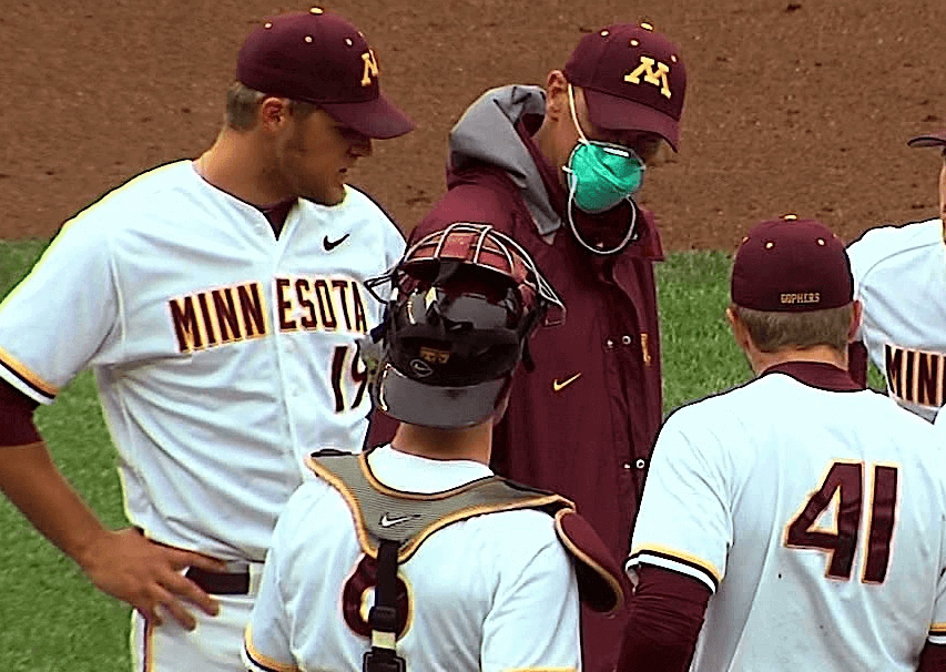
Here’s something you don’t see every day: Minnesota pitching coach Todd Oakes wore a surgical mask while visiting the mound during yesterday’s game against Illinois. “He has leukemia,” explains reader Tim Burke. “He just had a bone marrow transplant and is apparently very susceptible to disease right now.”
Wow.
First, let’s get all the snarky comments out of the way. Yes, it’s a shame he didn’t get a mask in Gophers colors. And no, I can’t believe Nike hasn’t provided him with a swooshified mask.
Now that we’ve dealt with that, I’m pretty blown away by Oakes’s determination. Very impressive that he’s working at all!
As long as we’re talking college baseball, here’s something else from yesterday:
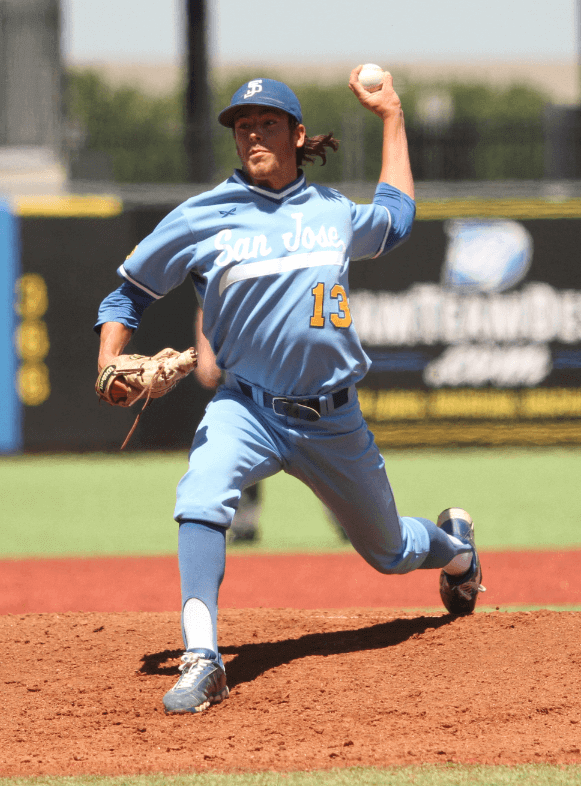
Thing of beauty, eh? That’s San Jose State from yesterday’s WAC conference tourney, but it’s understandable if the uni gave you a KC Royals flashback (gold number notwithstanding, natch). “That’s pretty big-time right there,” says reader Frank Mercogliano. “They’re not throwbacks — just one of their road uniforms for this year.” According to San Jose State’s SID, “[Head coach Dave] Nakama replaced the unis when he arrived and this is one of his selections. We also wore them once at home.” Very nice.
ESPN reminder: In case you missed it yesterday, my latest ESPN column is about the surprising location of the second-largest baseball card collection.
The knish is in the oven: Just thought you’d like to know.
Uni Watch News Ticker: The 1940 Oneonta Indians either had a puzzlingly simple jersey or else something was missing from that guy’s uni. “I have no idea what the scoop is,” says Todd Radom. “I was doing some research on vintage Phillies and came across it.” … Both teams in yesterday’s Braves/Twins game wore their BP caps. Anyone know why? … Menswear designer Alexander Julian, who designed the Hornets’ original uniforms, would like to design the new Hornets’ unis (thanks, Phil). ”¦ Speaking of Julian, here are two really good articles about him: one about his work for the Hornets and another about his work for UNC (both from Josh Hansen). … Steelers WR Plaxico Burress is launching a new line of fancy socks. ”¦ Check this out: a patent for a backless baseball cap (from James Gordon). … Awesome stirrups for Northern Kentucky University, although this dude is wearing them backwards (from John A. Gray). … I’m quoted in this article about Chicago sports uniforms. … New uniforms for United Airlines. … Rob Delaney doesn’t like long, baggy baseball pants (from Kyle Tarbet). … Two microbreweries are facing off in a court battle over their similar logos (from Patrick Barnett). … Speaking of beer, the Brewers and Leinenkugal are teaming up to create a new brew that will be called Bernie’s Barrelman Ale (from Ben Fortney). … Have I mentioned lately how good Hamilton Nolan is? Probably, but just in case: Hamilton Nolan is really, really good. Reprinted from yesterday’s comments: Check out this home plate ump wearing a cast on his arm. … Oooh, I gotta get me one of these (thanks, Kirsten). … Here are some photos of the Winnipeg Blue Bombers’ new field being painted (from Daren Landers). … Kevin Poss notes that Braves catchers Evan Gattis Brian McCann “appear to have a little bromance going with the hair-beard combo.” … Some very interesting eBay finds by Michael Clary, including a Reds rain slicker and a pair of super-cool NFL tray tables. … Why stop at desecrating the flag when you can also desecrate the Declaration of Independence while you’re at it? In case you can’t read the chest insignia, that’s the Lake Elsinore Storm (from Bryan Spangenberg). … Oooh, this is pretty cool: a gallery of MLB lifetime passes (from Adam Brodsky). … Ben Fortney has discovered a site devoted to really nice photos of stadiums and arenas around the world. … New kit for Man City (Phil again). … A revival of the play Good News! in Connecticut features some 1920s-style football uniforms (from Dave Sikula). ”¦ “I was watching the music video for Blink 182’s single ‘Adam’s Song,’ writes Danny Boyle. “In the video is a person wearing a cap that looks like a cheap Rays hat. But the video was made eight years before the Rays changed from green to blue.” Anyone know what cap that might have been? ”¦ So this is weird: The Mets’ stadium is surrounded by banners featuring notable past and present Mets. Inexplicably, one of the players featured is Keith Miller, basically a four-A player who had an utterly inconsequential career. So why is he on a banner? Possibly because he went on to become David Wright’s agent. ”¦ Also from Joe: This has got to be the best stirrups match-up of the year. That’s St. Louis University High (SLUH) and Hazelwood West, both from Missouri. (That noise you hear in the background is Mark in Shiga pointing out that the “27” on the black-jerseyed player is positioned too low. And he’s right!) ”¦ This is pretty awesome: 1932 footage of a box lacrosse game. Says Bobby Pinkham: “I always knew box lacrosse, particularly in Canada, was the summer version of hockey, but I never knew teams wore the actual sweaters (yes, sweaters during the summer!) of their affiliated pro hockey teams — in this case the Maple Leafs and the Canadiens. Pretty cool stuff, huh?” Indeed.
To everyone who’s been asking: Don’t worry, Uni Watch and I are still part of ESPN.com!
— Paul Lukas (@UniWatch) May 22, 2013
That Chelsea strip’s fake–it’s from March, and the team did the official reveal in April!
link
Yup, my bad. Now removed from Ticker.
The fact that Wright may have been able to get his agent a banner outside the stadium is utterly depressing. Do the Mets have no self respect?
No, I just think the Mets out of notable players from their past to fill all the spots.
If the Mets well had indeed run dry, why not put Sidd Finch on a banner?
The umpire with the broken arm is Ed Hickox – link
…and the cast is on his right arm.
Storm, huh? I’m glad you told me. I’d’ve never gotten it on my own. Seriously. I’m just no good at reading stuff in that graffiti-like “font”.
Kudos to Todd Oakes for even working immediately after being treated for leukemia. Talk about a true hero…
All of us should pray for Todd Oakes. As to Paul’s “snarky” comments, sadly there’s a grain of truth in them. The NCAA would probably invoke some arcane rule that his mask must be in school colors if worn on the field. And Nike or any of the other megabucks equipment and uniform conpanies probably will come up with logo-branded masks, etc. to show that “We care” while subtly promoting themselves.
It’s sad that something as precious as human life could be reduced to a battle of corporate logos.
Another nugget from the Big Ten tournament: How often do you get to see a team wear three different jerseys in two days? Gophers wore Maroon Thursday night, white for Friday’s noon game, and gray at 3:30 pm Friday.
My browser is showing the the comments “centered” and not left justified. New format?
Am I the only one whose comment section is completely page-centered?
No problems at my end. What browser and operating system are you using?
No problems on Chrome / Windows.
Definitely centered in IE. I’m forced to use it at work. The comments don’t nest either to show who was replying to whom. It looks neat, but it’s tough to follow the different paths people are commenting on. LOL
I think they nest- they’re all in the same box.
I’m centered on IE as well – even the Name/Mail/etc fields in the Reply pane are centered.
Looks fine on Safari/iOS, and also on Chrome/Windows.
I was watching the Braves/Twins game yesterday and the broadcasters said they (only mentioned the Braves caps, not the Twins’) wore those caps because they keep the players heads cool while on the field. Must be made of something different than their normal home cap?
They eventually acknowledged the Twins’ caps, too. Also, an Atlanta Journal-Constitution beat writer tweeted about it, noting that MLB approved use of those caps for hot/sunny day games.
I think the obvious question is this: if the BP cap material is lighter/cooler, why not use the same material for the regular game caps, too?
Being in Atlanta, I’m betting that the combination of a rainy, muggy couple of days in Atlanta, a late, rain-delayed, extra-innings game the night before, and a day game might have inspired both teams to wear the hats they had available in their lockers that might possibly be DRY by the start of the game. I certainly wouldn’t want to put on my sweat-soaked hat from less than 12 hours before.
That’s a reasonable possibility. The new BP hats really are fairly effective at getting a breeze.
The Twins wore their home BP caps on Sunday too. Why not – have 5 different hats to go along with the 5 different jersey tops….
I picked up a Mr. Met hat as a souvenior when I visited my Brother and his wife in NY.
I was talking to the guy at the store (Lids) trying to figure out if the new material shrinks (I wear anywhere from a 7 3/8 to a 7 5/8 depending on the manufacturer and material, and if I go with the right fit at the time of the purchase sometimes it can wind up being unwearable if the material shrinks), he didn’t have a definitive answer because they had only just gone on sale. He mentioned that they are trying the new design out and may eventually wind up using for the regular game caps.
I imagine that is why the MLB is granting their use in games (see their feasibility as game caps). It’s definitely a comfortable fit, more lightweight and definitely breathes better.
No Plaxico shirt garters ? Shame.
Not yet.
Re: Braves/Twins spring training caps, per the link…
The lightweight spring-training caps are approved for use in games, and #Braves and other teams planned to wear them on some hot/sunny days.
…#Braves and other teams planned to wear them on some hot/sunny days.
That’s, like, every summer day in Atlanta. Which is unfortunate, because I really don’t dig the BP cap.
In that case,
1) Why not make a version of their regular game caps with that material? They’d sell well, too, on the topic of what teams/league/manufacturer actually care about.
And
2) Any team that invokes the “heat” or “sun” excuse to wear BP caps while in the same game wearing a dark alt jersey should be slowly executed. From the front-office interns to the ace starting pitcher to the ownership. Wipe that team out and promote the top-grossing team in AAA to the bigs in its place.
For the Twins – the starting pitcher gets to choose the jerseys for that day. Worley was promptly demoted to AAA after the game. It was probably his 7+ ERA that caused it — but maybe not…. :-)
Now if Arr Scott was paying close attention, he would know that all teams have have cool base jerseys and standard double knit jerseys. The Twins road grey jerseys are the standard double knit and the blue alt that they wore with the bp cap is the cool base. So with that being said, the grey double knit would have been hotter to wear with no breathability compared to the lighter material of the cool base. And if Arr Scott wants to slowly execute an MLB team for stupidity, then wipe out the Mets for going black and wipe out the A’s for going black not once but twice.
I donated bone marrow about 2 years ago. Recipients go through more than people realize. I applaud that coach’s determination.
Knishes are delicious! Can’t wait for the shirt!
“Because your knish, your knish is on my lisht……” ~Oates
Is there any city where sports, food and puns dovetail more perfectly than in New York?
I got called into the office at 5:30 this morning, on an emergency. I threw on the first clothes at hand, a pair of shorts and my “New York Franks” shirt. There is no article of clothing I love more than that shirt.
Except my “Meats” shirt.
Great article by Pat Dooley about the NCAA being more worried about water bottle labels then student athletes well being.
link
Puzzled as to why a still-active player like Thurman Munson would merit a lifetime pass. It’s not as if he’d have much opportunity in-season to use it…
The ref in that box lacrosse video clip is quite dignified in his tie and white bucks … trying to prevent grown men from taking roundhouse swings at each others’ heads with wooden sticks!!
Perhaps it was awarded as a service-time accomplishment, as in after ten years as a player.
I thought the same thing when I saw the Thurman Munson lifetime pass. I’m thinking maybe this was something given to his family/children after his plane crash?
San Jose St. should wear sansabelt pants to go along with the v-neck pullover.
I read the article about Chicago sports unis, and I found this paragraph of the story ironic:
“Chicago’s uniforms clearly work. Any list of best the uniforms in sports has to include the Blackhawks. Lukas says the Bears’ are probably his top NFL uniform, the Bulls’ togs have carried over well from Michael and Scottie to Derrick and the ACLs, and the Cubs and White Sox wear traditional garb that fits in well with their long histories.”
Paul would not have the Blackhawks on said list.
You bring up an interesting point. The use of native American images at all vs uniform design aesthetics. If the Blackhawks (the tribe) played lacrosse and had unis like that, would it be bad? The Cleveland “Indian” cartoon is pretty offensive, while the depictions on the Blackhawks and Washington’s teams seek OK. The depiction not the name.
I prefer letting native groups affirm who can or can’t use tribe names and images. I also am in favor of native tribes running casinos and taking back the “white man’s” money.
Partially tongue in cheek, but can we still say “scalping tickets”?
Except the Blackhawks aren’t named after a tribe. They’re named after a WW I artillery unit, which was named after a specific human being:
link
Tim Leiweke wants to re-brand the Raptors. He wants them to be Canada’s team. This won’t turn out cheesy at all…
link
The Leafs & Jays are established brands; that’s why their simple look (based on today’s standards) works.
If they mimic Canada they are limited to red & white. The NBA is a teen market; multiple colours sell. Personal taste aside, what he wants to do won’t sell merchandise.
The Celtics are green and white. The Nets just switched TO black and white. Red & white could be done.
Also, lots of teams have switched to such a blue design that it’s as if blue is their only color.
Also, they could rebrand themselves without changing the name since a RAPTOR is also a bird of prey. The could just switch away from the dinosaur motif to a hawk/eagle/falcon type of thing.
Hard to say if the NBA’s main demographic would like the Celtics if their brand was introduced in today’s age…
I’m just one guy, but the Nets look horrible.
Hawks are taken. Falcons with the red/white might be too close to the Atlanta NFL team. Eagles? That would be ironic if they wanted to appeal to Canadian patriotism while using the US national bird!
It just doesn’t fit with the direction the NBA is going. The Hornets bright colourful look was popular enough that the NBA found a way to revive it in Charlotte. The NBA is just too colourful.
I also just remembered that the Houston Rockets have essentially been red and white since they switched to their designer uniforms… or when Yao Ming came into the league and they got that new logo. I guess the uniforms were technically red and silver, but that’s pretty close.
Didn’t you hear, Jurassic Park was just recently re-released in 3D. Dinosaurs are cool again, so the Raptors can keep some form of reptile for another decade or so.
I like Jason’s suggestion: Call ’em the Raptors but switch the icon to a bird of prey. [And birds, as we know, are direct descendants of dinosaurs, so it’s kinda cool on a taxonomic level.]
That doesn’t get at the owner’s desire to Canada-ize looks and colors. So maybe Jason’s bird could wear a Mountie hat. Or the bird could dress up like a Voyageur bouncing a basketball on a canoe paddle. Or you could superimpose the head of the bird on to that awesome statue of Lester Pearson in front of the Parliament Building in Ottawa. I’ll keep working on this.
Connie, you probably don’t realize I am from Toronto… Just kidding, I like Canadian jokes!
I’ll pitch in: they should use maple syrup like the Raiders used stickum in the 60’s…
Keep the name Raptors, change the logos, mascots, etc to an owl theme, throw a maple leaf pattern into the owl’s head or wings, and bam! Done.
And XKCD illustrates the case that birds are not descendants of dinosaurs: birds are dinosaurs. An owl is closer in both time and genetic mutation to a T Rex or, yes, a Velociraptor, than either of those dinos were to Apatosaurus or Triceratops. link
Owls are categorized as raptors.
As anyone who’s ever worn an unbuttoned flannel shirt over a black concert t-shirt knows, Rush’s breakthrough 1975 album “Fly By Night” featured a gigantic snow owl, soaring over a wintry landscape.
Rush is Canada’s Band.
The answer is simple: Keep the name. Make Geddy Lee the mascot.
To Connie’s particulars, the RCMP keeps a very tight lid on the use of Mountie symbols by non-Mounties. Even throwing a Mountie hat on a sports team’s mascot is probably a no-go, or at least not without hefty licensing fees to the Royal Mounted.
And Voyageurs is by far – by far! – the single greatest team nickname not currently in use among the top North American pro leagues. It still kind of irks me that Minnesota went with Wild instead of Voyageurs when we had the chance. If the Raptors became the Voyageurs, I’d force myself to try to like basketball as a sport just to become a Toronto fan.
Changing the mascot is nothing more than glittering prizes and endless compromises shattering the illusion of integrity. . . Yeah.
If the NHL returns to Quebec City, would they do so as the Nordiques, or as the Voyageurs? I would agree that Voyageur is a terrific name, except that when I was a kid, the Canadian version of Greyhound was called Voyageur, so I associate the name with the old, spectacularly grimy Buffalo bus station, and not with 17th century colonial expansion.
I may be wrong, but it doesn’t seem that a French-language nickname would fly in T.O. There are some feelings there.
The Mounties market their own line of merchandise, everything from stuffed teddy bears dressed like Dudley Do-Right to t-shirts bearing the rather beautiful RCMP crest. As Arr intimates, it’s not that the Mounties have a problem with exploiting their brand; they just don’t want anybody but them doing it.
Since they’re the only NBA club in Canada aren’t they already Canada’s team?
For most Canadians they are Canada’s team. There is a subculture in Canada that HATES everything to do with Toronto. The CEO is trying to appease a segment of the population that probably doesn’t like basketball anyway, even if the maple leaf is plastered all over the uniform. Good luck to him with that.
One more for Connie: the logo should be in a roundel made of actual Canadian bacon, sewn directly on the back of the jersey.
Huskies would work – prefer blue and white, throw in an obligatory Maple Leaf somewhere if you must (I’m Cdn – and while I understand the logic, I think it’s somewhat silly – when generally speaking none of the players are Cdn). As a long shot – go with the Toronto Northern Lights (although Northern Lights cannot be seen from here), it would be kind of a cool name.
I’m just venturing a guess here, but I’d say the hat in the Blink-182 video is probably an early attempt at Travis Barker’s clothing line… Or at least references him in some way.
Helmets for the new football program at DII Limestone College.
link
Chrome facemasks? No, there won’t be any glare problems with those.
i like those
Wait. For stirrups, the higher side goes in the back? I’m pretty sure that I wore the higher side in the front oh so many years ago when I was in little league. (Can’t remember for sure, though.)
Low in the front, high in the back. Thus has it ever been, thus shall it ever be.
Except, you know, when it isn’t.
Exactly why would it be that way, though? It seems counter-intuitive, as one would be likely to think the front of the foot would go through the side with the bigger “hole”.
It really doesn’t matter for the bigger loops (7″ and up) but for the smaller ones (4-5″) you run the risk of cutting across your achilles tendon if you have the lower side in the back.
Plus, it just looks better. Like a team photo. You don’t want the shorter players to be in the back row, right?
Okay, yeah, I can see where that makes sense about the tendon.
Color me shocked. I wore them for 12 years, high in the front. Wow.
What shocked me was the apparent presence of “Astro-Dirt” in that photo. Really? Now we can’t have real dirt in the infield but instead must have brown turf? First we lose the grass stains, now we lose the dirt stains? Sounds like a laundry-based conspiracy to me.
We’ll always have the pine tar stains on the back of the shoulder!
Re: the Astro-Dirt, I was at a pitching clinic with my son at North Park University (in Chicago) last spring and I noticed that their field was set up this way. It has real dirt around home plate and for the pitcher’s mound, but not around the bases.
My assumption at the time was that it was this way because the field is also used for football and this would make covering the sliding pits with green turf unnecessary, but apparently link for the football configuration.
My guess now is that it helps keep maintenance costs down.
That seems weird… you’d think they’d use fake dirt for the mound and leave the real stuff around the bases. After all, no one has to slide/dive into the pitcher’s mound.
Several college and even some high school programs are starting to join in on the trend. I’ve heard it explained as “less maintenance, lower maintenance cost, etc..” Basically, it’s easier. I’m not a fan, but I played on a field that was very poorly maintained, so I get it.
Knish?
Mazel Tov?
Watching the Canadian box lacrosse game, there are ‘violent’ sports and then there are ‘cracked-skull-brains-spilling-out violent’ sports. I know times have changed and technology is much improved, but ZERO attempts to protect the head and face area in box lacrosse and hockey?
This was 1933, you have to remember.
And that was a WOODEN stick that is bring brought across that player’s head. What you watched there, frankly, was aggravated battery.
Thank you Roy McMurtry. BTW-Number 2 for the Leafs was tough guy Red Horner, one of the stars of the 1932 Stanley Cup Champion Maple Leafs and the NHL’s all-time penalty-minutes leader until he was passed by Ted Lindsay in the late 1950s.
Worth noting: the website that box lacrosse video came from has some amazing footage on it:
link
Not least of which … baby boxing!
link
Just wanted to share this with the Uni Watch readers. I finally convinced my high school coach to let us break out the 1993 regional championship jerseys to wear (it’s my senior year and tonight is my last regular season game). Unfortunately, no stirrups (although the pants will be worn up) and no pictures of the pants yet. I hope to have some tomorrow.
The backless baseball caps won’t sell well to middle aged male fans with male-patterned baldness…..
In a vacuum, the Toronto Raptors would look great in royal blue, along with the Maple Leafs and Blue Jays. But that team will always be purple in my mind. I’d limit the red to a tiny accent color and the maple leaf on the back (a modern cliché, but it looks nice enough). I wonder how royal and purple would look together. Crayola time?
I’m not sure about royal and purple, but I think powder blue and purple is a great combination that nobody uses (to my knowledge). It doesn’t scream “Canada”, but it would look good to me.
What about using royal and red? It might be a little too garish, but when has that stopped a sports team? I’m sure black would be added as an accent, so maybe that could make it work.
Royal and red, if you break it up with some strategically-placed white, is used in hockey all of the time!
Royal and red? So, they’d look like the Pistons or Clippers?
Funny, I honestly didn’t think about either one of those teams. Huh. I’ll blame it on not being much of an NBA fan. I guess it does prove that color combo can work.
Sixers, too.
…not to mention the myriad teams across the sporting world that use royal and red.
The new Man City kit is lovely. The white socks are especially classy.
Nike continues to come through in club soccer.
Now if they would only apply the same aesthetic to college football.
I love the socks. They look really good.
And to their credit, Nike has kept the home kit very, very traditional: sky blue tops over white shorts. Nice.
The “training kit” are disastrous (they look like the sort of thing that portly middle aged men wear whilst boating: wide horizontal stripes in blues and white), and there are dark rumblings that the change kit will be a horror of white shoulders, asymmetrical stripes and gradients, but I’m keeping Hope alive.
Yeah, I’ve seen two away kit leaks, one as you describe, and one with black/charcoal panels and gold trims:
link
link
My son says the players’ line is heavy on the black and gold, and they’ve used that scheme before, so fingers crossed.
Even as a United supporter, that’s a great looking shirt.
I remember the Blink 182 cap being referenced years ago. I don’t think a consensus was ever reached on its origins.
At the Redskins photo shoot the other day London Fletcher had some new “Salute to Service” themed gloves on from Nike.
link
I had never seen those before.
Those don’t look any different than the ones used league-wide last season; the entire NFL, not just the Redskins, saluted military service in a variety of ways for a few weeks in November 2012.
Thanks, I must have missed those last year.
Carolina Hurricanes will be debuting their new unis on June 4th
link
Wow. That 1940 Oneonta uniform is fantastic. Brilliant, even. That takes restraint to a whole new level!
Pretty cool timeline of Michigan uniforms. Some really cool pictures from the late 1800’s and a great shot of Anthony Carter with no sleeve stripes.
link
I always knew Arr Scott was a cool cat, but then I see that he links to xkcd? Mind blown.
My favorite (hell, probably everyone’s favorite) xkcd:
link
Classic! I have a bunch saved to my phone, but that’s too much of a hassle to show ya in the comments.
Nah, I’m hopelessly square. Also, big difference between reading XKCD and understanding XKCD. I definitely don’t always fall into the latter camp!
*Leinenkugel’s
san jose state unis had a kansas city royals vibe? first thing i thought of when i saw the picture was the 1969 seattle pilots.
Ha! The sweat stain on his cap does mimic the Pilots’ old cap stripe just a bit….
I thought the same thing, when I was a kid the San Jose Bees were the single A affiliate for the Royals.
I thought the Braves looked pretty classy with the BP cap and their home whites. Always loved the piping on the belt tunnels for the Braves pants. Paul, we know how you feel about the Braves “screaming Indian” logo, but have you weighed in on the tomahawk under the Braves script? I have always liked that going all the way back to the Boston Braves and would hate to see that go.
Strictly from a design/aesthetic perspective, I’ve always liked it.
Culturally, though, it needs to go.
Culturally, though, it needs to go.
Why? You’ve lately been limiting your arguments on the Indian sports iconography question to an “intellectual property” view based on Native ownership of Native cultural imagery. Not my take on the question, but you’ve been consistent and interestingly novel in advancing this line of reasoning, so fair enough. So what’s wrong with the tomahawk?
The tomahawk is not, in fact, a uniquely Indian cultural item. Broadly, a tomahawk is a blunt or edged object of wood, stone, bone, or metal at the end of a short stick intended to be swung or thrown. Which is to say, it’s a tool or weapon that has existed in every known human society for at least 8,000 years. There’s no special Indian claim to that device. It’d be like saying the Cardinals can’t have a bat on their chest, because Neanderthals invented the wooden club and they’re not here to grant us permission to use their culture.
In the more narrow context of specifically North American cultures, the tomahawk or similar implements were not the most important or characteristic tool or weapon of all native peoples. As far as I know, not even of a plurality of them. Furthermore, European colonists, particularly French and British settlers, adapted the tomahawk from some of the first Eastern native tribes they encountered, and made it the ubiquitous tool and weapon of colonial frontier white society. Tomahawks were often issued to colonial militias, were widely carried by colonists serving on both sides of colonial wars between England and France, and were frequently carried by patriot forces in the War of Independence.
If the tomahawk “belongs” to any cultural group in the American context, it belongs to white folks, particularly those who can trace their ancestry to colonial times. (The ancestor for whom I’m named, for example, earned fame in the French and Indian War by leading a group of irregulars who carried tomahawks. So if anything, shouldn’t the Braves ask me for permission to use a symbol of my culture? If they did, I’d say yes!)
Anyway, I’ve presented the counterargument, but I don’t mean to suggest that I therefore believe you have no valid case to make. Just that I’m not seeing it, so I’m curious what your thinking is on the tomahawk.
Even if you wanted to make a case for the tomahawk in isolation, which I think if somewhat iffy, the Braves’ use of the tomahawk doesn’t exist in isolation. It’s part of a larger suitcase of imagery: The screaming Indian (which is still used on all sorts of merch), the team name, etc. It all needs to go.
Context matters.
But context doesn’t matter within the logic of the IP objection you otherwise maintain. Either the name “Braves” belongs to the native peoples whose ancestors held “brave” as a title, or it does not. Either the tomahawk belongs to native peoples, or it does not. If context, not directly attributable ownership is determinate, then (A) the IP argument as a whole is self-negating; and (B) the context of the Braves and Redskins being named for historically famous white people who dressed as Indians to stage a tax protest means that white Anglo Americans, not Indians, are the IP owners in question.
The whole idea of marketing a team with a Native American theme — and that’s what this is about — falls squarely within the IP argument I’ve been making.
It’s not like the Braves suddenly stopped being about Native American imagery when they fired Chief Nocahoma. They’re still about Native imagery (yes, even the tomahawk, since it’s clearly meant to convey a Native connotation). And that imagery still doesn’t belong to them. Which why it still needs to go.
“…the context of the Braves and Redskins being named for historically famous white people who dressed as Indians to stage a tax protest…”
The Boston baseball Braves were so named because of their owner’s connection to Tammany Hall, right?
And it’s plausible that the Boston football Braves were renamed the Redskins not only because they lost their use of Braves Field after 1932, but also because they recruited no less than 4 American Indian players (attendees/graduates? of Haskell Institute) for the 1933 season.
So it’s about “imagery” in the most abstract sense “belonging” to the linear descendants of the people to whom the “imagery” most broadly refers? This gets at why I’m so uncomfortable with the “intellectual property” or “ownership” argument. All those deliberately obtuse, bullshit arguments along the lines of “but what about the Minnesota Vikings? And the Fighting Irish? And did anyone ask Bill Donohue at the Catholic League for permission to use Padres?” – all of them become valid arguments in the context of cultural “ownership”. The only way to object to Indians but not Vikings is to raise the historical context of exploitation, genocide, and oppression. In which case, the “ownership” objection is reduced to a deceptive fig leaf for the actual objection of historical circumstance. So why make the “ownership” argument at all? Just advance the argument of historical context and save a step.
On a second front, I’ve never bought the notion that culture is or can be collectively “owned.” That just leads to all kinds of perverse outcomes. How dare the Rolling Stones appropriate traditionally black musical forms! How dare the French impressionists appropriate Japanese visual idioms! Plus, in a pluralist society like ours, everyone’s culture is all of our culture. Indian culture is American culture, as is Irish immigrant culture, as is Pacific Islander culture, as is Chinese immigrant culture, as is Anglo and German and Hispanic culture. If it’s OK for Ry Cooder to appropriate the forms and signifiers of Latino culture in his music, then it can’t be not OK for Indian cultural forms and signifiers to be appropriated, if “ownership” and thus appropriation are the issue.
Hey-hey, look at me with 2 ticker entries today. Maybe the most interesting gif on that stadium site is link of a gym that project different light patterns on the floor depending on what sport is being played.
(I have the nagging suspicion someone’s linked to this before.)
Turn over the lid on MLB’s Memorial Day camo caps, and next to the obligatory MLB “Authentic” hologram is an even bigger USMC hologram:
link
Does this mean that MLB is paying to license the camo pattern from the Marines?
I got an email or a text alert or something about getting some kind of perk when you buy $99 worth of USMC MLB gear.
So I’m guessing yes.
Also were we aware that the hats will feature untouched logos? Instead of the usual camo on the logos the entire hats will feature the pattern with the logo remaining the same colors as usual.
This may have been mentioned in the story earlier this week but I’m just now finding out.
link
I wonder if the ones worn for July 4th will be similar instead of the usual flagified logos.
If I recall correctly, the USMC owns the copyright to their current camouflage pattern. On an interesting note, authentic USMC fatigues have the EGA (Eagle, Globe and Anchor) interspersed throughout the pattern. That’s one easy way to tell if what you bought at the surplus store is actually “authentic” or not.
My understanding is that work of the federal government, which the USMC would fall under, is in public domain and cannot be copyrighted. So anyone *should* be able to copy the pattern and use it in merchandise.
An exception is if a third-party vendor was contracted by the USMC to create the pattern, in which case the copyright would be owned by the contractor and/or the USMC, but I don’t think that’s the case.
More flag unis in the cal leaguethis time in visallia all weekend and on the third. Second photo is adam eaton on a rehab stint for seven days.
link
link
Is Antti Niemi wearing an old jersey with a vector logo on the back? Kings v Sharks
DALLAS STARS LEAK – link
Maybe it’s time for a “Redesign the Toronto Raptors” contest.
Thanks for the shout-out, Paul! Indeed, link. And then that “cannot-unsee” terribly-positioned number pulls your eyes away from all the excellence.