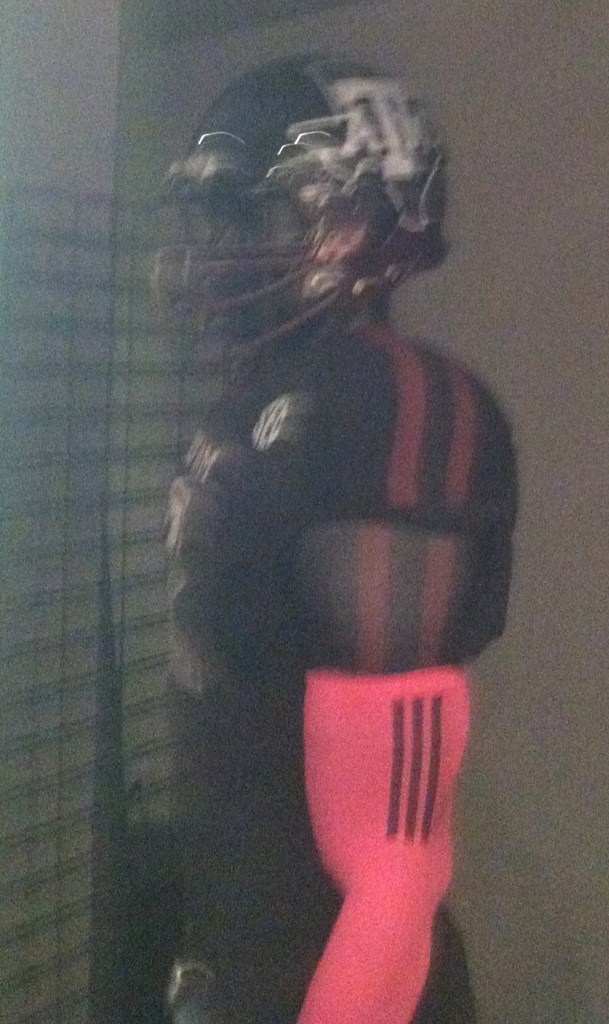
Hmmm, is this a new Texas A&M football uniform? Could be, according to a reader who prefers to remain anonymous:
I recently visited Adidas HQ in Portland and saw these uniforms in their football room. The helmets start black up top and turn to maroon toward the bottom. Facemask is the same way.
Interesting. I ran the photo past an Aggies-obsessed friend of mine. Here’s what he had to say:
If I had to wager, I’d guess they’re looking for something to trot out for their big Sept. 14 home game against Alabama, which is one of the most anticipated games in A&M history. Last year, that was the only game they wore the all-whites for. They wore the all-black ones for their first big game against a highly ranked team, Mississippi State.
Sumlin definitely seems to try to fire the team up with that kind of stuff.Now you’re gonna ruin the surprise and they’re gonna lose and Johnny’s not gonna win two Heismans and then I’m gonna wage a campaign for the Mets to wear black and purple uniforms.
(Update: Several commenters are pointing out that this is essentially the same uni A&M wore against Mississippi State last year. Only the pink arm sleeve is now. Ah well…)
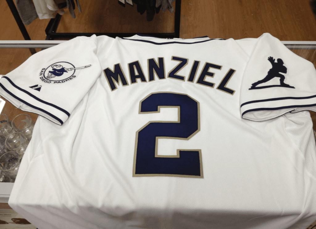
Speaking of Johnny Football, he threw out the first pitch at last night’s Padres game, so they gave him a jersey with a Heisman sleeve patch (photo courtesy of Jared Bremseth, click to enlarge):
And as long as we’re talking college football: Memphis is letting fans vote on two new proposed uni options, and Michigan won’t have alternate uniforms this season.
Purple Amnesty Day: Today is the seventh anniversary of the first entry ever published on this site. In keeping with longstanding tradition, that means today is also the one day of the year when the prohibition on purple-inclusive Uni Watch membership cards is lifted. So if you’ve been waiting to order the Vikings- or Lakers- or LSU- or Rockies-themed card (like Greg Cornwall’s LSU helmet treatment, shown at right), now’s your chance. Sign-up details, as always, can be found here. I’ll accept purple-inclusive orders until midnight Eastern tonight. (Of course, non-purple orders are also welcome.)
Bizarre chromatic coincidence: Today is also “Wear purple for lupus” day.
And hey, membership cards and purple aside — seven years! That’s pretty amazing. My thanks to each and every one of you for helping to make Uni Watch such a fun, successful project.
Uni Watch News Ticker: Another uni-notable thing about today’s date: It’s the birthday of Carlos May, the only athlete I’m aware of to wear his birthday on his jersey (my thanks to Brendan the Aspie for pointing this out in yesterday’s comments). … Bloody Nolan! “That’s from Sept. 8, 1990,” says Andy Chalifour. “Bo Jackson led off the second inning by hitting Nolan Ryan’s first pitch back to the mound. Ryan misplayed it and the baseball hit him in the mouth. Nolan Ryan refused to leave the game and went on to pitch through the seventh inning.” … Faaaascinating piece on how apostrophes are frowned upon in place names. … Rays pitcher David Price has been suffering from allergies that have been traced to the team’s uniform-laundering system (from Brian Mazmanian). … Buried within this story is the news that the Warriors will likely retain their sleeved jerseys for next season. … Good piece by Chris Creamer on the American and National League logos being updated. … Mets pitching prospect Zach Wheeler, who hails from Atlanta, was wearing a Falcons cap while in New York for a cortisone shot. … For the first time ever, Ebbets Field Flannels has done a college baseball throwback jersey — for Illinois State, 1969. … Dobyns-Bennett High School in Tennessee has some seriously weird baseball pants. “The head coach is the cousin of my best childhood friend, but I still haven’t had the balls to ask why these were even thought of, let alone produced game use,” says Daniel Hargis. … The Stockton Thunder (ECHL) will mark their first appearance in the Kelly Cup finals with this jersey patch (from Richard Paloma). … Did you know there’s a blog devoted to U.S. military uniforms? I learned that from this story about the military’s latest camouflage debacle. “And we thought the Jags had problems,” says Chris Weber. … Here’s a gallery of cycling shoes from the Giro d’Italia. “Sweet Jesus!” says a rapturous Sean Clancy. … Latest sports-themed soda display is for the Blackhawks. “Now that’s you honor Native American heritage,” says Jamie Uthe, with an indeterminate level of irony. … In a vaguely related item, check out this Blackhawks-themed barber chair. I happen to have that exact chair in my living room — only, you know, without the team design theme (from Brian Crago). ”¦ Small item at the bottom of this page informs us that the Rays are wearing camouflage on their current road trip. That’s, like, on the plane and the bus, not on the field (from Kevin Kleinhans). … All U. of Oregon teams will wear an “AR” memorial patch in memory of Alex Rovello, an Oregon tennis player who died last week (from Maks Skuz). … A Papa John’s delivery guy in Brooklyn was allegedly selling cocaine while in his Papa John’s uniform. At least this finally explains the longstanding mystery of why anyone in Brooklyn would order Papa John’s. “Yeah, gimme a large extra-cheese, half pepperoni, half coke.” … Ladies and gents, your Hillsboro Hops. The team’s inaurgural uniforms were unveiled yesterday (from Christopher Ouellette). … Did you know there were college football teams in Ireland? There are! And one of them is facing criticism for wearing Penn State jerseys (from Chris Flinn). ”¦ The Cardinals are giving away striped socks this Sunday and have produced a fun video to promote the giveaway (from Joe Mueller).
Battle of the Uniforms: Voting is still open in the LCS round until 9am Eastern. The World Series round, which looks like it will feature the Cardinals (no surprise there) vs. the Orioles (huge surprise there!), should be up and running by noon-ish today.
It’s not nearly as cool as Carlos May, but Sidney Crosby wears 87 because he was born on August 7, 1987.
Happy Anniversary buddy! Here’s to seven more years!
That isn’t a new uniform. That is the exact same black uni the Ags wore last year against Mississippi St., only with a pink arm sleeve
Happy Birthday Uniwatch! It is also my birthday and I wore the #17 all throughout my illustrious sports career through high school.
Of course, by illustrious, I mean i was terrible.
That apostrophe story hits home for me, literally. I grew up in St. Marys, WV and spent most of my childhood and early adult years telling outsiders there is no apostrophe.
My high school is also called the Blue Devils, and the school colors are PURPLE and gold. The town is all sorts of wonderful, I tell ya.
Oh, one last thing: I need one of those Hops hats with the logo, like, now.
“.. Faaaascinating piece on how apostrophes are frowned upon in place names. …”
OK, Coleman, I’m looking up St Marys (A period after the T? Or do you spell out Saint?), but first, a thanks to PL for running just this kind of not-especially-sports-related item, and congrats to same for seven years at the helm. Rock on.
Period after the T. No spelling it out. “St. Marys”
link
Sweet Mother of Jesus. This is getting scary. Not too long ago — a couple of years? — I asked you in this space about your hometown, and you sent me the same wiki link you just sent this morning. I (now) remember the picture 2nd Street! I need to buy a walker. And maybe a bib.
Ha! Well, some times wiki links are simply the quickest and easiest place for a little info, and St. Marys sure hasn’t changed much since the last time we apparently discussed it!
If it makes you feel any better, I didn’t remember either, and I’m only just turning 30 later this year!
Connie, ask Coleman to tell you how they pronounce the name of the town, “Hurricane, WV.” ;)
Ha!!! That’s where I’m living right now!
And to answer before ya ask, it’s pronounced “HURR-i-CUNN” or “HURRickun”. I can’t do phonetic spellings…
link
It doesn’t hit me relatively close to home too – I’m typing from an office building in Tysons Corner, VA, named after the former landowner, William Tyson.
Now, there’s talk of shortening the name to simply “Tysons” (and new Metro stations here will be called “Tysons East” and “Tysons Central”), which wouldn’t make sense since there’s no reason for the possessive “s” without the “Corner”. But I guess everyone’s so used to calling it “Tysons”, that “Tyson, VA” wouldn’t sound right.
Also, my old stomping grounds, St. Marks Place is a short street in East Village with a LOT of inconsistent signage thanks to the “St” and the “Mark’s”: link
Interesting, re: Tysons Corner. I don’t necessarily mean this in a negative way, but it sounds like another example of Americans’ ever shrinking attention span and love of shortening words. Why say (or type, LOL) Tysons Corner when you can chop it in half? It’s the same mindset that has given us the D-Backs, T-Wolves, Huskers, and an ever-growing list of shortened sports nicknames.
It’s not ALWAYS a bad thing, but it seems more often than not it results in names that have lost some of their historical meaning.
Apparently, people who run the area thought “Corner” felt too rural and sleepy: link
But Tysons Corner no longer exists. It was an actual corner. Now, the roads are still there and they still intersect, but what used to be like the only stop sign in miles is just one of a hundred identical traffic lights in a fully urban landscape of gridlock and glass hi-rises. A name changing when the thing it refers to has changed is not a sign of some lack of national virtue; that’s sort of how language is supposed to work.
Though I find the anachronism of Tysons Corner charming in a way that nothing about the reality of modern Tysons Corner actually is. So if it were up to me, I’d keep the Corner in the name. Kind of like Falls Church, though the actual original Falls Church does still exist in a way that the original Tysons Corner doesn’t.
What if Mike Tyson cut the ribbons on the new signs and Tyson’s chicken products were served at the kickoff?
Waiting for the “saint louis university” dont call it St. louis university talk. :)
I trace this back to Tim Horton’s changing to Tim Hortons.
OK, as a former grad-school Billiken, I’ll point out that the internet headers on the emails identified the institution as Saint Louis University, St. Louis, Mo.
The anagram is SLU, pronounced as a word (similarly, UMSL and WashU are pronounced as words as well).
I’d never thought about that. I’ve never heard people across the state pronounce “UMKC” as a word. My alma mater was formerly called “SMSU,” and I’ve never heard it pronounced as a word. And I think our friends in Columbia would shit a brick if we’d start calling ourselves “MisSU” or something like that. Probably just a coincidence (at least the SLU & UMSL, anyway), albeit a somewhat interested one, and nothing more.
These aren’t new
Happy Anniversary, Paul!
Congrats on the anniversary.
I’m a bit tired of the Lupus charity, but it’s my own fault. A few years ago I answered the phone and the caller said, “Hi, this is Lisa from the Lupus Society.” I replied “Thanks, but we don’t want any Lupus. Good night.” I think they were startled at the response, so that schtick went on intermittently for a long time. Because of that, I now have caller ID. Even now they call more frequently than other solicitors, though I retired that gag early last year.
Are you pro-lupus or anti-lupus?
link
I always thought lupus was a myth since it was never the diagnosis on House M.D. Then I got a job at a place that does a lot of work for a lupus charity.
Did you say Lisa Loopner from Lupus?
link
In the commercial for the Cardinals’ sock giveaway, a fellow parent from our daughter’s third-grade class works for the team in a marketing capacity; those are his kids jumping on the trampoline, etc. and the priest is the actual pastor from our parish in South County …
should we be offended by the Blackhawks barber chair? you know, with that whole scalping thing and all?
Happy Anniversary!
A. Happy Anniversary Uni-Watch!
B. Loooove the “Hillsboro Hops.” The name. The uni. The all-grey road set. The cap.
Yeah, those are spectacular.
I give ’em two years.
The script for those jerseys is gorgeous; the home “link” might be my favorite new wordmark in a long time.
Agreed, but the top of the H appears to break across the jersey placket. So if anyone opens his top button, the jersey will read H’opps. Terrible execution if so. Shift or slightly shrink the script so that the H is contained entirely on one side of the shirt and it’d be one of my favorite jerseys ever.
How long before someone gets uptight about high school kids wearing jerseys with an ingredient of beer across the chest?
It’s the Portland area, so either two minutes or never.
typo on the Blackhawks-themed chari?
Thanks. Now fixed.
Jordin Tootoo of the Detroit Red Wings kind of wears his birthday on his sweater. Born on February 2 and is Number 22. His last name is also Too-too, which is why he has always worn 2-2.
“…Swung on and missed for strike three!”
I hope Manziel didn’t take that Padres jersey home with him, or I smell an NCAA violation for accepting a gift coming.
He can get around that, all he has to say is “my daddy bought it for me”.
Isn’t it sad the khaki-colored outlines on their numbers and names sum up their “splash of color”?
Yes it is. Shame my hometown team, which once had a strong identity, has gone the nondescript “one of us” route
I thought that, too.
If all of their first-ball-throwers get one, maybe you could get around it that way. Sometimes random people throw out the first ball.
But, yeah, he (or somebody) should pay for it just to be on the safe side.
That’s pretty much the all black uni A&M wore against Mississippi State.
link
Man!!! Im going to the Cardinals game this Sunday – I wonder what the chances are of me sweet talking them into giving me some of those socks??? (Im a bit over 15)
We almost had tickets but then something came up and we aren’t going.
I was so excited for socks. I was totally going to take the ones they would have given for my daughter.
I think I still have an unopened pair of white tube socks for the Capitals that they handed out at the Cap Centre many moons ago.
The AL and NL logos really should be used more. And I miss the days when the umpires had AL and NL on their caps. I blame Bud Selig for all of this mess.
I also kind of wish that baseball would expand two more teams. And put the Brewers back in the AL and the Astros back in the NL.
No, thanks. We like being in the NL just fine. ;)
I’ve come to love having Milwaukee in the NL. First, it means they don’t play the Twins as much, so I don’t have to root against them as often. Second, it means they come to DC every year, and that’s always a fun series, even though I’m rooting for the Nats at those games. Used to be one of the series every year where you could get really good seats, since it wasn’t much of a draw for Nats fans or the DC poseurs who pretend not to really live here and root for their old hometown teams. Warshington is thick with that type.
But expansion to 32: Way past time. To think, it’s only been a decade since a mid-level Minnesota bureaucrat prevented baseball from contracting to 28.
Problem is where would you put them?
I have a fondness for Montreal, but there seems no interest in a stadium deal. Portland happily traded baseball for soccer.
There aren’t two willing and interested markets left. And even if there were, the sport would be better served by moving the Rays from a market that really doesn’t want them.
Could New York or LA handle a third team? Of course, NYC once had three. I’m sure that’s one option that could at least be explored.
Since I’m from the Southeast, I immediately think of a few options: Nashville, Memphis, Charlotte? New Orleans? I don’t really see any of these being a viable option, due to several factors. But perhaps they wouldn’t be out of the realm of possibility.
You mentioned Tampa’s struggle with the Rays, so would Orlando be a bad idea? Or looking outside the US, is there any other Canadian city that would work? Maybe Vancouver? Then there’s always Mexico City. What about Puerto Rico?
Two from this list:
Vancouver
Portland
San Antonio
Nashville
Charlotte
Indianapolis
Buffalo
In the mid-80s I remember doing MLB concepts for Denver (Riflemen), Washington Senators, Miami (Marlins), Buffalo (Bison) and Vancouver (Mounties).
As an outside-of-Orlando resident, I’m not sure a full fledged MLB team would be viable. Orlando doesn’t really have an upper level minor league team either, besides the southern leagues which play in Kissimmee. Disney had the Orlando Rays for a time but they moved to Alabama I believe about 5 years ago. I went to a game once, they drew in the hundreds. Although one would think with the high tourism Orlando draws an MLB team would work, just doesn’t seem to. A new stadium for a minor league team in the downtown area would be good though.
Until Havana becomes a possibility, the best MLB expansion target is probably Monterrey.
The A’s can’t even move down the road for a new stadium. Team’s are too protective of their markets.
Monterrey for sure, and honestly I think Montreal is viable. Yes, MLB went out of its way to salt the fields on its way out, but I’m not convinced Loria & Selig succeeded in their plot to make all of Quebec province hate the sport of baseball with Frankish fury.
But if not Montreal, then there are any number of midsize American cities that could support a team at the level of a Minneapolis, Milwaukee, or Pittsburgh. The whole Sun Belt is under-represented. And although Havana is tragically off-limits – the US embargo by now representing the single least successful policy in the entire history of human governance, Lysenkoism included – I’m not convinced that San Juan really couldn’t support a team. For one thing, statehood has become at least an even-odds proposition. And for another, while the island is on average quite poor, it has wealth disparity that puts even neofeudal mainland United States to shame. I suspect there’s enough income at the high end, and concentrated in and around San Juan, to support one top-level team. The NBA might be the slightly more viable option in San Juan, but I suspect MLB could work.
In any event, sending the contraction-era Expos to San Juan for a midseason horse-and-pony show was never a valid test of MLB’s viability in Puerto Rico.
I don’t think they’re quite ready yet … but within a generation or so, Charlotte should be abundantly able to support an expansion franchise, and Nashville is also a possibility. And if Castro finally pops a rivet, and the aftermath goes well to an admittedly unlikely degree, within a few generations we could be talking about Havana.
I’m not sure how great a destination Charlotte would be. I imagine it’d be a bit like Washington with the Nationals, but more difficult. Like DC, much of the ticket-buying population are transplants with preexisting allegiances. Tickets for Panthers games against NFC East opponents often end up in the hands of opposing teams, and the new team would have to convince Braves fans to switch.
Plus, college sports are big, and I sense a bit of a pro sports fatigue with Panthers getting public funding to upgrade a relatively new stadium and Bobcats being the Bobcats.
Then there’s also the problem any southeastern team would suffer – the damn humidity.
The Chris Creamer board points out the difference in league logos being the number of stars. One other very obvious change is that in the NL logo, the bird’s … collar? Not sure what the term is … now rests in front of the box, where previously it had been behind. I wonder how many other small nuances have changed.
Neck ruff?
Yeah … I didn’t shave very closely this morning. Funny you should notice.
I can’t believe the O’s are in the Uni-finals…and this isn’t even their best uni! That would be the 1966 set.
Jonathan Tootoo also wears his birthday on his jersey, sorta.
That is a 1991 Nolan Ryan card made by Pacific. HOWEVER, I don’t know where the “Bust” trophy came from or what it is supposed to mean. ???? My card collecting days are well behind me. Anyone? Seems to me Nolan is/was anything but a bust.
Speaking of Nolan Ryan and Bo Jackson, I recall arguably the most unusual baseball card in history involving those two players. Referring to Jackson’s inability to hit Ryan, the card said words to the effect “Ryan knows Bo”. Pictured below the caption was Nolan holding Jackson’s baseball card.
The trophy was added by a website, pretty sure they “grade” old cards. It’s an edited version of Topps’ “All Star Rookie” trophy.
link
Jordin Tootoo. My bad.
“Jordin Tootoo”? That’s not an athlete, that’s a minor Star Wars character.
Dobyns-Bennett High School in Tennessee has some seriously weird baseball pants.
I like ’em! Though I’m hard-pressed to say why; maybe just because they’re weird. It looks like some hoary old tradition handed down for a long-forgotten reason, like not picking up face-down pennies.
they should come with a matching vest and jacket. oh, and a bowler.
I wore my son’s birthday as my jersey number, sort of… His birthday is Nov. 9, and I wore #119.
Dobyns-Bennett High School in Tennessee has some seriously weird baseball pants.
Typo alert: You typed “weird” when you meant to type “awesome”. (Yeah, yeah, so wearing them without matching jerseys isn’t that good.)
Happy 7th anniversary! And my purple membership card order is in!
So is mine… Northwestern Wildcats themed. Happy blog birthday to Paul!
The irony is that, without the purple ban, I wouldn’t have thought to get mine in Charlotte Hornets colors (mid-90’s road alts). I probably would’ve gone with UNC basketball or Liverpool with the “96” above the NOB.
Purple Amnesty Day, combined with the SEVENTH anniversary (the number that appears in the header). Seems like there should be … more … like, a free pair of matching stirrups with every purple-inclusive card purchased today.
Apostrophe’s: I love’s ’em!!
Happy anniversary…Here’s to seven years!
Happy Anniversary! Found this ESPN gallery of throwback uniforms. link
p.s. I love apostrophe’s Patrick O’Neill a/k/a Mainspark
That’s pretty gorgeous, especially the Padres and Astros throwbacks.
I know you discussed the Wichita State flag uniforms in yesterday’s ticker, but I didn’t know if you saw that they wore some red, white and blue themed stirrups to go along with those jerseys.
link
Congratulations! Continue your awesome work!
Happy Anniversary Paul.
Regarding those pinstriped baseball pants. We sold several sets of colored pants with contrasting pins back in the late ’70s-early ’80s. Girls high school softball teams were the biggest proponents of the style.
The Dobyns-Bennett baseball unis are awesome. The fact that the pinstripes carry through to the jersey, just in reverse, is what makes it work. Great stuff.
Papa John’s switched from Coke to Pepsi products a few years ago. LOL
Texas a&m wore those uniforms against Mississippi state this year
Long time, first time. I recently bought a new house on a street called Dantes Voyage Drive. As an English teacher, it drove me crazy that they left the apostrophe out of Dantes. Now I know why! Thanks for the link. You learn something new every day!
Yikes. I would not want to spend any time on that road. At least not without Beatrice.
The cartoon character on the Hillsboro Hops uniform made me think of this:
link
(had to grow up in the 60’s to know what that is)
-Jet
Talk about an apostrophe catastrophe.
I still call it the Bronk’s.
Blue-ribbon comment.
I think you mean link…
Good grief, speaking of apostrophes, look at the apostrophe in “Pillsbur’ys” in the link I just posted above!!!!
-Jet
Whoops – should have scrolled down before commenting.
That’s a risk of Google Images – you grabbed link of the packet, not the link.
Arrghh, good catch Chance! Thought it looked kinda weird!
-Jet
Congrats on 7 years, Paul! I can’t believe it has been that long already for this site.
As for those Cardinal giveaway socks, they are sweet. Funny thing is that the video–which made me think DeWitt does Stirrup Fridays–shows adults and children wearing the socks that will be given only to kids 15 or younger…
I also wonder how easy it would be to turn them into actual stirrups…
5:4 that this is the horse Paul is betting on in the Preakness:
link
The name, the silks, the fact that it’s owned by a guy named Lukas … the GB surely stands for “greatness.”
Ha! Didn’t even know about that horse. But I’ll be rooting for him now! Not only that, but I’ll be in Wisconsin tomorrow, so it’ll be extra-appropriate.
link of the silks (last year, different jockey) is a more-obvious reference.
That letter really doesn’t work in combination with any others.
Titletown Five is the name of the horse, for those who don’t follow the link, with Packers-themed silks. But in if you didn’t follow the link, click on Chance’s. It’s awesome. I was kidding before, but seeing an actual photo, I’m totally going to watch the race and root for the horse. Who, since it’s an NFL reference, really should be Titletown V.
Remind me not to order a Coke from Papa John’s. They might misunderstand my order and send that driver, or the cops.
Oddly enough, this is word for word what the mayor of Toronto just said at his press conference.
They’d ask you if Pepsi is okay, because they switched to Pepsi products sometime last year.
Also, I had a dream last night that my fellow staff at The Daily Campus (UConn’s student newspaper) and I were marching in the Redskins parade, which for some reason was in Storrs. Also, they didn’t know who the grand marshall was going to be but we got a letter saying it might be someone who disagreed with the Redskins’ name, similar to how Herman Cain marched in the JP Morgan Chase Parade even though he disagreed with their mission.
As far as I know, neither parade actually exists.
The “Daily Campus?”!! Gregory, you gotta hold a contest for a name that says something about the school or the state. Everybody has a campus, ferkrissake. Let’s see… Daily Nutmeg, UConn Daily News, Daily Sled-Puller… C’mon, man, cause a fuss.
Congratulations on seven years!
I hate those Memphis uni options. The striped motif could work if:
A) They removed all black from the unis and used either grey or white/blue for the tiger stripes. I like how the all blue uni’s black and blue tiger stripes look against the blue background, so they could replicate that look on a white or grey jersey/pants by using different colors
B) They match these unis with a proper striped Cincy-esque helmet. The current helmet will look badly out of place will all of that busyness on the shoulders.
link
If ever there was a time I wished I had the time/talent to do a mock uni set…
re: missing apostrophes
I noticed Wegmans, founded by a Wegman,is missing an apostrphe as well, and its website explains why: link
It’s been missing in action since 1931, when the company incorporated and we simplified the logo. Believe it or not, adding an apostrophe to the sign on the front of each of our stores would cost more than a half million dollars! Not to mention changing the logo on all our products, bags, etc. Just think of it as the plural Wegmans, as in the many generations of Wegman family members that have built the company!
And I imagine URLs may contribute to apostrophe non-use as well.
from that video it looks like the cardinals are a bit ozzie come lately to the stirrup friday movement as far as i can tell. even if they are not stirrups, better late then never. still, a priest chilling in striped socks? we here at UW invented that shit. in other words UW is cutting edge cool, geek sheik if you will. i tip my hat to my comrades in hose.
and since i am posting, i might as well add good for michigan, that is fantastic news.
It just hit me…
Paul interviewed DeWitt. DeWitt takes a look at UW and sees the Stirrup Friday pictures/discussion and thinks it’s cool. DeWitt tells Marketing/Promotions to do a Cardinal stirrup promo. M/P tells him they can’t beacuse it would cost too much, but they can give away a full sock with the cardinal stripes. Video is made showing everyone wearing them. Then DeWitt thinks that they should just give them to the kids so the next generation can love and respect the high socks.
I feel we members of the Stirrup Revolution have made a differance…I mean, at least they are 2-in-1 stirrups…
are NOT 2-in-1 stirrups…
damnit…
Now I understand Floyds Knobs. Or at least the “Floyds” part.
The championship round of the Battle of the Uniforms is now up and running:
link
A battle of the songbirds, and the Blue Jays aren’t present? It’s a mockery and a farce and a travesty, I tells ya!
Ludicrous results aside, the whole project has been fun to watch and vote in. Thanks!
I really don’t understand the overwhelming praise of the Blue Jays unis that has gone on here. I was severely disappointed by the lack of Powder Blue throughout the entire set. I get they went from awful to good in that department but I don’t think they stick out as much to the general public, which is why they lost in the first round.
Paul, did you & Caple discuss the seeding, or did you each come up with the half of the bracket for the league you took on your own? I think the O’s unis are certainly more deserving than a 13 seed, but I’m a little shocked they took out the Astros (new unis are infinitely better than the previous 2 sets), Tigers, and Yankees.
The stockton kelly cup final patch doesn’t really designate them as first year in the finals…both teams will wear them as both teams always wear them. The cincinnati cyclones were in the finals twice across three years and the jerseys stayed the same while the patches simply denoted the year. Same exact thing as the Super Bowl patch or the World Series patch, etc.
“The head coach is the cousin of my best childhood friend, but I still haven’t had the balls to ask why these were even thought of, let alone produced game use,” says Daniel Hargis.
Why? Are you afraid you’ll get benched?
Seriously, though, what’s wrong with asking something like “So, Coach, what’s the story with the pants?”
Happy Anniversary!
uh, i hate to be the one to say this, but does anyone have a PHOTO of carlos may wearing “may 17″…?
because a quick google search shows the white sox wearing n.o.b. the year he wore #29 (rookie year)…and i don’t see any other photos to prove or disprove this (not all teams wore n.o.b. in mlb over the years, esp. back then)…
1968, #29 with nob…
link
1971-75, #17 without nob…
link
he also had a brief stint with the yanks and angels, but can’t locate any of those photos…
help, someone…?
prove or disprove, not a graphic based upon a wiki article with no reference…?
anyone…?
two more white sox unis for carlos may…no nob…
link
link
bad link in o.p…
here’s another shot of that sans-nob photo…
link
never mind that one…bad link again…that was the red pinstripe jersey on a baseball card with him in the batting stance, on grass…
Possibly?
link
Re. Dobyns-Bennett High School: The pants aren’t the problem. The fact they didn’t go all in with jerseys to match is the problem.
If I had the funds, a Pittsburgh Maulers card would be all mine!
So the Angels, at least, will be wearing their GI Joe outfits for Armed Forces Day after all. At least one team sorta kinda gets it, though they’ll probably undo any goodwill they earned with me by wearing the same unis for Memorial Day, which is all kinds of wrong. Anyway, the picture:
link
Wasn’t Armed Forces Day earlier in the week?
Check these stirrups out… worn by NCAA Division II Regional Tournament qualifier Missouri Southern (who unfortunately for stirrup fans went 0-2 and barbeque). link
Regarding this “Did he or didn’t he” about Carlos May wearing his birthday (May 17) on his jersey… the answer is yes he did. The 1969-70 White Sox road jerseys featured NOB, and it was in 1969 that May switched his number to 17 from 29.
Source for NOB in 1969 — Grey Flannel auction of 1969 road White Sox jersey link
Source for May’s number change, baseball-reference.com
link
Possible proof…
link
Old uniforms. Wore them against Mississippi State
I personally had a leak of the Hillsboro Hops uniforms, but it was bad quality and (before the unveiling) questionable accuracy.
To paraphrase Dennis Green, it was what I thought it was. But I didn’t share it since I didn’t have a good quality image of the number font and similar details.
Did you ever wonder what the New York Mets uniform would look like if Nike was able to do a Seattle Seahawks makeover on them it would be interesting Or gave them a Oregon duck makeover type
Pirates looked like crap tonight. One bonus to the GI Joe though. Apparently it distracted the Astros into forgetting how to field multiple times tonight.
link
I know it’s really late at night, but has everyone seen this? I guess it’s a recruiting letter from Nick Saban?
Few oddities on it, to me, though…
All Broncos uni’s are in orange, even though they wore primary blue until this year.
All the Patriots uni’s are from the Pat patriot era except for one, which is an Elvii.
There are both Creamsicle and new Bucs uni’s.
There are pre- and post-Nike Seahawks.
Most of the Chargers jersey’s have an almost old-school jags teal to them, while Fluker’s is kinda close, I guess.
Home Titan’s jersey for Warmack, road for everyone else.