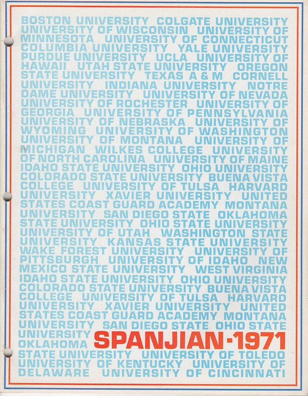
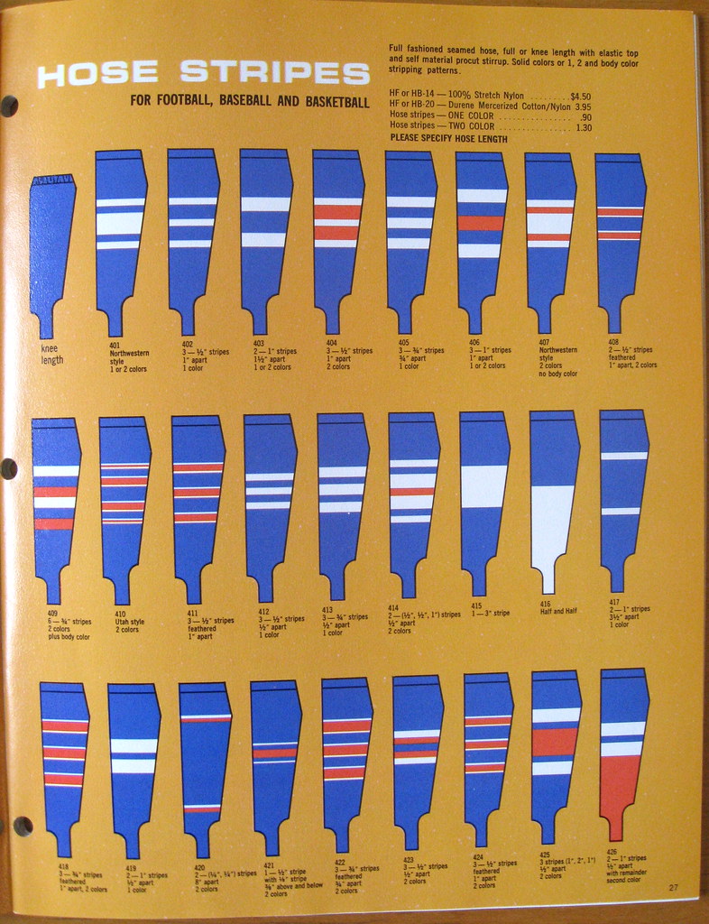
Time for another look at some vintage uniform catalogs that I recently acquired from the collection of the late Mike Hersh. We’re going to start today with a Spanjian catalog from 1971. As you can see above, it doesn’t have a particularly interesting cover design, and the interior pages feature a sort of murky illustration style that I don’t particularly like. So why did did I want this catalog to begin with? Because it features quite possible the widest variety of stirrup striping options I’ve ever seen (for all of these images, you can click to enlarge):
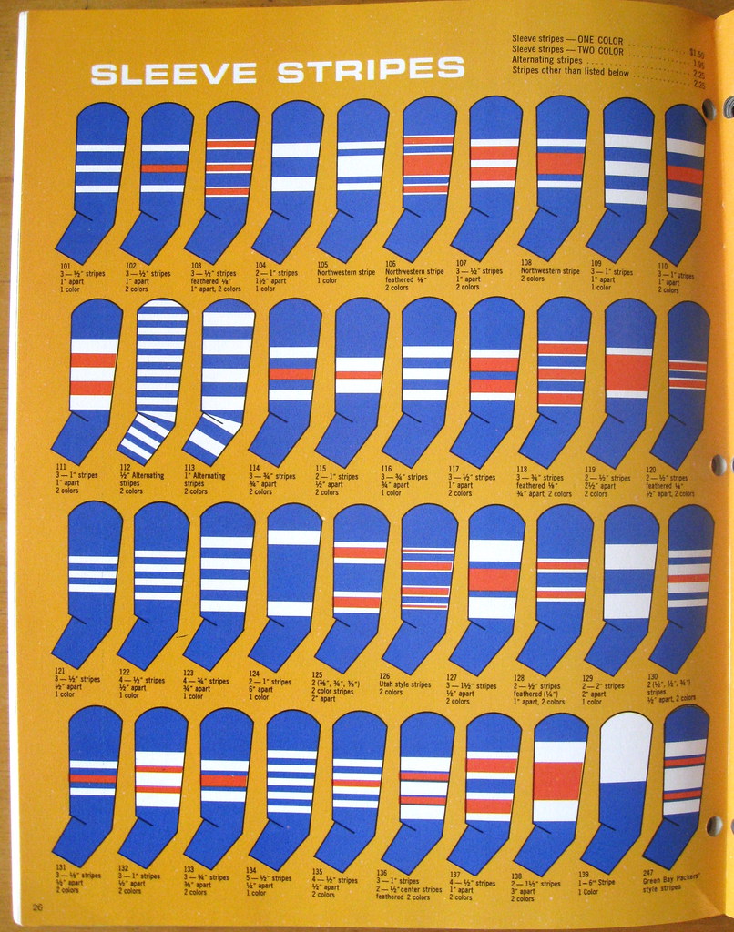
Even better and more wide-ranging: the incredible variety of sleeve striping options! Check this out:
———
Next up is a 1955 catalog from a New York company I’d never heard of before, Venus Knitting Mills. This is a short catalog, so I’ve photographed the whole thing. Nothing here really stands out, but I like the playful illustration style:

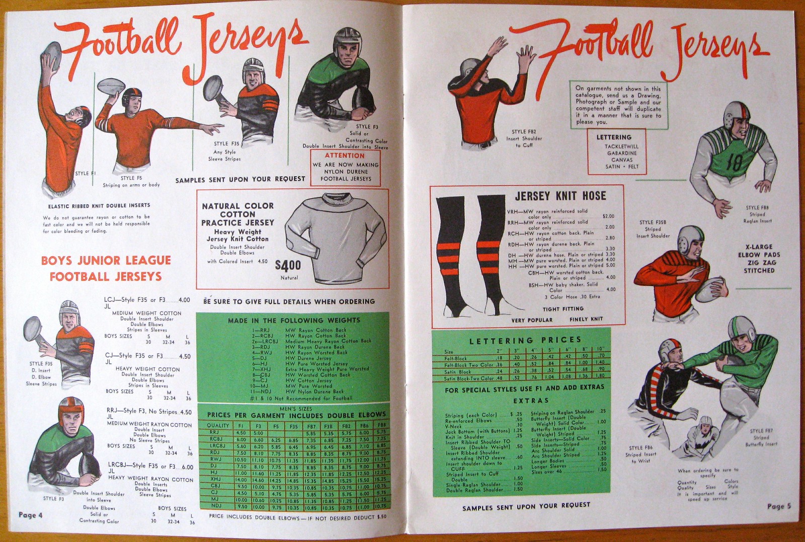
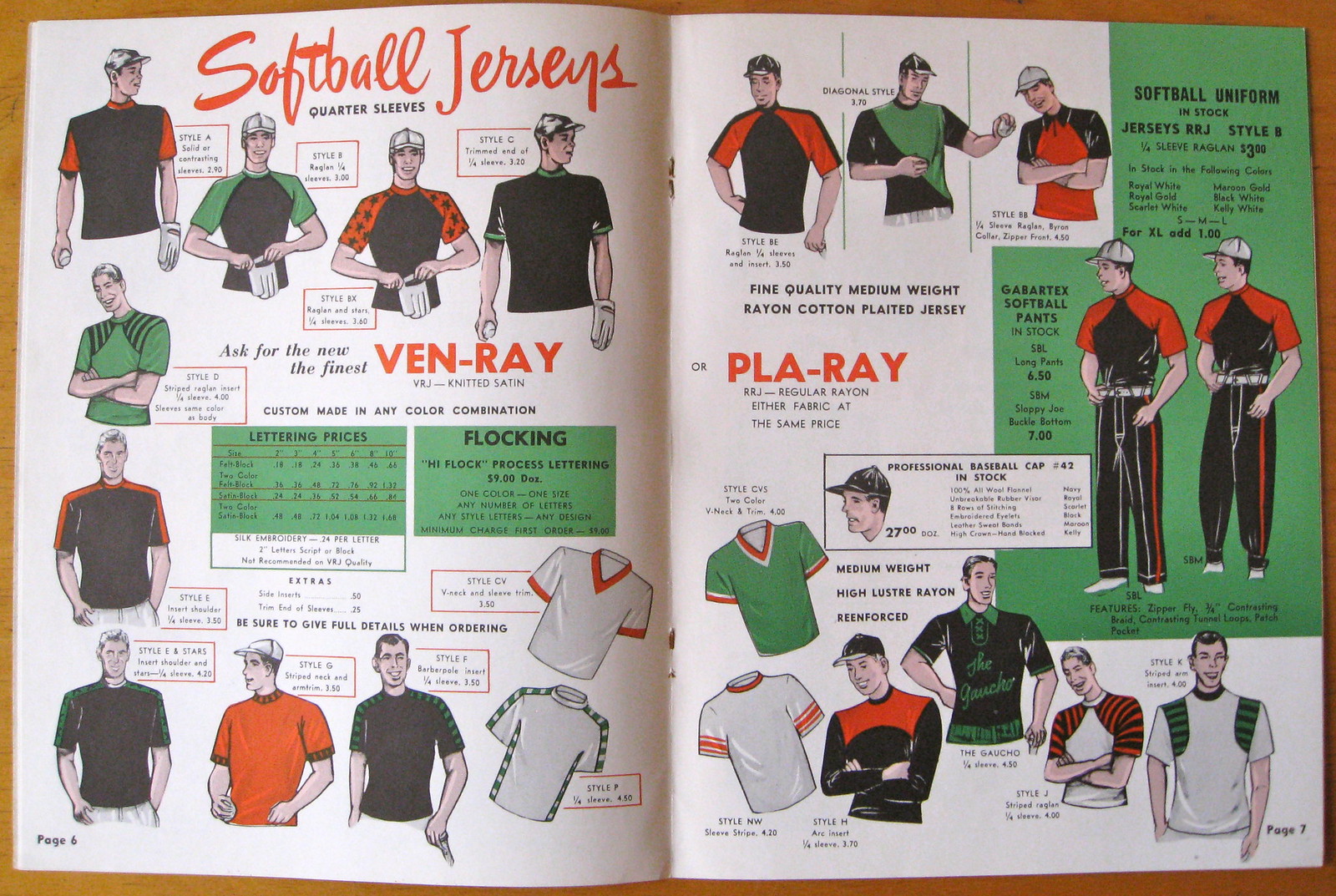
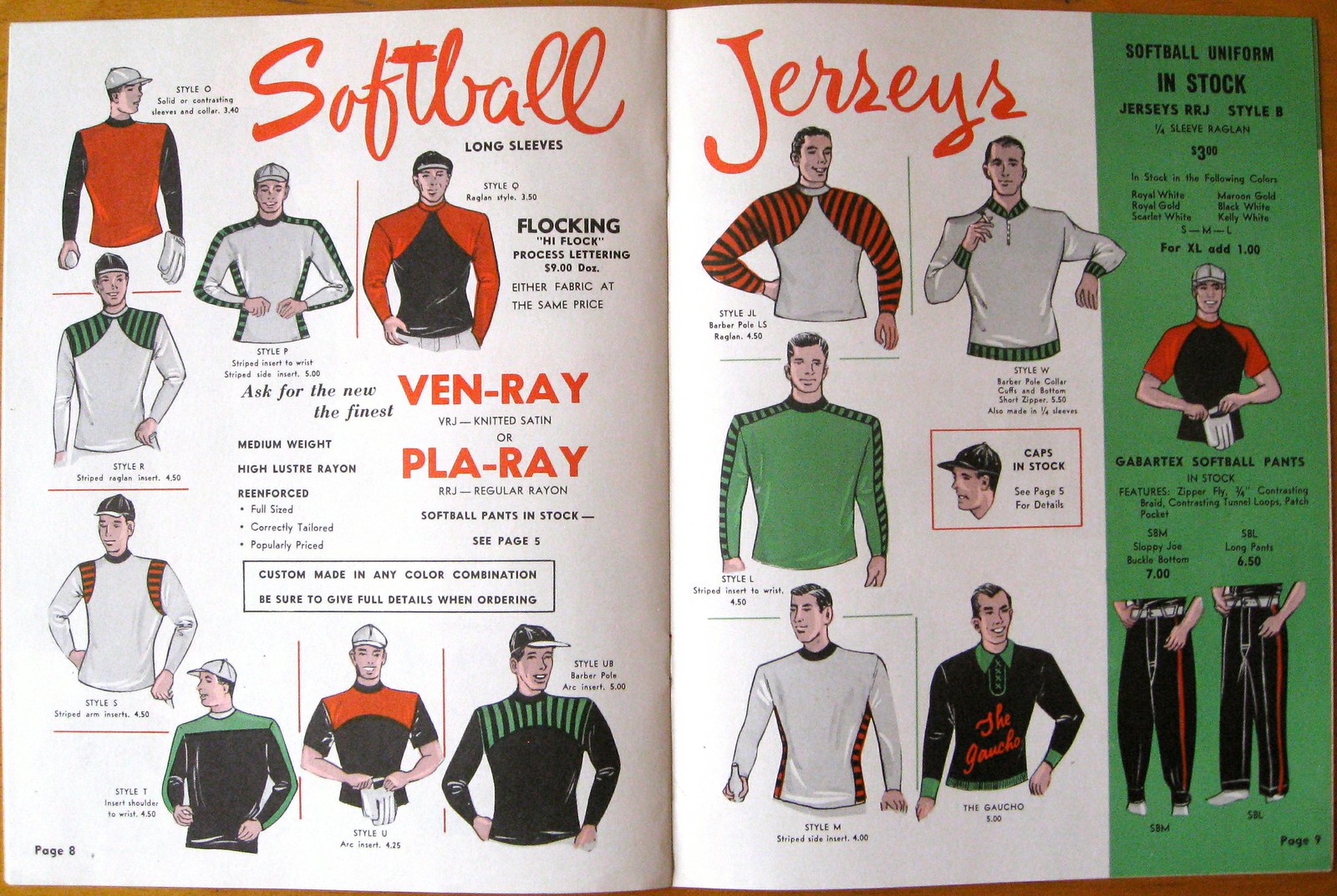

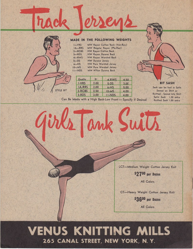
———
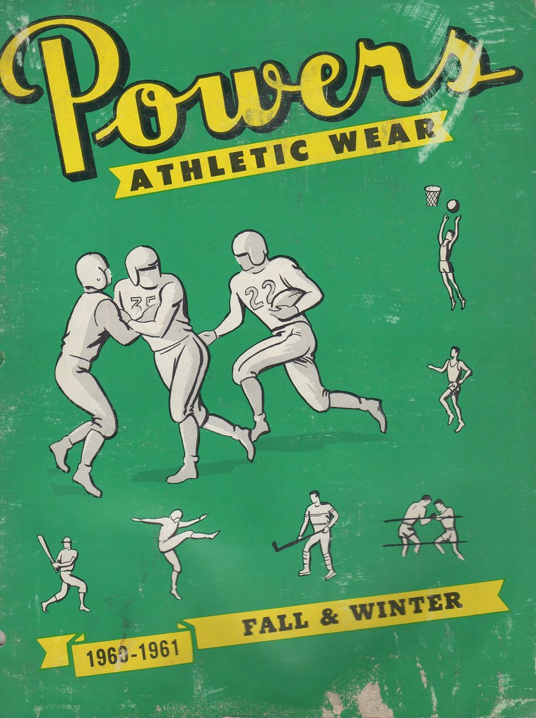
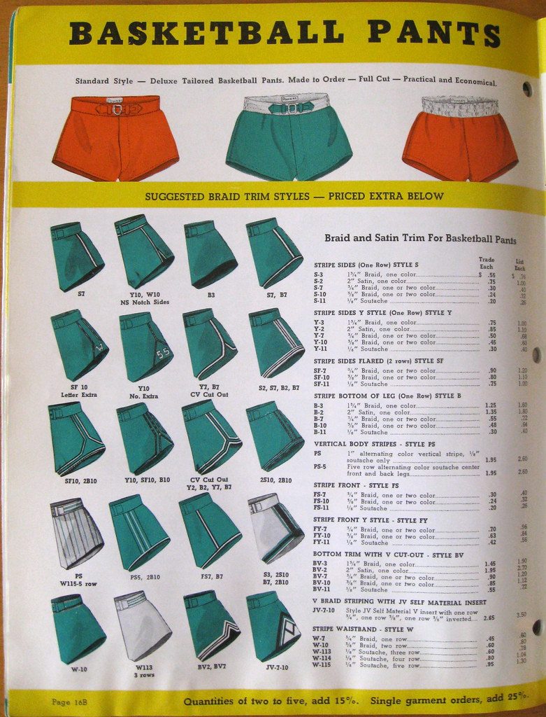
And here’s one more: a 1960-61 catalog from Powers. One thing I really like about this one is the wide range of insert and braid patterns for basketball shorts:

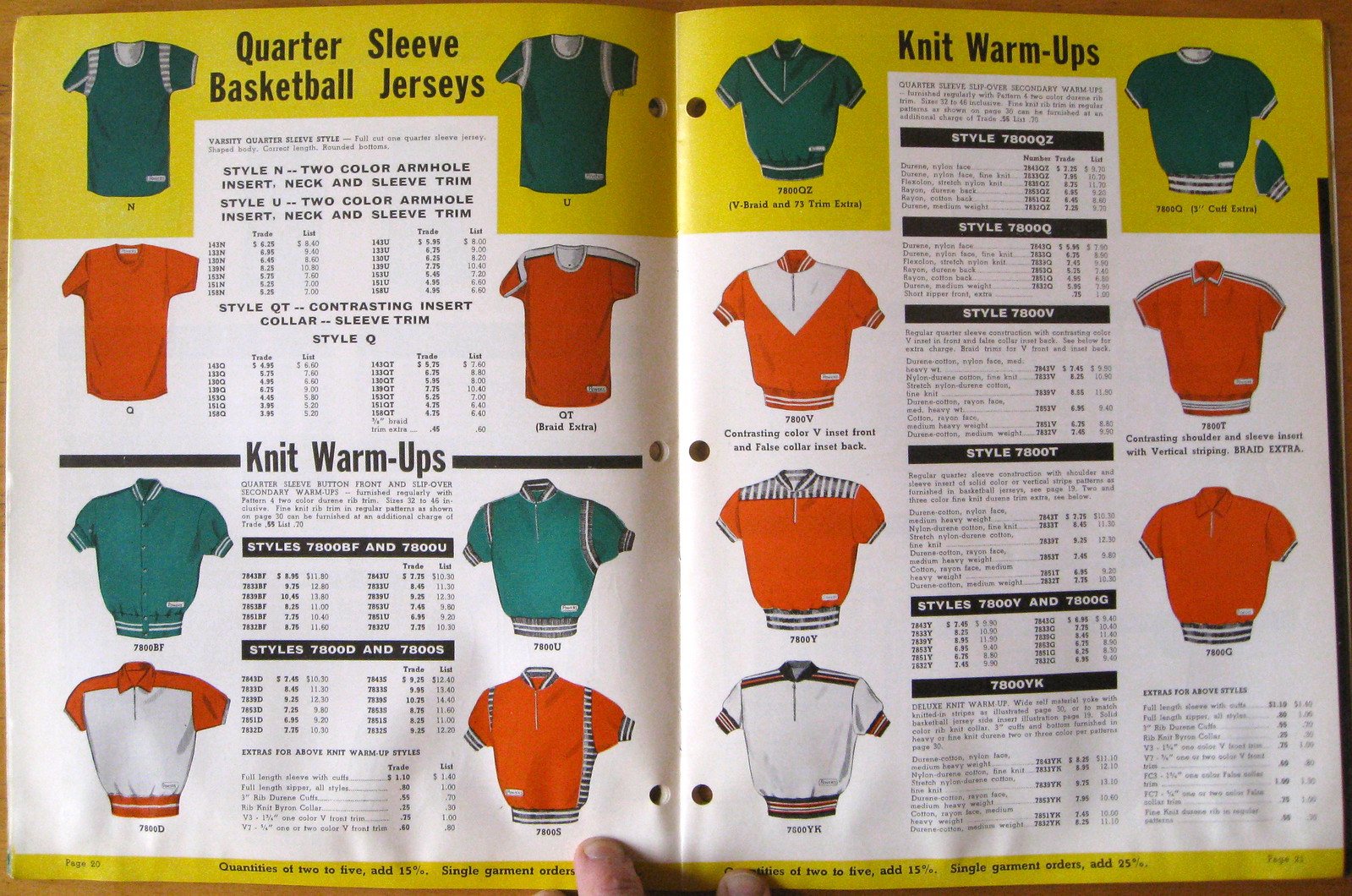
I also lovelovelove all these warm-up pullovers — mmmm, tasty:
Finally, check out the lower-left uniform on this next page — a zebra vest! I’ve never seen that before. What would it be worn over — a white shirt? A black shirt? Something else? Here, take a look:

———
That’s it for this round of catalogs. I still have a few more from Mike Hersh’s collection and will be sharing images from those soon.
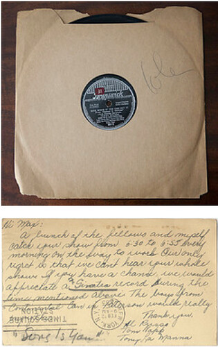
PermaRec update: The latest entry on the Permanent Record blog is about a postcard found inside the sleeve of an old Billie Holiday record (both shown at right). I don’t mind saying this is a pretty good one, people — check it out here.
Uni Watch News Ticker: The 49ers’ new stadium, due to open in 2014, will be called Levi’s Stadium. Insert all the obvious denim jokes here. … We just passed the 25th anniversary of Devils coach Jim Schoenfeld calling referee Don Koharski a “fat pig” and telling him to “have another doughnut.” What you might not recall is that the NHL officials refused to work the next game when Schoenfeld was allowed to coach that night despite being suspended by the league. In protest, the two linesmen for the game wore yellow practice jerseys rather than the traditional striped uniforms. It was called Yellow Sunday, and Jeff Barak has all the details here. … Matthiew Mitchell notes that the EMTs at the Trop have baseball-style scripts on their shirts. … New home kit for Liverpool (from Patrick Runge). … Meanwhile, Arsenal has signed a lucrative new deal with Puma (from George Chilvers). … The Cowboys have posted a slideshow of their uniform history, although it’s not very good because it doesn’t really show the wraparound collar style that the team wore in the early 1960s (from Casey Wieder). … With St. John’s switching from Nike to Under Armour, a ton of merch was put on clearance yesterday (photos by Leon Frager). … Giants infielder Marco Scutaro is wearing a custom pair of cleats becase one of his legs is slightly shorter than the other (thanks, Brinke). … Ravens first-rounder Matt Elam hasn’t yet played a down in the NFL, but he’s already changing his uni number (from Andrew Cosentino). … New pink alternate jerseys that have nothing to do with breast cancer — although they look more salmon than pink in the photo — for the Pensacola Blue Wahoos (from Trent Rosecrans). … New dress code for Turkish Airlines, whose female flight attendants — and presumably the male ones too — are being told not to wear red lipstick or nail polish, supposedly because it would clash with their uniforms. Yeah, sure (from Tom Mulgrew). … Here’s a closer look at UCF’s new helmet prototypes (from Bryan Council). … This is pretty funny: Bills rookie Keith Pough will be wearing the same logo he wore in college (from Timothy Tryjankowski). … Mean Joe Greene wore No. 75 — or did he? Never seen him wearing that number before. Even weirder, he wore No. 85 in the 1971 Pro Bowl. “Must’ve been a frustrated wannabe tight end,” says Chris Weber. … Gotta love the irony of Nike poster boy Steve Prefontaine wearing Adidas (from Andy Henderson). … You want uniforms? Here, I’ll give you some uniforms. Details here. … The Notre Dame basketball court now includes the ACC logo (from Warren Junium). ”¦ Outmania! That’s longtime Uni Watch hosiery hero Josh Outman, who recently came off the DL for the Rockies (screen shot by Michael Romero). ”¦ I like this Astrodome color-coding legend. “It was was distributed to potential season ticket holders prior to the opening season,” explains Sean Abruzzo. ”¦ Did you know the U.S. military has 10 different camouflage patterns? It’s true! Further details here (from Britt Jackson). ”¦ MLB ump Angel Hernandez is still wearing an adjusta-strap cap (screen shot by Andrew Bashuk). ”¦ Here’s a gallery of Maryland uniforms, across many sports, from the past two years (from Eric Garment).
That was more than just a protest by the linesman, the whole crew was a replacement crew because the real crew refused to work with Schoenfeld behind the bench. The game was delayed by over an hour until they were able to find the three replacements led by a goal judge with some college hockey refereeing experience.
That story had everything.
One more detail: during the whole fiasco, NHL president John Ziegler was missing. There were rumours that he was involved in extricating his son from a cult that weekend, but to this day nobody knows where he was. The missing leadership was a big part of the delay in suspending Schoenfeld and the officials’ walkout.
Love the sock stripe pattern that, in those colors, looks like two stacked Russian flags (first illo, second row, far left). Would look incredible with green base and white and black stripes.
Also liked the Star Trek:The Next Generation in the second Venus illo.
Angel Hernandez wears an adjustable-strap umpires cap to match his adjustable strike zone. (and is the MLB logo on his cap blacked out? It looks like it is)
Not to mention his adjustable home run calls.
Angel Hernandez? Today in the ticker? You’re kidding, right?
To paraphrase a line from “The Natural,” “Nice strap, Hernandez, try putting it over your eyes.”
Why did I think it was Mike Milbury who called Koharski a “fat pig” who should “have another donut”?
I get it, pig, oink oink, police officer. I used to say that to cops when I was your age, Campbell.
Still one of the greatest in-jokes of all time.
The Cowboys slide show also appears to have skipped their link, which was the blue star with just a white outline.
I’ve never been all that impressed with the Cowboys uniforms, but I really wish that photo from 1977 was in color. I think the uniform Diron Talbert is wearing may be one of my all-time favorites.
I got your Powers Athletic Gear right here.
One of the two Pre movies (I believe the one with Billy Crudup as Pre and Donald Sutherland as Bowerman) addressed this. Late in the movie, Pre visits Bowerman at his home, where he’s working on a prototype running shoe. Pre agrees, somewhat reluctantly, to give it a test run, saying “you know I’m an Adidas freak.” He goes for his run, and returns, describing the prototype as “not bad.” Bowerman then says he’s thinking of calling them “Nike…Greek goddess of victory.”
which came first…?
the howard bison charging bison, or the buffalo bills charging buffalo…?
there are comments on that page that would indicate it was howard’s logo first…
Four words: link.
…the day i refused to ever call them “pajama” bottoms again
Well, the Sloppy Joes are the ones with the MC Hammer cut and the buckle. The regular long pants could still be referred to as PJs, I suppose.
Always hated teh Cowboys (as a ‘Skins fan) but always loved the serifed numbers.
link
Outman started season in Triple AAA, called up about 10 days ago. No DL stint
UCF had the lamest uni unveiling ever!!
“Let me hold up our new uniform. Can the guys in the back see? And here’s our new helmet. Well, the helmet will look like *this* one but have the colors of *that* one. Hey, Jeremy, can you pull up the PowerPoint thang and put it on the screen? It’s just the rendering, but I think you guys will get the idea. So there you have it folks, your 2013 UCF Golden Knights! I mean Knights. I keep forgetting we dropped the “golden” a couple years ago.”
Yeah, because they didn’t have Nike spend millions of dollars on a fucking presentation, just like they do for nearly every single other school now. Man, how would we ever find out what the new uniforms look like? Oh yeah, we could see them on the field.
Sorry, don’t mean to come of so harsh, but I’m actually glad to see there wasn’t such hoopla around an essentially meaningless thing like a “uniform unveiling”.
I should have started my post with: “All uniform unveilings are pretty stupid, but UCF…”
I’m of the ilk that prefers to see them debuted on the field in week 1.
The Yellow Sunday Devils v. Bruins game was the first NHL game I ever attended – when the crowd figured out what was going on we started cheering for the scab refs.
Gotta love what Mean Joe Greene #85 has in his hand… a can of Coke!
Nice catch on the EMTs. If only the players at the Trop had baseball-style scripts on their shirts!
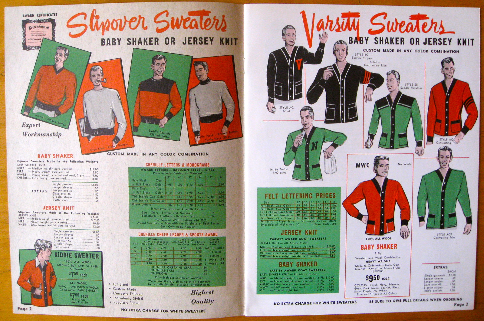
regarding the catalog pages, i had never heard of the unfortunately named “baby shaker knit” before. i don’t imagine that term is used much anymore.
That picture of Joe Greene wearing 72 was from his rookie preseason. I assume that was before Ken Kortas, who previously wore 75, was cut from the team.
wait, I don’t know what the obvious denim jokes would be…
Win one for the zipper?
‘Niners football….It’s Riveting!
Sending all the receivers out on fly patterns?
Picked that jean pocket when he stole the leather from him. (Fumble. Am I trying too hard?)
The sleeve stripes in the Spanjian catalogue are so, so fine. Sleeves will be back on football jerseys, you wait. Such fantastic, smart design cannot be held down for long. It’s inevitable.
Meanwhile, the recent installment of Permanent Record is essential reading! Just great!
“The spokesman said present beer can inventories are adequate for the immediate future.”
That line right there increases the likeability of the story exponentially.
Yeah, I really liked that too.
I believe the old pro bowl protocol had no duplicate numbers, with the senior player retaining his number and the junior player having to wear a different number for the game.
Correct. But it’s still odd to see a lineman ending up with an eligible-receiver number!
A shout-out for the photo of the Pro Bowl helmet buggies the other day. I love the lettering on the helmets that looks like it could have been done with color tape and an X-Acto knife. Graceful, powerful, simple.
Based on seniority, Winston Hill of the NY Jets woudl have worn 75 in the Pro Bowl that year. link
Also – unit numbers in the 80’s were pretty prevalent for D-linemen (Gerry Philbin, Verlon Biggs) back in the 1970’s – even Ted “The Mad Stork” Hendricks wore 83 at OLB (link)
Make that “uni” numbers, not “unit” numbers.
And for clarity, the examples above were AFC guys
Paul, what memories these catalogs bring back! These are the type of catalogs that I worked with at Ruby’s. Helping a coach design a uniform back then was a delight. You didn’t just take a pre-designed template and fill-in the colors. You actually selected trim patterns, inserts, etc. When you were finished you usually had something distinctive for that particular school.
Notice on the 1971 Spanjian cover the name “University of Rochester.” We sold the Yellowjackets their football, basketball, soccer, wrestling and track uniforms through Spanjian.
U of R got their flannel baseball uniforms through us from Powers Mfg. as Spanjian never offered flannel. Powers baseball uniforms were so good that Leo Ruby sold them to the Rochewster Red Wings in the early 1950s. We still had a few numberless Red Wing flannels in stock when I started at Ruby’s in 1967. They wings kept the same style uniform from 1950-64 so Leo could take a blank and just add the numbers. When the Wings changed to a different style in the early 1970s we sold the blanks for $5 each. I should have grabbed a few. Who knew?
One last thing Paul. Could you please send the Spanjian ’71 image of those “Utah” stripes to Nike so that the know-it-alls there can see the proper striping pattern for the Buffalo Bills. It ain’t rocket science all you swooshmeisters! All you have to do for the Bills’ White throwbacks are use the Utah pattern in the proper feathered stripes. Yours and Reebok’s attempt to make them I refer to as “throwup” jerseys they look so hideous.
As if I wouldn’t have link running through my head already after looking at the pictures, the headline of the Battle of the Nations article cemented it.
“Tis but a scratch!”
I love this site and read it almost daily. However, I wonder why you feel it ok and necessary to use vulgar language on the site. I have 2 children around 9 years old who love uniforms and love reading your site, but I have to screen each day’s post before letting them read it. I would just hope that you reconsider your use of vulgar language in your posts.
You can’t seriously expect a New Yorker to not swear occasionally. Just make sure your kids know not to use certain words until they’re older, they’ll be fine.
I realize this may be a stunner, but I don’t produce this site specifically for your kids.
Even bigger stunner: Your kids already know words a lot stronger than “shit” and “fuck.” Trust me.
Joe Greene was probably wearing 85 in the 1971 Pro Bowl because Winston Hill of the Jets was also on the roster. His number was also 75 and he had seniority on Joe Greene.
“This is pretty funny: Bills rookie Keith Pough will be wearing the same logo he wore in college.
link, link link, link link, and link Lumpki fail to see this as novel.
link link doesn’t think it’s a big deal, either.
*link
With the NCAA Men’s Lacrosse tournament starting this weekend, Cascade broke out school specific versions of it’ new Cascade R helmet for a handful of prominent programs, Albany, Cornell, UNC, Maryland and Syracuse:
link
Rob Pannell, superstar attackmen for Cornell sat out most of the 2012 season with an injured foot.
He came back in 2013 with a vengeance. Halfway through the season, I noticed him wearing a different style of cleats from what he’s used to.
Usual:
New Cleats
Being a good uni-watcher, I wanted to get to the bottom of this, so I called the Cornell
Lacrosse equipment manager. He had no idea except for the fact that Pannell has a wide foot.
Lo and behold, it turns out that he’s wearing the Nike Huarache IV which won’t be on sale until 10/1/2013.
link
I thought that you would at least appreciate the story!
Anyone see Jeopardy last night? College week, contestants were wearing hoodies representing their colleges: MIT (maroon), Baylor (forest green), Colorado (gold/yellow). Alex comments how much he likes the way the colors look together. I instantly thought of Uni-Watch!
I saw that.
I’m watching sports nation on ESPN and the woman on the show just called Josh Outman’s stirrups “old school suspender socks. ” smh
I could care less about this story, but the Skins will -NEVER- change their name. Snyder said ‘print that in caps.’
link
Any time you see someone escalate a claim of future action that much, the odds of the opposite happen double. If he were really never going to change the name, then he would ignore, rather than deny, and the stronger his denial, the shakier he feels his case to be. “NEVER in caps” is actually a sign of progress. For the first time, I have hope that the team might actually make a change under the current ownership.
Dude might as well have said, “Read my lips, no new nickname.”
Well you can wish in one hand …
I eagerly await his George Wallace moment.
And Brinke, you couldn’t care less…
If the Redskins name change movement had already organized itself to the extent that other rights groups have, what would Roger Goodell say? How does the league draw their moral lines?
The only solution to Snyder’s “NEVER” is growing the movement, like what other movements have done:
link
Wow! I loved looking at the striping chart page from that 1971 Spanjian catalog.
Could you also please post the color chart page from that catalog? Many of us would love to see visually what uniform colors were available from Spanjian back in 1971. In fact, I hope you will post the color charts in all future athletic uniform postings.
Also, I’ve finally had a chance to look at the 1990 Betlin and early-1990s Speedline catalog postings you did a couple years ago from Terry Proctor’s collection. Could you also please post the color charts from those catalogs?
Thank you.