here, and then there’s another thread here.)
The talk about Van Horne, who’s shown at right, got me thinking about a quotation that was published in 2004. The quotation, which has nothing to do with sports, has become somewhat famous in certain circles, but I couldn’t remember exactly how it went, so I wanted to refresh my memory. Here it is, as described by the reporter who first published it in an article back in ’04 (don’t worry about the identity of the person giving the quotation — that’s not important):
[The person giving the somewhat famous quotation] said that guys like me were “in what we call the reality-based community,” which he defined as people who “believe that solutions emerge from your judicious study of discernible reality.” … “That’s not the way the world really works anymore,” he continued. “We’re an empire now, and when we act, we create our own reality. And while you’re studying that reality ”” judiciously, as you will ”” we’ll act again, creating other new realities, which you can study too, and that’s how things will sort out. We’re history’s actors ”¦ and you, all of you, will be left to just study what we do.”
It’s a bold, audacious statement. Arrogant, even. But what does it have to do with uniforms?
This: Looking back at that statement, I’m struck by how it could very easily serve as a Nike manifesto. In fact, it’s not hard to imagine Todd Van Horne (or Tinker Hatfield, or Phil Knight) sitting me down and saying, “Look, Paul, here’s what you need to understand: We’re an empire now, and when we act, we create our own reality”¦” Seriously, go back and re-read the whole quotation — it’s a remarkably succinct breakdown of the Nike approach.
Of course, there’s nothing inherently wrong with consistently challenging people’s preconceptions, or with doing so mostly on one’s own terms and with little regard for previous boundaries, or with routinely moving on to your next thing while everyone else is still coming to terms with your last thing. Hell, that’s been the standard approach for a long run of creative geniuses: Picasso, Joyce, Dylan, Warhol, Monk, Pollock, etc., any of whom could be said to fit the model sketched out in the quotation.
Some of you may think the people at Nike qualify as creative geniuses too. I respectfully disagree.
Discuss.
(And for those of you who know the source of the quotation, please don’t give it away in the comments, at least not until mid-afternoon or so. Thanks.)
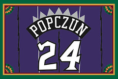
Accursed color reminder: Two weeks from tomorrow, May 17, is Purple Amnesty Day — the one day of the year when you can order a purple-inclusive Uni Watch membership card design (like Nicholas Popczun’s Raptors-themed card, shown at right, which he ordered on last year’s Purple Amnesty Day). So for those of you who’ve been patiently waiting to order that Vikings- or Lakers-themed card, your chance is fast approaching. Mark your calendars now so you don’t miss it!
As for everyone else, you can order a purple-free card at the usual place.
Uni Watch News Ticker: The Mariners will be wearing 1909 Seattle Turks throwbacks on May 29. ”¦ The NCAA’s Football Rules Committee issued a bulletin about uniforms and field markings yesterday. There’s very little in it that’s new, with one exception: No more URLs or hashtags on the field. You can read the actual memo here. … Speaking of hashtags, look what the Rangers are doing. Instead of using a real pound sign, it looks like they used four of the letter “I” and sewed them together, which looks like shite. “Oh the things that we do for social media,” says Luke Rosnick). ”¦ Still more about minor league teams and Star Wars (from Jason Hillyer). … Here’s the best view I’ve seen of the Dolphins’ new helmet striping (from Jessel Elliott). … Jamie Uthe notes that the ad on the boards in front of the Blackhawks bench has changed from Lemonheads to Geico and Verizon now that the playoffs have started. I’m assuming this is because the league imposes new rules for postseason arena advertising, yes? … Several readers alerted me to this very cool Kentucky Derby jockey silks poster. … Good story on athletes’ personal logos. ”¦ Here’s an article on a woman who makes costumes for the Philly Phanatic (from Kurt Esposito). … An NYC realty firm is offering employees a 15% raise if they get a tattoo of the company logo (thanks, Brinke). … Some thoughts here about ECU football uniforms (from Matt Windsor). … Lots of details on the Falcons’ proposed new stadium. Key quote: “Enticements could include ‘impact seats,’ which vibrate on a large hit.” Greeeeeeaaat (from Kevin Poss). … New design for DC cabs (from Ben Fortney). … Horrific new uniforms for the Boise Hawks. “On the bright side, they wont have to worry about anyone stealing their design,” says Christopher Ouellette. … Looks like Jaromir Jagr was practicing in shorts and a pom-pom hat yesterday (from Mark Kaplowitz). … The Cardinals will give away these cool striped socks to fans 15 and under on May 19 (from Joe Mueller). … This is pretty awesome: If you go to this page and click on the years at the bottom, you can see just about every program cover design in AFL history — even preseason! Amazing stuff (thanks, Kirsten). … Harvard baseball has added a Boston Marathon memorial decal. (I’m assuming the other helmet decal you see there is for breast cancer.) They’re also wearing a “2” patch for their late coach Joe Walsh. “I think it ought to be over the heart, instead of the Nike logo, don’t you?” asks Tris Wykes. ”¦ Icethetics has put together a handy guide to all the NHL’s pending uni changes (from Anthony Nuccio). ”¦ New kit for Liverpool (from Matthew Solly). ”¦ If you’re into lame-o teaser videos, you’ll love this one for Arizona’s upcoming football uniforms. ”¦ “An eight-year-old cancer patient in Portland named Atticus wished for his under-eight soccer team, Green Machine, to play against the Portland,” says Markus Kamp. “The Make-A-Wish Foundation made it happen. Here’s a very cool uni-related pic from Green Machine’s locker room before the match.” … During last night’s Chisox/Rangers game, the Rangers’ TV production team ran a poll: Who had the worst uniforms in MLB history? Here are the results (screen shot by Chris Rocco). ”¦ Ernest Penaflor says San Diego State will be unveiling a new logo and new uniforms today.
I think you mean the Jaguars instead of Panthers. If not, I really missed something.
Paul, I got confused for a second there, but I figured it out. I believe you meant Jaguars at the top of the article. Not Panthers.
What Neal said.
Is Panthers supposed to be Jaguars? Or did I miss this somehow?
You had me searching for 10 minutes trying to find the article i missed about new Panthers uniforms (which had been rumoured, but never confirmed) only to realize you meant Jaguars instead! I damn near had a heart attack
UGH.
Yes, someone absent-mindedly got his big cats confused.
MEA FUCKING CULPA.
Now fixed.
Re: the Nike quote, the company and some of it’s designs is genius. What started out as a small running shoe company has grown to a huge corporation, for better or worse. Hatfield’s work on the Jordan line was and is ground breaking, turning a basketball shoe into a collectible/piece of pop-art/fashion. Some of the technologies have been groundbreaking as well. Are all of the products aesthetically pleasing? No. Some credit should be given however.
Mussolini made the trains run on time. He was still a fascist.
Your arguments are suspect: Nike’s “sneakers as fashion statement/sweatpants as lifestyle” ethos did indeed create a market, a market of insanely overpriced merchandise, aimed primarily at consumers with little discretionary income. They became the malt liquor of footwear. Their so-called innovations are mostly marketing. Bill Bowerman was the innovator, and his primary innovation was to make running shoes lightweight. The rest, from the very beginning, has been marketing, marketing, marketing.
Cort, you made my point for me. The innovations-Air, Lunar flex, Phylon, Dri-Fit. They have their applications, and other companies have followed suit. Weiden and Kennedy (the agency that has done the marketing) has been very successful in helping Nike, the company, sell product, which is what companies do. I assume you are discussing Nikes sales of basketball shoes. The company has grown so much that basketball shoes is only a part of it.
While there have been real innovation, especially in the early days of Nike most of it has been “innovation” as a marketing buzzword. Yeah, Dri-Fit in theory is great, but a runner’s not going to experience any appreciable improvement in performance from wearing sweat-wicking material that can’t be attributed to placebo effect.
Anyway, I think you’re missing the gist of the argument – Nike is, no doubt, a company that serves its own interests well. But I suspect Paul’s beef is that Nike (and others, but Nike is obviously the most visible and influential) makes uniform designs about *them*, and often strip away team identities that have been decades in the building.
Nike needs to make money. Nike pays leagues and teams a lot of money. We’re not dumb. But we also get that branding goes beyond just the swoosh on the sleeve.
Dri-Fit, also known as polyester (or rayon).
A man-made fabric by any other name is still stinky. Just as consumers have been hood-winked with the return to popularity of florescent lightbulbs (thankfully, here comes LED) … so has the public been hornswaggled about “sweat-wicking” fabrics. (next, real, better technology?)
Nike: genius marketer. Innovative? Arguable. (Perhaps the “air” technology is the most innovative of all their features.)
(Perhaps the “air” technology is the most innovative of all their features.)
What about the flywire technology? I recall reading in Wired that Nike thought that not only would it result in lighter shoes, but that the manufacturing process would become cheap enough for them to return some manufacturing to the US (ignoring the fact that nothing is stopping them from doing so anyway).
Category error. This comment assumes that organizational growth from a small shop into a global conglomerate validates the quality of the company’s work. But organizational growth and quality of work are two wholly different categories.
And in fact, in the design field, the two are at least somewhat likely to be inversely correlated. That is, successful design serves the client’s functional needs. To the extent that people encounter a designed product – an NFL football jersey, say – and are led to associate that product with Nike, rather than the NFL team, then Nike is building its own brand equity at the expense of the NFL team. To the extent that an NFL jersey is a market good, then every quantum of emotional attachment that flows to Nike is a quantum of emotional attachment that doesn’t flow to the NFL team – and every dollar spent on further purchase of Nike goods is a dollar that doesn’t get spent on more stuff from the NFL team.
Which is all well and good for Nike, but the fact that this happens – the fact that this is what Nike intends to happen – makes Nike’s work bad design. Nike has built an empire by cannibalizing its clients’ brand equity and subordinating its clients’ needs to Nike’s financial interests. That Nike has succeeded at doing so does not make the doing of it right or proper or good, any more than not getting caught justifies a crime.
I would “like: this if I could. Very interesting and original point made.
+gazillion
…times two.
Extremely well stated. A perfect example of Nike building its empire “by cannibalizing its clients’ brand equity and subordinating its clients’ needs to Nike’s financial interests” can be found in this Uni-Watch blog entry from last year:
link
The thing that utterly perplexes me is how organizations like Mississippi State allow Nike to get away with this in the first place.
My ‘guess’ is that organizations like MSU employ people without the marketing savvy to understand they have a right (a moral one at that*) to interject and guide/force the branding/design of their athletic supplier. Instead, they allow the athletic supplier to serve as the catalyst for their brand identity (instead of having the talent on staff, or an independent ‘steward’ of the brand).
It’s like everyday B2B … your company’s office building needs better security. So, you call one of the 3-5 suppliers of video cameras and intrusion detection, right, and they give you advice? Or, do you call an independent consultant to analyze the situation and determine what kind of security vulnerabilities you have … and then propose the solution (be they cameras, swipe cards, fencing, security guard, whatever …)
Nike is no independent consultant. They aren’t looking out for the best interests of the university, and its brand identity. They’re looking to CREATE that brand identity, so they can co-opt it (as was so eloquently stated above).
To think places like UNC, Purdue, and many other outstanding institutions have been butchered by Nike, without any recourse … hard to fathom that happening in the ‘real’ business world.
Nobody complains because the reality is so few people truly understand: a) brand equity, and, b) good design. Nike gets away with it, because everybody acts like they can ‘do’ marketing.
What’s really a shame is the Nike staff (who frequent this very site) who don’t STAND UP and actually revolt against some of what’s happening.
You mean to tell me a good designer looked at the UNC football uniforms and said, “these are great” ?!
And nobody in the room said, “We shouldn’t do this to UNC, because, a) they don’t have navy blue in their brand palette.”
And nobody in the room said, “You know, this Boilermaker Special we designed … isn’t better than the one it’s replacing … not even close.”
Nobody’s smart enough or courageous enough on either side of the relationship to say, “NO.”
Arr Scott’s comments are so well-written, and make so much sense!
I was at a BYU-Utah baseball game last week. The Utes are an Under Armor team; the Coogs wear Nike. The Utah uniforms had more than their share of UA logos, and they they were overdesigned, but the general impression was, “Boy, those are sort of asinine.”
The Nike uniforms, from a distance, looked really nice: the blue was a little darker than BYU’s traditional royal, but the overall look was clean and classic. Up close, they left a different impression. It wasn’t that there were too many swooshes, it’s their placement: a large swoosh on the side of the cap, another, an ENORMOUS one, directly above the school logo on the chest. Before you thought “BYU”, you thought “NIKE” — it was impossible to avoid it.
“Cannibalizing brand equity and subordinating clients’ needs” is exactly right.
Oh. My. God.
Three of the four uniforms in the Rangers poll rank among my all-time favorites. I’ve actually owned one of those Sox jerseys, and if I weren’t built like an aging Yogi Berra, I’d have owned a rainbow jersey, too. (Yogi was an Astros bench coach in the 80’s; a local sportswriter once commented that the rainbow made Yogi look like “Saturn and its rings.”)
One more reason I don’t live in the Metroplex…
The Veeck unis… so many flaws…
1. The collar. If you’re going to do an old-timey collar, why half-ass it? That they only go up to the shoulder seams make them look ridiculous.
2. The hat logo. So, you’re going retro with your jerseys, but wearing your brand-spanking-new SOX wordmark on your cap? Arrgh.
… and that’s about it, really, aside from the extremely short-lived shorts experiment.
All reasons why I love it so much. It may well be the last time a major league sports team’s uniform was designed by the owner’s wife. In this case, she was concerned that several of the Sox were “portly,” and she wanted to cover up their guts (hence the untucked shirts).
It’s a mess, a wreck: The Space Age wordmark on the caps, the old-timey “CHICAGO” across the chest, the silly, silly flaps at the neck. If I still had one, I’d wear it immoderately.
The slapped together, “let’s put on a show in the Old Winslow Barn” feel of it is what makes it so appealing.
San Diego State will be unveiling new logos and uniforms today.
Already in the Ticker.
“… (And for those of you who know the source of the quotation, please don’t give it away in the comments, at least not until mid-afternoon or so. Thanks.)…”
I am being a good boy.
Only two people know for certain who said it. It was published as a quote from an anonymous source. People just assume it was one particular person on account of the special access the journalist in question was getting from that person at the time. A wildly safe assumption, but I’m pretty sure the quote remains technically not attributed.
In addition to the Geico/Verizon change, the WGN Radio ad (link) has been replaced by a Tim Hortons ad (link). Funny thing is that the closest Timmy Ho’s is in Michigan.
I’m assuming that rink advertising in the playoffs is driven by national, rather than local, TV marketing. With CBC or TSN carrying every series, those boards are probably worth a lot to Canadian advertisers.
I’m quite certain this comment wasn’t here earlier today when I basically posted very similar information down below.
Yes, that’s it. It must have been stuck in moderation. I couldn’t possibly be guilty of a double post.
Paul, I assume you have seen the documentary from a few years ago “Just for Kicks”. If not, go see it. It clearly shows how Nike got to where they are by dumb luck, and little else. They were in the right place at the right time.
“… … New design for DC cabs (from Ben Fortney). …”
So what do you think, Ben? So what do you think, fellow Potomacans?
I’m stuck at OK, I guess, coulda been worse, at least it’s red.
Yeah, but I just can’t picture Mr. T driving one of those.
Coulda been worse? Con, were you down in DC yet when the new livery design options were originally unveiled:
link
It’s not “coulda been worse.” It’s “actually was worse”!
All things considered, I think it’s a solid design. It always had to be red, and while I’d have preferred a more linear white stripe as sort of a mirror-image echo of the DC flag, the gray works and provides ample room for company info. But does it look too much like the front-wheel wings of the Super Shuttle?
link
What Scott said. The other designs were pretty heinous, glad they went with a more “reserved” look that ties it to an already existing (and fairly popular) transportation system.
I think I’m most pleased that 1) they’re going for some uniformity 2) it’s distinctive enough to stand out when trying to hail a cab.
I do hope they allow the cab companies to keep their logos, I really dig some of them.
link
Not sure if the new design will allow for these or not.
Agreed re the logos. I have some hope: there’s ample space within the gray for a logo, regulatory text, and phone number. A uniform livery is a great idea, but allowing a little personality places necessary value on the fact that cab companies and some drivers are independent, private operators.
Thanks, men. I am duly instructed.
I share your enthusiasm for the DC flag, Scott. Great design. But how about the Great Seal of the District? Astonishingly bad!
There’s a problem with the tagging on the Star Wars article.
RE: Rangers hashtag…
While I bemoan them attemping it, I applaud the fact that they don’t have the “hashtag” (or pound, or sharp) symbol in their lettering kit!
♯
A test!!!
It worked. ♯ is a musical sharp, # is a hash, £ is a pound sign.
The problem with all these brand hashtags is that they’re forgetting it needs to be short to allow for room to add your msg into the tweet. Anything over 7/8 characters is using valuable space.
Looks like Jay-Z’s grandfather designed the Seattle Turks’ uniforms.
That’s great.
If Seattle will be wearnig those in a home game against the Cubs, does that mean the Cubs will join the fun and wear their 1909 uniforms?
Because the Cubs’ 1909 road uniforms were link.
Lets hope so. More and more teams are joining the home team in the retro jersey games. It used to just be the home team if I remember correctly.
Back in the early 1990s the Cubs joined the Phillies in wearing 1948 uniforms; they looked great and it was totally unexpected. (I turned on the TV to watch the game and saw Mike Morgan pitching in a gray jersey with a blue number and NNOB, and was very surprised.)
In fact, the Cubs play much better in throwbacks than they do in regular uniforms — they’ve won with 1911, 1944, 1948 (home and road), and 1918 uniforms on, and have only lost in last year’s fantastic-looking 1912 road uniforms. I say wear throwbacks every game.
Too little has been reported on Nike’s role in the University of Connecticut rebranding the entire institution as UCONN, complete with complementary free Nike redesign of the Husky. Last I heard, Nike is not a non profit design studio. Designers do, and should get paid for their work. It seems to me, the university rolled over its entire academic credibility just to sell more merchandise; a case study in sports driving the show at a public learning institution. Can you say, “ACC”?
My man.
It’s sad to see Liverpool join the ranks of the New Home Kit Every Year crowd. Still, it was inevitable and it doesn’t look too shabby – I like the nod to the European Cup winning team.
Even close up the Dolphins new helmet needs… more… ORANGE.
As far as the lead quote goes, “the reality-based community” has a way of making itself known (as the original speaker found). I can imagine confirming with an NBA team that neither team will be wearing the stupid color-on-same-color numbers before buying a ticket. I have bypassed Nike shoes because I was so disgusted by how they truncated sleeve stripes on NFL uniforms to make sure the swoosh was “properly” positioned. My individual actions are unlikely to change anyone’s mind at the big lifestyle companies, but if there’s enough pushback, they’ll have to listen or lose significant market share to companies that are more in tune with the population.
What do you think will be Nike’s Katrina?
What?? You dont think Nike is in touch with the population? Judging by their sales figures and how much Nike I see in any given day, I’d say they are VERY in touch with the population.
FWIW, the originators of the “reality based community” were in touch with the population too – more people voted for Bush in 2004 than any other presidential candidate to that point.
And his image has been rehabilitated to an extent that *more* people approve of the Iraq invasion than did in 2008.
Not sure what point I’m trying to make him, but anyway.
TH: perhaps that certain corners of the Internet can become a tad hothouse-like, and tempt its denizens into assuming that what seems obvious and settled to them must also be so to reasonable people at large?
Folks sometimes forget/overlook that, in reality, the people at Nike do a lot of community/global ‘good’ with the profits they earn from their ‘bad’ designs and ‘imperical’ ways, and that their influence in the marketplace also makes them influential to a number of social causes and public policy initiatives, in Oregon and beyond.
FWIW, to continue the parallel, the “reality based community” people tried to be more progressive about minority outreach, and actually did some good work in Africa.
And while it’s easy to take for granted, Nike’s “If You Let Me Play” ad was really groundbreaking (even if the montage of people talking to the camera spawned oh so many bad imitations). To this day, no other sporting goods maker has been able to do anything so socially meaningful, and Nike is way better at talking to female consumers than its competitors.
They did indeed do some charitable things in Africa. New Orleans? Not so much.
There are three qualities shared by all satraps, potentates, and Empire Builders: they are obsessive about their own legacy, building impressive monuments, leaving their mark all over the place; they establish an artificial connection to some distant glory, twisting history (and often altering art) to suit their own agenda; they cover enormous bad acts with some minor benevolence, the Escobar family’s schools in Colombia, or John D. Rockerfeller tossing newly minted dimes to street children.
I don’t hate commerce. I don’t hate branding. Heck, I don’t even mind uniform ads all that much. There is something about the swoosh that sickens me. Arr Scott hit it right on the head: it’s not that Nike markets itself; it’s that Nike’s marketing strategy is “Nike Uber Alles.” And there really isn’t anything there.
Garry Trudeau’s image of another cipher — the asterisk wearing a battered centurion’s helmet — is perfect.
Still more about link league teams and Star Wars (from Jason Hillyer).
needs a fixing…
comment section fixed it.. but the Jason Hillyer link is formated wrong
Now fixed.
The orange stripes on the Dolphin’s helmet wouldn’t be so lost if they were positioned between the Aqua & Navy, instead of on the outsides. The stripes might actually pop more, but oh well.
I think its supposed to represent the horizon, in which the sun is on top of the water.
After watching games over a pair of playoff evenings, the ads on the boards that are most prominently on TV (behind the goals, except for the corners that appear on the bottom of the screen and the entirety of the length of the TV side of the rink) appear to have been switched to official NHL sponsors for the playoffs (at least according to a google search of “official NHL sponsor”). They’re all the same, though the order may differ. Since each game is on a national outlet now, I’m not surprised local ads got the boot.
I’m guessing that means the NHL has not one but two official donut shops, as I’ve seen both Tim Hortons and Dunkin’ Donuts ads in these prominent spots for every game I’ve seen, even for markets where there isn’t a Timmy’s (St. Louis, Chicago).
…add Washington, DC to that list.
“Wait a minute…when did we get a Timmy’s?”
re: Make-a-Wish with the Portland Timbers
First off, seriously, watch the video. But you might experience a little dustiness.
Second, the Timbers wore their road unis at home (but alas, not the gorgeous white/green alts). At the end of the match, Will Johnson does the traditional shirt-swapping with the boy. Great stuff all around.
Saw this on ESPN’s website last night.
link
I thought it odd that Johnson said it was “the first & only time in his career” he’d ask for someone’s jersey. Is he that competitive that he can’t abide by the ‘good sportsmanship’ tradition of swapping jerseys?
I also thought it was pretty cool, on a non-uni-related note, that the Timbers Army showed up to cheer on the Green Machine, going so far as to change up some of their usual chants/songs.
Johnson probably swaps tops with players, he just doesn’t ask for it. If someone else did, then he’d probably swap.
I remember that “reality” quote well. It had to do with a certain war of choice, and that worked out real well, didn’t it? History teaches that arrogance leads to predictable results.
I remember when Nike shoes were second-fiddle to Converse, Adidas, and maybe some other brands. But the air in the shoes really set them apart performance-wise and they took off and left everyone in the dust for a while. Nike still makes some great products, but it’s not the only company do do so. And Nike, and Adidas and other companies, have sure messed up a lot of uniforms in the last few years. The problem is that these companies don’t know proper boundaries. But arrogance will do that to you.
Air in the shoe = emperor’s new clothes.
Back in late elementary, middle, and early high school, in the mid to late 1980s, Nikes were the shoes everyone wanted to look cool, but they were also the shoes that you changed out of in the locker room before playing most sports. The quality and durability of Nike sneakers were infamously terrible. The stitching was routinely weak, and any real or fake leather elements on a Nike shoe would wind up coming loose and becoming a decorative flap, often after just a few weeks of casual wear.
Honestly, I think a lot of this has to do with one doing something and the others feeling like they need to keep up by overdoing it, and it’s had a snowball effect of sorts. No one wants to take the risk and take the permanent position being the “anti-Nike.” I suppose Umbro has the makings of that (from a uniform standpoint) the past few years, but they were owned by Nike during that time, which makes the whole thing pretty murky.
The University of Michigan doesn’t own their own iconic color of “maize” because Nike trademarked it and owns it.
THAT’S the NIke reality — and sadly — all of ours too.
Wasn’t this debunked on this website just a week or so ago?
Jinx!
Didn’t we already discuss this earlier and conclude that “Nike owns maize” is an urban legend? It fails the smell test on multiple levels.
Wasn’t that myth debunked here a while back? I thought I remembered hearing some proof otherwise during the Fruit Stripe uni nonsense.
Damn, in the three minutes I was reading/typing I kinda got left in the dust with this comment…
I don’t remember the discussion during the fruit stripes brouhaha, but there was one last week, third comment thread down: link
The basic gist is, while it’s possible for companies to trademark colors for very specific uses, it’s incredibly rare and Nike certainly couldn’t do it.
It’s amazing that some folks will accept a fib by a campus newspaper writer as gospel, and ironic that it gets brought up as fact in a comment about “reality”.
My bad.
I think so many voted the ChiSox unis as the worst because of the shorts. If it were just based on jerseys, that camo Padres atrocity wins by a long shot. At least the ChiSox jersey attempted to look like a throwback design. And how were those 4 choices arrived at? Nothing wrong with that A’s uni in my book, quite a beauty actually. The Padres mustard gold outfit should have been one of the finalists, and this coming from a huge fan of the Padres brown/gold era.
-Jet
I hate that they always add the ChiSox shorts uniform. It was more a gimmick than anything else. Why not add the TATC unis too?
Were they voting on those particular uniforms, or just the ugliest franchise in general? Because it seems odd they would put the camo Padres and not the brown/mustard Padres. I bet they were just discussing ugliest uniforms throughout the history of the whole franchise.
Purple Amnesty Day It’s not just for the Vikes and Lakers! There’s also the 1916 New York Giants
link
link
Man, just look at those black sox with the purple band. That’s so terrible it’s awesome. Comrade Marshall?
Scott knows whereof he speaks — he used the 1916 Giants as the basis for his card!:
link
Isn’t there a contradiction in the Nike/Evil Empire argument? It is a design company. Its purpose is to start/continue/develop trends and impact the history of athletic wear. I don’t see how Nike is any different than any Soho boutique also seeking to leave an impression on the fashion community.
I agree with you…but because for some people, the truth hurts…especially when they make it a thorn in their own side for no good reason…
But a design company isn’t a boutique – it’s a vendor that is tasked with solving problems for its clients and enhancing their brands.
Sure, a design company should be concerned with its own branding, but the priority should be on the client.
It’s kinda hard for us outsiders to judge what their priority actually is though, isn’t it? On this site it’s all Nike did this and Nike did that, but we really have no idea how much input that the schools/teams have.
Regardless, assuming that they *are* focusing on themselves more than the teams, at least they’re not as blatant about it as some other apparel companies. You might not have liked the “Pro Combat” football uniforms, but at least each team looked different, as opposed to Adidas putting everyone in the fruity template and calling it a special uniform.
True. adidas can be more blatant about ditching existing brand equity, to the point where they seriously depart from iconic colors, i.e. Michigan’s “Sun” yellow and Louisville’s “InfraRED” that was more orange than red.
Semi uni-related…. Chris Kelly of Rap Duo Kris Kross Dead at 34
link
link
Kris Kross didn’t popularize Starter gear or licensed sports apparel as fashion (I think NWA gets credit for that), but it definitely cemented their place in the mainstream.
link
Funny that Starter jackets and snapback caps are “throwback” now.
The significance of Kriss Kross wasn’t that they were wearing Starter gear or licensed apparel. Their significance came from the fact that they were wearing the jerseys backwards.
Did that actually become a thing anywhere? I listened to them and bought the cassette (because I was 11 and apparently hadn’t developed good musical taste yet), but I don’t recall backwards jerseys ever being a popular fashion choice.
I first heard of Kriss Kross when Skankin Pickle ad-libbed a lyric about them in “I Missed the Bus” at a live show. Something like, “Kriss Kross, backwards-ass wearing.” This was pre-Google & YouTube, so it took a few days to figure out what they were talking about.
What The Jeff said. Yeah, I know they were known for wearing clothes backwards, but their more last contribution was serving as walking billboards for Starter.
“I reject your reality and substitute my own.”
“half a gram is better than a damn”
As much as Nike can talk about itself as “innovator” and “actor” the reality is that the most long lasting changes in style usually come from the players. In football the single biggest impact on design in the last 40 years has been the disappearance of sleeves. Most modern designs, including Nike’s, are attempts at finding ways to cope with absence of sleeves. In basketball, the biggest change has been the lengthening of the shorts, giving designers more canvas to work with. This began with the Fab Five and Michael Jordan and has progressed to the present day.
So while Nike certainly can be creative they don’t exist in a different world. They might like to think they are Randian producers but even their immense bulk doesn’t make them immune to tidal shifts in style.
RE: Nike “Manifesto”.
It sounds a lot like Apple’s approach, and Sony’s back in the 80’s and 90’s. Strategic Marketing based on short-term, planned obsolescence. Continuous product turn-over while you’re hot. Is it really their fault, or the consumer’s?
Not sure I buy this argument. Sony in the 1980s-1990s made generally excellent, category-defining products. And they made the products for Sony. There was no “planned obsolescence” in the usual sense; Sony’s gamble was that you’d want to buy the Next Big Thing even though your one or three or five-year-old Last Big Thing or the Thing Before That still served you just fine. And Sony has struggled since the 2000s precisely because it tried, and has so far failed, to transform itself from a manufacturer of stuff to a Nike-like lifestyle brand. Nobody wants to live a Sony life; they just want to listen to music or watch TV on the go.
Personally, I’d cut Nike a lot more slack if it did behave like either Walkman-era Sony or iPod-era Apple: Manufacture and sell, under your own name and for yourself, innovative and reliable products, and do so with a minimum of bullshit. People liked to make fun of Steve Jobs’ little product demos, but the thing is, by and large no matter how breathless his delivery, the stuff he was saying was true. Anyway, point being that Nike fails on both accounts: It makes often inferior products, markets them for itself to the detriment of the clients who have their names on Nike gear, and markets inferior, overpriced items with pure, unadulterated-by-honest-facts bullshit.
I hate the fact that Nike throws money at the ‘haves’ (Texas, USC, UNC, etc), placing their swoosh all over their athletes (take a look at UT football player & try to count the # of swooshes on him). Of course, this influences the ‘have nots’ & they BUY the product which, of course, pays for the millions of $ the ‘haves’ get. I know it’s marketing at it’s finest, but I hate it.
Yeah, one of the more bizarre storylines from this year’s Final Four was Wichita State paying Nike for the gear while the teams that get millions from Nike in gear and cash stayed home.
The ads in front of the visitors’ bench at the UC were also different for game 1 of the playoffs. (They had been WGN Radio & Blue Cross Blue Shield. On Tuesday, they were link).
The Blackhawks have a time lapse video of the UC changeover from basketball to hockey for the playoffs on their website. It includes the painting of the playoff logos on the ice but does not catch the changing on the advertisement on the boards in front of the benches. Damn. link
Paul,
I remember the quote from ’04 pretty clearly. There was a subtext to it, and I wonder if you think it carries through to the Nike example. It was that there existed a clear disdain on the part of the speaker(s) toward the “reality-based community.” It was as if the person was saying (almost gleefully), “It doesn’t matter what you smarty-pants people think, I’m powerful and I’m going to do whatever I decide. You can react however you will.” Maybe I was reading too much into it then, but my feeling was that it almost had a tone of “revenge of those who’ve put put upon.” In the ’04 case, it was really freaking dangerous. If Nike’s embraces a similar viewpoint, and I suspect they do, then I guess it’s just galling.
Yes, I think that’s definitely the subtext — back in ’04 and now.
It’s that willful dismissal of what could/should be commonly accepted wisdom that is so frustrating. If any endeavor is going to move forward, a good place to start is to seek truth for truth’s sake, and base decisions on that. Ideology can throw a monkey wrench into that. For Nike (or most any other corporation, for that matter), profits = truth.
I dunno … at the time, it seemed more like a pointed observation towards those opponents who seemed outraged that they couldn’t make their contestable opinions into uncontested, “commonly accepted wisdom” by some sort of magical fiat. In Nike’s case, it seems partly directed toward people who act as if the company is somehow wrong to advance its interests.
Didn’t turn like they expected in ’04. It’s safe to assume that history has a sense of humor.
The dedication of Bush’s library took place on the 10th anniversary of his “Mission Accomplished” appearance on that aircraft carrier.
History has a sense of humor. Those people are incapable of getting the joke.
All true. But every time I encounter that quotation, or its lingering vestiges of “we’re an empire now” thinking, I think of Andrew Bird’s “Scythian Empires,” a dazzlingly beautiful song from that era.
link
Brief as the lyrics are, I get something new from them darn near every time. Like, all these years later, I just recently realized that the “hellfires” line could refer to either oil field fires or drone missiles.
The inevitable fate of all those who feel themselves above reality:
met a traveller from an antique land
Who said: Two vast and trunkless legs of stone
Stand in the desart. Near them, on the sand,
Half sunk, a shattered visage lies, whose frown,
And wrinkled lip, and sneer of cold command,
Tell that its sculptor well those passions read
Which yet survive, stamped on these lifeless things,
The hand that mocked them and the heart that fed:
And on the pedestal these words appear:
“My name is Ozymandias, king of kings:
Look on my works, ye Mighty, and despair!”
Nothing beside remains. Round the decay
Of that colossal wreck, boundless and bare
The lone and level sands stretch far away
You talk funny.
In college, I worked security at an exhibition of relics from the tomb of Ramses II (aka Ozmandias). This poem was painted on a wall, in enormous type, near the exit.
No one ever stopped to read it. They were mostly mad that we had the gold, but the mummy had stayed in Egypt. Everybody likes looking at mummies.
That’s a crying shame. I’m glad to hear the poem was on a wall.
Although now that I’m thinking how tourists continue to flock to the Ramasseum of Thebes and the Temple of Abu Simbel maybe Shelley should have picked another pharaoh.
Nice poem! You should try to get that published. ;-)
Re: the ECU uniform article. I wholeheartedly agree with Moore’s position that “winning should be more of a concern than wardrobe.” I wish that belief was more widely held within the NCAA.
I would love to know if it was the Vikings request to sew the sleeve graphics instead of shellacking them on, or if Nike decided to do it, since their shellack cracks?
Either way, it shows that not everything they come up with works. Football jerseys can’t be treated as everyday fashion, as much as that might pain their “designers”.
I don’t believe jerseys became popular to civilians BECAUSE of how they look. They’re not replacing the classic white or black t-shirt. People who wear jerseys wear them because THEY LIKE TO WEAR JERSEYS. They will fail at trying to create a fashion piece to appeal to people who think wearing jerseys is stupid, and will alienate the people who just like to wear mesh shirts with numbers.
When Nike finally understands this, we will go back to classic designs on the field.
“I would love to know if it was the Vikings request to sew the sleeve graphics instead of shellacking them on, or if Nike decided to do it, since their shellack cracks?”
*squee* Someone noticed!
Let’s talk about the “Redtails” proposal.
Does Congress have any legal right whatsoever to force the team to change their name? No. However, they can prevent the team from playing in a federally-funded stadium in the city itself, similar to the integration situation in the sixties. Since the current stadium is in Landover and is not owned by the government, they can’t do anything right now.
tl;dr: The resolution is not legally binding.
Right, but Snyder wants a new stadium, and he’d like for it to be in the District. And even if he foots most of the bill, he’ll need a lot of help from the gubmint.
How old is their stadium? Ten years? Fifteen?
He really is unbelievable.
To be fair, and I should’ve clarified, Snyder did say he’s looking 10, 15 years down the road – he sees 30 years as the lifecycle of a stadium:
link
The proposal to urge the Redskins to change their name was made by some neophyte DC councilman not their US House rep, and though I’m not a lawyer, feels a bit like criminal coersion.
The Redskins, for now, play in MD and practice in VA; so why would the demand be met or be given any consideration today?
Snyder (whose no George P. Marshall by any stretch)would be wise to stay out of DC proper and build a stadium elsewhere on his own dime, retaining ownership of course, for any number of reasons; being subjected to the DC political operation, a body consisting of several individuals with no business management experience, being a primary one.
Can someone explain what this resolution is if it’s non-binding? What is it then…mere feel-good posturing and self-promotion? How would it be enforced if it’s not law? How and where would Snyder go to challenge it or seek recourse?
You answer your own question. What this resolution is, if it’s non-binding, is a resolution. Legislatures pass resolutions that lack the force of law all the time. It’s a thing legislatures do, and have done since the birth of our own parliamentary tradition centuries ago. In fact much of the groundwork for our own Revolution was laid by colonial legislatures passing resolutions that, not being laws, did not need their royal governors’ assent.
How a resolution is enforced if it’s not a law, is it’s not enforced. That’s the difference between a law and something that’s not a law. A resolution expresses an opinion, basically, or urges someone else to take an action without requiring them to do so. That’s all! No cops battering down your door, no prosecutors hauling you in for questioning, no judges ordering you to pay fines or go to jail.
Washington Resolutions sounds better than Washington Redtails.
An interesting trio of items spotted on eBay:
Evidently in the early 1980s, the Pirates couldn’t figure out how to handle small letters (as in “Mc”, “De”, etc.) in their NOBs.
Here are some nameplates for Larry McWilliams in three different styles:
link
link If you look very closely, the C appears to be taken from a condensed font that you’d normally use with extra-long names.
My favorite: link
Lagniappe: link
More Pirates stuff from eBay:
In 1998, the bat boy jersey link.
Russell, with the black alternate, link.
But then in 1999, look what happens. link Why would they do this? Either there’s “BAT BOY” as the NOB, or the “number” BB means bat boy. Instead the poor visiting batboys had to suffer with this ugly shirt while the link (and again link.
Re: the ‘reality quote’ – seems awfully Ayn Randy to me.
Sun Sports says Joe Maddon is wearing his “Elmer Fudd” cap in today’s cold game in Kansas City. However every shot I’ve seen of him so far, he has been wearing his hoodie up so I haven’t seen it yet. Any pics or screengrabs from anyone?
The new face masks that Baylor, Notre Dame, and USC will wear this coming season:
link
ND (and I believe USC) wore them last year; the manufacturer claims that the gray-to-metallic gold shift will be more noticeable.
Recent poll on the Redskins name.
link
If the team were still based in Boston, the name would have been changed last century.
BREAKING NEWS: Majority not offended by nickname offensive to minorities
So apparently Revis will wear number 24 for the Bucs
link
Saw on ESPN today that the NCAA is banning twitter whatevers on the field. All I can say is YES!!!! It’s about time!!! Thank Jeebus they did this! No looking at those stupid number signs all over the place!!! I hope it carries over to the other NCAA sports as well. But then again I despise Twitter and would be thrilled to see it go away completely or at least go the way of MySpace.
You may all now commence with the sarcastic number sign filled replies.
It’s also mentioned in the ticker, for whatever it’s worth.
That it is. Guess my search bar wasn’t working because when I searched for it before posting it came up empty. But I think I may have searched for “Twitter”. HHHhmmmm…
Are we really at a point that comparing a government decision to go to a controversial war is equivalent to how a CEO or VP runs a shoe/clothing company? Really?!
Someone needs to step away for a while.
Actually, I think someone needs to go back and re-read the entry.
Greatest repurposing of a jersey. Ever.
link
HAHAHA, win.