Click to enlarge
The Vikings and Dolphins have unveiled their new uniforms. To see my very quick initial reaction, look here. ”” Paul
Tired of seeing annoying ads (like this one!) on Uni Watch? There’s a simple solution: Join Uni Watch Plus. You’ll get an ad-free site experience, plus exclusive access to our UW+ discussion forums, push notifications whenever a new blog post has been published, a special UW+ badge accompanying all your comments on the blog, and a 20% discount on our Teespring merchandise.
Already a member? Sign in here.
Click to enlarge
The Vikings and Dolphins have unveiled their new uniforms. To see my very quick initial reaction, look here. ”” Paul
The all-white Uni set for Minnesota looks really sharp. It only misses a purple belt, IMHO.
BOTH: All white looks sharp
BOTH: Dark pants are bad…especially for the Vikes
VIKES: Good (if only because it’s addition by subtraction)
DOLPHINS: Meh (there was nothing wrong with the previous set). New logo not working for me yet. Good-lost the aqua facemask. Apparently there is a navy stripe at the top of the aqua socks on the aqua pants, which may avoid the leotard look.
BAD: NIKE, for the love of all that is holy… STOP FUCKING MAKING NEW FONTS FOR EVERY TEAM!
That is all.
First we lose sleeves and now every number has to be a cartoon character.
The sorry state of of football uniforms.
DOLPHINS: Meh (there was nothing wrong with the previous set).
It’s odd that everyone was okay with link on the ‘Phins, apparently. I hated the navy addition in the Dolphins old set. Definitely wanted more aqua/orange showing up to the party. Otherwise, I’d be cool with the Stormtrooper style facemask.
Even though it was 15+ years ago, it’s okay to still blame my Broncos for the trend, you know. We were the first team to let Nike do that, waaaay back when.
Couldn’t agree with you more re: the fonts. Seems like the bizarro fonts were once reserved for complete identity overhauls. The more disturbing recent trend is that Nike is using bizarro fonts to add “modern twists” to classic uni’s (suppose the Steelers were in the vanguard with this nonsense). While the Vikes set doesn’t quite fall into this later category, it is reflective of the same Nike approach that led to the recent UGA, LSU and Ole Miss “updates.”
Vikings second numeral of two-digit numbers…
curved serifs on the back but not on the front?
link
link
Is that an error or what?
Links don’t work properly, let’s try again:
52, front
link
52, back
link
I noticed the same thing immediately. Very odd in my opinion.
I think someone posted Wednesday night wondering when the first Vikings font mistake would occur.
It looks like: the unveiling
Yeah, that was me… I was hoping for at least a pre-season game…
They even screwed up at the draft:
NFL Draft: Purple Uni
Back wall graphic, serif’d “1″ — link…
Jersey, non-serfi’d “1″ front and back — link…
Don’t like the less orange on the Dolphins, also WTF is up with the “Miami” above the ass. I sense a trend that will infect future NFL uniforms. God almighty.
What scares me is the possibility of this “infection” impacting teams like the Bears, Pack, Giants, Raiders and others who wouldn’t necessarily do a complete overhaul, but would allow for a Nike “updating.”
I’m a Vikings fan, and am disappointed with the redesign. The numbers are stupid, I don’t like the asymmetrical pant stripes,the purple pant stripe doesn’t match the purple fabric of the pants, I don’t like a matte finish as a full time helmet, and the jersey just looks a little blandsville to me.
I actually don’t mind the dolphin’s new set, though it could use more orange.
After looking at some other jerseys, I wish the Vikes would have done a contrasting collar or a contrasting outline on the numbers.
Vikes look like the Vikings again. Only question I have is where did the black face mask come from. Doesn’t seem to be a drop of black anywhere else.
As for the Fins, I’m fine with the new logo. I usually like white face masks but, definitely a downgrade from the aqua. And, the Dolphins just are the Dolphins without the orange. Did they think because the Marlins incorporated it in their new threads that the Dolphins could no longer use it?
And I guess we all can now see how Nike is putting there stamp (in some cases literally) on NFL unis. Doesn’t matter if it’s a new font if it looks like shit.
“Only question I have is where did the black face mask come from.”
Apparently, the team was in need of “a strong, stoic look.” Translation: the Vikings finally have BFBS.
For the facemask, I’ve kind of boiled down how I (and apparently a lot of others) feel on a key point:
White helmets must have a contrasting color. (Ari & Indy with gray. SD with navy. Old Mia with aqua. NYJ with green. Tenn with navy.)
The Pats in the 80’s looked bad in white on white, the Colts in the 80’s early 90’s were no bueno, too.
To be honest, those are the only two other instances of white/white I can remember come to think of it…
Miami’s uniforms and logo make them look like a fictional team on a movie or TV show
Agreed!
I think the best thing about the Miami redesign is the helmet logo; the rest looks awful. I like the Vikings’ set; I wonder what a white facemask would have looked like with that matte helmet.
Miami’s really meh. I agree with Paul that downplaying the orange is a big downgrade, and that tramp stamp is an incredibly stupid idea.
I’d be just fine with the Vikings if not for that stupid number font.
Agreed on all counts. The fonts are just… awful.
Maybe it’s just the helmet, but …
Ladies and Gentlemen, your Carolina Dolphins!
agree with most comments so far. need more orange with the Dolphins and not sure about the font and stripes for the Vikings. If the Dolphins are going to wear aqua pants they need to be wear white socks with stripes like they did before and same with the Vikings. The leotard look is the worst look I the NFL. One only time when wearing the same color pants and socks works is wear you wear a suit. Otherwise you need some contrast.
also glad to see the Vikings and Dolphins ditch the Nikelace, second worst look in the NFL
They didn’t, sadly.
link – Vikings
link – Dolphins
I was referring to when the collar is a different color like both teams had last year and the Saints, Chargers and so on. you don’t notice it as much when it’s the same as the jersey. don’t like the fly wire though makes the jerseys look cheap
The Vikings look good overall. To refine the look they need to something about the weirdness with the numbers, make the pant stripe somewhat match the sleeve stripe & the face mask needs to be a team color! Miami is a culturally rich vibrant town & the Dolphins go with a whiteout\stormtrooper look?!? Normalish numbers, more orange & aqua may have made up for the logo change.
I wonder what Miami’s helmet would look like with an ORANGE face mask!
Here is every screw up I’ve seen on the Vikings tonight, at the unveiling and the draft:
Greenway: White Uni
Serif’d back 2nd numeral & Serif’d TV number 2nd numeral- link
Non-serif’d front second numeral. – link
Greenway: Purple Uni
Non-serif’d front and TV 2nd numeral – link
Felton: White Uni
Non-serif’d back 2nd numeral – link
Also has non-serif’d TV number 2nd numeral, can’t get a good screen-grab.
NFL Draft: Purple Uni
Back wall graphic, serif’d “1” – link
Jersey, non-serfi’d “1” front and back – link
I was looking closer at these, and seriously look at the two Greenway unveiling pics, front and back.
Now on each you can see the “2” from one or the other side of the TV numbers…
His LEFT shoulder HAS the serif (pic of back) and his RIGHT shoulder DOESN’T (pic of front)…
I… I can’t TAKE IT anymore!
GAAAAAAAAAAAAAAAAAAAAHHHHHHHHHHH *runs into river and freaks out like Ken Watanabe in “Gung Ho”*
I like the Vikings uniforms with the exception of using the white jerseys with the purple pants and purple socks which gives them the awful unitard look. The Miami Dolphins, on the other hand, there was nothing wrong with their previous uniforms and logo that they needed to change it. I do not like the new uniforms because I feel that something is missing maybe because there is not enough orange like in the past. If the Dolphins decide to wear the white jerseys with the aqua pants hopefully the socks will be stripped because aqua socks will give them the unitard look that I do not like. Sadly in the NFL it is becoming popular to see teams wear their white jerseys with colored pants along with solid colored socks (which is the same color of the pants) resulting in the unitard look.
And something funny as hell I found on reddit about Ziggy Ansah’s glasses at the draft.
They were RealD 3D movie glasses with the lenses popped out…
link
Paul, if anyone, anywhere, ever again decides to question your hatred of Nike, the Dolphins’ tramp stamp ends the discussion. Stupidest thing I’ve ever seen on an NFL uniform. It might as well be on a sorority girls’ ass and read “JUICY.”
An addendum:
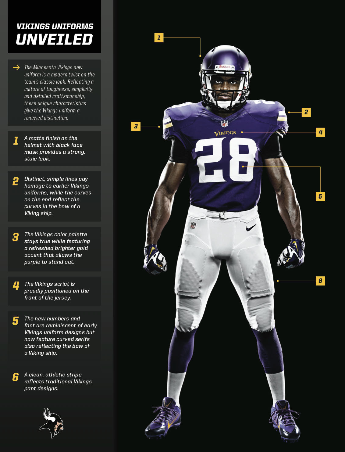
If you can’t show ’em the tramp stamp, show ’em that bullshit self-important designer-speak description they wrote up for the Vikes unis.
BTW, WTF is up with the BFBS Viking at the bottom right?!?!
whoops… bottom left.
Hopefully the other NFL teams/owners take notice of the online feedback (on various sites) about the awful number fonts.
The Vikings font looks like it was made for Adrian Peterson’s 28, and the other number combos are an afterthought. Those uniforms would be an A+ to me with a block font. Everything else I like.
The Dolphins aqua looks so washed out. Their number font is brutal! No wonder the little receivers wear teen #’s – they would never fit an 88 on their size 40 tailored jersey.
I’ll wait to see them in play but I hate these 2 looks much less than I anticipated. I wish both had better number fonts and the Vikes had gold trim on their numbers but other than the Bikes matte helmet which since I despise matte helmets I’d hate no matter what it’s not a bad look and still a major improvement for them.
Miami’s look has that awful tramp stamp which blows goats but other than needing the aqua facemask back and larger arm logos back it’s not too bad. The tramp stamp is a joke but adding the aqua pants makes the set look a lot better. Overall it’s still a small downgrade but not a downgrade on the levels of UNC or anything like that. It’s not as good as the previous Dolphins look but could’ve been much MUCH worse. With a few tweaks both sets could look pretty decent which is something that can’t be said for the Jaguars in at least a decade.
Wasn’t sold on the vikings new font at first but the more I see it the more I like it. Without it I think they would be too boring.
The big problem with it, to me, is that not every number combination will create the same negative space between the first and second numeral.
Since it looks like all ten digits will get the serif on the first number, only the 0, 3, 6 and 8 will have the rounded corners that fit into both the top and bottom serif. The 2, 5 and 9 will have one that fits, while the 1, 4 and 7 will have none. To me, this is going to likely cause an unwanted visual if mis-matching numerals on a uniform, and no one wants that. *heh*
That Dolphins wordmark looks like it belongs on a toothpaste tube.
Oh goddamn. Now all I’ll do is stare at those fucking serifed numerals on the Vikings jerseys for the rest of my life. I was very excited about getting back to a clean, classic look. But now, I’ll just be a babbling, rambling OCD mess trying to understand why the serifs don’t “flow” or match.
Nevermind.
I’ll just watch baseball.
The best unis in the NFL still belong to the Giants ,Dallas,Oakland,Chicago,Indianapollis,Cleveland,Green Bay,San Francisco since there return to 80s style ,none of nikes new styles come close, I think they missed a great opertunity with Miami a few alterations like more dominant Coral and no Navy would have been good with that design ,Minnesota an upgrade on the previous.
I think that the lesson we can take from those recent makeovers is that over-design is the worst sin when it comes to creating uniforms.
The Vikings one, for exemple, would have been perfect if not for all the bells and whistles uselessly added by nike as an effort to imprint its mark on something that could perfectly stand on its own.
Anyone notice the gold letters on the Chargers NOB last night.
Dolphins now look like the Memphis Maniax, that is my biggest complaint. But you really have to see the uniforms on the field during a game to get a final judgement.
As long as the NFL apparel contract never, EVER, goes to Adidas I’ll be happy – NFL would be as watchable as the NBA if everyone’s gear was required to have three stripes going down the side.
Miami looks like an Arena team.