Click to enlarge
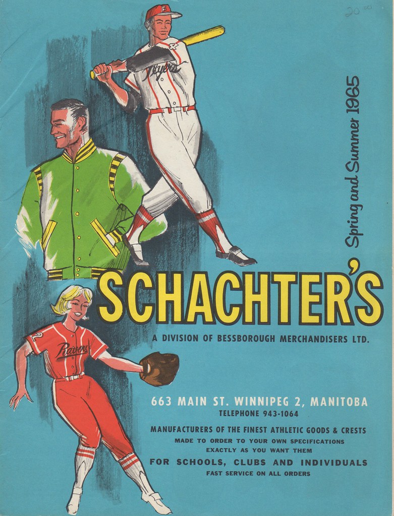
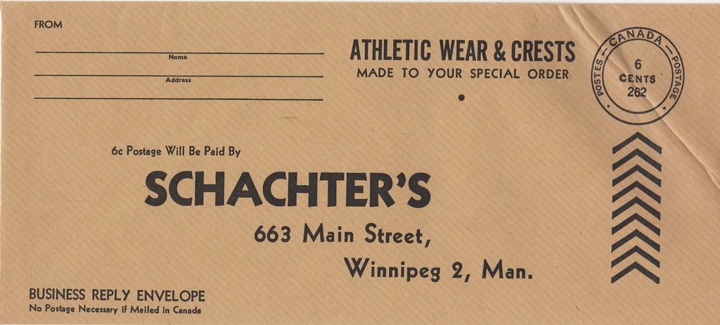
Time to look at another uniform catalog that I acquired from the collection of the late Mike Hersh. As you can see above, this one is a 1965 catalog from a Canadian company called Schachter’s. It’s fairly conventional in most respects, but a few things about it caught my eye.
The first and most notable thing is that almost every page of baseball and softball uniforms shows at least one mock-up of a jersey with a contrast-colored placket. This isn’t something you tend to see very often, either in catalogs or on the diamond, but it was clearly a Schacter’s specialty. Here, take a look (for all of these, you can click to enlarge):


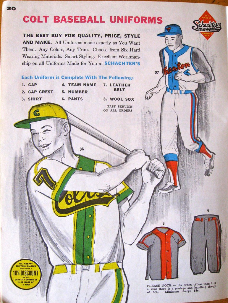

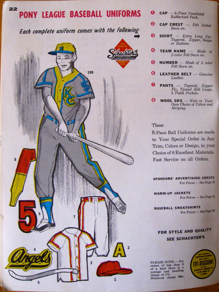
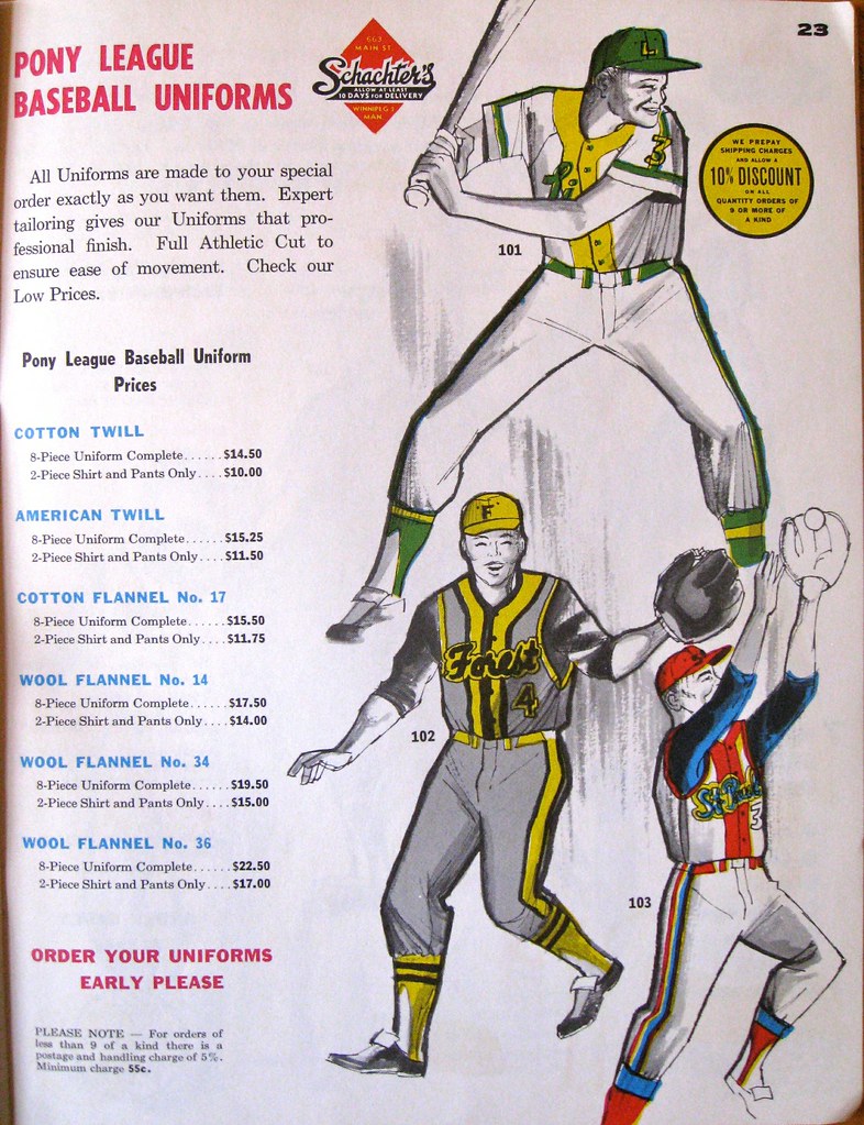
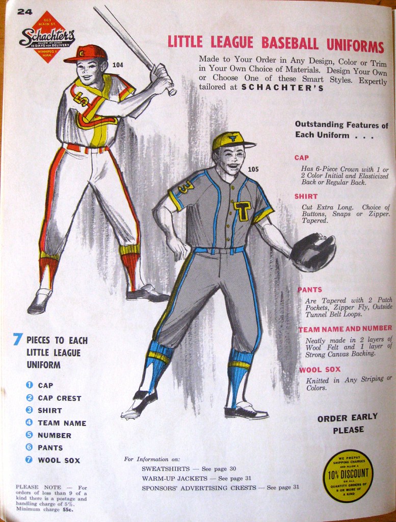
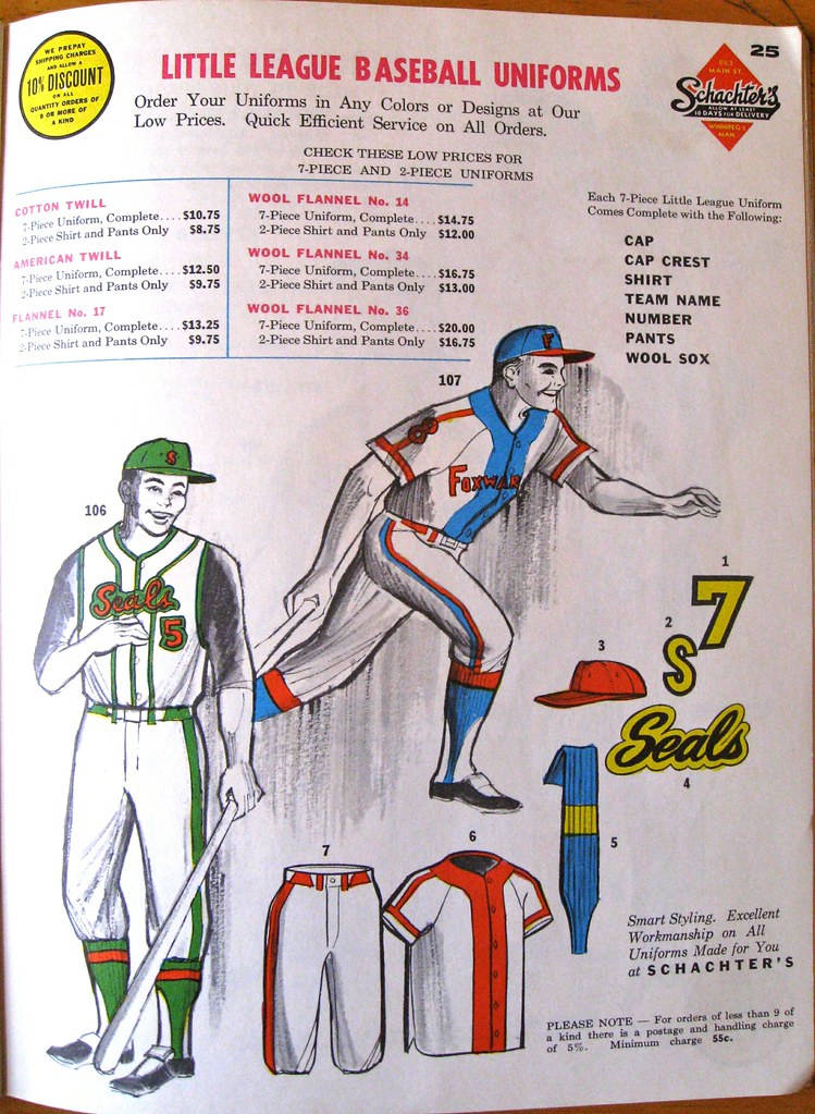

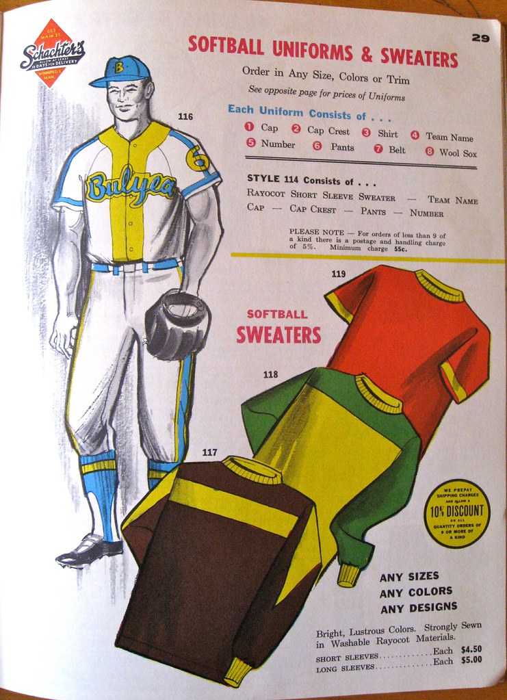
Weird, right? Some of those contrasting plackets look good, some not so good (and one of them is actually two-tone!). Maybe this was just a Schacter’s thing, and/or a way to show as many color and style options as possible, but I’m also wondering if this was a particularly popular style in Canada during the 1960s. Anyone know?
The other unusual thing about this catalog is that it features an unusual number of varsity-style jackets — 10 pages’ worth. Check it out:
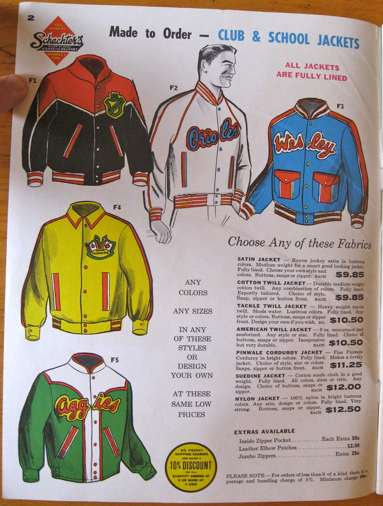
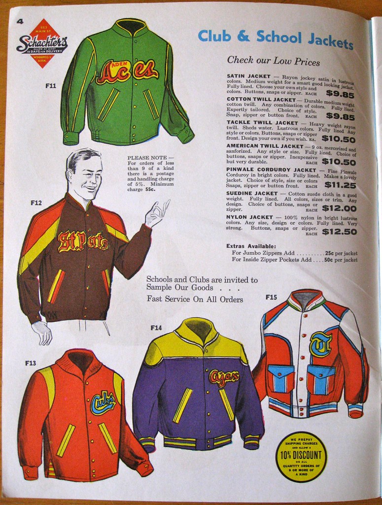


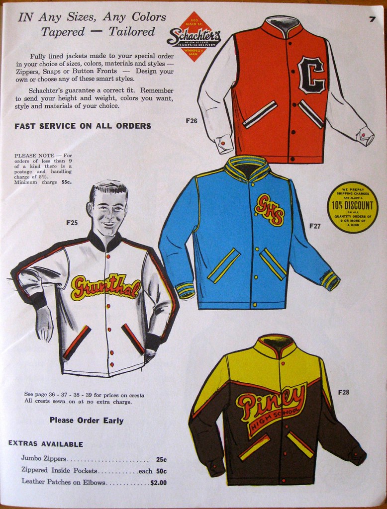
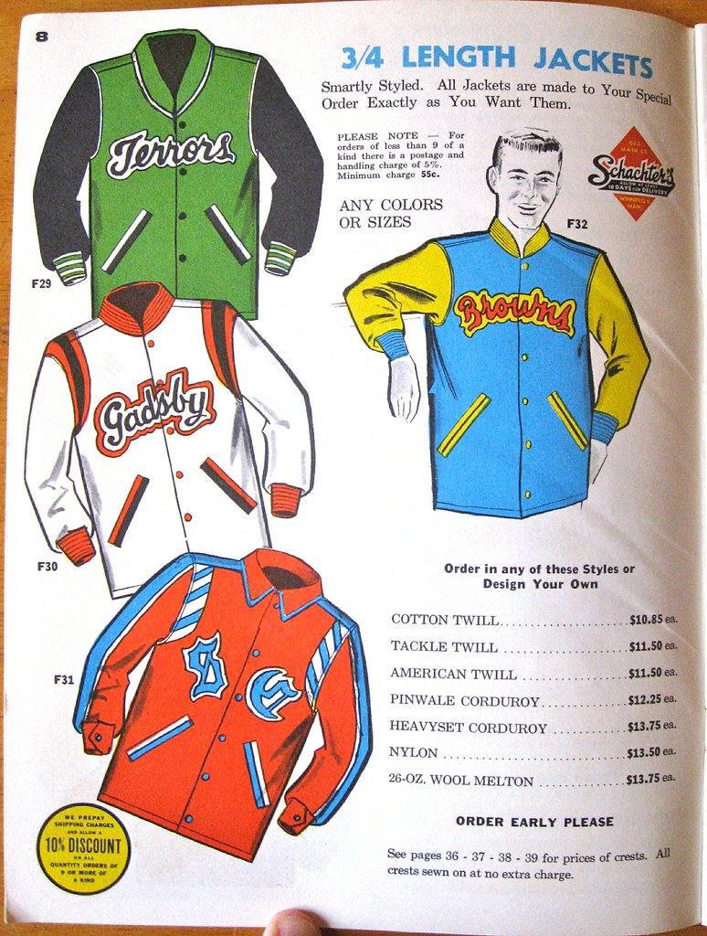
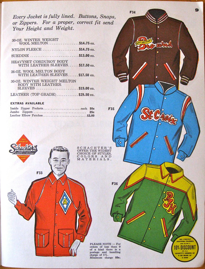
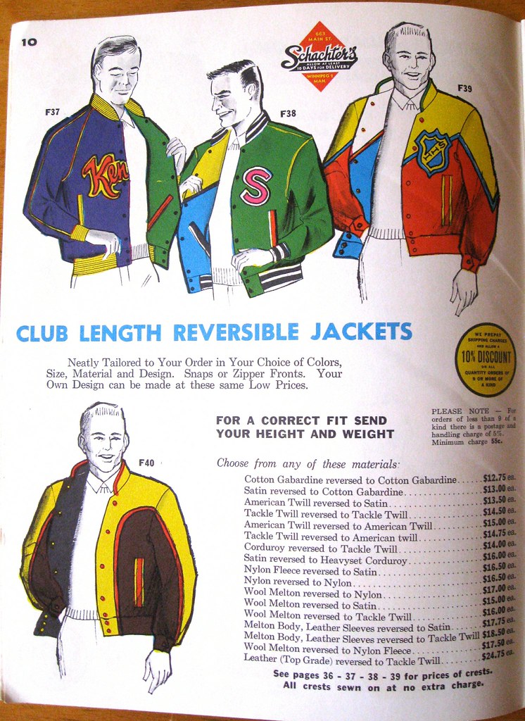

That’s a lot of jackets! But it kinda makes sense for a company based in Canada, eh?
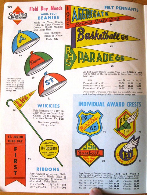
I also liked this page featuring beanies and something called “wikkies” — little felt pennants on a bamboo cane. Never heard of that before. Dig:
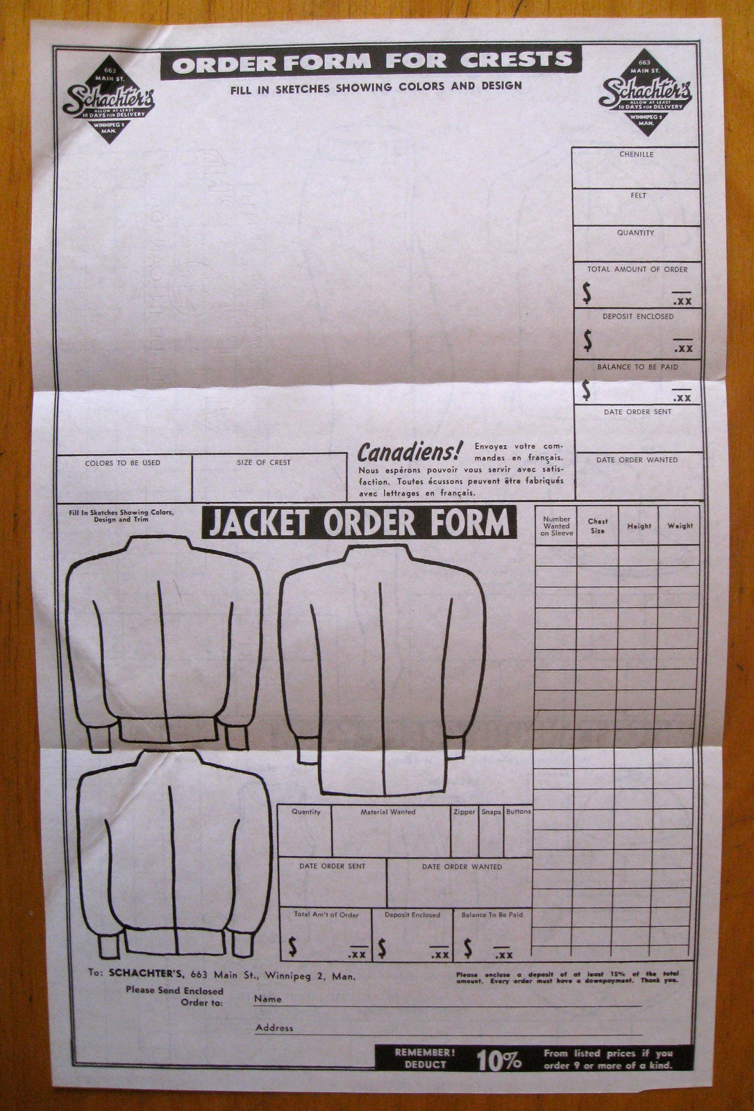
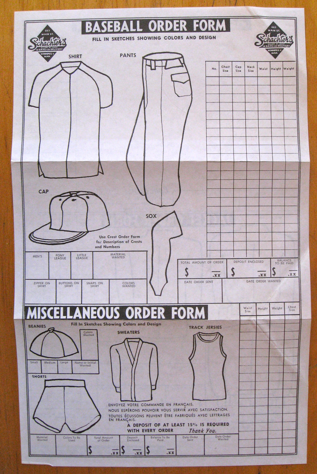
Finally, it’s worth noting that the catalog came with an order form (which includes template for ordering the beanies!) and an envelope in which to mail it. I’m not sure why, but I always get extra-excited when an old catalog still has these elements tucked inside:
———
That’s it for this catalog. More selections from Mike Hersh’s collection coming soon.
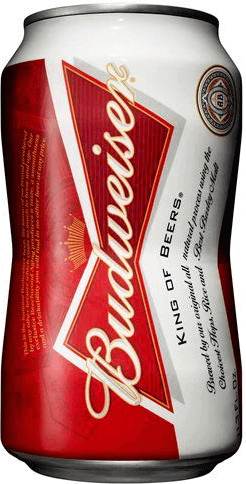
OMFG: My latest One-Man Focus Group column is about Budweiser’s new indented (or is it just dented?) can design, and I don’t mind saying I think it’s a pretty good piece. Check it out here.
In case you missed it, I ran an unusual entry on Friday: an interview with Uni Watch’s most prominent troll. This entry received quite a bit of very positive response — in the comments, via email, on Facebook, on Twitter, and in the media-crit world. To everyone who weighed in with favorable comments, thank you. And for those of you who missed it and want to see what all the fuss was about, look here.
Uni Watch News Ticker: NFL unveiling notes: The Jags’ unveiling will be tomorrow, 1:30pm; the Vikings’ will be Thursday, 6:15pm; and the Dolphins’ will be Thursday, 7pm (all times Eastern). I assume all three events will be streamed on the teams’ respective websites, although I don’t yet know that for a fact. ”¦ An anonymous reader who runs a sporting goods shop reports that he’s received a shipment of new Chargers jerseys with two changes from last season: (1) no more neck roll, and (2) two-color NOB lettering. Remains to be seen if these changes will appear on the field. ”¦ New football uniforms for West Virginia football. Phil had extensive coverage of that, and of lots of “Boston Strong” developments, in yesterday’s post. … Really good, long article about the current state of electric football (from Jeff Ash). … Brad Hovland received an email from the Vikings that included a “Metrodome Final Season” logo. Don’t know yet if that will be a jersey patch this fall, but I expect we’ll find out at the Vikes’ uni unveiling this Thursday. … The L.A. Kings wore Dodgers-themed warm-up jerseys last Thursday. … Pirates pitcher Jeff Locke has “Lockeness” on his glove — as in the Loch Ness Monster..? (From Kevin Poss.) ”¦ Robert Telleria notes that ESPN showed a Broncos helmet with a new striping pattern. Not sure what that’s about. ”¦ Ozzy Osbourne was once booked by police while wearing a St. Louis Blues jersey (from Jim Walaitis). ”¦ “I’m an employee of Bridgestone Golf, so I would appreciate it if my name is left out of this,” says an anonymous reader. “But I awoke this morning to an email about how to interact with idiots who connect the Boston bombing with our company, because of the one suspect who was wearing a Bridgestone cap. Apparently this has happened enough for all employees to be prepped. Just crazy.” ”¦ New uni number assignments for the 49ers (from Terry O’Donohue). … FAU is mulling lots of helmet options for this fall (from Dieter Kurtenbach). … The A’s will give away a Reggie Jackson bobblehead on Saturday. But as Richard Paloma points out, the NOB style is wrong — it should be straight, not arched. ”¦ The logos for the 2014 FIVB Men’s and Women’s World Volleyball Championships have been released (from Jeremy Brahm). ”¦ Some new lacrosse helmets have hit the field. … Keith Yandle of the Coyotes wore a tribute to Boston bombings victim Martin Richard in pregame warm-ups the other night (from Dustin Burns). ”¦ “Braves utility man Ramiro Pena was wearing a wristband with a logo that I (and the Braves broadcasters) had never seen before,” says Britton Thomas. “Joe Simpson commented that he had to keep doing a double take, because he thought it was a Cincinnati Reds logo.” I’ve never seen it either. Anyone know more? ”¦ Johnny Gomes of the Red Sox used a “Boston Strong” bat yesterday (from Warren Junium). ”¦ The Astros wore their BP jerseys for yesterday’s game against the Indians. ”¦ No photo, but Jay Abbott reports on an interesting minor league game from yesterday: “Oklahoma City and Albuquerque not only wore Negro League throwbacks, but they wore lots of them. I’ve seen the home team wearing whites of the New York Cuban Giants, KC Monarchs, and others, while the road team is wearing the Baltimore Black Sox, Homestead Grays, etc. I’ve never seen anything like this and it’s absolutely stunning.” ”¦ Ron Slover found a 1966 Pitt football program whose cover design mentions the team’s new uniforms. ”¦ The TCU and Baylor baseball teams wore red wristbands during last weekend’s three-game series. Mark Rybczyk explains why: “It was to honor the town of West, Texas, and those who died during the fertilizer plant explosion. Red represents Czech Heritage of the town, which is located halfway between the TCU and Baylor campuses. TCU had to turn the armbands inside out because they are sponsored by Easton and not TPX.” ”¦ Here’s a soda display of the MLB logo (thanks, Phil). … ”¦ Wisconsin’s spring football game featured new jerseys. Not sure yet if they’ll be wearing that this fall (from Joel Mathwig). ”¦ Construction plans for the Falcons’ new stadium call for the destruction of two historically important black churches. ”¦ World cycling champion Philippe Gilbert has taken the championship stripes thing a step further: He’s wearing the stripes as a tattoo (from Bernie Langer). ”¦ Interesting article on high-tech electronic sports goggles, which can apparently distract the user. ”¦ Mets and Nats went color-on-color yesterday. ”¦ I’m going to be busy working on an ESPN project in Manhattan for much of today. If you can go light on Ticker contributions, I’d appreciate it. See you tomorrow.
As a child of the 70s, loved the pirates and white sovx uniformd yesterday.
Bucs actually wore those mustard uniforms once in 2011, in a celebration of the 1971 club versus the Orioles. Only difference was the lack of NOB, which is how the originals were worn.
That Braves player is wearing an EvoShield wrist gaurd
Posey and a few Giants wear the same thing.
link
EvoShield has really blown up this year (they added much more team color options), but their shin guards, elbow guards and wrist protectors have been featured on the field for a few years now….definitely been on the site before, in fact,link was in the comments yesterday…look at Swisher’s shin guard.
I always thought the Broncos helmet stripe didn’t flow properly. Seemed against the grain. But this one looks odd. All they really needed to do was take their current stripe and apply it in reverse.
or no stripe at all
It looks like ESPN hastily put together a Broncos helmet using Titans/Ravens striping. I doubt this is a real change
The logo that Britton Thomas sent in is from a company called Evoshield. They make protective wristbands (like those) and those new elbow guards that stick out. They are becoming very popular.
They have some kind of material inside that is liquid when you put it on, then solidifies in the shape of whichever part of the body on which you are wearing it for a custom fit.
Yep, my son catches little league and wears the Evoshields on his forearms when blocking bad pitches. They definitely work for protection. No, I don’t work for Evoshield. I’m just a dad.
Page 11, baby!
The Wisconsin spring jerseys are just that, spring (practice) jerseys. A&M had the exact same style of adidas uni in their spring practices & game as well.
As does Notre Dame, although they wore last year’s jerseys in their spring game. They’ll have a new set of jerseys for the fall, which should look identical to last year’s.
They *couldn’t* wear that in an official game, right? NCAA bans the use of both the logo and the three stripes, and adidas challenged in court and failed.
Correct
Sorry, I meant to embed this link: link
Unless they come up with fruit loop pants for football, adidas can’t get any more branding into their uniforms.
mmmmmmmmmm fruit loops having a bowl now.
Thank goodness, because those are just the awful-est
I believe the jerseys that Wisconsin Football wore on last Saturday’s spring game are just their practice jerseys. It looks like Nebraska has an almost identical jersey as well.
Thanks to that catalog, I now wish I played for Angus and had a beanie and a wikkie.
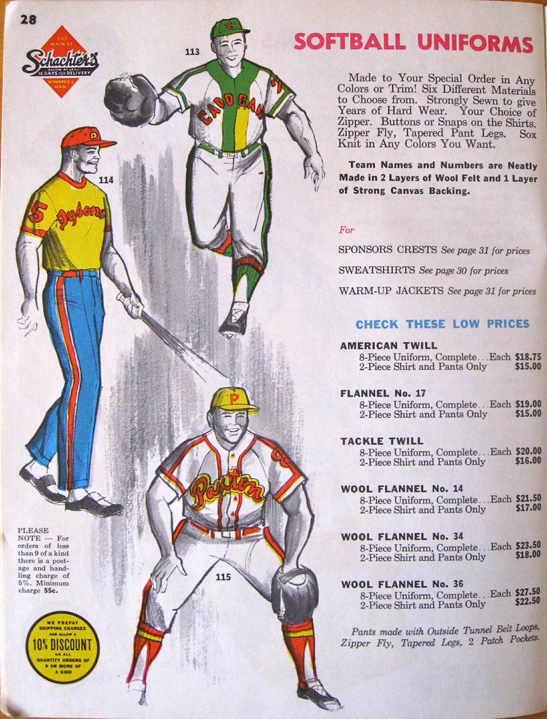
What’s the deal with the placket (113) on page 28? Two-tone on the left side only? Perhaps a print error? Also on p. 28, dig the pants on the guy in the middle (114)… not quite pajama-bottoms… more like movie usher pants.
Also on p. 28, dig the pants on the guy in the middle (114)… not quite pajama-bottoms… more like movie usher pants.
Those are softball pants. They show up frequently (in that style/length) in old catalogs, although you rarely if ever see photos of anyone wearing them on the field.
Looks like they’re cuffed, or ya think it’s just a hem? If it’s a cuff, those things would be dirt magnets.
On most softball pants of that era there was a cuff similar to a shirt cuff that adjusted by either a two-snap closure or a strap and d-ring buckle. The pants were made out of gaberdine or cotton twill with no stretch.
The Canadian manufactured jackets always were much more stylish than anything we sold in the US. We sold a line called Avon Jackets that were made in Toronto.
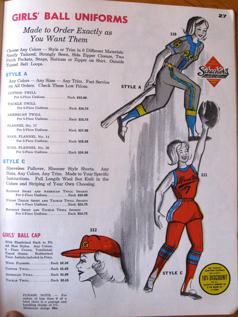
Where do I sign my Mrs. up to play for a team that wears those awesome full-leg stirrups as seen on page 27?
Those full-length socks were probably re-engineered hockey socks, eh? After all it’s a Canadian manufacturer.
“…I also liked this page featuring beanies and something called ‘wikkies’ – little felt pennants on a bamboo cane. Never heard of that before. Dig…”
Marc is right. [Not that Mark is wrong.] Those beanies! I just wish I had the guts to wear my beanie and wave my wikkie and march proudly down Pennsylvania Avenue. Might provoke the Secret Service, though.
Isn’t there an old Warner Bros. cartoon with a buddy of Foghorn Leghorn showing up with a long fur coat and wikky-like pennant?
Rhode Island Red! Probably rootin’ for ol’ P.U.
link, but UWers were once again spot on.
that made my day. thanks, ben!
Minor league teams have done that mix and match of Negro League uniforms in the past, so it’s not something unique to Albuquerque and Oklahoma City. I know of when example several years ago when the Vermont Expos did something similar.
I’m sure this has been pointed out before, but I could use a little help on this: For a sports column I write in a Wisconsin arts & culture magazine, I’m designing a 1970s throwback uniform concept for my city’s summer collegiate baseball team. Is there site with a blank template of a ’70s-era uni? In particular, one with a pullover jersey and sansabelt?
The MLB soda logo display looks like a white duck.
That logo on Ramiro Peña was Evoshield. They make protective gear. link
I would like a link, right fucking now, thank you very much.
Ditto. And the adjacent powder blue jacket that says “Browns”.
And a Tigers jersey in green and gold, not as weird as the powder blue “Browns” jacket, but still looked odd to me
Have we talked about Nets vs Bulls going color on color? Because that was pretty to look at. And is that the first time color vs color happened in the modern NBA (excluding gold worn by Lakers, Warriors etc)?
Warriors-Nuggets went Color/Color on Saturday.
True (and that game was before Bulls vs Nets), and it’s even rarer to see dark vs dark in the NBA.
Two thumbs up. I hope the NBA was paying attention to how good those games looked.
Colour on colour’s been happening for a few years now, but it’s really been ramped up this season (along with more teams using yellow home alternate unis).
Christmas Day games were especially with heavy on color on color, so NBA doesn’t seem to have any issue with it.
Apparently the Nets needed Chicago’s permission to wear black. The black-on-red did look great.
Spurs/Lakers was also color-on-color (silver-on-purple)
It was great and I hope getting blown out in Game 1 doesn’t make the Bulls change their minds for Game 2.
Not a playoff team, but don’t overlook the Cavaliers’ yellow (gold) uniforms.
Just another gimmick. Black vs. red might be ok for a weeknight game in December or something, but not in the playoffs.
Why are playoff games sacrosanct?
Because the focus should be on the game in the playoffs, not the uniforms. The Nets shouldn’t have to rely on wearing black to generate excitement.
But it’s a gimmick that adds to the atmosphere of the game, and reinforces the team’s visual identity. It’s a fun way to celebrate the team’s first playoff series in its current reincarnation. And it’s no less gimmicky than the Terrible Towel or various “whiteout” stunts.
Plus, color on color looks good. It’s not like the traditional home whites are meant to be sacrosanct either, now that we have color televisions and reliable laundry facilities.
This showed up on Louis Nix (Irish NT)’s Instagram. Looks like a mini helmet but he tagged it with the following: Look out for these helmets. #Nice #Swaggy #CantWait
link
Swaggy? Ugh.
The helmets might not be bad, depending on the uni they’re paired with, but it looks like the greens on the shamrock and facemask don’t match.
Anything other than a solid gold helmet just looks wrong on the Irish.
I don’t even know what “Swaggy” means.
The red wristband that Pena is wearing is an EvoShield. It’s a pretty popular protective accessory-type brand. If that was what you were referring to.
The Budweiser can is a gimmick that I can’t imagine will live long. That being said, I will personally be buying one 6-pack, simply to add the uniquely shaped can to my beer bottle/can collection.
Nope — you’ll be buying an 8-pack! That’s how they’re selling them.
A hot summer day and some brats from the grill will help me cope with the surplus.
They can’t sell them as 6-packs because it would make the math too easy. If they sell them as 8-packs us dumb millennials won’t be able to tell that we’re getting ripped- off!
Who knows which gimmick will catch on and how long it will last?
Coke’s stubby six packs usually cost more than the regular 12pk. case or XL large size six pack and they have been around for years.
If they want to appear to the younger crowd, I would think a better tasting beer would trump “weird shaped can”.
But we’re talking about college kids. They’re volume drinkers and they’re choosing from labels that all taste vaguely like water.
My college experience was that Bud was quite rare. It fell between two stools. If you were a volume drinker, it was Milwaukee’s Best, Natty Light or local favorite National Bohemian. My friends and I drank a lot of decent microbrew, and when we were feeling the pinch, Yuengling. You could always do better or more for cheaper than Bud.
I mentined it after the previous Sunday Home game the Astros had; they have a second set of the BP jerseys that is their Sunday Home tops. This was mentioned by the team historian when I asked why they had on the BP jerseys back when they played the A’s.
Don’t they have one set without NOBs for practice and another set with NOBs to be used as an alternate in games?
Nope, both sets have NOB. A friend of mine was at the game on Saturday and she Instagrammed a pic of Altuve. Clearly NOB for the regular BP’s. Obviously, the Sunday BP’s are NOB as well.
The NNOB was only for Spring Training. Too bad, they looked good.
Found the Tweet:
From Mike Acosta @AstrosTalk 04/07/2013
@Poisso3 They are designated as the Sunday home jerseys. There’s a set for games and a set for batting practice.
Thanks, James. Of course I prefer the NNOB style.
i was surprised to see the Spurs wearing their alt jersey for their first game of the playoffs yesterday
the nuggets did too.
And Miami wore its “bleed out” white alternates against the Bucks. So I was almost surprised to see Indiana wear its usual home whites against the Hawks.
Speaking of Miami, the Heat gave out Nike-branded t-shirts to create a “white out” effect, surprising in an adidas-heavy NBA: link
i guess the heat did too… maybe if i watched more than one team… LOL
That’s not a “jersey” Ozzy Osbourne is wearing – more like a short-sleeved pullover or polo shirt with a zipper neck, that is done up in Blues colors with a smaller version of the logo on the front.
-Jet
Yep, I saw that pic and said “That’s no jersey!” Interesting shirt, though.
the braves player is wearing a evoshield wrist band
If those are in fact this year’s Chargers’ jerseys, that’s absolutely an upgrade. They’re not quite there, yet, but definitely a step in the right direction.
Now they need to face the shoulder bolts in the right direction.
The wrist guard is an evo shield, it is a protective sleeve and also acts the same as taping as player wrist.
link
The Badgers have been wearing those jerseys all spring for practices. It’s just their practice jerseys. I highly doubt they’ll have new uniforms for the season.
I am shocked you have not seen the Evoshield logo before. Buster Posey, Yadier Molina, and Josh Hamilton are some big names that have been using it. I don’t believe it’s new for this season because I have seen it sold in stores for a couple years now.
Atlanta’s getting a new stadium? So the lifespan of a stadium these days is twenty years?
The Falcons want an outdoor stadium, and their mistake was building (or having the state pay for) Georgia Dome in 1992, just before domed stadiums went out of fashion.
Twelve new stadiums opened since 2000 – if I’m not mistaken, of them, Ford Field is the only indoor stadium, and four have retractable roofs.
The *really* crazy part is that they intend to keep Georgia Dome open even after the new stadium opens, because various college football and basketball events are big money makers. So the Falcons expect the state to pay for a new stadium and cover the cost of operating two NFL-caliber arenas.
I live in Atlanta and this is the first I have heard regarding the GA Dome remaining open. I have heard that all big events such as the SEC Championship, Chick-Fil-A Bowl and Kickoff Classic, NCAA basketball tourneys, high school championships, future Super Bowls, etc would all transition over to the new facility.
My mistake – I remembered GWCC folks talking about how the new stadium would be a “complement”, not a replacement back in 2010: link
Plans obviously changed since then (and a retractable roof, which wasn’t part of the initial plans, would allow Final Four hosting as well).
And, the state is not paying for it. The Falcons are paying $1 billion and the state is paying $200 million.
“The Falcons are paying $1 billion and the state is paying $200 million.”
I just laughed and laughed and laughed at that complete and utter bullshit lie.
There is no fucking way on Earth Arthur “Obama is a stinking MOOSLIM” Blank is going to shell out a single penny, let alone a billion dollars for this new stadium.
He’ll hem and haw and bitch and whine and negotiations will go on and then Blank will start mewling about Los Angeles and the city and state will cabe in like they all do and end up paying for ALL of it and get NONE of the parking fees or concessions
Enlighten me. What part of the financing plan hasn’t been settled?
And. . . Blank supported Obama.
Funny you say that… It’s the 20th season at Jacob’s Field and I was thinking “How long till we start hearing how the Indians need a new stadium?” Hopefully that’s only a trend reserved for late-model domes or pre-Camden Yards facilities.
Odd but true: Coors Field (opened in 1995) is the third-oldest ballpark in the NL.
I consider Charlotte’s Bank of America Stadium the first of the state of the art football stadiums (sort of like Camden Yards), but 17 years after opening, the Panthers tried to get a new stadium financed before settling on renovations. And the Redskins could leave FedEx Field (opened in 1997) if DC can build a stadium.
So yeah, it’s crazy – an NFL stadium can be replaced before it’s old enough to drink.
Over in basketball, Charlotte Coliseum was less than 19 years old when it was demolished.
BIG breakthrough for NFL collar treatments. Nike’s NFL shop has images that appear to suggest many teams are dropping the neckroll.
Ravens, Bucs, Bills, Chargers and Broncos are all changing. The Ravens, Bucs and Chargers all seem to be going with collars the same color as the jersey. The Broncos seem to be going with the contrast collar ala the new Georgia Bulldogs uniforms. I would say similar to the Texans, but those didn’t actually feature the Flywire technology- it just used the same shape of the collar. Buffalo seems to be going with the same treatment as the Patriots, meaning neither the shape or tech of the Flywire collar. Thus, this means they return to their traditional collar striping.
The Saints, Rams and Bengals all appear to have kept the neckroll.
Here is a link to the photos: link
Looks like they won’t be correcting the color of the Jets jerseys. Another year in Army green. Then again, no one will be watching…
I’m not seeing any changes on that link, can you provide another?
Just click the individual team logos to see the pics.
Aha! Got it! Yep progress indeed.
Click on each team’s individual page. Denver’s shows a player in a white jersey with a thick blue collar, rather than the blue neckroll it really was. San Diego has the powder blue jersey with no white on the collar at all, etc.
Okay…these are interesting. Where do they play again?
link
link
I do like this one, though.
link
It’s weird that Nike called this series of designs “Tri State”, when the term has a specific meaning in the NYC metro, and it only shows one state.
I like the DC treatment too, even if I don’t dig the Indian head. The Broncos shirt looks weird, but they can’t do anything about Colorado’s rectangular shape.
On the Budweiser can front, it is worth noting that some Euro beers come in 11.2 oz bottles. Koenig Pilsener and Warsteiner are the first two that come to mind.
Could this be the worst “uniform” of all time? Seriously. . . who thought that was a good idea?
link
I’m guessing the same people mentioned below who choose their beer based on bottle or can gimmicks, like labels that change colors to let you know that the object you just took out of your cold-making machine that is cold to the touch of your own hand is, in fact, cold. They’re the people who think making a sports uniform that calls oneself an ass-beast is a good idea.
As a millennial (God, I hate that term), I can say from first hand experience that these beer can gimmicks work wonders for these companies. I would see people at school drinking new brands of beer each week if there was a gimmick. There’s no loyalty whatsoever, which I can see as a big problem for these companies.
(Such gimmicks include: blue mountains when your beer is cold, scratch off labels on your Bud Light bottle, find the orange can in the box of Keystone, etc., etc….)
The dumbest of which was probably the Miller Lite “Vortex” bottle. The magic grooves really aid in the liquid flowing out! Otherwise, it wouldn’t pour out at all!
Miller Lite vortex – stupide
Miller Lite punch top – genius
While I mostly avoid mainstream brews, there are times that simply demand large quantities of canned beer (deer camp, hosting large parties, etc.) The punch top makes a big difference in flow – i.e. it’s more like drinking from a glass (no “chugging”) without the hassle of actually bringing glasses.
Didn’t Miller Lite or someone else (Bud Light maybe) have finger grooves like the laces on a football?
Paul notes the oddity of showing colored plackets in the catalog, but what strikes me is how the plackets shown overlap. The left-hand edge is shown going down the middle, similar to a zipper-front jersey, rather than overlapping all the way to the right-hand seam.
I can’t recall ever seeing a button-front jersey that had that kind of placket arrangement; they’re usually the traditional full-overlap kind. These look more like zipper-fronts, except for actually having buttons.
Looks like the artist exaggerated the plackets for the sake of detail. Some templates don’t bother finishing the part of the placket being overlapped.
link
Nike’s war metaphors make the company look even more blind to good sense than usual.
“We’ve been taking them down, but somehow they keep ending up back on the rack,” the employee is said to have replied.
Unfortunate imagery aside, you gotta give credit to Nike for the self-racking t-shirt technology.
Comment of the day!
The Iowa Wild (Minnesota’s new AHL affiliate) just tweeted a picture of their home jersey for next season:
link
I’ve gone to at least one Aeros game a year for 15 years. Ever since the arena in Des Moines was built, I knew that relocation was a possibility. I will miss them, but obviously most of Houston doesn’t even know the team exists.
I’m from Canada and the 1960s and I’ve never, ever, ever seen a baseball uniform anywhere with a placket in a contrasting colour.
If this is the final season at the Metrodome, are the Vikes moving to the University of Minnesota’s stadium for a few seasons? I thought and for what it’s worth, Wikipedia lists their new stadium as not being complete until the 2016 seasons.
Yes. They will play 1 or 2 seasons at U of M’s stadium. It’s going to great to have outdoor football!
It’s going to *be* great to have outdoor football!
Some Pittsburgh Penguin farmhand is gonna dress with the big club for the first time tonight.
link
Apparently, there are a lot of old-stock jerseys floating around that need to get pushed into use. In the picture in the tweet above, not only can you make out a vector logo through the back (it has a Reebok word mark patch as a coverup), but the inner neck line features the Rbk ligature with the vector. The Rbk abbrev hasn’t been used in about 5 years!
I realized after the fact, there is a really good chance that these aren’t just any old old-stock sweaters. These could be the originals, with too much hydrophobic material. Everybody hated those–all the sweat went to the gloves and skates and made them intolerably uncomfortably wet. It took Pens captain and Reebok poster boy Sidney Crosby to plead for a re-do with traditional Air-Knit. So if any team has way too many old “bad” jerseys on hand with an incentive not to make much noise, it’s the Penguins!
Hey, Paul, did you know that was an EvoShield?
Since the company was based in Canada, I am going to think of those softball pants as precursors to the Cooperalls.
Looks like Southern and Grambling do it as well link
Oh, how the meek have become meeker. Just a couple short years ago FAU had one of the link in all of college football. (yes, I said it.)
There was some line in South Park once that went something like “all you have to do to be a non-conformist is dress like us and listen to the same music we do.” I believe this is becoming applicable to college football uni design.
I attended a talk on finite-element modelling a few years ago in which the speaker commented on the pressure put by the beer and soft drink industries on can manufacturers to reduce the amount of material used in fabricating cans in order to save money on both raw stock and transportation. (His joke was that they wouldn’t stop until cans were so thin as to be see-through —Â and given how many times I’ve ruptured cans by dropping them, I can’t say as I’d doubt that.) I’m somewhat shocked that Bud would choose a can design that uses twice as much aluminum as the standard.
Those can manufacturers need to call Dr. Nichols over at PlexCorp:
link
You remember him, right?:
link
Paul – Love the work! A suggestion that you might consider adding a NSFW tag if you happen to have content like that in the link above under “In case you missed it”. While I have no personal issues with the content, I clicked on that link during my lunch break at work…at a children’s hospital…where people like to shoulder surf and my computer takes every opportunity to freeze.
Thanks!
I thought (and still think) “NSFW” is for visuals, not for text. Anyone who’s close enough to your monitor to read a dirty word — or any word — is too close, no?
Tearing down a church is a big deal, there has been two of such in my town in the last year (with a lot of uproar). But the establishments being built are a definite positive. Same for Atlanta as their current facility is an eyesore, Falcons owner can buy out anyone who stands in his way, even God.
Love the site, visit it daily. And I very much apologize if this question has already been answered – but what is up with the anti-Obama pop ups that come every time I open the site? Thanks so much.
Not sure if this has been covered, but link to determine which of the many faces of Sparky to use going forward.
The thing that sticks out to me is that all the options have swoosh eyebrows. Ironically, the most recent (and fan-rejected) Sparky had link.
link
beanies of the Big Ten
right now on LeafsTV showing 1986 playoff game between Blues and Maple Leafs, retro uni’s and shiny numbers for the Blues.
Ottawa Senators link before promptly getting bombed by the Penguins.