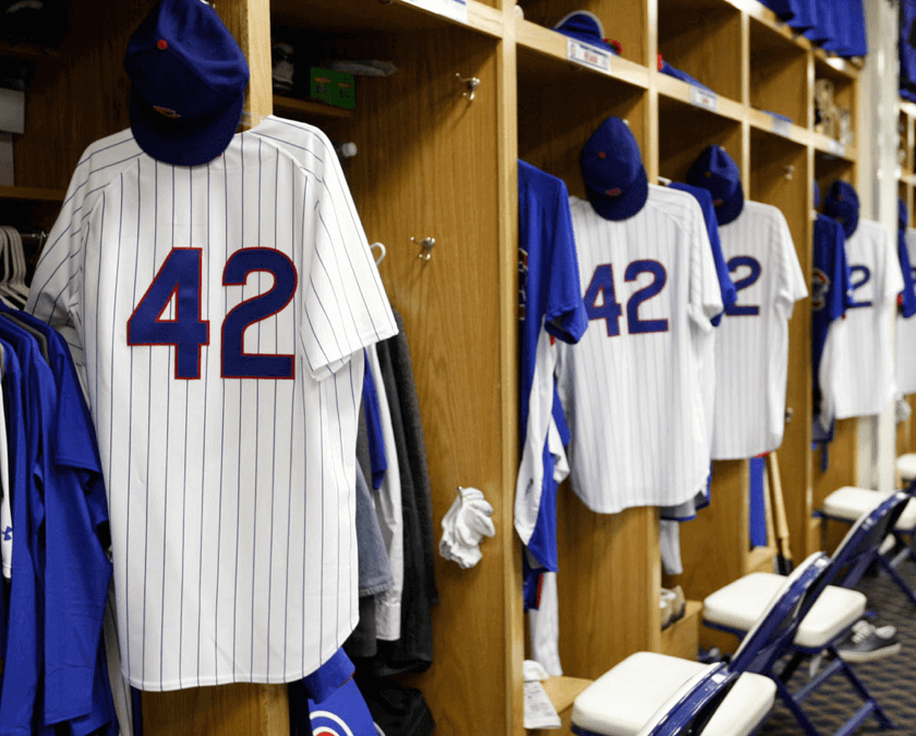
Yesterday was Jackie Day. I know some of you think it’s overdone, but I love it — not just the symbolism, but also the odd sight of game photos like these (and the inevitable carping from Mark in Shiga about how the numbers weren’t vertically centered properly on the NNOB jerseys).
By now we all know the drill for Jackie Day, but here are a few scenes that stood out:
• Everyone knows that the players, coaches, and skippers all wear 42, but it’s easy to forget that the umpires also get into the act. (Of course, nobody can name a single ump by number anyway, but it’s still a nice gesture.)
• Just in case there weren’t enough 42s on the field already, they put one on the back of the mound in Cincinnati and Los Angeles.
• Jimmy Rollins of the Phillies began the game wearing blue shoes and then switched to white. Both pairs were special editions that he plans to auction off for the Jackie Robinson Foundation.
• Carl Crawford of the Dodgers also had sets of white and blue shoes. But instead of switching between them, he wore one of each, which looked pretty damn ridiculous.
• The Dodgers had a bunch of 42-clad kids on the field prior to their game against the Padres.
• I had heard that all minor leaguers would also be wearing 42 (that was true of at least one team), but reader Richard Jurnack, who attended last night’s game between the Rochester Red Wings and the Scranton/Wilkes-Barre RailRiders, reports that Rochester had only two 42ers: second baseman Eric Farris and outfielder Brandon Boggs (the latter of whom was doubling as the first base coach in that photo). “Conspicuously,” says Richard, “they are Rochester’s only African-American players.”
And there you have it. Teams that didn’t play yesterday will wear 42 today. That includes the Mets and Rockies, who were snowed out in Colorado yesterday and are slated for a day/night twinbill today. They’ll go 42-clad in the first game and then wear 1993 throwbacks (which was the original plan for today’s game) in the nightcap — assuming the weather cooperates, which looks iffy at best.
Collector’s Corner
By Brinke Guthrie
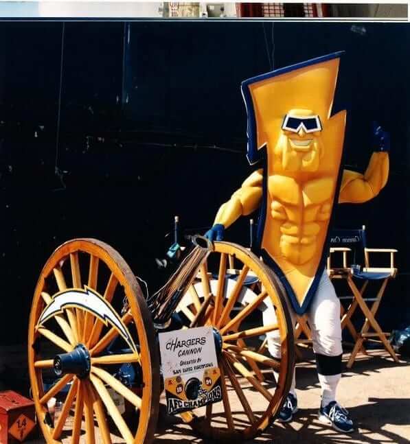
I’ve done Collector’s Corner for a while now, and it’s harder and harder to come across something I’ve never seen before. But I can honestly say I’ve never seen this Chargers “Bolt-Man” costume, which was sent in by reader Mike Powers. Just $10K and it’s all yours. This would go over great at Raiders games.
As for the rest of this week’s haul:
• Here’s a nice-looking early-1960s Detroit Pistons game-worn warm-up jacket. That same seller has a lot of vintage NBA game-worn merch, like this 1950s Knicks pullover. [I’d say Brinke buried the lede there, cuz that Knicks pullover is spectacular! ”” PL]
• This is a pretty neat: hand-painted jersey trophies of 1970s ABA stars David Thompson, Zelmo Beatty, and Artis Gilmore.
• 1970s NHL poster alert! We’ve shown several of these in the last few months and they’ve proven to be quite popular. We have the Sabres and the Rangers for you.
• Speaking of posters, how is it I never saw these? A Marathon gas station promo poster from the Cincinnati market, issued for the Hit King breaking Ty Cobb’s career hit record.
• Forget Mel Kiper. Frank Gifford had all the NFL insider info you needed back in 1968.
• Look closely at this 1970s Cleveland Browns football. See the uni design? Haven’t we seen that somewhere?
• I like the cover art on this 1967 NFL book, and the title too: Throw The Long Bomb! As opposed to what — the short bomb?
Seen something on eBay or Etsy that you think would make good Collector’s Corner fodder? Send your submissions here.
Calling All Collectors (and fans thereof): One week from tonight — next Tuesday, April 23, 8pm — is the latest installment of my favorite City Reliquary event: Collectors’ Night. It’s always a good time, as people display their collections of whatever, and attendees walk around the room to view the collections and talk to the collectors. At the last Collectors’ Night, about two and a half years ago, I displayed my collections of mid-century tap knobs, clothing tags, and recipe booklets with the word “Meat” in the title (couldn’t bring my pencil sharpener collection, cuz it isn’t really portable), and other folks showcased their collections of stringed instruments, books with one-word titles, ashtrays, volvelles, mousetraps, dipsticks, and dust from art museums (I love that one).
I won’t be showing a collection this time around, because I’ll be busy emceeing the event, but lots of other cool folks will be sharing their collections. Here’s what you need to know:
1) If you have a collection that you’d like to show (it’s free!), contact City Reliquary VP Matt Levy. He’ll hook you up.
2) If you’d like to attend the event and see all the cool stuff, full info on that is available here. Hope to see you there next Tuesday night, yes? Yes!
Uni Watch News Ticker: No word yet about uni-borne memorial responses to yesterday’s events in Boston, but I’m sure we’ll be hearing about that soon. ”¦ Here’s an interesting new site that tells you whether the roof is open at the six MLB ballparks with retractable enclosures. Very nice interface and site design, too. Nicely done. … Budweiser has come out with a line of MLB team-themed cans. … The comic strip “Cul de Sac” was uni-centric yesterday (from Sean Clancy). … UT-Tyler baseball went G.I. Joe over the weekend. So did the softball team and their opponent, East Texas Baptist (from Michael Greenwald). … Rays catcher Jose Molina normally wears the hockey-style maks. But his mask broke in the 9th inning yesterday, so he borrowed coach Tom Foley’s helmet and used a traditional-style mask (from Tim Burke). … The L.A. Kings will wear Dodgers-themed warm-up jerseys prior to Thursday’s game (from Jason Christie). … New UConn basketball uniforms will be unveiled on Thursday (from Gregory Koch). … Here’s a video clip featuring the Marshall football equipment staff (from Warren Junium). ”¦ For reasons that aren’t entirely clear to me, one of the Harlem Globetrotters brought out the lineup card prior to last night’s Reds/Phils game — in uniform and spinning a basketball. ”¦ Several members of the Illinois State basketball team who are majoring in Apparel, Merchandising, and Design helped design the team’s new uniforms (from Stephen Lucas). ”¦ Russell Martin has worn Nike gear throughout his career. This season, though, he’s worn a variety of different makes. “Also, he is no longer wearing Nike cleats or batting gloves and has now started wearing Franklin gloves and cleats,” says Ben Lowmaster. ”¦ Disappointing to see that Chris Young of the A’s, who was wearing very nice stirrups over the weekend, went with two-in-ones yesterday (from Andrew Tucker). ”¦ Also from Andrew: Someone at last night’s A’s game had a clever take on the “player to be named later” concept. ”¦ If the Bobcats change their name to the Hornets, it will reportedly be at least 18 months from now (from Mike McLaughlin).
You start with a ponderance of how/if the events on Boston will commemorated on uniforms. Ironically, the race itself was already commemorating the Sandy Hook tragedy with Mile 26 being dedicated to the 26 people killed there.
link
Phillies outfielder Ben Revere was way ahead of the pack on this one. Here’s his glove last night: link
For the Dodgers “42″ on the grass behind home plate – isn’t that just their standard “LA” logo (same as on their hats)?
You’re right! Now fixed.
The Dodgers did have a 42 on the field elsewhere. you can see it was painted on top of the “Opening Series” logo…
link
Typo alert!
“Conspicuously,” says Richard, “they are Rochester’s only Afrian American players.”
Should be “African-American”
Thanks. Fixed.
At least one of the online game trackers (I think it was Yahoo) had a bit of a 42 messup yesterday, reporting Sox pitcher Junichi Tazawa as being in the game in the 8th inning when in actuality it was Koji Uehara pitching for the Sox.
When Molina borrowed the facemask in the 9th inning, he first put it on with the brim of his helmet facing backwards. Played around with it for a few seconds, stood up, and turned the helmet forward, then settled into his stance.
I didn’t see my Natties featured on the Bud page, but it’s ok
not that I drink much Bud or Miller Lite anyway, other than a few of these ($5 until opening pitch) at Nats Park on game days: link
The Nats and several other teams are not represented in the Bud beer cans. The Nats primary beer sponsor is Miller Lite. The Rockies and Brewers aren’t in there either.
By the way, the beer situation at Nationals Park isn’t very good. Nothing local (some regional), high prices for macro beer.
add the white sox, and tigers to the list of snubbed teams as well.
seattle and toronto round out the “no love from ab inbev” club.
Interesting seeing the MLB logo in team/other colors.
There is no way the Rockies and their Coors connection would be on a Budweiser can.
I was in St. Louis once and a friend ordered a Coors Light. The waitress said “Not in this town.”
the strong a-b sentiment in st. louis has waned considerably since they sold to inbev and laid off thousands in st. louis. miller and coors are both available (and on tap to boot!) at almost all bars.
apparently, Nats Park has the highest beer prices in the NL (link)
BUT… get to the game early and drink Miller Lite or Coors Lite for “only” $5 each
As my bubbe would have said (if she’d been an alcoholic), “such a deal!”
Steinberg dug a little deeper on this issue and found that it’s not necessarily true. He cites Team Marketing Report and shows that $8.25 for 20 oz ranks 13th in the Majors
link
good! ammo for me in fight against folks who try (in vain) to badmouth the Park!
At Wembley on Saturday a 330ml bottle of Bud was £4.70.
You do the sums, but I think that wins.
I’ve done the sums for you.
it’s $10.38 for 16 US ounces
Sorry – meant to add – of course you could only buy Bud, because it’s the “FA Cup sponsored by Budweiser”.
Talk about a monopoly :(
Do people in the UK drink that swill? I imagine you guys have more refined beer palates than Americans do
Not willingly, Phil – but when it’s the only beer on offer inside the stadium then “needs must”.
I had mentioned several days ago in the ticker about the bud cans and how it is odd that it is mostly secondary logos and/or patches representing the teams (and someone else pointed out that the Indians have a centered wordmark)
it is odd that it is mostly secondary logos and/or patches representing the teams
With a few exceptions, those are link:
Orioles – primary logo
Red Sox – primary logo
Indians – wordmark
Astros – primary logo
Royals – primary logo
Angels – primary logo
Twins – primary logo
Yankees – print logo
Athletics – primary logo
Rays – primary logo
Rangers – primary logo
Diamondbacks – primary logo
Braves – primary logo
Cubs – primary logo
Reds – primary logo
Dodgers – primary logo
Marlins – primary logo
Mets – All-Star Game logo
Phillies – primary logo
Pirates – cap logo
Padres – primary logo
Giants – World Series Champions logo
Cardinals – primary logo
Setting aside the WS and ASG, the exceptions are sort of odd. I guess if they don’t want to use “Wahoo”, and the “C” isn’t obvious enough for nationwide recognition, the wordmark makes sense for cleveland, but why not use the Pirates’ or Yankees’ primary logo? The Yanks sure aren’t shy about using theirs around NY.
It’s too bad – I moved to the DC area last year and I’m impressed by the volume and quality of local brews.
Of course, some stadiums advertise “craft” beers and serve you MillerCoors brands: link
To be fair,
(1) The quality and variety of specifically DC-area craft brewing has absolutely exploded in the last two years. The local scene was much bleaker when the Nats came to town and when Nationals Park opened. And even then, DC doesn’t yet have an equivalent of New Belgium or Brooklyn Brewing or even Summit. Give DC Brau another couple of years and maybe it will be fair to give the Nats hell for not having a major local craft brewing presence, but for now the local craft scene is still on an upswing from a poor situation.
(2) That said, in 2005 the Nats let Foggy Bottom set up a terrific draft beer stand at RFK. Foggy Bottom brewed a pilsner beer that was only sold on draft at RFK and was one of the best pilsner-style beers I’ve ever had outside of the Czech Republic. The following winter, the guy who owned Foggy Bottom threw in the towel, wrote a petulant “DC doesn’t support its brewers” open letter, and shut down Foggy Bottom. You can kind of see how that experience might have soured the Nats on a relationship with a small local craft brewer!
Aside from the omissions for whatever the reasons may be, since there are only 23 teams represented plus 1 MLB logo can, are we to conclude that these will only be sold in 24 packs and that each case will include all teams (I won’t be able to pick up a case of just Phillies-branded Bud)?
That would kind of put the the “Look for them wherever Budweiser is sold and raise ONE for the home team” sales pitch into perspective.
Bowie Baysox only dressed one player (Xavier Avery) in a NNOB 42 jersey last night. Sorry, I didn’t get a picture even though I was at the game. But there is a photo of him on their website: link
I wasn’t watching the game, but I heard on the radio (en route to the Baysox game) that the Marlins must have left their roof open when rain hit. It sounded like some batters were having trouble in the batter’s box at the Nationals-Marlins game.
Your mileage may vary, but I really liked the Jackie Robinson tribute when it was one player on each team got to don the 42. The year Derek Lee was selected by his Cub teammates to wear it seemed like a big deal to me. Having everybody wear it kind of feels like the “participant” ribbon to me, not nearly as meaningful.
Yeah, except the “participant” ribbon waters down the notion of a winner, which is an exclusive concept by definition, while Jackie Day is supposed to be for *everyone* — an inclusive concept by definition.
On this, I think agree with both of you, Adam and Paul, to a degree.
I wholeheartedly agree with the idea that a “participant” ribbon or trophy waters down the notion of a winner. But in this particular case (and this is obviously just my opinion), if every player is wearing 42, the repetition almost mutes the impact.
Jackie Robinson Day is supposed to be for *everyone* inclusively, but to me one man being selected/volunteering/etc. to wear Jackie’s number is very much a symbolic parallel to the man’s courage in standing alone to achieve the inclusion you’re talking about. There is enough going on, i.e. scoreboard videos, announcements, etc, that the jersey numbers are not the only tribute.
That said, it doesn’t really bother me that everyone wears it. Just a preference, if it was up to me. It’s not up to me, so there we have it.
The “look closely at this 1970s Cleveland Browns football” link is going to the Frank Gifford thing right before it, looks like an ‘/a’ close tag is missing.
Fixed.
Not to knock the Illinois State players, but the uniform they “designed” is a standard NIKE template that has been used for the past few years – Missouri, DePaul and Davidson to name a few.
Yes indeed, Paul! The Cubs look so good without those hideous names on the jerseys… but then they botch it by putting the numbers halfway down their backs.
BTW, Yahoo has link as the lead story today, and upon seeing it, I started wondering (after the moment of disgust at the badly-positioned numbers, particularly for the guy in the middle) when exactly the Yankees had added that placket stripe extending around their necks.
It took several minutes to realize what jerseys I was in fact looking at. Wow, that team has leaped headlong into drabness these past few years.
Still, even with the bad positioning, I still love seeing #42 back in circulation (it should never have been banned) and love seeing all these NOB-only teams experiment with NNOB for a day. Some of them look so much better this way particularly the teams with a lot of clutter or layering on their jerseys. Nationals, Texas, Angels… if you’re going to have triple layers or warts on the numbers or things like that, get the name off the back and let your number font take center stage.
I’m with ya, Mark. That’s always bothered the hell out of me.
Is the number really off-center or is the folded sleeve creating the illusion of an off-center 42? Just wondering. Can’t really ask the guy who wore that jersey since there’s, well, NNOB.
I was so consumed with the improper vertical alignment — the digits should be two, maybe three inches higher — that I almost didn’t notice that they’re a little off horizontally as well.
Wow, at first glance the Chargers’ Bolt-Man made me think some team adopted Flaming Carrot as a mascot: link
As for Jackie Robinson Day, I think it’s great that everyone wears #42, and I wish more players would do like Jimmy Rollins and blouse their pants for the game.
At the Knights / Bulls game in Charlotte last night… there was a moment of silence for Boston, but no mention of JR day, and no one, conspicuously anyway, wearing 42
There were roughly 42 people in the stands if that counts for anything. (Seriously… live attendance was less than 500… published attendance was 1100.
so you’re saying they pulled a Fenway and announced a attendance figure that wasn’t factual??
Vendors … ticket takers … ushers … they all attended the game, too, you know.
Every year, myself and a some friends participate in the World’s Largest Trivia Contest in Stevens Point, WI. link
A very small fraction of the contest is receiving photos, and then being asked questions about those photos. Since we are a relatively young team, we struggle a bit with these old photos. As per contest rules, we are allowed to send out these photos to anyone, but we can’t post them on the internet, forums, or any social media sites.
If you want to take a few minutes, look at the pictures, and see if you know anything, please e-mail me, and I will send out the photos in a PDF file. My team won this event last year, and we would like to do so again this year.
link
Thanks guys!
Tony Gwynn Jr. – My newest favoritist athlete of all time:
link
Hilarious!
Cool moment in Cincinnati, where an African American player named Robinson, wearing 42, scored the winning run for the Reds. The only thing that could have made it better would have been if he stole home.
Way off topic, while trying to find candlepin bowling spots I found this link and cool little pic of Babe Ruth if you scroll down a little
Cool aspect of yesterday’s 42 day: there was not a single softball top to be found. All 8 games that were played were white against grey.
I noticed that as well. It happens far too infrequently!
How not to memorialize the Boston bombing: With a Nike slogan drawn in blood. One of many terrible political cartoons today. Not graphic, but kind of soul-deadening in its own cartoony way.
link
That cartoon doesn’t make any sense to me at all. Who or what is it criticizing?
Yeah. This one must be over my head somehow. If it’s a runner thing (of which I am a part-timer), I still don’t get it.
Weak.
Incredibly weak, particularly if the point they are trying to make is to have “just do it” as an affirmation of “we will find whoever did this”
Those Illinois State players should get used to those sewing machines- it’s the only thing their degrees will get them. :P
/Bradley ’96
//”If you can’t go to college, go to State”
That ‘Is The Roof Open?’ site is really sharp.
I think that the logos he/she has created are superior to what each team currently sports. And so clever how they animate when the cursor hovers over them. Nice find!
I’m having a problem with the site on this particular copy of IE – once I’ve hovered over the pennants they’re replaced with the BW Diamondbacks version.
That could just be my machine, though. And it’s nice design.
But that Houston icon is more “atomic” than “orbiting”.
Yeah, that’s true, Chance. That one might need to be tweaked.
Regarding Rochester Red Wings players wearing “42” – to add to the comment from today’s blog – interestingly, the jerseys that Rochester’s Farris and Boggs were wearing are old – this is the style the team wore from 1997-2000. Although they look similar to today’s jerseys, the sleeve patch and sleeve striping pattern is different. They must keep these old “42” jerseys hanging in a closet somewhere because they trot these couple of jerseys out every year on 4/15. It’s a shame – for as illustrious as Rochester’s baseball history has been, today they’re very penny-pinching when it comes to uni-related occurrences of a non-essential nature.
Those Pistons and Knicks warm up jackets are terrific.
Every element comes together so nicely: the colors, the design, the use of space. The message is clear and they’re easy on the eyes.
And there’s just enough embellishment to make them pop. Such beauty in restraint.
I think Paul might have to cough up the ten grand for that Knicks warm up. It’s all him.
The first three entries in today’s “Collectors Corner” were great to see, but there’s no way any one us paying what those guys want on eBay. They should take their stuff to a real acution house
Before the Mets- Rockies game was cancelled, the Mets took the field to practice, leading to these fantastic images.
link
link
For those of us on softball teams with money to burn (not me), New Era Japan is link.
Bring a pen and your last three paystubs. These hats will set back the common man a sweet penny, ranging in price from $48 up to $62.
Cool designs, but way over-priced.
I just saw a posting on Facebook from Franklin (the company that is a licensee for MLB) and they had a ribbon for those hurt in Boston yesterday that is red and has that unique Red Sox font look to it. Wonder if that will be the ribbon for the Boston-area teams or just for the Red Sox.
I’ve seen an inordinate amount of Boston Marathon bombing memorials that seem to, inexplicably, use the Red Sox “B” cap logo – with a ribbon through it, on graphics like “Detroit Loves Boston”, etc. Does this annoy anyone else? If anything, shouldn’t the Boston Marathon logo be used for these tributes? This awful tragedy has absolutely nothing to do with the Red Sox, and yet they STILL find a way to make it all about them.
Who’s the “they”? I doubt it’s the Red Sox putting out all these tributes.
“They” being Bostonians. I totally understand the need for a unifying symbol, but why not the Boston Marathon logo? It says “Boston” right on it. The Red Sox have nothing to do with this. Zero. link
Why do some of the Marshall helmets have different colored stripes? Check it out here as well, link
Marshall has their players “earn” the green stripe on the helmet.
Thanks.
Thought experiment: I’m seeing a lot of tributes to victims of the Boston bombing, and to Boston generally, that use the Red Sox cap logo B as a shorthand for Boston. (“NY hearts B” being a common example.)
But suppose something similarly terrible had happened at a public event in Cleveland. Would we expect to see people using Chief Wahoo as a symbol to stand for Cleveland? I suspect not. And only in part, maybe only in small part, due to Chief Wahoo being a racist caricature. Rather, Chief Wahoo is a symbol that stands only for the team it represents, not the community in which the team plays. If I ran a baseball team, I would want my team’s cap insignia to stand not only for the team itself, but stand for my community more broadly. Such that, to be crassly money-grubbing about it, even non-fans would be inclined to buy merchandise with the logo on it to represent their local identity.
See my post on this above.
Pat Summerall has died at 82.
Another piece of my childhood, gone.
link
While I’m all for honoring Jackie Robinson, I just don’t see the logic of retiring a number for a player, and then one game make everyone wear the said number.
If the number is regularly again worn on the field, then it is by definition not retired. Assuming, of course, that we are speaking the language “English” and give the first shit about what particularly words actually mean. But that is a faulty assumption; if we embrace the whole everybody-wears-42 thing, then we are actually speaking the language of marketing, known formally as “Bullshit,” in which words mean only what one’s corporate overlords intend them to mean at any given time. So keep in mind that we’re speaking Bullshit, not English, and it all makes perfect sense. It’s just a wonder we don’t dress all players in identical Brooklyn Dodgers home uniforms bearing the number 42 for every game all season, while sumultaneously insisting that the number 42 is retired for all players on all teams.
Paul – Just wanted to add a kudos for today’s headline – And yes, I know where my towel is!
The mile-high JR game is underway in cold wind and snow (on the ground). The home team committed to purple Monday this year so there are softball tops w/ 42.
I was off site for a bit. What happened to Ricko?
Go to link and scroll down to 5:48 pm.
“The home team committed to purple Monday this year so there are softball tops w/ 42.”
~~~
Ya know, you’d think for this ONE GAME, the could have gone with the regular tops.
Were they the only team to wear softball tops for JRR day?
Yeah, this same team that is so committed to following their own uniform rules that they have to wear the purple unis on Mondays is wearing road grays at home (!) for the second game of the doubleheader because they want to honor their first ever game which was a road game at Shea.
BJ Upton wearing ‘rups tonight vs KC. Has been wearing navy high sox, but definitely some sanis showing tonight. Will try to snap a pic
Collector’s Corner:I own the “Browns Ornament” featured. The uniform is their home version worn only in 1984.
Rockies wearing gray at home tonight. What’s up with that?
They’re partying like it’s 1993.
NNOB is a great look for baseball. More teams should adopt this look full time.
On the ‘Is it Open’ Website, “Marlins’ Stadium” is described as “Dolphin’s Stadium”