Georgia surprised everyone yesterday by announcing a big rebranding of its athletics program (or at least I think it was a surprise; I certainly hadn’t heard any rumblings about it). Let’s take a look:
The new football uniforms: As you can see above, they’re basically going with the same template that Nike’s using for the NFL. Nothing wrong with that per se, but it appears that they’re using that really thick collar that looked so awful last year on the Texans. Also, I can’t say I’m in love with the new rounded number font. It’s fine when viewed in a vacuum, but it doesn’t feel right for an old-school program like UGA. Take a look at this rear-view shot and tell me which looks better — the jersey numbers or the helmet numbers? For me, it’s no contest. Much like the Steelers, they’d be better off sticking with the block numerals, although I can understand how they’re viewing this as a simple way to modernize the uni without tarting it up with all sorts of gewgaws. In the end, probably a reasonable compromise. To put it in perspective, I’m sure the thick collar will be bugging me long after I’ve gotten used to the number font.
The new basketball uniforms: The rounded typography works better here. But naturally, they have to ruin everything with a sweatback. Sigh.
The new bulldog logo: Eh, whatever. Not awful, but it feels kinda generic, like they got it at Bulldogs R Us or something. Certainly lacks the charm of some previous versions. And as with so many sports logos these days, the black lines and shadows are way too thick.
The new wordmarks: Hmmmm. I do like how the “O” in Georgia nests into the “E” (clever kerning trick there). Aside from that, it feels fine. Not great, not awful, just fine. The bigger issue is whether it makes sense to impose this typography throughout the athletics program. I’m sure the school and Nike like that idea, because it streamlines things, helps unify the school’s brand, blah-blah-blah. But different components of UGA’s sports program (or any school’s program) have different histories, heritages, and feels. I’m not a big fan of the “one size fits all” approach they’re taking, even though I understand why they’re doing it.
The new track uniforms, or whatever they are: Not sure if these are for track, or gymnastics, or volleyball, or what, but they sure are purty. Very, very nice.
If you want more info, go here. And if you scroll down toward the bottom of that page, you’ll find links where you can download a style sheet and a full style guide, both of which I recommend exploring. Have fun.
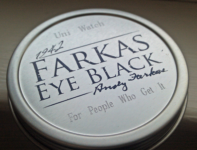
Eye Black Raffle: What you see above is a tin of Farkas Eye Black — the premier brand of the stuff — inscribed with “Uni Watch: For People Who Get It.” Our friends at Farkas are making six of these Uni Watch tins available to raffle off to Uni Watch readers. To enter, send an e-mail with your name and shipping address to the giveaway address by next Monday, April 8, 7pm eastern. One entry per person. I’ll announce the six winners next week.
Vikings redesign reminder: Remember, I’m running an ESPN contest to redesign the Vikings. Details here.

PermaRec radio interview: Today I’ll be doing an hour-long radio interview about the Permanent Record report cards. It will air live from 10:15-11:15am eastern (you can get the live stream here), with a rebroadcast that evening at 9pm eastern here. Further details on the PermaRec blog.
Meanwhile, that interview I was supposed to do yesterday with WAXY 790 in Miami got postponed (by the station, not by me) and has now been rescheduled for tomorrow, 9:15am eastern.
Uni Watch News Ticker: Bizarre scene last night in L.A., as the Lakers retired Shaq’s number. As you can see in that photo, the framed jersey they gave him looked fine (if a little huge), but the one they raised to the rafters inexplicably had an NOF instead of NOB. How could that mistake get past everyone on the Lakers’ staff? Embarrassing. … Very good article about new bat-making technology used by Louisville Slugger and others. ”¦ North Carolina and Clemson baseball went color-on-color the other day — well, if you count powder blue as a color (from Adam Garrettson). … “The 2013 edition of the New Zealand Rugby Almanack is out,” says Caleb Borchers. “The editorial board apparently felt the need to write about sock height protocol, as you can see in the 12th paragraph.” … NBA refs have been wearing purple wristbands as a gesture of support for fellow ref Greg Willard, who was diagnosed with pancreatic cancer last summer. Willard has now passed away, so it wouldn’t be surprising to see the officiating corps wear some sort of memorial for him (from Brett Crane). … In case you haven’t seen enough video clips of the Majestic jersey factory, here’s another one (from Chad Walters). … The Montgomery Biscuits have a new home cap and a 10th-season logo (which they’re mistakenly referring to as a 10th-anniversary logo). … Nice striped stirrups for St. Peter’s University (from John Gogarty). … Is this the new Adidas sideline gear for 2013? Alex Horn says it showed up on a Texas A&M forum yesterday. … Jim Walaitis made himself an alternate Cubs jersey. “I’ve never actually been a fan of the C-ubs logo,” he says. “Even though it’s been around forever, it just seems very 1980s to me. But I do like the walking cub. My only question is, what sleeve patches (if any) should I use? Maybe the Uni Watch faithful would be able to offer suggestions.” … The Indians are using the block-C on all their batting helmets this year but insist that they’re not phasing out Chief Wahoo (from Patrick Gaughan). … Wait, here’s an update on that: According to this article, “MLB asked teams with two different sets of batting helmets to use just one this season.” I hadn’t heard anything about that. Will try to confirm (from Mike McLaughlin). ”¦ John Schuerholz Is a Liar, Vol. 37: “The day the new BP caps were available online I ordered four of them, including the Braves’ script ‘A’ cap, from MLB’s online shop,” says Hovan Patey. “The Braves cap was listed as back-ordered, so my other three hats shipped right away while the Braves cap stayed on back-order. It showed up a few days ago and I opened the box to find this. Amazing. So not only did some of these leak out to stores, as you’ve already reported, but there was actually stock at MLB’s online shop (which they have the audacity to ship in place of what I ordered). I think I will keep the cap as a collector’s piece, but I can’t see myself ever wearing the thing.” … Not uni-related, but nonetheless a fascinating article about how baseball was played in Civil War prison camps. ”¦ Earlier this week I mentioned that the striping sequence on Marquette’s jersey and shorts don’t match. Now Andrew Terenzio has sent in a giveaway poster from earlier this season, and in the poster the jersey and shorts stripe patterns do match! Weird. ”¦ A reader who didn’t give his/her name sent in a photo of the new Pittsburgh Riverhounds kits. ”¦ Rangers catcher A.J. Pierzynski wore yellow nail polish last night, instead of the usual white.
I hate to be that person but the ‘viewed in a vacuum’ link in the Georgia story goes to a page not found. Also, the large collars look awful. Not sure why Nike feels like that needs to be everywhere.
Link to the St. Peter’s stirrups in the ticker seems to be missing, too…
Thanks, guys. Both now fixed.
i like the collars
I’m not opposed to them either. Better than the faux-rolls and the overly visible Nikelace.
Well, Hovan should be able to clean up nicely on eBay.
Yes he should, I just bought one on eBay for $199.00, and I plan on wearing it often.
So we’ve gone from $200 polyester hats to $200 polyester caps.
Ain’t America grand?
Jim Walaitis…amazing job on the cubbies jersey…that looks awesome!!!
Jim, re: the sleeve patch, why not use the National League insignia? I always thought that was a neat feature of the blue alternate.
That’s the second time I’ve had that suggestion … third, if you include the voices in my head. It’s by far the best choice I can think of, but would it be out of place on a Cubs (pseudo) home jersey?
The NL patch is not out of place on any Cubs jersey: being the only team to represent the National League in every year of its history, I wouldn’t mind seeing the Cubs be the only team that wears it, much like Cincinnati got a special 125th-anniversary patch in 1994 with their original 1869 team on it.
Incidentally, has the National League updated their logo to show that there are now 15 teams? The logo has always had a number of stars at the top that reflects the number of teams. Now that there are 15, I imagine they’ll go with a design that takes one star out of the middle part.
According to Chris Creamer, both the AL and NL logos have been updated to reflect 15 stars, but they’re not up on his site yet.
I have to agree on the National League patch but that is something that feels like it should stay on the alternate. As a concept it makes sense though. I’m not crazy about the look of the jersey but I appreciate your talent and ability for sure, I just think that primary logos and wordmarks should be what represents a club on their home jersey. Did you consider a 1984 logo as the logo instead of the walking bear as a faux back concept?
Love the perspective. I keep going back and forth on the NL patch. In my warped little mind, this is a new home jersey (concept), not an alternate.
I think the “1984” logo was fine … in 1984 … but to me, it’s too corporate, too … 80s … I’m ready to move beyond it, but that’s what I like about the walking Cub logo – it is a strong evolution of the logo, not a complete departure.
That, and I spent 2 hours hand-sewing the thing to the jersey a couple nights ago. I’m not going back now. :)
Thanks, 1vox … I feel like a cheater compared to real DIYers here, though. I bought the headspooned jersey, I bought the walking Cub patch … I just put the two pieces together, for a look that I personally think would just be a natural evolution for the team, staying with an old-time feel, with familiar elements, but in a new way for this particular team.
Yeah, I feel the same way. That’s how I did my ’29 Bruins sweater. Bought a pre-striped jersey from AK and the crest from eBay.
If I ever get around to numbering the back, it’ll have to be DIY, though.
Jim, I think it looks great. What’s on the back?
If you haven’t put anything on the back yet, may I make a suggestion? I think your design would look perfect with triple-layer numbers, red with a white border and then a blue border outside that. The Orlando Cubs did that once with their vest jerseys and it looked amazing. link
Nothing on the back now … I’m thinking of a blue-over-red 10 (in honor of two of my favorite Cubs, Santo and Durham), though with the headspoon, your three-layer treatment would probably look fantastic!
I sewed headspoon piping onto a DIY jersey a few years ago. Laborious, frustrating and not to my high standards. Will NEVER do that again.
Seconding the praise for Jim: That is a sweet Cubs jersey.
For a patch, I’d go with either the old 1980-1914 cap logo bear-with-bat, only the bear in royal and the bat in red instead of all in white:
link
Or the Wrigley Field patch, since that’s maybe the single most important part of the Cubs identity:
link
A Wrigley patch was my first though as well. Or the link they wore a few years ago. One of the best memorial patches I’ve ever seen.
Oooh, the Caray patch. Good suggestion. Personally, that and the Twins’ Herb Carneal memorial patches are my favorite memorial patches of all time. The Carneal memorial:
link
I have the dark blue bp jersey from a few years ago with the walking cub on the chest. The National League patch was on the jersey when I bought it, but I added the Harry patch and the Jack Brickhouse “Hey Hey” patch above it.
Jen, I think you might have done something you shouldn’t, at least in the minds of the super-purists.
The Cubs had royal blue practice jerseys with the walking bear from (I think) 1997 to 2004, then used the darker blue only in 2005-06, before going back to royal blue (but with hideous red-and-white side panels) and then royal with red side panels in 2011.
So if you’ve got the 1998 Harry patch, it should go on a 1998 royal blue practice jersey.
(Also… this could be a whole new level of sticklerishness, but I think the blank spaces between the bear and the C that surrounds it were filled in white before 2004 and then cut out after.)
But I’m sure it looks great. Harry and Jack Brickhouse deserve to be remembered!
LOVE LOVE LOVE the Wrigley Field logo you linked to’ it’d look amazing as a shoulder patch … can’t find it anywhere as patch, so it may be time to take up cross-stitching!
Thank you to all who have (and who still might) offer patch suggestions. It’s great to have multiple perspectives.
So, with Nike’s tweaks to the LSU, and now UGA, uniforms, it seems they’ve discovered a way to convince even the classic, tradition-bound SEC programs that their football “brands” need tweaking. Sigh.
Yeah, what’s really at the core of this is Nike’s inability to adhere to a college’s brand standards and accurately reproduce their various iconography “efficiently.” Case in point, that old bulldog logo is a “bulldog” to embroider because of its intricate lines. I’m sure they pleaded with Georgia to simplify it.
Same thing happened to Purdue. Nike recommended changing their “Boilermaker Special” train icon, because it was too challenging (as it had a trail of smoke that gave it a uniquely imbalanced perspective). Nike said it was “too hard to line up accurately.” They also were unable to produce an accurate “old gold” across all uniforms … so they changed the color to the more universal Vegas Gold.
Meanwhile, Missouri (a Nike school) actually uses some forms of old gold on their football and hoops uniforms (at least sometimes) and more of an Iowa gold-yellow on others.
The lack of brand standards at Nike is appalling, and, frankly, would make for a great expose.
I know for a fact they farm out some design to freelancers. I wonder if they just don’t pay close enough attention to the university’s culture to provide good, thorough recommendations? Similarly, I wonder if many universities lack the brand savvy in their athletic departments … and just go with what their outfitter tells them? University brand standards, be damned.
and why is the new Bulldog asymmetrical on the outside of the collar? details people….details!
Oh. My. Glob. I didn’t notice that at first glance because I only had the image up for like 2 seconds, like “oh, whatever”, but now that you pointed it out… that bothers the hell out of me.
If people want to complain about something, complain about THAT, not the perfectly fine number font.
I keep thinking how the SEC is mostly weathering this storm of changing uniforms, but then I stop to think how many of the schools look different (or will this season) than, say, five years ago:
– Georgia
– South Carolina
– Vandy
– Kentucky
– Miss State
– Arkansas
I’m not really counting TAMU/Missouri since they’re new entries, and LSU to me still looks about the same. Even so, that’s roughly half the conference that has changed the look of their basic uniforms in the past few years. Interestingly, most of these schools are the ones who have spent more time at the bottom of the conference than the top (UGA being the exception).
Man, you people and your irrational dislike of non-block numbers…
Don’t dislike non-blocks in all contexts. That said, in my opinion, most “conversions” from block to “other” are a downgrade, particularly where (as with UGA or LSU, or the Steelers for that matter) a large portion of your aesthetic cache is a traditional look.
Beats a non-block dislike of irrational numbers.
As a Cubs and Bears fan, I love non-block numbers. It’s when they try to get too original (i. e., italics on the Steelers) that things start to look bad. Georgia looks just fine.
Each time I see the Georgia numbers, I feel like they’re a Cubs/Bears hybrid.
And for this, I like them!
At least their not the jagged/pointy numerals Nike’s been foisting on everybody.
**they’re**
(I know how much everybody loves minor details…)
That Laughing Brave cap looks awfully black on my screen. Wasn’t the BP cap supposed to be blue? I think you’ve got a fashion cap there, not a discontinued one.
At ease, Jeff. Dark navy often looks black, depending on the lighting. That’s definitely the BP cap.
Shaq NOF reminds me of late ’60’s/early ’70’s Topps basketball cards when many player photos were taken with jerseys on backwards so NOB would become NOF for easier identification.
It wasn’t for easier identification. It was because Topps didn’t yet have a licensing agreement with the NBA and wasn’t allowed to show the wordmarks on the fronts of the jerseys.
Ah, so wise. I didn’t know that. So Topps only had an agreement with the players? Individually or as a group?
Good question. Don’t know the answer to that one.
The Georgia wordmark looks like absolute crap. Looks to me like a logo for a cheap electronics store. And the registered trademark logo after both words gives it this patched together feel — like they patched together two different registered logs and decided to tilt one at a funky angle because that’s what all the cool kids are doing.
Based on the shoddy reproduction of the fonts on the other retired Lakers jerseys, is it any real surprise a “detail” like NOF would slip through?
While watching the Tribe v Blue Jays last night, it looked like the Blue Jays catcher was wearing a 1st baseman glove when catching KnuckleBaller RA Dickey. Hopefully during tonight’s game I’ll be able to see if the Blue Jays catcher is wearing the same glove or if switches to more of a traditional Catchers mitt.
Here is some links to some photos of the mitt from last night
link
link
Whatever he was using, it didn’t help: He had three passed balls.
Dickey gave all the catchers in Blue Jays’ camp extra large gloves this season to help in the adjustment to catch the knuckler. Arencibia was wearing the bigger glove for that very reason.
With Morrow on the mound tonight, look for Arencibia to don his traditional glove.
According the Fan 590 in Toronto JP was using an oversized catcher’s mitt
i think that’s common practice for catchers who catch knuckleballers
I’ve heard about this with several knuckleballers. MLB Network talked about it at pre-game ASG festivities I believe. If memory serves me correct, I think R.A. Dickey buys his catchers softball catchers mitts rather than a regular baseball catchers mitt.
Very common practice…. Doug Mirabelli wore a larger glove catching for Tim Wakefield too. It’s almost a fast-pitch softball catcher’s glove.
There’s a comparison pic here:
link
The new bulldog logo is seriously lame.
I’m not sure whether you saw the Georgia rebrand presser before I posted the link yesterday, but thanks for the analysis. There’s no way I could’ve reached those conclusions given my lack of expertise and (sort of) institutional bias.
Unrelated: I just checked out some of your recent ESPN columns and until now hadn’t noticed the link section logo. Very reminiscent of the cover of link Any connection between them?
Andy Farkas? Any relation to Scott?
link
That’s Skut Farkus.
/you’ll shoot your eye out kid
I just IMDB’s it. It’s actually Scut Farkas.
Who knew?? I guess I never read the credits any of the 1000 times I’ve seen that movie.
“In the heat of battle my father wove a tapestry of obscenities that as far as we know is still hanging in space over Lake Michigan.”
“Scut Farkus! What a rotten name!
Scut Farkus…staring out at us with his yellow eyes. He had yellow eyes! So, help me God, yellow eyes!”
A Yankee jersey with a name on the back? Scandalous.
One would think a big school like Georgia would have learned from the disaster of the athletic rebrand at Kansas. Stupid.
Honest question – what was disastrous about the Jayhawks rebrand?
People hate the Trajan font. I’m a KU guy and I like it, I thought it was a nice clean, classy look, but Trajan is getting overused in other areas. But it has given some more consistency to the school and sports branding.
Oh, right. I forgot that was a thing (which kinda indicates to me it wasn’t exactly a disaster).
link
Something odd about UGA: How come they’re mocking them up as Herschel Walker jerseys if Herschel wore adidas?
They’re also using Dominique Wilkins and Willie/Shandon Anderson for basketball. I figure they’re using past players since they can’t use current players, faux-amateurism and all.
because he is easily their best player in school history and they are a nike school now.
They also have one for David Pollack and Dominque Wilkins, whatever brand they were using back when those guys played is irrelevant, they’re simply showing off the new looks without using nameless players.
Which begs the question: Are these guys being compensated? Because if not, that’s screwed up – the university profits off you in a hush-hush way (using a number but no name) while you’re enrolled, and then just uses your name for all eternity for marketing purposes whenever it feels like it.
There’s also a pretty strong possibility that Russell Athletic was providing their uniforms during his time there, as they did so for much of the country.
Here’s a decent shot…
link\165301991.jpg&w=567&h=589
Sorry…
link\165301991.jpg
UGGGGG! I’ll cheat.
link
A couple of typos:
Football uniform paragraph:
Much like the Steelers, they’d be better off sticking with the block numerals, although I can understand how they’re viewing this a simple way modernize the uni without tarting it up with all sorts of gewgaws.
Should be “viewing this as a simple way to modernize”.
Radio spot:
… and has now be rescheduled for tomorrow, 9:15am eastern.
Should be “been”.
… and I forgot to close the italics on the first quote. *facepalm*
Fixes now made. Thanks, Rob.
The block C looks good on the Cleveland helmets/caps, though don’t they use a different block C on the road jerseys?
The Dodgers “LA” cap logo doesn’t match the “L” and “A” script on the road uniforms. Neither does the Tigers “D” cap logo match the “D” script on the road jerseys. So I wouldn’t be surprised if the Indians have a similar inconsistency.
The story about only using one batting helmet is unfounded.
The Tigers used the new S100 helmet with the White “D” in spring training. On Monday they were in Minnesota sporting their usual Orange “D”.
Two different helmets for home and road. Seems like the Indians are trying to distance themselves from Chief Wahoo without having to be the bad guys.
I knew soneone would find the “one logo for batting helmets” waqs B.S.! Although distancing themselves from Chief Wahoo would make them the “good guys” dontcha think?
Not with their fans (the primary source of their cash flow)
It is amazing how many Indians fans support Chief Wahoo. Similar with Braves fans and the Screaming Indian head.
Same with Redskins fans. Taste and decency become “political correctness run amok” when it affects *your* tradition.
I’m sure that reflects the thinking of most team execs for teams like the Indians and Redskins. But here’s the thing: This is 21st century America. Fans are gonna buy the crap you sell ’em. If the Indians simply stopped wearing and selling Chief Wahoo, sure, the blowhards who blog and call into sports talk radio will scream bloody murder. But if the only Indians caps on the shelves have the block C, fans are going to buy those block C caps.*
The mistake is to expect fans to embrace the post-Wahoo or post-Redskins identities while continuing to sell the Wahoo or Redskins merch. Ask the federal government who the 40-year-old attempt to get Americans to switch from dollar bills to dollar coins while continuing to print as many dollar bills as people want is going. As long as you stop making the old stuff available, even if only for say a 5-year window, the noisiest fans will bitch and moan but people will actually buy the new stuff without any negative impact on the team’s bottom line.
*It helps that Cleveland’s block C caps are among the best in baseball at the moment. Beautiful caps, even the red one.
To be fair, this Braves fan barely even knew the Screaming Indian existed before this BP hat issue started. I knew of the Indian, but for my entire fandom (1990ish to the present), the only logos have been the script “A” and the “Braves” tomahawk.
Do a lot of fans like the Indian head? Sure. Do a lot of people that are casual “fans” at best like the hat as a fashion statement? Probably. But I don’t think there is some outcry of fans wanting to keep or resurrect it. It’s a part of the club’s history. Some folks think it’s wrong to use, some couldn’t care less. I’m personally just fine with using the logos that have been used the last 20 years. The Indian head being retired for good would not bother me a bit. It should have never been re-used in the first place.
“It should have never been re-used in the first place.”
~~~
Thank you. It’s historical, and if the Braves ever throw back to the uniform on which it was worn, that’s totally appropriate. But it’s definitely another story if they are trying to resurrect the old-as-new logo today. Not cool.
“But it’s definitely another story if they are trying to resurrect the old-as-new logo today. Not cool.”
Then it’s very un-cool for Mr. Met to appear on BP caps ;)
link
I HATE Mr. Met on the BP caps. I hope those are retired very quickly. That logo belongs, if anywhere, on the sleeve, or on the back of the ticket stub (do they even have those anymore?). The interlocking NY is all that should ever adorn the cap.
My $.02. YMMV
“The story about only using one batting helmet is unfounded.”
So there is hope that the Astros will at some point wear orange batting helmets (assuming they exist?)?
As for the Chief Wahoo logo, that’s come and gone from the caps over the decades; it’s use as a sleeve patch has been more of a constant.
Certainly teams have to pay Rawlings for the helmets, right? Does Rawlings give helmets to the teams as part of their exclusivity deal?
The new S100 Pro Comps cost $400 wholesale and $600 retail (if you can find them).
Perhaps MLB or the teams are trying to cut costs by only using one helmet style.
From this article, sounds more like one logo. You can have as many times of helmet, but no different logo.
But then again, if the Tigers have two of the same logo and color is different, that slides?
link
I just find it hard to believe the brewers will wear their navy helmets with their retro look.
The helmet issue has been a constant topic of discussion on Cleveland sports radio this week. Many see it as the first step of a “conspiracy” to eliminate the logo altogether.
Predictably, this has led to hosts and callers going through all the same arguments which have been made and re-made on this site for the last few years.
I suspect that the talk radio blowhards and whiners are half-right: There is a “conspiracy,” and it does involve MLB. But the conspiracy is that the Indians organization is trying to back away from Chief Wahoo slowly enough that people don’t notice and complain, and anytime someone does notice and complain, the Indians will deny volition and say, “We’re just responding to the league’s rules about [trivial issue that doesn’t affect the content of the Chief Wahoo debate].” And since this is MLB, and we’re all one big happy cartel, the league will keep silent and take the hit.
Anyway, that’s my theory. And by 2015, a new “rule” will be discovered whereby a team can only have either white or ivory home uniforms or somesuch and gosh darn it, but the Indians just won’t be able to keep both the block uni with the C cap and the script uni with Chief Wahoo, and Chief Wahoo will become an alt cap that just happens not to be worn much if at all. All an unintended consequence of disinterested league equipment rules, even if the Phillies and Twins sort of happen to keep wearing both white and ivory throwback-y uniforms at home.
Just to add another wrinkle to the Indians helmet story, Carlos Santana debuted a Block C & red bill catchers lid last night.
link
That Marquette jersey is last year’s. Vander Blue is the player featured with the side panels and he changed his number this year from 13 to 2. That’s pretty clearly a 2 on his jersey. Anderson, the other guy, didn’t change his number, so that could also be last year’s jersey.
As odd as Shaq’s NOF banner is, I can’t help but notice that the numbers on the other jersey banners are way off compared to how they were on the unis.
First, the font is all wrong, as the Lakers have worn the same number font since 1960 (drop shadows notwithstanding, the only real running change has been dropping the top serif on the 4). The drop shadows are more like side shadows, especially on Jamaal Wilkes’ banner. Finally, the numbers for Jerry West, Wilt Chamberlain, Elgin Baylor, and Gail Goodrich should all be white with purple shadows, if they truly want to be period-accurate.
Then again, the Kings’ retired number banners aren’t using period-accurate fonts these days… but link. Though I’d much prefer period-accurate.
Wow. The Kings really butchered those retired numbers. The Devils’ flubbing of Scott Niedermayer’s font pales in comparison. (Although in some respects Niedermayer’s may be worse, since the team found a way to get the font right for the two players who finished their careers as Devils — Stevens and Daneyko.)
If anyone received a screaming savage cap in size 7 or 7 1/8 and feels very outraged…i’ll be happy to buy it off of you and relieve you of your anger.
Me too, for 7 1/4 or 7 3/8. (Sorry, Paul; I quite like that logo.)
Come on guys, would you please start calling the logo by the name of the character with is “Chief Noc-A-Homa”. I am a huge fan of the logo, but I do get uncomfortable with the “Screaming Savage” reference.
“with” sorry meant to be which.
So, you’re OK with the cap if it’s referred to as “noc-a-homa” but you’re uncomfortable if it’s referred to as “screaming savage.” The fact that its the same logo, in either case, doesn’t bother you?
In an earlier post, you mentioned it being an appropriate logo to use if it were on a throwback for the period it was used, but not as an old-as-new. Still the same logo in either case…
And I stand by that. Whether or not I feel (or felt) it was inappropriate, it’s still historically accurate. A throwback (like where the Tampa Smokers removed the cigar or how the Colt .45s attempted to remove the revolver) should be historically accurate.
I’m talking about the NEW use of a logo – if one is “uncomfortable” with it being referred to as “screaming savage,” shouldn’t that make one uncomfortable with its use period? I’m just wonderingly why calling it something less comfortable makes the logo itself any better or worse.
No actually it does not bother me, in the same way that my Irish ancestors were treated like shit when they came to New York and New Jersey, but a major university uses Fightin’ Irish as their name, I know you hate that argument. I am actually not on here to argue but to just state my opinion that I like the logo very much, and would love to see the Braves bring it back.
If you think a screaming savage logo for a team with no historical ties to American Indians is equivalent to a sports team with a high number of Irish Americans adapting a leprechaun as a mascot, then, hmmm.
Thanks, Court — I actually wasn’t trying to be argumentative, I was just trying to clarify. So, no matter what the logo is called, you’re OK with it. You’re just uncomfortable with it being referred to as “screaming savage.”
I thought “Chief Noc-A-Homa” was the mascot and the logo was the “Laughing Brave”.
Actually they are both Chief Noc-A-Homa
You’re right, it is “laughing brave”, not “screaming indian” but that doesn’t fit the apparent narrative.
The link with the video from the Majestic factory is the same one that was posted here a few months ago. The only difference is that that site has a focus on efficiency and was critiquing Majestic’s manufacturing process and whether it could be improved.
For anyone who’s planning to tune in to the PermaRec radio interivew, it’s just been pushed back by 15 mins.
good assessment on the georgia logo. it doesnt have any character to it. it looks like a depressed bulldogs’ mugshot. and the lines are WAY to thick
So, new Riverhounds uniforms to go with the new soccer-specific stadium–and with one of Pittsburgh’s largest car dealerships as a sponsor to boot.
In case you’re wondering, black is home and blue is away. The red is a throwback to their original team colors, and gold is, well…let’s just say, when they replaced red with blue a few years back, they picked the wrong color…
Is the red the goalkeeper uni? It seems like the one color that doesn’t quite fit with the rest.
I was at the unveiling last night. The goalkeeper uniform is actually pink. Black is home, yellow is away, and blue is the alternate. There is also a lime green goalkeeper kit, which was not shown last night.
I think the switch to blue had something to do with a partnership they have with Everton FC, who wears those colors in the EPL.
Oh I see the pink now.
I was going by the Riverhounds article on Wikipedia on what is the away. Good, if gold is away, maybe they should switch to black & gold full-time. They don’t need red, or blue.
Well, they still need a color (or two) for the goalie shirt, and it seems like the blue is an obligatory nod to the Everton partnership.
I never realized how much Pierzynski looks like Bradley Cooper.
Interesting how Nike/ UGA used the old SEC logo
some interesting facts/quotes regarding the new UGA “identity” here: link
“Kind of like the (Dallas) Cowboys wear, that’s the kind of silver you’d like to get,” McGarity said. “That’s what we kind of used to have with little shiny stuff to them. It just depends on how fast they can get that material. … That will be a goal to get it back to silver britches.”
a.) I really wish he would’ve said the Raiders instead of the Cowboys, the thought of a green or blue tint in the silver britches is disgusting.
b.) Why not wait until enough fabric is available to release the new look if it will be changed eventually, anyway?
That makes me wonder if the Lions & Patriots will eventually get back to being metallic as well. (The Raiders stayed metallic by refusing Nike’s update.)
McGarity’s comments reinforce the observation that the silver britches haven’t been that silver in recent years. I’m going to take it on faith that his reference to the Cowboys was just in terms of sheen and not of color.
There’s a big difference between silver pants with a blue tint and what the Cowboys wear with their white jerseys.
Georgia’s pants when they were actually silver were cool, the matter pants they have been wearing recently are warm.
Somewhere along the line Dallas decided that their current pants should have a hue, because their older pants had one too. They incorrectly decided this hue should be aqua, when if anything it should be blue (not unlike the one they use for their numbers and stripes on the white jerseys). They went overboard on the aqua tint, to the point where you can see the aqua.
uga needs to cool down their silver/grey, this would mean giving them more of a blue tint but it should not make them appear to be a blend between blue and silver/grey.
Notice how all the colors in this circle end up grey towards the middle? Notice how each color creates a different shade of grey, uga should stay in the lower left quadrant.
link.png
In my opinion a cool grey/silver is the only type of silver that should be used on uniforms, I’m sure other people have different opinions but to me a cooler shade is much more akin to the metal silver, which is what teams are often attempting to replicate.
Here in NC “powder blue” is officially known as “Carolina Blue.” For many folks (except those that went to NC State or Duke), Carolina Blue is regarded as the State’s official color.
And how about those stirrups that the Tar Heels were wearing. IMHO, the uniform looked pretty awesome.
I believe the “yellow nail polish” that Pierzynski is wearing is actually a sticker from Game Signs: link
On the road in Louisville, City of Ample Parking. The locals don’t seem to mind the Angry Cardinal teeth, and won’t even let me pick a fight about it.
Well, at least you tried.
Odd that the new UGA uniforms have the old SEC pennant logo, as all teams went to the new circle logo last year.
Anyone else notice that on the Louisville Slugger page, link, they have Josh Hamilton still pictured with the Rangers logo.
Non-uni, but a great feature at Slate today: Prohibition-era speakeasy membership cards:
link
That “Epicure” card is gorgeous, love the Stork logo too.
The phone numbers on those cards also lead me to ask: Was there any rhyme or reason to assigning the long distance names before area codes came along?
Those weren’t long distance names on the cards – those were local exchanges. Now, I’m too lazy to google to check my memory of having the old system explained to me once, but what I recall is that the nation was basically divided into cities, counties, or regions of a state, depending. Within each, local zones were assigned two-letter prefixes. Those were the equivalent of the first three digits of a modern phone number. For ease of memory, each two-letter code was given a word or phrase to match, often based on local geography or culture. So you might see a number written
PA-8-5000
or
Pennsylvania 8-5000
Same number. Anyway, if you’re in Chicago and you wanted to reach your, um, business associate at the Stork Club, you’d ring the operator, and say something like, “Long distance. Put me through to New York City, El Dorado five nine oh oh three.”
The words like “Murray Hill” or “Eldorado” weren’t for long distance, but were the “exchange” – the first two digits but also a local mechanism long ago. The names for exchanges were set by local telephone companies. Eventually AT&T suggested exchange names. See here. I still remember when the local numbers in my mom’s parents’ northern Minnesota town only had five digits, as they were all in the same ‘exchange’.
The first phones I remember had an official sticker on the dial that started with words like SUnset or GRape.
My wife remembers a jingle from her NYC childhood that started “Murray Hill 5-5600”.
. . . and I still tie an onion to my belt, whippersnappers
Abe Simpson?! Who knew you were a UWer?
Thanks guys. So the code/name had nothing to do with actual geography or was it assigned like a map grid? I suppose a trip to Wikipedia is in order. I still get a kick out of seeing old signage in use today that has the exchange names.
For further discussion you can reach me at KLondike 5-3226
I obviously can’t speak for everywhere, but where I grew up the exchange was NElson (the original name of my town) and my current exchange in Calgary is CHinook, a locally important term.
I’d actually like to see cards like that come back into service. Just in the past few years, I’ve had alcohol-serving establishments and stores try to deny me service, despite being very visibly over 30, because I wasn’t carrying some kind of government-issued papers with my birthdate on them. If they’re that paranoid about accidentally serving a minor, they should issue memberships so that patrons could buy alcohol there without having to carry legally-bindnig papers on their person. Stores already have loyalty cards; just add a checkbox somewhere showing that the shopped is 21 or over.
You should read the article on Civil War and baseball. The author of the article is one of my college professors. he’s very knowledgeable on the subject and has even written a book on the topic (which is a good read).
Oh, baby!
link
Always funny bumperstickers from Kurt Snibbe and DJ Gallo on ESPN. Paul, you give them idea for the Indian’s one?
Ha! Nope, had nothing to do with it.
This spring, the Orioles wore last season’s away helmet (black w/ orange brim). I thought it was just a spring thing, but if MLB said that teams can only have one helmet it makes more sense.
link
I would much rather they have a home and away helmet, or since the white panel doesn’t work on the road compromise and just use a helmet based off of the new BP hats. That way you still get the panel in the front but it works on the road as well.
Also kind of makes sense in that the Cardinals went back to Red home AND away this season, with the navy blue going to alternate status. They held a vote afterward re-opening the red v. navy blue decision, but red won out apparently. So with navy blue being alternates, it’s easier not to have a navy alternate helmet IF it’s true the league wants just one. I think them limiting anything seems silly though, but then, the league isn’t really selling a ton of authentic helmets in every color are they? I mean you can buy novelty helmets, but I’m sure just one is/was the case in those anyway.
At the men’s Final Four, Louisville players will be wearing warmups with a tribute to Kevin Ware: link
Which is nice and all, but I can’t be the only person who’s uncomfortable with how it uses adidas’s commercial slogan but can’t explicitly name Kevin Ware, because he’s an unpaid talent?
it is what it is. very nice gesture and glad adidas got on the stick and put these together quick
I just wish the tribute wasn’t so branded.
Also, this too: link
The one in terriblehuman’s post is a “travel shirt,” not the warm-up.
This is the warm-up:
link
And, of course, it’s for sale:
link
Douchebags.
Kind of maddening that one of the fruit stripe uni’s made it to the Final Four. I guess Adidas cast its net wide enough…
NOB to the rescue!
This a-hole mugger was caught because internet folks tracked him down thanks to his NOB (really PNOB – pledge name on back) sweatshirt.
link
From today’s Sports Business Journal. It’s feeling more and more like ads on NBA jerseys are inevitable…
link
“Everyone knows there’s a big pot there. It’s not uncomplicated, but the idea that we have hundreds of millions of dollars sitting out there and we can’t figure out a solution to bring it into the league, shame on us.”
I physically cringed reading this.
Sad to see that ugly, circa 1999, Nike-designed wishbone collar/notch adorn the Staples center rafters for perpetuity on Shaq’s (and presumably Kobe’s) retired jerseys.
Indians catcher Carlos Santana wearing the blue block C batting helmet with the red brim, behind the plate again tonight.
Braves’ Evan Gattis the newest member of the no-batting glove group. Homers in first AB, btw..
These McDonalds all american uniforms are fucking ridiculous. Chrome numbers. CHROME.
Didn’t you hear, Mr. Mullins?
Seventeen year olds like shiny things.
The most disturbing thing about the rear view of the Georgia player is his camel toe.
After reading about 5% of comments but reading the ticker and pleading ignorance to the NBA, did the Lakers change color of their numbers since Shaq came around? As said in the ticker I agree it does look “embarrassing”, almost like noone cared compared to other Laker retired jerseys what it looked like.
Now I’ve read 100% of comments, it seems noone does care about retired Shaq’s jersey..
Yes the numbers are white now and no shadow. And yes, the Lakers said they’re going to fix it, but it may be a bit.
St. Peter’s stirrups are gorgeous but their pants look like total shit.
As a uni lover and sports marketing guy, I get rebranding, but I’m not here to discuss the overall merits and demerits. I am here to ask why the women’s basketball team pic shared by Nike doesn’t have the new typeface like the men’s team and the track uniform.
An overlook by Nike, or something different for the women hoopsters?
Women – link
vs
Men – link
vs
Track – link