Click to enlarge
MLB announced yesterday that all 30 teams (apparently including the Blue Jays) will wear G.I. Joe caps on Memorial Day. By now I’m sure most of you know my feelings about camouflage on a sports uniform — I’m opposed to it. But camo on Memorial Day is particularly bad, because it’s a major misreading of the holiday. Memorial Day is not for celebrating the military (that’s Armed Forces Day) or honoring veterans (that’s Veterans Day, although MLB’s PR dept. apparently doesn’t know that). It’s for mourning the dead. A moment of silence would be the best gesture; if something has to be worn, an armband would be appropriate. But in today’s sports world, anything even vaguely related to the military defaults to camo. It’s lazy, it’s wrong, and it helps spread cultural illiteracy.
Also: The caps are seriously ugly.
In addition, all 30 teams will wear flag-desecration caps on July 4. No visuals on that yet, which is probably for the best.
(Credit where it’s due: It appears that MLB is finally donating all of the profits from sales of the camo caps to a worthy cause, instead of just “a portion” of the proceeds. About time.)
Okay, enough grousing, because the 15th annual Uni Watch MLB season-preview column is up now on ESPN.com. Misguided holiday caps notwithstanding, it’s gonna be a pretty good-looking season.
OMFG: Special bonus edition of OMFG this week, about the Pepsi’s new bottle design. And remember, you can sign up for the OMFG Twitter feed here.
Uni Watch News Ticker: The Giants will be receiving their World Series rings on April 7. Since it’s now an unofficial rule that you have to wear gold-accented jerseys for such an occasion, they’ll be wearing this. The interesting thing is that this is actually their road design (well, one of their road designs), but rendered in cream instead of gray. Surprising choice for a home game. … The Cardinals have finally unveiled the Stan Musial memorial patch. … The Dolphins have finally confirmed what everyone already knew: Last week’s logo leak was legit. Interesting to see team CEO Mike Dee, who flat-out lied about the logo last week, now blaming Nike for the leak. Will that result in some behind-the-scenes sniping and backbiting? One can only hope. Anyway, the new logo is now shown on the team’s home page and Twitter feed. ”¦ As you may have heard by now, a new Nike ad featuring Tiger Woods is drawing criticism. ”¦ This is pretty awesome: For the 1964 football game between Wake Forest and UNC, Wake wore “Beat Carolina” instead of NOBs. Additional photo here (tremendous find by Larry Bodnovich). ”¦ By now you’ve probably heard that the Heat finally lost last night. The game was uni-notable on two counts: Both teams wore Noche Latina uniforms, plus they went color-on-color. ”¦ Meanwhile, Brendan Hickey has already provided a breakdown of what the Heat wore during their streak: retro red, 11 times; red alternate, seven times; white on white, three times; El Heat, three times; standard home, three times; standard road, zero times. ”¦ As had been promised/threatened, the Santa Cruz Warriors wore tie-dye uniforms last night (screen shots by ML Snider). ”¦ The Fukuoka Softbank Hawks will wear this uniform for six July home games (from Jeremy Brahm). … Chris Creamer’s site has had some good stuff lately, including an interview with the guy who won the Brewers’ YOUniform design contest and a good update on the Wrigley Field centennial logo design contest. … Cool time-lapse video of the Olympic Ice Rink speed-skating track being disassembled (from Paul Wajgel). … Not quite as good as a piece of toast that looks like Jesus, but close: a pancake with the Reds’ logo. “I’d be more impressed if it had spelled ‘Cincinnati,'” says Brice Wallace. … Long live the glorious stirrup revolution! That’s Brother Martin High School in burgundy, and Jesuit High in blue, both from Louisiana (from Seve Berry). … How much does it cost to design a new logo? Here’s the answer to that question for several major corporations (thanks, Brinke). … Cal will unveil a new look for its athletics program on April 10 (from Gilbert Lee). … New soccer kits for Phoenix FC (from Kenn Tomasch). … Super-stretchy uniforms aren’t limited to the NFL (from Tom Mulgrew). … Fun story about college basketball coaches’ clothing habits. ”¦”Three years ago, the Sioux Falls Canaries, an independent single-A club, was sold, and the new owners changed their name to the Fighting Pheasants in honor of the state bird, much to the chagrin of fans,” says Joe Baka. “Now they’re changing the name back. I’ve never heard of a team reverting a name change in response to fan feedback.” … This is pretty cool: an animation that shows 60 years of F1 car evolution (from Omar Jalife).
FYI-The Brother Martin High link takes me to a wordpress login page.
Thanks. Now fixed. Here’s the proper link:
link
Didn’t the Omaha Golden Spikes go back to being the Omaha Royals after negative fan feedback about the name?
Are fans of Reading’s AA ball club pleased with the team’s new branding?
link
Will there be any/enough negative reaction to influence a reconsideration?
Re the Sioux Falls Pheasants/Canaries, similar sequence of events in the Davenport-Molina-Rock Island-Whocanrememberthefourthone metro a few years back: In 2004, they changed from River Bandits to Swing, which as far as I can tell nobody, not even tourists in town for the Bix Beiderbecke Dixieland Jazz festival, liked. In 2007, the team announced its intention to change names for 2008, and public demand led to River Bandits being reinstated.
While Canaries has deep roots in Sioux Falls, the Pheasants had terrific uniforms. If the past is prologue, the Canaries are likely to be pretty dull.
The Stockton Ports spent a couple years as the link, but the fans never warmed to it and they went back.
To: Frank Bitzer
Are you THE Frank Bitzer that worked at Kings Island in 1981?
If so, how ya doing?
Brinke’s tip re the origins and costs of famous corporate logos most gratefully received. Love that stuff. There is nothing I’ve liked better than designing the logos of the (teeny-tiny) organizations that I’ve run. As the Pepsi guys said, “Emotive forces shape the gestalt of the brand identity.”
Oh, yeah. Somebody tell me why Accenture is a better name than Arthur Andersen.
re: tip about corporate logos
The $0 price tags on the Microsoft, Google and Coke are a tad bit disingenuous, because it’s not like in-house designers are working for free, and it wouldn’t surprise me if those companies brought in freelancers for something as big as a brand identity change.
All the costs of a logo redesign are still there, whether they’re filed as expenses and salaries or billed by an outside design firm.
Coca Cola in particular spent a decent amount of change changing the logo to “Coke”, adding the old “Coca Cola” back, then reverting back to just “Coca Cola”.
Because “Accenture” has a stronger emotive force.
Because Accenture wasn’t infamously convicted of corporate felonies and shuttered by the Feds.
Though the true story is that in the 1990s, Arthur Anderson, the accounting firm, was aggressively moving back into the consulting business that it had ceded to Andersen Consulting when the firm split its accounting and consulting businesses. Competition with Arthur Andersen was the main driver behind Andersen Consulting’s push to establish a more independent, non-Andersen identity. (I covered the intra-Andersen brouhaha a bit as a journalist in the last 1990s. It was a bit of a soap opera!)
The link on the Enron logo is pretty cool. I had no idea one guy did the logos for IBM, UPS, Westinghouse, and ABC (among others). Plus, I really like his unused Ford logo.
link
Yup. And Paul Rand did pretty much every US airline logo you can think of – United, Continental, Eastern, Pan Am, plus both AT&T and Bell.
Paul Rand was the greatest graphic designer who ever lived. (I saw him speak once in the early ’90s, toward the end of his life. He was awesome.)
But man, his name resonates differently now that Rand Paul is an increasingly prominent politician!
At least four of the logos you just mentioned were designed by Saul Bass.
You’re right – I’m getting myself confused. I wish I could blame the lack of coffee.
I think BP takes the cake on re-branding costs.
$211,000,000
link
I have to assume that this is another example of the apples-to-oranges-to-rocks nature of the list. Nike certainly spent much more than $35 to make the swoosh the company’s logo; BP certainly spent much less than $211 million to design a new logo. In all likelihood, the BP number includes not only the branding work and the actual design but also the costs of changing the logo, which would include everything from stationery and business cards to truck and ship livery to replacing the signs at thousands of extraction, manufacturing, transport, and retail facilities around the globe.
Agreed, it’s definitely an apples-to-oranges situation. BP’s number is the overall cost of the rebrand whereas Nike’s is $35 is simply what Phil Knight paid the local designer for the mark she created.
“The logo, which resembles a sunflower, will replace the BP shield, the company symbol for 70 years. It cost £4.6 million to design and BP Amoco will spend £132 million over two years on rebranding its stationery, van liveries and manufacturing plants.”
From this Telegraph article: link
BP still paid an estimated $6,965,780 for the logo.
Generally I don’t give a flying fish about camo stuff; but those caps are hideous!!
Speaking of flying fish…. I miss the helmet on the dolphin. :^(
That helmet was animal cruelty. That poor dolphin could barely breathe with that thing over its blowhole.
Yeah maybe, but at least there wasn’t a chinstrap that his short, fingerless fins had to struggle with to remove that lid for breathing.
But now he is more prone to concussions…
“There is no black in any of the three patches.”
A very odd stand-alone paragraph, as no other part of the story refers to any more than one patch (worn by all personnel) for Stan Musial.
Jim, I think this is another case of you not drinking your coffee! The article indicates that there are three patches: One with a white background for the home uni, a gray background for the road uni, and a cream background for the alt uni.
… it’s turning into one of those weeks …
re: purple Softbank Hawks alternates – this is kind of an annual Hawks tradition, where they wear a different alternate color each July.
Last year was green: link
Does anyone else think those tie-dye Warriors uniforms look better than the Adidas fruit stripe NCAAA uniforms?? Regardless, they are both crappy Adidas designs
Seriously awesome, Wake Forest jerseys with “Beat Carolina” as the NOB. Thanks, Larry! Really dig those WF socks as well.
Ya, those socks were pretty sweet also.
link to the press photo of the new Pepsi bottle at OMFG doesn’t work
Also, there’s a slight inaccuracy in the picture showing the Pepsi logo evolution (which isn’t Paul’s fault, as it’s been perpetuated elsewhere on the Net); the logo dated 1973 has the font introduced in the mid-1980s. link is the correct 1970s-early 1980s logo.
Love your take on wearing camo on Memorial Day. I hate the fact that every day of significance (and even those lacking any true significance) has to be treated as a branding opportunity.
Memorial Day would be much more appropriately marked with a moment of silence, a small ribbon or band on the sleeve or hat, and perhaps a moment/promotion to recognize the families of some local fallen soldiers.
Patriotic Usonians! The US Men’s National Soccer Team looked fabulous in their white retro unis with the stars-and-stripes shield the other night in Mexico City. And their opponents, in their black-head-to-toe, looked terrible, especially in light of the fabulous uni tradition of green-white-red that Los Tricolores once boasted.
Jurgen Klinsmann was rocking that big-shield sweater, too.
Sadly, I saw no media coverage that ran with the headline, “USA Beats Mexico 0-0,” which is the true story Tuesday night, not only in terms of the game’s results for CONCACAF qualifying but in terms of athletic aesthetics as well.
Klinsi wins with that retro sweater.
Is the US still going to wear the blue Santorum vest jerseys as the alt?
I hope not. Please, God, make them keep the red-and-white hoop shirt as the Alt.
I believe the throwbacks replace the hoops, since that’s the US’s “light” option, and unless Nike has another product launch up its sleeves, the sweater vests will be the “dark” option for the current set of qualifiers.
Loved Klinsmann’s sweater. I’ve poked around a little bit online, can’t find anything like it for sale – may have been custom-made.
Nike, sans mark of the beast:
link
Soccer.com… of course. Thanks, $100 is out of my range though.
Today’s ESPN column is up:
link
So the Rays’ fauxback is now an “official alternate option”.
Does that mean they can break them out on a whim for any given home game or do they have to announce that they are being worn?
They are going to be handing out Longoria “retro” bobbleheads in early July when they play the Chicago; I don’t know what that means or what the souvenir will look like, but it might make for interesting viewing to have the Rays wear those fauxs and tell the White Sox to pack their ’83 throwbacks…a white-on-the-road opportunity!
I don’t think there are any rules at all about when they can be used. Except possibly against another team which only brings blue tops to town.
They could conceivably be used on the road, if my memory of the regs is correct.
I was wondering about that the other day when I was surfing a leading Internet dealer’s site for new ball caps and saw a number of fashion caps using the Rays fauxback cap logo (and contrast-front design). Wouldn’t it just be the Rays way to go if the fake 1980 TB logo became so popular with fans that it supplanted the team’s actual logo?
Ahhhhhhhhhhh…
My mostest favorite column (well, I guess it’s tied with the NFL preview) returns, signaling the beginning of spring.
And all is, once again, right with the world.
Thanks for all you do, and have done for so many years.
A couple of thoughts:
1. The camo hats are hideous and I am so tired of the military-sports complex. An armband or highlighting local citizens who gave their lives for our country would be more appropriate.
2. The new Dolphins logo isn’t horrible, and it falls in line with the other stylized animal logos, the Bills for instances. Despite this, it would be more appropriate as a logo for a cruise line.
And why don’t we have Mothers Day unis? Carnations patches on caps? Faux-aprons on jerseys? Mimosas instead of Gatorade?
Did Paul bury the lede today? I don’t find any mention of special caps for games on September 11. Are we finally done with the maudlin trivialization and fetishizing of 9/11 on the diamond? Or did I miss something? (Or are we just supposed to assume that “commemorating” 9/11 now goes without saying?)
I don’t find any mention of special caps for games on September 11.
I’m sure there’ll be something. But nothing’s been announced yet.
+1
I can’t believe the BBC logo cost $1.8 million! It looks like something a Junior High Arts class came up with in an hour’s time.
If you’re interested, BBC has a page on the evolution of its logo: link
The logo itself doesn’t seem like much, but getting there can easily cost $1.8 million.
Much better is the old CBC logo designed by Burton Kramer. link
link
He also designed the signage for Expo 67.
link
I used the squirrel for my most recent DIY hockey jerseys.
link
link
Twins president Dave St. Peter tweeted more details about the Twins wearing St Paul Saints throwbacks this year.
link
link
link
The second tweet contained that flickr image.
Thank you! I’ll revised the text and get my editor to make the change.
That A’s pin promotion is so good. Understated, accurate, artful and educational.
And smart! I would’ve begged my parents to go to those select games if I was a kid growing up around Oakland.
i couldn’t agree more w/ Paul’s statement’s on Memorial Day.
it’s a day of mourning. of reflection. it’s a day to think about war and it’s consequences.
it’s solemnity is soiled by this display. hundreds of thousands of american soldiers died all around the world. many of them in this country.
black arm bands or black ribbons are appropriate uniform recognition.
of course, then again, some kind of poor marketing cash grab is actually what the US values, so maybe it’s an appropriate symbol after all.
What a downer you both are.
America: Love it or Leaf it!
“some kind of poor marketing cash grab is actually what the US values, so maybe it’s an appropriate symbol after all.”
~~~
THIS
You couldn’t have said it better, Skott. This is what this country values, money above all else. The caps are an embarrassment…on Memorial Day of all days!…but I’ve learned to expect nothing more.
I understand why MLB wants to make special caps (duh, to sell them). But they miss the mark of course on what Memorial Day is… So if I’m MLB and want to sell caps WHILE being appropriate to the specific holiday, why not make all teams wear black caps? Find a charity to donate the proceeds to that fits with the Memorial Day mantra, make the caps solid black, and at least you’re fitting within what Memorial Day is all about, instead of fueling the misconception that it’s military-related. Save that for Veterans Day.
Memorial Day actually IS about those who have died while serving in the armed forces, not about mourning anyone who has died. It’s definitely military-related. Veterens Day is all who have served, Memorial Day is those who died while serving.
You and Paul have it wrong. Memorial Day was also formerly called Decoration Day.
link
I think Paul (but not Joey above) gets that Memorial Day is about the military. His issue is that it’s used as a generic military celebration, rather than a day for specifically memorializing the war dead.
Correct.
Pre-zackly.
Guess I was wrong. My bad. Great info there.
I still think black would be more appropriate. But I’m not so much against the camo now that I realize that it is somewhat military related.
I think that sports teams/leagues need to stop doing any sort of memorializing or commemorating of anything that isn’t sports related. We watch sports for entertainment. It’s an escape. I don’t want to be reminded of all the tragedy in the world when I’m watching a game. I just want to watch a game and enjoy it. We don’t need pink ribbons, or camouflage hats, or Sandy Hook patches… We don’t need any of it. Just play the freakin game.
I have to disagree – sports don’t happen in a vacuum. Whether you like it or not, sports happen in the context of what’s happening outside the arena. Everything from the athlete to the arena is part of the social narrative.
More importantly, outside events often enhance the sports experience, whether it’s the 1989 Loma Prieta earthquake or the 2011 tsunamis or the 1968 black power salute or Jesse Owens in the 1936 Olympics, it’s the interaction with the time and the place that makes sports matter.
You do have a valid point, but I still think that the memorials and military worship has gotten a bit ridiculous as of late.
Professional sports teams didn’t wear a jersey patch when JFK or MLK were killed, and those men were far more historically significant than 20 random kids in Connecticut. (I’m not saying it wasn’t a tragic event, I’m just saying that it doesn’t need to be memorialized on a football helmet or baseball jersey.)
Well, those assassinations happened before cable and internet, which made sports 24/7 and ubiquitous (for better or worse).
And while I can agree that the patches and alt uniforms are going overboard, the military/sports complex isn’t exactly new. The pre-game national anthem was introduced during World War II.
I’m also certain nobody thought to wear a jersey patch right after November 22, 1963 or April 4, 1968, but that does make me think (and perhaps Paul actually knows):
When was the first uni-commemoration of an event or person that wasn’t actually connected to the team or league in question?
Was it MLB putting the American flags on the backs of batting helmets during the first Gulf War? Or was there some event prior to that spurring either a local or league-wide uniform element?
(And I’m not talking about team names like the 76ers or the 49ers, which obviously are inspired by events, but not tragic ones.)
According to Dressed to the Nines, all National League clubs wore an armband after the death of President Warren G. Harding in 1923, and the Washington Senators wore an armband after FDR passed away in 1945.
Prior to that, quite a few MLB teams wore flag-based imagery in 1917 and ’18 to support America’s entry into WWI:
link
Note that the Cubs wore red/white/blue stockings in 1918!
And of course all MLB teams wore the “Health” patch during WWII.
Acting as if sports doesn’t exist inside the entire world in which we live, and as if it can simply ignore the world around it on the theory that “We do this to escape” is ridiculous.
But, yes, we do over-do things. Sports should not ignore the greater context of the world in which we live, because it’s a part of it. But neither should it fetishize or commercialize it.
Major League Baseball, however, is particularly awesome at fetishizing and commercializing shit.
And I think the pregame anthem thing actually was a World War I deal, not World War II. (Though it was originally performed during the 7th inning stretch, not pregame, and, obviously, that wasn’t officially our national anthem until 1931.
I wrote about this back in 2001, when “God Bless America” started being played at ballparks in the wake of 9/11.
Scroll down to the “Carrying a Tune” section of this page:
link
As far as the memorializing goes, it’s really a superficial level of support when you’ve got stuff like ribbons and what not on helmets and uniforms. How many sports teams step up and get support on the ground when bad stuff happens? So, in some cases, the ribbons and patches are pretty much just create the appearance of support, and more like “we have to do it because everyone else is doing it”. Then you’ve got stuff like politicians all having to wear the silly little American flag pin since 9/11 or risk being seen as un-american. Like I said, too much superficiality and not enough substance with these displays.
As for the gi joe stuff, it’s been discussed pretty thoroughly around here, but I’ll add what I think is something new in the form of a question. What does it say when sports teams go out of their way to honor the military, when other valuable public service folks (notably teachers) often go unrecognized and even demonized?
What does it say when sports teams go out of their way to honor the military, when other valuable public service folks (notably teachers) often go unrecognized and even demonized?
I agree with your general sentiment — quite a bit, in fact — but that’s sort of a false equivalence, at least culturally, since we don’t have holidays for teachers or other public service employees. Maybe we should, but that’s another issue.
Well, I had to look it up and there is a Teachers’ Day in the US, it’s on the Tuesday of the first full week of May, although it was observed and recognized only once by Congress, in 1980. So, it’s really more of a national educator interest group effort rather than a real civic holiday, in which case they suffer from poor marketing, because they could certainly try to talk to MLB to get some sort of promotion on that day. The patch would be so easy, an apple!
The patch would be so easy, an apple!
Might be tricky, cuz the Mets have been using that home run apple-in-the-top-hat for three decades now….
Just let them wear a different patch every day and honor something different everyday.
There’s actually something similar going on in the UK, where a lot of, but not all, sports teams wear poppy flower patches for Remembrance Day (their equivalent of Veterans Day). It’s kind of the same deal – it’s mostly a superficial gesture except when people *don’t* do it.
An Irish soccer player received death threats for, understandably, refusing to wear the poppy: link
And England’s national team had a hissy fit over wearing the poppy patch on its uniform: link
If you’re a Seinfeld fan, the episode where Kramer refuses to wear the AIDS ribbon comes to mind!
“The Jeff”-
I agree, and would also like to see an end to individual athletes taking it upon themselves to memorialize this or commemorate that on their gear.
Is it really awful if someone writes a personal message on their shoes or ankle tape? Since you have to actually be looking for it to notice (or read Uni-Watch), it gives room for self-expression without actually ruining the look or the uniformity.
Yes, to hell with that “personal freedom” stuff, this is sports equipment. It’s sacrosanct.
Brother Martins colors are Crimson and Gold. Just pointing that out, I attend the school as well.
Something’s been bugging me about the Mets ASG patches. As I’ve watched spring training they looked odd on the sleeve, and it’s because there’s an link smack in the middle of it.
When the logo was link, the Mets script was in that space. A little poking around online shows both versions being used interchangeably. A little more digging shows ASG versions with/without the team logo, and “MLB” added as well.
The one without the script looks unbalanced IMHO, can anybody thing of a reason why they would wear the one that isn’t team specific?
I agree. Don’t care for the ASG patch/logo at all, for precisely this reason.
But oh my gods, look at all the blue in that picture! Gorgeous.
Still not used to seeing that.
New uniform set for the NASL’s Tampa Bay Rowdies, including BFBS alternate:
link
The main home and roads are true (and pretty accurate, considering) to the 1970s-era threads the original team wore. The socks aren’t quite right, but that’s a quibble, they’re fine.
The big issue (for some fans, myself included) is the inclusion of two stars above the wordmark. The club won the NASL title last year, but they had one star above the wordmark since 2011 in honor of the 1975 NASL title won by a completely different organization in a completely different league at a completely different level 36 years before. It’s dumb.
But these shirts are tons better looking than the ones the new club has had that Lotto designed.
Kenn I apologize for not including this in today’s Ticker after you sent it to me last night. A few things got lost in the shuffle!
No worries, mate. I don’t pay for this. :)
Understandable gripes about stars aside, such a great, obvious idea for an old school brand like Admiral.
I do like seeing nods to old NASL teams in general – I remember Dallas and New York doing “fauxbacks” a while back.
Tampa Bay and the MetroStars did a nod to the NASL back in about 1999? The MetroStars wore good representations of the Cosmos’ most-recognizable white uniforms. The Mutiny had a strange mishmash of old and new (with both teams’ wordmarks).
The San Jose Earthquakes have worn throwbacks reminiscent of the old NASL club. I don’t remember Dallas wearing Tornado stuff, though. And the Chicago Fire wore Sting-inspired kits on a couple of occasions.
The Rowdies aren’t the only ones to lay claim to past glories: the link do it link.
The Cosmos and their band of necrophiliacs are particularly egregious.
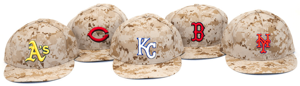
Is there a rhyme or reason to the choice of colors on the new camo caps? So far the lineup pictured above is the only image I’ve seen, and it shows most of the caps inverting the team’s normal logo colors. Presumably because A) The camo fabric is actually pretty light, so contrast more or less requires it; and B) Many teams render their logos in white on their caps but in team colors elsewhere, and this is an excuse to use the team-color logo on a cap.
So for some of these caps, the logo is team colored, and thus the reverse of the normal cap logo. Cindy’s wishbone C is red, not white; Boston’s B is red, not white. Yet the Mets NY is orange, as it would be on their regular caps, but with a blue outline for better contrast with the tans of the cap. And the Royals KC is white, which contrasts poorly with the light cap, even with the addition of a royal outline. Just makes me wonder if this is more or less random due to the league assigning the cap designs capriciously, or does this reflect each team making its own choice? And will the Nats, who often use a white curly W as a standalone logo even when doing so renders it nearly invisible, use a white curly W on the camo hat, or a red curly W?
I love the new Clubhouse caps mentioned in the MLB Preview & already bought the Braves’. Sure, it’s overkill, but they’re also in the business of making money.
Sure, it’s overkill, but they’re also in the business of making money.
It’s been a while since I’ve had to point out that “It’s just business” is not a sufficient explanation for anything, and that business practices are not existentially self-justifying. But this is a good time to do so.
If you like the cap, then fine. But you also say it’s “overkill.” Hmmmmmm.
MLB is already selling tons of this style of cap! It’s inconceivable to me that there actually is a business case that adopting Clubhouse caps will increase the league’s total revenue. Fans likely to buy these caps are already doing so. So at best, some fans who want to buy a team cap but only want to buy an actual official cap worn by players as part of the team uniform will now buy the Clubhouse cap instead of an on-field or BP cap. Except every consumer who substitutes a Clubhouse cap for an on-field or BP cap represents $7 in reduced sales of league merchandise.
I would be inclined to agree to an extent, but also suggest (with no factual evidence, only an assumptiion)that the business case may not be one aimed at the average fan, but to “hip hop culture.” Team hats are extremely popular in hip hop culture, often with no rhyme or reason to which team is being represented as long as the hat is “loud”. It is a “look at me” gesture. But if a popular artist wears one in a video, there’s exposure to 100,000 teenagers. Not sure if that would be plausible reasoning for a business case, and even more so agree that the hats are not justifiable because “it’s a business”. Just offering my observation/best guess at an explanation.
One way to look at it: Maybe you have the on-field cap and want to get a second cap, but you don’t like the way any of the others look. So until one comes out that you like, you’re not buying. Introduce the clubhouse cap which will get the aforementioned folks to buy, and the people who just have to have one of every type of cap, or folks who like that style.
Second, that style really makes no sense. Here you have a worn out brim and frayed edges on the patch, and an immaculate truckers back to it? How did the hat get so worn out but the back plastic mesh part is untouched which after so much wear and tear in my opinion would be the first part to go?
How about a tasteful black stripe on the sleeve of every uniform for Memorial Day, or a Blacked out emblem on the hat of every team (example: For the mets, keep the blue hat, but a instead of an orange “NY,” make it black.)
Tasteful, solemn, and even appropriate for the Blue Jays since plenty of Canadians have died in wars past too. Add to that a simple moment of silence before the game, and as a dude with 12 names that never leaves his wrist, I’d find that to be far more honorable than some half assed attempt at honoring everyone with the underlying purpose of adding profit to their brand.
Side note: as a Marine, it’s cool they chose the only functional camouflage pattern in the regular uniform repertoire (army only wears multi-cam on deployment, and the navy realized their Blue crap doesn’t work for their ground forces, and it’s pretty much the same pattern as MARPAT, so I’m not including those.)
Side note part II: Why don’t our leaders get together and come up with a camouflage pattern that does it’s job (hiding us so we don’t get shot so easily) and make it universal? Anyone who says lessening the DOD budget is unpatriotic clearly has never spent a day in the military, or just forgot how much money we waste on nonsense.
Conclusion: LET’S GO METS!
Not sure if this has been mentioned, but the Vikings officially announced today that they’ll be unveiling new uniforms at their draft party in April.
link
According to this article they’re going to leak some teasers, similar to what the U of M did with their new football unis last year.
link
Sorry for replying to my own post but it just occurred to me that when I went to the Vikings Locker Room store at Mall of America shortly after the season ended, the selection of replica jerseys was VERY picked over. I remember being surprised they hadn’t done a better job keeping them stocked. Makes sense now – they were purposely letting their inventory of the old design run out.
One can only hopes it’s nothing but reverting back to the mid-60’s uniforms with Northwestern strips on the home, and UCLA strips on the road.
link
Speaking of Vikings and uniforms: Who’s the batsman?
link
It’s Vikings tight end Kyle Rudolph, wearing the kit of the Yorkshire Vikings twenty20 club.
More info link
New logo from WNBA because, hmmm, I guess it’s better than the Jerry-West-with-a-wig of the current one?
link
In reference to your ESPN article, I am in agreement with your comments on the Giants uniforms. I’m a huge Giants fan and it would have been refreshing to have seen them roll out a version of the 1906 jerseys for their “ring” day. Also, I too would like to see them change over completely to the alternate “SF” road jersey instead of continuing their current standard road jersey. I’m OK with two road versions, but wished they had maintained the piping around just the collar and sleeves on their standard roads (pre-2012), and not have them extend down the chest under the “San Francisco”. This would have retained a look more similar to their 1950’s design in New York. It’s too
It seems to me that doing the camo caps “to honor veterans” despite probably never asking any actual military personnel what they think is on par with those who say using Native American imagery is “honoring” them without really seeking their input. Food for thought.
Last year an American team played in Canada on Canada’s birthday (July 1st). The american team did not acknowledge Canada, ie-the Blue Jays had red and white ball caps with a Maple Leaf along with their original caps, the American team?? nothing. When the Blue Jays are playing ball on the day of States bday, they gotta sport red white blue along with stars and stripes. What gives? Just doesn’t make sense.
Pffft.
The Blue Jays are lucky they even get to acknowledge America’s Hat day.
I wouldn’t expect any MLB team other that the Blue Jays to wear something Canadian on Canada Day. I could see MLB wanting the Jays to wear stars and stripes if they were on the road July 4th, but I checked the schedule and they are at home.
Yeesh Phil. What are you planning for Easter? Going to find some kid who birthday is on that day and go trash his party?
I have read a lot o f comments saying that people liked the US soccer unis. However I have to disagree. They were just to plain and boring. Also I’m the kind of person that likes conservative uniforms for instance I think penn state has the best cfb unis, in nba the celtics unis are best, in ncaab uclas unis are my favorite.
They were pretty plain.
That’s the point. It’s a centennial thing. The crest hearkens back to the days when that was it for uniform design. Simple.