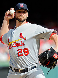
Last November the Cardinals announced that their blue road cap was being demoted. The plan was for the team to wear red caps on the road, with the blue cap being retained in some capacity as an alternate. This came up when I interviewed Cards President Bill DeWitt III four months ago. In case you missed that, or if you just want to refresh your memory, here’s the key cap-centric exchange from that interview:
Uni Watch: You’re going back to wearing the red cap on the road, right?
Bill DeWitt III: Yes. But we’re keeping the blue hat in our portfolio as an alternate. At the moment, we’re kind of indifferent to how it’s used. It could be used as a Sunday-getaway cap; it could be used just when we play other teams that wear red, as a point of differentiation; it could be worn on alternating road trips. We may actually get some fan feedback on this.
At some point during spring training I read that the Cards had decided to go with the navy road caps when the opposing team was wearing red (although I no longer recall where I read that, dang). Seemed reasonable, and it was one of the options that DeWitt had mentioned. I figured that was that.
Nope. With less than a week remaining before Opening Day, the Cards have asked their fans to vote on the issue. That page went up around noontime yesterday, and was announced on the team’s Facebook page and Twitter feed. As you can see, one of the options is for the team to “Wear blue caps during road games and red caps at home” — in other words, to retain the status quo.
Well, DeWitt did say the team might solicit some fan feedback. But it seems very odd to do so only five days before the start of the season (the Cards open on the road, incidentally), and even odder to offer the possibility of sticking with the old protocol after announcing the switch to a new one several months ago.
I’ve tried to get some comment from DeWitt, and from a few other contacts I have on the Cards. No response yet, but I’ll keep you posted.
One final thought: Not every fan has a computer. And even among those who do, there are plenty of fans who don’t spend all their time on Facebook, on Twitter, or poking around their favorite team’s web site. All of which is to say, things like internet polls and Twitter hashtag stats are useful tools for certain things, but they’re lousy ways of determining something like how a diverse fan base feels about a road cap. The young and the wired already have outsized influence in the uni-verse, because they’re the ones who buy most of the merchandised apparel, which in turn drives many of the designs we see. Letting a uni element be decided by an internet poll just gives more power to a demographic segment that already has too much of it. Meanwhile, the sanitation worker who doesn’t sit at a computer all day, the rural fan who doesn’t use the computer all that much because his community still isn’t wired for broadband, and your grandfather who only uses his computer for e-mail and doesn’t even understand what Twitter is — all of whom may be just as passionate and loyal in their fandom, and whose opinions matter just as much as anyone else’s — don’t get to have a say. Indeed, one reason I almost never run polls here on Uni Watch is that the results would only provide a blurry snapshot of a fairly small, self-selected group, and I wouldn’t want to see that polling data used to support more wide-ranging arguments regarding how fans feel about uniforms.
I realize the Cards are attempting a form of fan outreach here, and I certainly don’t fault their intent. But for those of us who believe that a sports team is a civic entity, and that the team (and its uniform) belongs to all its fans — not just the ones who are demographically inclined to spend cash on tickets and merch — the net effect of the Cards poll is basically the uni-verse version of the rich getting richer and the marginalized being told yet again that they don’t matter. It stinks.
Meanwhile, there was other big MLB and NFL news yesterday:
• The Nats have finally announced the existence of the alternate cap that everyone already knew about. Reader David Goodfriend points out that the grommet vents are contrast-colored. Is that detail present on any other current MLB caps?
• The New York football Giants will have a set of alternate white pants in 2013. I’ve always thought the gray pants looked too drab, so this is welcome news at Uni Watch HQ. I had no idea this was in the pipeline, so I’ve asked Joe Skiba for more info. Will advise.
• Further evidence that the latest Dolphins logo leak was the real deal: Take a look at the Dolphins logo in the left sidebar of NFL.com’s “Predict the Pick” page. In case they’ve changed it by the time you read this, here’s a screen shot that reader Jason Fortin made. Not only that, but the Miami Herald is reporting that the logo is legit, plus they’ve added a new detail to the mix: The team is switching to white facemasks. That article is terribly written (the guy spends half his time apologizing for writing about uniforms and logos), but it has plenty of good info.
Uni Watch News Ticker: And so it has come to this: The Lehigh Valley IronPigs are installing a urine-stream-controlled video game in their men’s room urinals. No mention of any corresponding game for women, so I guess female fans can just sit around wishing they had a penis and going to buy more beer for the gents. ”¦ I’m sure President Obama is just thrilled to have received a Notre Dame Fruit Stripe jersey (from Yusuke Toyoda). … Denard Span of the Nats forgot his jersey on the way to a spring training game and had to wear a minor leaguer’s number (from William Yurasko). … Whoa, check out these padded athletic glasses! “Is it wrong that i want to wear these like normal glasses?” asks vintage-enthusiastic Robin Edgerton. … The Sacramento River Cats are a little touchy about the spelling and styling of their name. Man, if I implemented a similar system of fines for Uni Watch — two words, both capped, space in between — I’d be a rich fella (from Brice Wallace). ”¦ There was snow on the ground yesterday in Ohio, so MLS used an orange ball for a Columbus Crew reserve match. “They should just do away with white soccer balls altogether,” says Leo Strawn Jr. “Orange is much easier to see. More color is a good thing, yeah? MISL used to play with an orange soccer ball indoors. USMNT played Costa Rica in a World Cup qualifier a few days ago in a snowstorm in Denver, and they used a yellow ball for part of the match. German futbol is also played occasionally in snow, with an orange ball used on such occasions.” ”¦ Fascinating five-part series looking at the apparel contracts for three Utah school — Utah State (Nike), University of Utah (Under Armour) and BYU (Nike). As I’m typing this, only the first two parts have been posted. Highly recommended reading (big thanks to Josh Sorensen). ”¦ Penn State is marking the 100th anniversary of its lacrosse team by posting some cool old photos online (from Mike Janke). ”¦ The old Logo Athletic is now being used by a trucking company (from Mike McLaughlin). ”¦ Some really nice action photos of the 1942 Southern Conference Basketball tournament here (from Nate Collins). ”¦ Only in America: CBS is asking for a $700K tax break for — get this — part of its Super Bowl coverage. Blow me. ”¦ “My father got this baseball game for my two sons — okay, and for me, too — for Christmas,” says Kevin Fox. “With the season almost upon us and my eldest preparing himself for his first year of T-ball, we’ve been breaking it out lately. Great way to teach the game to a kid when there’s eight inches of snow on the ground. Sadly, all the players are in pajamas, but the stirrup revolution is a long-term project.” ”¦ Hmm, can’t imagine why this old catcher’s gear never caught on (from Ronnie Poore). ”¦ Jets goalie Ondrej Pavelec used a solid-black stick with no branding last night. “I assume it’s because he was using a different stick than the one he’s under contract to use,” says Casey Hart. ”¦ If you were somehow unaware of the difference between an authentic jersey and a replica, the easiest way to tell is that the authentic is an even bigger rip-off than the replica here’s a look at the differences (from Peter Colvin). ”¦ There are rain delays, and then there are rain delays. That’s Crosley Field, 1937. “What incline?” says Matthiew Mitchell. ”¦ This is fascinating: an 1880s baseball team that appears to have worn tunics and stockings, instead of jerseys and pants. Never seen anything like that (great find by Daniel Listoe). … Mets prospect Matt Den Dekker broke his wrist a few days ago, which is a bummer, but check out his cool Mets-themed cast:
Best possible news no surgery just gotta wear this thing for a month #LGM twitter.com/UpperDekker/st”¦
— Matt den Dekker (@UpperDekker) March 25, 2013
Personally, I always liked the gray pants of the Football Giants because the gray pants worked with all three jerseys. White pants give too much visual sway to the white Jersey, and the Jints don’t look good in mono white. I also don’t think they can pull off blue pants either.
If you go back and re-read the article, you’ll see that it says they won’t be wearing the new white pants with the white jerseys.
You’re right. I was just saying because I see this is the start of a Giants redesign…
I don’t. As good as the Giants were during the Parcells era, even then many fans wished they still had the “ny” logo. I see them, MAYBE, eventually wear the Parcells-era uniforms with the “GIANTS” script on the helmets as a throwback third uniform (On a related note: Denver?) while keeping the standard home and away uniform. In some capacity, they’re gonna keep the “ny” logo as their primary insignia, just like they’ve kept the “GIANTS” script around in some capacity since going back to the “ny” logo full-time.
Uniform-wise, personally as a Steelers fan I would like to see the Giants continue using their current primary uniform set. The Northwestern red stripes on the road uniforms–being absent from the blue uniforms–is not only a throwback to the Giants 1950’s-early 1960’s look, but a nice contrast that we used to see in Minnesota until a few years ago.
I am probably in the TINY minority that thinks the current Giants home uni is the best in the NFL ( not too crazy about the roads ). Love the grey pants and I never liked the all whites or the GIANTS helmet.
That being said, if you are going to throwback, why just the pants? Current jersey, current helmet? Is this a test of sorts? Grey pants on the road, white pants at home?
I’m with you, I like the gray pants. Have loved the current set since they broke them out in link
BTW: that linked image shows white pants, to get an idea of what the 2013 version will resemble.
FWIW, 1994 was part of NFL’s 75th Anniversary league-wide throwback thing. The “NY” logo didn’t come back full time until 2000, and then the current design with the slightly modified road whites and thin stripes on pants didn’t come into effect until 2005.
I like that look too; the numerals are on the sleeves and the helmet paint is non-metallic. Those are my only complaints about the current Giants uni.
Paul,
If you fined people for misspelling Uni Watch, people would find another site’s name to write. Of course, you’d have only slightly less enforcement power than the geniuses in Sacramento, who may have found a way to lessen their pesky media coverage.
Do we really need riverCats news?
I’ve always liked the Giants grey pants and am sad to hear they’ll wear white. Their look now just feels very traditional to me and perfect for their franchise. When I watch old Bill Parcells era Super Bowl highlights and see them in white pants I just think it looks lame. Enough teams wear white, stick to and own grey pants.
It could get worse – they might start wearing the mismatched navy blue GIANTS helmets with the blue jerseys/white pants.
I agree, the Simms/Taylor/Bavaro white pants now look lame to me. There is something about the grey pants that just seems to…..”work”…..for me…
Broken Record Dep’t: Non-flashy pants (gray or tan, matte finish) showcase flashy stripes on sleeves and socks.
Non-flashy pants (gray or tan, matte finish) showcase flashy stripes on sleeves and socks.
…which the Giants don’t have.
True, but they should! Imagine the Jints with Blue jersey torsos and blue-and-red striped sleeves, dull gray pants, then blue-and-red striped socks. Make that blue:red ratio about 3:1, btw.
Naturally, TJeff, you can say, with good reason, that what I’m describing is so removed from current reality that it doesn’t bear at all on an operative question of the here-and-now. Guilty! I mean, we pick our individual UW persona, and mine happens to be mostly irrelevant to current decision-making on uni designs. Just an aesthetic posture, which Oscar Wilde described as the first requirement of social behavior. He wasn’t quite sure if there was a second requirement.
“Lighten up Riverc Ats.” ~ Sgt. Hulka
Cry me a river, cat, amirite?
Admittedly, the name thing (from the River Cats article) can be maddening. As a musician, I’ve had the name of bands of mine butchered by people by putting a “The” in front of it and/or a “Band” at the end.
“Ladies and Gentlemen, The Led Zeppelin Band!”
Bonzo would be spinning in his grave.
A certain band’s frustration over the (misused) definite article is how we got the album title The Name of This Band Is Talking Heads.
Stop making sense.
And what kind of a-hole attaches a definite article to a name that doesn’t deserve one?
Then there are (the) Smashing Pumpkins, who don’t seem to have a clear preference.
At least two bands changed their minds midway: Sweet started out being called “the Sweet”; and the first records from the Guess Who were credited to “Guess Who?” (no article; with question mark).
I guess if a big fat check had been made out to “The Spoon Collection”, I’d’ve still cashed it. If it was big enough I’d’ve even added the “The” to the banner!!
Pink Floyd also started out as “The Pink Floyd” while The Who started out as…”Unit 4+2″ whatever the hell that means!
I believe it was “The Pink Floyd Sound” and then shortened to “Pink Floyd”.
And then there’s Los Lobos, I always wanted to hear some unknowing radio or concert announcer announce them as “The Los Lobos”.
One band that surely doesn’t have this problem is The The. (It was always amusing in record stores to see their divider card, which said “The, The”.)
Major League Soccer, or “The MLS”, feels your pain.
Whereas, Major League Lacrosse use the article in their abbreviation “the MLL”. That feels much more natural than saying “MLS” without the article — even if the article with the abbreviation doesn’t make perfect sense alongside the MLL’s full name. I wish MLS had gone this route.
(The problem here, for both of these leagues, is the silly act of using “major league” as an adjective. Both leagues obviously imitated the name “Major League Baseball”. But that name was never meant to be the name of *a league*; it was the over-arching name of a union of two leagues. Of course, Major League Baseball has essentially become one league now, which is a whole other problem.)
How to name your new minor league team:
Take a local inanimate object or product, like River, Iron, or Sound.
Take generic (or semi-generic) plaural name of an animal, like Cats, Pigs, or Tigers and there’s your name.
Someone could really take on a column A/column B type project where they take all the minor league teams and you can mix and match the names. Sound Pigs, River Tigers, Iron Cats, etc.
This is what Uni-Watch has done to me…all I see is a jersey w/ No NOB or #OB….
link
On this week’s Slate Hang Up and Listen podcast,Grant Wahl said that the reason and orange ball
was not used in last week’s United States-Costa Rica snow game because Nike,US Soccer’s supplier,does not have an orange ball and orange is deemed an Adidas color. I would dispute that because Nike does make orange balls and it is the supplier to the Netherlands,which wear orange
as their primary color.
I missed the game on TV, but looking at the photos, the yellow ball does show.
Orange as an adidas color thing is puzzling, but I wonder if adidas would make a trademark claim if Nike were to introduce an orange match ball for a snowy pitch.
Orange balls used to be de riguer when football was played in the snow many many years ago. Before undersoil heating and when lines used to be cleared in the snow. Happy simpler days.
Appreciate Cardinal leadership listening to fans who don’t want to see the blue road caps gone. Way better than the red roadies. Now if they could only bring back the Sunday cap with the bird on the bat we would be back in business. Go Cards!!!
In Paul’s interview with Cardinals president Bill DeWitt III in November, it was mentioned that the third cap was being retained for use on Sundays.
link
Of course, apparently anything that had been decided in November could be up in the air now. :P
I’m a Cardinals fan, and I appear to be in the minority based on the current poll numbers, but I want to see the Cards in the red hats on the road for every game.
Although the red hats are more consistent with the rest of the uniforms, I actually prefer the blue hats because they add a quirky distinction to the Cards’ uniforms in the same way, I suppose, as the Dodgers’ use of the red numbers on the front of their jerseys.
Always a fan of the Cardinals’ navy away cap. Glad Dal Maxville brought it back; glad they’re keeping it.
Meanwhile, happy with news about the football Giants trying out the white trousers. Gray is fine, but the Giants’ version looks dingy.
Meanwhile, I’ll be interested in the Dolphins white face mask. Seems like it’ll look too much like the U’s helmet. You’d think they’d want a difference.
RE: Video Game….
I guess it’s the next gen Nintendo “wee”
I like how the press released refers to the game being “p-controlled” (not “pee-controlled”). That reminded the New Girl of the Prince song “P Control,” in which the “P” most assuredly does NOT stand for “pee.”
One of my favorite Prince songs!
You could say, “Now urine control of the game!”
I’d prefer to think that Den Dekker’s cast is a tribute to the University of Florida, which remembers him fondly.
Interesting point of view, I still can not help but see it as Met-related and wonder if Matt will occasionally add black as an alternate.
This Cardinals thing sounds like the proto-Elvis debacle of the Patriots of 1979 — they wanted to backtrack on a decision, so at the last minute they said, “let’s put it up to the fans” so it can be their fault.
That being said, I like the blue road cap, but how much of what we like is because it’s what we’re used to. I’m sure in 1992, I probably would have preferred the Cards to wear a red cap on the road.
I remember in 92 when they came out with the uniforms they basically have now it was a welcome change. No more sans-a-belt, buttons and the return of the navy cap that hadnt been seen since the fifties. Keeping the navy cap is a great idea and i for one like keeping the red to home only
When they introduced the new Saturday cream uniform, I was disappointed to see it would be paired with the red caps, especially since they had introduced the new BP caps which look similar to their “Gashouse Gang” era caps link
If there’s any change I want them to make, its to wear these caps with the new cream Saturday alternate uniform. (Although I firmly stand on the side of solid navy cap on the road)
From your mouth to God’s ears, Josh. And I clearly remember the Cards’ 1992 uniform change, and thought it was fantastic. As a DOMINANT color, red never looks quite right to me on a road uniform: something about it works poorly with the grey unis, and with the unspoken principle that the road team should wear something more muted than the home team is sporting.
Red hats with the gray uniforms really pop out, I love them and I’m going to be very disappointed if the Cards go back to maintaining the status quo. The Cardinals are a dominant team, they should wear a dominant color on the road! Besides, it’s not like that “unspoken principle” is followed by all of MLB… how many teams have worn red hats visiting Busch Stadium? Or even worse, completely colored jerseys? (I’m looking at you Cubs)
Completely colored jerseys look a lot better than boring gray. I’d even suggest link.
I grew up with the Cardinals during the powder blue jersey era, and always remember seeing the pictures of Musial and Red Schoendienst with the navy caps as “old school” Cardinals, and the older fans I knew appreciated it when they came back. I like them myself.
I’ll reserve judgment on the Giants’ white pants until I see them, but something tells me it’ll look good. I like the gray pants, especially with the road whites, but I think the blue-over-gray is a little drab, especially since the blue jerseys are monochromatic and have nothing on the sleeves/shoulder-cap-side-panels. The white pants will be a nice change-of-pace without being gratuitous. Move the numerals down to the sleeves, and then they’ll have a sharp-looking home uni.
Will look something like link
I have an idea what they’ll look like, but the striping will be different from that. I do like that look, though.
I like the gray pants, but I think it’ll be okay too. The Rams’ white pants are pretty sharp looking, I think, and the 49ers looked decent when they wore white pants with their mid-90’s unis: link
Pavelec has been using the “logoless” stick for a few games now. It’s reportedly from a stick manufacturer that hasn’t paid to be an on-ice brand, so Pavelec tapes it from top to bottom.
They were talking about it on HNIC on Friday night during the Caps-Jets game. Healy and Millen were all over it. I’ll go back and see if I can find the brand-name in the CBC replay on their site.
Apparently, it’s a Warrior stick. :o)
Warrior ponied up! Jonathan Quick and Evgeni Nabokov have Warrior sticks!
I’m never relying on the internet for fact-checking again. I’ll keep searching for the info.
Thanks, Mike! :o)
Now if I had to take a guess as to that stick’s brand, I’d guess Combat. It’s pretty popular in Europe, but they are a relative start-up and chose not to buy visible rights on NHL equipment. But Jaromir Jagr has been wearing the brand since his Philly days (so maybe he switched during his KHL tenure). How can you tell? Easy, the NHL doesn’t collect those fees in the preseason, so that’s how Combat can get a bit of free photo exposure.
link
link Lockout this year = Jagr had no preseason for Dallas, so his stick is blacked out because Combat couldn’t get the free exposure like last year. His gloves…should be blacked out too, but I guess the black shoe polish didn’t hold or something. I’m completely stumped as to why Jagr is insisting on carrying over Czech national gloves.
And hey-yo, link? Why, that looks like a publicity photo, featuring a Binghamton Senator on the right, Jagr in the center, and who else but Ondrej Pavelec on the left. BOOM. Combat, confirmed.
Mike’s 100% right. Found the clip from the game, but I can’t rip it while at work. Both Healy and Millen said it was a Combat stick.
Excellent work, Mike!
He used Combat while with Atlanta. They weren’t paying the fees for the past couple of years, and they’ve filed for bankruptcy two months ago.
The guide to tell authentic and replica MLB jerseys apart is mostly correct but it makes the mistake in thinking all authentic jerseys are made with Cool Base; the Yankees only use polyester double-knit for their jerseys and any Yankee jersey that has Cool Base tagging is a counterfeit.
Also, they shouldn’t have used the Phillies in the example, since their logo is chain-stitched (not tackle twill).
He also missed that the Majestic logo on the authentic is on the left sleeve, and on the replica its on the right sleeve.
Blue Jays are another team that doesn’t use cool-base. Teams that use cool-base usually have a double-knit authentic available as well.
Yes, but obviously, you’re getting what you pay for, with the incredibly high quality Majestic always brings to the table!
Or so I’m told…
The best way to tell an MLB authentic from a replica:
If the batter-man logo is on the back of the neck above the number, it’s authentic. Otherwise it’s a replica.
When I clicked the link, I saw Cardinal fans being told that the team wanted to get a fan vote. I did not see anything that said that the fans’ choices would be taken into consideration for the final decision.
What does “Red or Blue, It’s Up to You” mean to you, Jim? Seems pretty self-explanatory.
Note to self: Don’t comment before drinking a cup of morning coffee (and I don’t even drink coffee).
The team itself should be fined for having the name “River Cats” in the first place. I lived in Sac when the team started up and have always hated the name for being uninspired.
It’s not uninspired. It’s freakin genius. A River Cat? What the heck is a River Cat? Just think of the types of drugs you’d need to be on to come up with that name… heck, most cats don’t even like water. It’s no Thunderchickens, but it’s definitely in the same neighborhood.
Don’t you mean Thunder Chickens?
No, THE is referring to the Kalamazoo Thunderchickens (my early 70s football team in my mind), not the current band or whatever Thunder Chickens is. THE–I still need to draw up and post that logo for you…
I was just applying “River Cat logic” to the spelling of Thunderchickens.
A team at that high of level (AAA) with that lame a name deserves to be fined.
My local collegiate summer baseball team has the name of Border Cats – their bad excuse for that name would be being the only Canadian team in the league. Just as lame. Almost every team in the Northwoods League has a better animal inspired name than either of the Cats – especially the Rochester Honkers and even the oddly named Mankato Moondogs. link
sorry – MoonDogs
I’m a bit torn by the Nats new alt cap. On the one hand, it’s about time the team had a red crown, navy bill cap in its arsenal. On the other hand, they’re not getting rid of the gobsmackingly stupid Barves road cap with the navy crown and red bill, so what’s the point? On the one hand, it would look great with either the home or especially the road uniform. On the other hand, they’re only going to wear it with the red alt, where the normal red home cap is the obviously perfect cap to match the jersey. (Then again, we’ll get to see the new cap All. The. Time. since the Nats rule when deciding whether to wear the red alt at home seems to be, “Is it a day of the week ending in Y?”)
On the one hand, I generally think that contrasting grommets on a ballcap belong nowhere on a professional ball field – it’s the most collegiate of college uni styles. It’s an amateurish look – in a good way! On the other hand, the proportions it creates of navy vs blue are perfect for the way the Nats mix the colors, so it works about as well for me as I can imagine contrasting grommets working in the bit leagues.
And finally, we see that three years after the Nats tweaked and improved their curly W logo, New Era is still using the old curly W template to embroider Nats caps. Way to provide quality control, New Era! Way to uphold your brand and identity, Nationals!
Swear to god I was not drunk when I wrote the above. Navy versus RED. BIG leagues. Ugh!
Barves? ;)
Barves is a standard Braves hating misspelling, at least on SBNation sites. Even the Braves’ fans do it when their team loses.
Barves : Braves :: Natinals : Nationals. In this instance, I meant it as a dig against the Nats for adopting and continuing to wear a cap that mirrors the most distinctive feature of a division rival’s uniform.
The plural of “barf.”
Half Man, Half Dog. I’m my own best friend!
Generally, Scott has my proxy on all things Nats-ian. But I don’t like the red shirt alt a lot more than I don’t like the Barvesian cap.
I don’t entirely disagree. If the red shirt were the only alt element in the Nats closet, I’d be OK with it. It’s among the better softball tops in baseball. (Though it’s outclassed by the Reds red softball top.) But the profusion of alt elements in the Nats wardrobe makes ’em all look like clown suits.
Home, road, and either one alt jersey or a secondary (road or alt, take your pick) cap, would leave the Nats with a top-ten uniform set. Give the road uni piping that matches the home jersey and fix the number on the curly W shirts (either raise it, put it under the W, or eliminate it) and the Nats would be top-five.
If I ran for mayor of DC, I’d seek the nomination of the Alts Are Too Damn Many party. Off the rack, the Nats have 24 potential uni combos, and a penchant for wearing caps that aren’t intended to go with their jerseys, so that 24 isn’t a theoretical maximum. It’s their likely end-of-season total. Plus they’re rumored to be thinking about bringing back last year’s 1924 throwbacks from time to time in 2013 – Bryce Harper is said to favor the look – so it’s hard to call anything the Nats wear a “uniform” at all. (Though I don’t put much stock in that rumor – it seems to be unsourced twitter speculation.)
Which is to say, the Barvesesque road cap is a symptom; the red alt jersey, even if you kind of like it as I do, is part of the underlying disease.
I think it’ll be a nice way to break up the all-red look of the alts, which is too much IMHO.
You know what would really great with a cap like that?
An entire uniform set based on this:
link
On the one hand, I generally think that contrasting grommets on a ballcap belong nowhere on a professional ball field
Well said!
Hey, we Braves fans don’t begrudge you the road cap. Who WOULDN’T want to look like us? [Ducks]
No need to duck – I’ve been hating the Braves since long before the Nats came to DC, and yet I’d call the Braves home uni one of the handful of greatest uniforms in sports, all-time.
I don’t even mind lesser teams being derivative of better teams, such as the Royals being basically Dodgers copycats. What I mind is when a team is derivative of a nearby competitor or rival. If the Nats go all copycat on the Cardinals with a navy road cap, whatever. But aping the Braves is just too much to bear.
“On the other hand, they’re not getting rid of the gobsmackingly stupid Barves road cap with the navy crown and red bill, so what’s the point?”
Well, they DID start wearing those in 1946, so there’s tradition there.
Is “Barves” like the “Quebec No Dicks” of yesteryear?
“Salguero adds that multiple unnamed team sources have confirmed the image. Miami will also be changing the color of their face masks to white from aqua for the first time in team history.”
Is there something in that quote that I hadn’t already mentioned when providing the link to the story?
For some reason(s), the white facemask fell out of favor in the NFL…only the Chiefs currently use them.
I think those will look good on the Dolphins’ helmets, so long as they keep the stripes.
Is it possible that this means an Aqua helmet will replace the white?
White facemasks are so ’80s. In 1987, 10 teams had them (Jets, Giants, Patriots, Bills, Colts, Browns, Chiefs, Broncos, Vikings, Falcons). 10 years later, only 4 still had them (counting the Browns who were in hiatus at that time). 10 years earlier, only 5 had them.
If an expansion team came into existance and named themselves the Dolphins today (not likely, I know, too demure), I would look at that new logo and think, “Eh, not bad. Kinda generic, but not bad.”
But to lose this (which had already been altered to reflect the dolphin’s surprising transormation into an agressive sea beast) saddens me….
link
…It’s at once fanciful, funny, weird, eye-catching, odd, one of a kind, ridiculous, historic, and puts the entertainment of football in perspective.
The new one? While nicely rendered, it could be the logo of dozens of enterprises, lacks a sense of play and is forgettable.
To me, personally, I always felt that the Dolphins logo was a little antiquated–nothing wrong with that, mind you. It was a very historical logo, circa Patriot Pat and Brownie the Elf, and I always wondered if Miami would do a redesign like the Bucs or the Eagles.
It should have been off of the table at the start to do a radical redesign like the Bucs because unlike Miami, Tampa had the first winless record. Miami, on the other hand, had the first undefeated record. There was no way we would see a navy/orange dolphins or a rebrand. It’s cool that they’re “going back” to aqua and orange.
But the logo could be better. It’s sleek, it’s cool, but not great.
Considering the Sacramento logo has “River” and “Cats” connected, does this mean they should be fining themselves?
link
Really rIVERcATS? Really?
Interesting that the River Cats wear RC on their hats instead of S for Sacramento.
It always bugged me in Friday Night Lights when the Dillon Panthers were always represented by a P instead of a D. Who does that?
I guess the Bengals have a B logo. Anyone else I’m missing?
Oakland A’s
White Sox
The Angels during their “California” era
The Orioles when they didn’t have a bird on their hat
UCLA baseball wears “B” hats.
The reason for the Dillon Panthers’ “P” was that the game scenes in the first season mixed staged action with footage from real-life high school games in the Austin area, so all the fictional teams were given unforms identical to those worn by real schools. The Dillon Panthers uniforms were copies of Pflugerville High School.
I suspect that school was chosen because its helmets were identical, except for color, to those of Odessa Permian, the subject of the original book and movie.
I’m sure anyone watching the US Men’s Soccer Team take a point in Mexico City last night was just as enthralled with link as I was. My goodness that’s a thing of beauty; retro shield, white cuffs/collar, mark of the beast nowhere in site. Perfect.
Agreed, the giant shield and the absence of the swoosh were a pleasant surprise.
agreed, a clean simple look loved it
Take it easy. Say it too loudly and Nike is liable to take notice and “fix” it.
link That getup would only ever be remotely practical for batting practice, because there’s no way a catcher could actually function in game conditions with that contraption. The rate of stolen bases would soar, because the catcher would have to wait for the ball to drop into the pocket at the bottom, retrieve it, and then throw it while still wearing that box on his chest.
But you should see what the batters had to wear!!
#10 is by far my favorite part of that contraption. I’m assuming that’s a shoot for the ball to drop out of, not a pocket. Regardless, Brilliant!
I see it not as game gear but as a way to tell balls and strikes in practice. Inside the box = strike.
Good observation!
“Majestic has been a staple of the industry for years, and the quality and attention to detail in their jerseys is unparalleled!””
HAW HAW HAW HAW HAW HAW HAW HAW HAW HAW HAW HAW HAW!!!!!
No, no… wait… there’s more…
“…with the incredibly high quality Majestic always brings to the table.”
HAW HAW HAW HAW HAW HAW HAW HAW HAW HAW HAW HAW HAW!!!!!
^^^ this ^^^
Can you elaborate?
Not surprisingly, MLB’s official Twitter account just posted this:
Anyone shocked by this? Me either. Face palm.
I suppose it is remarkable that this year, New Era has not one, but TWO different hats to implore you to impulse-purchase. :P
This is the second consecutive year that they’ve referred to these as “Star and Stripes caps” — even though they’re CAMO, not stars/stripes.
Nomenclature aside, going G.I. Joe on Memorial Day (a day for mourning the dead) and July 4th (a day for celebrating the nation’s birth) is a travesty.
I read the Twitter information to mean that they’ll wear separate hats on each day, Memorial Day and the Fourth of July.
Can you confirm or deny, Paul?
You’re right, I mis-read it.
Here are the camo caps for Memorial Day:
link
Note that they say it’s to “honor vets” — which is NOT what Memorial Day is for!
Never let accuracy stand in the way of marketing spin!
I agree re: internet polling. I recently encountered a similar situation with American Airlines. I noticed a (further) drop in the quality of movies being shown on flights and made a comment about it online. To my surprise, AA replied and basically said “you can’t complain, it’s a public vote on our site” (or Facebook page or whatever). To me, that doesn’t excuse the drop in quality but rather explains it… only tweens probably participate in that voting and that’s why I get a Katy Perry documentary instead of a real movie.
Netflix has a tab titled “Popular on Facebook”. I expected all the most popular shows my early-to-late-twenties friends talk about on Facebook, i.e. Walking Dead, Breaking Bad, etc. Nope, it was filled with cartoon shows. The only one I remember specifically was Spongebob Squarepants, but it was more or less a days lineup of Disney and Nickelodeon. Very clear who is/isn’t dominating the results there.
How can that trucking co use the LA logo like that? Did they just steal it?
If Logo Athletics isn’t around to complain (they aren’t around, right?), the trucking company can do whatever it wants.
Which is to say, it’s not exactly kosher. Just that the United States Patent and Trademark Office won’t take action.
I agree with commenters who find Liver Tats to be an insipid team name. Same goes for Shiver Bats or Giver Hats.
I may be a bit biased, but I’m perfectly okay with “Rivercats.”
I looked around that Baseball gane web site and some pretty creative kids. Some built stadiums around the field and decorated the uniforms..future uniwatchers.
link
Paul,
For all the things you’ve said on this site which I totally disagree with (namely anything camo related), you hit the nail on the head with your thoughts on the internet polling issue. I’m speaking as a member of that target demographic (30 yrs old, works for a software company, owns a smart phone, posts to Facebook, etc) but I was raised old-school. To this day I’ve never voted for an All Star Game online. My dad barely uses a PC and he has my mom check his e-mail for him. The Cards are missing a lot of opinions this way and you expressed that perfectly! Well done, sir.
“the grommet vents are contrast-colored. Is that detail present on any other current MLB caps?”
I think only Seattle’s BP cap. It’s a good look, more teams should do it.
So the Giants linked answered what link: that teams are only allowed three pairs of pants.
I’m more than OK with that. That must’ve went into effect last season, when the Rams announced they were ditching the gold pants. (Another decision I was OK with–their white and blue pants are underrated IMO, plus they have their throwback pants.) Might also explain why Washington never wore the burgundy pants last year too, since they had white, the George Allen-era gold pants that are increasingly becoming the norm, and the throwback…umm, tan? Khaki? Pewter?
The article on the urinal video game should have been a lot shorter. All they had to write was:
We’re tired of men pissing on our bathroom floors and we will now trick men into being more accurate with their aim.
See,… Smoking bans lead to no cigarette butts to aim at, which leads to guys pissing on the floor.
(btw, “You get a Kent with a micronite filter….it takes 3 guys and a keg a beer to take care of that one”)
That’s good news on the Giants’ front. The uniform they wore during the Fran Trakenton era was their cleanest look. I wish they’d lose the gray entirely, but at least we get to see white pants as an alternate.
Their 80s look wasn’t bad except for the fact that the helmet blue was much darker than the blue jersey and numbers and trim. At least they matched the helmet and jersey blue in the retro-remake of a few years ago.
I was born in 71 so I don’t know about the Tarkenton Giants, but I do remember growing up how much I hated the all-white road look ( Thankfully I do not remember the blue horrid blue pants ). But I like when teams have what I guess you can call uniform “oddities”.
I like Big Blue wearing grey pants and not wearing an “inverted” home jersey on the road….besides the Cowboys I can’t think of another team that does that.
Never did like the red trim…..
Forgot to add in my initial comment that it would be great if the Giants would redesign the away jersey. The all-red on white is inconsistent with their predominantly blue color scheme. They should have at least some blue elements in their white jersey. Again, their white jersey during the Tarkenton era was their best.
I agree with the take on social media. As someone who was in college when facebook first started and graduated in information systems, I haven’t used it in years and have never been on Twitter. I enjoy most tech junk but hated that all this interaction through a website (with friends anyway). Want to invite me to something/ find out how I’m doing? ~ call! or better yet, grab a drink. How did society even work 10 or 20 years ago.
The S.F. Giants just tweeted link that they will wear for their home opener.
Nice.
That’s pretty, reminds me of Detroit.
Ring ceremony day (3rd home game), not the opener.
…isn’t that their alt road jersey beneath all the gold trim? Why wear a roadie at home?
Breaking news: The Nationals are bringing the fan-favorite (and also fan-despised) “Ice cold beer! Beer that is cold! And in ice!” guy north with them from Space Coast Stadium, where he’s become a Spring Training mainstay, to Nationals Park. Uni relevant because the guy also wears these BEER socks:
link
Beerups: Coming to the big leagues.
Ugh. The pictures on that website just scream “I DEMAND ATTENTION!” Pass.
That vendor’s hosiery is on par with rest of the Nationals’ get-ups…unoriginal and uninspired.
Alarming working conditions in Qatar in advance of the 2022 World Cup.
link
Nice to see The Catch of the Day is back to baseball.
This has nothing to do with anything, but my six year old son’s Little League opening day is this weekend. He plays on the Cardinals, and despite extensive internet searching, the red, white & blue link are not available in children’s sizes. (No, not even from Robert Marshall). So, I had to break down and get him solid red stirrups to wear for little league. I’m heartbroken, but at least solid stirrups are better than nothing.
If anyone knows where to find the Cardinals stirrups in kid sizes let me know!
Josh-Sorry to respond so late but this has been a hectic week. I might have a solution for your sock problem. We used to deal with a good quality sock manufacturing company called Soyad Socks. I just looked them up on line and they offer the 2-in-1 striped faux stirrup baseball socks in three sizes 5-9, 7-11 and 10-13. The small ones should fit little leaguers. They show the Red Sox style on their web page but IIRC they can probably do the Cardinal pattern. Their website is link Their toll free phone is 1-800-922-9923. They’re located in Warren, Mich. and all of their products are made in the USA. Give them a call. It may work out for you. Hey, I’ve only got 46 years in the uniform business. I knew there was a company out there that might do what you want. Good Luck!
Josh-I just looked a little deeper into teir web page. They do hockey socks so they might be able to do regular baseball-type stirrups as well. They do have a minimum number for specials so you might get the other parents to chip in to get them for the team. I believe you can combine sizes as well.
Thanks, I’ll check them out
Fine, then I’ll just call them the RiverCraps instead (which is far better than the other “C” word I was thinking of using).
its official.. thats the DOLPHINS new logo!! Its on the teams facebook photo stream
link
they are giving away shirts with the new logo.. the EVOLUTION logo they are saying
Oh, they made it FACEBOOK OFFICIAL!
link
Mike Dee from the Dolphins confirmed it for the South Florida Sun Sentinel. “We had always had a plan to kind of roll it out over a 30-day period, so we’re going to start rolling it out. But the logo is only one part of the announcement. It’s a complete re-branding of the team.”
I don’t understand the need for all of the denials then…
I like the Cardinals idea for an internet survey. I’m not going to tear up because someone didn’t see it online. The internet is by far the easiest way to reach a massive amount of fans and it is an awesome way to involve fans. I’d be more content with the decision to move to red hats on the road if fans are for it instead of just Dewitt.
The internet is by far the easiest way to reach a massive amount of fans…
You’re missing the point. It’s by far the easiest way to reach a massive amount of A PARTICULAR KIND of fan. And that particular kind of fan already has too much say in the uni-verse, while other fans do not. That’s what stinks.
Honest question – what *is* the best way to get fan input?
As flawed as online voting is, it seems like the best (or at least the least imperfect) way to reach the most fans. You could mail season ticket holders, but a mailer seems like the sort of thing that would get casually tossed without being read.
I guess the point is, the Cardinals organization shouldn’t have crossed this particular river in the first place. And this is why we shouldn’t be so dismissive when, as a lot of readers were to the news about the Browns exploring a uniform design change, and spend a couple of years doing marketing research and design explorations.
This shit is hard, and it looks like things got messy because the Cardinals skipped a few key steps.
Honest question — what *is* the best way to get fan input?
Honest answer: You don’t put something like your uniform program up for a referendum (just like we don’t put every piece of legislation up for a referendum). You have the balls to make a decision and stick with it. And if you want to get fan input, you go thru it via a variety of ways (internet, publicizing a toll-free phone number during TV and radio broadcasts, etc.), and with a fair time frame, instead of doing a last-minute maneuver that only a certain slice of your fan demographic — the same slice that already has too much power in the uni-verse — is likely to be aware of.
What is your point? Are the Cardinals discriminating against people with slow/no internet? They want fan input, the internet is how that is done. That PARTICULAR KIND of fan they are trying to reach is the majority of fans, the kind with the internet. Should they be calling everyone in the Midwest? Fan input is great, I don’t see how a person can complain about this.
What is your point? Are the Cardinals discriminating against people with slow/no internet?
My point, which I think I stated quite clearly (but I’ll state it here again for you), is that this type of mechanism — a last-minute internet poll — gives too much power to a demographic segment that already had too much power to begin with.
If you go back and read what I wrote, you’ll see that I specifically stated that I don’t fault the Cards’ intent (i.e., no, I’m not accusing them of discriminating against anyone). I’m saying that the effect of this policy, regardless of intent, is to strengthen the hand of a demographic segment that is already too strong. I’m not sure how much clearly I can make that point.
You say “fan input is great.” But what if the fan input were being solicited in a way that, intentionally or not, had the very specific effect of excluding *your* voice, and the voices of other like you? And what if that was only the latest example of you and those like you being excluded? You might not think it was so great then.
Of course, maybe you don’t care if certain people are excluded, as long as those people don’t include you. That’s your prerogative. But some of us prefer to look at the bigger picture.
I don’t care in this case because this demographic that they’re targeting, people with internet, is the largest possible audience they can hit. They would get less response with mail and phone calls. I could care less that Joe Schmo with no internet doesn’t get a vote. It’s 2013, get the freaking internet. I don’t twitter and rarely facebook, I saw it on the Cardinals website.
If you’re looking at the “bigger picture” what is the alternative? They should’ve given this more time but what other medium reaches this many fans? None. I’d argue people with internet access probably aren’t following the team as closely as those with it and therefore it is a better demographic to vote on it.
I could care less that Joe Schmo with no internet doesn’t get a vote. It’s 2013, get the freaking internet.
Your compassion for your fellow fan is heartwarming.
If you go back and read what I originally wrote, it’s not about having “no internet”; it’s about people who don’t have a desk job, or are more on the elderly side of things, or would be happy to live in a 2013 world if their community would just get wired for broadband already.
But I realize that actually thinking about other people is no match for a sense of entitlement. Have a nice life.
Edit:People *with* the internet follow the team more closely.
Pot meet kettle on that sense of entitlement.
I don’t have a desk job, I found it. It’s not that difficult. Not having broadband doesn’t mean they don’t have internet access. Almost 80% of Americans have the internet. That’s well over a majority. It’s the only way to do it that makes sense.
I’ll ask again, what is the alternative? Crying about a few people that don’t get to vote isn’t an alternative.
People *with* the internet follow the team more closely.
Oh really? So they’re “better” fans, and therefore deserve more of a say?
Here’s an even better argument: People with season tickets and luxury suites follow the team more closely. After all, they care enough to pay the big bucks. So all uniform-related decisions should be left up to them, and not to anyone else — including you.
There, that works nicely.
Pot meet kettle on that sense of entitlement.
Oh really? What sense of entitlement have I displayed in this discussion? Please be specific.
As if your opinion is the only one that counts, even though you clearly can’t come up with an alternative plan that hits whatever demographic you want to hit.
If the Cardinals chose to only poll season ticket holders that would be fine, they spend more money on the team than I do. I watch almost every game but that doesn’t generate the revenue they do. Life isn’t fair but I’m not going to sit around and bitch about it. You want a vote? Get the internet, case closed.
Actually, I did come up with an alternative plan — scroll up to my response to terriblehuman.
But I’ll give you credit for intellectual consistency: According to you, it’s fine if they come up with a plan that benefits rich fans over poor ones — including you. That’s crazy, but at least you’re consistent in your Darwinian approach, even if you end up with the short straw. Good on ya for that. But let’s just say I’m glad you’re not running things.
Thanks for the fun back-and-forth — g’night.
I just noticed that @miamidolphins just started using the new logo on Twitter. And their website. With a question of “How do you like the new avatar?” And ‘A finsiders look at the history of the logo’. link
link
It’s a good thing nobody is fining the rIVERcATZ for improper grammar. First sentence of the press release: either the name comprises both River and Cats or it’s composed of River Cats. “Comprised of”, although it’s become as common as incorrect usage of subjective pronouns, is technically grammatically incorrect.
Uni changes coming for all Cal-Berkeley teams: link
link confirms new logo.
I REALLY hope the Cards retain their red caps for road games…saw them wearing them with their road gray uniforms and thought they were beautiful.